#oh also i should probably add that i am in no way an expert so i could have fucked up
Text
A literary reading of byler
so in school (and outside of it) most of the subjects I am taking and my interests are some form of literature, so I thought I'd share my thoughts on byler from a literary analysis standpoint
when you are analysing literature, it can be divided into three major buckets: narrative, aesthetics and text. Let me quickly break down what they actually mean
Narrative: This one is pretty self explanatory. It is how the overall structure of the story fits together, including plot, character arcs, and all that big picture stuff that spans the whole text.
Aesthetic features: Also sometimes called stylistic devices, they are the artistic elements that contribute to the text, often adding new meaning/emotions/ideas to it. In the case of cinema, these are pretty much everything you see on camera, like lighting, costuming, props, camera angles, etc. Often these are used to establish literary techniques such as symbolism or narrative foils.
Text: This one is also pretty obvious- it is all the words and actions of the characters. Dialogue and movement are what primary make this up. Think of it as anything in the script (or what the actors say/do if it is improvised), and any directorial choices relating to that.
What I find so interesting about byler is how it has tons of supporting evidence in all of these. What you will see with most ships that are non-canon is that they have a few bits of 'evidence' in one, or two at most, of these categories. Within the fandom, steddie is probably a good example of this. In canon they are physically positioned close to each other a lot of the time, and a lot of their shared dialogue could be read as 'flirty'/having romantic connotations, so they have the textual box checked. However, there is really no grounds for thinking it will be canon (even putting aside eddie being dead) because there is arguably nothing that could really be considered 'evidence' in either the aesthetics or narrative.
Which brings us back to byler. I am going to list a few examples of evidence supporting their endgame for each of the categories just to provide some context, but this is definitely not all of it.
Narrative
In my opinion the most conclusive evidence for byler endgame narratively is the character arcs of mike, will and el. this has been gone over many times and there are many great posts that explain this in more depth, so I won't go into detail, but all three of them have been following their own character arcs since the beginning. in essence, will's is about accepting that he is not broken/a mistake and deserves a happy ending, el's is about finding her independence from the abusive men/other people that have controlled and learning to be herself, and mike's is about realising that conforming to societal expectations is not the path to happiness. they obviously each have other sub-arcs, but imo these are the main ones that are followed throughout the whole show.
Basically what this achieves is setting up a satisfying ending for each character. And really the only way to resolve all three of these in that way is for el to be on her own, and for mike to accept that he does not conform (is queer) and for him and will to be together. that is the only way. any other ending would be wildly unsatisfying
Other evidence within the narrative includes things like tropes, eg a love triangle with childhood best friend and seemingly perfect person, and how the best friend is always the one that ends up with the protagonist.
The overall themes of the show also tie into this. Arguably the whole show is about 'freaks and outcasts', and how "forced conformity is killing the kids". therefore it doesnt make sense thematically for the one (currently) canonically gay boy to end up alone and rejected after going through his whole arc, or for one of the main characters to have nothing really defining him as an outcast if he is not queer.
Lastly, to quote that one person, who the fuck writes a slowburn rejection? It makes absolutely no sense to drag out will's feelings for so long if they are not reciprocated.
Aesthetic
This is my favourite section for byler evidence. There is just so much of it. Which is extremely interesting because in every other non-canon ship I can think of, this is the area where they fall woefully short.
The first thing that springs to mind is the queer imagery constantly associated with mike. He is repeatedly placed in front of closets, his wardrobe is s4 is almost entirely the colours of the gay flag, he is associated with rainbows, fruit, triangles and words like 'men' and 'boy', etc. These were intentional choices made on the part of the production crew.
The blue and yellow motif also deserves a mention here as well, given how prominent the association with them is in their costuming, lighting, etc. There are many aesthetic devices that are used, eg symbolism like mike's flowers to el dying in her hands, byler always being blocked together alongside other couples, using the same music in a scene with mike as they did when robin told steve she was a lesbian, I could go on.
What is so interesting about these is how intentional everything has to be, especially when there is this much of it. You don't accidentally have a light focusing only on two character's faces during an emotional scene, or dress a character in a particular colour scheme or have them looking at another character's lips. With textual and narrative features, you can fuck up or have a coincidence fairly easily, but it is an obviously deliberate choice to have a character standing in front of an open closet the first time his girlfriend tells him she loves him.
Textual
These features are the most obvious to the general audience, so often they have to be a bit more subtle.
Every scene in the show uses dialogue and/or action, so there is plenty to draw from. The 'crazy together' scene is a really good example on multiple levels. Not only is it a very emotional scene that shows mike deeply cares about will via dialogue, the line itself (crazy together) calls back to the audience's mind other scenes that establish the word 'crazy' as a stand-in for 'love', such as the jancy scene in the police station in s1.
Additionally, a very clear shot is shown of mike reaching out to grab will's hand, something that is likely to be intended to be read romantically, due to the parallels with other canon couples.
The same could be said for almost any other 'byler scene'; "cool" "cool", "we're friends", the van scene, etc. Speaking of the van scene, all the lip glances are fair game to include in this section too!
-----
The Duffer's arent stupid. They know this stuff. looking at this from a literature student standpoint, saying it is a compelling argument is a wild understatement, and I am certain any reasonable lit teacher would agree.
We are not the delusional ones. At this point, if byler isn't canon the show was written wrong. Its as simple as that
#that was a. very long post#feel free to share your thoughts!#oh also i should probably add that i am in no way an expert so i could have fucked up#i just study lit a lot so im pretty confident in what i am saying:)#byler#stranger things#mike wheeler#will byers
65 notes
·
View notes
Note
youre the first person ive seen since biden drop out who seems genuinely positive abt it, everyone else ive seen is being rlly negative or making jokes and it scared me a lot.... can you explain, or link to another post or article, that explains why its good that he dropped out? i keep seeing everyone saying that biden didnt do anything, then that he did so many things, thrn stuff saying kamala is a bad choice to endorse then you sounded so positive abt her and im very confused ): i avoid politics a lot cuz i live w a very protrump dad and its so difficult to find accurate information that isnt seaped in memes and sarcasm and pessimism but you sounded very genuine! thanks for any help <3
I went into more depth over here! I also wanna share a couple of videos I've been getting these perspectives from, because these folks are a lot more educated on the topic than I am.
I first heard the perspective that Biden was woefully unlikely to win from Olayemi Ulurin, in this video. She has a kind of "I can't blame anyone for not voting" perspective that I do think I agree with, largely because she's coming at it with nuance: Biden is not a compelling candidate, he's not likely to win, it makes sense people don't wanna vote for him, and the Democrats need to get their shit together and pick someone else.
She also posted this video (below) that goes way more in-depth into the issue, and which I think reflects (and GREATLY expands and adds to) my personal stance on the "vote blue no matter who" thing: i.e., voting is ultimately about making the fight easier for activists who are working for real change. It's important for that reason, not because the person you vote for can be trusted to do anything helpful of their own volition.
youtube
If you're gonna watch any of the videos I link here, watch that one.
The other source I've looked to a lot recently is Some More News, which is where I initially heard a lot more detail on the "Biden should drop out oh god oh please it's our only hope" perspective.
First was their podcast episode immediately following the recent Biden/Trump debate, in which they delve (somewhat casually, but thoroughly) into why Biden's 2024 campaign was so fucking terrifying for everyone who needs a Democrat win:
youtube
They also get into more detail on the topic here, in another podcast episode:
youtube
Those two videos are great just for understanding this election and why Biden dropping out is very much the best thing that could have happened. That's basically the topic for the full length of both podcast videos (where Olayemi just kind of touches on that specific question, in comparison). If you just want more details on that question and only have the capacity for one of these, you could probably watch either podcast video (I personally have only watched part of the second one, and all of the first one).
I'd also recommend these two channels for political insight in general.
Olayemi is great because she comes at things from an explicitly activist perspective, and she has a huge personal background in very grounded, concrete political activism, especially as a black immigrant woman. She brings in a lot of other experts as well, often themselves marginalized political activists, which is just a fantastic way to be exposed to a really awesome diversity of knowledgeable perspectives without having to look very far on your own. She's also relentlessly hopeful- and grounded in that hope- which is so, so important and refreshing.
Some More News is a good supplementary to Olayemi, imo, just in that they have a good, upbeat (and again, very grounded) energy, and they cover a lot of very current political stuff in an easy-to-digest kind of way. I find both them and Olayemi really fun to watch, but the vibes are definitely different between the two, and they're good counterpoints to each other- plus they tend to cover different stuff, which just helps broaden your awareness of what's going on, again without needing to look super far.
I know this is a lot of information; hopefully I've made it possible to sift through for the piece you actually want to start with, though. If nothing else, I really encourage folks to check out Olayemi and see if any of her videos catch their eye. She's really fantastic, and her stuff scratches my "video to do laundry to" itch while also being, like, a really valuable watch overall.
Best of luck!!
112 notes
·
View notes
Note
oh sick a car appreciator. what cars would u have based the redbird on?
oohhh im glad u asked... to preface this btw im a car appreciator not exactly an. expert. i love old (40s-80s) cars (i grew up w/ my dream car being an aqua 1965 mustang convertible) but im not like. incredibly knowledgeable
that being said :] ! onward with redbird thoughts
shes supposed to be a rear engined sporty little coupe. modified to high hell. i would wager the rear engine is more so that tim can have weapons (missiles? grenade launcher? a fucking flamethrower?) under the hood and less actually thinking abt what a rear engine could DO for his driving experience at the ripe age of 14. its got a lowered chassis (rear-engine has a lower center of gravity, and if its a rear-wheel drive then overall its saving even More space cramped in the back, and probably has a better "grip" on the road) and apparently has pop out scoops for better airflow.. probably for the best.


its also got a bulletproof windshield! and blacked out windows! are those even legal in jersey? no! the tire shields are fine i guess
my problem with red bird is that shes just a little ugly. like there are things in the body of this car that have potential (i like the pop out scoops but they make the overall silhouette of the car look sort of . back heavy in a bad way) but ultimately fall flat.
so im gonna look at some cars that i think still sell the look they were going for!! FROM his time period even!!
the ferrari testarossa (produced from '84-'96 and im looking at the late 80s/early 90 ones here)


this is my ideal car to base redbird on. its a mid-engine, which has the best overall center of gravity, and while it limits cabin space its not like we were worried abt tht with tim. its still a 2 door sports car with a low chassis. the air scoops dont need to pop out, it has room in the back for the drag 'schute that they wanted to include, and has the room in the front too. also! she looks KILLER in red<3
the pontiac firebird trans am (1993) + chevy corvette ('90 red c4)
this is included in case we do not want to look at ferrari. sporty! red! coupe! i have less to say abt these ones honestly

i could just start naming other sporty coupes but my point being like.... theres cars of this era with the look theyre going for that look perfectly fine in the three different price ranges (general motors making pontiac as their low-tier, chevrolet as their bigger make) and ferrari at the luxury tier
ik 15 years later tim gets a new redbird (2008 i believe) and i do believe they WERE referencing real cars for redbird i simply think. it would not look like that. and didnt have to! less is more. if you want a cool looking aerodynamic sports car then she should look sleek. redbird drawn in the comics doesnt look sleek she just looks silly </3
ultimately i dont want to change her too much from being tim's (say it with me) sporty little red coupe. because thats not a bad thing for a car to be! i just dont think there was that much thought into what the car should look like aside from looking at a picture of a sports coupe and going "ok now add a flamethrower and a parachute"
#IDK IF THIS WAS WHAT YOU MEANT ... sorry. but ty for asking i just spent over an hour looking at cars#asks#dd 🫀#ultimatecryptid#i LOVE muscle cars and older 40s-50s cars especially#tim drake#rook.doc#redbird#ref
76 notes
·
View notes
Note
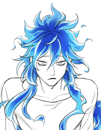
How do you draw Idia’s hair so good?? I struggle with the basic shapes so much!
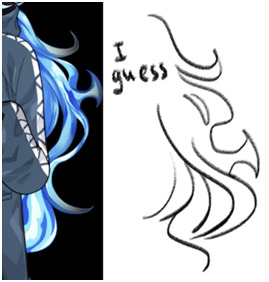
Sorry for the late reply! Your ask got us excited because Idia’s hair is such a pain to draw, but also such a fun detail, and I’m very happy that you like the way I draw it <3
Katsu suggested to me to record a speedpaint, and uhh, here it is. Please, don’t mind the wonky anatomy and me horsing around with zooming in and out randomly. As you can see, I struggle with Idia’s hair myself and constantly redraw it until I’m satisfied or at least tired enough to say “eh, that’ll do”. In case you’re wondering, it took me ~25-30 minutes to do the hair, and the original video was 59 min long lol I always spend a lot of time moving, reshaping and redrawing details when I draw Idia…
youtube
I’ll also list some tips and thoughts about it based on the way I draw it…
The shape of Idia’s hair is not at all consistent. Even in Toboso’s art it looks slightly different sometimes, which makes sense, because Idia has magical fire hair and technically you could do whatever you want with it.
But some rules tend to apply each time. For example, even though Idia’s hair is long and seems naturally “heavy” because of it, the individual strands tend to be turned upwards, like fire would. Not every single one, but the shorter ones and the ones closer to Idia’s head tend to do so.
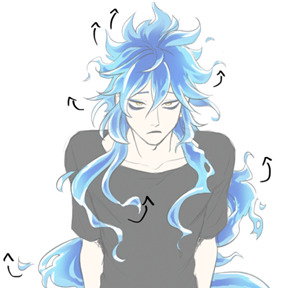
It’s wavy, but not too wavy. If the hair starts looking too “soft”, add sharp edges, random strands sticking out, rough shapes, etc.
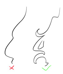
Oh, and it’s important to remember that it floats. This means, it doesn’t just go straight down, it does this weird “S” shape. It’s also hella long, I always forget just how long Idia’s hair is. If the magic fire logic didn’t apply to it, it would reach the ground easily. The volume of his hair is much bigger than I tend to remember too: it's quite thick and luscious lol So please give him lots of hair!

Tiny little flames + “holes” in the main ehh body of hair (wow there must be a way to phrase it better) make everything look good and more believable. Have fun with it. You might’ve noticed, I draw and redraw and move them around a lot in my speedpaint.
Obviously, I am no expert, and every artist I know draws Idia’s hair a little bit differently. The speedpaint doesn’t show it, but I always have some of Toboso’s artworks of Idia open when I draw him, just to make sure his design is not too off. I would definitely recommend looking at refs while drawing Idia (or anyone), and maybe even trying to redraw the hair from Toboso’s artworks once or twice as a study, it’ll probably make it easier to understand how Idia’s hair works.
You haven’t asked about the colouring, but I love colouring Idia’s hair, so I’ll talk about it a little. Colouring Idia’s hair is simultaneously the most fun and the most tedious part of drawing him lol 15 minutes of my hour long video is just me filling Idia’s hair with the base blue colour with a lasso (I refuse to use a bucket tool…)

But once you’re done with the base, this is where the fun begins. Because at this stage you can be pretty rough, just add in darker and deeper blues near the middle/core(?) of the hair mass. It doesn’t have to be very even or pretty, add some smaller dark spots; we personally really love it when Idia has this round little blob on his bangs. In the video you can see that I added it later on because I forgot about it lol
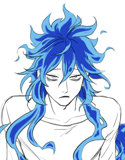
After the dark part is done, erase the ends of it a little bit with a soft brush. Not too much, we should still be able to see the shapes.
Then, on a separate layer set on overlay mode, with the same soft brush add some additional brighter spots, to make the hair look glowy. I used the same light blue as the base colour, and the overlay gives it a pretty hue.

And finally, add some white highlights at the ends of the strands. This is the stage when everything stops looking wrong and weird and starts looking like Idia, at least to me.
Phew, I think this is everything I wanted to say… I hope it was at least somewhat helpful.
Sorry for the long post, I just love talking about the drawing process. And about Idia too!
Once again, thank you for your kind words; I’m very happy that you like my art.
Have a good day!
268 notes
·
View notes
Text
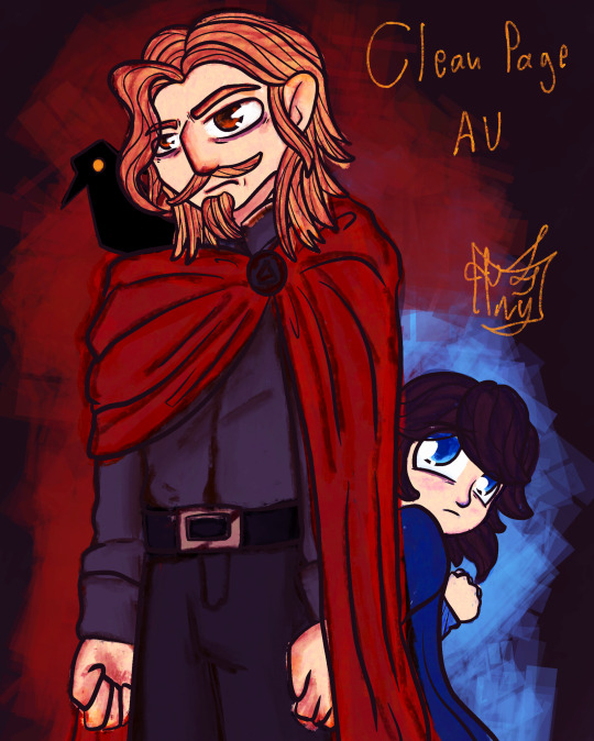

Alright- i finally came around and made a lil fanart of the Wittebane brothers with the design of @angstyhikka in her clean page AU! I absolutely ADORE their and and will surely try make some other fanart as soon as I have some free time.
Now, smol disclaimer and apology, I did take this as an opportunity to experiment a bit with a new brush- the thing is, her artstyle is SO dynamic and visually interesting to look at, and it sort of inspired me a lot and made me want to try something new! I should have probably made some study and surely more practice rather than jumping right into this- but oh well, it is what it is-
Although the final result is a bit odd in some points, I do consider myself overall satisfied with the result. In particular with their faces and eyes! I think they look SO pretty, i would suggest you all to zoom on them bcs the texture really makes them- idk, it makes me feel as if they have a soul? If that makes sense?
I also made a version without lineart- i personally prefer it with my classic lineart as I feel it makes everything more cohesive and considering I am not an expert in doing sharp/soft edges to define forms, it helps a lot, but let me know what you think!
I also did struggle a bit with Caleb, I don’t think I usually draw … oldish people? Mature people? Something I definitely have to work on- ON THE BRIGHT SIDE, i think Philip looks adorable and his hair flows in a very nice way!
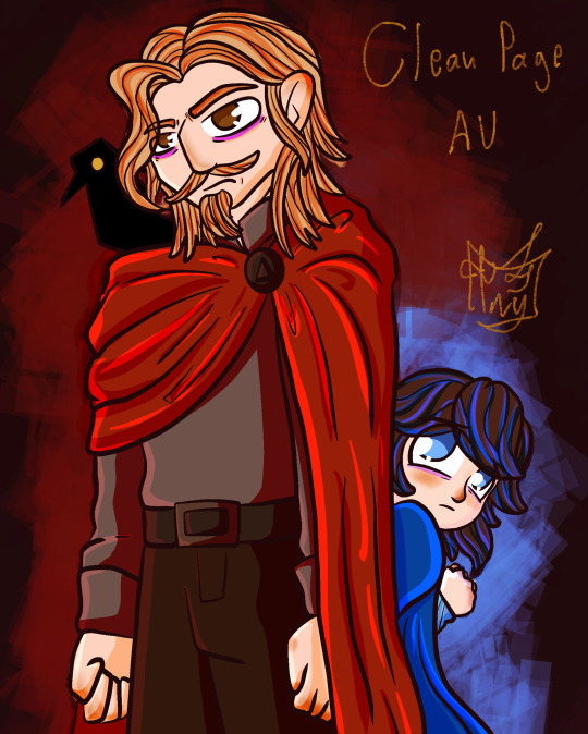
Here at the end I will also add a quick version I made with my usual flat colors just for comparison!
Not sure if I will continue experimenting with this particular brush, but It was very interesting and I really hope you can enjoy the result!
(Also not sure if is intentional, but I find it fascinating how their color palettes are inverted? Maybe is a me thing, but I always associate Philip with red due his childhood outfit and Caleb with blue due his jacket, so see them switched is very cute! But maybe that is just me-)
ANYWAY hope you all have a lovely day!!!!!!!! 🦊
#toh#the owl house#philip wittebane#caleb wittebane#try02art#emperor belos#wittebros#fanart#toh emperor belos#toh fanart#toh fandom#toh au#the owl house fanart#the owl house fandom#wittebane brothers#the clean page au#toh caleb#toh phillip wittebane#kid belos
51 notes
·
View notes
Text
The Childe (Movie Review)
hi omg. so i just recently watched the latest korean film from dir. park hoon jung, the creator of the witch film series, which is called "the childe". i am not a movie expert or anything so take my advice with a grain of salt.
let's talk about the cons first.
the pacing of the first 30 minutes of the movie, wherein the characters are slowly being introduced. it was a bit slow and unorganized. there were some scenes in the beginning that can be considered as filler scenes, which adds to the slowness of the pacing of the film, and the character of go ara was not really fleshed out well, which is a missed opportunity.
now the pros.
okay, the plot is simple with a few plot twists and there, pretty much john wick vibes except it's asian LMAO because of the main conflict of the show. i was a bit confused in one of the revelations of the show but caught up quickly anyway.
next is the comedy. actually, this was one of my fears to this film. comedy being used in action films are usually forced, and a bit cringeworthy, but SURPRISINGLY, seonho did it naturally. the comedic timing was so smooth and i genuinely laughed. it's like the icebreaker for the seriousness of the film. no forced jokes. there could be some lines that are cheesy for other people, but it's still tolerable.
and i think the what excelled the most in the film is the line delivery of each character, and how they contributed to the overall ambiance of the film. Each of the major characters had contributed enough in their delivery of their dialogues. However, i would like to emphasize two actors: kang tae ju and kim seonho.
kang tae-ju really did an amazing job for his character. the desperation and the fear of the character were obviously portrayed accurately by him, and he had such a good chemistry with seonho. his english accent is topnotch ofc. he has the potential to become the next thing.
and now of course, kim seonho. the kim seonho. oh my god. never have i ever thought, that he would also be fitting in the action genre. throughout the film, i tried to observe if there are resemblance of any past characters that he did e.g. han ji pyeong from start-up and hong du sik from hometown cha-cha-cha, and guess what? there was no resemblance AT ALL. i mean why am i surprised he studied theater acting for 10 fucking years before debuting in a small screen. of course, micro-expressions were obviously visible throughout the film i mean come on IT'S GIVEN already. next is his American English accent. oh. my. god. i truly lost it when he delivered his english lines in the movie. he literally has the potential to become really proficient in english. god he was so hot. the thought that he probably only took english classes for a short period of time... oh my god. again, the way he delivered his comedic lines throughout the film was just *chef's kiss, no more further explanation on that. of course, that popular filipino line that he said on the film, i mean, as a filo, it wasn't that bad actually, particularly the first filipino line, the filipino accent was present. and lastly, the fact that he filmed this, only weeks or months after that unfortunate controversy, blows my mind. dealing with that kind of stuff is so mentally draining and could obviously affect one's mental health but no, he insisted. he needed to continue what he's good at, which is acting. his passion to his craft is honestly one of the reasons why i just fall in love with this korean actor everyday. he had to act like the RENT WAS DUE.
now, is the childe a MINDBLOWING korean film? obviously not. but this just paved the way for seonho's comeback, and the exposure for his versatile acting. he should, at least be nominated honestly.
the childe rating: 8.0 of 10.
#the childe#kim seonho#kim seon ho#go ara#kim kang woo#kang tae joo#oh he is fucking back yall#this man's dedication... oh my god#highly recommend#movie review#korean film#he's so versatile i'm gonna cry
27 notes
·
View notes
Text
Looks like Photomatt has now deleted several of his posts regarding this whole incident, and edited the original one with further context. The edits to the original are 1) admitting that the hammer part of the "threat" seems silly but that he's apparently "almost died by car accident twice" (which, even if its true, are we taking into account personal triggers for what qualifies as harassment? And if so, why is misgendering people not considered one of those triggers?) And 2) adding that apparently Avery/Rita had "over 20 different blogs" which have names "so sexual to list them here would require a mature tag". (Which, he is perfectly capable of doing, and also it should be noted, there's not really rules against mature content so long as its tagged. There's been no proof of any untagged content. And third here, this is a *sex worker* we are talking about of COURSE she's got horny blogs!)
The posts which were deleted were largely the post-blowup tantrum replies, nothing too major there but overall trying to sweep away the tantrum. One post of note which was deleted is the one where he said the oh you know what i screenshotted it so lemme just post it
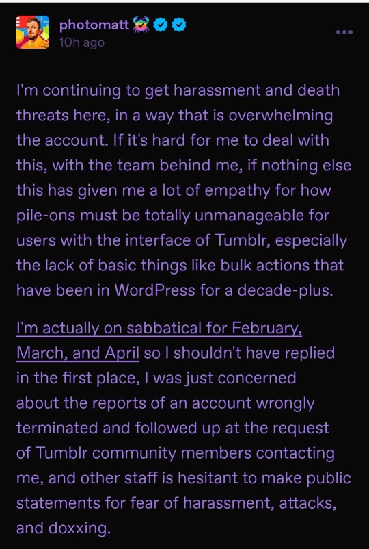

This is the one i'm most concerned about. This is the one where he mentions *pulling out investment* as well as saying "oh gosh I suddenly have empathy for those dealing with harassment campaigns now that I'm the victim of one".
Why do I think he deleted this one? He's scared of legal action. See, Tumblr was previously sued for bigoted moderation during the post-porn-ban era, and part of the stipulations is that they must make efforts to fix that. Then, we got in his other major post about this the tidbit that they *outsourced their moderation* and that they *had a known transphobic moderator in that company* LITERALLY last year. And now THIS post says that there (probably) werent plans to fix moderation before his sabbatical began, and even adds on that only *now* does he have empathy for how tumblr's poor moderation tools have made harassment a nightmare. Combine with multiple trustworthy testimonies that queer staff previously pointed this out to him...it sounds like the threat of legal action over moderation problems just led him to utterly ignore that problem until *JUST NOW*.
Now I am no legal expert. I have no clue whether this was culpable enough to show that he didnt make reasonable effort to fix biased moderation. Its entirely possible that fhis only sounds culpable to my untrained eye, and that he actually used secret language which dodges that culpability. But considering there's actual threat of lawsuit again now, and he posted all of this?
Well. Yeah, I'd delete some shit too. Too bad its probably too late. Anyways if you do nuke the site Matt I hope this follows you til you die. Or you could actually man up, and ask your lawyers whats the cheapest way you can apologize for this fuckup. It wouldnt erase this problem, but I think all of us would stop mocking you relentlessly if you at least had the guts to do that.
6 notes
·
View notes
Text
Thoughts While Watching Gilmore Girls, Season 2, Episode 9, "Run Away Little Boy". Part 2
You can read my previous reviews here.
If you have to keep repeating something out loud like this, it probably isn't true.
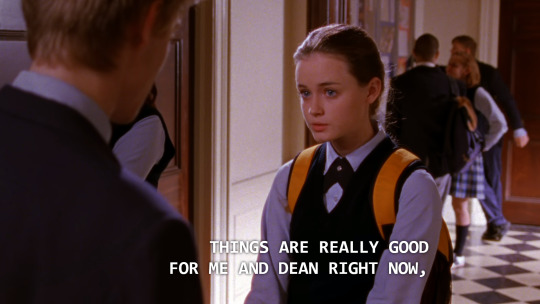
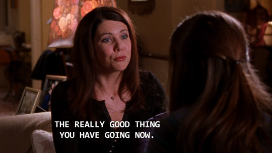
Every time Rory or Lorelai say Rory's relationship with Dean is "a really good thing going right now", God plucks a whisker off a kitten.
TWWGG= We Make Weird Metaphors.™
The Time Traveler hath returned (after a stop for a quick shave, apparently).
I forgot to add that in the middle of all this DL/Rory/Dean drama, Lorelai went on her date with TT and had fun but twas not meant to be but she was happy to discover she could Date Casually ™ after Max.

A crystal clear Tomatos Sign spotting!
Lorelai to Rory, who is stifling laughter: What? Say it!
Rory: Nothing, I always wanted a little brother.
Lol.
And we have another scene for the Rory's Bizarre Food-Related Habits Hall of Fame.
Rory picks up her burger and walks out of the diner without putting it into a to-go box. Is this the neatest burger ever that doesn't drip grease or ketchup? Like the time she walked out with a piece of French toast in her hand with no syrup dripping down her uniform?
Luke's Diner Motto: Do You Think We're Made of To Go Boxes Or Something? Carry Your Own Food.™

I kind of look like Lorelai right now after the suffering this episode has put me through.
Lorelai apparently talked about Luke on her date with Time Traveler or at least has mentioned Luke on some other occasion. Time Traveler even knew about Rachel.
STOP. EVERYTHING.
A MIRACLE HAS JUST OCCURED IN STARS HOLLOW!
LORELAI PAID FOR HER FOOD!


Luke In My Gritty Gilmore Girls Reboot titled "The Hollow": "You are hereby banned from this establishment. Get the fuck out."
God, Dean is so creepy. And not to say I'm an expert on Shakepeare, but Tristan reciting Shakespeare was...wow. That was some of the worst line reading I've ever heard, ChadMIchaelMurrayDietLogan.

The lips are getting reaaaal thin!

While looking straight at Dean, making Rory panic that he's about to tell Dean about their kiss, but he turns it around and pretends he was just talking about a scene from the play. Sneaky, disgusting, an absolutely vile piece of dog shit either way.
Honestly if I were Rory the sweet release of death would be preferable to being alive and having to suffer these two Butts With A Capital B.
Let's all Take Five and have an Ancient Cellphone Break.

Lips are realllly thin. Practically invisible.
I don't know how much longer I can tolerate this shit stain talking to Rory like this. How is this the fourth or fifth time I've suffered through this show? Why am I doing this to myself? Am I that masochistic? I'm in pain.
Dean is such a piece of shit that I am concerned for Jared Padalecki himself, in the same way that Milo Ventimiglia's mother thought he had suffered some kind of unspoken childhood trauma because he played dark villains so believably. Are you ok, JarPad? How are you this believably awful?
This is horrible. I want to shut it off. There are 9 minutes left in the episode. Ugggggggggh. Poor Rory. PUNCH HIM! PUNCH HIM! YOU KNOW YOU WANT TO!
The next episode is the Bracebridge Dinner. My second favorite episode and a shining beacon of of light, joy, minimal drama, and Jess galore in his ugly brown winter coat. You can do this, TWWGG. You can do this.
Oh my god my blood is just BOILING right now.
Portrait of the author.
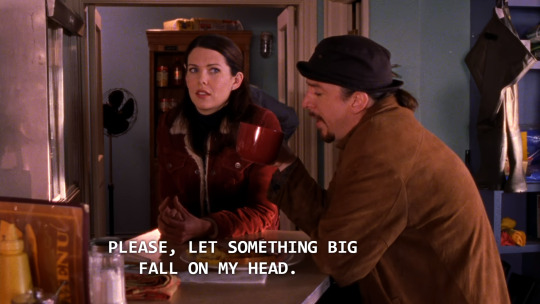
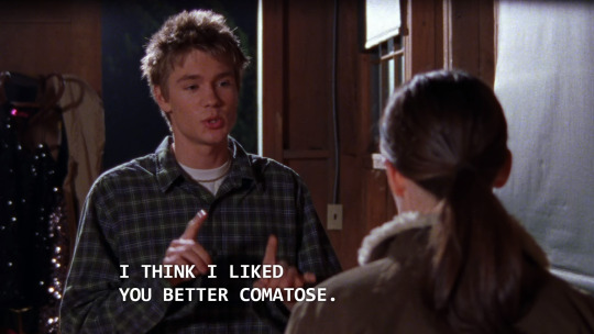
Let's take turns. Something should absolutely fall on your head, but also, I really need something big to fall on mine right now. I would welcome the sweet, sweet unconcious state where when I wake up this episode is over and I'm watching The Bracebridge Dinner.
(Context: Lorelai is annoyed because everyone is calling her a pedophile).
(Because of her date with the Time Traveler, not because she's absolutely having an affair with 17 year old Dean Forrester).
Luke is grumpy with her for going on a date with this guy. Jealous or something. Whatever. I'm tired of these men.
Sure, Jess has not made any appearance in this episode yet. But with 5 and half minutes left to go, my pain and suffering is about to be rewarded in other ways. With one tiny scrap and one medium scrap to gnaw on and one big, big juicy hunk of meat. Justice, thy name is Amy Sherman Palladino! (and Chad Michael Murray leaving for another TV show).
The small scrap:
Lane's face while she's watching Henry. My girl is feeling things. Stirring, yearning, Un-Christian things.
The medium scrap: Paris taking Diet Logan's part as Romeo to Rory's Juliet. Sweet.
And the big one:

DIET LOGAN IS GONE!!!!! GONE GONE GONE GONE!!!!!!!! WHO CARES WHY!!! HE BROKE INTO A SAFE OR SOMETHING WHO CARES!!! GOODBYE!!!! *PUNTS HIM IN THE ASS*

Look at Dean creeping again in the background!!! But I'm so happy we're back down to only one clown instead of two!!!! Wait, there's still Christopher. Still two clowns left. God damn it. #ClownMath
He's getting shipped off to military school lol he'll be eaten alive probably lol BYE
Don't let the door hit ya where the good lord split ya #BYE
"Take care of yourself Mary."
Ahahah I won't have to hear anyone call Rory a stupid nickname again because I'm not watching this show past season 4 ever again and I won't have to suffer through Full Calorie Logan calling her "Ace" yay!
Ahhhh. *breathes in* Everything just feels...a little more right once more.
A sea of confusion.
Dean: Did you and Paris actually kiss or was that just a stage thing?
Shut up.
The episode ends on a sweet little note of Luke & Lorelai talking about how they can rely on each other.
Not even a drop of Jess in this episode. Not even a shot of him in the background cleaning the counters. Nothing, zip, nada.
But...
BRACEBRIDGE DINNER NEXT!
#gilmore girls#rory gilmore#lorelai gilmore#gilmore girls season 2#Run Away Little Boy#Diet Logan#Dean Shitface Forrester#No Jess#Not a Drop of Jess Whatsoever#that episode put me through hell#Denise Rewatches Gilmore Girls#Paris Geller#Paris Gellar#Lorelai pays for her food#Miracles#Rory's Weird Eating Habits
32 notes
·
View notes
Text
I’m mad at the live action HTTYD. I know it’s simple don’t watch it. That’s probably what y’all gonna say. But this is for many reasons
1. CGI - I don’t see them not butchering this. It’s like you are starting from scratch making dragons try to look realistic and yet diverse. Like there are so many different types of dragons, ranging from terrifying to cute (or in Toothless’s case both). Also the RED DEATH that’s gotta be major scary so it looking really bad CGI takes away the scare factor. It has a very high probability of taking away from the film if the CGI is bad, and also lessens the impact of how we see the dragons.
2. Now onto the casting. (Just making a note, in no way am I doubting the acting talent of those cast, I know that they will kill it.)
First off I couldn’t give a fuck, about Nico Parker playing Astrid.
Oh that takes away blonde Scandinavian representation, it’s historically inaccurate. The whole plot is Vikings riding dragons. It’s not supposed to be historically accurate it is a fantasy world.
Also what Scandinavian representation. The vikings characters either have Scottish accents, whilst all the young dragon riders have American accents. Yes I know Vikings were in America, but they still wouldn’t have an American accent or speaking English. Scandinavian characters does not equal Scottish. They are two different cultures.
The Vikings are also not represented right in the first place, ie it’s a loose representation. They didn’t have the horns on the Helmets, the names are wrong. Astrid’s last name would be Hofferdottir (daughter of Hoffer), for example and Hiccups would be Stoickson (Son of Stoick). There is a paternal naming system with a clear divide on the gender binary (I hope that makes sense, I’m no expert when it comes to Viking naming and I don’t know how to explain it with the correct terms.
Additionally they even present the God’s wrong. If you are actively apart of the fandom re. watched all the content in the franchise not just the movies (no I’m not counting nine realms or rescue riders rest assured), season 1 episode 8, Portrait of Hiccup as a Buff Man, of ROB, mentions Freya as the goddess of fire. In Norse mythology she’s not the goddess of fire, that’s Logi (well he’s the god, and no I don’t mean Loki, I had to do I quick google search as my mythology knowledge is somewhat limited to the Riordan books). Freya is the goddess of love and beauty, and that kind of stuff.
I also have to add if this were era appropriate, and culturally accurate Astrid and Ruffnut and Heather, they wouldn’t be part of the action. Don’t get me wrong Viking women were some feminist queens who lived in a society that was more progressive. They were allowed to divorce their husbands, for mistreating them may it be that they were abusing them. However they still were not expected to fight, their lives and chores were still housebound. If this franchise cared about the ‘culture’ or the ‘historical accuracy’ we would not see these three queens grace our screens being badass and menaces to their adversaries in battle.
Instead it gives POC representation. (And no I am not a POC myself, I’m White so I can’t speak for the experiences of a POC woman because I don’t face the same type discrimination, feel free to add your input if you are POC.) Astrid being a love interest, and a character who is seen as others as a symbol of beauty. So it’s not Eurocentric beauty (blonde hair, blue eyes), but that makes it more impactful. Astrid is this three dimensional warrior goddess who is determined and strong and her being blonde never drove the plot or her character’s actions. Her biggest insecurity is that people view her as less tough because she is pretty not because she is blonde.
Quote, “Just because she's beautiful, people think she's not tough. But you should never underestimate me.”
It doesn’t matter she’s not blonde because she is still beautiful. This allows POC girls to be better represented (I do know that she is still light skinned).
I do think she is a bit too old for the role. Like she’s 18, you haven’t started filming and she just looks older, I mean 21 she doesn’t look 15. So I’m a bit iffy on that, but otherwise let’s get to why I am really boycotting this movie.
I don’t see anyone complaining about the casting of Hiccup, it’s all Astrid. Yet the casting of Mason Thames as Hiccup is problematic.
The main reason as to why I wasn’t looking forward to a live-action adaptation was that I knew that they would butcher it to be an ableist mess. Why isn’t anyone talking about how this movie is taking away disabled - amputee representation. Hiccup, a amputee, is being played by a abled bodied actor.
Now I’m disabled. I’m not physically disabled like Hiccup, so my experiences, limitations and how I am discriminated against are different as I am Autistic (also have ADHD to be mentioned). Let’s be honest though that boy definitely is AuDHD, but that’s not the point. So hopefully you can see why I am upset. (Feel free to add your input if you are physically disabled/an amputee)
By doing this they are taking away one of the only protagonist who is an amputee- and don’t say what about Luke Skywalker - because his disability was magically replaced with a lifelike copy, as if he never lost a hand in the first place, which is problematic in its own right.
Hiccup Haddock clearly is an amputee and is permanently affected by it, their is no cure, but this doesn’t make him any less of a person and whilst he does have limitations, he can still live out a happy fulfilling life. This is a defining aspect of his character and is essential to the plot and moving the story forward.
Now I know your counter argument, but Hiccup only lost his leg at the end of the movie. I know they can CGI it off for that little bit of time and find a way to show a prosthetic leg, but it is still takes away representation. You’re claiming you want these characters to be portrayed accurately but you don’t care if disabled representation is being taken away.
It isn’t authentic representation when a person who doesn’t live as an amputee to play an amputee. They don’t share those experiences. Thus this casting is ableism at it’s finest.
I know Hiccup is a abled bodied for most of the film so that’s why you think it would be more practical for an abled bodied actor, but when they make the sequel what are they gonna do for that? Hiccup is disabled for the rest of the franchise, so it’s counterintuitive in away. They might as well have casted an amputee actor from the beginning.
You might argue that how would they do that as Hiccup loosing is foot is less impactful if he is an amputee from the beginning of the film but have you considered that they just put a boot over it/ cover with clothing. I’m not to sure with the mechanisms but I’m sure they could have figured something out.
And if you are going to argue that it would harder to do and film action/practical scenes, whilst it might be harder (I’m not denying that and might being the key word) but friendly reminder about a certain character who is an amputee from the MCU being Echo (whose currently in line of getting her own series).
I’m honestly wondering why they are doing this in live action in the first point, and I am disappointed in not only the casting but the reactions to the casting, mostly how people aren’t even acknowledging the ableism of the casting and focusing on slamming the casting that was more inclusive and forward thinking. But no, clearly people are to focused on race, (being that all characters in the Viking times have to be white, the least oppressed group and the most represented, which I do include myself as I am aware of the privileges I get because of it) instead of focusing on the erasure of amputee representation.
So that’s it sorry for the long rant/post.
#httyd movies#httyd franchise#httyd hiccup#httyd astrid#how to train your dragon#hiccup how to train your dragon#hiccuphorrendoushaddockiii#hiccup haddock#astrid hofferson#astrid httyd
11 notes
·
View notes
Text
Antagonists
Alright. I know what you’re probably not thinking because it’s somewhat specific. Who’s this worms person, and why are they about to talk about antagonists for a bit? You don’t get an answer. By the way, I’m not an expert. I have no idea what I’m talking about. I’m just an idiot ranting on Tumblr.
I, the aforementioned worms person, love antagonists. Well, most of them. Elias Bouchard can go die. But generally, I really like antagonists. They just have vibes. Good vibes. (Not as in morally correct, most of them aren’t, but you probably get what I mean.) The things a properly good antagonist can add to a story… I don’t know how I was planning on finishing that. But they add lots. Having a good antagonist is just as important as having a good protagonist, regardless of how much thought is put into their character. Take Ursula. She doesn’t have a complex backstory with deep, traumatic reasons for her actions, but damn. She just has some vibes. She properly causes problems, and it takes actual effort to stop her. I haven’t seen The Little Mermaid in years, but I know without a doubt that if I rewatched it now, she would be my favorite.
(Unrelated: my phone thinks I’m British. It keeps trying to make my American spelling of words into British words. No. I don’t want another U. It’s fine as it is.)
Anyways, Ursula has a good design too. While protagonists in hero-villain stories can get a bit repetitive after a while regarding their costumes and designs (nothing wrong with that, it’s just true), antagonists tend to have something that just makes them pop, and really reflects their character. And there LOTS of variety among antagonists of all kinds of stories! There’s the incredibly traumatised, completely redeemable ones, and then they’re the entirely unhinged ones. Some of them have actual backstories with motivations that they think are worth their actions, and some are just random doing it because an antagonist was needed. There’s so much variety!
Brief paragraph or two on the distinction between a villain and antagonist. (Please refer again to where I said that I am not an expert in this stuff, and this should not be cited for some important paper or something.) Generally, villains tend to be characters, typically antagonists, though not always, who are morally lacking, or causing huge amounts of damage to something. A lot of the time, I see “villain” being used as a derogatory that labels an antagonist as bad, and removes the need for the people absorbing the media to look further into their character. They can just go “oh this person is bad, good to know I’m done now”. Villain can also be used instead of antagonist in instances where it doesn’t quite fit, but only because of the definition associated with the word. For example in Inferno Squad (Star Wars book), the protagonist is a member of the Empire, and so doesn’t have the most righteous of moral codes. Because she’s in the Empire, the antagonists of the book are rebels, so the term “villain” doesn’t really apply as much, since Just As A Rule Of Star Wars, the rebellion and republic and such just have better morals.
Antagonist refers to a force opposing the protagonist. It doesn’t mean evil, although my options on good and evil are perhaps a rant for another time, it means that the protagonist needs something to go against. It doesn’t mean a sentient being, or even a living thing at all. It can be mental health, societal norms, or a spoon that feels bad in the protagonist’s mouth. It can even be a stressful due date. This has gotten incredibly off track. If you’re still here, deal with it. An antagonist doesn’t have to have questionable morals, or even morals at all.
Now, when referring to sentient antagonists, I would be fine using villain. Key term, would be. Although it is slightly faster to say, people generally have it associated with evil characters, and I don’t like that. I don’t want people to think that I’m calling characters with complicated reasons for their actions evil just because of a dictated set of “correct” morals chosen by society, and shaped through the millennia of human existence, so carefully cultivated and yet so loosely followed. (To be clear, I’m saying facts. But facts don't really mean anything without opinions in place to give people something to do with them. I still think that some things shouldn’t happen, and I think some things are more complicated than moral or not).
Anyways, I love antagonists. They have such a unique view on the worlds around them, and since their story is usually told from the perspective of someone who isn’t meant to really like/understand them, they tend to come off as a little, well. Off. They don’t fit into the way that world is meant to be, because they’re there to cause problems for the protagonist.
But also they can just be incredibly badass and cool without trying, or just have inexplicable vibes(not those Vibes) and I am platonically gay for most of them with some exceptions, regardless of their gender or my current gender. At the end of the day, I am completely unable to describe how I feel about antagonists without dissolving into incomprehensible nonsense or off topic paragraphs. Hello, and welcome to absolute nonsense. I’m Woims, for no particular reason, and you’re watching Disney channel.
(But also screw you Disney why would you get rid of the Owl House)
Finally, some antagonists I don’t like:
Elias Bouchard (the Magnus Archives)
Victor Frankenstein (Frankenstein or the Modern Prometheus) (Yes, I know he’s technically the protagonist. No, I don’t care. I despise him with all of my being. If literally anyone asks I will post my spite essay here)
Morrowseer (Wings of Fire)
Those aren’t all of them, just the ones I got off the top of my head.
#antagonists#ranting#read this if you want#I was drawing something and having a good time and then I just spontaneously stopped and wrote this all in one sitting#i am perfectly normal
5 notes
·
View notes
Photo
A while ago I received an interesting question about game aesthetics. The person in that ask really struggles with downloading stuff and finding their own style. They asked me how I came up with what you see on my screenshots. Have you ever thought that you can recognize whose screenshot this is by just a quick glance? Is editing important in photoshop? How to take beautiful screenshots? Today let’s talk about how different one single game could be for each of us and what really makes this mysterious “sims aesthetics”.
EDIT: Sorry, it turned out to be huge with lots of random thoughts :D I hope at least one percent of these is useful!
NOTE: English is not my native language, I apologize for possible grammar or spelling mistakes. I tried my best in writing this!
Ok, let’s imagine that you’re a person who just obtained the sims game or just want a nice fresh start and demolished your download folder. (We all need fresh starts sometimes, right?) The struggle is that you have no idea which style you like the best. There are so many sims blogs. Everyone seems to enjoy what they post but you’re a little bit lost in that jungle. Don’t worry! I’ll try to guide you and share my thoughts.
STEP 1 Choose your general style
I roughly divide all sims blogs that I see on my dashboard into a couple of so-called styles. I’ve been doing it in my mind for ages. I like following different people and seeing diferent editing. None of them are better than others. I hope you understand that it’s just a matter of liking. Ok, here we go. Let me put this sorting hat on you :D
1. Realistic
Screenshot by @luchiatores
Perhaps, it’s the most important thing that you should decide for yourself. Wether you should use realistic textures in your game or you’d prefer to stick to more cartoonish maxis match ones. Why is it so important, to my mind? I like things that match. Just imagine game Witcher 3 where characters and surroundings are realistic. And now imagine Minecraft where things are pixelated. Both games are great, both games have certain beautiful styles. And now imagine Geralt hunting for monsters in a pixelated Minecraft swamp. A bit strange, isn’t it? :D The same applies to Sims. If you put a super realistic skintone on your sim and put a Maxis ponytail, that would probably look strange too. If you choose this style, just try to dig for a good quality content, start following simblrs in this style. Unfortunately, I’m not an expert when it comes to realistic content. So, try to drop an ask to someone whose realistic game you like. There are so many helpful people around in the sims community no matter what style they have :)
2. Trully Maxis Match
screenshot by @whattheskell
This is a complete opposite of a realistic style. I’ve always called people who use a lot of original maxis textures “trully maxis” :D If you can decorate a house without any custom content, if you like the way original hairstyles look, if you like Maxis clothes, you should go this way. From what I’ve spot after being so many years in the sims community, “trully” maxis simblr are so creative when it comes to storytelling. The stories that they write about either their sims/or maxis premades are so breathtaking. So much drama, so much fun. The only thing that I write about my screenshots is “Ok, this is my cat! Look, it can eat flowers and puke afterwardst! Yay! Cute”. If you choose this way, I can recommend you to check out @holleyberry, @didilysims or @moocha-muses. Obviously there are a lot more blogs that I follow. These people are just so sweet and helpful and they’re first who came to my mind.
3. Bright Maxis Matchery
screenshot by @muupi
This is where I refer myself to. This style is still Maxis but what stands out is the use of bright colours and saturated photoshopped pictures. Ah, my love for overedited pictures is endless <3 This is what I’m going to talk a lot below since it’s my cup of tea. It’s all about colours and pallete addiction. If you love looking at super bright/silly/cheery screenshots and they boost up your mood, than join the squad!
Basically, Maxis match (I’ll just shorten for MM from now on) players avoid super shiny skins or hair textures and prefer to have content with Simlish letters instead of English ones. This is a very important factor for me when I choose paintings or prints for T-shirts. I don’t know, I feel like it’s so cute that sims can’t understand our languages, talk this funny gibberish simlish language. It’s cute! There are so so many people that I can recommend. @lina-cherie @keoni-chan @kahlenas They are first who came to my mind <3
4. Grungy/cosmic
screenshot by @lilithpleasant
I don’t know if these are suitable words :D But this is how I describe people’s game who like aliens/supernatural sims/grungy textures with or without bright colours as well. Just think would you prefer a bit of a grungy stuff or less-textured but cleaner MM? You always need to think about textures while you download stuff. I can recommend to check out @pooklet or @furbyq-sims
5. Semi

screenshot by @whysim
You might ask me “Why am I not allowed to put a realistic skintone on a maxis sim? What the hell?” Of course, you are! Do it please, if you want. There are no rules, no restrictions. You CAN go semi-realistic, you CAN mix patterns, you CAN mix colours. There’s only one rule: please, enjoy what you do. Don’t be afraid to share your pictures on the Internet. There will always be people who can judje your style and say: “meh, it’s too dull, meh, it’s too bright, meh, too shiny, meh, too plain meh, meh, meh”. Just don’t pay attention and enjoy your game. As for semi-realistic I can recommend such wonderful people as @marvelann @lilith-sims @falkii @knowledgeaspiration
A bit about my style: I’ve always loved cartoonish/bright style. I’ve never ever played with shiny textures. Before Tumblr era I just played either without CC or with a bunch of maxis recolours. How I came up with the idea of cartoonishness? Pretty simple. It’s a part of my personality, I think :) I’ve always loved Disney/Pixar movies. Cartoons just make life a lot funnier! They make me happy. I’m a pre-school teacher after all :D. You can’t imagine how many cartoons I’ve watched throughout my life. I can quote Peppa Pig and will never be tired of that :D Before Tumblr I just played some funny legacies (I’ve never finished any though :D) When I found out about Tumblr, and such great content that can make my game even more Disney looking, it just blew my mind! Every time when I download stuff, I imagine that I’m watching a Disney/Pixar or whatever studio cartoon. When I create sims, I feel like I’m a cartoon designer. Pretty silly, right? :D
Let’s take a look at my screenshots from the past. I tried to find similar ones with a lot of greenery.
2014

2021
I stil like a lot of greenery. Editing has changed, photo angles have changed. But bright colours and Maxis stuff are forever in my heart <3
Risa (2014)

Gage (2021)
As I’m a big cartoon addict, I love recreating game/anime/cartoon characters. No matter, if they’re my favourite or requested ones. I love when my sims have different traits. I love when they’re funny looking/clumsy/absent-minded or when they’re evil/supernatural. When they are pirates/detectives/vampires or witches. This is my way of playing Sims. I love this game as it gives us possibilities to show your creativity, a chance to recreate our favourite characters. A chance to be a writer of storylines or if you’re bad at telling stories, just being “a cartoon designer” like me :)
STEP 2 Colour palettes
If you’ve chosen the path of “bright maxis matchery” than colour palettes are super important! Oh, you can’t imagine how addicted I am to certain colours. I can download GBs because of it.
Here are some of my favourite colour palettes:
1. Anna’s colours
My absolutely favourite palette. I would download absolutely anything in these pretty colours. Just looking at them makes me so cozy *0* There’s a photoshop action for those who want to recolour CC in this palette.
2. Poppet’s colours
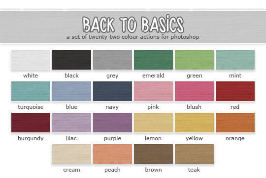
I especially like the latest one. So pretty! @poppet-sims is the queen of lovely recolours. She has some more palettes. But “Back to Basics is my favourite”
3. Eversims colours
@eversims has got a lot of pretty colour palettes. But the most iconic one is Ever So Lovely
So, these are the basic colours that I like downloading furniture/clothes with.
There are a couple more pretty palettes that I like:
Huning’s Pony Colours

Back in the days it was my ultimate favourite one. But these days I edit my pictures in Photoshop excessively and prefer calmer colours and add bright layers in photoshop instead.
Nyren’s Kosmic Colours
If you’re more into pastels, than try to download some stuff in this pretty palette.
You might wonder if I use all of these colours. Of course not! I have a selection of colours that I use: apple green, sky blue, yellow, red, pink, orange, purple, teal, mint. I absolutely love combining 2 or 3 of these in my interior shots. I also love choosing my sims’ favourite colours and dressing them/decorating their bedroom in this certain colour(s).
For example, my sim Mia likes apple green/purple and mint.

I think @deedee-sims can relate. While I prefer choosing a favourite colour per sim, she chooses favourite colour for the whole family!

This is a great idea, I think! :)
STEP 4 Bodyshop stuff
Ok, I hope it’s clear that I’m colour palettes addicted, now let’s move onto actual custom content and what I prefer adding to my game. I decided to divide CC by sections. Let’s start with Bodyshop.
4.1 Skintones
Another important thing that you need to choose for yourself. There are tones ofoptions. I’m going to recommend only MM skins as obviously I have no idea which realistic or semi-realistic ones are high quality.

screenshot by @deedee-sims
If you prefer trully maxis skintones, I recommend you to try Leh’s skintones. It’s super close to original ones in terms of shades. Also look at those button noses! These cute noses is the reason why I started using this skin back in 2014. But later I switched to Lilith’s feather as I wanted more variety and those noses there got a lovely shine.

It was my default skin for a lot of years. These days I own every possible skintone by Lilith and various blends by other people.
Lilith’s Alien Flavor
Lilith’s Android Skin Edit
Lilith’s Apple Pie Skinblend v.2
Lilith’s Apple Pie Skinblend
Lilith’s Apple Pie by Kahlena
Lilith’s Feather Skinblend
Lilith’s Feather Skins
Lilith’s Feather by Sim-Strangers
Lilith’s Feathers Colourful by Berrynooboos
Lilith’s Honey Supernatural Custom
Lilith’s Honey with freckles
Lilith’s Honey with no freckles
Lilith’s Honey Unnatural by Berrynooboos
Pixel-danger-sims pastel skins
Here’s a very handy set-up by Vimpse with Lilith’s skins being townified.
Try to choose one set of skins or download all of them by one certain creator. I need a lot of skins because I love creating tones of sims and I want to make them various looking.
4.2 Eyes

♦ Polaroid ♦ - my favourite

♦ Transcendental ♦

♦ Sleeping Lion ♦

♦ Sharp Eyes ♦

♦ Shallowed in the Sea ♦

♦ Hand Outs and Punch Ups ♦
These are just some of my eyes. There are some more by Poppet, by Kahlena. And I have various addons to these sets that I grabbed over and here. I remember having struggles of choosing only one set. But than I thought: why do I have to choose if I like all of them and want my sims to look as different as possible? I just love when they are cartoonish but high-quality with nice white clean sclera. Just look at Disney Rapunzel. You’ll see what I mean ^_^


There’s one little trick that most mm players do for making sims’ eyes bigger and rounder - adding a whiteline eyeliner by jesstheex. I personaly do it for every single sim of mine.
4.3 Makeup
I use tooooons of blushes, lipsticks and eyeshadows. I have everything by Lilith and Jesstheex. And lots of bits and bobs by various creators. I love using both matte or shiny textures. I sometimes add nose shine or use special nosemasks. There are various lovely things in my collection. What I can recommend you is to download a sim that you like by another creator with the help of Sims Clean Installer and just steal makeup from the sim to add to your collection *evil laughter* I recommend to do it because sometimes there are some mouth corners or various eyebags and etc which are difficult to find. It’s easier to grab them together with sims.
For example, I grabbed the shiny nosemasks from one of Lilith’s sims.
Sometimes I like adding a bit of shine on Sims’ noses. Some sims of mine don’t have shine. It really depends on a sim. But what I definitely like is cute button noses! I like using nosemasks to achieve that. I have all the masks by Lilith and these ones by kahlena.
4.4 Hair textures
Another important decision for you is the hair textures. I recommend you to choose one certain retexture. Back in the days, I used to have Remi’s textures
screenshot by @selenaq13
I liked Remi’s ones because they were non-shiny. They had maxis colours and a really cool yellowish blonde!
Receintly I switched to Simgarooped as I’ve always loved that there are 6 naturals. The yellowish blonde is still there! Plus my favourite Deedee-sims keeps updating every week with the retextures of new meshes <3
There are lots of various textures blends. Just search, download, play test. Think, if you’re ready to look at such type of hair hours of simming.
Also try to decide if you’d like to have more natural looking sims or go crazy and have supernatural/aliens. I used to have really bright sims with colourful skins and hairs.

Even my toddlers had unnatural hairs. It’s a lot of fun! But right now I prefer to create more natural looking sims though I like vampires/witches/aliens anyways!

screenshot by @honeylungsims
If you would like to have colourful supernatural sims, check out Honeylung! She has the brightest and most unusual supernatural sims <3
You’ll need a lot of face masks/bright lips/shadows. Check out @berrynooboos for the cutest alien CC.
4.5 Facial hair and Brows
I don’t think they should really match as long as they look great.
For example, I use eyebrows by @suratan-zir which are super cute and high quality but use Poppet’s textures instead of Simgarooped.

As for facial hair, I use some Poppet’s as well.
by Skoogy
by Poppet #1
by Poppet #2
by Simgaroop
4.6 Clothes
As I already mentioned, I love clothes in my favourite palettes. I love Simlish prints. There are so so many creators who share wonderful clothes.
I love @deedee-sims for age conversions, shoeswaps, morphs. I love @mdpthatsme for really cool 4t2 conversions. I love @moocha-muses for colourful T-shirts <3 Don’t be shy to send me a WCIF about a certain item of clothing.
STEP 5 Buy and Build
Tooons of bright recolours, IKEA items, Maxis add-ons, 3t2 and 4t2 conversions - all these things make my heart beat :D

These days I play in a rural-type world. I download a lot of craftsman-style build things, a lot of plants and garden deco.
I love bright wallpapers and greenhouses, I love clutter and kids CC for nurseries. Patterns with polka dots and plumbobs. Sunflowers and tulips. This is what I usually drop into my download folder :)
STEP 6 Taking screenshots
No matter which recolours and textures you prefer, I think high-quality pictures are important. The first thing that you need to playtest for yourself is a camera mod. It’s upo for you, but I can’t live without Gunmod’s Camera Mod. There are some more available, just check out.
Also lighting is important since Maxis original is terrible. I use Dreadpirate’s mod.
I recommend to take screenshots in a camera man mode. Click Tab to enter it. Use W, A,S,D,E buttons to move right/left/up/down etc. And what’s important, use X and Z for zooming in and out. I always use Z for example, when I take close ups of my cats.

Don’t be afraid to experiment with angles. Try some artistic ones.
You can move your camera down and take a screen from below.

Or vice versa from above.
Sometimes I’ll just take a screen of my sims’ hands or feet. It really depends. I love spending hours on just “walking” in a camera mod around my sims houses.
Another useful feature of this mod is to use Ctrl +4,5,6,7,8,9 buttons.
These can fix the angles for you. And after fixing them, when you click on 4,5,6,7,8,9 you camera will go back to those positions. It’s very handy when you want to screen 2 sims who are talking and there’s no need to constatntly move camera from sidde to side. Just fix it and wait for them to perform cute emotions!
As a bonus, you can fic positions in the life mode too. For example, I always choose a proper angle from above where the wgole house can be seen. And wait for something cute/funny/to happen.
Also there’s such a thing as The Rule of Thirds. It’s the rule of photography composition. I always try to follow it :)

STEP 7 Photoshop Editing
I love oversaturated colours. It can be too much for someone’s eyes, but I like the brightness :) I’ll share some good Photoshop resources. Probably, one thing that I can recommend to absolutely everyone no matter how bright you want your screens to be is sharpening! Seems that Tumblr eats our picture quality for breakfast. Sims screenshots seem so blurry to me. I love sharpening them first.
I use sharpening from Kalekaloo’s action.
After sharpening I run the base from Eversims Action and then add some colour layers from Simburgerr’s one (I like gradients and fluffy lights layers especially). It makes the reds colours a little bit too saturated but I think it’s cute!
There are a some more cute actions and PSD files out there:
OhMySims - Action 1
OhMySims - Action 2
Sterina’s Action
Photoshop PSDs by Pleyita
Snapdragoned PSD
Mandragore PSD by Kiinuu
JellyBeanery’s Action
Roguebotanist
Nnilou - 12:51
A generic PSD by Knowledgeaspiration
Colorize IT by Bonnypixels
Colour Crush by Bonnypixels
Just Like Heaven by Pixeldemographics
For more tips/palettes/cute fonts I recommend you to check out @bepixeled
That’s all that came to my mind. I hope at least something was useful!
480 notes
·
View notes
Text
Dimonds are a (material) gworl's best friend pt. 2
a.k.a. even more engagement ring slander with the tot boys ft. the round brilliant diamond cut and the slander it DESERVES
tw!: swearing! very hot takes on how the rings should've looked like, because i've seen thousands of engagement rings to keep my mouth shut about the rings mihoyo just gave us + swearing!
link to pt. 1 - here!
Oh boy this is going to be controversial because these two rings slayed a little more than the first two.
They might've slayed but they didn't slay as much to me. 😈 Compared to the other two, I genuinely do not have much to say about them in terms of design slander because I'm probably not as angry about them as I was with Vyn's and Luke's.
But hear me out anyway
note: based on personal opinion, i am no design expert, this is simply just a hot take because i'm TIRED of seeing beautiful designs being fucked up by the round brilliant cut when there are literally 108302840293 ways to cut a mf diamond like okay it's classic, sure, but that doesn't mean it looks good with every single design there is.
Marius Von Hagen
Personally, I do not have beef with the centre stones, but I will slander the ring anyway because we're here to talk shit and not praise it.

I am a firm believer of "if it's not broken, don't fix it." but the problem with this one, is that my beef is with the band itself, and not with the stones. This honestly slayed.
Okay Maybe it's a little Broken:
I can't call the mount uglee, but I HATE it. It's doing too much, with the beaded-type squiggly line running along the middle? If you're gonna do a filigree ring, do it RIGHT for fuck's sake, don't give us this lazy ball chain looking thing down the middle. Literally that's all that's wrong with it, because it looks like it's gonna be a bitch to clean and get caught on things. Small price to pay for beauty ig.
Also what the fuck is holding that giant ass rock to the goddamn ring bc I know DAMN WELL not a single jeweller will let a stone, let alone a pear cut that big be held up by four fucking prongs only??? Where is the support? Without it nobody can wear this bitch ANYWHERE. That jeweller's almost as bad as the bitch who invented tension mount rings.
The back is a little too wide, and should be tiny-fied, so it's not uncomfortable once it's worn with a wedding band. I have no issues with the front design, the centrestones are cool, sparkly, pear-cut, hitting us with the lil marquise cut sidestones (also lowkey reminds me of rapunzel's tiara?? for some reason) and the little amethysts to the side, but the back has to be sealed off and shouldn't be left as a blank ass gap? maybe merge the two bands together? That's literally it. Aside from the band itself, Marius slayed with this one.
note: all middle finger emojis from here on are directed to the Brilliant Round and to the Brilliant Round ONLY.
Artem Wing
I usually do not give in to bias, but listen, hear me out, he slayed.

Design that won't piss me off if i wore it? Slay. Sun and Moon theme with a lil star that was clearly taken DIRECTLY from his logo? Slay. Practical and pretty? Slay. Centrestone and metal choice?
Did not Slay.
(Hotel? Trivago.)
Undoing the Naurifications:
One of the naurificating factors of this ring is the size of the stone against the four tiny fucking ass prongs that are holding that diamond. Baby, that bitch is hanging on for dear life.
We're going for the sun and moon concept, right? The prongs could be the sun's rays. Why not add two more? why not make it EIGHT? the sun in artem's logo has EIGHT. We're going subtly referential AND functional, okay? fuck whoever designed this ring with four goddamn prongs ONLY. This bitch needs SIX to EIGHT or that motherfucker is falling the fuck off.
Now for the stone, in this case, I am a Round Brilliant Cut (🖕🏻) Hater first and an Artem girlie second. However, I almost had to swallow my pride here because the design's whole point is having a round stone. This is literally THE one design out of all 4 that could get away with the Round Brilliant Cut (alkslwmslslams 🖕🏻). BUT, as a good lawyer should, I found a few loopholes.


Introducing my two besties the rose cut (l) and the jubilee cut (r). Look at them. Gorgeous, gorgeous girlies.
The jubilee cut doesn't have a flat surface on top, so, ✨maximum sparkle✨ in the sun. I mean, isn't it what it's supposed to be? The Sun? The jubilee cut is designed to be for bigger stones, and since there's a little space between the original stone and the moon, you can switch it up with a jubilee cut so they're snuggled together. The downside of the jubilee cut though, is that it's HUGE huge, which means it's going to stick way out of your finger. However, the answer to that is my girl the rose cut.
But Trixie, where's the sparkle?
Nobody is allowed to slander my girl the rose cut, because she may be a little flat, but she is designed for lowlight conditions, which means she sparkles best in the night, especially in candlelight. Baby, she is the sun at night. The rose cut is also a bigger cut, since it's supposed to be a little wide, so it could also do the cute lil sun-moon cuddle that I mentioned earlier.
As for the metal choice, we could just switch it up: gold band, silver moon. The round brilliant (🖕🏻) lil star to the side can stay. It needs to sparkle. Although, it should've been a sapphire, like his favourite cufflinks.
this was fun, but i need to go to bed now. if i got a little crazy that's because i was probably a little delirious ok love you bye mwa !
#tears of themis#2nd anniversary#engagement ring slander#marius von hagen#lu jinghe#yu sinu#izumi kei#artem wing#zuo ran#baek eunhu#sakyo shizuma#everyone say fuck u brilliant round cut#this is kinda hard cos they slayed#can u tell i keep saying round brilliant cut so i can flip a middle finger at it
18 notes
·
View notes
Text
A Super Soldier Walks Into A Starbucks

“How did you know who I am?”
Gabe looks at Steve with wide eyes. “...is this a trick question?”
Steve is still stunned. “But you- I’m-” He gestures weakly towards his face. “I’ve got a mask.”
Word Count: 615 WAIT DOES THIS TECHNICALLY QUALIFY AS A DRABBLE YOU GUYS I WROTE SOMETHING LESS THAT 1500 WORDS WHAT
Tags/Warnings:
None other than Steve Rogers being a precious clueless bby, blatant impatience over people who ignore scientific fact because an orange wannabe-dictator loser tells them to and if you're one of those people, 1- you're probably not going to enjoy this and 2- fuck you, and whatever mistakes self-editing leads to.
Author’s Note:
Also on AO3!
This happened because @starryemerald173 made me die laughing in public over this chapter of The Avengers Wrangler , and my brain is absurd and came up with this:
"Headcanon: Steve Rogers doesn’t understand how disguises work. He walks into Starbucks in a mask, a hat, and those ridiculous glasses, and the barista is like “Your usual, Cap?”. And he's like “How’d you know it was me?”. And the poor barista is like “…because there’s only two guys the size of a fridge who come in and you don’t have the metal arm?” and then after a moment adds “Do you think Sergeant Barnes and Captain Wilson also want their regulars?” and points to the Dipshit Twins, also masked and capped and in no way blending in, arguing over pastries."
Dividers by @firefly-graphics.

Steve is so over hearing people not taking the pandemic seriously. It’s been twenty-fucking-months now, and speaking as someone who went the first 25 years of his life in an almost perpetual state of ‘near-death’, Steve considers himself an expert in how not to die. How hard is it to wear a damn mask for the greater good and to protect your community? The way some people talk, you’d think the sacrifice of wearing a piece of fabric on their face is comparable to, oh, say, flying a plane full of nukes into the Arctic and spending the next almost 70 years as a popsicle in order to save humanity from certain destruction.
Steve thinks he should have reconsidered that particular sacrifice.
Beisides their health benefits, masks are like armor. Masks make Steve feel like the Lone Ranger. No one recognizes Steve when he wears a mask. Masks let Steve wander through New York with near total anonymity. When he adds sunglasses and a baseball cap- hell, he might as well be a ghost. No one gives him a second glance.
Steve fucking loves it.
As far as he’s concerned, masks are the single greatest invention since the venti quad-shot iced brown sugar oatmilk shaken espresso. Which, incidentally, is what he’s standing in line to order.
So today, in his mask, with his cap pulled low and Nat’s borrowed black spectacles in place, Steve is confident he looks no different than any of the other late-morning patrons of the coffee shop.
When it’s his turn, he steps up to the counter, ready to give his order to the kid manning the register, when-
“Morning, Cap! You want your usual today?”
He blinks. “Sorry?”
The kid- ‘Gabe’, according to his apron, taps the register. “Venti quad-shot iced brown sugar oatmilk shaken espresso, right?” He glances up. “Did you want the banana bread today, too?”
“How-” Steve is sure he’s gaping like a fish (not that Gabe can see it, since Steve is wearing his supposed-to-make-him-invisible mask). “How did you know who I am?”
Gabe looks at Steve with wide eyes. “...is this a trick question?”
Steve is still stunned. “But you- I’m-” He gestures weakly towards his face. “I’ve got a mask.”
“Uh…” Gabe still is watching Steve like he’s not entirely sure Steve isn’t some kind of shapeshifting alien- and given the things New York has experienced over the last several years, it’s not, like, actually out of the realm of possibilities. “...because there’s only two guys the size of a fridge who come in here, and you don’t have the metal arm?”
...oh.
Steve can see the logic there.
Well, fuck. There goes his invisibility cloak. He glumly pulls the stupid glasses off of his face, and then freezes.
Wait, does that mean every time he’s thought he was incognito- shit, everyone has always known it’s been him, haven’t they? When he and Bucky were at the farmer’s market, that one lady wasn’t staring because he’d dropped all those plums and Bucky had wept, was she?
“Speaking of, Captain Rogers-” Gabe, oblivious to Steve’s inner crisis of recognition, nods towards the end of the bakery display case. “-but d’you think Sergeant Barnes and Captain Wilson also want their regulars today?”
Steve turns to see Bucky and Sam standing in front of the pastries, arguing about God knows what at this point (Steve started tuning them out years ago). They’re both wearing masks, glasses, and hats, too, but Bucky’s size alone makes him stand out wherever he goes, and Sam isn’t that much smaller.
Plus, you know, metal arm.
Gabe clears his throat. “...Captain Rogers?”
Steve heaves a super soldier sized sigh. “...yeah, the banana bread too, please. Thanks.”
A/N: Steve’s hat is a NASA trucker hat, Bucky found out they’d made reproduction Brooklyn Dodger caps, and Sam thinks for a super soldier and the greatest assassin of all time, neither one of them understands what ‘blending in’ means, and wears a plain black cap.
#steve rogers fanfiction#steve rogers fic#steve rogers imagine#steve rogers headcanon#steve rogers#chris evans#chris evans fanfiction#chris evans fic#chris evans fandom#marvel fanfiction#mcu fanfiction#bucky barnes fanfiction#bucky barnes#captain america#captain america fanfiction#tlc writes#I still blame Starry
113 notes
·
View notes
Text
Kalim Al Asim - Master Chef

You can unlock this story by getting Kalim’s SR Master Chef
Translation under the cut
Chapter 1
Cafetaria - Judging Venue
A little while before the cooking preparations start-
Kalim: Chef! Please take care of me!
Trey: Well, aren’t you excited?
Ghost chef: He certainly is. Were you perhaps looking forward to the Master Chef program?
Kalim: Yeah! I’ve always been told that “I’m not allowed to use kitchen knives or stoves because they’re dangerous”. That’s why I pretty much never cooked before. But they gave me the okay because a professional is instructing me today! So I’m super excited to try some real cooking!
Ghost chef: S-So, they forbid you to touch knives and stoves? You must’ve grown up in quite an overprotective household. Nevertheless, I am elated that you were looking forward to this program so much! I am eager to teach you. Let me list the meals we’re going to make today.
Kalim: We’re going to make biryani, right?
Ghost chef: Yes. Biryani is a seasoned rice with meat and all kinds of ingredients and spices. We steam curry and rice together, alternated on top of each other in layers. Originally it was a dish of the royal court, and is served a lot at festivals~
Kalim: That’s great! Seems like a perfect dish to welcome guests with.

Trey: Hey Kalim. I have one question… You’re always hosting the banquets. Have you never worked behind the scenes? If you never did, I understand why you wouldn’t know how to cook on purpose but…
Kalim: Now that you say it, Jamil always takes care of the preparations, not me. But this time I know that it’s the host's job to cook the meals to entertain the guests at the banquet. Seeing a chunk of meat roast in front of you, cutting stuff up… I really wanted to try it myself!
Trey: I see. So that’s why you took up Master Chef.
Kalim: Yeah. I can entertain more guests by learning more ways to delight them. By the way, you’re in charge of making the sweets at Heartslabyul’s tea parties, aren’t you? You seem like an expert at receptions, so if you have any secrets, please tell me.
Trey: I don’t think you should use our Unbirthday parties as reference. It’s basically just a gathering of people of our own. It’s different from your parties with guests from all over. And even if you were to use it as a reference… Don’t you want to try making sweets for divided preferences?
Kalim: Huh! So you do it like that. I just want to make everyone eat whatever I like… But yeah, there probably are some people who don’t like peculiar tasting herbs. I realized that next time I hold a feast, I should have a menu that everyone loves and not only ornate dishes. I just want to please as many people as I can!
Ghost chef: Indeed, the guests’s wishes are most important for hospitality. I too stand in the kitchen every day to see the smiles of our students. But enough chattering. It’s about time to cook!
Kitchen
Ghost chef: Kalim, there are enough ingredients to make this recipe three times. In the unlikely event that you fail, we’ll be fine. Relax and enjoy the process.
Kalim: Gotcha! I’ll do my best!
Ghost chef: First, we should cut the ingredients. I’ll have you cut the ginger, garlic, onions and tomatoes. Let’s start with the tomato. Put the flat side on the chopping board. That makes it easier to cut.
Kalim: The flat side… Like this?
Ghost chef: Yes! Now you take the knife with your dominant hand. Hold the tomato down with your other hand so it won’t move when cutting. Put the knife in front of you and press down the middle, while moving back and forth to cut it. Try to use big movements instead of force.
Kalim: Softly with big movements… Wow, I cut the tomato in half!
Ghost chef: Yes, well done! Continue cutting it like that.
Ghost chef: Okay, we finished cutting everything. Next up is…
Kalim: Hm? Hey, chef. There are still some uncut ingredients on the table, can’t we use them?
Ghost chef: Those were just spares in case you failed. You can add ingredients to your preference if you want to?
Kalim: Really? I’m going to use everything!
Ghost chef: E-Everything!? That’s about three times more than the recipe calls for. If you do that our next step might become problematic… Are you sure?
Kalim: Yeah. The more ingredients, the more our guests can eat to their heart's content. Okay, I’m cutting the rest!
Ghost chef: We have now finished cutting up all the spares. Next up is a vital part of biryani’s flavor… the curry! First, heat oil in a saucepan. Stir-fry the green cardamom, clove and cinnamon.
Kalim: Gotcha. ...Ah, wait! You know, I think it’d be splendid if we add more spices, considering we also added more ingredients.
Ghost chef: Right. If you added three times the ingredients, we should also add three times the spices…
Kalim: Great! Okay I’m adding all the spices!
Ghost chef: What?
/Pouring noise
Ghost chef: (H-HE POURED IN ALL THE SPICES~~!)
Kalim: Hahaha! I’m sure this will turn out great with all these ingredients and spices! Let’s continue cooking!
Chapter 2
Cafetaria - Judging Venue
Ruggie: Lalalalala~ Man, bein’ chosen as judge is so great for my food expenses. I’m so looking forward to it. I can already smell the aromas from the kitchen… BLERGH!! T-This intense smell… are those spices!? What the heck happened there!?
Kalim: Hey, Ruggie! So you’re the judge. That’s great! I got some biryani to serve.
Ruggie: No… I have to judge Kalim’s food…
Kalim: Here you go, bon appétit.
Ruggie: Bon appétit, he says… wait, why is there a mountain spilling off this large plate!? How many servings are there!?
Kalim: Uh, I used all the spare ingredients… I wonder how many servings there are? Anyway, it was a huge pot!
Ruggie: O-Okay. (Just as I expected, this seems spicy…) But not eating it would be a waste… I just gotta dig in!
/Chomp
Ruggie: HHHHHHHOOOOOT!! This is too spicy! Is this a punishment!?
Kalim: A-Ah? I wanted you to eat your fill, so I put in a lot of ingredients but did I overdo it? … Ruggie! You’re dripping in sweat after only one bite of the biryani! Hm… and Trey even told me that thinking about the preferences of the guests is important in hospitality. If you don’t like biryani I should just serve another…
Ruggie: ABSOLUTELY NOT!!! Eatin’ what’s served is my creed. Even if I take it home, I’ll finish it! I’m very happy that there are so many ingredients… I’ll be fine, I’ll eat it!
Kalim: H-Hey. This is the first time you made such a cornered expression!? To think I made such an inedible thing for you to persist like that… Sorry, Ruggie! I’m not used to cooking…
Ghost chef: Oh, calm down, you two! It’s fine to remake it instead of being pessimistic.
Kalim: If it weren’t that spicy you should be able to enjoy it right!?
Ruggie: Now that’s a wonderful idea!
Kalim: Okay, let me make something that you won’t regret! But how should I remake it?
Ghost chef: Right, how about this?
/Placing cutlery down
Ruggie: Hmpf… I’m so full! I’m satisfied! And the way you wrapped the spicy biryani in an omelet like omurice, and how you stewed it in coconut milk. That got me. Kalim, your do-overs were all amazing.
Kalim: Great! What a relief.
Ruggie: By the way, can I take the leftovers home?
Kalim: Of course!
Ruggie: Shshshs. I won’t have to worry about food for a few days with these!
Kalim: … While the biryani was a failure, I still learned a lot of skills and satisfied Ruggie. Thank you, chef!
Ghost chef: You’re welcome. Kalim, you honestly have a lot of potential. I want you to continue challenging your cooking.
Kalim: Really? I’ll do my best to learn many more recipes to please my guests!
Ruggie: Wait there, I think you should taste it as well...
330 notes
·
View notes
Note
17: “ Are you upset with me? ” with Din??
Gathering Intel
Pairing: Din Djarin/f!reader
Summary: You need information and flirting seems to be the best way to get it but not everyone agrees.
Word Count: 1004
Warnings: Alcohol mentioned
A/N: Can I ever actually just write a drabble? No I don't think I can.... but is anyone actually complaining?? I love jealous!Din and I hope y'all do as well.
You wouldn’t say you were proud of yourself exactly, flirting for information wasn’t your favorite pastime but Din was getting nothing with threats or credits so you did what you had to. He had objected to the idea immediately but ultimately he didn’t stop you when you got up and walked to the man who supposedly knew about where you might be able to find Jedi. You had hoped that just a little batting of the eyelashes would work, you should have known better.
Either way you got the information you had wanted, it was a solid lead so it was definitely worth the few drinks you had to down, and all the fake giggling you had to do to stroke the man’s ego while pretending to be terrible at a game you could have easily beat him at.
“Alright I got us a lead, let’s go,” You finally managed to slip away from the man and made your way back to the mandalorian. Immediately you could tell that he was not happy. You had become quite the expert of learning his body language and understanding what he was feeling without him having to say. Mainly because he wasn’t one to just say what he was feeling.
It wasn’t like Din normally would be chatty, quite the opposite but there was a tension while walking back to the Razor Crest. He hadn’t said a single thing to you. Not even when you told him the information you had got. He barely even gave you a nod. You could practically feel that anger that was radiating off of him but you couldn’t figure out why. You hadn’t gotten hurt, or even really done anything that risky. Plus you got more information that either of you had managed in weeks. If anything he should be happy.
Once you made it back to the ship you decided that giving him some space was probably best. If he didn’t want to talk to you for some reason you weren’t going to try to force him to. He would have to be a big boy and manage to tell you what was wrong on his own.
Din had headed straight for the cockpit when you got back, probably to get the ship prepped to see where your lead landed you. You normally would have went up with him, helped him with anything and just to make sure the ship didn’t fall apart on take off but this time you figured you would just feel like you were in the way. Instead you stayed on the lower level, tidying things up. You did tend to clean when you felt restless and anxious, and having Din possibly mad at you was certainly making you anxious. Eventually everything that could be cleaned and put away had been and still, Din hadn’t come out of the cockpit to talk to you. He also hadn’t taken off, which confused you.
You wanted to hold out, to make him come to you, but you couldn’t stand trying to figure out what was the matter so you decided that one of you was going to have to break and it might as well be you.
You had your way into the cockpit where Din was sitting in the pilot’s chair. He didn’t even so much as turn around to acknowledge your presence which frustrated you to no end.
You took your seat, moving the kid from your spot to on your lap. You were about to ask Din why he hadn’t taken off yet, but without a word he just suddenly took off. You had to hold back a small surprised noise at the jolt from the sudden movement.
Usually Din would make small comments, asking you to help with little things, but you were able to help without them. Which was a good thing, because he had still yet to say anything to you.
“Is everything okay?” You finally asked once you had cleared the planet's atmosphere.
“Fine.” He grunted out.
“You sure?” You asked furrowing your brow. He wasn’t great as expressing his emotions but he never usually just shut you down so coldly. “Are you upset with me?”
“Why would I be?” He snapped
“I have no damn clue but you sure have me fooled, refusing to say even one word to me. It would have been nice to get a thank you, you know.”
“What am I supposed to thank you for? Throwing yourself at that sleazy man?”
Oh. Oh, was the mandalorian jealous?
“I did not throw myself at him. I strategically flirted with him for information.” You huffed, you probably shouldn’t push him but you couldn’t help but add, “Why do you care who I throw myself at anyway?”
“Because you deserve better than that asshole!” He rushed out, almost as if he was shocked he had said it.
“Well the person who I want doesn’t seem to get any of my hints so I have given up.” You told him, deciding that you might have been wrong about the feelings not being returned and you might as well put your cards on the table.
“And who’s that?” He asked, you’d swear there was a tinge of hope in his voice.
“You.”
There was a moment of silence then, agonizing silence, you were waiting for him to just immediately throw you off his ship, tell you he never wanted to see you again.
“Me?” He asked softly, honestly so low that the modulator didn’t pick it up.
“Yeah, and listen if thats makes you uncomfortable we can just forget this conversation ever happened and-”
“Stop. I-sorry no. Not uncomfortable. Just, surprised.” Din cut you off.
“Good surprised?” you asked, hating the desperation in your voice.
“Better than good.” You couldn’t help but let out a sigh of relief. “But this only makes it worse that you flirted for information.”
“Well someone’s a jealous man” You teased.
“Yeah, you’re mine.” The blush that creeped up your face, could not be stopped.
#din djarin x reader#din x reader#the mandalorian x reader#mando x reader#din djarin/reader#din/reader#the mandalorian/reader#mando/reader#din djarin x you#the mandalorian x you#mando x you#din djarin#din#the mandalorian#mando#aimee writes
205 notes
·
View notes
Text
History of Chinese standing collars (part 1: Ming & Qing)
So, a lot of people nowadays refer to a certain type of standing collar as a “Mandarin collar” but I'm not sure if that’s legit, because standing collars throughout Chinese history looked different. I was confronted by this topic when I was writing my post on 1950s Chinese fashion and felt like I had to make a separate post. I’m gonna do a quick break down of all the different types of standing collars in historical Chinese fashion from the 16th century to the present and how they developed.
Ming Dynasty (1368-1644)
The first mature 立领 liling standing collars were applied to women’s robes in the late 15th/early 16th century. Before any garment with a standing collar was invented, both men and women in Ming China wore garments with either a 圆领 yuanling round collar, 直领 zhiling parallel collar or 交领 jiaoling crossover collar, with crossover collars being the more common in womenswear.

Source here
Early Ming Dynasty portrait of a lady in a crossover collar robe.
The development of a standing collar was in large part thanks to the invention/adoption of the 子母扣 zimukou metal clasp button. I wonder why the fabric knotted buttons used on round collar robes were not used on standing collars in this period? They were awfully similar to the pankous of later. Anyway, at one point in the 15th century, some women thought it would be cool to add zimukou to their clothes and it resulted in this (they were also used on 比甲 bijia, 半臂 banbi and 短衫 duanshan but those are irrelevant to collars):
Source here
Part of 明宪宗元宵行乐图 (a painting depicting various Lantern Festival activities at the court of Emperor Xianzong), 1485. This lady is wearing a crossover collar robe with a zimukou at the middle.
Source here
Modern reproduction zimukou. You could buy these for cheap on Taobao if you want to sew your own Ming style hanfu btw.
In the 16th century a fashion revolution took place in China: the standing collar, which came out of nowhere, began to suddenly dominate women’s clothing. This OG Chinese standing collar was very tall and form fitting, usually covering all of the wearer’s neck. It had sharp, rectangular edges and was closed by two zimukou, one placed at the bottom of the collar where it meets the bodice and another slightly above, not reaching the top of the collar. An important feature that set this apart from the collars of the 20th century is that it was unstiffened and made of the same fabric as the robe, meaning it was soft and could be worn with the top bit folded over, showing the lining which could be of a contrasting color. For archival purposes let’s call this collar style 1.
There are various theories as to why the standing collar was invented, e.g. because of colder climate during the little ice age, which peaked in the late 16th/early 17th century. Methinks it was just a fad which stayed.
Source here
Late Ming Dynasty portrait, collar style 1.
Source here
Late 16th century/early 17th century aristocratic lady wearing a standing collar robe underneath a round collar robe. The top of her collar is folded over. Collar style 1 variation 2.
Qing Dynasty (1644-1911)
This style of collar became the norm for Han Chinese women’s fashion in the mid to late 16th century and stayed that way throughout the 17th and 18th centuries. While the clothing silhouettes and accessories changed, the shape of the standing collar remained the same.
Source here
Late 17th century illustration for pornographic novel 肉蒲团 (1657). Collar style 1, but it became fashionable in the 17th century to have rows of piping around the neck for each button, so variation 3. Oh and wlw pride come throoouuuugh
Source here
Early 18th century court painting, collar style 1 variation 3.
At some point in the late 18th century Han women decided it would be cool to use 盘扣 pankou, this fabric braided/knotted button of Manchu origin (more on Manchu dress later) on their collars instead of zimukou. The decoration also became more extravagant, with often rows of thick binding, piping or trim, corresponding to the decorations on the rest of the robe. It’s also slightly shorter, the upper button being at the very top of the collar. Let’s call this collar style 2.

Source here
(Presumably) late 18th century reverse glass painting showing collar style 2. The late 18th century deserves more attention, it’s such an important transitional period but also charming in its own way. This is true of European fashion of the period as well, I honestly love both places in the late 18th century.
In the beginning of the 19th century, the fashionable collar shape suddenly changed for some reason. It became extremely low, approximately only 1-2cm tall, only tall enough to accommodate one button. It still had crisp, rectangular edges. You could say this is another variation of collar style 2 but it is so iconic to the 19th century I think I’ll call this collar style 3.

Source here
Reverse glass painting ca. 1830. Han lady wearing a robe with collar style 3.
Now a brief look at Manchu womenswear. I am not an expert on Manchu historical fashion so tell me if I’m wrong. So the Manchus, who were apparently a confederation of Jurchen tribes from the area in what is northeastern China nowadays, invaded China successfully in the 1640s and remained the rulers of China until 1911 when they were replaced by the Republic of China. Throughout most of the Qing Dynasty Manchu women wore collarless robes, it was not until the mid 19th century that some Manchu women started to wear detachable collars to emulate Han women’s fashion, and not until around 1908 (!) when standing collars were actually added to their gowns themselves. Yes, period dramas did Manchu women dirty, poor gals have been dressed in the wrong costumes this, entire, time. The misrepresentation of Manchu historical fashion in the media in general is just fucking infuriating, but well, topic for a future post.

Source here
Late 17th century/early 18th century portrait of a Manchu lady. She is wearing a 衬衣 chenyi, a robe with straight sleeves, no slits and closed at the right side. It’s a casual gown worn for everyday activities. Her chenyi is collarless and the collar is closed by binding.
Source here
1840s/1850s court gown. She is wearing 氅衣 changyi (the bottom part of the first character should be 衣 not 毛 but this character is so obscure that it literally DOES NOT EXIST in the Chinese language anymore omg), a more elaborate style developed in the early 19th century with slits down both sides and wide trims along the collar, cuffs, side closure, side slits and hem. I have yet to see an extant example with a standing collar, all the changyi from the 19th century I’ve seen in museum collections are collarless, so the collar seen in paintings must’ve been detachable. Maybe some Manchu women liked Han women’s fashion and wanted to wear a detachable collar. I have, however, seen Manchu women’s vests and jackets with standing collars. These were similar to late 18th century Han women’s collars, so collar style 2.
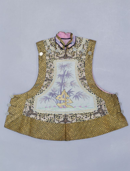
Source here
1890s/1900s women’s vest with collar style 2.
Source here
Ca. 1908. Chenyi with standing collar. If the passage of time is still not clear, notice the Western fabric used. Collar style 2.
At first glance this might look like a cheongsam but it is not. Chenyi did not have slits down the sides, unlike most 20th century cheongsam. It may have been a source of inspiration for cheongsam though, as I have explained in one of my 1930s posts, although the more obvious prototype for cheongsam was the changyi with slits and standing collars.
Let us now turn our attention to Manchu menswear, which is where things get complicated. In the 17th and 18th centuries, the Manchu riding habit, 行服袍 xingfupao, was a form fitting calf length robe with form fitting long sleeves and 马蹄袖 matixiu “horse hoof cuffs”, closed at the side with pankou. It was constructed in the same method as Han Chinese clothing. This original Manchu robe was collarless----I cannot stress this enough. The Manchus did not come barging into China wearing robes with standing collars goddamnit, get your facts right period dramas.

Source here
Portrait of Emperor Kangxi in a xingfupao. This is from the early 18th century already but the style didn’t change much so you get the idea. I love this color btw I think he looks great in it.
The xingfupao was an informal riding habit and only one small part in the gigantic system of Manchu court dress, the rules of which are well documented but I don’t bother to look them up. If you would like to do that, Google 大清会典. At one point in the early 18th century some Manchu dudes decided it was cool to add a collar to their xingfupao (like... Han women??) and it resulted in this:

Source here
An early example from the Kangxi era (1661-1722), a xingfupao with a standing collar of a contrasting color. The hem is detachable for horse riding (horse riding was an important aspect of Manchu culture and that influenced many of their fashion decisions). Judging by the fur lining I assume the standing collar was added for warmth in winter? I also saw some xingfupao with fur trim attached to standing collars so maybe that was the purpose.
Standing collars on xingfupao was constructed in a similar way to Han women’s collars, with rectangular edges and closed by two buttons. Pankous, which were unique to Manchu dress, were used instead of the Han zimukou. It appears that this collar was also soft and unstiffened, so it could be worn with the top bit folded over like in ye olde times (the 16th century). It’s important to note that xingfupao with a standing collar were not common at all, maybe a 1/20 probability to see in museum collections. Construction wise it’s similar to collar style 2 but it appeared earlier and was exclusive to menswear, so let’s call it collar style 4.

Source here
Qianlong era (1735-1796) portrait, xingfupao with standing collar of the same color folded over. Collar style 4 variation 2.
Another garment with a standing collar was the dress of the officials, known by white people as “Mandarins”. From the artworks and photographs I’ve seen, the collar only appeared in the outfit with a 行服褂 xingfugua, a button down tunic with straight, wide sleeves and slits at the front, back and sides. It was usually worn in combination with xingfupao, like how a shirt and vest are fixed combinations in European menswear. However, the collar of this kind of outfit was separate from the tunic itself. A plastron with an attached collar was worn underneath the robe and tunic (completely detachable collars were also used I think??) and the collar was buttoned from the inside. Not sure if this qualifies as a standing collar at all since it isn’t even attached to the robe itself, but anyway let’s just call this collar style 5.
Source here
19th century portrait of an official. He is wearing a blue xingfupao, an indigo xingfugua and a blue detachable collar; a standard ensemble (well he’s also wearing pants and boots and stuff but that’s not the focus here). Collar style 5.
Oh I forgot to mention, after the Manchus took over China, they enforced their dress code on Han Chinese men but not Han Chinese women, so in the Qing Dynasty Han and Manchu menswear were one and the same but Han and Manchu womenswear were not.
I’ve only been talking about court dress so far, educated/well off civilian Han men would wear 长衫 changshan, a floor length robe, sometimes with a 马褂 magua, a short riding vest (derived from xingfugua), whereas poorer Han men would wear 短打 duanda, a short button down shirt, and pants. Well people who wore changshan also wore pants underneath but they’re not visible. All men wore pants tbh (incoming tangent), a while back when Harry Styles in a dress (which I stan) was making the rounds on social media some well meaning people were trying to find historical precedents for men wearing dresses and they named Chinese historical clothing as an example. I just wanna say, while I appreciate the sentiment, the harsh reality was that historical Han Chinese fashion was extremely gendered (except for a few brief time periods and a few select garments). Pants were reserved for men and skirts for women, the long gown like garments seen on men in historical portraiture were all robes, not dresses; you wouldn’t consider a long coat or bathrobe a dress nowadays, would you? Men always wore pants as undergarments while women wore petticoats. However I think that’s great for illustrating how our perception of whether a garment is masculine/feminine could change over time and that gender is socially constructed. Back to the main topic, to my knowledge, magua never had collars because it was a vest, changshan commonly had collars and duanda sometimes did too. I’m not sure when the standing collar began to appear on changshan, maybe when the court xingfupao gained collar style 4 it stuck in civilian fashion, maybe it was some point in the 19th century.
Anyway, fast forward to the late 19th century, the men’s changshan had a tall standing collar but again it was different to everything we’ve seen so far. It was exceptionally tall and had a smoothly tapering edge closed by only one pankou at the bottom. This resulted in a huge v shape gap down the middle. It’s still unstiffened but because of the lack of a rectangular edge it couldn’t be worn folded over. Let’s call this collar style 6.

Source here
Late 19th century/early 20th century portrait of a man. Changshan with collar style 6.
Let’s finish this part with Han women’s collars in the 1890s and 1900s. Around this time Han womenswear began to modernize and become simpler, but that trend did not apply to collars: the collars of Han women’s robes suddenly became unnaturally tall. They were so tall that they touched the wearer’s cheeks and couldn’t be closed at the front at all, kind of resembling Regency era European men’s collars?? This style of collar was oftentimes called 元宝领 yuanbaoling, ingot collar, or 马鞍领 ma’anling, saddle collar, after the object it resembles. Let’s call all of these tall collars that touch the wearer’s face collar style 7, but bear in mind these had a lot of variations.

Source here
Photograph from the 1900s. This could be categorized as a cursed variation of collar style 6 judging from how it only has one pankou and a tapering edge instead of a rectangular edge. But like, belle époque Chinese collars are a whole other species, so let’s comfortably call it collar style 7.

Source here
More collar style 7 representation. This collar style will never stop being funny to me, like just look at it it’s so tall.
So, in summary:
Collar style 1: OG Ming Dynasty standing collar, in fashion from the 16th to mid 18th century. Tall, unstiffened, rectangular edges. Closed with two zimukou. Could have piping (17th & early 18th century). Could be worn with top bit folded over (16th & early 17th century). Worn by Han women.
Collar style 2: developed from collar style 1, popularized in the late 18th century. Medium height, unstiffened, rectangular edges. Closed with two pankou/other fabric buttons. Commonly has binding, piping or trim. Worn by Han women in the late 18th century, partially adopted by Manchu women in the late 19th century.
Collar style 3: developed from collar style 2, exclusive to the 19th century. Extremely short, unstiffened, rectangular edges. Closed with one pankou. Commonly has binding, piping or trim. Worn by Han women.
Collar style 4: collar style 2 but simpler, appeared in the late 17th/early 18th century. Tall, unstiffened, rectangular edges. Closed with two pankou. Commonly plain. Worn by Manchu & Han men.
Collar style 5: detachable standing collar, a staple of official’s uniforms throughout the Qing Dynasty. Medium height, unstiffened, rectangular/rounded edges. Buttoned from the inside. Always plain. Worn by all officials (exclusively men in this era).
Collar style 6: civilian men’s collar characterized by v shape gap at the front, I don’t know when it first appeared, some point in the Qing Dynasty. Tall, unstiffened, rounded and dramatically tapering edges. Closed by one pankou. Worn by civilian Manchu & Han men.
Collar style 7: cursed belle époque (1890s & 1900s) women’s collars that touched the wearer’s face. Extremely tall, stiffened, both rounded and rectangular edges existed. Closed by one pankou at the bottom but sometimes had more pankou for ornamental purposes. Worn by Han women in this period.
Join me next time as we dive into the Republican era where things get extra complicated.
#hanfu#historic fashion#chinese fashion#chinese history#ming dynasty#qing dynasty#16th century#17th century#18th century#19th century
349 notes
·
View notes
Last Seen Blogs
rayaari-my-beloved
Just a blog for some RATLD thoughts
h-8-c-designandfilm
H8C Design & Film

warehousesolutions
Untitled

luckyomagnifico
Lucky O Magnífico

kirikirilife0019
Share Collect