#or less color theory more pixel theory
Explore tagged Tumblr posts
Visit Tumblr Blog
Explore Tumblr blogs with no restrictions, modern design and the best experience.
Last Seen Tumblr Blogs


Fun Fact
There are dozens of funny blogs to kill time on Tumblr.
Text


cuties
(also one of these pokemon is considerable less cuddly then the other ones)
#pokémon#pokemon#pokespe#trainer red#blue oak#green oak#trainer yellow#scyther#<- only pokemon of these whose english name i know. i wont look up the other ones#for people who saw my last post. i did just sccreenshot them. if someone is intrested in why i couldnt export these just idk send an ask#or something. and then idk i will tell you about new kinds of color theory#or less color theory more pixel theory#my art#fanart
206 notes
·
View notes
Text
Senku l. (before & after the stone)
Headcanons, sfw,nsfw, suggestive…
Author’s note: Senku is a fictional character he is canonically 15-16 in the beginning of the series and 17-18 by season 3 not taking account for the manga which he is older. If in the future I make works on characters you deem unfitting for the roll of nsfw fiction or suggestive works of while aged up feel free to block me! Also a reminder that this is a fictional character, made up of lines/pixels. Do not waste your time writing petty hate comments which I will remove and are a waste of your life which you will not get back. I choose to be delusional about fictional characters for my own satisfaction, good day!
Word count: a lot

Before the stone
Sfw
Senku is a bit more less responsible before the stone as he is allowed to act like a kid. He often spends his time in the school lab or at home and can be seen with is small group of friends. (Taiju Oki and Yuzuriha Ogawa.)
Love and romantic relationships are something Senku has found himself uninterested in his teenage years. Dedicating himself to his craft and love for science.
You can take science away from the man but not the science from the man. (You really can’t do either)
Senku has found people conventionally attractive to a specific statistical standard but not to him personally and probably won’t ever given he doesn’t have a common attraction to physical attributes.
Though through statistics he can still find someone who he would be generally attracted to physically. Someone with glasses, makes their interests obvious ex: paint on body all the time, a lab coat or constantly wearing something of their special interest would be people he gravitates towards.
(As someone who is neurodivergent in the worst ways I think half the cast is autistic or a Shokunin if you will a person deeply dedicated to their craft.) So someone as such will attract Senku not romantically of course but they will be bound to cross paths.
There are a multitude of ways you could meet you might never meet but to keep it simple I’m going to give you a multitude of possibilities to have rot in your head.
Being apart of the school’s science club is one way always spending time with him constantly in the science room after school.
Being a dumbass needed tutoring friends with one of his friends but not with Senku directly, or competing for higher grades, a good enemies to lovers. Maybe you’re even apart of the school’s science club making you and Senku acquaintances if anything.
Senku doesn’t back down from competition when it comes to brains but quickly when it comes to fights. Being rivals to Senku is a good asset in the stone world getting you to be one of the first few people to be revived truly testing if you’re book smart (can do it in theory on paper in school) and street smart (do it for real and faster than the time given in school).
Senku was hesitant more than he ever has been getting in a relationship with you. Being shy was simply not an option for him, he thought it was a waste of time often making him coming off as stiff and blunt.
A relationship of romantic interest with Senku will never be said nor be official. He will never say he loves you or that he likes you even give he believes actions speak louder than words. If you give him time you will see through subtle ways that he is attracted to you. 
He will ask you about things that don’t matter much: like should I choose this or that color the small things…
He’ll allow you to touch his hair if your one for pda, he won’t reciprocated often at most leaning into the touch out of pure comfort. He won’t push you off understanding that this is a love language (that did take him a while to understand.)
Senku’s love language is quality time and gift giving. This is more often seen in the stone world but it expressed as well before hand even more so if you’re a science nerd along with him.
He’ll be willing to conduct experiments with you along with share materials with you which is a rare thing for him being an only child never having to share much of anything.
I believe that Senku is aroace or at the very least ace. He can still have platonic love and relationships but isn’t fond of romantic ones being in a romantic relationship from his perspective is his treating you like a best friend practically treating you like a mixture between yuzuriha and Kohaku.
Suggestive
Anything remotely romantic would have to be initiated by you and 9/10 you’re going to either get pushed off. Or he just sits there waiting for you to get over with it. Something like the (kohaku kissing Senku scene in season 3)
For your sake he has experimented once or twice before with make out sessions or kissing to get you to do something (like get you to do an experiment with him.) any kind of physical touch from him romantic wise once again if not initiated by you. 
He’s a responsible enough person to know better than to have sexual intercourse at his age nor is he interested enough to risk it not that questions about it don’t cross his mind but we’ll explore those much later down the line.
Though he’s more likely to tease you occasionally and lean his arm atop your head if you’re short. Expect this more often if you have curly hair
If you have 4c or curly hair in general he will be near you more often especially if you’re a foreigner. Have issues finding hair products for your hair type in Japan? He got you give him a couple strands of your hair next thing you know he has a whole list of products for your hair and product sample packets surrounding him.
Nsfw
Sorry there is none Senku was not interested in sexual acts before the stone nor very much after.
Though he will ask you a lot of “inappropriate questions” but i promise you he’s just genuinely curious. And he’s not trying to infer anything he promises.
After the stone

As I said Senku’s love languages are gift giving and quality time. This becomes more apparent in the stone world. If you had something you held close best believe he will try his best to make it for you. If you’re an artist he’s make brushes and paint etc…
He’s a bit kinder and softer after the stone. People he has known longer therefore care for more he unconsciously takes them on more missions with him around or in a safe space.
If he knew you before the stone you’re likely to be one of the first people out of stone. Though if not you are an important asset and he sees you for your skills and talents so be grateful for that.
If you’re a creative type expect to be paired with Yuzuriha often. A martial artist or athlete expect Kohaku and Taiju.
What Senku appreciate most is people interested in his work, he loves experimenting and explaining his process even to those a who don’t understand so please entertain him for a while if you expect at friendship let alone a romantic relationship.
People who are aroace can have relationships but they can often be on sided in the romance department. It’s not that they don’t love platonically you they just don’t know how to react to that romantically or don’t want romance.(yall can choose if Senku is aroace or not) As long as you’re ok with that your relationship with Senku will be fine. (I’ll just write him as dense to love for yall though.)
Senku if he does love you will occasionally indulge in your romantic behavior and take this a complent if it was a last resort he wouldn't be against procreating with you. (it took him a lot to admit that so you better take it.)
Romantic relationships are often seen as an inconvenience given he doesn't see the need for them and doesn't think he could would be the best fit for something like that.
He true for the most part but he is able to be in a romantic relationship. It may not be as romantic as a you like but if he has an interest in you he will unconsciously do these things. Don't expect any hand-holding and kissing though.
The only way you could get him to hold your hand is for technical reasons like you not getting lost.
Suggestive
I do agree with the fact that Senku would experiment on his significant other and I think this would be more common before the stone but in small ways.
An unexpected romantic act to see how you respond.
He will use this advantage if gen tells him you like him or something for free labor but we won’t abuse it he’s not that mean.
The only way I could see a “relationship forming” Is Senku using you for labor and “paying you” with physical touch. Kisses, hugs and stuff, he likes you platonically but as time goes on he starts experimenting with you first it’s his far will you go for each type of affection. Then it’s soon how will you react to this or that. He says it’s not you that he loves but the reaction you make like a chemical reaction in your mind. Knowing his autistic ass it might be true but the way he acts makes you unsure.
Or maybe finding a girl smarter than him would rial him up he might see you as arrival at first. You guys could be partners, he swears he doesn’t love you, but the science you create the knowledge you know, that wrinkly brain of yours.
He tends to have a love for things rather than people in a way he loves science and the things people are good at their talents but maybe not themselves, he swears but he does establish relationships with characters like Gen and Chrome as friends so I’m sure he can establish a romantic relationship if we take this route.
Then I could actually get into how Senku would “experiment” with his “friend” this would create an friends with benefits kinda situation but it’s not like Senku sees it like that he just doesn’t have time for labels and probably wouldn’t care about it. Just don’t call him pet names because he doesn’t like it. The relationship would be private so the villagers don’t make a fuss, for as far was that would last with Gen around.
NSFW - ish
Let’s talk about Senku’s experiments
Of course you consented to this but you might know what your getting into 100%
It’s basically just a very handsy check up while he asks you questions you may or may not be able to answer.
Ex: “Are your breast sensitive? There is a high concentration of nerve endings present in that area, making them one of the most sensitive parts of the body. While he’s over here playing with them in every way imaginable. He’s going to continue to do this for every inch of your body and take an analysis writing how painful each part is and or sensitive.
So I’ll let you guys imagine that
Thank you for reading!!
#anime#netflix anime#bf#dr stone#dcst smut#dcst#dcst x reader#dcst x reader smut#dcst brainrot#dcst senku#dr stone senku#senku ishigami x reader smut#senku x reader smut#senku ishigami x reader#senku smut#ishigami senku x reader#senku x reader#senku ishigami#ishigami senku#senku#senku smut#senku x y/n#senkuishigami#Senku x Black reader#x reader#dr stone x reader
595 notes
·
View notes
Text


>>Download<<
Edited mesh included. This will work with the original colors, however, I have replaced the default blue from Dr Pixel's original car with the one you see in the first pic. Mesh changes: Moved the front license plate to closer resemble the position that front license plates are usually located on these type of cars. Pulled the lip of the convertible top out of the interior wall of the car. Spelled "Bel Air" correctly in the filename & description. That's it! This was a surprisingly cromulent mesh for being from 2007! Texture changes: Added shading & better hubcaps. The paint is now slightly less reflective & more sparkly (yes, okay, this car did come in some matte colors BUT when you see that sparkly paint you just think 50s, so it works). The leather seats now have (gasp) a leather texture. The chrome is now all the same shade of chrome. The license plate is in Simlish. (It says "Simtown Classic Auto L57-CBA", if you're wondering.) Color Theory: I went down an entire car-nerd rabbithole for accurate exterior paint colors. What I ended up (see the paint swatch) with is a little more aged/yellowed than it probably would have been back in the day, but these are Old Cars. Unfortunately I wasn't able to find good info on actual preserved interiors/seats, they're either gross or restored with new upholstery, so I went with what felt right or what I saw done in restorations.
You Get: 30 car colors. 15 with just the chrome accents on the butt wings, & 15 with the accent color. 10 interior colors that are on their own recolor channel so you can mix&match.
Enjoy! @kalux-sims
517 notes
·
View notes
Text
Tutorial: How I Render Accents
PART 2: COLORS
I usually do not recommend 'pixel hunting' aka going over your work with a fine tooth comb and picking out stray pixels to erase. However, for setting up a proper base layer for accents it is imperative to do so.
To explain my method of color blocking: I select everything outside of the lines, invert that selection, then fill in. This does a more accurate job than going into each and every section and filling them all in individually, and is also significantly faster. Only downside is small sections like above where you can see bits of the green (which I use bright green against a dark grey background to contrast the base color, lines, and background) poking out, as well as the inner section where it filled in a spot I did not want filled in. Getting all of this right in this stage will make your life easier as you go. (It's also the method I use to color block all my work, even beyond accents)
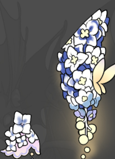
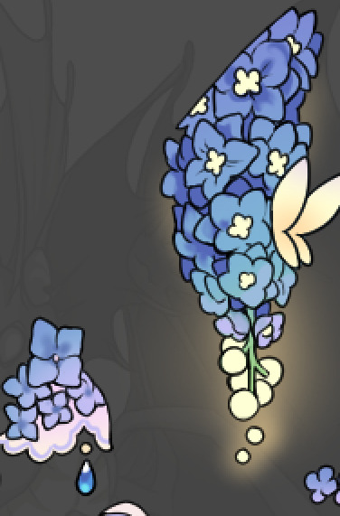
Now this where my style of rendering color may come off intimidating and, tbh it might be. I do gradients first and then I color over them with "normal" blend layers. I typically don't use multiply layers unless I'm shading something that has a lot of textures. If this scares you, it's okay I'll keep walking you through it. Here, my gradient goes from a pastel but deep periwinkle, to a soft more cyan blue, then to a lighter pastel green. Skipping steps and going from the periwinkle to green will give it a different look. There's also hints of a pinkish tone as an accent color.
So as I said, these additional layers are done with regular "normal" blend mode layers. I've placed one in between the butterfly line art and the line art for the rest of the flowers, and then an additional layer under everything else. This allows me to create a glow effect specifically around the butterflies, and then specifically under the flowers. Going back and forth with the proper amount of opacity (by using the airbrush transparently) helps to make it glow but not be Too Loud. Also checking it against a dark background can help to check for spots where it spills past the borders, as well as really gauge how Bright it is. I've also color matched the butterflies with the flower pits and the bulbs. This adds extra cohesion and makes them all look uniform but different enough with the gradients.


The stages of how I render gems/dew drops. Take the base color, make it a bit darker and less saturated (as well as changing the hue a bit depending on what the default color is. For yellows I go more orange/red, for blues I go more purple or even pink. It depends), add a small drop light at the bottom thats a fairly saturated version of the base color, and then a stark white/ near white highlight. That's it. Don't over complicate it, it will not matter when it gets shrunk down. Note that I do not use multiply/overlay/screen layers for these types of things as it adds too much bulk to the files and doing it manually helps to strengthen your color theory skills.
For shading and rendering, again, I create a "normal" layer and simply. Draw over what exists. Color picking and hand blending allow me to create the exact shades and effects that I want that multiply/screen/overlay layers may not be able to achieve. (which isn't to say I dont use them! i just don't use them for the main meat and potato part of my coloring) All of what is shown here is also achieved with the CSP asset SOIPEN (which can be found for free in the asset store)

another example. The one on the right is showing how the layer looks without the gradient base layer under it. All of this is rendered by hand. I also specifically put a highlight color around where the butterfly is sitting to give a better illusion that it is properly sitting on the flowers rather than just in front of them.
Next is changing the color of the lines, if needed. A method i'll use is I color just the sections I want (on a separate clipping layer) then lock that layer's alpha setting to them add in a gradient. It's a small and subtle effect that adds more depth without doing a lot of effort. (work smarter not harder)
Now we get to the Polish Layers!
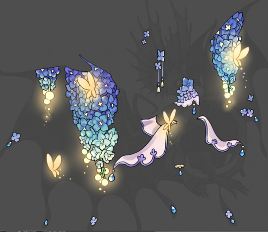
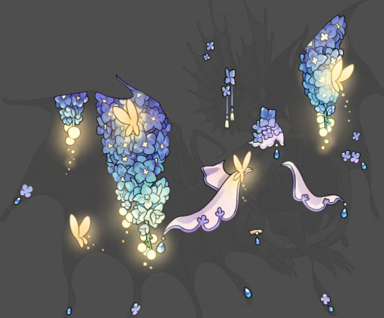
first image is how it looks as a base. second image is with an overlay layer applied. I've used some dark purples and mid tone desaturated greens to push the values a bit further (especially evident on the top left wing) Third image is with a screen layer applied, highlighting the inner most part of the flowers and adding some additional bounce light.
An important thing to note about making accents vs making full coverage skins: OPACITY AND LAYER TYPES MATTER OVER TRANSPARENT SPOTS. What I mean by this is that if you use a soft, light grey to shade with a multiply layer, don't clip it to anything, and have it go outside the lines - that will no longer appear as a 'shadow' when it comes to the final result. Instead you will have a section of soft light grey that is simply laid on top of whatever the image under it is. The same applies for overlay/screen/add layers and so on. If i use a very dark color on a screen layer (to give a soft highlight) and airbrush it over a bunch of stuff and don't clip it, it will end up with this horrible dark splotch over everything that isn't opaque. To this end, mastering normal layers is imperative to having well rendered and convincing accents.
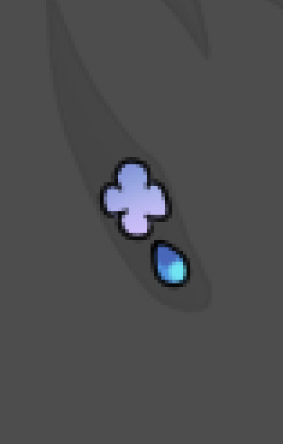
Another thing of note: when it comes to sparkles/small details, note how 'large' the sparkles behind the butterflies are. They seem a bit chunky, yeah?
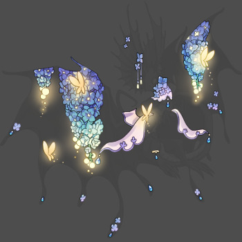
this is what they look like at proper size. If anything, I could have gone larger on the small metal beads connecting the dew drop jewels to the lace.
Another trick I also like to do is this:

a slight hint of transparency! It's just enough to let the dragon's lines underneath show through but not enough to be super noticable. I like to do this a lot when it comes to sparkly and magical effects.
Next is the worst part of all: destroying all that beautiful hard work with the shadow and line art layers! (sobbing)
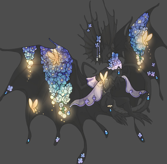
This stage always agonizes me. This is my first pass of the shadow/line layers and let's hope it's dark enough.
But yeah that's a start to finish look at how I create my accents. Unfortunately a lot it devolves into needing to know, yknow, line weight and silhouette importance, color theory and the ways that drawing applications actually apply color to a png vs how its rendered in app. All of these things impact the finesse of the accent, and are things you do have to learn gradually over time, but hopefully this has given yall some additional insight and perhaps some helpful tips.
And this should also explain why I get so mad when people go 'hey can I get this accent in another color' no! no you literally can't!
161 notes
·
View notes
Note
hey balu, do you know how to recolor skin / how a coloring psd works for that? like for a character that's pale and not the shade they should be ( cough cough natlan ) asking bc I want to that but idk how
Hiya, anon! I can explain how I personally do it, but here's a huuuuuuge disclaimer: I'm colourblind, so I heavily rely on colour wheel pointers. Throughout this tutorial, you'll see me constantly comparing where the pointer is and trying to use my somewhat limited knowledge of colour theory. I'm sure other creators have other ways to do this that are much simpler and/or more effective; you should look for and check out other tutorials here on Tumblr, YouTube, or Twitter!
Due to the limited previews of images on Tumblr, you can also open the images on new tabs to see more details.
For religious and political reasons, I will not use a Natlan character as an example. Instead, I'll use Candace (also from Genshin Impact) as our muse. Specifically, I will use her character card art image, which can be found on the Genshin Impact fandom wiki. The image quality is not so great, so that's why we'll see some bleeding pixels here and there. Dealing with those is another tutorial altogether. Also, if you meant an absolutely pale character (with littler to no melanin), that would be another tutorial, too. So, I'll be sticking with these examples and explanations here! This can give you a starting point.
In this tutorial, we will go from this before (left) to this after (right):

Also, I'd like to point out that these steps are for this specific picture/character. Though the same logic can be applied to other characters and images, it's imperative to remember, especially when you're starting your editing adventures, that there is no fool-proof and 100% universal PSD. I'm just explaining the logic behind how a colouring PSD works and some of my mental processes behind it.
Please consider reblogging, liking this post, and/or supporting me on ko-fi if this helped you! That way, I can keep bringing you tutorials like this faster and more effectively. ~
Now, let's begin!

First, we must notice that skin colours (even paler ones) are shade variations of yellows and reds. If we check the hex code colour/colour pointer on the colour wheel, we will see that Candace's skin colour is at the intersection between red and yellow, and is on the lighter/less saturated part.

Here, I am deepening/saturating the blues of her clothes by creating a Hue/Saturation layer, changing from Master > Blues and adjusting the Hue and Saturation values. Colour theory basics: opposing colours on the colour wheels will give a more significant idea of contrast; the bluer colours will appear colder, and the warmer colours will appear hotter and, therefore, more saturated.

In this second step, I am creating a Selective Colour layer, focusing on the Reds. I want this to be highly reddish for now, so I'm lowering the Cyans to the minimum values I can. Notice how the colour wheel pointers went down, meaning we are in a redder, more saturated and more precise zone. The darker the skin, the redder its colours will be in pictures.

Thirdly, I am now creating a Colour Balance layer. Since I want to adjust the warmer colours (e.g., Reds), I am adding more reds, magentas, and yellows.

The exact process I did for Candace's clothes, I'll do for her accessories. Her accessories blended too much with her skin tone (hex code-wise and I imagine that for the normal eye, too). So, to make the yellows on her accessories pop and be more different from her skin, I created yet another Hue/Saturation layer and changed from Master > Yellows, altering the Hues, Saturation and Lightness values.

Now that we have the image's primary colours (blues, reds, yellows) separated, it is time to deepen/saturate the reds. So here, I made another Selective Colour layer, also focusing on the Reds. Notice that now I'm also increasing the Cyan values. Why? Because Cyans make the reds look darker, and I want exactly that. So everything will increase in value.

To further deepen these colours, I created a Curves Layer and tweaked each RGB curve. I made the blues lighter; meanwhile, the greens and reds went darker. Again, colour theory! Notice on the colour wheel that her skin is extremely red and saturated. This is precisely what I want. Why? Well...

... Because now, by using a Selective Colour layer again, I can make her skin magentaish. Pure magentas are rare in pictures, even fantasy/2D characters. Generally, you will find variations of purples, pinks or reds, but magentas are more difficult to find. Therefore, they're easier to work with/edit. Even if the character had magenta colours, we could've isolated them beforehand, too. This step guarantees that my PSD will solely focus on her skin tone, basically.

Our final step is to create another Hue/Saturation layer and change the setting from Master > Magentas. We will decrease the Saturation and Lightness values and slide the Hue bar to the right. And now, check the colour wheel: it's a beautiful dark brown! It's popping a lot against the yellows and blues. ~
This is where we started vs where we finished!
So there you have it! A speedy but hopefully informative tutorial on how colouring PSD works and how you can quickly love your characters a bit more when doing edits and graphics for them!
Again, please consider reblogging, liking this post, and/or supporting me on ko-fi if this helped you! That way, I can keep bringing you tutorials like this faster and more effectively. ~
If you have any questions, please let me know!
#♡: tutorials! *#gfx tutorial#graphics tutorial#graphic tutorial#gfxs tutorial#resources#rolep#ps tutorial#ps tutorials#photoshop#photoshop tutorial#photoshop resources
51 notes
·
View notes
Text
More on my theory that Lizz is not Williams child:
In the books in which he makes an appearance, he is often portrayed with gray eyes (which is a rare variation of blue eyes). Now, most iterations of Evan and Mike, as shown in his pixelated “death”, also have blue or brown eyes. Now we know that Lizz has green eyes, due to baby’s eyes changing from blue to green. Now if Clara had green eyes it would be perfectly normal to have a green eyed child, but Evan doesn’t have a concrete eye color so we have no idea if his eyes are blue or brown. Now, if his eyes are brown and Clara’s eyes are green, then it would be a less than one percent chance of him having brown eyes, but if her eyes are brown then it is near one hundred percent of having a brown eyed child. So if Clara married into the family with Lizz, then there would be no speculation on Evan’s eyes being brown.
#codyton lost their mind in 1806#fnaf#five nights at freddy's#evan afton#michael afton#william afton#elizabeth afton#clara afton
23 notes
·
View notes
Text
youtube
How to Add Custom Characters to SNES RPG Maker Games
(This tutorial is also available at Neocities.)
The Super Famicom versions of RPG Maker did not have a sprite editor, meaning you were stuck with the medieval-looking default characters and couldn't make a game starring, say, Garfield. The second game (RPG Maker 2 / RPG Tsukūru 2), however, did have graphic packs that were downloadable via Satellaview, and those packs had extra characters. Characters that a sufficiently motivated nerd could, in theory, edit into other characters.
You see where this is going.
So here's a tutorial for adding not just custom characters, but custom character packs that basically amount to 16-bit era DLC. And yes, they work on a real console, if you're that motivated of a nerd.
Stuff you'll need:
Ryouma de Yuku, an RPG Maker 2 add-on game originally downloadable via Satellaview (preserved thanks to Satellablog)
BS-X Flash Manager, a program for editing Satellaview memory packs
YY-CHR, a program for editing graphics in a ROM
The sprite sheet for the character you want to insert into the game, no bigger than 16x24 pixels per sprite (the hundreds of A Link to the Past randomizer sprites available work, if you turn them into PNGs with ZSpriteTool and do some cutting and pasting)
RPG Maker 2 itself and a way to play it that allows loading Satellaview memory packs, such as Snes9x, bsnes-plus, FXPAK PRO, or the actual cartridge if you have an empty Satellaview memory pack and a way to flash it (NOTE: don't you fucking dare do this if you haven't dumped that pack already, even if it appears to be empty)
STEP 1: Extract the Ryouma de Yuku Graphics Pack
Launch BS-X Flash Manager and open the Ryouma file you downloaded from Satellablog (Ryouma De Yuku - Complete Set.bs). It should look like this:

Select the second file on the left (the one that says 2 blocks), then go to File and click Export. This will create another .bs file with only the graphics pack and not the other Ryouma stuff. NOTE: If you skip this step you'll still be able to change the sprites, but they won't actually work in the game. Why? No idea! Just accept the mystery and don't skip this step.
STEP 2: Edit the Graphic Pack Sprites
Before getting started, take a look at the Ryouma de Yuku characters below and pick one whose colors more or less match your desired characters' colors:

(That one lady in the second row has a pretty Garfield-esque dress, for instance.)
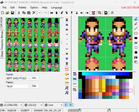
Now launch YY-CHR and open the graphics pack .bs file you extracted in the previous step. You'll see nothing but nonsensical graphics with weird-ass colors, until you change these settings:
Format: 4BPP SNES/PCE(CG)
Pattern: 16x24
Address (click the red "ADDR 0x80" icon): 0001BC00
There, now you'll see sensical graphics with weird-ass colors. It should look like this:

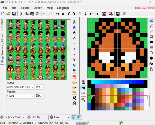
At this point, changing the colors is technically optional -- nothing here will change what the colors in the game itself will look like, but seeing them as you would in the game will make the next part a lot easier. To see the correct colors, you need to load a ZSNES emulator save state created within RPG Maker 2. No, this won't work with a save state made in an emu created this century, for, once again, some reason. Yes, this is kind of a pain in the ass, so here's an RPG Maker 2 save state we made just for you. You're welcome.
Anyway, go ahead and click "Palette," then "Load Emulator State" and pick the one we provided. Now the colors will look... worse?!

Ah, but notice that the color palettes available on the lower right are now different. If you scroll down that list, you should find a palette that makes each character's colors match the ones in the game.
Scroll down the window on the left to find the character you settled on at the start of this step, then pick the right palette for them. In our case, here's the Garfield lady with her right palette:

Now look at the sprites for the character you want to add. We're using this Garfield sprite sheet by Jon Gandee and Hansungkee from Spriters Resource, hastily adapted for this tutorial by someone who clearly isn't a pixel artist. (PRO TIP: you can easily add a grid over your image by opening it in Paint and pressing Ctrl+G. Take a screenshot to be able to zoom in all the way.)

Now use the drawing tools on the right of YY-CHR and the colors on the palette to replicate each sprite over the existing ones, always over its equivalent position ("walking right" over "walking right," and so on). Click the second cog icon on the bottom (the one that says 32x32 by default) if you want to zoom in. Heeeeeere comes Garfield!
When you're done with a sprite, you can click the Copy button on the toolbar above to copy everything currently being shown on the right window, the Paste button to paste it over another sprite, and lastly Mirror Horizontal (the double arrow pointing left and right reminiscent of Nickelodeon's Catdog) to mirror it.

Once you've finished all the sprites, you can go to File and pick Save as to create yet another .bs file, which takes us to the next step...
STEP 3: Load the Graphics Pack in RPG Maker 2
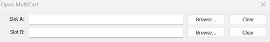
Assuming you're using an emulator, because you almost definitely are, we recommend Snes9x over bsnes, since save states don't seem to work for RPG Maker 2 on the latter and you'll be needing a shitload of those if you actually want to play this game. In Snes9x, go to File, Load MultiCart, and pick your legitimately obtained RPG Maker 2 ROM on Slot A and the last .bs file you just created in Slot B, then click OK. (You can ignore the BIOS part for this game.)

If you like living on the edge and insist on using bsnes, go to System, Load Special, Load BS-X Slotted Cartridge, and set the two files just mentioned as Base cartridge and Slot cartridge respectively. The game should start now. Press A to go to main menu, then go to the second option ("EDIT" if you're using the English translation patch).
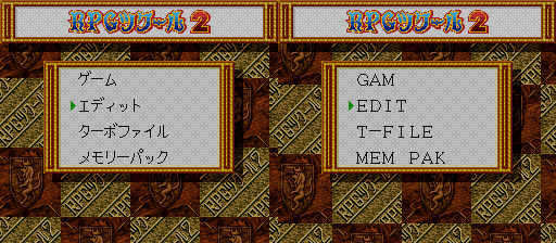
Now go to the last option ("DAT" in English), then the last option again ("MEM-PAK IMAGE DATA"). Press up to select the memory pack and A to confirm (this part is untranslated in the patch).

Press B to go back to the previous menu and go to the second option there ("PARTY"). Press A twice and that will take you to the Character Maker screen. This is, astonishing as it might seem, where you make characters for your game.
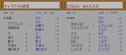
The first option in this screen is where you can name your character, so go for it if you want. In the Japanese version, press R twice to use the Latin alphabet. In the English translation, you start with the Latin alphabet and pressing R once will let you use lower case letters (not available in the Japanese version).

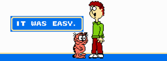
Press start to save the name and A to confirm. Now, at last, the reason we're here: goddamn Garfield. Pick the second option in the Character Maker screen ("IMAGE") and use the D-Pad to select a character. Your character will be among the last ones, so you'll probably want to start by pressing down. There's our boy!

Press A to select the character, B three times to leave, and A to save and exit the Character Maker. At this point you can start playing with the other options to make a game for your character -- or, if you just wanna see what it looks like in action with little effort, simply load someone else's RPG Maker 2 game, like one of the 11 existing English language ones from the '90s preserved at rmarchiv.de. These are always in SNES save ram format (.srm), so simply rename the file to match the name of the ROM, put it in the "saves" folder for Snes9x or the same folder as the ROM for bsnes, and repeat the process above to replace one of the characters in the game with your own.

NOTE: You'll need to load both files via the "Load MultiCart" or "Load Special" option every time you want to use the custom characters, but you only need to do the in-game memory pack loading/character selecting process the first time. You'll know you forgot to load the .bs file if your character is suddenly invisible.
NOTE 2: Be aware that this game's English translation is somewhat unstable and can randomly crash during fights, so you'll either have to save a lot (we weren't kidding about this game requiring shitloads of save states) or get used to navigating Japanese menus.
And that's it! You are now 1/10th of the way to creating your own SNES RPG Maker 2 character pack. In the words of Garfield himself:
If you make any games in this thing, with or without custom characters, let us know and we'll play them in our channel (most likely in test mode because we suck at RPGs, but still!).
#nintendo#super nintendo#gamedev#rpg maker#homebrew#retro gaming#super famicom#sfc#RPGツクール2#RPGツクール#romhacking#garfield#goddamn mondays#tutorials#YouTube
5 notes
·
View notes
Text
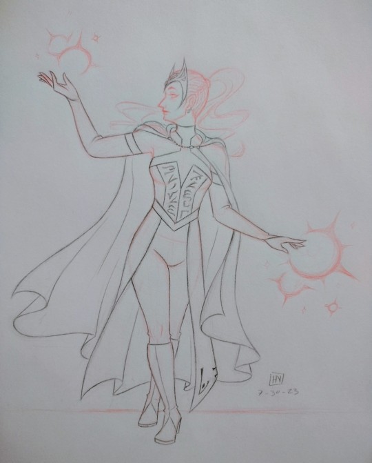
“This is chaos magic, Wanda. And that makes you the Scarlet Witch.”
— Agatha Harkness
a sketch showcasing my Wanda design!! credit to @adorkastock for the pose reference used :)
below the cut is a full breakdown of my design, including its evolution, my thought process, and other unposted drawings relating to this project, so read on if you’re interested!!
okay, so real talk, I first decided I wanted to make my own Wanda design because I Could Not be bothered to keep looking up refs for whatever tf is going on with her mcu costume bodice. I mean, look at this:
I mean, maybe it looks okay onscreen, but there’s so many fiddly little details, especially around the collar, and it was just a pain to draw whenever I would draw my Wanda. and okay I’ll be real I also wanted to distance my Wanda from the whitewashed Wendy version of her, because I Do What I Want. and also, the dullness of the reds did not spark joy within my heart. she’s the Scarlet Witch, people, not the Vaguely Maroon Witch!!
and I fell in love with the Kevin Wada design when I first saw it. it’s gorgeous, it’s sleek, it’s witchy, and it’s significantly less frustrating to draw!!
so for a while, I drew my Wanda in a variation of this fit, blended with some of my own touches (a high ponytail + an occasional choker) and a few of the things I did like from her mcu fit (the crown + the half skirt thingamabob + the long cape). but I was still feeling :/ about it, mainly because while the off-the-shoulder design looks lovely, I found it tricky to draw whenever Wanda would raise her hands above her head. exhibit a below:
behold, the sketch for an old drawing I never finished!! and I know artists smarter than me have figured out How The Sleeves, because some comics even today still use this design, but I only have so many brain cells to spend, and I felt like simplifying things for myself even further.
that was when Russell Dauterman’s design for the 2022 Hellfire Gala dropped. and I went FERAL.
it’s gorgeous!! it’s stunning!! high collars my beloved!! so I took the collar design and ran with it for my own design.
behold, a janky rendition of my costume design in the crappy colored pencils provided to us during my fashion design class!! I know, I know, the coloring looks atrocious, but I was working with what I had. now, you may have already noticed some elements not present in any of the designs I cited as my influences. let’s talk about those!!
the sleeves are split from the main bodice as gloves: this was for my own sanity, haha. it was a construction my smol lizard brain could comprehend and work with much better than Whatever is going on with the comics designs.
the red portion of the gloves tapers in kind of a V design rather than cutting off at the fingers: personally, I felt like this accentuated the elegant flow of all the hand gestures Wanda makes when using her powers better than the classic fingerless design, or whatever thumb strap thingy was going on with her MoM costume.
where’d the design for her cloak clasp come from?: now we all know that tumblr’s pixel budget is next to nil, but if you zoom in, you’ll notice that the clasp of Wanda’s cloak is not her M crown design, but rather a golden kinda coffin-shaped thingy. see, I saw this one theory that this hex shape in Wanda’s mcu bodice was an homage to Vision and the Mind Stone, and I liked that theory, so I referenced it with a hex-shaped clasp.
and the runes on her bodice and skirt?: I actually referenced the Enochian font for those!! according to wikipedia, it’s said to be the language of angels, which feels appropriate for a character as tied to cosmic powers as Wanda. also, real talk, it just looks cool. the script on her bodice originally said “not born, forged,” in reference to the Darkhold’s Scarlet Witch prophecy, but it’s become truncated as the bodice has become shorter to accommodate a more high-waisted structure, which I personally believe to be more flattering in general. I added the runes pretty late in the design process to her skirt to tie the whole fit together visually. from an in-universe perspective, I like to think of the writing as Chthon visually marking Wanda as his creation. his witch.
why does Wanda have a high ponytail when she’s never had one in her most recognizable incarnations?: because a) I do what I want, and b) Alba Flores looks STUNNING in a high ponytail.

and let it never be said that I am not fruity as all heck about Wanda Maximoff <3
so there you have it, a Wanda design that I think is as beautiful, regal, and magical as she is, not to mention one that I can draw repeatedly without having to immediately reach for my phone to Yet Again look up references for how the heck the bodice works.
(and really, it only seemed fitting that the Scarlet Witch of Earth-19384 should receive her own unique design.)
#ari does art#long post#mcu#scarlet witch#wanda maximoff#alba flores as wanda maximoff#costume design#earth-19384#marvel#artists on tumblr
73 notes
·
View notes
Text
Hey, so...
Does anyone remember this post I made recently?
.
.
.
I made some art for it...
If you wanna see it...
Here it is:
I'M SO MAD AT MYSELF IT WAS SUPPOSED TO BE SURVIVING THE MANSION BUT I DIDN'T REALIZE UNTIL AFTER I FINISHED IT AAAGGH
...Aside from that little oopsie, though, I'm actually really proud of how the logo came out? I based the font off a style called "Micro 5 Charted". Thank goodness I was using graph paper!
I'm not sure if that Kanji is correct; Google Translate doesn't seem to like the word "oni" or "stick", especially together, so I spelled out the Romanji in the English box and then tried to copy the characters Google offered me as closely as possible. I think I'd be more surprised if I got the Kanji correct, honestly.
Henry Stickmin title screens usually have two different fonts for the verb and the noun, and I thought about trying to make "Mansion" look like an actual house, but that made my brain hurt to much to conceptualize, so I stuck with different colored fonts. Hmm, that clock sure is there. I wonder what it means gets hit by a bus
-----
Anyway, here's some theoretical scenarios of what the main gameplay would look like! This one stars General Hubert Galeforce and some other guy:
Option 1: Shoot
Result: The monster hears you move as soon as you pull your gun from its holster. No time to defend yourself.
FAILURE (DiE!)
Option 2: Backup
Result: Your radio refuses to work, even though it was just fine before you entered the mansion. The monster waits until you've realized this, then goes for your throat.
FAILURE (No one will hear your screams...)
Option 3: Time Out
Result: The monster does not hear you and goes into a separate room, out of sight and out of mind. Galeforce survives... for now. But what was that thing...?
-----
I don't know how feasible it would be, but I imagine this would be a cross between typical RPG Maker-styled games (pixels, speech boxes with pictures of the characters, moving around a set floor plan, puzzle solving, etc) and typical Henry Stickmin-styled game play (cutscenes, choices, possible interactivity [grabbing items/bios], the occasional quick time event, etc) (voice acting would be a stretch). Most of the gameplay, like exploring the mansion, puzzle solving, and running/fighting the monster, would be RPG style, and then occasionally switch into a cutscene that requires you to make a choice; usually with just one correct answer but possibly others that could result in diverging dialogue/interaction/paths/endings? Something to think about.
Anyway, Galeforce! Poor man has no idea what he almost walked into, haha. I experimented with perspective and limb placement here, which was exhausting but also a lot of fun! Dynamics are hard with stick figures, but considering that they're they only character medium I've ever been decent at, I made it work.
And the Oni... I tried to give it some sort of anatomy, but quickly realized that I do not have the skills to pay those bills. I opted for a more of a shadowy figure looking thing with a big smile instead (you can see some of the lines where I tried to make it have arms, I think). I opted for Ao Oni's purple-y blue color scheme verses HetaOni's gray alien look. Back in the day of fan made Ao Oni games, people would usually try to put their own unique spin on the Oni sprite, with HetaOni's being the most unique I ever saw (keep in mind, it was one of the few designs I ever saw, so there might be cooler ones out there, who knows). In theory, a game called Sutikku Oni would use a stick figure shaped monster, but with my current art skills, that would just look like a normal stick person with a big head (look! Geoffrey Plumb's cousin!). I think the less we see, the better; all good horror games know when to leave things to the imagination!
-----
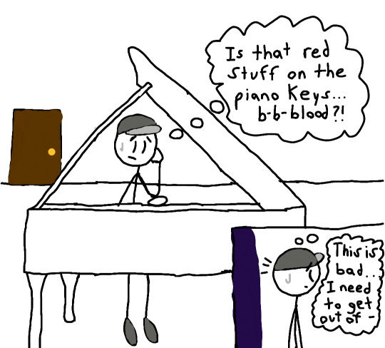
I also made a second one, featuring my boy Dave Panpa!
...Dave, I'm so sorry... *MAKES HIM PEEP THE HORROR*
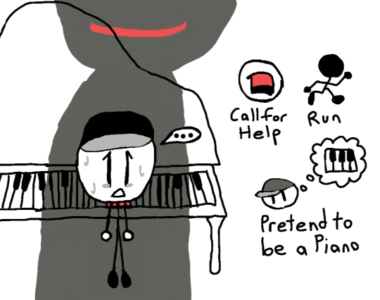
Option 1: Call for Help
Result: You call for help...
FAILURE (...but nobody came.)
Option 2: Run
Result: You tense your muscles in preparation to run. The monster is faster.
FAILURE (YoU... wOn'T... eScApE...!)
Option 3: Pretend to be a Piano
Result: Frozen with fear in front of the piano, it's all you can do to hope the monster thinks you're also a piano (a sopping wet piano, but still). It's deadly quiet. You can hardly breathe, and you're afraid to. The monster stares at you for an uncomfortably long time, before walking away, out of sight and out of mind. You stay still a little longer before collapsing to the ground. Dave Panpa survives... for now. How on Earth did that work? Or... did that thing let you live out of pity...?
-----
UGH the piano! Pianos are so hard to draw! Luckily, I had an almost head on reference that I was able to use for the first picture. For the above view shot, I had to do some wild guessing. The red stuff near Dave's head in the second picture is the red stuff he was referring to. Is it blood? Paint? Something else? Who knows! But as we all know, any self respecting Ao Oni fan game needs a piano puzzle!
I imagine Dave was dragged along for the ride when the Toppats decided to find the treasure of the mansion (or something to that degree), fully intending to leave him there to die if there was, in fact, a monster inside. Poor Dave... Maybe there could be an ending where amends are made? Or maybe not...
I mostly put the smile on the monster's shadow as a means of showing that, indeed, it is the monster, but now I'm wondering if the monster's mouth glows or something? Hot fires of Hell, delivered right to you! Can you beat the heat?
-----
Thank you all for coming to my fixation ramble that absolutely no one else except me finds interesting! Any thoughts before you go?
(A cricket chirps, then leaves because it's in the wrong conference room)
...Yeah, I figured.
#thsc#the henry stickmin collection#my art#ao oni#hetaoni#hubert galeforce#dave panpa#dave panpa my beloved#rambling#if anyone actually is entertained by my weird thing I made let me know!#this is hardly even a pipe dream#but it'd be cool if people were like “yeah that's cool I guess”#and then I could go YAY!#the blue clock in the logo and the quick time event are a reference to my hetaoni fic#just for fun#the actual clock/time travel device would probably be something unique#something Henry Stickmin would steal/get his hands on during the first mansion “playthrough”#triple threat#technically#they're referenced
18 notes
·
View notes
Text
Wire Witch Hex - Wearing Many Hats (Font Design)
Lately most of the traffic I'm getting on this blog has been people stumbling onto my multipart series on how a computer works. Glad people are enjoying that as much as they seem to be. My reason for teaching myself all of that (besides just the joy of learning) is I'm very slowly working on designing a new video game console that anyone sufficiently motivated can build for themselves as a neat little DIY project. There are so many moving parts to this project that for now I'm focusing mainly on just the controller and its unique features. To avoid having to make a whole working console, with software, to test it, and make sure I have something to show for all this if the rest doesn't pan out, I'm designing the controller to also be more or less compatible with the NES and SNES (which secretly use the same input standard, just differently shaped plugs at the end of the cord).
This means all I'll need to test and demo my controller is an SNES ROM that knows what to do with my scroll-wheel outputs, a setup where an emulator accurately handles those signals, and later a cart I can slap a couple EEPROMs into and test on real hardware. Oh and I also need to teach myself enough about SNES development to actually create every demo I want to run, do all the art, code it up, and compile it. This is a big job, and I'm not getting paid, so maybe consider throwing me a little money before we dig into this?
Since... really the last time I reported in on this, I've been studying away trying to learn all this, and hey, have a compiled ROM image that'll display a blank screen in any color I want, and a third party program that IN THEORY with a bit of massaging will convert a 256x256 image into an SNES character ROM image. AKA the file with all the graphics. My ultimate goal for this demo cart is to cycle through several very simple games, showcasing how my controller works with each. So I need to cram every image any of these are going to need into my one big image file, which I'm slowly picking away at, but the one thing I knew from the start that I'd definitely need is to throw some text on screen explaining the controls for each demo. And since it's not like there's a built in font in in the system, I had to make my own.

This is not my first font-making rodeo. For this one, my thinking was, I'm going to be in a fixed 16x16 resolution per character (because I forgot the specifics of how the SNES actually tiles graphics), some built in spacing so I can slap them all right up against each other or some border and still be readable, and I wanted a nice little shadow built into every character in case they end up on a low contrast background. Let's zoom in on what I have here so far, in case you don't feel like downloading the file and blowing it up to something more readable.
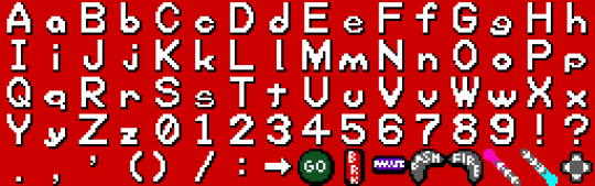
The first thing I want to note is that after finishing the first 4 rows of characters here, I double checked, and while the SNES CAN break backgrounds into 16x16 tiles, the absolute minimum is 8x8. If I were really trying to be space efficient, I should have designed around that. Several of these characters would easily fit into a 16x8 space, that level of compression would also let me have just the period and comma and be able to build a colon, semicolon, or apostrophe from those, and most importantly, I rendered this with all of the lowercase letters exactly 1 pixel too tall to fit into a 16x8 space and let me double up there. Since I'm rather happy with this font so far and I'd eventually like to make some version of it available for, if nothing else, other people writing software for my eventual console here, I will likely, at some point, make a more space-optimized variation. I'd also like to cover a wider range of characters. At the very least, have some accent marks, wouldn't be too hard to add support for Cyrillic. Pretty sure I can get Japanese and Korean text in keeping with this look. Maybe some other languages. Anyway though, let's talk about what I've got.
My general design rule here was, where possible, make lines 2 pixels thick, and have each white pixel cast a black pixel shadow immediately below, to the right, and the diagonal between them. This gives a pretty convincing relief effect in my opinion, and keeping the shadows this thick keeps a nice firm edge there so it's even generally readable on a pure white background. Within each 16x16 tile, I was extremely strict about keeping a 1 pixel margin clear at the top and bottom of each image, and 2 or 3 on the sides (often 3 on the left, 2 on the right. With capital letters, I went with a generally rigid and blocky style, trying to stretch things to my arbitrary margins. Lowercase letters I restricted to just 8 pixels tall, and those featuring tails are given special permission to drop down an extra pixel, leaving the shadow right on the edge of their true bounding box.
While it wasn't an intentional move at first, several lowercase letters ended up with a decidedly rounded, squashed look, particularly g and q. I found that to be both kind of cute, giving the whole font a real unique character, and eventually started to actively lean into it (which may not be super obvious, I started with W as it's kinda the letter than needs the most breathing room and worked outward from there), and did my best to distort all the rounder shapes and in particular the highly mirrorable b d p q set, as I seem to recall once reading the more you avoid identical shapes with those, the more legible the font becomes for people with dyslexia. Similarly, I made a point of distinguishing the shapes of the Ms and Ws, and added a little whimsy to the numerals. Overall I'm super happy with all the lowercase letters (except for e and s being too thin, but that was an inevitable compromise), and if I ever have the time to kill it's very likely I'll revisit this someday and apply this squishy rounded aesthetic to the capitals too.
Your eyes were probably drawn really quickly to the parentheses here, where for at least the moment I'm breaking my rules about blank space and shifting them inward quite a bit rather than centering them. That's going to look really bad if I use them in a sentence (like this), but the main reason I'm including them right now is so I can list button prompts with both the icons representing what's actually going to be on my controller, and the SNES buttons sharing the same signals. So something like: "GO (A) Jump" and I think the half-spacing and closeness to what they enclose will look pretty nice in this one specific case.
As a final note, the particular hardware I'm working with absolutely supports the ability to mirror any image horizontally or vertically, as well as change the palette. If I truly wanted to cram letters in as efficiently as possible at this font size, I could, for instance, have an 8x8 right-angle segment, build a whole H just from mirroring that, also use it for the legs of the A, P, F, the left side of the D, etc. This however is incompatible with the shadows I'm using for extra readability. And of course for other projects I HAVE made a perfectly legible 8x8 font before.
I'm pointing this out because hey, if you do the math, JUST these characters I've set aside for having arbitrary on-screen text, as is, are consuming 5/16ths of my total graphical memory, and I'm probably never even going to display most of these anywhere. Again, not a huge problem for the simple demo pack I'm making, and that 256x256 drawing space isn't a hard limit. Spending an extra processor cycle to change an index value and access a whole other page of image data is a pretty common practice on the hardware, but especially with older computers and racing to get things ready to draw before a screen refreshes, it's good to at least be mindful of the tradeoffs with that sort of thing.
And again, my sole source of income at the moment is patreon donations, so if you're excited about seeing updates to this weird project of mine or you're learning useful things from any of it, maybe consider throwing me a little support?
7 notes
·
View notes
Text
Hypothetical Side Order Update Hopes/Rambles
I know it may not be super super likely but I really do hope there are some updates to Side Order eventually.
I wanna talk about some things I would like to see:
☆ New Cipher shop items! Especially the banners and especially especially gear, since those are the two smallest sections.
Today's Find will still be unlocked for people who unlocked it by now, but my idea for those who haven't: the new things added after launch will only be unlocked if you bought out all of the launch items in that section. Cipher's shop is formatted very similarly to the Grizzco shop, so this could kind of be Cipher's equivalent of how some Grizzco items are greyed out until you spend a certain number of each scale. Buying out the launch items in every section will unlock Today's Find as well as all items added in any hypothetical update(s). Update items will of course be immediately unlocked for those of us who already bought all launch items.
Ideas for what new items they could add? ● Pixels of characters that may or may not even have palettes: Acht, Judd, Grizz, Cipher, etc?
● The order weapon pattern banner that was accidentally shown when they showed off the CoroCoro banner. People pointed out, based on its placement and the lack of an Acht banner, that the weapons banner was most likely unfortunately just an early-development banner, scrapped in favor of making the Acht one. BUT if they still have the file(s) for it I don't see why they couldn't just plop it into Cipher's shop in an update.
● Outfits of any Side Order character(s) that do not get an amiibo, or all Side Order character outfits if it turns out the amiibo don't just give the figure's outfit.
Dataminers found two upcoming amiibo, and animations found in Side Order seemingly suggest one is Marina. The other is not identified afaik. I don't think they would make an Eight amiibo unless there actually ends up being more than two, I feel like they would wanna make both the masc and fem promo designs like with OE. My theories: • Marina + Pearl Drone • Marina + normal Pearl • Marina + Acht • Maybe, maayyybe, Marina + only fem Eight. (Masc Eight wasn't really shown a whole ton in promo stuff anyway afaik, sooo...) I'm kind of hoping for Marina + Acht, because as much as I'd love for another Pearl + Marina pair to exist... an Acht figure would just be so cool. I'd probably never be able to get ahold of it anyway because I've been having a ton of trouble getting amiibo figures, but eh.
If the other amiibo is a Pearl, I think you would get Pearl's Side Order outfit from her amiibo regardless of whether the figure is normal her or Drone her. Whatever the amiibos are or what they give, the outfits of remaining Side Order characters, or all of their outfits if the amiibos give something totally unique, should go in Cipher's shop. That could/should include both the masc and fem Eight outfits from OE, if they don't get SdOdr amiibos, or if their SdOdr amiibos give something else.
● The Chaos/Order news gear from Splat2. Or at least just the Order ones.
● Any and all other gear you would get as rewards from OE. The gold takoyaki pick, Neo Octoling gear, etc etc etc.
● Locker figurines of the little NPCs outside, the jelly things and the little shrimp ladies etc.
● Maybe figurines of the bosses as well.
☆ Jelleton badges! Full-color, silver, then gold, just like Salmon Run. The app already tracks your kill counts so why not?
For the more common ones like Languendo, Andante, Lento, the requirements for their badges could be incredibly high just for the fact that they're so common that you can rack up tons and tons and tons of them relatively quickly (I'm personally at over 55k Andantes, for instance, and I haven't even played much since mid-March.) Less common or more incendental enemies like Alla Mambos, Portals (I mean why not count these since the app counts em), etc, can have smaller requirements, maybe on par with Boss Salmonid badges.
Bosses (Rondo, Marciale, Canon, Overlorder) can just be the same numbers as King Salmonid badges I feel like.
I would love a Marina Agitando badge in this manner, however her count does not go beyond x1 even if you re-fight her through memories, which makes perfect sense since only the first fight was even real. Maybe they could add one as a "Cleared the Initial Spire" badge...?
And an idea I had is maybe you could have both Overlorder and Smollusk badges. These both have silver and gold versions and you get both Overlorder and Smollusk of each color simultaneously upon meeting the milestones, kinda like the Deep Cut badges (even though Deep Cut doesn't have silvers, but you know what I mean).
☆ More weapons! Lore-wise clearing every existing weapon we have at the moment means that the problem with the simulation should be fixed I think, meaning no other souls could be pulled in and become palettes...? BUT we do still keep climbing the Spire afterwards if we want, just for the hell of it and so Smollusk isn't alone.
So I think maybe it could fit lore-wise if Marina just came up with some "fake"/"dummy" Palettes, i.e. Palettes not linked to any soul, just to play around with for funsies. Experimental builds are fun to play with so having some of the weapons that have unique gimmicks could be really exciting.
Some ideas:
Explosher! Tones could maybe be Power and Range just because a high Splash Damage + high Splash Radius combo would go so hard on this thing.
Snipewriter- This could possibly have a new chip for Shots-Per-Charge. With no chips it maybe starts at 2 shots per charge just so it's different from the normal Order Charger. And then, kinda like how Order Dualies can go beyond Tetra's four rolls when you put enough Extra Dodge Roll, many Shots-Per-Charge chips can put the Snipewriter beyond its multiplayer five shots per charge.
Any/all Grizzco weapons! I don't have clear ideas for aaaall of them, but I have some thoughts. Possibly all of the more ink-hungry ones, but DEFINITELY Grizzco Slosher, should have Support as a common tone. Having only four sloshes on a full tank in the Spire sounds like a fucking nightmare so that damn thing needs ink saving/recovering chips like we need air. Maybe for Grizzco Slosher, Support is its most common, while the other ink-hungry Grizzco Weapons have it as their second most, if they have it at all.
Grizzco Dualies would probably be affected by Extra Dodge Roll chips just like the normal Order Dualies, but since Grizzco Dualies get so many dodge rolls in SR, it should start off with slightly more, and build up to *much* more, rolls than Order Dualies do.
I have no fucking clue how Grizzco Charger could work, since you can essentially turn the regular Order Charger into it anyway. Maybe this one would not even be added for that reason?
For Grizzco Splatana, I don't really know how it not having a ranged attack (the "blade" of ink that Wiper and Stamper throw out) could be handled. Maybe getting one Main Range chip will add it at a kinda short range, and you have to stack multiple Main Range chips to make it even better?
☆ Misc/smaller things (either *actually* small changes or just stuff I don't feel like I talk super long about):
• Some other hacks / adjustments to existing hacks would be neat. I for one really wish you could be able to set Double Chip Rate to absolutely zero, instead of the minimum being 5%. Would make specific design runs a bit easier... I like making checkerboards and sometimes I refresh a ton, FINALLY find the color I need... only for it to be a x2 and I don't have enough money to room reset anymore.
▪︎ ... Either give us some sort of opportunity to spend Prlz while we are actively inside the Spire, or *stop putting Prlz in the vending machines if we're maxed out on them!* Slots that could have a chip or Sub or Special I could use are taken up by unbuyable Prlz a lot of times!
▪︎ More story stuff, somehow. Where is the explanation or even acknowledgement of #35 caught? What the hell is Cipher? I know it's a Lucifer Prawn but I mean, like, what is its purpose besides being a shopkeeper, is that it's only purpose? Is it a manifestation of something like Order/Smollusk was? Why did it pop up? Even Marina doesn't seem to know. Also I'm a little tired of the repeated dialogue now, some new stuff to stop and read would be cool.
▪︎More floor types? It feels unlikely they would do that at all let alone add very many (unless they come up with some kind of infinite mode), but itd be neat of they added enough new levels that you could hypothetically very easily do a Portal-only run, or Zones-only, etc.
▪︎More bosses possibly? If I remember old Splatfest datamined correctly, at least one of the bosses is based on a Splat1 boss. So like... even if they just remix a nostalgic boss fight to add a new boss, that's still something to add more variety to runs. And if they do the badge thing I mentioned before then that's more cool badges to get, more stuff that completionists can work toward.
6 notes
·
View notes
Text
Shining Force 2 Pre-release Coverage
Post on the first game here
Let’s continue our deep dive on old magazines. Again most of my info here are from the Beep! Megadrive magazine, but I did manage to find some footage from old Sega videos as well.
For context again, the game released in Japan on October 1993.
June 1993
Unlike the first game, which showed very few regions during pre release, this one is eager to show a bunch of new places, probably because it can’t generate hype about a unique battle system anymore. Bowie and a parade of peculiar placeholders take a good tour around the continent.
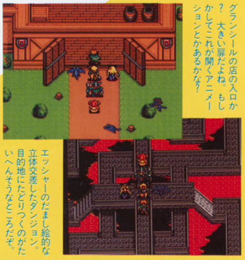
Save for the wall decoration and possibly the colors, it’s hard to judge on print, New Granseal’s castle is pretty much the final version. Same for Arc Valley's escher-like dungeon, as the magazine puts it.
Volcanon’s shrine is also here, and the magazine claims to have seen “a huge monster” on the top of the shrine, so Volcanon is likely already there as well. They wonder if it could be a boss but I think it’s just baseless speculation since it’s clearly not a battle scene, and little story was revealed at this point.
The monument looks wack, the shop signs are huge, and doors are different, but otherwise Hassan looks very close to the final version.
Bedoe is dark, that particular torch is also not in the final version, although there are torches in the town. Would be a pain in the ass to navigate, but might be just a test of the dark effect.
HQ already has the same vibe, but lots of different details, like different tables, cups and flowers vases on them, no stone walls, etc.
But enough of that, let’s stop pretending the Placeholder Force isn’t the wackiest and most amusing thing in these screenshots. What do we have there.
Bowie seems mostly complete, which makes sense as I’ll show in a second that his design was already announced. There are still a couple differences though, his clothes are blue instead of white and his cape has a golden line. His design might have been quickly revised at some point?
There’s a bunny girl NPC. Because of course the first thing these devs hopped to make was a bunny girl NPC. I’m actually more shocked that they did not keep her. Also I’m saying NPC with some certainty because as you can see comparing with Bowie, playable characters tend to have one less pixel between the eyes. So I don’t think she’s a scrapped character or anything.
Mae is here! Because of course it makes sense to use a character from the previous game as placeholder. As opposed to, you know, drawing a whole bunny girl. Her lower body was recolored to orange/yellow for some reason though.
There’s a wyvern sprite that does make it to the final game as an enemy. Curiously that shot of New Granseal shows more wyverns flying around as well. It makes no sense to use flying placeholders for the soldiers that should be there, so I wonder if there were supposed to be birds flying in the scenario or something, it would be neat.
There’s a cute little girl NPC with twintails who sadly didn’t make it. I don’t have anything to say about this.
Finally, true nerds like me fans of this blog will have certainly recognized the warrior sprite as an unused sprite from the first game:
From the side however, it was clearly edited, the helmet losing detail, getting shorter horns, and the whole guy getting shorter as well. My theory is that this guy was on the process of becoming this:

and maybe later Jaha, as this NPC is already very similar to him, and his design was already announced as well. In fact, that’s what we’ll talk about next. Besides these screenshots, there are four characters introduced in this article.
This kid is the protagonist!?
He is the protagonist who will represent you and travel through the world of Shining Force II. It seems he lives in the castle town of Granseal, but has no adventuring experience yet. From here on the both of you will have an exciting journey together!
The princess of Granseal!?
The princess of the country of Granseal, where the protagonist lives. She seems to be the main female character for Shining Force II. Her long hair and beautiful dress are nice. How will she get involved with the protagonist? We look forward to see it.
Jaha
“We’re the side characters!?“
Wielding a huge axe, he’s a bad influence for the protagonist, and a hobbit warrior. Just like the protagonist, he’s still in training and has no adventuring experience. Really bad at studying in school.
Slade
The greatest thief in Granseal. He shares the stolen treasures with poor people. Clearly a kind of Nezumi Kozo.
As the link above says, Nezumi Kozo (rat brat) is the nickname of a japanese thief who later became a kind of Robin Hood-esque folk hero as it was assumed he helped the poor as well with his crimes, and also apparently never hurt a victim. There’s an obvious inspiration here.
Producer Hiroyuki Takakashi doesn’t reveal much of the story at this point, only that it will be a different continent than the first game, and also have more events happening one after another unlike SF. He also says that there would be battles different than the army vs. army setting of SF. There are also talks of how certain details of the system and graphics were being reworked, and already talks of being able to choose between promotions, but it’s all very vague.
Later in this month, a demonstration of the game was presented at the Tokyo Toy Show. I couldn’t confirm it as there doesn’t seem to be a recording of it anywhere, but it’s likely a lot of the footage from here on is from that.
July 1993
Article opens up with an interview with the Takahashi brothers, but there’s not much to note. They mention being in the point of writing the game’s ending, and when asked about the presence of robots and such in the previous game, mention that while the Ancients are always a part of the Shining Series since SitD, this game would lean more into the fantasy vibes.
Also, up to this point, they had been working on both SF2 and Gaiden 2 at the same time. Gaiden 3 released in early July so from here on they’re free to focus on SF2. Or maybe not, because there’s already talks of a Gaiden 3 being planned. For better and for worse, these people could not stand still a second.
(To digress a bit, it’s also peculiar because the Final Conflict strategy guide mentions the game was originally planned for the Mega Drive. The Gaiden series was a Game Gear thing, so perhaps there was a whole different game being considered at this point which got shelved to make way for Final Conflict.)
Back to the topic, we get a few more screenshots with the Placeholder Force.
Most places seen like the final version, but this house/village in front of the ancient shrine was removed.
We then get pictures of what is likely a later build with more familiar characters being worked on.
The Caravan debuts, and we also finally get the first battle scenes.
Taros is already here as the most eye-catching part for the 90′s kids. I on the other hand am loving a lot more how the platform neatly informs you it is a test only. The UI also does not show the character’s class, even though it will in the final version.
And Luke is here! Except maybe not. His name onscreen says Nick. Obviously this could be an issue of them using the rename cheat, but that doesn’t happen for any other character in these pre release footages, and would be a bizarre move. It’s possibly a placeholder name derived from Sonic Co., (like Max is likely derived from Climax Entertainment, now you know). The interesting thing is that this sprite and its palettes in the final game don’t quite match Luke nor Skreech’s design, and Luke is also the only character to not get a sprite change upon promotion, so it’s easy to believe that was some delay or complication in finalizing these guys.
We also get a look at the Grans-Parmecia Shrine map, which is very much done as well. The monsters on the top however is frustrating me to no end because they look very familiar but I can’t remember where from. Anyway, definitely didn’t make it to this game at least.
We also get our first look at Sarah and Kazin, except Kazin is so cut off on this screen it’s not worth mentioning him now, there will be plenty of time to talk about Kazin later. Sarah on the other hand is easy to see, and she’s clearly not herself yet. Her outfit is what will become hers and Karna’s vicar outfit in the final version, but she also has a hat, which only the vicar battle sprite will have in the end.
It’s okay, she’s an important character so i’m sure they will sort this out in a timely manner. Anyway! We do see someone else there who is also from the starting gang and with a complete design. Chester’s design is indeed announced at this point, though with little character info. There’s also a small synopsis of the story by now, which is basically “Slade steals a treasure in the shrine and bad stuff begins to happen”. We then get a map of Parmecia.
I don’t think I’ve posted an official map of Parmecia before, so here it is for comparison. They do look pretty much the same already. Volcanon’s shrine is weirdly not marked in the map, but is mentioned in the text. Lemon and Creed’s names are mentioned as well.
August 1993
The article of this month explicitly mentions the Tokyo Toy Show so that’s nice for reference. While I couldn’t confirm it, by comparing the footage I also think this Sega video (the Shining Force part starts at the 6 minute mark) is from the same month, so I’ll be using footage from there as well.
The demo showed an early version of the jail cutscene with Slade. While the dialogue seems to be same as the final version, Sarah does not have her portrait nor her final sprite yet, and the other characters seem to be just following Bowie in line as opposed to having their own places in the cutscene. The old man NPC also has different colors, and there seems to be someone else in the room.
If you watch further in the footage you’ll see everyone keeps following Bowie, even hilariously clipping through walls at points. I’ve joked about it before but turns out I was right, they did put some good effort into coding the followers’ movement, because they might have intended to use it more, if not through the whole game.
Lemon’s sprite was not done at the time, and the event of the Galam army’s departure was likely simplified since the final version involves not only Lemon, but the king as well, who seems to have no placeholder here.

The Caravan scene is also shown, although using the dwarf village theme, and having Jaha instead of Peter. Given that it’s just one character as opposed to the big team you would have at this point, it’s possible he’s just standing in for Peter and not actually intended to be in the scene. The next one raises further questions though.
The Kraken scene is also shown, and the whole starting team is here. Slade’s text is very much in same vein as Oddler’s in the final version, warning everyone of the Kraken’s appearance, but it’s still different text, as Oddler speaks more politely, so this version was written for Slade himself, no placeholding.
It deeply hurts my heart to consider Slade was supposed to have a bigger role and got scrapped, though I feel I know why this happened. This series really likes to take its gameplay deaths seriously for some reason, and it would probably be too costly to constantly check which characters are alive and have alternate versions of a cutscene to adjust for that. That’s why the first game mostly has just Nova talking (though characters still show up for the ending at least). The Gaiden games go around this a bit more by reviving everyone at the start of every chapter and on endings, and also using characters who just joined the force in the cutscenes as they can’t have died already.
This game made Peter and Lemon, two immortal characters who carry most of the conversations from the moment they join alongside Astral. It also seems to delay some characters joining as playable characters for this reason. For example, Kazin is not playable through the path to Hawel’s house even though he’s following you, because he has to be alive for the cutscene there. Pretty much every instance of a character following you instead of joining the force seems to be because of this.
There are a few instances that show they might have considered other approaches though. There are numerous instances at the start of the game where characters revive automatically, since there’s a lot of dialogue with them. After the first battle, before the jail scene, upon leaving Grans Island, and during the one year timeskip. Of course, they all resurrect during the time Princess Elis is asleep in the ending as well. There’s also as far as I remember a single instance where you must have a particular character alive to progress, if Elric is dead he won’t open the passage to Creed’s mansion.
Of course, they might have felt that characters would have to be constantly revived for do more scenes with that, and it would ruin their game design, and it’s not intuitive to know that you must revive a particular someone to proceed, so they might just have scrapped this kind of plot. Still sucks given that it’s kind of a self imposed limitation, plenty of games just treat defeat in battle as different to death and let the characters take part in the story as needed. But alas, back on topic.
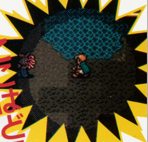
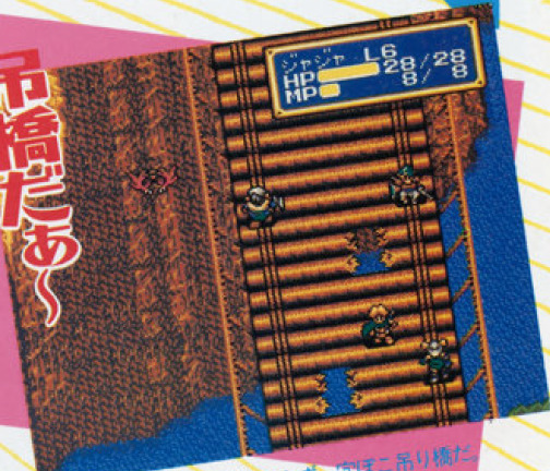
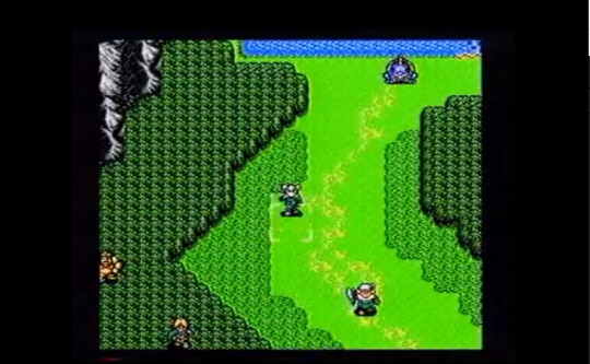
Plenty of other battle maps are shown, albeit with different enemies and different stats. A very minor detail is that the golem sprite has red eyes. In the final version they have green eyes except for Claude.
Sorcerer spells are in, although they don’t seem to be fully implemented yet, in the footage Kazin uses them through the attack command as opposed to an actual spell. Perhaps because of that it is also single target.
Speaking of Kazin, I did say we have to talk about him, now’s the time.
His sprite seems to be much like the final one, but blue. It is possible there are small differences though, because his staff, not in the final version, seems to use at least three colors besides black and white, when all final weapons in the game use only two. This is because the game loads the character and weapon colors into a single 16 color palette, so to have more colors in one you sacrifice colors of the other. Weapons in the first game did have three colors so this might be a leftover.
Small details for big nerds though, as I said the design is pretty much complete, including details like the bag and the feathers he carries around, which are less generic than I’d expect for a placeholder. Perhaps he already had a tentative design floating around.
More than that, the map sprite seen in all these pictures did make it to the final game. As his sorcerer sprite.
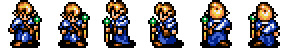
It looks nothing like the sorcerer design, so it’s easy to accept it was designed for something else. Let’s compare with the final mage sprite.
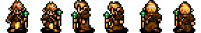
Hair changed to be spiky, but everything else is basically the same, including the green staff which matches his final artwork. It’s likely he had some concept art already around, though it wasn’t officially revealed so perhaps there was some intention of changing it. But it’s noticeable that he shows up in plenty of footage while nothing is seen of Sarah, who is not finalized either. He was at least further in the development.
The color thing is also interesting. Kazin does get to be blue as sorcerer, and also as wizard... in the map, and the game’s cover, a rare case of official illustration of a promotion. In battle however his sprite is brown. That palette, though? Is the last one set for the wizard sprite, even though he should be the first wizard. And the first palette for it? That’s right, blue. In the final version it is used for Chaz, who does have the exact same clothes but is the last wizard in the game. It would not surprise me if there was a swap at some point. And of course it makes sense to not use two blue palettes for the same sprite. The question is, why design the characters with the same colors then? I would love to get an answer.
September 1993
Signs of progress, every picture is this article is from a different build, since character classes now show up in the UI.
Sarah still does not have her map sprite.
Her battle sprite and finished design do finally show up in the next pages though, so they might have just not got to it at the time, even if it feels silly to me as map sprites are simpler, perhaps exactly because of that they weren’t top priority. Either way, it just feels wild to me when compared to how Chester and Jaha and even Kazin seem to have been done.
As for the actual point of the picture, that’s Bowie casting Freeze level 4. Normally I’d chalk this up to debugging shenanigans, as the first game and Gaiden I as well give the heroes extra spells in debug mode, but, that generally also comes with jacked stats including 99 MP. Bowie here is at max unpromoted level but his stats look normal.
For further consideration here’s another screenshot of him at level 4 knowing Egress and Blaze level 1. Everyone’s stats look normal so this looks like his actual intended progression. Also while drafting this post and having it blasted to oblivion because tumblr can’t save properly apparently, I realized this explains a bit of the wackiness when it comes to magic progression in this game. Did you know that the Kraken is weak to ice? Have fun trying to exploit that weakness. In the final game, you go a big stretch of the game without access to Freeze. If you promote Kazin to wizard and don’t pick Tyrin at Creed’s, you’re basically locked out of ice spells for most of the game, until you finally find Chaz. That always struck me as very weird, and I’m realizing now it might be because they might have stuck with magical Bowie here for a good time, and didn’t rebalance things when changing it.
Sarah debuts with a proper sprite for once.
Blue Kazin however remains undeterred. You might also notice his staff is switching colors weirdly during animation. I’ve had this problem on my first hacking attempts of the game due to not setting up proper Mega Drive colors, and it’s amusing me to no end that it happened to the actual devs as well. Though I don’t know that much on how animations are done so the problem might have a different origin as well. Anyway, fun.
We also get to see Kazin’s full spell list, and while mostly the same, he has the Attack spell instead of Desoul, much like Tao was the only wizard to have it in the first game. In the final version, only Frayja learns this spell, making this the only classic Shining Force game where it is a priest spell instead of a mage one, so it doesn’t surprise me at all that Kazin was meant to have it.
It’s also worth noting that in the final game, Kazin is the only character who learns Desoul. Either the spell wasn’t in (the article mentions every other wizard and priest spell except for it), or someone else was meant to learn it, or they hadn’t even planned that far ahead.
We get our first character bios in a long time.
Protagonist - Bowie
A boy who lives in the castle town of Granseal. He used to be a mischievous boy, but nowadays is well behaved (?) and studying hard as Astral’s pupil. He’s friends with Jaha and Chester, and they play together almost every day.
The thief Slade
The self proclaimed great thief of justice. But he’s not much of a bad guy, and shares his stolen treasures with poor people. He seems to main culprit behind the story’s beginning!?
Warrior Jaha
Bowie’s friend, and a hobbit who hates studying the most out of all of Astral’s pupils. Really strong in battle.
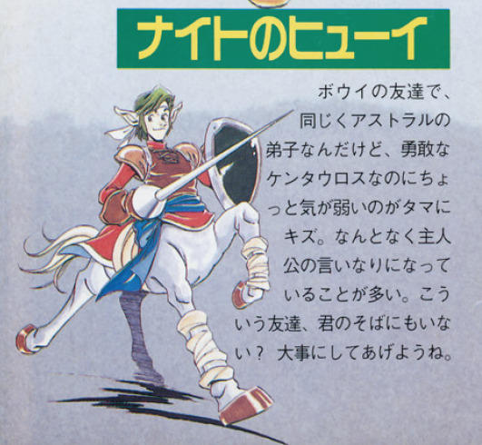
The knight Chester
Bowie’s friend, and another pupil of Astral’s, but while he’s a gallant centaur, his one flaw is that he’s not very assertive. He often comes up as just a yes-man to Bowie. Don’t you have friends like that too? Treat him well.
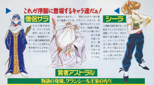
Priest Sarah
An elf girl and also Astral’s pupil. She’s helpful and likes taking care of others, being kind of a big sister to Bowie and the others. Pulling out that sisterly authority at times, she might be kind of annoying?
Sometimes I wonder if Sarah went through some kind of rewrite during development since none of her official descriptions bring up her being the actual mischievous kid who plans to sneak into the castle and is not even apologetic about it, but then I remember that this series is uhhhh, ah, erm, oof, hmmmm, about women, so yeah, I don’t think that’s what’s going on here.
Sage Astral
Currently retired, he has now taken Bowie and the other kids as pupils. He’s also a notable person who knows the king personally. At the story’s beginning, he berates these troublesome kids while also giving them a chance to go on the adventure.
Sheela
A mysterious and beautiful human girl. She used to train under Astral, but left for some reason. While she doesn’t have much relation with the story, we look forward to see just how will she and Bowie meet. She’s quite sexy!!
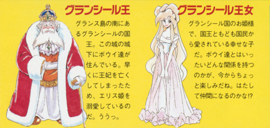
King Granseal
King of the country of Granseal at the south of Grans Island. Bowie and the others live in its castle town. Because the queen passed away too soon, he dotes a lot on Princess Elis. Ooh.
Princess Granseal
The princess of Granseal, she’s a happy girl loved by the king and her people. We’re quite curious to know how she’ll be connected to the heroes. Maybe in the end she’ll be a party member!?
OOF
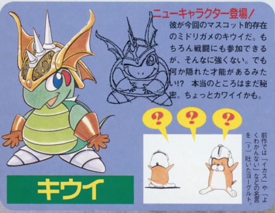
Kiwi
A new character appears!
The green turtle Kiwi is the mascot-like character this time. Of course he can take part in battles, but he’s not very strong. But he seems to hide some special talent!? What exactly is still a secret for now. He’s kind of cute, maybe.
-The previous game had Yogurt, of famous sayings (?) like “do you like my helmet” and “I don’t get it”.
After the magazine, we get more Sega footage (starts around the 4:45 mark).
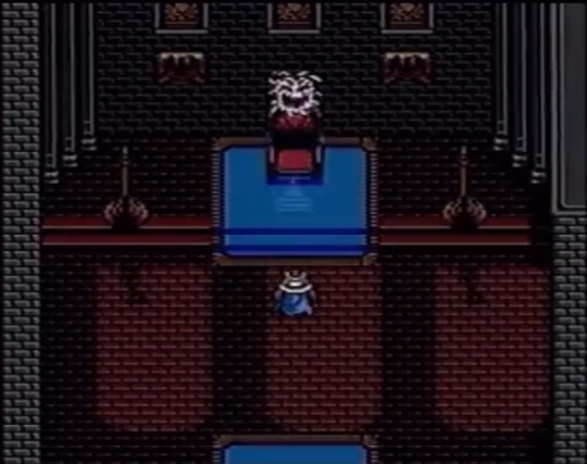
The intro seems pretty much done, except for a Gizmo attacking the king instead of Geshp. And it’s easy to think “oh it’s a placeholder”, but in the final version the king is really possessed by a Gizmo and Geshp doesn’t show up until much later, so I’m not sure? It’s not a very important change at least.
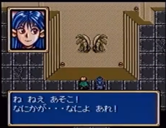
Sarah finally has her final sprite and portrait, so this is a different build. This does mean I can finally go bully the final graphics of this game a bit more.
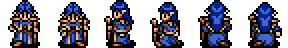
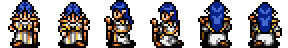
Sarah’s final priest sprite is not based on her artwork, and is instead just a recolor of the vicar spritesheet, which as I mentioned, is from the placeholder sprite we’ve seen all this time. You can even notice some leftover grey shading that doesn’t quite fit with the blue. Compare it with Blue Kazin’s robes that I’ve posted earlier, which use only the two shades of blue in the palette.
This sprite was a massive rush job, is what I’m saying. A lot of map sprites in this game feel the same, learning how to edit graphics is both a blessing and a curse because you can’t unsee these things.
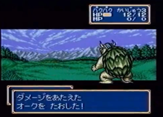
This footage shows up a lot of final battle sprites not seen until now, especially promotions, like Wolf Baron Gerhalt, Hero Bowie, and so on. I find it hilarious that it also brings up Kiwi when everywhere else they were trying to be coy about Kiwi’s promotion.
The weird thing though, is that the footage ends with the sorcerer spell display from the old builds. Did they not have footage of the final sorcerer graphics? Likely. Let’s bully the final graphics some more.
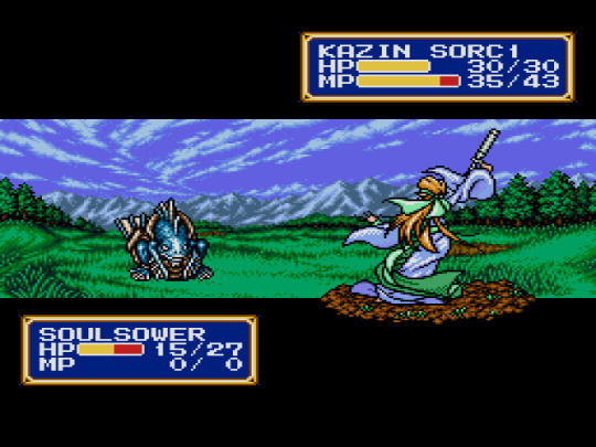
No fingers! Misplaced weapon! His ass was not designed in a sane and timely fashion!
So yes it is fully possible that the sorcerer sprite was not done even as the game was already like halfway through the door.
The funniest part? In this later build footage we only get a vague glimpse of Kazin.
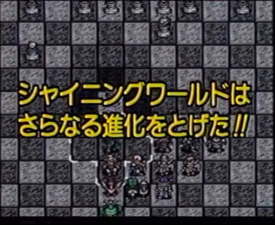
I’m sorry the screenshot is horrible since it goes by fast, but that’s Blue Kazin.
Of course, most characters in the scene seem to be promoted, even special promotions like Brass Gunner Elric. At the same time May and Slade remain unpromoted. So is this Blue Kazin already repurposed as the sorcerer sprite? Or is the mage sprite still not done?
We might never know the truth, but the fact is that the pre release coverage ends here, and we didn’t get a single glimpse of his final artwork. In a sense he might have been a bigger mess than Sarah.
I have more to write but tumblr has already messed up this draft four to five times and I’m tired, so I’m splitting this into two posts even though i didn’t want it just to see if the problem is post size.
#shining force#shining force 2#shining series#sf2 bowie#sf2 jippo slade#sf2 jaha#sf2 huey chester#sf2 kazin#sf2 sarah#this was fun to research but tumblr is making me want to kill something very hard not gonna lie
12 notes
·
View notes
Text

“Penny”, Chloe’s first design. At the time she was less “comically serious insane genius” and more “genuine source of reason”.

Pastel Chloe. At the time called “Jade”, Chloe’s hair was impossible to get consistently right, hence why it’s so messy early on.

Chloe in the ten episode RS pilot run. Compared to the others, her design remained largely consistent during this era.


Chloe, still named “Jade” throughout the entire old continuity, in her debut and later in S1. Her hair was far shorter, eventually becoming her current bob cut.


Chloe/Jade in S2. Her unusual, pixellated pupils become a design mainstay from her second appearance in this season onwards.

Chloe/Jade as she appears in the latter chunk of S2 and the entirety of S3. She gained freckles on her cheeks, presumably from being outside so much, that she lost in the jump to ICT.

A tentative redesign for Chloe, removing the borders around her pupils (black irises?) and giving her a darker skin tone.

Chloe as she appears in It’s Color Theory. The patterns in her irises develop a retro look.
#dullsville#it’s color theory#color theory#ict#character design#original character#artists on tumblr#chloe spearmin#green
3 notes
·
View notes
Text
Tubi Testimony (pirate POV, tubi-n-chill x reader)
Context? i came to the site for gothic soap opera Dark Shadows on ABC in the late 1960s. if you're gonna do the same... look for "Dark Shadows: the Beginning" because that's the real 1966 start of the series (before Barnabas shows).
Ads... Like, ANY?
first things first... i assume tubi has ads but i use ublock-origin (win10, firefox/opera) and haven't seen any... at all... ever.
. n . o . t . h . i . n . g .
Account?
in my browser, you don't have to have an account. I REPEAT: NO SIGN-UP OR SIGN-IN REQUIRED. can't speak for the phone app, haven't used it 🤷♀️
Watch Party
i'm not sure if they're one of the services that black out the screen when you stream to friends on discord/etc. (tbh i don't think they do this? but...) if so they're one i've worked around by disabling hardware acceleration in the browser's settings. 🤷♀️ like candy from a babbyform.
Subtitles [CC]
the captions aren't perfect but they're a straight up SRT file 👀 you can rip with anything (including, just, like... the ublock logger showing you the direct URL). i don't know where they came from, and they don't seem *entirely* automagically generated... so, i can't tell if they're pulled from some (phoned-in) DVD, they're paying someone to caption, scraping some (really half-assed) fan subs...or some combo?
this is important to me since i'm going to be fixin' up my OWN fan subs for this show and it's great when someone saves you some legwork. i use downsub dot com (which is SHOCKINGLY not a k*nk site) to scrape the captions when i'm being lazy.
The Video Itself
the videos themselves are quite easily obtained, too... but... i'll tell ya... i never bothered ripping the show, and i stopped downloading it from elsewhere atm, because i legit enjoy just watching it on tubi... the vibes are good, the ux/ui are good, and they basically have the same files as i can find elsewhere (admittedly scuffed, for the example of Dark Shadows) on any archive or torrent for a show...
i can side-by-side a rip to a file and see there's basically no difference... so i don't think they attempt any reformatting/editing/etc. of the media they, uh, obtain... from... somewhere?
🤔
actually... i have a test for this... brb...
(pulls up Buffy's 'Once More with Feeling' on Tubi)
so, since it's shockingly different on various platforms and editions, it's a great little litmus test.
VISUAL DIFFERENCES? placing the file and tubi side-by-side, playing the exact same spot... yeah, i guess... there's a little bitsy change in color/contrast/fuzz (very likely just throwing a few less pixels on the screen) that's probably just some lossy compression they do to make it easier to house/stream all these files…
BUT WHICH VERSION IS IT? for Buffy's s06e07, OMWF, they have the 00:50:45 runtime version, which afaik is "the good* version" with all the original visuals intact. i'm sure someone is a bigger Buffy scholar than me, but i think this the "DVD version" (not an old DVR/TV rip, like i subsisted on for years, not the terrible blu-ray wherein they cut several minutes).
the captions are LITERALLY identical from the "Buffy The Vampire Slayer Season 1 to 7 Mp4 1080p" torrent (which, again, are likely originally from the DVDs).
tangent: the entire scene before and after "I Have a Theory" is an amazing case study in why those Blu-Rays were strangely good 5% of the time but absolutely still ruined the show. why? well, tbh there are a couple edits this episode could use… changes that were made for the better in the blu-ray version, like... i guess i can understand taking out the donut/cruller Magnolia PUA joke, since it's very dated? along with Anya dropping the m-slur… we could lose that, for sure [which, i just checked, is in the tubi version, so it's def not blu-ray]. too bad the blu-ray also kills the pterodactyl joke??? they cut out the shared visual framing device of the shoppe's door/bell when buffy/dawn enter for one but leave the other? it feels like the level of brainpower that went into that Hitchhiker's Guide movie when they ruined the joke about "beware the jaguar" and all that in the first 10 minutes?
conclusion...
go watch Dark Shadows: The Beginning or Buffy the Vampire Slayer on tubi tv ig? do a fan sub for the first 365 episodes of an ancient soap opera in a desperate effort to get ppl to watch it?
fuck man idk...
💋
Tubi is the best streaming service because it captures the feeling of a video store, but not a corporate video store like Blockbuster, or even a good indie store, but a rundown video rental place under a overpass weeks away from closing down. You'll find, like, 2001: A Space Odyssey next to a unwatchable copy of a 70s exploitation film and a micro-low-budget indie and a movie called STRIPPER VAMPIRE MASSACRE III but you can find no evidence of STRIPPER VAMPIRE MASSACRE one or two existing.
This is a real, commercial streaming service and they've uploaded films with the DVD menu visible for the first few seconds bc it's a recording of a DVD copy. What a titan in the landscape of streaming
#tubi#tubi tv#dark shadows#dark shadows 1966#btvs#archive.org#downloading subtitles#buffy#buffy dvd#buffy blu ray#about subtitles#about closed captions#about piracy#90s nostalgia#2000s nostalgia#blockbuster video#fansubs#adblock#ublock origin#accessibility#barnabas collins#once more with feeling#the hitchhiker's guide to the galaxy
63K notes
·
View notes
Text
Undertale theory
- Colors represent the character's predominant traits -
Part 1.2
Another branching detail for the Color Theory in Undertale characters:
I think I figured out both what Black, and by extension, White, means on a character, and why the encounters all turn Black & White.
Black represents the threat level an enemy has to us and Frisk/their Capacity to do harm, or their magic capacity (which also seems kinda linked to their level of determination somehow).
Which means it's likely that White has an opposite meaning on characters, representing how harmless an opponent is to the player and Frisk/their Capacity to do Good, or how easy this enemy can be harmed if in Geno route.
So in general, an enemy(usually 1 or more monsters)'s threat level is shown via how much Black or White they have on them.
This is where the representations come into play on the Black & White battle screens:
If there's an enemy with more White,
it is easier to end the battle with relatively less damage, like Froggit, Napstablook;
If more Black then vice versa,
that enemy is harder to fight/spared off from you, like Undyne, especially her Undying phase, where she's covered with even more Black.
Oh and the color proportion & placement location part of the Color theory still applies.
Characters that fits this theory to a T:
With Papyrus, his Black parts is placed only on his backbone with mostly white covering him (white knight, huhhh),
as in that he can do harm, but chooses not to;
Undyne pops off with violence with most of her in Black, even more Black in her Undying phase.
Alphys is mostly White and covered with a white lab coat so yeah.
Mettaton is mostly Black in both phases, and he is coincidentally some of the most violent encounters in game.
Same thing all the time for Muffet.
Some of them are more interesting:
With Toriel and Asgore, you do not notice right off the bat just how much of the colors on their appearances are translated to Black once the battle screen happens.
Sans is also like Toriel and Asgore in terms of not easy to notice how much Black he has on him unless you enter a fight with him.
This type of monster seems to be designed that way not because they are hardest to fight, but it's more that:
They intentionally mask the extent of their True Powers.
That is what these 3 monsters have in common and it feels like this is the most fitting explanation for why those 3 suddenly are visually more dark when in a Black&White only color pallette. (Is That what Gaster meant by Darker yet Darker? Or is it something else...)
Some of the other powerful or hard-to-fight boss in Undertale is Undyne,
but since she's a straight forward greennie-r gal, she doesn't see the need in hiding her true power level, nor does she want to due to her personality, so she just doesn't do that and shows everything she's got at all times, full speed ahead.
Mettaton EX also has a "show everything you got" mindset so he's also relatively forward in putting his skills on display, the EX form was just hidden to be shown to the audience at the right time for maximum surprise.
Same thing with Asriel Dreamurr, mostly Black armour in the fight. (Though as Flowey he does pretend to be ice hence why he is mostly white in encounters, and has his face shrouded in dark only when he starts threatening Frisk)
Outliers:
Photoshop Flowey.
The whole thing's coloured during battle, and seems to be more of a stylistic choice without adhering to previous encounter visuals to give a surprise effect, Color theory is hard to be applied here with how it's mostly Green, of all colours.
. . . . . . . . . . .
I know fully well that this could all just be overtheorizing when Toby Fox was probably inspired by Earthbound on that stylistic choice, want an easier pixel animation process for battle encounters, maybe even it was for stuff to look more threatening and went "haha cool color scheme yeet", but it still makes sense and is interesting to think about.
Part 1.1 | Part 1.2
#undertale#undertale theory#The Undertale Color Theory#undertale theory discussion#undertale enemy encounters#black & white encounter screeen#feel like this is probably the most mind-blowing revelation I had with Undertale that still fully makes sense till this point yet#now I think of it#the color proportions part is kinda like that badness level from Lilo&Stitch#just in black&white instead of red&white
1 note
·
View note
Text
Falling in Love with Graphic Design — and Why Dehradun is the Best Place to Start"
Graphic design is everywhere. From the posters on your college wall to the sleek packaging of your favorite chocolate bar — it’s all crafted by someone with a creative eye and the right tools. And the good news? You can become that someone.
If you’ve ever wanted to create art that speaks, builds brands, or even just makes your Instagram stories look 🔥 — learning graphic design might just be your dream move.
And if you’re looking for the perfect place to begin that journey, you’ll love what a Graphic Designing Course in Dehradun has to offer. 🏔️✨
🖌️ What Even Is Graphic Design?
Think of it like visual storytelling. It’s how you make ideas come alive using:
Shapes
Colors
Typography
Images
And just the right vibes
From digital art and memes to logos and websites — graphic design is the unsung hero behind the scenes.
💡 Why Learn Graphic Design in Dehradun?
Dehradun isn’t just beautiful—it’s also a peaceful, affordable, and super creative city. Learning here feels less like school and more like a studio retreat. Here's why a Graphic Designing Course in Dehradun hits different:
Chill vibes that fuel your creativity ☁️
Affordable course options 🎓
Friendly mentors who actually care 💬
Growing design and startup culture 🚀
Whether you're a student, freelancer, or someone chasing a new career, Dehradun makes learning feel easy.
🧠 What Will You Learn in These Courses?
A solid Graphic Designing Course in Dehradun teaches you:
The basics of color theory, typography, and composition
Tools like Adobe Photoshop, Illustrator, InDesign, and CorelDRAW
How to design logos, flyers, social media posts, and even websites
Real-world design projects to build your portfolio
Freelance skills to start making money with your art 💸
And yes, most courses help you build a portfolio you can actually show off!
🧭 Where to Start? AddressGuru’s Got Your Back
Choosing a course can feel overwhelming. But platforms like AddressGuru make it super easy. Just hop on, search for Graphic Designing Course in Dehradun, and you’ll find trusted institutes, honest reviews, and all the deets you need in one place.
It's the smoothest way to find your perfect fit without going down the Google rabbit hole. 🕳️🐇
🎯 What Can You Do After the Course?
Endless things, honestly. A good graphic designing course opens doors like:
🌟 Becoming a freelance designer
🎨 Working with creative agencies
🛍️ Designing for brands and influencers
🌐 Creating websites and digital products
📱 Making social media content that pops
You’ll have skills that are in demand everywhere — from big cities to remote work gigs.
💭 Final Thoughts
Graphic design isn’t just about making things pretty. It’s about solving problems visually, expressing yourself, and creating impact. And the best part? You don’t need to be a professional artist to start.
All you need is passion, creativity, and the right guidance — like a Graphic Designing Course in Dehradun, where everything is designed to help you grow 🌱
So go ahead. Tap into your creativity. Make things. Break things. Design your future, one pixel at a time.

0 notes