#outlining tutorial
Explore tagged Tumblr posts
Visit Tumblr Blog
Explore Tumblr blogs with no restrictions, modern design and the best experience.
Last Seen Tumblr Blogs


Fun Fact
The total number of visits Tumblr.com received during January 2021 is 327 million.
Text

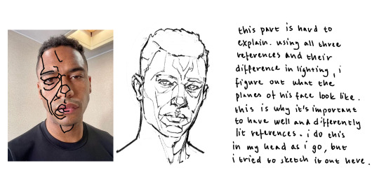
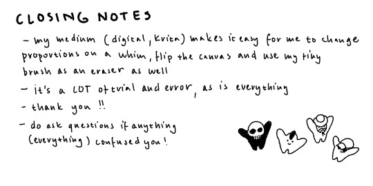
Another one of the paintings I did this week, was playing around with lighting and felt like painting Zuko, so I did. :D (oh yeah - and a close up if you're interested - you can see the sketch lines if you squint, but I reckon that's part of the charm~ *smiles innocently)

#this was actually the first one i did#watched a tutorial on how to not overwork watercolours recently#and wanted to test out the theory#this is take one#the other paintings i did got better as they went on#(like. i like this one its just a lil blotchy yknow?)#:D#zuko#atla#avatar the last airbender#zuko fanart#love drawing this angsty dude#mixing all the different reds is a lil hard tho#since i left most of my paint stuff at home#and like. i was away for most of this week#with my mini 12 colour paint set#(bit bigger than one of my hands)#cause it was easier to pack#anyway#reckon i figured some stuff out#really like this kind of 'sketch - paint over sketch - outline with fine liners' thing im doin atm#watercolours are cool#havent really tried other types of paint but yeah.#i like them a lot#:D:D:D
74 notes
·
View notes
Text
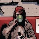
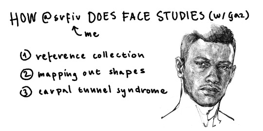
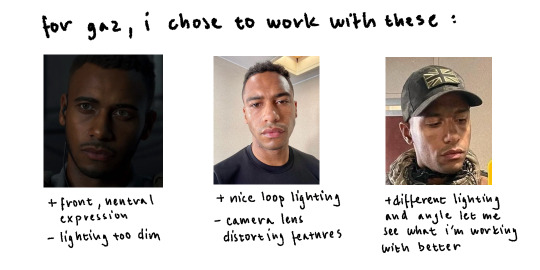
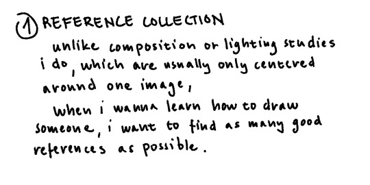
@wolfespiderr gave me a great excuse to finally practice drawing gaz, have my thanks in the form of weirdly paced tutorial:


take a shot for every word in this that starts with "distort-"
#kyle gaz garrick#art#tutorial#vif#maybe my explaining skills will improve if i make more (doubtful)#i usually dont post my face studies because theyre mostly just outlines and not fully rendered#first time i ever actually studied elliots face so if it looks wonky af dont mention it
163 notes
·
View notes
Text
every time i overhead smash something with my giant hammer i imagine it's this pop up
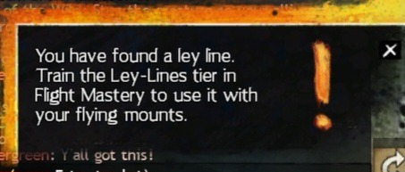
#i finally trained leylines for my glider and was like thank god i will never see ever again#oh boy was i in for a bad surprise#so now i gotta get this through several more expansions of content before it stops popping up while I'm in the middle of doing stuff#it also does it over and over when you're using the actual leylines since each one is several strung together#how hard is it to add a tutorials toggle guys#i am enjoying the game still but my god the user experience is a mess#and the whole thing is poorly designed for people trying to play anything but the latest stuff#like they did not put much thought into people who want to go back and play through the whole story#and what their experience might be like#it is also so so buggy#also annoyed rn that after lws1-2 it felt like some different writers stepped in who Did Not Like Women#the first two seasons were like women everywhere in every role and barely any dudes in the main cast#also the main npcs are your friends#then in hot it was like actually your friends are your subordinates and the entire world now revolves around you#and we need to remove or humiliate women in the cast or at least give them zero lines#like what is going on over there#I've heard the story improves as it goes but i liked lws1! (which was removed from the game for a long time???#despite being crucial to understanding the plot????)#now it's like one of my favorites got benched for pof and another is off babysitting some dudes manpain#manpain over a fridged female character#sometimes it's like someone read a list of the worst tropes ever and used it as an outline#when i played s1 i was like wow huge female cast and a ton of queer stuff#i guess that was seen as a Mistake and rectified#they should have added more gay stuff to hot and removed the snipers#seriously though i am going to murder this pop up#gw2mp#mp
4 notes
·
View notes
Text
#art tutorial#procreate#preocreate brushes#outline brush#I got asked to do this sorry for the accent!
3 notes
·
View notes
Text
Creating a simple outline shader
Learn how to create a simple outline around an image in a fragment shader using the GLSL programming language. Easily portable to other shader languages.
View On WordPress
#Creativity#Education#Game Design#game development#gamedev#GLSL#Inspiration#outline#Pixel Art#Shader#Sprite#tutorial#Video Games#shaders
7 notes
·
View notes
Text
-introductory post-
hi yall, its me
made this thing so i can post stuff im proud of on more than one account, specifically ambigrams
REQUESTS APPRECIATED AND ENCOURAGED
... if you're gonna be respectful ab it. i won't do bigoted, harmful, mean shit. the words of an ambigram are united into one beautiful work of art, and as should we. i can do most any type of ambigram, symmetrical or asymmetrical, conventional or nonconventional, or maybe one you made up! that would be really cool.
----------but flippy, what are ambigrams????------
the definition is quite hard to pinpoint, as it either is too vague to properly distinguish it from something entirely different (like synonyms, heterograms, etc) but the main thing is:
an art form where one or more words are taken and combined with respect to each other such that both are visible from different perspectives/orientations
symmetrical means it uses a single word, while asymmetrical (or symbiotic if you prefer, although that makes them sound like theyre alive) means two or more words.
----------------------flippy, i can't read them!!!!!!----------------------
yeah, it takes a really really really good ambigram to be able to be read clearly both ways. if you can't, and i mean really cant read an ambigram, it's ok, its likely nobody else does either, and i or the ambigram creator is biased to the reading bc they already know it. this is why i made this account, to try to learn how to make mine better :D
-------------but flippyy, what do they look like?????????--------------
examples include:
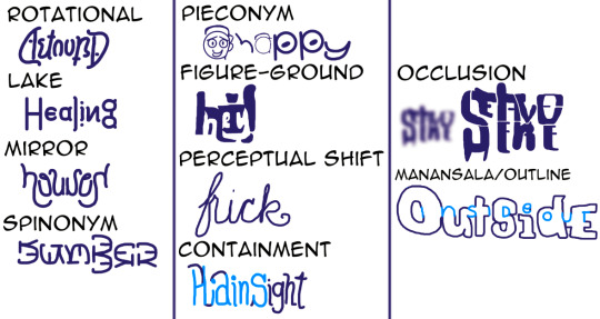
correct readings in order of top to bottom, left to right:
astound, healing, houses, dumber, 👦/happy, hi!/hey, frick/fuck, hiding/plain sight, stay/leave here, inside out/outside
#ambigram#art#digital art#calligraphy#my art#ambigrams#rotational#optical illusion#lake#mirror#spinonym#pieconym#figure ground#perceptual shift#containment#occlusion#manansala#outline#ambigram tutorial#ambigram guide
14 notes
·
View notes
Text
Follow these steps and enjoy crisp, clear image outlines! 👍💕
#adobe illustrator#tutorial#online tutoring#outline drawing#digital art#digital illustration#graphic design#editorial design#art#artists on tumblr
2 notes
·
View notes
Text
༯ warnings. mature content, fem!reader + toji fushiguro, unprotected sēx, piv, pwp. minors do not interact, please and thank u.
wc. 1.7k (not proofread 🥸)


toji fushiguro is a nice guy.
not in the annoying “i’m a nice guy why won’t women date me” way, but in the “i’ll fix your sink, walk your dog, and probably kill a man for you if you say please” kinda way.
the ex-assassin (and your next door neighbor) is always doing something for someone— mowing the lawn for mrs. takada across the street, teaching the neighborhood kids how to patch a flat tire like he’s not patched gunshot wounds with duct tape before. probably hand-knits blankets for stray cats behind closed doors too.
so when he sees you wrestling with a massive ikea box on your porch that you honestly never stood a chance against in the first place, he doesn’t even hesitate.
“fuck is in here, a whole corpse or somethin’?” he jokes, like he didn’t just pluck the box from your arms, like it was filled with feathers and not the broken promises of swedish furniture.
you give him an airy laugh, wiping sweat from your brow as you tell him it’s your new bed from ikea.
“ikea?” he repeats, like you just told him it really was a corpse in that god forsaken box. “yeah, nah. you’re not building that.”
you blink. “i’m not?”
“uh, did i not just say no? i’ll handle it. don’t want a pretty lil’ thing like you losing a finger over some overpriced planks and an allen wrench.”
and listen. you could’ve argued. you could’ve said you’re an independent woman, with your crappy youtube tutorials and a rusty ol’ hammer.
but instead you just say,
“. . .do you want water or beer?”
god, you swear your bedroom has never felt this small.
toji’s presence takes up space like he was built for it—one knee down, the other bent, thighs straining against those well-worn jeans like they’re one bad movement from tearing right at the seams. his tank is drenched, clinging like it’s got a personal vendetta, outlining every broad inch of him like a glove.
he’s hunched over the partially assembled bed, brows furrowed, scarred lips parted in quiet concentration like he’s studying scripture, not step six of some swedish-coded nightmare.
and it���s filthy, the way your brain strayed, drinking in the way he moved—tight, efficient, obscene without even trying.
every low grunt, every flex of his arms, every time he shifts and that heavy chain around his neck clinks against sweat-slick skin—it’s like you're watching the start of a bad porno.
your gaze drops, uninvited, right to the swell of his chest—broad and heaving—and lower, past the way his shirt clings to his dreadfully slutty waist, all the way to the waistband of his jeans.
the way they sit, low and loose, slung across those hips like temptation incarnate—
“you good over there, sweetheart?” his voice breaks through the haze, all casual and smug. “been eyein’ me reeaall hard over there.”
you choke.
“oh, uh—i was…” you mutter, blinking like an idiot, “just… making sure you’re not screwing m- it up.”
he hums, not even looking at you, allenkey twisting slow in his grip.
“mm. real thorough inspection you’re doing.”
your a/c is blasting, full arctic tundra, and yet here you are—skin flushed, thighs clenched, your mind absolutely nosediving into the filthiest trenches imaginable.
you open your mouth about to retort back, but he cuts you off with a simple, expectant:
“wrench.”
just that. hand out. palm grasping. not even looking at you.
you pass him the tool, and your fingers brush his. his hand is warm, rough - those thick, ragged fingers that have probably shot bullets into yakuza leaders skulls, probably broken bones, lingering just a beat too long.
and suddenly you’re not thinking about this stupid swedish furniture anymore.
you’re thinking about those same fingers digging into your hips.
gripping the back of your neck.
pressing into your thigh as he—
“you gonna let go, or you just like holdin’ my hand?”
you snap out of your. . trance, retracting your hand like the wrench had transformed into molten lava and burned it. “just um, didn’t wanna drop it. s-safety first, right?”
“riight, whatever helps you sleep at night.”
even though it’s your bed, he hasn’t let you touch a single piece of it.
not one panel. not one sad screw.
and it’s not like you didn’t offer to help—you did, multiple times!
yet every single time, he just waved you off like you were a gnat.
“jus’ sit n’ look pretty. this ain’t a group project,” he utters, dead serious. you open your mouth once more to argue, and all he sends you is a glare— playful, yet still warning.
and after three long, sweaty hours,
you—
no.
he is finally done.
toji leans back on his heels, wiping beads of sweat from his brow with the back of his hand “there,” he grunts, satisfied. “all done miss.”
you glance at the bed. it does look good. solid. intimidatingly so.
“looks sturdy,” you murmur, and toji hums in agreement. thick fingers drag slow over his stubbled chin as he leans back, marveling at his piece of work.“mm. might wanna test it out first, though.”
you blink. “…test it?”
he nods, rolling his shoulders, towering and terrible, that glint in his eye nothing short of criminal.
“how ‘bout i help ya out, yeah? call it uhh, ‘mandatory safety inspection’ .”
ᥫ᭡.
“ngh, to-tojiii,” you mewl, nails grasping helplessly at the cushioned mattress beneath you, your glossed dolly eyes fluttering back with each filthy fuckin’ thrust. his strokes are relentless, sharp, each one leaving a raucous snap from his toned v-line on your poor sore thighs.
for such a ‘sweet’ and ‘beloved’ guy, his dick game sure was mean as hell.
“atta girl, look at that,” he grunts, “takin’ me so fuckin’ well.”
your swollen bottom lip is caught between your teeth, an embarrassingly desperate attempt at concealing these lewd noises toji is managing to string out of your chest.
but with the way he’s fucking into you like this, those calloused, worn palms spreading the fat of your ass to give him a front-row view of how his cock is sinking in and out of you, before raising his hand to give it a nice hefty spank—
it’d be damn near impossible to not stay quiet.
your body feels so hot, practically melting as your spine arches further with each roll of his firm hips. the pads of his fingers are digging into the plush of your waist, burning against your skin like he’s trying to brand you with his hands alone.
toji sloows his pace, not enough to give you a break, but enough to make sure you feel all ten inches of him, that evilly thick stretch making your walls stutter. his chest dips down your spine, peppered stubble scratching at the nape of your neck as his full weight sinks over you.
“uh uh, shhh,” toji croons hotly, his breath warm as he leaves a wet kiss along the shell of your ear, “you hear that?”
“h-huh?” you hiccup, and he’s got you soo dumb off his dick that your surprised your still coherent.
“girl. listen.”
and you do. or try to, atleast.
your breathing slows just enough to catch it, between the wet slaps of skin and your pulse bursting in your ears—
creak… creak… creak….
“looks like she’s startin’ to talk,” he murmurs. “guess i forgot to tighten all the screws. oops.”
haha. you'd roll your eyes if they weren’t already damn near in your skull.
toji’s body shifts, swole chest hefted on your back as his beefy arms cage you in. he’s got one hand curled around your wrist, pinning it to the matress, while the other bruisingly grips your waist.
your plushed thighs quiver, ass rippling back with each fluid snap of his hips. he’s so deep, his entire length bottoming out in your sobbing cunt. landing countless blow after blow on that poor spongy spot of yours.
“f-fuuck,” it slips out breathy, caught between a gasp and a whine, your voice cracking with each draaag of his cock. “s’too much— i can’t—”
“yea you can,” toji huffs. “already are.”
creaking turns into clattering, death rattles now, and he’s still not stopping nor slowing. every hit leaves the mattress screaming, legs of the frame wobbling as it lurches underneath the weight of you both.
and your bed isn’t the only thing ready to give out eithet.
“ ‘m gonna, hnnghh— m’ gonna cumm, toj’ ” you sob, shuddering as your core tightens.
“shiit, thaaat’s it,” he pants as your pussy swallows him oh so snugly, and you can feel him start to throb inside of you. “ let ‘toj’ feel you cum ‘round his cock, baby.”
toji’s strokes sloppen, grinding now, likes he’s trying to engrave each and every inch of his cock into your unforgivingly tight cunt. your hips begin to spasm as your pretty glossed lips sputter out mindless, repetitive catches of his name.
he sends one more thrust, mean and s—
crack!
that poor lil’ ikea bed of yours sinks beneath you with a jarring snap, the headboard dipping rudely as one stubby leg snaps completely off— making you and toji slip forward with it.
you yelp, yet it slips into a broken moan as splotches of white fill your blurred vision, body jerking as your saccharine juices spill out onto him.
you let out a pouty whine, lashes fluttering as toji groans, gutturally, his posture stiffening, jaw hanging slack before you feel him begin to spill into you—sticky hazed shades of white rudely painting your insides like his own personal canvas.
the scent of sweat and sex hangs heavily in the air, the only sounds being you and toji left panting. he stills momentarily, assuring his sticky load is plunged deep enough inside of you before easing out with a sharp hiss.
“guess she, uh, failed the inspection,” clicking his tongue as he breaks the silence, acting all disappointed despite the way he’s grinning like a fucking fool— as if he didn’t just knock all you and your beds screws loose.
“you’re buying me a new bed.” you mutter, voice hoarse as your shooting him a mascara stained glare over your shoulder.
“ ya’ gonna let me break her in too?”
and it’s not like you decline— it’d be rude if you did. .
because toji fushiguro is a nice guy, after all.
@ssorenz™ do not, copy, repost or translate anywhere without my knowledge.
#‘ 𝐬𝐬𝐭𝐨𝐫𝐢𝐞𝐳 ୨𝑒.#annual ssorenz post this is insane#toji fushiguro x reader#toji fushiguro#toji smut#jujutsu kaisen#jujutsu kaisen smut#jjk toji#jjk smut#jjk#toji x reader#jujutsu toji#jjk x reader smut#fushiguro toji#fushiguro toji x reader#jjk x reader#jjk x you#anime smut
4K notes
·
View notes
Video
youtube
Draw Better LINEART. by Winged Canvas
1 note
·
View note
Text
I do a lot of simple hacks to my images and people always ask me how I do it. So I started writing about it.
For just a dollar you can learn all my secrets.
#or just read the tags#ok so this is photoshop specific#but the sketch filter called 'photocopy'#along with some careful application of curves and levels#and you can outline most strong contrast images#i'm sorry if you don't have photoshop#i dont know how to do it in free programs yet#but i'll tell you when i figure it out#designer#coloring pages#tutorial#photoshop trick#photography hack#cameraslinger#small business#support your local artist
0 notes
Text
Needle Felt Siffrin Build Log: (oct 6 - nov 20, 2024)


Credits goes wholely to @insertdisc5 for creating ISAT and siffrin's design! I am just here to attempt to make cool fanart (and get more people to play isat.. my devious plans are going great so far :3) As always, this isn't a tutorial- it is just a log about how i go about approaching a sculpture and I hope this collection of resources can help others make their own sifs!!
PSA: this has some spoilers for endgame CGs/sprites on my references image board ( also might see it in the backgrounds of my process pics). And bc this is needle felting, you will see some sharp needles! beware!
my inspiration was the intro cutscene where Sif eats the star, so my main goal was to adhere to the style of ISAT as closely as possible while transfering it to 3D space. And I knew i also wanted to try making the cloak for stopmotion purposes, so my process was tailored towards having control over the fabric with wire inlaid within the cloak (more on that later).
I ended up not sticking eyebrows on top of siffrin's bangs lol but anyways, first order of business is Gather Reference! v important. pureref is free and an awesome program. I also do some sketches to visualize the pose and important details i wanted to include in the sculpt.
behold the isat wiki gallery page! tawnysoup wrote an awesome ISAT style guide that absolutely rings true in 3d space too!! adrienne made a sif hair guide here!! (sorry i couldnt find the original link, but it's on the wiki). It says ref komaeda hair so that's what i looked at, along with other adjacent hairstyles! I also like doing drawovers on in progress photos to previs shapes n stuff to get a better idea of the end result.
Also if you're like me and struggle with translating stuff into 3D space, take a look at how people make 3d models and figurines! sketchfab is also a great resource! I looked at the link botw model by Christoph Schoch here for hair ref. (I used Maya, but there's a blender version too ! you can pose characters too if your model has been rigged!)


Face:
Started off blocking out the main shapes of eyelids and iris, and then filling in the colour details in the iris and the star highlights before moving onto adding thin black outlines and eyelashes. I didn't take many in-progress photos cause i kept ripping stuff out to redo them many many times, sorry!! This eye took about 3 hrs bc i just wasn't happy with it!! Sometimes it do be the vibe to give up, go to bed and see how it looks in the morning (more often than naught, it looks fine and it was the "dont trust yourself after 9pm" speaking)
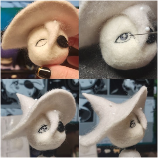
The Mouth:
Couldn't decide if i even wanted to add a mouth as per usual with all my humanoid sculptures.. but i did some drawover tests first to see what expression i liked and to try to visualize it from multiple angles. (I was also testing the placement of stars on the hat brim here)

And then I redid the mouth like 3 times cause the angle just wasn't right (this went on for about the course of a week yay!)
Hair: woe baldfrin be upon ye
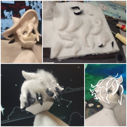
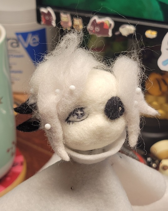
I made the hair strands individually first, and then since Sif has some of the hair at the back dyed black, i covered some of the tips with black wool (manually) (I think it would go much faster if i just took a marker to it, but hahaha i love pain and detailing!! )
And then the rest of it was positioning strands with sewing pins layer by layer, always looking at it from different multiple angles- sometimes tailoring the angle or swoop of individual hair flippies. At one point I thought the back looked too cluttered, but the hat covers a lot of it anyways!! yay for hiding mistakes! (imo this is a similar process to how cosplayers style wigs, but on a smaller scale and the same level of time consuming)
As always, look to your reference for guides, and I always do a whole bunch of drawovers over in progress photos to ascertain what was working and what wasn't.
Hat:
A trick to get a super pointy tip, make another tip seperately while keeping the connection point unfelted, and then combine the two to make super pointy hat!! (this also helps if you made the hat too short and need it to be taller. ask me how i know)

The embroidery on the hat brim was done in a hoop and then invisible stitched to the felted top portion. Technically you don't need a hoop but it helps keep the fabric tension, so you avoid puckers in your embroidery. You can also use iron-on stabilizer if your fabric is loose weave or particularly thin. this is the tutorial i used for the stars embroidery! particularly the fly stitch one, french knots, and the criss-cross stitches. highly recommend needlenthread for embroidery stitches and techniques! i learned all my embroidery from this single site alone.
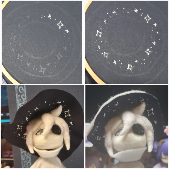
For fabric, I think I used a polycotton i had in my stash,, unsure of the actual fiber content bc i bought it a long time ago. I used DMC Satin floss which was nice and subtle shiny but frayed a lot so it was kind of a pain to stitch with... but keep a short thread length and perservere through it!! After the embroidery was done, I folded up the raw edges and invisible sewed it to the top portion of the hat.
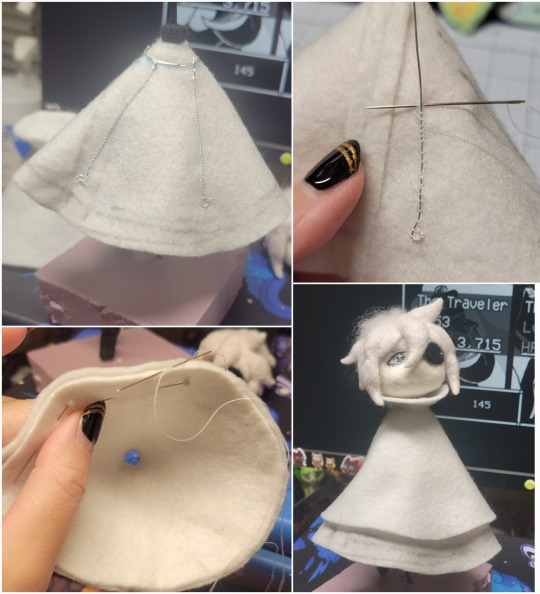
General shape:
Ok general structure of the body is this: wire armature body covered with black wool -> cloak lining & wire cage -> edge of lining is invisibly sewn to the main cloak at the hem -> head

Don't be afraid to mess around with the pattern, it's essentially a pizza with a slice taken out of it to form a steep cone shape!! Use draft paper before cutting into felt to save material! (i think i made like 3 cloaks before i was happy with the shape lol).
You can also hide the seam of the cloak and collars by gently messing up the fibers of the felt with your fingers or a felting needle btw! you can also sandpaper the seams according to Sarah Spaceman in this vid (highly recommend them for their in depth cosplay/crafting builds holy smokes), though since sif cloak is at such a smol scale, I just blended the seam with my felting needle.
For the lining wire cage section, I sewed in wire around the cloak, so the main rotation point is at the top neck area under the collar. These paddles are used to keep whatever pose I need the cloak to be in for stopmotion purposes. Then after the wire is done, I invisibly sewed the lining to the cloak at the hem (same technique as the hat brim to the lining there).
In hindsight, I should've used a thinner fabric for the lining, but i only had sheer white in my stash so had to go with double felt, thus resulting in a really bulky lining but oh well!
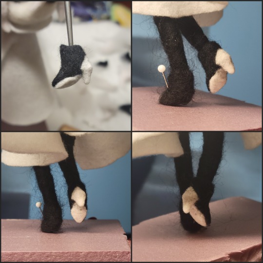
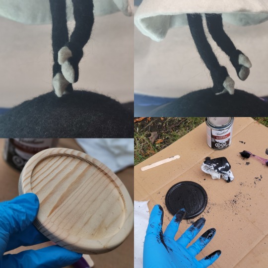
Heels:
started with the general boot shape, then tacking on the diamond shape heel stack and also diamond shape sole bc we're committed to the bit here. I skewer the boot onto the armature which also conveniently hides the connection point into the base to keep the whole thing upright and also I can rotate the boot to tweak the angle if needed.
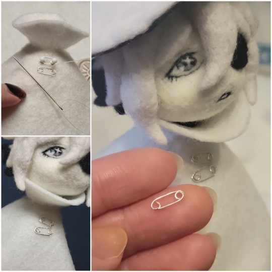
Pins:
I kinda just trial and error'd jewellery wire with pliers into the pin shapes. They're itty bitty!! had a whole bunch of fails before i got two nice ones. A hot tip is to use needle nose pliers and wrap the wire around the tip to get a smooth circle shape!
Base:
I smoothed out the edge of a circular wood base with a dremel, and then used wood stainer to get the black colour. It ended up kinda looking like I took a sharpie to it, but whatever.... now i have a whole ass can of black wood stainer........ I then made a rough mountain of black wool and stuck the feet armature in. And now he's standing!!
Normally at this point when I'm done felting everything, to get a smooth finish, I'd take a small pair of scissors and carefully snip away any flyaway fibers, but this time, I just left them fluffy cause i think that's what sif would do :3c
Photoshoot:
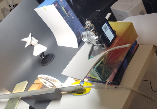
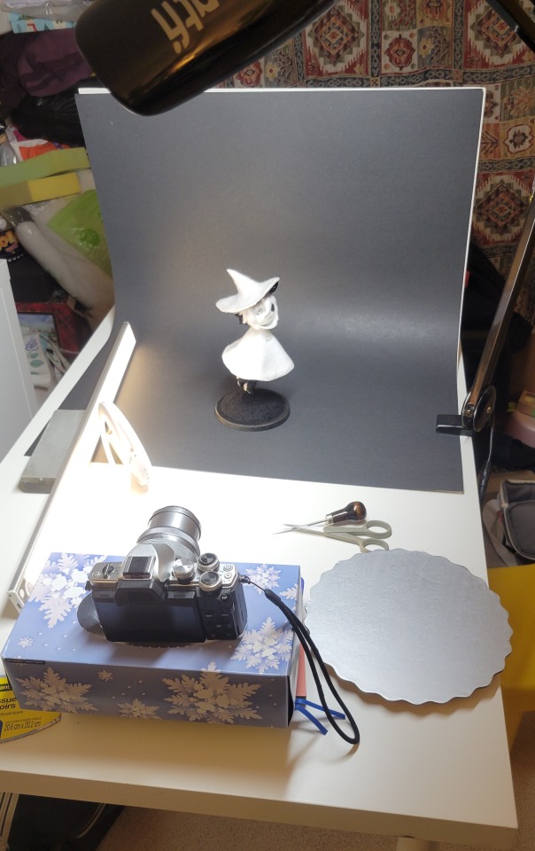
Normally I do shoots using daylight but it was winter so the sun was nonexistent. So I broke out the home lighting setup aka dollarstore posterboard for a nice smooth background, and then hit it with the overhead Fill, side Fill 2, and Rim light, and use white paper/posterboard for bounce light if one side feels too dark. But if things are overexposed, you can move the light sources away until the harshness dims down. I'm using a Olympus mirrorless camera (handed down to me by my sibling so i dont remember the model exactly), which can connect to my phone as a remote so I can avoid shaking the camera when i take photos. Pretty nifty for stopmotion purposes! (yes my camera stand is a stack of notebooks, a tissuebox and some eva foam under the lens, don't judge me)
Stopmotion animation:
I'm still figuring stopmo out on my part, but my process was straight ahead animation ... move the cloak a cm, take a pic.... move another cm, click.... and repeat until i get a version I was happy with. My ref was the cloak animation from Gris (beautiful game btw). The 2d star animation was also done straight ahead using procreate, exported in png with a transparent background, and finally stitched together with the stopmotion footage in photoshop.

My turnarounds are also stopmotion! also secret hack, the turntable is a fidget spinner sticky tacked to a cake platter.
And i think that's all! i mainly wanted to share how I go about thinking about taking a 2d concept and moving it to 3D. I also didn't go in depth into how to actually do the needle felting bc I don't think I''d be very helpful I'm a very good teacher by telling yall to just keep stabbing until it looks right (i'm self taught for this hobby),,, if anyone wants it though, i can share a bunch of tutorials and other felters' process that helped me learn more needle felting!
Hopefully this was helpful to someone! Feel free to send asks if ya got any questions or if anything needs clarification! Or show me your works! I love seeing other people's crafts :3
here have a cookie for making it this far 🥐
#in stars and time#siffrin#isat#isat siffrin#isat fanart#needle felt#soft sculpture#know that i am devouring all the nice words yall leave in the tags/comments of my posts :holding back tears:#I hesitate to call this a tutorial bc this is just how i fumble my way through crafting anything lmao#the only reason I know how long I worked on a project are timestamps on wip photos and however long the day's video essay or letsplay is#sorry time is immaterial when i get into crafting mode#reason why this log is so late is bc after i finish a project i'm perpetually hit with the ray of 'i dont ever want to look at this again'#hence why photos never get edited#AND THIS POST SAT IN MY DRAFTS FOR 2 MONTHS DUE TO BLOODBORNE BRAINROT SORRY#done is better than perfect!!!#sorry i dont control the braincell#sorry for using a million exclaimation points! i am not good at this.. conveying my anxiety in written form!!! my toxic trait
1K notes
·
View notes
Video
youtube
Inkscape Tutorial - Working with Outlines and Outlined Shapes, Strokes, Power and Taper Stroke Path Effects In this video tutorial from 2Dgameartguru.com, I try to show some of the many ways of working with outlined objects in Inkscape This video was requested to understand how different outlined objects react, work, and can be edited in Inkscape. I start with a traced bitmap of an outlined island shape and turn it into a more manageable filled shape with a single stroke for an outline. I adjust the shape and the stroke to be centre on the shape's edge. I use Power Stroke, Taper Stroke Path Effects as well as a dashed stroke. It's a brief introduction and I am sure I forgot about a zillion other ways to use strokes but that's for future videos. The beginner videos for the Inkscape - hands-on Facebook group also focus on strokes and lines: https://youtu.be/W4ATvIO5zJs https://youtu.be/SXKJMXwKfIE https://youtu.be/apf7NbtHM20 My epic fight with the taper stroke is recorded in this video: https://youtu.be/Y40HbNPD9cM While I am having a lot of fun with Power Stroke in these: https://youtu.be/LarlNUhLI8M https://youtu.be/a2Iopv6YSzY
#youtube#inkscape#tutorial#vector#illustration#graphic design#stroke#outlines#powerstroke#taperstroke#beginner#basics
0 notes
Text
Had a few folks interested in how I made the patches I posted for Solarpunk Aesthetic Week, so I thought I'd give y'all my step-by-step process for making hand-embroidered patches!

First, choose your fabric and draw on your design. You can use basically any fabric for this - for this project I'm using some felt I've had lying around in my stash for ages.

Next, choose your embroidery floss. For my patches I split my embroidery floss into two threads with 3 strands each, as pictured. You can use as many strands in your thread as you prefer, but for the main body of my patches I prefer 3 strands.
Next you're going to start filling your design using a back stitch.

First, put in a single stitch where you want your row to start.

Poke your needle up through the fabric 1 stitch-length away from your first stitch.

Poke your needle back down the same hole your last stitch went into so they line up end-to-end.
Repeat until you have a row of your desired length (usually the length of that colour section from one end to the other). Once you have your first row, you're going to do your next row slightly offset from your first row so that your stitches lay together in a brick pattern like this:

Make sure your rows of stitches are tight together, or you'll get gaps where the fabric shows through.
Rinse and repeat with rows of back stitch to fill in your patch design.

When you're almost to the end of your thread, poke your needle through to the back of the fabric and pull the thread under the back part of the stitching to tuck in the end. Don't worry if it looks messy - no one's gonna see the back anyway.
This next step is fully optional, but I think it makes the patch design really pop. Once your patch is filled in, you can use black embroidery floss to outline your design (or whatever colour you want to outline with - it's your patch, do what you want). I use the full thread (6 strands, not split) of embroidery floss to make a thicker outline.

I use the same back stitch I used to fill the piece to make an outline that adds some separation and detail. You could use most any 'outlining' stitch for this, but I just use back stitch because it's just easier for me to do.
Once you're finished embroidering your patch, it's time to cut it out!

Make sure to leave a little border around the edge to use for sewing your patch on your jacket/bag/blanket/whatever, and be careful not to accidentally cut through the stitches on the back of the patch.
If you have a sturdy enough fabric that isn't going to fray, you can just leave it like this. If not, I recommend using a whip stitch/satin stitch to seal in the exposed edges (I find that splitting your embroidery floss into 3-strand threads works best for this).

And then you're done! At this point you can put on iron-on backing if you want, or just sew it on whatever you wanna put it on. Making patches this way does take a long time, but I feel that the results are worth it.
Thanks for reading this tutorial! I hope it was helpful. If anyone makes patches using this method, I'd love to see them! 😁
#solarpunk aesthetic week#sewing#tutorial#sew on patch#punk diy#diy punk#punk aesthetic#handmade#solarpunk#handcrafted#embroidery#embroidered patch#how to#how to make a patch
18K notes
·
View notes
Text
A quick-ish guide to the culture of The Sims 2 modding community.
Are you new to The Sims 2 community? Are you coming from more modern games, either in The Sims franchise itself or other contemporary games? Are you excited to start your #brand and become a #simfluencer and post your #earlyaccesscontent to support your #sidehustle?
Have a seat, then! Let's chat.
Hello, friend! My name's Pooklet. I've been playing since 2004 and creating since 2007. I'm by no means an expert in most forms of content creation itself, but I've been around since the heyday of The Sims 2, I've watched how community opinions have shifted (or not) since practically the beginning, and I'm hoping to give you a basic outline of the community culture that you can expect to encounter as a newcomer.
A very brief history of Sims 2 content monetization:
People have been trying to monetize content since there has been content to monetize, all the way back in the days of The Sims 1. We tend to call them "pay creators" and their websites "paysites." Some big names in this arena include The Sims Resource (their free-with-ads model is a relatively recent development, which is why you will find people to this day calling them T$R), PeggySims, Newsea, and many others that you can find on this handy website:
Paysites Must Be Destroyed
Now, if you have a glance at that website, you might be saying to yourself:
"But, that's illegal! I own the copyright to my custom content!"
Alas, no! Due to the wording of the End User License Agreement for The Sims 2, no custom content creator owns their creations for this game (or The Sims 1, or 3, or 4, for that matter, but we're talking about 2 right now). It all belongs to EA at the end of the day, and by installing and playing the game, you have agreed to these terms. Which means you have no individual, protected copyright, and it is perfectly legal for someone to download your paywalled content and then reupload it for free for others to enjoy. And they will!
Furthermore,
You are not making anything alone.
Everything from modding resources, to tutorials, to the mods required to fix disastrous glitches in the game code and make it playable at all, to the third party programs used to make any and all custom content, such as SimPE—all of these have been provided to you for free by other creators, many of whom have a usage policy that asks that people not use their freely-provided tools to make a profit. Although no one can be forced to follow a creator's policy, it is generally considered good manners to not try to make a profit off of someone else's free work. And if you are using these tools to make paywalled content, that's exactly what you're doing.
Pay creators have been ignoring these policies since the beginning of time, and so free creators likewise ignore their policies against sharing their paywalled content. Pay creators have also tried lots of different ways to keep their content exclusive, everything from trying to track leaks with slightly altered files to actively filling their content with malicious code. It has never worked.
Free creators have always found a way around these barriers. In fact, it's taken as something of a challenge to undermine monetization efforts. As you can see from Paysites Must Be Destroyed, there are entire teams of players devoted to reuploading paywalled content for free.
A culture of sharing.
The Sims 2 is something of a time capsule. At 20 years old, it predates a lot of the hyper-capitalist hustle culture that has infested every creative hobby. It is from a time when monetization was an outlier rather than the norm, and a much maligned outlier at that. This attitude has persisted for 20 years. Believe me when I say, you won't be the combo breaker. Especially now, given that The Sims 2 is not the most contemporary in the series and the community has shrunk considerably, down to the people who have either been here for a very long time, or newcomers that understand the community culture.
Also, it's just kind of not a great idea in general to try to make money off of a 20-year-old game with a pretty small community?
Like, I get that The Sims 4 is really saturated with pay creators and it's hard to get a foot in the door. I get that you might look at The Sims 2 and think that the small pond will give you room to be a big fish. It won't. You might get a handful of people willing to pay for your content, but at least one of those people will be resharing it for free.
Paywalls vs. optional donations.
Okay, so hopefully you now understand why people don't like it when you put content behind a paywall. But what about those Ko-fi and Paypal donation links you sometimes see at the bottom of people's downloads? Why is that okay, but a locked Patreon tier isn't? Well, because they're voluntary. No one is obligated to pay for that content to be able to download and use it. It's just a way for someone who does have a little extra cash to basically "tip" a creator whose content they like. You have no way of knowing whether the person who posts those links is actually receiving any donations. And that's kind of the point. Whether or not they receive any donations, they are still sharing their content, because they enjoy the hobby of making and sharing content.
"I can't make a living off of that!"
No, you can't. Because that's not what we do here. That is not part of our community culture for all the above reasons. If you want to make a reliable income off of your hobby, you're going to need to get a different hobby. Try Second Life! That is a community that actively encourages monetization. The Sims 4 allows for "early access" monetization. There's options out there for you, if what you want is to make a profit off of your creations for a game.
"Fine, what about monetized link forwarding services?"
Link forwarding services historically have malicious trackers or viruses embedded. People will also strip those and provide direct links to each other. Or they just won't download your content.
"What if I want to make YouTube videos of someone else's written tutorials and I enable ad revenue on them?"
Personally, I still think that's a dick move. I love video tutorials, I'm a very visual learner myself, and although you might feel entitled to compensation for reciting the steps of someone else's tutorial into a microphone and then editing and uploading the video, you're still monetizing someone else's freely-provided content. I would consider this an 'ask permission' scenario, one in which you tell the person, explicitly, that you will be making ad revenue off their work. If they're fine with that, then you're good! (For the record, I'm not fine with that.)
edit: more of of my thoughts on monetized youtube videos over here.
"What if—"
Look, no one can stop you from trying to monetize your content, or worse, someone else's content. But you will have the exact same arc as every pay creator who came before you: your efforts will be undermined at every turn, your reception in the greater community will be chilly at best, and it will become a battle between you and the folks resharing free reuploads of your content until any fun you initially had making content is gone.
"The steady erosion of every known social safety net beneath the crippling weight of end-stage, line-goes-up capitalism and the yawning abyss of poverty over which I am dangling has imbued me with such anxiety that I cannot engage with a hobby that precludes monetization. I am exhausted. I know no other way."
I get it, friend! I have lived in poverty all my life. I do not begrudge the impulse to find a way to make passive income off of your every waking moment. Increasingly, it seems like that is the only way to survive! Unfortunately, you will not be able to do that with this specific community. We know that we have something special here, having resisted monetization's encroach for so long, which makes us fight all the more viciously to maintain it. You are entitled to try to find ways to supplement your income, just not here. Personally, I consider that a feature, not a bug.
Bonus Round: Remember, That's Not Just Yours!
I said it earlier, but I want to reiterate: you are not making any TS2 CC alone. You are making it with tools, resources, knowledge and code that people have provided on the condition that they not be used for pay content.
To use myself as an example, "my" hair textures are a blend of resources provided by other creators. Namely, Nouk's original hair texture was edited by Vintage D, which I then further edited over the years, using parts by the creators Ephemera and Helga. It would be extremely shit of me to say "well, I think that the time that I put into my edit is worth money, so I'm charging for it" when the edits that I made would not exist without the work of those people. And it continues on down the line with edits that other people have made of my texture blends and color actions, and the content they make with them.
(If you see someone charging for these, btw, lemme know. I'd love to have a talk with them.)
In closing,
The knowledge base, the resources, the coding required to make any and all working content for The Sims 2 has been compiled for 20 years. Please understand, I'm not trying to denigrate anyone's creativity when I say: you cannot bring anything wholly "new" to TS2 CC-making, something that uses no one else's resources or programs, something you can point to and say "no one helped me with that. I did it all on my own. It is my property." Nor should you aspire to! The fun of The Sims 2 community is to share and share alike, to credit each other for our contributions, to hype each other up and iterate on shared works and resources. We've been doing it for 20 years, and hopefully we'll be doing it for many more! Wanting to be a #simfluencer is utterly antithetical to the community culture. No one is influencing anyone else. You need to leave that shit at the door if you want to be invited in.
TL;DR:
Don't show up to the commie circle-jerk trying to charge for handjobs. We're already giving them to each other for free, and nothing about your wrist technique is special enough to justify the cost.
#sims 2#the sims 2#ts2#long post#like yes this post did come from a place of frustration but i do hope it is genuinely helpful to folks who are new to ts2#and maybe don't quite understand how we operate as a community.
436 notes
·
View notes
Video
youtube
HOW TO OFFSET AN IMAGE IN ADOBE ILLUSTRATOR | How to outline an image | How to make a cute Sticker
#youtube#HOW TO OFFSET AN IMAGE IN ADOBE ILLUSTRATOR#How to outline an image#graphic design#illustrator tutorials#How to make a cute Sticker#education#today i learned#graphic design tutorial#stickers
1 note
·
View note
Note
how does one make graphics (i need to . improve)

Well, the Princess' methods are very simple! She would be glad to teach you.
A bit long graphic tutorial under cut ^_^ (all art by Iinquint on twitter)

First, we import the frame or mask you will use. You can find these by searching "rentry frame".

Then, we will import our picture and erase any excess outside of the frame.

Then we usually add a chibi, You can do this by finding chibi art and erasing the background.

And now we will add any PNGs to the graphic. We chose circle laces for this.

Now we will duplicate the layer of our chibi.

We then use the Stroke Outer filter to find dots that weren't erased, we will go to the top original later and erase where all the exposed dots are.

After that, we delete the layer & reduplicate it. Then we use stroke outer for a white outline, and then a black one. If the chibi or whatever you are using is white or very light already, feel free to reverse the white & black.

Then we add glow outer (usually around 1-2px)

Continue this process for everything

Save it

And then we will import it into a new canvas through 'import picture' & then use the grayscale.

Now, We do not always use a gradient map. But feel free to try out gradients to see if it looks nice on the graphic. Either of the 2 top sites work.

Find a gradient that looks nice. If none fit your vision, feel free to skip it.


Now, import the new image and then add textures. Play around with blending modes & opacity until it looks right.

Boom! You've made your very own graphic.
Now for animated graphics...
(No visuals) If you'd like one where the small chibi moves, move it to be angle -5, save it, and then angle 5 and save it. (Also adjust angles if the 5 looks weird.)
Import the images into ezgif gif maker and turn on "Don't stack frames" and adjust delay time. (I usually use 80ish)
--
Animated graphics 2

Import your graphic into capcut. Add a green background or whatever color is not present on your graphic at all. Add the gif you want on the graphic. Adjust for all the images to go on for equal times so it works.


Ezgif > Mp4 to gif > Remove Background > Select hex code of background > "Replace hex with transparency" > Adjust Fuzz > Optimize

And voila, your graphic is completed! Feel free to adjust in ezgif effects if needed.

#ᛝ a chat with the lady spawn .ᐟ#rentry decor#rentry inspo#rentry resources#rentry#rentry stuff#rentry graphics#rentry banner#rentry coloring#ibis paint colorings#graphic tutorial#rentry tutorial#editblr#pr3typriincess#pr3ttypriincess forsaken#pretty princess forsaken#forsaken roblox#roblox forsaken#roblox#forsaken rentry
408 notes
·
View notes