#pseudo-selectors
Explore tagged Tumblr posts
Visit Tumblr Blog
Explore Tumblr blogs with no restrictions, modern design and the best experience.
Last Seen Tumblr Blogs


Fun Fact
China blocked Tumblr because of pornography and censorship problems in 2013.
Link
Harnessing the Power of :not() in CSS: Styling by Exclusion
The article delves into the significance of the :not() pseudo-class selector in CSS, elucidating how it enables developers to apply styles through exclusion. It begins by introducing the concept of the :not() selector, highlighting its function as a negation pseudo-class. The provided code snippets and examples vividly illustrate how the selector can be utilized to style elements while excluding specific criteria, such as classes or attributes.
The article's comprehensive coverage spans from basic usage to more intricate scenarios, such as combining :not() with multiple classes or leveraging it for advanced design considerations. By showcasing real-world implementations and scenarios, the article equips web designers and developers with practical insights into harnessing the power of the :not() selector. This knowledge empowers them to craft more targeted and precise styles without resorting to JavaScript for class manipulation.
In a succinct manner, the article offers a comprehensive guide to the :not() pseudo-class selector, imparting the ability to leverage this tool effectively for crafting sophisticated CSS designs with exclusions.
#CSS#pseudo-class selector#styling#element targeting#exclusion#web design#front-end development#code examples
0 notes
Text

they chopped her up into 5 different pages of shorter lists

w3schools css selector reference page my beloved
#my bookmark took me to a page with 12 line items — 4 of which are things like 'type div to select all div elements'#the whole point a having a css selector reference page was to have all the ways to select things with css on one page#moving at-rules to their own page makes some sense bc it's not like you just @media to pick specific items#but 'combinators' is separate webpage for six (6) characters that can be used to select things based on their relationship to other things#and the line between 'pseudo-classes' and 'pseudo-elements' is pretty thin (in the context of how you use any of these)#you dont care#if you saw this earlier with the simple-inverted color palette no you didnt. it was always recolored to be green
2 notes
·
View notes
Text
there are some work-arounds in CSS that seem so ridiculous it feels illegal.
so in CSS. selectors can be really picky with only wanting to cascade down from an element, or pick sibling elements (adjacent ones) but only after the selected one, or what-have-you - it constantly feels like you're wrestling with it if you want to do something slightly out of the way.
but you can also just apply pseudo selector to the entire HTML
so using the ":has" selector, if it finds a checkbox with this id in the entire HTML it will apply these settings


you can basically just make buttons that alter everything without any javascript like this??? this is ridiculous???
12 notes
·
View notes
Text
to do list
learn about pseudo selectors
learn about lignan
4 notes
·
View notes
Text
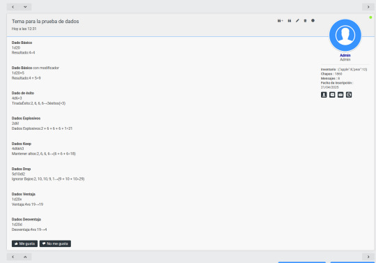
Foroactivo: Dados D&D

Bueno, luego de hacer la tienda automática me hice una pregunta: ¿Qué otras cosas puedo hacer para ganarle la pulseada a foroactivo?
Así que nada, decidí crear un sistema de dados a lo D&D. Me cansé de tener dados con imágenes, o dados sencillos que suman varias tiradas.
Mi idea inicial era muy sencilla:
Permitir que el jugador arroje N dados de N caras
Generar un resultado pseudo-aleatorio
Mantener dicho resultado sin importar cuantas veces se refresque la pestaña
El primer paso es sencillo: un poquito de javascript por aquí, unos query selectors por allá, obtener el texto, parsearlo, ping pang, listo.
El segundo también es easy peasy, uso Math.random y a dormir. Pero...
El paso 3 es el más jodido de todos, porque si te ha tocado implementar Math.random() en javascript, sabrás que cada uso de la función genera un número aleatorio:
vimeo
Antes de seguir: sí, estoy haciendo una skin de Fallout. Sí, la skin está rota. Acá pueden ver una versión ligeramente menos fea de lo que estoy creando: https://codepen.io/codetatoe/pen/gbbgLxQ
Retomando:
Obviamente no queremos eso de un resultado nuevo cada vez que entras al foro, la idea es que sea lo que sea que haga el usuario, el dado siempre deber mantenerse igual que antes (por eso de ser consistente en el rol y que no se vaya todo al carajo).
Y... lo logré. Dos doritos después:
vimeo
Eso era todo, podía ir a dormir sabiendo que había logrado mi cometido. Pero todos acá sabemos que yo no soy así.
No conforme con la implementación de ese sistema de dados, decidí implementar OCHO tiradas distintas para dar lugar a muchos más sistemas de rol. Ya la cosa dependería de la imaginación del staff:
Y alguno dirá: "Pero... Forastero, ¿qué pasa si el usuario edita el post?
Que lo haga, mi script se asegura de que una tirada SIEMPRE obtenga el mismo resultado dentro de un post. Es decir, da igual si pepito arroja 1d20 en el post, y lo edita 100 veces, o si mueve la tirada de lado... siempre le dará exactamente el mismo resultado. Así que el staff no necesita preocuparse de trampas en la respuesta.
Puede que me toque optimizar varias cosas con las que no estoy satisfecho, y modificar la forma en la que el usuario escribe el dado (para facilitarle la vida), pero en general funciona de 10 puntos.
Mi siguiente objetivo es crear un sistema de encuentros aleatorio. Es decir, si alguien está roleando, le puede salir un objeto o un enemigo, o un NPC de la nada, sin necesidad de tener que hacer algo explícitamente en su mensaje o arrojar los dados de foroactivo.
Nos vemos en la próxima <3
2 notes
·
View notes
Video
youtube
🚨 NEW VIDEO ALERT! 🚨
In this video, we’re breaking down the essentials of CSS—syntax, ways to add it to your HTML, key types of selectors, and even some advanced concepts like combinators, pseudo-classes, pseudo-elements and specificity. Enjoy! 🎉
#css #webdevelopment #csstutorial #learncss #thecommoncoder
https://youtu.be/qoNSnSErLJQ?si=eLcSF5AFPZL6mYGl
#youtube#css#css tutorial#csstutorial#webdevelopment#web development#thecommoncoder#the common coder
3 notes
·
View notes
Text
Revisiting CSS Multi-Column Layout
New Post has been published on https://thedigitalinsider.com/revisiting-css-multi-column-layout/
Revisiting CSS Multi-Column Layout
Honestly, it’s difficult for me to come to terms with, but almost 20 years have passed since I wrote my first book, Transcending CSS. In it, I explained how and why to use what was the then-emerging Multi-Column Layout module.
Hint: I published an updated version, Transcending CSS Revisited, which is free to read online.
Perhaps because, before the web, I’d worked in print, I was over-excited at the prospect of dividing content into columns without needing extra markup purely there for presentation. I’ve used Multi-Column Layout regularly ever since. Yet, CSS Columns remains one of the most underused CSS layout tools. I wonder why that is?
Holes in the specification
For a long time, there were, and still are, plenty of holes in Multi-Column Layout. As Rachel Andrew — now a specification editor — noted in her article five years ago:
“The column boxes created when you use one of the column properties can’t be targeted. You can’t address them with JavaScript, nor can you style an individual box to give it a background colour or adjust the padding and margins. All of the column boxes will be the same size. The only thing you can do is add a rule between columns.”
She’s right. And that’s still true. You can’t style columns, for example, by alternating background colours using some sort of :nth-column() pseudo-class selector. You can add a column-rule between columns using border-style values like dashed, dotted, and solid, and who can forget those evergreen groove and ridge styles? But you can’t apply border-image values to a column-rule, which seems odd as they were introduced at roughly the same time. The Multi-Column Layout is imperfect, and there’s plenty I wish it could do in the future, but that doesn’t explain why most people ignore what it can do today.
Patchy browser implementation for a long time
Legacy browsers simply ignored the column properties they couldn’t process. But, when Multi-Column Layout was first launched, most designers and developers had yet to accept that websites needn’t look the same in every browser.
Early on, support for Multi-Column Layout was patchy. However, browsers caught up over time, and although there are still discrepancies — especially in controlling content breaks — Multi-Column Layout has now been implemented widely. Yet, for some reason, many designers and developers I speak to feel that CSS Columns remain broken. Yes, there’s plenty that browser makers should do to improve their implementations, but that shouldn’t prevent people from using the solid parts today.
Readability and usability with scrolling
Maybe the main reason designers and developers haven’t embraced Multi-Column Layout as they have CSS Grid and Flexbox isn’t in the specification or its implementation but in its usability. Rachel pointed this out in her article:
“One reason we don’t see multicol used much on the web is that it would be very easy to end up with a reading experience which made the reader scroll in the block dimension. That would mean scrolling up and down vertically for those of us using English or another vertical writing mode. This is not a good reading experience!”
That’s true. No one would enjoy repeatedly scrolling up and down to read a long passage of content set in columns. She went on:
“Neither of these things is ideal, and using multicol on the web is something we need to think about very carefully in terms of the amount of content we might be aiming to flow into our columns.”
But, let’s face it, thinking very carefully is what designers and developers should always be doing.
Sure, if you’re dumb enough to dump a large amount of content into columns without thinking about its design, you’ll end up serving readers a poor experience. But why would you do that when headlines, images, and quotes can span columns and reset the column flow, instantly improving readability? Add to that container queries and newer unit values for text sizing, and there really isn’t a reason to avoid using Multi-Column Layout any longer.
A brief refresher on properties and values
Let’s run through a refresher. There are two ways to flow content into multiple columns; first, by defining the number of columns you need using the column-count property:
Second, and often best, is specifying the column width, leaving a browser to decide how many columns will fit along the inline axis. For example, I’m using column-width to specify that my columns are over 18rem. A browser creates as many 18rem columns as possible to fit and then shares any remaining space between them.
Then, there is the gutter (or column-gap) between columns, which you can specify using any length unit. I prefer using rem units to maintain the gutters’ relationship to the text size, but if your gutters need to be 1em, you can leave this out, as that’s a browser’s default gap.
The final column property is that divider (or column-rule) to the gutters, which adds visual separation between columns. Again, you can set a thickness and use border-style values like dashed, dotted, and solid.
These examples will be seen whenever you encounter a Multi-Column Layout tutorial, including CSS-Tricks’ own Almanac. The Multi-Column Layout syntax is one of the simplest in the suite of CSS layout tools, which is another reason why there are few reasons not to use it.
Multi-Column Layout is even more relevant today
When I wrote Transcending CSS and first explained the emerging Multi-Column Layout, there were no rem or viewport units, no :has() or other advanced selectors, no container queries, and no routine use of media queries because responsive design hadn’t been invented.
We didn’t have calc() or clamp() for adjusting text sizes, and there was no CSS Grid or Flexible Box Layout for precise control over a layout. Now we do, and all these properties help to make Multi-Column Layout even more relevant today.
Now, you can use rem or viewport units combined with calc() and clamp() to adapt the text size inside CSS Columns. You can use :has() to specify when columns are created, depending on the type of content they contain. Or you might use container queries to implement several columns only when a container is large enough to display them. Of course, you can also combine a Multi-Column Layout with CSS Grid or Flexible Box Layout for even more imaginative layout designs.
Using Multi-Column Layout today
Patty Meltt is an up-and-coming country music sensation. She’s not real, but the challenges of designing and developing websites like hers are.
My challenge was to implement a flexible article layout without media queries which adapts not only to screen size but also whether or not a <figure> is present. To improve the readability of running text in what would potentially be too-long lines, it should be set in columns to narrow the measure. And, as a final touch, the text size should adapt to the width of the container, not the viewport.
Article with no <figure> element. What would potentially be too-long lines of text are set in columns to improve readability by narrowing the measure.
Article containing a <figure> element. No column text is needed for this narrower measure.
The HTML for this layout is rudimentary. One <section>, one <main>, and one <figure> (or not:)
<section> <main> <h1>About Patty</h1> <p>…</p> </main> <figure> <img> </figure> </section>
I started by adding Multi-Column Layout styles to the <main> element using the column-width property to set the width of each column to 40ch (characters). The max-width and automatic inline margins reduce the content width and center it in the viewport:
main margin-inline: auto; max-width: 100ch; column-width: 40ch; column-gap: 3rem; column-rule: .5px solid #98838F;
Next, I applied a flexible box layout to the <section> only if it :has() a direct descendant which is a <figure>:
section:has(> figure) display: flex; flex-wrap: wrap; gap: 0 3rem;
This next min-width: min(100%, 30rem) — applied to both the <main> and <figure> — is a combination of the min-width property and the min() CSS function. The min() function allows you to specify two or more values, and a browser will choose the smallest value from them. This is incredibly useful for responsive layouts where you want to control the size of an element based on different conditions:
section:has(> figure) main flex: 1; margin-inline: 0; min-width: min(100%, 30rem); section:has(> figure) figure flex: 4; min-width: min(100%, 30rem);
What’s efficient about this implementation is that Multi-Column Layout styles are applied throughout, with no need for media queries to switch them on or off.
Adjusting text size in relation to column width helps improve readability. This has only recently become easy to implement with the introduction of container queries, their associated values including cqi, cqw, cqmin, and cqmax. And the clamp() function. Fortunately, you don’t have to work out these text sizes manually as ClearLeft’s Utopia will do the job for you.
My headlines and paragraph sizes are clamped to their minimum and maximum rem sizes and between them text is fluid depending on their container’s inline size:
h1 font-size: clamp(5.6526rem, 5.4068rem + 1.2288cqi, 6.3592rem); h2 font-size: clamp(1.9994rem, 1.9125rem + 0.4347cqi, 2.2493rem); p font-size: clamp(1rem, 0.9565rem + 0.2174cqi, 1.125rem);
So, to specify the <main> as the container on which those text sizes are based, I applied a container query for its inline size:
main container-type: inline-size;
Open the final result in a desktop browser, when you’re in front of one. It’s a flexible article layout without media queries which adapts to screen size and the presence of a <figure>. Multi-Column Layout sets text in columns to narrow the measure and the text size adapts to the width of its container, not the viewport.
Modern CSS is solving many prior problems
Structure content with spanning elements which will restart the flow of columns and prevent people from scrolling long distances.
Prevent figures from dividing their images and captions between columns.
Almost every article I’ve ever read about Multi-Column Layout focuses on its flaws, especially usability. CSS-Tricks’ own Geoff Graham even mentioned the scrolling up and down issue when he asked, “When Do You Use CSS Columns?”
“But an entire long-form article split into columns? I love it in newspapers but am hesitant to scroll down a webpage to read one column, only to scroll back up to do it again.”
Fortunately, the column-span property — which enables headlines, images, and quotes to span columns, resets the column flow, and instantly improves readability — now has solid support in browsers:
h1, h2, blockquote column-span: all;
But the solution to the scrolling up and down issue isn’t purely technical. It also requires content design. This means that content creators and designers must think carefully about the frequency and type of spanning elements, dividing a Multi-Column Layout into shallower sections, reducing the need to scroll and improving someone’s reading experience.
Another prior problem was preventing headlines from becoming detached from their content and figures, dividing their images and captions between columns. Thankfully, the break-after property now also has widespread support, so orphaned images and captions are now a thing of the past:
figure break-after: column;
Open this final example in a desktop browser:
You should take a fresh look at Multi-Column Layout
Multi-Column Layout isn’t a shiny new tool. In fact, it remains one of the most underused layout tools in CSS. It’s had, and still has, plenty of problems, but they haven’t reduced its usefulness or its ability to add an extra level of refinement to a product or website’s design. Whether you haven’t used Multi-Column Layout in a while or maybe have never tried it, now’s the time to take a fresh look at Multi-Column Layout.
#:has#ADD#almanac#Article#Articles#back up#background#book#box#browser#challenge#clamp#colours#columns#container#content#course#creators#CSS#CSS Grid#css-tricks#Design#designers#desktop#developers#digitalocean#display#easy#English#Explained
2 notes
·
View notes
Text
A dark mode without JavaScript
I’ve by now been warned that the reason I had issue with a previous tumblr account may have been because I put some JavaScript onto my page. I knew Tumblr didn’t let us put JavaScript onto custom pages—I didn’t know why, but the alert came up if you tried—but there was no warning or anything when I added it to my main theme.
The JavaScript I added was just a function for a checkbox. It added a class to the body element, thus enabling some CSS for a ‘dark mode’ reader. But it doesn’t matter what the function did, you’re just not supposed to be using JavaScript at all. But Tumblr can’t just have a strict thing on their database that says “if page contains javascript, deny”, because there’s literally scripts in their own default theme. So I don’t know how this works. The detection must be less straightforward.
Weeks ago, not knowing why I couldn’t use messages and didn’t show up in search even for people following me, I made a new account, copied my custom theme onto it, started posting, and within a few hours I realized it was shadowbanned again, already. It’s possible I just instantly re-triggered whatever system they have in place by putting on the same script I was already using. It was only then I started trying to figure out what I did wrong, and after realizing it could’ve been the JavaScript the whole time, I made this account, did all the HTML and CSS changes I wanted, but haven’t added a line of JavaScript.
And so far, I’m good. This isn’t an airtight proof—it could still be a coincidence—but that does really make it seem like JavaScript was the issue. And if it was, then what the fuck? It’s effectively a secret rule, not indicated to me anywhere, and which punished me quietly without notifying me that was the issue? I know people make fun of this place for not being run well at times, but god damn.
It’s possible to implement a dark mode just using CSS. It just might not be as obvious how, and it’s a bit trickier because you need the element that triggers it to be in a specific spot in your DOM, i.e. next to an element that either is or contains everything you want to manipulate. Then you can use a sibling selector to apply rules only to things that appear next to the trigger (a checkbox is easiest).
Where that checkbox appears on-screen can then be manipulated by setting its position to absolute or fixed; it just needs to be a sibling of the container in the DOM structure.
So here’s what I did. Put a checkbox right before the “posts” container in your theme.

Then that checkbox can be made invisible. Just give it display:none. The element still ‘exists’ in a magical sense, but it doesn’t get rendered in the document. Then put a label somewhere on the page that links to this checkbox. I put mine in my nav. Unlike the checkbox, the label can be anywhere.

This isn’t a link, meaning it doesn’t highlight when you hover or click it, but you can just put it in an empty link element if you want it to look like one.

Then you just make whatever changes you want this checkbox to be activating by applying it to the posts container after the checkbox when it has the :checked pseudo-class.

#tumblr#javascript#technology#development#webdev#css#seriously why does tumblr punish you for using javascript#so sad#I mean I get it js is dangerous
2 notes
·
View notes
Text
yes that's a valid selector. I tested it
on an MDN page documented CSS selectors, which I happened to be reading at the time because hell if I have all the pseudo-classes memorized
8 notes
·
View notes
Text
100 days of code - day 23
Hi!
Well, this is actually two days in one, because I didn't write about yesterday.
Yesterday I read a lot. I revised some of the most useful CSS properties and read about advanced selectors in CSS, that includes: child and sibling combinators, pseudo-selectors and attribute selectors.
Child and sibling selectors aren't too different from normal selectors, so although they're useful, there's nothing much to talk about, they select child and siblings.
There are a lot of pseudo selectors, and they are divided in two groups. Pseudo-classes and pseudo-elements.
Pseudo-classes are generally states of some element, like :hover, :active, :focus and so many others. And I can edit the element style when those states are activated. E.g. I can change the color of a box when I hover the mouse over it.
Pseudo-elements are selectors that lets you style some part of an element, like ::first-line, ::before, ::after and much more. So I can add style only to the first line of a paragraph if I want, or add content before or after an element.
After reading a lot, I played a little interactive game called "CSS dinner" to practice using these selectors.
That's it, just remembering it was yesterday, because today I did pretty much nothing 😵💫

#day 23#100 days of code#100daysofcode#codeblr#programming#progblr#studyblr#computer science#1000 hours#code#100 days of productivity#100 days of studying#software development#100 days challenge#tech#javascript#html css#coding
8 notes
·
View notes
Note
hi! i was wondering if there was a way to add an option to remove the activity tab with dashboard unfucker? i think i could do it myself if i got the general idea of how it works, but i just wanted to ask before doing anything
If you're just looking to hide the activity icon, I would probably just recommend using a uBlock filter. uBlock thankfully supports the :has() pseudo-selector, you can just use the filter ##.KTRcB:has([aria-label="Activity"]). If you don't already know JS, I don't really have a concise answer on how to add a feature, but if you do the code should be pretty self-explanatory. The spots you would need to modify are the configPreferences initialization, the checkboxEvent() and initializePreferences() functions, and the config menu string.
6 notes
·
View notes
Link
Harnessing the Power of :not() in CSS: Styling by Exclusion
The article delves into the significance of the :not() pseudo-class selector in CSS, elucidating how it enables developers to apply styles through exclusion. It begins by introducing the concept of the :not() selector, highlighting its function as a negation pseudo-class. The provided code snippets and examples vividly illustrate how the selector can be utilized to style elements while excluding specific criteria, such as classes or attributes.
The article's comprehensive coverage spans from basic usage to more intricate scenarios, such as combining :not() with multiple classes or leveraging it for advanced design considerations. By showcasing real-world implementations and scenarios, the article equips web designers and developers with practical insights into harnessing the power of the :not() selector. This knowledge empowers them to craft more targeted and precise styles without resorting to JavaScript for class manipulation.
In a succinct manner, the article offers a comprehensive guide to the :not() pseudo-class selector, imparting the ability to leverage this tool effectively for crafting sophisticated CSS designs with exclusions.
#CSS#pseudo-class selector#styling#element targeting#exclusion#web design#front-end development#code examples
0 notes
Text
youtube
Mastering CSS: Complete Guide to Styling Web Pages | Learn CSS for Web Development
In this comprehensive CSS tutorial, we delve into the world of Cascading Style Sheets, covering styling techniques, selectors, declarations, properties, and values in CSS. Whether you're a beginner or a seasoned professional, this video is designed to equip you with a thorough understanding of CSS. We explore advanced CSS concepts such as descendant combinators, pseudo-classes, pseudo-elements, @rules, shorthands, functions, and more. By the end of this video, you'll have the skills to style your HTML documents with precision and finesse. Watch now and take your web development skills to the next level!
#CSS#WebDevelopment#LearnCSS#FrontEndDevelopment#CSSStyling#CSSTutorial#CSSGuide#Coding#WebDesign#HTML#JavaScript#Youtube
3 notes
·
View notes
Link
0 notes
Text
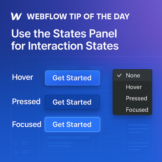
💡 Webflow Tip of the Day: Mastering the “States” Panel for Pro-Level UI Feedback
In Webflow, the States panel (also called “Pseudo-classes”) lets you style how elements behave when a user interacts with them—like hovering, clicking, or focusing. This is essential to creating engaging, interactive, and accessible web interfaces—without writing a single line of code.
🎯 Why It Matters:
Users expect visual feedback—like a button changing color or expanding slightly on hover.
Improves usability and accessibility by clearly indicating when an element is interactive.
Elevates your design from static to dynamic and responsive—delighting your users.
🛠️ How to Use It in Webflow:
Select your element (like a button or link).
In the selector dropdown, choose a state:
Hover: When the mouse is over the element.
Pressed: When the element is clicked.
Focused: When the element is selected (important for accessibility).
Apply unique styles to each state:
For Hover: Change the background color, apply a box-shadow, or scale up slightly.
For Pressed: Add a darker shade or inner shadow to simulate a button press.
For Focused: Add an outline or glow for keyboard navigation support.
In the Style panel, scroll to the Transitions section and set animations (e.g., 200ms ease-in-out for background color or transform).
🧠 Real-World Example: Stylish CTA Button with Full Interaction States
Imagine you're building a Call-to-Action (CTA) button for a landing page.
🔹 Default: Text = "Get Started", background = blue, text color = white.
🔹 Hover: Background transitions to a lighter blue, button scales up 1.05x, and a subtle drop shadow appears.
🔹 Pressed: Button becomes slightly darker with an inset shadow—simulating a tactile press effect.
🔹 Focused: Add a glowing outline for accessibility, so keyboard users see focus clearly.
🔁 Add smooth transitions for transform, background, and box-shadow to make the interaction feel polished.
✅ Pro Tip: Pair button States with a Lottie animation or icon that reacts to hover for extra flair. For example, a rocket icon that jiggles slightly on hover makes your CTA more eye-catching.
🔗 Hire Me or Explore My Work: 🌐 Portfolio: www.webflowwork.com 🎯 Fiverr: https://bit.ly/3EzQxNd 🎯 Upwork: https://bit.ly/4iu6AKd
#webflow#freelancewebdeveloper#web design#webflowdesign#web development#webflowlandingpage#nocode#ui ux design#webflowexperts#website
0 notes
Text
CSS Selectors and Specificity by Abdelfattah Ragab
CSS Selectors and Specificity by Abdelfattah Ragab
Welcome to the book "CSS Selectors and Specificity". In this book, I explain the different types of selectors, from simple element selectors to advanced attribute selectors and pseudo-classes. You will understand how specificity and cascading work and how to write CSS rules that deliver predictable and desired results. By the end of this book, you will be confident in using CSS selectors and have mastered all possible scenarios. Let’s go!
Available on https://shop.tredition.com and https://www.amazon.com

0 notes