#the sizes overlap - I got the larger size of the ones i fit into
Text
@mayakern OK so I have a PLAN to write a nice and helpful review of your skirts, but I honestly have no idea if I'll actually be able to follow through anytime soon or if it'll just languish in my head for the rest of time, so this is a PLACEHOLDER nice and helpful review that just says HER SKIRTS ARE V. NICE, IF PLUS SIZE AND ON FENCE HIGHLY RECOMMEND DO BUY
#this is in fact me tricking myself into writing a helpful review#by putting the stuff in the tags#these skirts are a+++#i'd been looking at the sunflowers skirt longingly for months#and then it was on sale and i was everything is terrible i want cheerful sunflowers#and i got it#wore it#and immediately ran into the problem of wanting to wear it every day#(side note i now have purchased three additional skirts)#for the texture-sensitive people such as myself! important info:#material feels like bamboo cotton like you can get in sheets#so if you don't know what that feels like and if it's an ok texture you can go to a store that sells bed linens and find a sample#n.b. it's not exactly the same probably but it feels close enough for me#and i am . notoriously picky about textures#the skirts are full enough that even though the material is soft and light#it hangs heavily enough to not show off anything you're wearing underneath#and disguises that you've got stuff in your pockets#even if your pockets are FULL#(and these are BIG POCKETS)#the sizes overlap - I got the larger size of the ones i fit into#and i like the fit but did find that my pockets will start pulling them down a bit#which is less of a problem if both pockets are full#and more of a problem if it's just one pocket#so i have now ordered the size down as well#anyways yes highly recommend#yes expensive but also! not actually THAT expensive!#because this stuff is quality??#like i buy shit from torrid which is somewhat cheaper#but also will start falling apart within six months if not sooner#and i can tell that when it arrives because of the stitching etc
3 notes
·
View notes
Note
Thinking about that one post about the 5000 year old teenager girl found buried with her collection of 180 sheep ankle bones but specifically the addition of how ankle bones were used as dice back then and she was a gamer.. what I'm getting at is: would clan cats make bone dice and Are They Gaming
First let me teach you a little bit about Knucklebones: The Game.
You probably know one of its variants better as Jacks, that game you play with a rubber ball and little metal spikes. There's a version of Knucklebones in nearly every culture, where the basic idea is to throw an object up in the air, pick up as many of the smaller objects as possible, and then catch the larger object before it hits the ground.
In cultures with a lot of access to livestock, usually the hand and ankle bones of sheep would be used. Places that don't have them might use rocks, seeds, shells, whatever. It was Ancient Greece that had such an extreme take on the game that it eventually evolved into dice-throwing-- a totally chance-based game where you would just throw the biggest foot bone of a sheep (the astralagus; equivalent to the talus in a human) and see how they landed.
So the girl they uncovered in Kazakhstan with the 180 sheep bones wasn't really buried "with dice," make sense? It's more like being buried with jacks. Central Asia is actually jam-packed with knucklebones-types games. Mongolian Shagai is recognized by UNESCO.
And it makes a TON of sense, because those regions are grasslands absolutely ideal for raising sheep.
SO. CLAN CATS.
There's two major considerations here;
ONE: The access to, and size of, sheep bones.
Clan cats don't kill sheep. TRIBE cats actually have access to sheep and kill one or two a year! I would actually like to give them a bunch of special uses for various parts of the sheep. I think the eagle-killing thing in canon is actually pretty ridiculous for several reasons
BUT THAT SAID, an astralagus is the size of a cat's paw.
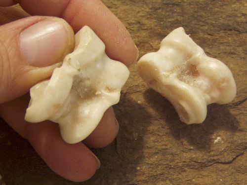
[ID: A human holding an astralagus in the tips of its fingers.]
You'd need to play a different sort of game with this. It's more like a square softball to a cat than a little rubber ball.
Boar also have bones like this, though. A muntjac probably produces bones that are sized properly for a cat. Hares and rabbits are probably the BEST bet here though, which, somehow feels right. I'm not sure why, but WindClan seems like the gamerclan Clan that would think up these sorts of cute games.
Something about it fits their whole savvy culture, tunneling, emphasis on trade and invention pre-Heatherstar. ShadowClan and WindClan share a cultural value of innovation, but ShadowClan seems more... chemical and competitive.
Hard to explain it. ShadowClan invents flax retting and WindClan invents the drop spindle. There's overlap but it has a bit of a different flavor between them.
TWO: Range of motion
I've made BB!Cats have the same range of motion as the cats in canon, which is higher than a real cat. They're able to WEAVE, you can't do that without a basic pincher grasp. They're also able to mix herbs, wrap things up in leaves, and apply bandages.
I haven't actually given my reworked cats much more ability than they already had, I just codified rules based on what we already see.
But that said, they DO have less range of motion in their hands than humans. They have little thumbs and a better ability to grab, but can't twist their paws completely upwards. There's no way they can toss an object straight up, then catch it again.
So any games they do play would need to accommodate that. So far I've got Scratchstone, Teeterstrike, and an unnamed rhyme game. The bone game would need to look more like a game of marbles than jacks. Or, maybe more modified to accommodate swipes and strikes, somehow? Or a two-person game of catch?
Gotta think about it.
#Partner and I had a super cool food idea for the tribe where they make a sort of like... flavored bone lolly out of sheep bones#Called a Sucker#And they'd soak it in juice before leaving on a hunt and gauge how long they had been out based on the fading flavor of their sucker#And have a cool phrase like ''where have you been?? My sucker's gone bland you spanner''#And if they go into something dangerous like a cave or down a river#they actually leave their sucker behind#so if they run into danger and someone comes looking for them#they'd see their sucker unattended#The sucker would also get holes carved in it to feed a brightly colored string or something through it#So it's very bright and conspicuous#And you can tell what sucker belongs to whom based on how they bedazzled it#But I couldn't find anything on flavoring bones or replenishing their flavor#Since humans aren't dedicated carnivores#The string has the added value of making it easy to pull out if they accidentally swallow the bone#But it's all still wip#clan culture#bone babble
94 notes
·
View notes
Note
would you potentially be able to rejigger the sizes so that a 30 inch waist isn’t Exactly in between size A and size B with no overlap? because there’s a 5 inch overlap between B and C and between C and D, but not between A and B
unfortunately in order to do that we would also have to adjust the other sizes or we would have to have the A size get larger again and not provide a good fit for the XS-M sizes
i do think eventually we will adjust our sizing again but right now we literally cannot afford to do that, as the amount of size exchange requests that happen when we change our sizing is pretty high and therefor very expensive for us. we’re a really small business and already having adjusted our sizing twice this year (one big overhaul, one relatively small change) + having the shirts (which are new and not as stretchy/forgiving so had a high % of size exchange requests) basically ate up all the usual wiggle room we have to experiment (which, with manufacturing clothing, is expensive)
and it doesn’t matter how clear we try to be: we can update the size charts, include messages at the top of the listings, even edit the listing titles, and be very vocal about the changes on social media: a lot of people are just going to assume they can buy the same size they always have. this is also part of why shirts got so many exchange requests: a lot of people just say “oh i’m a medium” and buy that size even tho being a medium doesn’t really mean anything concrete, it’s all relative, and so you could be a medium in one store and a small in another.
53 notes
·
View notes
Text
Turning the formerly feral kittens into public domain characters, starting with Sapphire, because she was the first to hold still for me to get a picture as a reference for her face.
Includes a more detailed guide and cute simplified versions, including one where her white paws are literally mittens and boots.
Fun fact: Her name is Sapphire because she was so fluffy, and at first we wanted to name her Cloud, but then we were like no, there's too much of a theme here already. So then we were like "okay but what about Sephiroth as a reference to clouds". And then we were like no, because we want someone to want to adopt her. So Sapphire it is. As a reference to the name Sephiroth. As a reference to the fact that she's fluffy like a cloud.
She has the biggest ears of all her siblings, and the shortest, skinniest, but fluffiest tail.
Feel free to draw her in whatever style you want. Or change her pronouns. She's a cat. She doesn't know what gender is. But she could in your version!
They can all have the last name Jupiter since we caught them on / the day after the 4th of July, and I can't think of any other name.
So, Sapphire Jupiter.
As of September 2023, she weighs 4lbs.
Gizmo is now posted!
Not drawn yet:
Eclipse Jupiter
Taaz Jupiter
and their mom, Marlena Jupiter.
Who is the father? The world may never know....unless you decide to create him yourself.
...Aand she has just jumped into an empty trash can. So I will edit the picture I just got of her in the trash can into this post. Lol.


[ID: Three digital drawings, each with the same royal blue background, each showing a black and white kitten character.
The first shows the kitten with more detail, drawn linelessly, with the head and torso in the center, and the arms and legs off to the side, disconnected to fit in the square frame of the image. The character is labled, "Sapphire", and a small photo of the kitten it's based on is in the upper left corner.
Some notes read, "Yellow eyes, thin, fluffy fur", and "short, skinny fluffy tail".
The kitten has a mostly black body, with round yellow-gold eyes, and a pink and black nose. The face is solid black, except for an irregular white stripe from the chin, going crookedly up to between the eyes at a diagonal. Where the white stripe overlaps the nose, the nose is pink, and black where the stripe does not meet.
The kitten has a thick white fluffy chest like a collar, and a thinner white stripe on the belly all the way down. All the feet are white with solid pink paw pads, with the front feet having the white end at the end of the foot, and the back feet stretching up to almost the knee, like tall socks.
The tail, drawn to one side, is skinny and fluffy, and slightly more than half the length of the torso.
The next two images show a much more simplified version of the character, standing upright against the blue background. The character now has larger pointed ears, oval shaped yellow eyes with a line for pupils, a simplified face stripe, a black nose and mouth, and a simpler white collar and belly. The limbs are drawn as simple bendy lines ending in white, with the tail raised happily behind.
The second version of this image is the same as the first, except that the white parts of the front paws, or hands, have been extended out to form little gloves or mittens, and the white markings on the back legs have been extended into boots.
End ID.]
I would share pictures of her for drawing references...but dear gods these cats do not want to be photographed lol. Every time I try to take a picture they're already moving.
Edit: Nope, lol, here's the picture of her in the trash can:

[ID: Another photo of the kitten depicted above, now looking up while sitting in the bottom of a medium sized white trashcan.]
@publicdomaincharacters some more public domain characters :)
#described images#eye contact#vbgfb#alright. Gizmo typed that. so it can stay#public domain characters#Sapphire Jupiter#Sapphire the cat#lol#furry#anthro#could be!!!!#xenofiction#public domain#public domain cats
12 notes
·
View notes
Text
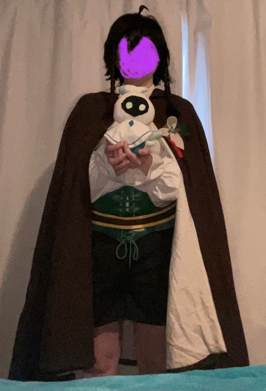
Nameless Bard Cosplay Breakdown
Why? Why not (I want to share my creation especially with seeing so many tiktok cosplays of them, but never any guides/posts about how people. did stuff for them /lh)
I..don't know how well screen-readers will handle such a long post. I hope it works out okay.
Note: final image does not have alt image text at the time of posting, but I intend to add it later on
add alt text to images (all minus final since that would be a picture from the morning of)
Cloak
This thing is LONG. I'm about 5'1/155 cm, and this thing goes down to my KNEES (& big hood too!)
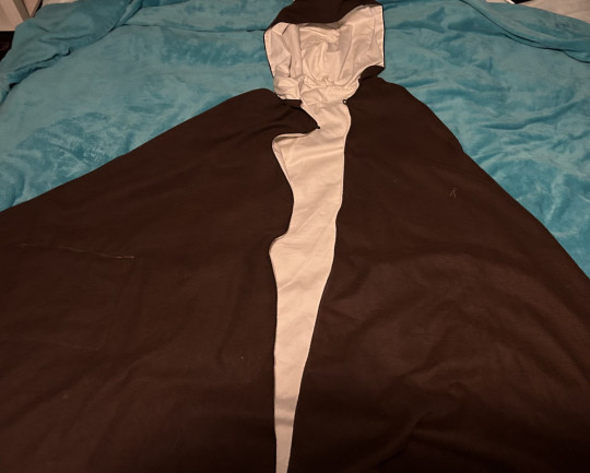
The inside fabric is from old off-white/beige bedsheets, and the outside fabric was from joann's (link).
I used a pattern from Aliceincosplayland on Etsy (link) (note: you don't need to buy a pattern to make a cloak- I bought it because of the different options between the lengths & hood sizes) ; for mine, I used the knee-length pattern & the larger hood size.
The large covered hook & eye also from joann's (link).
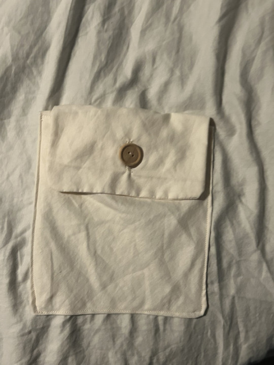
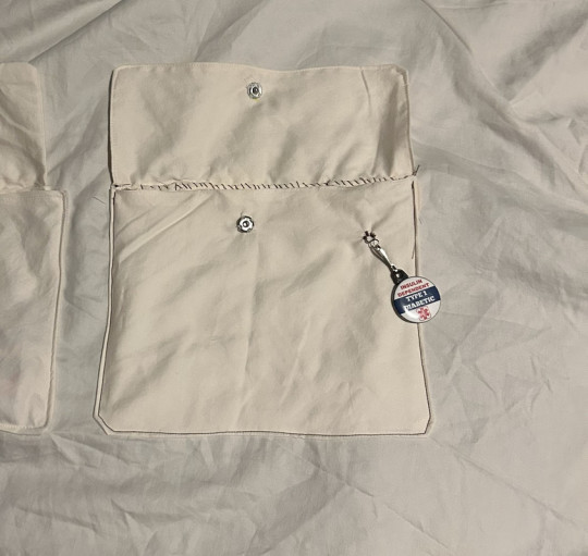
POCKETS! There's 2 small pockets close to the edges, & a bigger one I added this year to fit things like my PDM, testing kit, battery pack, etc. The smaller pockets have wooden buttons & button holes, the bigger one has a snap w/ a wooden button hot-glued on top because I didn't wanna tinker with the button hole foot.
Windblume Flower
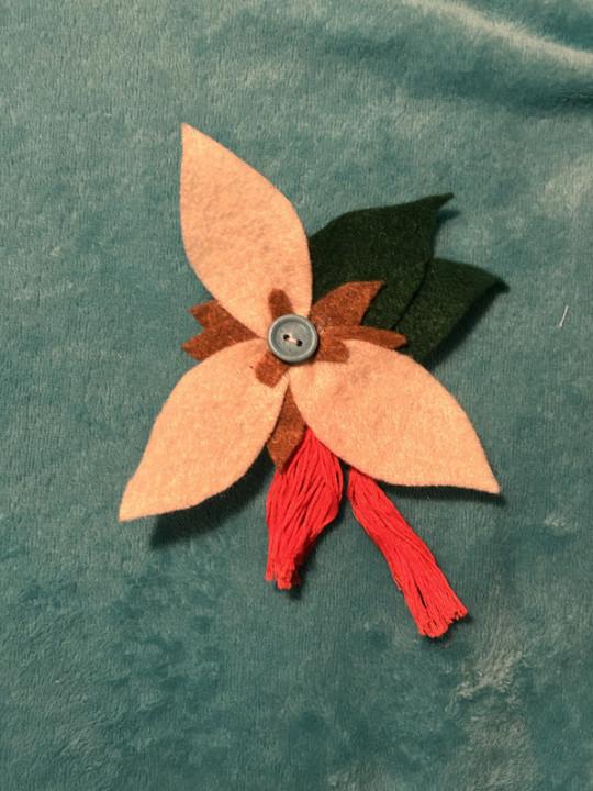
I forgot what I traced but I made patterns for the leaves and petals & used a tutorial to make the tassels with red embroidery thread.
It's made of felt, hot glue, and I hand-sewed some bits like the button in the middle. It's also removable & fastens via safety pin sewed into the back.
Shirt
I gotta be honest, I forgot to work on it and tried to finish it about a week before the con. It looked like it was going well, but little errors made it look not up to the standard I was holding myself to and I hated it. I didn't even add the finishing touches with the shirt's collar's closure, or the ruffles on the cuffs of the sleeves. Instead, I'm using the original shirt I got off amazon last year (link), which I'm glad I kept intact when trying t make the second version's pattern.
I wanted to make another variation that was closer to his canonical outfit and was not made out of that plasticky fabric material (not that it was uncomfy, I just thought it'd be better for a convention center with a lotta people). The arm holes were a bit too big, the neck hole was a bit snug, and I botched the collar almost entirely. Lesson learned, make mockups and do not procrastinate on your projects until the week before the event.
I have the picture of it in this post.
If it counts, last year I made a slight alteration to the original shirt in which I sewed part of the slit in the top so it didn't go as deep. That's about it, honestly.
Shorts
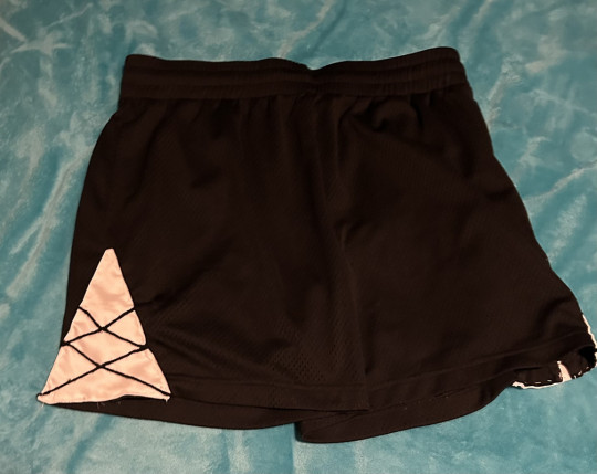
Honestly, these weren't too bad overall. I cut the triangle panels out of white fabric, used embroidery thread for the criss-cross bits, and hand-sewed said panels onto the shorts.
It's great 'cus it has pockets and it's adjustable with the drawstring on the inside.
Wig
This fucker (part 2)
I combined a wig off Amazon (link) with wefts from hair extensions (link; though it comes with two I used just under one weft for both briads) to get the general shape
I went into detail on how I redid it here (also where the pictures are) but to sum it up: washed out hairspray/gel from last year, trimmed & rebraided the longer strands, used hairspray to do the bangs & gel to fix the ends.
Belt
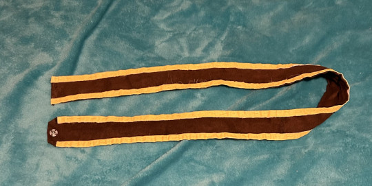
I had this old brown fabric from an old sewing class project that I used. I measured the length by putting the rest of the costume on and using a measuring tape, overlapping a little so there was room to add the snaps for a closure. I think I used the trim from an old bedsheet and put it on either of the longer ends, then painted it yellow to match the bard's. Semi-reliable snap closure sewn in later, then boom, belt!
Lyre Prop
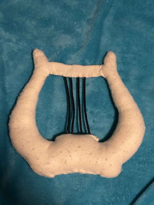
I forgot what I traced to make this pattern too, but I made it out of felt, essentially a stuffed toy. The little bar bit at the top is a separate pattern piece, as I tried making it all into one and was unable to turn it inside out. I forgot what kind of cord/string I used for the lyre strings, I just remember using mod podge to stiffen it as a finishing touch.
I used it last year as a prop, but I ended up just carrying it around so it might be best to leave home unless you plan to take a lotta pictures.
Miscellaneous Parts
Corset Belt: bought off amazon (link) ; It's comfy for the most part. liked the idea of a faux corset as opposed to the vest
Boots: last year I used a different set of boots that I've had for years, this year I'm using slightly newer boots that I got off my brother since they're small on him. They're timberlands I think? A li'l bit of height, lace-up, slight heel, feels 3% more badass /j
Makeup: I... know very little about makeup. I highly doubt the bard used makeup back then (/j). With that in mind, I really just use black eyeshadow & an eyebrow brush to fill my brows in and that's it. I use an old eyeshadow palette, but I also have an eyeshadow stick from the dollar store that works if you wet it slightly (mostly because it's a year old and is dried out by now..probably).
Wisp Prop: Touched on in this post, I like to take along one of my wisp dolls- the second one I've ever made, specifically. Made with my own personal pattern, he's easy to tuck away into a smaller pocket with just his head sticking out. I'll never forget the excitement of the Bennett and Fischl cosplayers I ran into last year when I took the wisp out to show them. 100/10, easily my favorite prop. The only real change made to him is that he has glow in the dark paint on his eyes, which probably won't do much in a convention setting but I still think it's cool.
Sword Prop: Very unnecessary & impromptu, but also very fun. At last year's con there was a vendor selling foam game/anime weapons and I got a foam Freedom Sworn. At the time of writing this out, I'm unsure if I will be taking it with me this year or not, since I can't exactly store it under my cloak when I'm not holding it.
Final Reveal!
(like I said at the top, this image is the only one w/out alt image text; I'll add it later)
(face scribbled over for comfort reasons)
#genshin impact#cosplay#genshin#nameless bard#old mondstadt#genshin cosplay#nameless bard cosplay#og posts#cosplay genshin impact#long post#sewing#cosplay guide#today's the day of the con & I'm fuckin' pumped >:33
13 notes
·
View notes
Text
Quirk awakenings >:)
Hello!
I decided to make a list of some random (of mostly pro heroes) short list possible quirk awakenings that probably won't happen since we're nearing the end of the series but it's still fun to think about :)
Manga spoilers ahead
Mt. Lady
A possible quirk awakening I could see for her is either to become larger or being able to control her size. The size control would probably be the most useful so she could navigate tighter alley ways in cities without causing damage. Plus if she's able to shrink in size she could do stealth missions but I'd doubt that would happen. If it were to though she would basically become the opposite of ant man! (instead of starting with shrinking powers and later getting growth power she starts with the growth power than gets the shrinking power.)
Kamui Woods
So I have 2 for him but one involves someone less so I'm braking it up. The first idea is him being able to manifest and manipulate wood not just from his body. The way I imagined it is it being very similar to Yamato's/ first hokage's kekkei genkai but only with wood. So as long as he has enough energy for it, he could manifest wood and treat it like he would with his own limbs but with more versatility. I feel like im doing a really bad job explaining this so here's this link just skip down to the ninjutsu part:
Kamui woods and Kinoko Komori
So they haven't been in this final arc a whole lot but they have been shown together a few times which makes me think that they'll have a moment together which works well for this awakening. So there is this thing called the "wood wide web" where basically fungi roots connect different tree roots together allowing trees to "talk" and transfer stuff to each other. So for example lets say one tree (the mother tree) whose roots are connected to a nearby saplings. The nearby sapling isn't getting enough food since it's in a shady spot and is in danger of dying. The mother tree can send spare nutrients to the dying sapling to give it a better chance of survival. (you should look this up on youtube when you got free time it's quiet interesting!) With the large amount of people who have been injured by afo this battle being able to incorporate that ability could be super helpful! Komori could use her mushrooms to connect the injured people and kamui to what remains of the nearby forest and help at least keep them alive! I've heard that there's not enough evidence to prove that this actually exists but considering all the other stuff that has happen this arc alone i think it's still a possibility plus a neat way to connect the 2 characters.
Ryukyu
I think a good quirk awakening for her is to simply make her more dragon like. Like I feel like getting rid of her human characteristics in her dragon form itself would do wonders with her design at least but also increased durability. Also giving her a ability like fire breathing or some other elemental power would also give a huge boost to her overall abilities. If you ask me the element that make most sense for her too me is water. The reasons I chose water is that one, i think it would overall fit her personality well, her little jaw things look like fins, and that we already got a fire user in the top ten so it wouldn't overlap in that area. (Although there may not be one for much longer...)
here's the jaw things I was talking about
#hehehe#I had the kamui woods ones in my head for a while now and was the main reason i made this post lol#though i did come up with the ryukyu one a long time I just haven't talked a lot about her for a while so this gave me a good excuse to >:)#Also speaking of ryukyu were did she go?#We know she didn't retire since we saw her working with fat gum in that vigilante arc but thats the last we saw of her#Like her quirk is so cool bring her back#I got the ultra analysis book today and the info on her was kinda cute!#It described her personality as a “dependable big sister” which is amazing :D#kamui woods#mt lady#mount lady#ryukyu#Kinoko Komori#mha#bnha#mha manga#bnha manga
7 notes
·
View notes
Note
Cool Dice!!!!

THIS IS CORRECT I AM A NERD AND IF YOU COUNT TIGHTS I HAVE THE COOLEST FUCKING SOCKS IN THE WORLD
Okay but actually this overlaps with special interest because my love for my tights is to that degree frankly, and I just want to take a minute to plug Snag Tights for plus sized tights. I have the kind of thighs and ass that make the heavens quake and people always recommend Sock Dreams for that but I had horrible experiences with them, almost none of their sock styles actually come in my size and the ones that did were very low quality and got runs immediately (I am told that line has been discontinued to be fair to sock dreams but they still also have like 12 actual socks in my size :|).
Snag. Tights. My guy. It's based out of the UK so shipping was always a nightmare, but they have an American warehouse now that really speeds things along if you're state side. If not? Worth the wait. Worth the shipping. I have owned some of my tights from them for 2+ years now and have YET to get a SINGLE run. I have only ever had ONE pair of tights I was disappointed in from them (a recent run of glitter tights that loses glitter too fast imo), and not for structural issues. I am talking two years of wearing tights almost every day and not a single tear, my man. And they FIT. And they fit WELL. I am a women's size 28 and they go larger than me.
So, yes, this has been ur ad for Snag Tights go buy some treat yourself.
#solitaretalk#ask meme#that turned into an ad bc u asked me to talk abt a special interest and i picked tights ig gjksfjgksdjgkdsjgsklj LOOK#i am a shill for companies that treat me well and snag is one of them#nerdykeppie is the other but EVERYONE knows that one. and mayakern
4 notes
·
View notes
Note
Howdy! Hope you're doing alright, all things considered.
I was wondering, I've got a 4x4 Babylock Sofia 2 A-line - do you know if I'd be able to use the spring action hoops on it? I'm having a lot of trouble finding them to begin with (and not just standard machine hoops and spring-loaded hand sewing hoops), let alone what's compatible with my ol' gal 😮💨
I appreciate your help either way!
PS. Do you think a tutorial for the execution of larger files with smaller hoops may ever happen? I've tried to read up on it but it hasn't quite clicked enough to try it and I'd love to see how you would do it (not to be a kiss ass but your tutorials have made so much more sense and helped me more than 99% of other media consumed on the same subjects).
For repositionable hoops for the Sofia (and this also goes for people who own the Baby Lock Verve and Aurora, as well as most Brother 4x4 machines), I recommend the DIME Snap Hoop Monster. It's a magnetic hoop.
There's three kinds of Brother/Baby Lock hoop attachments, so make sure you're buying the right kind. There's the slide-in one that you see on most machines 6x10 or larger, there's the one where the pins are on the hoop, and the ones where the pins are on the embroidery arm. Nothing like getting your shiny new hoop home and finding that it doesn't fit your machine.
If you have software, the first thing that I'd do is check to see if it has design splitting built in.
When I'm making something bigger than my biggest hoop, I make a custom hoop that's the size of my finished product, and I split it after.
This automatically tries to find the best place to split, calculates how much overlap I need between hoopings, and places alignment stitches at the start and end of each block. Sometimes it makes decisions that it doesn't handle very well, like how it deletes stop commands if it has to split an applique. However, it's pretty okay for things like this, where it's able to split between motifs most of the time.
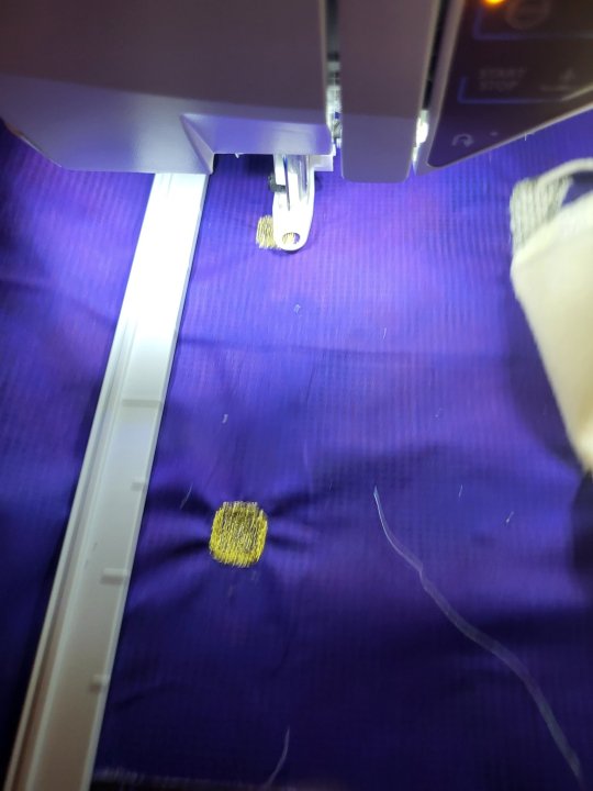
I'm using the Mega Endless Hoop here, which has its own problems. Notably, it doesn't grip particularly tightly, which can lead to puckering and other problems. It requires fusible or sticky stabilizer applied to the entire piece before you hoop, and all I had was Power Mesh, which is intended for much lower stitch counts. I might get some small and powerful magnets and use them to increase clamping power on the hoop, but I haven't tried it yet.
Having a way of telling the machine where it's sewing in reality (viking calls it Design Positioning, Pfaff calls it Precise Positioning, Bernina calls it Perfect Placement, and I can't for the life of me remember what Brother and Baby Lock call it) really helps. It means that my alignment markers have to be in roughly the correct position, but that I have some wiggle room to adjust to get my needle to be right on my marker.
If your machine doesn't have the ability to tilt the design (mine doesn't) then you need to get the piece in the hoop as straight as possible. What I do for that is to get one marker lined up, and then sink the needle. With the needle down, you can pivot the fabric without losing your placement. This is also the only time that I find those clear plastic hoop alignment guides to be any use at all. If you've lost yours, like I have, you can stretch a rubber band across the hoop and make sure that it's even, and then line up with the rubber band. On a long project like this, I will also iron in a crease across the length of the design, to be a marker. You can also use a pen or chalk to mark that. My hoop has center marks molded into it, so if I can line my center line up with my center marks, then I know my piece is straight enough, and I just have to match the corner marks.
I definitely recommend doing a test run, which will let you spot trouble areas and make some overall design adjustments. It'll also give you experience with how the multiple hoopings work. Especially if you're just using a 4x4 hoop, there's a learnign curve to doing this. Doing a test run means that you won't be in a situation where the first hoopings are bad and the last hoopings are really good. You'll be more even across the board.
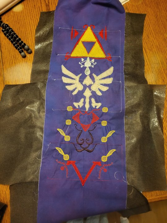
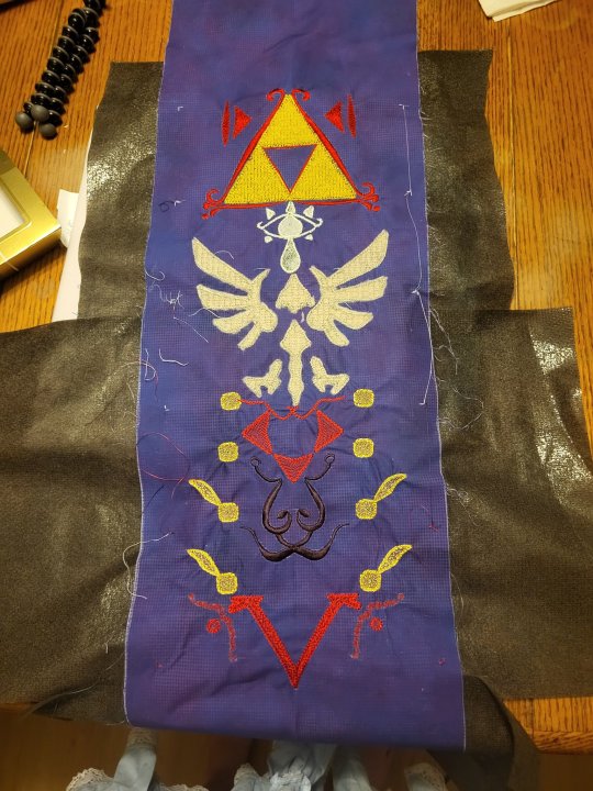
This piece here has taught me a lot of things. When I have a chance, I'm going to go through all of it in my software and fix things. Most of that fixing is just adjusting the size of things or how close they are to each other, but there's some some changes to fills and lines and density as well. I need to change how the gold squares are built to try to cut down on the puckering. Because I was watching as this stitched out, I noticed that the piece was much flatter before the line was stitched out. I think that changing that line will reduce puckering. Being able to sit with the physical copy in my hand while I go through the project on the computer is very helpful.
I'll also probably be layering some stabilizer in this. If I do fusible cut-away instead of fusible mesh, the designs will be better supported, but the piece will hang differently. It's all about balancing the pieces with each other.
The corner markers can be easily removed, or incorporated into the seam allowance and hidden.
If you have very detailed pieces to build, you can also do what a lot of Kimberbell pieces do, and just stitch out the whole piece with overlapping edges. You'll build a seam allowance that has part of the design, and then you can sew the finished pieces together and perfectly match the seams. This is probably a long easier, but does mean that you'll have seams all over your piece.
But I'd definitely start with either a piece that's pre-split by the maker, or one that's split by a machine and that adds the markers for you, before you try to yolo one on your own.
And, for what it's worth, if you have an applique that has to stretch over two hoopings, it's a really good idea to pre-cut that if at all possible. You can do it where you just hold the fabric off to the side on each side, or where you cut the fabric and splice it together, but pre-cut is the way to go. On the final one, I'm probably going to export the applique shapes on my Cricut, because having the fabric fused to the piece will make re-hooping a lot easier.
9 notes
·
View notes
Text
Ruminations on RatFest
Now that work reveals for RatFest (or alternatively, the /r/rational spin-off discord writing fest, which is a bit of a mouthful) have happened, I've got some thoughts about the fest itself, fests and exchanges in general, my own works, and my experience taking part.
Here's this year's collection (and last year's collection, for reference) for anyone who wants to follow along.
RatFest is a really fun event because ratfics are a niche style of story where no-one can quite agree on a definition, and the fest basically ends up having the theme of 'what do the people on this one server happen to like'. We're lucky in that we have a label we can use for that, and also that there's enough overlap in our tastes that we can make an event out of it (though I don't think we'd be able to rustle up enough writers to get a decent exchange going). RatFest is run by a popular server member who isn't involved in interpersonal drama, which is also a boon, and is a capable organiser who regularly takes part in other fests and events.
As with fests in general, the stakes are quite low. People can drop out or scale back the number of fics they're writing, no questions asked, and it makes for a more relaxed experience. I picked out five prompts that I liked, and ended up only having time to write for two of them, and that wasn't an issue at all. There's also less pressure to deliver something perfect for the recipient, as someone writing for a prompt doesn't prevent others from doing the same. Last year we had a couple of first-time writers and both years we had people write some last-minute stuff that turned out to be quite good. The 'two cakes' effect is really nice in events like these, and some prompts were fulfilled several times in very different ways.
I wrote two stories: Upstream, an original story about Xianxia cultivators who seek Buddhist enlightenment instead of wanting to ride swords around, and Phytozoology, a Pokemon fanfic about a young researcher who gets involved in white-collar crime under future Celadon Gym Leader Erika. I enjoyed writing the latter story a great deal more, and it's much longer, so naturally it was a bit less popular despite being written for a much larger fandom. Upstream was a bit of fun written mostly because I wasn't very familiar with the Xianxia genre and thought that distance meant I could come up with a different approach to the prompt. Phytozoology was an excuse to put a lot of worldbuilding around Pokemon research down on the page (which was the original request), and then a plot snuck its way in. I like both stories overall and credit RatFest with giving me the motivation to write them.
Compared to last year, there were roughly the same number of fics (16 versus last year's 14) and a slightly higher total wordcount, as well as a few more prompts. It's nice that the fest has grown a little, rather than stagnating and declining. I wrote more total wordcount, albeit the same number of fics, though one factor for me was that in an unfortunate quirk of timing I was running my own overlapping fest which is finishing in two weeks. If that hadn't been going on, I think I could have managed a third story for RatFest.
My takeaway as to why this event was successful at what it aimed to achieve, and enjoyable for the people who took part, is that it fit the community it was aimed at. The size and scope of the event, the duration, the way it was advertised, and so on, all did a good job at reaching the people most likely to want to take part and enjoy the process. There were also enough people familiar with AO3, which was hosting the event, that there weren't major technical hurdles for participants.
I'm really excited for next year!
2 notes
·
View notes
Text
Scars - Eruri Post-war + Erwin Lives AU (WIP)
Summary: Eruri’s first time seeing Levi’s whole face after they removed the bandages and stitches from his face.
I wrote this a while back and shared it on my twt for Eruri Angst Week Day 4: Scars + Post War. Being assured that it was actually decent, I thought I might share it here. This is a part of a larger Post-war WIP that i’ve started but because i have 2 more urgent projects atm, it had been put to the side. hopefully at some point, I will come back to it.
Erwin recalled the first time Hange had shown up without bandages over their left eye. The weather had begun to turn and outside the windows, frost began to form regularly on the branches. Usually this tended to signal the incoming dormancy period in the Survey Corps - a little less training and the eventual halting of all of their expeditions. It was fitting for the time. They all needed the break, most of all, the kids and Hange, who greeted him with false cheer before sitting down before him.
Their left eyelid was littered with pink scar tissue, exploding like fireworkds that trailed trailing to the top of their left cheek. Except, it wasn’t pretty like fireworks. Scars were never pretty, regardless of how one was always assured otherwise. But scars told stories no words or speech could ever tell - of will and bravery and suicidal charges with thumb-sized shreds of hope that it would have been all worth it in the end.
Levi’s scars now - the long one with raised skin running across his right eye, the two diamond shaped patches upon his left cheek, and a rough overlap of skin where his two fingers used to be - was a story of courage, of standing up against tyranny, and of humanity. A powerful story, indeed.
But the aftermath was this: the weather was the same now as it was back then - just frosting outside, cold enough that one could feel it in their missing limbs. Levi looked at himself in the mirror after the nurse had removed his bandage. He stared for a long, long time. Erwin almost asked what he had been so intensely staring at. Was it the scar, the faded colour in his right eye, or the sickly parlour to his skin that had him transfixed like that, his mouth curling downwards with contempt.
Scars weren’t pretty. Erwin knew that, and he was a romantic at heart. But Levi was a realist through and through. It was hard not to see the ugliness, even if one didn’t care too much about appearances.
“You look handsome.” Erwin brushed a hand through Levi’s hair. And he did look handsome with his hair simply parted in the middle - soft, like the pale blue shirt he was wearing. He was always handsome. No scar was going to ever change that for Erwin, and he would never tell Levi that he was anything else.
“Liar.” Levi snorted. “I look like a dog’s chew toy that got stitched back together by a five year old.”
He took another gaze at his reflection in the handheld mirror, then swallowed thickly. He hated the vision, Erwin could tell. The doctor had come to check his right eye a while ago too, and had concluded loss of vision from said eye. Hange had told them to expect that. But there was knowing something through words people spoke to you, and there was understanding that knowledge when the facts were laid out to you.
A cold weight settled in the room.
“You’re lucky Hange isn’t here to hear you say that. They were the ones who patched you up, afterall.” He said, and watched the tension bleed out of Levi’s shoulders.
“Sorry. I didn’t mean it like that.”
“I know.”
Levi sighed through his noses then turned to Erwin. Erwin smiled back, hoping that it would have the desired effect. Levi had always said his smile was distracting.
“If you say something sappy again to make me feel better, I won’t believe you.” Levi turned back to the mirror.
“You don’t have to believe me. But you don’t have to keep looking in the mirror either.” With slow, gentle hands, Erwin placed his hand just beneath Levi’s jaw and tilted him away from that self-pity, away from the thing that blinded him more than he already was. He tentatively touched the very edge of the long scar with his thumb. Levi pulled back slightly at first, but then leaned back into his touch.
“It feels… it’s still a bit… strange.”
“I know.” Erwin nodded. “I remember.”
Levi’s eyes flicked to his right side by habit, where Erwin’s sleeve was neatly rolled up with Levi’s careful hands just that morning. It had taken some time, since Levi was unused with his dominant hand having only three fingers, the same which was still under white cotton bandages which Levi had complained about. He kept getting stains on them.
“Let’s go out tonight.” Erwin suggested, knowing that they both didn’t want to cook right after getting home. “Let’s go to that restaurant Falco took us to a while back - the one with the flatbreads and those dips you liked.”
Levi frowned, raising his bandaged hand. “We would have to eat with our hands.”
“I could feed you.”
Levi gave him another look. “I don’t want you to. You only have one hand. And I look crippled enough as it is.”
That wasn’t something Erwin had expected him to say. Levi was always so apathetic about certain things, specifically about others’ perception of him and how they think of his attitudes. He dressed nicely, but mostly because he liked how certain things looked, like how he loved wearing his cravat with his old Scouts uniform, and not because of any discernible public trend.
But this wound was still raw beneath the surface, Erwin reminded himself. It had only been so long since the final battle. Levi still forgot that he only had eight fingers, sometimes.
“Okay.” Erwin relented, his throat tight. “Well, umh… I’ll bring some containers to the restaurant and ask them to pack us food to go, then. So we can eat at home. Is that better?”
Levi nodded after a moment. Erwin kissed his cheek. “Good.”
#wip#wip wednesday#meapwrites#eruri#eruri fanfic#aot#snk#levi ackerman#erwin smith#attack on titan#shingeki no kyojin
12 notes
·
View notes
Note
Okay so I sent the obligatory Bloomburrow ask around, asking what woodland creature your oc would turn into on the plane.
This time I want to try something more esoteric.
Let's say something went wrong with the magic of Bloomburrow and instead of turning into a critter, your oc became a calamity beast!
What large woodland creature/predator and force of nature/disaster would you combined to represent your oc's calamity beast?
Given theres some overlap with the available animals I'll be using some of my previous answers for this one and leaning into animals of home planes.
Ceral- Lightning Storm Tiger. He's got Raz, a Kaldeshi dragon and he's a storm mage. It fits
Laan- Volcano Terastodon. Given his ability to change size, a larger creature native to Zendikar seemed a good choice, and it merges well with his earth magics
Except- Overgrown Shapeshifter. Plant based disguises instead of animals but everywhere she goes is choked with too much plant life.
Y'lona- Blight Cat. Similar to Except with verdant growth, plant life thrives before she arrives only to wither within a certain range
Zoya- Drought Bear. Her main thing is being a blacksmith and reenforcing stuff. This form would be making things brittle
Atlan- Wildfire Falcon. Honestly Pyreswipe Hawk but burn instead of artifacts would be a neat way to go about it.
Sturn- Skeletal Fog Fish. The fog is just for spooky purposes but could have a -/- effect, functionally killing most weaker creatures. Think Vaal Hazak from MonHunWorld
Samuel- Natural Predation Bat. Similar to Ygra potentially in ability, but possibly life gain instead of +/+ counters.
Kitai- Sunburn Hawk. Just the idea of too much sun light. Not to the point of drought but more UV exposure.
Aseri- Plague Goat. A large goat that brings with it swarms of lesser creatures. Occasionally trailed by a different calamity.
Cas- The Calm Wolf. Signifies the calm before the storm. Rolls though areas and all forms of natural activity halt. Making the impact of the next calamity that much worse.
#tibalt the fire#little red rabbiit#ceral redd#laan dovar#except#y'lona#sturn dregg#atlan#zoya#kitai skalto#cas anova#fanwalker#samuel dusken#aseri kalot
0 notes
Text
I've finally figured out a stand design I would want for jjba self-insert. This is all subject for change as I just thought of it in the shower and I'm now typing this out on the bathroom floor so yeah I haven't flushed it out a whole ton. Just shower thoughts and revisions I think of as I write this. Descriptions under the cut.
Name: Weird Science
Appearance: The bit of the stand that shows up first appears as a large, glowing gold, semi-transparent, right hand that's arm can appear just upto before the elbow at most outreached. With how abnormally scaled the arm can be compared to an actual human arm, this allows it a reach of about 2 meters. The arm appears from my right hand (because I am right handed) and the base of it lines up with the same spot on my arm. In calm situations, it won't be scaled up at all and will just perfectly overlap with my hand. In battle, it would probably be stretched all the way out to the elbow, lined up with my elbow, and will be scaled up as large as I can make it. Inside of the palm of the hand is an eye that looks like my own. If the hand/arm part gets injured, it reflects on my own hand/arm. If the eye gets injured it reflects on my left eye. I summon the stand a bit with my left arm/right eye but it will be smaller and less stable. If my right arm gets cut off or left eye gouged then that's the best I've got ig. I'd keep this hidden like Polnareff did Silver Chariot's ability to shed its armor.
After the hand/arm/eye bit does it's work, the rest of the ability will manifest into whatever book I activate with it so the outside and general size can vary a lot. I prefer larger books with images drawn/photographed and text written in a clear to understand style for obvious upcoming reasons.
Ability: The hand/arm/eye bit is used to scan a person and can only scan them within a foot (about 1/3rd of a meter) of the surface of their body. It can scan their full body if I run my stand down the length of their body and get all their limbs or it can just get one section if I just hold it in one place. I prefer to just get one section if I'm looking for something in particular because otherwise it's a lot of extra information that gets crammed into the book and the font size and diagrams start getting way too small to fit.
Once scanned, the book will fill with as much biological information as you can think of about the area scanned in the text and image style of the original book. I hate using poetry books and anything with abstracted art styles. They're terrible for this. I adore biology textbooks though.
If I scan just your finger, ill be able to look through all the layers of your skin, muscles, bones, sweat glands, veins, arteries, capillaries, any tumors you may have, etc with lovely little diagrams preflagged with any abnormalities. The pages of the book kinda work like a screen where I can zoom in on different bits (despite this, bigger books are still nicer because I can't tell what I need to zoom in on if the font and diagrams are puny. In the back of the book, I can also see all of the genes turned on by your epigenome in all of the sections I have scanned very small font with a drop down menu for if I want to see the individual codons. Generally I can't do much with this information without a ton of research but I do know how to throw in a stop codon if you know what I mean.
And about actually using this book, I can edit things. I can flag a tumor to be destroyed or increase the production of tumor suppressing genes; I can select cells are areas of cells and force them to duplicate or preform apoptosis, I can change your DNA (keyboard smashing in new codons here tends to be quite useful in defeating enemies it just may take a bit depending on how lucky I get); I can turn on/off different genes in different sections of your body by fucking with your epigenome (like turning on genes for making an eye in your balls); and I can crank up production of different stuff like hormones or enzymes.
The books stay the way I've made them forever but they can be destroyed without any harm to the scanned person. Nobody else can edit the information in the book or even zoom in/out on stuff. Non-stand-users can see the book but only in its original state. They cannot seem the hand/arm/eye bit.
Weaknesses? Many. It's an overwhelming amount of informationt that gets put into that book and while I am planning to go to college for bio premed and then med school, I haven't yet. Sure I'm in a few college classed in my high school but I'm not as educated as I could be to use this stand well. I also have to scan a person to use it first. Without internet to google shit, I don't know what certain genes are or the total effects of different enzymes or anything. As I use my stand more, ill develope quick strategies for obtaining different goals in editing people but I don't know a ton. Making cells duplicate/apoptosis has to be done by selecting cell by cell unless I figure out how to change the genetic code for it. Changes in the genome/epigenome can take a bit to express themselves on a large scale as well.
So uh. That's my stand idea B) I hope you enjoyed. Feel free to share ideas/thoughts/anything
TL;DR:
I CAST CANCER!!!!!!!
1 note
·
View note
Note
i don’t suppose you could elaborate a bit on your dino race with six genders 👉👈
.......................ok ok ok ok this is the only time I'll put OC stuff on the blog, this is absolutely not warriors related
they actually have 26 genders in like 3 larger 'groups.' It's based on the Greek Alphabet, and gender is 'fluid' between the larger groupings. They describe your social purpose in a group dynamic, and come with hierarchies.
Kind of like how you could think of "Boy" and "Man" being two different genders, they have that going up in the ranks. Staying as one, fixed gender is rare though, an "Alpha" is expected to occasionally act as a Beta, Gamma, or Delta. Gender also overlaps like a pyramid.
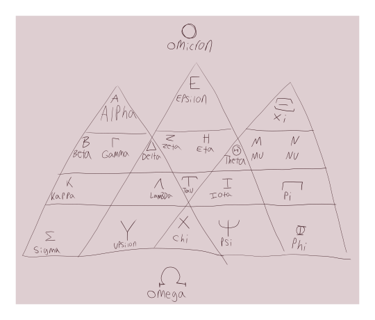
Two genders lie outside of the pyramids-- Omega is for children and good-for-nothings, and Omicron is reserved for their God.
Their god is actually the mad scientist who created them, he said that no one else is allowed to have his gender because he got really jealous of the idea that someone else would copy him. He's an immortal weirdo who literally just embodies the "I DON'T WANT TO CURE CANCER, I WANT TO TURN PEOPLE INTO DINOSAURS" meme.
(what does Omicron mean? It means he does what he wants. he liked the sound of 'omicron'. shut up. go make a race of dinosaur people and then you can complain)
He created them when he fled Earth (and all of its pesky ""Ethics Violations"") so that he wouldn't be alone in space. He stole a big codex of all the DNA for the Avemetatarsalia clade (and as many little vials as he could fit in his pockets, which is why every standard-issue uniform has 5 external pockets, 2 internal pockets, and a Surprise Pocket which the issue-ee has to find on their own), jumped into a rocket, and set a course for a crash-landing on a little planet that was orbiting a gas giant
The gas giant and the planet did already have names, but he renamed them to Sauropod-B and Cambria. Most practical Starmaps had to be updated about this because the name "XB-343" or whatever really doesn't prepare you for a full-sized edmontosaurus tackling you when you step foot onto the weirdly lush planet
Everyone also ends up with a beast form they can tap into, with great effort. They tend to resemble 1 particular species, blended a little bit with other types. So instead of being just a stegosaur, they're a stegosaur-like creature with fluffy yutyrannus fur or something.
In their default forms, they're strange half-dino half-human creatures, with mixes of crests, horns, claws, elflike ears, and a flexible tail. In beast form, they keep their same general 'colors,' traits, and their ears.
The race is nameless right now because I don't really like their old one, but they're a personal for-fun thing that until now existed exclusively in a shared OC-world with my partner. One of those old ideas that you kinda keep going back to for funsies.
45 notes
·
View notes
Text
Aha! I'm right. Or at least I think I'm right.
So: over the last couple of generations, high-end (~45-watt-and-higher) laptop CPUs from both AMD and Intel have come in two variants: a traditionally sized chip that's primarily designed for mobile use, and a larger chip partially derived from the desktop version of the CPU in question with a higher maximum core count (each core is itself physically the same and generally is similar in speed) and significantly weakened integrated graphics to save chip space for those extra cores. This isn't an official name, but I'm going to call these bigger chips "extreme" in this post.
(Oh, for clarity, gaming laptops generally use the graphics that are built into the CPU when you're not running a game, as running a separate external graphics chip uses a bunch of power even when you're just browsing the web; there are multiple modes of operation here and it's not important to this post.)
For Intel CPUs, starting with 12th gen, the regular chips have an H or HK at the end (e.g. 12700H) and top out at 6+8* cores, while the "extreme" chips end in HX (e.g. 12800HX) and the latest ones top out at 8+16 cores. The lower end of the "extreme" range totally overlaps with the regular chip line, though.
*6 big performance cores; 8 little efficiency cores. AMD uses one type of core that, to oversimplify, let's call a compromise between the two
AMD's "extreme" chips came out about a year after Intel's, and AMD's model number scheme recently got changed to be, in a word, fucked, so we'll gloss over the names and link here for details and say that, loosely, if it doesn't end in 45HX (or, in the future, 55HX, probably), it's a regular chip and tops out at 8 cores, while if it does it's an "extreme" and tops out at 16. Again, there's an overlap between the low end of the "extreme" range and the high end of the regular range.
Why do these overlapping chips exist? I think a big reason is that the packages are physically different between "regular" and "extreme" chips, and so a certain laptop motherboard design (and, essentially always, laptop design) is compatible with one or the other. The AMD Ryzen 7745HX, say, is an 8 core chip in a physical package that could fit 16 cores, and would thus be used in a lower spec variant of a laptop that can go very high-end.
Now, normally you would think the consumer shouldn't really care about this distinction. If I'm getting an AMD chip with 8 "Zen 4" cores, I shouldn't have to care about whether it's a 7745HX or a 7840HS, right? If I'm getting an Intel chip with a 6+8 "Raptor Lake" config, I shouldn't care if it's a 13700H or a 13700HX, right? Small difference in maximum clock speed aside, anyway, which one should generally ignore IMO.
But, not quite. Because, firstly, as mentioned, the "extreme" chips have significantly worse integrated graphics. Now, this generally doesn't matter in a gaming laptop with a massive, expensive discrete graphics card that will turn on whenever you open a game. It wasn't that many years ago, though, that Apple (a company that drove high-res laptop displays, and cares immensely about UI performance on them) actually commissioned an exorbitantly expensive-to-manufacture chip line from Intel with more powerful integrated graphics.
But the other point—something that, as far as I can tell is specific to AMD—is that their "extreme" package, as far as I can tell, has higher idle power draw than you would expect from a mobile chip. Because it kind of... isn't a mobile chip in some senses? Like the desktop chip it's based on, it's actually two to three chips packaged together, and while that kind of thing is likely the future (Intel just announced their first mobile chip, Core Ultra, that's broadly in this category), the AMD Dragon platform doesn't seem very mobile optimized. Hey, it was the first non-monolithic mobile chip, it's not terribly surprising.
Now, that doesn't make it a bad line of chips. Actually, AMD CPUs are as a baseline currently measurably more power efficient than Intel ones (Core Ultra muddies this but ignore that for now, it's not widely available), so their "extreme" Dragon ones generally wind up in the same battery life range as their Intel competitors. But it does mean that—again, as a generalization—a gaming laptop might find itself in the slightly higher tier of battery life than an otherwise very similar device because they have AMD CPUs that are similar in specification and performance but different in physical package.
And I think I found one! The reason I made this post is because I was trying to decipher Lenovo's 8th generation gaming laptop lineup, as one does, and I couldn't figure out the difference between the Legion Pro 5 and the "Legion Slim 5."
(Well, aside, the big issue is that the latter's name is entirely inconsistent; Lenovo has a thinner and lighter product line that the Legion Slim 7i (and hypothetical-but-nonexistent AMD-based Legion Slim 7) continue, but the "Legion Slim 5" uses the regular-size body and should thus be a "Legion 5." Also, in the past they used the "Pro" name to indicate a taller 16" display, but all of them use that now, so they're now using it to mean something else.)
But, whatever, anyway, I noticed that the Legion Pro 5 is using the "extreme" processor line and the "Legion Slim 5" is using the regular one. And they're otherwise very similar! In fact, if I compare part numbers 82Y9000NUS and 82WM001JUS on the Lenovo site at this very moment, the only differences in their compare tool are the HS/HX CPU model numbers as mentioned, a 0.23lb/0.1kg weight difference in favor of the Pro (the Pro body has more metal, per reviews), a $60 price difference in favor of the "Slim," and shipping with a different charger. Those are two awfully similar devices for a company to be selling at the same time in the same hardware generation.
And god, I want to be a laptop reviewer with the kind of budget that lets one buy laptops for review so bad, because that would be such an interesting comparison. I couldn't find many review outlets that have tested both (and why would one have). The only one I could find is the venerable NotebookCheck, which has tested an 8-core "Slim 5," an 8-core Pro, and a 6-core Pro...
...and got web browsing battery life figures of ~7, ~4, and ~5.5 hours. Now, I wouldn't trust those numbers to be highly precise by any means; I would want to see more tests from different review outlets. But that's completely absurd. These are very, very similar devices, and the slightly higher-end one is getting something like one third or more worse battery life in that test. If that delta is accurate, I have no idea how much of that to assign to the fact that one of them is a Dragon chip and one is a Phoenix chip (and the differences in their motherboard components directly due to that difference), but, I mean, I have no reason to conclude that it's anything else; if it's some other component, why would Lenovo put the more efficient component in the cheaper device?
So that's just truly fascinating to me. I guess the practical upshot of this might be "hey look, a scenario where the 'better' product is probably worse," but I doubt anyone will be reading this and cross shopping that particular device. More generally, it's just cool to find a scenario where subtle details like this have a (seemingly) meaningful effect on something most users of a device would find themselves caring about at some point, when these days I find that the majority of tech products are all reasonably decent and all reasonably comparable and there's not a whole lot of analysis to be done that anyone should care about.
#I need a tag for “computer bullshit”#long post#this... took me... like three hours to write up why do I do this#(I know why. actually. practice explaining things.)
0 notes
Photo

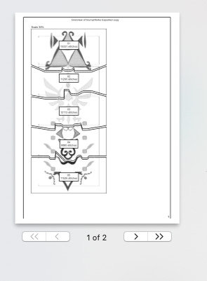
Print Tests
Above are A3 colour and layout print tests. They are scaled to fit, so the text and assets are not full sized. This gave me an idea of the colour shades and compositions. I can see from these that the older blue shades were too dark, and the lighter one is not quite the shade desired. The new poster layout also needs a few adjustments to fit better.
Full scale prints
Full scale tiled poster on x2 A3 pages. This and the one below, have been assembled by leaving one overlapping flap and gluing the other page to that. The outter bleed and crop marks have not been cut out. After printing this I have a btter idea of what the final poster will look like, and some some small changes that need to be done. My speaker names at the bottom sit too close to the 4, The title text inside the 2 is not positioned very well, I think it would be better to align it to the left margin like the text below.

Full scale tiled brochure side below.
Changes to be made: The speaker images came out a reddish tint due to colour mode issues. They were created in Cmyk, so I’m not sure why they came out tinted, but to fix this I changed them all to Greyscale. The Timetable text needs to be slightly larger for legibility. The map has been adjusted for visibility. The Back cover has now got added details and the map on it as requested by the brief. The Front cover scale and positioning needs small changes to sit better. The blue colour needs to be updated.
Full scale old poster printed on x4 A4 pages. This printed poster did not have overlap set, and as you can see there are bits across the middle that have been cut out when printing.

0 notes
Photo

Some of my lovely friends asked to show how I do my blending, so here is a very long tutorial! I will explain how to:
Blend GIFs with lots of movement
Blend three or more GIFs on one canvas
You will need:
Any version of Photoshop with a timeline
Basic-intermediate knowledge of GIF making (including cropping, how to use adjustment layers for color correction, applying layer masks, and placing multiple GIFs on one canvas)
Since the way I blend depends on the footage I'm able to work with, I often end up going in a different direction than I first planned. So this isn't a strict step-by-step guide that can be applied to everything you make. These are just some tips!
Read the rest under the cut.
TERMINOLOGY:
(Pretty sure you already know this but I will be repeating these a lot here, so just in case!)
Highlights & Shadows - The highlights are the brightest parts of the image. The shadows are the darkest parts. Remember that just because it's bright doesn't mean it's actually white, and just because it's dark doesn't mean it's actually black!
Negative Space - This refers to empty space around your subject. When there's negative space, it's easier to spot the focal point of the image.
BLENDING GIFS WITH LOTS OF MOVEMENT
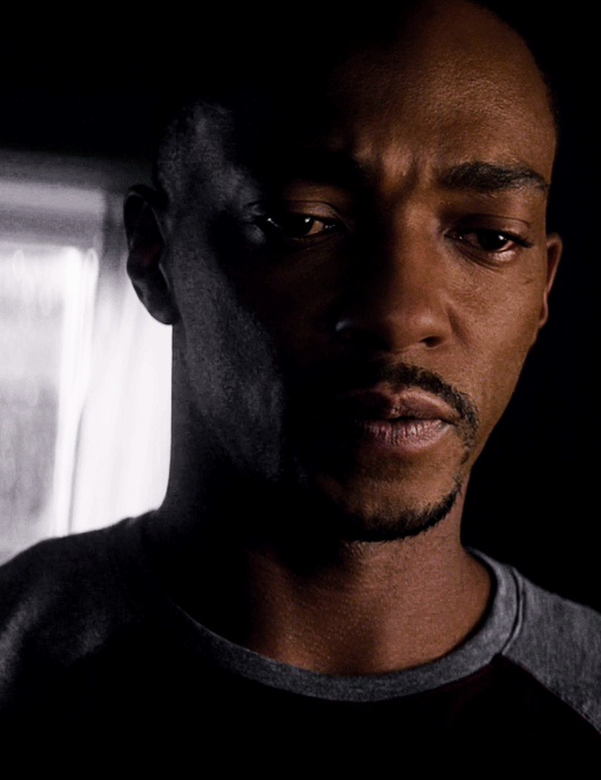
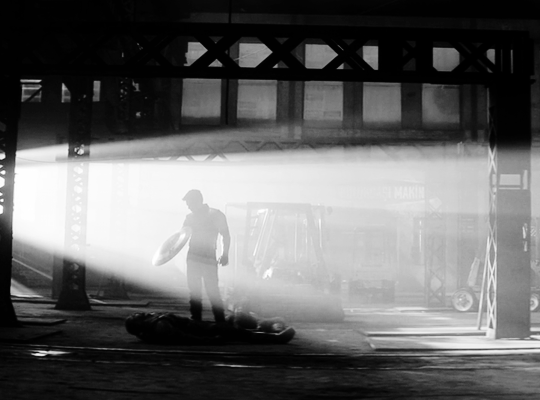
Number of GIFs: 2
Main GIF: Closeup of Sam (“big!Sam”)
Secondary GIF: Sam flying (“flying!Sam”)
STEP 1: Find the right scenes
Since the subject of the secondary GIF is much smaller and basically cuts across the frame, it’s important (but not always essential!) that the main GIF has less movement and a decent amount of negative space.
STEP 2: Make your individual GIFs
Make your GIFs like how you usually do (Important: Remember that your GIFs need to have the same number of frames). When it’s time to crop, it’s best to have the two files opened in Photoshop at the same time so you can compare them against each other. It’s absolutely fine for them to overlap because that’s the whole point! The secondary GIF has Sam flying in from the top left to the bottom right, so I cropped the main GIF with him off-center so there would be space to see flying!Sam.
Now we have these two GIFs:

STEP 3: Combine your GIFs
Place the secondary GIF over the main one and adjust the blend mode. Setting the blend mode to Screen usually works, but in this case, this is how it looks:
As you can see, the highlights in the main GIF are obscuring flying!Sam in the first frames. You can only see him clearly when he’s flying over big!Sam’s face. This is because the shadows on the top GIF will lighten and/or disappear against the highlights of the bottom GIF when set to Screen. It would be too complicated to fix this with a brush (which we will get to later) because of the movement in the secondary GIF, so instead I set the blending mode to Multiply, which is the opposite of Screen. Now here is the GIF:
We can now see flying!Sam. But the blue of the sky is now a pseudo-filter over big!Sam’s face up until the last frames. So I applied a Hue/Saturation adjustment layer over the secondary GIF to remove those colors. The sky in the GIF is made up of cyans and blues, so I dragged those sliders down to -100. Here is how it looks now:
STEP 4: Erase the bits you don’t want
So that big!Sam’s face isn’t covered by flying!Sam’s wings and that pesky airplane up top, we have to use a brush to erase those parts. In the Layers panel, make sure your GIF layers (in this case, groups/folders) are selected and click the Add Layer Mask button. A little rectangle next to the layer/group name will show up like so:
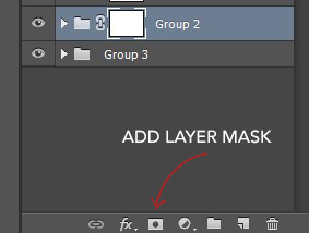
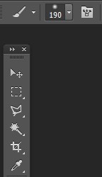
Then in the Tools panel, click the Brush tool, pick a soft brush and set the size to around 180-210px. The larger the brush, the softer the look. I learned this from Becca (@inejz-ghafa) who made an amazing tutorial a while back (will link it in the source at the bottom)! Adjust the brush size if you have to.
Now click on the little rectangle layer mask of the group you want to erase (in this case, the secondary GIF). When you do this, the Foreground and Background Colors buttons in the Tools panel will revert to the default black and white.

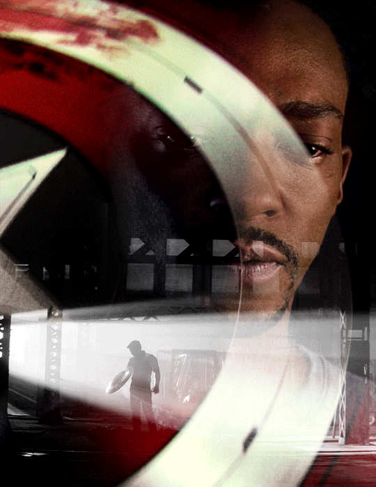
Painting with black will erase and painting with white will undo the erasure. So I erased the airplane and the bits of the wings covering his face. I didn’t erase the parts that overlap with his uniform, just to keep the effect of flying!Sam zooming across the GIF. And here is our finished product:

BLENDING THREE OR MORE GIFS ON ONE CANVAS
We will be working with these two GIFs since they use different techniques:

STEP 1: Compose your image
Find the scenes you want to put in your GIF and choose which of those is the most important. Once you've decided on that, you can build the rest of the elements around it.
Sam's GIF: Multiple Exposure Effect
Number of GIFs: 3
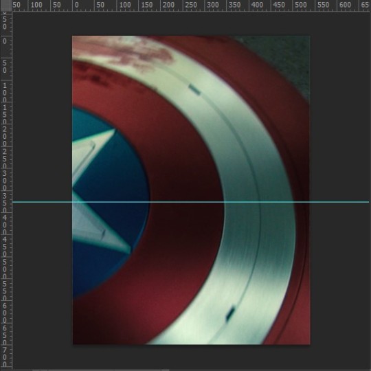
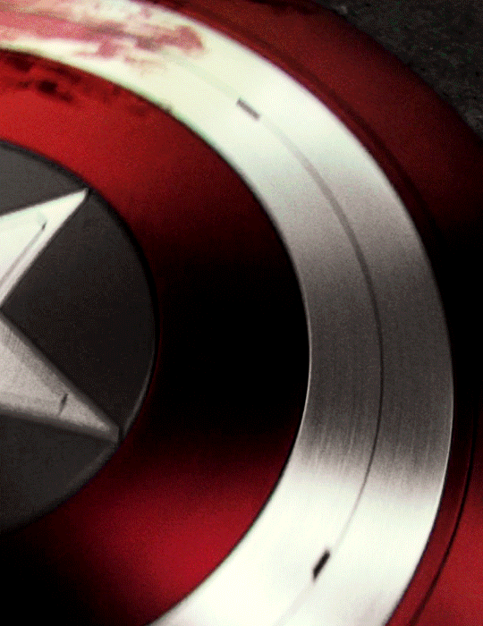
Main GIF: Bloodied shield
Secondary GIF: Closeup of Sam
Tertiary GIF: Bucky with the shield
STEP 2: Make your individual GIFs
Since the shield is the most important part, I made it the largest GIF and cropped it close to emphasize the star and the blood. I made Sam's GIF the same size, but cropped it with his face off-center so that the star wouldn't completely cover his face. Again, it's totally fine for the images to overlap! The tertiary GIF is the least important so I cropped it smaller. To determine the size of that GIF compared to the shield, I made the Rulers visible (View > Rulers; or Ctrl+R) then clicked the top ruler and dragged down to create a guide to where I wanted the smaller GIF to end. Then I measured from the bottom of the GIF up to the guide to determine the height of the smaller GIF. (Tip: It's better to make the tertiary GIF too large than too small. That way, you have more to work with. So size it larger than it will appear on the final GIF.)
This is only a stylistic choice for this particular set, but I removed the blue from the shield and set the tertiary GIF to black and white, so that the only notable colors in the GIF are red, black and white. Varying up the coloring of each GIF (i.e. color vs. monochrome) adds some spice to the image, so play around with these different styles if you like!
Here are our three GIFs:
STEP 3: Combine your GIFs
At first, I made the main GIF of the shield the bottom GIF. Then I placed the secondary GIF over it and set the blend mode to Screen, but found that it lacked depth. So I switched them and made the Sam GIF the bottom GIF (blend mode: Pass Through) and placed the shield GIF (blend mode: Screen) over it. And this is what I got:

Notice how the window behind Sam on the left side is distracting? It also partially obscures the star. So I went back to Sam’s GIF, created a New Layer and painted over the window with a black brush. Now here is our GIF:
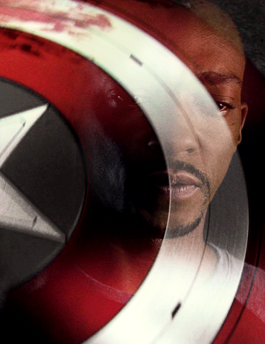
This is just my personal preference, but I wanted the area around the star to be a solid black rather than gray, so this time I created a New Layer over the shield GIF and applied a layer of black with the Paint Bucket tool, setting the blend mode to Soft Light. Now we’re done with the main and secondary GIFs:


Now let’s add the last GIF:
STEP 4: Erase the bits you don’t want
Lastly, I erased the warehouse rafters over Sam’s face and a bit of his shirt and the warehouse floor on the bottom right corner using Layer Masks and a soft brush (like in the first tutorial). And we’re done!

Bucky's GIF: Silhouette Effect
Number of GIFs: 3
Main GIF: Bucky holding the notebook
Secondary GIF: View of the sunrise from the boat
Tertiary GIF: Sam and Bucky walking away
STEP 2: Make your individual GIFs
To achieve this silhouette effect, the main GIF needs to have a clear focal point, which means it’s better to have negative space around the subject and for there to be minimal movement. In this case, the subject is made up of Bucky’s hands, notebook, and part of his shirt; and there’s some movement but we can still work with that. The other two GIFs will then be placed “inside” the subject. Because the negative space in the main GIF consists of highlights, I chose a secondary GIF which emphasized the shadows. For the smallest GIF, I used a guide like in the previous tutorial to measure its size.
We have these three GIFs:

STEP 3: Combine your GIFs
Place the secondary GIF over the main one. In my case, I didn’t measure it right so I had to nudge the top GIF a bit to the right to fit it inside the silhouette. The important thing is that the edge of the secondary GIF should not overlap with the silhouette itself, or else the illusion “breaks.”
Now let’s add the third GIF:
STEP 4: Erase the bits you don’t want
For this GIF, there’s a lot we need to erase! Using Layer Masks and a soft brush again, erase the parts of the secondary GIF that extend beyond the silhouette. It’s entirely based on personal preference if you want to keep some parts of the secondary GIF outside the silhouette (like I did here) or if you want them completely removed. And for the small GIF, erase the edges for it to blend with the secondary GIF while also staying within the silhouette of the main one.
Now here is our finished GIF:

And that’s it! If you’ve made it this far, thank you for reading. I hope this was useful! Remember, there is no definitive way to blend GIFs, so keep experimenting. And don’t be afraid to make mistakes either, because we learn a lot from those. Happy Photoshop-ing!
- Elle
#completeresources#allresources#blending tutorial#photoshop tutorial#userpavi#tusergabriela#usersae#userrex#usertk#supervalcsi#usernums#userringo#userkraina#usersmile#tuserlouise#usersof#mine#my tutorials
2K notes
·
View notes
Last Seen Blogs

kaiseycapsisbatbitch
i will set the fires that make the ocean burn

twisted-writing-mess
Write the way into their heart ✎

larschoi
oc blog

kalamwaala
Experiences Unlimited!

jyotigarg001
Untitled