#trying to find easy hand drawing tutorials
Explore tagged Tumblr posts
Visit Tumblr Blog
Explore Tumblr blogs with no restrictions, modern design and the best experience.
Last Seen Tumblr Blogs


Fun Fact
There were a total of 171.5 billion posts on Tumblr in 2019.
Text
When you're trying to draw hands but cant draw them properly but you're supposed to draw them properly cause they're one of the only obvious things that differentiate your art from AI art

#i cant draw hands to save my fuckin life#trying to find easy hand drawing tutorials#art struggles#artists on tumblr
2 notes
·
View notes
Text
A Big Collection of Art Tutorials
I find art tutorials really useful and also, sometimes quite far-flung. I'll come across one cool resource here and another incredibly helpful post in a totally different place, months later. I've been collecting bits and pieces of art advice that ease my way for a long time now, and I wanted to make a post to share some of the good art resources I've come found all in one place! GENERAL RESOURCES The Etherington Bros. have an enormous repertoire of drawing advice on their blog and I find almost all of it spot on! Griz and Norm have an incredible tumblr chock full of tutorials!
Drawing Den is a great tumblr that collects how-to-draw resources! Zephy.fr has some lovely free tutorials on their Insta (their main site is paid, but I've found the free resources to be quite helpful all on their own)
Sycra has a truly wonderful YT channel comprising a zillion vids on practically every topic - he's been going a long time and it's all excellent (his stuff on human anatomy and figure really fixed some difficulties for me)! DRAWING PEOPLE THIS is my favorite basic breakdown on expressions! A HELPFUL WAY to conceptualize drawing hair! People are complex - simplifying with CLEAR SILHOUETTE helps!
Aging or de-aging characters can be rough- THIS HELPS imo! WHEELCHAIRS are easy to get wrong if you don't have one/haven't studied how to draw them - and this is a very helpful remedy!
CLOTHES Hats are difficult to get sitting right and THIS POST helps a lot!
Suits and formal clothing can be A Lot: THIS LAYS IT OUT helpfully!
Historical Menswear is tricky: TRY THIS LINK by Shoomlah
And as always.... DON'T FORGET TO STRETCH YOUR HANDS!!!
(this makes a big difference in the long run, I can't emphasize enough that you oughta try a little stretching on the regular!)
3K notes
·
View notes
Note
Any tips for a perfectionist that wants to be able to draw funny doodles like you do?
Easy, stop being a perfectionist. I'm joking but also I'm not, lol. IT'S HELL. You're gonna fight your own brain and the voices telling you that it's "not clean" "not finished" etc Work with it like an addiction. Sometimes you manage to change and do better (let go of perfection, and shit a bunch of doodles) and bam the day after you find yourself crying for 2 hours on drawing a hand nobody cares about. It's ok, once you realize you lost yourself into details again, just redirect yourself to what's important: clarity and expressions. Clarity: legible, well placed text (start with drawing stickmen and immediately place the bubbles) and clear simple action/poses. Then expressions: draw funny eyes and the BARE MINIMUM of bodies, like a hand pointing and the 1 or 2 distinct elements to make a character recognizable.
The only important parts are the one used in the joke. If someone bangs their toe, draw a shit minimalist triangle body and make sure the leg and foot are there and the movement on it is clear. Nothing else is important. Leshy is a triangle body with a wiggly sphere on it for the head, with a few lines as antlers. Morgan's head is a bunch of triangles.


This looks like shit but the joke is clear, you know who is who, good enough, hit send.
I HIGHLY advise to regularly compare your work to your fav shit doodles artists. Watch them draw if they stream. Every time you feel like you're being a perfectionist, go see their art closely, and you go like "Oh they really don't give a shit huh" and then you go back to drawing and try to give the same amount of shit lol Also save expressions you find funny from mangas and stuff, and copy them to understand them.
And find comic tutorials online, what efforts you don't put into "good art" you want to put in comic building basics so your jokes come across better.
There we go, I rambled. Hope this helps!
208 notes
·
View notes
Text
Just Dance Care AU!
Ok ok so I thought of a story for this Au but it’s nothing really impactful or full of drama and angst like my other au’s, I wanted to leave this au easy and fun to play around, because, let’s say it. Just Dance and drama in the same sentence makes me laugh.
story and PNG version under the cut!
(I gave up on Y/n design because I couldn't figure out a general look for them. This is you we are talking about! Draw your own JD fit, I'll draw mine soon XD)
Anyway here’s the story so far:
Year 2029, videogames industry made a huge step forward and classic consoles and devices were substituted by the new and upgraded VR headsets with full body tracking. It’s something like the NerveGear in Sword Art Online without the kill switch. Some games still require you to actually move your body (like fitness games or sports because yeah, they don’t have a purpose otherwise).
Y/n wanted to buy the newest VR headset but, while searching for the best offer, they found out FazCo entertainment was hosting a giveaway, the prize? One of their prototypes, a VR meant to be released the next year coinciding with the opening of their first mega pizza plex.
(so the plex doesn’t exist right now). You decide to sign up for the giveaway and after a while you receive an email telling you you won the VR headset and that, to claim it, you need to read and sign a series of NDA policies (understandable, it’s a prototype headset that’s not even in commerce). Some clauses are a little bit concerning but nothing you hadn’t read on other electronics booklets, so you decide to sign. After, like, a day, you have the VR in your hands.
The box let you know with super saturated and colorful writing, that the VR came with a game pre-installed inside. Uh, that’s why they were giving one away, they wanted a free game tester…but you know what, it’s worth it.
You always liked Just Dance games, they make you think about happy memories of your childhood. This pre-installed game called “Five Dances at Freddy’s” is a close copy of your childhood game with original FazCo songs, characters, environments and also some collaborations with other famous artists. It probably will be the cause of a big copyright infringement report.
There are various ways to play it: story mode, Casual dance, Five Dances, and Just Dance Care.
The first one is similar to the casual dance mode but with little cutscenes between a dance and another to tell a tale, Casual dance is how you can play the collab songs, Five Dances is the multiplayer mode and Just Dance Care is a more uhhhh “hard” way to play the game with all the other modes mixed in it. You stare at the description of the last mode smirking and decide to try it first just to see how far you can get before losing (yes you can lose in hard mode in this Just Dance, but you don’t die, you just have to restart from the beginning). Turns out the FazCo wasn’t kidding when they advertised the new headset as a breakthrough in the world of virtual reality headsets, the thing TRANSPORTED you inside the game itself.
You almost have a heart attack when you can’t find your VR on your head, but before you can try something you are blocked by two tall individuals who you think are the “tutorial” characters.
Yadda yadda, tutorial, you can pause the game and exit whenever you need just by opening an hidden menu, you find out your tutorial characters are called Sun and Moon and that you are way worse than you remembered at dancing (damn full body tracking, there is no way you are going to do a cartwheel in the middle of a dance, you still don’t know if your body is inside your home and if you’ll physically feel pain if you fall and you don’t want to find out).
You pass an embarrassingly long time trying to win your first dance battle just to discover it was still the tutorial.
You try to go on with the story but you fail at the first real battle with a bear character named Freddy.
And guess what? You have to start again from the tutorial! Y/n is gonna spend A LOT of time with Sun and Moon if this goes on.
557 notes
·
View notes
Text
How The Tables Turned [Ford x reader oneshot]

Summary: This time, its Ford making you stop what you're going to make sure you get sleep.
Rating: SFW and very fluffy
Warnings: Aside from a slightly suggestive part, none!
AO3 version
A/N: Actually based on a period of time where I tried to learn how to use unity (before the whole drama of it happened). I refused to do ANYTHING but to work on my little project no matter how much I was starving for a few weeks straight. lol.

It’s basically routine at this point for you to drag Ford out of his lab to head for bed. Even if you remind him of the benefits on sleeping and how the lack of it will impact his work, you still needed to get him into bed, sometimes having some food ready for him to make sure he didn’t sleep on an empty stomach.
That’s how its USUALLY IS.
Lately, you’ve started your own personal project involving learning a game engine to play around with. It was mostly just a random idea one day, wanting to try your hand at making your own little “video game”. Nothing too fancy, just something fun to put together and to learn some new skills along the way. There was A LOT you needed to look into and learn to make this happen, however.
From learning a coding language, the game engine itself, a mix between finding free to use assets and even making your own when nothing suited your taste- you had a lot on your plate. It wasn’t all that bad really, considering how this whole thing turned into a full blown hyper fixation fairly soon after starting it. It was easy to let the hours fly by as you were split between watching tutorial videos, drawing and fixing any errors/bugs in any of the codes you wrote down. You were aware of when you needed to sleep, eat and do other things for your health, but something about working on this project made you refuse to move from your chair. And you weren’t the only one to noticed this.
After a decent amount of time being with you, Ford has grown used to the routine of you coming to his lab to check up on him. It got to the point where he purposely stayed late in the lab to get you to come in and “pester” him to take care of himself better. The feeling of knowing you cared and loved him so much to go out of your way to make sure he knew that was something he relished in. Of course, he did felt a little “silly” and “immature” doing this instead of straight up telling you, but there was no harm being done anyways, so it was fine.
So when you stopped checking on him after a few nights, he couldn’t help but to worry a bit. At first, he figured you were just a bit busy, possibly even out for the night, so he didn’t think too much of it. However, when walking into your computer room and seeing you up staring at your screen with an open notebook with various random things written on it, he couldn’t help to smile a bit as you reminded him of his university days. You were just working on something, nothing too bad.
But as time passed by, he soon realizes he only ever sees you in your computer room. You barely went out for anything, even for food. Ford didn’t want to jump to any conclusions, but he was worried. Things escalated for him when he barely sees you in bed anymore.
It’s not like he didn’t talk to you as you were deep in your work. He would sometimes check in on you when things felt a little too quite after he started to noticed your absent in his lab. Ford was happy you were able to pursue something new and to take the time and effort to do it. He was aware of the little game you wanted to make for the sake of saying “I made this!”. When he had the free time, he’ll listen to you talk about the things you learned, some of the issues you faced and how you fixed them, etc etc. But he can only take so much before he had to really step in for your own sake.
The sky was dark out, and it was around 1am. You weren’t in bed yet. Again. Ford was really concerned for you now. Walking through the dim hallway, he opens up the door of your computer room. He can see you fully concentrated on your screen, looking over some codes you put together, as if you were trying to find any errors in the lines of text that was presented in front of you. It was obvious how dry your eyes were, how your body longed for rest, but the urge to keep going and to fix this one mistake kept you from wanting to sleep despite how much you felt the need to do so.
It was almost funny to him. A taste of his own medicine some would say. It reminds him of the many nights on how he too would refuse to stop for the night, always needing to do one more thing before he could let himself rest. How you would do your best to persuade him to let himself walk away from his work, to take care of himself to avoid any health complications, and to spend time with you in the comfort of your bed.
It made him feel guilty as well. The things you did for him and how much you loved him to always go out of your way to show it. Ford knew he was taking full advantage of that, and he wanted to repay it back.
You jumped a little in your seat when you felt his familiar six finger hand land on your shoulder, being so focused on the lines of text on your screen that you forgot where you were for a good bit. You look over at Ford as he stood beside your seat, giving him a weak smile.
“Oh hey! Do you need anything?” You asked before quickly looking back at the screen again.
“Love, when was the last time you ate?” Ford asked you in a gentle voice.
“Uh… I had breakfast?” You answered, only remembering you had some toast with a sunny side egg on top when you last ate. It didn’t seem like it mattered too much though.
“Its almost one am” Ford replied, a little stern this time. You quickly check the clock on your taskbar, feeling surprised from how much time had passed.
“Oh… oops” you spoke mostly to yourself, feeling a little silly for not checking the time more often. “I’ll probably head to bed soon”
“Not soon,” Ford points out, “you’re going to bed now.” His words made you look at him again, confusion viable on your face.
“Just let me do this one fix-” Ford says your name, stern voice again, causing you to stop your sentence.
“You are fully aware of the effects of not taking care of yourself” Ford spoke to you with a smirk on his face. You knew that he was referencing the many of times where you brought out the facts of how the lack of sleep and self care can affect your health and day to day life. It was the best way to convince him to come to bed and let you cuddle with him until you were both asleep. “You’re no different form me, sweetheart. Got to practice what they preach, as they say”
“Uh…. I’m built different?” You gave a half shrug and a low chuckle at your own joke. Obviously, this did nothing to change his mind. You knew he was right, and had nothing to say to argue back. Ford knew this too. “Fine… let me quickly save and shut off my computer…”
Ford watches you quickly save any progress before shutting off your computer, the light of the screen turning off and making the room dark as it was the only thing on. As you start to stand, your body fully conveyed how tired you really were. You were about to walk to the hallway door before Ford lets out a ‘let me’, and you were now being picked up bridle style in his arms. You let out a small gasp, often forgetting how much muscle the older man has as he often hides it away in his iconic turtleneck. The comfort of him holding you made the realization at your own exhaustion hit hard. You can feel yourself somewhat go limp as Ford carried you to your shared room.
Ford felt you quickly relax in his arms, feeling prideful as he carried you to your bed. Sitting you on the side and pulling the blanket back. He lays you on your pillow before fallowing suit into his usual spot on the bed beside you. Your eyes were shut as you let yourself sink into the soft mattress, the weight of the blanket being pulled over you giving a sense of security, along with how his arms wrapped around you to pull you close to his chest. You let out a sigh of relief as you feel him nuzzle his face into the crook of your neck, getting a few shivers down your spine.
“Sorry…” You mumbled to him, feeling guilty now for making him go out of his way to get you to bed. You feel him chuckle into your skin, the smile forming on his face being easily felt on your skin.
“Nothing to be sorry about sweetheart,” his replied, voice audibly sounding more tired, “I should be the one to apologize, making you go through this almost every night. I see how doing this almost all the time can be a bit frustrating for you.”
“Not if its you,” You were quickly to reply, “I’m always happy to make sure you’re okay”. Ford felt his heart flutter at your words. You always did surprised him with how much you loved him despite how many times you pointed it out.
“The feeling is mutual,” Ford placed a kiss on your skin as he caressed one of his thumbs that rested on you, “lets get to sleep now, I’ll be sure to do something for you in the morning” Ford gave another kiss on your skin, and you can’t help but to feel excited for what he had planned.
Silence followed as you two let yourselves slowly fall asleep in each others comfort. Feeling his steady heartbeat on your back lulled you to your sleep.
Ford smiled when he realized you fell asleep before he did. It was no surprise, you needed it really bad. Without fail every night when he has you in his arms like this, he feels like the luckiest man in the multiverse. He didn’t deserve you, but it was almost as if this is the repayment he deserved after many years of suffering, a way of life saying sorry to him.
And he wouldn’t ask for anything else.
#Gravity Falls x reader#Ford pines x reader#stanford x reader#reader insert#fanfiction#one shot#fluff#Killjam's fic tag
365 notes
·
View notes
Text
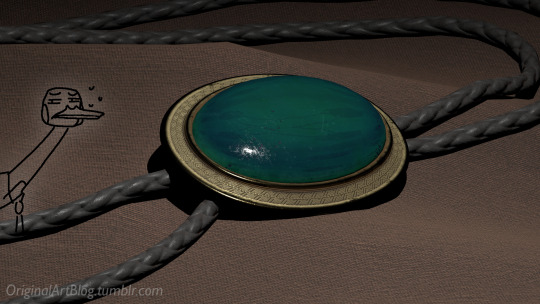
"Nawy what do you MEAN quick-ish 3D render it's got scratches and everything and I thought this was real for a minute!!"
Well, first, thank you very much that was the intention ❤, and second, you see, all speed is relative, and between finding my references, modeling, texturing and lighting, on top of having to learn how to make convincing gems, it still took me quite a few hours. I, however, cut corners everywhere for speed, and I wouldn't put this piece in a portfolio in its current state.
But! for the curious, I thought I could do a simple breakdown of how the witchcraft happens, without using too much specialized language to make it more accessible. In short,

In this case, I’m talking about a 3D model that was textured (colours and stuff) and then lit (lights on!) to make a pretty final picture. The objective is not to make a tutorial, but to put in simple terms what a 3D artist does to make something go from this, to that:

(people curious and/or trying to see if this interests them welcome)
I'm skipping the 3D modeling part altogether, since it isn't where most of the magic happens here. Just know that to be able to add colour and stuff on a 3D object, you have to go through the process or "unwrapping" it, which is like doing those foldable cubes in reverse
and then we can draw on it!!
Now, the good stuff:
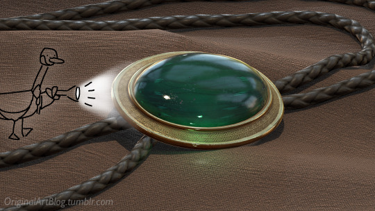
Surfaces (metal, plastic, fabric, wood, skin, etc.) have different looks that make you able to differentiate them on sight. To make something look realistic, you have to try to replicate real life into the 3D world (duh.)
The software developers took care of the hard part (math and coding), so as artists we can play with the parameters available to make something pretty. What those parameters are depend on which "recipe" we're using. One of the most common "recipes" for realistic results is called PBR: Physically Based Rendering, named that way because it's trying to replicate real-life light physics. In this case, the 4 basic parameters are called albedo, roughness, metalness, and normal.
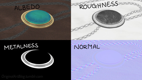
Albedo is the base colour of the surface (easy stuff). Roughness is to determine if a surface is rough or shiny. Metalness is to say if something is made out of metal or not. The normal is there to add all those tiny details you don't want to or can't sculpt on your 3D model (engravings, fabric bumps, etc.)
The roughness and metalness are black and white images because the information you're giving to the software is black = no and white = yes. It's easier to understand in the metalness image, where everything that is NOT a metal is black, and everything that IS a metal is white.
The normal is a bit more complex, but in short, it uses the colours green and red to know what is up/down or left/right, and will help the software fake relief on top of the model. You don't make it by hand; it's computer-generated from other stuff I'm not getting into.

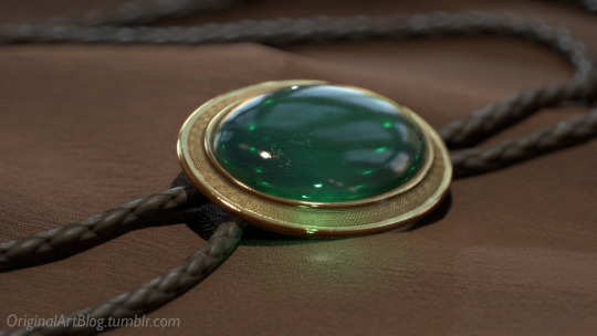
With the technical stuff out of the way, we can actually use these. There are specialized softwares that will let you preview the results of each parameter in real time, so you can see what you're doing easily. This is what I have.
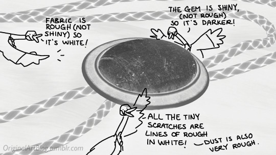
That software comes with some types of surfaces that are already set up, like the fabric in my piece, which was already 85% good for me straight out of the box. Then, it's up to me to use the tools available to decide how shiny a surface is, if there's dust or scratches and where, what colours things are, if there's metal parts, etc. That's where you can see a 3D artist's skills.
And finally, you bring it all together into a specialized software that can render 3D stuff and use those images on the corresponsing parameters, and then light the scene.
Because it all comes down to this: the light! For something realistic, light is vital to get right. You can pour your heart and soul into those tiny scratches, but if you don't light the scene correctly, well...
So we carefully light the scene to get some nice highlights to make the textures look good and highlight our subject (it's basically a photography studio inside a computer)
And then we add some camera effects...

and voilà! pretty picture!!
... and if you somehow did notice something different with the bolo tie from my last post, I did find out while taking all these screenshots that I messed up my initial renders in a way that made everything darker than it was supposed to be and that's why my gold looked so muddy...

I hope this was interesting and that you learned a thing or two!
#welcome to nawy's 3d school for complete beginners#nawy's 3d#technically not art but... you know...
377 notes
·
View notes
Note
You might’ve said before. But what animation software do you use? And what do you refer to use?
But also sorry, for a beginner what one would you say would be easier and simpler to use? I love seeing your animations you make everything down nicely
It depends on what I want to do
for the comics most of the time I just use photoshop, tho i wouldnt really recomend it 😅 is not that much intuitive but it gets the work done for what I need on the comic and is what I normally use to draw so it's easy for me
when the comic has more complicated animation and I need a more normal looking timeline, I move either to krita or lately to clip studio
for example the animation of One rising and the kick were done in krita

Krita is a free drawing software, I almost never use it now, but I do highly recomend it, specially if you are starting out either on drawing or animation, I did my whole tesis in there
youtube
I've been trying to move more to clip studio, is a very complete program for drawing, comics and animation, tho is not free, it is on the cheaper side. A lot of my friends use it, and I got a friend who is doing the intro for her show completely there (except post production stuff)
I still dont feel 100% confident on it but is mostly because I'm just so used to working on photoshop and im still going on a learning curve with csp
Clips studio is what I used for these crossover animatics [ 1 ] [ 2 ] [ 3 ] and is also what I'm using for an original comic I'm working on that is also a mix of comic and animation


Then there's my absolut beloved: Toom Boom Harmony, I started using it while I was doing studio work and fell in love with it imediately, I learnt to use it very quickly, is very intuitive and the parts that are not you can find tutorials about it very easly. I think it was the first program that made me like use vectors to draw
it is a very expensive program, so I only kept it for a few months after I stoped working on the studio (mostly cause I wasnt using it as much as I would want to for the amount I was being charged montly)
but thats the program I used to animate quite a lot of crossovers nonesense:
This early Council crossover animatics [ 1 ] [ 2 ] [ 3 ] This 2al crossover animatics [ 1 ] [ 2 ] [ 3 ] These fanarts of other peoples' aus [ 1 ] [ 2 ] [ 3 ] This crossover comic page:

and while I do heavily recomend it as an animation program, I wouldn't if you are just starting out cause is very expensive, so might want to strat trying your hand at it with krita or clip studio
all these programs have a lot of tutorial videos on yt for bigginers, so you might want to go ahead and watch a few to see what looks like is gonna fit to what you wanna do
89 notes
·
View notes
Note
hello!! i love your art so much, your colors are beautiful and your characters are just so 👁️👁️ and i adore seeing them on my dash :)
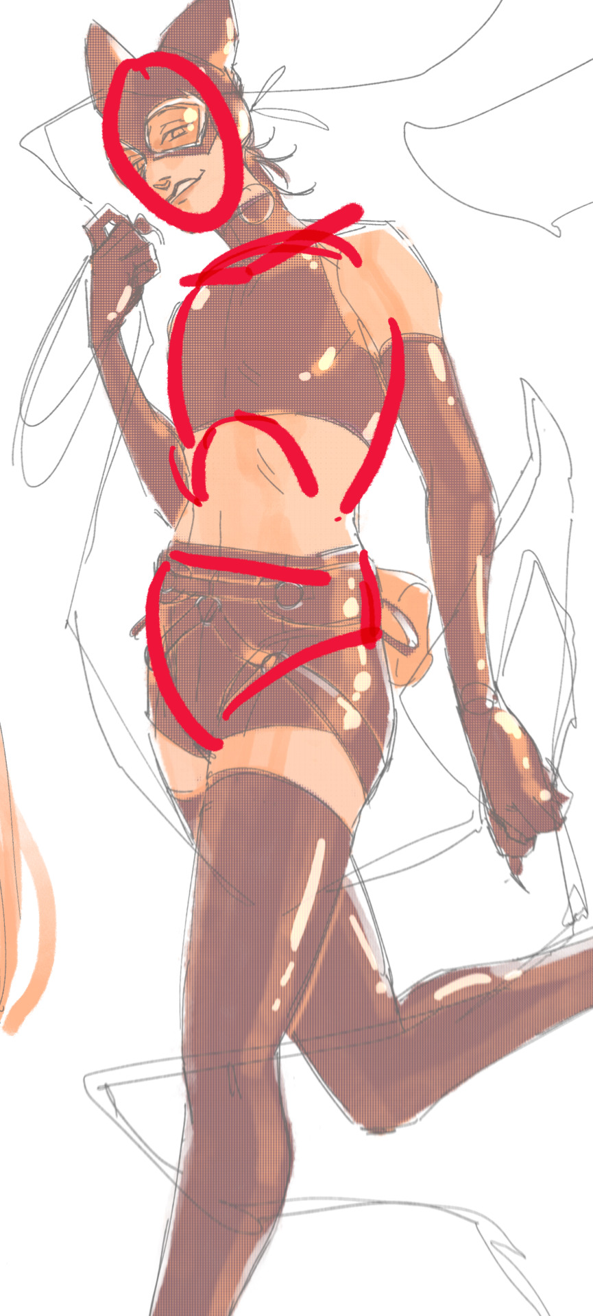
i had a question about how you do the details on your fabrics: how do you keep the patterns on clothes on a body looking so,,, clean and readable while also making it make sense on the form under it?
like the cape/sleeve(? idk what it is but it looks cool as hell) on the magnolia commission pattern looks so cool and it's still readable on the fabric (like, if i wanted i could probably do a silly sketch of it) BUT ALSO it seems to make sense with the folds so it doesn't just look unnatural and stiff?
i'm so sorry this is kind of a long ask but like. would you be down to talk about your process for patterns on clothing? it's cool if you're not, that's totally fair, just figured i'd ask
have a wonderful day!!
OOOH Thank you so much for the ask!! I wanna do a more in depth tutorial, but I tend to make patterns in two different ways, with one being fully hand-drawn and the other playing with mesh transforms or the... Uh, liquify CSP tool? Let me find examples

This is an example of a fully hand-drawn pattern. No trickery here- Only trying to eyeball everything. It's kinda a lot of work to draw it manually, but it's the more convenient option if the character I'm drawing doesn't have files for the patterns, or if the files are a bit too different from my usual style, as they could potentially not look great with my linearted or painted style
And then- For cases such as Nolia's cloak, I did the entire pattern as a separate file, then placed it using Photoshop's mesh transform!

Here's a WIP file from when I placed all the patterns after finishing the lineart, where you can see them in full contrast. I tend to keep my patterns in different files- The black parts here are not joined with the base color of the cloth, so I can bring nice highlights and texturing when they're meant to be golden inlays, for example. Now, the Photoshop mesh transform is a bit finnicky to use, and I don't have any proper step by step of it- I could potentially record how I do it someday. But let's take the humble cylinder and demonstrate it quickly:

So, the mesh warp tool is the one on the right- You can see these sort of blue lines creating a mesh. I'm sure CSP has it in it's pro level or something? Correct me if I'm wrong. You play around with the different sections, move it to the right place, and put it on the cylinder. This is a very simplified form. You can make many subsections to your meshes (that's 3x3- you can have stuff such as 20x20) for when you have multiple folds.

And then you can just shade your pattern accordingly so it fits the volume of the drawing, and- ta-daa!
This is by no means an easy method. Sometimes you can get away with the Liquify tool (which CSP has and it's very decent), which I've used when the pattern in question was over a simpler surface with few folds. It takes some practise to use that well, and it isn't gonna be the best for complex ones, but it's also an option. Let me do a lil compilation of some patterns I've done and which tools I used for each!
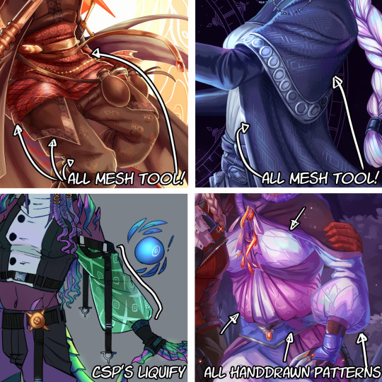
The tool I use highly depends on the time I have, the level of finish for the drawing, and so on. CSP's liquify is probably the fastest but gives simpler results, drawing them manually works better with some styles and more organic/less geometrical patterns, the mesh tool takes a bunch of time but it's great for small repeating patterns that are meant to be very precise or geometrical.
If people would be interested in it, I may someday do a video tutorial of me doing a pattern and then putting it over a folded cloth. I do hope this can help a bit tho!!
124 notes
·
View notes
Note
Hello! I was wondering if you would think about posting tutorials or stuff like that! I really admire your art style, and there are a lot of things that you were capable of drawing that I and many others are not.
You don't have to respond to this if you don't want to, bye honestly I just need to know how you're able to draw a kiss and make it look natural or, certain poses with characters
You're just really talented and I admire your work! I would love to learn from you if you were inclined to teach💕
i typed this almost all out once and tumblr deleted it so here we go again 🥀🥀
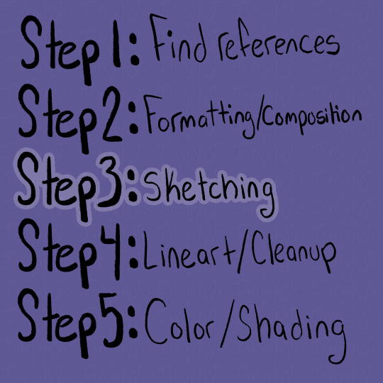
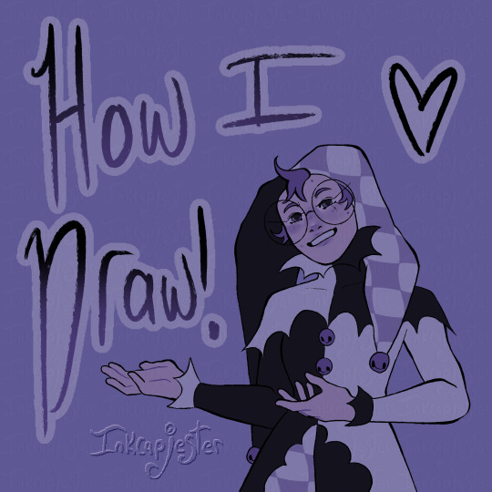
OFCC!! this is so sweet 😭😭 I broke my process down into steps so hopefully it’s easier to understand. This is just a general tutorial, but if you’d like a more in depth one on something specific do let me know and I can try!! I am not a professional (yet) and only a student but I hope my tips can be useful!!
Step by Step tutorial + full speed-paint of my Cassius drawing below cut 💜

Using references has been something I’ve more recently gotten into the habit of, and by god I’ve improved so much because of it. Studio classes really forced me to get used to drawing from reference, and I’m glad I got that push.
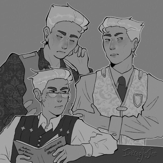
For finding references, I usually use Pinterest, or I take my own photos (like for this cover image!! i couldn’t figure out the pose LMAO) For this tutorial, I’m going to be using my recent drawing of Lord Cassius from KotLC as examples of my steps. When I’m searching for references, I like to type phrases and emotions I associate with the character and see what it gives me. For Cassius, I literally searched “Judgmental facial expression man” as my beginning search LOL.
From there, if I’m not immediately finding pictures I want to use, I try finding one that’s within the realm of what I’m looking for, and then continue deep diving under the recommended pictures below the one I clicked on. I find this is a good way to more quickly get the specifics you want, and it’s something I love about Pinterest.
You can also combine images together to create a new pose if you’re not finding exactly what you want! I love hodge-podging pictures together to create my scenes.
Along with pose references, I also like to gather emotion/body language references. Sometimes it’s just looking at different aesthetics I’m going for, and sometimes, like when I’m drawing sokeefe, it’s looking at pictures of couples. I study their facial expressions, and how their bodies interact in a space together, compared to more platonic relationships. I also just think it’s fun to study human behavior lol.
An extra thing I do when find references is also look for clothing inspiration! Especially with fantasy works like KotLC, it’s sometimes hard for me to come up with fashion for them. I often really like taking random elements from a couple different pictures, putting them together to create an outfit, and unifying them through color!
Once I have gathered a bunch of references that I like, I sift through them and pick out the ones I think will go well together, both stylistically and composition-wise. I think it’s important to note that your drawings don’t have to be a 1:1 replica of the reference!! The pictures are there to guide your drawing, but not dictate it. Some parts of the picture I will reference a lot more heavily, often things I struggle with like hands, while things I’m more comfortable with like expressions I will stray from the reference a bit and give it my own flare.
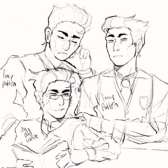
Whether your making a drawing like the ones I will show below (of the multiple smaller drawings of Cassius all laid out on one spread) or more of a scene drawing, I find using the reference photos to roughly “sketch” out how I want the composition to look to be extremely helpful. Especially with digital art, using the images as a rough guide is easy to create multiple compositions to choose from.
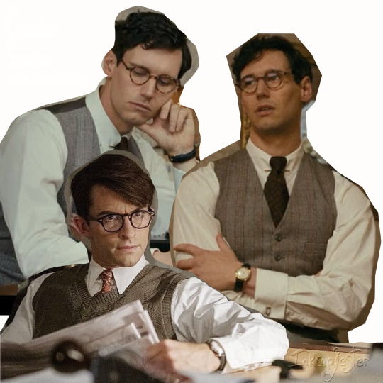
As you can see in this picture, I’ve cut out the backgrounds/parts of the reference photos that I don’t need, so I can better see what my composition will actually look like. I’ll have the full speed-paint of my Cassius drawing at the bottom of this post, and in that you can see briefly at the beginning me cutting apart and piecing together a bunch of images, until I landed on this layout.
When actually laying out the images, I always have in mind the viewer’s eye. I want to guide the viewer through the drawing, giving them lots of entertainment while not being an overwhelming amount of information.
When it comes to sketching, I have a lot of different approaches that I use, depending on the time I have and what I need to draw. Most of the time, I lightly trace over the reference image, blocking out any large and important shapes. This makes it a lot easier for my brain to understand and replicate. When I’m tracing, I also like to mark where certain features are, like the nose and eyes, along with the curves of the shapes. That is especially important on the face.
I like to turn the reference off, or put it in another window, bring my traced shapes to the left side, then begin my own drawing on the right. At first, I focus on making sure the proportions are correct and the shapes match. After that, I go back over and adjust the sketch to my style, and the characteristics of whoever I’m drawing. Often the reference image’s face/body will look different from the character, so it’s important to understand the fundamental shapes of the body, and how they are interacting, rather than just copying the image straight up. Here are some examples below from the speed-paint 👇


If I’m feeling stuck and like something doesn’t look right, I’ll hover my drawing over the tracing, and sometimes over the reference to see what is not lining up. Then putting it back off to the side and working on that section. I also flip the canvas a lot, to help my eyes not get too used to my drawing.
I keep repeating that process until all of my images are sketched out in my style and look like the character I want. I’ll also leave notes for myself to remember details I need to add when I’m closer to being done, and don’t want to draw LOL
Also note that some people’s sketches are incredibly neat and thought out, while others’ (like me) opt for figuring out the details in the later stages. Either way works, it’s kinda just what works for you. What sketches need to have are solid fundamentals, and if that’s looking good, then you’re set.
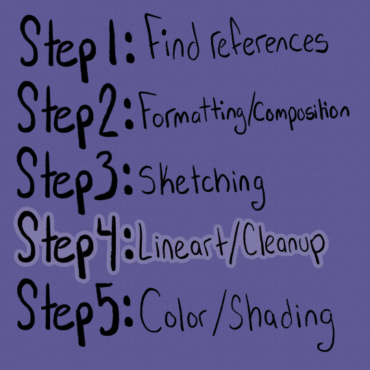
I looooovvveee line art /gen and i know a lot of people don’t which makes me sad 🥀
I get it, it can be tedious, but I really do enjoy bringing my drawing to life and finding all the details I want to add. I used to really struggle with my lineart feeling very stiff compared to my sketch, and it took me a long while to learn how to keep the vibe of the sketch in my final drawing. I’m not always as successful as I want to be, but that’s okay, my goal is to keep learning not to be perfect.
I’ve found that utilizing line weight helps that problem a lottt. Also just having fun with your lines, like in the sketching stage. When I was younger I remember doing line art and needing every.single.pixel to be perfect, and it really sucked all the fun out of it. There are tons of different ways to do line art, and something that helped me get out of that perfectionist mindset was just looking at artists I admired. I studied their speed-paints, what kinda of brushes they used, and how they used line in their line art.
A lot of them had more expressive strokes than I realized, often using the weight of lines to exaggerate the drawing.
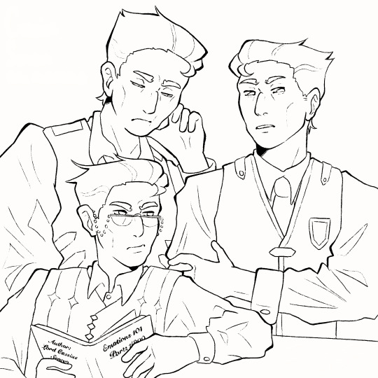
The line art doesn’t need to be out-of-this-world to be good. I like using a textured brush, with lines that connect for the most part. I try to put heavier lines on places of emphasis, like the outlines, folds, points, and where lines connect. Usually, the smaller or softer the details, the lighter and thinner the lines.
It took me a long time to find a style of line art that I really enjoyed, and even now sometimes I switch between brushes. Something that art school taught was how important play is. Even just messing around with brushes helped me find how I liked to draw. All of the brushes I use I've found for completely free on Gumroad. If you're ever curious what I use I'd be happy to make a post about it!
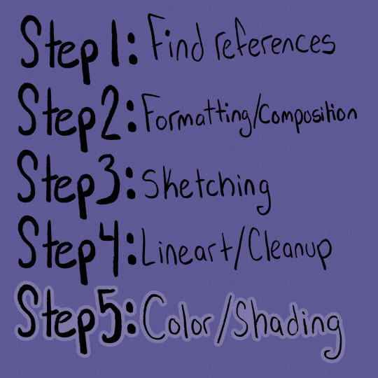
Color!!! This is one of my favorite steps, and also the one I find most frustrating. I absolutely love color theory and tweaking colors to look completely different than reality, and it sometimes bites me in the butt lol. Recently I've gotten a lot better with base colors, and I always try to set the background to a mid-tone grey instead of blaring white. I tend to favor saturated yet darkish colors if that makes sense.

The grey background allows the colors to not have to fight so much to be seen against a white background, and also helps me keep my values in check. I'm always thinking about readability in terms of value as well as saturation when I'm coloring.


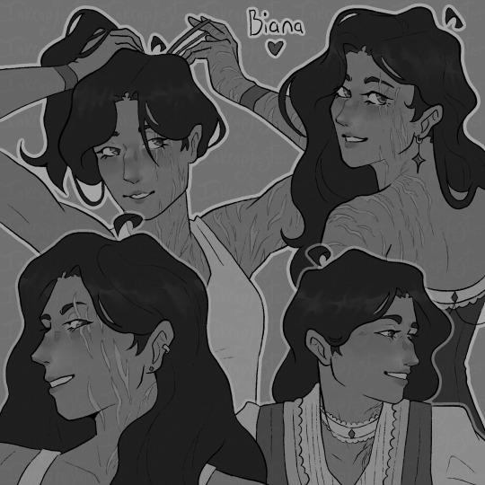
I always check my values by having a layer above all others filled with white and set to the blending mode saturation. I want the main points of the character to be distinguishable and easy to read, especially from a distance or if you squint. This is why I kinda hate drawing blond characters because it is a lot more difficult to find values of a light skin tone and light hair that are different enough without it looking insane. Some areas I succeed more in terms of "value readability" and some are weaker. Not every single color needs to have extremely different values, but the composition needs to include large areas of varying value. I also use value in my colors to frame things I want to emphasize, like Biana's face in front of her dark hair.
You can also frame pieces of a drawing with the actual colors, like in my Cassius drawing, I wanted the drawing in the foreground to stand out, so I used tints and shades of blue for the outfit behind him. Blues and yellows often go well together, and it gave me a nice opportunity to bring him even more forward.
When it comes to actually choosing colors, I like to chose a color palette for that character ahead of time. I also limit my use of different colors and tones both as a challenge and to make my pieces more cohesive. I love reusing colors, like the whites of a character's eyes being the same as their clothes.
For Cassius, I knew I wanted his palette to be primary golds, whites and blues. White can be a particularly difficult color to make, because it depends so heavily on its environment to exist. This is why I usually chose the brightest white and the skin color first. I absolutely need the white to pop and I need the skin to look alive and well, so those two colors take the highest importance for me. For each character's white, I take a look at the color palette I assigned them, and try a few different kinds of white alongside the skin tone. I try giving them cool and warm undertones that correspond with their color palettes, then chose the combinations I like the best. I always try to master a few colors together at a time. Trying to get all of the colors to work together all at once is overwhelming to me, and often leaves my drawings looking messy.
I know a lot of artists that fill the inside of their character with a base color that they want to tie all the other colors back to, and I've heard that works great too! Color is really something that you learn through play and experimentation. It took me a very long time to get a good grip on it, and even now I stumble sometimes trying to wrangle my colors. Sometimes just going back to the basic color wheel is what helps me get back on track.
The most important thing about color is just that they always exist in context. Take them out of that context, and they can look completely different, like in my example below ^.^ This is a very extreme version of what I would use for a white, but I thought it was a good way to show just how different something reads when its against a different color/value.
As for shading, I've been trying a lot of different techniques lately. I'm in-between shading styles right now, so I'm still trying to figure myself out too!! I do love using masks for shading though. I use them in my more simple/cel-shading, and for when I'm rendering.

The masks have been deleted by this point and I can't pull them from the speed paint :< but these layers I have highlighted came from the same mask. Basically, I make a clipping layer clipped onto the base colors, and fill the entire layer with whatever I want to shade with. Usually I use the layer mode multiply, and set the opacity down to whatever I want. After that, I make a mask of that clipped layer, and use the mask to carve out where I want the light. I like using masks because it lets me mess with opacity without messing with the layer's over all opacity.
After I'm satisfied with what I've carved out, I merge the mask and shading layer. Then, I select the contents of the shading layer, invert that selection, make a new layer, and fill the inverted selection with my lighting color. Then I mess around with blending modes and opacities till I get it how I want it!
If that was confusing I can always go more in-depth about it :] That and anything else that I maybe didn't explain well enough!! I love talking about this stuff and art in general (it's my major for a reason LOL) so please don't hesitate to ask!!!
Here is the Cassius speed-paint as well!!
#digital art#digital artist#artists on tumblr#digital illustration#art tutorial#tutorial#digital art tutorial#small artist#inkcapjester tutorial#inkcapjester
41 notes
·
View notes
Note
how r you so good at drawing (halo) armor. You’re literally one of the best I’ve ever seen. Tips please if possible? (specifically for the shapes of the armor)
Oh god heLLO; I'm super bad at explaining my process of drawing RvB armor, as it's been multiple years since I've done it up until recently, so I'm super rusty but I will do my best to explain myself!!!
I've never made any sort of tip guide or tutorial, so please bear with me!
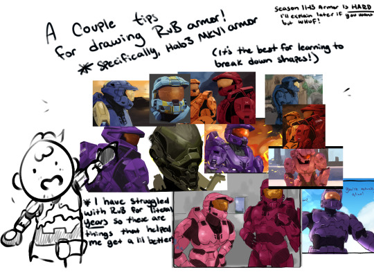
USE REFERENCES!!! This can go for renders from the Halo games directly (ArtStation was a great place to start, I'm not sure how things are post AI ""art"" surge, though) but at the very least, screenshot the heCK out of the series from whatever season you want to draw. There are a lot of different angles, and after they started to animate, it made it easier to get references with arms up or splayed out to the sides, or legs bent and hand motions!! Depends on what you're looking for!!
For this Reference, I used a Halo 3 render, as well as the Caboose-isms poster render. There are more clear renders out there, I'm sure!
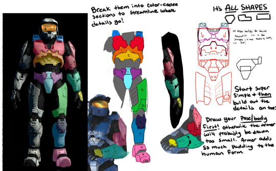
First step that I take in learning to draw a new set of armor is color coding the sections that I'm going to draw, and then labeling them with points of interest that make me remember the detail later; Like grooves, or a bevel that looks weird or silly. Color coding and labelling the parts made it easier for me to break it down into smaller bits to draw piece by piece, bc let's face it; Armor can be super tedious and daunting, especially if you're just starting out.
Remember It's ALL SHAPES!!! IT'S JUST SHAPES!!!! Break them down into more simple shapes to find what works best for you! Keep it loose in the sketch stage, so you don't get lost in the pesky details
Remember that the armor goes on TOP of a body, and isn't a part of their body! Halo Infinite dOES have prosthetics that are a bit smaller than the armor, which adds depth and flavor to your armor though!
When in doubt, draw it larger than you mean to, and size it down to fit your other pieces!
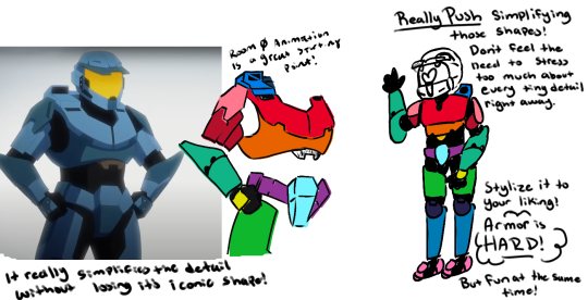
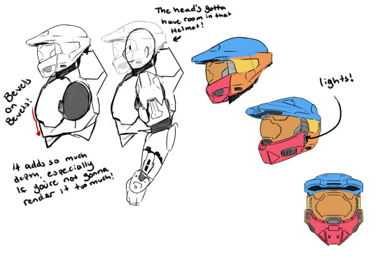
SIMPLIFY IT!!! TRACE TO LEARN!!!! Really just figure out where the pieces go and put them together like a puzzle! Armor is simply just, hard, and there's no easy way to learn quickly how to do it efficiently and well; It really does take a lot of practice and trying and sketching and watching clips and staring at other's art to maybe notice shortcuts or even details you didn't notice before!!
But the biggest tip that I can give you is just, don't be afraid to make "bad art" don't be afraid to draw "bad armor" !!! It doesn't have to be perfect, the details don't all have to align on model 100% of the time! All of my art, paintings and all, have things that I fudged or missed, or messed up on and didn't notice, but I still have fun painting and drawing because I like making people laugh with my comics and I like having them feel stuff about my paintings!
Sorry if this wasn't what you were looking for, but I hope this helps even just a little bit!!
#tony's art tag#rvb#sorry again for the long post I'm rEALLY bad at explaining things and I've never made one of these before hfkjhadfsh
134 notes
·
View notes
Note
Good afternoon! I really like your art, especially with Nikolai. I don't often see any content on it, and that's why it's very nice to see. Can I ask you how you draw hair and other items of clothing? It's just that in the future I also want to practice drawing to draw my favorite characters. 🌹
Hi there thank you! :D
Uhhh I tried my best to compile my way of drawing things, take this as a reference because I'm not a professional by any means and a lot of things I do are very much simplified and dialled down to fit my chibi style :3 but I'm flattered that you ask me, I like sharing my process sometimes!
alright first off with hair, we'll take Nik for example. For me I usually try to make sure the hair flows from the same origin (refer the red arrow on chibi Nik), this will make sure the hair looks consistent and neat. For me I usually like to add more volume and floff to hair to make it cuter (exaggerated feature), so I do that by making the hair thicker or more curly. What really brings the hair together imo is the side burn, all the cod characters have it so study how they look like (like how Price's one will be connected to his beard, while Nik's end in a neat line). Lastly, look at the characters and ask yourself what are their prominent features? Like for Soap, it's his mohawk. For Nik? It'll be his high widow's peak and the neat slick back look. If it is hard to draw it yourself, trace over the reference photo to get an idea, then draw it yourself again on the side, it'll allow your hand to recognize the shape and flow better.
Hair can be individualized according to your own artstyle, for example @/nekrosmos (hi hehe) draw Nik's end of the hair curling inwards (link of the example). Studying other artist's way of drawing characters can help ease the process of finding your own, if ya wanna look at Nik fanart I highly recommend @/shkretart's page (example used is from here) (also would recommend their post about how they draw heads here, because from there you can see how they plot down the shape of the hair as well)

also! something I like to do is showing the character's emotions through hair as well :3
example:

see how the Price in lower opacity has his hair jagged because he's horrified by the taste of shamrock + my OC dishevelled hair because she's cranky/angry


uhhh when it comes to clothes I don't really have much advice because I....don't draw a lot of variety of clothings XD

I think most importantly if you can get the torso shape correctly the clothings wouldn't be much of an issue since ya can just follow references (see 2nd photo with the square + inverted triangle method, reference used: valiants, pignk). Like the hair, I just take the what I think are prominent features of an outfit then remove the gear (see Ghost below for example).


I think the only thing I can comment on are creases?? even so I'm still a newbie at this but yeah again, tracing over images to study them is what I do most of the time, especially when I'm doing a non-chibi art. Whenever I feel like the sleeves looks weird, I try to find a similar pose, draw over the crease, see what went wrong then implement it on my own art. I think what really changed my mind was it's not just about the lines of the clothes inside, you should take account of the creases that creates the fold on the outline. You can watch this video by emiliodekureart if you want a more detail explanation! (I follow a lot of their tutorials cuz it's simplified and easy to understand and follow :3) (another ref is Morpho Clothing folds and creases if you wanna learn in depth)


Okay, say you got the torso, shape and creases down, what's next? Textures! the way you add details or color a clothing can make small but noticeable differences. Here's how I approach a clothing using my commission works as examples below.
Similar to hair, first I see what's the most obvious feature of the reference photo which are the pattern lines and patterns. Usually with wool or animal fur or any material that's fuzzy I like to add the " lines to my doodles.

For this example we're looking at suits, so the materials are usually harder that's why the edges of the clothes will be sharper (see Ghost's shoulder ends and elbows). Add in details like lines/patterns to show different materials. Sometimes you can overlay the shades with textures, which all can be found online to add that feel to it, yk? (like Soap's pants and this hat)


Lastly, you can always change the way you want to draw based on the references, you don't have to follow it 100%, scroll through sites to find one you like and tweak it!

hope these are helpful!
#soap's ref shirt has horrendous colors do you guys agree#what is that brown LMFAO#feels like it's something Price would wear tho#I WAS VERY TEMPTED#but nah i decided a coat and jeans is more of his vibes#gomz yapping#idk if i make sense HAHA these are like#shit i learn by myself by a lot of trial and errors#these may not be relevant months later with how often i change my artsyle#i feel like ive been pretty consistent with my chibi tho so i'll acknowledge that#ask response
32 notes
·
View notes
Note
Ok fine! You’ve convinced me! I’ll learn how to draw specifically so I can draw codywan kissing, you’ve spread your gospel successfully
…
How do you draw tho fr cuz I can doodle like, funky lookin birds but people is fully out of my depth send help
AAAA HELL YEAHHHH!!!!! LET'S GOOOO!!!!!
You've opened a can of worms asking me for art advice so *cracks knuckles* buckle up.
I sort of (only a little bit) use the Loomis method for easy head drawing. Here is a playlist of YouTube videos by Proko. Highly, highly recommend that channel for your art tutorial needs!
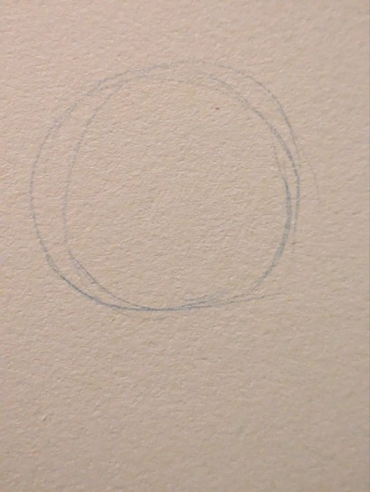
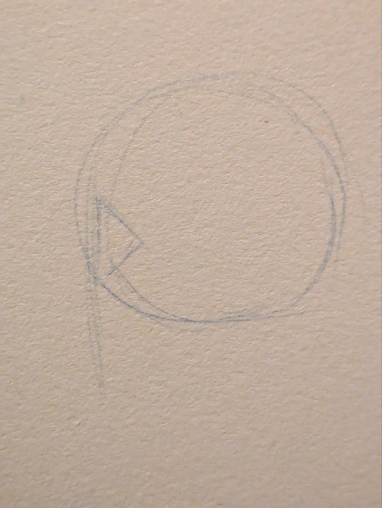
I start with a circle. For side profiles, I draw a line down the side of the circle to determine where the features will sit upon. I draw a triangular shape to mark where the orbital socket is. Around the middle point of the circle is where the jawline ends and the ear begins so draw a line there. There are proportion rules which are good guidelines when starting out in art but since I've been doing this my entire life, I have a feel for things and just wing it. That's to say, I put in a line implying the jaw based on vibes.
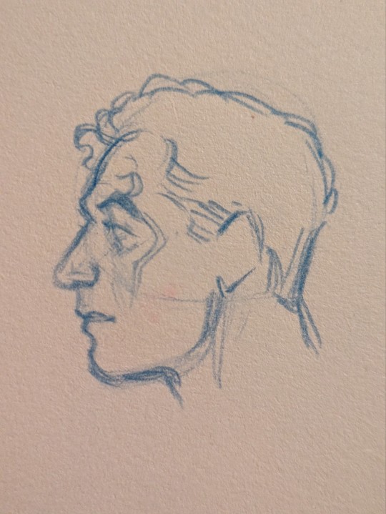
Next, I draw the eyebrows and brow ridge. Then the nose. I find I majorly base my proportions on this area so if anything is off, it throws the rest of the face off.
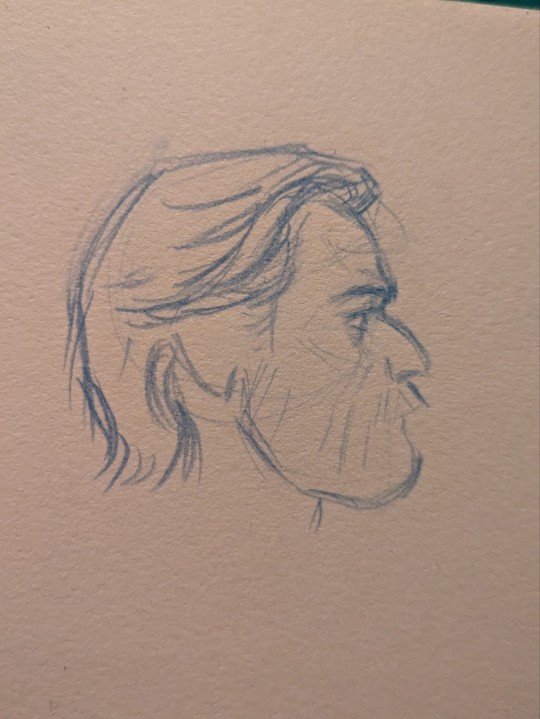
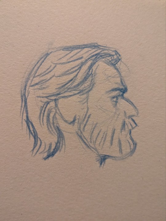
Then I draw the lips and chin... or in Obi-Wan's case, his beard. I will mark in his sideburns and hairline as well. Now, about ears: generally the top of the ear begins right around the top of the eyebrow and stops at the base of the nose. At this point I like to draw his eye, define the cheekbone, and refine the eyebrow. I'll finish scribbling in hair and that's it!
(Cody is much the same but I forgot to take useful progress pics 😂)
Extended Art Advice 👇
Tip #1: Draw lightly. Do not ever grip your pencil tight. This only leads to pain. You will notice I didn't erase at all. This is partly because I know what marks to make because I've done it a million times before and also because my lines are soft enough I can make lots of them and choose to deepen the ones that work.
Tip #2: Practice, practice, practice. Artistic skill is just loads and loads of accumulated knowledge and muscle memory from practice. This sounds boring but, in reality, you should make it fun.
Tip #3: Draw from observation/USE REFERENCE! The only reason I can get away without using reference when I'm feeling lazy is because I've drawn the same things over and over enough times it stuck. Aka I did lots of practice.
Now, to combine all these tips together, let's talk about how to use reference and how to make practice fun.
Reference is a huge aid when drawing at any point in your art journey. But I've found that in order to learn from what you're looking at, you need to think critically.
You obviously have something you want to draw. Reference helps you with that. You'll start out trying to draw what you see. Eventually you will run into an obstacle where you've messed up and things aren't looking good. This is to be expected. Every time this happens, think about what isn't working and find solutions with your reference. Analyze your subject to find your answers. Draw it again. Do not be afraid of failure. Each time you fail, you must look for a solution and this will lead you closer to your goal. This is how you grow as an artist.
I know, it sounds dreadfully boring and like a shit ton of work. It is a lot of work but you can make it fun! You love Obi-Wan and Cody so make Pinterest boards of Ewan McGregor and Temuera Morrison. Whatever you want to practice (may that be eyes, mouths, hands, hair, the face as a whole, etc) draw them. Ever hear tracing is bad? Fuck that. It's a perfectly valid tool to help you learn. If you're drawing digitally, pull up your reference in the art program of your choice, lower the opacity a little, make a new layer and trace what you see. I honestly find tracing to be very hard so when I've done this, I prefer to try to find shapes that will aid me when I'm actually drawing. If you're drawing traditionally, you can print out the photo and trace over it with a tracing paper or use a lightbox. You can also up the brightness on your computer screen and tape a piece of paper and trace that way.
Photos aren't the only references you can use! You can always look to your favorite artists' work and try to figure out how they do it. Often artists will break things down into more easily digestible shapes that will help you better understand how things work. Remember, if you ever copy or trace someone's art, it is for learning purposes only and you shouldn't post it. Feel free to take elements of people's art that you like and put your own spin on it though. For instance: I really love how this one artist draws men's tits so I studied a bunch of their art and now I'm much better at drawing them.
Oh and did you think you only get practice in while studying? Wrong! There's no reason you should shy away from trying to make the art you really want just because your skills aren't the most refined. Spoiler alert: you will grow the most when you push yourself out of your comfort zone. Draw codywan kissing. Draw it really enthusiastically and through profuse swearing and gritted teeth... but never a clenched hand. Don't hold back from the fun stuff just because it's hard. Aim high, land low, and shoot even higher next time.
In the beginning it will be especially frustrating. You'll feel like everything you make is a failure and nothing works out. You'll feel like you're not making any progress. Trust me, you are making progress and I believe in you.
If something really isn't working out and you find yourself growing distressed, take a break. It might last an hour or a week. Just take the break. Don't push it. Come back with fresh eyes and less stress. We all have days where nothing comes out right. Sometimes I can't even draw anything resembling a human face. It's okay. Whisper-yell expletives at your artwork and take the break. It will be okay.
With all that said, happy drawing and even happier codywan kissing!! 🧡💋🩵
#hope this helps!!!#(yes i did put my teaching hat on and break out my sketchbook to draw examples the moment i saw this in my inbox 😂)#ask box#lasagna rambles#my art#codywan
164 notes
·
View notes
Note
i really like how much depth your art has, do you think you could show how you break down bodies when sketching if that makes sense? it’s something i struggle with a lot in my art! 。゚(゚´ω`゚)゚。
ok apologies in advance, this is probably going to be a really long and tangential rant about art that may or may not actually help you in learning how to construct bodies. im just gonna put it under a cut to save everyone from seeing this huge text wall.
i dont think its gonna be possible for you to replicate my methods here, because theyre mostly just really specific shortcuts for finding certain proportions and reference points for anatomy, which i'm fairly versed in, but not as much as i'd like to be. the shortcuts you'll need will be different from mine. im glad you think my art has depth, that is something i am trying to seek very intentionally right now, and i dont think im even close to the depth of form i am actually aiming for. so like. this makes making a tutorial kind of inherently hard. nevertheless, i threw this quick sketch together after like 3 failed attempts. (i was doing those attempts digitally, ended up giving up on that and going back to traditional because its what im most comfortable with rn)
i didnt get all the steps i took to get here because scanning that much would be cumbersome but ill try to explain how i got here. i start with the head almost every time.

i use a lot of symbolic/graphic shapes when drawing heads and dont stick to using forms very often besides the circle at the center of the head, which i use as the base to form these graphic shapes around. think of it like "wrapping" the ball in various textures and masses. the eyes are usually "textured" onto the head, notice how the her left eye looks narrower then her right. of course i try to make sure her bangs sit along the curve of the sphere and her ears look like they sit on opposite sides of the head. its easy to forget that part, making the head look unsymmetrical. the particular masses of leica's head would be her snout, which is just a curve extended slightly outside the diameter of the ball, and her hair, which are two strange organic shapes that are quite hard to draw, two hair sprig anime antennae things (forgive me, i forgot the word for them,) and the back of the head, which i usually need to extend slightly. its a little too extended here, needs more on the top, i fix this in the final pass. this was a quick sketch, so i didnt focus too hard on the forms of the head beyond the most essential ones for her design, but i sometimes highlight the form of cheeks with curved hatching, or try to make the eyes appear more sunken-in as they are on human faces. i dont know how to proportion the neck and torso correctly until i draw the head, so i always do it first. next, i did the torso.
so heres why i said that you probably wont be able to replicate this approach. you do kind of just have to practice anatomy, i cant just make it make sense because im not very good at explaining this stuff, but ill try to go through what i did here. so, i generally use simplified bone shapes to find proportions and reference points, as well as more complicated shapes like those of elbows and knees. i try to study fairly often because im not satisfied with here im at with this stuff yet. of course, i dont think i'll ever be. so i'll usually start with the ribcage, add a shoulderblade out the back to find the shoulder, the armbones come out of that, the bone in the upper arm connects to the ulna with a sort of three-pronged attachment, one big knurl in the middle, which forms the thrust of the elbow, two little ones on the side. i think those are part of the ulna but i dont remember. see, you dont really have to know what exactly they do as long as you know what they look like. the ulna does some goofy rotation shit i dont understand, connects to the wrist, and then we have a hand, which, i mean, im not good enough at hands to even be telling you how to do it, but i just have a big squarish mass and some little hotdog fingers coming out of that. you can see on her left hand that ill have a big circle forming the the area on the hand where the thumb attaches... theres more depth to the hands, i think you can easily find better tutorials then i could offer. anyway, under the ribcage theres the pelvis, represented with a box. ill get into that when i talk about the legs. i wanna briefly talk about the way i add the flesh and fat to the bones.
so, i really can't give a comprehensive crash course on anatomy, but i can point you towards the morpho series, which is where i get most of this stuff from. you can get very far with the volumes Simplified Forms, Fat and Skin, and Skeleton and Bone Reference Points. moving on, i just kind of have a feel for where the masses attach by now. the important thing to remember when drawing fat characters like this is that the fat should "hang" from the bones and flesh, drooping down slightly. leicas fat hangs substantially, so she's not very wide despite her weight. this is important to her character design i feel. i almost always draw characters naked first when doing serious drawings because it will come in handy knowing where the forms of the body are when i add the clothing. by focusing on the way her body looks naked, i can modify the impression of those forms when adding clothes, and when i add them later on in this drawing, leica will take on the distinctive boxy look i try to draw her with.
if you look at the arm, youll see that the place the line of bone sits is very high compared to the whole mass of the arm, the flesh and fat of the arm "hang" from the bone, and then the upper arm squishes against the bent forearm too. even if the anatomy in the arm is indistinct, it can still look convincing when the forms act realistically against one another. the elbow has much less fat connected to it, so its more bony then the rest. this isnt actually consistent on all people so like, think about that kind of thing when designing characters, like i was talking about before, fat can sit in infinite different ways. maybe if i was doing a more objective anatomy lesson i'd draw cath, because i do have a sort of vague understanding of muscle placement that doesnt come through here, but probably would if i was drawing a scrawnier character. let me know if you want that.
a word on the breasts too: they hang a bit lower then you'd expect, keep that in mind. the attachment point is also angled, as the line shows. the line starts roughly in the middle of the torso and ends around the armpit, but the form of the breast can go underneath the armpit or even connect around the fold of fat in the back. many things to think about. i love boob shapes. ok lets finally get on with it and talk about the legs.
so, the really specific shape of the pelvis doesnt matter that much unless youre drawing a really thin character, so its just a box here. out from the sides of the pelvis, extending out more then you'd expect, is the femur, which ends in a similar joint to the arm. this shape helps me figure out the form of the knee. two masses on each side with a bunch of complex and weirdly shaped bones forming the kneecap, which i have omitted because i dont yet know shit enough to include them. i am learning though. so, obviously the feet are just scribbles here because im just gonna put her feet in socks anyway. you really dont have to do more then you have to. a few tips i can offer here, the butt should hang a bit too when drawing fat characters, i think the butt is supposed to start just below the pelvis if i remember, but take that with a grain of salt. i also didnt really do that here but its hard to tell because she's facing mostly forward. again, i dont think i can really communicate what's going on here. morpho has a lot of great drawings explaining the shapes and muscles of the legs, all things i might focus on more when drawing a scrawnier character. for this case, i regrettably don't go too hard on the legs. also i should note that legs would usually be much longer, leica is really short so ive exaggerated the proportions to communicate that. i may change my mind on that front in the future and give her more grounded proportions. the important thing to remember with legs is just getting a nice hierarchy of forms going. bigger thigh going into smaller calf going into smaller foot. it mostly comes automatically now.
i added the clothing, shaped up her head a bit, added a bit of fur. i put her in her classic outfit, just a sweater and jeans. i enjoy the big thick folds that come out of these clothes, and big areas of white space too. its nice. i try my best to form all the folds around the forms of the body i drew earlier. thats one case where i really really have no idea what im doing and could never explain it in words. its just some fun intuitive play with loops and lines. this is at around the stage for a sketch where i'd do inks, or if it was going to be a finished pencil drawing i'd erase out parts piece by piece and replace them with nicer and more defined lines and tones.
i guess that's all i can offer , i hope that halped.
163 notes
·
View notes
Text
♥️ Art resources ♥️
Hey I put together a beginner art resource list! Feel free to share, save, etc. but a lot of people don’t know where to start:
Man is this a holy grail it includes free programs, online courses, tutorials, and scholarships (us based):
A big thing you are taught early on is just hand/eye coordination. Speed drawing, or “gesture drawing” if you’re fancy, is the best practice you can do on a regular basis.As much as you hate hearing “just practice”- it matters.
The best online art course I can think of. It will literally go step by step in teaching you commands and digital painting:
YouTube anatomy holy grail:
The Loomis method for the construction of the head is very popular because it is easy to learn and remember and can be applied to any drawing of the head.
Loomis also has many published books under his name. I’m not saying you can get free books here but if you could well. Careful of fake links with this site, if you don’t see the single login.re it’s the wrong one.
If loomis method books aren’t your style and you are more of a video person try this (this is the first on a short series):
youtube
If you know me I’m barely cracking the surface with digital art but I’m actually trained in professional forensic art and hyper realistic portraits , so here is info on traditional art by media.
Little proof of some training, but if you like this, this is woodless graphite pencils on vellum- just a slightly better quality than a pencil and paper :)
Finally here are some amazing pose references. Adorkastock had moved from Pinterest and is working on their own website so check them out here:
Taco is single handed my my go to for simplified anatomy and it goes my section of the body (people have made Pinterest copies that is separated by parts of the body) but I highly recommend buying it if you’re able!
I hope that this helps at least someone find a resource they needed or wanted! Feel free to dm me or repost with comments or more resources!
#artistsoninstagram#artofinstagram#my artwork#my art#artwork#art#artists on tumblr#digital art#artfight#traditional art#art fight#art reference#art resources#art related#youtube#books#loomis method#art and design#art anatomy#anatomy#art help#resources#gesture drawing#practice#blah#mine#blah blah blah
64 notes
·
View notes
Text
Here's the baby. (A beautiful 23"/58 cm baby!)

I'm insatiably curious (I draw/sculpt/sew historical dresses/crochet/knit/WHATEVER) ... well... I test everything I can get my hands on. I wanted to try 3D printing, and as I like to get into trouble immediately, I always start with something super complicated (but it helped me understand a LOT, and now, everything I sculpt / prepare for 3D printing, seems easy to me

Anyway, after a lot of failures, after realizing that the file I'd bought was terrible, I reworked the parts myself to finally get a clean assembly process (the Nautilus was sliced in unlikely and impractical places! For exemple in the middle of the ark O_o).
After my modifications, I ended up with 3 big pieces, which all needed about 12 to 16 hours to print.


Look at all those small pieces ! You can actually open the skiff, put the tiny tiny oars in it, and close it again.

Joining the pieces together to hide any gap was my biggest fear. I had to search and learn how to fill them :) But Internet is an incredible place to find ressources and tutorials.


I wanted to try out a non-realistic color, a little gold/vers de gris, inspired by what I like and also by the model on display at Wal'ts an american restaurant, all gold, which I love.


The sad thing is... that I've learnt many things since then. Using an airbrush, the right paint, the right glue... I would totally print and paint this (little) guy differently today ! I want to make another one so baaaaad hahaha !)

#20000 leagues under the sea#capitaine nemo#jules verne#nemo#tkluts#20000 lieues sous les mers#captain nemo#twenty thousand leagues under the sea#disney#3Dprint#nautilus#nautilusbygoff#harpergoff#3Dprintmodels
32 notes
·
View notes
Note
do you have any tips for drawing dynamic poses? i always love the way you draw bodies!!
i know this has been said a million times but the way i draw bodies significantly improved after i started drawing more frequently from reference. if i cant find a reference for a pose on the internet, i'll just use myself or a friend. i spend an unfortunate amount of time just standing in front of my mirror looking at my own joints. pay attention to where your body curves!!
other than that though—honestly my anatomy/pose knowledge is a whack amalgamation of art tips i've accumulated over the years (i miss old school deviantart/tumblr style art tutorials). i also like to look at how artists i admire draw bodies—what details to they include, what anatomical short-hands etc
i think i'm still figuring out how to draw dynamic poses, but here are some cheats i've picked up (under the cut coz this got long again):
gonna use this stray!tim as a base
the easiest way for make up a pose is to start roughly with the head, collarbones, ribcage, and pelvis — you can build everything from there
here's a couple more of what i mean by the ribcage-pelvis deconstruction:
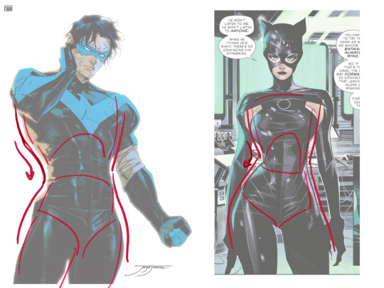
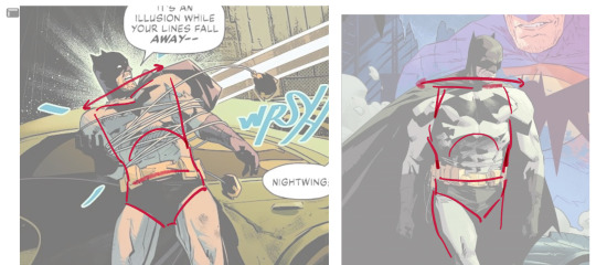
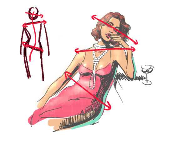
2. push your perspective a little!! imo things look more dynamic if you move your sight-line up or down—the horizontal orange line here. if you look at the panels above, the sight lines tend to be a little low, at around the character's torso or waist. i did the same below with stray!tim
to do this i usually try to get a sense of the space im working in by putting in some sloppy perspective grids
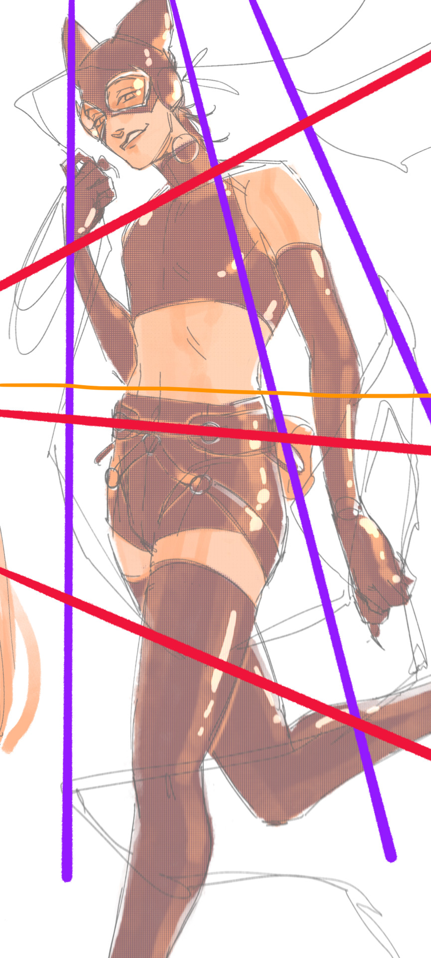
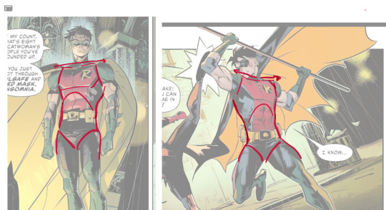
3. S curves!!! exaggerate the lines of the body. the body naturally has parallel horizontal lines—an easy way to get a body to look less rigid is to tilt those horizontal lines which in turn curves the vertical line of the body
this is what a mean by horizontal lines—usually i use the eyes, shoulders, and hips:
i'm gonna use caterina as a better example—usually you want the horizontal lines to sort of zigzag:
i've also picked up a couple visual tricks that don't exactly add dynamism to a pose? but they do give a static pose a little more oomph. a lot of this is done by visually highlighting one specific point of the body
for our purposes, i'm gonna make the focal point tim's face
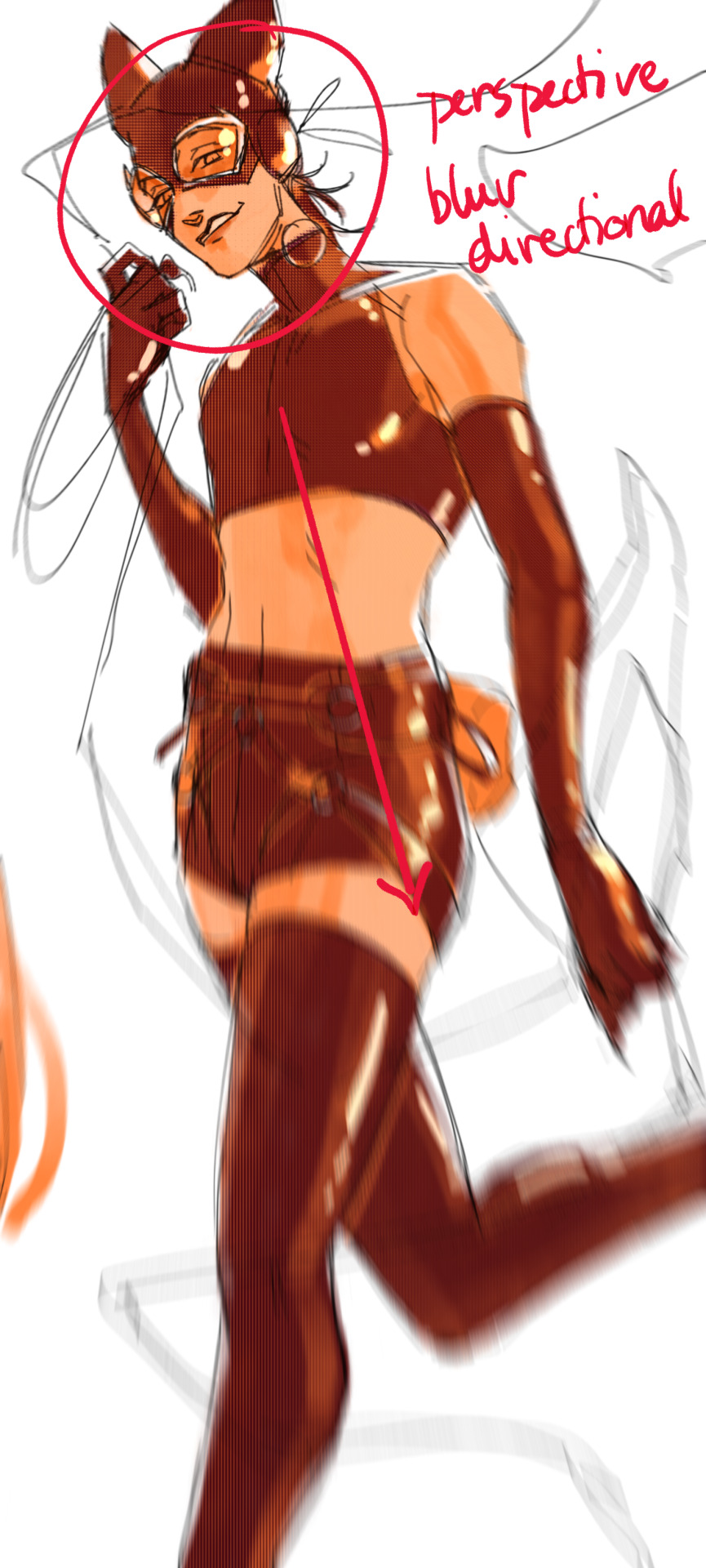
motion blur! there are a couple ways to do this. i actually dont like working with traditional motion blur because you have to mess around with selections, so i usually fake motion blur using postional perspective blur:


2. gradient lighting—you can add a lot of depth this way. usually i like setting the gradient in the direction of the focal point, e.g. tim's face
below, i added a layer above the base drawing, used an airbrush to get this gradient, and then set the layer to color burn and lowered the opacity. you can also clip the lighting layer to the base drawing and set it to multiply

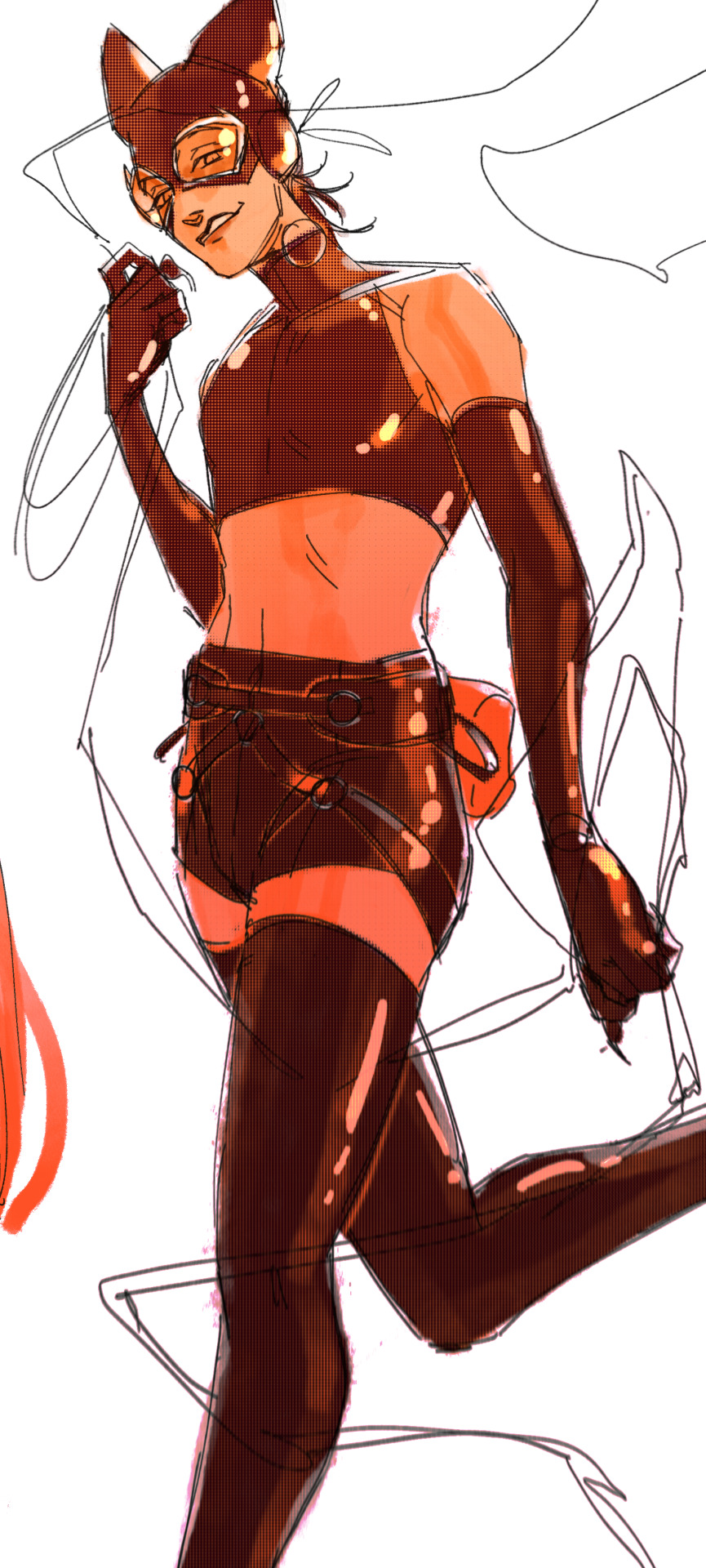
below, i did the opposite—instead of adding a gradient shadow, i added gradient light. i set the layer to add this time (instead of color burn) and then lowered the opacity again.
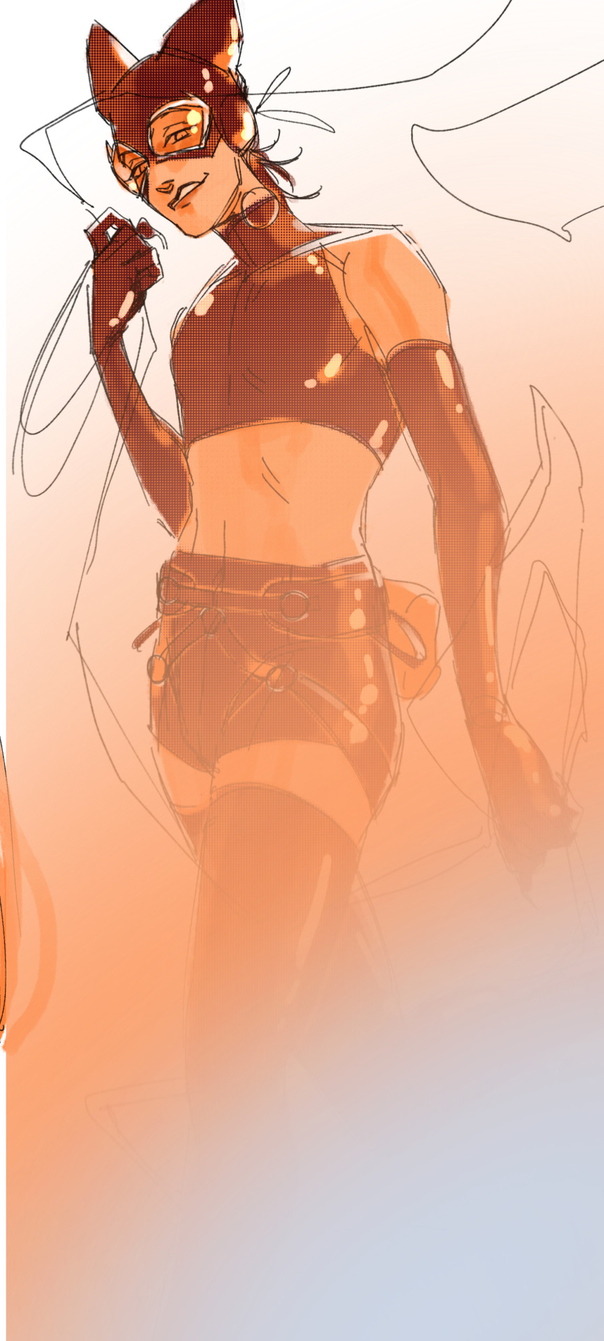
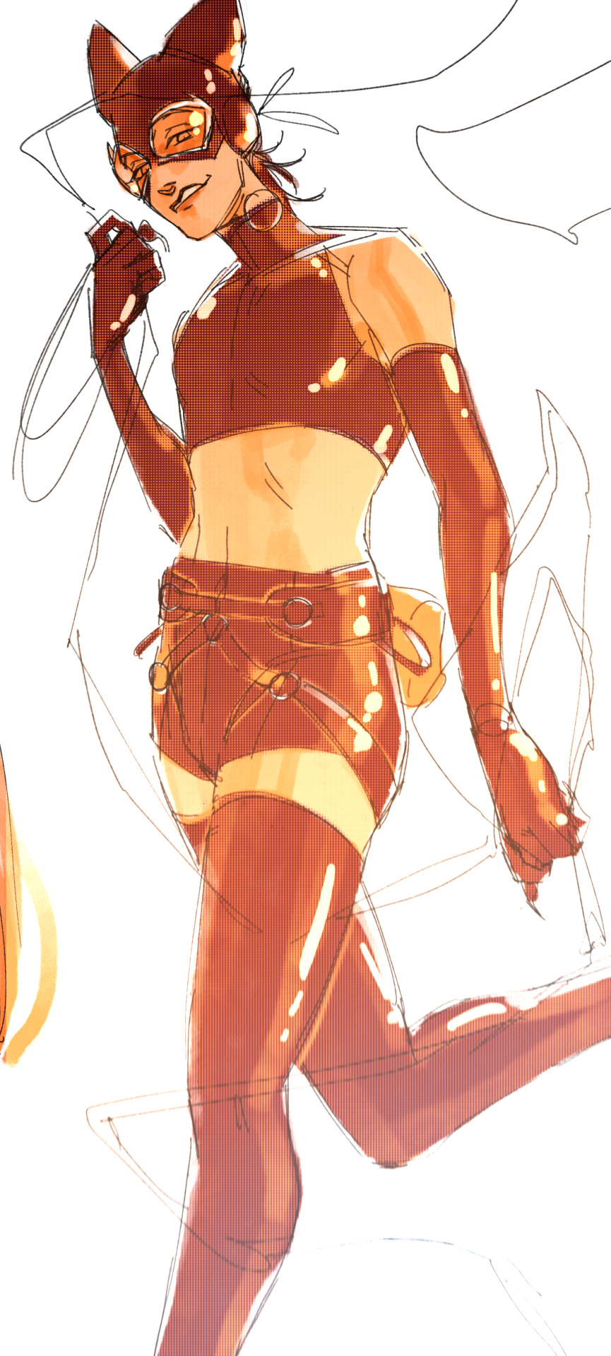
this kinda serves to desaturate the parts of the piece that are less important (ish i was kinda sloppy here), driving the eye to face—the most saturated. the motion blur does a similar thing, where the only thing "in focus" is tim's face
the gradient also sort of adds a directionality to the piece—it starts at the bottom right corner and goes up towards the upper left, causing your eye to follow that same path, which drags your gaze up tim's body
here's what it looks like when i combine 1 and 2:

3. chromatic aberration's been pretty popular recently. it does a similar thing as perspective blur but with more eyestrain (although i went with a really exaggerated version below just to show you what it does) but it looks cool!
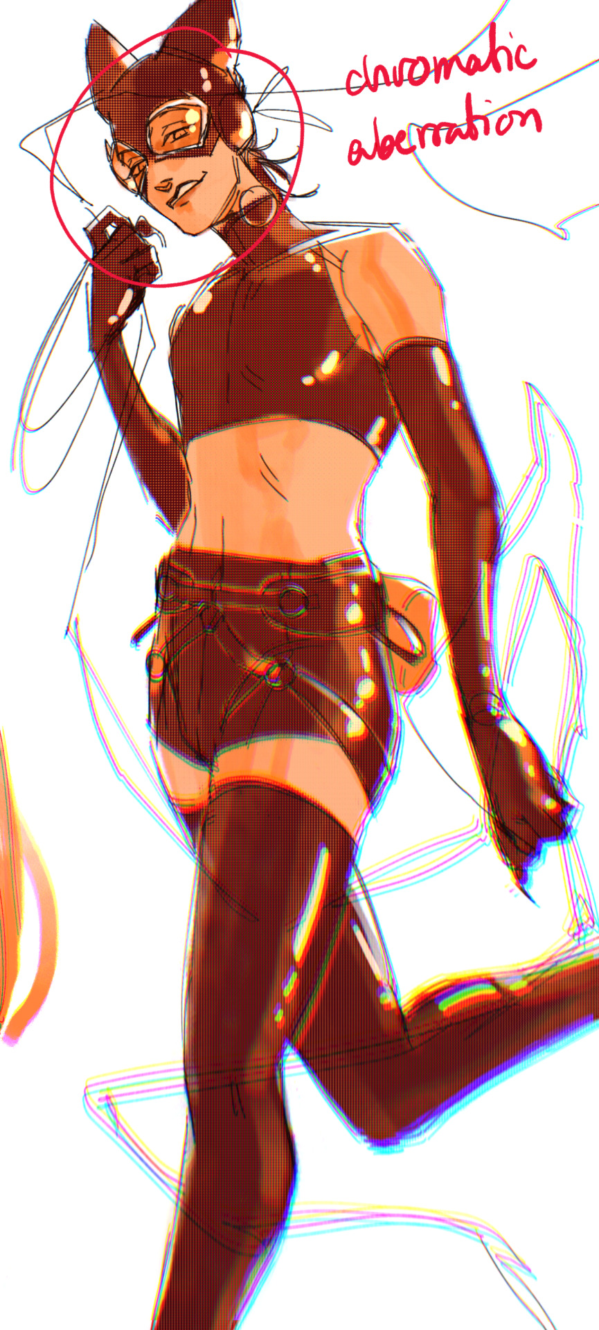
bonus cryptid tim as a reward for getting to the end :-)
#red talks#sart#art tutorial#YeAH UH this got long lmaooo i was on the bus for a Sec plotting this out so#also i am neck deep in a reincarnation/regression manhwa stress hyperfixation so i havent had the brain space to draw#so you get this instead!#if anyone wants recs lemme know lol#thank you anon :)))
68 notes
·
View notes