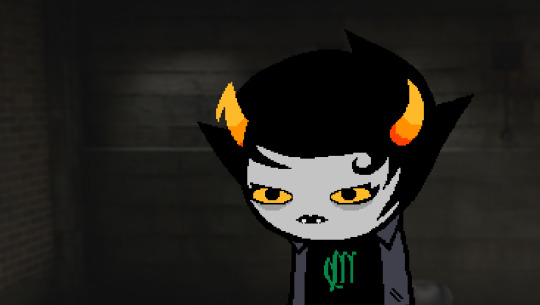
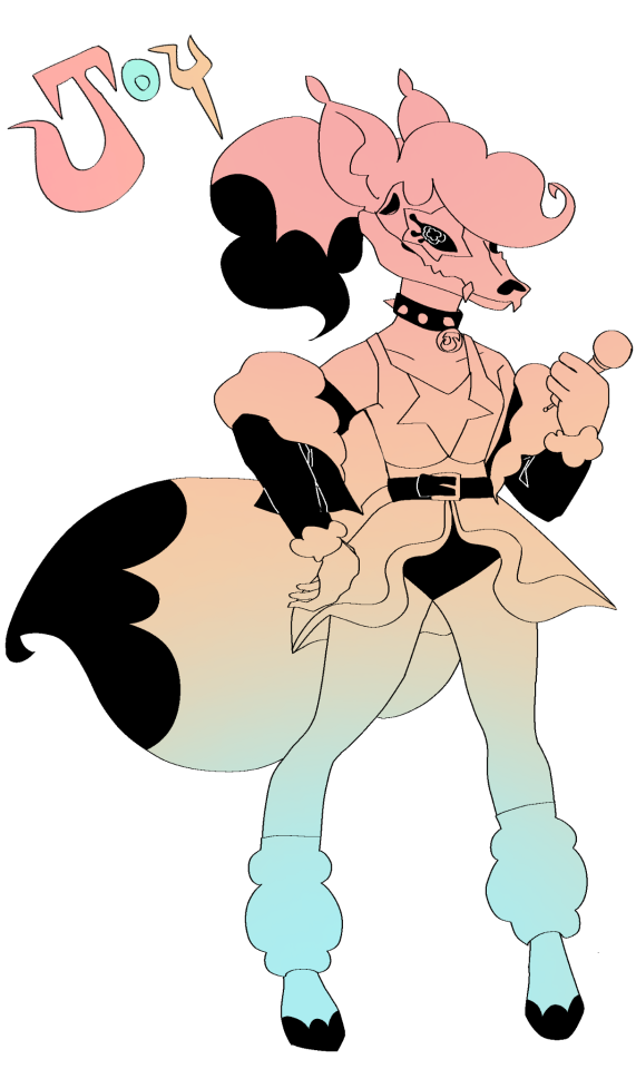
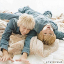
#But still looking like the blogs original design
Text
> Rose: Confess to Kanaya!
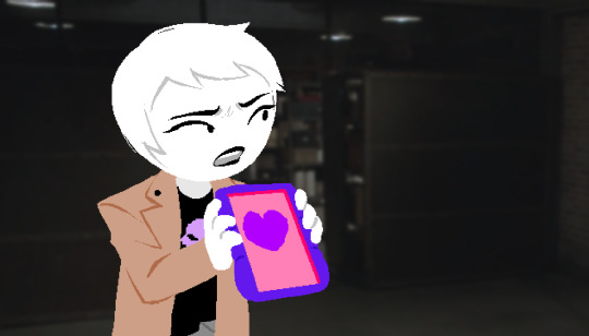
Rose: I love you.
Kanaya: Y Yo Ati, Rose.
> Rose: Get swallowed by something that looks like Venom.
> Rose: Get sent to super hell!
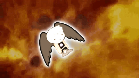
> Kanaya: Have something very gay and homophobic happen to you.
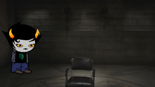
Kanaya: ...
What an absolute diversity loss. You find yourself thinking "love loses!"
#Okay this is my highest possible effort post so far; please spread it around like it's the flu or something#I put so many hours into this like actually lmao I surprised myself with how late I stayed up#going on a content hiatus soon so I suppose that fits that I put out a high effort destiel meme & scene recreation as a last hurrah#send in requests though; i'll get around to them when I get around to them! love to see what you folks come up with!#the sprite assets are up on my main but I'll reblog them here later; not sure if I'll have a tag system or not for it yet#new supernatural & homestuck memes format dropped along with a couple of spn AU designs & beyond canon too#yes I even included a shot of super mega turbo hell; it's got a little bit of everything as it should 🔥#rosewheresheshouldntbe#kanaya maryam#rose lalonde#rosemary#homestuck#originals#hs rose#hs kanaya#spn#supernatural#destiel#dean winchester#castiel#please don't expect me to commit to the bit this hard every time because that's absolutely not realistic; I just got super into this 😂#I can't believe I designed entire new outfits around rosemary just for the bit of doing this joke; just for this little side blog#the rose outfit is just an edited version of her hs beyond canon outfit; but still! I'm happy with how she & her wife look 💜
35 notes
·
View notes
Note
Can you do some more comics with Francis mosses
I can, but the problem is
That I’m pretty much out of ideas and I’m progressively getting tired of tnmn fandom
Ppl who look at my tags probably noticed that 😓
More of my thoughts under read more for curious ppl
(short answer maybe I will do more, but I desperately need a break from tnmn)
! Just a general warning: this came out kinda long + sort of venty
Originally I planned to do 1 comic drop and move on, but got stuck bc ppl liked tnmn comics and kept asking for more (and still do-)
Generally I don’t mind doing more if the ideas are there, but I want to address this: I’m tired
I know blowing up is usually a good thing and I appreciate people enjoying my stuff
But it’s exhausting to see that tnmn is the only type of content which is relevant, to the point that my own projects or stuff I enjoy are just kinda.. ignored
It’s fair – again my blog is heavily fandom based
(+Tsp were and still is kinda the focus)
But with tnmn fandom it’s a bit… different
Maybe I’m biased and it’s just my negative experience with tiktok comments
Remember this art?

cleaning up transphobic comments was.. um tough
Again, I get that you can’t be in that neat bubble completely sheltered from negativity
Humans are just assholes by nature really/j
So I was expecting the backlash, but not that much
I think maybe tsp fandom spoiled me a bit (in a good way), bc I got a feeling that everyone in tsp was positive of any lgbt+ headcanons and just generally more supportive
(don’t get me wrong, there ARE problems in tsp community too, taking narrators design controversy into account as one of the examples)
Obviously every fandom always has it’s own issues, show me at least one fandom that didn’t have some sort of meaningless controversy or some sort of problematic people in it
It happens
But it leaves a bad taste in your mouth sometimes
And for me personally it only added to not so pleasant experience
The thing I also noticed, when I interacted with other fandoms
Ppl wrote positive stuff first and foremost, not really asking for anything
Here it’s just “hey more. I want more. Do more. Do this character. Do this. Do more.”
The only reason I kept doing more, because likes, reblogs, views – these comics get a ton of attention
there is a audience to please alright
But this thing comes with a pressure tho
and it shows
so let me illustrate
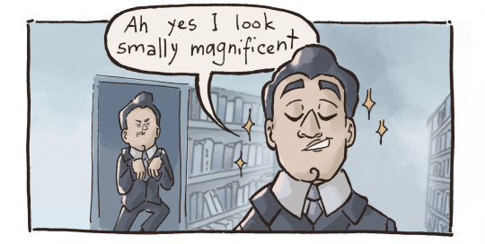
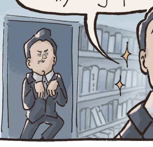
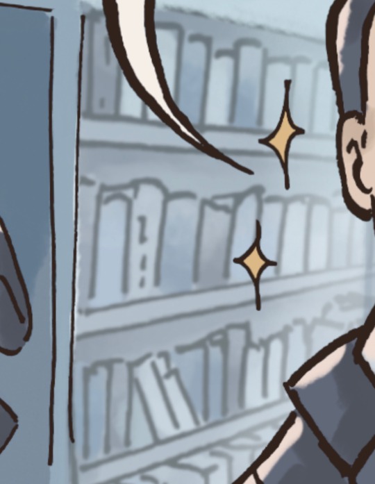
This bookcase
Is my shame
Because I was so rushing, I just copied and colour corrected this bookcase from my diploma comic and pasted it here in hopes for the best
💥IT LOOKS HORRIBLE OKAY💥
Usually it’s normal to take materials used in other projects
the not so normal part is
to leave it like that because your stress reducing tea doesn’t work and you don’t really have time to redraw it
my m en ta l s t a t e i s f i n e ah ah h ah ah
Ok but jokes aside: it’s really tempting, to just abandon everything and produce content like some sort of content farm
But I don’t want to, I’m forcing myself and it makes my art worse
Yes it’s subtle, new people won’t even see this
But I’m not improving
And I don’t enjoy just anxiously popping out comics because everyone keeps asking
I can give it my all to something when I’m passionate, but just “hey I’m getting attention” is not the best motivator
Attention like that does get to my head, I know that I will probably give in again and do more, bc I will compare my posts engagement
But what’s the point of recognition, when you feel.. so numb about it…
Sorry for a mountain of text and thank you for ppl who actually took their time to read it
It’s been building up for a while and I feel like people need to know the reason why I’m not so enthusiastic about making “more”
I’m not necessarily completely abandoning this fandom
I still plan to do ask/suggestions event for STP (I’m just making sure I can dedicate my time to it, that’s why it’s taking so long) and I can add tnmn to the mix
Like STP+tnmn kind of deal
But for now – I need a break
At least for a little bit
#bear answers#vent post#nothing serious just a bunch not so positive thoughts#tnmn#that’s not my neighbor#tnmn fandom#thoughts#fandom thoughts#apologies for possible mistakes/typos
30 notes
·
View notes
Text
I wanna be just like you; made of felt and flesh and FREE( no strings on me !)

[ ID: Traditional fanart of me standing with an AU version of Puppet Habit or Pabit from Smile For Me the game. The AU is called AskPabit. Traditional materials used are pencil, black and blue pens, sketchpens, color pencils. The coloring is vivid and mostly done in many different shades on an individual scale, even for the same color.
Pabit's more anthromorphised form, from the askblog, is drawn in my interpretation as skinny and muppet-like with bigger proportions for the facial features and hands, high-heeled feet. He is made of felt and this is shown through the messy textured strokes.
Stitches run through the sides of his body and face. On his chest at the side is stitched a trans flag-colored heart with the letters " We love U!" -- the word love is just represented by a heart. His hair is brunette, curly and very long. His eyes too are a brown shade-- his eyes are big and lashed like those found on some children's dolls, the sclera are yellow. Below his eyes, fur-patches of pink blush are there. In his grin, his taken teeth are seen, one of them bleeding still at the side. Not all the teeth are there yet. He only wears pants in dark shades that seem to smoothly become heels in one piece-- stitches run along the sides of these too.
I am by Pabit's side. I am a shorter, light brown skinned person of average size with longer black hair and a round sparsely acne-marked face. I wear square pink glasses. My dress is a bright teal chudidar with multicolored flower designs in outline, and a sandy gold dupatta with pants of the same color to complete it.
Pabit grins and leans with one arm unsteadily on my head, I am clasping my hands in closed-eye delight, clearly excited. I lean to him. His face tilts slightly and he looks amused, one eye squinted while the other crinkles.
Beside me the text is written in a pink and black outlined box -" I'd love to be just, just like you"-- words in blue pen. Then in black--" I'll be made of felt and flesh and" -- then an arrow leads to a lavendar cloud saying " Free!" in bigger words.
Half the top background is covered by big outlines of flowers in sketch pen, lightly filled in with overlapping color pencil shades. It gives a soft look. Finally, from out of the very top a little bit of a book with a dragonfly wing design on it is seen in the drawing's photo. End ID]
--
My fanart for @askpabit ...!! I was trying for SO MANY DAYS and I FINALLY did it woooo..!!! I'm so tired after my flight so I'm short on words but I've been following this blog since like the beginning I think. The artist obviously has a lot of talent and he's really sweet too. Askpabit has been a happy influence on my life and here's my expression of that! I wish the artist all the best in his future endeavours. :) (smiley emote)
I really enjoyed coloring this by the way. Hehe all my faves become FLUFFY. I know Pabit's different here from your version but I hope you still like him...!! This is kind of just how I roll in my style.
And here's a small concept below...plus the uncoloured version of this drawing!..
[ ID: uncoloured concept sketch of Pabit from AskPabit. He is front facing and it's a bust. Here he's like he's made of felt, has big eyes like a doll, stitches like a felt toy and has long curly hair. Overall he looks a bit muppet-like. He has blush-patches of fur as well. End ID]
--
The very first concept art( Not this one) had him more like a potato sack LOL. But anyway I tried to make him look like he's made of felt..!!! As blog lore dictates, hehe. And I remember saying I really liked how Pabit's movements worked all cutesy and kind of, like he's really stuffed, like a toy. It was really neat to see coming through in just non-animated images So I tried to imitate that a bit.
Here's the Uncoloured version..!

[ID: Uncoloured version of the first drawing. It's all outlined in pencil. It's in warm filter. End ID]
#COLLAPSES#I'm tired but happy 🥹(teary emoji)#Also id like to say if this reminds anyone of my old habit design it's purely a coincidence haha#I tried to make this design unique!#But still looking like the blogs original design#I like the result#He has a squishy Squashy puppet face#STRETCHES IT#Fanart#My art#Askpabit#Askblog#Transgender#Yes SOOOO transgender#Iconic of us TBH!!!#S4m#Smile for me game#Pabit#puppet habit#Me#My face#?? LOL
26 notes
·
View notes
Text
i think the most annoying fucking thing is when tumblr decides to do a fun little event for no reason and then it turns out the reason is that its actually an ad for a movie or show that i have never heard of nor will i watch. and my view of it will be tainted because they made tumblr annoying to use
#👽 < text tag#im not experiencing the brute force of the y2k event right now but im seeing screenshots#and getting reminded of that event they did last year#where it made the dashboard look like the original one from 2010#BUT ONLY ON ONE SPECIFIC PAGE#WHATS THE FUCKING POINT!! I LIKED HOW THE OLD DASHBOARD LOOKED. WHY COULDNT I APPLY THAT TO THE WHOLE BOARD?!?!#FUCK YOU if you like skeuomorphic design this is essentially a BLOG THEME for a TAG#im still mad about it. sorry
6 notes
·
View notes
Text
rudely awoken from a doze by glimpsing a spider crawling on the wall my bed is pushed up against, directly next to my head, and jumped completely out of my warm nest of blankets with my heart hammering. the spider is safe and my bed is secure but gottdamm why you gotta do me like that on my day off little guy.
#spiders#look i’ve always been ambivalent about them#i like to observe them in the outdoors where i can easily avoid touching them#but when they in my personal bubble i still freak out#i don’t wan’t to be arachnophobic but i kind of am#but because of my known fascination with spiders i am the designated spider catcher at work#the duality of existence#personal blogging#original content for a certain definition of content
0 notes
Text
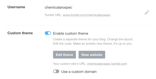
I just made a new sideblog and found out this setting (found under "Edit Appearance") (now found under "Blog Settings") is disabled by default.
Edit: Tumblr settings are unpredictable and devious. This may not be disabled by default for you. People have also said that their themes have been removed. Please look to the notes if experiencing complications.
This means that ALL new blogs will NOT have a [username].tumblr.com page. Not only that, but they will not have any themes besides the mobile-default.
As someone who really likes custom themes and Tumblr still having a fully customizable profile page, please turn this on!
You can make a website for your tumblr blog that is entirely your own!
Finding posts on your URL.tumblr.com page is much easier due to the ability to use your Archive and url.tumblr.com/tagged/[tag] pages!
Visiting your mutual's tumblr pages will become much more fun if they do the same! I used to always associate blogs with the themes they had, but that's sadly not possible anymore :(
If Tumblr themes die out, it will truly be an end of an era for the internet, and the future will hold only mobile-orientated, endless-scroll design devoid of personality.
Even if you don't like themes, this is a move that almost destroys Tumblr's origin as a blogging website and showcases the takeover of social-media-sameness.
Having your own URL and custom theme is fun! Try it today!!!
Edit: I focused on promoting custom themes but I do encourage people to simply turn on this setting for the URL. You can pick a free tumblr theme or even leave on the tumblr mobile-orientated default!
Also sorry I didn't think of this until now, but there are versions of this post in the reblogs without the colored text, with extra information, with how to find this setting, and troubleshooting why it might not be working!
#tumblr#tumblr blog#tumblr theme#tumblr themes#tumblr culture#internet#social media#internet culture#I said this#psa#url#themes#fixed the black text
29K notes
·
View notes
Text
As has already been reported elsewhere, Penders recently took to his personal blog to announce a major milestone...
The first Lara-Su Chronicles book (which is mostly a Mobius: 25 Years Later collection) is real. The proof copy has been manufactured. These will be in peoples' hands in a matter of months.

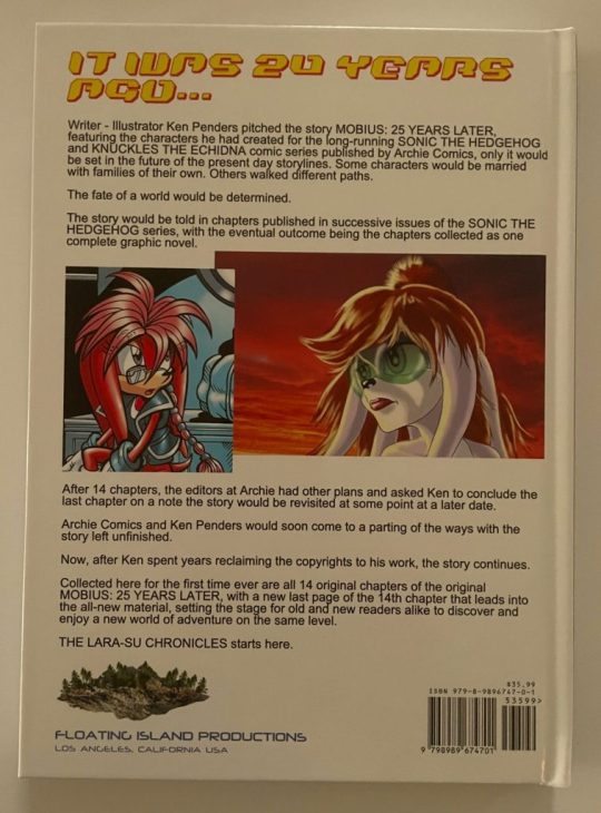
We've already seen the godawful cover art plenty of times before, but I'd like to highlight how bad the back cover blurb is here. It's mostly background info with very little about the actual story. "Some characters would be married with families of their own. Others walked different paths. The fate of a world would be determined." That's all it says about what happens in the comic! The rest is inside baseball stuff. Not exactly a great hook.
However, I feel like this weirdness may be because Ken had to very carefully design the front and back cover so that it isn't selling itself as a new Sonic book. As we've discussed before, Ken regained ownership of all the stories he wrote for Archie Sonic after the settlement with Archie, as well as all the characters he created for the series. He's allowed to do whatever he wants with his old work and his own characters, but he's forbidden from selling new Sonic-branded products. They have to be distinct at a glance. Per the settlement, Sega needed to make sure Ken's future works didn't "have a look or feel as though they were part of a Sonic universe." This is one of the reasons why the cast has been redesigned in a new (bad) art style for The Lara-Su Chronicles.
So while the old comics reprinted inside the book still contain Sonic characters, since Ken can still use that existing material that was forfeited to him in the settlement, you'll notice that nowhere on the new front or back cover does Ken show a character owned by Sega. The only characters shown using their appearances from the original comics are Julie-Su and Lara-Su, who Ken owns. Knuckles has been replaced with his TLSC equivalent, K'Nox, who's probably juuuuuust different enough to be considered a legally distinct character. In the blurb, Ken can mention that he wrote the original stories for Sonic and Knuckles-branded comics, because that's just a factually true statement, but he can't advertise that the book he's selling contains Sega-owned characters like Sonic, Knuckles, or even Sally. They're just... "some characters."
I remain fascinated by the weird needle Penders has to thread here due to the very specific copyright situation he's found himself in.
585 notes
·
View notes
Note
this overwatch 2 shit has GOT to be illegal right? I mean, they sold the game on the promise of PvE and now they cancel it. This better earn them a false advertising charge
And the wildest part is that you can't even play Overwatch 1 anymore.
Anyone who's followed this blog long enough has probably seen me post a rant about how terrible video games are at media preservation, and how we should preserve games (even ones we don't like) to be playable in some manner long after the developers take the servers offline because games are art and deserve to be able to be experienced by the future long after they've been discarded by their makers as a product.
You can't do that anymore with Overwatch 1, a game that wasn't even free to play.
People paid 40$ in 2016, 60$ if they went for the deluxe edition, to play Overwatch. New heroes, maps, etc were promised to come as free updates, instantly accessible for anyone to play without grinding or microtransactions (though there were mtx for cosmetics) and that the game would be supported for many years.
This was one of the many reasons why Overwatch back then absorbed a large part of TF2's playerbase: TF2 had been chugging along since 2007, at the 8-9 year point its updates were winding down and people have accepted it was finally hitting the end of tis life, and were looking for a new cartoon team shooter that would last for years. OW was not TF2's successor and was never intended to be, but that promise of many years of free support was a major part of why people gave it a chance just the same.
And then just 3 years later in 2019 they announced Overwatch 2, a game that looked really, really similar to Overwatch 1, except it was going to have the actual story missions via PvE mode that Overwatch 1 didn't have. They said there would be enough new things to justify the '2', and that people who bought Overwatch 1 need not worry about their investment in the first game.
And then it turned out what they meant by that was that they were killing Overwatch 1 by closing its servers, forcing everyone to move over to Overwatch 2, a Free to Play game where you had to grind to unlock the new heroes (people who bought OW1 instantly had the new hero unlocked but come on), was chock full of the usual Free to Play engagement mechanics, and changed the 6v6 format to 5v5, if you had a full squad of friends before, you had to tell one guy to get fucked.
I think the worst part was that when people were understandably angry that Overwatch 2's actual changes from the original were almost all monetization based, games journalists that pressed Blizzard on why players now had to grind a battlepass for heroes, which Overwatch 1 had always given for free, were met with a "well, heroes are the strongest engagement point for our players" type of deflection where they didn't even try to hide their reasons behind something respectable.
Now they're announcing that OW2's PvE mode, the whole (public) reason they made OW2 a sequel instead of an update to OW1, isn't even happening anymore, and Overwatch 1's original 6v6 remains dead and inaccessible.
I didn't like Overwatch 1. I was really hyped for it when it came out, but found myself really disliking the gameplay (especially on its map design which I thought was terrible) which only worsened with its creative and balancing direction until I lost interest in only a few weeks.
Still, killing OW1 to force all players to move to OW2's free to play model was inexcusable. All art must be preserved in some manner, even ones we don't think are good enough to be worth preserving. Overwatch in particular was so massive in 2016-2018 that to kill it is to make inaccessible the source material of a kajillion other pieces of art from those years.
2K notes
·
View notes
Text
Also going to finally make a pinned post for all my stuff:

BOGLEECH - my tumblr blog is named after this website I created around 2002 and still update. Thousands of pages worth of content focusing on creature design as well as real biology. My review of the original Legend of Zelda monsters might be the most straightforward example of my articles.
Links to some of the most popular content:

POKEMON REVIEW ARCHIVE: - I rate and review each and every single Pokemon, in Pokedex order, on its merits as a creature design. I also do so as someone whose favorite animals are all parasites.
DIGIMON REVIEW ARCHIVE - same, but more chaotic.
CREEPYPASTA COOKOFF ARCHIVE - for several years I hosted a yearly writing contest before it grew too big for me to keep up with. There are over a thousand user submitted horror, fantasy, sci fi and surrealist stories here emphasizing unconventional, original ideas you seldom see from the "creepypasta" community!
The original "MORTASHEEN" Monster Archive - since the early 2000's I've created and illustrated more than 800 creatures and counting for my own monster-catching world, now set for release as a tabletop RPG setting.
AWFUL HOSPITAL: SERIOUSLY THE WORST EVER (page one): an interactive comedy-horror-sci-fi webcomic I started in 2014 about a medical facility that could maybe be better.
Some of my other internet stuff:
PATREON - constant work makes my patreon updates inconsistent, but the content backlog goes back years with a huge amount of exclusive art and writing. I try to put up new exclusive stuff whenever I can.
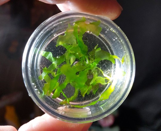
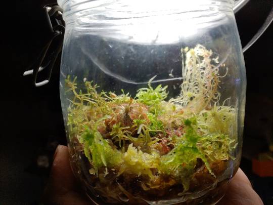
ETSY - I design all sorts of original enamel pins like these, plus I sell zero-maintenance terrarium plants (just leave them in a jar!), original books and other things!
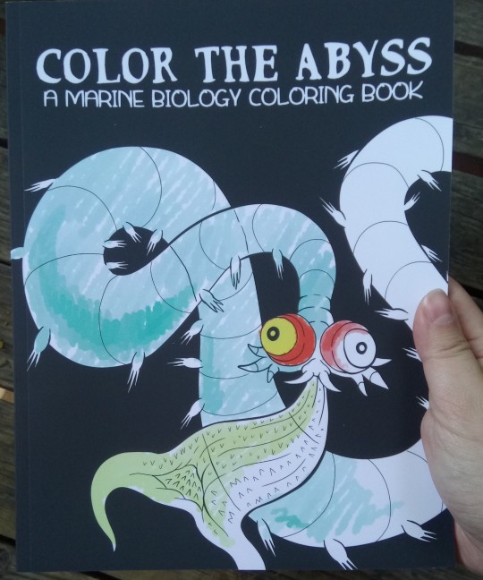
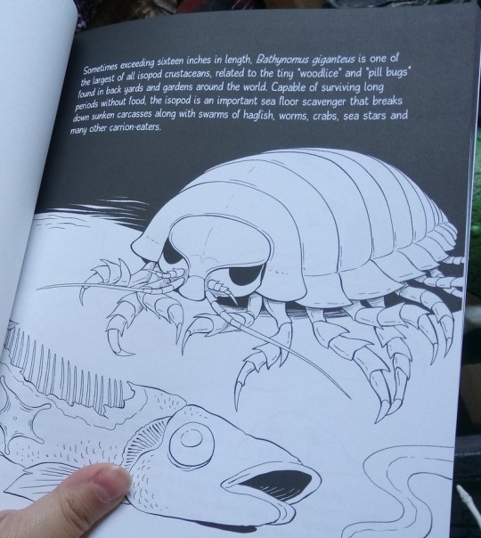
COLOR THE ABYSS (available on the above etsy!) - a 30 page educational deep sea coloring book! Includes a few famous favorites like giant isopods and hagfish, but mostly focuses on less popular, often much weirder animals.
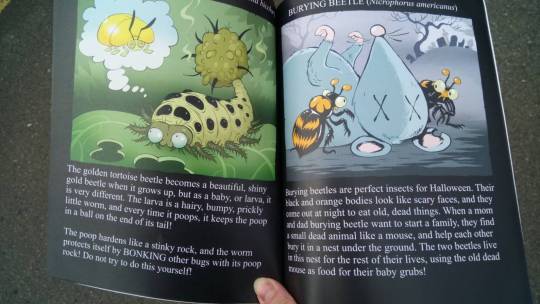
UNBELIEVABLE BUGS - also regularly restocked in the etsy store, 30 of the strangest and most surprising arthropods most people have likely never heard of, illustrated by myself and @revretch, written for even the youngest kids to understand (but will likely teach you something new at any age)
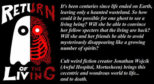
My Itch.io and Ko-fi - both sell digital versions of my books, including some creepypasta collections and my first novel, "Return of the Living," about a world of entirely ghosts suddenly dealing with the appearance of ghost-hunting monsters.
TWITCH CHANNEL - I now try to stream something at least monthly, sometimes weekly when possible, from horror games to books and art.
YOUTUBE CHANNEL - archives my twitch streams and other little things.
INSTAGRAM - look at pictures of my huge weird collection of toys and Halloween collectibles
BLUESKY - I'm going to put mainly just updates to my stuff on here.
SEE ALSO:
HUMANS-B-GONE - a science fiction animated series by my partner @revretch, about a world of kaiju-size, technologically advanced insects and arachnids to whom vertebrates like us are just pesky little "gubs." Also has a tumblr account @humansbgone
438 notes
·
View notes
Text
Ɗᥙҽ 𝜏σ ᙏყ Ɲҽɯ⨍σᥙɳԃ Ƒιχα𝜏ισɳ... ♚
⋆⋆⃟⊱✪⃝⃞⃝⊰⋆⃟⋆ ⋆⋆⃟⊱✪⃝⃞⃝⊰ ⋆⃟⋆⋆⋆⃟⊱✪⃝⃞⃝⊰ ⋆⋆⃟⊱✪⃝⃞⃝⊰⋆⃟⋆
Specifically with the Gluttonous Sin of Beelzebub being my favorite Sin of the group (not necessarily in Helluva Boss, but just in general), I wanted to make a ranking list of my favorite Queen Bee redesigns and their creators for really no other reason than I just feel like it. Now, this is all personal opinions and should not be taken to heart by any means, it's just for fun:
#1. "Beelzebub & Bibi" by @gravcore

♡ In terms of an actual redesign of the original, I love how this artist made "Bibi" because, for one thing, they made sense of the originals hair by giving her a ponytail since way too many characters have a mohawk style (Loona included); two, I cannot explain just how much I adore the clothes they gave her. The top is actually insect based and gorgeous, and not some recolor version of Loona's outfit; and third, they made canon Bee her own character rather than a royal because nothing about the OG read "Ancient Sin" to anybody.
♡ Now, in terms of the actual Beelzebub, here, she's legitimately stunning. Rather than a redesign, I can tell this was the original long before the Queen Bee episode came out, and I love how it reads both "70's party girl" and "regal ruler" all in one. That, and the actual bug design aspect and the color scheme. Above all else, I love how they incorporated the lava stomach in her design, too.
#2. "Beelzebub" by @s3tok41b4
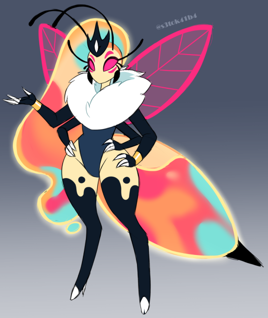
♡ This design can best be described as a literal re-imagine of the canon Beelzebub as it shares almost all her similarities with the actual bug aspect to it that it desperately needed. It's legitimately simplistic but still appealing to the eye, futher showing us that Viv was perfectly capable of making something so simple, but actively chose to make it more confusing than it had to be.
#3. "Beelzebub" by @ruinxl0ve
♡ Similar to the first two, this shares both a regal and party girl bug aesthetic with the added bonus of actually being beautifully emotive despite not even having a mouth. I feel this beautifully differentiates the design from the original while also making it recognizable and I feel that it kinda feeds into the original concept that Queen Bee could literally "feel the vibe", hinting to her being an empath in some manner.
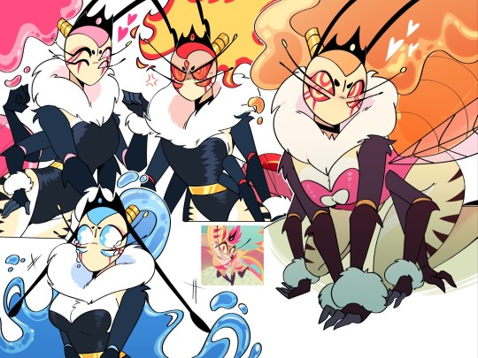
#4. "The Three Bees" by @onehelluvatime
♡ Long story short, these are three individual versions of the Queen Bee and her new placing within the Hellaverse outside of the canon one. For more in-depth explanation of these interpretations, it's best to check the blog yourself. Truly, I love these designs not only because of the visual redesigns themselves, but also the well-crafted and creative explanations and backgrounds regarding these characters. I especially like the idea that the hellhounds within society are half-undead with skull-like appendages and facial aspects.
#5. "Spontaneous Beelzebub" by @redd-byrd


♡ I know it's essentially the same as the canon design, but with the small tweaks that were made to this one (the giant "Bee Butt", the added black lines, the actual bug-like wings, the blue-thin eyes), all of them give a more clear indication (at least to me) that this Bee is more higher up than her fellow hellhounds, meaning she looks a lot more like a hybrid thus making her more grand. It's nice how they added these small details for improvement while still essentially leaving the design like its original.
⋆⋆⃟⊱✪⃝⃞⃝⊰⋆⃟⋆ ⋆⋆⃟⊱✪⃝⃞⃝⊰ ⋆⃟⋆⋆⋆⃟⊱✪⃝⃞⃝⊰ ⋆⋆⃟⊱✪⃝⃞⃝⊰⋆⃟⋆
Anyway, thanks for listening to my Ted Talk. Have a nice day!
#helluva boss critical#vivziepop critical#helluva boss criticism#helluva boss#helluva boss critique#hazbin hotel critical#helluva critical#hazbin hotel#hazbin hotel critique#vivziepop criticism#personal opinion#pls dont hate me#pls dont be offended#credit to artist#credit to artists#helluva boss redesign#beelzebub#queen beelzebub#queen bee
716 notes
·
View notes
Note
i was rewatching the rite of spring segment from fantasia and i've got to wonder. Why Did We Draw Archaeopteryx Like That. i remember toys having that same, boomerang arm shaped pose too. it's like a monkey lizard more than a bird.
Ooh okay this is a fun one cause while it technically is an Archaeopteryx and is listed as such in the production draft, I don't think the design is based on Archaeopteryx at all!
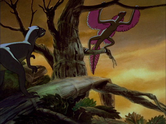
To me, this "Archaeopteryx" almost exactly resembles something else, the fascinating historical phenomenon called Proavis.
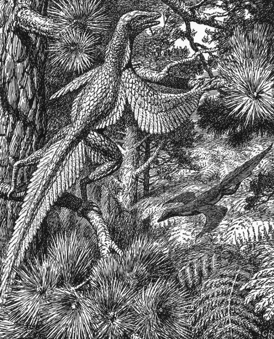
Proavis, or Tetrapteryx as some four-winged interpretations were called, was a hypothetical prehistoric creature that was proposed in the early 20th century as a best guess at what the unknown ancestor of birds could have looked like. The illustration above was drawn in 1926 by Gerhard Heilmann, a Danish artist and amateur scientist who argued that birds evolved from non-dinosaurian archosaurs like Euparkeria. In his 1916 book Vor Nuvaerende Viden om Fuglenes Afstamning and the 1926 English translation The Origin of Birds, he presented Proavis as the imagined midpoint between a scaly ground-running archosaur and Archaeopteryx, which at the time held the title of The First Bird.

Other versions of the same hypothesis, like William Beebe's Tetrapteryx above, were published and discussed around the same time, but it was Heilmann's Proavis that gained immense popularity to the point that bird evolution was considered essentially "solved" for decades. It was also painted by Zdeněk Burian, one of the Old Greats of palaeoart, which kept the concept alive in dinosaur books for decades as well.

Of course further study has shown this hypothesis to be incorrect and that birds are instead members of Dinosauria (and honestly Heilmann either missed or ignored a lot of evidence for a dinosaurian origin of birds even in the 1910s), but the Proavis to me remains a beautiful and fascinating concept that represents scientists and artists striving to understand the prehistoric world and the passage of evolution, much like we still do today!
And of course, its popularity in the early 20th century put it at the perfect time for Fantasia's artists to take... let's say heavy inspiration from Heilmann's imaginary Proavis when depicting a creature that was intended to be Archaeopteryx the whole time! The pattern of feathers matches up almost exactly, although the larger leg wings might have been inspired by Beebe's Tetrapteryx as well:
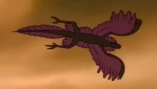
So to get back to your original question that led to this whole deep dive, artists didn't actually Draw Archaeopteryx Like That except when they were mistakenly drawing something that wasn't Archaeopteryx at all! If you want to read more about the Proavis and Tetrapteryx I recommend this Tetrapod Zoology blog post by Darren Naish, he does into more depth about the history of the concept and some of the unusual evolutionary ideas that Heilmann used to arrive at this weird and cool imaginary creature!
791 notes
·
View notes
Text
Making Humanoids Less Human
I did make a small post on this, but now I've got the art for a much bigger and more detailed post! so here we go.
I had several anonymous asks that all came in quick succession weeks ago. Every single one of them was basically just a variation on "how would you take (typically humanoid) fantasy being, and make them look less human?"
This blog does not exist for me to just give people original designs for free, my goal is to show off my own personal thoughts about fantasy design and help people figure out how to adjust their own designs to fit their vision better. That means when people ask me questions about how to do something, I want to give them things to think about so they can come to their own conclusion. I don't mind making original designs to illustrate concepts, but a whole flood of "show me how to make this specific thing look different" all at once like that was too much. I'm not answering them all individually, it's just not what I want to do.
But what I can do is show my own thoughts and ideas about how to take any fantasy design and push it further away from "human", and you all can look at my ideas and figure out your own way to do things!
So here are the main 4 methods I've come up with to make humanoids look less human.
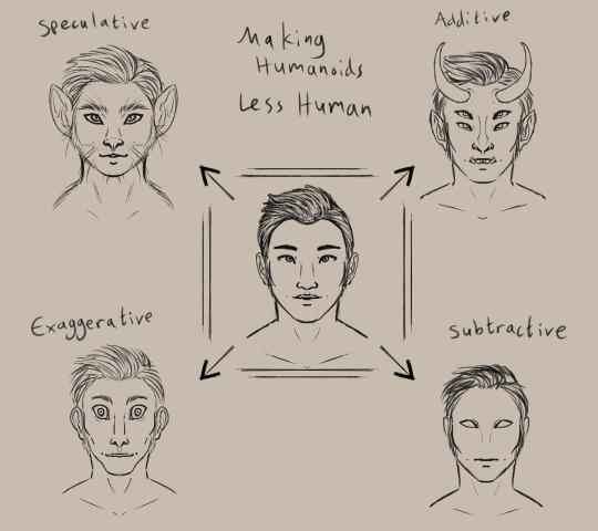
(image description: a simplified drawing of a humanoid face surrounded by four altered versions of the same face. clockwise starting from the top left, they are:
Speculative, drawn as a cat person. Additive, drawn with horns, pointy ears, sharp teeth, and a second pair of eyes. Subtractive, drawn with blank eyes, no nose, and no eyebrows. Exaggerative, drawn with a long face and huge eyes, as well as a wide mouth, narrow nose, and big ears.
end description)
I am personally a fan of the speculative route, which means exploring an alternate root of evolution to create a new design. Through this method, I've created monkey elves, frog goblins, and pig orcs.
the additive option is the most common, I think. adding new feature or doubled features to a humanoid form is a very intuitive way to change the design and make it look less human. you see this in most fantasy and scifi designs, like star trek aliens and the dnd player races.
subtractive and evaggerative are the most common options for people that like the uncanny valley. it's really easy to make uncomfortable designs by removing or exaggerating recognizable features, and they're often used together. Slenderman, for example, removes all facial features and skin color but also exaggerates the limbs and body.
Combining the four methods will give you a really interesting design as well! So for practice I decided to explore an alternate design for Tieflings, the part-demon player race in dnd.


(image description: four examples of differnt tiefling designs using the previously described methods. the additive example is just offical dnd art of a tiefling woman with purple skin, horns, and a long tail.
the subtractive sketch looks very alien, with a bald head, empty eyes, and no other facial featuers aside from a small mouth. it has three fingers per hand and two toe per foot.
the exaggerative sketch shows a hunched humanoid figure with huge eyes and big ears. the neck, limbs, and digits are all long with claws at the ends of the fingers and toes, and the limbs are also quite muscular.
the speculative sketch shows a bipedal figure with features similar to a giraffe, including a long neck, ossicones, and hooves.
end description)
now, because tielflings have such a distinct look to them, obviously my new sketches don't really look like tieflings, do they? the only one that comes close is the giraffe. relying only on one type of alteration to the human form has left the designs rather empty and lacking in the more iconic traits of the original concept. so i tried a sketch that combined my ideas! it came out looking like a completely different creature lol, like it could be a kobold or something, still not really a tiefling.
(image description: a sketch of a creature with a giraffe-like head, long tongue, and sharp teeth. it appears to be roaring at something and stands in a half-crouch. it has long limbs with hoof feet and clawed hands, as well as a long tufted tail curled behind it. end description.)
didn't work out. too far into the animal side of the speculative evolution, I think. so I tried again and got a design I liked much better!
(image description: a digital painting of a tiefling leaping back and casting a glowing orange spell. she is wearing a tunic with a corset and detached sleeves, as well as several pieces of jewelry. Her skin is purple with dark patches like a giraffe's spots, and she has a giraffe's ossicones as well as hoof-like hands and two-toed hoof feet. Her tail is long with a tuft at the end. She has glowing eyes and a flat nose, and there is a single sharp tooth visible poking out of the side of her mouth. end description.)
Brought the face back into slightly more human proportions and that helped a lot. Sometimes designs just take a few tries! that's normal.
and hopefully this is helpful to all of you! there are so many ways to alter humanoid designs to come up with something original and unique to you!
#humanoids#making humanoids less human#altered humanoids#non primate humanoids#tiefling#long post#my designs#and btw ai cannot do this#does not matter how detailed you prompt it#it can't really get things to look this original and unique#it can't really blend different features like this in a way that makes sense#you have this power#the computers cannot replicate it
216 notes
·
View notes
Text
ok yeah lots of memes about how the shitty new UI is literally a direct carbon copy of twitter and we hate it because of that, yea yea
here’s some actual/extra reasons why the UI itself is shitty beyond the fact that it’s stolen from twitter (in just my personal opinion)
it’s claustrophobic as hell. the old UI felt breathable, felt like you could scroll and actually look at your posts, and now there’s enough shit going on on one page that it actually gives me a headache. (i’ve heard other people say this as well, so maybe it’s not just me that’s overstimulated by all the fucking noise on the dash?)
the ‘dash sorting’ (for you / your tags / what you missed) is way too high up the page now and appears crowded against the top where things like the bookmarks bar are on most browsers. not that anything in this new UI isn’t crowded.
i’ve seen it mentioned plenty already, but there’s quite a lot of unnecessary duplication-- as in, the same buttons that exist in the new left navigation panel show up on the right in blog view, which is just completely annoying and unneeded clutter.
the fact that post interaction options are all on the right side of the posts, but dashboard navigation is now all pushed to the far left of display, is extremely annoying. i’m right-handed, so it’s extra annoying for me to have to constantly go all the way over there. maybe that’s easier for left-handed people, but if the case was supporting diversity, why not just put an option in dashboard preferences to switch the side of ALL the controls? because the post interactions are still on the right.
while we’re on the subject-- tumblr’s original design was actually MUCH more intuitive and easy to navigate. the reason for this is that everything you needed to click was in one small area. you scroll up and down the dash, move slightly up to navigate (home/asks/notifications) and slightly down to the side to interact with a post (reblog/reply). extremely simple, easy to use, even ‘lazy + addicting’, which is what all social media studio exes are supposed to want right now. changing the ui to actually be more work and more frustrating to navigate seems completely opposed to what their obvious business strategy should be.
tumblr’s original design was also much more breathable, with the small icons in the corner looking organized and not taking up much space, and lots of room for the posts themselves to be the main attraction.
there’s the fact that copying someone else’s brand entirely actually just puts you in a bigger, wider pool with much more competition, and makes you much more likely to immediately fall short of that and go bankrupt.
tumblr's original purpose was to be geared toward blogs, and these updates, along with the writing on the wall about blog themes being completely phased out soon, is completely against the original purpose. although sometimes website purposes change for the better, so take that as you will.
and finally the obvious point that you can tell from all the memes: this change is almost universally hated by the core tumblr userbase-- aka the site’s loyal consumers for years and years. driving out their main demographic seems like a very obvious, very quick way to lose a lot of fucking money. they also did this “carbon copy of twitter” update literally just a week after sitewide protest about the idea of this site being anything like twitter, so it feels like a massive Fuck You to literally all of the users. tumblr is rapidly approaching their trust thermocline, and show no sign of slowing down.
these are just my opinions about the ui, and i’m only one person. so feel free to add on other design flaws you think people should be aware of or able to mention! i will probably also be submitting this post as feedback to staff, and will be taking their surveys when i can as well.
679 notes
·
View notes
Text
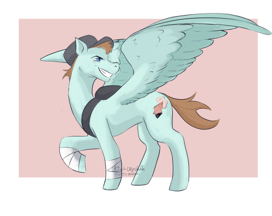
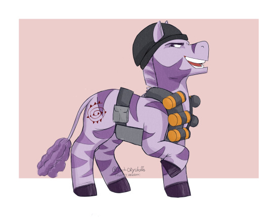
THEY ARE DONE!!!
I finally finished drawing the mercs of the MlpTf2 AU of @homkamiro, but first, im sorry, cuz i accidentally made heavy too diferent form the original design. as i was doing him my brain just got stuck with the idea of a percheron horse heavy and well... it ended up looking like this.
Still, i hope you like it
Edit 18/12: Should i post them on instagram???
Edit 22/12: so i forgot to post medic mlp version, there is a new link on the pined post on my blog with this post reblogged with medic version. In case u wanna see it, in the one in parentecis


#team fortress 2#team fortress#tf2#my little pony#mlp#heavy tf2#medic tf2#pyro tf2#engineer tf2#scout tf2#demoman#tf2 engineer#spy tf2#tf2 spy#sniper tf2#sniper#tf2 sniper#soldier tf2#tf2 soldier#tf2 solly
321 notes
·
View notes
Text
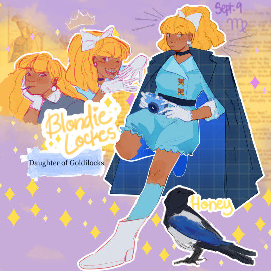
As per usual, info under the cut <3
IM BACK BITCHES!!!
Alright, here's the design stuff:
I wanted to go for kind of a Lois Lane vibe, including the way she gets all the way up in business she should not be up in. At the same time I wanted to bring the super cutesy gothic lolita style in at least a little. So I ended up going with a poofy short jumpsuit with bows and teddy bears. I would love to make a specific thank you to @themooncallsyou for suggesting I look at the Moschino 2022 spring line for inspiration, it ended up having a very heavy impact on the final design.
I tried to lean into the investigative part of investigative reporter, so that's what the heavy coat is about. I thought adding that classic detective silhouette would be a nice final touch. Plus, I think Blondie likes the drama of the coat flying behind her as she's chasing down a lead. It makes her feel very cool.
Alright, so her original pet is a bear cub named Grizz but I have. Several problems with that. The main one is that it's not clear what the difference between Grizz and the actual sentient bears and her story is. There is never any differentiation between them. It's a Goofy-Pluto situation. Like it doesn't need to be explained, but the minute you start thinking about it too hard it gets weird real fast.
Anyways say hello to Honey the magpie!! Magpies are great mimics and lovers of shiny things, so I thought one would be a perfect fit for Blondie. She repeats bits of gossip and steals little trinkets and clues to help Blondie with whatever case she's on. Honey is where Blondie gets her infinite supply of bobby pins. Her scale is a little off, I don't think magpies are actually that big, but I still think she's cute so I'm not changing it now lol.
Now for character stuff:
Honestly I'm not really changing anything as much as I am exploring what's already there. I think Blondie has the potential to be really interesting, because she's unique within the class system of the school. She's kind of the inverse of Raven status-wise. Raven was born to royalty, but because her mom is the Evil Queen she's actually considered a commoner by society. Blondie was born to a wealthy commoner family, but her fear of rejection leads her to exaggerate the prestige of her lineage. Everyone sort of knows that she's not a Princess but she's so desperate to keep up the image of royalty that no one knows where she actually lands. Most of the royals assume her parents are Lord and Lady or Duke and Duchess or something. In reality they don't have any noble title, and Blondie is very insecure about that.
Blondie isn't so much ashamed of her family as she is terrified of exclusion and rejection. Her standing in society is the one major thing that makes her different from all the other royals, but she has major anxieties that she's always on thin ice. In her mind she's permanently one wrong step from total ostracization.
On a happier note, she does have a genuine passion for journalism! She considers her news blog/podcast practice for her future career. She starts out discussing school drama and gossip, but tries to stay a neutral third party. That's why her hair is so big. It's full of secrets. As the story goes on she starts reporting on more political and social topics beyond the boundaries of the school (and therefore becomes one of Milton Grimms worst nightmares). She is really, really, really good at getting into shit people do not want her to get into. She's got her eyes on prize and good luck stopping her
#eah#ever after high#coffeepaintart#eah fanart#blondie lockes#eah art#yes i have thought about this cartoon for children designed to sell dolls from almost a decade ago for far too long why do you ask#eah redesign
263 notes
·
View notes
Text
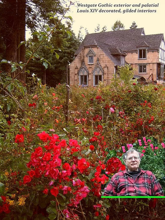
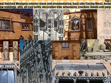
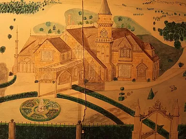
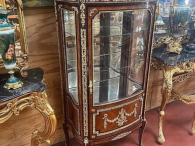
You know how I love offbeat properties and I found this seller's For-Sale-By-Owner ad on Zillow. He started building the home in 1969, in Eureka, California, and it's been under construction for 43 years! It's a French ornamented cathedral Gothic, with all custom ornaments, molds and scaffolding techniques. This mansion is based on Newport, Rhode Island style and spirit from the 19th Century.
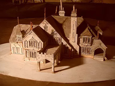
This is what it's supposed to look like - The Vision.
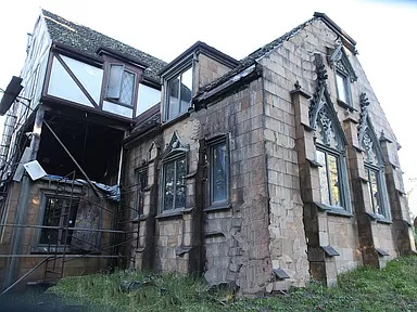
And, in 43 yrs., this is what he's done so far. He's asking $4.5M. Now, he has been living in it, so you can live in the finished part. The house is being sold furnished, and what furnishings! Read what he wrote about them below:
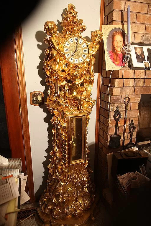
"Also for sale here are 1500 sq. ft of the ultimate grade palatial antique Italian marquetry, veneer and solid wood furniture, ranging from console tables and mirrors; 10 different sizes of round antique tables, up to a 12' x 6' museum-piece dining table, various rare cabinets, marquetry, upholstered chairs, couches, china and other cabinets, solid gold (plated) grandfather clock and two huge antique chandeliers, all worth over $300k on the market now and arguably TWICE that!"
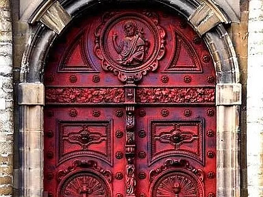
This outer door is amazing.

Here's a gargoyle and other ornamentation that still has to go on the house.
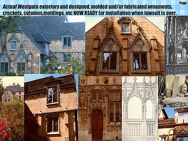
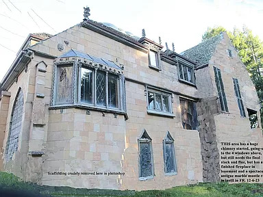
But, look at this - it says the exterior designs are ready for installation "when the lawsuit is over." So, the property is involved in a lawsuit, too? (Check the blog - I found the lawsuit papers and posted it.)
There's so much stuff here.
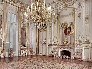
This room is done. It must be a ballroom. I don't know what to make of all this. This looks like the Romanoff's place.
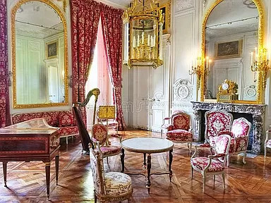
This must be a music room. There's a harpsicord and a harp in here.
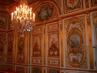
Look at these walls. He says the walls are hand done- are these the actual walls?
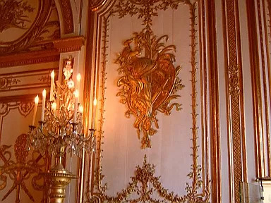
The walls are hand painted according to the description.
Here's a mantel waiting to be installed.
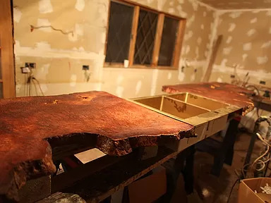
This is going to be the kitchen.
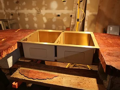
The gold double sink.
I don't know if this is an old picture of the original inspiration for this home, but it's definitely a representation of the home itself.
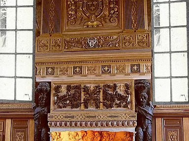
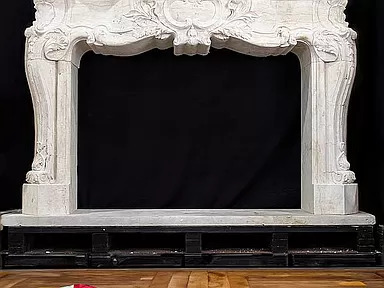
This is an amazing fireplace.
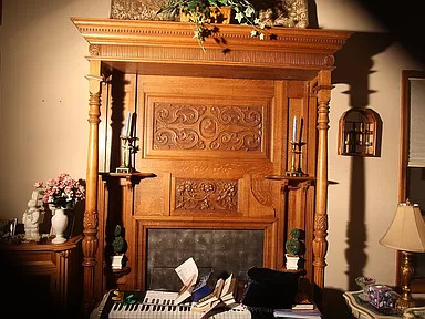
Another beautiful fireplace.
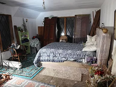
He's using the bedroom, but it's not finished.
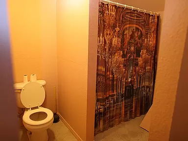
I'm disappointed in this bathroom. Maybe it's just temporary?
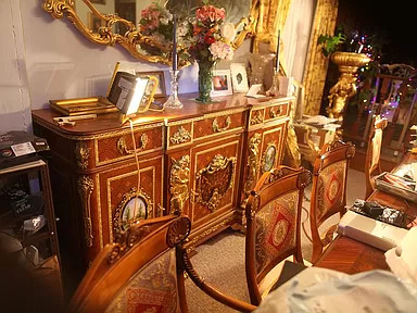
He has a lot of photos of the furniture and these are really primo antiques. So, this would be one of the dining rooms.
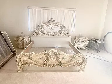
This looks like a brand new bedroom set. Looks like a furniture store that used to be near me called Roma Furniture.
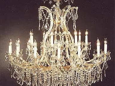
The chandelier in the ballroom that he says is included in the sale.
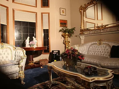
One of the sitting rooms.
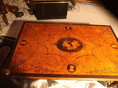
Nice inlaid table.
There's a lot of furniture. If you want to see it all, click on the link b/c he's posted 100 photos. But, I'm very confused.
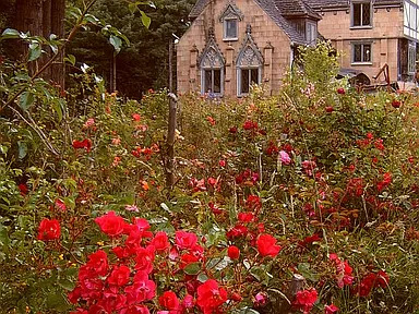
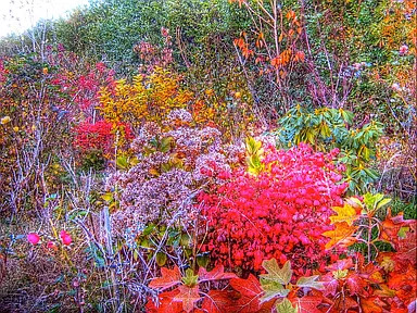
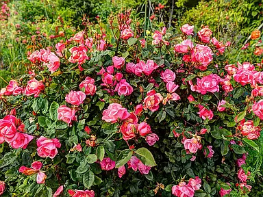
The property measures 6 acres and there are "massive fall color and rose gardens, 20,000 plantings, plus 10,000 daffodil, iris, lily, etc. Bulbs are spread over 6 acres, still there mostly, alive and colorful. Plus, hundreds of valuable landscaping sculptures are included."
121 notes
·
View notes
Last Seen Blogs
amiym
泡沫
thealtoduck
I'll await my armored fate with a smile
h-doodles
certified insane girlkisser™—on thesis mode

earth-24-blog1
earth-24.com

deikyrio
Dei