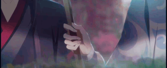
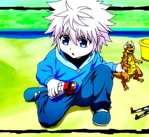
#I've been trying to find a way to get the colors and brightness and contrast etc right for this scene for WEEKS but I'm not there yet
Note
Whats your art process and what would you reccomend for someone who would like to achieve a style similar to yours? i love this mix of cartoonism and realism. your work is such an inspiration >.<
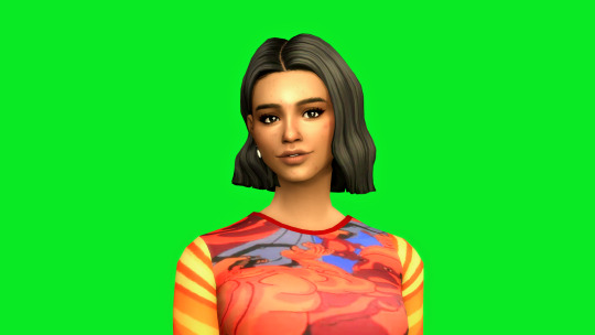
oh gosh! thank you?! 💞 i'll do my best to explain it, but even I have a difficult time trying to understand my own art process/style because of how inconsistent it is;; (i still have a lot to learn!) this is gonna be a long reply so i'll place it under the cut
process:

I start loose with a more gesture type rough sketch. I mainly just do lineart in the same layer as my sketch and erase away parts I don't like. Sometimes I'll lower the sketch's opacity and on a new layer do my lineart (which is what i did for the drawing above). But regardless doing that loose gesture sketch helps keep my drawing dynamic even as I refine over top of it!
- I duplicate layers A LOT for safekeeping my previous progress, especially if I'm thinking of making a big change (ex. changing limb position)
If I wanna put colors down underneath it I set my lineart to Multiply. For coloring I'm very inconsistent with the process, but recently I've been using a more subjective coloring style, where I pick my own shadows and highlights to try relying less on blending modes (which is gonna be too long to get into here;;) Finally if I feel like it, I make a layer on top of my lineart layer where I render everything
Oh this is something that helps me a lot for colors! I have 2 layers that are a mid-gray tone placed above all my other layers. One I set to the Color mode (to make the drawing black and white), and the other I set to the Luminosity blending mode (to make the drawing's brightness the same..?not sure)
The Color layer helps me check if I have enough contrast in values, and the Luminosity layer helps me check if I have enough contrast in color hue and saturation!
style:
This is really difficult to answer because style encompasses so many different aspects of art, but I'll try to focus my answer on the mix of cartoonism and realism that you mentioned!
I struggled trying to explain what my style is like so I just broke down one of my drawings that exemplifies a lot of my stylizations! Hopefully these can give you some pointers about what I tend to think about when I draw (click for higher quality)
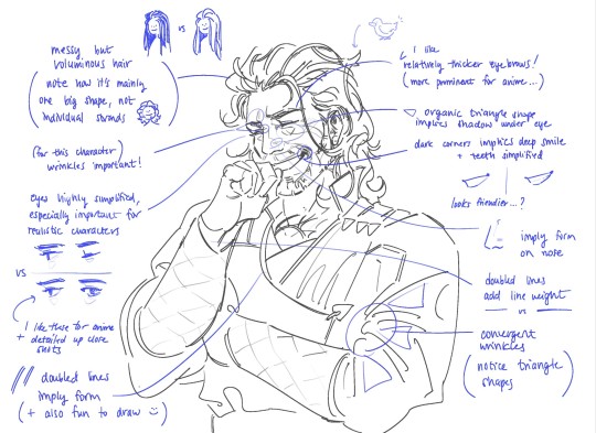
(+to add to this i use a brush with no size pressure, only opacity pressure)
What I recommend for stylizing a realistic character: The way I learned to stylize a more realistic character like this one was to import a reference of his face, then trace over it very deliberately, making sure to stick to big shapes and characterizing details I thought were important to achieve his likeness! Then I'd turn the reference layer off and freehand it over and over, comparing and redrawing until I managed to get the mix of accuracy and stylization I liked!
What I recommend to find a style: I basically ended up with my style subconsciously as an intersection between the things I like to see in art + the things I like to draw! Most of my inspiration comes from anime (😔) and artists online. I'll see a very specific stylization I like in others' art, and try replicating it to see if I like how it fits with my style + if I enjoy drawing it in that way. I did this a lot over the years, accumulating into a big mosaic of inspiration from all the artists whose work I personally enjoy and learn from! I know this isn't exactly answering how to get a style like mine, but I think knowing this general process may help you out in the long run!
ahh i think that's it! i tried to be as comprehensive as i could without being too verbose (my bane). i hope this is the answer you were looking for and that it can help you! 💞 and thank u for the ask! it was a good exercise for myself to analyze my own art
#my asks#anonymous#tutorial#...? art info? not sure what to tag this#i spent a very intense day mulling over this ask#hopefully i answered this correctly...!#art resources
41 notes
·
View notes
Text
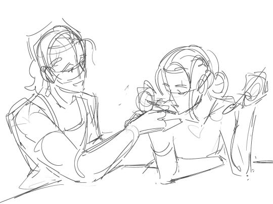
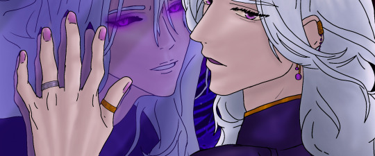
Day 20: Garden
The Koopa King's castle has a garden, apparently.
For Luigi, it was known after everyone arrived to get healed (Luigi never knew Kamek could look so happily annoyed), and their Paper versions had bid them goodbye.
He tries not to think about how easily anyone could drop in and out of their world like that.
Meanwhile, Peach and Mario have decided to stay over ‘for undisclosed political reasons’, but honestly just to keep an eye on… well, him.
-don’t think about it don’t think about it-
So, for some time to himself, he set out for the garden as suggested by Flambo. It’s surprisingly full of color, even though only a small part of the vegetation has flowers.
Immediately, he loved feeling the warm breeze and hearing the quiet rustling of the leaves. He loved how the rumbling of the distant volcanoes is muffled, and that the air smelled sweet and spicy in contrast to the smoke and sulfur that normally lingered.
It become a favorite spot the moment he saw the large marble fountain, visibly made with seats and built-in steps that lead to the water basin.
Could anyone blame him for nearly skipping to it?
Behind him, he feels… something approach why can he feel that. It's large, and- warm? Not in temperature, but-
“Figured I would find you here.”
He turns, and feels his heart flutter does he have- no, don’t think.
Behind him, Bowser stands with the sun shining above him, hair seemingly aflame from the light and scales shining just as bright. His eyes are soft, and Luigi feels dizzy with the burst of affection he feels as he walks closer.
"Mind if I join you?"
Luigi answers by patting the seat next to him, watching as the Koopa plops down next to him before scooting closer to lean against his side.
A sigh-
And they sit there, unwinding from the tension they carried for... four days?
The only noise that breaks the silence is when Bowser shifts and offers a hand- one that Luigi gladly accepts.
Bowser is warmer than usual or maybe he’s colder, but the gentle grip enveloping his hand is just as comforting as ever.
“Luigi.”
He squirms. Even though Luigi knows he doesn't have to fear anything when around Bowser...
He has been trying to avoid this conversation for a while.
"Y-yeah?"
The Koopa catches his eyes, "What's wrong?"
"I- I don't-"
"Love,"
His breath catches in his throat.
"You hadn't gone out for days, and I've never seen you wander the palace like you used to. Not outside official meetings."
Luigi swallows down the sudden nausea that welled up Don't look down don'tdon'tdon't'. "It- it just feels not as safe, you know? I hadn't been able to relax at the library-"
"Luigi." He says his name so softly. "No."
The world's getting blurry, and his eyes are starting to sting-
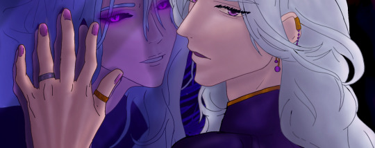
"It's about this, isn't it?"
He doesn't want to look, would rather he never has to see it but-
A claw traces a knuckle, winding down just past his wrist.
Even he knows it's impossible.
He looks down at their hands, even as he starts to tremble watching that claw run under his wrist.
It shouldn't look like that.
His skin shouldn't look like that -like not even the sun could give him dimension-
Just a solid void, where his skin should be is, just no veins, no wrinkles, no scars, just monochrome everywhere, just-
Nothing. Nothing of himself. Just like-
Another large hand wraps around him, pulling him towards Bowser before squeezing him into an embrace it's warm and safe-
"Breathe, Luigi, breathe."
He takes a gulp of air -that's why he's lightheaded- and tries to keep breathing even if- if he doesn't-
"It's alright. You're okay." He knows he is. He's just wrong- "There's nothing wrong, feeling this way."
"B-" He nearly chokes on the words. "But I sh-shouldn't..."
"Shhh," the hand he was holding only pulls away briefly, if just to wipe the wetness trailing down his cheeks.
"I- shouldn't exist-"
He regrets his words immediately when Bowser physically shudders, stilling in a way that makes Luigi utterly aware of the silence again.
Before he registers it, the Koopa hauls him straight off the bench and holds him tightly to his chest, the plastron digging into his ribs while his cheek is pressed to the near-hot scales above it.
"NO. No," Luigi hates how that deep voice hitches, and it feels like someone is twisting a knife in his gut again- "You should exist, Luigi. You exist, and it's enough."
One of his hands runs through his hair, and it takes everything for Luigi to not question if it creeps him out to feel-
"Even so-"
He tries to not hold his breath, but his lungs(?) burn-
"I'm here,"
He's crying again.
"And I won't leave you like this."
And he's back to square one, feeling small and fragile and feeling like he shouldn't be anywhere-
"Not you."
It feels like something in him is breaking.
"Not when I love you."
And Luigi-
breaks.
The guards stationed along the garden's perimeter never talk about that day, but they still think about the echoing wails and the bursts of acrid feelings years later.
#bowuigi#KAIJUNE Prompt#Happy Pride Month#in which the void is always there#but now in the size and shape of a Green Bean#who is also friend shaped#he's just grieving for his humanity#and Bowser is there supportively
77 notes
·
View notes
Note
Hello there! I'm Eden :D I LOVE your renders! I've been rendering for well over a year at this point, however I only stuck to the super basic stuff since it took me a year before that to even know how to do it at all. I've wanted to up my game and get to where you are now. I'm SO SORRY if this question was asked already (I haven't gotten too far in your posts yet), but;
How do you personally edit your renders? I understand you use photoshop, but how do you do it exactly? Your renders have that kind of digital art style, like you drew them yourself. Feel free to be as descriptive or brief as you'd like!
Hi Eden!!! Thank you so much! 🥹😍♥️
I've followed you back and glad we're moots! I'd love to see some of your work!
I'm not sure if I've answered this before but I'm happy to answer it again! Also I haven't advertised it in a while (and I really need to try to get up a new tut, maybe soon), but my alt account is a Render School where I post tutorials, with plans to post editing tutorials in the future!
But honestly as far as my editing, I really don't do much.
Actions are my secret weapon, and I have a few favorites/go-tos I'll link! A few are by simmers and a few are just action sets. I'm in a family of photographers, so I have access to a wealth of resources for my editing.
Sonder set by @intramoon
Cold Water set by @intramoon
Retro Prime photoshop actions
Indie camera photoshop actions
But my "secret weapon," as it were, and the set of actions that I think most helps me accomplish that digital art style is a set of actions that are sadly expensive and hard to find now.
My favorite set is by Totally Rad! and I think in recent years it's been folded in to this Pixel Sugar product on their website. I know that's a steep price point but it's possible you can find it around the corners of the Internet for less, or if you can't, you might be able to find "dupes" of the better ones, which imo are:
Technicolor dream world
Super Fun Happy
Bullet Tooth
Grandma's Tap Shoes
As for my method, I know a lot of simmers paint over their renders, and I've done that a few times but find I'm too impatient tbh. My goal is always to have to do only minor touchups over my renders and some color/vibe adjustments before the finished product. My "raw" files are always exactly what blender spits out for me, unaltered in any way except to resize them for Tumblr.
To get that digital art style, I'd recommend rendering with alpha details if you don't already. If your computer can't handle alpha cc in the game, DM me and I can give you some pointers (sneak peek info for a future tut lmao) on how to accomplish it without bogging down your game.
When I go into photoshop I adjust the brightness and contrast, as I tend to personally prefer high contrast pieces that contain dark subject matter but you can still see the details. Then I'll paint/blur/clone/adjust anything that needs it, then I'll "stack" and adjust a handful of actions before applying edge blur and vignette and any other color adjustments (levels, curves, etc).
That's a very oversimplified rundown of what I do, but really overall my editing process is simple. The bulk of my work happens in blender itself. I find that the more time I take to perfect the lighting and shadows and angles in blender, the less frustrating the editing process and the happier I am with the end result. So, that said, be sure you're spending a lot of time in blender getting the light and shadows to be exactly where you need/want them to be before running it.
I know this is a bit long I'm sorry! If any of it is super confusing or you'd like a more in-depth look at any of it please let me know! I do plan to do editing tutorials for my side blog, but the latter half of this year has kind of run over me like a train, and for now I'm just trying to get by day by day. But I'm happy to help if you have more specific questions!
& thank you again!! ♥️
#replies#thank you so much this literally made my day#I was having a bad one too ugh I needed this#mini blender tutorial#tutorial ish#sims 4 blender tutorial#sims 4 render tutorial#sims 4 editing tutorial#I can't tell yall how happy it makes me when yall love my work#legit holding back tears#♥️♥️♥️
18 notes
·
View notes
Text

winter | a sunghoon short fic
word count: 1.1k!
warnings: noneee i don’t think / spelling errors
genre: fluff?
pairing: ice skater! sunghoon x ice skater! gn reader

snow covered the majority of the streets, a blanket of white over everything in sight. the streetlights had enough glow to illuminate the icy road and sidewalks, a bright contrast to the dark sky. everything was quiet, with no cars rushing past or people chattering about what time it was and where they were going.
a calmness that only spiraled in the dead of winter, a peaceful silence unlike any other. everyone was at home, not wanting to be out in the negative-degree weather, bundled up and watching their televisions. you wished you could say the same for yourself, though.
you sighed, shrugging on your coat (and the thick wool scarf that accompanied it) as you trudged through the snow, a light dusting of snowflakes dancing lazily around you. the city's snowstorms were always pretty mild, but this one was something special. special or not, though, it wouldn't stop you from getting to your destination; the ice rink.
it was almost like a blessing from heaven when you entered the rink, feeling its chill wash over you. the smell of fresh pine from the trees that lined the building, the sounds of skating blades clicking against ice; it was perfect. when you finally reached the building, you couldn’t help but sigh in relief and take in your surroundings. it was very late in the day (too late in fact), so the whole building was relatively empty apart from some staff who hadn't gone home yet, sitting at the counter and talking amongst themselves.
you greeted them before making your way to the rink, sitting down on one of the bleachers to put on your skates. after pulling on your laces, you hopped onto the ice, moving slowly to get accustomed to the surface. the music playing through the speakers was soothing, reminding you of how close it was to christmas, as if the shining red and green lights outside weren't enough.
but your mind wandered off as you picked up your pace, skating around the perimeter of the rink. you could feel your muscles relaxing as your anxiety began to slip away; the rink would help soothe you, helping to relieve some of your stress. you made sure to keep an eye on how much pressure you applied while doing the turns, keeping an even tempo and a steady beat. skating was always calming.
it kept you grounded, gave you a reason to keep pushing forward.
as you did another lap around the quaint rink, you noticed another figure emerging; a guy, who seemed surprised that you were there. he stopped short of stepping onto the ice, watching you carefully. his expression wasn't hostile, but rather...confused.
you furrowed your eyebrows slightly, glancing back at him curiously.
"um... hi?" you said slowly.
he glanced away, an awkward smile across his lips. "hi."
it looked like there was more to his statement than just "hi". there seemed to be something he wanted to add to it, like he was trying to find the right words to say. you waited patiently, unsure of what he was thinking about. the silence went on for a few seconds before he took in a breath and spoke again. “how long have you been here?”
you blinked, taken aback by the sudden question. “um, I came in here earlier.”
“oh,” he replied quietly, looking down at his feet. “hope i'm not interrupting your skating, then."
your face broke into a soft grin, your brows lifting slightly as amusement flashed across your features. "not at all," you explained. "did you wanna... skate together?"
his eyes snapped back up, staring intently at you. for a second, you swore you saw a bit of color bloom onto his cheeks. then the faintest hint of a smile graced his features.
“sure," he agreed quickly. he didn't hesitate to take off the coat and scarf he was wearing, laying them over the back of the seat beside him. “oh, and i'm sunghoon, by the way."
"y/n. how come I've never seen you before?"
you questioned, turning to properly look at him now that he was right next to you. his hair seemed silky under the dim lighting of the rink.
his eyes crinkled in a soft smile as he answered your question, the corners of them wrinkling. "i usually come earlier, not at 11 at night."
the ice beneath your feet creaked softly, a pleasant noise that filled the air.
"makes sense," you replied quietly. "it's cool to see someone else here, though."
he smiled, nodding in agreement. you two skated in silence for a while, enjoying the quiet and each other's company. when you got tired, you slowed down a bit, sunghoon skating up beside you. his pace gradually matched yours, and soon the two of you were moving together gracefully.
you felt relaxed around him, which was rare since you tended to avoid interacting with strangers unless absolutely necessary. you also appreciated his presence, despite being a stranger.
"so uh..." he started, voice hesitant. "...what brings you to the ice rink, anyway?"
"i love skating," you responded easily. "always have, i guess."
sunghoon chuckled softly. you glanced over, confused by his reaction.
"you're really good at it too. the way you move... it looks natural," he said.
your cheeks felt warm, and you turned your gaze downwards bashfully, mumbling a response to his compliment. "thanks."
sunghoon nodded, seemingly satisfied with that answer. he moved his gaze towards the floor, continuing to watch his skates glide along the smooth ice. you mirrored his movements, admiring the sleek lines and smooth surfaces of the rink.
"can i... can i have your number?" you questioned, hoping that it wasn't too soon to ask.
your heart fluttered in anticipation, hoping he'd agree.
after a moment, he shook his head with a small laugh. he pulled out his phone and handed it over to you. you accepted it gratefully, typing your number into a new contact slide before sending him a text message. you returned the phone, watching as a slight flush crept across his skin, again. it was endearing, seeing him so flustered.
"thanks, um, i have to get going," he said, smiling nervously.
he began to skate back towards the exit, but paused once again, facing you.
"are you coming tomorrow?" he asked. "just asking.”
you smiled, quite cheesily. “i am, same time.”
“cool,” he replied with a tiny smirk. “later, then.”
with that, he left the rink, leaving you to watch him go until he disappeared into the darkness. you exhaled loudly, a content smile gracing your features.
you knew sunghoon was cute, but you definitely hoped that he would come tomorrow. you weren't sure why you were so eager to see someone you barely knew, but you decided that that excitement would be a one time thing.
-
had to write one for hoon ofc
<3
#enhypen#enha#sunghoon#park sunghoon#enhypen imagines#enhypen reactions#enhypen scenarios#enha imagines#enha fluff#enha scenarios#niki#jungwon#sunoo#jake#jay#heesung#fanfic#enhypen fanfiction#sunghoon fluff#sunghoon x you#sunghoon x y/n#enhypen x reader#enha x you#kpop fanfiction#enhypen fluff#enhypen ff
70 notes
·
View notes
Note
Hello! this is a 2 part ask but, I'm sending it all in one to avoid cluttering up your inbox!!
Back in February or so you received an about your lighting setup for taking photo shoots and you linked all the stuff you use for them (thank you!), but… could we see how you have the lights arranged and such? It's something I've been trying to emulate because I find the lighting in your posts really nice, but can´r quite wrap my head around.
The 2nd part of the ask is a WCIF (sorry!) for the boxers and briefs in these 2 posts (/deathbypufferfish/718514235415691264 and /deathbypufferfish/718527232399884288/outtakes-since-yall-absolutely-lost-your-mind-for)
So sorry for sending such a long ask, and I hope you're having a great day or night! 💗
Yeah someone actually inquired about my set-up but I kept putting it off and then felt awkward doing it so late 😭 I'll answer the wcif in a separate post heheh. This is the post with my light and backdrop cc. The ceiling light is from Get Famous.
I have a build save that I use for photoshoots so I don't have to worry about clones walking around. It's just a basic room with my lighting set-up plus a space to teleport sims out of the way. I recommend turning off sim autonomy in this save too. I just evict sims when I'm done with their shoot.
Use different lights for different intensity, shapes of the light source, softness/harshness, and direction of light. If you experiment with different lights in build mode you'll see what I mean.

This is my general lighting set-up, but I am always adjusting the lights' color and brightness for what I need. Or turning some off. It depends on the mood I am going for and the sims complexion. (Since pale sims get blown up with my gshade on a white backdrop lol.) If I want a light from the left I will only have the front light and left one one for example. Mess around with the position of your angled lights!
Save your camera state so you can replicate the same shot for other sims or if you need to redo part of your set-up. Simply find your shot, hold down Ctrl and select a number key between 5-9. When you want to snap to your position, enter tab mode and press the number you set. You can set multiple camera states with different numbers. To clear the camera state, use Alt+ [5-9], or override it by repeating the original step.
Keep Teleport Sims statues on hand so you can drag them to the position of your sim if you need to switch out subjects and get the same position. Also to teleport sims away from your set-up.
For dynamic lighting like I do a dark backdrop with lights on the right and left of the sim at an angle. The colors I use the most are magenta for the focus area and blue for the shadows/contrast. It depends on the mood or sims complexion.
If you want a light source from below, use a table or outdoor light at their feet and turn off some/all lights.
Using the backdrop with different colors can affect the hue and brightness of your screenshot so be careful with that. If you need to key out the background, choose a color not present on your sim. You don't need to just use green. Mxao will also add a seam at the backdrops curve which can be edited out later.
18 notes
·
View notes
Note
Hey I have a question? How do you produce such high-quality gifs. It's so cool and I've been trying but it usually just doesn't come out well
Thanks! I’ve been making gifs for about 2 years, so I’m by no means a pro. Sometimes it feels like I’m just throwing things at the video until it looks the way I want it to look.
I didn’t use any guides, so it took a lot of trial and error to learn. Just to compare, here’s the first gif I ever made!
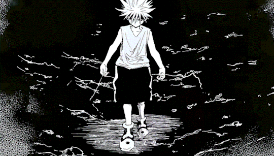
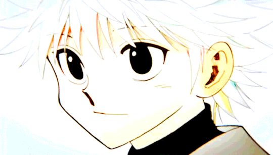
My advice for starting to get into gif-making is, you gotta really choose a media or character you love because the process is time consuming and it can be frustrating if it doesn't end up the way you wanted right away. Plus, you’re gonna stare at the same picture for like a loooong time. Over time, I’ve gotten a lot faster at making sets. Like that killua x start over gifset only took me an hour to make, but I barely edited that one. I normally spend a few days on each set.
I still don’t completely get photoshop, so I don’t feel like I can give a tutorial for it. But I do make a lot of gifs on my phone so here’s a more in depth look at that.
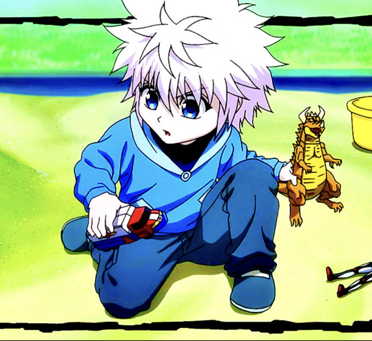
For starters, I always get video footage in 1080P. Either download or record the footage you want to turn into gifs. I’m gonna use Killua as an example. Here’s a picture of what the clip looks like before I’ve done anything.
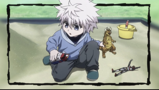
I find that the shorter the clip, the easier it is to make it smooth and crisp. This clip is only 5 seconds long. I try to keep my clips 5 seconds or shorter. I can do longer clips, but then I’d have to shorten the frames used and the speed of the gif (frames per second), which I don’t like doing. Next, I crop it. You want to crop before you start editing.
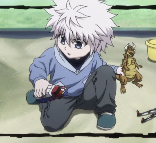
After that, I can start recoloring. There’s a couple good apps I like using for this. VideoDay and InShot are pretty good, but they’re pay to use. The free one Apple provides in the photos app is good, too. I’ve got a different coloring style for most of my sets. But I mainly focus on making dark colors darker, making colors more saturated so they pop, and brightening the video. On VideoDay & Inshot you can find this setting under Filter. Then go to Adjust. This is what it looks like after boosting up the contrast, saturation, brightness, shadows, and definition. Mess around with different settings until you come up with something you like.
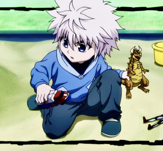
Now, I recolor it a second time with filters. Sometimes I use Inshot or VideoDay, but I mostly use the app ImgPlay. ImgPlay is what I’ll be using to actually turn this video into a gif. I use different filters depending on what colors I want to stand out. CL2 and HW3 are a couple favorites. For this set I use HW3. Then I added more contrast, saturation, and sharpened it as high as it could go.
Now that it looks pretty, time to make it move smoothly. Through a lot of trial and error, I’ve found that these settings work okay. I have it set to 90 frames for this clip. For frames, I usually try to keep it within 80-90 frames (or 30-80 if it’s a shorter clip). If I push it past that, like say 100 frames, it’ll start to look blurry once I condense it.
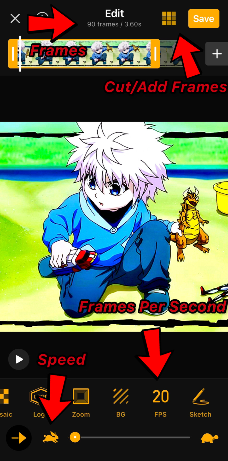
For speed, I either use .04 seconds or .05 seconds. For frames per second, I always go with 20 FPS at least. This will push up the frame count, so you’ll need to make the clip shorter. You can do that by using the slide bar or that little area with 9 squares in the top right corner.
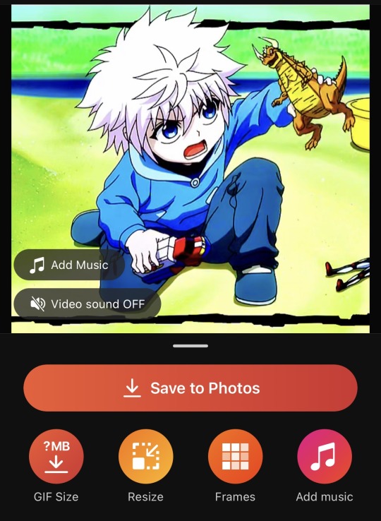
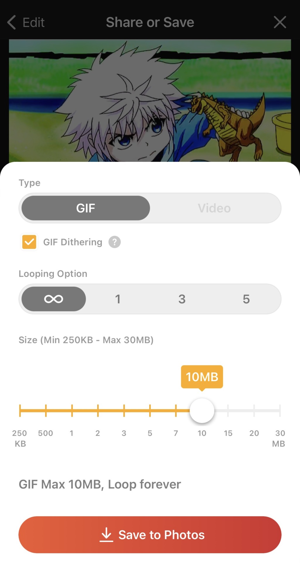
Now it’s time to export! Just click on save and GIF size. Set the loop to infinity and size to 10 MB. Tumblr has a limit on GIF size, so it needs to be 10MB or under. You can also click on GIF dithering to make the colors blend a bit more.
And we’re done! Hope it wasn’t too confusing and that I explained myself clearly! There’s a lot more cool effects you can do once you get the hang of video editing. This is by no means a strict guide or anything! Heck, even I don’t follow this exactly and I try changing things around, seeing what works and what doesn’t. Gif-making can be super fun, so I hope you keep at it! 😊💖
#asks#lucy answers#hope this made sense!#i tried to explain myself as best as i could 😅#now you all know how long my process is (and why i get so angry when someone reposts my stuff acting like they made it)#i don’t follow these rules exactly like i have a whole different setup for live action gifs#plus i try different settings all the time#but this is the gist of it 😊#flashing tw#flashing
8 notes
·
View notes
Text
The greatest use of CGI in movie history (I am being unironic) (SPOILERS FOR SPEED RACER)
It’s the final five minutes of 2008’s Speed Racer. Of course the greatest CGI sequence was in a movie directed by the Wachowski sisters, that makes perfect sense.
For years, films with obscene budgets have been racing to try and reach the point with CGI where it can perfectly mimic reality, where practical effects and props are entirely done away with and replaced by some underpaid VFX artists working obscene hours. Any Disney project of the last decade is perhaps the finest example. With budgets to match a small nation’s GDP, they have repeatedly tried and failed to make the finest examples of bland hyper-realism. The trailer for the new Ahsoka series, where the titular Ahsoka fights with white lightsabers in a mostly grey environment, is just the newest case of this. In the drab, depressing Lion King remake, the last few MCU movies I bothered to watch, and seemingly every new Star Wars project, Disney has used a titanic budget to make a shoddy simulacrum of what 70’s movie prop artists could do with a box of scraps.
The real reason for this is that, at the time of writing, VFX artists lack the same union backing as those who work in practical effects. It is cheaper to make people slave away in front of a computer for months on end to render Chris Evans in his newest low-contrast, boring American flag outfit. The fault lies with the executives, who decided that this was the best way to both spend money and treat their fellow human beings, and that this is the direction high-budget cinema should go in. So many high-profile films are just messes of shitty CGI that seems to get worse every year. And I don't want this to be some annoying "RETURN TO TRADITION" post, this is specifically calling out the really big-budget stuff. I've gotten really into low-budget indie horror movies again, and the last few years have been an incredible time for those.
Now, back to that scene in Speed Racer. What does it do right? First of all, I think it justifies itself. The idea of making something so vivid and fluid with mostly practical effects just doesn’t seem feasible. This is a bizarre, cartoony neon-coloured nightmare of a racetrack that refuses to make sense. Bright colours pour out of every single place they feasibly could, and then a few others. It’s absolutely sensory overload, but it’s beautiful sensory overload. Every scene in the movie is high-contrast and visually appealing, even the dark and gritty moments.
On another level, I think it also knows how to hide the weaknesses of CGI. You mostly view objects from a distance and behind a layer of effects, and that makes it hard to see how bad some things might look in a clear close-up. Even when it really zooms in on a car, it’s in a moment where it feels so weighty and is still moving around too much to pick out flaws. Even managing to get across the vibe that these are heavy machines with momentum behind them is impressive, and more than I can say for a lot of CGI-heavy scenes. Nothing feels like it moves in an unnatural way, and the real humans inside of these color-vomit deathtraps don’t look out of place.
I think the thing it does best, though, is context. This movie is many things. Goofy, shockingly earnest, and stylish. The final scene is the culmination of all of that. The cars are doing frankly absurd things. The Mach 6 is doing some kind of car judo flip in the end of the grand prix scene. The flashbacks that come up help set the mood and take your mind off of analyzing the visuals of the scene to the point of finding flaws. I cannot emphasize this enough, this movie is about someone who loves his family and drives cars so well that he ends up halting an attempted corporate monopoly and reveals an insider trading scandal, and the film is all-in on this. They want you to be genuinely invested in this plot, and I still am on every viewing even as an adult. The visuals, the music, the culmination of the plot, it all gives this scene what it needs to work and stand out as perhaps the greatest application of CGI ever. I am being unironic.
Again, if you wish to give pointers or kill me with hammers, please do so and/or kill me with hammers. I finished this at 3am while listening to nu-metal and installing bootleg Starsector mods.
#speed racer#movies#cgi#animation#the matrix#disney#stars war#please tell me how to do tags well#essay
7 notes
·
View notes
Text
Color Me Blue [Wirt x Reader] (Pt. 1 of 2)
Both of you are lying on the floor of Wirt’s room the evening after Halloween, staring at the ceiling while listening to the cassette tape he had made for you when he first got a crush on you. You both quietly felt each other’s company. Your heads are both next to each other, but you are lying in opposite directions, looking upside down from his perspective. His face is red as he subtly looks at your reaction to the music and poetry he recited on the tape, embarrassed by it. You turn your head to face him and smile as Wirt blushes and he looks at you. He fidgets his hands as if wanting to hold your hand but doesn’t want to make the move out of fear. You sigh taking note of this and took his hand in yours. Wirt’s face flushes, becoming more red than before. He smiles as he looks into your eyes. He squeezes your hand and holds onto it. His hand is soft and warm, which is in contrast to his usually reserved demeanor. But now he is showing much more affection, and it is very much welcome. The tape finished almost as soon as they held hands and she took the chance to say something."Wirt, that was really nice..." you say as she sat up to look at him. Wirt slowly sits up with you, still holding onto your hand. He smiles and looks into your eyes. His face is still bright red and he is nervous to speak, but you can tell from his gaze that he wants to say so much. Just as he opens his mouth to say something, his younger brother, Greg, came in. "[N/N]!" the young boy said using the nickname most everyone called her. "I found your pen!" Wirt’s face fell as Greg entered the room. He lets go of your hand and sits forward, trying to not look bothered, not wanting to show any jealousy, but you can tell he is. He was glad that the tape ended when it did instead of playing another two minutes of romantic poetry. No matter what is happening, he still finds a way to get jealous of him. You glance over to Wirt taking notice of this and decide to help. You walked over to Greg pat the preschooler on the head and took the pen he had extended out for you. "Thanks, Greg, I've been looking for this!" Greg put his hands on his hips and smiled with pride. “Jason Funderburker helped me find it!” You furrow a brow at this. “Jason Funderburker? The one who likes Sarah?” He shook his head and pulled out a frog from behind him, “Nope! This Jason Funderburker!” He said pointing to the frog as it croaked. You smile down at him and kneel to his height. “Thanks for finding my pen, Greg. But, Wirt and I are trying to talk right now, so I can’t hang out with you. I definitely will once we’re done though!” The boy nods excitedly and runs off with ‘Jason Funderburker’ and spouts out a made-up song. Wirt sighs, watching Greg leave the room. He turns his body so he is facing you again with your heads close together as you lay on the ground. “I’m sorry Greg interrupted us.” Wirt’s tone is remorseful but he’s quite happy at the fact that Greg left the room. Once you are the only two in the room, Wirt wants to take advantage of this and speak in peace. "No need to apologize," you say, "what were you trying to say?"
6 notes
·
View notes
Note
How do you make so many gifs and gifsets so quickly? Genuine question. It sometimes takes me a long time to make just one gifset and they're often not that good anyway. Yours are always great and I love your colouring technique. Is it just practice over the years or do you follow a particular tutorial?
Have a good day!
Hi! First, thanks for your compliments <3
I think my speed in gifmaking does come from having practiced and adjusted my methods/techniques a lot over the last 10 years. I used to be really, really slow at it and didn't really get very good results, but I kept trying new things and ways to do things and eventually got better at it.
I used to take individual screenshots of every frame of the video (extremely time consuming), but now I use Quicktime (I have a Mac but there are other options for Windows that are probably just as good) to clip moments and scenes I want to gif. It can clip from programs like VLC, or online streaming services like Youtube or Amazon. I always use the highest quality video I can find! Although sometimes with the rarer stuff it's hard. Then I import the clips into Photoshop, which is probably the most time-consuming part of the process for me. Then I quickly crop them, add a curves layer, levels layer, brightness/contrast, and then if the color needs adjusting, sometimes a hue/saturation layer and a color balance layer. Then add text if needed.
Some of this I've automated using Photoshop actions, so that really can help speed things up!
I've actually been considering making a video tutorial thing about how I make my gifs. I think I could explain it a lot better with visual aids!
2 notes
·
View notes
Note
Hello 💜
This set is absolutely gorgeous. Like, jaw-droppingly stunning. I don't know why it seems like the better, more complicated sets never get as many notes 🙁 but this set is so amazing it makes me weep.
https://at.tumblr.com/thewintersoldier/705733681810227200/wesj90y4zy6k
Please when you have time can you do a tutorial for the first or second gif?
(I promise I wasn't just trying to butter you up with that opening - I've been showing this set to everyone I know, it is truly beautiful)
Lol dude you’re totally good thank you ♥️♥️♥️ but yeah, I can do a tutorial! Everything’s under the cut!
Alright, so first things first, I’m going to assume everyone looking has a basic knowlege of coloring gifs with photoshop.
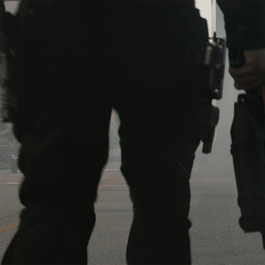
Now, the biggest thing is you want your two gifs that you are blending to have a lot of contrast. So for my first gif, I chose a scene that I could make the background pretty much pure white but have the subject in it be as close to straight black as possible.
So this is what I start with
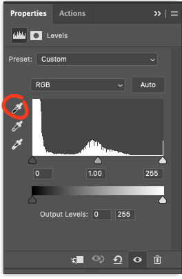
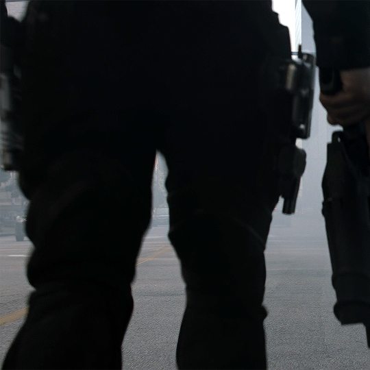
Bucky’s legs are pretty dark here, but since the background is mostly shades of grey, I know that I can get it to lighten up to white pretty easily. To do this, I create a layers level, selet the white eye dropper tool and click around on the background until I get a white that I like. I ended up choosing the big of white sky that you see up towards the top right hand side of the image. This was the area that was already closest to white already and I don’t want to blow out the whole image by selecting an area to make what that was too dark to start with

And now I’m here.

I now create another layers level and select the black eye dropper tool.
and it takes me here
This is going to help make your blacks blacker while keeping the white’s still pretty while and you need as much contrast as you can get for this to work well.
At this point, I now add brightness and contrast and exposure layers and play with them until I get the whites as white as I can while also keeping the blacks black and I end up here.
What I also like to do to help the gif blend better is add a hue and saturation layer. From there, I’ll go and reduce the saturation on all the colors I don’t want that are in the image. So For this gif, I just went a head and turned the saturation down to -100 on the cyans and yellows to remove the little bit of yellow and cyan that I’m seeing.

So now about the only color I have going on is a bit of red in the skin of his hand. However, looking at this the skin you can see there, it’s going to make blending the second gif on top of it a bit more difficult and I’d like it as close to black as I can get to the second gif I overlay looks as good as it can. The way that I tackle this is I added a black to white gradient map.
Which at this point pretty much turns the gif black and white. If you don’t want it to be straight up black and white though, I suggest adding the gradient map, setting it to soft light and playing around with the opacity until you like how it looks.
But this is what I’m left with for the first gif.
Now for the second gif, this is what I’m starting with

The only color I’m looking to preserve here is going to be the red, so what I’m going to do is follow the steps I took on the first gif with the two level layers, and brightness and contrast/exposure until I’m happy with it. I then also add the hue and saturation layer to remove the yellows I see in the image.
This leaves me here. But I want to add a bit more contrast to make the book pop out even more. So I add an exposure layer to make the brights a bit more bright and then balance it out with the blacks.

My last step is I now add a gradient map of black to red because I want to bring out the reds a bit more here and increase the contrast.
I then set this layer to soft light and played around with the opacity (ended up with 17%)
and we get here
I find the more contrast you can put in, the better gifs will blend together. If they’re all sitting at the same range of shades, it’s just murky and you can’t really see what’s going on. Now at this point, I convert both these gifs to smart objects and place them on a canvas together. I do this my creating a new project, making the background black, and then converting the black background to a smart object as well.
I then drag and drop both smart objects of the gifs into this new canvas. I keep
The put the first gif on bottom and then place the second on top and set it to screen. For this step, play around with which gif you think looks better set to screen and which one looks better just set to normal. With all the contrast I have in it, I find it really didn’t make a difference either way. This is what I get from doing this:
These blend together well because the colors in the second gif don’t show up well on white, but they will show up on the blacks. If your contrast isn’t as intense, you can create layer masks on the gifs and erase parts you don’t want showing, but keep in mind, since the gif is moving you have to be careful about where you erase. I do this sometimes, but frankly it’s a pain in the ass and if I can avoid it, I will. I much prefer to blend just with setting a gif to screen if I can.
Another thing to add, the second gif does have a pretty dark background which also helps make the gif blend a lot easier. If you’re putting a white background on a white background you’re just going to end up not being able to see much of anything.
Now, my last step for the coloring is I add a Gradient Fill layer.
and these are going to be my settings for it:
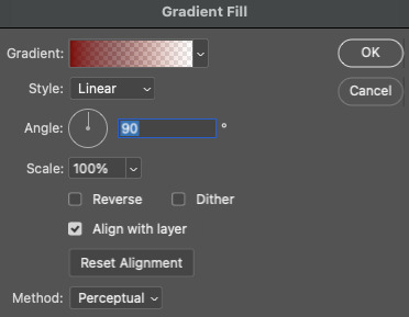
I now then set the gradient fill to Multiply and we get this effect:
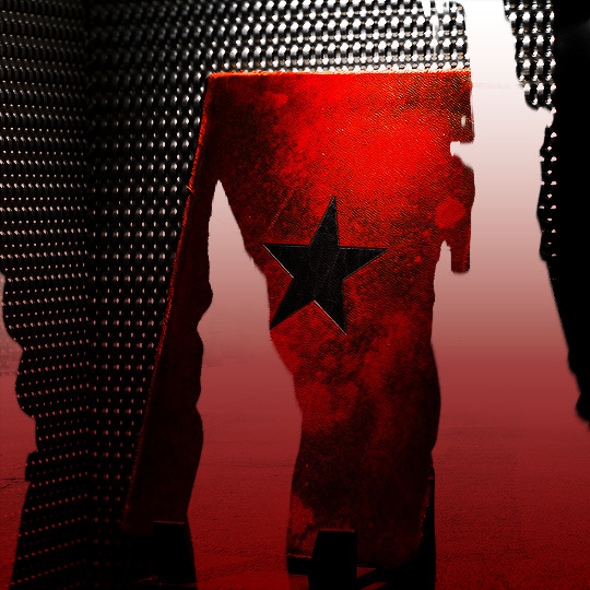
It is important to note, this needs to go on top of both of the other gifs or it’s going to mess with the blending. For example, if it put this between the two gifs, it turns the white background to red, which is going to give the second gif more color to show up on which will then make it look like this
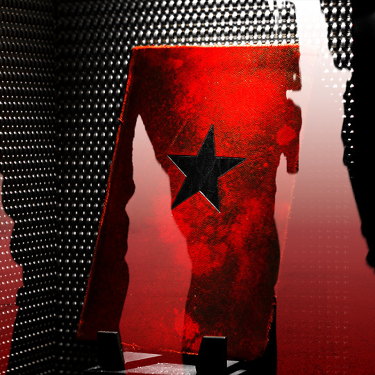
and since we want it to really only show up on the black, putting it anywhere but on top of them isn’t going to work.
I played around with the text until I got ended up here

I have a tutorial for how I do this effect here.
The font’s I used were Champagne & Limousines for the white text, set to 16px
and Doctor Glitch set to 72px, with a flag warp text, which you can find here.

I hoped this helped! If you need anything explained in more depth or you have any other questions, just shoot me an ask!
15 notes
·
View notes
Text
As someone who is slowly learning how to do digital art alone, I may have some advices to give to those who want to start and don't have time/resources to spend a lot of time trying and testing out drawing processes.
These are some things that I've found useful but Boi, it got me a lot of time to get to it. Of course, this is just what I think can be a good advice for who is a newbie like me, you can try it as a way to start your coloring process but it's not something professional t.t so take it with a bit of salt
First advice I wanna give is to do like I did during this drawing process: while I keep everything on different layers (skin tone / armor / hair /detail / background), don't just start with one layer and then start another one after rendering the first one.
Multiple times I've noticed how the different tones didn't match to each other, or the colors were simply horrible to see next to each other. I've spent a lot of time fixing this type of issues in my old drawing, always deleting the layers (fully rendered) or trying to change the tone with horrible results.
Instead, if you too happen to have this problem, I'd advice you to first coloring everything with the base color. As you see in the video, as first thing I simply filled the lineart with base colors. It's not clear but I assure you I've changed his skin tone multiple times because it didn't match the armor. Same with the mask and the red details.
This is something you can easily do at the beginning to see if the colors match and are nice to see all together in the bigger picture.
It's really something easy and I'm 100% sure they teach you this literally at the beginning of art school but Boi I'm stupid. I only learn when I do things myself t.t
Change colors as much as you want until you've reached your desired tones. Be careful of saturation levels. To make everything more balanced, play with the hue level for every base color you've used. You don't like how the red is in contrast with the blue? Change the red layer' hue/saturation values a bit and you'll find the perfect type of red you need.
After you are happy with the overall results, start with the rendering.
This is something I recommend to do if you still aren't used to the use of tones/saturation.
If you need some examples of the pieces where I struggled, here you go: this one is probably my fav one even now that I draw from pc.
Before:
As you can see there isn't balance in the colors. Fulgrim's skin is too much out of everything and in general there is too much differences between the colors. It just doesn't look harmonious. Then:
I assure you I haven't re-drawn anything here, just fixed the saturation, tones and hue levels (and added a bit more of shadows), yet now everything matches. (i also have changed the color of the lineart in a few places, look at the hair for example).
This might looks obvious to others, but I've spent a lot of time on this piece with the only focus on making those colors look nicely together and with time I've learned from my mistakes.
Another example: the commission I did a few weeks ago. I had to draw an Imperial fist, so you'd expect to see a yellow armor. Considering that I painted the background with red colors, bright yellow would have been quite a shock to see: that's why the base color is not yellow but orange. Same thing the clothes aren't white anymore but a light pink.
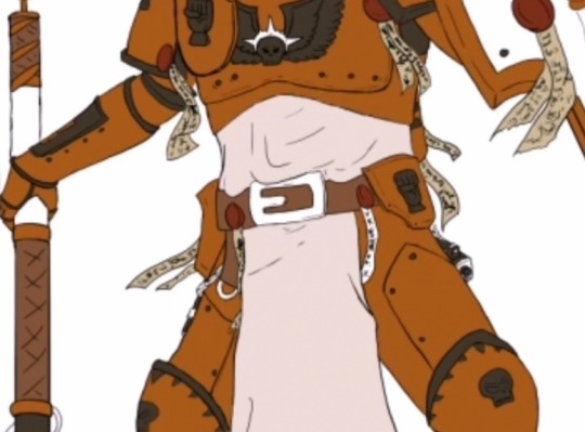
On a white background it looks weird for an IF armor, yet this is the result at the end:
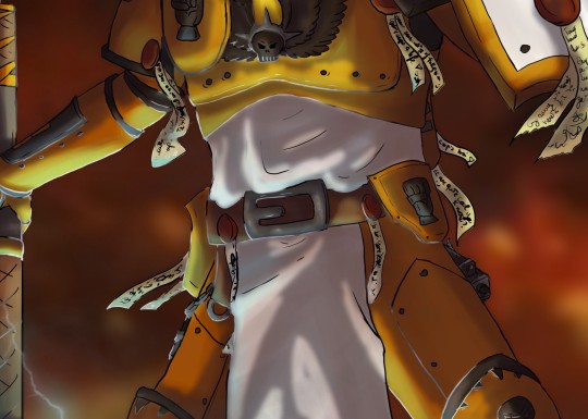
Yellow is only for the parts hit by the light, where the shadow are more on the red tones. (don't mind the light blue for now)
Of course, you have to take in consideration many things before changing the hues of the original colors, but I hope this could help c:
#Art tips#For newbies like me#Just in case you're struggling with the colors like used to do#Kind of rambling#Video#My art#Digital art#Long post#Might also be wrong but at least it's a start
18 notes
·
View notes
Note
Hi, I hope you're having a good day! 🥰
I'd like to ask for a cod pairing pls ✨️
(I hope this ends up being coherent because I did just get back from spending several hours in the blazing sun lol)
as for appearance: I'm 5"4', have wavy brown hair that goes just past my shoulders, green eyes and I'm pretty pale with some freckles. as for body type I guess I'm more on the skinny side but I do have some curves and have been building some muscle lately.
personality-wise, I'm a fellow infp 👋🏻 I tend to be shy around people I don't know yet but once I get to know someone enough to be comfortable I get very talkative and make (sometimes really bad) jokes. my sense of humour bounces from silly to pretty dry or even sarcastic/cynical sometimes. I try to be kind to everyone unless they give me a reason not to, and I very rarely get angry or loud. I also try to always give my friends a sense of reassurance that I sometimes wish someone would give me. I do struggle with generalized anxiety disorder but I've been working on it, trying to live with it and move out of my comfort zone one step at a time.
in terms of interests/hobbies, I love playing video games, especially story-driven or open world adventure/fantasy games, as well as reading and writing, and going for hikes in the woods (I also do a bunch of nature photography). I work out twice a week and am pushing to get to a third time. this is definitely something I need since I work in office administration and sit a lot haha. but I do also like getting physically stronger, it helps my confidence quite a bit.
okay this is starting to get long so I'll cut it off here lol
thank you!💖
Kyle "Gaz" Garrick
How you met: Civilian Hikes in autumn were some of your favorites. You loved the crisp, cool weather and always had your camera on you to capture the changing of the seasons. You zipped up your fleece jacket as the soft breeze flowed gently through the trees. Your camera roll was filled with pictures of the wildlife making preparations for the winter and the silhouette of birds against the colorful leaves. The ground crunched under your step as you walked the nature trail. Eventually, you came across a man who was enjoying the beauty of the forest. He wore a warm flannel jacket and his bright smile was picturesque. You shamelessly snapped a picture of him as he was perfectly contrasted against a collection of yellow, red, and orange foliage. You weren't going to say anything until he approached you with a friendly wave. "Was it a good picture?" he asked and you blushed in embarrassment. You looked at your camera and it was, his smile perfectly capturing the enjoyment of fall and the leaves descending elegantly behind him. You sheepishly showed him it and he awed in response. "You have to send me a copy!" he exclaimed and quickly handed his phone over to you to exchange numbers. "I'm Kyle, by the way," he said as you sent yourself a text, "being a model is just a hobby of mine." You both laughed at his comment and said your goodbyes as you continued in opposite directions. You wouldn't find out until months later but he saved your contact as "the pretty photographer."
A peek into your relationship: "My turn!" you exclaimed as Kyle finished playing through another character's unfortunate demise in What Remains of Edith Finch. You had a tradition when he was on leave to play a game you each picked and trade off controlling the main character. It had taken you months to get through the Borderlands series as your boyfriend was terrible at making quick decisions and completing dialogue branches. He pushed the keyboard and mouse to your direction as you continued to direct Edith through the sprawling maze of a house. You had started the game this morning and after many breaks (Kyle was so upset after certain character deaths) you were finally approaching the ending. You had just played through Lewis' story and both were heartbroken at his fate. "This game is so twisted," Kyle said as you finally navigated to Edith's great grandmother's room. "I know but the art and the story is just so good," you said as you sat back and watched another tragic cutscene playthrough. "You are something else," he joked as he gently held your hand to pull the mouse away. By now, it was only Edith left and the plot twist left you both yelling and screaming at your pc. "WHAT DO YOU MEAN SHE WAS PREGNANT?" Kyle yelled as tears pricked your eyes. "Why did she have to die in childbirth?" you sobbed and shut your computer off as the cut scenes rolled. Kyle picked you up and placed you in his lap to comfort you. "Next time I pick the game," he joked and you could even see he was getting a little glossy in the eyes. "Deal" you said as you wiped at your cheeks. "Can we watch something silly like FNAG reaction montages or something?" you asked and he nodded as he carried you off to your living room for some much needed laughs.
3 notes
·
View notes
Note
I like most of the pesterquest sprites and i find some of the artistic liberties charming but damn I'm petty and I'm bothered that they didn't base most of their looks from the original alterniabound sprites. I dislike Gamzees pesterquest sprite, I'm too used to his signature long chin. Why is Jane so obese? It's been described multiple times in the comic that's she's busty, gameover shows her figure. Where are her tits? The comic has brought her boobs more than once. She's had 2 titty grab scenes and Caliborn inquired about hers. Give her boobs back, also I'm not a fan of Kanayas sprite, i dislike the weird posture and I'm not into the hair (missed opportunity to have her switch her wardrobe in her volume). I've mentioned before Tavros's sprite is stiff as hell. I hate the lack of a consistent art style, im being picky as hell but it's what i think each time i see those sprites.
After Jade's sprite, everyone else's soon after was a bit inconsistent for art style. WhatPumpkin following the Steven Universe way of Rebecca Sugar hiring various artists/writers to do it and each one is "unique", so it has be shown off. Fuck a set line of rules or details they follow. Everyone's art style is unique in their own way (except for anime. Anime is bad for Western fandom).
Reason for Jane being fat is because it was CALIBORN himself who insulted her that she was fat, and people picking it up thinking she genuinely has a real chubby body. He's insulting her, but they are desperate for diversity. So in an unironic fashion, all the fandom has and now accepted Caliborn, the guy who is said to be the toxic masculinity of this fandom, as being in the right.
gg fanbase
g fucking g
Better to ignore Jane's frustration of being called fat. Because fatphobic and not many people like Jane if she were to claim she is thin. Boobs are also bad because girls being sexy is bad and they are all teenagers here, despite that they are fictional.
It is a missed opportunity. I can see her clothes change depending on certain emotions (like bright colors if happy or dark when it hits to the bad end). She probably wear something nice and professional when renovating Tavros' room.
Don't get me started on the contrast between Mom Lalonde and Roxy Lalonde's sprite. Why mess with her hair? Is Mom Lalonde a bad person for trying to straighten her hair now? Interpretations like this are bullshit.
They really didn't give Nepeta her hat. I could have seen funny sprites where her hat would also make similar facial expressions like Nepeta or the opposite that shows her real feelings. Here is a nice art of someone giving Nepeta her hat back.
7 notes
·
View notes
Note
I've always wanted to ask this but have been too scared but i adore the way your gifs look like they have a reddish tint to them! they're slightly darker and have huge reds popping out? can i ask how do you accomplish this?? thnx!
hello, and thanks! so i love that "reddish tint" you're talking about - it really helps my gifs look colorful and over time, i've found a couple of methods that allow the scenes i gif to look bright and color-corrected while not looking over-saturated.
beyond using high quality footage, screencapping properly, and using the sharpening settings that work best for you (all of which i've touched on before here), these are some other things i find help with maintaining a consistent coloring for my gifs:
selective color layers - my saving grace! i set these layers to "absolute" and usually use 2 or 3 per gif. i don't try to go too overboard with these layers but increasing the cyans on "red" helps make the reds/pinks pop out and look Pretty. i also increase the yellows on "orange" to even things out and maintain some balance. i also set neutrals to -10 to make the gif look more even without fully desaturating the colors. selective color layers are a lot of fun to experiment with, and with practice it becomes like second nature to know how each setting will affect your gif based on the coloring. just keep playing with those layers until it looks the way you want it to look!
channel mixer - another saving grace! i've only just recently started using this adjustment layer and have def noticed a difference. like selective coloring, the channel mixer takes a bit of time/practice to understand how it works, but if you practice you'll get a sense of what to use based on the lightning of a scene. i put this layer right below selective coloring and use it if a scene looks too orange/yellow. this is especially helpful when giffing people, because it evens out skintones. again, i don't go too overboard with this layer but try to make small adjustments until the gif looks more even in tone and enhances that red tint without looking ~too~ intense.
vibrance - a vibrance layer set to +50-70 helps lock in the color and make the gif look brighter, along with one or two brightness/contrast and exposure layers. the brightness and exposure settings vary from scene to scene, so just experiment until it looks just bright enough without losing the color and pops of red.
that's honestly everything i can think of! my coloring process isn't too complicated, and like i said i don't rely on a base psd and prefer to color each gif from scratch bc each scene has different lightning/coloring/etc. but these are the general settings i tend to use when trying to achieve that red tint you're referencing.
hope that helps, and please please don't hesitate to send me an ask or reach out if you have any questions/concerns/comments (and please don't feel scared! i genuinely love helping and chatting with people, especially fellow gif makers/creators on this site, and am always happy to help whenever someone needs it) have a wonderful day/night ❤️
3 notes
·
View notes
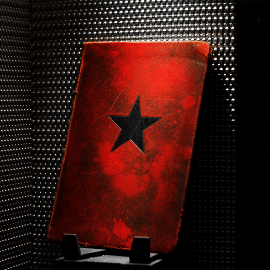
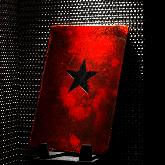
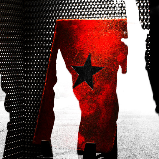
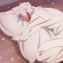
Photo


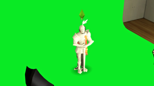
#I really turned him into Mr Orange in the second gif didn't I#Freddy Newandyke#I've been trying to find a way to get the colors and brightness and contrast etc right for this scene for WEEKS but I'm not there yet#will keep trying#but in the meantime here we are because I really want this scene on my blog! not so garishly colored obviously#but since I can't find it anywhere and I really want it because look how adorable Freddy is!#so here is the exact same gif in three different color contrast brightness etc combinations#none of which works obviously#nothing can really replace Photoshop huh#I get it now -- all those posts raging at Adobe for their subscription model#sigh#seriously this scene is epic adorable Freddy -- chewing gum and grinning at his boss after he tells Freddy that he can tell a joke can't he#and Freddy says no and then gives the biggest lil shit grin ever haha#it's an adorable scene that I never seem to remember -- I always remember the diner#then Freddy practicing the commode story#and I'm always pleasantly surprised with this scene#anyway if anyone knows where this scene has been properly giffed by someone who knows what they're doing#could you link me please so I can reblog it and enjoy it? thank you so much!
4 notes
·
View notes
Note
Hi! I love your tutorials, and I may also have a question 😊 I've been making gifs recently, but I am having trouble with Tumblr showing them correctly. For example, I work on them in photoshop and then post them on Tumblr via desktop and they look fine when it comes to brightness. However, when I look at them on the mobile app, they are so dark, it bothers me. If I adjust the brightness of my phone (which really hurts my eyes LoL) they look fine again, however when I put it back to the lower brightness it's darker again, while other people's gifs do look brighter than mine. How do you ensure the correct brightness without losing quality? I've seen brighter gifs, but when I look at those on PC they are super grainy. Thanks in advance for the help!
Hmm. I’ve never actually paid much attention to the brightness of gifs, or at least not in a comparative desktop-vs-mobile light. That could be because I so rarely use the app (and often as a last resort, because I truly hate the mobile experience) but something I do keep an eye on is colors and colorings, just because something that drives me bananas as an editor is the fact that colors can look anywhere from mildly to wildly different between screens.
A general piece of advice I’d give to you or any creator—and I emphasize any, because I’d give the same advice even if someone isn’t experiencing this specific issue or something similar to it—is to save your gifset as a draft instead of posting it straight away, if you don’t already do as much. This allows you to see how the gifset looks on both screens, and make adjustments accordingly.
Now, in terms of advice that’s specifically brightness-oriented, I would probably recommend... the backwards of a lot of people? Because I use Curves to do everything. Literally everything: brightening, adding contrast, even color correcting if Color Balance isn’t quite getting the job done for me. I used to use Levels, but never do anymore unless I’m trying to create a silhouette. I never use, or so much as look at, Exposure. And the only time you’ll see me use Brightness & Contrast is to actually lower the brightness for scenes that are on the too-bright side of things.
You might find you like other adjustment layers better, which is more than fine. I’m a firm believer in there being no one particular or exclusive way of doing anything in Photoshop. But since I keep my computer at max brightness and keep my phone near or at min brightness, and I haven’t seen much of a difference (beyond colors) in how my gifs look, I thought I’d give a quick rundown of what I do in case you’d like to try it out.
My ‘base’ layers tend to look like this:
Curves (for brightness or brightness and color correcting)
Color Balance
Curves (for a little bit of extra brightness and some contrast)
Curves (for contrast; sometimes disabled if a scene already has a decent amount of contrast, or if the first Curves layer does double-duty)
And this is what my Curves layers typically look like:

The trick to using Curves without making things too grainy, I’ve found, is to avoid any extremes. Instead of tinkering with that first Curves layer on the far left, I a) adjust the opacity of the layer as I see fit, and b) duplicate it when a scene is still dark and calls for some added brightness.

Alternatively: The droppers on the left side will do a lot of the work for you in both the brightening and color correcting departments if you know what you’re doing. (And, like anything in Photoshop, it really is just playing around with it until you get a feel of how it works.)
When picking the brightest point of a scene doesn’t brighten it to my standards, I go for the brightest point on or near a character’s skin (typically around the nose and forehead area; wherever the light hits them) or hair, if they have lighter hair like Ciri and Geralt do in The Witcher.
Here’s a quick Before and After look:
There’s obviously no 100% guarantee of retaining The Most Perfect Quality, especially when uploading on Tumblr, but as long as you’re working with HD footage (1080p or 2160p), sizing your gifs correctly, and choosing the right Save for Web settings, ensuring brightness shouldn’t mean loss of quality.
If you’re still experiencing issues with it, feel free to let me know! I’m always happy to work with people one-on-one.
#okie-dokie-artichokies#ask ava: an organizational tag and not an advice column (unless it needs to be)#ps asks
95 notes
·
View notes
Last Seen Blogs
arrow-v-flash-polls
Arrow Vs Flash
noes-pillow
Vanoé Will Kill Me One Day
junoiii
case
wolfcubjim
2 Dumb 2 Delirious
waiting-makes-me-antsy
Newsies hyperfixation