#tutorial ish
Explore tagged Tumblr posts
Visit Tumblr Blog
Explore Tumblr blogs with no restrictions, modern design and the best experience.
Last Seen Tumblr Blogs


Fun Fact
US Tumblr user growth rate is estimated to slow down to 4.1%.
Note
Hello there! I'm Eden :D I LOVE your renders! I've been rendering for well over a year at this point, however I only stuck to the super basic stuff since it took me a year before that to even know how to do it at all. I've wanted to up my game and get to where you are now. I'm SO SORRY if this question was asked already (I haven't gotten too far in your posts yet), but;
How do you personally edit your renders? I understand you use photoshop, but how do you do it exactly? Your renders have that kind of digital art style, like you drew them yourself. Feel free to be as descriptive or brief as you'd like!
Hi Eden!!! Thank you so much! 🥹😍♥️
I've followed you back and glad we're moots! I'd love to see some of your work!
I'm not sure if I've answered this before but I'm happy to answer it again! Also I haven't advertised it in a while (and I really need to try to get up a new tut, maybe soon), but my alt account is a Render School where I post tutorials, with plans to post editing tutorials in the future!
But honestly as far as my editing, I really don't do much.
Actions are my secret weapon, and I have a few favorites/go-tos I'll link! A few are by simmers and a few are just action sets. I'm in a family of photographers, so I have access to a wealth of resources for my editing.
Sonder set by @intramoon
Cold Water set by @intramoon
Retro Prime photoshop actions
Indie camera photoshop actions
But my "secret weapon," as it were, and the set of actions that I think most helps me accomplish that digital art style is a set of actions that are sadly expensive and hard to find now.
My favorite set is by Totally Rad! and I think in recent years it's been folded in to this Pixel Sugar product on their website. I know that's a steep price point but it's possible you can find it around the corners of the Internet for less, or if you can't, you might be able to find "dupes" of the better ones, which imo are:
Technicolor dream world
Super Fun Happy
Bullet Tooth
Grandma's Tap Shoes
As for my method, I know a lot of simmers paint over their renders, and I've done that a few times but find I'm too impatient tbh. My goal is always to have to do only minor touchups over my renders and some color/vibe adjustments before the finished product. My "raw" files are always exactly what blender spits out for me, unaltered in any way except to resize them for Tumblr.
To get that digital art style, I'd recommend rendering with alpha details if you don't already. If your computer can't handle alpha cc in the game, DM me and I can give you some pointers (sneak peek info for a future tut lmao) on how to accomplish it without bogging down your game.
When I go into photoshop I adjust the brightness and contrast, as I tend to personally prefer high contrast pieces that contain dark subject matter but you can still see the details. Then I'll paint/blur/clone/adjust anything that needs it, then I'll "stack" and adjust a handful of actions before applying edge blur and vignette and any other color adjustments (levels, curves, etc).
That's a very oversimplified rundown of what I do, but really overall my editing process is simple. The bulk of my work happens in blender itself. I find that the more time I take to perfect the lighting and shadows and angles in blender, the less frustrating the editing process and the happier I am with the end result. So, that said, be sure you're spending a lot of time in blender getting the light and shadows to be exactly where you need/want them to be before running it.
I know this is a bit long I'm sorry! If any of it is super confusing or you'd like a more in-depth look at any of it please let me know! I do plan to do editing tutorials for my side blog, but the latter half of this year has kind of run over me like a train, and for now I'm just trying to get by day by day. But I'm happy to help if you have more specific questions!
& thank you again!! ♥️
#replies#thank you so much this literally made my day#I was having a bad one too ugh I needed this#mini blender tutorial#tutorial ish#sims 4 blender tutorial#sims 4 render tutorial#sims 4 editing tutorial#I can't tell yall how happy it makes me when yall love my work#legit holding back tears#♥️♥️♥️
39 notes
·
View notes
Note
Ziku, do you have any advice for the color technique? I really like how you apply shadows and lights.
My advice? start with grayscales.
using grayscales helps you distinguish the proper lighting without having to worry about the colors. It's also why I'm able to do the 1-hour pomnis: I could place the colors after I'm done with the lighting placement.
my process is this:
I first start off using airbrush, softly shading areas that don't get hit with light often.
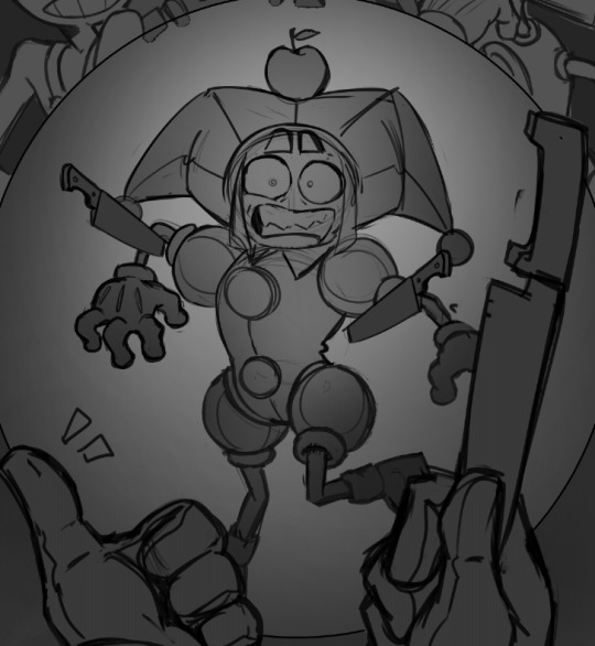
I then proceed to roughly put of where should light hit with a light shade of gray, and how it affects the surrounding area with darker greys. The closer a solid object is to another, the harder the edges of the shadows are. I embrace the imperfection of my strokes, and do not perfect them at this stage since it would be a waste of time.

fun fact: you can make hard edges look more defined by placing a very light shade of gray. This is how I achieve the illusion of lighting hitting something on my art :)
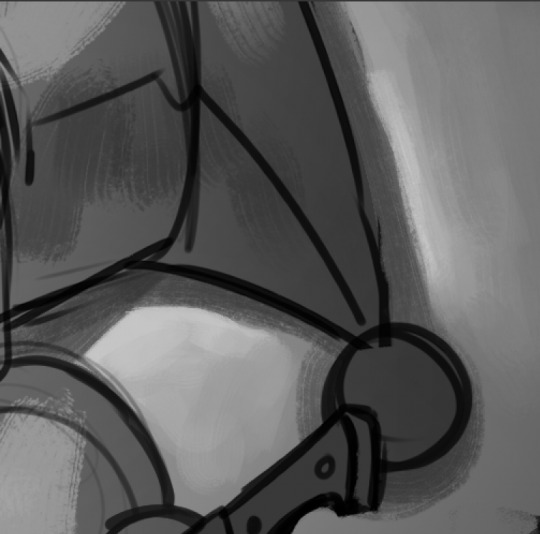
once I'm done with the values, I move to coloring. I keep the strokes as loose as I did the lighting placements, because again. Imperfections HELPS. Glossy things like eyes, teeth and the apple are colored a bit darker, to make the shine pop later.
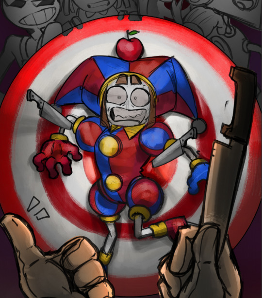
Apply a multiply layer above the colors between 15-30% depending (for this piece it's set to 26%), it's up to you if you want the multiply layer to be cooler colors, or warmer. I chose a saturated orange coloring for mine.
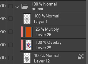
now this is my favorite part: glow dodge. Set to 100% and above every other layer except lineart, light dap it around using an airbrush where the light hits the most.
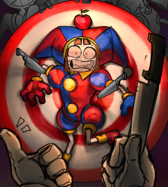
This part is mostly optional, since this is where I "clean up" the lineart by locking the layer, then color dropping the edges to "erase" most of the lines.
you don't have to do this, it's just easier for me for the rendering stage since it won't get in the way.
You can also go ahead and combine every layer (grayscales + colors + lineart and etc.) afterwards. This one is important.
all that's left to do now... is to render your painting.
and you render,
and you fucking trust the process even though Pomni looks like a stoned as fuck vampire with a receding hairline,
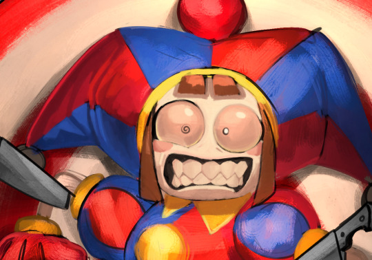
and you render. (and add more glow dodge for the glossy objects)

When I finish a painting, I actually apply a difference layer above it all to give it some flare,
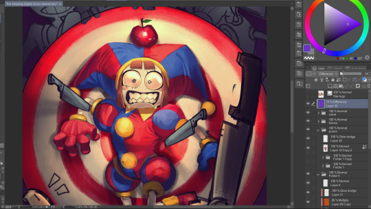
to which after that I'll do a render noise, chromatic aberration, tone curve and posterization for final touches.
That is all :)
#thanks for the ask!#ziku's insane rambles#tadc#pomni#tutorial-ish#the amazing digital circus#art wip#this is my tadc anniversary piece btw
283 notes
·
View notes
Text
MY GO-TO'S FOR EDITING.
I’ve decided to put together a masterlist of the resources I use, since I get asked about them pretty often. If you're somebody who can’t commission resource makers or you’re just wanting to get into editing or creating commissions yourself, I hope this helps.
pinterest. IMPORTANT NOTICE IF YOU UTILIZE THIS: avoid usings people's art; if you can get permission from an artist to use a piece, that's another discussion. Be warned there may also be ai mixed in, which I've personally got a good eye for spotting; i prefer to go by images i've seen long before the ai craze, since i've been on there for a while. your best bet is looking through miscellenous character boards. From there, you can choose images to blend or even make pngs out of, to give unique flare to your edits.
remove.bg + photokit. if you're looking to save time or don't have a way to cutout images manually ( i sometimes like to use my art tablet if I want to be really precise ), these are good ways to make pngs out of images you find, as opposed to png sites. i prefer this because ive caught adware on png sites before, plus there's also a lot of ai on those as well.
for screencaps, i use google images or youtube, since the quality is higher than anything on pinterest...though, psds are what normally cover up quality issues, from what i've learned. then again, it might depend on the psd. IMPORTANT NOTE IF YOU UTILIZE THIS: If you’re using google Images, searching for actual screencaps might lead you to blogs or websites dedicated to capping—many of which ask for credit if you use their content. Also, avoid reposting people's edits or gifs, since those will inevitably show up when searching faceclaim names and similar tags. on the off chance you find free-to-use faceclaim content, be sure to credit if/when asked !
photopea. it's a great alternative for those of us who can't be assed to learn adope, nor can afford it .
I know it doesn't look like much, but this is genuinely my go-to formula. I don't think there's any need for anything over the top. That said, if you guys have better alternatives or anything to add, feel free—this is just based on my own experience.
ADDITIONAL EDITING TIPS: If you find yourself stumped creatively or unsure how to approach using these, I’d recommend breaking down the character or setting you’re working with in terms of aesthetic. What are some keywords or imagery you associate with that muse ? Take a character like h/arry p/otter, for example—focus on individual visuals, important symbols, and signature colors. For him, I’d think of round glasses, lightning bolts, owls, candles, spell books, brooms, etc. Then, take each of those elements and explore them individually. I’d maybe start by looking up “owls” on Pinterest; from there, I might find images that can be turned into pngs. Repeat that process with every vibe or detail that comes to mind. You don’t have to limit yourself to making pngs either—feel free to experiment by blending different images together and building a look from there.
ADDITIONAL UPDATES/RECOMMENDATIONS:
Screencapped ( * will need an account )
VLC Media Player ( * good for screencaps / things you've downloaded from youtube )
#re: editing resources#free to reblog!#for the other anon i got#roleplay help#roleplay resources#roleplay community#rp graphics#rp resources#editing resources#editing tutorial#ish
76 notes
·
View notes
Note
How did you go about redesigning the clothes in you remaster?
Ooh great question! I'll go into more detail below, but the gist is that I broke down each character into their vibes and general aesthetic and tried fitting it to my design biases.


I tend towards more grounded designs than the original JRPG-inspired armour and clothes, so I referenced a lot of medieval fashion for the setting. You'll usually see me covering bared skin in battle outfits or toning down extra details I struggle to draw

Then, using those references, I'd try to thumbnail basic shapes and colours to figure out which works best


(More specific character notes below)

For some characters like Iseul, I didn't feel much need to change his outfit so I mostly toned down the detail to suit my style. I shifted the colour scheme to something warmer and removed the fur and extra armour to serve his image as animal-loving and battle-avoidant. This serves as great contrast to his timeskip outfit where he then commits to being both a warrior and a prince, with more ornamentation and practical armour


I designed Helena and Alain as contrasts. They have very similar themes and designs, so I decided to smooth Alain down into the picture-perfect metal knight while Helena's wilder and asymmetric. I referenced more realistic armour for Alain but overall I wanted to keep his clothes similar.
For Helena, my design style is more practical and thematically I want to avoid Helena baring skin and vulnerability so I extended her corset into more of a chest armour and covered her other thigh. To add to her duality of magic and metal, I gave one arm armour and bared the other to show off magical scars.


August and Altea's designs are where I start to venture off into more vibes-based outfits. August is humble and traditional, a knight with proud loyalty to his Lord and family, so I gave him medieval colours to represent both on his tabard. The armour is still there, but it's less focus on metal and more on "cheaper" materials to serve as a contrast to his timeskip where he becomes a proper knight in shining armour. For that reason, I took away the cape and other unnecessary decoration.
Then Altea is flashy, wealthy, and bright. I kept the focus on light armour, with scalemail as the only obvious protection. I've mentioned before but I took inspiration from south east asian fashion (mostly cambodia and malaysia) as a grounded but ornate basis for her magical girl theme. Here the colour scheme and fabrics are what mostly connects it to the original

Similarly, Lennox is where vibes rule and the overal aesthetic changes quite a bit. He's often described with "choir boy" hair, so I wanted to combine choir robes with ornate priestly outfits to sell him as a vain cult-leader. I kept the symmetry, long coat, and lack of obvious armour, but I wanted him to look less modern and stick with less structured outfits.

One thing specific to the generals, is that I wanted to give them more of a variety to colour palettes to sell that while they're working together, they're not exactly happy about it. While they all have a focus of blue and silver to keep them cohesive, they each have a motif: Alain - silver, Helena - pale blue, Jinhai - brown, Lennox - dark blue, Magnus - turquoise
#love and legends#character design#costume design#whyyy did the image orientation all fuck up??#art#art ref#tutorial#ish#i love doing redesigns#or well converting designs to fit my biases :P
236 notes
·
View notes
Note
aro culture is imagining yourself as a personal advisor to the protagonist in self-insert dating simulators
ooh i like that, where's an otome where you're literally the tutorial guy?
#aro culture is#aro#aromantic#actually aro#actually aromantic#ask#mod phoenix#this reminds me that uhhh arcade spirits iirc had the option to be aro and also you could befriend your friendly narrator/tutorial person#i think also date them#i only played like half ish of it at best cause it was a college dorm group playthrough and they#uh. well they were being lowkey very like. 'girls are inherently better guys are always sus' and they were mean about a character#that was just. like straight up he was just autistic in my interpretation#so i stopped going to that#i was like okay no thank you no weird sex/gender essentialism or ableism or general bullshit for me thank u
65 notes
·
View notes
Note
Hi, I would like to know how to make a list of all the ships in a fandom on AO3. For example, I use the Tag Search on "Transformers - A Media Types", but it shows that Jetfire/Starscream is the most popular with 641, but it is actually only the 6th with 1074. Furthermore, it quickly drops to showing Relationship with a single digit when I know that there are dozens of Relationship with hundreds of Works! Why don't most Works appear? Do you know of a way to find All the ships of a fandom on AO3?
Hey! Sorry for the slow reply... I was traveling and then covid knocked me flat for several weeks. :P
So let's talk about AO3 Tag Search. In general, I'm very excited about recent improvements to this feature... There didn't used to be any way to find the top ships (or characters, or freeform/additional tags) across all of AO3. But now you can* by doing a tag search and sorting by uses (descending order):
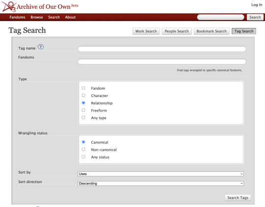
*In practice, though you won't exactly get a trustworthy list of top tags (and, as you pointed out, in some cases tags may even be missing! we'll get to that later). You will get a list where the numbers are not correct, sometimes to a bizarre degree:
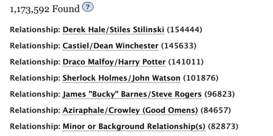
For example, when you click through on the Derek/Stiles tag, you find far fewer works using the tag (note that these are the public works -- if you're logged in, you see a somewhat higher number, but not as high as in the above screenshot):

I will be posting some stats soon that show different numbers (and a different order) for all of the above top ships. But why is there the discrepancy? Here are several guesses about why some works are wrong in Tag Search (and then I'll get to why some ships are missing and what to do about it):
TAG INFLATION #1: The above numbers probably include tags used in AO3 bookmarks, which increases some of the numbers quite a lot. [Evidence: if you search for top freeform tags, you get tags like "To Read" high on the list, and authors don't use those tags.]
TAG INFLATION #2: The above numbers seem to include draft works. [Evidence: I just tested this out by finding a rare tag with only one use... I created a draft of a new work using that same tag, and even though I didn't publish the work, Tag Search now showed 2 uses of the tag.]
TAG DEFLATION: The above numbers do NOT seem to take tag wrangling into account. Some AO3 tags have a lot of synonyms or subtags, but I think only exact uses of the tag get counted in the above list. [Evidence: I found at a tag with only one use according to tag search, but two works when I clicked the tag (Peter Gabriel/Mike Rutherford). I found that one of the works contained a synonym of the main tag ("Mike Rutherford/Peter Gabriel (Imagined)"). That would match with Tag Search only listing one of work for "Peter Gabriel/Mike Rutherford." And when I created a new draft work that used the main tag, it increase the count in Tag Search for "Peter Gabriel/Mike Rutherford" -- but when I created a new draft work that used the synonym tag, it did not.]
There may also be other factors affecting the overall Tag Search numbers.
Okay, so I suspect #3, tag deflation due to no tag wrangling, is (helping to?) create the unexpectedly low numbers you are seeing for ships like Jetfire/Starscream. I suspect that many people do not use the full canonical tag "Jetfire | Skyfire/Starscream (Transformers)", and those other uses don't get counted in Tag Search. The only way to address this issue is to click through on a tag returned by Tag Search and find out how many works the tag has once you look at its list of works.
But why aren't some ships showing up at all? That's a different question. Here, I suspect the answer again is related to tag wrangling. Every (?) canonical ship tag has at least one parent tag that is a fandom tag (as well as the relevant character tags). You can see the parent tags for Jetfire/Starscream on its tag page:
Skyfire (Transformers), Starscream (Transformers), The Transformers (Cartoon Generation One), The Transformers (IDW Generation One), Transformers (Bay Movies), Transformers (Dreamwave Generation One), Transformers (IDW 2019), Transformers (Marvel Generation One), Transformers - All Media Types, Transformers Animated (2007), Transformers: Armada, Transformers: Beast Wars (Cartoon), Transformers: Cybertron, Transformers: Cyberverse, Transformers: Energon, Transformers: Prime, Transformers: Shattered Glass, Transformers: The Headmasters, Transformers: War for Cybertron (Video Games)
Jetfire/Starscream has "Transformers - All Media Types" as a parent tag, and I suspect that is why it shows up in the Tag Search for that fandom. I would guess that some of the bigger Transformer ships do NOT have that broad fandom as a parent tag. Let's check the parent tags of Megatron/Optimus Prime:
Megatron (Transformers), Optimus Prime, The Transformers (IDW Generation One), Transformers (Bay Movies), Transformers Animated (2007), Transformers: Armada, Transformers: Robots in Disguise (2001), Transformers: Robots in Disguise (2015)
Megatron/Optimus Prime does NOT have "Transformers - All Media Types" as a parent tag. I suspect that's why it didn't show up in your tag search.
So what can you do? Unfortunately, I think the only way to be sure to find all the Transformers ships is to do a Tag Search within each of the different Transformers subfandoms (and I know there are a lot) and then combine the lists of ships you find for each. And then be sure to visit the tag works page for each resulting tag to get the actual number of works, as discussed above. I also discussed other ways to get the find the top relationships here, but I think they're all either less reliable or more arduous than this method, at least for a big fandom like Transformers.
Best of luck!
#ao3#ao3 tag search#ao3 search#tutorials#sleuthing#and speculation#asks#toasty replies#fandom stats#ish#toastystats#op#methodology#50
64 notes
·
View notes
Note
Hey op. I really love your art and would love to learn more of your style
Do you perhaps stream or have tutorials? If not that's fine, I just wanna learn more about the breakdown of your pieces and such <3
Hi nom!
Thank you! I don’t do streams or tutorials, but I’m more than happy to share some here if you like. If you’ve got more specific questions, let me know.
In fair warning most of my work is based on intuition more than studies, so my ability to articulate any sort of process is limited.
Attempt to Articulate Process 1.0
1. I start with motion and shapes. My goal with this is to capture the tone and mood of the piece as a whole. (Since I nearly always feature a hyper-emphasized subject rather than multiple subjects or environment pieces, usually this part is shown in a person I am drawing and what they are doing/preoccupied with.)
Sometimes I use lines/line art to capture these, sometimes I just select parts of my canvas to block out in different colors or paint in broad, clean strokes.
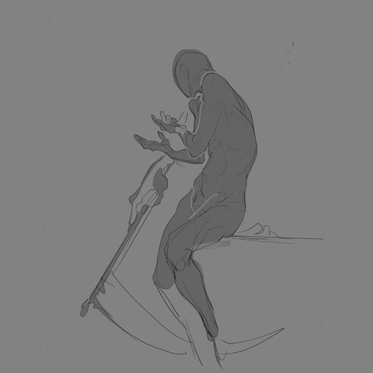
Here’s an example of this in an old draft for @ddeck ‘s Jedi OC:

Breakdown: You can see I have used both lines (in the background skeleton you can still see traces of, as well as the face and shoulder of the clothes, defining finer details) and colors in blotted, blocky, or clean shapes (the majority of the subject). The motion lines are complimentary in opposing directions, shown in the blowing hair and growing vines. The gaze of the viewer is drawn by the perspective and focal points of finer details in the piece, complex shapes or lines (hands, face, seams in the clothes, etc.).
2. While finalizing my motions and shapes to build on, I pay attention to voids and contrasts for what’s being viewed/communicated to come through clearly at a glance:
The shape of a subject can be emphasized by rotating it or stylizing the shapes themselves to leave spaces where the background will come through (voids). I think of this a lot like carving clay, using perspective and paint/eraser alternating to get dramatic shapes. The colors used can be contrasted as well to emphasize depth of a subject. Here’s another example:
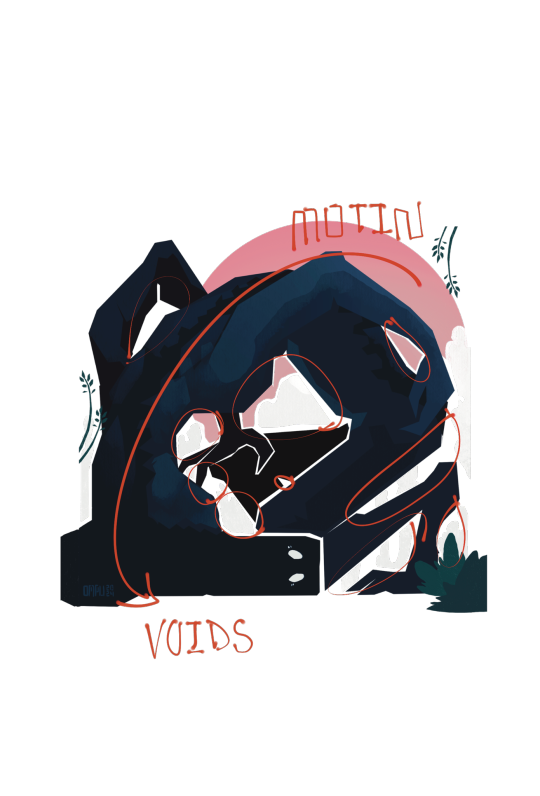
Breakdown: There are plenty of voids both large and small to carve out the shape of this OC creature from the background. Additionally, the color of the background and accents to the creature contrast strongly while emphasizing the motion in the piece, to carve that silhouette out even further. Fun-ish Fact: Sometimes I give the impression of lines without there being any, by leaving gaps in the base colors of the subject where line art would define the shape of, say, crossed arms or the contouring of a subject. Basically I use void lines instead of line art, sometimes.
Here’s an example of steps 1 & 2 in a piece I’m currently working on:

3. After that it’s just lighting, detailing, and shading all the way. Here’s where it usually gets wild for me, because I rarely approach this the same way. The one thing I always do is add another layer to repaint over what I had before.
I either paint in simple, broad, low-opacity strokes after selecting the parts of the subject I want to be affected by the color and texture I’m using, or in tiny, boldly solid strokes that come together for an impression. Here’s an example of each:
Primarily broad strokes:

Primarily detailed strokes, ad nauseam:


Worth Noting: Backgrounds aren’t my forte. For them, I tend to use broad strokes and focus on setting a mood with the colors, shapes, motion, and textures, and using both to highlight the shape of the subject. Sometimes I will throw in a little spice of details in the background for accents or symbolism, but usually I prefer if they’re geometric thematic mood-setters or flat color shapes. You can see this in all of the above examples.
This isn’t comprehensive, and all this is for my digital art pieces that don’t take as much time to make, but I hope it’s helpful as a starting reference.
Thanks again for asking!
#OmPu ask hours#artists on tumblr#tutorial-ish#I struggled articulating this so this is delayed#long post
21 notes
·
View notes
Text
My lovely fellow cosplay freaks, help a bloke out
I've never dyed shite apart from my hair before (and even so, I pay someone else to do it) so I'm in need of some assistance
To dye the following denim jacket black with RIT black dye

Is one bottle enough, or would I be safer with two bottles?
Kisses on the forehead, and may the Metatron not bite
#good omens cosplay#cosplay#diy craft#diy projects#dyeing#rit dye#send help#cosplay help#good omens#(kinda)#(you will see)#fashion#crowley cosplay#-ish#cosplay tutorial#denim jacket#diy#crafts#costume#spencer speaks#spencer begs for help#spencer has too many projects
14 notes
·
View notes
Text
🟨 Reminder that you don't need to rely on a mod to rename your Cyberpunk 2077 save files!
Just shared that in a server I'm in, making a post about it cause people didn't know about it 🤠🤚
You don't need the "Named Saves" mod to edit the name of your save files; you can even customize your thumbnails however you'd like!
To do so, go into your save files folder
C:\Users\[USER]\Saved Games\CD Projekt Red\Cyberpunk 2077
And simply rename the folders of your save files
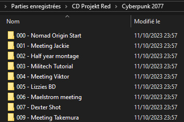
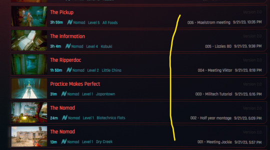
You'll find the thumbnail picture in the save folders as well
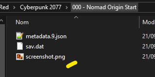
You can edit them too :>
50 notes
·
View notes
Note
Wo @ Chunli:
The snail, after looking at the lanterns and having thoughts about them, slowly makes his way over to her.
Wo: "Your event is wonderful, and I must thank you for inviting us all~ I have something on my mind too. The lanterns that I see here and there - did you make them? If so, could you show me how to do so? They do manage to intrigue oneself~"


11 notes
·
View notes
Text
Reese Verner
#I feel like I can’t draw him so I keep trying#but each time I feel like he looks different than the last and I’m not sure that’s a good thing lol#the fernweh saga#fernweh saga#reese verner#my art ish thing#i polish nothing#we got tutorials for drawing black folk can we get some tutorials for drawing white folk?#sorry i feel like ive got zero consistency with him
17 notes
·
View notes
Text

face reveal: me as victoria's secret adar
#face reveal#i made these wings out of cardboard and a tiktok tutorial and i love them#the rest of the costume was a struggle (i completely failed at making a gauntlet out of foam)#adar#trop#the rings of power#halloween costume#also i painted a river-ish pattern on the bustier to replicate adar's breastplate pattern but i don't think you can really tell
18 notes
·
View notes
Note
Hi! I saw your caption tutorial and was wondering about a couple things.
1. What is faux bold? (why is it faux?)
2. Do you have a method for making sure the distance from the bottom is always the same?
Thank you! 🥰
hey there!
"faux bold" is when you select the bold option in the character panel in photoshop. some fonts have their own bold option, which you can find in the drop-down "font style" setting. not all fonts have these tho, which is where faux bold comes into play, if you want to bold your text. i usually check the if the font has a bold style option first though, cause there are some things you can't do with faux bold (like warp text effects). and sometimes i even use both bold options together (for subtitles for example).
as for why it's called faux, well "faux" means "fake" in french, but i have no idea if that's the actual reason haha, it's just where my french brain went 😅
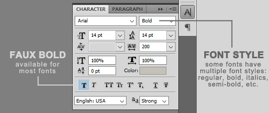
i usually just eyeball the distance of a text layer from the bottom, but you could for sure use guides to help you out with that.
if you've never used guides before, you go to the top menu: view > new guide, you'll get a box where you can put settings for a guide. choose the horizontal orientation. for the position, enter your gif's height in pixel MINUS 10 (or whatever number you feel is right). this example gif was 300px in height, so i entered 290px for its position.
this will create a thin cyan line where you can just drag your text along it. it should make the bottom of your text snap to it once you drag it near it. you can create a new guide like that with the same orientation and position values for all your gifs if you wanna make sure you always have the same distance at the bottom.
(also don't worry, this cyan line won't appear on your rendered gif when you save it for web, and you can remove it by clicking on it and dragging it away from the gif.)

i hope this helps <3
43 notes
·
View notes
Text
Trying to paint a house without bursting into tears challenge
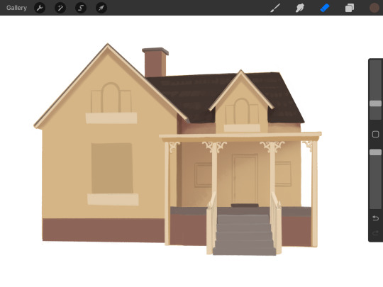
#the windows are filling me with a profound sense of dread#I’ll revisit this later#for now… i retreat to the safety of my comfort zone#my art#ish#I WANT to be good at drawing architecture OR AT LEAST DECENT !#literally every tutorial makes 0 sense to me#like I have the same brushes but how are u Making Them Do That
22 notes
·
View notes
Note
Hi! I really like your stats! I was browsing your character stats published in January 2024, and I was surprised by the fact that Wanda Maximoff didn't appear in the list. I checked, and there are ~38.000 public works under her tag. Did I miss her on the list? In any case, I just wanted to let you know, if it may be useful. Thank you for your great work!
Hey, thanks for the compliment and for the great question! :) I went back and checked my January big fandom/character/ship stats and also the underlying character data, and you're not wrong! Wanda is missing, and so are others. I'm going to post graphs with data about Wanda plus a bunch more missing characters -- and some missing ships! -- shortly. But here, let me explain how some characters inadvertently got left out.
Until recently, there was no way of directly finding the top characters or ships across all of AO3. Now there is a Tag Search feature (edit: sort by usage) that allows you to do so (though, as I posted about earlier, it has some limitations). But because I didn't have access to that method until recently, I used to instead do the following:
Find all fandoms with 10K+ works. (tutorial)
Combine the top 10 characters (and ships) listed in the Sort & Filter sidebar for each of those big fandoms.
Find out how many works each of those characters (and ships) have, and make my top characters / top ship lists from that data.
This worked well for many popular characters and ships. However, for really huge fandoms with lots of popular characters, like MCU, it misses a lot of big tags. My hope was that most of the characters that were missed in a giant fandom like MCU would show up in the top 10 list of some other popular fandom. E.g., Pepper Potts isn't in the top 10 characters listed in the Sort & Filter sidebar for the "Marvel Cinematic Universe" tag, but she is in the top 10 for the tag "Iron Man (Movies)." However, Wanda is an example of where this didn't work out. The WandaVision fandom didn't have 10K works, so it didn't make my list of fandoms in step 1 -- and Wanda wasn't in the top 10 for any fandoms with 10K+ works. So I just missed her altogether despite the fact that she appears in more fanworks than other characters in my list.
I will use Tag Search in future years and hopefully avoid this issue. That method would have caught Wanda -- and when I used that method as a starting point earlier this week (and then did follow up work to address the limitations of Tag Search), Wanda came in #108 out of all AO3 character tags! I'll share the resulting data that includes the previously missing characters in a bit. :)
40 notes
·
View notes
Text
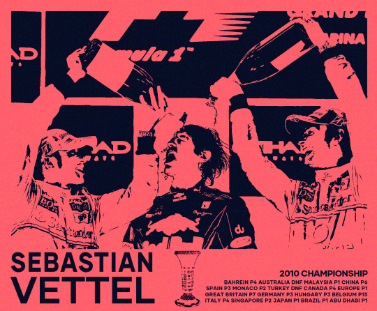
THE BEGINNING
#entering my editing era..?#followed this random tutorial and i had so much fun hopefully i get good at this#this is the first poster ish thing i make no one make fun of me or i k1ll myself#i looked at it for too long now idk if i actually like it well#sebastian vettel#formula 1#f1#red bull racing#golden boy#lewis hamilton#own post#jenson button#f1 edit#edit#sv5#toro rosso#abu dhabi gp 2010#seb#myedit
58 notes
·
View notes