#One-Column Layout
Explore tagged Tumblr posts
Visit Tumblr Blog
Explore Tumblr blogs with no restrictions, modern design and the best experience.
Last Seen Tumblr Blogs


Fun Fact
69% of Tumblr users are millennials.
Text
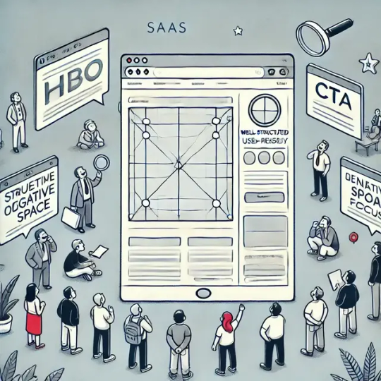
Enhancing Page Layout Design for Conversion Optimization (CRO)
Optimize your page layout for higher conversion rates with these proven CRO strategies.
Source: https://cro.media/insights/ux-ui/enhancing-page-layout-design-for-cro/
Page layout design plays a pivotal role in Conversion Rate Optimization (CRO). A well-structured, user-friendly layout enhances engagement, reduces friction, and increases the likelihood of conversions. At CRO MEDIA, we focus on building layouts that not only look great but are optimized to convert visitors into customers. Below, we’ll break down how CRO principles can be applied to various layout designs for maximum impact.
Importance of Clear Structure in CRO
A clear structure is the backbone of any high-converting page layout. Whether you're using a grid system or applying the rule of thirds, the idea is to create a layout that naturally guides users through your content. When users can easily navigate and find what they're looking for, they’re more likely to stay on your page longer and engage with your content.
For CRO, this means that organizing content logically, from the most important to secondary elements, is crucial for guiding users to take action, such as filling out a form, clicking a call-to-action (CTA), or making a purchase.
Hierarchy and Content Focus for Conversions
Incorporating hierarchy within your layout, such as the hero section or card-based layouts, directs the user’s attention to the key content or actions. In CRO, the focal point—like a CTA—needs to be placed in a way that stands out, ensuring users are naturally drawn to it.
For example, a hero image with a CTA button is perfect for a high-impact introduction to your service or product. It grabs attention right away and sets the tone for the rest of the page. A strong CTA within the hero section significantly boosts conversion rates by providing an immediate and clear next step for the user.
"A well-structured, user-friendly layout enhances engagement, reduces friction, and increases the likelihood of conversions." This sentence highlights the core benefit of effective page layout design.
Using Negative Space for Better CRO
The concept of negative space plays a significant role in CRO by reducing cognitive load. A cluttered page can overwhelm users, causing them to leave before they’ve had a chance to explore your offerings. By incorporating the right amount of white space, you can make your content more digestible and the page more inviting.
A well-spaced design helps users focus on key elements without feeling overwhelmed, thus improving the chances of conversion. CRO MEDIA uses negative space strategically to highlight CTAs and other important elements while maintaining an aesthetically pleasing design.
Conversion Focused Layouts
One-Column Layouts for Clear CTAs
One of the most effective layouts for CRO is the one-column layout. This layout focuses users' attention on a single, clear message with a CTA placed directly after it. This minimizes distractions and ensures users are only seeing the content that leads them toward conversion.
For example, in a landing page design, a single-column layout with compelling copy and a simple form can significantly improve conversion rates by making the process easy and straightforward.
Z-Pattern Layout for Natural Scanning
The Z-pattern layout mimics the natural reading pattern of the human eye, making it an ideal choice for CRO. It leads users from the top left to the top right, then diagonally down to the bottom left and finally to the bottom right. This layout ensures that important information, including your CTA, is placed in strategic spots to guide the user through the content and towards conversion.
Split-Screen Layout for Focused Choices
The split-screen layout is highly effective for showcasing two distinct actions or products on a single page. For CRO, this layout allows you to present two options, such as "learn more" vs. "buy now" buttons, enabling users to make decisions without feeling overwhelmed by too many choices.
This layout balances attention between two key elements, directing users where to go next while maintaining a clean, engaging design.
Testing and Refining Layouts for CRO
The effectiveness of any layout ultimately depends on how well it aligns with your CRO goals. At CRO MEDIA, we continuously test different layouts using A/B testing to find the designs that drive the highest conversion rates. Whether it’s testing the impact of a hero image vs. a full-screen photo, or experimenting with a card-based layout, testing is crucial for optimizing each page. Our Shopify CRO audit services can help you identify areas for improvement.
Analyzing User Behavior
Understanding how users interact with different layouts is key to making informed decisions. Heatmaps, session recordings, and user surveys are invaluable tools that help us at CRO MEDIA track where users are spending the most time and where they drop off. This data allows us to tweak layouts and elements to improve conversion rates over time.
"By designing your pages with clear structures, maintaining focus on content hierarchy, and using effective layouts such as one-column or Z-pattern designs, you can guide visitors toward taking the desired actions." This quote summarizes key strategies for effective CRO page design.
Conclusion
The layout of your website plays a crucial role in CRO. By designing your pages with clear structures, maintaining focus on content hierarchy, and using effective layouts such as one-column or Z-pattern designs, you can guide visitors toward taking the desired actions. At CRO MEDIA, we focus on testing and refining these layouts to ensure maximum conversion potential. Start by choosing a layout that suits your brand’s message, then optimize it to create a seamless, conversion-focused experience. Contact us to discuss your CRO needs.
0 notes
Text


# manchild : theme 079.
↻ features:
png: 300x330px
postal pic: 75x75px
font size options (9px, 10px, 11px, 12px, 13px)
8 font title variants
3 font family variants
phostop gutter options (0px to 5px)
visible source link
optional extra link
optional tags
optional rounded edges
optional black and white effect on images
npf images fix! ( thanks to @glenthemes )
↻ terms of use and info:
don’t use it as a code base or steal it, do’t edit the credits or remove them and please don’t take parts of the theme and paste them into another’s.
please read my rules!
the appearance may change depending on the size of your computer screen.
↷ get this on patreon or payhip
( ps ). reblog if you actually mess with your HTML at 3am — be the algorithm you want 🙏🙂↕️
#theme#tumblr theme#themes#custom theme#theme maker#theme maker tumblr#html theme#theme code#free theme#tumblr layout#one column theme#contained theme#aesthetic theme#coding#tumblr code#theme hunter#rp indie theme#indie rp themes#indie themes#indie theme#tumblr themes#rpt#rp themes#rp things#01. codes : mine.#code: manchild
23 notes
·
View notes
Text
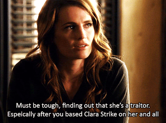

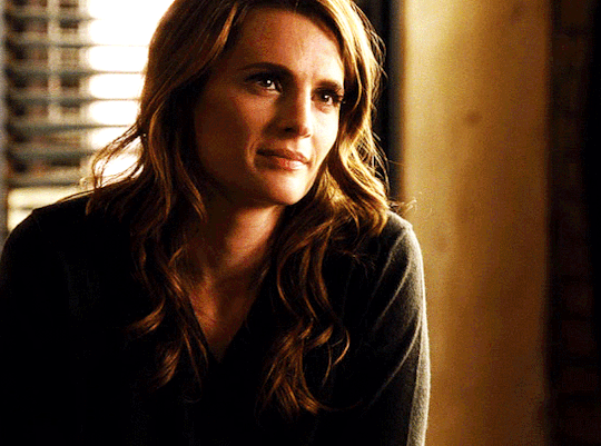


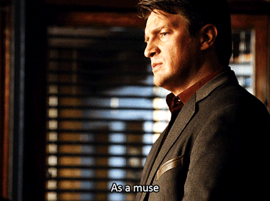
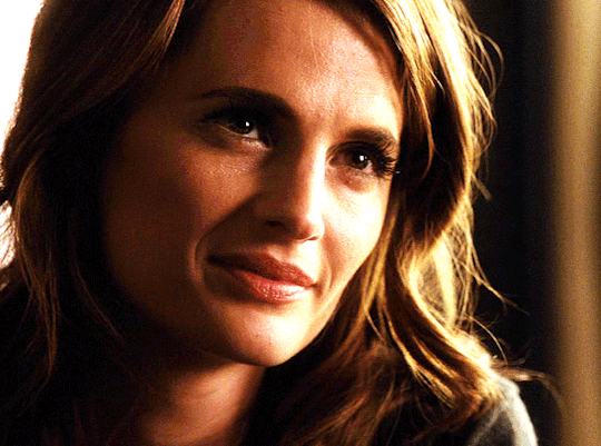
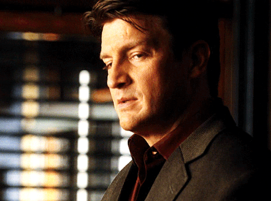
Favorite Caskett moments Season 4 x
#I struggle with how to upload these gifs and in what layout but this just felt so much better than two columns of four#please let me know if you have any layout opinions on gifs. i like these larger ones#you can see so much more and can get drawn in especially on mobile but I also know its a lot to scroll through on mobile#stana katics face will forever be my favorite thing in this world i swear#HER EMOTIONS AND ACTING ARE FREAKING CHEFS KISS#4x15#castle#abc castle#caskett#kate beckett#castlegraphics#richard castle#stana katic#linchpin#castleseason4#castle tv show#castle and beckett#season4
148 notes
·
View notes
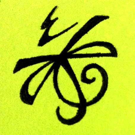
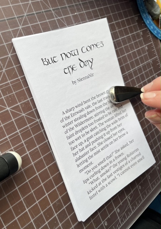
Photo

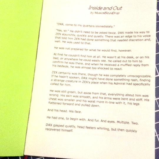

I decided to give a go to @niennanir’s lovely print-your-own-fic recipe on my Inside and Out as a test run and I’m quite pleased with the results as a first pass :D
I wish I’d taken a few more process pictures but there was a slight lull as I had to go shopping for 12x12 cardstock lol, but! I do have a couple closeups/extras that I added for funsies :D
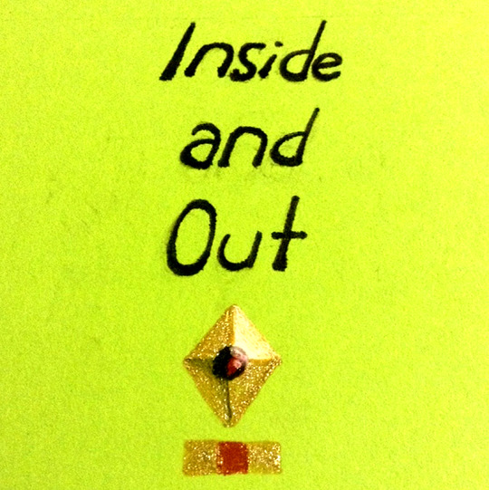
I went with freehanding the title and I think in the future I would opt to not do that lol, at least not without a printed template. That said, both LibreOffice and SAI refuse to recognize my SCII fonts >:0 If you notice on the first page, I used the Ace Attorney font in italic haha, it’s an okay alternative even if it’s not what I actually want |0 I am happy with the gold detailing tho :3c
I did have an unconscionable amount of fun freehanding the ship caption tho ahh <3 <3 Immediate happy stims upon completion, their names together look so pretty ♥ Credit to Zarla’s original minicomic on that one :3
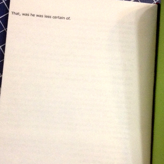
I also managed to get the last sentence of the fic isolated on the last page thanks to the formatting haha ♪

I was also able to add a bookmark! Ma happened to have a couple very thin ribbons to choose from and red ended up complementing the green very prettily!
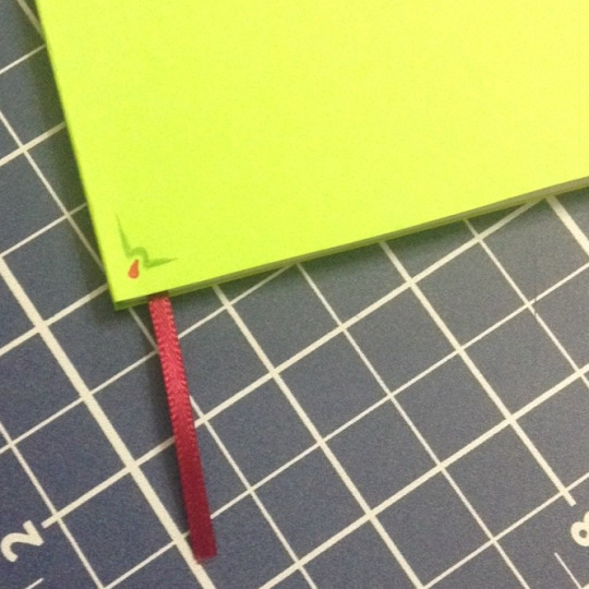
It reminds me of VUX tongues hehehehe ❤️💕💖💞
#What do I tag this lol#SCII#I am continually and incurably in love with papercrafts <3#Hard to believe it's been since Pokemon Homestyle since I've given anything a go! These darn talented artists inspiring me! Lol#Honestly tho I would absolutely recommend this project :D The prep work is manageable and friendly and the action itself is enjoyable#Depending on how much you enjoy repetitive motions haha ♪ Folding and creasing the pages was very relaxing to me :)#I went for my own fic as a first run since y'know - I have very direct access to it lol#Plus it'd be less sad if I messed something up - I want to do right by my favourites from other artists! I'm allowed to make my own mess lol#Also finally convinced me to return to the loving embrace of LibreOffice after like a decade away lol#I just never had a reason to redownload it! Wordpad does exactly what I want 95% of the time!#But it couldn't do columns so okayyyyy fiiiiine I'll get it again (lol) I do rather like it :)#There's still some things I'd change! I'm sure you can see from the pages where you can see both edges that the layout's a bit uhmmmm#Skewed? Corner-heavy? Lol just a matter of changing the borders :) LibreOffice's measurements are wack tho :P#But I fully intend to do this again! :D Print a few test sheets first >:3c Legitimately looking forward to it!#Probably gonna do another one of mine next before I give a go to someone else's I'd like to keep#I have ideas for how to improve! And better and more plentiful supplies! It makes me want to make! :D#Oh yeah and being in the book-making mood reminded me of one of the Vargas-as-a-psuedo-bible ideas I had but didn't put anywhere lol#If I may posit for your consideration: Before as the Old Testament and After as the New Testament :3c#I'd Absolutely buy two versions - And a full version for the record lol I would easily own multiple copies of physical!Vargas lol#Fun thought to me hehehehe ♪♫
12 notes
·
View notes
Text
Experiencing the new layout. I'm baffled by how bad the UX is.
Having the For You tab first, and locked, is horrendous. Also, when there's new posts on Following, clicking on it doesn't update the dash, but clicking on Home to update Following...leads you to For You. I don't even talk about the fact that they display a notification bubble on Following, which in good UX would tell you "click here to see what's new", but no. Click on Home on the left, to go to For You then go to Following. Where we displayed a notification bubble. To tell you you have new posts there. But you have to click twice on other links before getting there.
They really fucked this up. I don't even know what they get from pushing For You onto us since we're not interested and will switch to Following immediately.
#and it's still not a pdf so what are they trying to do with this website?#they could push promoted posts in the right column#they could push a promoted post on top of the dash#we would deal with that easily#but no they decided to take us on a tour every time we want to update our real dash#i need xkit i think#the previous layout was enough for me but this one is a mess
2 notes
·
View notes
Text
What We Know (So Far) About CSS Reading Order
New Post has been published on https://thedigitalinsider.com/what-we-know-so-far-about-css-reading-order/
What We Know (So Far) About CSS Reading Order

The reading-flow and reading-order proposed CSS properties are designed to specify the source order of HTML elements in the DOM tree, or in simpler terms, how accessibility tools deduce the order of elements. You’d use them to make the focus order of focusable elements match the visual order, as outlined in the Web Content Accessibility Guidelines (WCAG 2.2).
To get a better idea, let’s just dive in!
(Oh, and make sure that you’re using Chrome 137 or higher.)
reading-flow
reading-flow determines the source order of HTML elements in a flex, grid, or block layout. Again, this is basically to help accessibility tools provide the correct focus order to users.
The default value is normal (so, reading-flow: normal). Other valid values include:
flex-visual
flex-flow
grid-rows
grid-columns
grid-order
source-order
Let’s start with the flex-visual value. Imagine a flex row with five links. Assuming that the reading direction is left-to-right (by the way, you can change the reading direction with the direction CSS property), that’d look something like this:
Now, if we apply flex-direction: row-reverse, the links are displayed 5-4-3-2-1. The problem though is that the focus order still starts from 1 (tab through them!), which is visually wrong for somebody that reads left-to-right.
But if we also apply reading-flow: flex-visual, the focus order also becomes 5-4-3-2-1, matching the visual order (which is an accessibility requirement!):
<div> <a>1</a> <a>2</a> <a>3</a> <a>4</a> <a>5</a> </div>
div display: flex; flex-direction: row-reverse; reading-flow: flex-visual;
To apply the default flex behavior, reading-flow: flex-flow is what you’re looking for. This is very akin to reading-flow: normal, except that the container remains a reading flow container, which is needed for reading-order (we’ll dive into this in a bit).
For now, let’s take a look at the grid-y values. In the grid below, the grid items are all jumbled up, and so the focus order is all over the place.
We can fix this in two ways. One way is that reading-flow: grid-rows will, as you’d expect, establish a row-by-row focus order:
<div> <a>1</a> <a>2</a> <a>3</a> <a>4</a> <a>5</a> <a>6</a> <a>7</a> <a>8</a> <a>9</a> <a>10</a> <a>11</a> <a>12</a> </div>
div display: grid; grid-template-columns: repeat(4, 1fr); grid-auto-rows: 100px; reading-flow: grid-rows; a:nth-child(2) grid-row: 2 / 4; grid-column: 3; a:nth-child(5) grid-row: 1 / 3; grid-column: 1 / 3;
Or, reading-flow: grid-columns will establish a column-by-column focus order:
reading-flow: grid-order will give us the default grid behavior (i.e., the jumbled up version). This is also very akin to reading-flow: normal (except that, again, the container remains a reading flow container, which is needed for reading-order).
There’s also reading-flow: source-order, which is for flex, grid, and block containers. It basically turns containers into reading flow containers, enabling us to use reading-order. To be frank, unless I’m missing something, this appears to make the flex-flow and grid-order values redundant?
reading-order
reading-order sort of does the same thing as reading-flow. The difference is that reading-order is for specific flex or grid items, or even elements in a simple block container. It works the same way as the order property, although I suppose we could also compare it to tabindex.
Note: To use reading-order, the container must have the reading-flow property set to anything other than normal.
I’ll demonstrate both reading-order and order at the same time. In the example below, we have another flex container where each flex item has the order property set to a different random number, making the order of the flex items random. Now, we’ve already established that we can use reading-flow to determine focus order regardless of visual order, but in the example below we’re using reading-order instead (in the exact same way as order):
div display: flex; reading-flow: source-order; /* Anything but normal */ /* Features at the end because of the higher values */ a:nth-child(1) /* Visual order */ order: 567; /* Focus order */ reading-order: 567; a:nth-child(2) order: 456; reading-order: 456; a:nth-child(3) order: 345; reading-order: 345; a:nth-child(4) order: 234; reading-order: 234; /* Features at the beginning because of the lower values */ a:nth-child(5) order: -123; reading-order: -123;
Yes, those are some rather odd numbers. I’ve done this to illustrate how the numbers don’t represent the position (e.g., order: 3 or reading-order: 3 doesn’t make it third in the order). Instead, elements with lower numbers are more towards the beginning of the order and elements with higher numbers are more towards the end. The default value is 0. Elements with the same value will be ordered by source order.
In practical terms? Consider the following example:
div display: flex; reading-flow: source-order; a:nth-child(1) order: 1; reading-order: 1; a:nth-child(5) order: -1; reading-order: -1;
Of the five flex items, the first one is the one with order: -1 because it has the lowest order value. The last one is the one with order: 1 because it has the highest order value. The ones with no declaration default to having order: 0 and are thus ordered in source order, but otherwise fit in-between the order: -1 and order: 1 flex items. And it’s the same concept for reading-order, which in the example above mirrors order.
However, when reversing the direction of flex items, keep in mind that order and reading-order work a little differently. For example, reading-order: -1 would, as expected, and pull a flex item to the beginning of the focus order. Meanwhile, order: -1 would pull it to the end of the visual order because the visual order is reversed (so we’d need to use order: 1 instead, even if that doesn’t seem right!):
div display: flex; flex-direction: row-reverse; reading-flow: source-order; a:nth-child(5) /* Because of row-reverse, this actually makes it first */ order: 1; /* However, this behavior doesn’t apply to reading-order */ reading-order: -1;
reading-order overrides reading-flow. If we, for example, apply reading-flow: flex-visual, reading-flow: grid-rows, or reading-flow: grid-columns (basically, any declaration that does in fact change the reading flow), reading-order overrides it. We could say that reading-order is applied after reading-flow.
What if I don’t want to use flexbox or grid layout?
Well, that obviously rules out all of the flex-y and grid-y reading-flow values; however, you can still set reading-flow: source-order on a block element and then manipulate the focus order with reading-order (as we did above).
How does this relate to the tabindex HTML attribute?
They’re not equivalent. Negative tabindex values make targets unfocusable and values other than 0 and -1 aren’t recommended, whereas a reading-order declaration can use any number as it’s only contextual to the reading flow container that contains it.
For the sake of being complete though, I did test reading-order and tabindex together and reading-order appeared to override tabindex.
Going forward, I’d only use tabindex (specifically, tabindex="-1") to prevent certain targets from being focusable (the disabled attribute will be more appropriate for some targets though), and then reading-order for everything else.
Closing thoughts
Being able to define reading order is useful, or at least it means that the order property can finally be used as intended. Up until now (or rather when all web browsers support reading-flow and reading-order, because they only work in Chrome 137+ at the moment), order hasn’t been useful because we haven’t been able to make the focus order match the visual order.
#Accessibility#Articles#Behavior#change#chrome#columns#container#Containers#content#CSS#CSS-Properties#direction#display#Features#focus#grid#grid-template-columns#guidelines#how#HTML#html elements#it#layout#links#mind#Moment#nth-child#One#Other#prevent
0 notes
Text

Implementing the appropriate checkout layout is important for lowering cart abandonment. Investigate IoCheckout's various layout options and conduct A/B testing to determine the best fit for your store. Improve the user experience and watch your sales increase dramatically!
0 notes
Text
Listen to your elders
So last week I posted abut the importance of downloading your fic. And then three days later AO3 went down for 24 hours. No one was more weirded out by this than I was. But while y’all were acting like the library at Alexandria was on fire I was reading my download fic and editing chapter eight of Buck, Rogers, and the 21st Century. And also thinking about what I could do to be helpful when the crisis was actually over.
So first off, I’m going to repeat that if you’re going to bookmark a fic, you really need to also download the fic and back it up in a safe place. I just do it automatically now and it’s a good habit to get into.
But let’s talk about some other scenarios. Last October I lost power for over a week after hurricane Ian. Apart from not having internet or A/C I did find plenty to do, I collect books so I had plenty to read, but maybe, unlike me, your favorite comfort reads aren’t sitting on a bookshelf. So let’s do something about that, shall we?
In olden times many long years ago around 1995 we printed off a lot of fic. It was mostly SOP to print a fic you planned to reread and stick it in a three ring binder. And that’s totally valid today too, but you can also make a very nice paperback with a minimum amount of skill and materials.
Let’s start with the download; Go to Ao3 and select your fic, we’ll be working with one of mine. This method works best with one shots, long fic tends to need a more complicated approach. Get yourself an HTML download

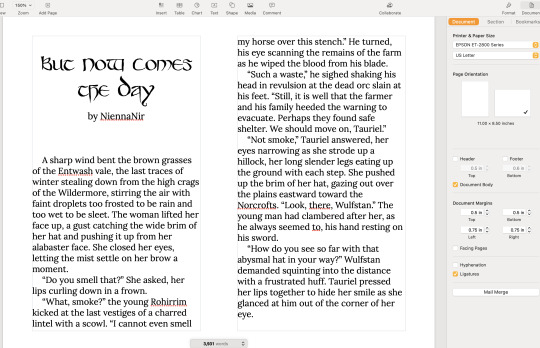
Open up the HTML download and select all then copy paste into any word processor. Set the page to landscape and two columns, then change the font to something you find easy to read, this is your book, no judgement. This is all you have to do for layout but I like to play a little bit. I move all the meta, summary, notes to the end and pick out a fun font for the title:
No time like the present to do a quick proofread. Congratulations, you’ve just created your first typeset. On to the fun part.
Now you’re going to need some materials: 8.5x11in paper ruler one sheet of 12x12 medium card stock (60-80lb) scissors pencil pen or fine tip marker sheet of wax paper white glue two binder clips 2 heavy books or 1 brick butter knife
You’ll also need a printer, if you’re in the US there is almost a 100% chance your local library has a printer you can use if you don’t have your own. None of these materials are expensive and you can literally use cheap copy paper and Elmers glue.
Print your text block, one page per side. Fold the first page in half so that the blank side is inside and the printed side out:
use the butter knife to crease the edge. Repeat on all the sheets. When you’ve finished, stack them up with the raw edge on the left and the folded edge on the right. I used standard copy paper, because you’re only printing on one side there’s no bleed to worry about. Take the text block and line everything up. Use the binder clips to hold the raw edge in place.
Wrap the text block in the wax paper so that the raw edge and binder clips are facing out. I’m going to use my home built book press but you don’t need one, a brick or a couple of books or anything else heavy will work fine.
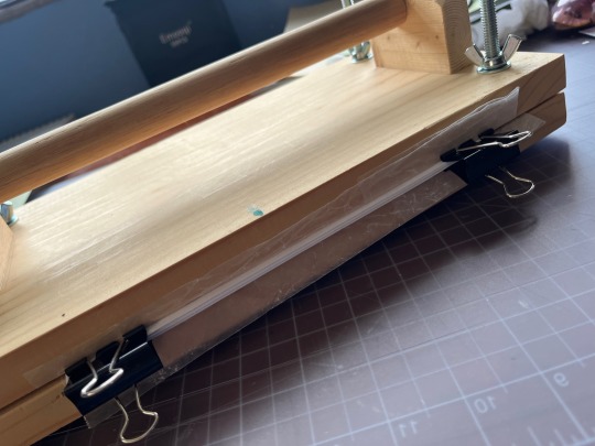
Once the text block is anchored down, take off he binder clips and get out the glue.
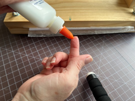
You can use a brush but you don’t need one, smear some glue on that raw edge.
Go make a margarita, watch The Mandalorian, call your mother. Don’t come back for at least an hour
In an hour smear some more glue on there and shift your brick forward so that the whole book is covered. This keeps the paper from warping. While glue part 2 is drying we’ll do the cover. Get out your 12x12 cardstock
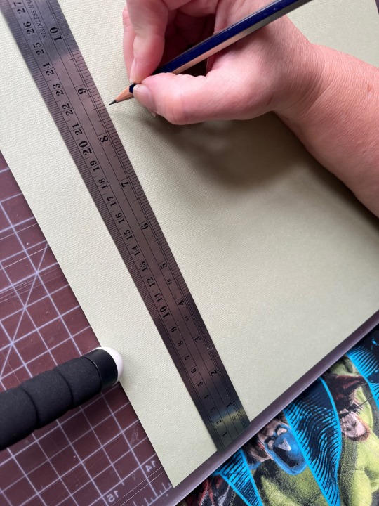
Mark the cardstock off at 8.5 inches and cut it. Measure in 5.5 inches from the left and put in a score line with the butter knife (the back edge not the sharp edge)
Carefully fold the score line, this is your front cover. You have some options for the cover title, you can use a cutting machine like a cricut if you have one, you can print out a title on the computer and use carbon paper to transfer the text to the cardstock. I was in a mood so I just freehanded that beoch. Pencil first then in pen.
Take your text block out from under your brick. Line it up against the score mark and mark the second score on the other side of the spine
Fold the score and glue the textblock into the cover at the spine. Once the glue dries up mark the back cover with the pencil and then trim the back cover to fit with your scissors.
Voila:
I’m going to put this baby on the shelf next to the Silmarillion.
The whole process, not counting drying time, took less than an hour.
If you want to make a book of a longer fic, I recommend Renegade Publishing, they have a ton of resources for fan-binders.
22K notes
·
View notes
Text
Wow...this new desktop layout needs to just...fuck off.
#seriously tumblr#wtf#why did you move shit over to the opposite side of the page#who told you a three column layout was a good thing for desktop#especially when the columns are the exact same fucking width#and it took me forever to find the link to my queue#why isn't my queue with the rest of the links#i mean#you have 11 in there#was one more going to be so bad#and whenever i search tumblr for any tag#the search results are being strangled in the middle column#it's like the middle column has some vital information#and tumblr is trying to squeeze it out#there's no way this went through fucking user testing#no fucking way
0 notes
Text
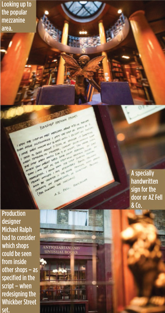
SFX Magazine Issue 372 - Designing Good Omens ❤ 😊


PRODUCTION DESIGNER MICHAEL RALPH REVEALS HOW THE SHOW’S CENTREPIECE SET, WHICKBER STREET, WAS GIVEN A DEVILISHLY CLEVER UPGRADE FOR THE SECOND SEASON
WORDS: DAVE GOLDER
Invisible Columns And Thin Walls “The new studio is Pyramid Studios in Bathgate – it used to be a furniture warehouse. And unfortunately – or fortunately, because I accept these things as not challenges but gifts – right down the middle of that studio are a series of upright columns. But you’ll never spot them on screen. I had to build them in and integrate them into the walls and still get the streets between them. And it worked.
“There’s all sorts of cheeky design values to those sets. Normally a set like this is double-skin. In other words, you do an interior wall and an exterior wall, with an airspace in between. But really, the only time a viewer notices that there’s that width is at the doors and the windows. So I cheated all that. I ended up with single walls everywhere. So the exterior wall is the interior wall, just painted. All I did was make the sash windows and entrances wider to give it some depth as you walked in.”
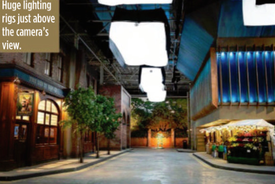
GOOD OMENS HAD A CHANGE of location for its second season, but hopefully you didn’t notice. Because Whickber Street in Soho upped sticks from an airfield in Hertfordshire to a furniture warehouse in Bathgate, Edinburgh. It’s the kind of nonsensical geographical shenanigans that could only make sense in the crazy world of film and TV, and production designer Michael Ralph was the man in charge of rebuilding and expanding the show’s vast central set. “I wish we could have built more in season one than we did,” says Ralph, whose previous work has included Primeval and Dickensian. “We built the ground floor of everything and the facades of all the shops. But we didn’t build anything higher than that, because we were out on an airfield in a very, very difficult terrain and weather conditions, so we really couldn’t go much higher. Visual effects created the upper levels.”
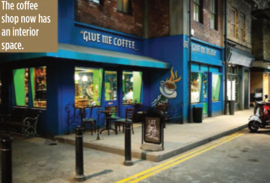
But with season two the set has gone to a whole other level… literally. “What happened was that the rest of the street became integrated into the series’s storyline,” explains Ralph. “So we needed a record shop, we needed a coffee shop that actually had an inside, we needed a magic shop, we needed the pub. To introduce those meant we had to change the street with a layout that works from a storylines point of view. In other words, things like someone standing at the counter in the record shop had to be able to eyeball somebody standing at the counter in the coffee shop. They had to be able to eyeball Aziraphale sitting in his office in the window of the bookshop. But the rest of it was a pleasure to do inside, because we could expand it and I could go up two storeys.”
For most of the set, which is around 80 metres long and 60 metres wide, the two storeys only applied to the shop frontages, but in the case of Aziraphale’s bookshop, it allowed Ralph to build the mezzanine level for real this time. According to Ralph it became one of the cast and crews’ favourite places to hang out during down time.
But while AZ Fell & Co has grown in height, it actually has a slightly smaller footprint because of the logistics of adapting it to the new studio.
“Everybody swore to me that no one would notice,” says Ralph wryly. “I walked onto it and instinctively knew there was a difference immediately, and they hated me for that. I have this innate sense about spatial awareness and an eye like a spirit level.
“It’s not a lot, though – I think we’ve lost maybe two and a half feet on the front wall internally. I think that there’s a couple of other smaller areas, but only I’d notice. So I can be really annoying to my guys, but only on those levels. Not on any other. They actually quite like me…”
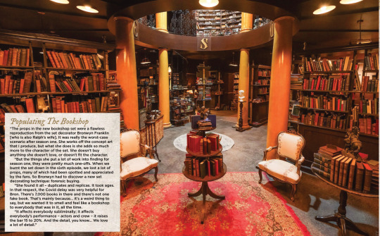
Populating The Bookshop “The props in the new bookshop set were a flawless reproduction from the set decorator Bronwyn Franklin [who is also Ralph’s wife]. It was really the worst-case scenario after season one. She works off the concept art that I produce, but what she does is she adds so much more to the character of the set. She doesn’t buy anything she doesn’t love, or doesn’t fit the character.
“But the things she put a lot of work into finding for season one, they were pretty much one-offs. When we burnt the set down in the sixth episode, we lost a lot of props, many of which had been spotted and appreciated by the fans. So Bronwyn had to discover a new set decorating technique: forensic buying.
“She found it all – duplicates and replicas. It took ages. In that respect, the Covid delay was very helpful for Bron. There’s 7,000 books in there and there’s not one fake book. That’s mainly because… it’s a weird thing to say, but we wanted it to smell and feel like a bookshop to everybody that was in it, all the time.
“It affects everybody subliminally; it affects everybody’s performance – actors and crew – it raises the bar 15 to 20%. And the detail, you know… We love a lot of detail.”
(look at the description under this, they called him 'Azi' hehehehe :D <3)
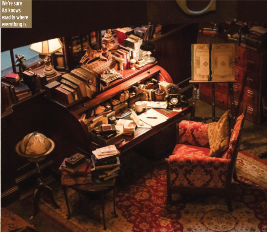
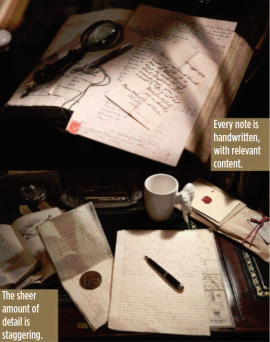
Aziraphale’s Inspirational Correspondence “There’s not one single scrap of paper on Aziraphale’s desk that isn’t written specifically for Aziraphale. Every single piece is not just fodder that’s been shoved there, it has a purpose; it’s a letter of thanks, or an enquiry about a book or something.
“Michael Sheen is so submerged in his character he would get lost sitting at his own desk, reading his own correspondence between takes. I believe wholeheartedly that if you put that much care into every single piece of detail, on that desk and in that room, that everybody feels it, including the crew, and then they give that set the same respect it deserves.
“They also lift their game because they believe that they’re doing something of so much care and value. Really, it’s a domino effect of passion and care for what you’re producing.”

Alternative Music “My daughter Mickey is lead graphic designer [two of Ralph’s sons worked on the series too, one as a concept artist, the other in props]. They’re the ones that produced all of that handwritten work on the desk. She’s the one that took on the record shop and made up 80 band names so that we didn’t have to get copyright clearance from real bands. Then she produced records and sleeves that spanned 50, 60 years of their recordings, and all of the graphics on the walls.
“I remember Michael and Neil [Gaiman] getting lost following one band’s history on the wall, looking at their posters and albums desperately trying to find out whether they survived that emo period.”


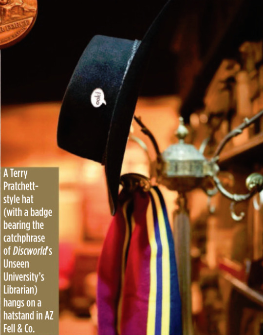
It’s A Kind Of Magic One of the new shops in Whickber Street for season two was Will Goldstone’s Magic Shop, which is full of as many Easter eggs as off-the-shelf conjuring tricks, including a Matt Smith Doctor Who-style fez and a toy orang-utan that’s a nod to Discworld’s The Librarian. Ralph says that while the series is full of references to Gaiman, Pratchett and Doctor Who, Michael Sheen never complained about a lack of Masters Of Sex in-jokes. “He’d be the last person to make that sort of comment!”
Ralph also reveals that the magic shop counter was another one of his wife’s purchases, bought at a Glasgow reclamation yard.

The Anansi Boys Connection Ralph reveals that Good Omens season two used the state-of-the-art special effects tech Volume (famous for its use in The Mandalorian to create virtual backdrops) for just one sequence, but he will be using it extensively elsewhere on another Gaiman TV series being made for Prime Video.
“We used Volume on the opening sequence to create the creation of the universe. I was designing Anansi Boys in duality with this project, which seems an outrageously suicidal thing to do. But it was fantastic and Anansi Boys was all on Volume. So I designed for Volume on one show and not Volume on the other. The complexities and the psychology of both is different.”
#good omens#gos2#season 2#photos#bts#bts photos#interview#sfx magazine#magazines#hq photos#neil gaiman#terry pratchett#michael sheen#david tennant#michael ralph#mickey ralph#bronwyn franklin#anansi boys#the small back room#maggie's record shop#soho#aziraphale's bookshop#dirty donkey#magic shop#aziraphale's correspondence#give me coffee or give me death#fun fact#michael ralph interview#sfx 372 magazine#s2 interview
4K notes
·
View notes
Text
cold hands, warm crush – DR3


content warning: age-appropriate crush (reader is an adult), fluff, slow burn vibes, Raikkonen dad energy pairing: Daniel Ricciardo x reader (Kimi Raikkonen's daughter) setting: early 2010s paddock requested!

“You ready?” Kimi asked, tossing you his spare Alfa cap without looking up from his espresso.
You nodded. “Always.”
He gave a quiet hum — his version of fatherly enthusiasm — and started walking toward the garage. You followed, sunglasses on, braid swinging, pretending not to care. But your heart was already speeding like the engines around you.
Because you weren’t here for your dad.
Not really.
You were here for Daniel Ricciardo.
Stupid Daniel. With his toothy grin, sunshine eyes, and the dumb way he always waved at you when he spotted you by the timing screens.
You weren’t even that into Red Bull. But you’d memorized the layout of their garage. Knew his car’s number. Knew exactly how long he lingered near catering after quali.
Your dad didn’t notice, of course. He wasn’t the nosy type. But Seb definitely did. He’d caught you last week standing very still behind a column, watching Daniel laugh with his engineers.
“You alright?” he asked, grinning like a cat. “Just stretching,” you said, red-faced. “In one spot. For five minutes.” “…Yes.”
Today, you slipped away again, quiet and practiced, walking like you had somewhere to be. And there he was.
Daniel.
Leaning against a barrier in his fire suit, cap backwards, talking to a few mechanics. He looked up — and there it was. That smile.
He jogged toward you. “Hey! You’re back!”
“I—uh. Yeah. My dad’s racing,” you teased. “Maybe you’ve heard of him.”
Daniel laughed. “Kimi? Doesn’t ring a bell.”
You tried not to smile too wide. Tried to seem chill, cool, Raikkonen-level calm. “Guess you’ll just have to keep an eye out for me.”
“Already do,” he said — so casually — that you almost tripped over your own shoes.
He didn’t push. Never did. Just gave you that look, that warm glance like maybe he was starting to fall too.
And later, when you rejoined your dad and he asked, “Where were you?”
You shrugged. “Just watching.”
But really? You were falling. Harder than anyone on that track.
©p1girlfriend / let me know if u want a part two!
#daniel ricciardo#DR3#daniel ricciardo x reader#daniel ricciardo x you#daniel ricciardo x y/n#daniel ricciardo x imagines#daniel ricciardo imagine#daniel ricciardo fanfic#daniel ricciardo fanfics#daniel ricciardo x female reader#daniel ricciardo blurb#f1 imagines#f1#f1 x reader#fanfic#formula 1#f1 fanfic#f1 fanfics#x reader
268 notes
·
View notes
Text
I finally finished a NEW CUSTOM MAP ART!!! "Visitor," a portrait of an enderman, is extra exciting because it's my first full-palette map painting, meaning I used block height to access all the highlight and shadow colours available!! More on the full process under the cut, but the short version of what this means is:
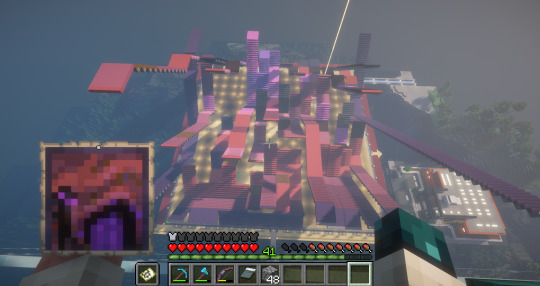
ITS A VERY COMPLICATED CONSTRUCTION. I created the art, then planned and built this manually, without any mods or schematics for construction. Huge props again to everyone else in the server for helping me gather all the materials to make this absurd thing possible!!!
This was the original art I made for it! I'm a huge fan of the "compressed" look of the vanilla paintings, so I've been starting with a large image and shrinking it down, though there were a lot of pixel tweaks to get it to read well. After shrinking it to 16x32 (for an art made of two maps), I convert it to a limited palette that I've set up to match the colours minecraft actually has available:

The map palette is actually tremendously limited, so figuring out a painting that will still look good with that constraint is a challenge in and of itself!
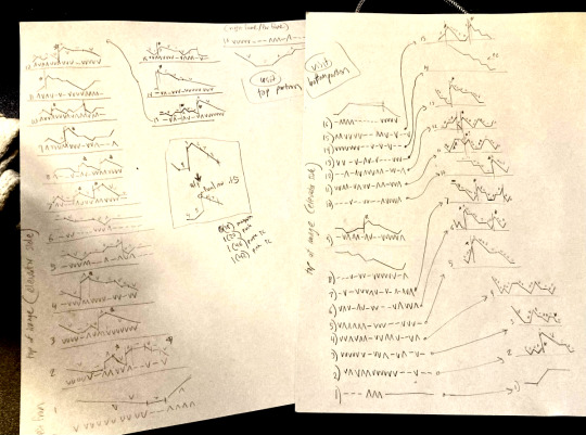
Anyway, the way minecraft maps work, a block that is Taller than the block to the north of it shows up with a slightly lighter colour, and a block that is Lower than the block north of it shows up on the map with a slightly darker colour. So when making a key for this one, I marked all the squares with a little arrow if it's the lighter or darker version:
Each "pixel" here is a full stack of blocks on the mapped area: 64 blocks, 8 rows of 8. In order to achieve the affect of every block in a given pixel being taller or shorter than the block to the north of it, dark and light shades need to staircase either up or down. Because staircasing downwards in survival sounds even worse than this madness, I did some planning to make sure each of the "downwards" staircases would touch the ground, so I could simply staircase up from south to north instead. This involved figuring out how many up and down movements were in each individual column and planning out 32 little layouts:
It's worth noting that if you look up minecraft map art on Youtube, most of what you'll find is either, the simple realisation that placing blocks allows you to make custom map art, or an explanation of how to use a generator that will let you plug in any picture and then produce a schematic for you. It's very cool that these exist, but I wanted to do full palette art myself, without an auto-generated schematic, and at the time THERE JUST WEREN'T ANY TUTORIALS FOR HOW TO DO ALL THIS?? Now, having the experience of finagling all this, i think perhaps the reason is that this is a mad undertaking.
ANYWAY: PROGRESS SHOTS!!
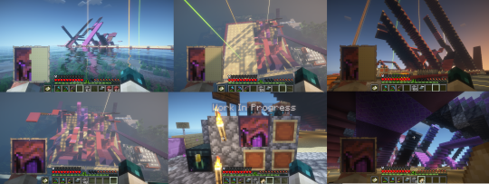
I actually love how the staircases look..... its like some kind of modern sculpture
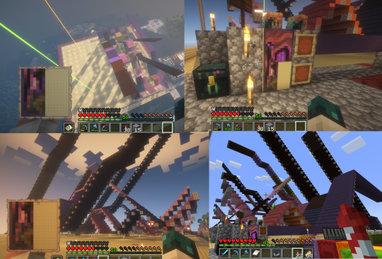
Fewer shots of the second half since I did it on call with friends; the last screenshot is one Thren took of me activating the new locked map to use for the gallery.
Once these paintings are done, I lock the finished maps, make copies, and stock them in the art gallery so other friends on our server can also put these paintings in their homes! It's a lot of work, but really rewarding to see my art decorating various buildings around the server. ;u;
I have one more custom full-palette painting I've done the art for and gathered all materials for; I still need to do the full key and plan staircasing for it before I can start, but HOPEFULLY if my resolve doesn't waver there'll be at least one more of these!!
#minecraft build#minecraft screenshots#minecraft#block game liveblogging#minecraft map art#GENUINELY SO PROUD OF THIS ONE#bsl shaders#im so tempted to make some sort of tutorial on doing this by hand sometime. you shouldnt do it by hand. but a tutorial should exist!!
485 notes
·
View notes
Text

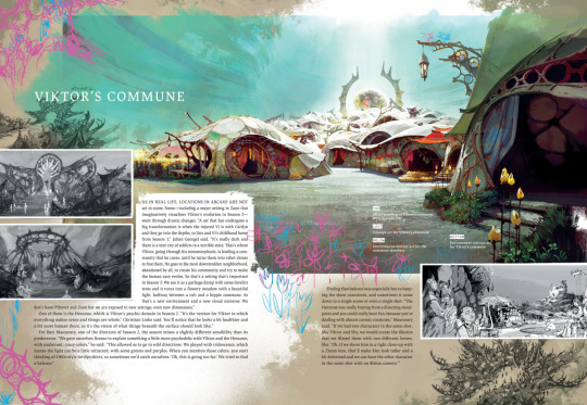

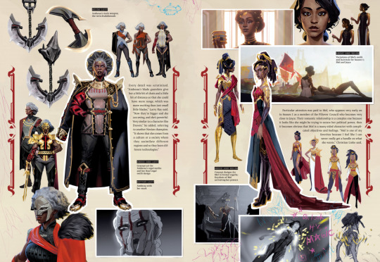
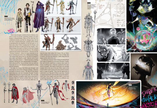
“The Art and Making of Arcane: League of Legends” 🎨🎨🎨🎨 Book Review Under the Cut
⋆。°✩*ੈ✶⋆.˚✩‧₊˚⋆˚☆˖°⋆。° ✮˖ ࣪ ⊹⋆.˚⋆˙⟡⋆✴︎˚。⋆⊹.˚⟡ ݁₊˚⊹⋆☆˖°
If you enjoy my work, please consider supporting me on Ko-fi 👛🫙✨🖤 Thank you! 🥰
Hi All! 😊 As I have amassed loads of Art Books throughout my degree and in my work as an illustrator, I thought I could do some reviews so those of you who are just now embarking on your art journeys and wondering whether something is worth spending money on, can make an informed decision about what part of your creative development you want to put your money towards. I’m thinking of structuring the reviews in five key areas, with books earning a palette for each area they score against, with a total of five palettes being the max, and a brush being awarded in areas where a book can only score half a point. As someone from a working-class background who is also neurodivergent, I’m especially mindful how these things can impact the way in which we access information and new knowledge. Of course, if you have any suggestions on what else should be included, please let me know and I’ll be happy to consider this in future too. 😊
Now! Off to the main bit...
Is the book Useful? 🎨
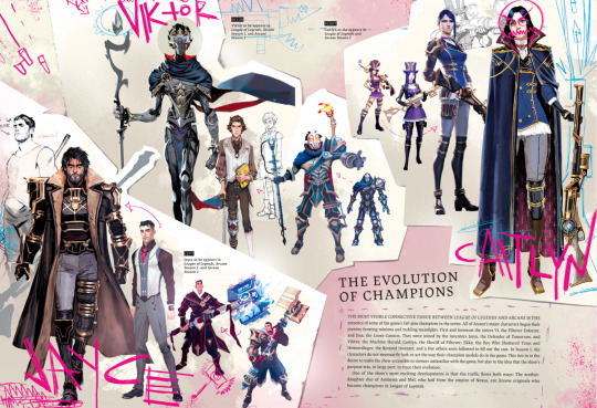
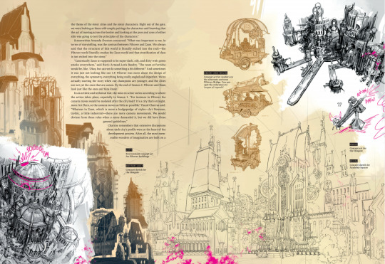
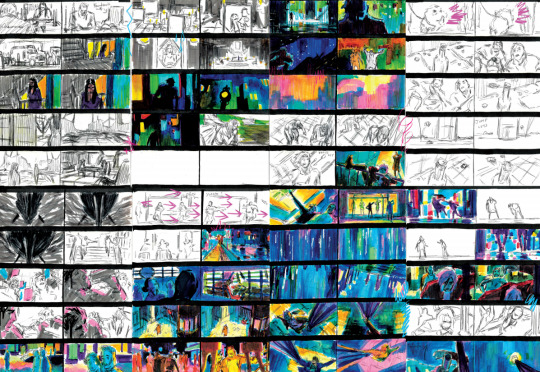
I think this would of interest not only to fans of the game and series alike, but also less experienced artists who want to learn about the motivation, inspirations, ideas, and thought processes behind the storytelling, characters and plotlines. Alex and Chris (the Creators) talk about the history and background of how it came to be, how the right group and studio of people were found to bring it together, and how the story and visuals were built from the smallest details to the major production hurdles. There are the back scenes of the storyboarding and character designs, with frameworks and the timeline between the layouts of the game vs the show. The book also goes down into details on the music, lyrics, color schemes, speeds of animation, backgrounds and the in-depth world building of Arcane. It pays attention to the visual and personal development of the central characters, their set bases and their props. Given all of this, I would say – Yes. It is a very useful source and guide on master adaptation, for those already interested in the game as well as those who have just come into its world now, brought in by the art of the show before they got caught in the story.
Is the book Engaging? 🎨
The book design has been planned thoroughly, and the content is very well paced. There is good overlay between photographs, illustrations, game graphics and show scenes alongside the text and other visuals. The design of the book is beautifully done, with phenomenal coloring, and good spacing between the texts and images. As someone who struggles with big chunks of text, and a very temperamental attention span, the way that the chapters and sub-sections of the book are broken up, helped me quite a lot in managing to keep my focus and my mind engaged at one page at a time, without feeling the need to put it down indefinitely or jump ahead and move on to the next bit before I was done. Therefore, I would say – Yes. It is manageable, digestible, and entertaining, which makes it a joy to engage with, and even more so because it can be done so easily.
Is the book Accessible? 🖌️
There might be some pages where people who are easily visually overstimulated might struggle to keep with the text, as the graphics fill the sheet and overlay each other quite strongly. However, if you are someone who prefers the strong visuals of a comic book or a graphic novel, then this might not be an issue for you at all. Overall, the blocks of text come in small chunks and are set in narrow columns with a max of 15 words to a line at its longest (on average up to 10), which makes the text easier to follow. Though the typesetting of the book is primarily in serif fonts, and on some pages the text blocks are slanted to fit the visuals’ layout better. I have an advantage that I have a digital copy and can easily zoom into the text, though if you had the physical copy of the book (judging by the format size of 23.5 x 3 x 32.4cm) there might be some pages where you struggle with the smaller lines. From what I have been able to find out, the standard hardcover edition weighs approx. 800gr, which isn’t very light to carry or hold up with one hand, especially considering a thick rectangle is less manageable than a single bag of sugar or bottle of water for example. In terms of language, it is written in plain English (in EN speaking countries) and even though I am not a native English speaker, there were no overcomplicated structures or words I was unfamiliar with at any time. So overall, I would say Yes and No. It is up to you to decide whether any of the above is a deal breaker regarding accessibility, but if it is in the physical aspects, I would advise in looking for a digital copy alike myself as well.
Is the book Affordable? 🖌️
Well. When I was looking for a copy, unfortunately there were no paperbacks available, and the only hardbacks were second hand varying in price point from £40 - £80 GBP. Which is about $50 – 110 USD, or €45 - 95 EUR. I also could not find any free digital copies, so my only option was to buy the book on Kindle for £14, or approx. $18 / €16. Given that when I was a student, I used to live on £1 a day (my family is poor), I think that up to £80 for a single art book is a high price to pay, especially for a young person who isn’t in full time employment. But even though I am a working adult now, I still wouldn’t pay this for the book given that the actual cost was £40 before it went out of stock, and the price has been inflated solely because the book isn’t physically available anymore. Due to this, and because it is the right thing to do, before making a purchase, I would adamantly encourage you to check with the library(ies) near you first. If they have it, you can borrow it for free and make copies, scans or take pics of it if you’d like to make your own digital copy. If this is not an option, look for it online and check if there are any torrents on the sites you have access to where you live. Only if you exhaust all other options, or if you are dead set in buying a physical copy for a memento / getting it signed by the artist type of keepsake, should you consider purchasing it at the inflated price. So even though the book might be affordable to those who have the money, that simply isn’t applicable to most people, meaning that – No. It isn’t affordable as it would not fall into most people’s budgets easily or without being looked at as a luxury.
Is the book Worth it? 🎨
Even though due to points 3 & 4 above, I cannot give the book a full 5 palettes, and must settle only on 4, I would say – Yes. It has been great to learn more about the backstory and history of Arcane and the people who made it possible. The work they’ve put in for years, each single step in their journey and the care and dedication that has been poured into the creation of this new world. It has been lovely to gain an insight into the visual development of the series, as well as the character building, and the considerations awarded to all the small things that make them the characters that they are and the characters that we love. I may have never played LoL but I absolutely loved the show. Though even if I hadn’t seen it, from the perspective of a graphic designer, I can certainly appreciate the beauty of Arcane and this book still. And if like me, you are new to this world, then I suspect the book will make you love it even more. It’s worth it.
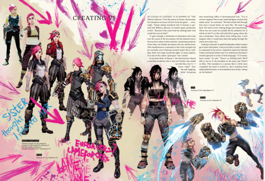
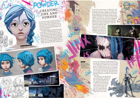
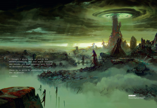
#arcane#jayvik#kz reviews#league of legends#arcane art#jayce talis#viktor arcane#video games#art of arcane#book review#visual development#character design#character art#jinx#jinx arcane#vi arcane#caitlyn arcane#mel arcane#game design#graphic design#digital art#art#art community#artists on tumblr#art school#book recommendations#book reccs#arcane season 2#silco#vander
173 notes
·
View notes
Text
Hey Look At This Comic: Smut Peddler Presents Pitch Black
I can't remember how we got on the subject of the comics that my friends Iris Jay and Nero Villagallos O'Reilly did for an old Iron Circus april fools bit. maybe we were chatting about Megan Delyani's blank frame comic Spaces, which I wrote a whole review of last year, but it might just as easily have been talking about comic structure generally. cause we're huge nerds. being a huge nerd, I was all over the premise of the joke: a fake kickstarter for a Smut Peddler volume full of comics with all blacked out panels.
it's a great gag, a full webpage duping the Kickstarter layout, with a fun tongue in cheek explanation: comics don't leave enough up to the imagination, there aren't enough interpretive gaps for the reader, so to fix that Smut Peddler will publish a bunch of Pitch Black comics where YOU have to provide the visuals. Joke, maybe, but it lends credence to frame-focused models of comics reading: it's not the images that make something a comic, but the breakdown of page space into discrete units. So goes one theory, anyway. How do these pages fare without their images?

Lin Visel deploys a regular grid of long, thin columns, with a kind of horizontal capital at the top. The speech bubbles drive a lot of the action here and there's a sense of simultaneous movement across the bottom, with the bubbles breaking the panel borders at the top and the sound effects flowing into each other below. So, there's an interesting division between the upper strip, which is relatively subdued, a moment of reassurance that exists almost in its own zone before the rush of the bottom. And, as we'll see with a bunch of the others, in the absence of images the style of the text, the shape of the word balloons, and the font colors all become more crucial to conveying what's happening (sex, to be clear). That's already a lot going on with a series of black panels.

I love how Iris's comic bakes an explanation for the blacked out panels into its narrative. The apparently dominant character gloats that her streaming site won't let her actually display the brutal force-fem pegging she's giving to some shitty gamer bro. Sure enough, at the bottom of that panel there's a black and white video control interface and LIVE signal. Text alone and the design of the speech bubbles transforms the whole diegesis of that second panel, from the floating omniscient "camera" of the other panels to a webcam. Which is crazy because don't forget, there is no diegesis at all. It's all black!
There's so many great touches in this. I love the fact that the tongue in cheek panel containing the "guy's" internal monologue ("I can feel my epic skills draining away with every thrust... along with my masculinity!") is not just a second panel on the upper strip but an inset, separating out this moment of more intimate first person experience from the more remote view of implied fucking. And look at the flowers in the final orgasmic speech bubble! This is a total tangent but I feel like a lot of older attempts at structuralist comics decomposition wanted a firm line between the panel, the image, the characters, the speech bubbles, and so on. But comic elements can constantly interpenetrate, with the apparent domain of text becoming more complex graphical elements. Also, what a cute way to depict orgasming so hard you get turned into a girl. Head full of flowers. :)
It's incredible what you can achieve without breaking Tumblr's draconian terms of service at all.

Robin Tess offers a more straightfoward humorous panel, which lets me catch my breath after Iris's hot and heavy speech bubbles. Yet, this could have been a straightfoward 2 x 3 grid, couldn't it? 6 panels? Instead, this joke about over-engineered jargon names for what could just as easily have been called a "fuckmachine" (left delightfully up to the imagination) gets its core pacing from an irregular panel format. The premise is introduced in a big splashy full-strip panel at the top, the elaboration takes up the middle row, and then the bottom, in two equal panels, displays the two part punchline. I like the subtle way the middle row panels get progressively smaller. It increases the tension as we move toward the release of the punchlines, in a way that could be easily obscured by the panel contents if the page wasn't all blacked out in this way. Like Delyani's work, it makes me want to see notable comics blacked out. It could offer a whole new perspective on the medium's language.

Speaking of which, Nero uses a series of tall regular panels that suddenly POP into one that seems to squirt across the page, the other panels moved to allow for the white negative space to show off the irregular splash of the panel edge. This could be the silhouette of literal fluid, but I also like the idea of a frame that just has this kind of irregular energy. The comic structure itself becoming unruly and fluid to highlight a climax is a staple of many comic genres, but I'd say that I see it deployed most consistently by adult creators, who seem more willing to throw page literalism to the wind in order to achieve heightened expressivity. And once again we've got this escalation to a climactic panel. Typing this up I actually realized I don't have a specific idea of what I think the visual for these panels is or should be. Part of the excitement comes from filling in the blanks, to be sure, but that's true of any comic, which requires us to engage in closure to make sense of the transition from panel to panel. No, it's the drama of the reveal of the vibe plug one character apparently has been hiding, the invitation to intimacy, and finally the release, all achieved through dialogue physically arranged on the page. I don't think this would really make sense at all without the visuals that ARE there--the buzzing sound effect that moves across panel borders and is simultaneous to rather than sequentially arranged between lines of dialogue, and the incredibly suggestive final panel shape. Even without apparent visuals, this is visual storytelling.

Abby Howard wraps things up with the most abstract of the pieces, one that doesn't use frames at all but implies panel contents simply through the convention of word balloon tails. The result is a disorienting dark mass. It's hard to know what exactly is happening here and actually I'm having a hard time imagining what the last visual is "supposed" to be. It sort of is what it is: groping claw marks raking a black void. It's part of the april fool's joke, but it's a creepy one, and it feeds into the final joke of the page: that all this overthinking, all this trying to make sense of black panels, has worn you out, made you vulnerable to the Dark. Well, looking at everything I typed up here, I can't deny the inevitability of this end. Time to get in the maw!
Actually I think this end uncovers the close relationship that comics and hypertext narratives or more experimentally formatted texts have to one another: the space on the page becomes, itself, a signifying element and a way to direct the flow of the story. It's a shame that this is, I think, still considered a bit gimmicky in the realm of professional publishing and criticism. We have all these tools we've barely employed for storytelling, made far more accessible than in the days of having to manually set type!
Well, maybe it'll all have its day in the sun, or I suppose night in its new moon, soon enough. With an increasingly puritanical treatment of sexuality in society and on the internet, maybe we'll ALL have to black the action out of our comics and leave the frames to imply what we socially no longer want to see.
Pitch Black: Comics Code Authority approved!
you can read more reviews in the Hey Look At This Comic tag and support me on Patreon at least until they get my ass for being an adult writing about comics for other adults.
#Hey Look At This Comic#comics#iron circus comics#experimental comics#indie comics#webcomics#comic review
132 notes
·
View notes
Text
Wachowski Family House Fan Layout (Sonic Movie Universe)

Hi 8'D I was writing a Sonic fic and couldn't keep the house layout straight in my head. So I hyperfixated for like 30-40 hours over the course of 3 days and recreated some semblance of the Wachowski family home based on screenshots and watching scenes on Youtube. Repeatedly. 8 |
And since maybe people don't want to do the same, I figured I'd share. X'D Please keep in mind this layout is NOT canon, and no one should use it to try and prove of disprove anything. It's just what I ended up with based on what I could find, and figure out despite the inconsistencies within the movies themselves.
Details all under the cut. And if you want to see the SketchUp model itself I think this link might work. I've never actually tried to share SketchUp models before.
Sorry these files are MASSIVE, but eh, I'm too lazy to break them down smaller at this point.
Exterior:

1st Floor:
This is the only floor I could find scenes for. So everything started from here, and is based on fitting in with this floor. Talking with my sister (aka complaining to her) I found out that the house was most likely renovated before Sonic lived there. That's why they have this random floating closet next to the entrance. It probably has to be there to support the structure after a bunch of the walls were knocked out to convert to a more open floorplan.

2nd Floor:
This floor is entirely made up by me 8'D Feel free to completely redesign it to fit your fancy. Everything is based on window placement, with the master bedroom being at the front because that's the biggest window.

Attic:
This was actually hard to place, because it could be argued that the attic is above the living room area. Especially since there's scenes that have a chimney column going through the attic. But I decided to put it above the kitchen based on that skylight window that Sonic is seen running into (that totally isn't round in that shot, but okay), and because the living room looks to have a high ceiling with nothing above it. Also I could not figure out how to get the attic stairs to work with the 1st to 2nd floor stairs also being on that side of the house.

#sonic cinematic universe#sonic movie universe#sonic movie#wachowski family#wachowski house#floorplan#layout#long post#fanfic#reference#fan concepts#I dunno what to tag this as#fanfic reference#so many screenshots#lost my mind a little over the 3 vanishing rooms#and that floating closet#redid the layout of the 2nd floor 3 times too#might be a little crazy#but at least writing will be easier
286 notes
·
View notes
Text
Grouping Selection List Items Together With CSS Grid
New Post has been published on https://thedigitalinsider.com/grouping-selection-list-items-together-with-css-grid/
Grouping Selection List Items Together With CSS Grid

Grouping selected items is a design choice often employed to help users quickly grasp which items are selected and unselected. For instance, checked-off items move up the list in to-do lists, allowing users to focus on the remaining tasks when they revisit the list.
We’ll design a UI that follows a similar grouping pattern. Instead of simply rearranging the list of selected items, we’ll also lay them out horizontally using CSS Grid. This further distinguishes between the selected and unselected items.
We’ll explore two approaches for this. One involves using auto-fill, which is suitable when the selected items don’t exceed the grid container’s boundaries, ensuring a stable layout. In contrast, CSS Grid’s span keyword provides another approach that offers greater flexibility.
The HTML is the same for both methods:
<ul> <li> <label> <input type="checkbox" /> <div class=icon>🍱</div> <div class=text>Bento</div> </label> </li> <li> <label> <input type="checkbox" /> <div class=icon>🍡</div> <div class=text>Dangos</div> </label> </li> <!-- more list items --> </ul>
The markup consists of an unordered list (<ul>). However, we don’t necessarily have to use <ul> and <li> elements since the layout of the items will be determined by the CSS grid properties. Note that I am using an implicit <label> around the <input> elements mostly as a way to avoid needing an extra wrapper around things, but that explicit labels are generally better supported by assistive technologies.
Method 1: Using auto-fill
ul width: 250px; display: grid; gap: 14px 10px; grid-template-columns: repeat(auto-fill, 40px); justify-content: center; /* etc. */
The <ul> element, which contains the items, has a display: grid style rule, turning it into a grid container. It also has gaps of 14px and 10px between its grid rows and columns. The grid content is justified (inline alignment) to center.
The grid-template-columns property specifies how column tracks will be sized in the grid. Initially, all items will be in a single column. However, when items are selected, they will be moved to the first row, and each selected item will be in its own column. The key part of this declaration is the auto-fill value.
The auto-fill value is added where the repeat count goes in the repeat() function. This ensures the columns repeat, with each column’s track sizing being the given size in repeat() (40px in our example), that will fit inside the grid container’s boundaries.
For now, let’s make sure that the list items are positioned in a single column:
li width: inherit; grid-column: 1; /* Equivalent to: grid-column-start: 1; grid-column-end: auto; */ /* etc. */
When an item is checked, that is when an <li> element :has() a :checked checkbox, we’re selecting that. And when we do, the <li> is given a grid-area that puts it in the first row, and its column will be auto-placed within the grid in the first row as per the value of the grid-template-columns property of the grid container (<ul>). This causes the selected items to group at the top of the list and be arranged horizontally:
li width: inherit; grid-column: 1; /* etc. */ &:has(:checked) grid-area: 1; /* Equivalent to: grid-row-start: 1; grid-column-start: auto; grid-row-end: auto; grid-column-end: auto; */ width: 40px; /* etc. */ /* etc. */
And that gives us our final result! Let’s compare that with the second method I want to show you.
Method 2: Using the span keyword
We won’t be needing the grid-template-columns property now. Here’s the new <ul> style ruleset:
ul width: 250px; display: grid; gap: 14px 10px; justify-content: center; justify-items: center; /* etc. */
The inclusion of justify-items will help with the alignment of grid items as we’ll see in a moment. Here are the updated styles for the <li> element:
li width: inherit; grid-column: 1 / span 6; /* Equivalent to: grid-column-start: 1; grid-column-end: span 6; */ /* etc. */
As before, each item is placed in the first column, but now they also span six column tracks (since there are six items). This ensures that when multiple columns appear in the grid, as items are selected, the following unselected items remain in a single column under the selected items — now the unselected items span across multiple column tracks. The justify-items: center declaration will keep the items aligned to the center.
li width: inherit; grid-column: 1 / span 6; /* etc. */ &:has(:checked) grid-area: 1; width: 120px; /* etc. */ /* etc. */
The width of the selected items has been increased from the previous example, so the layout of the selection UI can be viewed for when the selected items overflow the container.
Selection order
The order of selected and unselected items will remain the same as the source order. If the on-screen order needs to match the user’s selection, dynamically assign an incremental order value to the items as they are selected.
onload = ()=> let i=1; document.querySelectorAll('input').forEach((input)=> input.addEventListener("click", () => input.parentElement.parentElement.style.order = input.checked ? i++ : (i--, 0); ); );
Wrapping up
CSS Grid helps make both approaches very flexible without a ton of configuration. By using auto-fill to place items on either axis (rows or columns), the selected items can be easily grouped within the grid container without disturbing the layout of the unselected items in the same container, for as long as the selected items don’t overflow the container.
If they do overflow the container, using the span approach helps maintain the layout irrespective of how long the group of selected items gets in a given axis. Some design alternatives for the UI are grouping the selected items at the end of the list, or swapping the horizontal and vertical structure.
#amp#approach#Articles#columns#container#content#CSS#CSS Grid#css-tricks#Design#digitalocean#display#employed#focus#Forms#gap#grid#grid-template-columns#how#how to#HTML#inclusion#it#labels#layout#list#lists#Method#Moment#One
0 notes