#RWBY NEXT GEN
Text
A gift for my awesome friend, Morgan/Bowl!! @bowl-of-shortness
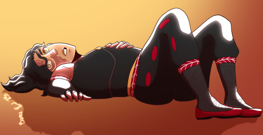
I drew necros oc and surprisingly I enjoyed drawing her chvhfhd very certain Qorbyn is my fave, I will know more about you Qorb-
Please do not STEAL/COPY/REPOST my art!!! Only the person whom this is for is allowed to repost as long as credit is given!!
#my post#my art#rwby#qorbyn branwen#rwby oc#oc#original character#rwby next Gen#next Gen#qrow branwen#Ozpin#qrow x ozpin#ozpin x qrow
22 notes
·
View notes
Text

Amaya Amin! She is the daughter of Tawny Los and Marrow Amin! She is a goat faunus as you can see, my friends helped me out with her so shout out to my pals!
#rwby#fun#rwby oc#rwby next gen#rwby oc child#rwby marrow#rwby tawny#rwby tawny los#rwby marrow amin#rwby the lynx and the hound#tawny los#marrow amin#oc x cc
5 notes
·
View notes
Text
My Rwby AUs
R&J Au
Hogwarts Au
Bittersweet Au
Crossover AUs
(CD + NG Au and Bittersweet AU are both going to have next gens)
Reverse Human/Faunus AUs
Fairytail AU
The Owl House AU
The Amazing Digital Circus AU (not planned)
Spy x Family AU
Team Swap AU (not planned)
‘No Name’ AU
Celebrity AU
Grimm Adam AU
I Woke Up as a Villain in a Parallel World (for lack of a better name, it’s an ok name I guess)
Persona 5 AU (not planned)
Acting AU
Arranged Marriage AU #1 Courtship Battles (I think my original idea was to have many suitors vying for one person)
Arranged Marriage AU #2 Power based Match Ups
Hunger Games AU (not planned)
Villain/Hero Swap AU (not planned)
Earlier Period Era AUs (not planned)
Canon, Canon Divergent + Next Gen Aus
OTPverse
Black Lotus verse
White Lotus verse
Silent Love verse
Envy Zinnia verse
Canon verse
Black Rose Lotus verse
Sunflowyr verse
Bittersweet verse
Reverse Human/Faunus verse
Arranged Marriage AU# 2
Poly NG AU (might make a rule in legacy challenge poly next gen aus, have to find lovers outside their respective universe and go into another)
Crossover verses
5 notes
·
View notes
Text
“Oh, Arc... You have not aged as gracefully as I have. Take a shower. Get a trim. Wash your clothes. You must reek.”
3 notes
·
View notes
Text
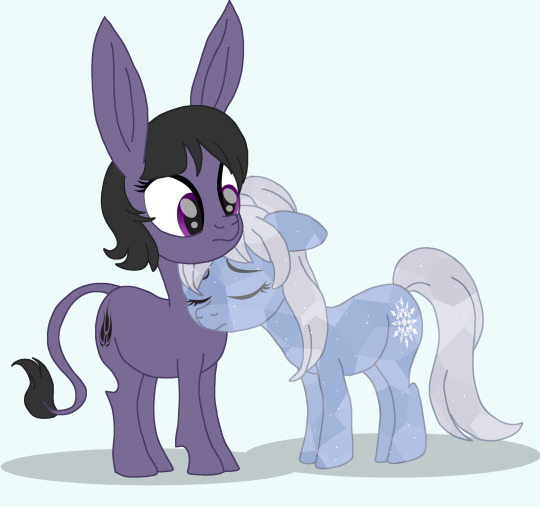
A goofy ass idea from a long time ago (this art is literally from 2021)
They’re my MLP OC’s heavily inspired by Blake and Weiss from RWBY, though you can say they’re probably just pony-fied versions of the characters cuz I changed so little about them.
Bella Donna and Winter Apple, not so hard to tell who’s who. Bella’s a mule cuz I thought a hybrid animal would match Blake being a Faunus in the show, Winter Apple is a Crystal Pony
They are next gen OC’s btw, they exist in the same universe as my Mane 6 fankids long post-Season 9
#I can’t seem to stop drawing monos as equines first the last unicorn AU and now this#my art#my ocs#mlp:fim#mlp Sketchverse#rwby#rwby monochrome#rwby checkmate#rwby checkmating#blake belladonna#Weiss Schnee
15 notes
·
View notes
Text
Round 2 #4
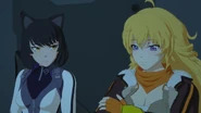
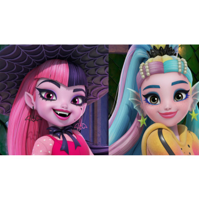
[ image ID. An image of Blake belladonna and Yang Xiao Long from RWBY. Blake is on the left of the image. She has pale skin, and yellow eyes and short black hair with cat ears. She is wearing a white jacket over a black shirt, Yang is on the right. She has pale skin, purple eyes, and long blonde hair. She is wearing a orange scarf, and a brown jacket with white puff on it.. They are standing next to each other. Blake is looking at Yang. Yang is looking down., and an image of a photo of Draculaura and Lagoona from Monster high gen 3 edited together. On the left is Draculaura. She has pink skin, pink eyes with eyeliner on, a small lack heart under her left eye. Her hair is long and it is pink on the right and black on the left. She has bat earrings. A black bat on the right with the pink hair and a pink bat on the left with the black hair. She is wearing a pink dress over a pink long shirted shirt with white dots and a black bow around her neck. She has a opened mouth smiling, showing fangs. She has pointy ears. Next to her on the right is an image of Lagoona from gen 3. She has pink skin and grey eyes. Her hair is a mix of the colors blue, a dull purple, and yellow. It is in a ponytail. She has pearls in her hear. Her ears look like fish fins. She has yellow star earring. She is wearing a hoodie with a yellow and pink gradient. it has blank lines on the sleeves. She body is slightly turned away from the camera but her head is facing the camera. End ID]
#draculaura#draculaura x lagoona#lagoona#monster high gen 3#monster high#poll tournament#poll#tournament poll#bumbleby#blake belladonna#yang xiao long#rwby#dracugoona
22 notes
·
View notes
Note
Just saw your next gen OC's, and I did a double take when looking at Lê Chiến Summer, because she looks a LOT like Ilia Amitola from RWBY.
Ha!
You know what you're absolutely right
10 notes
·
View notes
Text
Current WIPS:
SREN - Next gen RWBY fic
Heart Of A Hero - My Hero Academia fic that after over 100k words am re-doing to add more OCs (FML)
The Place I Call Home - Symphogear Fic - AKA Let's give Chris a girlfriend
I'm Okay - Jem and The Holograms fic centered around Kimber and Stormer's relationship
And my own original novel.
What even is my life?
7 notes
·
View notes
Note
hi! any plans for more fics in the wukoverse coming up? im a 20yo college student btw and i think about your fics. all the time
Hi!
First off, thank you! So much. Believe me when I tell you, it means a lot to hear it.
I haven't written in a long time. The lockdown was hard on me and there were some other fairly shitty things going down and my mental health took a nosedive. I know I'm not alone there, lots of folks are having a hard time right now. However, I went to Eurocon in the beginning of the month and spoke on a few panels and got to see a bunch of friends in person I've been missing thanks to the pandemic and it really gave me a boost in all aspects of my life.
I have two WIPs right now in the Wukoverse. One is the final chapter of the Advent 2021 collection (I know, I know!), whose prompt was Kissing and that was supposed to be a little ficlet with Jai and Poppy that turned into something much bigger and waaaaaaay too smutty to go there. It's been a year and half writing that thing! I would really like to finish it, because I personally love their dynamic.
The other is a chaptered story about Izumi's 80th birthday, where she steps down and Juziya is crowned Firelord. I actually have 4 chapters of it written. It takes place when Naoki is 16, Zhi is nearly 12, Meili is 9 and Sayuri is nearly 2. The family attends, along with Beifongs and Airbenders. Shenanigans happen, as they so often do in my stories. (Wu gets a new airship! Sayuri gets the nickname that will stick the rest of her life! Hemadri misbehaves as only a draconic teenager can! Baatar Jr just wants to go back home! Five year old Poppy is five year old Poppy! All of the Next Gen give a bending demonstration for the Firelord! Jewelry is distributed!) I really, really want to finish it because I am enjoying it, or at least in my own head.
As always, I have a few little ficlets bubbling away in there. (And a RWBY fic that desperately needs finishing as well as a very silly Xianxia mash-up crack fic I have been writing for a friend.)
I actually did some writing on the Jai and Poppy story yesterday and it is nearly done. If all goes well I will post within the next week. Fingers crossed! It would be really good to finally put that collection to rest.
I hope you are getting a nice summer break before heading back in the fall. :) Watch this space or subscribe on AO3 for the Jai and Poppy ficlet, at least!
10 notes
·
View notes
Note
In the RWBY Next Gen, did any of the original cast presumably gain some weight when raising their kids?
Jaune did, or more accurately he sort of went back a bit to what he was like before training. Kind of noodly but still pretty strong. He’s a professor at Beacon, so he needs to be in shape but not fighting for his life fitness, ya know?
I’ve always headcanoned that a sign Nora is happy somewhere and feels safe is she puts on a little weight, because she doesn’t feel like she has to ration every bit of food she gets. So she gets that strong man pudge to a degree
I don’t think Weiss could gain weight if she tried, Ren either. They’re scrawny til the days they die. Pyrrha, Blake, and Ruby find comfort in staying in fighting shape, so they stay pretty fit.
I honestly can’t say for Penny either way, we don’t have any canon knowledge of even what she LIKES to eat. And of course she doesn’t need to work out at all, her body is always at peak performance. So I really couldn’t say
Yang gets that butch dad bod, like she deserves
#rwby#jaune arc#ruby rose#yang xiao long#weiss schnee#nora valkyrie#lie ren#blake belladonna#pyrrha nikos#penny polendina#rwby next generation
47 notes
·
View notes
Text
rwby v10 predictions:
its just rwby v1-3 again except its a major timeskip so they dont have to actually finish the story and they also dont have to write actual depth for any relationship and now its next gen with bumbleby twins and a rosegarden kid and a whiteknight kid and ruby is missing just like summer and yang is off doing something qrowlike searching for ruby while blakes on menagerie and weiss is running the sdc while jaune is like general of vale or some ironwood/ozpin equivalent and its just rwby again guys i cant stress enough its literally just rwby with next gen characters
7 notes
·
View notes
Note
So have you thought about RvB characters RWBY style like you did with Young Justice and Owl House? Blood Gulch Crew, Freelancers, Chorus, Shatter Squad, etc.
Well, I already did the Meta as a RWBY Story Idea, and I know he used to belong to a team with other Freelancer characters...
But other than that, I think the Blood Gulch crew would just be a collection of regular soldiers. Like, Lopez as a reprogrammed Atlesian Knight.
I did include Grif (Gris) and Simmons (Cinnamon) as background characters and airship pilots in my Next Gen AU.
2 notes
·
View notes
Text
Extra! Extra! Here’s an update as to what I will write and post! Please read and request if you feel like it!
FANDOMS: Baldur’s Gate 3, Resident Evil, Halo, COD, Devil May Cry, My Hero Academia, Black Butler, Naruto, Hetalia, Gen Lock, Red vs Blue, RWBY, Fast and Furious, Harry Potter, etc)
IF YOU DONT SEE SOMETHING LISTED PLEASE ASK! I WILL REPLY WITH AN ANSWER!!!! ❤️❤️❤️
TOPICS I’LL WRITE: Angst, Comfort, Hurt, Injured(Character/Reader), Dead/Dying(Character/Reader), Mental Health(Depression/SH/PTSD/Etc), Smut, Fluff, AU’s, and Gender Bends.
WHAT I WILL NOT WRITE: Rape, Sexual Assault/Abuse, and Incest.
IF YOU REQUEST IT YOU WILL BE BLOCKED AND YOUR COMMENT DELETED! DON’T TEST ME!
EXCEPTIONS TO THE RULE: If it is requested that the reader has gone through being raped or sexually assaulted/abused in the past and want it mentioned to the character requested in a scene where it makes sense I will include the mention of the past action. But I will NOT write the present action of the event taking place.
I WILL WRITE FOR MOST CHARACTERS!!!
DISCLAIMER: Any and all characters requested below the age of 18 WILL BE AGED UP!!! If you don’t like it ask someone else to write it.
This concludes my rant/update!!! Thank you guys for reading! Please request if you want! Ask me questions! DM me questions if you don’t want to comment!
Until next time Darlings!
#rules#writing#x reader#request rules#fanfiction#request#request away#ask me anything#anon ask#ask#send asks#asks open#send me asks#dms open#dm me#character x reader#character x you#character x oc
2 notes
·
View notes
Text
Here are some the ships I ship or am ok with, and am planning to build an next gen AUs and maybe AUs in general:
Main Next Gen AU: Rose Lotus, Iceberg, Elderburn, Thunderfeet, Tauradonna, Ironwitch, Neon x Sage, Rich Data Farmers, and I’m still deciding on other ships (maybe Arkos if Pyrrha got revived or a seperate AU where she didn’t die but is not the same).
Minor or Secondary next gen AUs: Poly AU where everything is I ship is canon, like canon compliant, divergent, any specific au type really, plus a next gen.
#rwby#rwby ships#rwbabies#writing prompt#next gen#Ruby x ren#iceberg#elderburn#thunderfeet#tauradonna#ironwitch#neon x sage#Rich data farmers#broken machines rwby#rich farmers rwby#data farms rwby#possible arkos
3 notes
·
View notes
Text
Introduction
Hello everyone! this is your resident artist and author here! my name is Kat/Lime! I hope we can get along and I hope to grow more on Tumblr like I have on Instagram...I don't have very many followers on either BUT I like very different things and I hope we can find a connection and possibly fan over art and other things?
I have an Instagram as well if you guys wanna follow me there (artsykidwolf_2000). I also post art there too and would love the appreciation there as well. (Before you ask NO I'm NOT taking Commissions at this time for I have NO way of actually doing them at this time and idk about Art Trades other than with mutuals/friends) (I've been getting DMs if I am and I listed specifically on my bio that I don't! I will update all of you when I'm confident in taking commissions!!!)
Here are some things I have made/are proud of:
My Original Story Series called Last Pegasus! It's a fantasy magical adventure type story based off a lot of things I'm interested in over the years (give or take) and I have SOME works and art based off the story itself or putting them in silly outfits of different fandoms or something hehe... I'm really hoping this series will be my pride and joy once I figure how to get my stuff organized and whatever else is needed comic or just a story otherwise...
Next is OC-TOBER, a OC appreciation type drawing/writing prompt challenge to where the weekly prompt helps you to share your original characters based on that prompt! I already have a few (as of writing this) and there's more to come (hopefully)
My art in general is what I do the best, sure I'm good at writing but I'm not the best best. I hope to grow as I go along and discover more and more tips n tricks and new art friends along the way! I have plenty to show but I'm taking my pace with it to not burn myself and y'all out lol.
My OCs are like Family to me, especially some I keep REALLY close to my heart, and I hope to share more about them
Here are some Fandoms I'm REALLY into/know very well (I have ADHD so it changes sometimes to my hyper-fixation lol):
(most of these are not rank per position on list, permanent hyperfixes are in this color. common ones in this color)
For Games/misc. I like:
Final fantasy
Zelda
Kingdom Hearts
Fire emblem
Monster hunter
God of war
Slime rancher
Pokemon
Dragon age
Sims
Splatoon
Dungeons and dragons
Subnautica
I also like some Vtubers
For anime/shows I like:
Fairytail
My Hero academia
RWBY (Like the concept don't like the company)
Ancient Magic Bride
One Piece
Dragon ball
Naruto
Little witch academia
Avatar the last airbender/Korra
Avatar (James Cameron)
Star Wars
Dinosaur (the movie)
Prehistoric Planet
Monster High (all gens)
My little pony (most G4 but G5 is alright too)
Ghibli movies
Lots of Disney movies (I can recite a lot of them "word for word")
Nature/Historical Documentaries (I'm a nerd, I also love OSP (Overly Sarcastic Productions) their podcasts and videos are hilarious)
Feel free to ask if I know more these are the ones I could name off the top of my head hehe
Thank you for coming and I hope we can all be friends and hopefully you like my art alot hehe. Thank you bye!
#art#my art#my oc#original character#final fantasy xv#final fantasy#zelda#legend of zelda#final fantasy 7#fire emblem#monster hunter#anime and manga#pokemon#meet the artist#meet the author#dragon age#kingdom hearts#last pegasus#golden hearts and silver stars#dnd#dungeons and dragons#dinosaur#prehistoric planet#my little pony#avatar#star wars#one piece#ancient magus bride#documentaries#disney
2 notes
·
View notes
Note
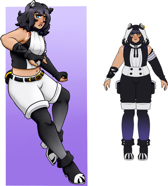
What details have you changed on Teams RWBY and SPRN?
Glad you asked! Really, the only ones who haven’t been redone at all are Sun, Pyrrha and Ren, simply because I love their designs enough that there really wasn’t anything I wanted to change!
I am going to be showing pictures of all the outfits that have changed from their previous appearance. If one isn’t shown, it’s just because I haven’t changed anything about them, so this post is a bit long.
But now starting with Ruby:
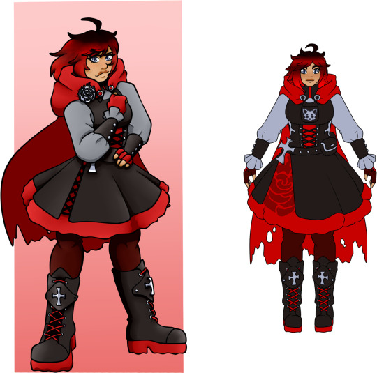
Not much has changed overall for her Mistral design, but changing a few details have really pulled it from being my least favourite Ruby design of the lineup. It’s probably still on the bottom, but it’s far better than the first attempt.
I widened the gap in her skirt to show more of the red petticoat underneath, and took the V2 inspiration with her emblem being printed there rather than as an emblem on her cape like in the original. I like the more natural inclusion of it rather than the constant clip either on her cape of her belt, and it leaves room for her cross imagery.
Besides that, I added some silver buttons on her belt and the silver thorned stems on her corset. I think it looks cute and really adds to Ruby’s rose theme. The dog on her chest pouch was always there, but her pose in the original piece just covered it so you couldn’t see it.
Plus, I tweaked some of the colouring choices, namely on her gloves and the pins holding her cape. I didn’t know how to make them not look dumb and also keep the red on her arms to keep the colour flowing. I decided to go for a deeper maroon colour, and I really like that more toned back colour rather than the bright red from before.
Not much really changed for her Atlas design, and it still remains one of my favourite from Team RWBY as a whole. The only difference is that the silver thorn design on her corset carried over and stays on all her designs barring her first one.
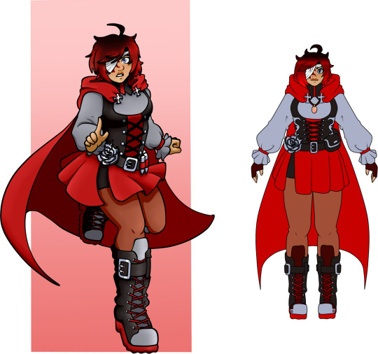
I changed a few things around for her Vacuo design and I honestly like it more now.
It’s still very similar to the OG design, but I added the thorns on her corset, a pouch replacing the hanging bullets, and the silver inside of her boots were changed to a maroon instead. The silver before really did help set apart the red laces, but I think with all the extra silver she has now, the large areas of silver on her boots were just a bit too much.
Also, she now has a necklace! It’s a sunstone, and I like how it incorporates the goldish yellow from Yang into her design without being too much for Ruby’s more gothic colour pallete. I gave her the same maroon gloves from her Mistral outfit, it’s hot in Vacuo and her hands need protection when holding Crescent Rose.

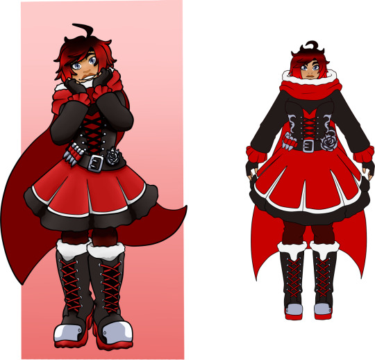
Okay, biggest change for Ruby’s adult design is her hair. I actually don’t know why I didn’t change it since the OG is specifically for AZRE still, and the lore that SEW start showing white hair earlier on in their life has been established since new the beginning? So, idk why I didn’t do that in her adult one????
Either way, her hair is mostly white now. You can still see some reddish black on the tips, but by the time Ruby’s in her early 30s, which is the start of AZRE’s next gen sequel, her hair has gone nearly completely white.
I also changed the silver of the boots to white just so the colour flows a bit better and she actually have Weiss’ colour on her. With the addition of the thorns, all the metal, and the new silver lined pouch instead of her bullets, the silver is still kept pretty consistently in her design so I can sacrifice it in her boots for white.
Also her sunstone is still there, of course, and her maroon gloves. I just like how it adds a further level of protection for Ruby’s hands, and the darker colour helps with the black to excentuate the red. Her rose decal on her tights is a little hard to see, and I did mention perhaps lightening it in further drafts to see it better, but when I did it just looked too much and cluttered her legs, so I kept it black.
I’m starting to like it more, like a more hidden detail to her rose theme rather than apparent like her rose clapse and corset thorns.
Next is Weiss:
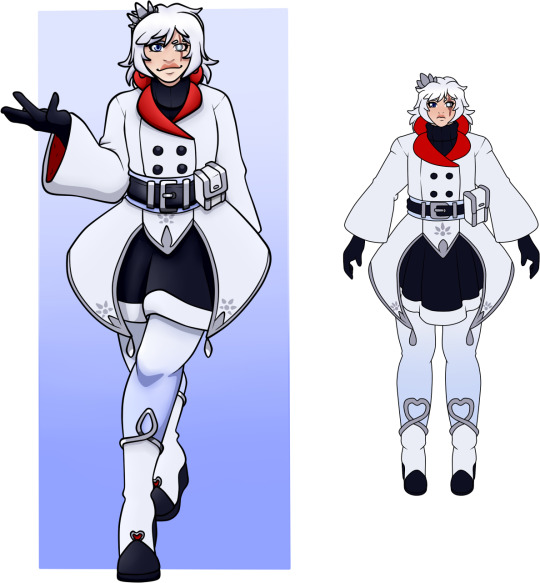
The only thing that I changed on her Atlas outfit was the shape of her boots, removing the red apples on the bottom and instead having the boot trim be the apple shape instead. I like it but you can clearly see that somehow the shape of an apple continues to allude me.
Now I completely overhauled Weiss’ Vacuo design, and I like this one a lot better.
I still kept some of the main features of the OG design in this revamped one. She still has the short, bell shaped sleeves, with added black gloves underneath for both protection and to balance the black on her design to include her arms. The pouch was also moved to the front, and I added a second black pounch on her belt.
Her long jacket style was changed to have a completely closed front rather than the open chest area, and the front white frills now go over her longer black skirt, keeping that wide skirt shape that Weiss uses while balancing the two colours more. Similar to that, I added thin tights to protect her pale legs, and darken her legs so that the white boots stand out more.
Her boots haven’t changed too much in look. They still have the black soles, silver trim and red gems, but they’re longer than before and the dip isn’t as extreme in the middle.

Fun fact, this was the original design for my Adult RWBY a few years ago, back when my edits were absolute garbage.
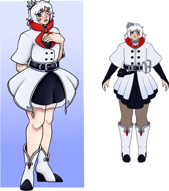
Same with her Vacuo design, I completely revamped the OG design for the new one. Before, it felt kinda old fashioned, in line with how Atlas was decades before, and I wanted to go more into a business woman style with Weiss’ known design features.
I replaced the more poofed sleeves for the normal bell shapes, with the black fur and the shorter black gloves. The actual jacket was made more into a long coat type, with the original strapless dress now more of a sweater dress like her atlas one, just now without the white trim and less poofy. I did keep the idea of the blue sash around her waist, but it’s tied at the front in a more normal way, and the large frill at the back let the red on the inside that you see mostly in the collar travel down to her legs, like her Beacon design.
I finally remembered the tights. The OG design was meant to have tights, but every time I kept forgetting because I would be using previous works as refs, and then remember like ten days after finishing. Either way, the tights work similarly to her Vacuo tights. They darken her legs to make the boots stand out, and also work in keeping her legs warmer than just having them bare, since she lives in Atlas.
Her boots are pretty much the same, just more form fitting at the top with added silver decal. The previous red details were swapped for black and really they’re kept pretty monochromatic, since the big red collar, the added red pin, and the visible red of her coat tails more than keeps the red in her design.
Along with the slightly different design of her crown, which is meant to allude to the petal shapes of Blake’s emblem, Weiss’ hair is longer as she gets older, but it’s never going to get as long as it originally was. She keeps it in a low ponytail similar to how it is in the OG version.

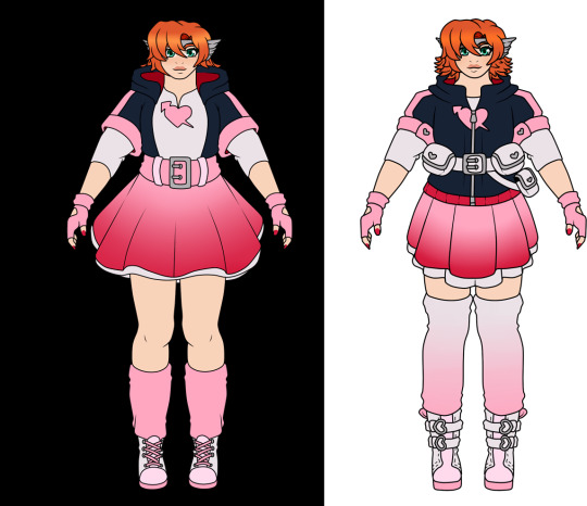
A minor thing for all of the Blake designs is that the scars on her shoulders are more visible, rather than being hidden by the straps of her backpack. Simply because of how big Iya’s claws are, it’s strange that they were so close together.
Now for her Menagerie outfit specfically. the upper half of her design remains pretty much the same; her top, backpack, different length gloves and ribbons, stomach scar, and her white belt and pouches were made bigger compared to how tiny they look on the OG draft. Her bottom half was changed up more.
Her previous pants were meant to try and replicate her canon Mistral pants, but honestly felt a bit plain since her boots are much shorter than the thigh highs. So I still kept the black pants with the purple tint, and added her emblem on her thighs with white lines similar to her V2 pants. Both the tint and the lines help to separate her black pants from her black boots.
The boots still have the paw decals and the white soles, but since her emblem is on her pants, I removed the metal emblems from the top of her boots and had them as stringed up boots instead.
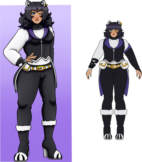
Really, the only difference between these two is the colour of the top of Blake’s left glove and her inner coattails. Both were white in the OG draft, but i changed them to purple instead.
Similar to Weiss’ Vacuo outfit, I completely revamped Blake’s Vacuo look.
The style of her shirt is pretty much the same, but I added a hood with some cool shadow decals at the bottom, adding some white to the top of her head and also protecting Blake’s face in Vacuo. The gloves are pretty much the same, only that I changed her right one from black to white, just so there’s some white there and the black ribbons stick out and keep the black there also.
As much as I love showing scars on my characters, I did swap the more crop top for a completely covered hoodie and highwaisted shorts. They took up too much when I made them completely white like in the OG, so I had the top and bottom rolled up bits as white and the middle black. On the sides, she now has pockets similar to how Sun’s jeans worked also; extra storage and something to look at on her legs.
Her tights were black with white gradient in the OG design, but I decided to keep the purple tints just so Blake can have what little purple she does and stops her from looking completely monochromatic.
Her boots are pretty much the same also, I just added the silver buttons on the rim just like her Beacon boots, and because they look cute.

Her adult one is pretty much the same save for a few tweaks. You can’t see on the original because of the pose, but the front of Blake’s jacket didn’t actually have the gold buttons on them, which I decided to add.
The only other thing is her boots. The top rim was originally white, but I changed them to purple instead to separate the white rim from the white pants. Plus, I remembered Blake’s emblem and added it to her left boot, similar to how she wore it on her left thigh in Beacon.
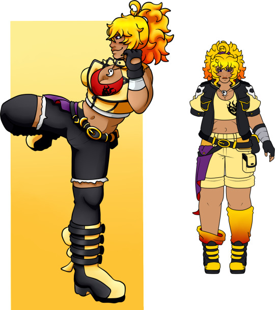
Finally for the team, let’s do Yang:
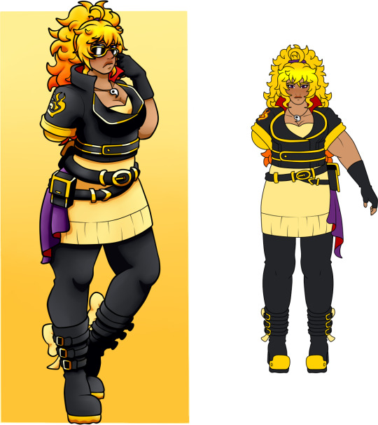
Same outfit, but I actually remembered that Yang did in face lose her right arm so any pouches and things she needs to grab is on the left side.... where she can reach it.
Other than that, I added some gold metal on her boots and changed the yellow soles for black. It just concentrates the yellow a little bit better, and stops the bottom part of her design from looking a little lacking of her colour.

Same thing, her pouch was moved to the left instead, and the gold metal soles were added to her shoes. The silver armband was always a design point, I just never included it in the OG draft, and is actually one of Eirian’s silver wristbands that she gives to Yang.

Besides Ruby, the Vacuo designs really weren’t something I was jiving with.
For Yang, I swapped the leather jacket she usually wears for the more comfortable jock jacket. Is it the jacket I designed for her Ice Queendom redesign? Yes. Do I care? No.
I love the softer yellow sleeves and her emblems on the top, and the flames on her middle to add to her fiery design. Her pouch was moved again, the sash is more buttoned on, and the inclusion of her silver wristband is still there. Her shorts are still the same, just more detailed with added pockets and lines for interest, but the thigh high socks were replaced with shorter yellow and gold gradient socks and kneepads.
Boots kept the metal front like her other designs, removing the belts, and swapping the black soles for yellow. Overall, I wanted this design to be lighter, since I didn’t want Yang in so much black while in Vacuo.
Yang’s adult outfit has been changed twice actually. I had a previous version that I decided I didn’t like as much and redid it today, and this is the finalised version.
I honestly moved away from the leather, geared up biker chick that Yang was and instead went for a more casual, lighter wear. She has the lighter black jacket with different toned sleeves, both having ursa skulls as a little nod to her allusion, and uses far more lighter cream yellow in her design than black. I like to think her shorts are more like khakis, similar to what Taiyang wears.
Her socks are different lengths to add a little assymetry to her, and her boots moved completely from the buckles to velcro for easy access. Really, I wanted Yang to look more comfortable and settled in an calmer life, rather than all geared up and ready for a fight.
Onto Team SPRN, I only changed one outfit out of all of them which is Nora’s Vacuo outfit.
I mentioned in the ask talking about Team SPRN’s designs that I wanted to redo Nora’s Vacuo design since it was very similar to her Mistral one and I wanted to change it up a bit.
I still went for the original idea of the light hoodie but just fixed the proportions slightly. The thing rim of her sleeves are now clasps, the hoodie zips up in front of her white shirt, and her belted skirt is swapped out for a more pleated skirt and a white belt, adding another pouch for extra space. A lot of the buttons are heart shaped too, which I thought was cute.
Her short leg warmers were swapped for longer thigh high socks, which are now white with a pink gradient rather than the solid pink before. I wanted to protect more of Nora’s bare legs and keep the lighter colours throughout it, plus the pink on the bottom helps so that the white boots she wears are not lost in solid pink socks.
The belts on the boots are clasps to help secure the boots on, and I shaped the buckles as more hearts. Nora could always do with some more cute hearts in her look.
Looking at them now, I much prefer the newest version to her original.
12 notes
·
View notes
Last Seen Blogs
lumichi
Lumichi Land

rythmsole04
rye bread

evgenij294
Без названия

ufc250nunesvsspencer
UFC 250 Live Nunes vs Spencer Online Streaming

mega-stock-stable
Stock & Stable