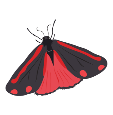
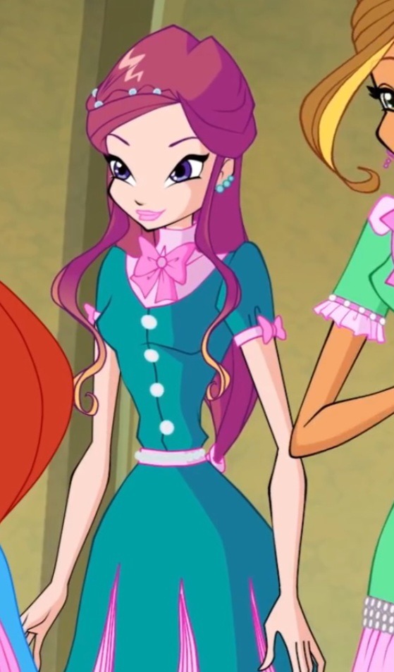
#Redesign the outfits a little so they make Sense-
Text
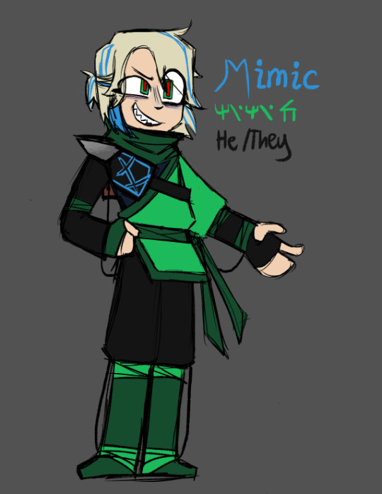
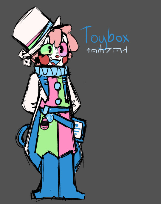

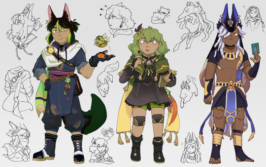
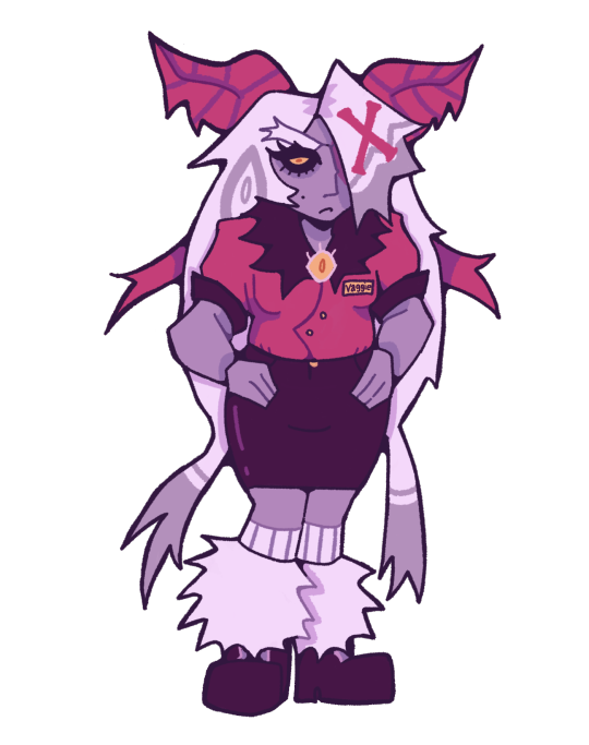
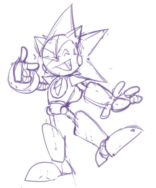
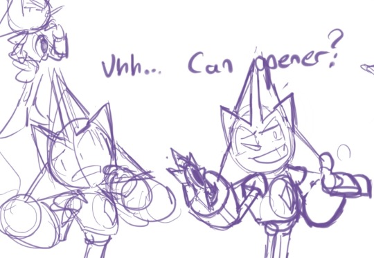
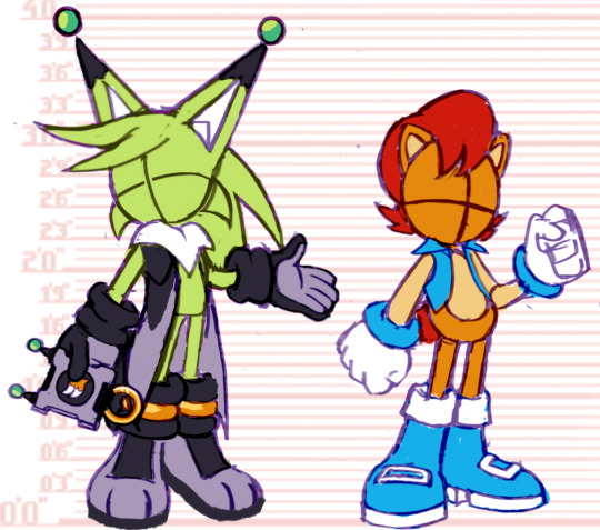
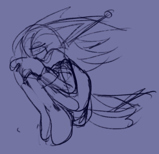
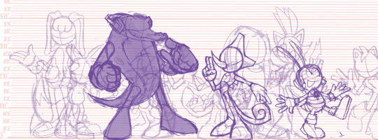
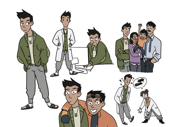
I dont Normally Post about oc's- but heres my Ninjago Villain Oc's- Mimic and Toybox- I Really wanted to make a Fan season- and They just sort of happened- Toybox is the Em of Imagination- Since it Fit with the Toy/Circus Theme I went with- and Mimic is Someone Toybox Made with their Elemental Ability- These images are Sort of old- but lmk if y'all would be interested in hearing More abt them ig-
#Ninjago#Ninjago Au#Technically?#Ninjago: Showtime#Ninjago: Nostalgia#Mimic (Oc)#Toybox (Oc)#blues art tag#blues.txt#These pictures are kinda old- and Dont make sense anymore since I didnt have a Timeline in mind when i Originally making them- So i might#Redesign the outfits a little so they make Sense-#Esp the Skybound one- The more I look at it the more the outfit looks inspired by the Core Designs- Whoops-#Ninjago Oc#I Forgot to add that Tag originally my bad#Program Files#My Documents
67 notes
·
View notes
Text
im definitely redesigning my sona next year lmao. it has only been two months* since i designed him but still 😭
#jay talks#with next year it can mean in january once im done with my current wips#or in 6 months (once im done my current wips too /hj)#but i definitely have to redesign this guy#not saying the design is BAD#i probably will keep the outfits (but i’ll change some little things lol)#but it’s so annoying to draw 😭 the glasses dont make sense#the stupid braids never look right#the gloves look stupid and the colors are too purple#idk if i’ll introduce like. another color for contrsst#contrast* or if i’ll try to make the design a bit more saturated or something. idk but rn it all looks the same and it’s weird?#idk but yeah i have to change a lot of stuff#i had to make a clean character sheet anyway so it’s not like im giving myself more work or anything#i just dont want to draw another pfp 😭 i probably should make a base for pfps tbh#or a picrew lmaoooo
0 notes
Text
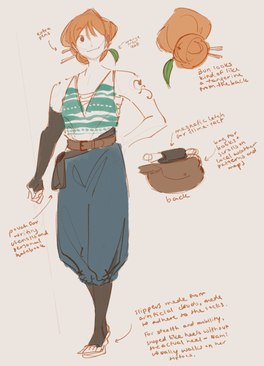
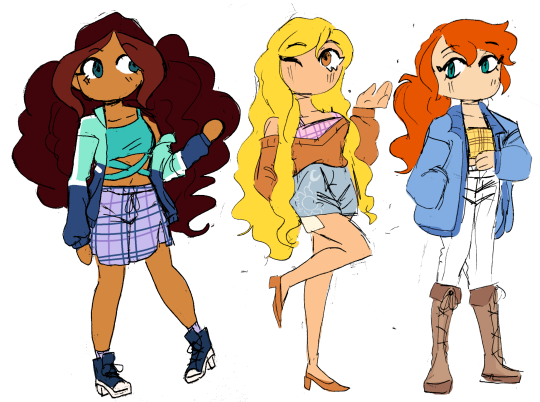
Straw hat women redesigns :) I was trying to doodle some of the crew and came to the realization that I just Could Not with Nami so I wanted to play around with it a little bit
Some more design notes below:
Nami’s design actually went a lot smoother for me than Robin’s! I think canon post timeskip Nami is a very low bar. While you can argue that to some extent Nami being vain and seductive is part of her character, I do feel that there are many more integral parts of her character that can be highlighted in her design, namely map making and her combat. Though not one of the stronger straw hats, Nami does seem to be well practiced with her staff outside of its use for weather manipulation, and I think her being a physical combatant, even slightly, can be better reflected with more loose clothing for better mobility.
For her mapmaking, I wanted her to have constant easy access to her tools and to information about the locale, so around her waist she has one large pouch at the back for books and scrolls and maps in progress and one small pouch to the side for writing utensils and measurement tools. As backup she also has 2 pens in her bun, which also act as pins for keeping her hair up if she ever needs to move a lot.
I’m not sure how clearly it shows up in the notes, but Nami’s shoe soles are also made from whatever artificial cloud material makes up the weather island she stayed on during the timeskip, so that it both pads her steps to make them soundless and bounces for better mobility. The shoes are naturally shaped like heels but without the actual heel, since she tends to move around on tiptoes anyways- a nod to her epithet as cat burglar and her past as a thief.
I made her shoulders a bit broader because I think they probably get a lot of exercise with her staff, and changed out the bikini top for a more supportive chest wrap, with a loose tank over it for breathability. The compression socks and sleeve are more stylistic than anything, since I like layers, but they might come in handy for her if she spends extended amounts of time sitting down making maps for the crew.
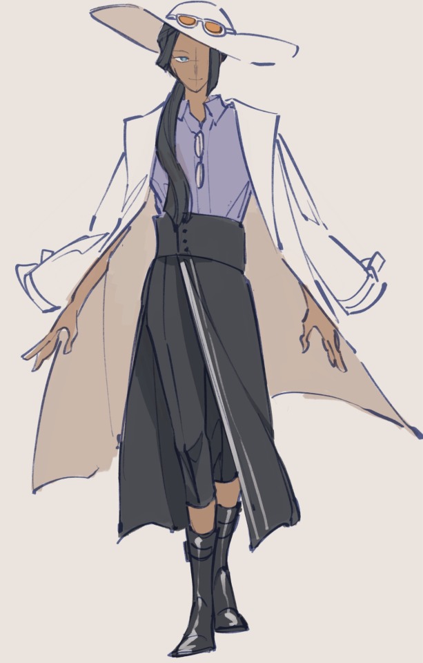
Robin’s was a bit more difficult for me to figure out, and I might go back and revisit it at some point. For Nami, it was a bit easier to imagine what would pair well with her combat methods and her needs as a mapmaker, but with Robin, she’s an academic who fights almost completely hands off, without a specific weapon to her name. Because her strength lies mostly in her devil fruit, she has a bit more room for style over functionality, but I also still wanted her to have something that made sense with what she was. I don’t really think I succeeded in that regard, but it’s also hard to convey what she does visually— she’s more of like a professor than a field archaeologist I think.
I really really enjoy her cowboy hat but I didn’t think it would match with the rest of the outfit so I switched it out for a wider brimmed hat and kept the orange sunglasses on it, as a nod to the revolutionaries with the combination of headwear and eyewear. She deserves a trench coat. I don’t make the rules. And the rest of the fit mostly came down to things I think I would enjoy wearing, haha
The trench coat is partially a nod to the scholars of ohara, who seem to wear white coats like lab coats in some screenshots of robin’s backstory. I think also the reading glasses help to make her seem a bit more academic, but aren’t prominent enough to leave a strong impression. All in all I do wish robin’s design had more functionality in it but I also think that robin is a character who probably enjoys dressing up nicely like this, especially in the comfort and stability of the straw hats.
1K notes
·
View notes
Text


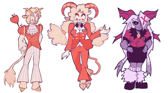
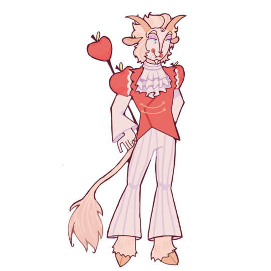
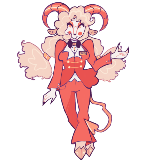
Luci and Adam redesign/my version! 🍎🎸
Here’s the brief explanation n a bit of lore for why i designed them like this! (Warning, it’s basically just me rambling LMAOO)
Lucifer 🍎:
I let him kept the whole angelic aesthetic cause even if he’s a fallen Angel his features didn’t seem to get distorted or turn “demonic” (from what I’ve read anyways), so by that logic he can still be God most beautiful Angel, and it fit too cause Demons are usually more attractive or good looking to lure in people, deceiving people with their good look. He’s also kinda stuck in the past so usually he’ll appear in his heavenly robe or any old school outfits that he deems old enough
Lucifer in my version is more similar to his pilot personality, he’s more king like in this sense! And of course he’s pretty prideful, and is in denial about having Fallen, he still present himself as if he’s a pure Angel and hates having to interact with Sinners, he’s more lenient with hellborns as they are his rightful subjects after all. But yeah, anyone that isn’t him is often meet with nonchalant or cold attitude, he also doesn’t really care about Charlie whole Hotel, he doesn’t support it nor does he hate it. Cause it have nothing to do with him, he does think it’s a little silly and speak to Charlie like she’s still a child essentially. (He still like ducks in my ver heheheh)
Adam 🎸:
I wanted him to have something nature related in his outfit so I gave him some leaf lol, and his fit is changed so that it resembles a priest outfit more than a simple dress, the halo on his neck and hands restricts his powers, like a power dampener (I based them off of Sun Wu Kong headband!), the seraphim uses it to control how he acts, they can also communicate with him through them, commanding him without using too much energy, Words of god kinda thing. These halo can weaken him A LOT like at some point it can even stop him from using powers entirely, it doesn’t hurt him physically. The halo on his head make it so that anyone who look at him will only see a blur, or blurry version of his face
His helmet has three faces, when he’s wearing it he can see from either sides or all of them, it help him counter attacks, his exorcist uniform is just like his normal outfit, just with more gold, the horns on his head emit holy light, stopping any demons n Sinners from looking at him unless they want to lose their sight, he can also use it to gather up energy to shoot out a massive beam that can erase anything in it path. His wings are based on duck wings but more durable, water and blood can’t stick to it which is fantastic for clean up!
#fanart#hazbin hotel#adam hazbin hotel#hazbin hotel adam#first man adam#hazbin adam#adam#hazbin hotel fanart#hazbin art#adamsapple#lucifer x adam#adam redesign#hazbin hotel Adam redesign#lucifer hazbin hotel fanart#lucifer hazbin#lucifer hazbin hotel#hazbin lucifer#lucifer morningstar#hazbin hotel lucifer#lucifer redesign#hazbin hotel Lucifer redesign#hazbin hotel redesign#redesign
271 notes
·
View notes
Text
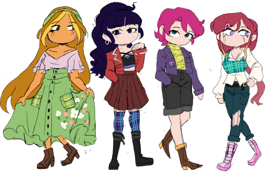
I decided to have a go at doing my own redesigns because these three are my favourites and I love them very much. further notes + sources under the readmore (warning: lots of text). I did my best with the research, but if there's anything I overlooked, I'd really appreciate people letting me know :)
Tighnari:
My main source for Tighnari was this excellent thread, from which I looked up each item of clothing individually. Since djellabas tend to be quite long, and Tighnari needs mobility for forest ranger activities, I figured he would cut and re-hem the lower half. He also has a lot of clothing pieces that are traditionally multicoloured, but to keep his design cohesive I decided to use the same colours across different items, but using a larger palette of colours than I would usually. I like the bright colours on him a lot though!
There are also some minor details I just changed because I wanted to. The flower on his chest is now a nilotpala lotus, because I thought it was nice to include his acension material/the material he asks you to help gather. The dirt stains/scuff marks are because rainforests are muddy and I wanted the design to emphasise Tighnari being very practical and hands-on with his work (see also, the specimen belt).
Finally, I shrunk the magnifying glass on his back (because I'm pretty sure it's meant to be his first magnifying glass toy and that thing is very large for a child to handle) and gave him an undercut because it seemed right. Also, I merged his front and back trailing cloths into a scarf type of thing that he could wrap around his nose and mouth to prevent inhaling spores from mushrooms.
Collei:
COLLEI my beloved. I had a mild nightmare trying to figure out a specific source culture for her design, but nobody seemed to know specifics and her outfit wasn't matching with any traditional dress I looked up, so in the end decided to keep the overall look the same. Just in case I assigned her something else, but then it turned out I missed her actual inspiration.
Anyway, I made her shoes simpler (no fur, heels, and open toes in the rainforest seemed reasonable to me), and gave her shorts. I liked the green colour because it's pretty unique under a dark dress, and pairs nicely with Nahida's white dress + green undersides. Amber's tie stays, but I made most of her jewellery smaller since it felt a little clunky for a trainee ranger.
Her earring and necklace(?) are allusions to the Evil Eye and the Khmissa/Hamsa, both symbols of protection. Especially considering the fact they're meant to ward off evil, and very common across multiple MENA cultures, it seemed fitting for Collei to have them. Also, she has Eleazar scars, and I used the design for her stockings as inspiration for the combination knee braces (similar to those used for arthritis, since Eleazar also causes stiff limbs and I HC that people affected would probably still need some recovery support)/knee pads (in the case of a fall). I like the idea that Kaveh would have helped make them for her (tangent but the fic Here is the House explores similar ideas; it's really really good, I heavily recommend it). Finally, she has curly hair because I thought it would be cute.
Cyno:
Here's the thread I found for Cyno. The main critique was to do with the eras from which each aspect of his clothing drew inspiration, but I admittedly wouldn't be able to do much about this without a lot of research. One thing I did try and verify was the small strip of cloth on the left of his chest, and I found a few wall murals where the people seem to be wearing similar strips of cloth? (example here; rightmost figure) Therefore, I didn't remove it, but if someone wants to explain Ancient Egyptian clothing history to me I'd be really interested to hear it 6.6
I might iterate on the design in the future, but for now the changes are mostly HC territory. Cyno wearing his hair in locs (a protective hairstyle) makes sense for someone who does a lot of hiking after rogue scholars, and I also gave him quite old and faded top surgery scars because healthcare is canonically free in Sumeru (thanks for that information, al-Haitham)(though tbf Cyno makes bank anyway). I also adjusted the colours a bit, since Genshin tends to use desaturated shades for metallic elements.
I also considered giving Cyno more scars, but figured that it could indicate Hermanubis' presence that someone you'd expect to get injured a lot is relatively scar-free (i.e. some sort of godly healing factor/resistance to damage). However, we know next to nothing about Hermanubis, so Cyno having a lot of scars also makes sense. This paragraph is mostly just a cry for help cyno story quest 2 literally any more elaboration about the nature of Hermanubis' pact and the Temple of Silence.
Conclusion
I wasn't intending to write one when I started the explanations but this got REALLY long so if you made it this far, thank you so so much ToT please check out the links; the threads especially were a great resource, and I'm grateful that people take the time to make them <3 genshin's character design department are cowards but I'm glad I learned some new things through the redesign process
#FINALLY#IT'S DONE#I don't know why this took so long. maybe because I was trying new art style stuff#anyway I like how this came out!! my favourite guys#my main thoughts for each of them were like. tighnari <- kind of a chad. collei <- should get to wear shorts. cyno <- gap moe#<- i say having written 9 paragraphs about the development thoughts under the readmore. wahey#big shoutout to everyone who draws the archers ripped. you guys are inspirational#genshin impact#tighnari#collei#cyno#my art
412 notes
·
View notes
Text

I redesigned madeleine for funsies though idk if I’ll use this one in more of my art, I may but idk if it’s too off model
I just changed his outfit to have more armor, his sword, and gave him the wings, also under lashes to match his mom
I also tanned him a little cuz I never really thought the gold looked great on the paler skin kinda just blends in too much, and plus I imagine he’s out in the sun a lot so I thought it makes sense
#madeleine cookie#crk#cookie run#cookie run kingdom#crk fanart#cookierun kingdom#my art#art#cookie run redesign
297 notes
·
View notes
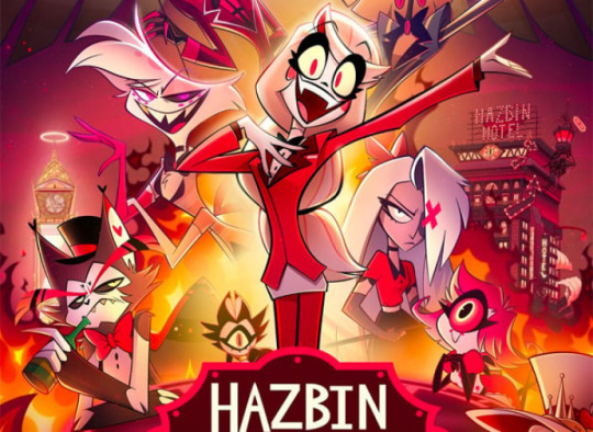
Text
Hazbin Hotel Redesigns - Part One!
brainworms told me to hyperfixate on hazbin hotel and i did. so here are some redesigns! i'm planning on doing all of the cast, starting with the big (little) guy of hell himself, charlie, and vaggie!
next is going to be the hotel staff (niffty, alastor, and husk)!
individual pngs and redesign notes under cut
Lucifer Morningstar - He/him, trans man, bisexual
he has goat hooves, horns, and ears, as well as a little goatee:-)
his tail is a lions, since lions symbolize jesus, royalty, and also are a little nod to pride.
he doesn't keep his wings after he falls from heaven. i know he has his wings in the og show, but i never understood why. he lost his wings in the fall and still has feather growth, but they turn into these weird malformed lumps of flesh and feather instead of actual wings. they're quite itchy and uncomfortable for him.
longer hair, for fun! as well as lots of apple motifs. he has little lines coming from his lips like a ventriloquist doll or puppet. i've seen it in a lot of charlie and lucifer redesigns and i think it's super cool.
he wears pretty fancy clothes but doesn't go overboard with it, as he doesn't particularly like his royal status.
he has a special interest in toy making and is specifically hyperfixated on rubber ducks! he's able to use toy making as a creative outlet to distract himself.
no shoes cuz he has sensory issues and shoes made for hooves don't seem comfortable!!!
still wears his wedding ring even though there hasn't been any sign of lilith for years
Charlotte 'Charlie' Morningstar - She/her, cis woman, bisexual
she also has goat hooves and ears, but unlike her father, she has horns more reminiscent of a ram's, much like her mother's horns. her tail is more of a classic imp shape, since she is a hellborn demon and not a fallen angel like her father.
the bottom of her pigtails are meant to resemble angel wings! she's a little piece of heaven in hell:-)
i didn't change her outfit too much, but i did want to add things to it to make it stand out more. she has gold details like her dad, as well as a bowtie with an eye detail to nod to biblically accurate angels.
she has the ventriloquist mouth like her dad! in general, she also looks more like her dad than her mom.
Vaggie - She/her, intersex, lesbian
SHE DESERVED A MORE PURPLEY COLOR PALETTE!! purple is definitely her color.
i changed her body type a lot in this redesign, i think it makes more sense for her to be buffer, because of her history.
she's not a moth demon, but disguises as one to blend in, since most sinners have animal motifs.
fur collar and fur leg warmers because i think they're really fun. i also think she's most definitely a pencil skirt + combat boots girl.
i actually do kind of like the X on her hair in her og design, but i wanted to make it look less?? plastered on?? since in her og design i genuinely can't tell if it's meant to be part of her hair or not.
she has a big bow like her og design, but it's meant to be reminiscent of moth antenna. it also adds to her biblical angel silhouette!
another eye detail on her chest, like charlie, to nod to angels. this nod is particularly relevant considering her past!
#hazbin hotel#hazbin redesign#hazbin art#hazbin lucifer#hazbin hotel fanart#hazbin hotel art#charlie morningstar#charlie hazbin hotel#vaggie hazbin hotel#chaggie#vaggie#lucifer morningstar#lucifer hazbin hotel#hazbin hotel lucifer#character redesign#redesign#hazbin#hazbin hotel rewrite
109 notes
·
View notes
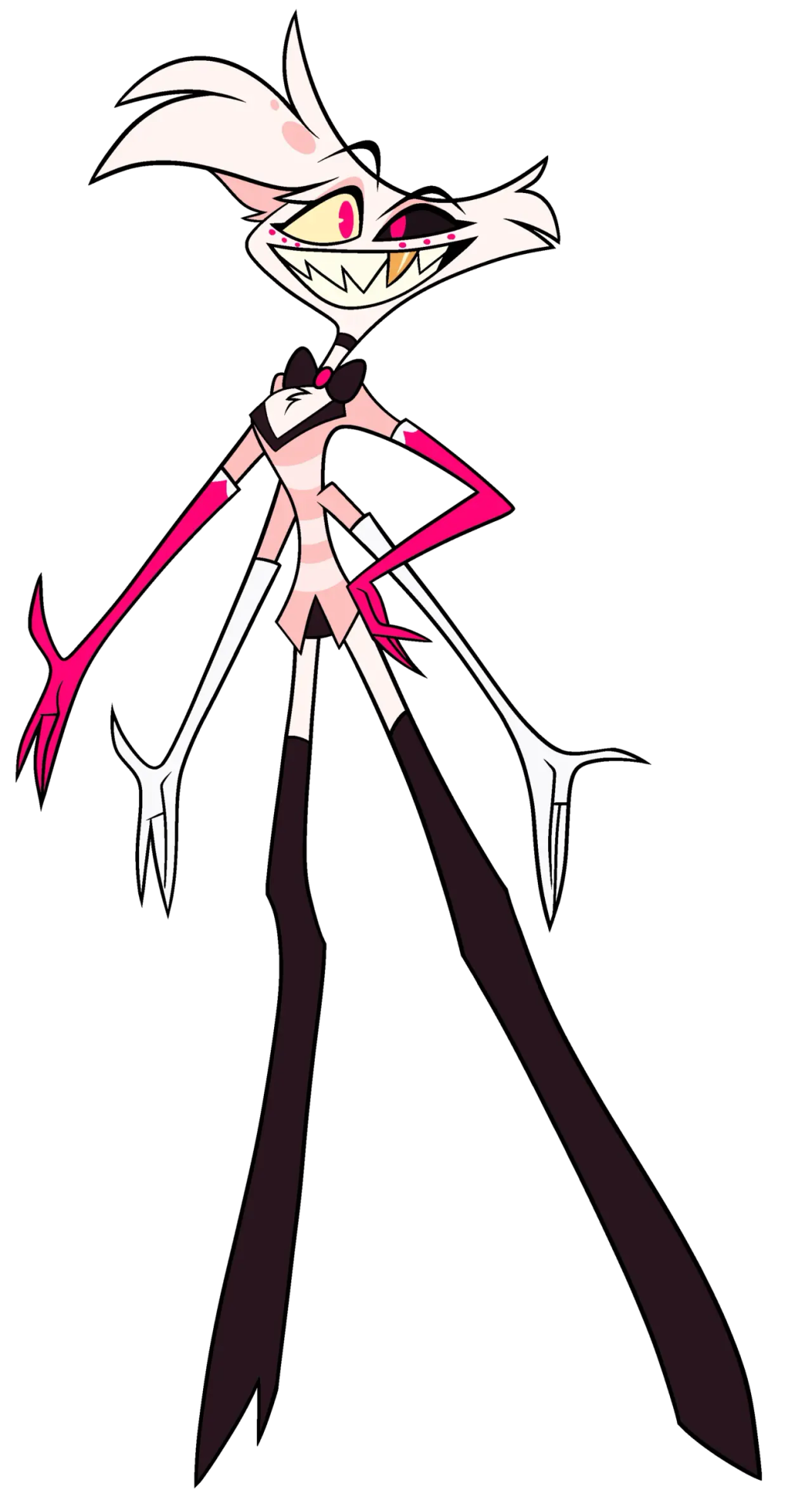
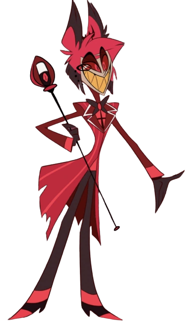
Text
ᕼᑌᔕK ᗩᑎᗪ ᑎIᖴᖴTY ᖇEᗪEᔕIGᑎ
Deadbeat father with his baby-leashed daughter.
I believe these are the last of the designs that will try to follow the original design as best as it can because looking at my sketches right now, Alastor, Cherri Bomb, and Pentious (and Crymini) goes a different direction than their counterparts.
You know how this works, thoughts below:
My issues with their Original designs:
Niffty:
Man, I only have two things to critique about this one since she's also a solid design:
What is the purpose of the scarf? It comes out of nowhere for the design, what is the connection/purpose of having it? Genuinely asking since it does bother me a bit.
She barely is a bug, there is no feature in the design that gives us any idea that she might be a bug (Or even an alien since apparently Cyclops are just a normal sinner type in this hell). Looking at the Wiki, I think the only reason for the alien aspect is that it came from a song? Either way, she doesn't showcase any of either in her design.
Husk:
GOD THE WINGS. DEAR GOD THE WINGS. IT'S SO UGLY AND CLUTTERED AND THE PATTERNS BARELY MAKE ANY SENSE. It's so awful ewwww. Every scene that didn't have them closed looked extremely rushed and ugly. It could've benefitted from just copying how actual feathered wing patterns naturally are.
His eyebrows are not a problem for me (It's my favourite part of him) but the unnecessary two black stripes are.
He's probably supposed to be a tuxedo cat, but he legitamately looks like the cat in the hat with his entire face being white.
The thought process for these two:
Niffty:
Personally was not into the whole Cyclops thing, especially when there are no hellborns (that I can recall at least) in Helluva Boss that posess a singular eye. She's got 2 eyes now because.... reasons.
The mismatched eyes was my solution to removing the Cyclops sinners of this world. Plus it's a neat little character detail that her insecurity of some kind of eye defect manifests as this odd eye shape.
Her hair is a bit neater because as much as I enjoyed how her original hair looks, It's kind of silly to think a person who's obsessed with cleanliness would have such an unkempt haircut? (Specifically talking about that scene kid-esque bangs she has.)
While I kept the maid aspect with her clothes, I made it a lot more flowery so that it reads more like a child's outfit mimicing a maid's.
I gave her one fucked up antennae since in the rewrite ill be doing, she's very easily lost and thus became homeless, drifting to any place that would allow her to stay for a little while long until they kick her out.
Bug wings and the spurs on her arms and legs are just to sell the bug aspect a bit more.
Hopefully, it was clear enough. But her arms are made of two arms conjoined together to create a singular arm.
Admittedly, I did not choose a specific bug for Niffty. Insects are not something I'm interested in and I got lazy with this aspect.
Husk:
MADE HIM A LOT FATTER AHAHAHAHHA. Husk feels like he could've ended up as a bara if Vivzie's twinkif-y ray didn't hit him.
Specific fluff areas as well as a red mustache make him look older and do more to make you understand he's much more aged than the rest of the cast.
Genuinely enjoyed the hair that they gave Husk in his flashback, it looked handsome on him. Why Vivzie didn't put that in his actual redesign is beyond me, but here it is on him now
Since his wings barely play any role in the story, I shrunk it and de-cluttered the poor thing.
The red suspenders are there to simply put a pop of color on his already muted colors.
Despite the running joke that Vivzie's characters all have a bowtie, kept it on Husk since I think it would be cute that he probably keeps it on because Niffty made it herself for him.
This is just personal, but I wanted to give him an actual cat's pattern because I saw Husk from the headcanon voices video and thought that he was a sloth for some reason.
#deadbeat motel redesign#hazbin hotel criticism#hazbin hotel redesign#deadbeat motel niffty#deadbeat motel husk#hazbin hotel critical#vivziepop critical
360 notes
·
View notes
Text
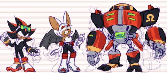
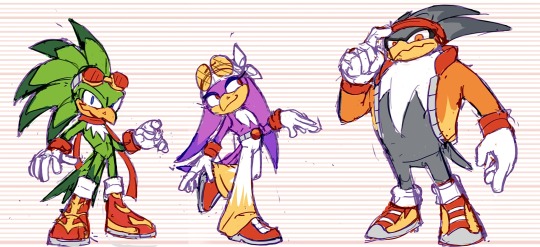
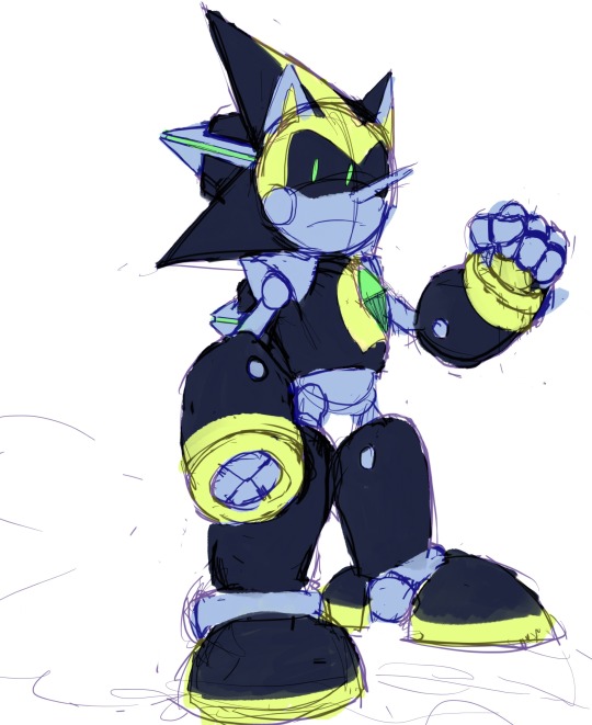
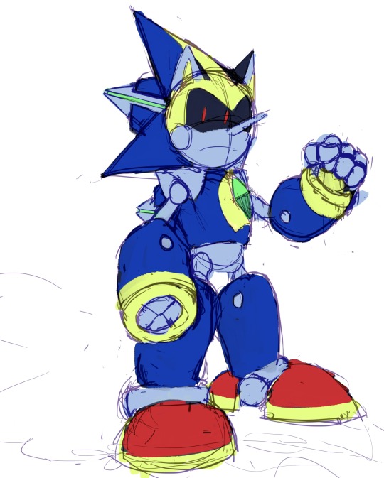


Sonic WIPs and Scribbles from 2023 (Notes Below)
Gave Chaos the Angel Chao ... "Ears" ? So that All Forms (Neutral/Dark/Hero) have some form of Representation. (The two split ... Hair? Things? In the back already resemble the Devil Chao, since the Light Chao only has one.)
Solaris Exists! ... Crazy. I recall this redesign being bit tricky because it was just so hard to see what the fucking thing looked like Originally, but I did my best. Tried to show the Bird/Eagle Theming, and to simplify the design so People like Me could understand it. I wanted this design to look like a counterpart to Chaos -- because in this AU, Solaris is from, you'll never guess...the Sol Dimension!
Gave Team Dark a sort of... cohesive color scheme with eachother, so they really look like a Unit. Plus, Rouge wearing Red just... Makes sense, considering her name, even if I enjoy the Purple color scheme as well.
Similar color scheme thing here with the Babylon Rogues -- They all share Red/White/Yellow -- I took the darker colors out of these designs to not be so similar to Team Dark haha. The amount of points on each of their...Chest...Fluffs?? matches the amount of feathers they have on their head Respectively . Changed Storm the most -- I wanted to make his "Hair" Silhouette more Unique from Wave's, and really just wanted an excuse to give a character a Cool Jacket . The Shoes ... I phoned those in a bit, I'll probably change them Later...
Sharddddddd. Throughout my Scribbles (including some here) You might've seen me struggle to decide what Quill Style to give him -- his OG style? Or the Metal Sonic style? Eventually, I decided I didn't need to choose -- I could do both. It's not demonstrated that well in these, but it's basically the same style the Bits have in Sonic Universe: The Silver Age -- just thinner and more Pointy .
Ahhh Faceless Jumpscare! This is what they look like when I'm trying to work on Poses and Colors but don't want to Commit to a Face yet, haha . Nicole, I'm always changing her design it seems -- don't be surprised if it happens again! But I based her handheld off various devices Tails uses -- I wanted it to be compact while being more Modern than the Nokia Flip Phone. Changed her hologram form slightly to resemble her handheld -- her ears are the antenna, and the rings are on her feet like how the ring is plugged in at the bottom. Made her vest longer too! So it looks more like her Reboot Outfit . Just a little.
And that's mostly it! I've been on a quest to draw Every Character in my Sonic Au -- I've sketched about... 35 so far? Here's a Screenshot of a bit of the Madness on that canvas haha.
#sth#shard the metal sonic#blaze the cat#chaos 0#marine the raccoon#storm the albatross#e 123 omega#solaris#nicole the holo lynx#sally acorn#shadow the hedgehog#rouge the bat#jet the hawk#wave the swallow#amy rose#cream the rabbit#silver the hedgehog#sonic au
174 notes
·
View notes
Text
Actually I’m gonna talk about this, controversy aside, Hazbin Hotel is so fucking lackluster. From character design, as I've previously mentioned, to animation
Vivziepop had years to work on these character designs and this is the best she could do on a LARGER animation budget?
I’d hardly even call them redesigns since you couldn’t even tell they’re different than when they first debuted (save for Vaggie)
And the actual animation just looks so stiff and like it’s a fan made thing


Versus the pilot from FOUR YEARS AGO


The reasoning for the “simpler” designs is to make them easier to animate but they aren’t that complex of designs and I’m no animator I’ll admit so maybe it makes it easier for musical numbers, but part of the appeal of the pilot was the hand-drawn loose style
Plus, any interesting design choices that were there were taken away in the Amazon show
Not to mention that almost every character is supposed to be based off an animal and you can't fucking tell what animal they're supposed to be unless you fucking google it
THIS is supposed to be a spider. If I didn't know who he was, i wouldn't even know that. Maybe it's not a universal opinion, but I feel like if your character is supposed to be based off of something, it should be a little more obvious than four arms and dots under his eyes which are actually another set of eyes.
He's a gay man, who's also a sex worker/porn star, which can be told by his outfit, but none of his outfit looks good together. You've got two sets of gloves, knee high boots, a mini skirt, and a blazer with a bowtie AND a choker.
It is a perfect outfit to tell you everything you need to know about him because it's a fucking mess. It looks like when your kid dresses up in your fancy clothes to take pictures in but nothing goes together because the kid is 5 and doesn't understand that just because you like the clothes doesn't mean they go together.
This is apparently a deer, though I've heard he's based off a w*ndigo so he wouldn't be deer-based, WHICH IS STILL BAD BTW HE'S GOT SO MANY RACIST PARTS OF HIS CHARACTER ELEMENTS BUT I'M NOT EDUCATED ENOUGH IN THOSE ASPECTS TO TALK ABOUT IT
And the outfit is just...bad. Aside from the tiny antlers that can barely be seen behind the hair, there's nothing cohesive about it. There's his coat that doesn't match the era he's from, the bob cut, the microphone which doesn't look like a microphone, the neckline that makes no sense, the random stripes on his shirt that you can't really tell what they're supposed to be (suspenders and a tie? a print on the shirt?), the actual tee shirt he appears to be wearing underneath his coat, the gloves, and again the FUCKING BOWTIE WHY DO EVERY ONE OF HER MALE CHARACTERS HAVE BOWTIES IS SHE ALLERGIC TO NECKLINES?
Not to mention the colors of the show and the characters. Vivziepop is under the impression that since they're all in Hell, they need to have a color scheme. Or at least the more important characters do. And what color scheme is that? Red and black.
But you know what else has red and black?
EVERY
SINGLE
BACKGROUND
IN THE SHOW
And he just blends in with the background. Which is not something you want a character to do if they're one of the more important characters in your show.
91 notes
·
View notes
Text
Next up is Caesar Salazar, or as I spell it for this redesign, César Salazar because just. Just look at him. He looks more like a César.
His actual design in the show has never made any sense to me because it doesn't really tell anything about him as a character, and as a character he is extremely silly. And in flashbacks he wears a nice shirt and tie and neither of his looks scream silly but unintentionally dangerous science guy, which is his character. I feel like my design does a good job with making him the kind of guy that if Van Kleiss said that you couldn’t trust him, you’d go “really??? This guy???”
César also reads as autistic to me so I essentially just defaulted to my signature silly autistic guy design thing and gave him sweatpants with little to no other clothes that actually go with sweatpants. I swear I’m not trying to project, sometimes characters just have the vibe of something I would do. I also gave him a LEGO brick shaped chewing stim necklace because I thought it would be cool to have a little thing that neurodivergent people tend to use as a sort of “I know what you are” thing.
I tried to keep his colour scheme close-ish because it does fit him pretty nicely, but obviously with a big fluffy cardigan instead of whatever his outfit is. Tiny little fun fact, I did actually make him and Rex have slightly different skin tones. Colour pick them, I dare you. You cannot convince me that César has ever seen the sun. The doodle of their whole family was a way for me to sort out what traits César and Rex get from each parent while still making them look very obviously like brothers. Also I think it’s pretty cute.
Now the biggest thing to me in César’s redesign is that he seemed like the kind of guy who would wear socks with either crocs or sandals in a lab setting, because César and lab safety are mutually exclusive concepts. It also gives him an easy-access chancla to smack his unruly experiments. The idea is that it could potentially lead to a running gag that every scientist he’s ever worked with has gotten super pissed off that he doesn’t wear covered shoes in a lab setting and he doesn’t see why he has to and just. Keeps doing it. The mental image of Van Kleiss especially losing it and going off on an off the rails rant when he realises that César is STILL not adhering to basic lab safety is absolutely hilarious to me.
I feel like I put a little more conscious thought into his design than Dr Holiday’s, but the design I have for Dr Holiday just felt correct and it just popped into my head as it was. Next in the design thing is going to be Circe. It might take a minute because even though I have come up with a design for her in the past it needs a bit of tweaking.
prev || next || masterpost
#generator rex#genrex#generator rex fanart#genrex fanart#generator rex redesign#caesar salazar#character design#character redesign#theaxolotlart
89 notes
·
View notes
Text
I'm forever going to be conflicted about how good Jason looks in his new fit compared to his utrh outfit, because my heart and head are settled on the utrh look, but my monkey brain sees the mask and the biceps and the forearms and swoons a little.
It is important to me for narrative contrasting purposes that Jason's costume be a very "just some guy" look because of how he foils Batman's character. He is not so much about the symbol that instills fear or crafting a persona, but cares only about pragmatically achieving a goal.
Batman's whole thing is of course needlessly elaborate and weird if one disregards or forgets the stated purpose of him being a symbol that instills fear in Gotham criminals. Seeing as Jason is thoroughly disillusioned with the superficiality of vigilantism, it makes sense to me that he would not care to cultivate an iconic look or a symbol. The only thing he cares about is what he gets done, the actual lives he helps improve and save in the moment.
So, no matter how visually appealing a redesign of Jason's costume is, my heart is set on my "just a guy" Jason look.
#jason todd#red hood#yeah I'm onto my bullshit abiut the costume again#I love all Jason's don't get me wrong#there are two wolves inside me
437 notes
·
View notes
Text
Hazbin Hotel redesign ideas p. 1
Unfortunately I don't really have time to draw rn, but here are some ideas if anyone is looking for inspiration.
THE VEES:
They follow lates trends so they won't stick to the outfits and technologies from the times they died. We even see that Vox changed his screen (head) to more modern, flat TV screen.
Valentino:
He is a moth that realises poison that's basically a date-rape drug. His wings are hidden, looking like a coat, which makes no sense, a cloak, cape or sleeveless coat would look better. He is a pimp who died in 1970s. Val was Hispanic when living. Apparently, he has bad eyesight.
He is supposed to be a moth, but I don't really see it much, and the furr around his neck, that's a part of his body, just looks ridiculous. I would design him after some actual poisonous moth.
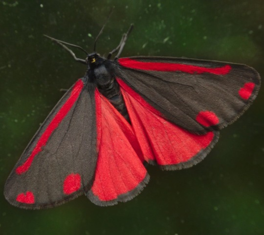
Cinnabar moth - The cinnabar is slate-black with two red spots and two pinky-red stripes on the rounded forewings. Its hindwings are pinky-red and bordered with black. The caterpillars feed on poisonous ragwort leaves. The poison from the leaves is stored in the caterpillar's body and remains even when they are an adult. As adult they leak the poison when they need to. Cinnabar moths can be seen flying during the day and night.

Six-spot burnet moth - day-flying moth that flies with a slow, fluttering pattern. It has glossy black, with six red spots on each narrow, but long forewing. They release hydrogen cyanide when attacked.
Personally I would go with Cinnabar moth, but make the spots heart shaped, and leave his inner outfit without the accessories (the suit with the white pants and golden heart belt). I would also leave his general body type but definitely change the neck furr ring, because wtf is that? I would play around with his glasses since he is supposed to have eyesight problems.
[Edit: Actually, I would make him a combo of both moths and make the furr ring his hair, because he is bald without the hat!?!?]
Velvette:
Velv is a fashion designer and critic, she is also an influencer. She keeps the Vees together and their image fresh on the internet. She's a British black woman in her early 30's. Originally her appearance was supposed to be doll-like, but that was changed to 'it-girl' and a 'bad bitch' with a darker aesthetic.

Velvette's outfit is reminiscent of Val's (heart belt, coat with hearts, black stripes on arms) but darker, especially her sleeveless coat that imitates his wings. Since Valentino is already going to be darker (in my idea) and she is a fashion influencer it would make more sense for her to be brighter.
Main thing I would change about her is her skin tone, hair, and Harley Quinn themes left from her old design.
When creating very human like characters it's important to actually get the racial characteristics right. Her ashy skin and "curly" hair just makes it look like they didn't know how to draw a black character. I would give her a different texture, something between 3A and 4B. A hairstyle like heart shaped space buns would be so cool, but even if not, her styl in a poster in the background is already better than the ponytails.
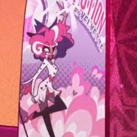
When it comes to her style I would get rid of pom-poms shoes and fingerless gloves. Her outfit for meeting the overlord was pretty okay, but I would change her other outfit. My inspiration would be PidginDoll's design, because he makes fabulous outfits and makeup looks for all bodies, genders and races, but I'll keep the 'goth' (it's not goth, it's just a little bit alt, mostly skulls) theme.
Blue accents like makeup would work great with her brown skin and would reference Vox.
Vox:
I genuinely think he has the best design in the entirety of the show, I would barely change anything. His outfit is similar to Alastor who he is trying to imitate, but he wears a tail suit, which is way more formal and elegant than any other suit, trying to showing he is a better, modern version of Alastor. I've seen some people got rid of his hat and gave him a tail made out a cord for fun, but other than that his design is good. Not too much details and not too little, tells us a lot about the character.
Maybe less stripes, because apparently Viv loves zebras or something. /hj
#hazbin hotel#hazbin hotel redesign#hazbin hotel criticism#hazbin hotel critical#the vees#hazbin hotel valentino#hazbin hotel velvette#hazbin hotel vox#hazbin hotel fanart
76 notes
·
View notes
Text
Hi, I redesigned the season 7 causal fits + Roxy
Redesigns
Og (based Roxy's off of this outfit)
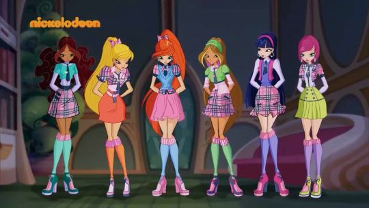
Feel free to do whatever if the designs (just don't take the art without asking.) And if you make fanart or anything I'd like credit and maybe tell me because I'd love to see it 👀
Anyway
Gonna ramble on the designs I did for a bit because I feel like it. Sorry for bad writing. I don't write often and can't put my thoughts into words.
Aisha- I wanted that sporty girl vibe and found sporty clothing with a sports jacket. I think she's slays in it. Didn't change her hair because I liked how it was.
Stella- Wasn't sure what vibe I wanted, so I just looked up "leo outfits" on pintrest. Stuff like this popped up everywhere, and I think it would be nice if Stella wore something other than dresses and skirts. Because as the queen of fashion, she can and will rock everything. I accidentally made her hair more wavy because I'm used to drawing wavy hair. But maybe it's just a change of pace for her.
Bloom- Okay, so I might have based this Bloom off Unicorn of War's Bloom. So she's a tired artist. Wearing more comfy than fashionable clothes.Flora- Not much to say. I just wanted Flora in a big dress because she deserves it. Cottagecore Flora vibes.
Musa- For Musa, I based her outfit off of Chinese street fashion because, in my opinion, it fits her. I also changed her main color of the designs from blue and pinks back to red. Because I think she works better in reds.
Tecna- First, I wanted to change Tecna's hair. Since Believix she's had the same hairstyle minus a few differences. So I just made it shorter, because we need a least one girl without stupidly long hair. I losely based her outfit off a business causal vibe. She has a T in her jacket for Tecna/Technology (She thinks it's neat).
Roxy- Roxy is a little different from her usual vibe. But I wanted to call back to the school uniforms in Roxy because she would be in her 3rd year of Alfea at this point. So it would make the most sense for her to wear it. So I gave her more of an academia vibe but tried giving it Roxy's vibe. I made her hair a little redder because she looked too much like Tecna.
Hi, thanks for reading my rambles. I did this because I accidentally rewriting some of season 7 causally in my head. And sometime after Halloween, I'll share my thoughts in a big post, hopefully. It's not a full rewrite, mainly the transformations. And a little on the villains and charcter arcs.
#winx aisha#winx stella#winx bloom#winx flora#winx musa#winx tecna#winx roxy#winx#winx club#winx season 7#winx club season 7#winx redesign#wimx club redesign
160 notes
·
View notes
Text

Behold, everyone, my most beloved creation… Gowther’s redesign.
Genuinely been tweaking while making with this, ecstatic to show you guys, and he’s finally here!
You mean to tell me that man was a doll the whole time and that never factored into his character design at all? Not in this fuckin’ house, we go full borderline uncanny valley or not at all, because it’s what our boy deserves. Thus, as a doll, Gowther gets to function a bit differently from the others — there had to be a reason he was in that armour for all that time, and I’ve decided that it’s the thing that best protected him from literally breaking because he has porcelain skin and no bones. And, as you can see, there are some Gold Seams from where he’s been broken and put back together before, which I like to imagine the armour has been enchanted to help with.
One of the more glaringly obvious changes, aside from the ball joints, is that Gowther’s hair is now blue. The bright hot pink always felt like a little much to me, especially with his primary colour scheme already being purple, and having a bunch of other bright colours in the cast already. Plus, blue is, surprisingly, the colour that is most associated with Lust.
As for the outfit, I have a friend irl who legit said to “let Gowther be a slut,” being the Sin of Lust and all. So, naturally, I have delivered. I took some partial inspiration from designs I’ve seen for Medieval prostitutes and wenches. With all of these redesigns, I try to have the Sins’ brands showing, and the off the shoulder shirt fit the best both for Gowther’s Sin and the placement of his brand.
As for his brand and the gold seams around it… well, placing a hot brand against anything like porcelain doesn’t mix too well.
My plan for Gowther is to have him be a bit more expressive and lively than he is in canon, in the sense that he’s clearly overcompensating most of the time to appear more normal around others. He’s still got his plot line with figuring out emotions, with some tweaks that I’m still working out, since I always really liked that plot but just not where they went with it, exactly. With strangers, or someone like Elizabeth, he comes off as almost overbearingly friendly; meanwhile, he will roast the rest of Sins into oblivion—largely inspired by his characterization in the Abridged Series, believe it or not.
But that’s enough minor spoilerly stuff for now. Here is Gowther, bask in his glory, let me know what you think, and I will be back relatively soon with another redesign! I think you can guess who the next one will be… ;)
#seven deadly sins#nanatsu no taizai#nnt canon rewrite#nnt rewrite#nnt fanart#nnt Gowther#gowther#sds gowther#seven deadly sins rewrite#sds rewrite comic#NNT FANDOM YOUR DINNER IS READY AND IT’S HOT#my wonderful morally bankrupt boy#in all his ball joint glory
68 notes
·
View notes
Text
The Unexpected One
Ironwood: So… How did this one happen? I thought you were having difficulty making a new Hunter Drones? You were having problems getting them to fit into their Housing Matrix.
Jaune: Shear dumb luck, Sir. I was running another test like usual, and this one somehow managed worked. With a, 98% match to OAI’s Matrix I must add.
Ironwood: 98%? That’s impressive.
Jaune: I know! Yang’s about 89% match to OAI’s Matrix. But, this one gave me a near perfect replication of OAI’s Matrix!
Ironwood: Wonderful! Can you make more?
Jaune: Uhh, no… No I can’t.
Ironwood: Did the matrix’s degenerate as soon as you put them into the, Housing Units?
Jaune: Five housing units. Five separate housing units! All of the failed; I need to start redesigning the housing units. There has to be something in there that’s causing this instability. I need to fix it!
Ironwood: Well, at least you’ve added another, Hunter Drone to the their ranks.
Jaune: Yep! Five Hunter Drones at your service sir! I hope she’ll get along with the rest of her sisters when they come back.
Winter: Jau…?! Professor Arc, mind if I ask you a question?
Jaune: Of course, Win…?! Specialist Schnee! W-What is your question?
Winter: Why does she… Why does she look the way she look?
Jaune: In what context; Contexts?
Winter: Is this unit blind?
Jaune: Nope, her eyesight is among the best, Blake barely surpasses her in terms of vision efficiency rates, mostly due to the fact she has better night vision specs.
Winter: Then why the blindfold?
Jaune: I asked her myself, she says it is to protect her eyes whenever she slashes through something with her swords. Trying to keep any mental fragments, dust, or general viscera out of her face.
Ironwood: But, with a simple cloth of fabric?
Jaune: Hey! All the materials used in, and by my HD’s are top of the line Hunter Grade materials! I will accept only the best for my creations!
Ironwood: My apologies, it’s just her choice in weaponry. And, the destruction they wrought, I doubt a small piece of fabric could protect her from all tha shrapnel.
Jaune: You’re just upset she wrecked all of your precious little, Paladins with a simple pair of ōdachi’s?
Ironwood: L-Little?!
Winter: I think he’s concerned because of how quickly she dealt with those, Paladins. And, to be fair, one of those ōdachi’s is exceptionally large; She has a drone carrying it around for her.
Ironwood: When did you build that drone?
Jaune: Wait, when did she retrofit that drone?!
Winter: Haa… Another question if you will: Why is her skirt like… like that?
Jaune: What do you mean?
Winter: Why is their such a large slit in the design?
Jaune: Ease of movement?
Winter: I can see that, but why did you design her skirt to be so revealing? When she moves you can see her…?! Ahem! You can see a lot.
Jaune: Wait, you thought I did that?
Winter: Didn’t you make her outfit?
Jaune: Specialist Schnee, look at me? Do I look like I have a sense of fashion?
Winter: N-No…?
Jaune: Exactly! I build, and maintain the drones. Anything cosmetic related is entirely on their part.
Ironwood: It is?
Jaune: Yeah, the schematicts to how their limbs are designed, how the eye sockets, and lenses work, how the Nano-Fiber Skin reacts to touch, how the internal casing works. Even how they’ll upload their minds into new housing units. They’re the ones who redesign these to fit their preferred specifications. Do you think I deliberately designed two of them to be loli’s, that’s not my type. What do you think I am, some perverted lolicon?!
Winter: That’s because I’m your type~!
Ironwood: No I do not insinuate you are… whatever that is.
Jaune: Damn right you better!
Winter: But, why is her posterior so… big?
Jaune: Why does she have a big butt? Is that the whole reason for these questions?
Winter: Well…
Jaune: …?
Ironwood: Don’t look at me. I’m more concerned about her combat prowess, not her appearance.
Jaune: Winter…?
Winter: …
Winter: Jaune… Jaune do you… Do you perhaps…
Winter: Like girls with a big ass…?
Jaune: …
Jaune: She has a nice butt. End of discussion.
Winter: Very well then~!
Ironwood: So, this android; What is her name?
Jaune: She calls herself…
Jaune: 2B.
Winter: …
Ironwood: …
Winter: Do you think she could pass as my older sister?
Ironwood: She’d definitely could take after your mother then. That woman sure has nice curves…
Jaune: What?!
Winter: What?!
///
Will this go along with the rest of the Hunter Drone story. Possible.
I just like the idea that, 2B was one of them.
Do enjoy~!
#rwby#jaune arc#winter schnee#james ironwood#yang xiao long#blake belladonna#jaune x winter#winter x jaune#rwby winterknight
217 notes
·
View notes
Last Seen Blogs
joyce-stick
joystick system
rizrahman7
Riz Rahman

m2migzz
🌸🏝👸🏾👛💎

virologyconsultcovid19
Untitled

beomggyus
dreaming