#Style Movie Logo
Photo
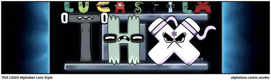
(via https://alphalore.comic.studio/)
0 notes
Text

#the maze runner#tmr#barbie 2023#barbie#tmr meme#tmrmeme#Image ID: The cover of The Maze Runner movie with Thomas Teresa Newt Gally Minho Frypan Winston and Chuck running through the Maze.#Pink lazers are shooting from the sky.#The white text with black outline reads Us on the way to see the new Barbie movie#with Barbie being a Barbie logo i.e. in the white text with pink outline cursive style. /end ID]#reblogged with the description too#mine
744 notes
·
View notes
Text
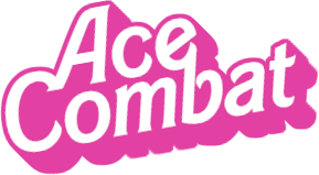
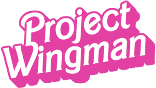
💕✨ fox 2, fox 2! ✨💕
barbie font generator!
#ace combat#project wingman#barbie#barbie 2023#my posts#i have no regrets about making this#barbie font generator was used for getting a png of the text#gimp was used for the border and shadow effects#i recognize this style is a mix of two different barbie logo styles#but i really could not find a font for the barbie movie logo so this will have to do
109 notes
·
View notes
Text

This one is just for our Tumblr users…. The beloved Shard wallpaper returns from the dead with a new hot pink look.
Download them below, or visit our Google Drive HERE to download them in there full resolution…


#wallpapers#apple#iphone#Barbie#barbie movie#backgrounds#original#papers#oppenheimer#greta gerwig#design#style#logo#branding#designer
21 notes
·
View notes
Text

Zara x Barbie leather tote bag ♡
#pink#upload#Zara#barbie#barbiecore#barbie logo#barbie the movie#the barbie movie#barbie movie#barbie doll#barbie 2023#fashion#style#cute#kawaii#girly#hyper feminine
19 notes
·
View notes
Text
Paramount Logo But In My Style 🏔🎥🖌

20 notes
·
View notes
Photo

48 notes
·
View notes
Text
I’m an adult so if I want to buy a toy highland cow after I fall in the mud I can and will do that
#MY WEE COO#HIS NAME IS MOONY LOREAL SUMMER#CURTESY OF ME AND LIV’S ONE BRAINCELL HITTING THE CORNER OF THE SCREEN DVD LOGO STYLE#HE IS MY SON AND I LOVE HIM#MOONY BC I GOT HIM AT THE BRIDGE FROM THAT ONE MOVIE THAT I WON’T NAME BUT ALSO HE’S A COW#LOREAL FOR HIS FABULOUS HAIR#SUMMER BC IT’S A COOOOO SUMMER#my post
4 notes
·
View notes
Text
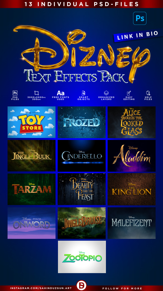
MOVIE TITLES - Vol.16 | Text-Effects | TempPack by Sahin Düzgün
#3d#3d text#3d design#3d effect#text effect#layer#smart object#photoshop#mockup#template#psd#logo#design#effect#style#typography#film#movie#fantasy#animation#classic#cinematic#90s#2000s#2010s#aladdin#frozen#disney#toy story#jungle book
4 notes
·
View notes
Text

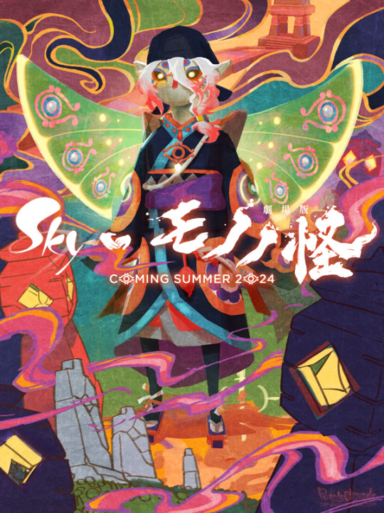
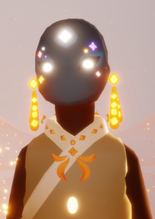
Currently, Sky: Children of the Light and Mononoke are my two favorite things and I so very badly want to will this collaboration into existence. 🕯⚖️
Process GIF & artist commentary below the cut!
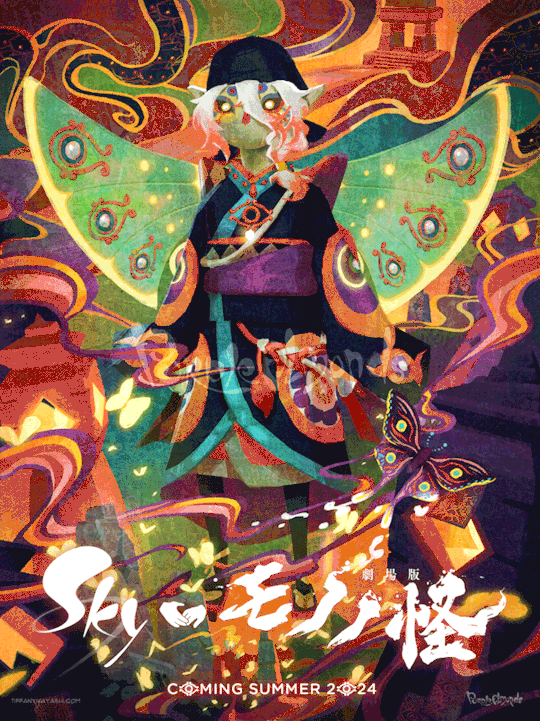
This began as a self-indulgent costume design project: aMononoke-inspired Sky cosmetic. It was supposed to be a quick-and-dirty mockup that would not be shared outside of private Discord servers, but I got...carried away.
It came out a lot nicer than anticipated. A bit rough around the edges, but when zoomed out clean enough to look like a legit Sky cosmetic. I extracted the high-res Sky and Mononoke logos from their respective websites. I custom-made the handhold collaboration icon. Then I slapped it on top of the costume design. It looked neat!

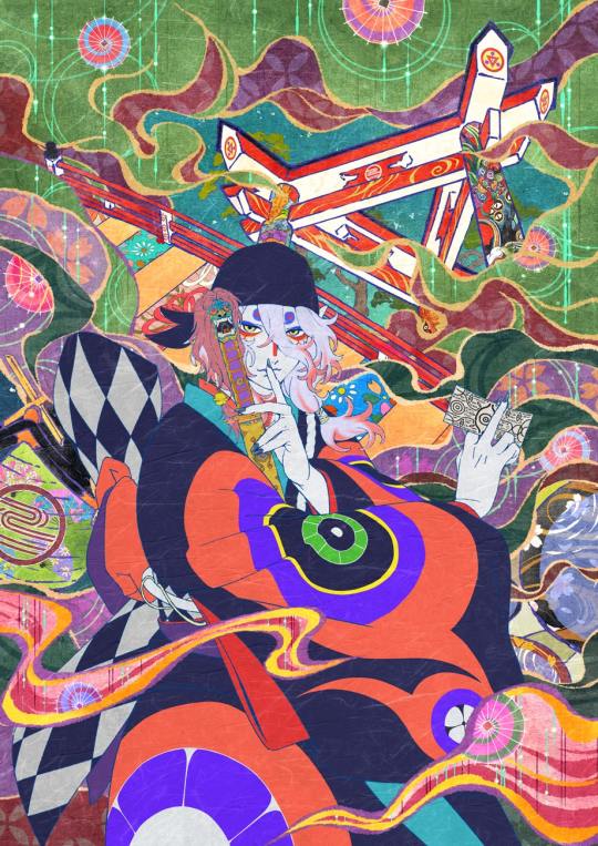
But then I started having second thoughts. The outfit was quite complex, and it didn't feel right to have it sit in a sterile, empty space like that. It looked half-baked, incomplete. So I used the Mononoke movie poster as inspiration for set dressing and color palette:
There are vestiges of the project's origins scattered throughout this piece - namely that a lot of the visuals were built upon screenshots from Sky. Since it was a costume design project, I didn't feel the need to draw from scratch. They were completely painted over in the final product, but using this technique sped up my process quite significantly!
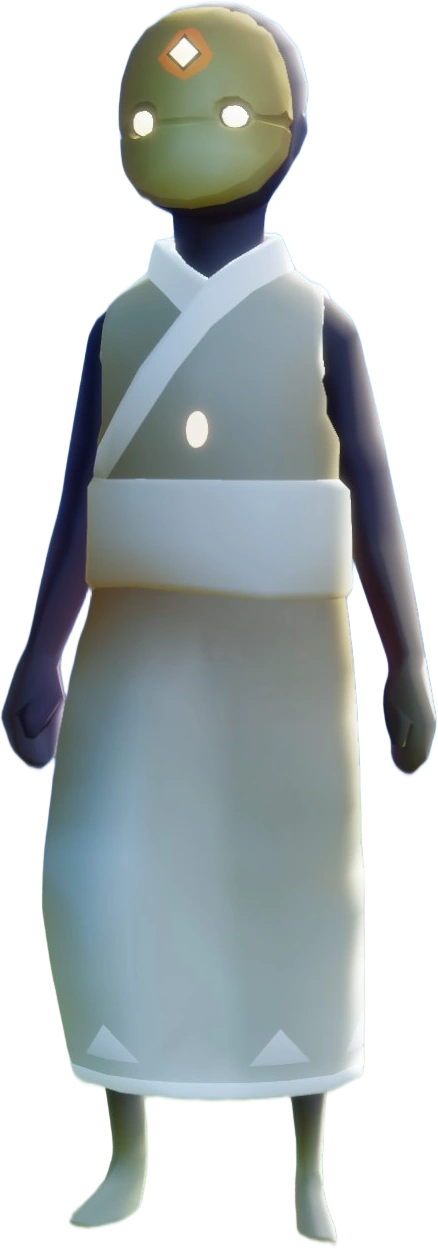
I went to the Sky Wiki for references. I cobbled together some Season of Revival's kimono cosmetic as a starting point for the outfit. The eyeliner detail Days of Style mask looked similar to the Medicine Seller's face markings, so did a quick photoshoot in the Office to match the camera angle of the previous image.
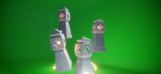
For the lantern, I made a shared memory in the green room to get the ideal camera angles for each of them:
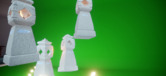
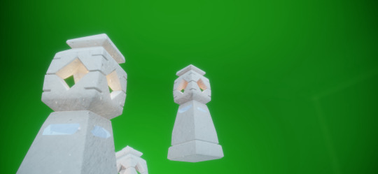
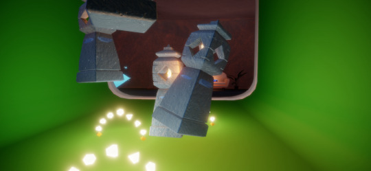
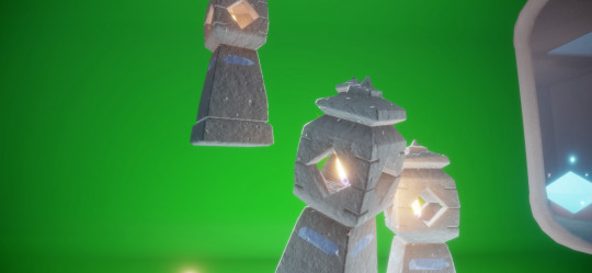
The grave markers I referenced from a photoshoot in the Hidden Forest's hub:

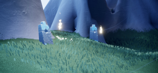
And the bridge I took from the Sunny Forest:

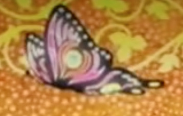
The butterflies were a last-minute addition - I wanted something to make the composition more sparkly! Then I remembered the end credits of Mononoke had a butterfly too! I figured since I went with the Medicine Seller's new design, this would be a nice homage to his classic look.
#モノノ怪#mononoke 2024#mononoke 2007#kusuriuri#medicine seller#thatskygame#sky cotl#sky children of the light#thatgamecompany#thatskygame fanart#sky cotl fanart#crossover#purplealmonds#2023
726 notes
·
View notes
Text
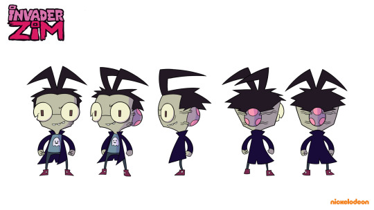
I made this rotation of Zib because I plan to animate it in the not too distant future! I wanted to keep it in the style of the movie, so I merged Zim and Dib's rotations for this lol.
I left the logos PA PURO PAPEAR JOJOJOJOJO :vvv
#invader zim#fanart#invader zim fandom#iz fandom#iz dib#zib#iz zib#invader zim dib#zim#iz dib membrane#dib membrane#character ref sheet#iz fanart
466 notes
·
View notes
Note
trolls has a certain vibe to it,yknow? like the scenery, the props, the creatures,the clothes, there's just something about it that screams "TROLLS"
and iv tried looking for stuff that gives off this same feeling, but I cant, where do you get your inspo from?
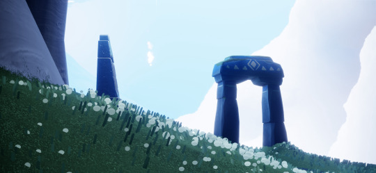
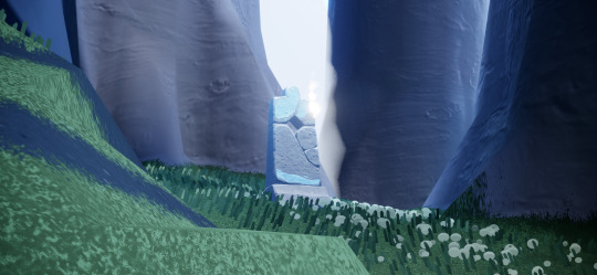
*CRACKS KNUCKLES* You've mentioned something that relates to what I am passionate about- design! Apologies in advance if this is long but I am so excited to dive into this.
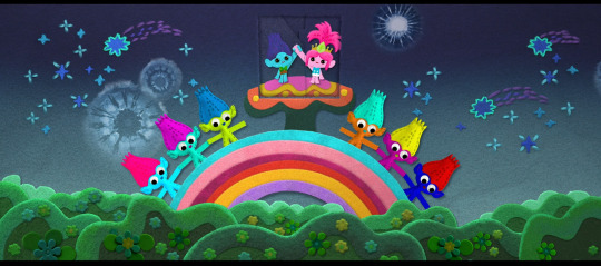
When trying to nail down the aesthetic for a type of media in particular it always helps to STUDY THE SOURCE! I get most of my inspiration from the Trolls movies themselves because the whole franchise is such eye candy. So let's look at it!
The general observation is that everything has been designed to look crafted or handmade, or almost toy-like. Everything is so artsy and creative it looks like someone created everything with craft supplies. The takeaway key words I get when looking at everything is: Happy, bright, colorful, soft, shiny, fun, glittery etc. These are what you take and incorporate into your ideas! It also helps when searching for references too!
I absolutely love the Dreamworks cards at the start of each movie. It's such a perfect way to show how they took the Trolls aesthetic and applied it to their logo!


Everything looks felted, painted, embroidered, pieced together, etc. These cards alone tell you so much about the world of Trolls.
Next is observing environments. The designs for all of these locations are stunning not only because they are creatively done but because the things that make them different from each other are so fascinating.


You've got the visuals from around Pop Village/Troll Tree which feels knitted, crocheted, sewn, felted, etc. It all feels so SOFT.

Then I love this environment because it's all POOL TOYS? the vinyl textures? Foam? Amazing.


Then my fave, The Rock aesthetic is full of flannels, denim, leather, etc. I could go on with more examples but I'd be here all day.
I think understanding the design choice behind the world of Trolls is so important because it'll tell you exactly what you should be looking for in your inspo. From this you can take that everything is fun and very artistic. This can influence your styling, your color choices, your textures, etc.
Creating a guide or inspo board gets a lot easier when you can type in key words or names of objects that are relevant to the world and characters you are working to capture!
Hope this helps some! (Again, I'm not great at explaining things, but this is my approach!)
228 notes
·
View notes
Text
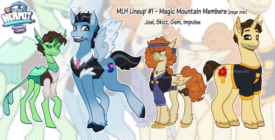
Hello there! I’d like to introduce you to my newest project:
My Little Hermit!
Two of my hyper-fixations decided to merge and create this cute little AU! Mostly based off of season 10 and the hermits personalities- I wanted to give a shot at creating pony designs for them.
More information and singular reference sheets below the cut!
First up we have Joel!
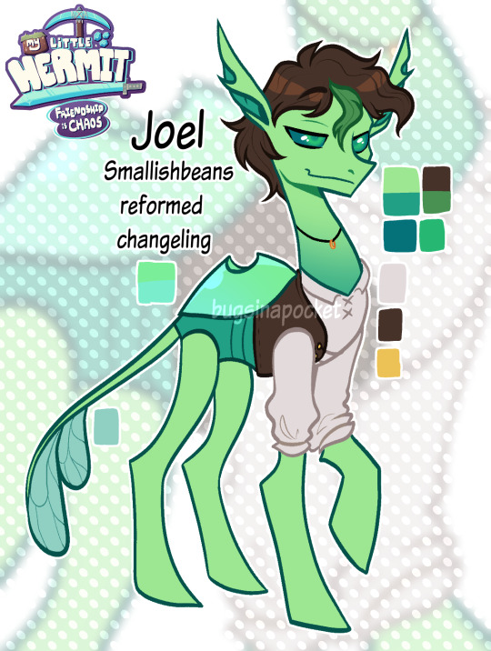
Joel is a Changeling; I’ve always seen him as a bug and I like to change his Shrek ears into antenna! Changelings are the bugs of the MLP universe, so I thought it it. I decided to make him reformed because of the colour palette. I’ve always seen Joel as somebody with a very vibrant and bright personality; and he tends to use eye-catching colours in many of his builds. Vibrant, bright, and eye-catching are all words I would associate with the reformed changeling colour palette! They use very vibrant colors, and I think it suits Joel quite a lot.
Next we have Skizz!
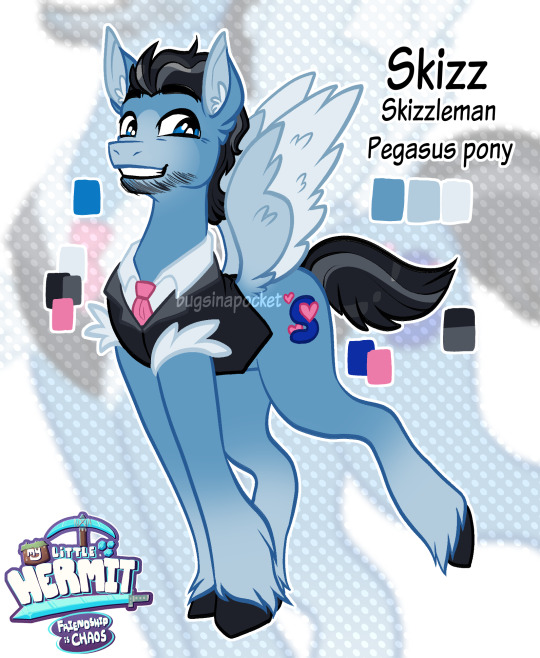
Skizz is a Pegasus pony for a few reasons! I’m trying to base the pony designs off of the content creators’ personalities and building /gaming styles- but I’m also taking the more popular fanon designs for these characters into account as well. Many people draw him as an angel. I also see Skizz as somebody who is incredibly sweet and is constantly trying to lift others up, and with a pair of wings, he could do that literally! So why not!
Then of course the lovely Gem!
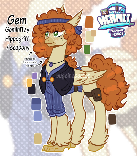
Gem was a little harder to pinpoint, since I’ve only recently started watching her videos, but since I’m also trying to base these designs off of their season 10 aesthetics- I decided to make her a hippogriff! In the MLP universe, hippogriffs are creatures that can transform into sea ponies using a magical necklace (this is shown explicitly in the movie). Since her base for this season is based on dredge and fisher/pirate aesthetics, I decided to make her a hippogriff to give her that advantage when it comes to terraforming her underwater section of the base. I also think that her little fishing rivalry with Grian could be funny if she could literally transform into a fish.
And last but certainly not least; Impulse!

Impulse is a unicorn, partially to be parallel with Skizz- but also for his ability to create magic with Redstone. I considered making him an earth pony for his feeling of stability and competence, but it didn’t feel quite right. So unicorn he is! His cutie mark is his signature "i" symbol that's lit up like a redstone torch.
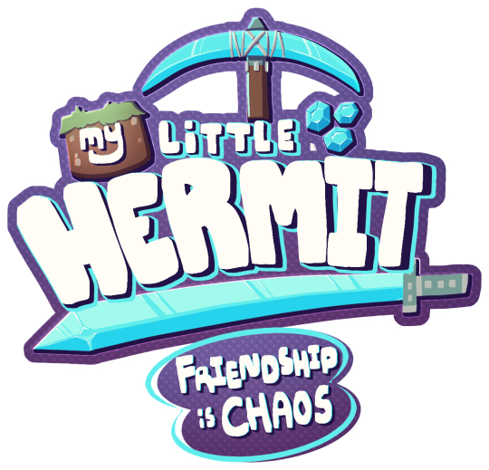
AND YES I MADE A LOGO. I HAD TO. I COULDNT NOT DO THIS.
I hope you enjoy!
#My little hermit au#joel smallishbeans#skizzleman#geminitay#impulsesv#smallishbeans#smallishbeans fanart#skizzleman fanart#geminitay fanart#impulsesv fanart#hermitcraft fanart#hermitcraft#hermitblr#hermitcraft season 10#hermitcraft season 10 fanart#hermitcraft s10 fanart#my art#mlp au#hermitcraft au
253 notes
·
View notes
Text
I have many thoughts on Challengers (2024) and I need to get them out so here we go
First, the tennis.
This movie understands tennis better than any film, tv, book, etc. I have ever seen. You know exactly how the relationship between the three main characters is going to play out just based on how they play. The cardinal rule of tennis is you want to get to the net as quickly as possible. Playing from the baseline (the line that you serve at) is all well and good and it's a vital part of the game but playing at the net is where the action is. The quicker you get to the net, the more likely you are to win.
From the first moment we see Art and Patrick, Art is at the net and Patrick is at the baseline. Then we see Patrick serve. In the language of tennis, Patrick's serve is a crime against beauty. It might work well enough for him but it is ugly. Those two facts put together mean that when Tashi tells Patrick he isn't a tennis player, she knows what she's talking about. Art is not as talented as Patrick and neither of them are as talented as Tashi but Art gets to the fucking net. He understands what Tashi means when she says that tennis is a relationship.
Second, the framing of the narrative as a tennis match.
Patrick wins a set, Art wins a set, we're left looking at the tie breaker. Brilliant. Camera shots from far away steadily get closer and closer, just like if you were in a rally and you were moving toward the net. Tashi, in particular, always moves closer to the person she's talking to and she always wins the point. She goes towards the net.
Third, Tashi as a character.
I love her, your honor. She is in love with the game of tennis. She doesn't give a shit about anyone or anything else. When she says she would stab a child to have the recovery that Art did, she means it. Moreover, we know that the child in question could be her own daughter and she would still mean it. From the first night in the boys' hotel room, she doesn't care which of them gets her number, she just wants to see good tennis. She is unlikable and yet Art is right. Who wouldn't love her?
Fourth, Art and Patrick.
One thing about tennis: your teammates are also your competitors. They are the yardstick by which you measure yourself, the only people capable of making you better, the people that you most need to beat. The relationship between the two of them, even from the beginning, perfectly reflects this.
I would actually argue that not a single one of the three of them is a good person. But the narrative is completely uninterested in whether or not their moral people. All it cares about is if they're good tennis players.
Fifth, the background details.
Art is sponsored by Wilson, his rackets have their logo repainted on (normally, you get rackets restrung and don't get the logos painted back on, only the players that are sponsored get that done.) Tashi was sponsored by Wilson (and Adidas but only for her clothes). Art only switches over from Dunlop to Wilson after they get married. Patrick's racket is restrung, but no logo, he's not sponsored. But, his poverty is at least a little bit performative because you don't smash up a $300 racket unless you have money to spare.
The ad in the background of the parking lot. It still has both Tashi and Art on it while Tashi and Patrick are having sex but by the time the final match starts, Art's half of the picture has torn away.
Patrick's changed serving style. Only when communication is happening directly between him and Art, that Tashi has no way of understanding, do they start functioning well on a court together. Ironically, when Tashi is removed from the relationship she finally gets to see some good tennis.
Anyways, I love this movie.
102 notes
·
View notes
Photo


The Super Mario Bros. Movie will be available in a wide variety of languages, each of which has its own translated logo. With one exception, every logo in every language (sample selection in the first three rows) uses the same font with the same graphical effects for the logo, regardless of the language.
However, the French Canadian logo, shown on the bottom, is unique in that it is the only logo that uses a much more simplistic font with fewer graphical effects. Why it is the only language that does not use the same style as the others is unknown.
Main Blog | Twitter | Patreon | Small Findings | Source
2K notes
·
View notes
Text

MOVIE TITLES - ULTIMATE BUNDLE - Vol.2 | Text-Effects | TempPack by Sahin Düzgün
#3d#3d text#3d design#3d effect#text effect#layer#smart object#photoshop#mockup#template#psd#logo#design#effect#style#typography#film#movie#sci-fi#fantasy#horror#superhero#animation#classic#80s#90s#video game#cinematic#superman#harry potter
1 note
·
View note
Last Seen Blogs

intanbumiperkasa
CV INTAN BUMI PERKASA
yesimwriting
Elle

redlbp
Untitled

celerys-galaxy
Rissen-Celerys
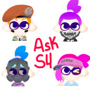
askthes4
Ask us anything!