#Typographic Tools
Explore tagged Tumblr posts
Visit Tumblr Blog
Explore Tumblr blogs with no restrictions, modern design and the best experience.
Last Seen Tumblr Blogs


Fun Fact
Tumblr has a 66 index score for customer satisfaction in the US.
Text
Writing Notes: Book Cover

“Don’t judge a book by it’s cover!” We’ve all heard the phrase and we all know that’s impossible. Because the cover of a book is the first thing a potential reader sees—it should stop them in their tracks. It’s a very powerful marketing tool; having a well-designed book cover is crucial.
Tips for Making a Great Book Cover Design
Using more than two to three typefaces on a cover is discouraged, as it can look really messy.
Keep things simple. Your cover will be in a sea of other covers so try to keep your design from getting muddy and make sure it stands out.
Show your designs to people who have a design eye and/or you trust. It’s great to get feedback.
If you hire a professional designer, write a brief and send them info. Be really clear on what you want. Designers usually do a certain number of design rounds included in the agreed upon fee and any extra rounds of design will be extra.
If you hire a professional designer, they will likely have ideas about printing and may have connections to printers. They are a resource so don’t forget to ask questions.
Don’t forget: a book cover is an important part of selling any book. Whether you decide to do it yourself or collaborate with a professional, pay special attention to this part of the process, as a great cover goes a long way.
6-Step Guide: Professional Book Cover
STEP ONE Generate Ideas. Look around at book covers you like. Go to a bookshop and peruse what’s currently happening in book cover design. Take notes of what elements you like on the cover image. A certain typeface? Color? Do you prefer an image or an illustration or something purely typographic on the cover? Another option is to create a mood board. You can use a platform like Pinterest or Evernote, or create a folder on your desktop, and pull book cover inspiration from the web. While you’re gathering inspiration, keep in mind what genre your book is and what kind of book design feels appropriate.
STEP TWO Find a Designer (Who Could Be You!). Do you have design skills? If so, your next step is to begin layouts and mock-ups of the covers. You should use whatever software program you are comfortable with. Most professional book cover designers use a program from the Adobe Creative Suite:
InDesign. InDesign is a multi-page design platform but can also be used for single page design.
Photoshop. Used to manipulate and experiment with photography.
Illustrator. Illustrator is a vector-based program, which means you can create graphic art that can be scaled up or down without loss of quality.
Photoshop and Illustrator. These can also be used together as you can bring your Photoshop file into Illustrator to set the type after you have worked with your cover image.
If you don’t have design skills, now is a great time to hire a book cover designer. The first step is to figure out what kind of budget you have for this. A designer’s fee will range depending on their expertise. Get a figure in mind and then write a design brief which should include the book specs:
Size
Print-run
Intended audience
Where and how the book will be published
Anticipated publish date
You should also include a summary of what the book is about and what you are looking for in a cover. Also share the inspiration you’ve gathered with the designer.
If you don’t have design skills but want to create the cover without the help of a professional, there are a few software programs you can use, such as Canva or 100 Covers, design tools that allow you to DIY the cover (for free or a fee).
STEP THREE Decide on the Dimensions. If you’re self-publishing and printing with a local printer you can work with them to make sure your book dimensions will fit on their printer (remember a book prints front, back, and spine in one sheet of paper). It’s also a good idea to find examples of books whose size you like and feels good to hold. Use that as a jumping off point for your book.
Book Cover Dimensions List. If you are printing for a specific market, from print to ebook, here is a handy list:
Amazon Kindle Direct Publishing File Format: JPEG or TIFF Cover Size (Recommended): 2560x1600 pixels Cover Size Requirements: between 1000x625 pixels and 10,000x10,000 pixels (one side must be at least 1000)
Apple iBooks File Format: JPEG or PNG Cover Size (Recommended): 1400x1873 or 1600x2400 pixels Cover Size Requirements: at least 1400 pixels wide
Barnes & Noble File Format: JPEG or PNG Cover Size (Recommended): Rectangle height and width, at least 1400 pixels Cover Size Requirements: Min. 750 pixels height and width
Kobo Books File Format: JPEG or PNG Cover Size (Recommended): 1600x2400 pixels Cover Size Requirements: Min. 1400 pixels width
Smashwords File Format: JPEG or PNG Cover Size (Recommended): 1600x2400 pixels Cover Size Requirements: Min. 1400 pixels width Draft2Digital
File Format: JPEG Cover Size (Recommended): 1600x2400 pixels Cover Size Requirements: Tall rectangle
STEP FOUR Choose Your Style
Photo-based cover. If you’re creating an photo-based book cover, you’ll need to source stock imagery. There are lots of great resources online to find stock imagery including ShutterStock, Getty Images, and Adobe Stock. (Keep in mind: most photography archives require payment to use their images. Always investigate the copyright of images you’re interested in using.) Look for images that convey or allude to your book’s genre. You can use programs like Photoshop to manipulate your image, making it black and white instead of color or cropping it in a certain way.
Illustration-based cover. If you’re considering a more graphic approach to your cover, Illustrator is the tool to use. You can bring hand-drawn drawings into it and outline them to create scale-able, high-res illustrations which you can manipulate within the program. You can also create shapes, patterns, experiment with typography within illustrator and play with color, transparency, size and much more.
Typography-based cover. Finally, many successful book covers use typography as the main graphic device. This takes some skill and knowledge of typefaces, the historical context of a typeface, and how to manipulate it thoughtfully. That said, using type as a graphic can be very impactful.
STEP FIVE Pick a Typeface (Font). No matter what kind of cover you are designing, you are going to need the title of the book and the author’s name on the cover. As mentioned above, picking an appropriate typeface is very important. You want to pick something that feels right for your book—is it a sans serif or serif? A heavy weight or lighter weight? You want to make sure it’s not something with a lot of baggage, like Comic Sans or Papyrus. It is a good idea to actually do a little research on when, where, and who your typeface was designed by to give you context and feel out if it will be right for your book. You might also consider using up to two different typefaces, one for the title and one for your name. A serif and sans-serif mix can give a bit of contrast and visual interest. There are some typefaces that pair really well together. Check out the website TypeWolf to get ideas of what fonts pair well together.
STEP SIX Test, Tweak, and Repeat. Once you have a few versions of your cover, print them out on your home printer and take a look with a critical eye. Does the type size feel chunky? Too bold? Too small? How does your image look? Is it cropped right? Are the lines of your illustrations too thin and not showing up? Go back and refine your design and then repeat! Don’t forget to look at your book cover as a small thumbnail as well. People are on their mobile phones and you want to make sure your cover still stands out and is impactful.
Book Cover - serves as your first impression with potential readers—and though book covers don’t always look the same, they do tend to contain the same essential elements.
Design standards may be different in the world of traditional publishing than they are in self publishing, and book cover templates for physical paper books may differ from those of ebooks—but they all serve the same purpose.
Some Functions of a Book Cover
A book’s cover provides essential information. At its most elemental, a good cover includes a book’s title, the author’s name, the publisher, and the price.
A good cover offers clues about your book’s content and tone. Your cover design indicates whether your book is a work of high-minded literary fiction, a pulpy page turner, or a compelling work of non-fiction.
A front cover reveals a book’s genre. You can usually tell if you’re holding a thriller, a memoir, a sci-fi epic, or a nineteenth century classic just by looking at a book’s cover art and typography.
A back cover offers broader context. It may feature quotes from reviewers and fellow authors. Softcover books may contain a plot summary or author biography on the back; those summaries and bios are typically moved to the inner flaps of a hardcover book.
How to Hire a Professional Book Cover Designer
Book covers are marketing materials, and a well-designed professional cover can make your book stand out among the competition. If you want someone with expertise in the realm of cover design to work on your book, you may want to hire a professional book cover designer. Here are some steps to consider when hiring creatives to design your book cover:
Hire a cover artist. A cover artist produces the cover art and imagery that will appear on your book cover, either on their own or with heavy input from an author or publisher.
Hire a graphic designer. Certain graphic designers specialize in layout; they incorporate cover art that you provide them—whether that’s an original illustration, photograph, or even a stock image—into the overall design of the cover.
Find a cover designer online. Reedsy is one of a number of online resources for independent authors, self-publishers, and anyone connected to the world of books. Many professional book designers list their services on Reedsy.
Use your personal network. Seek out writers’ groups, either locally or on Facebook. In these groups, people share professional referrals and help support one another when a member has a new book in the works. A group of like-minded individuals can be an invaluable resource when creating your own book cover for the first time.
When to Call a Pro:
You have a budget (a designer’s fee will vary depending on experience and location).
You have enough time to work with the designer.
You have a clear idea of what you want or at least what you don’t want.
You don’t have any design skills.
You don’t want to invest in the design software.
Your book isn’t selling.
How to Design a Book Cover Yourself
If you don’t have the budget for a pro designer or just have a DIY itch you want to scratch, it is easier than ever to design your own book cover. While it may not be quite as rudimentary as when you covered your textbooks in a brown paper bag back in fifth grade, modern technology has made cover image design accessible to anyone with a computer. Here are some tips:
Use a template. There are numerous websites that offer book cover templates and step-by-step tutorials covering basic cover design skills. Some even have a free book cover creator tool, along with cover ideas, design tips, pre-made design templates, and digital cover image tools.
Use standard design software. Book covers can also be made using standard home computing software including Photoshop, Microsoft Word, and even (with a little sweat equity) Google Docs. This is particularly easy if you are importing a pre-made cover image from another source.
Make a prototype. The process for assembling a book is straightforward and satisfying. If you want to test out how your book will appear in print, you can learn to bind a copy yourself.
When to DIY:
You don’t have any budget for design.
You have design skills to do it yourself.
You have the design software.
You have a template and know exactly what you want.
You have people with an eye for design that can guide you.
How to Make a Hardcover Book
So you’re ready to bind your own book. Here’s what you’ll need:
Content, of course.
Uncoated printer paper for book pages
Decorative paper for endpapers, such as wrapping paper or cardstock
Davey board (aka bookbinder’s board), thin chipboard, or cardboard for the book covers
Craft knife
Polyvinyl acetate (PVA) glue such as Elmer’s glue
Hot glue gun and glue sticks
Ruler or straight edge
A long stapler
Thin fabric or book cloth for cover
Binder clips
Thick decorative paper (optional, for dust jacket)
Paper trimmer (optional, for trimming book pages)
Paintbrush (optional, for spreading glue)
There’s more than one way to bind a book, and you’ll find tons of great tutorials online for making homemade books, including Japanese bookbinding and perfect bound softcover books. The most popular style of hardcover book binding is called case binding, which is traditionally done by stitching pages together with thread. Here is how to make a hardcover book step-by-step—no sewing or special materials required:
Assemble the content. The number of pages and the type of paper you work with depends on whether you’re binding a novel, a full-color photo book, or a sketchbook. Familiarize yourself with the format by taking some hardcover books down from your bookshelf and observing how they were made.
Format your pages. If you’re creating a blank book, you can skip this step. If you’re printing a book with text, you'll need to format the text so that you can print it into a book. You can get help with this at a copy shop, or you can download book design software and print at home. Eventually, you’ll end up with a PDF with a page count. This page count has to be divisible by four so that your book can be bound as folios made up of eight sheets of paper (32 pages) each. You may need to add some blank pages at the end of the book to keep your page count correct for the folios.
Print and fold. Once all of your pages are printed, fold pages in half and stack eight within each other, making sure the pages are in the correct order. Staple the folios together in the folds, alternating the location of the staples so that you don’t end up with a bulge in the spine.
Bind your folios together. Arrange all of the folios in the correct order and flatten them between heavy books. Once your folios are flat, it’s time to glue them together. Hold the folios together with binder clips and use a glue gun to glue the folios together along the stapled edge. This will become your book’s spine. Be careful not to overdo it on the glue: Use just enough to keep the folios together. Before the glue cools, use a thin piece of fabric to cover the spine only.
Even out the pages. Carefully trim the edges of the pages with a paper trimmer or craft knife, if needed.
Make the hardcovers. Cut two pieces of cardboard for the front and back covers of your book. For the spine, cut a piece of cardboard that is the same height as the front and back covers, with a width equal to the thickness of the spine plus the front and back covers.
Attach the hardcovers. Paint the cardboard (both covers and the spine piece) with a thin layer of PVA glue and attach to the cloth you’ll use to cover your book, leaving a space between the covers and the spine equal to one and a half times the thickness of the cardboard. Let dry.
Assemble the book. Use PVA glue to attach the fabric-lined spine of your bound folios to the cardboard spine. Keep the book propped up between other books while you wait for it to dry.
Attach the endpapers. Trim the paper lining so that it’s twice the size of the first page and fold it in half. Paint glue onto the inside of the front cover and the front page, and attach paper lining. Repeat with the back cover.
Make the dust jacket. If you’d like to cover your book with a dust jacket, measure a piece of thick decorative paper as tall as your book and as wide as the entire book, plus a few extra inches to fold over the edge of the cover. Fold the dust jacket over the bound book. Lay another heavy book on top of it to help the dust jacket keep its shape. This is the place to add a cover design, if you’d like.
Sources: 1 2 3 4 ⚜ More: Notes & References ⚜ Writing Resources PDFs
#books#book cover#writing tips#writeblr#booklr#literature#writers on tumblr#writing reference#dark academia#spilled ink#writing prompt#creative writing#bookblr#writing inspiration#writing ideas#writing advice#on writing#light academia#writing resources
118 notes
·
View notes
Text

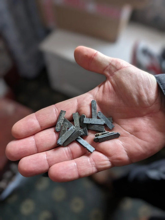
Remnants of a Legendary Typeface Have Been Rescued From the Thames River
Doves Type was thrown into the water a century ago, following a dispute between its creators.
The depths of the river Thames in London hold many unexpected stories, gleaned from the recovery of prehistoric tools, Roman pottery, medieval jewelry, and much more besides. Yet the tale of the lost (and since recovered) Doves typeface is surely one of the most peculiar.
A little over a century ago, the printer T.J. Cobden-Sanderson took it upon himself to surreptitiously dump every piece of this carefully honed metal letterpress type into the river. It was an act of retribution against his business partner, Emery Walker, whom he believed was attempting to swindle him.
The pair had conceived this idiosyncratic Arts and Crafts typeface when they founded the Doves Press in the London’s Hammersmith neighborhood, in 1900. They worked with draftsman Percy Tiffin and master punch-cutter Edward Prince to faithfully recall the Renaissance clarity of 15th-century Venetian fonts, designed by the revolutionary master typographer Nicolas Jensen.
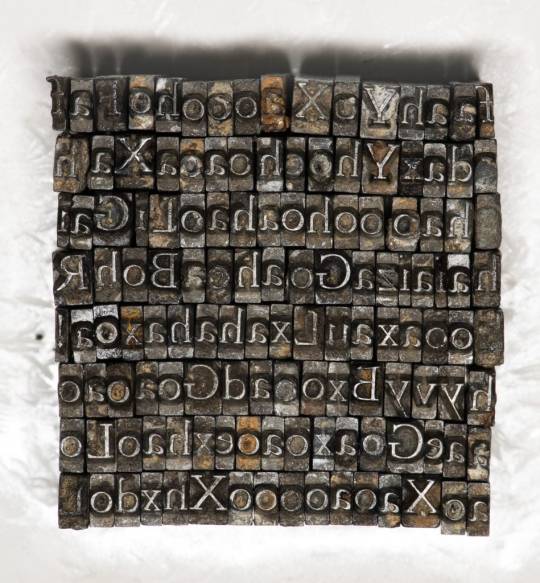
With its extra-wide capital letters, diamond shaped punctuation and unique off-kilter dots on the letter “i,” Doves Type became the press’s hallmark, surpassing fussier typographic attempts by their friend and sometime collaborator, William Morris.
The letterforms only existed as a unique 16pt edition, meaning that when Cobden-Sanderson decided to “bequeath” every single piece of molded lead to the Thames, he effectively destroyed any prospect of the typeface ever being printed again. That might well have been the case, were it not for several individuals and a particularly tenacious graphic designer.
Robert Green first became fascinated with Doves Type in the mid-2000s, scouring printed editions and online facsimiles, to try and faithfully redraw and digitize every line. In 2013, he released the first downloadable version on typespec, but remained dissatisfied. In October 2014, he decided to take to the river to see if he could find any of the original pieces.

Using historical accounts and Cobden-Sanderson’s diaries, he pinpointed the exact spot where the printer had offloaded his wares, from a shadowy spot on Hammersmith bridge. “I’d only been down there 20 minutes and I found three pieces,” he said. “So, I got in touch with the Port of London Authority and they came down to search in a meticulous spiral.” The team of scuba divers used the rather low-tech tools of a bucket and a sieve to sift through the riverbed.
Green managed to recover a total of 151 sorts (the name for individual pieces of type) out of a possible 500,000. “It’s a tiny fraction, but when I was down by the river on my own, for one second it all felt very cosmic,” he said. “It was like Cobden-Sanderson had dropped the type from the bridge and straight into my hands. Time just collapsed.”
The finds have enabled him to further develop his digitized version and has also connected him with official mudlarks (people who search riverbanks for lost treasures, with special permits issued) who have uncovered even more of the type.

Jason Sandy, an architect, author and member of the Society of Thames Mudlarks, found 12 pieces, which he has donated to Emery Walker’s House at 7 Hammersmith Terrace. This private museum was once home to both business partners, and retains its stunning domestic Arts and Crafts interior.
Much like Green, Sandy was captivated by the Doves Type story, and mounted an exhibition at the house that displays hundreds of these salvaged pieces, including those discovered by Green, as well as mudlarks Lucasz Orlinski and Angus McArthur. The show was supplemented by a whole host of Sandy’s other finds, including jewelry and tools. An extant copy of the Doves English Bible is also on display.
“It is not that unusual to find pieces of type in the river,” Sandy said. “Particularly around Fleet Street, where newspaper typesetters would throw pieces in the water when they couldn’t be bothered to put them back in their cases. But this is a legendary story and we mudlarks love a good challenge.” The community is naturally secretive about exactly where and how things are found. For example, Orlinski has worked under the cover of night with a head torch, to search for treasures at his own mysterious spot on the riverbank.
For Sandy, the thrill comes from the discovery of both rare and everyday artifacts, which can lead to an entirely new line of inquiry: “The Thames is very democratic. It gives you a clear picture of what people have been wearing or using over thousands of years. And it’s not carefully curated by a museum. The river gives up these objects randomly, and you experience these amazing stories of ordinary Londoners. It creates a very tangible connection to the past. Every object leads you down a rabbit hole.”
By Holly Black.
#Remnants of a Legendary Typeface Have Been Rescued From the Thames River#Doves Type#printer#Society of Thames Mudlarks#mudlark#mudlarking#ancient#archeology#archeolgst#history#history news#long reads#long post
109 notes
·
View notes
Text


Marbled Monday
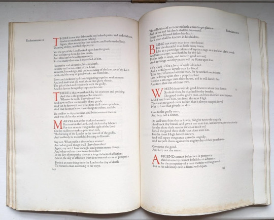
Flosculi Sententiarum was published in 1967 by the Gehenna Press. The Gehenna Press was founded by American sculptor, printmaker, and publisher Leonard Baskin in 1942 in Northampton, MA. A fine art press, The Gehenna Press published many well-known poets and became one of the most significant publishers of fine press books in the United States. Flosculi Sententiarum (or Thoughtful Flowers) features aphorisms or phrases surrounded by ornaments arranged by Leonard Baskin himself from a collection of ornaments collected by American typographer Bruce Rogers, who also designed Centaur, the typeface used in the book. I couldn't help but highlight my favorite phrase of those featured in the book—it simply says "Shut up, he explained."
The marbled covers look a bit like woodgrain and the color reminiscent of mushrooms, full of grey and cream and brown. The pattern is loose and free, with asymmetrical swirling throughout that would have been done using a stylus or other similar tool.
View more Marbled Monday posts.
View more posts on books featuring work by Leonard Baskin.
-- Alice, Special Collections Department Manager
#Gehenna Press#Marbled Monday#Leonard Baskin#Centaur#Flosculi Sententiarum#fine press books#fine press#aphorisms#Bruce Rogers#ornaments
62 notes
·
View notes
Text
Akello Chapter 2 Devlog

Akello's second chapter is out on Steam! Additionally, you can find TCM on the itch.io page too! As always, much love to my beta testers who work very hard to make sure shit works! I wanna give a shoutout to @cvnvryarts for letting me bounce Raath prototypes and designs around with them for the last few years, they really helped me refine his visuals especially.
Changelog - Here's what got updated besides story content:
Removed Discord Rich Presence for the time being. The base tool had not been developed with Linux users in mind and had some fairly significant stability issues. On top of that, it added a not-insignificant amount of endless loop crashes going between in-game and menu navigation in other builds. Because of this, I've decided to pull the feature for now. It may return after more thorough Linux testing and general stability tweaks happen.
I had a couple users still running into issues with the game crashing because pronouns weren't correctly saved as persistent data from earlier chapters so I added how to fix this in the FAQ post.
For reference, this glitch doesn't affect users who started playing after update 0.3.0 or any new playthroughs started after that point now the player can't get back into the story via Chapter Select or Load without requiring default MC data stored.
HOWEVER, if you're running into crashes at specific points, the first thing to do is make sure your MC's name, pronouns, and body are entered in the Options menu before jumping back into the story. Exiting the Options menu will save that data as persistent (for reals, this time!) and you should only have to do this once to fix the issue.
New Achievement
Learned not to set up Achievement Back End before game is updated! (It shows up as an unearned Achievement for users and it drives people batty. OOPS sorry, I wanted to test and make sure it worked)
File structure cleanup on the back end to keep things organized
Reorganized some bookmarks and their flags, got rid of a doubled up one for Akello
Fixed Raath getting unexpectedly shorter in Mori's Chapter 1
Typographical and Stylistic Adjustments to text
New animated bg
New backgrounds, music tracks, and sfx
UP NEXT: Amir Chapter 2
#gamedev#indie game dev#visual novel#renpy#devlog#the trials and tribulations of#make one oversight with persistent data and it will haunt you forever lmfao
19 notes
·
View notes
Text


BRIDGE SKIP
OR RIOT!!!!
to elaborate, this is an anniversary gift for my datemate, who likes Gargoyle's Quest and speedran it back in the day (he can still but he doesn't bc he's retired from active speedrunning). Bridge Skip(tm) is a trick in Gargoyle's Quest 1 that gets the player access to an area before they should have access, by pressing buttons in a specific rhythm to make your wing energy last long enough when it really really shouldn't. As is speedrunning tradition. Anyway, it's a difficult trick and not marathon safe, so of course. Bridge Skip or RIOT.
I remember him making some sorta quip when he did streaming about having a bridge skip or riot shirt, bc his bridge skip emote wasn't as thrilling as he would've wanted, and sometime in the middle of the night after that I laid down a sketch of it.
and then. didn't complete it.
and then years later, I showed him the sketch because I thought I wouldn't finish it.
and then after that he asked me about it again because he was doing silly speedruns with his friend.
and here we are now with me finishing it. It's not available as a shirt by the by, it's strictly for him and whoever he might give it to who gets the joke.
anyway if I were to theoretically do the thing, my original sketch worked better as a print, so I tooled around with it to make it more fitting for a shirt, and then I ended up with two designs. Cel shading is fun but also vector shapes are a mess of pulling vertices around to look some form of correct haha. I've been working on this for like two weeks or something now and I'm glad to have finished it on anniversary weekend. The joke is long over, but it's a labor of love anyway.
I'm no typographer or graphic designer, so I referenced the Gargoyle's Quest 2 box art for the font and drew what I did via that. I'm pretty proud of the effort, still.
5 notes
·
View notes
Text

Describe the Visual Identity: Making Your Brand Visually Memorable
The visual identity of your brand is the thing most people will notice first. Now, let’s go into detail about each element and explore what should be included in brand guidelines:
Brand Guidelines Logo
Your logo is the face of your brand. Outline when and how to deploy it. Include variations in format, such as horizontal or stacked. Mention minimum size and spacing requirements.
Example: Apple’s logo is iconic because it’s simple yet versatile.
It works equally well on product packaging, digital ads, and storefronts. A good mark helps people recognize your brand right away.
Color Palette
Choose primary and secondary colors that reflect your brand personality. Use tools like Pantone or HEX codes to ensure accuracy.
Example: Coca-Cola’s red evokes excitement and energy, while Tiffany & Co.’s Robin’s egg blue conveys elegance and exclusivity.
Colors evoke emotions and associations. Choosing the right palette strengthens your brand’s emotional impact.
Typography
Specify the selection of font types that match your brand’s personality. Include rules on headings, subheadings, body text, and other typographic elements.
Example: Google utilizes clean, sans-serif fonts to convey simplicity and approachability.
Typography informs both readability and perception. The wrong font undermines credibility.
Photography
Establish rules for imagery styles. Include candid shots and staged shots. Also specify filters or image treatment to utilize.
Example: Airbnb photography is about homes and actual experiences, therefore reinforcing their community-driven ethos.
Imagers tell stories, and continuing photography styles reinforce the brand narrative.
Iconography
If applicable, provide examples of approved icons and explain their role within your brand ecosystem.
Example: Microsoft’s Fluent Design System includes standardized icons that enhance the device user experience.
Icons simplify communication and improve usability, especially in digital interfaces.
By detailing these elements, you create a framework ensuring every piece of content aligns seamlessly with your overall aesthetic.
GraphyPix LLC offers multiple brand guidelines for your design. Investing in strong brand guideline templates is not just about looks. It’s about giving your audience a smooth experience. When done well, these documents are valuable tools. They empower teams, please customers, and boost growth.
11 notes
·
View notes
Text
Here’s a list of five great programs for graphic design that are perfect for creating flyers
Adobe Illustrator A powerful vector graphic design tool, Illustrator is ideal for creating detailed and scalable flyers. Its extensive features allow for precise control over typography and illustrations.
Canva User-friendly and accessible, Canva offers a wide range of templates and design elements, making it easy for anyone to create professional-looking flyers without extensive design experience.
Adobe InDesign This program is perfect for layout design and is commonly used in the publishing industry. InDesign provides advanced typographic controls and is great for multi-page flyers or brochures. Free InDesign alternatives.
Affinity Designer A cost-effective alternative to Adobe, Affinity Designer offers powerful vector and raster design tools, making it suitable for creating eye-catching flyers with ease.
Microsoft Publisher While simpler than the others, Publisher is a solid option for beginners. It features various templates and drag-and-drop functionality, making flyer design straightforward and intuitive.
Feel free to explore these options to find the one that best fits your design style and needs!
Visit Our Web Design Blog
#illustrator#adobe indesign#affinity designer#microsoft#publisher#indesign#canva#canva design#adobe illustrator#adobe#i-mpressed
7 notes
·
View notes
Text
Ok can I say one quick thing about the nintendo switch 2? Why is the logo kinda... bad?

I was already quite surprised that the new gen console was actually called "switch 2", doesn't feel offcial somehow even though now it clearly is. But that is a branding decision that was probably properly discussed, and it's very clearly intentional that the Switch 2 does not want to be separate to the Switch 1. I'm not a marketing expert nor a game console designer so that's none of my business and I have nothing much add. But the logo is... bad, and lazy too. Reusing the already existing Switch logo (which has an amazingly good design) is one thing worth criticising from a design and branding viewpoint. But to size it down and just slap a number 2 next to it (which, it looks like it was just written in with the text tool of whatever program they were using, using the same font as the typographic half of the logo without any alterations) is just... I don't know man... The composition also implies that the "Switch" iconographic part of the logo and the "2" on it's right are intended to be one singular element, but in practice the logo reads as if it's composed of three different elements, one icon, and two texts. Which makes it feel unbalanced, and the line weight of the "2" being much thicker than the line weight of the icon also contributes to that.
Graphic design is complicated to criticise and I'm no design expert here, I'm but a graphic designer fresh out of university with no experience designing for the tech sector. But this is 101 design stuff, this is the criticism I was being given by my professors on first year classes.
I wish I could hear the reasoning and process of the designers behind this logo, as I'm sure whoever was hired to make it must have thought about it through and through, and it wasn't just made in a rush. After all, the Switch is a console only 2 years short from being a decade old, and rumours about it's successor had being brewing for at least 5 years. I hardly doubt this was a rushed design with no thought being put in it than to just be the Switch 2. But I'm having a hard time finding anything interesting or unique about this design that could indicate otherwise. Ok rant over, just wanted to give my thoughts on it. TLDR: The Switch 2 logo feels oddly unoriginal for Nintendo at best and poorly executed lazy design at worst. So as a junior graphic designer I have thoughts on it.
3 notes
·
View notes
Text
Ellipsus can do regular expressions!!
So I started using Ellipsus for my writing, or rather, for my polishing (and I’ll experiment with collaboration soon). I love it for many reasons, you can do so much with it – but what really makes me super happy is their regex support for the find and replace function.
What is a regular expression, you ask?
A regular expression is needed whenever you want to search for a certain bit of text with a certain context, but it’s not just a word or bunch of characters. To be honest I’m not sure how often there are use cases in ‘normal’ writing scenarios, but then, what is ‘normal’? So, let’s consider some examples.
Imagine you have written a lot of dialogue on the notes app of your phone, because you had a flash of inspiration and no better tool at hand. Now you have dialogue with straight quotation marks ("like this"), but you like the proper typographic, curly ones (“like this”). You can’t just search for " and replace it, because at the beginning of a word they curl differently than at the end. But you can define a regular expression that says, find all instances of this character " that have whitespace to the left and no whitespace to the right, and then replace it with “.
Pretty neat huh? I did that recently while fixing up the Dead Boy Detectives oneshot and also chapter 8, and I’ve been meaning to write up a tutorial and maybe do a screencast, but guess what? The good folks at @ellipsus-writes already did that, so I don’t have to.
Scroll to the advanced stuff at the bottom and find enlightenment! 😃
They also have some interesting use cases:
Find occurrences of passive voice
Find all adverbs
Find all gerunds
Find all dialogue
And I’m actually writing this because I was talking to someone today who has a doc full of dialogue that is labelled with the speakers’ names in capitals, and they wanted a line break before each name. I managed to write a regex to catch those names, but found no way to use a line break character in the replace field. (I’ve contacted Ellipsus about it, so we’ll see.)
But really, I think regular expressions can be so useful. You could also use them to highlight all instances of say/says/saying/said in one go. Or variations of any other word you’d like to pay special attention to.
This is another thing where my inbox is always open – if you want to know if a certain thing can be done with regex, or you need help figuring out the actual regex, feel free to ask me any time!
(Also if a screencast would be helpful I might be persuaded.)
#witch moon ramblings#ellipsus#how to ao3#(oh well not quite but that’s my tag)#writing resources#formatting help
2 notes
·
View notes
Text
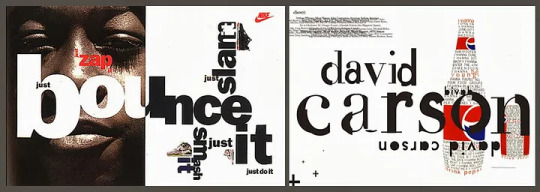
David Carson’s Unconventional Design Approach

David Carson’s graphic design is characterized by its intuitive, personal, and communicative approach, prioritizing the emotional impact of the design over strict adherence to traditional rules. His style, often described as visual jazz, is recognizable for its rich textures, visual distortions, and the deconstruction and reconstruction of typographical and photographic elements. This distinctive style emerged from his background in surfing and his late entry into the world of graphic design. Instead of adhering to the rigid grid structures favored by modernist design principles, Carson prioritizes visual communication that captures and conveys specific emotions, often pushing the boundaries of legibility to achieve his desired effect.
Breaking with Convention: Typography and Grids
Carson’s approach to typography is central to his unique style. He frequently manipulates letterforms, mixing and modifying fonts, to evoke particular feelings, even at the expense of traditional legibility. He challenges the modernist reliance on grid structures, arguing that software-driven, templated designs lead to uninspired results. Instead, he approaches each design intuitively, considering the audience, message, and desired emotional impact.
An example of his unconventional approach is his use of Zapf Dingbats font in a Ray Gun magazine interview with Bryan Ferry. Frustrated by the interview’s “boring” nature, Carson set the text in the symbol-based font, rendering it illegible, to make it more visually engaging. He later published the interview in a legible font elsewhere in the issue.
Finding Inspiration in Everyday Life
Carson stresses the importance of finding inspiration in everyday surroundings. He advocates for engaging with the world, visually, sonically, and even olfactorily, to make creative connections that go beyond the obvious. He encourages activities like life drawing and sketching to break down preconceived notions and see the world with fresh eyes. Morning Pages, a stream-of-consciousness writing exercise, is another tool he recommends for unlocking creativity and fresh perspectives.
The Power of Collage
Collage, a medium Carson champions, plays a significant role in his design approach. He sees collage as a powerful tool for subversion, using the juxtaposition of existing images to reveal unseen meanings and challenge conventional ways of seeing. He cites John Stezaker, a conceptual artist known for his thought-provoking collages, as an example of appropriation done well, demonstrating the medium’s capacity for subversion and timeless relevance.
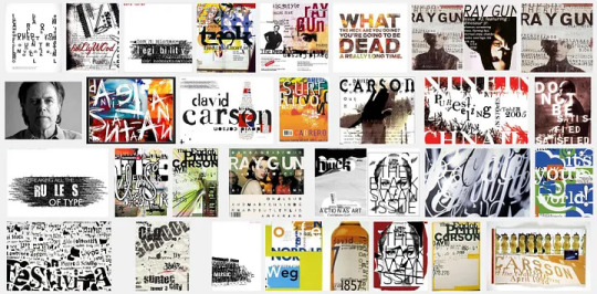
Key Characteristics of Carson’s Style
Intuition and Emotion: Design should be driven by intuition and a focus on evoking emotions rather than adhering to strict rules.
Experimental Typography: Unconventional use of typography, including mixing fonts, distorting letterforms, and pushing legibility, to create visual impact and convey specific feelings.
Rejection of Rigid Grids: Favoring a humanist approach over the rigid grid structures favored by modernist design, allowing for more fluid and emotionally resonant compositions.
Collage and Appropriation: Embracing collage as a means of challenging norms and creating new meaning through the juxtaposition of existing imagery.
Finding Inspiration in the Everyday: Encouraging designers to find inspiration in their surroundings, observing details and making unexpected connections.
Emphasis on Visual Communication: Prioritizing the overall message and emotional impact of design over mere legibility or adherence to conventions.
David Carson’s design legacy lies in his willingness to break with tradition and embrace instinct, emotion, and visual impact as guiding principles. His work continues to inspire designers to think outside the box and prioritize communication and emotional resonance over strict adherence to rules.
4 notes
·
View notes
Text
I have finished reading Creative Code and decided to get back to using my business planner, as well as continuing to use my morning pages. Yesterday I realized that I have turned all of my stationery into drawing utensils (more on that in a few months), so I went shopping for writing utensils.
And, as things are with all graphic designers, I of course did not use these tools to write anything, but instead put together a flatlay of what I’ve got.

I am playing around with becoming a travelling designer of sorts, so I need to consider a few things in the future, like how mobile can a workshop be and is that even a thing? That sort of play.
But with these new tools up there, I am fairly sure I can find new enjoyment in writing down, literally writing down.
And it struck me as odd how expensive these products were, since I associate Lamy and Pelikan with school brands, much less stationery brands. Maybe I am wrong, and these are just high quality brands? Having looked through my local supply store’s shelves one town over, all the other brands were a lot less expensive, so maybe these things in my flatlay are frivolous to someone else?
Eh. Now that is some Poor Dad talk right there, if I may say so!
There are also other things happening right now, which curiously are also about writing–typing, that is.
Maybe you remember that I have put together a set of so‑called text expansions for the Beeftext software before and uploaded these to github, and there is some development happening there, but in a direction basically implied in this repository, and this development has been catalyzed by a kickstarter project turning the E1‑keyboard layout into a physical keyboard, which I have backed for the keycaps (I’ll put my own keyboard together, thank you very much).
I am teaching myself how to use the E1‑keyboard layout, while not relying on my own text expansions. Gradually, I am learning where the additional, typographically accurate marks are.

Until my set of E1‑keycaps arrive, I have plenty to study and improve upon. Now, if you’ll excuse me, I’ll enjoy being able to do this, using a typewriter keyboard:
While chatting with an old friend today, I took note of what I’ve said about listening to the band Meshuggah, and liking it. “When you like Meshuggah,” I typed, “then you don’t have to share it with anyone–you don’t care if somebody listens to Meshuggah, you don’t care if they don’t. You just enjoy what you enjoy.”
5 notes
·
View notes
Text
Remnants of a Legendary Typeface Have Been Rescued From the River Thames
Doves Type was thrown into the water a century ago, following a dispute between its creators.
by Holly Black - Artnet, May 5, 2024

Doves Type recovered by Robert Green, 2014. Photo Matthew Williams Ellis
The depths of the river Thames in London hold many unexpected stories, gleaned from the recovery of prehistoric tools, Roman pottery, medieval jewelry, and much more besides. Yet the tale of the lost (and since recovered) Doves typeface is surely one of the most peculiar.
A little over a century ago, the printer T.J. Cobden-Sanderson took it upon himself to surreptitiously dump every piece of this carefully honed metal letterpress type into the river. It was an act of retribution against his business partner, Emery Walker, whom he believed was attempting to swindle him.
The pair had conceived this idiosyncratic Arts and Crafts typeface when they founded the Doves Press in the London’s Hammersmith neighborhood, in 1900. They worked with draftsman Percy Tiffin and master punch-cutter Edward Prince to faithfully recall the Renaissance clarity of 15th-century Venetian fonts, designed by the revolutionary master typographer Nicolas Jensen.

Doves Type recovered by Robert Green, 2014. Photo Matthew Williams Ellis
With its extra-wide capital letters, diamond shaped punctuation and unique off-kilter dots on the letter “i,” Doves Type became the press’s hallmark, surpassing fussier typographic attempts by their friend and sometime collaborator, William Morris.
The letterforms only existed as a unique 16pt edition, meaning that when Cobden-Sanderson decided to “bequeath” every single piece of molded lead to the Thames, he effectively destroyed any prospect of the typeface ever being printed again. That might well have been the case, were it not for several individuals and a particularly tenacious graphic designer.
Robert Green first became fascinated with Doves Type in the mid-2000s, scouring printed editions and online facsimiles, to try and faithfully redraw and digitize every line. In 2013, he released the first downloadable version on typespec, but remained dissatisfied. In October 2014, he decided to take to the river to see if he could find any of the original pieces.
Doves Type recovered and held here by Lukasz Orlinski at Emery Walker’s House. Photo: Lucinda MacPherson.
Using historical accounts and Cobden-Sanderson’s diaries, he pinpointed the exact spot where the printer had offloaded his wares, from a shadowy spot on Hammersmith bridge. “I’d only been down there 20 minutes and I found three pieces,” he said. “So, I got in touch with the Port of London Authority and they came down to search in a meticulous spiral.” The team of scuba divers used the rather low-tech tools of a bucket and a sieve to sift through the riverbed.
Green managed to recover a total of 151 sorts (the name for individual pieces of type) out of a possible 500,000. “It’s a tiny fraction, but when I was down by the river on my own, for one second it all felt very cosmic,” he said. “It was like Cobden-Sanderson had dropped the type from the bridge and straight into my hands. Time just collapsed.”
The finds have enabled him to further develop his digitized version and has also connected him with official mudlarks (people who search riverbanks for lost treasures, with special permits issued) who have uncovered even more of the type.

A mudlark by the Thames with Hammersmith Bridge in background. Photo: Lucinda MacPherson.
Jason Sandy, an architect, author and member of the Society of Thames Mudlarks, found 12 pieces, which he has donated to Emery Walker’s House at 7 Hammersmith Terrace. This private museum was once home to both business partners, and retains its stunning domestic Arts and Crafts interior.
Much like Green, Sandy was captivated by the Doves Type story, and mounted an exhibition at the house that displays hundreds of these salvaged pieces, including those discovered by Green, as well as mudlarks Lucasz Orlinski and Angus McArthur. The show was supplemented by a whole host of Sandy’s other finds, including jewelry and tools. An extant copy of the Doves English Bible is also on display.
The Doves Bible returns to Emery Walker’s House. Photo: Lucinda MacPherson.
“It is not that unusual to find pieces of type in the river,” Sandy said. “Particularly around Fleet Street, where newspaper typesetters would throw pieces in the water when they couldn’t be bothered to put them back in their cases. But this is a legendary story and we mudlarks love a good challenge.” The community is naturally secretive about exactly where and how things are found. For example, Orlinski has worked under the cover of night with a head torch, to search for treasures at his own mysterious spot on the riverbank.
For Sandy, the thrill comes from the discovery of both rare and everyday artifacts, which can lead to an entirely new line of inquiry: “The Thames is very democratic. It gives you a clear picture of what people have been wearing or using over thousands of years. And it’s not carefully curated by a museum. The river gives up these objects randomly, and you experience these amazing stories of ordinary Londoners. It creates a very tangible connection to the past. Every object leads you down a rabbit hole.”
“Mudlarking: Unearthing London’s Past” is at Emery Walker’s House, 7 Hammersmith Terrace, London, through May 30.
#Doves typeface#letterpress type#letterpress printing#T.J. Cobden-Sanderson#Emery Walker#Emery Walker's House#Robert Green#Jason Sandy#mudlarking#Artnet#May 2024#long post
6 notes
·
View notes
Text


Marbled Monday
This week's example of marbling is used in the binding of Poems by Goldsmith and Parnell printed by W. Bulmer of the Shakespeare Printing Office in 1795. English printer and typographer William Bulmer (1757-1830) established the Shakespeare Press in 1790 and published over 600 volumes during its operation.
Irish poet, novelist, and playwright Oliver Goldsmith (1728-1774) was a poor student but a good writer, especially noted for his pastoral style. English-Irish poet and clergyman Thomas Parnell (1679-1718) is considered one of the "Graveyard Poets," whose work often contained ruminations on mortality and were considered precursors to the Romantic and Gothic movements. Goldsmith wrote a biography of Parnell that was often published with collections of the latter's works.
The binding of this book shows great attention to detail. The marbled paper is, I believe, a Stormont Pattern in red, ten, green, and black. The corners and spine are covered with dark green goatskin featuring gold tooling and the title stamped on the spine. The corners and the edges of the goatskin leather covering the spine have a blind-tooled design on them. It's a very good example of a well-considered and designed binding.
View a post on the wood engravings in this book.
View more Marbled Monday posts.
-- Alice, Special Collections Department Manager
#Marbled Monday#Oliver Goldsmith#Thomas Parnell#William Bulmer#graveyard poets#stormont#stormont pattern#poems#marbling#marbled paper
23 notes
·
View notes
Text
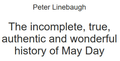
The Red: Haymarket Centennial
The history of the modern May Day originates in the center of the North American plains, at Haymarket, in Chicago - "the city on the make" - in May 1886. The Red side of that story is more well-known than the Green, because it was bloody. But there was also a Green side to the tale, though the green was not so much that of pretty grass garlands, as it was of greenbacks, for in Chicago, it was said, the dollar is king.
Of course the prairies are green in May. Virgin soil, dark, brown, crumbling, shot with fine black sand, it was the produce of thousands of years of humus and organic decomposition. For many centuries this earth was husbanded by the native Americans of the plains. As Black Elk said theirs is "the story of all life that is holy and is good to tell, and of us two-leggeds sharing in it with the four- leggeds and the wings of the air and all green things; for these are children of one mother and their father is one Spirit." From such a green perspective, the white men appeared as pharaohs, and indeed, as Abe Lincoln put it, these prairies were the "Egypt of the West".
The land was mechanized. Relative surplus value could only be obtained by reducing the price of food. The proteins and vitamins of this fertile earth spread through the whole world. Chicago was the jugular vein. Cyrus McCormick wielded the surgeon's knife. His mechanical reapers harvested the grasses and grains. McCormick produced 1,500 reapers in 1849; by 1884 he was producing 80,000. Not that McCormick actually made reapers, members of the Molders Union Local 23 did that, and on May Day 1867 they went on strike, starting the Eight Hour Movement.
A staggering transformation was wrought. It was: "Farewell" to the hammer and sickle. "Goodby" to the cradle scythe. "So long" to Emerson's man with the hoe. These now became the artifacts of nostalgia and romance. It became "Hello" to the hobo. "Move on" to the harvest stiffs. "Line up" the proletarians. Such were the new commands of civilization.
Thousands of immigrants, many from Germany, poured into Chicago after the Civil War. Class war was advanced, technically and logistically. In 1855 the Chicago police used Gatling guns against the workers who protested the closing of the beer gardens. In the Bread Riot of 1872 the police clubbed hungry people in a tunnel under the river. In the 1877 railway strike, Federal troops fought workers at "The Battle of the Viaduct." These troops were recently seasoned from fighting the Sioux who had killed Custer. Henceforth, the defeated Sioux could only "Go to a mountain top and cry for a vision." The Pinkerton Detective Agency put visions into practice by teaching the city police how to spy and to form fighting columns for deployment in city streets. A hundred years ago during the street car strike, the police issued a shoot-to-kill order.
McCormick cut wages 15%. His profit rate was 71%. In May 1886 four molders whom McCormick locked-out was shot dead by the police. Thus, did this 'grim reaper' maintain his profits.
Nationally, May First 1886 was important because a couple of years earlier the Federation of Organized Trade and Labor Unions of the United States and Canada, "RESOLVED... that eight hours shall constitute a legal day's labor, from and after May 1, 1886.
On 4 May 1886 several thousand people gathered near Haymarket Square to hear what August Spies, a newspaperman, had to say about the shootings at the McCormick works. Albert Parsons, a typographer and labor leader spoke net. Later, at his trial, he said, "What is Socialism or Anarchism? Briefly stated it is the right of the toilers to the free and equal use of the tools of production and the right of the producers to their product." He was followed by "Good-Natured Sam" Fielden who as a child had worked in the textile factories of Lancashire, England. He was a Methodist preacher and labor organizer. He got done speaking at 10:30 PM. At that time 176 policemen charged the crowd that had dwindled to about 200. An unknown hand threw a stick of dynamite, the first time that Alfred Nobel's invention was used in class battle.
All hell broke lose, many were killed, and the rest is history.
"Make the raids first and look up the law afterwards," was the Sheriff's dictum. It was followed religiously across the country. Newspaper screamed for blood, homes were ransacked, and suspects were subjected to the "third degree." Eight men were railroaded in Chicago at a farcical trial. Four men hanged on "Black Friday," 11 November 1887.
"There will come a time when our silence will be more powerful than the voices you strangle today," said Spies before he choked.
#may day#may 1st#anarchism#resistance#autonomy#revolution#community building#practical anarchism#anarchist society#practical#anarchy#daily posts#communism#anti capitalist#anti capitalism#late stage capitalism#organization#grassroots#grass roots#anarchists#libraries#leftism#social issues#economics#anarchy works#environmentalism#environment#anti colonialism#mutual aid#survival
4 notes
·
View notes
Text

Usability: Great RPG Mechanics #RPGMechanics: Week Nine
Continuing my week of meta-elements which make for great games, I want to talk about physical presentation. There’s a weird mix in my collection of ttrpgs. I have 8-9 shelves filled with physical books and way, way too many accumulated in my badly organized “rpg e-files” folder which has migrated across five different desktops. I’d say pdfs have become the majority at this point. I usually read those on a crappy Samsung tablet, mostly because I have a hard time reading large amounts of text on a screen. So pdfs work better than others– and I appreciate when the designers have thought about these elements.
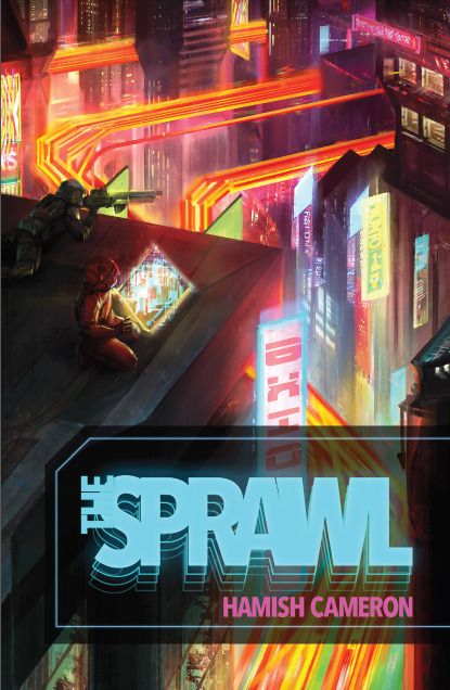
Printer-Friendly: I love it when a ttrpg has a printer friendly mode. This can take a couple of forms. Some games, like The Sprawl, have a day-mode and night-mode versions. When I first saw the Sprawl’s white text on black background, I didn’t like it. Eventually I found out that was a more comfortable approach for a lot of readers. But I appreciated that Hamish Cameron eventually released a version with standard black on white page design. Other games publishers in the last few years have begun to do this more and more. Star Trek Adventures includes that with the pdf purchase.
The other version of printer/reader friendly is to have layers available in the pdf. This allows readers to turn off distracting page elements: paper textures, watermark art, intrusive page frames. This allows for easier printing, but frankly for me, it makes for easier reading. It just makes me unreasonably angry when I get a pdf with page backgrounds that make it harder for my old person's eyes and I can’t turn those off. Sometimes a pdf will have layers but turning off the backgrounds removes the text as well because they’ve merged the two together. The best games have layers, cleanly separated and cleanly labeled.
Give Me Text: Some games in recent years have offered text-only versions, like The Veil. I love this. It is hugely useful and makes it more likely that I’m going to run that game. I run the majority of my ttrpgs online. Usually that means I’m putting together materials for the players: setting background, cheat sheets, and character keepers. Extracting text from pdfs is a pain, even with a good program. You almost always have to deal with the paragraph breaks and formatting. When a company provides the text, it makes my job significantly easier. If you want people to play your game online, outside of a set VTT package, include the text with the pdf. A lot of folks on itch.io know to do this.
Accessibility: There are a couple of elements which I can’t speak to from experience, but I appreciate when I hear about publishers who spend the extra time getting these things right. My father was color blind and the few board games he played with us often had to be modified to make up for that. Some companies use online tools to check how their material works for the color blind. That’s important where color is used to mark out important information: particularly different colors to indicate different things.
On the other hand, one complaint I’ve heard about certain books is that they’re particularly dyslexia-unfriendly. They choose fonts which look cool but become a pain to actually read for people with this condition. I know tools and resources exist for checking which fonts work better than others. Of course it isn’t just about fonts, but general typographic elements, size, background bits, etc. When I designed the earlier Gauntlet Community revised logos, I had input from a couple of folks who encouraged me to move clutter away from the words and remove some extra type flourishes. It looked better and became more useful as a result.
6 notes
·
View notes
Video
youtube
Typography Poster Design in Adobe Photoshop | FREE COURSE
Bold typographic posters will never go out of style. Learn how to design your own typography poster in Adobe Photoshop! In this course, you'll learn everything you need to get started, from tips on the creative process and generating ideas through to preparing your files for printing or sharing on social media. Along the way, you'll learn some of the principles of graphic design, discover how to create a visually powerful composition, and master several crucial tools in Adobe Photoshop—such as layer masks and adjustment layers. At the end of this course, you'll walk away with all the skills you need to create your best poster design yet!
#youtube#graphic design#typography poster design#free education#Typography Poster Design in Adobe Photoshop#Typography Poster Design in Adobe Photoshop free course#Typography Poster Design in Adobe Photoshop tutorial#graphic design tutorial#graphic design tips#educate yourselves#education
3 notes
·
View notes