#and HOW the colors and shapes are effective visual elements
Explore tagged Tumblr posts
Visit Tumblr Blog
Explore Tumblr blogs with no restrictions, modern design and the best experience.
Last Seen Tumblr Blogs


Fun Fact
Tumblr has 16.74 million mobile monthly users in the US.
Text
anyone got any tips on getting art industry jobs w/o a college degree bc holy fuck this shit is horrendous /oAo;\
#nebbles talks#s.struggling to. survive working full time and still trying to get an illustration degree..#wish i. couldve taken the semesters off for work again like i did last year#but. unfortunately. since someone decided to change lanes w/o checking for. yknow. traffic in that lane. i now have an extra $200/month#to pay in bills. :)))))#not to mention the horrendous interest rate i got fucked over with :)))))))))#not even looking at the terrible financial stress the stress of these classes themselves is INSANE#like. one prof says hes ''simulating working with real clients'' with how he formats the class#which to him just means 'im going to assign you three major projects at once'#each of which have overlapping and hard set due dates for an asinine amount of preliminary work that can take up to 6 hours EACH#plus you have to submit at least 2 pages for all your preliminary work describing WHY you chose your colors or shapes#and HOW the colors and shapes are effective visual elements#and then you also have to submit a mini essay that describes how your art might fair against other real businesses art and illustrations#like. my guy. i have to work 35 hours a week. and do homework for 4 other classes.#i cannot physically keep up. with that kind of a pace. without killing myself in the process with self-neglect#just. do not understand why i have to run myself ragged and to the brink of total collapse and failure.#just so i MIGHT get improved odds of getting a decent job that wont even help me get above the poverty line#like. i wanna be able to make art for a living and be able to live comfortably#but that just doesn't seem like its possible in the society thats currently set up rn#just. AUHG#;w;
0 notes
Note
Hello! I’m just here bc I’m a little confused on what you meant by Smythe drawing out “each individual asset” when she was making comics? Now, granted, I can see that it made her file ginormous, but me personally as someone who knows nothing about making online comics but is really wanting to get into it (and also as someone who has a ‘too many layers’ problem myself), is there a way to avoid using too many layers?
My current way of making comics has been to draw the panels individually and then format them (which I know is terrible management wise and also messes with the quality) but I honestly have no other idea of how to do it properly, and seeing how stunning Lore Rekindled looks, I don’t know how you would manage to put all that lighting effects and little details on the same layers. (But also I may be thinking of it wrong so I’ll let you talk qwq)
Ah I can actually give you a visual breakdown of what I meant by that!
So in this you can see there are a TON of layers, and not even all of them are visible because some of them are stuffed into FOLDERS that have been left closed. BUT if you look REEEEALLY carefully-

^^^ These layers right here? That's specifically Minthe from this panel in Episode 61:

(the unique pose here makes it real easy to tell that this is the corresponding panel, you can see the matching body shape with the dark shading that's clipped to the base layer below it!)
So what this means is that Rachel didn't draw all her characters on one base layer, she drew every single character in every single panel separately. Now of course, she could merge all these layers together as working on separate layers helps make it easier to work on elements that collide separately (like one character being 'underneath' another character like Hades is here) but because she has all of those clipping layers with the shading already added in, she likely didn't merge them afterwards because that would actually create MORE problems (because if she merged the Minthe layer in with Hades, then the shading for Minthe that she painted outside of the lines would show up on Hades and then she'd have to erase it which is just a bunch of extra work).
You can also tell all these characters are on their own layer because the layer thumbnail EXCLUSIVELY shows those characters. A layer will show as much canvas length as it needs to cover what's in that layer, so if the thumbnail is only showing one character, that means there's NOTHING ELSE on that layer. If there were more elements on this layer than just Minthe, the layer thumbnail would look more like this:
Now let's compare it to Rekindled's layers! I'll use a completed page to make it fair as we use a lot of extra layers in the post-production phase where we add the texture effects and glow and all that fun stuff, plus I'll even make it a more complicated page like that big nymph explanation spread from Episode 51:
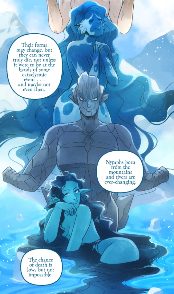
So I'll break it down to make this make more sense:
BG 2 Copy (technically this is supposed to be BG 1) - Basically the panel shapes, what I'll do is mark out the panels with flat blocks and through that we'll add background elements in a clipping layer (usually done by Banshriek). Often times they'll do multiple layers to make the process easier and then merge them all together in the end. With these shapes operating as panels, it means I can just auto select the whole layer, invert the selection, and easily erase whatever's outside of it (such as the lineart and base colors that I put down afterwards). I could just use masking layers like I did in [AFTERBIRTH] but I find this way works better for the process of making Rekindled.
BG 2 - This is where we add objects / foreground elements. So stuff like furniture, interactables, anything that needs to be kept separate from the larger background to make it easier to work with. This can also include "floating" panels that need to be above other panels, such as this:

All of the backgrounds are then nested in a folder for organization purposes (we also sometimes use clipping layers on top of those folders to apply extra effects over anything contained within that folder without affecting other folders, that's a common technique that Banshriek applies)
Then we get into our Characters folder:
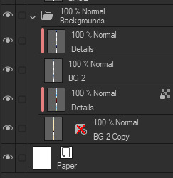
BASE - This is where I do the majority of my work, all the characters in every panel on a page are flatted into this layer. Sometimes I do have to create separate layers to, again, make it easier to work with overlapping characters, but usually those layers will be merged before I go into the shading process. I simply shade on a single layer by using the lasso / magic wand tool to select my area for painting, the flat colors make it really easy to do that. Sometimes I need to create a secondary shading layer if I've put down dark colors that start to bleed into the lighter colors, but again, I merge when I'm done into a single shading layer. We also sometimes employ an Add (Glow) layer into the clipping set if we need a glow effect that's exclusive to the characters and doesn't travel outside of their base colors.
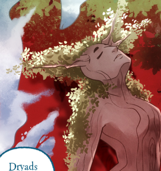
There's a (leaves) layer here that I used for the dryad because I needed the leaves to be above the base layer, after that I selected the leaves elements so that I could erase the lineart in the layer above it where needed.
LINEART - It's lineart, enough said haha That said, I do think Rachel actually uses clipping layers for her lineart in places, it seems to be visible in some of her process videos where you can see the lineart present in a clipping layer, and that would explain why there are panels where the lineart suddenly 'cuts off' and doesn't travel outside of the base layer, like so:
GLOW - This is where we do an Add (Glow) layer that isn't restricted to the base layer, it's where we add all the fun lil' glow and sparkle effects over the characters !
The CLOUDS layer is, like the leaves, a background element that needs to be above the base layers rather than constricted to the background.
Above the Characters folder you can see what I mentioned earlier where Banshriek has added more post-production effects that are exclusively clipped to the contents of the Characters folder. This means the effects / blend modes do NOT affect the background layers or anything above it.
The BLUR (Overlay) layer is something we just started doing over the past several episodes, it's a technique I actually picked up from 66 of City of Blank where I merge all the layers into a new visible layer which I then apply a Gaussian Blur to at around 60% and then set to Overlay (and then I adjust the layer opacity until it looks right, usually around 25-35%), it gives it a bit of a softer "dreamier" vibe in the final colors and really helps unify everything!
CANVAS - This is an Overlay layer which is also set to an opacity of 25-35% where I go over the panels with the Add Canvas brush from the Kyle Webster set, unlike the Canvas overlay texture in CSP I can actually choose the colors I want to use which means I can match the canvas texture color to the mood and environment of the scene (ex. I'll use a very light blue for scenes in the Underworld). Not only does it give it that signature texture from S1 of LO, but it also helps balance out the effects of the BLUR layer.
The SKETCH layer sits on top of everything and gets turned off once all the base layers and lineart are down, and ofc the SPEECH folder is just where all the text is kept.
I know everything I just laid out is a LOT but ultimately it's how we operate, it works for us! But it also begs the question of why Rachel operates the way she does because a lot of it seems extremely unnecessary and more likely to bite her in the ass (the more layers there are, the bigger your file size gets, the risk of drawing on the wrong layer increases as well as the risk of posting a panel that's missing elements because the layer was left turned off by mistake, etc.) And it's more so concerning with how she operates with her assistants because if she's still using this many layers when collaborating with other people, hooo boy. Though based on what I've observed of what her assistants contribute, I get a lot more of the sense that she circumvents this by having the artists do the flats separately and then importing them in as separate assets that she then just imports into the page and places them where they need to be. Still not a great workflow IMO because it's what's led to a lot of the issues of characters "floating" rather than feeling like they're actually in the environment-
-but that's still an issue that could be solved by Rachel just taking more time to actually flesh out the backgrounds and lighting to give more of an impression of the characters actually existing in the space. Like that Hestia panel could easily be fixed by just giving the background a bit more detail and putting actual shading underneath her (and lighting from whatever direction it's coming from).
Either way, regardless of whether or not Rachel's process is productive or not, I hope that breakdown helps explain how we do it in Rekindled! Learning how to manage layers is definitely a skill that can be tricky to harness, but once it "clicks" there's a lot you can get away with. Ultimately how you do it is up to you, but my best piece of advice to offer is to just be open to other types of workflows because you don't know how much you might be shooting yourself in the foot doing things the hard way when there are often way easier and more efficient ways to get the same job done. That's basically the vibe I get from observing Rachel's workflow, it seems like she's still using methods that she thinks are working for her (and probably did work just fine for her when it was JUST her) but could be vastly improved for her and her team if she'd just get over the initial hump of stepping outside of her comfort zone. Would probably make for a better comic too LOL
I hope that helps! Good luck! ( ´ ∀ `)ノ~ ♡
#ask me anything#ama#anon ama#anon ask me anything#lore olympus critical#anti lore olympus#lo critical#lore rekindled#webcomic advice
155 notes
·
View notes
Text
Kara as Itzpapalotl
Itzpapalotl, "Obsidian Butterfly", "Clawed Butterfly", or "Butterfly of Obsidian Knives" is the ruler of Tamoanchan and the leader of the Tzitzimimeh, murderous creatures associated with the stars that hunt down people during the night and solar eclipses.
Itzpapalotl, as the leader of the Tzitzimimeh, shares their physical features, and so does Kara in her character design! I will be using these illustrations of Itzpapalotl from different codices, and an illustration of a Tzitzimitl from Codex Magliabecchiano.
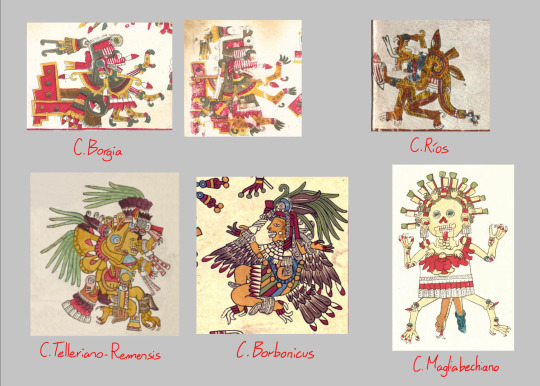
First I'll list the things Itzpapalotl and the Tzitzimimeh have in common, then I'll get more specific into Itzpapalotl's iconography.
—
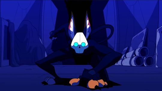
First of all, the Tzitzimimeh have skeletal bodies, and their heads are just their skulls with eyes inside the eye sockets . Quoting Mexicolore again here, these eye sockets are particularly blue. Kara has a mask of a skull with bright blue eyes.

*Using this image again, I believe there was a reference to the Tzitzimimeh's paper banners in ep4 when Agent K gestures to her mask with his hands (also note that on her head are hearts AND HANDS!)

Itzpapalotl and the Tzitzimimeh have sharp claws for hands and feet (varying from jaguar claws to eagle talons), just like Kara

The Tzitzimimeh also have small faces on their joints, their hands and feet, each with blue eye sockets. Kara has these buttons on the back of her hands that turn into the same blue when they light up

Finally, these star creatures were generally female. The Aztecs believed that pregnant women could become Tzitzimimeh. Itzpapalotl alternates between having a skeletal and a flesh body. Kara is a feline based alien, but unlike the cat brothers, she's anthropomorphic, she has a female humanoid body.
—
Getting more specific with Itzpapalotl's iconography now, the goddess' name means "Obsidian Butterfly", and she's illustrated with butterfly wings, although sometimes she's given feathered wings as well

Kara might not have wings herself, but she has other possible butterfly elements. Itzpapalotl is based on a moth, the Orizaba silkmoth.


I thought the shape and color of her ears resembled the moth's antennae
Also, Kara has a song called "Killing Butterflies" in her official playlist
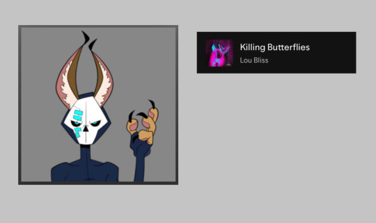
This song has the sound effect of a butterfly flapping its wings multiple times. You can hear a similar sound in ep1 whenever Kara dashes, but it's even more clear in this scene in ep4.
Edit: @hi-im-a-rat mentioned that her ship might be designed to look like a butterfly cocoon


Her name can also be translated to "Butterfly of Obsidian Knives", because she is depicted with flints (tecpatl) either in the tips of her wings or around her body

And we see Kara using similar shaped blades at the end of ep3

This could be also why she's paired with Agent K! Agent K is Itztlacoliuhqui. They're both obsidian related deities, and in some cases he's considered the male counterpart to Itzpapalotl. His name is commonly translated as "Curved Obsidian Knife" (although there are other translations of his name that I will mention in his post). In a way, he is part of Kara's Itzpapalotl iconography, being named "obsidian knife" himself
—
Itzpapalotl was believed to be the ruler of Tamoanchan. This is a paradisiacal realm where the first humans were created. This place is visually represented with a tree cut in half with blood sprouting off of it.

This symbol is very often close to Itzpapalotl. It reflects how the goddess broke the tree, and she was then banished from Tamoanchan because of it (Snippet from Gods Of Mexico by Lewis Spencer, page 225)


It's possible that Kara cutting the desk in half when intimidating Shrike was a reference to the tree?

There's also this moment here where it looks like she's copying the pose of a stone relief of Itzpapalotl in the National Museum of Anthropology in Mexico City (image taken also from Gods of Mexico, page 223)

—
The Tzitzimimeh are murderous creatures that kill people in the dark. They'd come down to Earth during the night and solar eclipses. I mentioned them in Shrike's post, this current era was prophesized to end with earthquakes, and once the world was without a Sun, all the Tzitzimimeh would come down from the night sky and kill all of humanity.
Kara is an assassin, killing people is her job. And not only that, her job requires her to be stealthy. She tends to stay in the shadows before going in for the kill

When she's in public and she can't do that, she'll stay in a high place, then she comes down when it's the best moment to strike.


Like a Tzitzimitl would!
List
#monkey wrench#monkey wrench theory#five sun theory#kara#aztec mythology#itzpapalotl#tag#hi-im-a-rat#the playlist format looks a bit silly with no lyrics on it but I will be using it for Agent K's post. maybe DH's too#and um... shrike's other family :o)
43 notes
·
View notes
Text
Writing Character Appearance More Effectively
A character’s appearance plays a crucial role in storytelling, especially when it reflects their struggles, background, or how they navigate the world around them. Well-crafted descriptions can help readers connect with characters on a deeper level. However, it’s essential to focus on relevant details instead of overwhelming your audience with too much information at once.
Character descriptions should unfold gradually throughout the story rather than being dropped all at once. With that in mind, let’s explore the elements that make a character’s appearance distinct and memorable.
The Basics of Character Appearance
- Sex: Defining whether your character is male, female, or non-binary can help shape their identity and interactions within the story.
- Age: A character’s age influences their experiences, outlook, and physical appearance. Noting this helps readers understand their journey.
- Height: Using subtle comparisons between characters rather than listing exact measurements can add realism and depth to interactions.
- Weight: Weight can vary greatly between characters, offering room for diversity. Be mindful of how you present it to avoid alienating your audience.
- Skin Tone: Describing skin tone helps readers visualize your character and can be significant if cultural identity plays a role in your story.
- Hair Color & Style: Hair color, length, and texture can reflect personality, background, or personal care habits, making your characters more distinct.
- Body Build: Including hints about body type can contribute to characterization, such as a muscular frame indicating an active lifestyle or a slender build suggesting elegance.
Beyond Physical Appearance: Lifestyle & Expression
A character’s appearance isn’t just physical—it also includes clothing, behavior, and personal habits, which add complexity and realism.
- Fashion Choices: Clothing reflects personality, profession, status, or even personal struggles. A character’s wardrobe can tell a story of its own.
- Body Language: How a character carries themselves can indicate confidence, nervousness, or emotional distress. Small gestures can enhance depth.
- Hobbies & Routine: Interests like fitness, arts, or manual labor can subtly shape a character’s physique and style.
- Flaws & Unique Traits: Imperfections—like scars, freckles, or an unusual way of carrying themselves—make characters realistic and memorable.
Conclusion
Crafting a character’s appearance effectively means balancing detail without overwhelming your audience. Gradually revealing aspects of their looks, lifestyle, and mannerisms throughout your story allows for more natural and immersive characterization.
By following these suggestions, you’ll create authentic, engaging characters that leave a lasting impression on your readers.
Happy writing!
#writing community#creative writing#writing tips#writingjourney#fiction writing#character development#writing inspiration#author life#story building#buildbettercharacters
32 notes
·
View notes
Text
Writing Notes: Elements of Art
The elements of art are components or parts of a work of art that can be isolated and defined. They are the building blocks used to create a work of art.
LINE A mark with greater length than width. Lines can be horizontal, vertical, or diagonal; straight or curved; thick or thin.
Horizontal lines suggest a feeling of rest or repose because objects parallel to the earth are at rest. In landscape paintings, horizontal lines help give a sense of space. The lines delineate sections of the landscape, which recede into space. They also imply continuation of the landscape beyond the picture plane to the left and right.
Vertical lines often communicate a sense of height because they are perpendicular to the earth, extending upwards toward the sky. In a church interior painting, vertical lines may suggest spirituality, rising beyond human reach toward the heavens.
Horizontal and vertical lines used in combination communicate stability and solidity. Rectilinear forms with 90-degree angles are structurally stable. This stability suggests permanence and reliability.
Diagonal lines convey a feeling of movement. Objects in a diagonal position are unstable. Because they are neither vertical nor horizontal, they are either about to fall or are already in motion. The angles of a ship and rocks on the shore convey a feeling of movement or speed in a stormy harbor scene.
The curve of a line can convey energy. Soft, shallow curves recall the curves of the human body and often have a pleasing, sensual quality and a softening effect on the composition. The edge of a pool in a photograph may gently lead the eye to the sculptures on the horizon.
SHAPE A closed line. Shapes can be geometric, like squares and circles; or organic, like free-form or natural shapes. Shapes are flat and can express length and width.
FORM A three-dimensional shape expressing length, width, and depth. It is the basis of sculpture, furniture, and decorative arts. Balls, cylinders, boxes, and pyramids are forms. They can be seen from more than one side.
Geometric shapes and forms include mathematical, named shapes such as squares, rectangles, circles, cubes, spheres, and cones. Geometric shapes and forms are often man-made. However, many natural forms also have geometric shapes. Example, a cabinet decorated with designs of geometric shapes.
Organic shapes and forms are typically irregular or asymmetrical. Organic shapes are often found in nature, but man-made shapes can also imitate organic forms. Example, a wreath uses organic forms to simulate leaves and berries.
SPACE The area between and around objects. The space around objects is often called negative space; negative space has shape. Space can also refer to the feeling of depth.
Real space is three-dimensional; in visual art, when we create the feeling or illusion of depth, we call it space.
COLOR Light reflected off of objects. Color has 3 main characteristics:
Hue - the name of the color, such as red, green, blue, etc.
Value - how light or dark it is.
Intensity - how bright or dull it is.
White is pure light; black is the absence of light.
Primary colors are the only true colors (red, blue, and yellow). All other colors are mixes of primary colors.
Secondary colors are two primary colors mixed together (green, orange, violet).
Intermediate colors, sometimes called tertiary colors, are made by mixing a primary and secondary color together. Some examples of intermediate colors are yellow green, blue green, and blue violet.
Complementary colors are located directly across from each other on the color wheel (an arrangement of colors along a circular diagram to show how they are related to one another).
Complementary pairs contrast because they share no common colors. For example, red and green are complements, because green is made of blue and yellow.
When complementary colors are mixed together, they neutralize each other to make brown.
TEXTURE The surface quality that can be seen and felt. Textures can be rough or smooth, soft or hard. Textures do not always feel the way they look; for example, a drawing of a porcupine may look prickly, but if you touch the drawing, the paper is still smooth.
Texture depicted in two-dimensions. Artists use color, line, and shading to imply textures. In a painting, a man's robe may be painted to simulate silk. The ability to convincingly portray fabric of different types was one of the marks of a great painter during the 17th century.
Surface texture. The surface of a writing desk is metallic and hard. The hard surface is functional for an object that would have been used for writing. The smooth surface of a writing desk reflects light, adding sparkle to the piece of furniture.
Principles of Design ⚜ Writing Notes & References
#writing notes#art#writeblr#writing prompt#writers on tumblr#poets on tumblr#literature#spilled ink#poetry#writing advice#writing tips#writing reference#dark academia#studyblr#light academia#lit#words#art reference#art resources#writing resources
86 notes
·
View notes
Text
Drift Review Essay!!
Haven't had time to draw BUT guess what I have been doing? Here's a semi-short review essay about the drift mini series I wrote for my english class! Hope yall enjoy it >:D
(Okay essay starts now hehe)
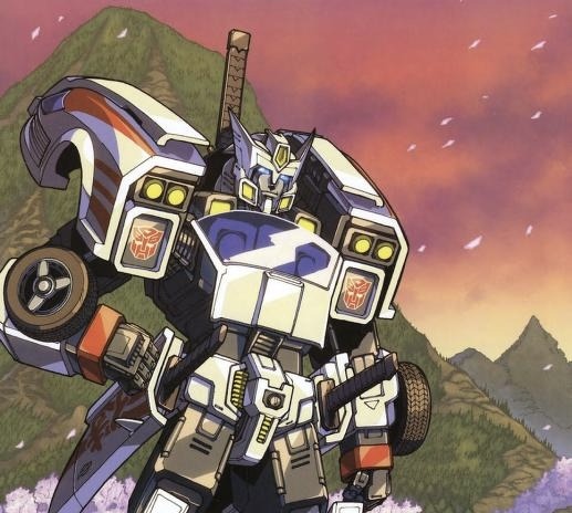
The Transformers: Drift—My Thoughts and Observations
Written by fallisl1fe on tumblr
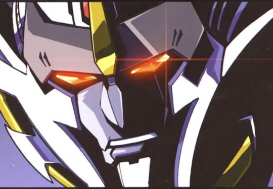
Comics were not something I expected to become fully enthralled with, not even in a million years. Yet, after finally reading one, I have been pulled deep into the comic book rabbit hole. The IDW Drift mini series from the Transformers franchise—its proper name being The Transformers: Drift by Shane McCarthy—is one of the most notable comics I’ve read. I was blown away by Drift’s incredible characterization, the comic’s outstanding art, and the side characters’ undeniable influence on the story, so much so that I still think about each element of the comic regularly.
Above all else, what stood out most in this series was Drift as a character and his part in the Cybertronian civil war. From his history as a violent Decepticon sniper with guns blazing, to his emergence as a factionless knight and devout protector of innocent life, his character arc and motivations are perfectly shown. Drift is steadfast in his beliefs with his motives always circling back to the desire for equality, no matter what faction he chooses to fight beside. Seeing him realize the crude reality of the Decepticons and changing to be better gives readers a sense of hope, that is after they’ve finished wiping tears away. It is a beautiful story of self-realization and redemption. It can feel quite rushed at parts, especially with the limitations of comics, but despite that fact, I still adore how the book handles Drift’s internal moral dilemma through visual storytelling.

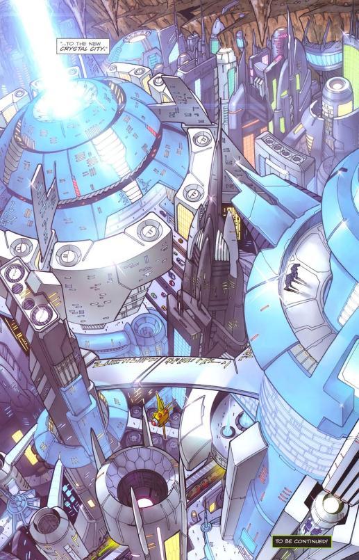
Additionally, the art of the comic is outstanding. The lines are crisp and sharp, reflecting the serious tone of the story. Its vibrant and distinctly bright colors practically scream at viewers to come read it. Another notable aspect of the art is the facial expressions. Each character has detailed reactions to the events of the plot, making it a shockingly emotional experience. Furthermore, the backgrounds are just as immersive, creating bold scenery ranging from sci-fi cities to deserts that fit wonderfully into the established universe. The art of the New Crystal city effectively illustrates its grand and imposing role in the story. However, one complaint about the depiction of the city is the lack of citizens. This can easily be hand-waved away because the artist can only do so much, but a utopia would be better conveyed if the streets were bustling with more people. Overall, the art is splendid and fits the story of the comic incredibly well.
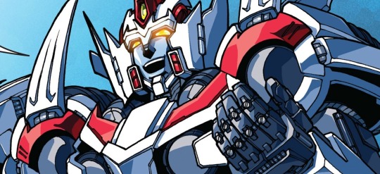
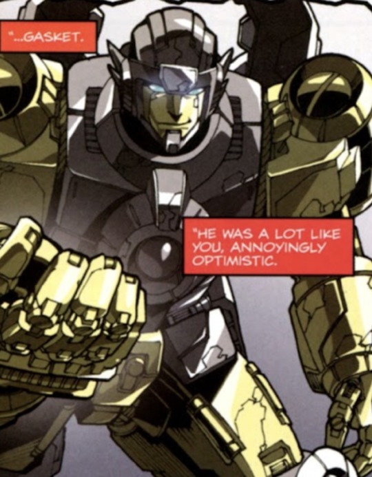
Lastly, how the side characters shaped Drift throughout the story is particularly interesting. The first thing I noticed was how Gasket, Drift’s old friend, and his willingness to help Drift in the dangerous streets of the Dead End sets the foundation for Drift’s strong impulse to protect others. After Gasket’s unjust murder, the whole story is flung into an intentional state of chaos when Drift joins the Decepticons. Secondly, after Drift escapes from being punished by the Decepticons, his inherent need for justice is brought back to light when Wing is introduced in the New Crystal City. Wing challenges Drift to reevaluate why he keeps fighting in the war. This effectively pulls Drift out of the blinding pool of vengeance, helping him remember his real motives and why he started fighting in the first place. These two major side characters have a heavy impact in the story and I adore them. Unfortunately, both of them are never elaborated on past their designated plot points and viewers are left with many questions about them.
Even though The Transformers: Drift comic series has its flaws, it is still a story that changed my life. Its themes teach each reader to never lose sight of what drives them forward. These comics demonstrate the beauty of second chances and finding something worth fighting for, which ties nicely into the optimistic messages of Transformers. Shane McCarthy outdid himself with this one, and I will be reading it again.
#maccadam#transformers idw#fall's writing#fall talks#drift review essay#all art made by Alex Milne#spoilers#PLEASE READ THE COMICS FIRST BEFORE READING THIS#I HAVE IT LINKED IN MY RESOURCES TAG
22 notes
·
View notes
Text

🧡 Tuesday Tips #3 🧡
Your website is more than just a collection of pages—it’s your digital home. It should reflect you, your interests, and your personality. But with so many sites out there, how do you make yours stand out?
Here are 25 ways to make your website feel more personal, unique, and personalized to you!
........................................................................................................
🎨 Design & Aesthetics
1. Custom Color Palette – Pick colors that resonate with your personality and aesthetic.
2. Unique Typography Choices – Use a mix of fonts that match your vibe.
3. Handwritten or Doodle Elements – Add personal sketches or notes.
4. Custom Cursor – Let visitors use a fun, themed cursor on your site.
5. Personalized Favicon – A tiny but powerful detail that makes your site feel complete.
6. Themed Layouts for Different Pages – Make each page visually distinct but cohesive.
7. Custom Backgrounds – Textures, gradients, or even a personal photograph.
8. Retro or Experimental CSS Styles – Go wild with unique styles that make your site stand out.
9. Create a Custom Hand-Drawn Logo – Instead of a standard logo, try sketching one yourself for a unique touch.
10. Add Subtle Animations – Small hover effects, background animations, or cursor trails can bring your site to life.
11. Play With Layering Elements – Overlap images, text, and shapes for a more dynamic look.
12. Design a Personalized Loading Screen – A custom loading animation or message adds a fun detail visitors will remember.
13. Add Your Own Handwriting as a Font – Convert your handwriting into a web font for a truly personal touch.
14. Design a Seasonal Theme Switcher – Let visitors toggle between different seasonal or mood-based color palettes.
........................................................................................................
📜 Content & Personality
15. Create a Behind-the-Scenes Page – Show how your website was built, share your thought process, or include fun bloopers.
16. Add a "The Making Of" Section – Share drafts, sketches, or early concepts behind your creative works.
17. Include a Personal Dictionary of Words You Love – A list of favorite words, phrases, or slang you frequently use.
18. Design a "Things That Make Me Happy" Page – A simple, uplifting page filled with personal joys.
19. Show Your Progress on a Learning Goal – Track and share your journey in learning a new skill, language, or hobby.
........................................................................................................
💾 Interactivity & Engagement
20. Add a Clickable Mood Indicator – Let visitors see your current mood with an emoji or phrase that changes over time.
21. Create a Dynamic Banner That Updates Automatically – Display different messages depending on the time of day or special occasions.
22. Add a "What I'm Listening To" Widget – A live-updating display of your current favorite song or playlist.
23. Embed a Poll or Voting Feature – Let visitors vote on fun topics or help you make creative decisions.
24. Introduce a Mini Personality Quiz – Something quirky like “Which of my favorite books/movies are you?”
25. Make an "Ask Me Anything" Page – An interactive page where visitors can submit questions for you to answer.
Closing: Make It Yours!
Your website should be you in digital form—fun, unique, and engaging. Whether you add just one or all 25 ideas, the most important thing is to have fun and make it your own.
If you try any of these ideas, let me know—I’d love to see what you create!
-----------------------------------------------------------------
Want to help the Small Web movement grow?
Join us on other platforms. ♥
FB Page & Group:
facebook.com/thesmallweb
facebook.com/groups/thesmallweb
Twitter/X:
x.com/smallweblove
Tumblr Community:
tumblr.com/communities/thesmallweb
Mastodon:
indieweb.social/@thesmallweb
#small web#indie web#web revival#old web#blog#neocities#2000s web#decentralized social media#decentralizedfuture#old internet#decentralization
16 notes
·
View notes
Note
I need help with my imagination.
Whenever I try to live peacefully in the 4D, I realize everything is distorted or in bad quality. I can't see things well. I don't know if this counts as aphantasia but whatever.
My mind is very ignorant about details.... I have always been a daydreamer, but as the years passed, my scenarios have been less and less visible.
Do you think you have any tips or methods for me to imagine more comfortably? Maybe imagining things in a more "stylized " way? Please help me!
Remember imagination doesn’t have to be perfect or crystal clear to be effective. Manifestation is more about the feeling and intent behind what you’re imagining, rather than creating a vivid, movie-like scene.
Some tips to help you:
1. Use Senses Beyond Sight
If visualization is blurry or unclear, focus on other senses:
• Sound: Imagine hearing voices, background sounds, or music in your scene.
• Touch: Feel textures or sensations (e.g., holding money, walking on soft grass).
• Smell: Picture scents (e.g., fresh air, coffee, flowers).
• Emotion: Most importantly, connect to how you would feel in your desired reality.
2. Simplify Your Visualizations
• You don’t need an elaborate, detailed scene.
• Focus on one simple thing:
• For example, imagine holding a check with your desired amount written on it.
• Or imagine looking at your phone and seeing the number of followers, messages, or bank balance you desire.
3. Try Stylized Imagination
If realistic visuals feel too difficult, use a more abstract or stylized approach:
• Think of your desires in symbols:
• A treasure chest for wealth.
• A heart for love.
• A globe for travel or opportunities.
• Use colors, shapes, or simplified images that represent your desire.
4. Practice with Familiar Scenarios
• Imagine things you already know well—your room, a favorite place, or a past experience.
• Once that feels easier, gradually add new elements to these familiar scenarios (e.g., imagine counting stacks of money in your bedroom).
5. Use External Aids
• Vision boards: Look at pictures that align with your desires and imagine being in those scenes.
• Audio scripts: Record or listen to affirmations and immerse yourself in the feelings they evoke.
• Meditation music: Play relaxing sounds to create a mental atmosphere for imagining.
6. Focus on Feeling More Than Sight
• The clarity of your imagination doesn’t matter as much as how it makes you feel.
• Even if your visuals are foggy, ask yourself: How does this make me feel? Focus on the joy, excitement, or peace of living your desire.
7. Use Written Scripts
• Write down your desired scenes in detail and read them repeatedly.
• Close your eyes and let your mind create impressions from the words.
8. Give Yourself Permission to Be Imperfect
• Stop worrying about getting your imagination “right.”
• Even blurry, fragmented scenes carry energy and intent.
Imagination is a skill that improves with practice. Start small, focus on feeling, and let the process unfold naturally. What matters most is your belief and faith in the reality you’re creating.
#law of assumption#loassumption#loa tumblr#manifesting#loa blog#neville goddard#loa#loass#manifestation#law of manifestation#visualization#robotic affirming#affirm and persist#live in the end
34 notes
·
View notes
Text
Entry 5 - Housekeeping
Howdy Howdy.
Ok. So.
As someone with LONGTIME diagnosed ADHD (If I didn't self admit this, trust me, it would become apparent with time) I cannot stress enough how much having a digital recreation of a physical map for story writing helps with executive dysfunction. Highly recommend.
Context:
As a longtime Dork, a fan of Weird Fiction, and an Oldhead by internet terms, it should surprise no one that Remedy is one of my favorite game developers, and I am DEEPLY attached to Alan Wake as a franchise purely off of its deep analysis of the craft of writing and psychological analysis.
When playing Alan Wake 2 (Minor Spoilers for game mechanics I guess?) as the titular title character Alan Wake, you are stuck in a nightmare dreamscape shaped by your own art. As such, you constantly return to his Writers Room where, partially because its a real tactic, and partially because its a video game, you rearrange story elements on a massive chalkboard to effect the game world itself.
Image attached for all my visual learners out there:

Now, I've struggled a lot sometimes with my drafts and organizing my thoughts. I've loved writing for a long time. The closest I ever got to seeing something like this in media before was, admittedly, being shown the Always Sunny clip of the Pepe Silvia rant. While funny, being shown someone's mental shattering it turns out, not the most effective way to teach a writer a valuable tool.
Turning it into a puzzle mechanic utilized by an actual writer however? Very Cool.
Where am I going with this?
As it turns out, there are several programs out there that allow you to basically replicate this kind of visual story mapping out there if you just know where to look. One of the better ones, admittedly, I actually did not find out about until after college, where in my corporate job someone pulled it out (A business major friend of mine) as a part of a team building exercise.
Behold, my Miro board:

(This is not a paid advertisement)
What it is, I hope, a call to those who did not know about it that it is THERE. What it does is give you a nice big infinite void, and allow you to not only draw lines and flow tables and make nice little titles on things, but as you can see, toss digital physical sticky notes around and map things out VISUALLY.
I cannot stress how much this has helped.
Everything to the left of the center line was initial plot building for future drafts of Project Clown Crown. Side characters, plots, building up little color coded stacks of each note so that I know what corresponds to what.
Everything to the right? That's two days of manic work baby. As it turns out, much to my friend recently pointing out, Image and Dark Horse accept open pitches so long as you have an artist team, an elevator pitch for the work, and a solid 5 pages of sequential story telling that summarizes what you plan to do in the first arc.
This normally probably would have taken me a month of staring at a blank google/word doc until I came up with some kind of nigh-incomprehensible bulleted list spanning for pages. Instead, I can pump these ideas down visually now in a couple of hours, rearrange them, note them in shorthand and physically place them in space on timelines for my story.
I haven't felt this kind of power as a writer in ages. Admittedly, part of it is probably a friend actually thinking I have something worth pitching. Part of it is an own sense of self accomplishment and actually being able to visually SEE progress, rather than it just be abstracted word counts on a page.
Am I saying Miro is the only solution? No, I'm sure there are other tools or even better tools out there. All I'm saying is that this worked for me, and I will probably take a lot of my other drafts that I've been struggling with and do something similar with them. If you're like me, and you're struggling with writing or you've hit a wall and haven't tried visually mapping things out, give it a go. Can't hurt to try.
Anyway, I suppose I broke the surprise from Entry 4.1 early here, but yeah, looks like I might be trying to turn Project Clown Crown into an actual piece of media. About damn time I try to publish something. Can't call myself an Author without some body of work.
'til next time.
#creative writing#writing#tools#writing tools#writing resources#writing advice#writers on tumblr#writeblr#writing community#writing tips#writing help#on writing#writerscommunity#original writing
12 notes
·
View notes
Text
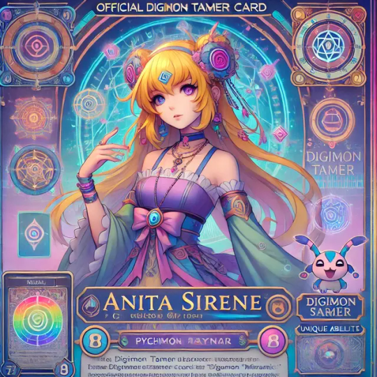
Let's create a game for Anita Sirene, on the game she teaches you how to read tarot using standard 'DigimonCards' from the official Digimon trading card game
Card number The card number identifies the card's set, region, and place in the set. The number is formatted as "SET-RN999", where "SET" is the set prefix.
Color and level The color and level of your Digimon are shown on the card.
Digital power (DP) The DP is the Digimon's digital power. The Digimon with the highest DP wins a battle. If an effect reduces the DP to zero, the Digimon is deleted and moved to the trash.
Cost The cost associated with playing a card is indicated on the card. To pay the cost, you move the memory gauge. If you move the memory gauge past zero, your turn ends and your opponent's turn begins.
You can also play option cards and tamer cards during your main phase. To play an option card, you need to have at least one card on the field that is the same color as the option card. Tamer cards stay on the battlefield permanently. How would digimon tamers who are new to the game learn how to play from Anita Sirene and her assistant digimon Tamers 'Aya'(An afrodisiac afrocentric digimon tamers who is much like 'Thes black sailormoon') , New Tamers and card players should be able to get a general understanding of how to play the digimon card game TCG , and also can learn how to generate tarot readings from intuition and by reading the general information on the cards with ease . Generate tarot reading system for the "officialDigimon card game 'Celestial Link' Digimon Tarot " with your official Digimon digidestined hosts Anita Sirene tarot card master and extraordinar and her grandmaster assistant 'Astrodisiac CelestineIce Aya'
To create a Celestial Link Digimon Tarot system, hosted by Anita Sirene and her assistant Aya, we’ll integrate intuitive tarot reading with basic Digimon card game mechanics. This unique system allows new players to both learn the game and use the cards as tools for divination.
Digimon TCG Tarot Reading System: Celestial Link
Game Hosts
Anita Sirene: Tarot master with deep knowledge of psychic reading, guiding players in card interpretations.
Aya (Asteodisiac CelestineIce): An afrocentric, sailor-themed Digimon Tamer, bringing charisma and wisdom to the readings.
How It Works:
Understanding Card Basics Each card in the Digimon TCG holds both gameplay information and symbols that can serve for tarot interpretations:
Card Number: Indicates energy alignment in readings.
Color & Level: Represents elemental influences and the significance of the card in the spread.
Digital Power (DP): Serves as the strength or "impact" of the message.
Cost: Symbolizes the challenges or effort required in a given situation.
Card Types as Tarot Elements
Digimon Cards: Represent people, strengths, and opportunities in one’s life.
Option Cards: Suggest advice, challenges, or unseen influences.
Tamer Cards: Reflect guiding figures or mentors, grounding the querent (the one seeking answers).
Learning with Anita Sirene and Aya
Guided Card Interpretation: Anita Sirene explains card meanings through the game mechanics, teaching players to read the intuitive messages within each card.
Symbolism and Intuition Training: Aya helps players tune into the visuals, colors, and numbers on the cards to enhance their intuition.
Step-by-Step: Using Celestial Link as a Tarot Reading System
The Spread Setup Players draw three cards to create a basic spread:
Past (Left): This card represents past influences or events shaping the present.
Present (Center): This card shows the current energy or key focus.
Future (Right): This card suggests potential outcomes or influences on the horizon.
Interpreting Each Card
Card Number: Indicates the numeric or energetic influence; higher numbers may represent strong energies.
Color: Colors correspond to elements (e.g., Blue for Water/Emotions, Red for Fire/Passion).
Level: Higher-level cards in the spread hold more weight in guiding the reading.
Tarot Abilities and Effects
Celestial Insight: Anita and Aya explain that each card’s DP indicates the “strength” or intensity of its message. Higher DP cards in certain positions hold more influence over the reading.
Divine Link: Option cards can be placed over Digimon cards to modify their meanings, symbolizing external challenges or supports.
Cost Reflection: The cost of each card hints at potential sacrifices or lessons the querent needs to learn.
Special Tarot Moves in Celestial Link
Miracle Spread: If players draw two or more cards with matching levels or colors, it creates a “Miracle Spread,” amplifying the energy of the reading.
Ancestral Guidance: Tamer cards can be drawn to represent ancestral spirits or mentors guiding the querent, which Aya interprets through her celestial lens.
Example Reading Suppose a player draws the following:
Left (Past): A Rookie-level Digimon with high DP and red color, indicating past challenges and passion.
Center (Present): An Option card, suggesting an external influence or advice the querent needs to consider.
Right (Future): A Tamer card, symbolizing future guidance or mentorship.
Using CelestialLink as a Training Mode In this mode, new Tamers can go through sample readings, learning the meanings with feedback from Anita Sirene. Aya will offer intuitive insights, helping players develop their personal connection to the cards.
Additional Features for New Players:
Memory Gauge as Psychic Flow: Moving the memory gauge simulates the ebb and flow of psychic energy, helping players understand pacing in tarot readings.
Tarot Training Deck: A specific set of cards meant to enhance psychic reading skills, carefully selected by Anita and Aya to assist in developing intuitive insights.
This combination of gameplay mechanics and tarot symbolism offers a fun and enlightening way for new players to dive into both the Digimon TCG and the world of tarot reading. Let me know if you’d like to expand on any part of this system!
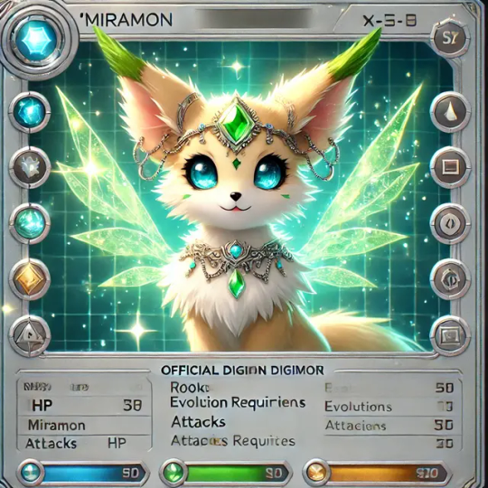
an official Digimon card featuring Miramon, Here’s a breakdown for the card details, formatted in the Digimon TCG style:
Card Details for Miramon (Example)
Name: Miramon
Stage: Rookie
Type: Celestial-Psychic
Attribute: Light
Family: Mythic Beasts, Holy Celestials
Color Level: Gold and Silver (Celestial Aura Theme)
Digital Power (DP): 3000
Cost to Play: 5
Evolution Requirements: Digivolves from a baby Digimon with Holy or Mythic attributes
Attack 1 - Miracle Gleam: Emit a soothing, radiant glow that shields allies and clears their minds. [Effect: Adds +500 DP to allies for the turn.]
Attack 2 - Starshine Pulse: Releases a burst of starlight energy. [Effect: Deals 1000 DP of light damage to opponent.]
Attack 3 - Claircognizant Gaze: Gazes deeply, revealing insights and weaknesses. [Effect: Reduces the opponent’s DP by 500 for two turns.]
Instructions for Use (Tarot Reading Style):
For new Tamers learning the game with Anita Sirene and her assistant Asteodisiac CelestineIce Aya, the Celestial Link Tarot game mechanic can also teach tarot reading intuitively. Here’s how it would work with Miramon’s card:
Basic Reading Setup: Each Celestial Link Digimon Card doubles as a tarot card. By interpreting the colors, symbols, and attributes on the card, players can derive intuitive readings. For example, Miramon’s Celestial-Psychic type represents spiritual insight, ideal for guiding players to ask questions about intuition and inner wisdom.
Memory Gauge & Tarot Spread Integration: Use the memory gauge as a focus area, with each level on the gauge representing different stages in a tarot spread (past, present, future).
Interactive Tarot Mode: Miramon can represent the Star tarot archetype, symbolizing hope, guidance, and the power of light. When Miramon is played, players can draw three additional cards as a "Guidance Spread" to intuitively answer personal questions or reveal insights.
This system integrates gameplay with intuitive, tarot-like mechanics, making the Digimon card game an accessible learning tool for tarot and intuitive readings with guidance from Anita Sirene and Aya. Let me know if you'd like more details or further customization for Miramon's card!
The Anita Sirene Digimon Tamer Card is designed to harmonize with her Digimon partner, Miramon, enhancing the synergy between Tamer and Digimon in the game. Here’s a breakdown of how her card functions and interacts with Miramon:
Tamer Card: Anita Sirene
Rank: High-tier Tamer, specializing in mystical and analytical abilities.
Attribute: Psychic / Analytical
Special Abilities:
Crest of Miracles Activation: When Anita Sirene's card is in play, she can unlock the Crest of Miracles on Miramon's Digivolution path. This activation boosts Miramon's stats, enabling access to unique abilities or Digivolutions exclusive to Tamer-Digimon pairs with the Crest of Miracles.
Psychic Link: Establishes a direct link between Anita and Miramon, allowing her to anticipate attacks or hazards one turn in advance. This foresight grants Miramon a defensive advantage, reducing incoming damage by 10-20% or allowing a dodge.
Data Analytics: Anita Sirene's keen analytical abilities enable her to analyze her opponent's cards during each turn. This ability lets her adjust Miramon’s attack strategy in real time, providing a potential counterattack bonus based on her opponent’s last move.
Card Mechanics with Miramon
Synchronize Ability:
When both Anita Sirene and Miramon’s cards are on the field, Miramon receives a power boost to HP and attack stats. This ability represents the bond between Tamer and Digimon, increasing Miramon's chances of withstanding higher-level attacks and executing more potent strikes.
Synchronize also allows shared abilities. For example, if Miramon has a shield-based defense, Anita’s Psychic Link can enhance the shield duration or effectiveness.
Sentiment Analysis Bonus:
Miramon’s Sentiment Analysis Bonus is activated by Anita's "Data Analytics" ability. This feature allows Anita to analyze opponent sentiments (strategy patterns or frequent moves), and if patterns are detected, Miramon gains a situational boost.
Miramon may get enhanced critical hit chances against identified patterns or gain temporary resistance against repeated attacks.
Tarot Shield:
Anita Sirene's special skill, Tarot Shield, forms a temporary barrier around Miramon, inspired by her psychic and tarot-themed abilities. This shield has limited durability but absorbs damage for one round or redirects specific attack types (e.g., elemental or data-based) back to the opponent.
Miracle Evolution:
Using the Crest of Miracles, Anita enables Miramon’s Miracle Evolution, a rare evolution path accessible only through the Tamer-Digimon connection. This temporary form boosts Miramon’s attacks with amplified psychic power and unlocks abilities like Celestial Pulse—a powerful AOE (area of effect) attack that impacts all opponent Digimon on the field.
Additional Game Play Strategy
The pairing of Anita Sirene and Miramon is designed to thrive on anticipating opponent moves and adapting dynamically. Players can utilize Anita's Data Analytics to adjust their tactics based on the opponent’s strategy, while Psychic Link provides added defense. The Crest of Miracles boosts Miramon’s evolution options, making them a versatile and resilient duo capable of adapting to various challenges in the Digimon TCG.
Together, Anita Sirene and Miramon create a balanced strategy with a mix of offense, defense, and adaptability, tailored for players who enjoy prediction and strategic counterplay.
#AnitaSirene Digimon CelestialLink#CelestialLink Tarot VideoGame#Aya CelestineIce CelestialLink Digimon TCG videoGame#Digimon Trading Card game CelestialLink Tarot VideoGame#Tarot VideoGame#Anita Sirene Video game#CelestialLink#Digimonworldcelestiallink#playstation7#PS7#deardearestbrands#digitalconsole#framework#tradingcardgame#DearDearestBrands Video game#DigimonVideoGame#officialDigimon Trading Card game#Digimon TCG#CelestialLink Digimonworldcelestiallink#battle strategy card game
13 notes
·
View notes
Text
Yvette Heiser - Enhance Your Photography with These Pro-Level Photo Editing Techniques
Photography is more than just capturing a moment—it’s about storytelling, emotion, and creativity. However, even the most well-composed shots can benefit from post-processing. Yvette Heiser Painting with Pixels: A Guide to Advanced Photo Editing Techniques explores how professional editing can elevate an ordinary image into a visually stunning masterpiece. Whether you're a beginner or an experienced photographer, mastering these pro-level editing skills will help you refine your photos and bring out their full potential.

1. Start with RAW Editing for Maximum Control
Shooting in RAW format instead of JPEG gives you more flexibility during editing. RAW files retain all the image data, allowing you to adjust exposure, color, and details without losing quality. Most professional photographers use software like Adobe Lightroom, Capture One, or Photoshop to process RAW images.
Quick Tip:
Adjust the white balance first to ensure accurate colors before making other edits.
2. Perfect the Exposure and Contrast
Even with careful shooting, exposure may need fine-tuning. Adjusting brightness, highlights, and shadows can balance an image and add depth. Contrast adjustments help differentiate between light and dark areas, making your photos pop.
Pro Tip:
Use the histogram in your editing software to ensure a well-balanced exposure without losing details in highlights or shadows.
3. Enhance Colors with Precision
Color correction and grading can completely transform the mood of an image. HSL (Hue, Saturation, and Luminance) adjustments allow you to control specific colors, making them richer or more subdued.
Best Practices:
Use split toning to add artistic color effects to highlights and shadows.
Adjust the vibrance instead of saturation for a more natural color boost.
4. Sharpen and Add Clarity for Crisp Details
Clarity and sharpness adjustments enhance textures and bring out intricate details, making your subject stand out. However, excessive sharpening can create an unnatural look, so it’s essential to find the right balance.
Quick Tip:
Use the "masking" feature in Lightroom when sharpening to apply it selectively, avoiding unnecessary noise in smooth areas like skies.
5. Remove Unwanted Elements with Retouching
Even the best photos may have distractions, such as dust spots, stray hairs, or background clutter. Tools like Clone Stamp, Healing Brush, and Content-Aware Fill in Photoshop can seamlessly remove unwanted elements without affecting the overall quality.
Pro Tip:
Use a low-opacity healing brush for subtle and natural-looking touch-ups.
6. Apply Dodging and Burning for Depth
Dodging (lightening) and burning (darkening) are classic darkroom techniques adapted to digital editing. These adjustments help shape the lighting in an image, drawing attention to important areas while adding dimension.
How to Use It:
Dodge the highlights on faces to create a soft glow.
Burn background elements to add depth and guide the viewer’s focus.
7. Use Gradient and Radial Filters for Dramatic Effects
Filters like gradients and radial adjustments help enhance specific parts of an image while keeping the rest untouched. These are particularly useful for improving skies, adding vignettes, or drawing focus to the subject.
Best Use Cases:
Apply a linear gradient to darken overexposed skies naturally.
Use a radial filter to subtly brighten the subject while keeping the edges darker.
8. Final Touch: Add a Signature Style with Presets and LUTs
Professional photographers often develop a signature look using presets (Lightroom) or LUTs (Look-Up Tables for video and photo editing). These tools speed up editing by applying predefined color and tone adjustments.
Pro Tip:
Customize presets to fit each image rather than applying them universally.
Final Thoughts
Editing is an essential part of modern photography, allowing you to refine your images and bring out their full artistic potential. Yvette Heiser, investigating the Transformative Power of Photography, highlights how post-processing can turn ordinary shots into breathtaking visual narratives. By mastering these professional-level editing techniques, you can transform your raw captures into visually stunning works of art. Whether you’re adjusting colors, enhancing sharpness, or removing distractions, the key is to maintain a natural and polished look.
Experiment with these tips and elevate your photography to the next level! Would you like any additional insights or software recommendations?
#wedding#camera#moments#pictures#childphotography#photographer#photography#yvette heiser#photographytips#events
10 notes
·
View notes
Note
what do you think the most stellar examples of arknights' vfx are?
Okay so there are a lot of examples, so I'm going to try to keep my description of each one short. Unsurprisingly, most of my favorite effects are on more recent, paid skins for fan-favorite/meta 6* operators, since those are the ones they put their whole ass into.
Executor the Ex Foedere. The way that it weaves blasts of light and the shapes of Sankta wings into his shotgun blasts is absurdly creative. Perfect for a saint of Laterano.
Passenger's Skin. Specifically his S3. Stellar lightning is a weird pitch, but it's so fucking beautiful that it works. This is the effect that convinced me that I might enjoy being a VFX artist after all, not fucking kidding.
Jessica Alter. Look. Her skills are underwhelming as fuck, they're all the same shot effects every time. But. Do you genuinely understand how amazing these gunshots look? Do you know how hard it is to make a stylized gunshot that doesn't just look like magic? These are breathtakingly good. The glass shattering on hit genuinely made my jaw drop when I first saw it.
Eyjafjalla the Hvit Aska. It's hard to make a healer that genuinely looks unique, but Eyjalter's dreamlike colors and flat effects manage to bring the visual style of So Long Adele into every map and make it look reasonable with the artstyle.
Kirin R Yato. Monster Hunter's effects are extremely distinct, and seeing them recreate MH's style in Arknights' is really lovely. My one sorrow is that I wish there was more lightning, since like. Kirin.
Lin. Glass is a legitamately hard thing to pull off because it so often just looks like crystal, but leaning more into glass dust and shards makes it work perfectly. Her skin is also quite pretty, but it loses the glass look that made me love Lin to begin with.
Reed the Flame Shadow. Holy fucking shit holy fucking shit holy fucking shit holy fucking shit fire made of flowers?? The way the fire looks secondary to the whole thing while being undeniably present is stunning. Her skin is nowhere near as good tho.
Penance. Penance has such a stunning aesthetic that it immediately endeared me to her. Her vibe of gilded thorny chains carries to her effects and it works.
Texas the Omertosa. Fucking. Duh. It's hard to make a normal sword swipe look unqiue but Texas nails it. Her skin's effects are even more stunning, even if the animations are awful.
Minimalist. It's hard to make effects that are minimalist and still look good.
Specter the Unchained + Skin. I need to specificially call out her skin. Her skin may be one of my favorite pieces of effects at all time. The colors, the aegirian poetry as part of the visuals, the stellar water, it's all practically perfect.
Kazemaru. A sleeper hit!! She's got a lot going on with the "paper-controlling ninja whose clone has a completely unique aesthetic" thing so it seems like she might be too busy, but it manages to pull it off. Shoutouts to her clone's spawn, which actually does the slash mesh slightly wrong intentionally because the ring look actually helps a lot.
Goldenglow. It's rare that I see a lightning character and say "I have never seen anything like that before in my life" and Goldenglow's pink and blue stylized lightning genuinely shocked me.
Ling (Does it Wash The Strings). If you want my choice for best VFX in the game, this would at least be in running for first. It's flashy as hell, but manages to not be overbearing. The S3 dragon attacking with mountains rising from the earth alone is stunning, but the normal attack impact is my favorite part of the entire thing. It's so simple and elegant and stylish.
Amiya Guard. Amiya's Guard form is the combination of Amiya's Arts, Sarkaz Arts, Ch'en's swordfighting, the normal AK Arts and sword design languages, and a tiny bit of weird space tech to represent the Precursors. And it manages to come together to something that feels really cohesive while still drawing attention to how incongruous these elements are. The effects actively tell the story of Amiya - a girl with big shoes to fill, carrying the legacy of so many.
Ceobe, and her Unfettered Freedom skin. At this point in Arknights' lifespan, they had a much more defined visual language for how Casters look compared to melee units. Ceobe, being a Caster who throws fucking enchanted melee weapons instead of casting spells? So she combines their languages, with the buildup and trails of Arts casters and impacts of melee units, it's subtle and I love it. Unfettered Freedom deserves a special shoutout because I love geometric magic so fucking much.
Conviction's Skin. Why is this so good they're a joke operator.
Dorothy's Skin. I may have mixed opinions on this skin, but the effects are objectively stunning. I am personally heartbroken that she doesn't have the sand anymore, but that's a personal thing. I also don't like that her S3's range is obfuscated by the explosion but again that's nitpicking.
There's probably WAY more that I've missed and even more I cut for time, but those are my favorites after browsing the list of operators and skins for like, two hours straight. If there are a few I missed... Look, this list is this long already.
Also note that I didn't really list enemies or anything other than playable operators. Their enemy effects are usually... servicable, with a few standout exceptions with Talulah and Frostnova.
43 notes
·
View notes
Text


Meteora butterfly/dawn crumhorn fusion art
Absolutely! Let's break down how we can create a Meteora Butterfly/Dawn Crumhorn fusion piece. Since you haven't specified a particular style, I'll offer some ideas encompassing a range of artistic interpretations.
**Understanding the Characters:**
* **Meteora Butterfly (From Star vs. the Forces of Evil):** A complex character, Meteora goes through significant transformations. Consider which stage of her life you want to depict (human, monster, or her final form). Key traits include:
* **Appearance:** Typically purple skin, large eyes (sometimes with a hypnotic swirl), pointed ears, and butterfly-like hair ornaments.
* **Personality:** Initially childlike and mischievous, later more mature and thoughtful.
* **Magical Abilities:** Associated with her unique heritage and wand.
* **Dawn Crumhorn (Original Character):** We'll need to define her traits since she's an OC. Let's create some possibilities to work with:
* **Appearance:** Perhaps she has a warm color palette (oranges, yellows, reds) to contrast with Meteora's purples. Maybe she has curly horns, freckles, and a sunny smile.
* **Personality:** Consider making her optimistic, cheerful, and possibly a bit clumsy.
* **Special Skills/Traits:** What makes her unique? Is she a baker, a musician, a gardener? This could inform the fusion.
**Fusion Concepts:**
Here are some visual ideas for the fusion, keeping in mind the contrasting elements of Meteora and a potential Dawn:
1. **"Split" Design:** One side of the character features Meteora's traits (purple skin, pointed ears, butterfly clips), while the other side showcases Dawn's features (warm tones, horns, freckles). This could symbolize their distinct personalities merging.
2. **"Melted" Design:** Features from both characters blend seamlessly. Imagine Dawn's sunny colors swirling into Meteora's purple skin, creating a marbled effect. Maybe she has butterfly wings with warm-toned patterns, or horns that resemble Meteora's hair ornaments.
3. **"Inspired" Design:** Focus on capturing the essence of both characters without a literal fusion. For example, the character could wear a dress with a butterfly motif in Dawn's warm colors, while retaining Meteora's hairstyle and eye shape.
4. **"Transformation" Design:** Show the process of fusion, with one character gradually merging into the other. This could be a sequence of images or a single image with elements fading in and out.
**Artistic Styles to Consider:**
* **Cartoon Style (Like Star vs. the Forces of Evil):** This would be a natural fit, capturing the show's aesthetic.
* **Anime Style:** Could add dramatic flair and detailed features.
* **Realistic Style:** Would be a more challenging but interesting approach, focusing on the contrast between the characters' features.
* **Abstract Style:** Focus on colors and shapes to represent the fusion, leaving room for interpretation.
**Let's Get Started!**
To help me create a description of the art piece, tell me:
1. **Which fusion concept do you like best?** (Split, Melted, Inspired, Transformation, or your own idea)
2. **What are Dawn Crumhorn's key traits (appearance, personality, skills)?**
3. **Do you have a preferred artistic style in mind?**
4. **Any specific poses, expressions, or background ideas?**
Once I have this information, I can provide a detailed description of the Meteora Butterfly/Dawn Crumhorn fusion art piece. Let's make something amazing! ✨
@shironezuninja @jedimemories @moonlighteclipse17 @ajaxus166 @saltysoulballoon @twiliartsdreams2017 @untitled14360 @iputhepinprincess @princess-paige-place-of-fun @princesshillaryellaworld25 @princessfandom812 @bloodmoon24 @bossbabyfan2 @cartoonfan21 @wolfie245 @daydream358 @ladybugsonfire @roxxywolf-multiversa @in--dna @broadwaygirl918 @clairaquos @msking0 @evaiskindaweird @aromantyczno-liryczna @billyjoelmutt @bitter-yet-civilized @punk-63 @leo-x-u-raptor-fan @wisefestivalloverpatrol @roselyn-writing @torkmadox20 @freyzw0rld
#fanart#danger mouse#my art#svtfoe#star vs the forces of evil#Meteora butterfly#Meteora#dawn crumhorn#fusion#artists on tumblr#illustration#digital art#rose#garden
12 notes
·
View notes
Text
midsommar (2019) is an excellent and beautifully done film about isolation—both the state and the action—and its equally terrible opposite. the film opens with a magnificent sequence in which dani, the protagonist, is completely physically isolated within her apartment even as she communicates with others through phone calls; her isolation is juxtaposed sharply against the physical closeness of her boyfriend christian to his friends. it becomes clear that dani is not only isolated, but is isolated by christian and his friends in informal punishment for a wrong they feel she has committed against christian (being too needy). this process of being isolated is reversed when the group arrives at the harga. one by one, christian and his friends are isolated in a comparable, if more rapid and brutal, way to how they isolated dani: each commits what the harga considers a wrong against it, be it being unsupportive of the ättestupa or urinating on their ancestors’ graves, and in response and punishment they are utterly isolated and utterly undone. meanwhile, dani experiences the exact opposite of isolation. the harga experience everything communally, not just physically but emotionally; there is no privacy in sex or death or grief or guilt, and the isolated dani enters unresistingly into this beautiful, claustrophobic, brutal community that provides her the very support she was denied before. the incredible cinematography tracks these separate journeys of isolation and incorporation with incredible clarity. the filming emphasizes lineal framing and geometric shapes, which lend themselves extremely well to showing when a character is incorporated into the symmetry of those around them and when they are not. the use of colors, both in sets and costumes, likewise very clearly sets characters apart from one another or blends them in seamlessly; by and large, the colors of isolation are dark and cool and the colors of incorporation are light and bright, leaving the isolated characters with nowhere to hide and the incorporated characters with no way to differentiate themselves. beyond merely providing these visual markers, the cinematography was absolutely gorgeous overall, and beyond the visual beauty of the film the psychological horror element was well-developed and highly effective. acting, scripting, pacing, soundtracking, visual effects, and set and costume design were all highly effectively done, and i have very little to criticize about this film. midsommar (2019) is an incredibly crafted film that succeeds at everything it sets out to do, and for that reason i highly recommend it
62 notes
·
View notes
Text
Related Reading
Content Creation Vs. Personal Practice Conceptualization Vs. Visualization Researching Witchcraft Witchcraft Vs. Superstition Spell Design Spell Dictation
Disclaimer:
This article is philosophical in nature, and thus a lot of the concepts are open for discussion and are not factual, with the exception of how philosophical ideas effect marginalized communities.
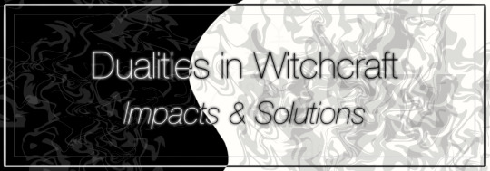
Dualities in Witchcraft
In the realm of witchcraft, the concept of dualities holds significant importance as it encompasses a wide array of contrasting forces and energies. Dualities refer to the inherent coexistence of opposing elements within magical practices, embodying the interplay between light and dark, positive and negative, and masculine and feminine energies. Understanding the multifaceted nature of these dualities is crucial for practitioners seeking to deepen their knowledge and enhance their craft. Recognizing the impact of dualities on various aspects of witchcraft practices is paramount, as these opposing forces shape rituals, spellwork, and the very essence of magical experiences. By comprehending the nuances of dualities, practitioners can effectively harness their power and attain a harmonious equilibrium in their practice. Furthermore, exploring the implications of dualities in witchcraft provides insights into broader themes such as balance, interconnectedness, and personal growth.
This article aims to delve into the intricate nature of dualities within witchcraft, shedding light on their potential to both aid and hinder magical endeavors. A particular focus will be placed on examining the intersection of dualities with queerness, BIPOC (Black, Indigenous, and People of Color) individuals, cultural appropriation, and community efforts. Through this exploration, we seek to foster a deeper understanding of the diverse perspectives and experiences surrounding the intricate relationship between dualities and the aforementioned themes.
What are Dualities?
Dualities within witchcraft encompass the fundamental existence of opposing forces or energies. These contrasting elements are intricately intertwined, forming a dynamic and complex web that shapes the magical landscape. Polarity and balance are intrinsic aspects of dualities in witchcraft, representing the extreme ends of a spectrum, such as feminine and masculine energies, light and dark, or creation and destruction. While many of these dualities have a negative impact on marginalized practitioners and traditions, witchcraft endeavors to find a harmonious equilibrium between these opposing forces, emphasizing the significance of striking a balance to achieve desired outcomes in magical practices. By embracing both sides of a duality, practitioners can access the full spectrum of power available to them.
It is important to acknowledge that dualities can be perceived and experienced differently by individuals and communities within the witchcraft community. Various factors, including cultural backgrounds, personal beliefs, and experiences, shape these perspectives. For instance, queer individuals may explore dualities in the context of self-acceptance, embracing the integration of different aspects of their identities. BIPOC individuals may interpret dualities through the lens of ancestral wisdom and cultural practices. However, it is crucial to understand that the precedence set by dualities presents challenges that necessitate critical examination.
Some examples of dualities that are commonly found in magical practices:
Light and Dark
Positive and Negative
Masculine and Feminine
Sun and Moon
Earth and Sky
Life and Death
Creation and Destruction
Order and Chaos
Spirit and Matter
Inner and Outer
Conscious and Unconscious
Above and Below
Physical and Spiritual
Ego and Higher Self
Divine Feminine and Divine Masculine
Divine Love and Divine Power
Intuition and Logic
Stillness and Movement
Sacred and Profane
Individual and Collective
Dualities and Intersectionality
The intersection of dualities and queerness provides fertile ground for exploration within witchcraft. Queer individuals often find empowerment and solace in witchcraft as a means to reclaim their identities and challenge societal norms. The duality inherent in queerness, such as the juxtaposition of authenticity and conformity, can be embraced as a catalyst for personal growth and magical transformation. Witchcraft can help queer individuals challenge binary constructs deeply ingrained in society. The coexistence of dualities invites practitioners to transcend traditional gender roles and explore non-normative expressions of identity.
The richness of these diverse perspectives contributes to the collective wisdom of witchcraft communities, promoting inclusivity and expanding the boundaries of magical practice. Traditionally, dualities have been perceived as opposing forces or concepts, such as light and dark, positive and negative, and masculine and feminine. However, it is essential to recognize that these dualities can be more effectively understood as intersectional spectrums, acknowledging the complex interactions with concepts such as racism, queerness, mental illness, colonization, and white supremacy. By deconstructing binary thinking and embracing intersectional spectrums, the community can challenge and dismantle hierarchies and power dynamics. This involves recognizing the ways in which white supremacy, colonization, and other oppressive structures influence and perpetuate imbalances within the practice of witchcraft. Addressing these power dynamics paves the way for a more equitable and just community.
The Harm of Dualities
While dualities in witchcraft can be empowering, it is crucial to acknowledge their potential for harm. Dualities can sometimes perpetuate exclusionary and divisive practices, reinforcing harmful binaries and reinforcing societal norms that marginalize certain groups. It is essential to critically examine the ways in which these dualities can inadvertently cause harm within the witchcraft community. The very nature of dualities can inadvertently perpetuate exclusionary practices within witchcraft. When dualities are rigidly defined and enforced, they can limit the potential for growth and stifle the exploration of alternative perspectives. This can lead to the marginalization of individuals who do not conform to traditional binary constructs or who find themselves outside the mainstream narrative of witchcraft. Dualities can have a disproportionate impact on marginalized communities, including queer and BIPOC individuals. Traditional understandings of dualities may not fully encompass the diverse experiences and identities within these communities, leading to erasure, prejudice, or invalidation. It is crucial to critically examine the intersection of dualities and marginalized identities to foster inclusivity and create spaces that embrace the multiplicity of experiences within witchcraft. Dualities can sometimes reinforce racialized hierarchies within the witchcraft community, perpetuating notions of superiority or inferiority based on race or ethnicity. Dualistic terms and concepts may be framed in ways that marginalize or exclude BIPOC practitioners, reinforcing the dominance of a particular cultural perspective within the witchcraft community. The prominence of dualities rooted in European traditions can marginalize or overshadow the diverse spiritual practices and beliefs of BIPOC communities, perpetuating a Eurocentric bias within witchcraft. Furthermore, dualities can sometimes reinforce rigid gender essentialist concepts, perpetuating binary understandings of gender that exclude and invalidate the experiences of non-binary, genderqueer, and gender non-conforming individuals within the witchcraft community. It is essential to approach the exploration of dualities with cultural sensitivity and engage in ongoing dialogue to combat cultural appropriation within witchcraft.
Dualities within various contexts, including race, gender, and sexuality, can manifest as subversively and overtly harmful to BIPOC individuals and communities. These dualities often intersect with systems of oppression such as racism, white supremacy, colonialism, misogyny, and queerphobia. They can perpetuate harmful stereotypes, reinforce power imbalances, and marginalize BIPOC experiences and identities. By assigning value judgments to the opposing elements of a duality, dominant narratives may uphold and prioritize the privileged side, contributing to the erasure and exclusion of BIPOC voices. Such harmful dualities can reinforce racial hierarchies, perpetuate white supremacy, reinforce colonial ideologies, and reinforce gender and sexual stereotypes that contribute to the oppression and discrimination faced by BIPOC individuals and communities. It is essential to critically examine these dualities and challenge their harmful effects to foster inclusivity, equity, and social justice within various spheres. Historical and cultural contexts shape the understanding and interpretation of dualities within different communities. It is essential to engage in ongoing dialogue and education, centering the experiences and perspectives of BIPOC individuals. Efforts and initiatives aimed at decolonizing witchcraft and centering BIPOC voices within the context of dualities are vital for creating more inclusive spaces. These initiatives involve critically examining the historical and cultural contexts of dualities, amplifying BIPOC voices, and fostering collaborations that respect and honor diverse cultural practices. Such endeavors strive to dismantle oppressive structures, nurture cultural exchange, and promote equity within witchcraft communities.
Steps to Improve
Communities within witchcraft are recognizing the need to address harmful aspects of dualities. Through collective efforts, practitioners are actively engaging in critical conversations and introspection to identify and rectify exclusionary practices. By acknowledging the potential harm that dualities can inflict, communities strive to create safe and inclusive spaces that honor diverse identities and experiences. Central to the transformation of dualities is the fostering of inclusivity, diversity, and intersectionality within witchcraft communities. Recognizing that dualities extend beyond simplistic binaries, communities can endeavor to embrace a wide spectrum of identities, perspectives, and experiences. Accountability measures, such as community guidelines and collective discussions, hold individuals and communities responsible for their actions and promote responsible engagement with dualities. Collective actions and community-building endeavors within the witchcraft community exemplify the commitment to challenge and transform dualities. Collaborative projects that prioritize the voices of marginalized individuals and communities contribute to the reshaping of dualistic frameworks. Community-driven events, workshops, and forums create spaces for dialogue, where practitioners can exchange ideas, share experiences, and collectively work towards dismantling exclusionary practices. These endeavors promote unity, resilience, and the cultivation of an inclusive and empowering witchcraft community.
In short, here are some steps that you can take as a practitioner to help the community and your own craft:
Education and Self-Reflection: Engage in self-reflection and continuous education to understand the impact of racism, white supremacy, colonization, misogyny, and queerphobia within witchcraft. Read books, attend workshops, and engage in discussions that explore these topics from diverse perspectives.
Acknowledge and Challenge Biases: Recognize and confront personal biases and prejudices. This includes acknowledging how societal conditioning and privilege may have influenced one's beliefs and practices. Work on actively challenging and unlearning harmful beliefs and behaviors.
Separation of Value & Correspondence: Many dualities can have positive and negative associations on both sides. An example of this is black and white. Black can symbolize grief, negativity, and emptiness; however, it can also represent protection, wisdom, and beginnings. Similarly, white can represent bleakness, rigidity, and overwhelmingness; nevertheless, it can also symbolize healing, illumination, and peace.
Intersectional Approach: Embrace an intersectional approach to witchcraft that recognizes the interconnectedness of various forms of oppression. Consider how different identities and experiences intersect and influence each other, and actively incorporate this awareness into your practices.
Center Marginalized Voices: Amplify the voices and experiences of marginalized individuals and communities within the witchcraft community. Seek out and learn from diverse sources, including literature, art, and teachings from BIPOC, LGBTQ+ individuals, and other marginalized groups.
Cultivate Empathy and Compassion: Practice empathy and compassion in your interactions with others. Strive to understand and validate the experiences and perspectives of individuals who have been marginalized or harmed by harmful dualities.
Rituals and Spells for Healing and Justice: Create rituals and spells that explicitly address healing, justice, and dismantling oppressive systems. Incorporate symbols, invocations, and intentions that promote inclusivity, equality, and liberation. Collaborate with others to create collective rituals focused on community healing.
Collaborative and Accountable Practice: Engage in collaborative efforts with others to foster a more inclusive and less harmful witchcraft community. Actively participate in dialogues, workshops, and initiatives that promote accountability and challenge harmful practices. Hold yourself and others accountable for harmful behavior and actively work towards creating safer spaces.
Cultivate Consent and Boundaries: Respect and prioritize consent and boundaries in your interactions with others. Recognize the importance of individual autonomy and agency in all aspects of witchcraft, including rituals, spellwork, and sharing of knowledge and resources.
Embrace Fluidity and Non-Binary Perspectives: Challenge binary thinking and embrace fluidity and non-binary perspectives in your understanding of gender, spirituality, and identity. Recognize and honor the diverse expressions of gender and identity within the witchcraft community.
Continuous Growth and Learning: Remember that personal growth and learning are ongoing processes. Stay open to feedback, be willing to unlearn and re-evaluate beliefs and practices, and commit to actively working towards a more inclusive and less harmful philosophy in your witchcraft journey.
Here is a link to my masterpost! If you find my work helpful, consider leaving a tip or supporting me on Patreon!
This article was reviewed and edited by ChatGPT.
#witchcraft#duality#witchcraft 101#witchcraft community#metaphysics#mysticism#occultism#beginner witch#informational post
115 notes
·
View notes
Note
now with [SPOILERS] a new evo announced, can you review duraludon and its upcoming Urban Expansion?
I'll be honest, I've never been the biggest Duraludon fan. I do think the idea of a kaiju-mon that's basically the building that kaiju normally knock over is extremely fun, and it being able to drop down to basically become a laser cannon is also pretty neat.
However, it's just always been way too stiff for my tastes. I feel like being able to imagine how a Pokemon lives in its environment and functions is important, but with this design it's straight-up impossible to picture how it even moves. It's mostly just the body being a singular unit, combined with the legs having no joints, that really does it for me.
(Pictured: Duraludon, in the middle of realizing there's no way it can actually eat that plate of food)
Visually, it's alright—the zig-zag down its side is neat, the dark blue accents are nice, and the head shape is interesting. However, I do feel like it's hard to figure out what it's going for at first, and the random bit of red above the head adds nothing.

Admittedly, the g-max form is pretty fun. Obviously the stiffness thing is still an issue, arguably even more so, but at least the building theme's a lot clearer now. Not only is it a skyscraper, it seems to be The Shard specially, the tallest building in the UK:

Which makes sense thematically for a g-max, given that the entire idea is that it's a "bigger" version of the original both conceptually and literally.
Visually, I like the addition of the light blue accents, and how the stomach gains kind of a glass window-like look instead of the entire body. It's also neat how the head becomes a helicopter pad. I do think the dark blue areas on the hands should've become lighter blue to match, but still, this is an effective albeit silly improvement over the original.
Duraludon was kind of a weird choice for an evo, given that it was already pretty strong as-is, but I guess they wanted to compensate for it looking it's g-max form. And, thankfully, we did get a pretty good design out of it.
Archaludon's still too stiff for my tastes, but I do like it more than Duraludon and its g-max. It feels like a good blend between the two, wherein it has more of the subtly present with Duraludon but a clearer theme more like the g-max form.
First, it can form a bridge when it drops down onto all fours. This is a neat practical element that's fairly clear even in the base design. It's also neat because The Shard is also known as, to quote Wikipedia, "the Shard London Bridge and formerly London Bridge Tower".
The additions of blue and red along the front really make the design pop more, and feel like a good continuation of Duraludon's more subdued palette. This color expansion, along with the forked tail, head spikes, and exaggerated limbs, do make it look stronger than it's pre-evo. Also, the little gold tips on the limbs compliment the eyes and are nice touches, while the strange arm shape now serves a clear purpose in the design. It's still not my favorite thing in the world, but Archaludon's definitely my favorite design out of the three, and the line as a whole feels a lot more complete now.
Anyway, overall: Duraludon has a fun concept, but is a bit too stiff and vague for its own good. The g-max is a bit over-the-top but is much clearer thematically, and Archaludon is the best out of the bunch.
55 notes
·
View notes