#barely a tutorial?
Explore tagged Tumblr posts
Visit Tumblr Blog
Explore Tumblr blogs with no restrictions, modern design and the best experience.
Last Seen Tumblr Blogs


Fun Fact
Tumblr has a 66 index score for customer satisfaction in the US.
Note
I wanna know about your art style. How you draw like that??
i tried putting down considerations as well as a (very) general step by step of what i do; if there's anything more specific you want me to explain lmk i guess?
first off, general (self imposed) constraints / purpose of project -- this informs what i draw & how i draw it
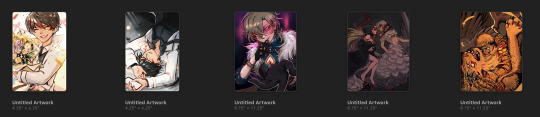
i.e. "kuradex" is pretty different from my normal art (my 5 latest rough illustrations):
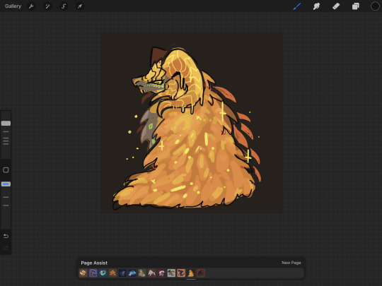
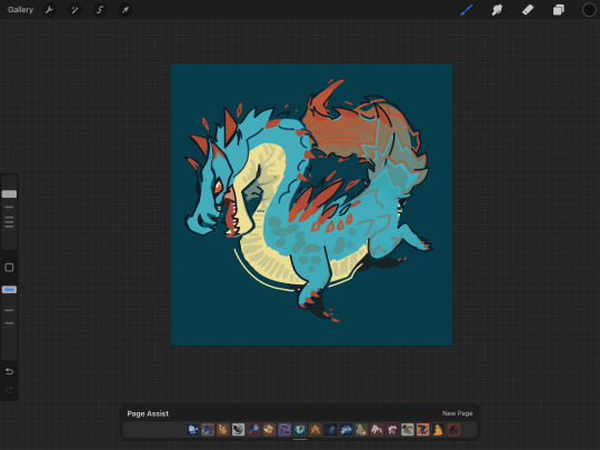
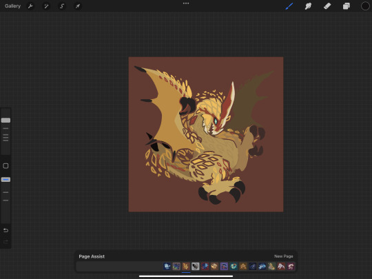
or my monster hunter charms:
or my pokemon tcg contest illustrations that im not allowed to show until june (😉):
although i've said its for merch purposes, ive started drawing these because i wanted to practice conveying "liveliness" and noticing key features / nuances of a given design, but i didn't want to spend a large amount of time on each one.
so what i came up with is
i want to draw things on-model in terms of proportions ( + take note of weight / tapering of shapes / etc )
no backgrounds & minimal "props"
experiment with / practice line/texture/color/flow/rhythm/etc
spend <1 hr on each pokemon on average (this is a bit more difficult for me to track, but for example, the cyndaquil line took me less than 42min to color, combined, and means at some point in time instead of focusing on cleaning up the art as much as i can, i stop after cleaning up most of it)
that said, the pose & the rhythm/flow of lines are key in conveying liveliness, and if i have a concept in mind i usually end up going with it, but i may go thru a few if i dont.
i consider pokemon origin / lore or a key point in its design, and if i'm particularly stuck, i try looking up pokemon card illustrations for inspiration. (i noticed the research i do is essentially a truncated version of how Atsushi Furusawa does research before doing an illustration.
(& even despite all this i do get stuck sometimes and don't exactly understand a pokemon and just opt for "as cute or cool as i can make it i guess?", but i think it's part of the process...?) (theoretically things that are A Shape should be really easy to draw but with what i want to practice in perspective i find them difficult...)
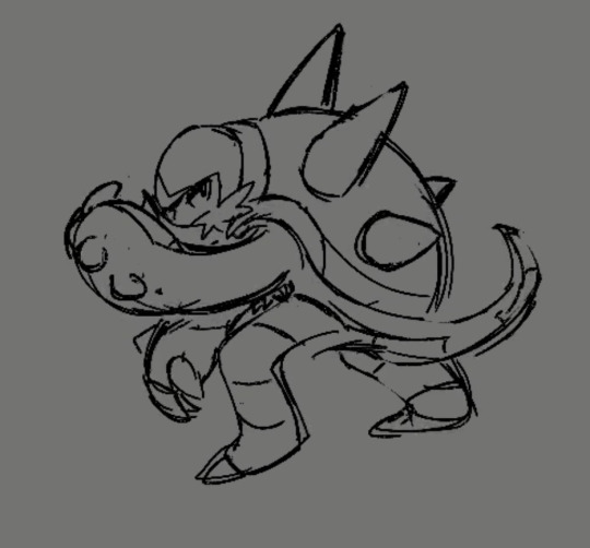
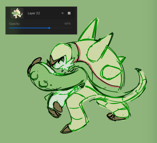
this is from my latest paid req but these are my first sketches of chesnaught -- i was thinking of how one of its inspirations is a warrior / tanker from RPGs, so i drew a pose where it's shielding its face.

i do another pass and take note of details.
in general i draw overlapping shapes and erase (it's a bit visible on one of the spikes)
because i opt for quickness i start coloring at this point -- i just use a colored "color burn" sketch layer for the "lineart" & colorpick official art & lay down messy flats & set the color layer to 60%
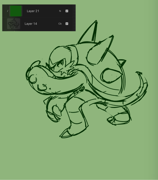
60% multiply layer for shadows. i tend to use both hard and soft brushes
for bigger projects i would use 2-3 shadow layers to create more "layered" shadows
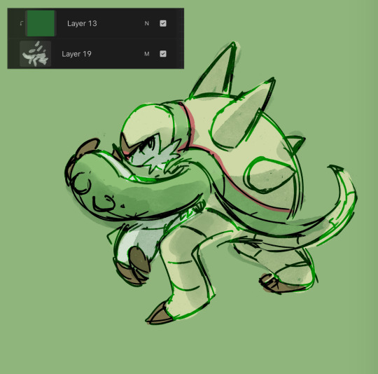
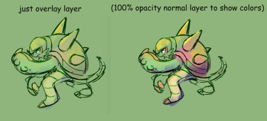
here i use overlay layer (60%). this is just throwing colors at it and seeing what works and doesn't work. i personally prefer to throw red under the eye and a yellow or blue near the top of the head. this is mostly done with a soft brush

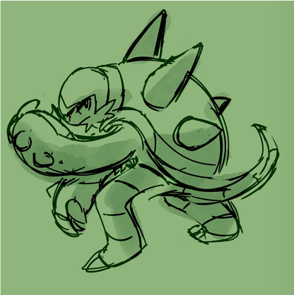
before this point, everything is under the rough lines, but now i start drawing/painting over it
i just color pick the colors that have been laid down from the previous steps and clean up / render textures (making the green on its arms look fuzzy) / fixing anything that i forgot or looks too off (i.e. the spike on its shoulder and the way the tail curves)

I could potentially keep cleaning this up, but this is where i usually stop 🫡
148 notes
·
View notes
Text

lunchtime
bonus reigen sketch i kind of ruined with lineart

#my art#mp100#girl psycho 100#reigen arataka#serizawa katsuya#genderbent serirei#serirei#youtube keeps recommending me tutorials on breaking apples in half with your bare hands and i keep falling miserably
382 notes
·
View notes
Text

Barbie and the Three Musketeers ♥ 2009
#barbie and the three musketeers#barbie#barbie movies#barbie movie#barbie classics#nintendo ds#video game#dailygaming#dailyvideogames#pixel art#pixel#pixel game#nostalgia#gif#y2k#2000s#2000s games#2000s nostalgia#barbie nostalgia#retro barbie#ysigifs#that view from the window is genuinely breathtaking#AND AGAIN this room is barely used!!! it looks gorgeous but you can only visit it during the tutorial for each character!!!!!!!
144 notes
·
View notes
Text
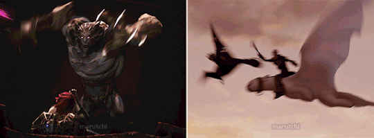
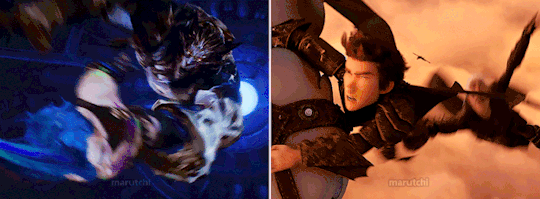
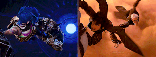

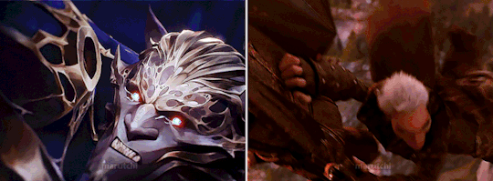
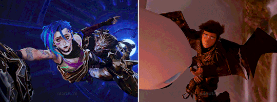
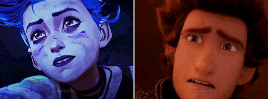
Arcane S02E09 | How to Train Your Dragon: The Hidden World
#falling for the one you love </3#I saw this movie so many god damn times that this was the first thing I thought. was barely able to concentrate on Jinx lol#I freaking love coincidences like this!#arcane#arcane 2024#arcane spoilers#arcane season 2 spoiler#arcane s2 spoiler#jinx#jinx arcane#arcane jinx#vander arcane#vander#how to train your dragon#httyd#how to train your dragon the hidden world#httyd thw#hiccup haddock#hiccup horrendous haddock iii#grimmel#grimmel the grisly#the gifs could look better but it had been a thousand years since I made side by side gifs#and I was too lazy to look up a tutorial ahaha#gifs#arcane vander
174 notes
·
View notes
Text
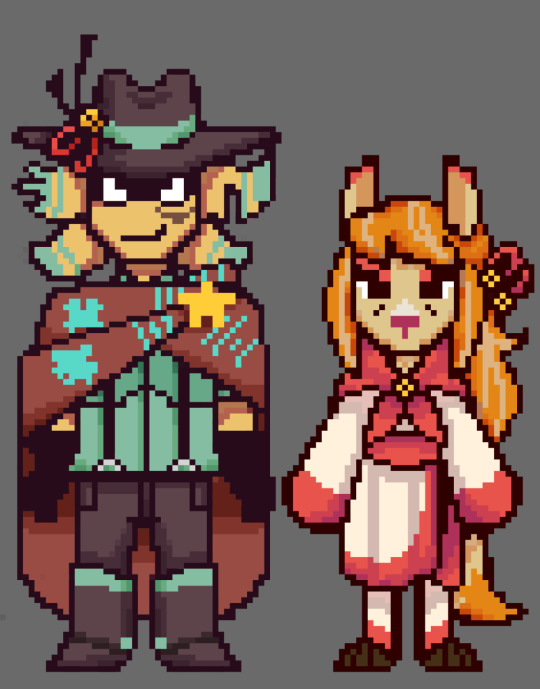

Totally real and canon older Staroba sprites from the upcoming Undertale Yellow 2 game
#undertale yellow#north star#uty starlo#ceroba#uty ceroba#staroba#starlo x ceroba#the cowboy hat draws#Okay but I have barely attempted pixel art before so these might not look stellar. I just wanted to practice with a tutorial I found#Obviously drew some heavy inspiration from their canon sprites!#lucky clover au
460 notes
·
View notes
Text
I knew I had my dads coding gene hidden within me
#feeling proud i could code a basic sanity system without following a tutorial#listen usually when i have a i want to make a game phase i can barely learn a thing about coding#but now i think it finally clicked & i'm happpy
76 notes
·
View notes
Note
I LOVE this set and i was wondering if you could pls explain how you did the text, including how you added texture to the ripped text and the highlighting/circling/etc of words? thank you for posting your beautiful gifs 😊
thank you!! 🥺 & of course! (photopea tutorial)
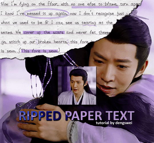
the majority of the texture for the ripped paper effect i can't really take credit for it's on the paper it's self all i did was make the paper white (because the texture was yellow) and used curves to darken the texture), i got the texture from one of photopea's templates but it seems their whole template section has changed drastically and no longer has like anything i used to see before ???? so i'll just share both versions here:
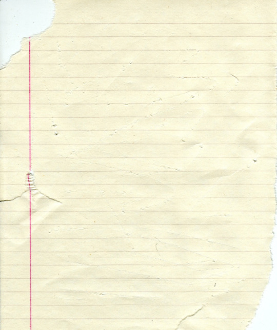
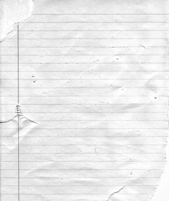
(original & my edited version)
for the ripped parts i just played around with this brush set in the plugins
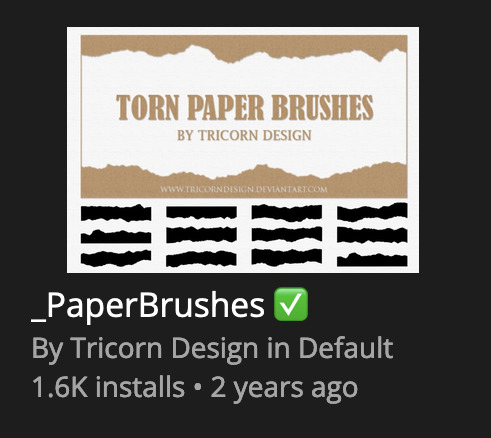
once i decided which of the paper brushes to use i had a new layer and used it where i wanted, so top left in the gif above, i clip masked the paper texture (and the adjustment layers as well) onto it so you get that ripped effect (if you don't like or want to add to that you can always use the brush tool again (or the erasure tool) set as the paper brush to add or remove sections i did this a lot when i realised certain words i wanted to show weren't on there (also changing the size of the paper brush when wanting to add a little bit or take a little bit away was a massive help)
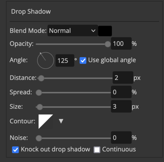
i also always add a drop shadow to my paper textures, the settings i used is mostly the same EXCEPT for the angle for all of the ripped paper (it's also my text drop shadow settings) because depending on how the ripped paper looks you might have to change the angle
also i know in the screenshot below it's on but make sure the use global angle is off if you're going to have multiple different angles of drop shadow in your one gif (so if you want your paper texture on 125° but anything else on 60° the global angle needs to be off but if you want them the same then you can keep that on, which is why it's on for me because the angle is the same for both the text & the ripped paper) (and by text this isn't the text on the ripped paper, there isn't any drop shadow on the text itself there, just to clarify this was for my "ripped paper text tutorial by dengswei" text)
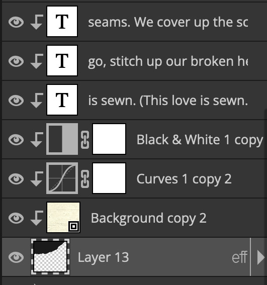
as you can see i also clipped my "handwriting" text to the paper layer this is so it stayed on the paper rather then going onto the gif itself (and it saved the fiddly part of masking it away & it felt more authentic this way too)
i found for me it was easier to seperate the text line by line so i knew exactly which part of the text was on which and if i wanted to change anything either it being a typo, changing the paper texture, or wanting a different word on a different line it was easier that way because it didn't end up messing up all of the text (though you don't have to do it that way, it's just what worked for me here)
font i used was: vag-handwritten (a default photopea font)
all of the next part needs to be above the text on your ripped paper:
for the highlighting, circles, and the lines it's pretty much all the same, i chose the colour which matched the gif (so say purple), for the highlight used the rectangle select & colour fill tools and set that to multiply & then played around with opacity (for most of my highlighting it's set to 50%), for the circles it was the same except the circle shape tool (no fill just stroke) set to purple, set to multiply, with 100% opacity (i found the circles looked better with 100% on some gifs depending on what colour i used), & then duplicated it once or twice and then just moved each circle to where i thought it looked best & the double lines is also the same using the line tool, set to multiply, & playing around with the opacity, & positioning them where i like
for the squiggly lines, the hearts, the 3 small doodle lines at either side of a word, & any other doodles i had on there i doodled them myself with my drawing tablet (you probably don't have to use a drawing tablet i just found it easier that way) using the free pen tool and then did the same thing set it to multiply and played with the opacity
if the colour you choose looks too dark or too light with it set to multiply either try a lighter/darker colour, try out something else like lighten, or screen, or increase/decrease the opacity more (i found i had this issue with the yellow being hard to see on the white paper so i used a darker yellow and kept everything at 100% opacity rather than 50%)
hope that helps! and please if anything is confusing or you want to ask any more don't hesitate to ask i know i ramble on a bit and it can sometimes get a bit confusing 🤣 or if there was anything i missed feel free to ask again 🥰
#replies#edwinas#mine | tutorials#gifmakerresource#photopeablr#photopea tutorial#photopea tutorials#gif tutorial#gif tutorials#usergif#tutorial#tutorials#photopea has so many great default fonts i just spend hours searching through them i barely download fonts now 🤣#i hope i didn't miss anything#also i don't know why the paper textures & my screenshots posted this way i had them side by side#okay they're side by side on mobile but not desktop ??? but mobile doesn't have the read more okay
125 notes
·
View notes
Text
my biggest pet peeve is when """art tutorials""" dont actually give the "bad example" a chance and draw it as poorly as possible on purpose. they dont even explain what is wrong with it, you're expected to look at it and play spot the difference even though it doesnt have the same level of effort. it comes across more like they're bragging about what a good artist they are and what a bad artist YOU are for doing what they did
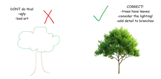
dont draw tree that is bad, draw tree that is good! you can tell my art is better because it is realistic and pleasing to look at unlike your UGLY UNSKILLED tree. be like me 😊
#if you're gonna make a ''tutorial'' the BARE MINIMUM should be explaining what NOT to do#''show dont tell'' doesnt work here because the entire point is to explain to someone who doesnt understand the fundamentals
55 notes
·
View notes
Note
Do you have any personal tips on drawing and rendering wrinkles and folds for your painting? I’ve seen so much of your work and it just fascinates me every time!
Have a slug my amigo 🐌
Thank you for the slug :3 Now I'm no teacher, but this is usually my thought process when drawing "wrinkles" on a fabric
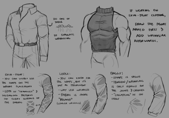
1st): I like to add one of those "bumps" on the edge of the fabric to emphasize that yes, there are wrinkles there. it pretty much helps the eyes process the idea of wrinkles being present, and it helps making it feel like figure's plausible to exist on a 3D space.
2nd): triangles, loops and zigzag-ing patterns. when I make wrinkles on fabrics, my brain automatically looks for places where "tension" would begin, and then fold everything. This means areas like joints, elbows, armpits, knees, etc. Triangles are a go-to if you want to make tighter fabrics, zigzags are more so for looser clothing depending.
When I draw tighter clothing, I also tend to draw the figure in detail first --ex. if I want to draw a tight shirt, I draw the torso in detail first-- and then adding wrinkles on where they would form after that. References definitely help a lot.

There's also the fact that I always imagine wrinkles to be two areas having a tug of war, but there's no winners
the unaffected areas of wrinkles are also ALWAYS darker (even if ever so slightly), because the wrinkles itself are more exposed to light than the rest of the fabric, except of course, on certain lighting placements. (like the light being shone directly onto the unaffected area)
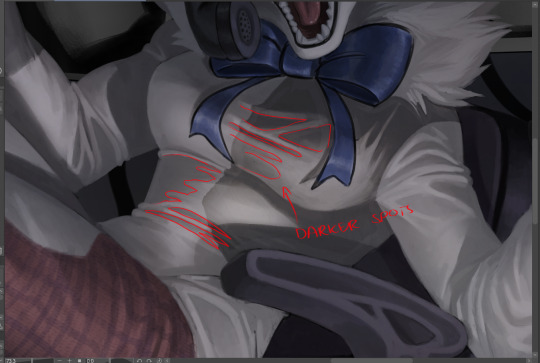
(this is a commission I'm working on)
Hopefully what I've put here is comprehensible and not overwhelming, I tried my best to explain it as much as possible lol
#thanks for the ask!#Ziku's insane rambles#simple wrinkle tutorial :3#it's not 100% accurate to real life wrinkles btw it's what I would call “the bare minimum” lol#because there's SO many types of fabric wrinkling#but these methods are what I use/encounter the most when making character art#so yeah#also OC JUMPSCARE AGAIN!!!!!
95 notes
·
View notes
Text
when you watch dead cells immortalis it's really beautiful because you can tell how little motion twin gaf about their own dead cells universe and story that they made <3 and cut out the studio that does gaf out of the credits. wow. beautiful /sarcasm
#4wtih0p9gppgpgpgpgpgpgpgpgpgpgpg#AHHH ITS SO PAINFUL#look idm a casual little dead cells flavored adventure or whatever#but this is barely dead cells and it just kills me imagining how much better/more bearable this would be if it#HAD CHARACTERS#FROM.. THE GAME..#you know#because its the DEAD CELLS show..#idm laure shes like pseudo from the game because shes like some kinda#tutorial knight lookalike with a similar role#but what the fuck is going on with the rest#txt#dead cells immortalis#dead cells
94 notes
·
View notes
Text

Web design is my passion
#shitpost#wobbledog#just 1#as you can see my programming class is going very well#html#i know a lot more than i did about html but i can barely do ANYTHING with what i know#fun fact i actually had to put in MORE effort to make it look like this m#quick image tutorial incoming#when you alter the image size in css you use the string img { width: 400px; } (or your desired pixel number or percentage)#and this scales your image accordingly. however.#you can also add a second value of height or width depending on what you started with and the image WILL stretch#so my code looked like this:#img { width: 100%; height: 400px; }#also ☝️ the colour of the title is dodgerblue and i think its the best blue. followed closely by aliceblue
39 notes
·
View notes
Note
Genuine question, because I've been struggling HARD on how to nail Afton in my own artstyle - how do you study with yer take of him? I know the sketches n whatnot, which are honestly inspiring to me, and of course studying Matthew Lillard would help - but you have such a specific flow that is incredibly charming to me.
How did you work/study in terms of yer anatomy & facial structure fer yer art? Whether it be Afton studies or yer older pieces like Markiplier! Ya got such a nice flow between 'cartoon' & 'realistic' that is genuinely scratching every part of my brain. /vpos /gen 🙏🏼🧡🧡
that's a good question 😂 if I draw something long enough, someday I'll get an enlightenment what I like + what looks good. the struggle is finding the right amount of details/ lines and keeping it balanced
well for example with Markiplier: my first studies were more realistic and had a lot of detail, which takes more time draw 😩
Went the more simplified route: - less details!!! keeping the lines at a minimum - round nose + face/chin - minimalistic beard - stylized hair (kinda like disney 2D characters)

biggest factor to make it more cartoony/ simpler was that I wanted to do animatics with him, so I had to go the "low poly" design route and make it easy to draw. tried to study what makes the face characteristic for the person. works more or less - sometimes I cannot get it right either :'DD So I said ♪ meet me halfway ♫ and tried to aim for the middle of these styles 😂
Same goes for William - my first drawing of him (for a shitpost animatic, left side) was a bit too complex, so I had to simplify it (right)

GET SIMPLIFIED, IDIOT (affectionate) 🙏
#ask#tutorial#kind of?? I guess??? I tried lmao#happy with William by now#and yes I am using /that/ side view of william again cuz it's my favorite :3#Mike is a whole other chapter: I cannot get it riiiight (yells) haven't found a good way to draw him consistent yet 😔 also barely draw him#maybe this is connected.. who knows~ but thats just a theory. a GAME THE- (gunshot)
72 notes
·
View notes
Note
WHAT PROGRAM OR TECHNIC OR WHATEVER DID U USE FOR THE 3D SQUISHES

ITS CALLED PAINT 3D AND ITS KINDA JANKY BUT TOTALLY FREE AND I RECOMMEND IT
#im thinking abt making a tutorial since i barely see ppl using it but also its pretty easy to use so maybe its not necessary lmao#asks
86 notes
·
View notes
Note
Hey, I've asked this question before but I will ask again. How did you learn to find your art style? Like how did you learn to draw?
<:)? I don't know what kind of answer you're expecting, since my answer is usually mostly the same each time someone asks!!
I drew bad for a long time!! I continue to draw bad!
Every time I try to draw something new I've never drawn before, it's bad the first few times. That's just a part of the process.

And then, I do research online, look at reference images, look at other artists and see how they choose to tackle things, learn and then adapt to a style that I prefer better.
I practice. I draw every day. I beat my head against the wall until something looks sort of presentable.
Don't forget, each time you see a post by me, that art is just one single successful attempt at drawing compared to the 15+ sketches that weren't good enough to continue.
Sorry if this isn't what you wanted to hear 😅
#fizzles answers#anon#anonymous#also im not sure i like how passive aggressive that first sentence is#im not sure if you were expecting a tutorial ?? on how to stylize things? or just like a generic how to draw#but i dont know how to teach art to others. i barely know how to teach myself 😂
52 notes
·
View notes
Text
youtube
OH WHAT A BEAUTIFUL THING TO WAKE UP TO
#FUCK YEAH IT'S BEEN SO LONG SINCE I'VE SEEN UPDATES ON THIS#crosscode#alabaster dawn#it's been so long i can't even remember if there was plans for a capybara character all along#or if this is literally a shout out to some memes at the server lol#anyway i can't wait. but i wish there were more puzzles at the trailer#because i know many people complaining about the puzzles (bad taste) and i wanna know if they're gonna tone them down (crime against me)#you're not supposed to listen to your fanbase you're supposed to listen only to me specialiest boygirl on the planet#(tho real talk i get other might dislike puzzles but. crosscode was so honest about it from the beginning)#(the demo had only bare combat tutorial with lots of shooting angle puzzles already)#(i felt it was very clear what the game was gonna be about)#(why play it to complain about it)#Youtube
49 notes
·
View notes
Text
A guide I made earlier mostly for myself

I feel proud of it soo, yall get to see it:3
#hand tutorial#digital art#lets be real tho#i barely did these#i moreof learned it one by one as time passes#not me pretending to be a pro at hands
18 notes
·
View notes