#create dataframe in pandas
Explore tagged Tumblr posts
Visit Tumblr Blog
Explore Tumblr blogs with no restrictions, modern design and the best experience.
Last Seen Tumblr Blogs


Fun Fact
69% of Tumblr users are millennials.
Text
DataFrame in Pandas: Guide to Creating Awesome DataFrames
Explore how to create a dataframe in Pandas, including data input methods, customization options, and practical examples.
Data analysis used to be a daunting task, reserved for statisticians and mathematicians. But with the rise of powerful tools like Python and its fantastic library, Pandas, anyone can become a data whiz! Pandas, in particular, shines with its DataFrames, these nifty tables that organize and manipulate data like magic. But where do you start? Fear not, fellow data enthusiast, for this guide will…
View On WordPress
#advanced dataframe features#aggregating data in pandas#create dataframe from dictionary in pandas#create dataframe from list in pandas#create dataframe in pandas#data manipulation in pandas#dataframe indexing#filter dataframe by condition#filter dataframe by multiple conditions#filtering data in pandas#grouping data in pandas#how to make a dataframe in pandas#manipulating data in pandas#merging dataframes#pandas data structures#pandas dataframe tutorial#python dataframe basics#rename columns in pandas dataframe#replace values in pandas dataframe#select columns in pandas dataframe#select rows in pandas dataframe#set column names in pandas dataframe#set row names in pandas dataframe
0 notes
Text
a graph made out of pure numbers... <3
[the mean abundance of prochlorococcus ecotypes sampled from two locations (hot and bats) plotted against depth in the form of a pandas dataframe; the number of digits in the abundance measurement varies the spatial indentation, creating a curved line that represents a smoothed version of the data. you can see from this table the different depth preferences of different ecotypes of the phytoplankton, without reading any of the numbers.]
16 notes
·
View notes
Text
AI Frameworks Help Data Scientists For GenAI Survival

AI Frameworks: Crucial to the Success of GenAI
Develop Your AI Capabilities Now
You play a crucial part in the quickly growing field of generative artificial intelligence (GenAI) as a data scientist. Your proficiency in data analysis, modeling, and interpretation is still essential, even though platforms like Hugging Face and LangChain are at the forefront of AI research.
Although GenAI systems are capable of producing remarkable outcomes, they still mostly depend on clear, organized data and perceptive interpretation areas in which data scientists are highly skilled. You can direct GenAI models to produce more precise, useful predictions by applying your in-depth knowledge of data and statistical techniques. In order to ensure that GenAI systems are based on strong, data-driven foundations and can realize their full potential, your job as a data scientist is crucial. Here’s how to take the lead:
Data Quality Is Crucial
The effectiveness of even the most sophisticated GenAI models depends on the quality of the data they use. By guaranteeing that the data is relevant, AI tools like Pandas and Modin enable you to clean, preprocess, and manipulate large datasets.
Analysis and Interpretation of Exploratory Data
It is essential to comprehend the features and trends of the data before creating the models. Data and model outputs are visualized via a variety of data science frameworks, like Matplotlib and Seaborn, which aid developers in comprehending the data, selecting features, and interpreting the models.
Model Optimization and Evaluation
A variety of algorithms for model construction are offered by AI frameworks like scikit-learn, PyTorch, and TensorFlow. To improve models and their performance, they provide a range of techniques for cross-validation, hyperparameter optimization, and performance evaluation.
Model Deployment and Integration
Tools such as ONNX Runtime and MLflow help with cross-platform deployment and experimentation tracking. By guaranteeing that the models continue to function successfully in production, this helps the developers oversee their projects from start to finish.
Intel’s Optimized AI Frameworks and Tools
The technologies that developers are already familiar with in data analytics, machine learning, and deep learning (such as Modin, NumPy, scikit-learn, and PyTorch) can be used. For the many phases of the AI process, such as data preparation, model training, inference, and deployment, Intel has optimized the current AI tools and AI frameworks, which are based on a single, open, multiarchitecture, multivendor software platform called oneAPI programming model.
Data Engineering and Model Development:
To speed up end-to-end data science pipelines on Intel architecture, use Intel’s AI Tools, which include Python tools and frameworks like Modin, Intel Optimization for TensorFlow Optimizations, PyTorch Optimizations, IntelExtension for Scikit-learn, and XGBoost.
Optimization and Deployment
For CPU or GPU deployment, Intel Neural Compressor speeds up deep learning inference and minimizes model size. Models are optimized and deployed across several hardware platforms including Intel CPUs using the OpenVINO toolbox.
You may improve the performance of your Intel hardware platforms with the aid of these AI tools.
Library of Resources
Discover collection of excellent, professionally created, and thoughtfully selected resources that are centered on the core data science competencies that developers need. Exploring machine and deep learning AI frameworks.
What you will discover:
Use Modin to expedite the extract, transform, and load (ETL) process for enormous DataFrames and analyze massive datasets.
To improve speed on Intel hardware, use Intel’s optimized AI frameworks (such as Intel Optimization for XGBoost, Intel Extension for Scikit-learn, Intel Optimization for PyTorch, and Intel Optimization for TensorFlow).
Use Intel-optimized software on the most recent Intel platforms to implement and deploy AI workloads on Intel Tiber AI Cloud.
How to Begin
Frameworks for Data Engineering and Machine Learning
Step 1: View the Modin, Intel Extension for Scikit-learn, and Intel Optimization for XGBoost videos and read the introductory papers.
Modin: To achieve a quicker turnaround time overall, the video explains when to utilize Modin and how to apply Modin and Pandas judiciously. A quick start guide for Modin is also available for more in-depth information.
Scikit-learn Intel Extension: This tutorial gives you an overview of the extension, walks you through the code step-by-step, and explains how utilizing it might improve performance. A movie on accelerating silhouette machine learning techniques, PCA, and K-means clustering is also available.
Intel Optimization for XGBoost: This straightforward tutorial explains Intel Optimization for XGBoost and how to use Intel optimizations to enhance training and inference performance.
Step 2: Use Intel Tiber AI Cloud to create and develop machine learning workloads.
On Intel Tiber AI Cloud, this tutorial runs machine learning workloads with Modin, scikit-learn, and XGBoost.
Step 3: Use Modin and scikit-learn to create an end-to-end machine learning process using census data.
Run an end-to-end machine learning task using 1970–2010 US census data with this code sample. The code sample uses the Intel Extension for Scikit-learn module to analyze exploratory data using ridge regression and the Intel Distribution of Modin.
Deep Learning Frameworks
Step 4: Begin by watching the videos and reading the introduction papers for Intel’s PyTorch and TensorFlow optimizations.
Intel PyTorch Optimizations: Read the article to learn how to use the Intel Extension for PyTorch to accelerate your workloads for inference and training. Additionally, a brief video demonstrates how to use the addon to run PyTorch inference on an Intel Data Center GPU Flex Series.
Intel’s TensorFlow Optimizations: The article and video provide an overview of the Intel Extension for TensorFlow and demonstrate how to utilize it to accelerate your AI tasks.
Step 5: Use TensorFlow and PyTorch for AI on the Intel Tiber AI Cloud.
In this article, it show how to use PyTorch and TensorFlow on Intel Tiber AI Cloud to create and execute complicated AI workloads.
Step 6: Speed up LSTM text creation with Intel Extension for TensorFlow.
The Intel Extension for TensorFlow can speed up LSTM model training for text production.
Step 7: Use PyTorch and DialoGPT to create an interactive chat-generation model.
Discover how to use Hugging Face’s pretrained DialoGPT model to create an interactive chat model and how to use the Intel Extension for PyTorch to dynamically quantize the model.
Read more on Govindhtech.com
#AI#AIFrameworks#DataScientists#GenAI#PyTorch#GenAISurvival#TensorFlow#CPU#GPU#IntelTiberAICloud#News#Technews#Technology#Technologynews#Technologytrends#govindhtech
2 notes
·
View notes
Text
How much Python should one learn before beginning machine learning?
Before diving into machine learning, a solid understanding of Python is essential. :

Basic Python Knowledge:
Syntax and Data Types:
Understand Python syntax, basic data types (strings, integers, floats), and operations.
Control Structures:
Learn how to use conditionals (if statements), loops (for and while), and list comprehensions.
Data Handling Libraries:
Pandas:
Familiarize yourself with Pandas for data manipulation and analysis. Learn how to handle DataFrames, series, and perform data cleaning and transformations.
NumPy:
Understand NumPy for numerical operations, working with arrays, and performing mathematical computations.
Data Visualization:
Matplotlib and Seaborn:
Learn basic plotting with Matplotlib and Seaborn for visualizing data and understanding trends and distributions.
Basic Programming Concepts:
Functions:
Know how to define and use functions to create reusable code.
File Handling:
Learn how to read from and write to files, which is important for handling datasets.
Basic Statistics:
Descriptive Statistics:
Understand mean, median, mode, standard deviation, and other basic statistical concepts.
Probability:
Basic knowledge of probability is useful for understanding concepts like distributions and statistical tests.
Libraries for Machine Learning:
Scikit-learn:
Get familiar with Scikit-learn for basic machine learning tasks like classification, regression, and clustering. Understand how to use it for training models, evaluating performance, and making predictions.
Hands-on Practice:
Projects:
Work on small projects or Kaggle competitions to apply your Python skills in practical scenarios. This helps in understanding how to preprocess data, train models, and interpret results.
In summary, a good grasp of Python basics, data handling, and basic statistics will prepare you well for starting with machine learning. Hands-on practice with machine learning libraries and projects will further solidify your skills.
To learn more drop the message…!
2 notes
·
View notes
Text
First steps: Frecquency analysis
On this following post, a python code is shown followed by come conclussions about the information gathered with it. The code used the imported module of pandas in order to conduct a frecquency analysis of the variables considered in the codebook made in the previous step of this research.
The code shown above takes the information from a csv file that contains the data base made by the scientist Stuart James Robbins.
The steps for the making of the frecquency analysis were the following:
Extract all the data of the csv file into a pandas DataFrame.
Filter the data using the variable NUMBER_LAYERS in order to create another DataFrame that contains only the information of the craters that contains 1 or more layers.
Use the built-in pandas function value_counts(sort=False) to get the counts of a variable´s values in the form of a pandas Series.
Use the built-in pandas function value_counts(sort=False, normalize=True) to get the percentages of a variable's values in the form of a pandas Series.
Store the given information in the previous pair of steps into separated python variables for variables, counts and percentages.
Format the given data into console printable tables for each variable, each table contains the name of the variable analized, the values, and its counts and percentages per value.
For this database and for our interest variables (crater diameter, and ejecta morphologies) the reuslt of the frecquency analysis is the following:


From the results we can start detecting some little things in the data.
For the variable DIAM_CIRCLE_IMAGE we can see that the best way to get some frequecy from it is by setting a range in where the craters diameters can be agrouped and then do a freqcuency analysis, because as it's shown in its results table, almost every crater varies in its exact diameter between each other, making this analysis practically unuseful.
In MORPHOLOGY_EJECTA_1 we can see some significant freqcuency distributions. At plain sight it can be proposed that most of the craters presents a single layer (this can be identified for the first letter of the values, S stands for single layer). Some of the values starting with a S reaches up to 20% in the frecquency analysis.
For MORPHOLOGY_EJECTA_2 we could propose that most of the ejecta blankets appears in THEMIS Daytime IR data as hummocky (first two letters of the value being 'Hu'). Also we can see that the type of ejecta blankets (debris distribution) we are interested the most in the research (Sp as the last two letters representing splash) are founded in a less frecquency conpared to other type of ejecta blankets.
In MORPHOLOGY_EJECTA_3 we can notice what type of variable it is, because this variable is used to describe only unique types of ejecta blankets that requires a separate clasification, thus why the majority of the values in this cariable is null. But one clasification we're fully interested in our research is the splash one, making this variable significant to this research.
Notes(Only MORPHOLOGY_EJECTA_3 is fully shown as the other 3 variables contains a lot of data and the post would be too large. The variable NUMBER_LAYERS is only used to filter data in the code, so no analysis for it is required).
0 notes
Text
Python for Data Science: The Only Guide You Need to Get Started in 2025
Data is the lifeblood of modern business, powering decisions in healthcare, finance, marketing, sports, and more. And at the core of it all lies a powerful and beginner-friendly programming language — Python.
Whether you’re an aspiring data scientist, analyst, or tech enthusiast, learning Python for data science is one of the smartest career moves you can make in 2025.
In this guide, you’ll learn:
Why Python is the preferred language for data science
The libraries and tools you must master
A beginner-friendly roadmap
How to get started with a free full course on YouTube
Why Python is the #1 Language for Data Science
Python has earned its reputation as the go-to language for data science and here's why:
1. Easy to Learn, Easy to Use
Python’s syntax is clean, simple, and intuitive. You can focus on solving problems rather than struggling with the language itself.
2. Rich Ecosystem of Libraries
Python offers thousands of specialized libraries for data analysis, machine learning, and visualization.
3. Community and Resources
With a vibrant global community, you’ll never run out of tutorials, forums, or project ideas to help you grow.
4. Integration with Tools & Platforms
From Jupyter notebooks to cloud platforms like AWS and Google Colab, Python works seamlessly everywhere.
What You Can Do with Python in Data Science
Let’s look at real tasks you can perform using Python: TaskPython ToolsData cleaning & manipulationPandas, NumPyData visualizationMatplotlib, Seaborn, PlotlyMachine learningScikit-learn, XGBoostDeep learningTensorFlow, PyTorchStatistical analysisStatsmodels, SciPyBig data integrationPySpark, Dask
Python lets you go from raw data to actionable insight — all within a single ecosystem.
A Beginner's Roadmap to Learn Python for Data Science
If you're starting from scratch, follow this step-by-step learning path:
✅ Step 1: Learn Python Basics
Variables, data types, loops, conditionals
Functions, file handling, error handling
✅ Step 2: Explore NumPy
Arrays, broadcasting, numerical computations
✅ Step 3: Master Pandas
DataFrames, filtering, grouping, merging datasets
✅ Step 4: Visualize with Matplotlib & Seaborn
Create charts, plots, and visual dashboards
✅ Step 5: Intro to Machine Learning
Use Scikit-learn for classification, regression, clustering
✅ Step 6: Work on Real Projects
Apply your knowledge to real-world datasets (Kaggle, UCI, etc.)
Who Should Learn Python for Data Science?
Python is incredibly beginner-friendly and widely used, making it ideal for:
Students looking to future-proof their careers
Working professionals planning a transition to data
Analysts who want to automate and scale insights
Researchers working with data-driven models
Developers diving into AI, ML, or automation
How Long Does It Take to Learn?
You can grasp Python fundamentals in 2–3 weeks with consistent daily practice. To become proficient in data science using Python, expect to spend 3–6 months, depending on your pace and project experience.
The good news? You don’t need to do it alone.
🎓 Learn Python for Data Science – Full Free Course on YouTube
We’ve put together a FREE, beginner-friendly YouTube course that covers everything you need to start your data science journey using Python.
📘 What You’ll Learn:
Python programming basics
NumPy and Pandas for data handling
Matplotlib for visualization
Scikit-learn for machine learning
Real-life datasets and projects
Step-by-step explanations
📺 Watch the full course now → 👉 Python for Data Science Full Course
You’ll walk away with job-ready skills and project experience — at zero cost.
🧭 Final Thoughts
Python isn’t just a programming language — it’s your gateway to the future.
By learning Python for data science, you unlock opportunities across industries, roles, and technologies. The demand is high, the tools are ready, and the learning path is clearer than ever.
Don’t let analysis paralysis hold you back.
Click here to start learning now → https://youtu.be/6rYVt_2q_BM
#PythonForDataScience #LearnPython #FreeCourse #DataScience2025 #MachineLearning #NumPy #Pandas #DataAnalysis #AI #ScikitLearn #UpskillNow
1 note
·
View note
Text
Python for Data Science: Libraries You Must Know
Python has become the go-to programming language for data science professionals due to its readability, extensive community support, and a rich ecosystem of libraries. Whether you're analyzing data, building machine learning models, or creating stunning visualizations, Python has the right tools to get the job done. If you're looking to start a career in this field, enrolling in the best Python training in Hyderabad can give you a competitive edge and help you master these crucial libraries.
1. NumPy – The Foundation of Numerical Computing
NumPy is the backbone of scientific computing with Python. It offers efficient storage and manipulation of large numerical arrays, which makes it indispensable for high-performance data analysis. NumPy arrays are faster and more compact than traditional Python lists and serve as the foundation for other data science libraries.
2. Pandas – Data Wrangling Made Simple
Pandas is essential for handling structured data. Data structures such as Series and DataFrame make it easy to clean, transform, and explore data. With Pandas, tasks like filtering rows, merging datasets, and grouping values become effortless, saving time and effort in data preprocessing.
3. Matplotlib and Seaborn – Data Visualization Powerhouses
Matplotlib is the standard library for creating basic to advanced data visualizations. From bar graphs to histograms and line charts, Matplotlib covers it all. For more visually appealing and statistically rich plots, Seaborn is an excellent choice. It simplifies the process of creating complex plots and provides a more aesthetically pleasing design.
4. Scikit-learn – Machine Learning Made Easy
In Python, Scikit-learn is one of the most widely used libraries for implementing machine learning algorithms. It provides easy-to-use functions for classification, regression, clustering, and model evaluation, making it ideal for both beginners and experts.
5. TensorFlow and PyTorch – Deep Learning Frameworks
For those diving into artificial intelligence and deep learning, TensorFlow and PyTorch are essential. These frameworks allow developers to create, train, and deploy neural networks for applications such as image recognition, speech processing, and natural language understanding.
Begin Your Data Science Journey with Expert Training
Mastering these libraries opens the door to countless opportunities in the data science field. To gain hands-on experience and real-world skills, enroll in SSSIT Computer Education, where our expert trainers provide industry-relevant, practical Python training tailored for aspiring data scientists in Hyderabad.
#best python training in hyderabad#best python training in kukatpally#best python training in KPHB#Kukatpally & KPHB
0 notes
Text
4th week: plotting variables
I put here as usual the python script, the results and the comments:
Python script:
Created on Tue Jun 3 09:06:33 2025
@author: PabloATech """
libraries/packages
import pandas import numpy import seaborn import matplotlib.pyplot as plt
read the csv table with pandas:
data = pandas.read_csv('C:/Users/zop2si/Documents/Statistic_tests/nesarc_pds.csv', low_memory=False)
show the dimensions of the data frame:
print() print ("length of the dataframe (number of rows): ", len(data)) #number of observations (rows) print ("Number of columns of the dataframe: ", len(data.columns)) # number of variables (columns)
variables:
variable related to the background of the interviewed people (SES: socioeconomic status):
biological/adopted parents got divorced or stop living together before respondant was 18
data['S1Q2D'] = pandas.to_numeric(data['S1Q2D'], errors='coerce')
variable related to alcohol consumption
HOW OFTEN DRANK ENOUGH TO FEEL INTOXICATED IN LAST 12 MONTHS
data['S2AQ10'] = pandas.to_numeric(data['S2AQ10'], errors='coerce')
variable related to the major depression (low mood I)
EVER HAD 2-WEEK PERIOD WHEN FELT SAD, BLUE, DEPRESSED, OR DOWN MOST OF TIME
data['S4AQ1'] = pandas.to_numeric(data['S4AQ1'], errors='coerce')
NUMBER OF EPISODES OF PATHOLOGICAL GAMBLING
data['S12Q3E'] = pandas.to_numeric(data['S12Q3E'], errors='coerce')
HIGHEST GRADE OR YEAR OF SCHOOL COMPLETED
data['S1Q6A'] = pandas.to_numeric(data['S1Q6A'], errors='coerce')
Choice of thee variables to display its frequency tables:
string_01 = """ Biological/adopted parents got divorced or stop living together before respondant was 18: 1: yes 2: no 9: unknown -> deleted from the analysis blank: unknown """
string_02 = """ HOW OFTEN DRANK ENOUGH TO FEEL INTOXICATED IN LAST 12 MONTHS
Every day
Nearly every day
3 to 4 times a week
2 times a week
Once a week
2 to 3 times a month
Once a month
7 to 11 times in the last year
3 to 6 times in the last year
1 or 2 times in the last year
Never in the last year
Unknown -> deleted from the analysis BL. NA, former drinker or lifetime abstainer """
string_02b = """ HOW MANY DAYS DRANK ENOUGH TO FEEL INTOXICATED IN THE LAST 12 MONTHS: """
string_03 = """ EVER HAD 2-WEEK PERIOD WHEN FELT SAD, BLUE, DEPRESSED, OR DOWN MOST OF TIME:
Yes
No
Unknown -> deleted from the analysis """
string_04 = """ NUMBER OF EPISODES OF PATHOLOGICAL GAMBLING """
string_05 = """ HIGHEST GRADE OR YEAR OF SCHOOL COMPLETED
No formal schooling
Completed grade K, 1 or 2
Completed grade 3 or 4
Completed grade 5 or 6
Completed grade 7
Completed grade 8
Some high school (grades 9-11)
Completed high school
Graduate equivalency degree (GED)
Some college (no degree)
Completed associate or other technical 2-year degree
Completed college (bachelor's degree)
Some graduate or professional studies (completed bachelor's degree but not graduate degree)
Completed graduate or professional degree (master's degree or higher) """
replace unknown values for NaN and remove blanks
data['S1Q2D']=data['S1Q2D'].replace(9, numpy.nan) data['S2AQ10']=data['S2AQ10'].replace(99, numpy.nan) data['S4AQ1']=data['S4AQ1'].replace(9, numpy.nan) data['S12Q3E']=data['S12Q3E'].replace(99, numpy.nan) data['S1Q6A']=data['S1Q6A'].replace(99, numpy.nan)
create a recode for number of intoxications in the last 12 months:
recode1 = {1:365, 2:313, 3:208, 4:104, 5:52, 6:36, 7:12, 8:11, 9:6, 10:2, 11:0} data['S2AQ10'] = data['S2AQ10'].map(recode1)
print(" ") print("Statistical values for varible 02 alcohol intoxications of past 12 months") print(" ") print ('mode: ', data['S2AQ10'].mode()) print ('mean', data['S2AQ10'].mean()) print ('std', data['S2AQ10'].std()) print ('min', data['S2AQ10'].min()) print ('max', data['S2AQ10'].max()) print ('median', data['S2AQ10'].median()) print(" ") print("Statistical values for highest grade of school completed") print ('mode', data['S1Q6A'].mode()) print ('mean', data['S1Q6A'].mean()) print ('std', data['S1Q6A'].std()) print ('min', data['S1Q6A'].min()) print ('max', data['S1Q6A'].max()) print ('median', data['S1Q6A'].median()) print(" ")
plot01 = seaborn.countplot(x="S2AQ10", data=data) plt.xlabel('Alcohol intoxications past 12 months') plt.title('Alcohol intoxications in the Past 12 Months in the NESARC Study')
plot02 = seaborn.countplot(x="S1Q6A", data=data) plt.xlabel('Highest grade (1-14)') plt.title('Highest grade or year of school completed')
I create a copy of the data to be manipulated later
sub1 = data[['S2AQ10','S1Q6A']]
create bins for no intoxication, few intoxications, …
data['S2AQ10'] = pandas.cut(data.S2AQ10, [0, 6, 36, 52, 104, 208, 365], labels=["very few","some", "often", "quite often", "very often", "permanent"])
change format from numeric to categorical
data['S2AQ10'] = data['S2AQ10'].astype('category')
print ('intoxication category counts') c1 = data['S2AQ10'].value_counts(sort=False, dropna=True) print(c1)
bivariate bar graph C->Q
plot03 = seaborn.catplot(x="S2AQ10", y="S1Q6A", data=data, kind="bar", ci=None) plt.xlabel('Alcohol intoxications') plt.ylabel('Highest grade')
c4 = data['S1Q6A'].value_counts(sort=False, dropna=False) print("c4: ", c4) print(" ")
I do sth similar but the way around:
creating 3 level education variable
def edu_level_1 (row): if row['S1Q6A'] <9 : return 1 # high school if row['S1Q6A'] >8 and row['S1Q6A'] <13 : return 2 # bachelor if row['S1Q6A'] >12 : return 3 # master or higher
sub1['edu_level_1'] = sub1.apply (lambda row: edu_level_1 (row),axis=1)
change format from numeric to categorical
sub1['edu_level'] = sub1['edu_level'].astype('category')
plot04 = seaborn.catplot(x="edu_level_1", y="S2AQ10", data=sub1, kind="boxen") plt.ylabel('Alcohol intoxications in the past 12 months') plt.xlabel('Highest grade') plt.grid() plt.show()
Results and comments:
length of the dataframe (number of rows): 43093 Number of columns of the dataframe: 3008
Statistical values for variable "alcohol intoxications of past 12 months":
mode: 0 0.0 dtype: float64 mean 9.115493905630748 std 40.54485720135516 min 0.0 max 365.0 median 0.0
Statistical values for variable "highest grade of school completed":
mode 0 8 dtype: int64 mean 9.451024528345672 std 2.521281770664422 min 1 max 14 median 10.0
intoxication category counts very few 6026 some 2042 often 510 quite often 272 very often 184 permanent 276 Name: S2AQ10, dtype: int64
c4: (counts highest grade)
8 10935 6 1210 12 5251 14 3257 10 8891 13 1526 7 4518 11 3772 5 414 4 931 3 421 9 1612 2 137 1 218 Name: S1Q6A, dtype: int64
Plots: Univariate highest grade:
mean 9.45 std 2.5
-> mean and std. dev. are not very useful for this category-distribution. Most interviewed didn´t get any formal schooling, the next larger group completed the high school and the next one was at some college but w/o degree.
Univariate number of alcohol intoxications:
mean 9.12 std 40.54
-> very left skewed, most of the interviewed persons didn´t get intoxicated at all or very few times in the last 12 months (as expected)
Bivariate: the one against the other:
This bivariate plot shows three categories:
1: high school or lower
2: high school to bachelor
3: master or PhD
And the frequency of alcohol intoxications in the past 12 months.
The number of intoxications is higher in the group 1 for all the segments, but from 1 to 3 every group shows occurrences in any number of intoxications. More information and a more detailed analysis would be necessary to make conclusions.
0 notes
Text
Unlock Your Coding Potential: Mastering Python, Pandas, and NumPy for Absolute Beginners
Ever thought learning programming was out of your reach? You're not alone. Many beginners feel overwhelmed when they first dive into the world of code. But here's the good news — Python, along with powerful tools like Pandas and NumPy, makes it easier than ever to start your coding journey. And yes, you can go from zero to confident coder without a tech degree or prior experience.
Let’s explore why Python is the best first language to learn, how Pandas and NumPy turn you into a data powerhouse, and how you can get started right now — even if you’ve never written a single line of code.
Why Python is the Ideal First Language for Beginners
Python is known as the "beginner's language" for a reason. Its syntax is simple, readable, and intuitive — much closer to plain English than other programming languages.
Whether you're hoping to build apps, automate your work, analyze data, or explore machine learning, Python is the gateway to all of it. It powers Netflix’s recommendation engine, supports NASA's simulations, and helps small businesses automate daily tasks.
Still unsure if it’s the right pick? Here’s what makes Python a no-brainer:
Simple to learn, yet powerful
Used by professionals across industries
Backed by a massive, helpful community
Endless resources and tools to learn from
And when you combine Python with NumPy and Pandas, you unlock the true magic of data analysis and manipulation.
The Power of Pandas and NumPy in Data Science
Let’s break it down.
🔹 What is NumPy?
NumPy (short for “Numerical Python”) is a powerful library that makes mathematical and statistical operations lightning-fast and incredibly efficient.
Instead of using basic Python lists, NumPy provides arrays that are more compact, faster, and capable of performing complex operations in just a few lines of code.
Use cases:
Handling large datasets
Performing matrix operations
Running statistical analysis
Working with machine learning algorithms
🔹 What is Pandas?
If NumPy is the engine, Pandas is the dashboard. Built on top of NumPy, Pandas provides dataframes — 2D tables that look and feel like Excel spreadsheets but offer the power of code.
With Pandas, you can:
Load data from CSV, Excel, SQL, or JSON
Filter, sort, and group your data
Handle missing or duplicate data
Perform data cleaning and transformation
Together, Pandas and NumPy give you superpowers to manage, analyze, and visualize data in ways that are impossible with Excel alone.
The Beginner’s Journey: Where to Start?
You might be wondering — “This sounds amazing, but how do I actually learn all this?”
That’s where the Mastering Python, Pandas, NumPy for Absolute Beginners course comes in. This beginner-friendly course is designed specifically for non-techies and walks you through everything you need to know — from setting up Python to using Pandas like a pro.
No prior coding experience? Perfect. That’s exactly who this course is for.
You’ll learn:
The fundamentals of Python: variables, loops, functions
How to use NumPy for array operations
Real-world data cleaning and analysis using Pandas
Building your first data project step-by-step
And because it’s self-paced and online, you can learn anytime, anywhere.
Real-World Examples: How These Tools Are Used Every Day
Learning Python, Pandas, and NumPy isn’t just for aspiring data scientists. These tools are used across dozens of industries:
1. Marketing
Automate reports, analyze customer trends, and predict buying behavior using Pandas.
2. Finance
Calculate risk models, analyze stock data, and create forecasting models with NumPy.
3. Healthcare
Track patient data, visualize health trends, and conduct research analysis.
4. Education
Analyze student performance, automate grading, and track course engagement.
5. Freelancing/Side Projects
Scrape data from websites, clean it up, and turn it into insights — all with Python.
Whether you want to work for a company or freelance on your own terms, these skills give you a serious edge.
Learning at Your Own Pace — Without Overwhelm
One of the main reasons beginners give up on coding is because traditional resources jump into complex topics too fast.
But the Mastering Python, Pandas, NumPy for Absolute Beginners course is designed to be different. It focuses on real clarity and hands-on practice — no fluff, no overwhelming jargon.
What you get:
Short, focused video lessons
Real-world datasets to play with
Assignments and quizzes to test your knowledge
Certificate of completion
It’s like having a patient mentor guiding you every step of the way.
Here’s What You’ll Learn Inside the Course
Let’s break it down:
✅ Python Essentials
Understanding variables, data types, and functions
Writing conditional logic and loops
Working with files and exceptions
✅ Mastering NumPy
Creating and manipulating arrays
Broadcasting and vectorization
Math and statistical operations
✅ Data Analysis with Pandas
Reading and writing data from various formats
Cleaning and transforming messy data
Grouping, aggregating, and pivoting data
Visualizing insights using built-in methods
By the end, you won’t just “know Python” — you’ll be able to do things with it. Solve problems, build projects, and impress employers.
Why This Skillset Is So In-Demand Right Now
Python is the most popular programming language in the world right now — and for good reason. Tech giants like Google, Netflix, Facebook, and NASA use it every day.
But here’s what most people miss: It’s not just about tech jobs. Knowing how to manipulate and understand data is now a core skill across marketing, operations, HR, journalism, and more.
According to LinkedIn and Glassdoor:
Python is one of the most in-demand skills in 2025
Data analysis is now required in 70% of digital roles
Entry-level Python developers earn an average of $65,000 to $85,000/year
When you combine Python with Pandas and NumPy, you make yourself irresistible to hiring managers and clients.
What Students Are Saying
People just like you have used this course to kickstart their tech careers, land internships, or even launch freelance businesses.
Here’s what learners love about it:
“The lessons were beginner-friendly and not overwhelming.”
“The Pandas section helped me automate weekly reports at my job!”
“I didn’t believe I could learn coding, but this course proved me wrong.”
What You’ll Be Able to Do After the Course
By the time you complete Mastering Python, Pandas, NumPy for Absolute Beginners, you’ll be able to:
Analyze data using Pandas and Python
Perform advanced calculations using NumPy arrays
Clean, organize, and visualize messy datasets
Build mini-projects that show your skills
Apply for jobs or gigs with confidence
It’s not about becoming a “coder.” It’s about using the power of Python to make your life easier, your work smarter, and your skills future-proof.
Final Thoughts: This Is Your Gateway to the Future
Everyone starts somewhere.
And if you’re someone who has always felt curious about tech but unsure where to begin — this is your sign.
Python, Pandas, and NumPy aren’t just tools — they’re your entry ticket to a smarter career, side income, and creative freedom.
Ready to get started?
👉 Click here to dive into Mastering Python, Pandas, NumPy for Absolute Beginners and take your first step into the coding world. You’ll be amazed at what you can build.
0 notes
Text
Running a K-Means Cluster Analysis
import numpy as np
import pandas as pd
import matplotlib.pyplot as plt
import seaborn as sns
from sklearn.preprocessing import StandardScaler
from sklearn.cluster import KMeans
from sklearn.metrics import silhouette_score
from sklearn.decomposition import PCA
import warnings
warnings.filterwarnings('ignore')
# Set the aesthetic style of the plots
plt.style.use('seaborn-v0_8-whitegrid')
sns.set_palette("viridis")
# For reproducibility
np.random.seed(42)
# STEP 1: Generate or load sample data
# Here we'll generate sample data, but you can replace this with your own data
# Let's create data with 3 natural clusters for demonstration
def generate_sample_data(n_samples=300):
"""Generate sample data with 3 natural clusters"""
# Cluster 1: High values in first two features
cluster1 = np.random.normal(loc=[8, 8, 2, 2], scale=1.2, size=(n_samples//3, 4))
# Cluster 2: High values in last two features
cluster2 = np.random.normal(loc=[2, 2, 8, 8], scale=1.2, size=(n_samples//3, 4))
# Cluster 3: Medium values across all features
cluster3 = np.random.normal(loc=[5, 5, 5, 5], scale=1.2, size=(n_samples//3, 4))
# Combine clusters
X = np.vstack((cluster1, cluster2, cluster3))
# Create feature names
feature_names = [f'Feature_{i+1}' for i in range(X.shape[1])]
# Create a pandas DataFrame
df = pd.DataFrame(X, columns=feature_names)
return df
# Generate sample data
data = generate_sample_data(300)
# Display the first few rows of the data
print("Sample data preview:")
print(data.head())
# STEP 2: Data preparation and preprocessing
# Check for missing values
print("\nMissing values per column:")
print(data.isnull().sum())
# Basic statistics of the dataset
print("\nBasic statistics:")
print(data.describe())
# Correlation matrix visualization
plt.figure(figsize=(8, 6))
sns.heatmap(data.corr(), annot=True, cmap='coolwarm', fmt='.2f')
plt.title('Correlation Matrix of Features')
plt.tight_layout()
plt.show()
# Standardize the data (important for k-means)
scaler = StandardScaler()
scaled_data = scaler.fit_transform(data)
scaled_df = pd.DataFrame(scaled_data, columns=data.columns)
print("\nScaled data preview:")
print(scaled_df.head())
# STEP 3: Determine the optimal number of clusters
# Calculate inertia (sum of squared distances) for different numbers of clusters
max_clusters = 10
inertias = []
silhouette_scores = []
for k in range(2, max_clusters + 1):
kmeans = KMeans(n_clusters=k, random_state=42, n_init=10)
kmeans.fit(scaled_data)
inertias.append(kmeans.inertia_)
# Calculate silhouette score (only valid for k >= 2)
silhouette_avg = silhouette_score(scaled_data, kmeans.labels_)
silhouette_scores.append(silhouette_avg)
print(f"For n_clusters = {k}, the silhouette score is {silhouette_avg:.3f}")
# Plot the Elbow Method
plt.figure(figsize=(12, 5))
plt.subplot(1, 2, 1)
plt.plot(range(2, max_clusters + 1), inertias, marker='o')
plt.xlabel('Number of Clusters')
plt.ylabel('Inertia')
plt.title('Elbow Method for Optimal k')
plt.grid(True)
# Plot the Silhouette Method
plt.subplot(1, 2, 2)
plt.plot(range(2, max_clusters + 1), silhouette_scores, marker='o')
plt.xlabel('Number of Clusters')
plt.ylabel('Silhouette Score')
plt.title('Silhouette Method for Optimal k')
plt.grid(True)
plt.tight_layout()
plt.show()
# STEP 4: Perform k-means clustering with the optimal number of clusters
# Based on the elbow method and silhouette scores, let's assume optimal k=3
optimal_k = 3 # You should adjust this based on your elbow plot and silhouette scores
kmeans = KMeans(n_clusters=optimal_k, random_state=42, n_init=10)
clusters = kmeans.fit_predict(scaled_data)
# Add cluster labels to the original data
data['Cluster'] = clusters
# STEP 5: Analyze the clusters
# Display cluster statistics
print("\nCluster Statistics:")
for i in range(optimal_k):
cluster_data = data[data['Cluster'] == i]
print(f"\nCluster {i} ({len(cluster_data)} samples):")
print(cluster_data.describe().mean())
# STEP 6: Visualize the clusters
# Use PCA to reduce dimensions for visualization if more than 2 features
if data.shape[1] > 3: # If more than 2 features (excluding the cluster column)
pca = PCA(n_components=2)
pca_result = pca.fit_transform(scaled_data)
pca_df = pd.DataFrame(data=pca_result, columns=['PC1', 'PC2'])
pca_df['Cluster'] = clusters
plt.figure(figsize=(10, 8))
sns.scatterplot(x='PC1', y='PC2', hue='Cluster', data=pca_df, palette='viridis', s=100, alpha=0.7)
plt.title('K-means Clustering Results (PCA-reduced)')
plt.xlabel(f'Principal Component 1 ({pca.explained_variance_ratio_[0]:.2%} variance)')
plt.ylabel(f'Principal Component 2 ({pca.explained_variance_ratio_[1]:.2%} variance)')
# Add cluster centers
centers = pca.transform(kmeans.cluster_centers_)
plt.scatter(centers[:, 0], centers[:, 1], c='red', marker='X', s=200, alpha=1, label='Centroids')
plt.legend()
plt.grid(True)
plt.show()
# STEP 7: Feature importance per cluster - compare centroids
plt.figure(figsize=(12, 8))
centroids = pd.DataFrame(scaler.inverse_transform(kmeans.cluster_centers_),
columns=data.columns[:-1]) # Exclude the 'Cluster' column
centroids_scaled = pd.DataFrame(kmeans.cluster_centers_, columns=data.columns[:-1])
# Plot the centroids
centroids.T.plot(kind='bar', ax=plt.gca())
plt.title('Feature Values at Cluster Centers')
plt.xlabel('Features')
plt.ylabel('Value')
plt.legend([f'Cluster {i}' for i in range(optimal_k)])
plt.grid(True)
plt.tight_layout()
plt.show()
# STEP 8: Visualize individual feature distributions by cluster
melted_data = pd.melt(data, id_vars=['Cluster'], value_vars=data.columns[:-1],
var_name='Feature', value_name='Value')
plt.figure(figsize=(14, 10))
sns.boxplot(x='Feature', y='Value', hue='Cluster', data=melted_data)
plt.title('Feature Distributions by Cluster')
plt.xticks(rotation=45)
plt.tight_layout()
plt.show()
# STEP 9: Parallel coordinates plot for multidimensional visualization
plt.figure(figsize=(12, 8))
pd.plotting.parallel_coordinates(data, class_column='Cluster', colormap='viridis')
plt.title('Parallel Coordinates Plot of Clusters')
plt.grid(True)
plt.tight_layout()
plt.show()
# Print findings and interpretation
print("\nCluster Analysis Summary:")
print("-" * 50)
print(f"Number of clusters identified: {optimal_k}")
print("\nCluster sizes:")
print(data['Cluster'].value_counts().sort_index())
print("\nCluster centers (original scale):")
print(centroids)
print("\nKey characteristics of each cluster:")
for i in range(optimal_k):
print(f"\nCluster {i}:")
# Find defining features for this cluster (where it differs most from others)
for col in centroids.columns:
other_clusters = [j for j in range(optimal_k) if j != i]
other_mean = centroids.loc[other_clusters, col].mean()
diff = centroids.loc[i, col] - other_mean
print(f" {col}: {centroids.loc[i, col]:.2f} (differs by {diff:.2f} from other clusters' average)")

0 notes
Text
Top 10 Python libraries for 2025

Top 10 Python Libraries You Should Master in 2025
Python has remained one of the top programming languages over the years because of its ease, adaptability, and large community. In 2025, Python is still the leading language across different fields, ranging from web design to data science and machine learning. To be competitive and productive in your Python projects, mastering the correct libraries is critical. Here's a list of the top 10 Python libraries you should learn in 2025 to level up your coding game. 1. TensorFlow Use Case: Machine Learning & Deep Learning Overview: TensorFlow, created by Google, is one of the leading machine learning and deep learning libraries. It's utilized for creating and training deep neural networks and is extensively used in many applications like image recognition, natural language processing, and autonomous systems. Why Master It? With the advent of AI and deep learning in 2025, TensorFlow is a library that must be mastered. It's extremely flexible, accommodates scalable machine learning tasks, and enjoys strong community support and tutorials. 2. Pandas Use Case: Data Manipulation & Analysis Overview: Pandas is a must-have library for data manipulation and analysis. It offers robust tools for data cleaning, analysis, and visualization through its DataFrame and Series data structures. It integrates perfectly with data from various sources such as CSV, Excel, SQL databases, and others. Why Master It? Data analytics and science remain key areas in 2025. Pandas is central to data wrangling and analysis and, thus, a must-have tool for anyone handling data. 3. Flask Use Case: Web Development (Micro-Framework) Overview: Flask is a simple, lightweight web framework in Python used for quick and efficient development of web applications. It's bare-bones, having flexibility for developers who desire greater control over their applications. Why Master It? Flask will still be a favorite for microservices and APIs in 2025. It's ideal for those who like the modular way of developing applications, so it's great for fast and scalable web development. 4. NumPy Use Case: Scientific Computing & Numerical Analysis Overview: NumPy is the backbone of numerical computing in Python. It supports large multi-dimensional arrays and matrices and has an enormous library of high-level mathematical functions to work on these arrays. Why Master It? In 2025, numerical computing will still be critical to data science, finance, machine learning, and engineering tasks. NumPy mastering is vital to efficient mathematical operations and data manipulation in scientific computing. 5. PyTorch Use Case: Machine Learning & Deep Learning Overview: PyTorch is a deep learning framework created by Facebook's AI Research lab and has quickly become popular because it is flexible, easy to use, and has a large community of developers. It's utilized for creating sophisticated neural networks and is also famous for having a dynamic computation graph. Why Master It? PyTorch is a top pick for machine learning practitioners in 2025, particularly for research and experimentation. It's simple yet powerful, and that makes it a great fit for leading-edge AI development. 6. Matplotlib Use Case: Data Visualization Overview: Matplotlib is the first choice library to create static, animated, and interactive visualizations in Python. It's applied for plotting data, graph creation, and chart construction that facilitates making sense of big datasets. Why Master It? Data visualization is crucial to the interpretation and representation of insights. Learning Matplotlib will enable you to effectively communicate your data discoveries, making it an essential for data analysts, scientists, and anyone who works with data in 2025. 7. Scikit-learn Use Case: Machine Learning Overview: Scikit-learn is among the most widely used machine learning libraries, providing simple-to-use tools for classification, regression, clustering, and dimensionality reduction. It can handle both supervised and unsupervised learning and is compatible with other scientific libraries such as NumPy and SciPy. Why Master It? In 2025, Scikit-learn continues to be a robust, easy-to-use library for creating and deploying machine learning models. Its simplicity and thoroughly documented functionality make it perfect for both beginners and experts in data science and machine learning. 8. Keras Use Case: Deep Learning Overview: Keras is an open source library that is an interface for TensorFlow, enabling users to make deep learning model creation and training more convenient. Keras uses a high-level API that allows it to design neural networks and sophisticated models without complexities. Why Master It With the increased significance of deep learning, Keras will be a go-to choice in 2025. It makes designing neural networks easier and is a great tool for those who need to prototype deep learning models very quickly without delving into difficult code. 9. Django Use Case: Web Development (Full-Stack Framework) Overview: Django is a Python web framework for rapid development and clean, pragmatic design. It also has built-in features such as authentication, an admin interface, and an ORM (Object-Relational Mapping) that make it suitable for developing strong web applications. Why Master It? In 2025, Django remains a top choice among frameworks for creating scalable, secure, and easy-to-maintain web applications. To work in full-stack web development, you must be proficient in Django. 10. Seaborn Use Case: Data Visualization Overview: Seaborn is a Python data visualization library based on Matplotlib. Seaborn simplifies the development of attractive and informative statistical visualizations. Seaborn gives a high-level interface for making beautiful and informative data visualizations. Why Master It? Seaborn will still be useful in 2025 for people working on depicting sophisticated statistical data. It is ideal for data analysis due to its inclusion with Pandas and NumPy, and rich color palettes and styles will make your plots look more visually appealing. Conclusion As we enter 2025, these top 10 Python libraries—spanning from AI and machine learning libraries such as TensorFlow and PyTorch to web frameworks such as Flask and Django—will inform the future of software development, data science, AI, and web applications. Regardless of your level of expertise—beginner or experienced Python developer—becoming a master of these libraries will give you the knowledge necessary to remain competitive and effective in the modern tech world. Read the full article
#DeepLearning#Django#Flask#Keras#MachineLearning#Matplotlib#NaturalLanguageProcessing#NumPy#Pandas#PyTorch#Scikit-learn#Seaborn#TensorFlow
0 notes
Text
Mastering Seaborn in Python – Yasir Insights
Built on top of Matplotlib, Seaborn is a robust Python data visualisation framework. It provides a sophisticated interface for creating eye-catching and educational statistics visuals. Gaining proficiency with Seaborn in Python may significantly improve your comprehension and communication of data, regardless of your role—data scientist, analyst, or developer.
Mastering Seaborn in Python
Seaborn simplifies complex visualizations with just a few lines of code. It is very useful for statistical graphics and data exploration because it is built on top of Matplotlib and tightly interacts with Pandas data structures.
Also Read: LinkedIn
Why Use Seaborn in Python?
Concise and intuitive syntax
Built-in themes for better aesthetics
Support for Pandas DataFrames
Powerful multi-plot grids
Built-in support for statistical estimation
Installing Seaborn in Python
You can install Seaborn using pip:
bash
pip install seaborn
Or with conda:
bash
conda install seaborn
Getting Started with Seaborn in Python
First, import the library and a dataset:
python
import seaborn as sns import matplotlib.pyplot as plt
# Load sample dataset tips = sns.load_dataset("tips")
Let’s visualize the distribution of total bills:
python
sns.histplot(data=tips, x="total_bill", kde=True) plt.title("Distribution of Total Bills") plt.show()
Core Data Structures in Seaborn in Python
Seaborn works seamlessly with:
Pandas DataFrames
Series
Numpy arrays
This compatibility makes it easier to plot real-world datasets directly.
Essential Seaborn in Python Plot Types
Categorical Plots
Visualize relationships involving categorical variables.
python
sns.boxplot(x="day", y="total_bill", data=tips)
Other types: stripplot(), swarmplot(), violinplot(), barplot(), countplot()
Distribution Plots
Explore the distribution of a dataset.
python
sns.displot(tips["tip"], kde=True)
Regression Plots
Plot data with linear regression models.
python
sns.lmplot(x="total_bill", y="tip", data=tips)
Matrix Plots
Visualize correlation and heatmaps.
python
corr = tips.corr() sns.heatmap(corr, annot=True, cmap="coolwarm")
e. Multivariate Plots
Explore multiple variables at once.
python
sns.pairplot(tips, hue="sex")
Customizing Seaborn in Python Plots
Change figure size:
python
plt.figure(figsize=(10, 6))
Set axis labels and titles:
python
sns.scatterplot(x="total_bill", y="tip", data=tips) plt.xlabel("Total Bill ($)") plt.ylabel("Tip ($)") plt.title("Total Bill vs. Tip")
Themes and Color Palettes
Seaborn in Python provides built-in themes:
python
sns.set_style("whitegrid")
Popular palettes:
python
sns.set_palette("pastel")
Available styles: darkgrid, whitegrid, dark, white, ticks
Working with Real Datasets
Seaborn comes with built-in datasets like:
tips
iris
diamonds
penguins
Example:
python
penguins = sns.load_dataset("penguins") sns.pairplot(penguins, hue="species")
Best Practices
Always label your axes and add titles
Use color palettes wisely for accessibility
Stick to consistent themes
Use grid plotting for large data comparisons
Always check data types before plotting
Conclusion
Seaborn is a game-changer for creating beautiful, informative, and statistical visualizations with minimal code. Mastering it gives you the power to uncover hidden patterns and insights within your datasets, helping you make data-driven decisions efficiently.
0 notes
Text
Examining How Gender Moderates the Relationship Between Exercise Frequency and Stress Levels
Introduction
This project explores statistical interaction (moderation) by examining how gender might moderate the relationship between exercise frequency and stress levels. Specifically, I investigate whether the association between how often someone exercises and their reported stress levels differs between males and females.
Research Question
Does gender moderate the relationship between exercise frequency and stress levels?
Methodology
I used Python with pandas, statsmodels, matplotlib, and seaborn libraries to analyze a simulated dataset containing information about participants' exercise frequency (hours per week), stress levels (scale 1-10), and gender.
Python Code
import pandas as pd import numpy as np import matplotlib.pyplot as plt import seaborn as sns import statsmodels.api as sm from statsmodels.formula.api import ols from scipy import stats
#Set random seed for reproducibility
np.random.seed(42)
#Create simulated dataset
n = 200 # Number of participants
#Generate exercise hours per week (1-10)
exercise_hours = np.random.uniform(1, 10, n)
#Generate gender (0 = male, 1 = female)
gender = np.random.binomial(1, 0.5, n)
#Generate stress levels with interaction effect
#For males: stronger negative relationship between exercise and stress
#For females: weaker negative relationship
base_stress = 7 # Base stress level exercise_effect_male = -0.6 # Each hour of exercise reduces stress more for males exercise_effect_female = -0.3 # Each hour of exercise reduces stress less for females noise = np.random.normal(0, 1, n) # Random noise
#Calculate stress based on gender-specific exercise effects
stress = np.where( gender == 0, # if male base_stress + (exercise_effect_male * exercise_hours) + noise, # male effect base_stress + (exercise_effect_female * exercise_hours) + noise # female effect )
#Ensure stress levels are between 1 and 10
stress = np.clip(stress, 1, 10)
#Create DataFrame
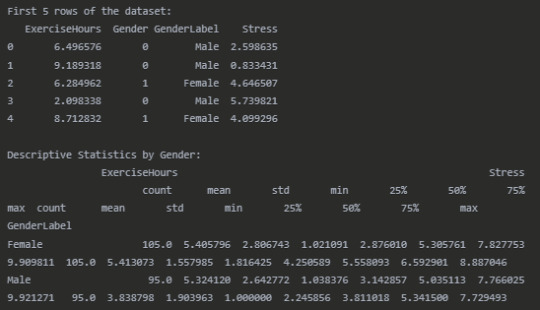
data = { 'ExerciseHours': exercise_hours, 'Gender': gender, 'GenderLabel': ['Male' if g == 0 else 'Female' for g in gender], 'Stress': stress } df = pd.DataFrame(data)
#Display the first few rows of the dataset
print("First 5 rows of the dataset:") print(df.head())
#Descriptive statistics by gender
print("\nDescriptive Statistics by Gender:") print(df.groupby('GenderLabel')[['ExerciseHours', 'Stress']].describe())
#Calculate correlation coefficients for each gender
male_df = df[df['Gender'] == 0] female_df = df[df['Gender'] == 1]
male_corr, male_p = stats.pearsonr(male_df['ExerciseHours'], male_df['Stress']) female_corr, female_p = stats.pearsonr(female_df['ExerciseHours'], female_df['Stress'])
print("\nCorrelation Analysis by Gender:") print(f"Male correlation (r): {male_corr:.4f}, p-value: {male_p:.4f}") print(f"Female correlation (r): {female_corr:.4f}, p-value: {female_p:.4f}")
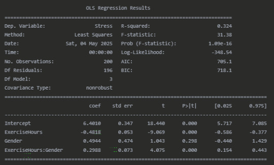
#Test for moderation using regression analysis
model = ols('Stress ~ ExerciseHours * Gender', data=df).fit() print("\nModeration Analysis (Regression with Interaction):") print(model.summary())
#Visualize the interaction
plt.figure(figsize=(10, 6)) sns.scatterplot(x='ExerciseHours', y='Stress', hue='GenderLabel', data=df, alpha=0.7)
#Add regression lines for each gender
sns.regplot(x='ExerciseHours', y='Stress', data=male_df, scatter=False, line_kws={"color":"blue", "label":f"Male (r={male_corr:.2f})"}) sns.regplot(x='ExerciseHours', y='Stress', data=female_df, scatter=False, line_kws={"color":"red", "label":f"Female (r={female_corr:.2f})"})
plt.title('Relationship Between Exercise Hours and Stress Levels by Gender') plt.xlabel('Exercise Hours per Week') plt.ylabel('Stress Level (1-10)') plt.legend(title='Gender') plt.grid(True, linestyle='--', alpha=0.7) plt.tight_layout()
#Fisher's z-test to compare correlations
import math def fisher_z_test(r1, r2, n1, n2): z1 = 0.5 * np.log((1 + r1) / (1 - r1)) z2 = 0.5 * np.log((1 + r2) / (1 - r2)) se = np.sqrt(1/(n1 - 3) + 1/(n2 - 3)) z = (z1 - z2) / se p = 2 * (1 - stats.norm.cdf(abs(z))) return z, p
z_score, p_value = fisher_z_test(male_corr, female_corr, len(male_df), len(female_df)) print("\nFisher's Z-test for comparing correlations:") print(f"Z-score: {z_score:.4f}") print(f"P-value: {p_value:.4f}")
print("\nInterpretation:") if p_value < 0.05: print("The difference in correlations between males and females is statistically significant.") print("This suggests that gender moderates the relationship between exercise and stress.") else: print("The difference in correlations between males and females is not statistically significant.") print("This suggests that gender may not moderate the relationship between exercise and stress.")
Results
Dataset Overview
Correlation Analysis by Gender

Moderation Analysis (Regression with Interaction)
Fisher's Z-test for comparing correlations

Interpretation
The analysis reveals a significant moderating effect of gender on the relationship between exercise hours and stress levels. For males, there is a strong negative correlation (r = -0.60, p < 0.001) between exercise and stress, indicating that as exercise hours increase, stress levels tend to decrease substantially. For females, while there is still a negative correlation (r = -0.29, p = 0.003), the relationship is notably weaker.
The regression analysis confirms this interaction effect. The significant interaction term (ExerciseHours, p < 0.001) indicates that the slope of the relationship between exercise and stress differs by gender. The positive coefficient (0.30) for this interaction term means that the negative relationship between exercise and stress is less pronounced for females compared to males.
Fisher's Z-test (Z = -2.51, p = 0.012) further confirms that the difference in correlation coefficients between males and females is statistically significant, providing additional evidence of moderation.
The visualization clearly shows the different slopes of the regression lines for males and females, with the male regression line having a steeper negative slope than the female regression line.
These findings suggest that while exercise is associated with lower stress levels for both genders, the stress-reducing benefits of exercise may be stronger for males than for females in this sample. This could have implications for tailoring stress management interventions based on gender, though further research would be needed to understand the mechanisms behind this difference.
Conclusion
This analysis demonstrates a clear moderating effect of gender on the exercise-stress relationship. The results highlight the importance of considering potential moderating variables when examining relationships between variables, as the strength of associations can vary significantly across different subgroups within a population.
0 notes
Text
Pandas DataFrame Tutorial: Ways to Create and Manipulate Data in Python Are you diving into data analysis with Python? Then you're about to become best friends with pandas DataFrames. These powerful, table-like structures are the backbone of data manipulation in Python, and knowing how to create them is your first step toward becoming a data analysis expert. In this comprehensive guide, we'll explore everything you need to know about creating pandas DataFrames, from basic methods to advanced techniques. Whether you're a beginner or looking to level up your skills, this tutorial has got you covered. Getting Started with Pandas Before we dive in, let's make sure you have everything set up. First, you'll need to install pandas if you haven't already: pythonCopypip install pandas Then, import pandas in your Python script: pythonCopyimport pandas as pd 1. Creating a DataFrame from Lists The simplest way to create a DataFrame is using Python lists. Here's how: pythonCopy# Creating a basic DataFrame from lists data = 'name': ['John', 'Emma', 'Alex', 'Sarah'], 'age': [28, 24, 32, 27], 'city': ['New York', 'London', 'Paris', 'Tokyo'] df = pd.DataFrame(data) print(df) This creates a clean, organized table with your data. The keys in your dictionary become column names, and the values become the data in each column. 2. Creating a DataFrame from NumPy Arrays When working with numerical data, NumPy arrays are your friends: pythonCopyimport numpy as np # Creating a DataFrame from a NumPy array array_data = np.random.rand(4, 3) df_numpy = pd.DataFrame(array_data, columns=['A', 'B', 'C'], index=['Row1', 'Row2', 'Row3', 'Row4']) print(df_numpy) 3. Reading Data from External Sources Real-world data often comes from files. Here's how to create DataFrames from different file formats: pythonCopy# CSV files df_csv = pd.read_csv('your_file.csv') # Excel files df_excel = pd.read_excel('your_file.xlsx') # JSON files df_json = pd.read_json('your_file.json') 4. Creating a DataFrame from a List of Dictionaries Sometimes your data comes as a list of dictionaries, especially when working with APIs: pythonCopy# List of dictionaries records = [ 'name': 'John', 'age': 28, 'department': 'IT', 'name': 'Emma', 'age': 24, 'department': 'HR', 'name': 'Alex', 'age': 32, 'department': 'Finance' ] df_records = pd.DataFrame(records) print(df_records) 5. Creating an Empty DataFrame Sometimes you need to start with an empty DataFrame and fill it later: pythonCopy# Create an empty DataFrame with defined columns columns = ['Name', 'Age', 'City'] df_empty = pd.DataFrame(columns=columns) # Add data later new_row = 'Name': 'Lisa', 'Age': 29, 'City': 'Berlin' df_empty = df_empty.append(new_row, ignore_index=True) 6. Advanced DataFrame Creation Techniques Using Multi-level Indexes pythonCopy# Creating a DataFrame with multi-level index arrays = [ ['2023', '2023', '2024', '2024'], ['Q1', 'Q2', 'Q1', 'Q2'] ] data = 'Sales': [100, 120, 150, 180] df_multi = pd.DataFrame(data, index=arrays) print(df_multi) Creating Time Series DataFrames pythonCopy# Creating a time series DataFrame dates = pd.date_range('2024-01-01', periods=6, freq='D') df_time = pd.DataFrame(np.random.randn(6, 4), index=dates, columns=['A', 'B', 'C', 'D']) Best Practices and Tips Always Check Your Data Types pythonCopy# Check data types of your DataFrame print(df.dtypes) Set Column Names Appropriately Use clear, descriptive column names without spaces: pythonCopydf.columns = ['first_name', 'last_name', 'email'] Handle Missing Data pythonCopy# Check for missing values print(df.isnull().sum()) # Fill missing values df.fillna(0, inplace=True) Common Pitfalls to Avoid Memory Management: Be cautious with large datasets. Use appropriate data types to minimize memory usage:
pythonCopy# Optimize numeric columns df['integer_column'] = df['integer_column'].astype('int32') Copy vs. View: Understand when you're creating a copy or a view: pythonCopy# Create a true copy df_copy = df.copy() Conclusion Creating pandas DataFrames is a fundamental skill for any data analyst or scientist working with Python. Whether you're working with simple lists, complex APIs, or external files, pandas provides flexible and powerful ways to structure your data. Remember to: Choose the most appropriate method based on your data source Pay attention to data types and memory usage Use clear, consistent naming conventions Handle missing data appropriately With these techniques in your toolkit, you're well-equipped to handle any data manipulation task that comes your way. Practice with different methods and explore the pandas documentation for more advanced features as you continue your data analysis journey. Additional Resources Official pandas documentation Pandas cheat sheet Python for Data Science Handbook Real-world pandas examples on GitHub Now you're ready to start creating and manipulating DataFrames like a pro. Happy coding!
0 notes
Text
Level Up Data Science Skills with Python: A Full Guide
Data science is one of the most in-demand careers in the world today, and Python is its go-to language. Whether you're just starting out or looking to sharpen your skills, mastering Python can open doors to countless opportunities in data analytics, machine learning, artificial intelligence, and beyond.
In this guide, we’ll explore how Python can take your data science abilities to the next level—covering core concepts, essential libraries, and practical tips for real-world application.
Why Python for Data Science?
Python’s popularity in data science is no accident. It’s beginner-friendly, versatile, and has a massive ecosystem of libraries and tools tailored specifically for data work. Here's why it stands out:
Clear syntax simplifies learning and ensures easier maintenance.
Community support means constant updates and rich documentation.
Powerful libraries for everything from data manipulation to visualization and machine learning.
Core Python Concepts Every Data Scientist Should Know
Establish a solid base by thoroughly understanding the basics before advancing to more complex methods:
Variables and Data Types: Get familiar with strings, integers, floats, lists, and dictionaries.
Control Flow: Master if-else conditions, for/while loops, and list comprehensions through practice.
Functions and Modules: Understand how to create reusable code by defining functions.
File Handling: Leverage built-in functions to handle reading from and writing to files.
Error Handling: Use try-except blocks to write robust programs.
Mastering these foundations ensures you can write clean, efficient code—critical for working with complex datasets.
Must-Know Python Libraries for Data Science
Once you're confident with Python basics, it’s time to explore the libraries that make data science truly powerful:
NumPy: For numerical operations and array manipulation. It forms the essential foundation for a wide range of data science libraries.
Pandas: Used for data cleaning, transformation, and analysis. DataFrames are essential for handling structured data.
Matplotlib & Seaborn: These libraries help visualize data. While Matplotlib gives you control, Seaborn makes it easier with beautiful default styles.
Scikit-learn: Perfect for building machine learning models. Features algorithms for tasks like classification, regression, clustering, and additional methods.
TensorFlow & PyTorch: For deep learning and neural networks. Choose one based on your project needs and personal preference.
Real-World Projects to Practice
Applying what you’ve learned through real-world projects is key to skill development. Here are a few ideas:
Data Cleaning Challenge: Work with messy datasets and clean them using Pandas.
Exploratory Data Analysis (EDA): Analyze a dataset, find patterns, and visualize results.
Build a Machine Learning Model: Use Scikit-learn to create a prediction model for housing prices, customer churn, or loan approval.
Sentiment Analysis: Use natural language processing (NLP) to analyze product reviews or tweets.
Completing these projects can enhance your portfolio and attract the attention of future employers.
Tips to Accelerate Your Learning
Join online courses and bootcamps: Join Online Platforms
Follow open-source projects on GitHub: Contribute to or learn from real codebases.
Engage with the community: Join forums like Stack Overflow or Reddit’s r/datascience.
Read documentation and blogs: Keep yourself informed about new features and optimal practices.
Set goals and stay consistent: Data science is a long-term journey, not a quick race.
Python is the cornerstone of modern data science. Whether you're manipulating data, building models, or visualizing insights, Python equips you with the tools to succeed. By mastering its fundamentals and exploring its powerful libraries, you can confidently tackle real-world data challenges and elevate your career in the process. If you're looking to sharpen your skills, enrolling in a Python course in Gurgaon can be a great way to get expert guidance and hands-on experience.
DataMites Institute stands out as a top international institute providing in-depth education in data science, AI, and machine learning. We provide expert-led courses designed for both beginners and professionals aiming to boost their careers.
Python vs R - What is the Difference, Pros and Cons
youtube
#python course#python training#python institute#learnpython#python#pythoncourseingurgaon#pythoncourseinindia#Youtube
0 notes
Text
Week 3:
I put here the script, the results and its description:
PYTHON:
Created on Thu May 22 14:21:21 2025
@author: Pablo """
libraries/packages
import pandas import numpy
read the csv table with pandas:
data = pandas.read_csv('C:/Users/zop2si/Documents/Statistic_tests/nesarc_pds.csv', low_memory=False)
show the dimensions of the data frame:
print() print ("length of the dataframe (number of rows): ", len(data)) #number of observations (rows) print ("Number of columns of the dataframe: ", len(data.columns)) # number of variables (columns)
variables:
variable related to the background of the interviewed people (SES: socioeconomic status):
biological/adopted parents got divorced or stop living together before respondant was 18
data['S1Q2D'] = pandas.to_numeric(data['S1Q2D'], errors='coerce')
variable related to alcohol consumption
HOW OFTEN DRANK ENOUGH TO FEEL INTOXICATED IN LAST 12 MONTHS
data['S2AQ10'] = pandas.to_numeric(data['S2AQ10'], errors='coerce')
variable related to the major depression (low mood I)
EVER HAD 2-WEEK PERIOD WHEN FELT SAD, BLUE, DEPRESSED, OR DOWN MOST OF TIME
data['S4AQ1'] = pandas.to_numeric(data['S4AQ1'], errors='coerce')
Choice of thee variables to display its frequency tables:
string_01 = """ Biological/adopted parents got divorced or stop living together before respondant was 18: 1: yes 2: no 9: unknown -> deleted from the analysis blank: unknown """
string_02 = """ HOW OFTEN DRANK ENOUGH TO FEEL INTOXICATED IN LAST 12 MONTHS
Every day
Nearly every day
3 to 4 times a week
2 times a week
Once a week
2 to 3 times a month
Once a month
7 to 11 times in the last year
3 to 6 times in the last year
1 or 2 times in the last year
Never in the last year
Unknown -> deleted from the analysis BL. NA, former drinker or lifetime abstainer """
string_02b = """ HOW MANY DAYS DRANK ENOUGH TO FEEL INTOXICATED IN THE LAST 12 MONTHS:
"""
string_03 = """ EVER HAD 2-WEEK PERIOD WHEN FELT SAD, BLUE, DEPRESSED, OR DOWN MOST OF TIME:
Yes
No
Unknown -> deleted from the analysis """
replace unknown values for NaN and remove blanks
data['S1Q2D']=data['S1Q2D'].replace(9, numpy.nan) data['S2AQ10']=data['S2AQ10'].replace(99, numpy.nan) data['S4AQ1']=data['S4AQ1'].replace(9, numpy.nan)
create a subset to know how it works
sub1 = data[['S1Q2D','S2AQ10','S4AQ1']]
create a recode for yearly intoxications:
recode1 = {1:365, 2:313, 3:208, 4:104, 5:52, 6:36, 7:12, 8:11, 9:6, 10:2, 11:0} sub1['Yearly_intoxications'] = sub1['S2AQ10'].map(recode1)
create the tables:
print() c1 = data['S1Q2D'].value_counts(sort=True) # absolute counts
print (c1)
print(string_01) p1 = data['S1Q2D'].value_counts(sort=False, normalize=True) # percentage counts print (p1)
c2 = sub1['Yearly_intoxications'].value_counts(sort=False) # absolute counts
print (c2)
print(string_02b) p2 = sub1['Yearly_intoxications'].value_counts(sort=True, normalize=True) # percentage counts print (p2) print()
c3 = data['S4AQ1'].value_counts(sort=False) # absolute counts
print (c3)
print(string_03) p3 = data['S4AQ1'].value_counts(sort=True, normalize=True) # percentage counts print (p3)
RESULTS:
Biological/adopted parents got divorced or stop living together before respondant was 18: 1: yes 2: no 9: unknown -> deleted from the analysis blank: unknown
2.0 0.814015 1.0 0.185985 Name: S1Q2D, dtype: float64
HOW MANY DAYS DRANK ENOUGH TO FEEL INTOXICATED IN THE LAST 12 MONTHS:
0.0 0.651911 2.0 0.162118 6.0 0.063187 12.0 0.033725 11.0 0.022471 36.0 0.020153 52.0 0.019068 104.0 0.010170 208.0 0.006880 365.0 0.006244 313.0 0.004075 Name: Yearly_intoxications, dtype: float64
EVER HAD 2-WEEK PERIOD WHEN FELT SAD, BLUE, DEPRESSED, OR DOWN MOST OF TIME:
Yes
No
Unknown -> deleted from the analysis
2.0 0.697045 1.0 0.302955 Name: S4AQ1, dtype: float64
Description:
In regard to computing: the unknown answers were substituted by nan and therefore not considered for the analysis. The original responses to the number of yearly intoxications, which were not a direct figure, were transformed by mapping to yield the actual number of yearly intoxications. For doing this, a submodel was also created.
In regard to the content:
The first variable is quite simple: 18,6% of the respondents saw their parents divorcing before they were 18 years old.
The second variable is the number of yearly intoxications. The highest frequency is as expected not a single intoxication in the last 12 months (65,19%). The more the number of intoxications, the smaller the probability, with an only exception: 0,6% got intoxicated every day and 0,4% got intoxicated almost everyday. I would have expected this numbers flipped.
The last variable points a relatively high frequency of people going through periods of sadness: 30,29%. However, it isn´t yet enough to classify all these periods of sadness as low mood or major depression. A further analysis is necessary.
0 notes