#replace values in pandas dataframe
Explore tagged Tumblr posts
Visit Tumblr Blog
Explore Tumblr blogs with no restrictions, modern design and the best experience.
Last Seen Tumblr Blogs


Fun Fact
Tumblr Inc. has $15.1M in annual revenue.
Text
DataFrame in Pandas: Guide to Creating Awesome DataFrames
Explore how to create a dataframe in Pandas, including data input methods, customization options, and practical examples.
Data analysis used to be a daunting task, reserved for statisticians and mathematicians. But with the rise of powerful tools like Python and its fantastic library, Pandas, anyone can become a data whiz! Pandas, in particular, shines with its DataFrames, these nifty tables that organize and manipulate data like magic. But where do you start? Fear not, fellow data enthusiast, for this guide will…
View On WordPress
#advanced dataframe features#aggregating data in pandas#create dataframe from dictionary in pandas#create dataframe from list in pandas#create dataframe in pandas#data manipulation in pandas#dataframe indexing#filter dataframe by condition#filter dataframe by multiple conditions#filtering data in pandas#grouping data in pandas#how to make a dataframe in pandas#manipulating data in pandas#merging dataframes#pandas data structures#pandas dataframe tutorial#python dataframe basics#rename columns in pandas dataframe#replace values in pandas dataframe#select columns in pandas dataframe#select rows in pandas dataframe#set column names in pandas dataframe#set row names in pandas dataframe
0 notes
Text
4th week: plotting variables
I put here as usual the python script, the results and the comments:
Python script:
Created on Tue Jun 3 09:06:33 2025
@author: PabloATech """
libraries/packages
import pandas import numpy import seaborn import matplotlib.pyplot as plt
read the csv table with pandas:
data = pandas.read_csv('C:/Users/zop2si/Documents/Statistic_tests/nesarc_pds.csv', low_memory=False)
show the dimensions of the data frame:
print() print ("length of the dataframe (number of rows): ", len(data)) #number of observations (rows) print ("Number of columns of the dataframe: ", len(data.columns)) # number of variables (columns)
variables:
variable related to the background of the interviewed people (SES: socioeconomic status):
biological/adopted parents got divorced or stop living together before respondant was 18
data['S1Q2D'] = pandas.to_numeric(data['S1Q2D'], errors='coerce')
variable related to alcohol consumption
HOW OFTEN DRANK ENOUGH TO FEEL INTOXICATED IN LAST 12 MONTHS
data['S2AQ10'] = pandas.to_numeric(data['S2AQ10'], errors='coerce')
variable related to the major depression (low mood I)
EVER HAD 2-WEEK PERIOD WHEN FELT SAD, BLUE, DEPRESSED, OR DOWN MOST OF TIME
data['S4AQ1'] = pandas.to_numeric(data['S4AQ1'], errors='coerce')
NUMBER OF EPISODES OF PATHOLOGICAL GAMBLING
data['S12Q3E'] = pandas.to_numeric(data['S12Q3E'], errors='coerce')
HIGHEST GRADE OR YEAR OF SCHOOL COMPLETED
data['S1Q6A'] = pandas.to_numeric(data['S1Q6A'], errors='coerce')
Choice of thee variables to display its frequency tables:
string_01 = """ Biological/adopted parents got divorced or stop living together before respondant was 18: 1: yes 2: no 9: unknown -> deleted from the analysis blank: unknown """
string_02 = """ HOW OFTEN DRANK ENOUGH TO FEEL INTOXICATED IN LAST 12 MONTHS
Every day
Nearly every day
3 to 4 times a week
2 times a week
Once a week
2 to 3 times a month
Once a month
7 to 11 times in the last year
3 to 6 times in the last year
1 or 2 times in the last year
Never in the last year
Unknown -> deleted from the analysis BL. NA, former drinker or lifetime abstainer """
string_02b = """ HOW MANY DAYS DRANK ENOUGH TO FEEL INTOXICATED IN THE LAST 12 MONTHS: """
string_03 = """ EVER HAD 2-WEEK PERIOD WHEN FELT SAD, BLUE, DEPRESSED, OR DOWN MOST OF TIME:
Yes
No
Unknown -> deleted from the analysis """
string_04 = """ NUMBER OF EPISODES OF PATHOLOGICAL GAMBLING """
string_05 = """ HIGHEST GRADE OR YEAR OF SCHOOL COMPLETED
No formal schooling
Completed grade K, 1 or 2
Completed grade 3 or 4
Completed grade 5 or 6
Completed grade 7
Completed grade 8
Some high school (grades 9-11)
Completed high school
Graduate equivalency degree (GED)
Some college (no degree)
Completed associate or other technical 2-year degree
Completed college (bachelor's degree)
Some graduate or professional studies (completed bachelor's degree but not graduate degree)
Completed graduate or professional degree (master's degree or higher) """
replace unknown values for NaN and remove blanks
data['S1Q2D']=data['S1Q2D'].replace(9, numpy.nan) data['S2AQ10']=data['S2AQ10'].replace(99, numpy.nan) data['S4AQ1']=data['S4AQ1'].replace(9, numpy.nan) data['S12Q3E']=data['S12Q3E'].replace(99, numpy.nan) data['S1Q6A']=data['S1Q6A'].replace(99, numpy.nan)
create a recode for number of intoxications in the last 12 months:
recode1 = {1:365, 2:313, 3:208, 4:104, 5:52, 6:36, 7:12, 8:11, 9:6, 10:2, 11:0} data['S2AQ10'] = data['S2AQ10'].map(recode1)
print(" ") print("Statistical values for varible 02 alcohol intoxications of past 12 months") print(" ") print ('mode: ', data['S2AQ10'].mode()) print ('mean', data['S2AQ10'].mean()) print ('std', data['S2AQ10'].std()) print ('min', data['S2AQ10'].min()) print ('max', data['S2AQ10'].max()) print ('median', data['S2AQ10'].median()) print(" ") print("Statistical values for highest grade of school completed") print ('mode', data['S1Q6A'].mode()) print ('mean', data['S1Q6A'].mean()) print ('std', data['S1Q6A'].std()) print ('min', data['S1Q6A'].min()) print ('max', data['S1Q6A'].max()) print ('median', data['S1Q6A'].median()) print(" ")
plot01 = seaborn.countplot(x="S2AQ10", data=data) plt.xlabel('Alcohol intoxications past 12 months') plt.title('Alcohol intoxications in the Past 12 Months in the NESARC Study')
plot02 = seaborn.countplot(x="S1Q6A", data=data) plt.xlabel('Highest grade (1-14)') plt.title('Highest grade or year of school completed')
I create a copy of the data to be manipulated later
sub1 = data[['S2AQ10','S1Q6A']]
create bins for no intoxication, few intoxications, …
data['S2AQ10'] = pandas.cut(data.S2AQ10, [0, 6, 36, 52, 104, 208, 365], labels=["very few","some", "often", "quite often", "very often", "permanent"])
change format from numeric to categorical
data['S2AQ10'] = data['S2AQ10'].astype('category')
print ('intoxication category counts') c1 = data['S2AQ10'].value_counts(sort=False, dropna=True) print(c1)
bivariate bar graph C->Q
plot03 = seaborn.catplot(x="S2AQ10", y="S1Q6A", data=data, kind="bar", ci=None) plt.xlabel('Alcohol intoxications') plt.ylabel('Highest grade')
c4 = data['S1Q6A'].value_counts(sort=False, dropna=False) print("c4: ", c4) print(" ")
I do sth similar but the way around:
creating 3 level education variable
def edu_level_1 (row): if row['S1Q6A'] <9 : return 1 # high school if row['S1Q6A'] >8 and row['S1Q6A'] <13 : return 2 # bachelor if row['S1Q6A'] >12 : return 3 # master or higher
sub1['edu_level_1'] = sub1.apply (lambda row: edu_level_1 (row),axis=1)
change format from numeric to categorical
sub1['edu_level'] = sub1['edu_level'].astype('category')
plot04 = seaborn.catplot(x="edu_level_1", y="S2AQ10", data=sub1, kind="boxen") plt.ylabel('Alcohol intoxications in the past 12 months') plt.xlabel('Highest grade') plt.grid() plt.show()
Results and comments:
length of the dataframe (number of rows): 43093 Number of columns of the dataframe: 3008
Statistical values for variable "alcohol intoxications of past 12 months":
mode: 0 0.0 dtype: float64 mean 9.115493905630748 std 40.54485720135516 min 0.0 max 365.0 median 0.0
Statistical values for variable "highest grade of school completed":
mode 0 8 dtype: int64 mean 9.451024528345672 std 2.521281770664422 min 1 max 14 median 10.0
intoxication category counts very few 6026 some 2042 often 510 quite often 272 very often 184 permanent 276 Name: S2AQ10, dtype: int64
c4: (counts highest grade)
8 10935 6 1210 12 5251 14 3257 10 8891 13 1526 7 4518 11 3772 5 414 4 931 3 421 9 1612 2 137 1 218 Name: S1Q6A, dtype: int64
Plots: Univariate highest grade:
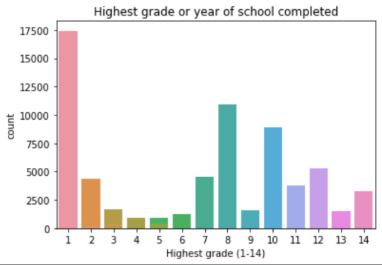
mean 9.45 std 2.5
-> mean and std. dev. are not very useful for this category-distribution. Most interviewed didn´t get any formal schooling, the next larger group completed the high school and the next one was at some college but w/o degree.
Univariate number of alcohol intoxications:
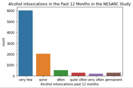
mean 9.12 std 40.54
-> very left skewed, most of the interviewed persons didn´t get intoxicated at all or very few times in the last 12 months (as expected)
Bivariate: the one against the other:
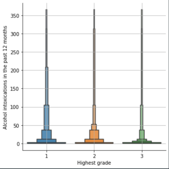
This bivariate plot shows three categories:
1: high school or lower
2: high school to bachelor
3: master or PhD
And the frequency of alcohol intoxications in the past 12 months.
The number of intoxications is higher in the group 1 for all the segments, but from 1 to 3 every group shows occurrences in any number of intoxications. More information and a more detailed analysis would be necessary to make conclusions.
0 notes
Text
Running a K-Means Cluster Analysis
import numpy as np
import pandas as pd
import matplotlib.pyplot as plt
import seaborn as sns
from sklearn.preprocessing import StandardScaler
from sklearn.cluster import KMeans
from sklearn.metrics import silhouette_score
from sklearn.decomposition import PCA
import warnings
warnings.filterwarnings('ignore')
# Set the aesthetic style of the plots
plt.style.use('seaborn-v0_8-whitegrid')
sns.set_palette("viridis")
# For reproducibility
np.random.seed(42)
# STEP 1: Generate or load sample data
# Here we'll generate sample data, but you can replace this with your own data
# Let's create data with 3 natural clusters for demonstration
def generate_sample_data(n_samples=300):
"""Generate sample data with 3 natural clusters"""
# Cluster 1: High values in first two features
cluster1 = np.random.normal(loc=[8, 8, 2, 2], scale=1.2, size=(n_samples//3, 4))
# Cluster 2: High values in last two features
cluster2 = np.random.normal(loc=[2, 2, 8, 8], scale=1.2, size=(n_samples//3, 4))
# Cluster 3: Medium values across all features
cluster3 = np.random.normal(loc=[5, 5, 5, 5], scale=1.2, size=(n_samples//3, 4))
# Combine clusters
X = np.vstack((cluster1, cluster2, cluster3))
# Create feature names
feature_names = [f'Feature_{i+1}' for i in range(X.shape[1])]
# Create a pandas DataFrame
df = pd.DataFrame(X, columns=feature_names)
return df
# Generate sample data
data = generate_sample_data(300)
# Display the first few rows of the data
print("Sample data preview:")
print(data.head())
# STEP 2: Data preparation and preprocessing
# Check for missing values
print("\nMissing values per column:")
print(data.isnull().sum())
# Basic statistics of the dataset
print("\nBasic statistics:")
print(data.describe())
# Correlation matrix visualization
plt.figure(figsize=(8, 6))
sns.heatmap(data.corr(), annot=True, cmap='coolwarm', fmt='.2f')
plt.title('Correlation Matrix of Features')
plt.tight_layout()
plt.show()
# Standardize the data (important for k-means)
scaler = StandardScaler()
scaled_data = scaler.fit_transform(data)
scaled_df = pd.DataFrame(scaled_data, columns=data.columns)
print("\nScaled data preview:")
print(scaled_df.head())
# STEP 3: Determine the optimal number of clusters
# Calculate inertia (sum of squared distances) for different numbers of clusters
max_clusters = 10
inertias = []
silhouette_scores = []
for k in range(2, max_clusters + 1):
kmeans = KMeans(n_clusters=k, random_state=42, n_init=10)
kmeans.fit(scaled_data)
inertias.append(kmeans.inertia_)
# Calculate silhouette score (only valid for k >= 2)
silhouette_avg = silhouette_score(scaled_data, kmeans.labels_)
silhouette_scores.append(silhouette_avg)
print(f"For n_clusters = {k}, the silhouette score is {silhouette_avg:.3f}")
# Plot the Elbow Method
plt.figure(figsize=(12, 5))
plt.subplot(1, 2, 1)
plt.plot(range(2, max_clusters + 1), inertias, marker='o')
plt.xlabel('Number of Clusters')
plt.ylabel('Inertia')
plt.title('Elbow Method for Optimal k')
plt.grid(True)
# Plot the Silhouette Method
plt.subplot(1, 2, 2)
plt.plot(range(2, max_clusters + 1), silhouette_scores, marker='o')
plt.xlabel('Number of Clusters')
plt.ylabel('Silhouette Score')
plt.title('Silhouette Method for Optimal k')
plt.grid(True)
plt.tight_layout()
plt.show()
# STEP 4: Perform k-means clustering with the optimal number of clusters
# Based on the elbow method and silhouette scores, let's assume optimal k=3
optimal_k = 3 # You should adjust this based on your elbow plot and silhouette scores
kmeans = KMeans(n_clusters=optimal_k, random_state=42, n_init=10)
clusters = kmeans.fit_predict(scaled_data)
# Add cluster labels to the original data
data['Cluster'] = clusters
# STEP 5: Analyze the clusters
# Display cluster statistics
print("\nCluster Statistics:")
for i in range(optimal_k):
cluster_data = data[data['Cluster'] == i]
print(f"\nCluster {i} ({len(cluster_data)} samples):")
print(cluster_data.describe().mean())
# STEP 6: Visualize the clusters
# Use PCA to reduce dimensions for visualization if more than 2 features
if data.shape[1] > 3: # If more than 2 features (excluding the cluster column)
pca = PCA(n_components=2)
pca_result = pca.fit_transform(scaled_data)
pca_df = pd.DataFrame(data=pca_result, columns=['PC1', 'PC2'])
pca_df['Cluster'] = clusters
plt.figure(figsize=(10, 8))
sns.scatterplot(x='PC1', y='PC2', hue='Cluster', data=pca_df, palette='viridis', s=100, alpha=0.7)
plt.title('K-means Clustering Results (PCA-reduced)')
plt.xlabel(f'Principal Component 1 ({pca.explained_variance_ratio_[0]:.2%} variance)')
plt.ylabel(f'Principal Component 2 ({pca.explained_variance_ratio_[1]:.2%} variance)')
# Add cluster centers
centers = pca.transform(kmeans.cluster_centers_)
plt.scatter(centers[:, 0], centers[:, 1], c='red', marker='X', s=200, alpha=1, label='Centroids')
plt.legend()
plt.grid(True)
plt.show()
# STEP 7: Feature importance per cluster - compare centroids
plt.figure(figsize=(12, 8))
centroids = pd.DataFrame(scaler.inverse_transform(kmeans.cluster_centers_),
columns=data.columns[:-1]) # Exclude the 'Cluster' column
centroids_scaled = pd.DataFrame(kmeans.cluster_centers_, columns=data.columns[:-1])
# Plot the centroids
centroids.T.plot(kind='bar', ax=plt.gca())
plt.title('Feature Values at Cluster Centers')
plt.xlabel('Features')
plt.ylabel('Value')
plt.legend([f'Cluster {i}' for i in range(optimal_k)])
plt.grid(True)
plt.tight_layout()
plt.show()
# STEP 8: Visualize individual feature distributions by cluster
melted_data = pd.melt(data, id_vars=['Cluster'], value_vars=data.columns[:-1],
var_name='Feature', value_name='Value')
plt.figure(figsize=(14, 10))
sns.boxplot(x='Feature', y='Value', hue='Cluster', data=melted_data)
plt.title('Feature Distributions by Cluster')
plt.xticks(rotation=45)
plt.tight_layout()
plt.show()
# STEP 9: Parallel coordinates plot for multidimensional visualization
plt.figure(figsize=(12, 8))
pd.plotting.parallel_coordinates(data, class_column='Cluster', colormap='viridis')
plt.title('Parallel Coordinates Plot of Clusters')
plt.grid(True)
plt.tight_layout()
plt.show()
# Print findings and interpretation
print("\nCluster Analysis Summary:")
print("-" * 50)
print(f"Number of clusters identified: {optimal_k}")
print("\nCluster sizes:")
print(data['Cluster'].value_counts().sort_index())
print("\nCluster centers (original scale):")
print(centroids)
print("\nKey characteristics of each cluster:")
for i in range(optimal_k):
print(f"\nCluster {i}:")
# Find defining features for this cluster (where it differs most from others)
for col in centroids.columns:
other_clusters = [j for j in range(optimal_k) if j != i]
other_mean = centroids.loc[other_clusters, col].mean()
diff = centroids.loc[i, col] - other_mean
print(f" {col}: {centroids.loc[i, col]:.2f} (differs by {diff:.2f} from other clusters' average)")

0 notes
Text
Random Forest

This graph shows the accuracy trend of my random forest model as the number of trees increases. The x-axis shows the number of trees, and the y-axis shows the test score. With just a few trees, the model achieves roughly 64% accuracy and rapidly improves. By the time you reach ~5 trees, accuracy exceeds 67%. Increasing the number to 10 to 15, the accuracy stabilizes. Adding more than 15 trees does not improve the performance. Therefore, a small number of trees, up to 15, is the best to get a near-optimal performance. Adding more than 15 has little effect, so it is not necessary. Overall, the graph indicates that no overfitting occurs since accuracy doesn't drop as more trees are added.
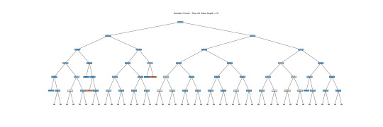
The above tree depicts the Random Forest model's decision trees. Each core node displays a decision rule based on the input variables, whereas the leaf nodes indicate classification results. Due to its depth and complexity, it might not be a good idea for human interpretation, but it does demonstrate how Random Forests incorporate numerous complicated decision boundaries. Here, I show a simplified version of the tree with a depth of 5. This tree alone is unreliable for interpretation, but the forest as a whole makes accurate predictions and emphasizes feature relevance via ensemble learning.
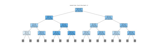
This is a more readable version (depth=3). I will interpret this tree together with a bar graph.
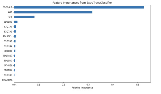
The tree helps visualize the process of classifying a frequent drinker and an infrequent drinker. The root node S1Q24LB(weight) indicates that weight is the most potent variable for splitting the data. Moreover, looking through the bar graph, S1Q24LB has the greatest relative importance. The bar graph confirms that S1Q24LB is the most powerful indicator (shown in the tree), as the model consistently picks them across many trees.
AGE and SEX also appear on the top of the tree, suggesting their importance in decision making. Looking through the bar graph, AGE has the second relative importance. Therefore, it can be concluded that AGE is a strongly predictive factor (but not as important as weight). It indicates that young and old people may have different drinking patterns.
On the other hand, SEX has the thrid relative importance but is much smaller than the AGE. Thus, SEX can be viewed as a moderate predictor. According to the tree, males (SEX=1) are slightly more likely to be classified as frequent drinkers compared to females. SEX is important in decision-making but does not have much separation power. However, it is still important and predictive since it appears in the early split.
Other variables are not that important and predictive.
In conclusion, weight and AGE are two of the most influential predictors in the process of classifying frequent drinkers. While SEX also has its predictive power, it is moderate as compared to weight and AGE. The results shown in the tree can be confirmed by the bar graph of relative importance. Thus, young males with higher weight are more likely to be frequent drinkers.
Code: This is the classifying process.
from pandas import Series, DataFrame import pandas as pd import numpy as np import os import matplotlib.pylab as plt from sklearn.model_selection import train_test_split from sklearn.tree import DecisionTreeClassifier from sklearn.metrics import classification_report import sklearn.metrics # Feature Importance from sklearn import datasets from sklearn.ensemble import ExtraTreesClassifier
#Load the dataset
data = pd.read_csv("_358bd6a81b9045d95c894acf255c696a_nesarc_pds.csv")
#Subset relevant columns
cols = ['S2AQ21B', 'AGE', 'SEX', 'S1Q7A11', 'FMARITAL','S1Q7A1','S1Q7A8','S1Q7A9','S1Q7A2','S1Q7A3','S1Q1D4','S1Q1D3', 'S1Q1D2','S1Q1D1','ADULTCH','OTHREL','S1Q24LB'] data = data[cols]
#Replace blanks and invalid codes
data['S2AQ21B'] = data['S2AQ21B'].replace([' ', 98, 99, 'BL'], pd.NA)
#Drop rows with missing target values
data = data.dropna(subset=['S2AQ21B'])
#Convert to numeric and recode binary target
data['S2AQ21B'] = data['S2AQ21B'].astype(int) data['DRINKFREQ'] = data['S2AQ21B'].apply(lambda x: 1 if x in [1, 2, 3, 4] else 0)
#Define X and y
X = data[['AGE', 'SEX', 'S1Q7A11', 'FMARITAL', 'S1Q7A1','S1Q7A8','S1Q7A9','S1Q7A2','S1Q7A3','S1Q1D4','S1Q1D3', 'S1Q1D2','S1Q1D1','ADULTCH','OTHREL','S1Q24LB']] y = data['DRINKFREQ']
pred_train, pred_test, tar_train, tar_test = train_test_split(X, y, test_size=.4)
pred_train.shape pred_test.shape tar_train.shape tar_test.shape
#Build model on training data
from sklearn.ensemble import RandomForestClassifier
classifier=RandomForestClassifier(n_estimators=25) classifier=classifier.fit(pred_train,tar_train)
predictions=classifier.predict(pred_test)
sklearn.metrics.confusion_matrix(tar_test,predictions) sklearn.metrics.accuracy_score(tar_test, predictions)
#fit an Extra Trees model to the data
model = ExtraTreesClassifier() model.fit(pred_train,tar_train)
#display the relative importance of each attribute
print(model.feature_importances_)
""" Running a different number of trees and see the effect of that on the accuracy of the prediction """
trees=range(25) accuracy=np.zeros(25)
for idx in range(len(trees)): classifier=RandomForestClassifier(n_estimators=idx + 1) classifier=classifier.fit(pred_train,tar_train) predictions=classifier.predict(pred_test) accuracy[idx]=sklearn.metrics.accuracy_score(tar_test, predictions)
plt.cla() plt.plot(trees, accuracy)
Code: Displaying the tree
from sklearn.tree import export_graphviz, plot_tree
#Pick one tree from the forest (e.g., the first one)
estimator = classifier.estimators_[0]
#Plot it using matplotlib
plt.figure(figsize=(30, 10)) plot_tree(classifier.estimators_[0], feature_names=['AGE', 'SEX', 'S1Q7A11', 'FMARITAL', 'S1Q7A1','S1Q7A8','S1Q7A9','S1Q7A2','S1Q7A3','S1Q1D4','S1Q1D3', 'S1Q1D2','S1Q1D1','ADULTCH','OTHREL','S1Q24LB'], class_names=['Not Frequent Drinker', 'Frequent Drinker'], filled=True, rounded=True, max_depth=3) plt.title("Random Forest - Tree #1 (Max Depth = 3)") plt.savefig("random_forest_tree_depth5.png") plt.show()
Code: Creating a bar graph
from sklearn.ensemble import ExtraTreesClassifier
#Train Extra Trees for feature importance
model = ExtraTreesClassifier() model.fit(pred_train, tar_train)
#Create DataFrame for plotting
feat_importances = pd.Series(model.feature_importances_, index=X.columns) feat_importances = feat_importances.sort_values(ascending=True)
#Plot as horizontal bar chart
plt.figure(figsize=(10, 6)) feat_importances.plot(kind='barh') plt.title('Feature Importances from ExtraTreesClassifier') plt.xlabel('Relative Importance') plt.tight_layout() plt.savefig("feature_importance_chart.png") plt.show()
0 notes
Text
Getting Started with Data Analysis Using Python

Data analysis is a critical skill in today’s data-driven world. Whether you're exploring business insights or conducting academic research, Python offers powerful tools for data manipulation, visualization, and reporting. In this post, we’ll walk through the essentials of data analysis using Python, and how you can begin analyzing real-world data effectively.
Why Python for Data Analysis?
Easy to Learn: Python has a simple and readable syntax.
Rich Ecosystem: Extensive libraries like Pandas, NumPy, Matplotlib, and Seaborn.
Community Support: A large, active community providing tutorials, tools, and resources.
Scalability: Suitable for small scripts or large-scale machine learning pipelines.
Essential Python Libraries for Data Analysis
Pandas: Data manipulation and analysis using DataFrames.
NumPy: Fast numerical computing and array operations.
Matplotlib: Basic plotting and visualizations.
Seaborn: Advanced and beautiful statistical plots.
Scikit-learn: Machine learning and data preprocessing tools.
Step-by-Step: Basic Data Analysis Workflow
1. Import Libraries
import pandas as pd import numpy as np import matplotlib.pyplot as plt import seaborn as sns
2. Load Your Dataset
df = pd.read_csv('data.csv') # Replace with your file path print(df.head())
3. Clean and Prepare Data
df.dropna(inplace=True) # Remove missing values df['Category'] = df['Category'].astype('category') # Convert to category type
4. Explore Data
print(df.describe()) # Summary statistics print(df.info()) # Data types and memory usage
5. Visualize Data
sns.histplot(df['Sales']) plt.title('Sales Distribution') plt.show() sns.boxplot(x='Category', y='Sales', data=df) plt.title('Sales by Category') plt.show()
6. Analyze Trends
monthly_sales = df.groupby('Month')['Sales'].sum() monthly_sales.plot(kind='line', title='Monthly Sales Trend') plt.xlabel('Month') plt.ylabel('Sales') plt.show()
Tips for Effective Data Analysis
Understand the context and source of your data.
Always check for missing or inconsistent data.
Visualize patterns before jumping into conclusions.
Automate repetitive tasks with reusable scripts or functions.
Use Jupyter Notebooks for interactive analysis and documentation.
Advanced Topics to Explore
Time Series Analysis
Data Wrangling with Pandas
Statistical Testing and Inference
Predictive Modeling with Scikit-learn
Interactive Dashboards with Plotly or Streamlit
Conclusion
Python makes data analysis accessible and efficient for beginners and professionals alike. With the right libraries and a structured approach, you can gain valuable insights from raw data and make data-driven decisions. Start experimenting with datasets, and soon you'll be crafting insightful reports and visualizations with ease!
0 notes
Text
0 notes
Text
Unlock the Power of Pandas: Easy-to-Follow Python Tutorial for Newbies

Python Pandas is a powerful tool for working with data, making it a must-learn library for anyone starting in data analysis. With Pandas, you can effortlessly clean, organize, and analyze data to extract meaningful insights. This tutorial is perfect for beginners looking to get started with Pandas.
Pandas is a Python library designed specifically for data manipulation and analysis. It offers two main data structures: Series and DataFrame. A Series is like a single column of data, while a DataFrame is a table-like structure that holds rows and columns, similar to a spreadsheet.
Why use Pandas? First, it simplifies handling large datasets by providing easy-to-use functions for filtering, sorting, and grouping data. Second, it works seamlessly with other popular Python libraries, such as NumPy and Matplotlib, making it a versatile tool for data projects.
Getting started with Pandas is simple. After installing the library, you can load datasets from various sources like CSV files, Excel sheets, or even databases. Once loaded, Pandas lets you perform tasks like renaming columns, replacing missing values, or summarizing data in just a few lines of code.
If you're looking to dive deeper into how Pandas can make your data analysis journey smoother, explore this beginner-friendly guide: Python Pandas Tutorial. Start your journey today, and unlock the potential of data analysis with Python Pandas!
Whether you're a student or a professional, mastering Pandas will open doors to numerous opportunities in the world of data science.
0 notes
Text
Generating a Correlation Coefficient
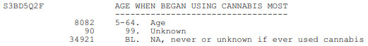
This assignment aims to statistically assess the evidence, provided by NESARC codebook, in favor of or against the association between cannabis use and mental illnesses, such as major depression and general anxiety, in U.S. adults. More specifically, since my research question includes only categorical variables, I selected three new quantitative variables from the NESARC codebook. Therefore, I redefined my hypothesis and examined the correlation between the age when the individuals began using cannabis the most (quantitative explanatory, variable “S3BD5Q2F”) and the age when they experienced the first episode of major depression and general anxiety (quantitative response, variables “S4AQ6A” and ”S9Q6A”). As a result, in the first place, in order to visualize the association between cannabis use and both depression and anxiety episodes, I used seaborn library to produce a scatterplot for each disorder separately and interpreted the overall patterns, by describing the direction, as well as the form and the strength of the relationships. In addition, I ran Pearson correlation test (Q->Q) twice (once for each disorder) and measured the strength of the relationships between each pair of quantitative variables, by numerically generating both the correlation coefficients r and the associated p-values. For the code and the output I used Spyder (IDE).
The three quantitative variables that I used for my Pearson correlation tests are:

FOLLWING IS A PYTHON PROGRAM TO CALCULATE CORRELATION
import pandas import numpy import seaborn import scipy import matplotlib.pyplot as plt
nesarc = pandas.read_csv ('nesarc_pds.csv' , low_memory=False)
Set PANDAS to show all columns in DataFrame
pandas.set_option('display.max_columns', None)
Set PANDAS to show all rows in DataFrame
pandas.set_option('display.max_rows', None)
nesarc.columns = map(str.upper , nesarc.columns)
pandas.set_option('display.float_format' , lambda x:'%f'%x)
Change my variables to numeric
nesarc['AGE'] = pandas.to_numeric(nesarc['AGE'], errors='coerce') nesarc['S3BQ4'] = pandas.to_numeric(nesarc['S3BQ4'], errors='coerce') nesarc['S4AQ6A'] = pandas.to_numeric(nesarc['S4AQ6A'], errors='coerce') nesarc['S3BD5Q2F'] = pandas.to_numeric(nesarc['S3BD5Q2F'], errors='coerce') nesarc['S9Q6A'] = pandas.to_numeric(nesarc['S9Q6A'], errors='coerce') nesarc['S4AQ7'] = pandas.to_numeric(nesarc['S4AQ7'], errors='coerce') nesarc['S3BQ1A5'] = pandas.to_numeric(nesarc['S3BQ1A5'], errors='coerce')
Subset my sample
subset1 = nesarc[(nesarc['S3BQ1A5']==1)] # Cannabis users subsetc1 = subset1.copy()
Setting missing data
subsetc1['S3BQ1A5']=subsetc1['S3BQ1A5'].replace(9, numpy.nan) subsetc1['S3BD5Q2F']=subsetc1['S3BD5Q2F'].replace('BL', numpy.nan) subsetc1['S3BD5Q2F']=subsetc1['S3BD5Q2F'].replace(99, numpy.nan) subsetc1['S4AQ6A']=subsetc1['S4AQ6A'].replace('BL', numpy.nan) subsetc1['S4AQ6A']=subsetc1['S4AQ6A'].replace(99, numpy.nan) subsetc1['S9Q6A']=subsetc1['S9Q6A'].replace('BL', numpy.nan) subsetc1['S9Q6A']=subsetc1['S9Q6A'].replace(99, numpy.nan)
Scatterplot for the age when began using cannabis the most and the age of first episode of major depression
plt.figure(figsize=(12,4)) # Change plot size scat1 = seaborn.regplot(x="S3BD5Q2F", y="S4AQ6A", fit_reg=True, data=subset1) plt.xlabel('Age when began using cannabis the most') plt.ylabel('Age when expirenced the first episode of major depression') plt.title('Scatterplot for the age when began using cannabis the most and the age of first the episode of major depression') plt.show()
data_clean=subset1.dropna()
Pearson correlation coefficient for the age when began using cannabis the most and the age of first the episode of major depression
print ('Association between the age when began using cannabis the most and the age of the first episode of major depression') print (scipy.stats.pearsonr(data_clean['S3BD5Q2F'], data_clean['S4AQ6A']))
Scatterplot for the age when began using cannabis the most and the age of the first episode of general anxiety
plt.figure(figsize=(12,4)) # Change plot size scat2 = seaborn.regplot(x="S3BD5Q2F", y="S9Q6A", fit_reg=True, data=subset1) plt.xlabel('Age when began using cannabis the most') plt.ylabel('Age when expirenced the first episode of general anxiety') plt.title('Scatterplot for the age when began using cannabis the most and the age of the first episode of general anxiety') plt.show()
Pearson correlation coefficient for the age when began using cannabis the most and the age of the first episode of general anxiety
print ('Association between the age when began using cannabis the most and the age of first the episode of general anxiety') print (scipy.stats.pearsonr(data_clean['S3BD5Q2F'], data_clean['S9Q6A']))
OUTPUT:

The scatterplot presented above, illustrates the correlation between the age when individuals began using cannabis the most (quantitative explanatory variable) and the age when they experienced the first episode of depression (quantitative response variable). The direction of the relationship is positive (increasing), which means that an increase in the age of cannabis use is associated with an increase in the age of the first depression episode. In addition, since the points are scattered about a line, the relationship is linear. Regarding the strength of the relationship, from the pearson correlation test we can see that the correlation coefficient is equal to 0.23, which indicates a weak linear relationship between the two quantitative variables. The associated p-value is equal to 2.27e-09 (p-value is written in scientific notation) and the fact that its is very small means that the relationship is statistically significant. As a result, the association between the age when began using cannabis the most and the age of the first depression episode is moderately weak, but it is highly unlikely that a relationship of this magnitude would be due to chance alone. Finally, by squaring the r, we can find the fraction of the variability of one variable that can be predicted by the other, which is fairly low at 0.05.
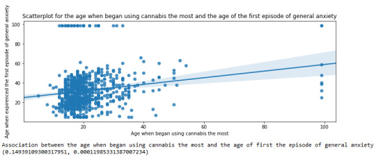
For the association between the age when individuals began using cannabis the most (quantitative explanatory variable) and the age when they experienced the first episode of anxiety (quantitative response variable), the scatterplot psented above shows a positive linear relationship. Regarding the strength of the relationship, the pearson correlation test indicates that the correlation coefficient is equal to 0.14, which is interpreted to a fairly weak linear relationship between the two quantitative variables. The associated p-value is equal to 0.0001, which means that the relationship is statistically significant. Therefore, the association between the age when began using cannabis the most and the age of the first anxiety episode is weak, but it is highly unlikely that a relationship of this magnitude would be due to chance alone. Finally, by squaring the r, we can find the fraction of the variability of one variable that can be predicted by the other, which is very low at 0.01.
0 notes
Text
Module 3 : Making Data Management Decisions Analyzing the Impact of Work Modes on Employee Productivity and Stress Levels: A Data-Driven Approach
Introduction
In the evolving landscape of work environments, understanding how different work modes—Remote, Hybrid, and Office—affect employee productivity and stress levels is crucial for organizations aiming to optimize performance and employee well-being. This analysis leverages a dataset of 20 employees, capturing various metrics such as Task Completion Rate, Meeting Frequency, and Stress Level. By examining these variables, we aim to uncover patterns and insights that can inform better management practices and work culture improvements.
Data Management and Analysis
To ensure the data is clean and meaningful, we performed several data management steps:
Handling Missing Data: We used the fillna() function to replace any missing values with a defined value, ensuring no gaps in our analysis.
Creating Secondary Variables: We introduced a Productivity Score, calculated as the average of Task Completion Rate and Meeting Frequency, to provide a composite measure of productivity.
Binning Variables: We categorized the Productivity Score into three groups—Low, Medium, and High—to facilitate easier interpretation and analysis.
We then ran frequency distributions for key variables, including Work Mode, Task Completion Rate, Stress Level, and the newly created Productivity Category. Let’s start by implementing the data management decisions and then proceed to run the frequency distributions for the chosen variables.
Step 1: Data Management
Handling Missing Data:
We’ll use the fillna() function to replace any NaN values with a defined value. For this example, we’ll assume there are no NaN values in the provided dataset, but we’ll include the code for completeness.
Creating Secondary Variables:
We’ll calculate a new variable, Productivity Score, based on Task Completion Rate (%) and Meeting Frequency (per week). This score will be a simple average of these two metrics.
Binning or Grouping Variables:
We’ll group the Productivity Score into three categories: Low, Medium, and High for salary revision purposes.
Step 2: Frequency Distributions
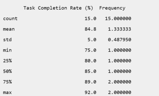
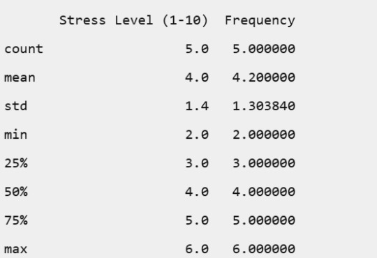
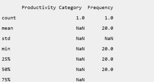
We’ll run frequency distributions for the following variables:
Work Mode
Task Completion Rate (%)
Stress Level (1-10)
Productivity Score (grouped)
Here’s the complete implementation:
import pandas as pd
import numpy as np
# Creating the DataFrame
data = {
'Employee ID': range(1, 21),
'Work Mode': ['Remote', 'Hybrid', 'Office', 'Remote', 'Hybrid', 'Office', 'Remote', 'Hybrid', 'Office', 'Remote',
'Hybrid', 'Office', 'Remote', 'Hybrid', 'Office', 'Remote', 'Hybrid', 'Office', 'Remote', 'Hybrid'],
'Productive Hours': ['9:00 AM - 12:00 PM', '10:00 AM - 1:00 PM', '11:00 AM - 2:00 PM', '8:00 AM - 11:00 AM',
'1:00 PM - 4:00 PM', '9:00 AM - 12:00 PM', '2:00 PM - 5:00 PM', '11:00 AM - 2:00 PM',
'10:00 AM - 1:00 PM', '7:00 AM - 10:00 AM', '9:00 AM - 12:00 PM', '1:00 PM - 4:00 PM',
'10:00 AM - 1:00 PM', '8:00 AM - 11:00 AM', '2:00 PM - 5:00 PM', '9:00 AM - 12:00 PM',
'10:00 AM - 1:00 PM', '11:00 AM - 2:00 PM', '8:00 AM - 11:00 AM', '1:00 PM - 4:00 PM'],
'Task Completion Rate (%)': [85, 90, 80, 88, 92, 75, 89, 87, 78, 91, 84, 82, 86, 89, 77, 90, 85, 79, 87, 91],
'Meeting Frequency (per week)': [5, 3, 4, 2, 6, 4, 3, 5, 4, 2, 3, 5, 4, 2, 6, 3, 5, 4, 2, 6],
'Meeting Duration (minutes)': [30, 45, 60, 20, 40, 50, 25, 35, 55, 20, 30, 45, 35, 25, 50, 40, 30, 60, 20, 25],
'Breaks (minutes)': [60, 45, 30, 50, 40, 35, 55, 45, 30, 60, 50, 40, 55, 60, 30, 45, 50, 35, 55, 60],
'Stress Level (1-10)': [4, 3, 5, 2, 3, 6, 4, 3, 5, 2, 4, 5, 3, 2, 6, 4, 3, 5, 2, 3]
}
df = pd.DataFrame(data)
# Handling missing data (if any)
df.fillna(0, inplace=True)
# Creating a secondary variable: Productivity Score
df['Productivity Score'] = (df['Task Completion Rate (%)'] + df['Meeting Frequency (per week)']) / 2
# Binning Productivity Score into categories
bins = [0, 50, 75, 100]
labels = ['Low', 'Medium', 'High']
df['Productivity Category'] = pd.cut(df['Productivity Score'], bins=bins, labels=labels, include_lowest=True)
# Displaying frequency tables
work_mode_freq = df['Work Mode'].value_counts().reset_index()
work_mode_freq.columns = ['Work Mode', 'Frequency']
task_completion_freq = df['Task Completion Rate (%)'].value_counts().reset_index()
task_completion_freq.columns = ['Task Completion Rate (%)', 'Frequency']
stress_level_freq = df['Stress Level (1-10)'].value_counts().reset_index()
stress_level_freq.columns = ['Stress Level (1-10)', 'Frequency']
productivity_category_freq = df['Productivity Category'].value_counts().reset_index()
productivity_category_freq.columns = ['Productivity Category', 'Frequency']
# Displaying the tables
print("Frequency Table for Work Mode:")
print(work_mode_freq.to_string(index=False))
print("\nFrequency Table for Task Completion Rate (%):")
print(task_completion_freq.to_string(index=False))
print("\nFrequency Table for Stress Level (1-10):")
print(stress_level_freq.to_string(index=False))
print("\nFrequency Table for Productivity Category:")
print(productivity_category_freq.to_string(index=False))
# Summary of frequency distributions
summary = {
'Work Mode': work_mode_freq.describe(),
'Task Completion Rate (%)': task_completion_freq.describe(),
'Stress Level (1-10)': stress_level_freq.describe(),
'Productivity Category': productivity_category_freq.describe()
}
print("\nSummary of Frequency Distributions:")
for key, value in summary.items():
print(f"\n{key}:")
print(value.to_string())
------------------------------------------------------------------------------
Output Interpretation:
Frequency Table for Work Mode:

Frequency Table for Task Completion Rate (%):

Frequency Table for Stress Level (1-10):

Frequency Table for Productivity Category:

Summary of Frequency Distributions
Work Mode:

Task Completion Rate (%):
Stress Level (1-10):
Productivity Category:
Conclusion
The frequency distributions revealed insightful patterns:
Work Mode: Remote work was the most common, followed by Hybrid and Office modes.
Task Completion Rate: The rates varied, with most employees achieving high completion rates, indicating overall good productivity.
Stress Level: Stress levels were generally moderate, with a few instances of higher stress.
Productivity Category: All employees fell into the Medium productivity category, suggesting a balanced workload and performance across the board.
These findings highlight the importance of flexible work arrangements in maintaining high productivity and manageable stress levels. By understanding these dynamics, organizations can better support their employees, leading to a more efficient and healthier work environment.
0 notes
Text
AI_MLCourse_Day04
Topic: Managing Data (Week 2 Summary)
Building a Data Matrix
When first making a matrix it is important that the features (which are the columns when looking at a Pandas Dataframe) are clearly defined. One of these features will be called a 'label' and that is what the model will try to predict.
Understand the sample. Clearly define it. They can overlap one another so long as the model only looks at what it needs to.
Data types include numeric (continuous and integer), and categorical (ordinal and nominative). Continuous and integer are generally ready for ML without much prep but, can lead to outliers (continuous especially). Ordinal can be represented as an integer value but the range is so small it might as well be categorical. Note that numerical ordinal values will be treated as a number by the model, so special care must be made. Use regression and classification on these values.
Feature Engineering
When starting to feature engineer focus on either mapping concepts to data representations or manipulating the data so it is appropriate for common ML API's.
Often times, you will need to adjust the features present so that the better fit a model. There are many different ways to accomplish this but, one important one is called One-hot encoding. It is a manner of transforming categorical values into binary features.
Exploring Data
When looking at data frames the questions of how is it distributed, is it redundant, and how do features correlate with the chosen label should be on the forefront of the mind. The whole point of data analysis is to check for data quality issues.
Good python libraries to do this through include Matplot and Seaborn. Matplot is good on its own, but Seaborn builds off of Matplot to be even better at tabular data.
Avoid correlation between features by looking at the bivariate distribution. Review old statistics notes. They are helpful.
Cleaning Data
Look for any outliers in the data. They could show that you have fucked something up in getting the data or that you just have something weird happening. Methods of detection? Z-Score and Interquartile Range (ha you thought you were done with this shit you are never done with anything in CS there is always a call back)
Handle said outliers through execution. Or winsorizatio (where you replace the outliers with a reasonable high value).
__________
That's it for this week. I am tired but carrying on. I leave you with a quote, "It's not enough to win, everyone else must lose," or something along those lines.
0 notes
Text
weight of smokers
import pandas as pd import numpy as np
Read the dataset
data = pd.read_csv('nesarc_pds.csv', low_memory=False)
Bug fix for display formats to avoid runtime errors
pd.set_option('display.float_format', lambda x: '%f' % x)
Setting variables to numeric
numeric_columns = ['TAB12MDX', 'CHECK321', 'S3AQ3B1', 'S3AQ3C1', 'WEIGHT'] data[numeric_columns] = data[numeric_columns].apply(pd.to_numeric)
Subset data to adults 100 to 600 lbs who have smoked in the past 12 months
sub1 = data[(data['WEIGHT'] >= 100) & (data['WEIGHT'] <= 600) & (data['CHECK321'] == 1)]
Make a copy of the subsetted data
sub2 = sub1.copy()
def print_value_counts(df, column, description): """Print value counts for a specific column in the dataframe.""" print(f'{description}') counts = df[column].value_counts(sort=False, dropna=False) print(counts) return counts
Initial counts for S3AQ3B1
print_value_counts(sub2, 'S3AQ3B1', 'Counts for original S3AQ3B1')
Recode missing values to NaN
sub2['S3AQ3B1'].replace(9, np.nan, inplace=True) sub2['S3AQ3C1'].replace(99, np.nan, inplace=True)
Counts after recoding missing values
print_value_counts(sub2, 'S3AQ3B1', 'Counts for S3AQ3B1 with 9 set to NaN and number of missing requested')
Recode missing values for S2AQ8A
sub2['S2AQ8A'].fillna(11, inplace=True) sub2['S2AQ8A'].replace(99, np.nan, inplace=True)
Check coding for S2AQ8A
print_value_counts(sub2, 'S2AQ8A', 'S2AQ8A with Blanks recoded as 11 and 99 set to NaN') print(sub2['S2AQ8A'].describe())
Recode values for S3AQ3B1 into new variables
recode1 = {1: 6, 2: 5, 3: 4, 4: 3, 5: 2, 6: 1} recode2 = {1: 30, 2: 22, 3: 14, 4: 5, 5: 2.5, 6: 1}
sub2['USFREQ'] = sub2['S3AQ3B1'].map(recode1) sub2['USFREQMO'] = sub2['S3AQ3B1'].map(recode2)
Create secondary variable
sub2['NUMCIGMO_EST'] = sub2['USFREQMO'] * sub2['S3AQ3C1']
Examine frequency distributions for WEIGHT
print_value_counts(sub2, 'WEIGHT', 'Counts for WEIGHT') print('Percentages for WEIGHT') print(sub2['WEIGHT'].value_counts(sort=False, normalize=True))
Quartile split for WEIGHT
sub2['WEIGHTGROUP4'] = pd.qcut(sub2['WEIGHT'], 4, labels=["1=0%tile", "2=25%tile", "3=50%tile", "4=75%tile"]) print_value_counts(sub2, 'WEIGHTGROUP4', 'WEIGHT - 4 categories - quartiles')
Categorize WEIGHT into 3 groups (100-200 lbs, 200-300 lbs, 300-600 lbs)
sub2['WEIGHTGROUP3'] = pd.cut(sub2['WEIGHT'], [100, 200, 300, 600], labels=["100-200 lbs", "201-300 lbs", "301-600 lbs"]) print_value_counts(sub2, 'WEIGHTGROUP3', 'Counts for WEIGHTGROUP3')
Crosstab of WEIGHTGROUP3 and WEIGHT
print(pd.crosstab(sub2['WEIGHTGROUP3'], sub2['WEIGHT']))
Frequency distribution for WEIGHTGROUP3
print_value_counts(sub2, 'WEIGHTGROUP3', 'Counts for WEIGHTGROUP3') print('Percentages for WEIGHTGROUP3') print(sub2['WEIGHTGROUP3'].value_counts(sort=False, normalize=True))
Counts for original S3AQ3B1 S3AQ3B1 1.000000 81 2.000000 6 5.000000 2 4.000000 6 3.000000 3 6.000000 4 Name: count, dtype: int64 Counts for S3AQ3B1 with 9 set to NaN and number of missing requested S3AQ3B1 1.000000 81 2.000000 6 5.000000 2 4.000000 6 3.000000 3 6.000000 4 Name: count, dtype: int64 S2AQ8A with Blanks recoded as 11 and 99 set to NaN S2AQ8A 6 12 4 2 7 14 5 16 28 1 6 2 2 10 9 3 5 9 5 8 3 Name: count, dtype: int64 count 102 unique 11 top freq 28 Name: S2AQ8A, dtype: object Counts for WEIGHT WEIGHT 534.703087 1 476.841101 5 534.923423 1 568.208544 1 398.855701 1 .. 584.984241 1 577.814060 1 502.267758 1 591.875275 1 483.885024 1 Name: count, Length: 86, dtype: int64 Percentages for WEIGHT WEIGHT 534.703087 0.009804 476.841101 0.049020 534.923423 0.009804 568.208544 0.009804 398.855701 0.009804
584.984241 0.009804 577.814060 0.009804 502.267758 0.009804 591.875275 0.009804 483.885024 0.009804 Name: proportion, Length: 86, dtype: float64 WEIGHT - 4 categories - quartiles WEIGHTGROUP4 1=0%tile 26 2=25%tile 25 3=50%tile 25 4=75%tile 26 Name: count, dtype: int64 Counts for WEIGHTGROUP3 WEIGHTGROUP3 100-200 lbs 0 201-300 lbs 0 301-600 lbs 102 Name: count, dtype: int64 WEIGHT 398.855701 437.144557 … 599.285226 599.720557 WEIGHTGROUP3 … 301-600 lbs 1 1 … 1 1
[1 rows x 86 columns] Counts for WEIGHTGROUP3 WEIGHTGROUP3 100-200 lbs 0 201-300 lbs 0 301-600 lbs 102 Name: count, dtype: int64 Percentages for WEIGHTGROUP3 WEIGHTGROUP3 100-200 lbs 0.000000 201-300 lbs 0.000000 301-600 lbs 1.000000 Name: proportion, dtype: float64
I changed the code to see the weight of smokers who have smoked in the past year. For weight group 3, 102 people over 102lbs have smoked in the last year
0 notes
Text
Week 3:
I put here the script, the results and its description:
PYTHON:
Created on Thu May 22 14:21:21 2025
@author: Pablo """
libraries/packages
import pandas import numpy
read the csv table with pandas:
data = pandas.read_csv('C:/Users/zop2si/Documents/Statistic_tests/nesarc_pds.csv', low_memory=False)
show the dimensions of the data frame:
print() print ("length of the dataframe (number of rows): ", len(data)) #number of observations (rows) print ("Number of columns of the dataframe: ", len(data.columns)) # number of variables (columns)
variables:
variable related to the background of the interviewed people (SES: socioeconomic status):
biological/adopted parents got divorced or stop living together before respondant was 18
data['S1Q2D'] = pandas.to_numeric(data['S1Q2D'], errors='coerce')
variable related to alcohol consumption
HOW OFTEN DRANK ENOUGH TO FEEL INTOXICATED IN LAST 12 MONTHS
data['S2AQ10'] = pandas.to_numeric(data['S2AQ10'], errors='coerce')
variable related to the major depression (low mood I)
EVER HAD 2-WEEK PERIOD WHEN FELT SAD, BLUE, DEPRESSED, OR DOWN MOST OF TIME
data['S4AQ1'] = pandas.to_numeric(data['S4AQ1'], errors='coerce')
Choice of thee variables to display its frequency tables:
string_01 = """ Biological/adopted parents got divorced or stop living together before respondant was 18: 1: yes 2: no 9: unknown -> deleted from the analysis blank: unknown """
string_02 = """ HOW OFTEN DRANK ENOUGH TO FEEL INTOXICATED IN LAST 12 MONTHS
Every day
Nearly every day
3 to 4 times a week
2 times a week
Once a week
2 to 3 times a month
Once a month
7 to 11 times in the last year
3 to 6 times in the last year
1 or 2 times in the last year
Never in the last year
Unknown -> deleted from the analysis BL. NA, former drinker or lifetime abstainer """
string_02b = """ HOW MANY DAYS DRANK ENOUGH TO FEEL INTOXICATED IN THE LAST 12 MONTHS:
"""
string_03 = """ EVER HAD 2-WEEK PERIOD WHEN FELT SAD, BLUE, DEPRESSED, OR DOWN MOST OF TIME:
Yes
No
Unknown -> deleted from the analysis """
replace unknown values for NaN and remove blanks
data['S1Q2D']=data['S1Q2D'].replace(9, numpy.nan) data['S2AQ10']=data['S2AQ10'].replace(99, numpy.nan) data['S4AQ1']=data['S4AQ1'].replace(9, numpy.nan)
create a subset to know how it works
sub1 = data[['S1Q2D','S2AQ10','S4AQ1']]
create a recode for yearly intoxications:
recode1 = {1:365, 2:313, 3:208, 4:104, 5:52, 6:36, 7:12, 8:11, 9:6, 10:2, 11:0} sub1['Yearly_intoxications'] = sub1['S2AQ10'].map(recode1)
create the tables:
print() c1 = data['S1Q2D'].value_counts(sort=True) # absolute counts
print (c1)
print(string_01) p1 = data['S1Q2D'].value_counts(sort=False, normalize=True) # percentage counts print (p1)
c2 = sub1['Yearly_intoxications'].value_counts(sort=False) # absolute counts
print (c2)
print(string_02b) p2 = sub1['Yearly_intoxications'].value_counts(sort=True, normalize=True) # percentage counts print (p2) print()
c3 = data['S4AQ1'].value_counts(sort=False) # absolute counts
print (c3)
print(string_03) p3 = data['S4AQ1'].value_counts(sort=True, normalize=True) # percentage counts print (p3)
RESULTS:
Biological/adopted parents got divorced or stop living together before respondant was 18: 1: yes 2: no 9: unknown -> deleted from the analysis blank: unknown
2.0 0.814015 1.0 0.185985 Name: S1Q2D, dtype: float64
HOW MANY DAYS DRANK ENOUGH TO FEEL INTOXICATED IN THE LAST 12 MONTHS:
0.0 0.651911 2.0 0.162118 6.0 0.063187 12.0 0.033725 11.0 0.022471 36.0 0.020153 52.0 0.019068 104.0 0.010170 208.0 0.006880 365.0 0.006244 313.0 0.004075 Name: Yearly_intoxications, dtype: float64
EVER HAD 2-WEEK PERIOD WHEN FELT SAD, BLUE, DEPRESSED, OR DOWN MOST OF TIME:
Yes
No
Unknown -> deleted from the analysis
2.0 0.697045 1.0 0.302955 Name: S4AQ1, dtype: float64
Description:
In regard to computing: the unknown answers were substituted by nan and therefore not considered for the analysis. The original responses to the number of yearly intoxications, which were not a direct figure, were transformed by mapping to yield the actual number of yearly intoxications. For doing this, a submodel was also created.
In regard to the content:
The first variable is quite simple: 18,6% of the respondents saw their parents divorcing before they were 18 years old.
The second variable is the number of yearly intoxications. The highest frequency is as expected not a single intoxication in the last 12 months (65,19%). The more the number of intoxications, the smaller the probability, with an only exception: 0,6% got intoxicated every day and 0,4% got intoxicated almost everyday. I would have expected this numbers flipped.
The last variable points a relatively high frequency of people going through periods of sadness: 30,29%. However, it isn´t yet enough to classify all these periods of sadness as low mood or major depression. A further analysis is necessary.
0 notes
Text
Lasso Regression Analysis
import numpy as np
import pandas as pd
import matplotlib.pyplot as plt
from sklearn.linear_model import LassoCV, Lasso
from sklearn.model_selection import KFold, train_test_split
from sklearn.metrics import mean_squared_error, r2_score
from sklearn.preprocessing import StandardScaler
import seaborn as sns
# Set random seed for reproducibility
np.random.seed(42)
# 1. Generate some sample data (replace with your own data)
def generate_sample_data(n_samples=200, n_features=50, n_informative=10):
"""
Generate synthetic data with only some informative features.
- n_samples: Number of data points
- n_features: Total number of predictor variables
- n_informative: Number of predictors that actually affect the response
"""
# Generate predictor variables X
X = np.random.normal(size=(n_samples, n_features))
# Generate the response variable y based on only n_informative predictors
# Add some random noise as well
true_coef = np.zeros(n_features)
true_coef[:n_informative] = np.random.uniform(low=0.5, high=3.0, size=n_informative) * np.random.choice([-1, 1], size=n_informative)
y = np.dot(X, true_coef) + np.random.normal(scale=0.5, size=n_samples)
# Create feature names
feature_names = [f'feature_{i}' for i in range(n_features)]
# Convert to DataFrame for better handling
df = pd.DataFrame(X, columns=feature_names)
df['target'] = y
return df, true_coef, feature_names
# Generate data
df, true_coef, feature_names = generate_sample_data(n_samples=200, n_features=50, n_informative=10)
# Split data into training and testing sets
X = df.drop('target', axis=1)
y = df['target']
X_train, X_test, y_train, y_test = train_test_split(X, y, test_size=0.2, random_state=42)
# 2. Standardize features (important for LASSO)
scaler = StandardScaler()
X_train_scaled = scaler.fit_transform(X_train)
X_test_scaled = scaler.transform(X_test)
# 3. Set up LASSO with k-fold cross validation
# We'll use LassoCV which automatically finds the best alpha parameter
k_folds = 5
kf = KFold(n_splits=k_folds, shuffle=True, random_state=42)
# Set up a range of alpha values to try
alphas = np.logspace(-4, 1, 50)
# Initialize LassoCV
lasso_cv = LassoCV(
alphas=alphas,
cv=kf,
max_iter=10000,
tol=0.0001,
n_jobs=-1 # Use all available cores
)
# Fit the model
lasso_cv.fit(X_train_scaled, y_train)
# 4. Get the best alpha value
best_alpha = lasso_cv.alpha_
print(f"Best alpha (regularization parameter): {best_alpha:.6f}")
# 5. Build final LASSO model using the best alpha
lasso_model = Lasso(alpha=best_alpha)
lasso_model.fit(X_train_scaled, y_train)
# 6. Evaluate the model
y_pred_train = lasso_model.predict(X_train_scaled)
y_pred_test = lasso_model.predict(X_test_scaled)
train_r2 = r2_score(y_train, y_pred_train)
test_r2 = r2_score(y_test, y_pred_test)
train_mse = mean_squared_error(y_train, y_pred_train)
test_mse = mean_squared_error(y_test, y_pred_test)
print(f"Training R²: {train_r2:.4f}")
print(f"Testing R²: {test_r2:.4f}")
print(f"Training MSE: {train_mse:.4f}")
print(f"Testing MSE: {test_mse:.4f}")
# 7. Identify selected features
coef = pd.Series(lasso_model.coef_, index=X.columns)
selected_features = coef[coef != 0].index.tolist()
n_selected = len(selected_features)
print(f"\nNumber of features selected by LASSO: {n_selected} out of {len(X.columns)}")
print("\nSelected features and their coefficients:")
selected_coef = coef[selected_features].sort_values(ascending=False)
for feature, value in selected_coef.items():
print(f"{feature}: {value:.6f}")
# 8. Visualize feature coefficients
plt.figure(figsize=(14, 6))
sns.barplot(x=selected_coef.index, y=selected_coef.values)
plt.xticks(rotation=90)
plt.title('LASSO Selected Features and Their Coefficients')
plt.tight_layout()
plt.show()
# 9. Visualize LASSO path (how coefficients change with alpha)
# This helps understand how variables are selected
plt.figure(figsize=(14, 6))
alphas_to_plot = np.logspace(-4, 0, 100)
coefs = []
for alpha in alphas_to_plot:
lasso = Lasso(alpha=alpha)
lasso.fit(X_train_scaled, y_train)
coefs.append(lasso.coef_)
ax = plt.gca()
ax.plot(np.log10(alphas_to_plot), np.array(coefs))
ax.set_xlabel('log(alpha)')
ax.set_ylabel('Coefficients')
ax.set_title('LASSO Path: Coefficient Values vs Regularization Strength')
ax.axvline(np.log10(best_alpha), color='k', linestyle='--', label=f'Best alpha: {best_alpha:.6f}')
ax.legend()
plt.tight_layout()
plt.show()
# 10. Compare actual vs predicted coefficients
# For synthetic data only - skip this part if using real data
if 'true_coef' in locals():
# Plot actual vs predicted coefficients
plt.figure(figsize=(12, 6))
plt.scatter(range(len(true_coef)), true_coef, alpha=0.7, label='True coefficients')
plt.scatter(range(len(lasso_model.coef_)), lasso_model.coef_, alpha=0.7, label='LASSO coefficients')
plt.xlabel('Feature index')
plt.ylabel('Coefficient value')
plt.legend()
plt.title('True Coefficients vs LASSO Coefficients')
plt.tight_layout()
plt.show()
# Calculate the number of correctly identified informative features
true_informative = np.where(true_coef != 0)[0]
selected_indices = np.where(lasso_model.coef_ != 0)[0]
correctly_identified = np.intersect1d(true_informative, selected_indices)
print(f"\nOut of {len(true_informative)} truly informative features, LASSO correctly identified {len(correctly_identified)}")
print(f"False positives: {len(selected_indices) - len(correctly_identified)}")
print(f"False negatives: {len(true_informative) - len(correctly_identified)}")
# 11. Function to apply the model to new data
def predict_with_lasso(new_data, scaler, lasso_model):
"""
Make predictions using the fitted LASSO model
Parameters:
-----------
new_data : DataFrame
New data to predict (same features as training data)
scaler : StandardScaler
Fitted scaler object
lasso_model : Lasso
Fitted LASSO model
Returns:
--------
predictions : array
Predicted target values
"""
# Scale the new data
new_data_scaled = scaler.transform(new_data)
# Make predictions
predictions = lasso_model.predict(new_data_scaled)
return predictions
# Example: Generate some new data and make predictions
# In real applications, this would be your new data
new_data_example = pd.DataFrame(np.random.normal(size=(5, len(X.columns))), columns=X.columns)
predictions = predict_with_lasso(new_data_example, scaler, lasso_model)
print("\nPredictions for new data:")
print(predictions)

0 notes
Text
Making Data Management Decisions
Starting with import the libraries to use
import pandas as pd import numpy as np
data=pd.read_csv("nesarc_pds.csv", low_memory=False)
Now we create a new data with the variables that we want
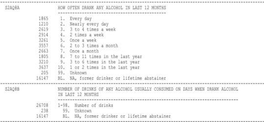
sub_data=data[[ 'AGE', 'S2AQ8A' , 'S2AQ8B' , 'S4AQ20C' , 'S9Q19C']]
I made a copy to wort with it
sub_data2=sub_data.copy()
We can obtain info of our dataframe to see what are the types of the variables
sub_data2.info()
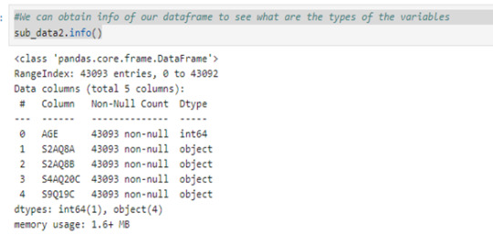
#We see that foru variables are objects, so we can convert it in type float by using pd.to_numeric
sub_data2 =sub_data2.apply(pd.to_numeric, errors='coerce') sub_data2.info()

At this point of the code we may to observe that some variables has values with answers that don´t give us any information

We can see that this four variables includes the values 99 and 9 as unknown answers so we can replace it by Nan with the next line code:
sub_data2 =sub_data2.replace(99,np.nan) sub_data2=sub_data2.replace(9, np.nan)
And drop this values with
sub_data2=sub_data2.dropna() print(len(sub_data2)) 1058
I want to create a secondary variable that tells me how many drinks did the individual consume last year so I recode the values of S2AQ8A as how many times the individual consume alcohol last year.
For example, the value 1 in S2AQ8A is the answer that the individual consume alcohol everyday, so he consumed alcohol 365 times last year. For the value 2, I codify as the individual consume 29 days per motnh so this give 348 times in the last year.
I made it with the next statement:
recode={1:365, 2:348, 3:192, 4:96, 5:48, 6:36, 7:12, 8:11, 9:6, 10:2} sub_data2['S2AQ8A']=sub_data2['S2AQ8A'].map(recode)
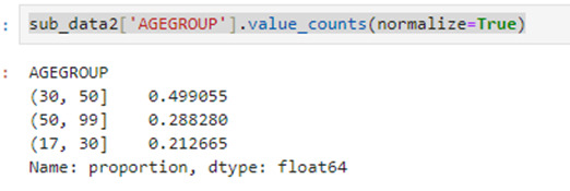
Adicionally I grupo the individual by they ages, dividing by 18 to 30, 31 to 50 and 50 to 99.
sub_data2['AGEGROUP'] = pd.cut(sub_data2.AGE, [17, 30, 50, 99])
And I can see the percentages of each interval
sub_data2['AGEGROUP'].value_counts(normalize=True)
Now I create the variable 'DLY' for the drinks consumed last year by the next statemen:
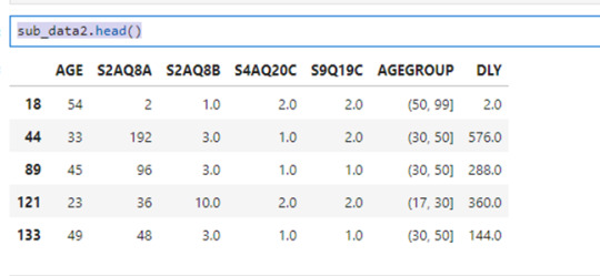
sub_data2['DLY']=sub_data2['S2AQ8A']*sub_data2['S2AQ8B'] sub_data2.head()
The variables S4AQ20C and S9Q19C correspond to the questions:
DRANK ALCOHOL TO IMPROVE MOOD PRIOR TO LAST 12 MONTHS
DRANK ALCOHOL TO AVOID GENERALIZED ANXIETY PRIOR TO LAST 12 MONTHS
respectively.
The values for this question are:
1 = yes
2 = no
I want to know if people who decide to consume alcohol to avoid anxiety or improve mood tends to consume more alcohol that peoplo who don´t do it.
So I made this:
sub_data3=sub_data2.groupby(['S4AQ20C','S9Q19C','AGEGROUP'], observed=True)
And I use value_counts to analyze the frecuency
sub_data3['S4AQ20C'].value_counts()

From this we can see the next things:
158 individuals consume alcohol to improve mood or avoid anxiety which represents the 14.93%
151 individuals consume alcohol to improve mood but no to avoid anxiety which represents the 14.27%
57 individuals consume alcohol to avoid anxiety but no to improve mood which represents the 05.40%
692 individuals don´t consume alcohol to avoid anxiety or improve mood which represents the 65.40%
We can obtain more informacion by using
sub_data3[['S2AQ8A','S2AQ8B','DLY']].agg(['count','mean', 'std'])
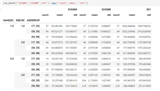
From this we can see for example:
Mots people are betwen 31 to 50 year old and they don´t consume alcohol to improve mood or avoid anxiety and they have a average of 141 drinks in the laste year which is the lowest average.
The highest average of drinks consumed last year its 1032 and correspond to individuals betwen 31 to 50 years old and the consume alcohol to improve mood or avoid anxiety and the second place its for indivuals that are betwen 18 to 30 year old and also consume alcohol to improve mood or avoid anxiety
This suggests that the age its not a determining factor to 'DYL' but 'S2AQ8A' and 'S2AQ8B' si lo son
0 notes
Text
Demystifying Data Science: Essential Concepts for Beginners
In today's data-driven world, the field of data science stands out as a beacon of opportunity. With Python programming as its cornerstone, data science opens doors to insights, predictions, and solutions across countless industries. If you're a beginner looking to dive into this exciting realm, fear not! This article will serve as your guide, breaking down essential concepts in a straightforward manner.
1. Introduction to Data Science
Data science is the art of extracting meaningful insights and knowledge from data. It combines aspects of statistics, computer science, and domain expertise to analyze complex data sets.
2. Why Python?
Python has emerged as the go-to language for data science, and for good reasons. It boasts simplicity, readability, and a vast array of libraries tailored for data manipulation, analysis, and visualization.
3. Setting Up Your Python Environment
Before we dive into coding, let's ensure your Python environment is set up. You'll need to install Python and a few key libraries such as Pandas, NumPy, and Matplotlib. These libraries will be your companions throughout your data science journey.
4. Understanding Data Types
In Python, everything is an object with a type. Common data types include integers, floats (decimal numbers), strings (text), booleans (True/False), and more. Understanding these types is crucial for data manipulation.
5. Data Structures in Python
Python offers versatile data structures like lists, dictionaries, tuples, and sets. These structures allow you to organize and work with data efficiently. For instance, lists are sequences of elements, while dictionaries are key-value pairs.
6. Introduction to Pandas
Pandas is a powerhouse library for data manipulation. It introduces two main data structures: Series (1-dimensional labeled array) and DataFrame (2-dimensional labeled data structure). These structures make it easy to clean, transform, and analyze data.
7. Data Cleaning and Preprocessing
Before diving into analysis, you'll often need to clean messy data. This involves handling missing values, removing duplicates, and standardizing formats. Pandas provides functions like dropna(), fillna(), and replace() for these tasks.
8. Basic Data Analysis with Pandas
Now that your data is clean, let's analyze it! Pandas offers a plethora of functions for descriptive statistics, such as mean(), median(), min(), and max(). You can also group data using groupby() and create pivot tables for deeper insights.
9. Data Visualization with Matplotlib
They say a picture is worth a thousand words, and in data science, visualization is key. Matplotlib, a popular plotting library, allows you to create various charts, histograms, scatter plots, and more. Visualizing data helps in understanding trends and patterns.
Conclusion
Congratulations! You've embarked on your data science journey with Python as your trusty companion. This article has laid the groundwork, introducing you to essential concepts and tools. Remember, practice makes perfect. As you explore further, you'll uncover the vast possibilities data science offers—from predicting trends to making informed decisions. So, grab your Python interpreter and start exploring the world of data!
In the realm of data science, Python programming serves as the key to unlocking insights from vast amounts of information. This article aims to demystify the field, providing beginners with a solid foundation to begin their journey into the exciting world of data science.
0 notes
Text
0 notes