#design tutorials
Explore tagged Tumblr posts
Visit Tumblr Blog
Explore Tumblr blogs with no restrictions, modern design and the best experience.
Last Seen Tumblr Blogs


Fun Fact
Tumblr has 4 main sources of revenue.
Text
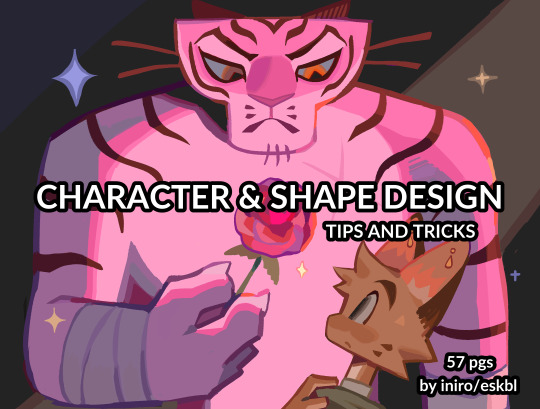
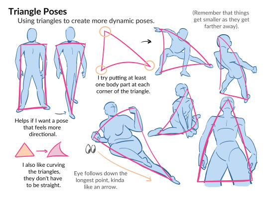

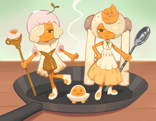
HII my character & shape design tips PDF is now available! ^_^ hope you enjoy !!
BUY HERE or HERE
#character design#art tutorial#art resources#csp brushes#art tips#shape design#myart#i beat the page count of my last pdf woo!
38K notes
·
View notes
Text
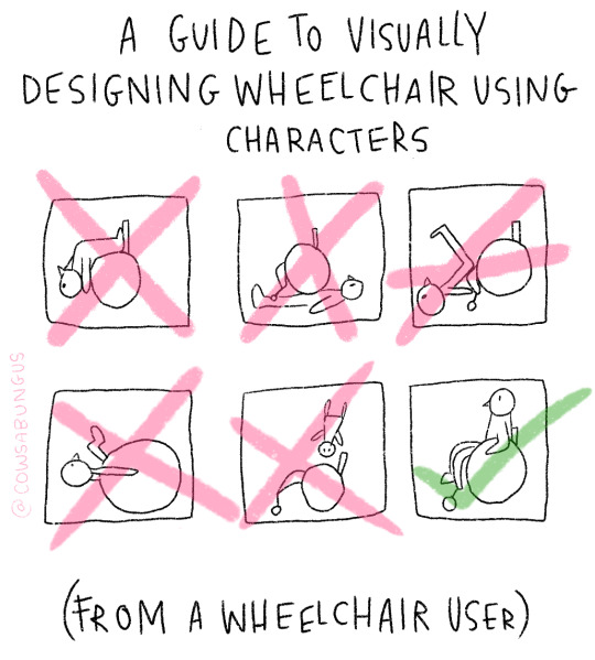
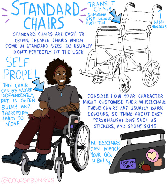
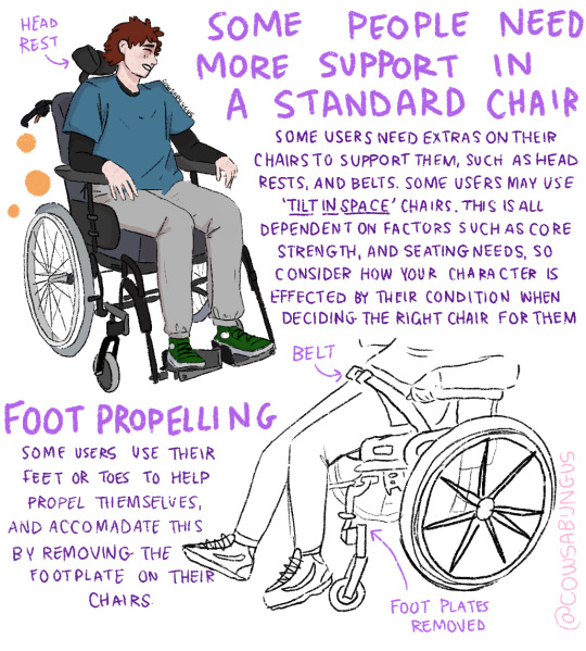

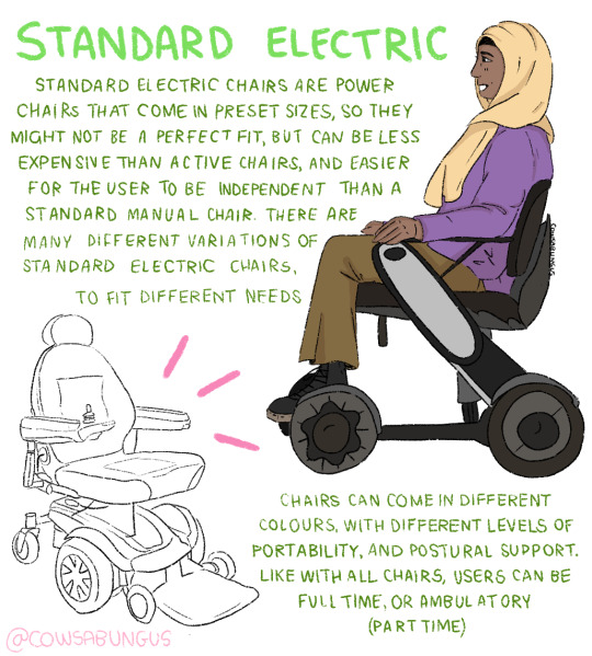

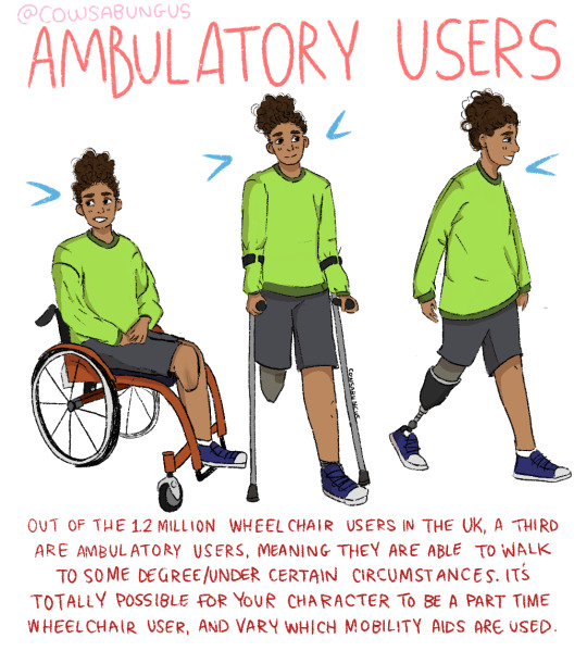
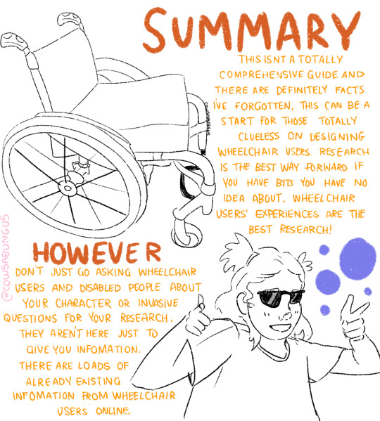
A guide to designing wheelchair using characters!
I hope this helps anyone who's trying to design their oc using a wheelchair, it's not a complete guide but I tried my best! deffo do more research if you're writing them as a character
#art#original art#artist#oc art#original character#queer#disabled#disabled rights#disability#disability pride month#tutorial#art tutorial#disabled character#design tutorial#drawing tutorial#Tumblr tutorial#character design#character illustration#concept art
113K notes
·
View notes
Text
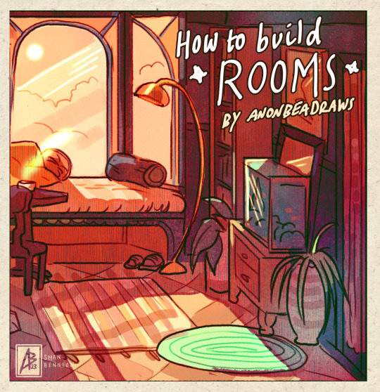
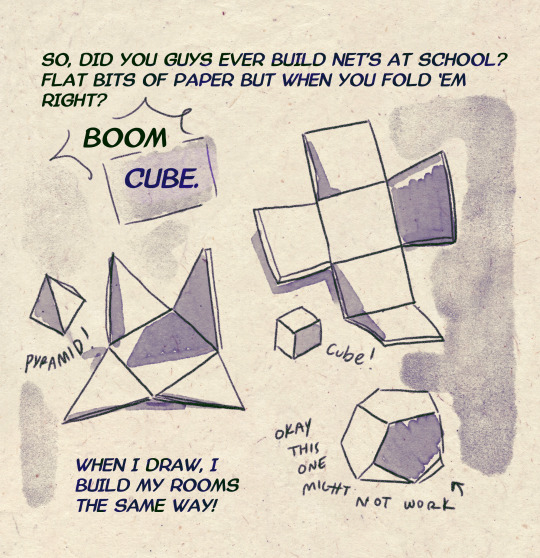
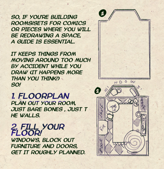
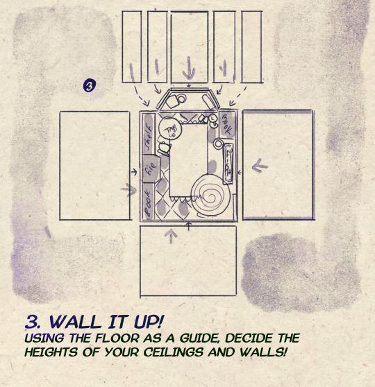
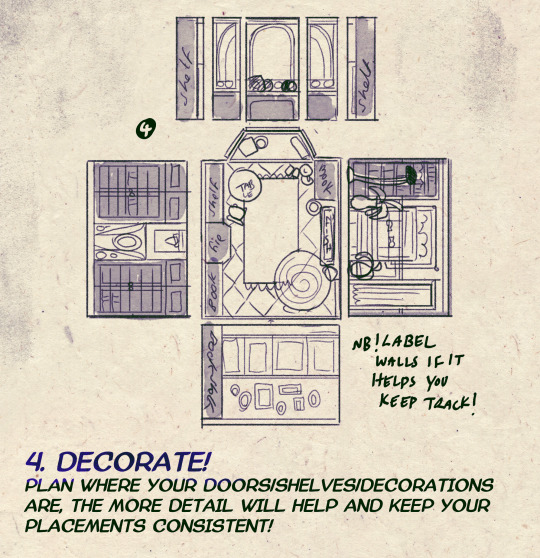
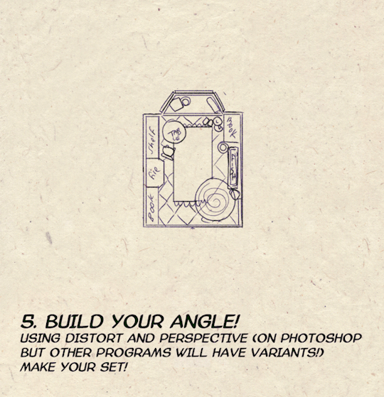
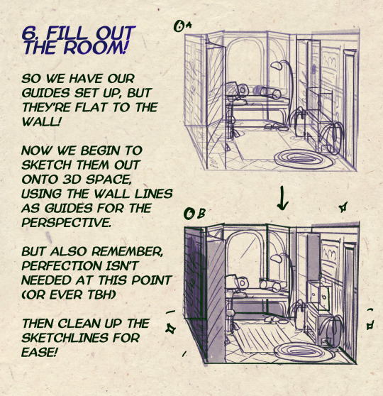

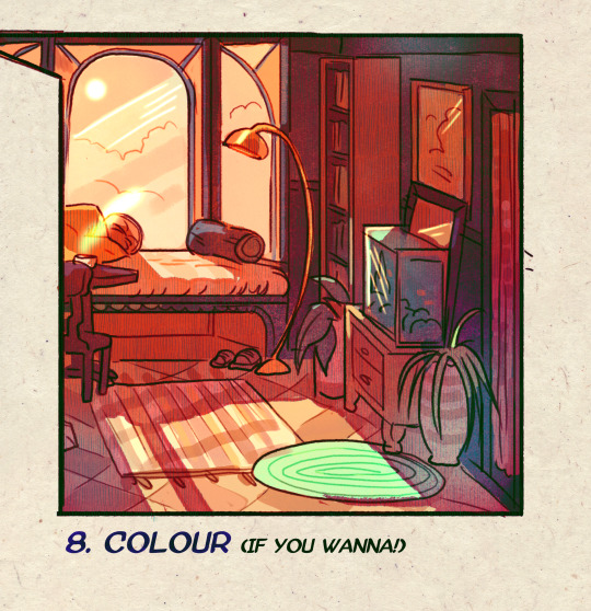
I made a Room Building tutorial! Lemme know if it helps! 🧡
Tip me here| Commission info here!
#anonbeadraws#digital#art tutorial#tutorial#room building#room design#illustration#gif#digital art#digital tutorial#art help#art resource#let me know if it helps!#tried to make it as simple as I could
41K notes
·
View notes
Video
youtube
How to Add Text Behind an Image in Canva | Step-by-Step Tutorial
#youtube#canva#canva design#canva tutorial#Canva tips#Canva design hacks#Canva design tips#photo effect#social media post ideas#graphic design tutorial#graphic design tips#design tips#design tutorials
0 notes
Text
📚 A List Of Useful Websites When Making An RPG 📚
My timeloop RPG In Stars and Time is done! Which means I can clear all my ISAT gamedev related bookmarks. But I figured I would show them here, in case they can be useful to someone. These range from "useful to write a story/characters/world" to "these are SUPER rpgmaker focused and will help with the terrible math that comes with making a game".
This is what I used to make my RPG game, but it could be useful for writers, game devs of all genres, DMs, artists, what have you. YIPPEE
Writing (Names)
Behind The Name - Why don't you have this bookmarked already. Search for names and their meanings from all over the world!
Medieval Names Archive - Medieval names. Useful. For ME
City and Town Name Generator - Create "fake" names for cities, generated from datasets from any country you desire! I used those for the couple city names in ISAT. I say "fake" in quotes because some of them do end up being actual city names, especially for french generated ones. Don't forget to double check you're not 1. just taking a real city name or 2. using a word that's like, Very Bad, especially if you don't know the country you're taking inspiration from! Don't want to end up with Poopaville, USA
Writing (Words)
Onym - A website full of websites that are full of words. And by that I mean dictionaries, thesauruses, translators, glossaries, ways to mix up words, and way more. HIGHLY recommend checking this website out!!!
Moby Thesaurus - My thesaurus of choice!
Rhyme Zone - Find words that rhyme with others. Perfect for poets, lyricists, punmasters.
In Different Languages - Search for a word, have it translated in MANY different languages in one page.
ASSETS
In general, I will say: just look up what you want on itch.io. There are SO MANY assets for you to buy on itch.io. You want a font? You want a background? You want a sound effect? You want a plugin? A pixel base? An attack animation? A cool UI?!?!?! JUST GO ON ITCH.IO!!!!!!
Visual Assets (General)
Creative Market - Shop for all kinds of assets, from fonts to mockups to templates to brushes to WHATEVER YOU WANT
Velvetyne - Cool and weird fonts
Chevy Ray's Pixel Fonts - They're good fonts.
Contrast Checker - Stop making your text white when your background is lime green no one can read that shit babe!!!!!!
Visual Assets (Game Focused)
Interface In Game - Screenshots of UI (User Interfaces) from SO MANY GAMES. Shows you everything and you can just look at what every single menu in a game looks like. You can also sort them by game genre! GREAT reference!
Game UI Database - Same as above!
Sound Assets
Zapsplat, Freesound - There are many sound effect websites out there but those are the ones I saved. Royalty free!
Shapeforms - Paid packs for music and sounds and stuff.
Other
CloudConvert - Convert files into other files. MAKE THAT .AVI A .MOV
EZGifs - Make those gifs bigger. Smaller. Optimize them. Take a video and make it a gif. The Sky Is The Limit
Marketing
Press Kitty - Did not end up needing this- this will help with creating a press kit! Useful for ANY indie dev. Yes, even if you're making a tiny game, you should have a press kit. You never know!!!
presskit() - Same as above, but a different one.
Itch.io Page Image Guide and Templates - Make your project pages on itch.io look nice.
MOOMANiBE's IGF post - If you're making indie games, you might wanna try and submit your game to the Independent Game Festival at some point. Here are some tips on how, and why you should.
Game Design (General)
An insightful thread where game developers discuss hidden mechanics designed to make games feel more interesting - Title says it all. Check those comments too.
Game Design (RPGs)
Yanfly "Let's Make a Game" Comics - INCREDIBLY useful tips on how to make RPGs, going from dungeons to towns to enemy stats!!!!
Attack Patterns - A nice post on enemy attack patterns, and what attacks you should give your enemies to make them challenging (but not TOO challenging!) A very good starting point.
How To Balance An RPG - Twitter thread on how to balance player stats VS enemy stats.
Nobody Cares About It But It’s The Only Thing That Matters: Pacing And Level Design In JRPGs - a Good Post.
Game Design (Visual Novels)
Feniks Renpy Tutorials - They're good tutorials.
I played over 100 visual novels in one month and here’s my advice to devs. - General VN advice. Also highly recommend this whole blog for help on marketing your games.
I hope that was useful! If it was. Maybe. You'd like to buy me a coffee. Or maybe you could check out my comics and games. Or just my new critically acclaimed game In Stars and Time. If you want. Ok bye
#reference#tutorial#writing#rpgmaker#renpy#video games#game design#i had this in my drafts for a while so you get it now. sorry its so long#long post
8K notes
·
View notes
Text
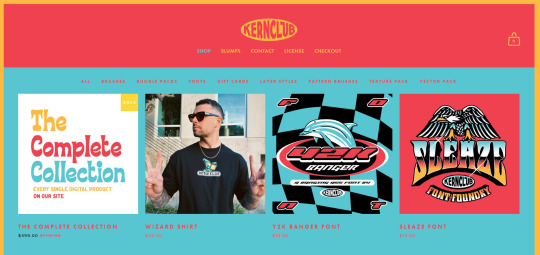
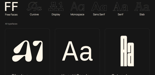
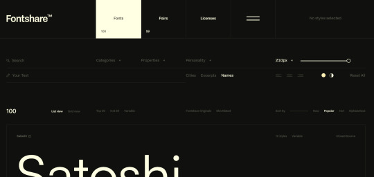
RESOURCES FOR FONTS
KernClub
FREEFACES
FontShare
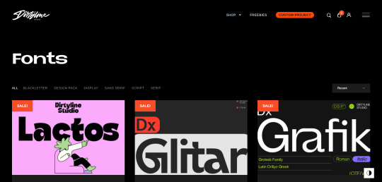
DirtyLineStudio
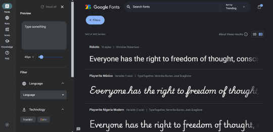
FontsGoogle
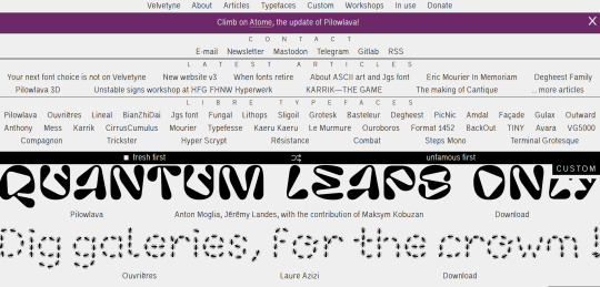
Velvetyne.FR
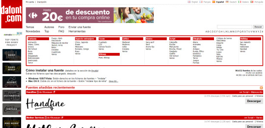
Dafont
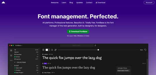
FONTBA.SE
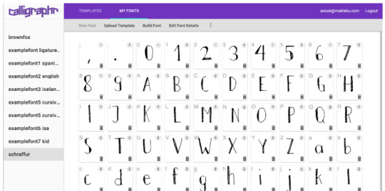
CALLIGRAPHR (to create your own fonts)
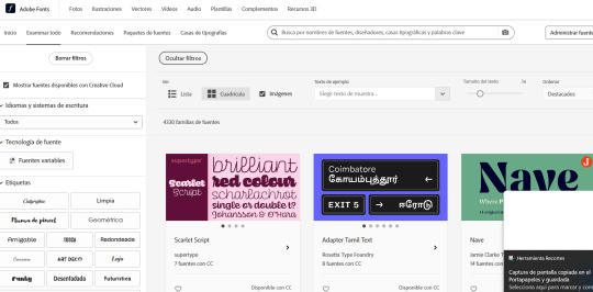
ADOBE FONTS
#reference#tutorial#art#art reference#concept art#illustration#artist#resources#web#websites#design#designer#fonts#font#typography
4K notes
·
View notes
Text

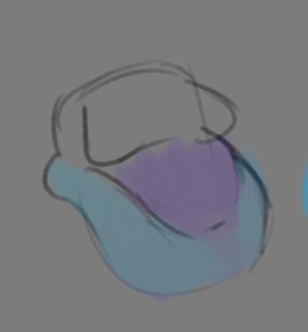
lazy comfreyplume & cobalttree sketches
1K notes
·
View notes
Text
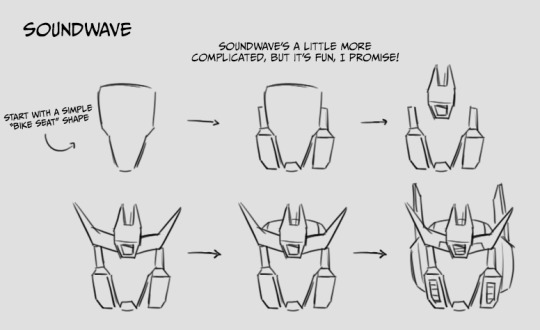
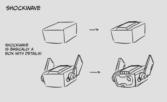
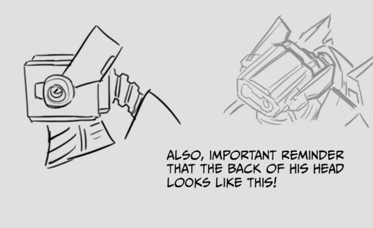
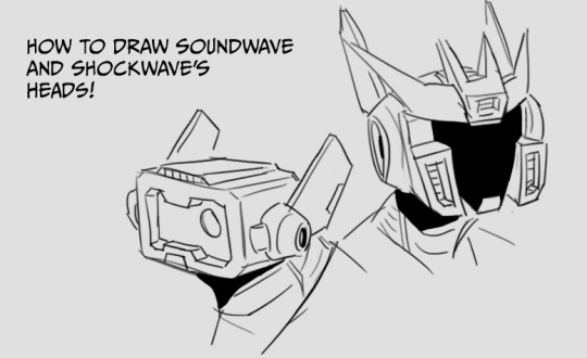
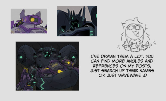
Fun little tutorial, let me know if you want any more! :D
#transformers#au#soundwave#shockwave#wavewave#tutorial#decepticons#character design#redesign#doodle#robot
800 notes
·
View notes
Text


A knight and friends.
#art#digital art#original character#character design#2d animation#animation#oc#animated gif#cartoon#tutorial#art tutorial#animation tutorial#how to#knight#medieval#steed#horse#bird#pet#quest#adventure#dnd#d&d#fantasy#king arthur#arthurian#derp#derpy#equestrian#armor
605 notes
·
View notes
Text
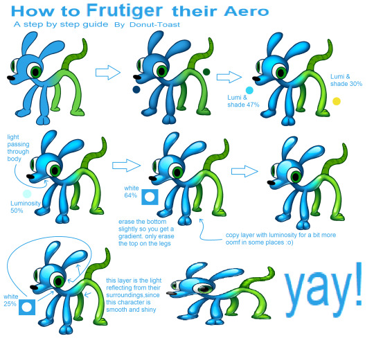
Made a quick tutorial for how to apply that Frutiger Aero Button texture to living creatures, since I made an entire design with it!
#art tutorial#frutiger aero#art tips#art help#art resources#art research#drawing tutorial#tutorial#resource#art resource#digital art#art#aesthetic tutorial#aesthetic#frutiger aesthetic#y2k#spore 2008#spore#old web#donutdrawsthings#character design
517 notes
·
View notes
Note
If you don't mind my asking, how do you go about drawing fat? :3
JUST THE EXCUSE I WAS LOOKING FOR
So, for me personally, a lot of the time when I draw fat characters, I'm not looking to specifically capture the specifics of fat as much as the feel of fat. Bulkier, rounder shapes in the right places that has a feeling of weight to em! A lot of that is intuition and simplification at this point, but it all works on the same frame as just any ol' person. Like take this-

For example. This is the basis for any body shape, not just the more average one that it may imply. Sure- it can be that average body shape:
But also a fat one too!

And a big part of that is knowing where fat usually tends to bunch up on the body, so lets take a look piece by piece! (Please keep in mind this is very simplified, and not completely precise in some parts)
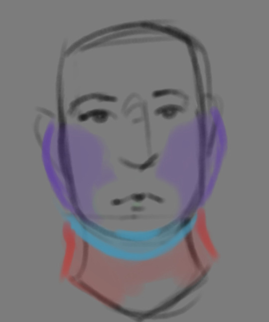

THE FACE: Cheeks (in purple) and especially the chin (in light blue) are the places where a lot of the fat is gonna wanna gather and round out on your face! Additionally, theres a small pocket of fat beneath the cranium on the backside of your head. It's small, but it is there. I believe fat can build up elsewhere like the bridge of your nose and forehead, but generally speaking, you're gonna have a whole lot more buildup in other places first.
THE TORSO: A lot of the fat built up on the torso is gonna be sent to your tummy. More cushioning for vital organs, mostly out of the way, it just makes sense. Additionally, the lower backs fat builds up and joins with a patch of fat on your sides that forms what is typically referred to as the love handles to make that double belly look. Along with this, the immediate next target for the torso is the breasts, followed by the upper back!
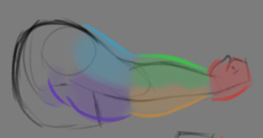
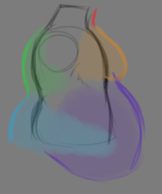
THE ARMS: For this limb, a VERY notable amount of the fat present builds up on the tricep and bicep areas, lessening once you get towards the flexor and extensor areas. You can almost think of the arm as a sort of triangular shape, wide side starting from the shoulder and tapering towards the hand, which itself mostly builds up fat around the back of the hand and the fingers. The shoulders themselves don't build up too much fat unless you got a lot
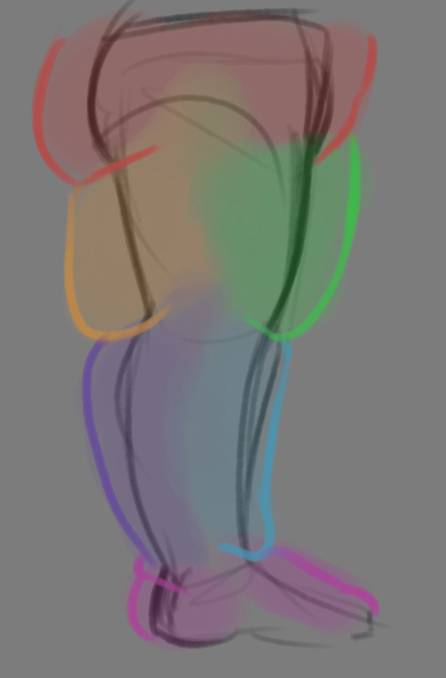
THE LEGS: And finally, you can think of the legs having pretty similar curves to what you're probably already used to thinking. The front of the thighs getting a big buildup, along with the back of the calves, the other parts being flatter in turn. As far as the feet go- similarly to the hands, the top of the feet, along with the heels get most of the buildup, as fat on your soles would impede mobility. The glute, hip and crotch area will also especially build up fat, lending to the same triangular shape that you can see in the arm!
A big thing to note with fat is that it tends to taper off towards joints. Your knees, elbows, shoulders, hips, and all the other places are gonna have significantly less fat so that you remain mobile and flexible, as that's important!
Now that we have an idea of where fat builds up on the body, you might have something that looks kinda like this
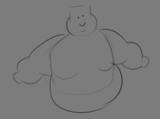
Which yes, does demonstrate a solid understanding of the places fat builds up, lacks the weight you're probably trying to convey, which brings us to out next point! Fat is well... heavy! Gravity is what gives fat much of it's shape, especially as you tread towards larger and larger bodies.
This is demonstrated really well on the arms especially-


Those big ol' bits of fat'll really start to sag when left hanging, and they will squish like hell if they run into something. I like to think of these bits of fat as big ol' ovals that squash and stretch depending on if there's an obstacle in their way or not


These are the important shapes to remember when it comes to the weightiness of fat! If you take all of this into mind, you should be getting something a lot closer to that shape you've been after!

Oh, and always remember that fat bodies come in all variety of shapes and sizes! Play around with a whole lot, and seek out all the resources you can! it'll really lend to your knowledge when it comes to this kinda stuff!
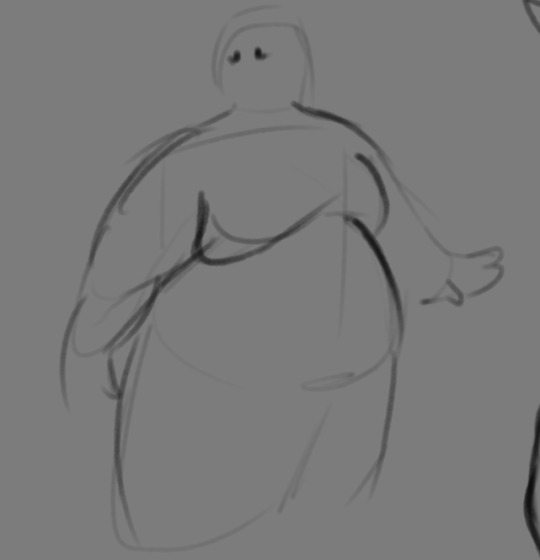
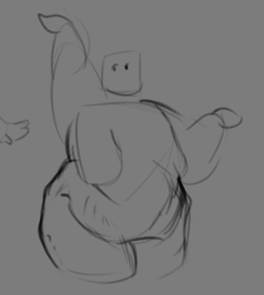
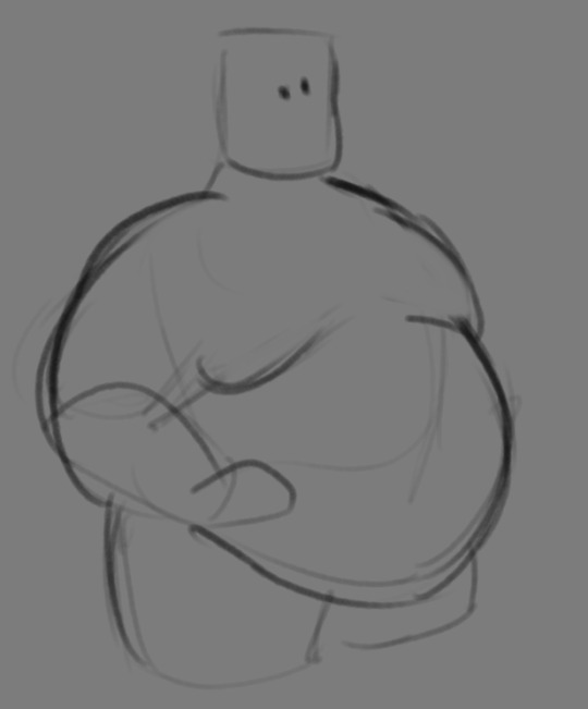
And as I always recommend when it comes to learning art- look at what your favorite artists do with fat bodies. See what you really like about the fat bodies they draw and try to replicate it in your own work, I promise you it's one of the most helpful things ever.
This is like the most basic of basics when it comes to drawing fat bodies though. If there's any additional thing about fat bodies, or maybe you want clarification on something, don't be afraid to ask! If there's enough to cover, I'll make an addition to this post!
#hat answers#my art#design talk#tutorials#yeah im unfortunately pretty tired so this gets a liiiitle rambly at the end but i think this covers like the basic basics#i hope this was helpful at all#and again dont be afraid to ask questions and stuff#if theres enough traction/questions on this i will most definitely try to clear up as much as i can in an addition to the post#whoops this took a bit!
3K notes
·
View notes
Text


My notes from my "Drawing 'Creepy' Creatures" Makerspace class at MICE, I thought it might be interesting to post them here because I don't usually share my process. I printed out fact sheets for different animals and then encouraged people to draw their own animal characters (and even mix different animals together for some fun creature design!).
I am very passionate about drawing animals that others might find off-putting or unsettling and I wanted to share that in my class. All animals are important to their ecosystems and have so much to offer, especially the ones that don't conform to the human standard for cuteness!
626 notes
·
View notes
Text
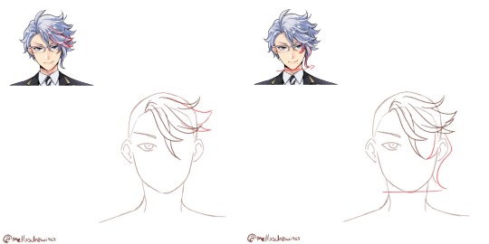
Alrighty, let's tackle the second part of this request!
Here's a tuto on how to draw the nightmare that is Azul's hair!
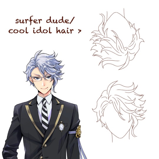
First, a few observations.
Contrary to other characters like Jamil, Riddle, or Sebek, Azul's hair doesn't immediately tell you everything about his personality. For someone as calculating and (trying to be) mature as Azul, you'd expect his hair to be slick and and each strand to be at it's proper place.
It's the contrary here. Azul has wavy, almost curly hair that is completely all over the place.
It's because that's his own struggle that is shown here. Azul has always fought against himself, being his octopus nature, his weight, or even his hair that won't stick down. That boy is just cursed to forever have something about himself that doesn't fit his aesthetic.
(Personally whenever I look at Azul upside down, I really feel like it'd be the kind of hair for a cool extroverted guy in an Idol gacha game)
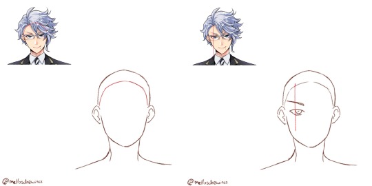
Step 1. Hairline
Azul has a simple round hairline so simply draw an arch.
Step 2. Hair root
Azul's hair all comes from a point right above the left side of his left iris, so I would suggest you draw Azul's face (and even glasses) first.
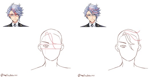
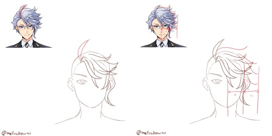
Step 3. Bangs
Azul has two strands that fall between his eyes, just a bit to the right. Start from the root point you placed earlier, and draw two wavy lines intersecting. The first will stop at the upper rim of his glasses, above his right iris area. The second will stop at the lower rim of his glasses, below his right iris area.
All of Azul's hair will be made with soft waves that fork back up, so train yourself to do that move flowingly. You're not done using it.
Step 4. Front hair 1
There are two strands that seem closer to us and frame the other bangs, so let's draw them first. In my example I drew the lower strand a bit too high, it should come right above Azul's right eye. The upper one thought will almost be horizontal. Both of those will reach the area above the right ear.
Once more, waves.
Step 5. Front hair 2
Now the two strands between the last two. They will go further than the ear.
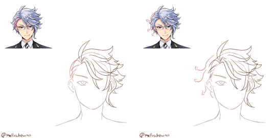
Step 6. Side strand
Azul's tentacle-like strand. It is composed by the only strand of hair that forks towards his face, instead of outward. It goes around the eye and reaches lower than the middle strand.
The second part is the actual tentacle. It hides the ear entirely and reaches down to Azul's chin level.
Still, always a wave that forks outward.
Step 7. Ahoge
Yup. "Mature" and calculating Azul has an ahoge. That might be the only part of his hair that does indeed reflect his personality. Azul can be quite immature and stupid at times. (For those who don't know, "ahoge" literally means "stupid hair" and it's usually used on stupid or immature characters)
Simply make it start at the root point. It's about the size of Azul's hairline to eyes, but globally just make it go up above where the rest of his hair would go.
Step 8. Right side
That is the part that people (even Yana if we trust the notes she made) struggle with. There is a volume here that can't be too fluffy or not big enough. It's actually just the size of half his face. Put your mark and do your best to fill it without going further.
From there, draw about 4 or 5 waves. Connecting each tip should make an arch, with the further point being the strands at Azul's eye level.
Step 9. Behind the ear
The only part of Azul's hair that is well groomed is those few strands of hair, that look like they were pushed behind his ear. This is also the only part (alongside the ahoge) that isn't made using a wave.
Step 10. Left side
And we're back to drawing waves, this time forking left. There is about 3 waves to do. These strands won't be as fluffy as the right side, sticking closer to the skull, but still add some volume. Wavy/curly hair just can't stick to the skull (I'd know it *sigh*)
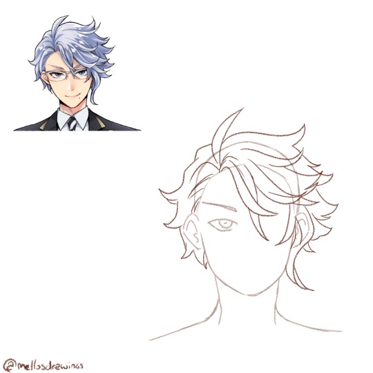
Step 11. Details
Time to check your proportions, add a few lines within the strands, add more lines at the roots to show that his hair go from here.
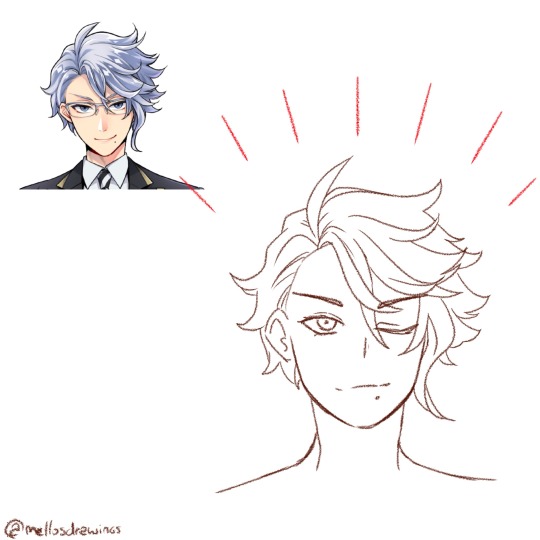
Finished!
So. Idol!Azul when? (One day. One day I'll do that Housewarden Idol AU)
(Last note: he does have an undercut. I'll forever go crazy about Azul of all people having a fuckboi (/affectionate) haircut)
(Official pic from the Magical Archives)
#this one got long#but I spent so much time dissecting Azul's chara design#have I told you dissecting and analyzing character designs wa my fav pasttime?#mello's drawings#twisted wonderland#twst#azul ashengrotto#my art#ask me anything#analysis#art tips#step by step#tutorial#tuto#drawing tutorial
437 notes
·
View notes
Video
youtube
Creating Professional Line Charts in Canva docs: A Step-by-Step Tutorial
#youtube#canva#canva tutorial#canva tips#canva design#line chart#data visualization#canva docs#Canva love#how to use canva#learn canva#graphic design#design tutorials#learn design#graphs#tutorial#video tutorial
1 note
·
View note
Text

Anomi
#interloper#interloper arg#source engine#my art#artists on tumblr#anomidae#skyghost#project skybox#I really like his design... Even if it was never shown in the series#only in tutorials#and the way he designed skyghost in the same manner. little goobers with no mouth. awww#ANOMI LEFT A REACTION ON MY ART ON THE DISCORD SERVER. EXPLODING
409 notes
·
View notes
Text
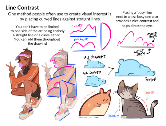
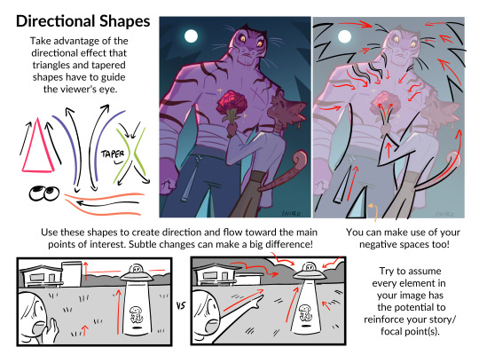
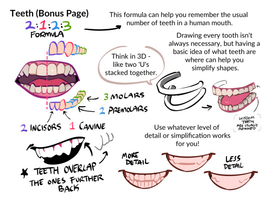
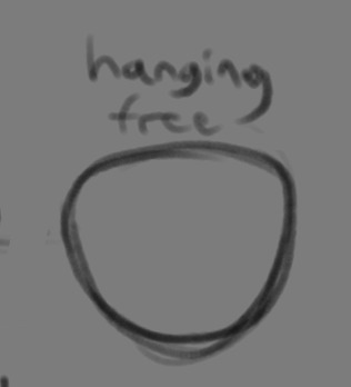
O_O...HI
sooo i'm officially making another little art tips and tricks pdf - this time focusing on approaching character and shape design !!
is there anything you guys are curious about regarding those topics that i might be able to explain in a tutorial? ie: drawing character interactions, contrast in shapes/lines, color palettes for a chara, expressions, how do you draw ___, etc ?
feel free to reply here or send an ask :-D
#myart#character design#shape design#art tips#art tutorial#i wanna cover as many topics as possible!
1K notes
·
View notes