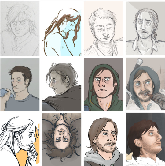
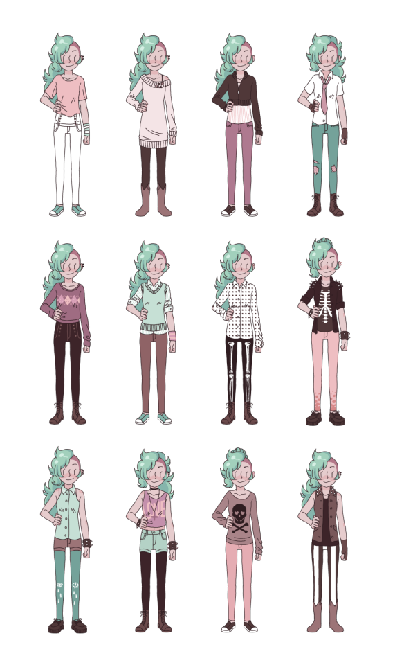
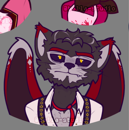
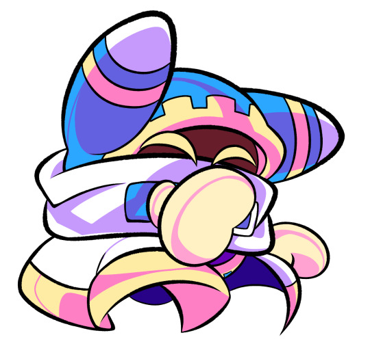
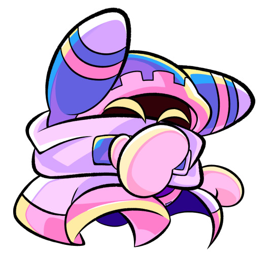
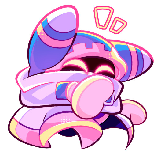
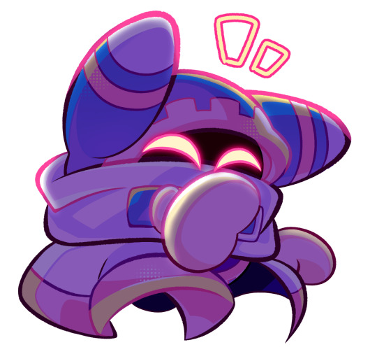
#does my art style change every time i draw them?
Text
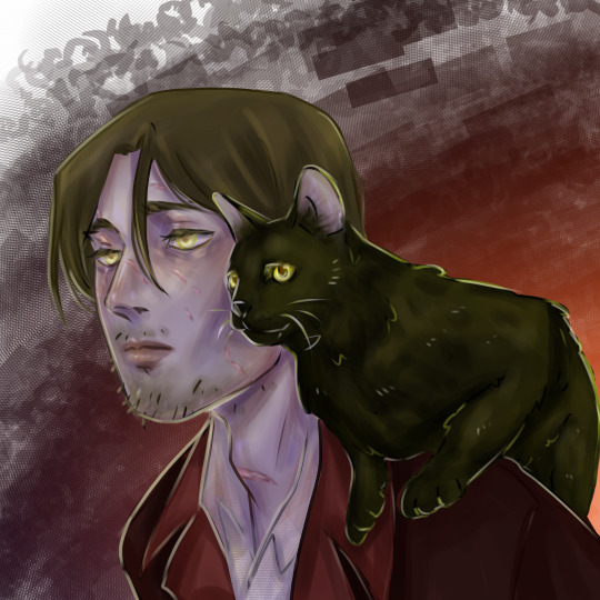
more Cat!John to satisfy the voices in my head (harlan, it's all harlan)
#seriously#how many voices can one guy have#what if i get trust issues and assume every voice i hear from now on is him#ai cant do what he can#malevolent podcast#arthur lester#arthur malevolent#arthur lester malevolent#john malevolent#john doe malevolent#john doe#malevolent fanart#malevolent#harlan guthrie#does my art style change every time i draw them?#yeah#what about it#god i cant wait til february
595 notes
·
View notes
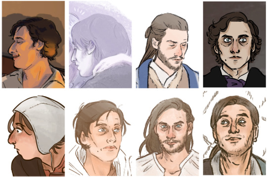
Photo

If you have never considered pretty Macaque before... this is my offer.
Wanted to credit the hair stick and bun inspo! No idea who the original artist is so if you do comment it or something thaaanks
https://www.pinterest.com/pin/807481408207048363/
#lego monkie kid#monkey king 2009#lmk sun wukong#lmk macaque#shadowpeach#my art#i finally figured out how to draw them omfg#macaque > wukong like if you agree#i am once again going through art puberty#please be patient as i figure out how to fucking draw again#srsly im serious why does my art style change every time i draw help#peachbuds#i guess
1K notes
·
View notes
Text
please, i’m on my knees, and that’s bad poetry~
#captions are from the song bad poetry by ben lee#it slaps go listen to it#qsmp#frubbo#my beloved#pulled this shit out of my ass at like 3am#worth it tho i miss them always :(#qsmp fanart#feel like this song is a little them coded#and thats bad poetry#qsmp tubbo#qsmp fred#also why does my art style change every time i draw what the fuck#what is this phenomenon
60 notes
·
View notes
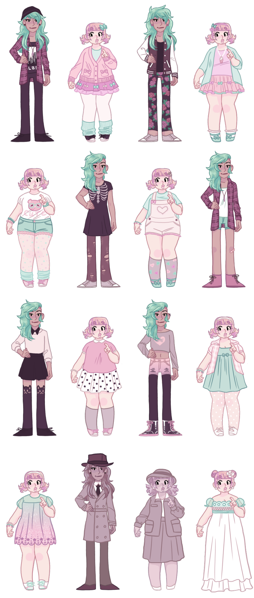
Text
My Neekeys over the last two-odd years. I was curious to see the changes 🤔
#forgive the low quality dfghfds it was just an experiment#now to do the DRAW ANYONE ELSE challenge#siggy draws#he is my blorbo. my muse. i guess#don't get me wrong. i am CRINGING and SWEATING at just the thought of uploading this.#have i been drawing almost every day my entire life? yes. does my style still change all the time? yes!#and i'm mostly self-taught so i struuuuggle a lot. i'll finally admit that reference pictures help immensely. no shit lol.#i learned a lot in the last 2 years!!! there are some really ugly ones i didn't show but i kept the cringe old ones sdfghfds help.#i mean they're still here on tumblr so i can't exactly hide them#you can kind of see when i actually started to use reference pictures. and when i got more used to using a tablet#idk digital art is so hard. it's a whole other world. but i'm in it now and haven't drawn traditionally in forever#i can also literally see how i used to CRUSH my nibs while drawing. all those really thin lines?? i pressed too hard lol#i've actually kept all my nibs since i started drawing digitally and....... it's too many fghfds#that one slightly more realistic nicky in the bottom right of the first collage lmaooo. i should finish him... maybe... it's haaard.#the top right on the first collage and bottom right on the second one are good comparisons ;_; they're both pirate!nico gifts for lily!!#i'm feeling sentimental now omg
210 notes
·
View notes
Text
EVENT OVER! THANKS EVERYONE WHO JOINED IN U ALL DID AN AMAZING JOB <3 SEE YOU AGAIN NEXT YEAR IN MARCH FOR #mARTch OR NEXT OCTOBER (2024) FOR A NEW SET OF PROMPTS!!!!!

OC-TOBER 2023 PROMPTS!!
general tag: #oc-tober / my prompts: #bweirdOCtober
F.A.Q:
Do I have to draw EVERY DAY?
NO! I highly encourage skipping as many days as you need to avoid burnout! There are 10 main days in the event (marked with a ⭐ star) that you can focus on if you don't feel up to doing every day, or you can choose your own adventure and just do the prompts you personally like!
Do I have to DRAW?
NO! You can also write fanfiction snippets, repost older art that fits the theme, tweet headcanons/backstory, roleplay in-character as your oc ... genuinely anything that fits the theme is OK!!
Can I start early?
YES! I understand some people work at a slower pace and might need a head start! So long as you wait until October to post it, you can start working as early as you need!
I missed the start of the event .. do I have to catch up?
NO! Please don't stress about days you missed, you're allowed to just skip to the current prompt!
RULES:
1. MAKE FRIENDS! The community is the best part of this event .. please try to follow new people, ask questions about ocs you like, compliment people's styles, ask friends to create with you, etc!
2. TAKE IT EASY! Skip a day if you're tired, busy or just not interested in the prompt. You don't have to catch up on it later. This is supposed to be fun, not work!
3. BE KIND! Please think about the people around you - don't give people unwarranted harsh criticism, content warn for themes/imagery in your work that could trigger someone, don't create anything hateful, etc
MORE:
text version / tips and ideas on bweird.art or below ↓
star = main prompts | no star = optional
INTRO WEEK
1: FAVE OC ⭐
-Which of your characters is your favourite right now?
2: NEW OC
-Who is your newest OC?
-Design a new OC right now
3: OLD OC ⭐
-Do you remember the first OC you ever made?
-Is there an OC you haven't drawn in a long time?
4: RE-DESIGN
-An OC who has changed a lot over the years
-Take an old OC and update their design right now
BACKSTORY WEEK
5: RELATIONSHIPS ⭐
-Who is important to your OC?
-Do they have a partner?
-Do they have a best friend?
-Are they close to their family?
6: SYMBOL
-What imagery do you associate with your oc?
-Are there any colours, flowers, animals or concepts that symbolize them?
7: PERSONALITY ⭐
-How does your OC behave?
-What are their positive traits?
-What are their negative traits?
-Are they extroverted or introverted?
8: PAST
-What was your OC like as a child?
-Where did they grow up?
-Are there any significant moments from their past that shaped who they are?
9: FUTURE ⭐
-Does your OC have a goal they're working towards?
-What will your OC look like when they get older
-Do you have a planned ending for their story?
PALETTE WEEK
10: pumpkin patch palette
#251604 #1E3807 #5B5E1A #A2A657 #EBA00F #F3ECCC

11: hot cocoa palette
#520B13 #BB382E #E27E6D #88392C #AF5D40 #E1AFA4

12: midnight zone palette
#000007 #000049 #183885 #004D4F #0E8788 #FFF1C0

13: peachy palette
#DE6450 #DB9171 #FFC1AE #FEE1AD #FFF2E0 #D9D8D8

14: haunted house palette
#552506 #6E25AA #ED690B #F925A0 #8F8BA7 #A6C1AA

FUN + GAMES WEEK
15: MEME ⭐
-Post memes that remind you of your OC
-Draw your OC as a meme
-Fill out a character meme (classic deviantart style)
16: FOOD
-What is your OC's favourite food?
-What is their least favourite?
-Can they cook?
17: EYES-CLOSED ⭐
-Draw your OC with your eyes closed! No cheating!
-Write a scene without looking at the keyboard! Keep the typos in!
18: SWAP
-Swap the style or aesthetic of two of your OCs
-Species or gender swap AU
-Invert an OC's colour scheme
19: INSPIRATION ⭐
-Is your OC inspired by any pre-existing characters?
-Are there any particular songs/lyrics that inspired something about one of your OCs
-Do you have a dedicated pinterest moodboard for your character?
20: INVENTORY
-What does your OC carry around with them on a daily basis?
-Are there any objects that have sentimental value for them?
-Loot drop for your DnD OC
FRIENDS WEEK
21-25:
There's no specific daily prompts for this week, but here are some ideas you can try ...
-Art trades with friends who are doing the event with you
-Your OC interacting with a friend's OC
-Gift art for someone whose OCs you like
-Work together and collaborate on something with a friend
-Roleplay an OC scene together with someone
HALLOWEEN WEEK
26: FEAR ⭐
-What is your OC scared of?
-Draw one of your OCs trying to scare the others
27: MONSTER
-Do you have any monster OCs? (eg: vampires, werewolves, creatures, ghosts...)
-Draw a human OC as a monster
-Design a new monster
28: TRICK
-Play a trick on an OC
-Do you have an OC who would play tricks on people?
29: TREAT
-What is your OC's favourite halloween candy?
-Give an OC a special treat to make up for yesterday's trick
30: MAGIC
-Do any of your characters have magical powers?
-Give an OC a magical or cursed artifact
-Create a magic-using OC like a witch or wizard
27: COSTUME ⭐
-What is your OC dressing as for halloween?
6K notes
·
View notes
Note
I was curious how you manage to keep features consistent when you draw them? Do you use models? Is there a model for Crowley? He is very handsome.
I don't use models per se, but I sometimes keep files of photos or art that resembles the subject.
Crowley is based a bit on the French actor Alain Delon who was once considered the handsomest man in the world. He doesn't look exactly like Delon, but that is in my head when I draw him. I recall reading Neil and Mr. Pratchett once considered Peter Sellers for Crowley.
There is no reference for Aziraphale because he is entirely in my head and I can't really find anyone who looks exactly the way he does. I recall reading that Neil and Mr. Pratchett thought of Brian Dennehy at one point, but my head canon Aziraphale won. I think a Brian Dennehy Aziraphale would have been amazing, though. Anyway, he is actually kind of hard for me to draw because his facial structure is a bit outside my usual style. His face is a bit long and his eyes closer together than I normally do, and if I'm not careful, he slips away. He appears younger and more classically handsome as an angel than he does in his corporeal form, but I think he's quite fetching as a bookseller.
Michael Sheen is so perfect in this role it is really hard not to leak bits of his performance into the graphic novel edition, but I have to resist the impulse. I am not allowed to use any of the show actors as models.
I adore Michael Sheen. Who doesn't?
Adam is also a head canon character. He is a perfect young Greek God, so that's kind of drawing on a day with a Y in it for me.
The inspiration for Newt I'm keeping a secret. I submitted a number of sketches for Newt. The show Newt dug in deep and I had a hard time shaking him off.
The Them are based on kids I knew. They're in my head, I don't need any photos. They don't really look like the kinds in the show. The book version of Pepper, for example, is a freckled red-head.
Anathema is an amalgam of features that don't come from one person, which I think fits the description of the character. She's also unusual for me to draw but she's easier to draw than Aziraphale. I nail her every time.
Hastur is a caricature of the stereotypical English upper class you'd see in broadsheets 200 years ago. I have a file of pictures of Anthony Ashley-Cooper, 7th Earl of Shaftesbury for Hastur. I considered making Hastur more handsome in a Duke of Hell sort of way, but I think Hastur likes to be scary. I keep thinking of Peter O'Toole when I draw Hastur, too.
I feel kind of bad basing Hastur on Lord Ashley because he was a wonderful person and I'm sure he didn't go to Hell.
Ligur is a broad caricature of Danny Devito. I obviously can't use a DeVito portrait. That would be wrong. But I can tweak from there and come up with a general idea of the face I want to use.
Beelzebub and Metatron are head canon, and don't look a thing like they do in the show. I postulate some demons prefer to look like their angelic selves, and at other times prefer to be fearsome. Crowley can look fearsome when he wants, for example. In the book, Beelzebub appears as a young man in red flames.
Shadwell was drawn from reference at the direct suggestion of Neil.
Madame Tracy is based on a certain person, but no one you would have heard of. The original source might not be flattered, but I love Madam Tracy. She's really easy to draw because she's a bit over the top. I'm sketching around her scenes right now because I don't have final approval on some things yet. So she might need some changes later.
War is head canon, very easy to draw. She's a knockout. No reference required.
Famine looks a lot like Famine in the show, actually, but that's what Famine always looked like, pretty much. Except he has the grey eyes he has in the book.
Pollution is initially described as being a forgettable white guy, but later described as looking like a romantic poet, which strikes me as being memorable. Because he's only on one page in his forgettable white guy phase, I chose not to make major changes in his appearance between those panels and later when he appears as his true self, because that's a bit more confusing than it needs to be in the graphic novel edition. He's rather glamorous as the essence of Pollution, though. No reference needed.
Dog is a dog.
While I do give every detail a lot of thought, I am sure other people have other opinions. I understand that, and hope you enjoy what I do anyway.
Thanks for your question.
I'm still a bit under the weather, so may be stepping away from the net for awhile so I can concentrate on work. I have a lot of sick time to make up.
But don't think I don't appreciate your interest in the Good Omens graphic novel adaptation. Your wonderful support is acting on me like a tonic, let me tell you.
kickstarter
2K notes
·
View notes
Note
i just need to take a second to gush about how much i love durge drow and astarion, they feel so fleshed out and perfectly written together in their fucked up wretched ways. They really inspire me to write more for my own tavs, hopefully one day ill be able to say im as happy with my own work as i get when seeing yours. I have to ask though, do you have any tips on drawing head shapes and faces? or maybe about wrinkles? i find i really struggle with that stuff when drawing and i adore how expressive and grungey all your art looks!
First of all thank you so much, I love hearing what people think of the two of them together 😭
Honestly you've hit on something that's quite near and dear to my heart, I love developing and figuring how to draw and stylize different faces to get the most unique, interesting looking results - everything about the details is highly rewarding to me. What does x type of nose look like from this angle? In this style? How can this eyeshape best translate to my art? How different does a face look when its making this expression? What does that MOUTH DO? etc etc.
In fact you kind of inspired me to put a little tutorial/guide together the last hour lmao and what a blessing it is that the two current subjects of this blog serve as great models here, being that their faces are basically polar opposites!
When it comes to heads, you've probably heard it a dozen times before that you want to think of them in terms of geometry and facets; my process to drawing them is pretty conventional so I won't spend too much time on it, but it goes something like this:
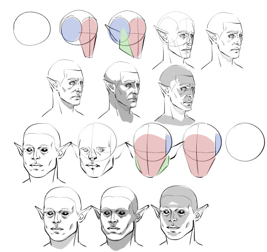
Obviously I don't do every single one of these steps most of the time, which is just something that comes from practice/developing muscle memory, but it is helpful to start off this way for two main reasons:
By making these guide lines and splitting a head into pieces like this, you'll have an easier time seeing and understanding it as a multidimensional object, and in turn, facilitate It for you when you venture out into doing wacky angles and lighting.
Making different headshapes starts HERE. notice how Astarion's "face" slate is narrower and longer, how my durge's jaw pieces sit lower on the head, how all of the same pieces came together in the same way but we ended up with one real pointy elf and a real brick of a drow - making characters look different successfully begins very early in the sketching process.
The next thing you want to do branches out into every day life: start noticing yours and other people's facial features. How does an upturned nose look from a high angle? How does the size of someone's cheekbones affect what they look like when they smile? How about when the light hits them a certain way? Does someone's lip shape changes when they pout? When they laugh? How does a person's hairline change the shape of their face? You do NOT need to creepily sketch every stranger you see on the bus, but get into the habit of actually noticing what people look like when you talk to them - when you look at pictures, when you watch movies - make a mental list of interesting ways mouths, noses, and eyes can come together in a variety of different proportions to make completely distinct looking mugs, and how they change depending on how you are looking at them.
Light and shadow play a HUGE role in how faces look, too, basically as crucial as actual bone structure does. As you see up there I tried to rough out how natural, head on, and underhead light would look on these two very different looking guys, and while we can see definite patterns, there are small differences that come to be because of the sizes and shapes of their features.
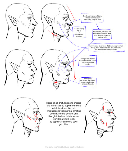
Here is a very, very basic look at how some of these features come to look the way they do, how they interact with one another, and how they compare between a blocky, rather conventionally "masculine" head and one that's much softer and slimmer.
Note please that it is not one or two characteristics that give a chaarcter their "look"; you can reduce a face to eyes, mouth, and nose through stylization and still have them be recognizable, but if you want to do more than that, you have to consider the whole package! Chin, cheeks, brows, direction of the jaw, slope and size of the forehead, depth of eyes, ridge of the nose, etc - I know this is probably far more than you bargained for, but if you start making note of a FEW of these things now and slowly add on, this will eventually become second nature to you.
Similarly, understanding how these characteristics come together will help you with rendering light and shadow in a realistic way, and predicting what their facial expressions may look like - if no two people are alike, neither are their smiles. :)
Lastly, remember that I'm no expert - I have developed my own methods and semiotics and yours may look slightly (or vastly) different, and that's fine! I hope only that by sharing this it has given you a base to work off of.
Anyways, I HOPE this has been helpful and not just the unsolicited ramblings of a face pervert.
669 notes
·
View notes
Note
what do you think about the fact that al likes doodling?
i have a head canon that he has some sort of scrapbook or sketchbook full of little doodles of things going on at the hotel and just in his life, I feel like he would draw really stick-figureish (is that a word?) but I read a fic that depicted it as the same art style as an Invader-Zim obsessed scene girl and I could not stop cackling.
I also feel like he would either guard it with his life from everyone (exception to Rosie, of course) or just not bother to tell anyone and one day they just find him doodling schoolgirl style, kicking his legs in the air, LMAO NEW THOUGHT WHAT IF CHARLIE OR LUCIFER FOUND IT
OH! OH! Now that you mentioned it - i LOVE that about him! I just absolutely ADORE little thing he made for the add in the first episode. And i love this fact because 1) he's the first character i like that likes to draw canonically (okay maybe also toothless from httyd?) 2) Me and Alastor share so many similarities, and even drawing???? This just makes me love him even more (i'm sure we would hate each other irl tho AHAHHAHAHA or maybe not, idk)
SO, SINCE ME AND AL ARE SO SIMILAR, I'M GONNA PROJECT ON HIM MY DRAWING HABITS >:3c Forgive me this one, i usualy don't do that, i usualy project characters on myself haha
He DOES have sketchbooks just to draw, and they are ORGANISED. He's numbers every sketchbook and counts every drawing in them since the first one. He also has two numbers for each page - through one sketchbook and through them all. He has over 300 of sketchbooks by now (I have less, only 56). They are stashed somewhere in a very safe place.
Every sketchbook has a date of first and last drawing. Also amount of drawings. It looks like:
NOTEBOOK 253 (number of sketchbook, also he doesn't call them sketchbooks)
03.06.1978-05.07.1978 (dates while it was active)
119 (amount of drawings)
29961-30080 (which numbers of drawings are in this sketchbook)
He would cound something else, but he's just too busy to spend time on it. He can remember something thinking about what he was drawing in that period and vice versa
He used to draw at overlords meetings, pissing off Carmila and everyone else, because it looked like he hadn't listened to them, so Carmila banned drawing at overlords meetings (Alastor is still angry about it)
But he doesn't progress too much - most of his progress was made through first 10-20 sketchbooks, now he only has slight style changes sometimes when he feels like it
Tho he's really proud of his current skill and used to think that he's literally the best (used to get angry when reminded that it's not true) (now he kinda knows, but still likes his own drawings, doesn't accept criticism and doesn't try to purposely improve)
He likes showing his drawings to people, he knows and if he does, you have to say that it's literally So Cool, show enthusiasm turning pages and say that everything is just amazing. If you don't, he'll be OFFENDED. He also can leave a sketchbook opened on a page with a drawing he likes the most, and it's like a sign "NOTICE THAT I'M DRAWING AND SAY THAT YOU LIKE IT"
If he considers you a friend (well not like Rosie, but at least like Charlie), he'll be showing you his drawings regularly (and you have to be enthusiastic about it!!!!!!) He has showed it to Charlie, but somehow her enthusiasm is... too much. She's too patronising about it. He also shows his things to Husk, he knows that Husk is annoyed and doesn't give a shit, and he just enjoys his annoyance. He also shows his drawings to Niffty and she gives him Just Right amount and vibe of enthusiasm. (He sometimes draws something for her fanfiction if he likes something enough and enjoys Niffty's reaction (she explodes from happiness)). BUT!!!!! He never shows anything to Mimzy. Because she's like, person from the real life, and he feels like she would laugh at it. To Rosie he shows only things he considers his best and her opinion is the most important to him. He can even forgive her criticism (wouldn't take it tho) (she never critisizes him and absolutely ADORES his drawings). Angel kinda likes his drawings, but isn't enthusiastic about them enough
He doesn't take requests (Angel tried "draw me like one of your french girls" shit, Alastor never did (also his ass did not get the reference and he was like "i dont??? have??? any french girls????")) (Vox also tried to make Alastor draw something for him, Alastor was just "that's interesting, i'll think about it" and never thought of it again)
SOME OF HIS DRWINGS TURNED OUT TO BE PROPHECIES but he notices that only when something happens and then he goes back to his old sketchbooks and accidentally finds it. They are just coincidenses tho, but it's fun and Alastor makes a big deal from it and screams to Rosie like "I PREDICTED THAT SHIT 27 YEARS AGO" when finds out. (it's how i predicted many plot points from SU and literally TOH hunter's possession before the show even was a thing JHJDFJHFGJFDHKH i wonder if i predicted something from Hazbin, i need to look through my sketchbooks now)
If you dare to mess with his drawings and vandalise them... oh... you better pray to whatever god you belive in to make your sufferings be enough to redeem your sins and go to heven.
#hazbin#hazbin hotel#hazbin alastor#sudden ask lol#alastor hazbin hotel#alastor#hazbin hotel alastor#the radio demon#alastor the radio demon#radio demon#radiorose#platonic radiorose#hazbin headcanons#hazbin hotel text post
252 notes
·
View notes
Text

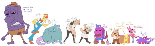
a year!!! as of today i have now been drawing these funny little pizza freaks, to the exclusion of almost everything else, for!!! an entire year!!! i wanted to do a nice group shot/lineup of everybody to compare to when i first started trying to draw them because oh boy were they bad. i never even posted most of them anywhere because they were so bad. but im posting them here, now, to see how everything's changed/evolved.
this is probably the hardest time i've ever had trying to figure out how to work with a style, but we got there eventually; i'm pretty happy with the handle i've got on everybody now...dont let ur memes be dreams. lots of unimportant journaling and idle thoughts abt it below.
older pics
the first one is the VERY first time i drew them, before i thought i was going to actually have any interest in drawing them [lmao]; it was just the one isolated image, for my friendserver, to illustrate the funney message, so there was no attempt to make it Good or actually understand anything going on w/ the designs or style.
second is the original run of practices sketches to start trying to figure them out for real; done after i started having ideas for the comics and such and realized oh god maybe i am actually gonna draw fanart for this. [again, lol, and lmao.]
third one is the first pt art thing i posted on here. there were a couple weeks of sprite studies between this one and the previous image. the one on the top right wasn't part of that post i just threw it on as space filler; i'd intended to shift to doing Sprite Redraws But Stylized to explore tings more, but that was the only one i did. ¯\_(ツ)_/¯
individual characters
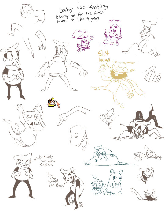
peppino: by far the hardest dear god. bro what ARE your shapes how DOES your face work. jesus christ. everything i have trouble with this style for, peppino has it in excess. i draw in polygons! i need consistency! and that is the last thing this kind of style is concerned with. they are made of squarshy clay and i do not understand how to mold them. i was really hoping trying to learn this game's style would GIVE me that kind of flexibility for fun exaggerated facial expression but i don't think much came of it in the end 😔. anyway on the bright side all this means once i got peppino figured out a little bit everybody else clicked way easier.
fake peppino: honestly i never did anything with him on purpose except for how his eyes work + the perma-smile thing. i figured ok hes supposed to look weird and off model so whatever happens with him happens. and it did. and it kept happening. it is still, in fact, happening.
noise/ette: somehow, for every bit that peppino was the least natural thing i've ever tried, these two worked pretty much right off the bat. i still don't understand it, seeing as pretty much all the things at play for peppino are also at work for them. i think the new sketches are actually a little worse than older ones but not enough that i care.
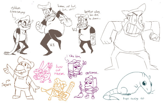
gustavo: really funny bc i drew him on model twice and just went 'okay, cool nice, easy, um. he doesn't have any fucking legs?' fortunately he was the only one i had a strong idea for how to stylize him [square] and it worked exactly as i was hoping so wahoo.
brick: is an animal and therefore 5000x easier and more natural for me to draw/stylize than anything else in the cast. that is Just a rat bro. i can draw a rat.
gerome: i think the funniest one here. the most drastic and least necessary change imo. i was gonna have him be really small at first, like smaller than the noises, but then i just... didn't. he's just peppino-sized now. also i gave him like. actual human facial structure, which is funny bc in most cases i'd do anything to avoid, but it works well for his being A Rock to give him some angles and definition like that+ to differentiate his vibe from the rest of the cast who are all very squishy. also since he is essentially Just A Head it's good to emphasize that too ig.
john: i only drew john a couple times but he gets to be here because i like him. and because most of the stuff i applied to gerome was readily applicable to john, though i did try to keep him a little more uncanny because he is a Huge And Lanky Freak. i hate that he is barefoot btw but idk how to make his color balance look right with shoes.
pizzahead: i did not want to put him on here honestly but i Have drawn him a handful of times and more importantly i didn't know what i was gonna do with john's pose if i didn't have him there to be glared at. the only thing that's different with him is giving him wider-bottomed pants, which i got from when i tried to draw these guys in clone high style [i never posted that one either][i will eventually]
snick: he gets to be here because 1. he's like 6 lines 2. i like him and 3. ive scribbled him a few times offhand and it went pretty well
misc
there are some guys missing because those are guys i didn't draw enough [or at all] to have gotten comfortable with them. sorry
i would have Liked to shade these but for the time being i have accepted that my grasp of light/shadow has decayed to the point im not going to be happy with anything i try there, so For Now i am working on my presentation with flats i guess. gerome has a shadow only because he's shaded like that ingame and looks naked without it
anyway if you are still reading [hi?] i get to shamelessly plug now. i'm over the hill of my pizza run now, and while i still have plenty of things i want to make here, most of the bigger more in-depth ones have passed. pizza tower was the first thing in THREE YEARS to get me out of my oc groove to doing fanart, and once i am done with my ideas here i will be going right back to it. if you like my art or how i write characters/interactions you should check out my oc/webcomic blog @jamverse . i can't promise people who like pizza stuff will be terribly into my designs, but i can guarantee i treat my guys with the exact same sort of tone i handle the pt guys with. and hell, i've mentioned it a few times before, but like 70% of my characterization for fake pep is just copied off one of my characters, so if u are going to miss him... he will still be there in spirit >;p
and if you dont care about any of that and are still reading thank you anyway. actually making these comics + seeing how shockingly well-received they've been has done a lot for my confidence, and for seeing that my kind of stuff IS something people enjoy :')
#pizza tower#peppino spaghetti#fake peppino#gustavo and brick#the noise#noisette#pizzahead#arting#pizzaposting
179 notes
·
View notes
Text
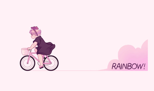
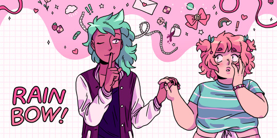
SUPER OLD RAINBOW! ART THREAD!!! Open only if you are brave enough to face teen me's cringe art...
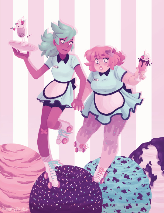
(mostly joking but fr white Mimi and skinny Boo jumpscare below)
Very first digital piece of Boo and Mimi circa 2011!! I was 14 when I drew this. Usually I'm able to look back fondly at super old art of mine but this one does make me cringe a liiiiittle bit. Mimi girl what are you wearing, why are you white. Boo also had pink eyes in the beginning, which she would continue to have for several years to come (even in the current iteration of RAINBOW! they were pink at first, I later recolored those pages) but it was only later that it was due to the color scheme of the comic and not because they were literally pink. I'm pretty sure they were meant to be contacts, because their hair is and always have been dyed rather than anime-esque natural colorful hair, so that was some crazy dedication from Boo back in the day.
More 2011 art showing off Mimi's goth/scene-ish style and green eyes. They were initially meant to have pastel and neon fashion senses, respectively. The story was already named at this point, only a few days or maybe weeks into its inception, which is impressive considering it has taken us literal years to name other stories (I'm looking at you, Phantom Pains)
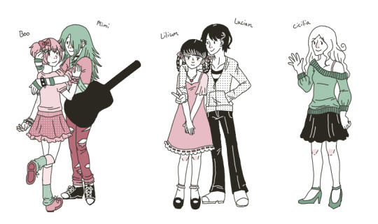
this one is from super early 2012! Interesting to think that this was less than 9 months later since it feels completely different to me. The first version of the comic had started at this point, and the pink and green color scheme was just starting to develop. This lineup features some characters that would later be cut. Lucian and Lily were friends of Boo, and Cecilia was Mimi's ex girlfriend. Notably Clarice is not on this lineup, and frankly I'm not sure why.
A picture I drew to commemorate 50 fans on RAINBOW!'s smackjeeves page, mid 2012. Boo's outfit resembled a recolored version of her 2011 outfit, but I have no idea what Mimi is wearing. What. are. you. wearing.
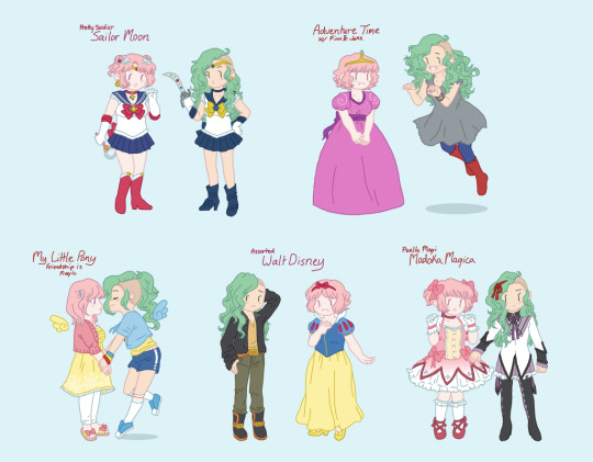
Chibi-ish drawings of Boo and Mimi cosplaying various characters, from early 2013. Homura Mimi is very funny to me, I really don't know why I didn't draw her as Kyoko. I assume I was trying to keep them as paired characters, but I didn't do that with the Sailor Moon or Disney ones, so I who knows why I did it with PMMM. Mimi's hairstyle changes to a shaved cut somewhere around this time, but it is much more dramatic than her current undercut, and her hair is still pretty long. Boo is wearing a closet cosplay of Fluttershy that I myself wore once. These also resemble the chibi-ish drawings on the chapter intermission pages of RAINBOW! Vol 1.
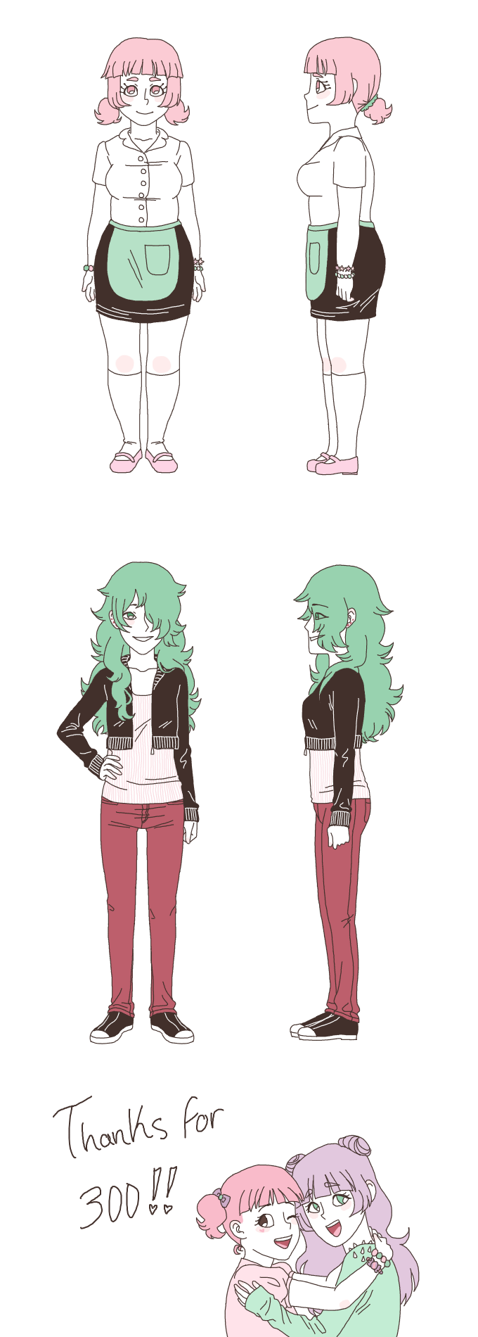
A character study I did in late 2013, which would be shortly after I made a major style shift into the art style that would eventually develop into the one I currently have. At this point, Boo was meant to be fatter than Mimi, but the execution wasn't really there at all. There is also a doodle at the bottom of me and Sunny at the time (I am the one with long hair), expressing thanks for 300 fans on smackjeeves. Considering it had 50 in mid 2012, the readership was pretty slow growing back then.
outfit exploration for Mimi, circa 2014. At this point I started to expand the color scheme a little bit more so that not every character would be paper-white, though she is still very pale even though she is no longer meant to be white anymore. None of these outfits really resemble her current style, and I don't particularly like any of them either. It took me a very long time to settle on a fashion sense for her.
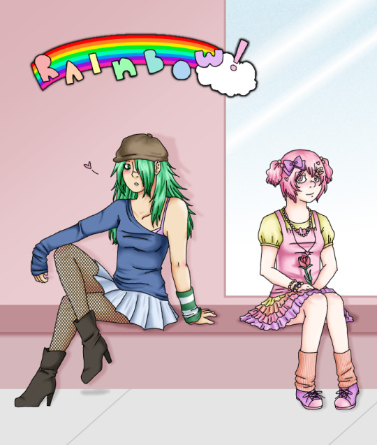
an Adventure Time-eqsue drawing of Mimi and Boo that I actually drew less than two weeks after the previous image despite the difference in things such as the way the hair was drawn. I had to include this one because it blew up overnight, which was a huge deal for highschool me, I remember checking my phone at school a lot because it was just getting hundreds or even thousands of notes over the span of the day. I think it has something like 16,000 notes. Still the post with the highest number of notes I have by far, so I guess I peaked in high school, whomp whomp
More fashion exploration, this time of Mimi and Boo, from early 2015. The color scheme is starting to approach what it currently is, but much more dull since I used to be afraid of bright colors. Mimi's fashion sense is starting to get closer to what it currently is, but the pastel goth influence that was popular in early-mid 2010s tumblr is apparent. In chapter 1, Boo wears an outfit that is extremely similar to the one with the bear shirt, except it's a rabbit instead. The dress that Mimi gives to Boo is also almost identical to the depiction of it here. This drawing implies that Mimi was originally going to be present in the film noir scene where Boo finds her mom, which is interesting...
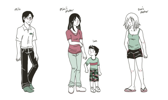
Another cast lineup! This one is from late 2015-early 2016. Mimi is wearing an outfit pretty similar to what she wears in chapter 1 but with the colors altered. The execution of Boo's body type is starting to improve but she's still kind of pear-shaped. Mimi is also a little more square, and her hair finally looks like the style she has now. Clarice gets to be in the lineup this time and she is SUPER tall. I think she is still taller than Milo. And Mimi is around 5'7"-5'8", so Clarice must be around 6 foot by that logic.
The original version of chibi-ish Boo riding a bike in her Kiki outfit, from 2016. I think it was meant to be a banner of some kind, possibly for tapas or tumblr. A newer version of this drawing features as a chapter intermission drawing in the physical book.
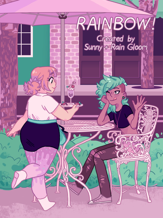
The original cover for RAINBOW! from 2017. The color scheme is finally starting to get a little brighter! This is actually a redraw of an older drawing from 2014, I want to draw it again someday. Also, I was going by Rain at the time.
A drawing I did in late 2017 for a class in which we were meant to try digital painting and I went for a very simple approach. I like that Mimi's legs are a little noodle-y. This is also the first drawing where Mimi's eyes are no longer green, but dark pink instead. By the language of RAINBOW!'s color scheme, that means they are brown. Boo's eyes are still pink, however.
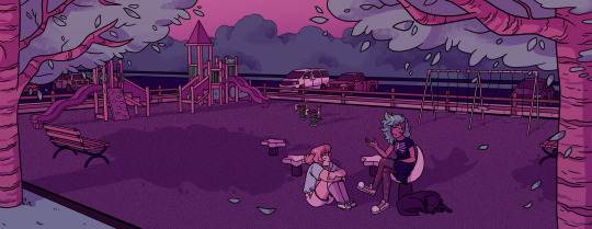
Another drawing for a class, this time from 2018. I can't remember the specifics of the assignment, but I used the opportunity to draw the playground and Max, the dog, for the first time. I like the way the trees look in this. That little snip of hair by Mimi's ear also made a reappearance here for some reason.
The original version of the drawing that would become the cover of RAINBOW! Vol 1, from mid 2019! I believe I drew it to be a banner on Tapas, but I used it for tumblr as well.
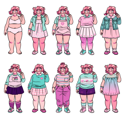
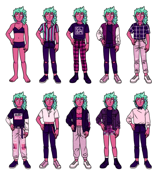
And lastly, Boo and Mimi outfit sheets from 2019-2020. I messed with them for a while, hence the timeframe. Boo's eyes are finally green, which I changed since I liked the idea of Mimi having green hair and pink eyes, and Boo having pink hair and green eyes, as if they are reflected a bit in each other. Outside of RAINBOW!'s color scheme, Boo's eyes are actually blue though. It took about a decade, but I finally settled on a fashion sense for Mimi.
BONUS ART!!! 💖💖✨✨ I thought these would be better grouped together rather than chronologically with the rest.
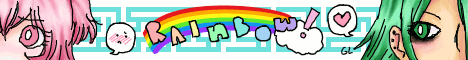
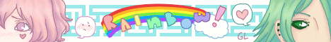
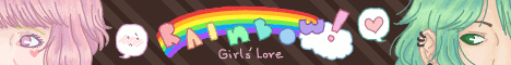


RAINBOW!'s banners from its era on smackjeeves! Smackjeeves didn't have square/circular icons but rather these thin long banners which could also be animated. I thought that was so fun, so I always animated them at least a little, even though one doesn't seem to work. It was customary to write girls love/boys love on the banner of mlm/wlw romance stories then, so almost all of them say that. I still see that trend on some comics on webtoon and tapas nowadays. They are from 2011, 2012, 2013, 2014, and 2017. I don't believe the 2017 one was ever used.
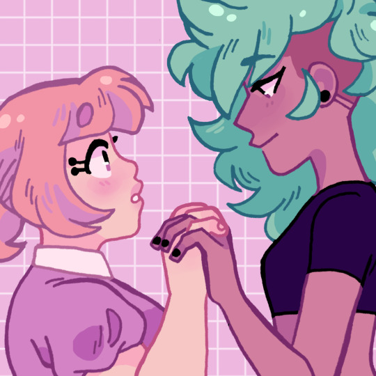
And RAINBOW!'s icon throughout the years! I always refused to change it, only update it, because I thought it was really cute. They are from (approximately) 2017, 2018, 2020, and 2021.
And finally, art from 2021 of Mimi with her cousin August, who will be the protagonist of our next comic, Phantom Pains. Weird to think that we'll be on that comic in foreseeable future, since it is also over 10 years old now. Bit of a passing the torch type drawing to end on. 💕 If you made it all the way here, thanks for reading! Hopefully it was fun and didn't hurt your eyes.
176 notes
·
View notes
Text
◾It always turns out that in every new fandom I draw one or three arts or comics and no longer appear in this fandom with drawings, no matter how much I would like to draw something more (I have a lot of ideas). It's just that every time I'm very busy after that.
◾It turned out the same way with Hazbin Hotel. I made one comic, drawn pretty poorly (but still it got over 20K NOTES, which is CRAZY, guys, this is the largest number of notes I've received here), and there were no more art from me.
◾But slowly I was able to draw the main seven in my own style (also redesigning Husk that was in the previously mentioned comic).

◾I could have drawn something better, but in general I like it)))
◾A few words about each design under the cut :>

◾Charlie. I didn't change Charlie much, just added pointy ears and removed her bow tie (because half of the characters in this series wear bow ties: Charlie, Alastor, Husk, Angel, Pentius, Lucifer, Vox—)
Oh, I also made her underhair... Coral color? This color is present in her original design in the form of lines on her hair.
◾Vaggie. I changed the shape of her hair and bow, also added ears.
Made an eyepatch more noticeable, and made the cross on her eye in the form of hairpins (although they do not have a practical use in this design, but I did exactly that to explain why in the series itself this cross does not overlap even with Vaggie's hair. This cross is constantly in plain sight).
Also changed the color of the pupil to orangish-red. Yellow somehow didn't fit here...
◾Angel Dust. Didn't change much: I changed his pink spots a little bit (also added a heart-shaped spot on his cheek). In case of his clothes, I added some yellow in it to match his right eye and golden tooth. And removed a bow tie.
◾Husk. I changed Husk A LOT. I wanted to make him look a bit more like his Overlord-self. I changed some patterns on his fur and wings, gave him a shirt and tie instead of bowtie. And removed a hat.

◾Alastor. Alastor was the first Hazbin Hotel character that I drew. And I LOVE how I drew him. His curly hair and deer ears, AH— And I made his eyes yellow to make them stand out and match his teeth.
◾Niffty. She just has freckles instead of red cheeks now XD.
◾Sir Pentious. I added a couple of interesting details, like a gear brooch and the iron inserts in the hat. And made his pupils white. And I also wanted to make visible scales in some places, because, you know, snake, but I couldn't do it presentably, so I made freckles instead :'D (I don't really like his purple-light version)
#hazbin hotel#hazbin hotel charlie#hazbin hotel charlie morningstar#hazbin hotel vaggie#hazbin hotel angel dust#hazbin hotel husk#hazbin hotel alastor#hazbin hotel niffty#hazbin hotel sir pentious#hazbin hotel fanart#hazbin hotel redesign#kinda
72 notes
·
View notes
Note
were there any specific styles/cultures you took inspiration from when designing the telchin clothing styles?
Honestly the tricky answer is: a lot-
Initially, it was very much just like “okay does this shape and colour palette and design look cool? Sick” and just throwing thoughts at a wall.
When it came to defining those broader shapes/colours and adding things like specific cuts, details, patterns, etc, I sort of worked backwards to grab inspirations.
Ulysses initial/main outfit is honestly quite Medieval, European (but notably Norse/Scandinavian in its cut/style), albeit with a ridiculously plunging neckline for some reason lol-
(it was even a bit early on that every time one of the cast drew Ulysses, we’d make his neckline just a little bit sluttier)
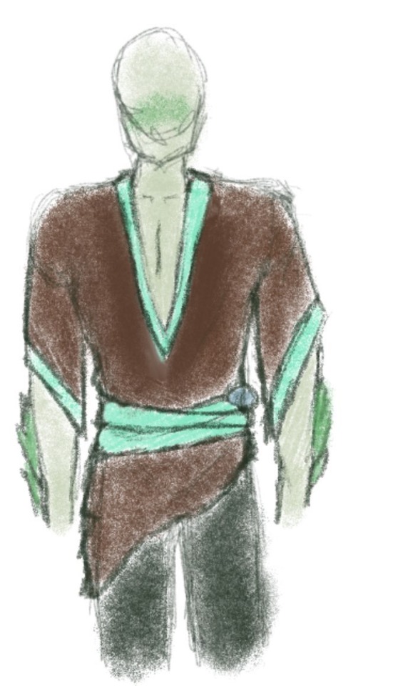
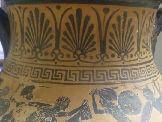
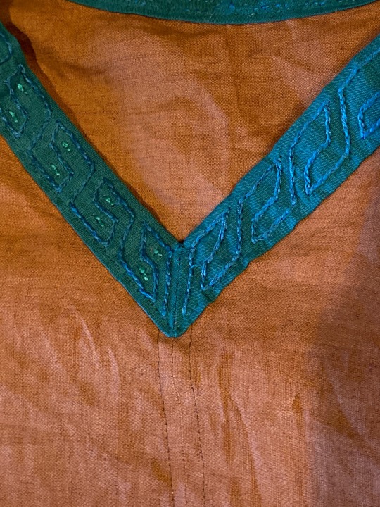
HOWEVER the details on the collar and sleeves are directly lifted from ancient Greco-Roman designs, specifically influenced by the “Greek Key” or “Greek Meander” pattern which can be seen in pottery, jewellery and architecture all over the ancient Mediterranean!

Specific to Ulysses, his clothing has currently reached a fairly fairytale-esque “fantasy” stage, drawing a lot of early Renaissance and pirate-style influences with his little poet-shirt and sash, since he’s been on the Overworld so much, and is slowly growing to become a part of that culture and world, and I really wanted to show that in his clothing changes.
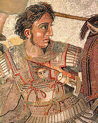
Honestly, a lot of the broader telchin clothing when I have sketched it up is very Greco-Roman, at least in the way I tend to depict it (that is my field of expertise, given my degree haha) but there’s honestly a lot of broader Mediterranean ties in as well. The army and their armour is designed to be very Ancient Macedonian, and a lot of the more casual clothing skew very Ancient Egyptian.

Canonically the Telchin clothing style also definitely develops rapidly over the course of the war with the drowned, mostly for practicality sake more than fashion (loose flowing fabrics aren’t doing anyone much good escaping the undead), leading to an almost 1950s/60s American aesthetic? Of course still mingled with the Greco-Roman patterns. Especially in the way the scientists are presented in lore/my art, they always had a very retro-60’s almost sci-fi scientist aesthetic. If I was to give it a fancy/proper-sounding name I think “Wartime-Americana Retro-Classicism” would be more or less it, potentially lmao-

(You can even sort of see similar shapes and patterns in that first reference image to Ulysses eventual design!)
There was of course always a flair of Victorian-Mad-Scientist too, because I have a bit of a brand and I can’t help myself. And given the blurring of science, alchemy and magic in Fable I think it definitely fits.
It’s a shame Tumblr only lets me upload 10 images per post on mobile because I have A BUNCH of reference images for all of these stages of the Ulysses/broader telchin clothing design lol, but sadly I can’t include them here :(
But I hope this was somewhat useful/interesting!! I’ve had so much fun coming up with this kind of stuff over the course of Fable s3 for the telchin and I’m very grateful to Ocie and Metta for kind of just letting me go ham on a bunch of aspects like this lol-
57 notes
·
View notes
Text
im so sorry it took me so long to answer these oml but YES i'd be happy to show how i draw and color :)
— SKETCHING
please note that i almost always sketch traditionally first lol it's just a lot easier for me to determine how the drawing is placed that way, but i always go over and re-sketch it digitally
for magolor i always start with a basic egg shape (lmao) and then i add his ears. then I draw the scarf; it's easy to determine the shape and dynamicism based on where the bottoms of the ears are located
then i usually add the cape and hood together. where and how these are placed and what these look like in general are very important because they're the main area that perspective is directed to (the ears and everything else is important too ofc!! but the hood and cape usually help demonstrate where he is looking and how he is moving the most). then i add everything else, usually his hands last!
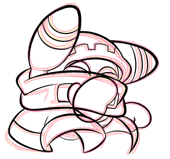
— LINEART
ohhhhhh god my worst enemy. Hope youre sitting down because this will be embarrassing LMAO
lineart is easily what i struggle with most and is more often than not the most time consuming and grating step for me. If i had a choice i would drop it in a heartbeat, but my style is so dependent on thick lines and shapes that it's difficult to 😭 a hole i dug myself into unfortunately ITS FINE THOUGH. ANYWAYS I'm getting sidetracked
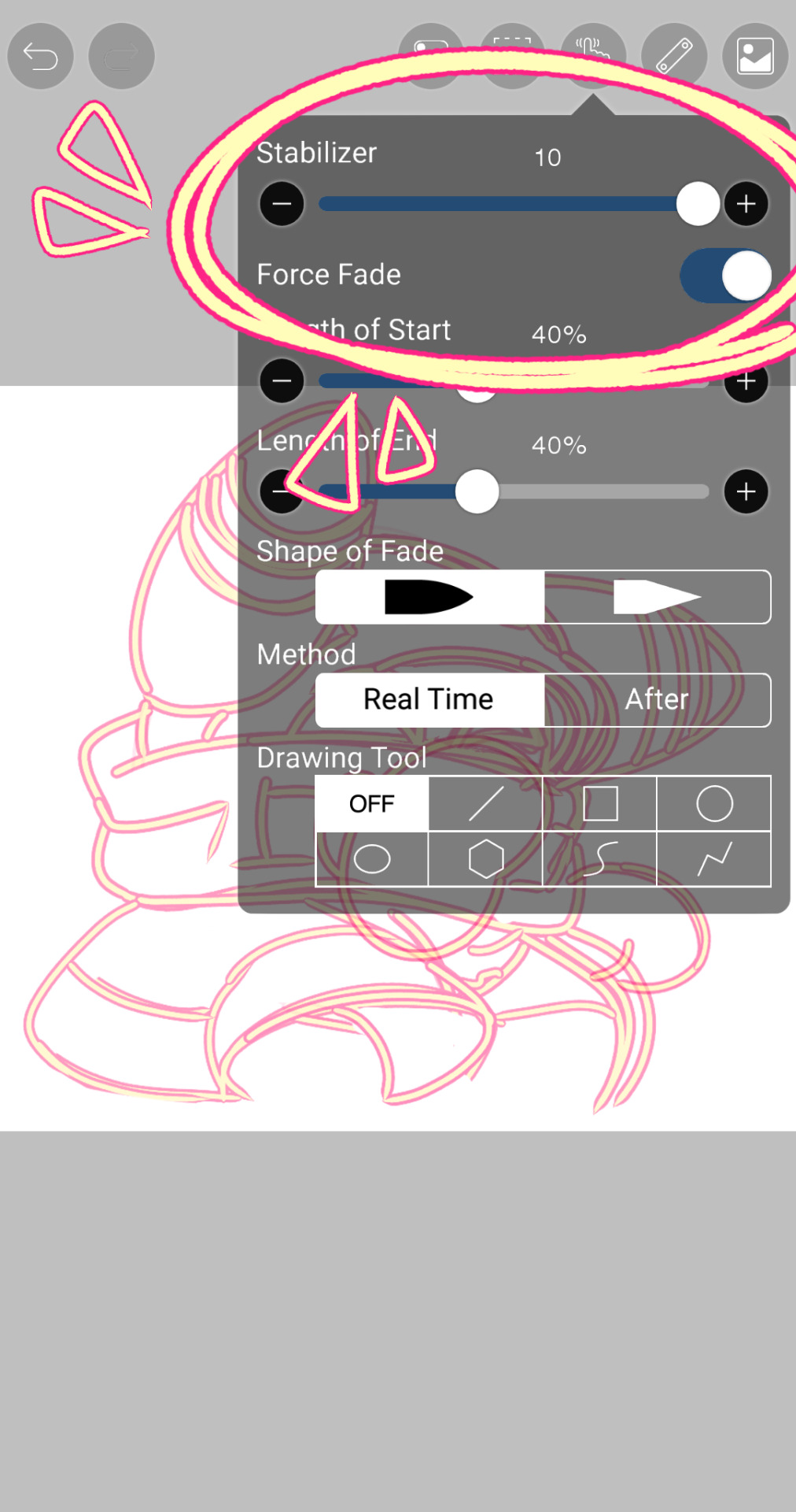
i use my finger to draw all my digital art, which means i usually have to use a Heavy stabilizer to avoid shakiness and staggered lines. Unfortunately ibis paint's stabilizer is actually dog water and doesn't even stabilize more than half the time (in which case i have to repeat lines over. And over. And over again until i get it right) but when it does like me and works properly it's very helpful!
i always use the soft school pen bleed brush as my main tool for lineart. This brush has been my best friend for everything, i even use it for sketching idk it just really like the way it looks lol. sometimes i change the aspect if i want the lines to look more ,, chalky?? or smoother depending on the work

i don't really use this tool much but for this specific piece, force fade was my partner in crime
also i think i need to mention that i use so many layers for this. So many layers lol like to the point it's embarrassing. and at the end i merge most of them (except for the gear patterns, rings on his ear, and eyes + hands, which usually need to be by themselves as they're colored separately) Thank you for layers
and i end up with this!
— COLORING && SHADING
yippee yahoo the fun part !!! the part that i love the most
at this point, if i havent already, i always create a folder for convenience in organization because this is the part that i stress the most about what details are on which layers lmao
then i add ANOTHER layer below that for the color, then i put every single color used on their own separate layer!
now, for shading, if im working on larger pieces with more complex shading, i'll usually plan it all out. normally when just drawing magolor, i don't really need to do this anymore because i'm so used to it lol, but for funsies i did it here anyways
then i use the bucket tool to fill them all in
i usually have a set color palette for all the characters i draw (though the way i shade white differs. A lot between my work as you can probably tell fhdfgf). For every color, i have two specific tones that are associated with the shading. for example, indigo + violet are shaded with my blue, pink + light orange (or lighter pink depending on my mood lol) are shaded with yellow, etc.
so, i shade the other areas with the 2nd shading color
a big tip i can give for coloring is to look at a color wheel when you draw. i know that sounds like. Such basic advice LMAO but that seriously was a huge help for me when developing my shading and something i learned while studying — if you notice, in all of the shading in my work, all of the colors used are analogous on the color wheel. note that not ALL combinations will work together like others obv !! but it's a huge step in knowing where to go with it
then i add other extra details like extra lighting, halftones (if i feel like it // if it fits the work), glow to his eyes, and color the lines and ta-da!
another tool i use a lot especially with my more recent art are blending modes, especially multiply. i use a clipping layer to add a dark color (usually a dark blue or purple) and set it to multiply, then erase the areas that emit light

and this is the end result! this is a very very basic demonstration of it fhdjg i was a pretty messy with the lighting and erasing in this example but you get the general idea right
and that's how i draw :) i hope this was helpful, and thanks for asking and being so patient with the response!
#ask#magolor#kirby#macdraws#ive wanted to make a tutorial for So long and finally found a bit of time to do it lmao
139 notes
·
View notes
Text
cardiomyocytes and connective tissue @nopanamaman
I’ve wanted to do a fic like this for some time now, a ‘thank you’ letter to PAFL and its community of sorts. I’m happy I finally got around to writing it:)
I wasn’t sure whether I should do this or not, but, hey! It might make someone feel a bit better!! Or, reading the fic will. That’s enough reason, I think, and you don’t have to read this, of course, no matter who you are.
First of all, I want to talk about PAFL a bit.
The first PAFL song I listened to was PiP. I saw its thumbnail when listening to some other music youtube, and so, I listened to it. Oh boy am I glad I did:)
I remember thinking how cool it is that someone's making songs for their OCs and that people are interested in them. I could see so much love for the characters in it. I was so happy when I discovered there were more songs like that!!
This was around when Comfort Zone had first come out, a week or two after at most. That was two years ago. I’ve been obsessed ever since.
I love PAFL. I genuinely love that songs haven’t been coming out much lately. Like, there’s media that comes out weekly and sucks shit. I’m glad Ferry is taking their time with this!!! Even if all we get each year is one song, that’s cool, because the community is wonderful and we also get doodles and art and now patreon stuff.. yippee yay… !!! And even if we didn’t. who the fuck caressss!!!!! I love coming up with AUs and OCs and theorizing with my friends!!! the time between songs gives us time to do all that:)
The characters are so charming. Every member of the cast has been a fave of mine at some point or another. They’re all so, real! I love them! I love how they fuck up and I love how they get fucked over and I love how they get exploded and killed and shot and hugged and saved and helped!!! They’re human… might not make sense, but i rlly do like them…
It’s so neat looking back at older songs and seeing how stuff’s changed. The art style, the music, it’s all so nice to look back on. Even if I wasn’t there for it.
And don’t even get me started on the worldbuilding.. Everyone say thank you to Boris Strugackij and Arkadij Strugackij for making roadside picnic and inspiring Ferry to make this… so lovely and neat. wonderful. I have not read it myself, but I might, just to be able to make my own pafl OCs more swagger..
So. This fic.
I can’t mention two years ago without at least mentioning my depression.
I can’t remember most of last year, speaking truthfully. Parts of 2021 are also fuzzy. Depression and anxiety are terrible, would not recommend. This feels cheesy to say, but it does get better!!! Slowly, unsteadily, it gets better!!! I don’t mean for this part of the post to be a ‘feel bad for me’ thing at all. Do not. I am safe and healthy now and I couldn’t be happier to be here right now.
Is life good now?? Sorta, but what matters to me right now is, I’m happy!!! It feels so surreal. I never thought I’d be like this. A part of me wants to be angry, to get depressed again about how I could have been happy all this time. But I won’t!!! Because then I’d spiral and forget another year, and, I don’t want that!
Which is so cool!!! I can like, fucking, do stuff now!! I can throw away the bad thoughts, embrace the good ones, encourage myself!!! I do things!!! I go outside and goddd dude that’s so good!! I go outside!!!
I’m doing stuff! I’m drawing, writing, cleaning my room, taking care of myself!!! If I didn’t stay alive to enjoy these small joys, what am I even here for??
And I’m alive!!! I’m here!!! I made it, I’m here, writing this on 10th november, 2023, and I’m ALIVE!!!! How cool is that???
And yea, the world is shitty, it sucks ass, but, my friends don’t!!!:3 and that’s more than enough for me… SHOUT OUT TO MY FRIENDS!!! I LOVE YOU DUDES!!!
Moving on:
It doesn’t feel right to say that I’m here now only to PAFL. But, what I can say is that it’s been a wonderful crutch for me!! It’s been something to focus on, something silly, but also something I can relate to, and something that inspires me to make my own stuff! I’d most likely still be here, were it not for these silly songs.. but, not sure I’d be as alive as I am now! Unsure if my heart would feel right in my chest! And I wouldn’t have met my amazing friends!!!! Everyone here is so nice.
Dima may be a bit OOC in this fic, and that's because! This fic is based on my own experiences, which, i don’t think is bad…
I could talk here forever about how it gets better. Butttt to be quite honest I don’t wanna lol. I just wanna say, Thank you! to Parties are for Losers, for being cool.
(Though I also wanna say, don’t put Ferry on a pedestal, they’re human, we all make mistakes, all that stuff.)
Ok time to go back to my manly Sergei ways and never talk about emotions ever again. or as anya would say: FUCK IT WE BALL!!!!!
145 notes
·
View notes
Note
Hello I stumbled across your profile and I just say I love your art style! I've gotta ask, how'd your develop it? And do you have any advice for someone who can't decide what they want their art to look like?
Thank you so much!
To be entirely honest, I don't feel like I truly "developed" my style. I feel a lot more like I finally let myself draw it! But I am incredibly deliberate with my work, and I do have clear tendencies and preferences... So I'll do my best to explain how I got to where I am now as an artist.
It's important to remember that "style" is something of a nebulous concept. It changes with you as you grow as a person, and most artists can work in and emulate many art styles! Art really is a form of communication with yourself, and your "style" is a reflection of the tendencies and preferences you have. My art does not look how it looked 5 years ago, and my art will look different 5 years from now too. I've changed, and my art reflects that!
(2012, 2018, 2023; two pieces I remember being incredibly proud of and considered my best work up til that point, and then my most recent piece)
What you need to do, as everyone will tell you, is study the fundamentals (anatomy, perspective, form and structure, lighting and shadow, color, and composition) so you have the proper tools to make the most informed decisions possible about your art, and so you can deliberately break or follow rules as you please for your desired effect. I know it sounds silly to learn rules if you're not gonna be following them anyways, but they help you be much more consistent and intentional! More knowledge is NEVER a bad thing to have!
However, I know it's a bit demoralizing to just be told to study fundamentals. Everyone knows you're supposed to do that, but it takes YEARS to learn, and people want their art to feel how they want it to now (which is very very very normal to want!)
So on that front, I have 2 follow up suggestions that I personally find helpful (of course, everyone is different, so it's not like this is the only way to learn! But, if it resonates with you, it might mean it will work for you too.)
1: Separate study from application
I believe this is beneficial for a few reasons:
If the goal of every piece is learning, it can become frustrating, overwhelming, and boring
It's harder to self critique when there are multiple variables to investigate. I like to study one fundamental at a time
Study (usually) works best with a large quantity of output, whereas application of knowledge (finished pieces) is often more satisfying and effective when you get to take your time
Deliberate practical application of what you've learned in a finished piece helps cement the learning in your mind, and also lets you get satisfying finished pieces with noticeable improvement after a good study session!
I've found that keeping these things separate helps me improve faster and more deliberately, and it takes a lot of the pressure off of both aspects! I'm not worried about my studies looking beautiful, they're just to learn! And I don't feel pressured to critique my finished pieces, cause they're just for fun and to make something pretty. I personally find this helps me have a much healthier relationship with my art.
When studying, copy! Copy things as best as you can, all the time. It gives you something to compare to for self critique (and of course, if you're copying someone else's work and you share the study, ALWAYS give credit, share the original, and say it was for study.) In application, don't copy: reference. Make it yours!
2: Let yourself do the things that feel "easy" or like "cheating"
This one is simpler: nothing in art is easy.
If something feels easy to you, most of the time it's not because it's actually any easier... It's because it's part of your natural tendencies and preferences! This took me forever to realize, but as long as you're actually doing some study, then you're learning. You don't need to learn All The Time. When you're doing the "application" portion, you should let yourself do whatever is actually the most fun and feels easiest! This is where your style will start to come through, and where you get to learn about yourself. Take the pressure off, and have fun!!!
The only cheating in art is theft. If you're not stealing, then it's allowed!
My whole life (and yes, still!) I'd get regular criticism about both my style and my subject matter. You will too. You'll see a thousand different styles, and a hundred different things to admire in each. Your heart will ache that you don't draw like others do.
But art is a form of communication with yourself. It's like your voice, or your accent; just something that's a part of you! It can be fun to mimic others', but when you sit to have a conversation you speak naturally. (I know some people want to and do change their voice, but this is a metaphor and metaphors aren't perfect)
Don't stress so much about what you want your art to look like, especially if you're not sure. There's a lot of value to be had in constant experimentation, I think it'd be rather boring to only draw one style the rest of my life. What I draw is what I want to see, right now, for who I am now! It's a part of me and comes naturally, if I let it!
I hope this helps!
#justbrowsing1124#asks#art tips#drawing advice#drawing tips#art advice#long post here sorry#long post#I could have gone on so so so so so so much more but this took me like 2 hours to write#and I've gotta go to bed! haha#so if you feel like something wasn't properly explained you can send a follow up ask and I'd be happy to elaborate#I love answering questions like this#sorry if it sounds a bit condescending I wrote the post for like... what would have helped me to hear when I was just starting out#so I wrote it basically for how I think would help I guess a kid#sorry about that. the content is still all what I think though#also I realize that i didn't really talk about like... my journey... at all here lol.#I guess if you wanna know my personal journey I'd love to get into it!#but i focused a lot more on the second part#cause yknow#that's kinda what my journey was internally anyways#but yknow no fun progress of my art with notes about what I was doing and why#but fuck that sounds fun if someone did wanna know about that LOL#I am VERY deliberate with my art I could legit analyze every piece#pretentious? maybe. do I care? not at all.#why make it if I dont have a reason?
109 notes
·
View notes
Text
This has been on the horizon for a while, but I think a part of me just didn't want to admit it until recently. I'll cut straight to the chase, you probably won't see much RA content from me anymore.
The topic of the fandom, the tags or quality of the posts have been discussed a few times already -mostly by me I think which should have been a warning sign haha- so I'm not going to go into too much detail. I'll just share my perspective.
The fandom simply just doesn't have much to offer me at the moment.
Everyone knows that a huge part of my interest in RA was and always has been TRR Will. If he didn't exist, I would have lost interest in the series a LONG time ago. But I can cook my own meals for only so long before I get tired and want to eat out for a change, and unfortunately for me no one is serving the food I want at the moment. I still love love love this man, but there just isn't enough content for him in the fandom (except the ones made by me) for me to want to actively keep engaging with it.
Not only that, art just doesn't get the same reception as it used to here. If I can draw another interest of mine and get triple the engagement, then it's just easier for me to be motivated to share my art of that other thing. Sure I draw because I want to first, but suprisingly for everyone I do want to draw things other than RA. And if those other things are more appreciated, then it just means I'm more motivated to keep posting them for everyone else to see. Most people probably remember I used to be very active in discussions and character analyses on here as well, but I just don't see the space for that sort of content here anymore. (Sorry to that one anon who said they liked my writing, you know who you are)
I still love RA and TRR Will, but I'll probably keep my thoughts or the occasional sketch I draw for myself from now on. I just don't feel motivated to share it.
Also just in case anyone asks my opinion after the recent discussion at the ask blog; yes, I don't like the current state of most of the posts here either. I don't want to go out bad-mouthing others though, the current style of content in the fandom just isn't my taste. Which is alright, maybe I've simply grown out of the series! The book getting newer fans is a good thing and I hope they have as much fun as I did when I first joined. This fandom has been my home for years now but I think it's around time I go out and explore more.
I'll still keep up with the series. Again, my fixation on Will is very much alive and well. It sucks that I don't have the energy to share my passion with others anymore, but I'm sure people will do just fine without me mauling every other guy that completely misunderstands his character to death. Don't get me started on the beard shit, genuinely frustrating how a fandom revolving around a book series has 0 literacy at times.
TLDR: I'm not going to be active in the RA fandom anymore because of multiple reasons. I still love TRR Will but I'm not motivated to share my work here in the current state of things. I loved my time here and I hope everyone else does too.
-
Also if my feelings change in the future, then that will be that and I might come back. I'm not sending myself off to exile here. I'm not writing any of this because I believe I have to explain myself either, I'm doing it because I simply want to avoid causing people confusion. Feel free to send me RA related asks still, just don't expect to see me around the RA spaces as much. I'll stay in all the servers obviously, and my presence will be around indirectly since most of my friends are still here. Also, if you draw TRR Will do feel free to send him to me in the dms. Love that guy and his apprentice so much, wish more people did.
39 notes
·
View notes
Last Seen Blogs

dhsqfg72-blog
Untitled

kupfergeist
Hauntingly Divine is the Flesh made Mechanical

hunters-jumpers
You Are A Great Champion

yjlsexdoll
Untitled

nalvdgkkkdba
假证哪里可以办【网址★bzw987.com】