#fandom tier list
Text
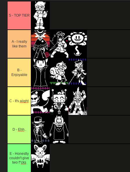
I MADE AN “All Spooky Month People!!” Tier List :D
Feel free to do!!
#spooky month#sr pelo#sm#skid#pump#skid and pump#lila#bob velseb#kevin#streber#sm jaune#sm jack#sm John#tiermaker#tier list#spooky month tier list#fandom tier list#my tier list maker
18 notes
·
View notes
Text
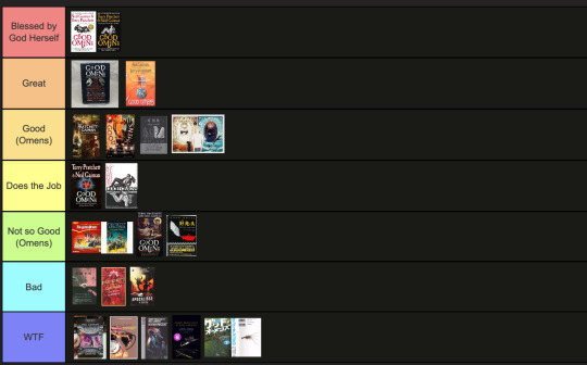
The art director & the Good Omens book cover tier list of doom, part 1
part 1 l part 2
This is going to have to be a multi-part series because there are *checks notes* 64 different covers that I've found so far.
I am your resident Art Director/Good Omens enthusiast,
and welcome to my completely meta-free book cover tier list.
Listen, making a book cover is HARD. I should know. But while we salute these artists for their hard work and time, I think we can all admit that once in a while, the vision is just not on. And on very rare occasions, publishers seemed to have managed to commission the cover art directly from hell...
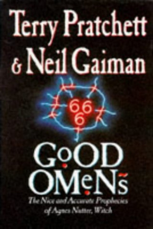
1. The original UK cover
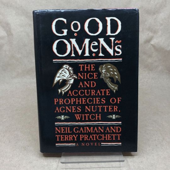
Ahh, the standard by which all shall be judged. We're starting off with a nice & easy cover, with adorable woodcuts of Aziraphale and Crowley flanking a custom Good Omens font! While I have to take a few points off for the terrible kerning of the word "GoOD", the blockprint vibes and general bitchiness of Aziraphale's teeny weeny wittle face, along with the sick colour palette puts the orignial in my good graces.
Tier: Great
2. The duelling US covers
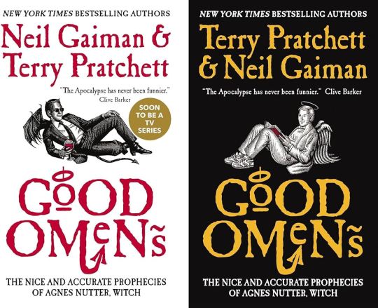
Progress! Hail to the designer who figured out trying to make "GoOD" and "OMeNs" fit the same width was a fool's errand, and even managed to IMPROVE on the original handmade title by adding a little halo and devil's tale to the design. Aziraphale and Crowley are facing each other, while also managing to serve absolute cunt. Aziraphale is wearing EIGHTIES SNEAKERS. Crowley's little snake boots have HEELS. They've managed to keep the woodcut vibes and colour simplicity, while balancing out the full title of the book. Both authors get to trade off on who's name comes first! Dare I say, this is a work of genius. I could dock some points for Crowley's sad bat wings growing out of his right clavicle, but who am I to question greatness.
Tier: Blessed by God Herself
3. The Halo Master Chief(?) cover

How the mighty have fallen... As a Canadian child, I was subjected to maybe the most horrifying ad in existence by the War Amps warning children about machine safety. This cover is the paper embodiment of that ad. I am confused by the purple haze. I am frightened by the seeming ethereal flatness of Adam and Dog. I am strangely aroused by Aziraphale's eyebrows, and intensely saddened by the terrible outline/drop shadow they had to inflict on the type to fit "Pratchett" in that god awful space.
Tier: WTF
4. Germany, Ein Gutes Omen covers
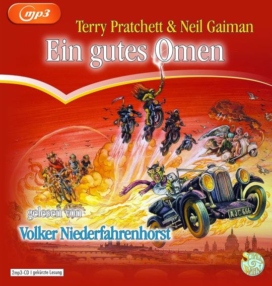
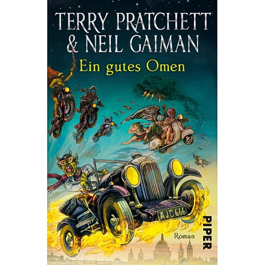
This cover inexplicably exists in two colour ways: red and teal. I put the audiobook cover here so you could experience the full illustration, and also how fucked up it is that they cropped the book version to include three horse-people of the apocalypse, but cut off DEATH on the regular cover. Points must be given for drawing a pretty slick Bentley, but I think we have to take even more points away for turning Crowley into a Ray Charles/Mike Wazowski hybrid. The ducks are nice.
Tier: Not so Good (Omens)
5. Germany, Ein Gutes Omen covers continued
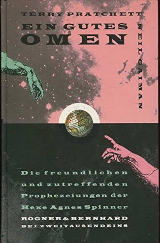
I don't know if the German designer of this cover *knew* that they were using western yeehaw cowboy woodblock letters when they made this cover, but judging by how they spaced the rest of the text at the bottom, THEY DID NOT CARE. And that seems to be a running theme for this one. We get kind of a duality thing going on with the black and pink background, but it just seems like somebody whispered the general themes of Good Omens into a jar, and threw it down a well, and this poor chap came along and picked it up. The baffling choice to align every piece of text on the cover *except* Neil Gaiman's name which is right aligned and rotated 90 degrees (not even real vertical type) will haunt my dreams, I think.
Tier: Bad
6. US, UK The Traffic Jam cover
For the love of Good Omens, WHY. I can think of so many more interesting symbols to put on the cover of this book than the ODEGRA SIGIL TRAFFIC JAM. Props for keeping the good colours and type, but like, I think this cover was secretly designed by @amtrak-official, or someone who just really, really likes public works.
Tier: Does the Job
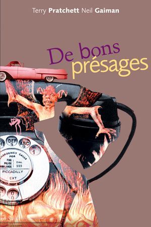
7. France, De bons présages cover
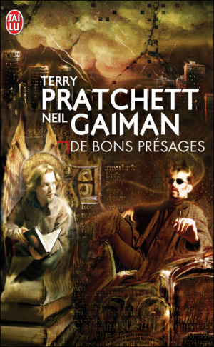
Leave it to France to make sure people know that Aziraphale and Crowley fuck severely. While I can't condone leaving out half the title of the book (and thinking a red carpenter's square counts as decoration), I can begrudgingly acknowledge that Ron Pearlman and Benedict Cumberbatch's love child is excellent Crowley casting. I think I give this a solid dark academia/10.
Tier: Good (Omens)
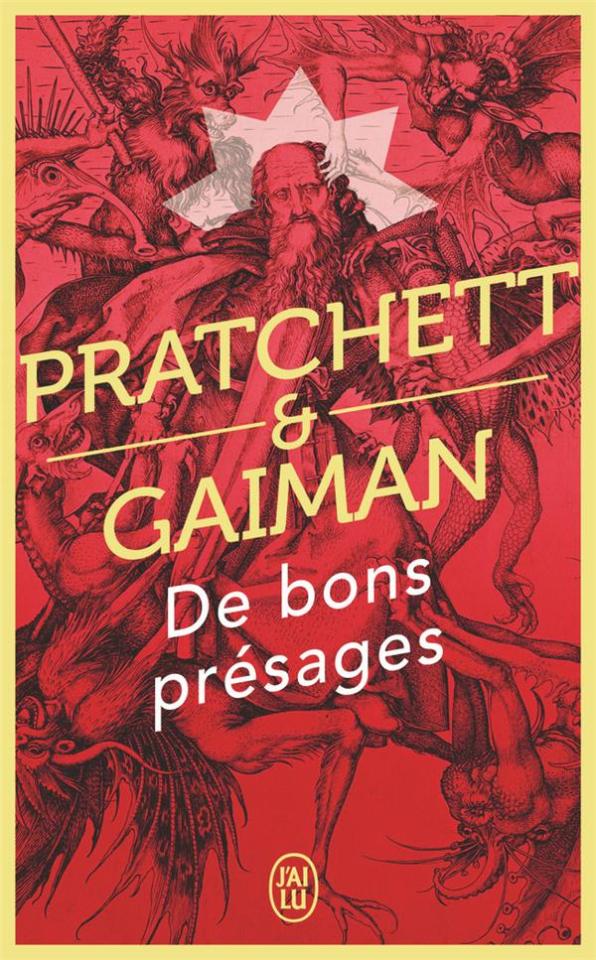
8. France, De bons présages covers continued
Just imagine with me, if you will, the absolutely hilarious reality that this cover posits: Good Omens is exactly the same in every respect, but Crowley drives a pink 1950s convertible. Why do all of the colours on this cover look like they've been pre-digested? Why are the font choices and placement so bafflingly bad. My face is the demon's face holding that car. I feel his pain.
Tier: WTF
9. France, De bons présages covers continued
Minus points for not managing to write the full title of the book once again. I don't know what it is with the French. They seem pretty set on Good Omens being demonic. While I do appreciate a good Bosch-style demon party, the dude in the middle confounds me. All-caps Museo Sans that isn't even *centred* in the frame is just so lazy. I am le tired.
Tier: Bad
10. France, De bons présages covers continued
Uhh. The font. The font is okay.... I think? Yeah. The font and kerning are. Okay. OHHH GOD I LOOKED DOWN BELOW THE TEXT WHYYYY.
Tier: WTF
END of round one. I need a nap.
#good omens 2#good omens fandom#good omens#art director talks good omens#tier list#cover art#aziraphale and crowley#aziraphale x crowley#book cover#go s2#gomens#good omens analysis
251 notes
·
View notes
Text
Tier ranking Belos based off of how screwed up he is.
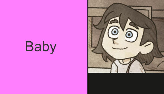
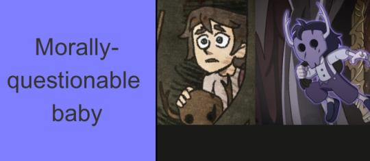


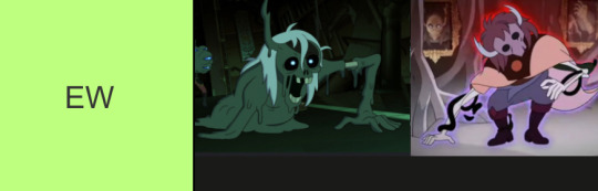

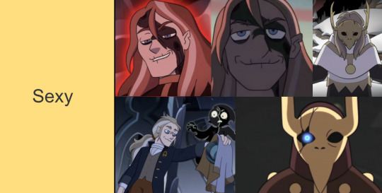
#beware the pipeline#yk it’s bad when he started off as baby and ended as AAAAHHHGH WHAT THW FUCK#I could fix him but whatever’s wrong with him is funnier#can we collectively bring back fanon Philip as a fandom#please#I miss him#giggling at how the majority of the photos are in the sexy tier#the owl house#toh#philip wittebane#emperor belos#owl house#belos#tier list#toh tier list
266 notes
·
View notes
Text
here's a long ass Tumblr sexyman tier list. judge me as you wish
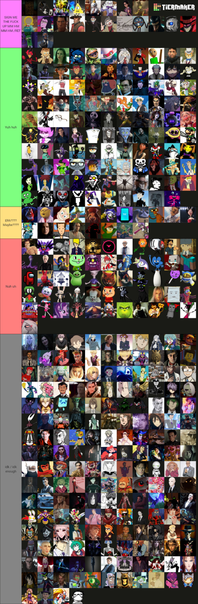
#tumblr sexyman#tier list#I don't think i can tag all of these fandoms so I'll just tag the ones in the SIGN ME THE FUCK UP tier#i have no mouth and i must scream#ihnmaims#portal#portal 2#crash bandicoot#gravity falls#jack in the box#Cuphead#team fortress 2#tf2#showdown bandit#omega mart#ok ko#ok ko let's be heroes#tsp#tspud#dhmis#venom#villainous#veggietales
123 notes
·
View notes
Text
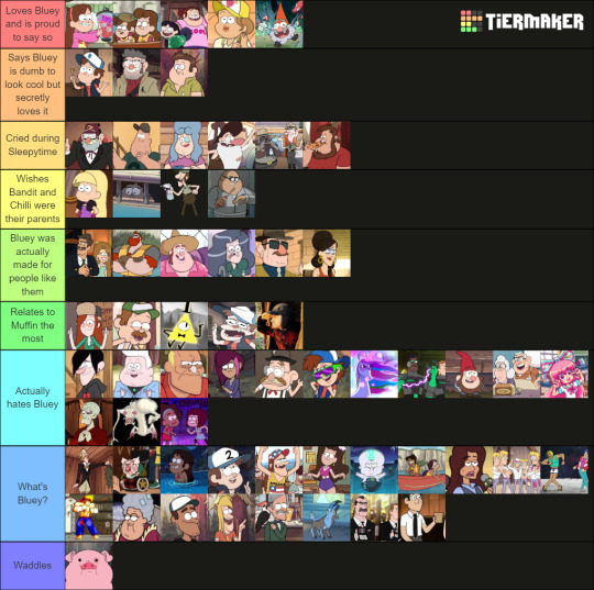
Gravity Falls characters ranked solely by their views on Bluey
Feel free to do this yourself here
#gravity falls#bluey#Dipper Pines#Mabel Pines#Stanford Pines#Stanley Pines#Grunkle Stan#Grunkle Ford#Muffin Heeler#Bill Cipher#gravity falls fandom#Bluey meme#bluey memes#gravity falls meme#gravity falls memes#tier list#tier maker#That GF FAN#ThatGFFAN
168 notes
·
View notes
Text
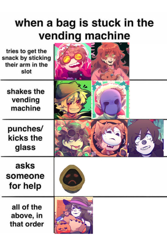
VERY IMPORTANT NOTE!!!!! jack is only in "shakes vending machine" because he's too proud / socially exhausted to ask someone for help.
thank you for coming to my ted talk.
#creepypasta#creepypasta proxy#creepypasta slenderman#slender proxy#slenderman#slenderverse#tier list#meme#creepypasta fandom#creepypasta fanart#ben creepypasta#creepypasta family#slenderverse fanart#slenderman fanart#proxies#proxy#jeffrey woods#jeff the killer#ticci toby#toby rogers#tim marble hornets#tim masky#eyeless jack#jane the killer#ben drowned
56 notes
·
View notes
Text
Hazbin Hotel Tier List Chain Game

Link will be below - https://tiermaker.com/create/the-complete-hazbin-hotel-character-tierlist-15295874 (You can add pictures to this tier list too)
Keep the chain going->: @lokis-imaginary-friend , @jyoongim , @ohdeerfully , @redfoxwritesstuff , @selineram3421 , @yukiinee , @ohmylovewhereartthou-blog , @91062854-ka @penelope-potter
#tier list#hazbin hotel#hazbinhotel#hazbin hotel tier list#my tier list#tagging game#tumblr tag game#tag chain game#tier list game#hazbin hotel alastor#alastor hazbin hotel#hazbin hotel vox#hazbin hotel velvette#hazbin hotel mimzy#charlie hazbin hotel#hazbin#hazbin angel dust#hazbin fandom#hazbin hotel 2024#hazbin hotel lucifer#hazbin hotel season 1#hazbin hotel susan#hazbin husk#hazbin lucifer#hazbin niffty#hazbin rosie#hazbin vaggie#rosie hazbin hotel#hazbin vox#hazbin hotel valentino
64 notes
·
View notes
Text

Tierlist update!!!
I watched the movie 3 times at this point and got a pretty solid idea of what I like! This of course can always change but I'm in a sorta happy place now.
I dropped Fear x Anger and Sadness x Embarrassment by one tier, I also added Anxiety x Joy, Anxiety x Fear and Anxiety x Ennui :)
What is your tierlist like? Make it right here!
#I won't add all the possible ships#mainly because it really doesn't make sense#also keeping Envy out of this for obvious reasons#Feel free to share your tierlist here I'm always interested#inside out 2#inside out#inside out fandom#tier list#inside out anger#inside out disgust#inside out joy#inside out fear#inside out embarrassment#inside out anxiety#inside out ennui#inside out sadness#anxifear#anxiety x fear#disgust x anger#anger x disgust#starnerve#brickoli#panicfrog#fear x anxiety#anxienn#anxiety x ennui#ennui x anxiety#sadness x joy#joyness#sadness x embarrassment
185 notes
·
View notes
Text
found some old tweets frm my private diary acc logging errant thoughts i had while getting into hs
and well. smth abt the progression of it makes me emo. happy new year ig :')
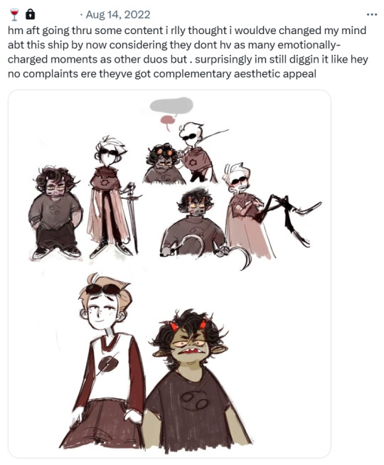
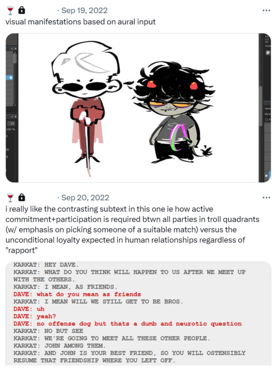


#srry misleading opening img. i am actually asian#homestuck#2024#vioart#karkat vantas#dave strider#sollux captor#davekat#ok ya i did cry a little#esp since these were like. littered here n there btwn vents of struggling w mental health executive dysfunction assignments etcetc#so it was kind of (a lot of) cope. but id say it worked well considering im now here livin my online cringe life :)))#took me super late in the year to actually join the fandom tho so theres a huge gap of absence and my tweets p much ended there#my final tweet was “captor fans 🤝 trekkies” hgehe it makes me kick feets to see those fandoms crossposting on blr :)))))#but aye these are just the tweets relevant to the lore behind my fanart the rest is for me to keep priv...#esp the character tier list! 2nd half of that had to be redacted for my protection LMAO
88 notes
·
View notes
Text
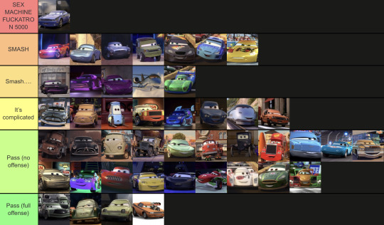
In case anyone was wondering here’s my take on all the cars 1-2 characters
91 notes
·
View notes
Text
My UTYellow character tier list:
(Starlo was originally on top but I realized that I only started liking him because of that one animatic that made him look hot. So it was a very shallow liking of him, especially since I didn't really care for him all that much before seeing the hot fanart of him. So I swapped his place with Martlet.)
{Also, just realized that Clover wasn't on this tier list, I'd put them in Top Tier}
Link to the Tier list (hopefully it works)
#Remember to respect my opinion. I know the Undertale fandom can be pretty toxic but that does not give you an excuse to be a douche-bag#undertale yellow#tier list#character tier list#yellow#clover#martlet#starlo#uty#ceroba#axis#north star uty#clover uty#undertale#dalv#flowey uty#el bailador#decibat#fiesty four#edward moray mooch ace#yellow soul
55 notes
·
View notes
Text
Okay. I've stayed inactive for too long so here are my personal (keyword : personal) thoughts on different obey me characters starting with the brothers (in this order) ->
Lucifer and Mammon || Leviathan and Satan || Asmodeus, Beelzebub and Belphegor
Lucifer
• My second favorite
I really like his design and personality (Except for the red themed part of his design I feel like it doesn't make sense but I've talked about it in my Lucifer redesign post so go check it out <3 )
I often find his reactions and his way of thinking interesting but what I like the most about him is that tired pathetic overworked single father energy he has going on.
What I do dislike about him is that the game pushes the ''sadistic'' side of his character way to much in his relationship with his brothers. Like. What? Why??!
I understand that his sadistic side can be attractive if aimed towards the player, but his brothers??
We know for a fact that he's overprotective of his brothers and that he may act very strict but loves them unconditionally. So : why the fuck does the game highlight the ''sadistic heartless older brother that bullies his siblings thought weird punishments for any mistake that they make'' trope, like it's the direct opposite of Lucifer's intention...
Plus tying his brothers up feels extremely wrong and is weirdly suggestive?
So yeah. But other than that I just want to make him a coffee and give his a soft kiss on his forehead :)
Petnames I give him : Star, Stardust, Lu/Luce/Luci, Avatar of gays (dw)
Mammon
• I have mixed feelings about him
First of all, I LOVE his design. Dark skin + white hair as always been an amazing combination, he does not disappoint.
What I have mixed feelings about is his tsundere side. On one hand, it's pretty fucking adorable. Blushing pathetic men are amazing. Though once again, the game pushes that side of him far to much in my opinion like okay it's cute I agree but that's not the only interesting part of his personality pls give us other sides of him like yeah cool you ''don't even care if I get hurt or anything'' but I'm just here trying to stop your brothers from killing each other can you help please? Also the fact that his brothers always insult him is just there to be there cuz we know it hurts is feeling but we can't do anything about it other than insult him too or try to confort him like pls let me slap his siblings when they do that or give us a way to make it stop it's pissing me off.
They also don't make him show any remorse about his greed which feels very odd to me, like at the very least make him realize his mistakes or at least acknowledge the problems he caused. The idea that he can't stop himself from making the same mistakes over and over again because of his sin is good but make him a bit more self aware of it like he's not THAT dumb and I feel lile he does care. (especially when his mistakes ends up bothering and/or pissing off his brothers).
In conclusion, We know he has the biggest crush on us but don't make it his whole personality please, there's other very interesting parts of him that I didn't find explored anywhere and it's pretty disappointing.
Petnames : Mamms and Treasure
That's it for today, I'll post the next one as soon as my brain and motivation lets me!
Much love!
#obey me#obey me headcanons#omswd#obey me au#obey me drabble#obey me lucifer#obey me mammon#obey me reader#obey me mc#obey me fandom#obey me fanfic#original character#tier list
33 notes
·
View notes
Text
The art director & the Good Omens book cover tier list of doom, part 3
Part 1 l Part 2 l Part 3
I am your resident Art Director/Good Omens enthusiast, and welcome to my completely meta-free book cover tier list. Listen, making a book cover is HARD. I should know. But while we salute these artists for their hard work and time, I think we can all admit that once in a while, the vision is just not on. And on very rare occasions, publishers seemed to have managed to commission the cover art directly from hell... here's where we left off last time:
21. Labas zīmes, Latvian cover
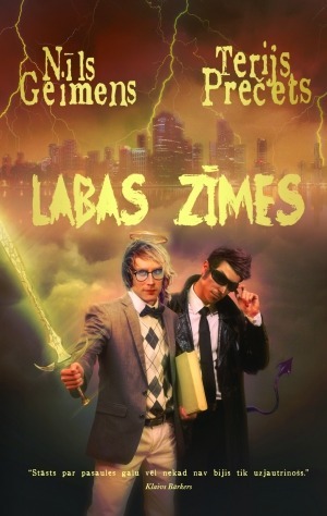
Our boys are back! And they are so ready to join the Dead Boy Detective agency. I would say that Latvians don't wear much tartan, so Argyle might seem like a similar print, but it just seems so... not Good Omens. Much like Crowley's flying purple people eater tail and Aziraphale's Conan the Barbarian sword, we're straying into niche AU fan fiction territory here. I mean, it's not *wrong*, but it certainly ain't right, either.
Tier: Does the Job
22. Bons Augùrios, Portuguese
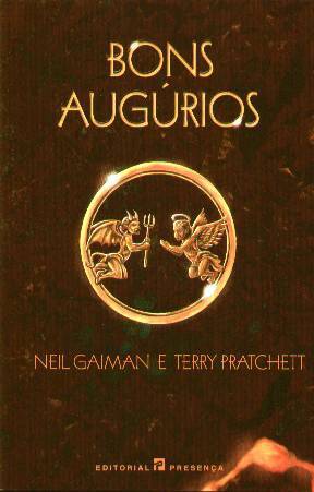
Let me start by saying this cover is so close to being in the blessed category. The layout and spacing are divine, the imagery is simple and whimsical, it reflects the humour inside the gravitas to give you an idea of the *feeling* of reading Good Omens. So few of these covers have gotten this aspect of good design right. Honestly, I would slow clap if it wasn't for that random FLAME JIZZ stuck to the bottom right hand corner of the book. Who's idea was that? Dagon's?
Tier: Great
23. Semne Bune, Romanian cover
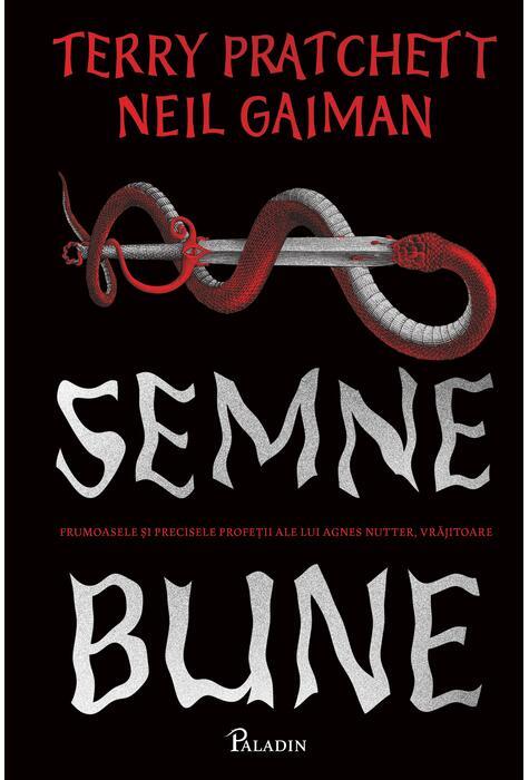
I admire two things about this cover: 1) Their utter commitment to a clean 3-colour palette and comprehensible layout. 2) Symbolic demon giving a principality head joke RIGHT ON THE FRONT COVER. This designer had balls. cotillion-sized balls. Now, does Aziraphale's sword have a sentient rooster tassel that watches said head-giving in horror? I sure hope not, but I don't see how that could be allegorical so, I'm torn. I feel like this goes in two categories for completely different reasons. And seeing as I'm in charge around here...
Tier: Great & Not so Good (Omens)
23. Semne Bune, Romanian cover cont.
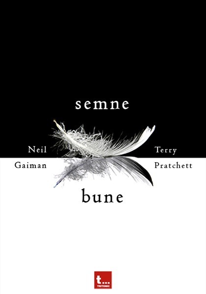
Compared to the last cover's gigantic double-entendre, this feels so tame and logical. The text is centred and balanced. There's breathing room, and we have wing symbolism! I've never seen a cover try to split Terry and Neil's names like that, which is a fun twist but BY GOD that center line is not straight near the right end of the feathers and it is sending this cover straight down to Does the Job. It's grounded there forever.
Tier: Does the Job
25. HYVIÄ ENTEITÄ, Finnish cover
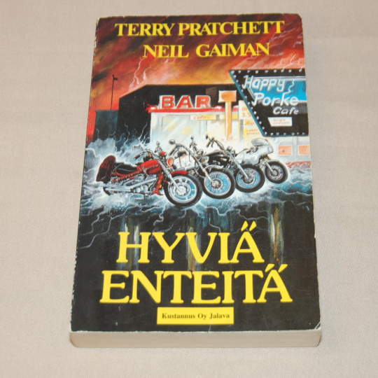
In this list, having something actually *relevant* to the main plot of the book and not mangling and main characters really puts you in rarefied air. All the motorcycles are book accurate which means somebody read something! Would I have ever picked the empty parking lot of Famine's restaurant as a subject worth a cover? Absolutely not. But the sick 80s lightning tips it into "fine" territory. The text is yellow. It's pretty.
Tier: Does the Job
26. Head ended, Estonian cover.
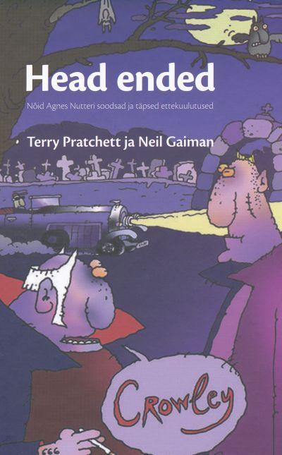
My face after staring at this cover for ten minutes and finally realizing that this is Hastur and Ligur waiting around for Crowley to pull up:
The artist's face after watching me do that:
Do I even need to rate this? It's called HEAD ENDED. I don't know how to be funnier than that.
Tier: WTF
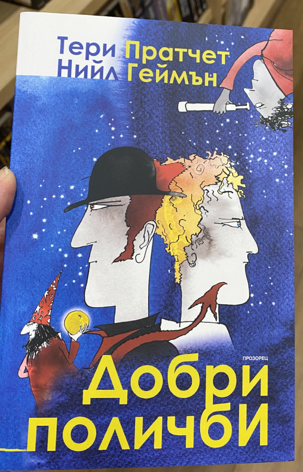
27. Dobry Omen, Polish cover
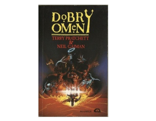
Some good points for trying to be original with the layout of the title by drawing a custom pitchfork "Y", but the heinous kerning and the fact the whole text block is not even centred kind of makes me take all the points back. I feel like we're pretty heavy on the demonic, extremely light on the angelic in this take. Maybe it's because on his death bed the lead guitarist of White Snake will finally admit to having designed this cover in his spare time.
Tier: Not so Good (Omens)
28. Good Omens, Hungarian cover
If I told you this designer did not read the book, and instead just watched the trailer of The Omen (the movie) and vibed this heinous brown carpet swatch into existence, you would one hundred percent believe me. I can't even talk about the faux belle-époque font right now. I am irrationally angry.
Tier: WTF
29. Good Omens, Bulgarian cover
WHO. IS. DADDY. WIZARD?? Is all I can think when I look at this cover. Aziraphale & Grommet are recognizable enough, and you could make the case for telescope monkey being Adam, but I need to find this cover designer and shake them until they tell me who this deranged Gargamel is supposed to be. I must know.
Tier: Bad
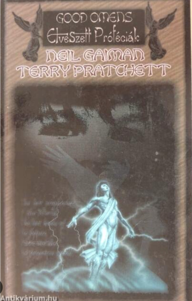
30. BELAS MALDIÇÕES, Portuguese cover
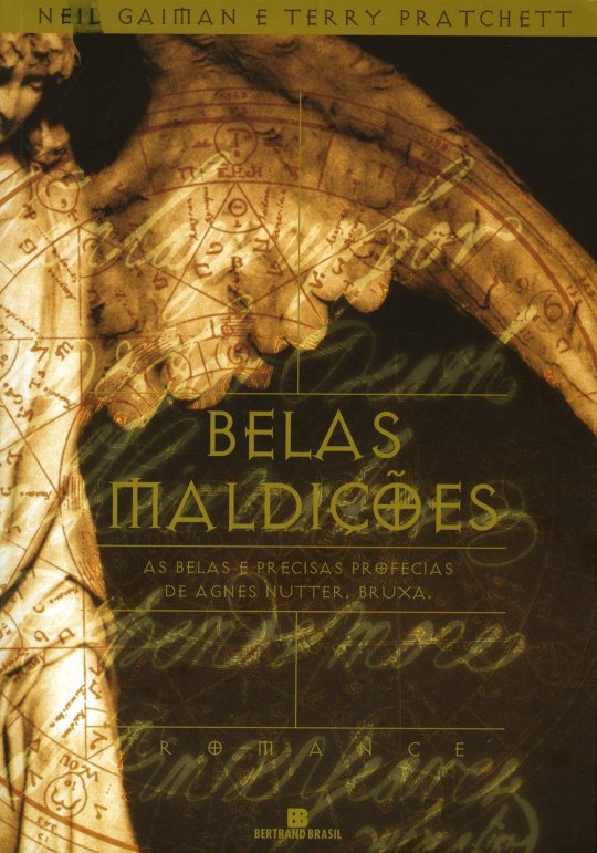
After all we've been through on this list so far, this truly sucks. It's not even weird. It's just puce text layered atop text to create a great yawn of a cover. Shout out to the designer of the Diablo PC game font, I hope you got paid.
Tier: Bad
Part 3 roundup:
#good omens 2#art director talks good omens#go season 2#good omens#good omens fandom#tier list#good omens analysis#book cover#cover art#gomens
87 notes
·
View notes
Text
The OFFICIAL MLP FiM character tier list (REAL, NOT CLICKBAIT)
No I will not be taking any questions or comments about the tier list and yes, this list is, in fact, one hundred percent factual and scientifically proven, thank you for understanding.
#mlp#mlp fandom#mlp fim#mlp g4#my litte pony friendship is magic#my little pony#rainbow dash#tier list#apple bloom#sweetie belle#scootaloo#cutie mark crusaders#mlp cmc#twilight sparkle#pinkie pie#fluttershy#applejack#rarity
33 notes
·
View notes
Text
Here's some sonic tier lists
Characters

Sonics forms

Sonic model

2020 and on media

i rest my case.
#sonic the hedgehog#sonic#sth#sonic fandom#sth fandom#sonic the hedgehog fandom#tier list#im willing to have a debate#i will explain myself to#sonic and the black knight#i love sonic and the black knight
23 notes
·
View notes
Text

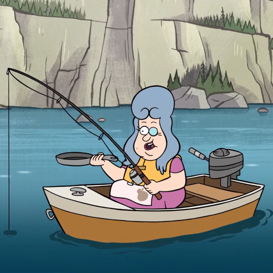
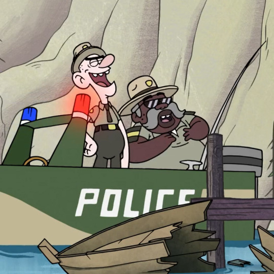
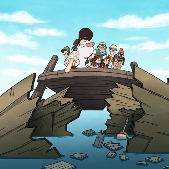
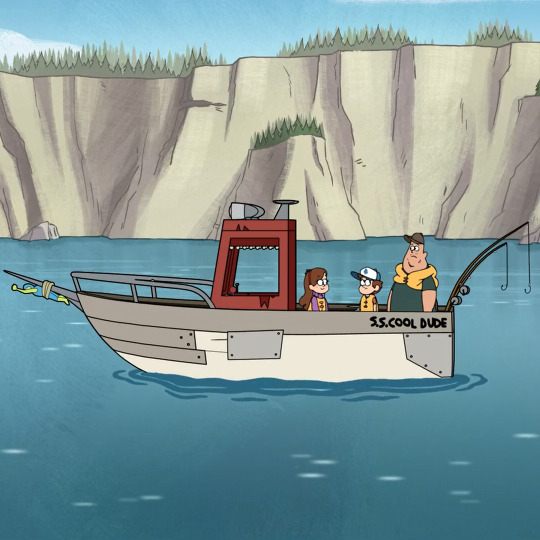
After years of being asked, I am happy to present my Gravity Falls ship tier list. I hope you all will respect my opinions on these very popular GF ships! Feel free to let me know if you agree with me or not.
Tier list template I used
And check out my video where I explain how I came up with these choices!
youtube
Happy April 1st ;)
THE SHIPS, lol


#gravity falls#gravity falls fandom#gravity falls ship#gravity falls ships#ship#ships#shipping#did I do it right lmao#Dipper pines#Mabel Pines#Pacifica Northwest#Grunkle Stan#Ford Pines#That GF FAN#ThatGFFAN#YouTube#tier list#april 1st#April#april fools#april fool's day#april fools 2024#hehehe#totally legit shipping tier list#alex hirsch#dipper#mabel#boat#Youtube
49 notes
·
View notes
Last Seen Blogs

sockiart
socki

surarchitprintpack1
Surarchit Printpack Pvt.Ltd.

allyfrd
Untitled

soda-shota-blog
🇹🇭🇯🇵mixx
