#font tutorial
Explore tagged Tumblr posts
Visit Tumblr Blog
Explore Tumblr blogs with no restrictions, modern design and the best experience.
Last Seen Tumblr Blogs


Fun Fact
1,644 Tumblr posts in 1 second.
Text
some people were asking about the font settings on my gifs so if anyone's curious:
i haven't really felt the need to change the font i use in years; it's Ariel Rounded MT Bold. i usually keep it Strong but you can experiment with that if you like the other styles

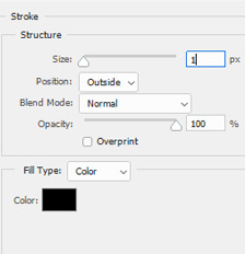
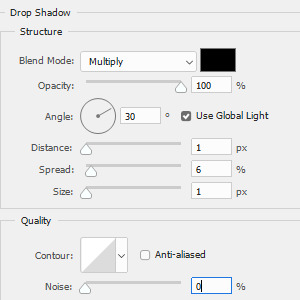
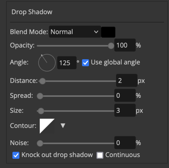
for the other settings i just use a bit of stroke and drop shadow:
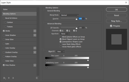
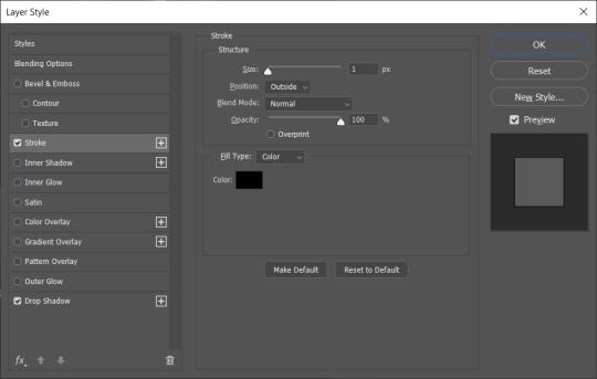
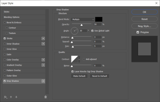
one different thing i do which i don't think most people do is i duplicate the subtitles on top of each other - mainly to make the drop shadow deeper and make the text stand out in front of the background better

that's pretty much it! like i said, i'm pretty happy with these settings so i haven't felt the need to change them in ages. the only change i make is how big the font is depending on how big the gif itself is. i hope this helps!
#gif tutorial#font tutorial#subtitles tutorial#yeah i remember i was never perfectly happy with the text on my gifs back in the day#so i couldn't have been happier when i worked out this combination and i've stuck with it since
95 notes
·
View notes
Text
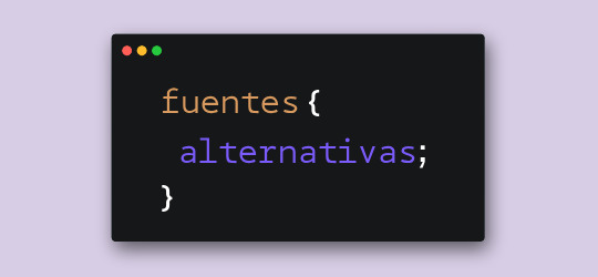
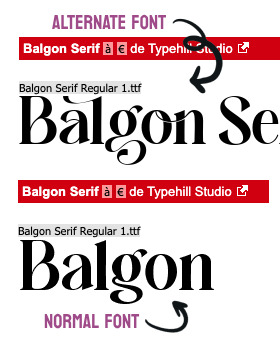
Hace unos días, cuando estaba compilando las fuentes para el pack que les subimos, me llegó una duda. Verán, algunas fuentes tienen versiones alternativas o caracteres alternativos. En Photoshop es fácil elegir la opción para usar esas variantes, pero me surgió la duda de cómo se lograría en CSS.
Bueno, al parecer la opción sí existe y se llama font-feature-settings. ¿Es infalible? Nope. ¿Podré usar todos los caracteres que tenga la fuente? No lo sé al cien por ciento. De todas maneras, quise hacerles este post para compartirles mi nuevo descubrimiento.
Tomemos de ejemplo la primera fuente de este pack, Balgon. Lo primero que vemos es el nombre de la fuente con caracteres que no están en los glifos principales, ¿cierto?
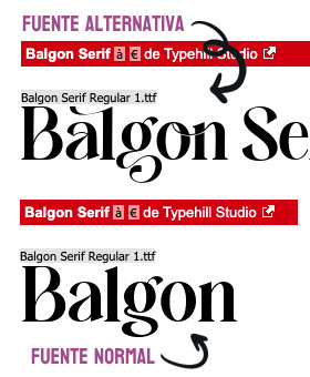
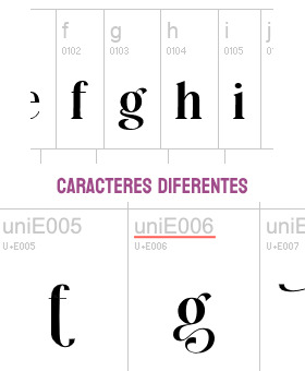
Pero si clickamos en "Ver todos los glifos", podremos darnos cuenta que sí están incluidos en la fuente, sólo que bajo un nombre diferente. En el caso de la fuente Balgon, tienen el nombre uniE000, de acuerdo al caracter. A veces, en otras fuentes, estos caracteres alternativos se llaman alt, aalt, salt, etcétera.*
Entonces, si queremos usar estas versiones, basta con agregar lo siguiente:
.tu-clase { font-feature-settings: "salt" 1; -webkit-font-feature-settings: "salt" 1; }
*Si no funciona con "salt", intenta alguno de los otros nombres como alt, aalt, etcétera.
¡Y voilà! Puedes ver el resultado dando click acá. ✨
¡Pero espera, hay más! Si hay más de un estilo alternativo, puedes sustituir el 1 por 2, o 3. Inténtalo y nos cuentas.
78 notes
·
View notes
Note
do you mind sharing your font settings? my subtitles always end up looking so blurry and i’m wondering what i’m doing wrong 😭 tysm.
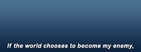
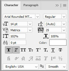
Sure thing :) I always use Arial Rounded MT Bold as a font for my subtitles.
Here are the settings I use and, as you can see, they're very basic.
So the text should appear like this:
15 notes
·
View notes
Text
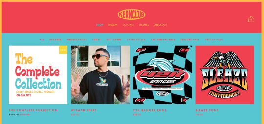
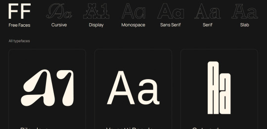
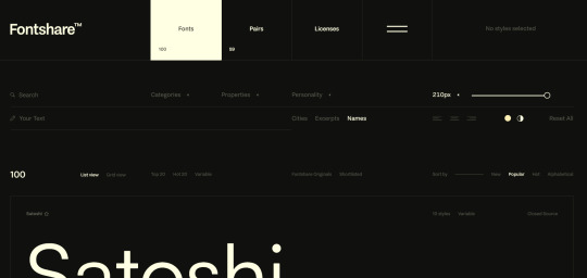
RESOURCES FOR FONTS
KernClub
FREEFACES
FontShare
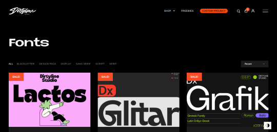
DirtyLineStudio
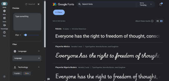
FontsGoogle
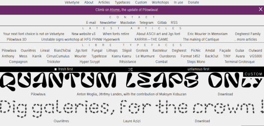
Velvetyne.FR
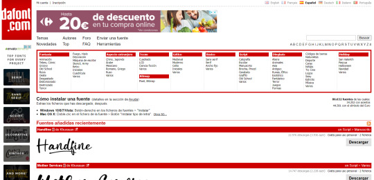
Dafont
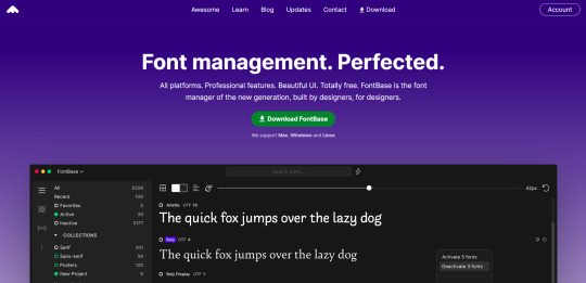
FONTBA.SE
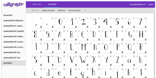
CALLIGRAPHR (to create your own fonts)
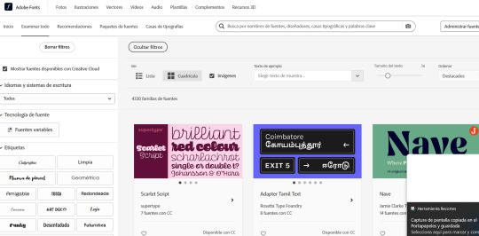
ADOBE FONTS
#reference#tutorial#art#art reference#concept art#illustration#artist#resources#web#websites#design#designer#fonts#font#typography
4K notes
·
View notes
Text


Don't Call Us Dead / Yellowjackets for @jackienatist
#i dont know WHAT yall put in your gifs that prevents text from being fuzzy i did everything all the bougie tutorials told me to do lol#i like this one! i tried like three different typography options and clicked that font by accident but ended up loving it the most#requests are still open#my gifs#lottielee#yellowjackets#laura lee#lottie matthews#usermiles#userbecca#tusercj#yellowjacketsnetwork#yellowjacketsedit#userlindsay#wlwsource#yj
687 notes
·
View notes
Text

As a thank you for so many new followers, here's a brand new edition of my editing resources masterposts ✨ (you can find the previous editions here). Make sure you like or reblog the posts below if they’re from other blogs to support their creators! A friendly reminder that some of these are free for personal use only, so be sure to read the information attached to each resource to verify how they can be used.
Textures & Things:
Collage Kits from @cruellesummer that I find myself using basically every single day
Taylor Swift Wax Seals from @breakbleheavens that I also use literally every day
Rookie Magazine Collage Kits (1, 2, 3, 4, 5, 6, 7, 8, 9, 10)
Scribble Textures & Cross-Outs (1, 2, 3)
GIF Overlays (1, 2, 3)
Film Grain & Noise Textures (1, 2, 3)
Paper Textures (1, 2, 3, 4, 5, 6, 7, 8)
PNG Overlays (Paper, Flowers, Clouds, Stickers, Lips, Vintage Paper, Misc. Symbols)
Halftone, Scan Line, & VHS Noise Textures (1, 2, 3, 4)
VHS Tape Textures by @cellphonehippie
Misc. Texture Packs (1, 2, 3, 4, 5, 6, 7, 8)
Photoshop Effects (Halftone Text Effect, Chrome Effect, Glitch Effect, Ink Edge Effect, Photo Morph Effect)
Fonts:
Badass Fonts (free fonts designed by womxn 🤍)
Open Foundry Fonts
Free Faces
Uncut Free Typefaces
Some Google Fonts I Like: Instrument Serif, DM Sans, EB Garamond, Forum, Pirata One, Imbue, Amarante
Some Adobe Fonts I Like: New Spirit, Ambroise, Filmotype Yukon, Typeka, Big Caslon CC (TTPD Font!)
Some Pangram Pangram Fonts I Like: Editorial Old, Neue World Collection, Eiko, PP Playground
Fonts In The Wild (font-finding resource)
Tutorials & Resources:
Comprehensive Rotoscoping Tutorial (Photoshop + After Effects, great for beginners!) by @antoniosvivaldi
Rotoscoping & Masking Tutorial (After Effects) by @usergif
Texture Tutorial for GIFs by @antoniosvivaldi
Color Control PSD by @evansyhelp (to enhance, isolate, or lighten specific colors)
Cardigan Music Video PSD by @felicitysmoak
Picspam Tutorial by @kvtnisseverdeen
Moving GIF Overlay Tutorial by @rhaenyratargaryns
GIF Overlay Tutorial (+ downloadable overlays!) by @idsb
Icon & Header Tutorial by @breakbleheavens
GIF Blending Tutorial by @jakeperalta
Split GIF Tutorial by @mithrandirl
Guide to Coloring Yellow-Tinted Shots by @ajusnice
Slow Motion After Effects Tutorial (useful for GIFs!)
Gradient Map Tutorial by me!
Misc:
How to Make Your Own Textures by @sweettasteofbitter
How to Report Tumblr Reposts of Your Work by @fatenumberfor
Tips for Accessible Typography
915 notes
·
View notes
Note
I LOVE this set and i was wondering if you could pls explain how you did the text, including how you added texture to the ripped text and the highlighting/circling/etc of words? thank you for posting your beautiful gifs 😊
thank you!! 🥺 & of course! (photopea tutorial)
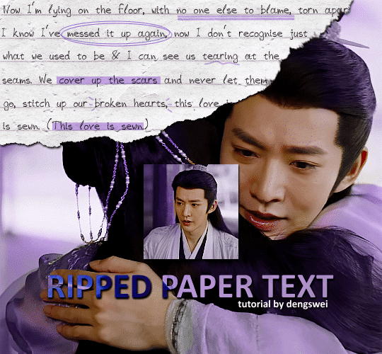
the majority of the texture for the ripped paper effect i can't really take credit for it's on the paper it's self all i did was make the paper white (because the texture was yellow) and used curves to darken the texture), i got the texture from one of photopea's templates but it seems their whole template section has changed drastically and no longer has like anything i used to see before ???? so i'll just share both versions here:
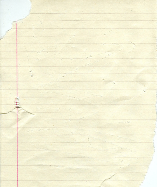
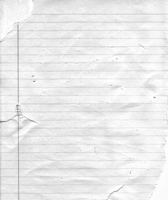
(original & my edited version)
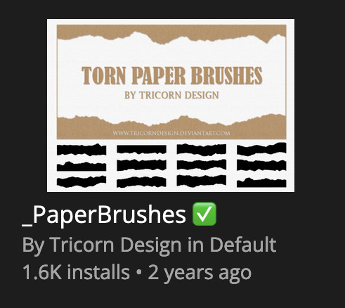
for the ripped parts i just played around with this brush set in the plugins
once i decided which of the paper brushes to use i had a new layer and used it where i wanted, so top left in the gif above, i clip masked the paper texture (and the adjustment layers as well) onto it so you get that ripped effect (if you don't like or want to add to that you can always use the brush tool again (or the erasure tool) set as the paper brush to add or remove sections i did this a lot when i realised certain words i wanted to show weren't on there (also changing the size of the paper brush when wanting to add a little bit or take a little bit away was a massive help)
i also always add a drop shadow to my paper textures, the settings i used is mostly the same EXCEPT for the angle for all of the ripped paper (it's also my text drop shadow settings) because depending on how the ripped paper looks you might have to change the angle
also i know in the screenshot below it's on but make sure the use global angle is off if you're going to have multiple different angles of drop shadow in your one gif (so if you want your paper texture on 125° but anything else on 60° the global angle needs to be off but if you want them the same then you can keep that on, which is why it's on for me because the angle is the same for both the text & the ripped paper) (and by text this isn't the text on the ripped paper, there isn't any drop shadow on the text itself there, just to clarify this was for my "ripped paper text tutorial by dengswei" text)
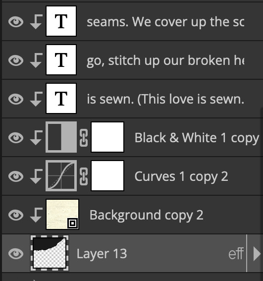
as you can see i also clipped my "handwriting" text to the paper layer this is so it stayed on the paper rather then going onto the gif itself (and it saved the fiddly part of masking it away & it felt more authentic this way too)
i found for me it was easier to seperate the text line by line so i knew exactly which part of the text was on which and if i wanted to change anything either it being a typo, changing the paper texture, or wanting a different word on a different line it was easier that way because it didn't end up messing up all of the text (though you don't have to do it that way, it's just what worked for me here)
font i used was: vag-handwritten (a default photopea font)
all of the next part needs to be above the text on your ripped paper:
for the highlighting, circles, and the lines it's pretty much all the same, i chose the colour which matched the gif (so say purple), for the highlight used the rectangle select & colour fill tools and set that to multiply & then played around with opacity (for most of my highlighting it's set to 50%), for the circles it was the same except the circle shape tool (no fill just stroke) set to purple, set to multiply, with 100% opacity (i found the circles looked better with 100% on some gifs depending on what colour i used), & then duplicated it once or twice and then just moved each circle to where i thought it looked best & the double lines is also the same using the line tool, set to multiply, & playing around with the opacity, & positioning them where i like
for the squiggly lines, the hearts, the 3 small doodle lines at either side of a word, & any other doodles i had on there i doodled them myself with my drawing tablet (you probably don't have to use a drawing tablet i just found it easier that way) using the free pen tool and then did the same thing set it to multiply and played with the opacity
if the colour you choose looks too dark or too light with it set to multiply either try a lighter/darker colour, try out something else like lighten, or screen, or increase/decrease the opacity more (i found i had this issue with the yellow being hard to see on the white paper so i used a darker yellow and kept everything at 100% opacity rather than 50%)
hope that helps! and please if anything is confusing or you want to ask any more don't hesitate to ask i know i ramble on a bit and it can sometimes get a bit confusing 🤣 or if there was anything i missed feel free to ask again 🥰
#replies#edwinas#mine | tutorials#gifmakerresource#photopeablr#photopea tutorial#photopea tutorials#gif tutorial#gif tutorials#usergif#tutorial#tutorials#photopea has so many great default fonts i just spend hours searching through them i barely download fonts now 🤣#i hope i didn't miss anything#also i don't know why the paper textures & my screenshots posted this way i had them side by side#okay they're side by side on mobile but not desktop ??? but mobile doesn't have the read more okay
125 notes
·
View notes
Text
demo 3 if they didn't gaf
tuna is really good though
#ignore the fact im using the undertale font#tutorial terry block tales#jerry block tales#block tales meme#block tales
115 notes
·
View notes
Text

KNiFELACE ──── a(n edit) resource blog run by @chocospresso .

𓊆 my neospring . if you wish for me to delete a post / reblog , let me know .

#𓊆 ✑ 𓊇 posts.#𓊆 ✑ 𓊇 asks.#𓊆 ✑ 𓊇 reblogs.#𓊆 ✑ 𓊇 not resources.#𓊆 ✑ 𓊇 transparents.#𓊆 ✑ 𓊇 masks.#𓊆 ✑ 𓊇 pfp masks.#𓊆 ✑ 𓊇 banner masks.#𓊆 ✑ 𓊇 dividers.#𓊆 ✑ 𓊇 lace.#𓊆 ✑ 𓊇 frames.#𓊆 ✑ 𓊇 backgrounds.#𓊆 ✑ 𓊇 psds.#𓊆 ✑ 𓊇 gradient maps.#𓊆 ✑ 𓊇 overlays.#𓊆 ✑ 𓊇 fonts.#𓊆 ✑ 𓊇 tutorials.#𓊆 ✑ 𓊇 websites.#𓊆 ✑ 𓊇 graphics.
65 notes
·
View notes
Text
Drawing Rockerduck with Corrado Mastantuono! 😃
PART 1:


from Topolino #3581 (translated from italian by me).
#you're welcome :)#have fun#i'll translate the next part sometimes soon#john d. rockerduck#tutorial#corrado mastantuono#topolino magazine#disney ducks#my translations#(and i discovered they use an adobe font)#(good good... thus long gone are the days when I spent ages searching for a similar font! ^^)
56 notes
·
View notes
Text
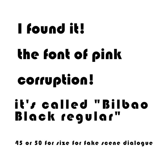

For anyone wondering where I can find this font for pink corruption art.
25 notes
·
View notes
Text
We have noticed we have followers who would also benefit from having these posts in English (or maybe even Portuguese or French, which may come in the future) so we decided to start posting in both languages from now on. Without further ado, let's get into the tutorial.
As I was saying in the Spanish version, this question popped up in my head while searching for fonts. I noticed many of them had alternative characters that were not easily accesible outside of desktop or Photoshop use. But what if I want to use those characters in CSS?
Well, the option actually exists and it's called font-feature-settings. But some things first: Will it always work? Nope. Will I be able to use all the alt types or letters? I'm not 100% sure. Regardless of that, I still wanted to make this post/tutorial to share my findings.
So, let's take the first font in this pack, Balgon. The first thing we notice is that the font name is written with different types, right?

Now, if we click on "View all glyphs", we will see that those glyphs are indeed in the font under a different name. In the case of Balgon, for example, they are uniE000, with every number changing according to each glyph. Sometimes, other fonts use alt, aalt, salt, etcetera.*
So, if we want to use these versions, we need to add the following code:
.your-class { font-feature-settings: "salt" 1; -webkit-font-feature-settings: "salt" 1; }
*If "salt" doesn't work, try using some of the other spellings like alt, aalt, etc.
Voilà! You can see the results here (text in Spanish). ✨
But wait, there's more! If the font has more than one alt type, you can change the number 1 to 2, or 3. Try it and let us know if it worked for you.
17 notes
·
View notes
Text
youtube
HOW TO MAKE A COMIC IN PROCREATE + FREE RESOURCES ❤️
Hope it helps! Let me know if the resources are helpful! Links are in the video description!
Thanks for watching!
#tbbt#shamy#fanart#rgbcn#bigbangtheory#tutorial#how to make a comic in procreate#procreate tutorial#comic tutorial#free resources#free brushes#free tones#halftone hospital#dafont#free comic fonts#free fonts#how to make digital comic#procreate tips#procreate#procreate comic art#thebigbangtheory#sheldon cooper#amy farrah fowler#comic artist#youtube creator#youtube short#youtube tutorial#artists on tumblr#Youtube
28 notes
·
View notes
Note
hello mommy!!
I just wanted to ask, how do you make your texts small in your fics? Usually, when I write some fics, the text don’t get to the size I prefer, I know you can adjust the size big and small, but when I want to make it smaller, the font changes 😬😬 could you help me out??


hi darling .ᐟ.ᐟ i’m not the best at making tutorials , but i can try and help you out as best as i can .
for this particular font , you are going to want to make sure it is on “regular” . to do this , while you’re editing your fic , you simply press the “Aa” button on the left and press the tab that says “regular” . once you have done that , you are going to simply select all of the words/sentences you want your font to be applied to . once you select it all , there should be the options to color , bolden , and more . you are going to select the tab that says “<s>” . this toggles how large the text will be . then me personally , i also toggle italic because i like the slanted look .


this best applies to the fonts such as “lucille” and “chat” because these fonts are also small .
i hope this tutorial helped in some way , mwah .ᐟ.ᐟ and if not , let me know and i can try another way .
#tutorial#fonts#lesbian#wlw#video games#life is strange#the last of us#tlou#wuh luh wuh#chloe price#ellie williams#lgbtq#lgbtqiia+#lgbtq positivity#wuhluhwuh#lgbtq community#lgbtqia#lgbt pride#sapphic yearning#sapphic#paythepricee
11 notes
·
View notes
Text
Do I know how to animate? Absolutely not. Is this gonna stop me from trying? Also no.
#THE HORSE AND THE INFANT LETS GOOO#epic the musical#epic the troy saga#odysseus#pyro speaks#artist#artists#artists on tumblr#animation#the horse and the infant#also wanna do maybe Monster#or Wouldnt you like#theyre pretty cool songs#idk ill see how i go on this one first#itll be very chuncky#i can assure you#i font watch tutorials
25 notes
·
View notes
Text
Playing a game you’re quite familiar with but in a different language that you can mostly read but only sometimes really understand is fun i think. I think
#(playing platinum in japanese. its kana only. for babies and kat.)#im adjusting to the font… i think im reading a bit faster… 2 hours and 20 minutes in im almost at the catching tutorial… lol…#its fun though sometimes i do get a sentence that i fully understand. and i smile#i should do some real studying after my nap.#the kat goes meow
9 notes
·
View notes