#form design html
Explore tagged Tumblr posts
Visit Tumblr Blog
Explore Tumblr blogs with no restrictions, modern design and the best experience.
Last Seen Tumblr Blogs


Fun Fact
The Tumblr office adopted Tommy, an 11-year-old Pomeranian.
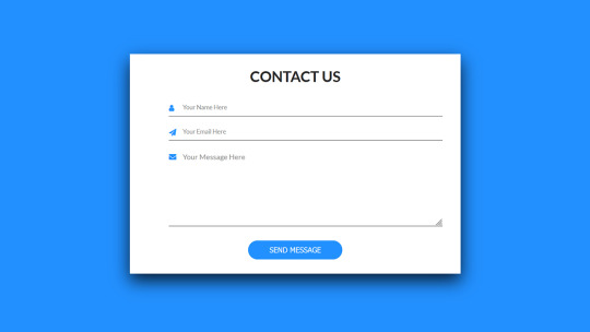
Text

CSS Form Input Animation
#html css form#css form#form design html#css input label animation#input label animation#css animation examples#css animation tutorial#cool css animation#html css#divinector#learn to code#code#frontenddevelopment#css#css3#html#animation
3 notes
·
View notes
Text

Contact Form with Floating Level
#contact form html css#contact form design#contact form with floating level#animation#html5 css3#frontend#codingflicks#css3#frontenddevelopment#html css form#css forms
2 notes
·
View notes
Text
goal!
0 notes
Text
Grouping Selection List Items Together With CSS Grid
New Post has been published on https://thedigitalinsider.com/grouping-selection-list-items-together-with-css-grid/
Grouping Selection List Items Together With CSS Grid

Grouping selected items is a design choice often employed to help users quickly grasp which items are selected and unselected. For instance, checked-off items move up the list in to-do lists, allowing users to focus on the remaining tasks when they revisit the list.
We’ll design a UI that follows a similar grouping pattern. Instead of simply rearranging the list of selected items, we’ll also lay them out horizontally using CSS Grid. This further distinguishes between the selected and unselected items.
We’ll explore two approaches for this. One involves using auto-fill, which is suitable when the selected items don’t exceed the grid container’s boundaries, ensuring a stable layout. In contrast, CSS Grid’s span keyword provides another approach that offers greater flexibility.
The HTML is the same for both methods:
<ul> <li> <label> <input type="checkbox" /> <div class=icon>🍱</div> <div class=text>Bento</div> </label> </li> <li> <label> <input type="checkbox" /> <div class=icon>🍡</div> <div class=text>Dangos</div> </label> </li> <!-- more list items --> </ul>
The markup consists of an unordered list (<ul>). However, we don’t necessarily have to use <ul> and <li> elements since the layout of the items will be determined by the CSS grid properties. Note that I am using an implicit <label> around the <input> elements mostly as a way to avoid needing an extra wrapper around things, but that explicit labels are generally better supported by assistive technologies.
Method 1: Using auto-fill
ul width: 250px; display: grid; gap: 14px 10px; grid-template-columns: repeat(auto-fill, 40px); justify-content: center; /* etc. */
The <ul> element, which contains the items, has a display: grid style rule, turning it into a grid container. It also has gaps of 14px and 10px between its grid rows and columns. The grid content is justified (inline alignment) to center.
The grid-template-columns property specifies how column tracks will be sized in the grid. Initially, all items will be in a single column. However, when items are selected, they will be moved to the first row, and each selected item will be in its own column. The key part of this declaration is the auto-fill value.
The auto-fill value is added where the repeat count goes in the repeat() function. This ensures the columns repeat, with each column’s track sizing being the given size in repeat() (40px in our example), that will fit inside the grid container’s boundaries.
For now, let’s make sure that the list items are positioned in a single column:
li width: inherit; grid-column: 1; /* Equivalent to: grid-column-start: 1; grid-column-end: auto; */ /* etc. */
When an item is checked, that is when an <li> element :has() a :checked checkbox, we’re selecting that. And when we do, the <li> is given a grid-area that puts it in the first row, and its column will be auto-placed within the grid in the first row as per the value of the grid-template-columns property of the grid container (<ul>). This causes the selected items to group at the top of the list and be arranged horizontally:
li width: inherit; grid-column: 1; /* etc. */ &:has(:checked) grid-area: 1; /* Equivalent to: grid-row-start: 1; grid-column-start: auto; grid-row-end: auto; grid-column-end: auto; */ width: 40px; /* etc. */ /* etc. */
And that gives us our final result! Let’s compare that with the second method I want to show you.
Method 2: Using the span keyword
We won’t be needing the grid-template-columns property now. Here’s the new <ul> style ruleset:
ul width: 250px; display: grid; gap: 14px 10px; justify-content: center; justify-items: center; /* etc. */
The inclusion of justify-items will help with the alignment of grid items as we’ll see in a moment. Here are the updated styles for the <li> element:
li width: inherit; grid-column: 1 / span 6; /* Equivalent to: grid-column-start: 1; grid-column-end: span 6; */ /* etc. */
As before, each item is placed in the first column, but now they also span six column tracks (since there are six items). This ensures that when multiple columns appear in the grid, as items are selected, the following unselected items remain in a single column under the selected items — now the unselected items span across multiple column tracks. The justify-items: center declaration will keep the items aligned to the center.
li width: inherit; grid-column: 1 / span 6; /* etc. */ &:has(:checked) grid-area: 1; width: 120px; /* etc. */ /* etc. */
The width of the selected items has been increased from the previous example, so the layout of the selection UI can be viewed for when the selected items overflow the container.
Selection order
The order of selected and unselected items will remain the same as the source order. If the on-screen order needs to match the user’s selection, dynamically assign an incremental order value to the items as they are selected.
onload = ()=> let i=1; document.querySelectorAll('input').forEach((input)=> input.addEventListener("click", () => input.parentElement.parentElement.style.order = input.checked ? i++ : (i--, 0); ); );
Wrapping up
CSS Grid helps make both approaches very flexible without a ton of configuration. By using auto-fill to place items on either axis (rows or columns), the selected items can be easily grouped within the grid container without disturbing the layout of the unselected items in the same container, for as long as the selected items don’t overflow the container.
If they do overflow the container, using the span approach helps maintain the layout irrespective of how long the group of selected items gets in a given axis. Some design alternatives for the UI are grouping the selected items at the end of the list, or swapping the horizontal and vertical structure.
#amp#approach#Articles#columns#container#content#CSS#CSS Grid#css-tricks#Design#digitalocean#display#employed#focus#Forms#gap#grid#grid-template-columns#how#how to#HTML#inclusion#it#labels#layout#list#lists#Method#Moment#One
0 notes
Text
spent a good 20 minutes yesterday daydreaming about what a hypothetical personal website for myself would look like
#one of these days ill learn html#plum rambles#if i implement any kind of search or filtering system#youll be able to drag an drop little blocks labeled with boolean operators into it#there would be an accessibility settings button#and settings would be saved with cookies#everything. EVERYTHING would have tooltips#and lists would be categorized with silly little icons for different categories#thered be a legend at the top of the page where you could click on an icon to filter it#i want it to be like. something you can play with. toy block ass website#the home page would have art of me (irl human appearance) and Tir (turtlesona) posing back to back#with buttons for the main pages to the right of them#the top or bottom of the site would have a banner saying that i dont know what im doing and to contact me#if you have accessibility concerns or encounter bugs#maybe have a little google form as an alternative to emailing me bc emails are scary!!#anyways. um.#plum rambles (in the tags)#web design
0 notes
Text
AI Writer Services HTML Landing Page Template
Are you ready to revolutionize your AI writing services? Look no further than "Writey" - the ultimate AI Writer Services HTML Landing Page Template that combines stunning design with powerful functionality. Whether you're a content creator, or copywriter, or run an AI writing service, Writey has got you covered.
Buy Now:
#html#ai writer#landing page#template#clean design#responsive#RTL support#PHP contact form#dark theme#light theme#animations#testimonials#FAQ section#sliders#W3C validation#cross-browser compatibility#updates#accessibility#SEO optimized#fast loading#social media buttons#SCSS files#back-to-top button#coding#landingpage#css
1 note
·
View note
Text
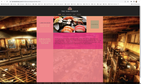
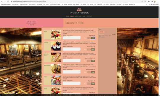
Desktop users add and delete items from an order, enter special instructions, total selections, and contact.
#javascript#frontend#coding#forms#html5 css3#html css#html#html5#htmlcoding#css#code#css3#xhtml#web designers#website#websites#web development#web design#ui ux development services#ui#ui ux design#uidesign#ux#user interface#design#Lynn Stanikmas
1 note
·
View note
Text
Easy Em Website Template
Role: I built an improved and easy to use JavaScript menu for everyone Project goal: A lot of small businesses and other site owners don’t need much more than static web pages, a contact form, and a well-functioning menu system where they can easily add and remove items. Many people have learned some HTML and CSS but not advanced into JavaScript or PHP. When I needed to expand my menu to beyond…

View On WordPress
#Contact Form#CSS#CSS3#Easy Em#eCommerce#FormSpree#Freelancing#Github#HTML#HTML5#JavaScript#Save the Oxygen#Shopify#Upwork#Web Design
0 notes
Text
#Accessible Design#Accessible Forms#Assistive Technology#Disabilities#HTML Elements#Screen Readers#Section 508#WCAG#Web accessibility
0 notes
Text
Terror Camp is hiring!
We are looking to expand our volunteer staff for this year’s conference.
We have two job listings based on our current needs, but if we receive a lot of great applicants there is the possibility we’ll split up these responsibilities into 3 or even 4 separate positions.
Terror Camp is a fully volunteer, remote, asynchronous workplace (with occasional sync meetings as schedules permit). We communicate over Discord and organize our documentation over Notion and Google Drive.
We are looking for people who can devote up to a few hours a week, depending on the time of year. Commitment increases around the times of Submission Opening (June 1), Submission Closing/Acceptances (September 1-Oct 1) and the conference itself (early December).
Terror Camp looks great on your resume. You can say that you volunteer for a successful community-led online history & heritage conference with an audience in the thousands!
You don’t need to match the job descriptions perfectly in order to apply. If your experience doesn’t match up but you think you’d still be good at the job, please apply anyway!
Here are the positions we're looking to fill:
🎨 Designer 🎨
Terror Camp is seeking a dedicated Designer who will:
Ideate and deliver a new evergreen brand identity for TC that can be revamped and reused each year
Including logo, logotype, color scheme, font families, and other brand assets for use on web, social media, and printed merch
Be an proactive team member with strong communication skills, able to quickly and regularly deliver new graphics for promotional use on social media and in email marketing
Help design an evergreen/permanent collection of merchandise as well as a limited-edition collection for this year’s conference
Assist our Webmaster in revising our website & email marketing templates to fully match new brand identity and meet best practices for UX
Potentially work on print layout for a Terror Camp book or zine (TBD)
This job would be a good fit if you:
Work or have worked professionally or semi-professionally as a graphic designer; or are a hobbyist designer with a standout portfolio
Have experience working with both digital and print assets
Have a working knowledge of web design best practices and HTML/CSS
Have experience with Photoshop, Illustrator, InDesign, Canva (but not ONLY Canva, sorry) and Wix or similar WYSIWYG ESP/site builder
The Designer will report to our Assistant Director/Webmaster, & will also collaborate closely with our Marketing Lead on graphic assets for social media and with our Merch Lead on preparing designs for print.
To apply, please fill out this form.
💬 Communications Coordinator 💬
Terror Camp is seeking an enthusiastic Communications Coordinator who will:
Own Terror Camp’s main email inbox and oversee all direct communication with attendees and interested parties
Respond promptly to inquiries including:
Requests for past recordings
Requests to join the Discord
Questions about schedule, programming, submissions, guests, and other conference topics
Catch inbounds to social media inboxes (Tumblr, X, Bluesky, Insta) & answer or redirect to email as appropriate
Act as coordinator/assistant for Marketing Lead, with responsibilities including:
Scheduling pre-written content
Assisting with ideating and drafting content, proposing content ideas
Cross-posting content to multiple platforms
Consistently and frequently engaging with social audiences (finding content to repost, replying to people, etc)
This job would be a good fit if you:
Work or have worked in any digital customer-facing environment; have experience with support tickets and/or ongoing user communications; have run social media for brands or institutions; are an efficient and clear writer able to work creatively within brand voice guidelines
Have successfully and sustainably moderated Discord servers, Tumblr communities, social media for other fandom projects like fests, zines, and charity events
Can spare the time and attention to respond to inquiries and turn around new social media posts in a timely manner
Are prepared to represent the Terror Camp brand professionally and maturely in digital public spaces
The Communications Coordinator will report directly to our Marketing Lead.
To apply, please fill out this form.
If you have any questions about these positions, please email us at command [at] terror [dot] camp!
117 notes
·
View notes
Text

Bootstrap 5 Contact form
#bootstrap 5 contact form#form design bootstrap#bootstrap snippets#html css#divinectorweb#css#html#css3#code#learn to code#form design#html css form#frontenddevelopment
2 notes
·
View notes
Text
Contact Form Design
#contact form design#html css#frontend#css#html#frontenddevelopment#learn to code#css3#webdesign#html css form#css form#html5 css3 form#html5#login form design
3 notes
·
View notes
Text


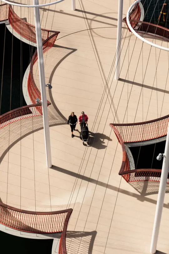
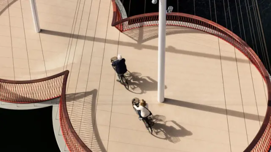


Круговой мост Cirkelbroen в Копенгагене, Дания.
В Дании в городе Копенгаген появилась новая художественная достопримечательность — мост под названием Циркельброен. Он был разработан датско-исландским дизайнером Олафуром Элиассоном и открыт в прошлом месяце. Мост пересекает канал Кристиансхавн, соединяя Кристиансбро с Эпплби.В проекте отражена морская истори�� этого региона, которая нашла свое отражение в виде особой структурной конструкции.
Пешеходный мост сделан из пяти связанных круглых платформ различных размеров, каждая из которых имеет свою собственную мачту. Здесь проводится аналогия с парусными лодками, пересекающими многочисленные каналы Копенгагена. От мачт расходятся специальные тросы, дополняющие единый ансамбль проекта. Циркельброен не является классическим поворотным мостом - при необходимости поворачивается лишь его часть. Когда мост закрыт, высота от поверхности воды до его круглых платформ составляет 2,25 м, чего вполне достаточно для прохода под мостом небольших лодок. Для прохода через канал более габаритных судов предусмотрен следующий механизм: три платформы имеют общее основание, находящееся подводой, это основание крепится к центральной платформе с помощью шарнирного сочленения, благодаря этому данная часть конструкции и поворачивается при необходимости. В результате образуется девятиметровый коридор для судов. Длина моста составляет 40 метров, а вес всей конструкции - 210 т. Вместо того, чтобы обеспечивать прямой путь через канал, мост следует по кривой линии. Это позволяет пешеходам замедлиться и сменить фокус, обратив внимание на красоту мостовой конструкции.Мост позволит жителям и гостям Копенгагена следовать по непрерывному маршруту вдоль всего Индерхавн, значительно облегчая перемещение и сокращая путь.
Cirkelbroen Circular Bridge in Copenhagen, Denmark.
A new artistic landmark has appeared in the city of Copenhagen, Denmark — a bridge called Cirkelbroen. It was designed by Danish-Icelandic designer Olafur Eliasson and opened last month. The bridge crosses the Christianshavn Canal, connecting Christiansbro with Appleby. The design reflects the maritime history of the region, which is reflected in the special structural design.
The pedestrian bridge is made of five connected circular platforms of varying sizes, each with its own mast. Here, an analogy is drawn to the sailboats that cross the many canals of Copenhagen. Special cables extend from the masts, completing the unified ensemble of the project. Cirkelbroen is not a classic swing bridge — only part of it rotates when necessary. When the bridge is closed, the height from the water surface to its round platforms is 2.25 m, which is enough for small boats to pass under the bridge. To allow larger vessels to pass through the canal, the following mechanism is provided: three platforms have a common base located underwater, this base is attached to the central platform using a hinge joint, thanks to which this part of the structure rotates when necessary. As a result, a nine-meter corridor for ships is formed. The length of the bridge is 40 meters, and the weight of the entire structure is 210 tons.
Instead of providing a straight path across the canal, the bridge follows a curved line. This allows pedestrians to slow down and change their focus, paying attention to the beauty of the bridge structure. The bridge will allow residents and visitors of Copenhagen to follow a continuous route along the entire Inderhavn, significantly facilitating movement and shortening the journey.
Источник:/leondom.ru/news/22-otraslevye/538-olafur-eliasson-prezentoval-most-cirkelboen-v-kopengagene,/architime.ru/specarch/ studio_olafur_eliasson/cirkelbroen_bridge.htm#17.jpg,//posmotrim.by/article/krugovoy-most-cirkelbroen-v-kopengagene.html, /rajskij-sad.livejournal.com/379272.html,//www.tripadvisor.ru/Attraction_Review-g189541-d8711955-Reviews-Circle_Bridge-Copenhagen_ Zealand.html,//t.me/borderlesstravel.
#Дания#Копенгаген#городской пейзаж#архитектура#набережная#речной канал#необычные мосты#круговой мост#Циркельброен#Олафур Элиассон#фотография#Denmark#Copenhagen#cityscape#embankment#river canal#Architecture#unusual bridges#circular bridge#Zirkelbroen#Olafur Eliasson#wonderful
188 notes
·
View notes
Text
ever wonder why spotify/discord/teams desktop apps kind of suck?
i don't do a lot of long form posts but. I realized that so many people aren't aware that a lot of the enshittification of using computers in the past decade or so has a lot to do with embedded webapps becoming so frequently used instead of creating native programs. and boy do i have some thoughts about this.
for those who are not blessed/cursed with computers knowledge Basically most (graphical) programs used to be native programs (ever since we started widely using a graphical interface instead of just a text-based terminal). these are apps that feel like when you open up the settings on your computer, and one of the factors that make windows and mac programs look different (bc they use a different design language!) this was the standard for a long long time - your emails were served to you in a special email application like thunderbird or outlook, your documents were processed in something like microsoft word (again. On your own computer!). same goes for calendars, calculators, spreadsheets, and a whole bunch more - crucially, your computer didn't depend on the internet to do basic things, but being connected to the web was very much an appreciated luxury!
that leads us to the eventual rise of webapps that we are all so painfully familiar with today - gmail dot com/outlook, google docs, google/microsoft calendar, and so on. as html/css/js technology grew beyond just displaying text images and such, it became clear that it could be a lot more convenient to just run programs on some server somewhere, and serve the front end on a web interface for anyone to use. this is really very convenient!!!! it Also means a huge concentration of power (notice how suddenly google is one company providing you the SERVICE) - you're renting instead of owning. which means google is your landlord - the services you use every day are first and foremost means of hitting the year over year profit quota. its a pretty sweet deal to have a free email account in exchange for ads! email accounts used to be paid (simply because the provider had to store your emails somewhere. which takes up storage space which is physical hard drives), but now the standard as of hotmail/yahoo/gmail is to just provide a free service and shove ads in as much as you need to.
webapps can do a lot of things, but they didn't immediately replace software like skype or code editors or music players - software that requires more heavy system interaction or snappy audio/visual responses. in 2013, the electron framework came out - a way of packaging up a bundle of html/css/js into a neat little crossplatform application that could be downloaded and run like any other native application. there were significant upsides to this - web developers could suddenly use their webapp skills to build desktop applications that ran on any computer as long as it could support chrome*! the first applications to be built on electron were the late code editor atom (rest in peace), but soon a whole lot of companies took note! some notable contemporary applications that use electron, or a similar webapp-embedded-in-a-little-chrome as a base are:
microsoft teams
notion
vscode
discord
spotify
anyone! who has paid even a little bit of attention to their computer - especially when using older/budget computers - know just how much having chrome open can slow down your computer (firefox as well to a lesser extent. because its just built better <3)
whenever you have one of these programs open on your computer, it's running in a one-tab chrome browser. there is a whole extra chrome open just to run your discord. if you have discord, spotify, and notion open all at once, along with chrome itself, that's four chromes. needless to say, this uses a LOT of resources to deliver applications that are often much less polished and less integrated with the rest of the operating system. it also means that if you have no internet connection, sometimes the apps straight up do not work, since much of them rely heavily on being connected to their servers, where the heavy lifting is done.
taking this idea to the very furthest is the concept of chromebooks - dinky little laptops that were created to only run a web browser and webapps - simply a vessel to access the google dot com mothership. they have gotten better at running offline android/linux applications, but often the $200 chromebooks that are bought in bulk have almost no processing power of their own - why would you even need it? you have everything you could possibly need in the warm embrace of google!
all in all the average person in the modern age, using computers in the mainstream way, owns very little of their means of computing.
i started this post as a rant about the electron/webapp framework because i think that it sucks and it displaces proper programs. and now ive swiveled into getting pissed off at software services which is in honestly the core issue. and i think things can be better!!!!!!!!!!! but to think about better computing culture one has to imagine living outside of capitalism.
i'm not the one to try to explain permacomputing specifically because there's already wonderful literature ^ but if anything here interested you, read this!!!!!!!!!! there is a beautiful world where computers live for decades and do less but do it well. and you just own it. come frolic with me Okay ? :]
*when i say chrome i technically mean chromium. but functionally it's same thing
461 notes
·
View notes
Text
How to Manage Your Website's Technical Debt – Speckyboy
New Post has been published on https://thedigitalinsider.com/how-to-manage-your-websites-technical-debt-speckyboy/
How to Manage Your Website's Technical Debt – Speckyboy
The web seems to move at the speed of light. The tools and best practices we use today will soon be outdated. It’s a vicious cycle we repeat again and again.
That often leaves us with some form of technical debt. It could be a WordPress theme that isn’t compatible with the latest version of PHP. Or a hacked-together layout that won’t adapt to future needs. The worst case is software that is no longer supported.
It will impact every website sooner or later. There are ways to manage or even prevent it, though.
So, how do you keep technical debt from becoming a nightmare? Let’s review a few tips for minimizing the impact.
Unlimited Downloads for Web Designers
Starting at just $16.50 per month, download 1,000s of HTML, Bootstrap, and Tailwind CSS, as well as WordPress themes and plugins with Envato Elements. You will also get unlimited access to millions of design assets, photos, video files, fonts, presets, addons, and much more.
Build with Sustainability in Mind
The first step is to reduce the chances for technical debt to take hold. In practice, it’s about building with sustainability in mind.
There are several things you can do. For one, use tools that are popular and well-maintained. It’s not a guarantee of smooth sailing. It does increase the chances of future viability, though.
Let’s use WordPress as an example. The content management system (CMS) has existed for over 20 years. It is continually updated. A large ecosystem of themes and plugins is also thriving.
Perhaps there’s another CMS that catches your eye. It hit the market only recently – there aren’t many users yet.
There’s nothing wrong with this new CMS. But is it sustainable? Only time will tell. Therefore, it may not be the best long-term solution. Using it comes with some level of risk.
Best practices also guard against technical debt. Use the latest standards when writing code. Don’t rely on CSS hacks to build layouts. Comment your code and take detailed notes.
The idea is to think about the present and future. That could save you some headaches down the road.
Perform Regular Audits of Your Website
The status of your stack can change in an instant. Thus, it’s a good idea to perform regular audits.
A website audit should cover both hardware and software. On the hardware side, make sure your web hosting is still viable. Check your site’s performance and resource usage. The results should tell you if you need to upgrade.
You’ll also want to look closely at the software you’re using. Start with the server’s OS. Move on to versions of PHP, MySQL, or whatever you have in place. These items are crucial to your site’s well-being.
From there, it’s time to look at your CMS, themes, and plugins. Also, review any software dependencies – JavaScript libraries are a good example.
Look for outdated items. Are updates available? Is it still actively maintained?
This process will help you identify potential problems. From there, you can take action.
So, how often should you audit your site? A yearly review is fine for small websites. Large and mission-critical sites would benefit from biannual or quarterly inspections.
Use Change as an Opportunity
Perhaps you found an item or two that needs addressing. That’s OK – change is inevitable!
The good news is that change also presents an opportunity. You can reassess how your website is working. There is a chance to build a more stable foundation for the future.
In some cases, you may have to swap one item for another. For example, maybe a WordPress plugin you use has been abandoned.
Now is the time to find a replacement that will offer better longevity. It’s also possible that you no longer need what the old plugin offers. That’s one way to reduce technical debt.
You might also need to modernize your code. We often do this when dealing with PHP compatibility issues.
It’s not only a chance to use the latest version of PHP. You can also look for ways to improve functionality and security. After all, reviewing the code you wrote years ago can show how far you’ve come. There’s a chance to build it better and stronger.
You can do more than bring your website up to date. You can also make forward-thinking changes. The hope is that you can lessen the technical debt you have today – and for the future.
Take Control of Your Site’s Technical Debt
Every website will deal with technical debt. That’s part of its lifecycle.
The difference is in how much debt you’ll face. Critical thinking early in the site-building process can reduce your burden. To that end, always search for the most stable and functional solution.
Changes will come eventually. That’s an opportunity to recalibrate your approach. You can review what works and what doesn’t. The lessons you learn will come in handy as your site evolves.
The key is to think about each step you take. Consider how it will impact your site today, tomorrow, and a year from now.
You probably won’t eliminate the need for change. However, you can learn how to make change more manageable.
Related Topics
Top
#approach#assets#audit#Bootstrap#Building#change#CMS#code#content#CSS#deal#Design#designers#eye#fonts#form#Foundation#Future#Hardware#Hosting#how#how to#HTML#impact#issues#it#JavaScript#layout#Learn#Learn Web Design
0 notes
Text
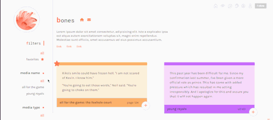

bones | preview , code
a quotes pages with a little popup on each quote to add notes
responsive design
combined filters
you can add notes to each quote card in the form of a popup
card footer with fandom and timestamp
little star icon for favorites
color coded cards: you can edit the colors of each quote card directly on its html
is something wong? need help? let me know! if you’d like, you can support me on paypal or ko-fi
#THIS WAS FUN#quotes page#theme hunter#dearindies#dailythemes#allresources#resourcemarket#resources#complete resources#codingcabin#tumblr page#free content#my page#my free page#coding
228 notes
·
View notes