#i wanted to try out making flag icons for the first time and its so fun
Text


just finished watching one piece : red with a friend and i absolutely fell in love with uta as a character (and cried so hard at the end). they had also introduced me to yamato and he is such a cutie. do i know anything about one piece other than that? no. are they my new fictional siblings? absolutely. /silly
sister & brother flip flag credit to lilbunnyofideals
˚ʚ♡ɞ˚ feel free to use, just reblog if you do firelights˚ʚ♡ɞ˚

#flip! uta#flip! yamato#i wanted to try out making flag icons for the first time and its so fun#their hyperfixation is one piece so this won't nearly be the last thing to show up on this blog as they force me to watch it /lh#uta#uta one piece#yamato#yamato one piece#one piece#one piece agere#agere#age regression#fandom agere#sfw agere#sfw age regression#sfw agere blog#sfw age regression blog#sfw interaction only#ember creates
25 notes
·
View notes
Text
A message to Twitter users coming to tumblr: a message from your local duel-hellsite citizen
So, I’ve seen a ton of Twitter users talking about making and sharing their new tumblr blogs, to escape Elon Musk’s “anti censorship” bullshittery. First of all: welcome! I know it’s looking bleak over there; especially for trans people. But, now that you’re here, I’m here to tell you all about tumblr etiquette, how this website works, and how it’s different from Twitter. Because you can’t come onto here acting like it’s Twitter, lest The Beast get to you.
First, here are a small handful of tips and tumblr facts!
Your likes and who you are following are automatically set to public. You can make them private in your settings!
You can block tags from the settings, too.
There are lots of bots on here. If you’re not careful, you could be mistaken for one! The main way you can avoid this is changing your icon and header from the defaults. Adding a bio helps too!
You can queue and schedule posts so that your account posts throughout the day.
Like Twitter, tumblr has a radical feminist and TERF problem. However, they’re pretty easy to spot. There are lots of guides out there to help you learn how to spot tumblr TERFs!
Tumblr, for the most part, does not have any celebrity or brand accounts.
Your tumblr follower count is private.
You can have multiple accounts with the same email, and they’re very easy to switch between! These are called “sideblogs”.
Your main page is not a “timeline”. It is a “dashboard”!
You can have a custom desktop theme using HTML! Think like ye olde MySpace days. There are tons of pre-made tumblr themes available, if you’re not already proficient in HTML; including free ones!
Now, let’s talk tumblr etiquette and how it’s different from Twitter. You’re a tumblr user now! It’s time to start acting like it!
Don’t just like posts. They don’t increase visibility whatsoever. The way that you can help posts that you like is reblogging them to your blog. Especially for art!
We don’t say “oomfs” or “oomfies”. Just “mutuals” is fine, thanks!
Adding onto a post with pointless comments is frowned upon. If all you have to say is “this is so true,” or something else to that effect, you should put that in the tags of your reblog.
Most people don’t have carrds or rentries on here. Some of us do, but it’s not an obligation like it is for Twitter.
Similarly, we don’t censor words like “die” and “death”. Posts about wanting to brutally murder people in power go viral all the time, and it’s completely allowed. I’m serious! Enjoy your newfound freedom!
Blocking isn’t a big deal here. Get rid of any weird notion you have that morality is linked to blocking certain people.
But lastly, and most importantly:
Drop your discourse at the door.
If you try to post about most of the things that Twitter users discourse about, you will be laughed off the site. Especially Twitter LGBT+ discourse. Posts actively mocking topics of Twitter discourse go viral on here regularly.
Tumblr has mostly healed since its discourse-ridden days, and it’s now much more chill. Of course, discourse still happens, but it is so easy to avoid now. For a lot of us, tumblr is the last pleasant social media site left, so don’t ruin it.
Here is a list of discourse-related things that tumblr users don’t do:
Most of us don’t do callout posts, unless it’s something actually serious (like that one blog that had a human slave).
Everything that you heard on Twitter was “exclusive” to certain LGBT+ groups is used by just about everyone on here. Bi women use the double venus symbol on here. You’ll just have to learn to live with that.
In particular, I want to emphasize how much we don’t do flag discourse. To the point that somebody caring about flag discourse of any kind is how we tend to identify an ex-Twitter user.
On here, you will never have to see another slur discourse post again, unless you actively seek it out.
You’re free.
You’re welcome. And enjoy your time on here! If you have the time, please consider watching StrangeÆons’ Tumblr Etiquette Manual on YouTube, as well.
16K notes
·
View notes
Note
Reader is trying to learn German, and König finds out. Its only right that he helps teach her Ja? Makes her say filthy things to him with her none the wiser.
Pervert!König x Reader (fem)
MDNI🔞
Master List ✍🏽
>cw: fem/afab, dirty talk, masturbation
1.1k word count
📱
.
.
To say König has a crush on you would be an understatement. He’s more so…obsessed with you. No matter what is going on, König makes sure to keep an extra close eye on you. Always lingering near you during training exercises or sitting close in the mess hall.
Today, as he walks into the common room, he spots you sitting on the couch with your phone in your hand. He walks behind you, trying to get a peek at what you are up to. As his eyes land on your phone, he sees the little green language app owl icon in the corner and the German flag. A rush of excitement shoots through him. German? His mother tongue? How exciting!
Acting as casually as he can, he sits down next to you on the couch. You look up and smile at him before looking back at your phone. Not that you could see it, but König smiles back at you under his mask. He struggles to come up with a way to approach the topic, so he just decides to be direct like he always is.
“So, you’re learning German?”
You look back up from your phone and meet König’s gaze. “Yeah, I’ve been trying for a few months now. I just can’t keep the habit of logging on to do so.” Your voice carries a certain lightness to it that isn’t usually found on a military base.
“You know, I have extra time on my schedule. I could help you. German is my first language, after all.” König leans back into the couch, crossing his arms.
“Oh? I wouldn’t want to be a bother.” He’s the Colonel. Getting in his way is the last thing you want to do.
“No bother at all. It would be a pleasure to help. I love when people want to learn German.” His blue eyes gaze into yours, masking his hidden agenda behind a kind look.
“I would really appreciate that, Colonel. Thank you.”
“My office, tomorrow at 19:00.” König stands and walks away with that.
The next day, König sits at his desk, waiting eagerly for you to show up. His fingers tap on the solid wood desk before him as he watches the time. Two more minutes before he told you to appear. Where are you?
Just then, a knock sounds at the door. König perks up in his seat and looks towards the door. “Come in.” His voice carries to you on the other side of the door. You enter and see König appearing relaxed at his desk.
“Hello, Colonel.” You close the door behind you.
“You can just call me König since it’s just us.” He pulls his phone from his pocket and just holds it in his hand.
“Okay, König.” You say in a tone he can easily mistaken as flirting, and he did.
As you take a seat, his eyes follow every curve of your body. He watches the way you relax even in his presence; not something many do. Clearing his throat, he leans forward in his seat.
“So how much German would you say you know?”
“I can only say ‘hallo’ and ‘danke’.” You say with a small chuckle.
“So, you know nothing?” König laughs as he leans back. “Okay, I’ll start with some easy things.”
For the next twenty minutes he walks you through simple greetings, pulling out a pen and paper to write these down for you. He teaches you about umlauts and how they’re pronounced. Once he feels more comfortable, he looks down at his phone and unlocked the screen. The voice recording app is open and he hits record, placing his phone face down on the table.
“Now, let's put some of these words into sentences.” A sly smirk on his face underneath his mask. “Ich bin deine Hure.”
“Ich bin dein Hure.”
“Close, it’s deine. Try it again.”
“Ich bin deine Hure.” You say confidently, not knowing you just called yourself a whore.
“Gut, das ist gut!” He can feel his cock begin to tingle at the sound of you calling yourself a whore. “Once more before we move on.”
König relaxes in his chair as he listens to you say it loud and clear, perfectly too. He nods his head in approval. “Great. Now let’s say, ‘Bitte iss meine Muschi’.” He swallows hard as he waits.
“Bitte iss meine Muschi.” You repeat after him perfectly.
“Again.” His blue eyes are glued to your lips as you speak. He can’t help but to imagine them wrapped around his cock as you gag on him. He listens to you beg him to eat your pussy and its heaven. If only you really were begging.
“You’re doing very well, y/n. Your accent isn’t that bad either.”
You smile proudly at being complimented by your own Colonel on your German. “Thank you, König.”
“Ja, ja…of course. Let’s continue.” He shifts in his chair to ease the tension of his erection straining against his cargo pants. “Next is, ‘Ich liebe deinen Schwanz’.”
“Ich liebe deinen…Schwanz?” You struggle with the last word, a nervous giggle in your voice.
“Schwanz, you said it right. Now again.” His eyes follow your lips closely as you say it again. You really would love his cock if you gave him a chance. He’s never had a lover complain so far.
As you speak you watch König’s gaze lower to your chest and back up to your lips. You think nothing of it, and just assume he was simply looking at you, not checking you out. What you don’t see from where you sit is the giant tent in his pants and him biting his lip underneath the cover of his mask.
A half hour passes of him recording you saying depraved sexual things to König. He’s made you tell him that you have a tight pussy, sweet pussy, how much you’d love to fuck and suck him. By the time he ends the session, there is a wet patch on the olive-green fabric of his pants.
“Tomorrow, same time?” König asks as you stand, preparing to leave.
“That works for me.”
“Perfect. I’ll see you then.”
König watches as you leave his office, his eyes glued to your ass swaying until the door closes. He lifts his phone and stops the recording. In a rush he locks his office door, sitting back down and opening your file on the computer so he can have a visual. He undoes his pants and pulls out his cock. As he hits play, his eyes stay focused on your photo. A low moan leaves his lips as he strokes his cock, listening to you beg to suck it on his phone.
#konig#konig x reader#könig#konig cod#könig x reader#konig x y/n#konig smut#könig cod#könig mw2#könig smut#könig call of duty#konig call of duty#cod konig#cod smut#konig x reader smut#smut#konig mw2#cod könig#könig x you#x reader
473 notes
·
View notes
Text
I’m obsessed with this show and fear a hyperfixation anyways here are my thoughts on every character in the show
Edwin Paine: forever my favorite, even back before the show when I read the comics! I think it’s funny that basically every man in the show wants him? I’m intrigued by his character arc throughout the story regarding his sexuality as despite dying in 1916, he seems to have had time to slowly become more accepting of gay people (I’m guessing in part due to Charles, who is pansexual), to the point where there’s only mild internalized homophobia if at all, which just exhibits itself in him denying any possible feelings for Monty. I love how face-value and logical he is while still being a sweetheart
Charles Rowland: he has a pan flag pin on his jacket which confuses me bc can ghosts only wear clothes they would’ve worn when they were alive, or how do ghost clothes work? Because he died in 1989 and I’m near positive he didn’t wear that pin back there. Anyways I do love him but I wonder about some design choices, like the one earring (not sure why it just kinda annoys me). That was more a rant abt his design than his character, which I have nothing notable to say abt since I LOVE HIM he’s so real
Crystal Palace: sometimes she was a bit annoying the way she was trying way too hard to pry into everyone’s lives, but honestly that was just momentary annoyance since nothing could make me hate her. I love how her past was slowly revealed (as someone who already knew it from the comics) and how she came to terms with the person she used to be vs the person she is now. She’s so cool!
David the demon: honestly kind of caught me off guard at first bc the person I’m dating is named David but I actually enjoyed his character. LOVED when Crystal dealt with him in the end. He was very interesting
Niko Sasaki: I love Niko, but I have some problems with her character. First of all, I feel like ditsy anime-loving cutesy Asian girl with dyed hair is a weirdly common trope? But whatever my main issue is that it feels like characters who normalize the fetishization of gay men are so common. Like if Niko had been a guy obsessed with lesbian manga evb would be weirded out, so why is it different? If we ignore all of this tho I absolutely adore her and I’m actually praying she’s in the next season bc she was one of my favorites (esp her relationship w Edwin)
Jenny: She is so hot and cool and funny I’m in love with her
Esther: oh my god words cannot come close to describing how much I love her character. She felt powerless and weak in the past and now she’s become obsessed with making sure nobody has that power over her ever again. She was so fun and I loved her attitude! I’m sure she won’t show up next season, as she was the main antagonist of s1, and while I love her, I kind of hope she doesn’t since I think her arc was finished.
Monty: His personality was like 2020 “soft boy” who acts nice and dumb but is lowkey a manipulator. So obviously this kind of made me like ☠️ bc why is he acting like that… but I still love him to bits because he’s just a crow guys he didn’t ask to be human,, Anyways yeah his personality annoys me but also I love him so much so? It’s confusing. ITS COMPLICATED. I will cry if he’s not in s2
Kingham and Litty: I honestly thought they were annoying but I can’t lie they were so fucking funny. Every time they were on screen I laughed.
Cat King: oh my god. He is so camp. I love him. There’s honestly not much to say he is simply iconic. Love how he’s afraid to be alone so chases after other people, he’s so real AGHH I love him
Night Nurse: Ruth Connell the woman you are… 😍 she reminds me of Muriel from Good Omens, in a way, and I love her! I really hope we get to see more of her in relation to the guy in the fish, and see her get to better understand human emotions and why they choose to cling onto the human world rather than pass on!
#dead boy detective agency#dead boy detectives#charles rowland#edwin payne#crystal palace surname von hoverkraft#crystal palace#niko sasaki#david the demon#neil gaiman#esther#monty crow#cat king#night nurse#good omens
60 notes
·
View notes
Text
Can't Fuck Bracket - Group Stage. Group 1: Mob Psycho (Part 1)
Reigen Arataka versus Reigen Arataka versus Reigen Arataka versus Reigen Arataka versus Reigen Arataka versus Reigen Arataka

[ID: The unfuckable pride flag overlaid with the "no bitches" meme. On top of it are several pictures of Reigen making exaggerated grimaces and sweating. Reigen is a light skinned Japanese man with short blond hair. End ID]
In all seriousness, we got too many submissions for Reigen, so I am doing this poll for you guys to pick which PROPAGANDA should be used for him. The maximum any other character has is two propagandas so the TWO most voted ones will represent Reigen in the tournament
Propaganda:
Reigen Arataka 1: "cringe. fail. pathetic. loser. canonically doesnt fuck. has never touched a woman in his life. hes sweaty. he got cancelled on twitter. hes the internet sex icon not the real life sex icon he doesnt fuck"
Reigen Arataka 2: "hes kinda ugly :/"
Reigen Arataka 3: "He has absolutely no swag. Nobody wants him. Gets rejected so many times"
Reigen Arataka 4: "most bitchless motherfucker this side of seasoning city. once when asked about his previous romantic pursuits he lied by reciting the plot of titanic as if he were leonardo dicaprio"
Reigen Arataka 5: "Literally when talking about his past love life he makes up the plot of the titanic. Gets no bitches, sweaty as all hell, and just like. Have you seen him? Internet sex symbol but he gets no sex this is false advertising at its finest."
Reigen Arataka 6: "dude okay listen. he is chronically bitchless. when giving out advice on how to woo someone he was just reading tips off of google. there was once a big hype where the author, ONE, was going to reveal reigen’s past romantic endeavors in an in character q&a but it was just reigen making up bullshit about how he’s “DEFINITELY had so many girlfriends before and he once held one at the front of a famous boat. oh that was from a movie? UMMM well it doesn’t matter anyway.” literally just saying something from the first romance movie that comes to mind and trying to pass it off as something he did himself."
93 notes
·
View notes
Note
could you explain (as briefly or detailedly as you feel like, i'm just curious) what makes a flag better than another flag other than just a general like or dislike for the design? like how does one design an effective and "correct" flag? what makes some flags bad? i've been in so many different art and design classes and whatnot and have never learned about this but it interests me!!
oh my god absolutely. buckle up lol
so the main purpose of a flag in general is to symbolise something, in this case a country. a good flag should be something people can rally around. the most important factor there is if people actually like the flag (its not a hideous eyesore). but beyond that, there are a couple general rules that help flags stay unique and accessible so everyone in that country/state/organization/etc. that it represents will be happy with it.
First you have to think about where flags most commonly are: on flagpoles. a flag should not be designed to be seen from five feet away, it should be designed to be seen from hundreds of feet away. in that vein, it has to be simple.

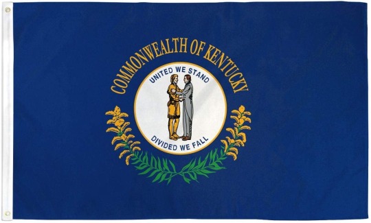
heres the flag of panama and kentucky for comparison. panama’s flag is simple and neat, while kentucky’s flag has lots of little details that are hard to make out even on a phone screen
Secondly, you are not going to be seeing a flag on a flagpole straight on like these images. they will be fluttering in the breeze (AT BEST) and a portion of the flag will be obscured. you know what that means? NO TEXT. you cannot read shit if that flag is flying in the wind, even if you’re on the right side of it so the text isnt backwards. if the wind isnt blowing then youre out of luck

on the left is the german flag, which even if you didnt know was the german flag, you can still tell what it looks like. three stripes, black red yellow. on the right is the flag of illinois, which is trying to tell you its the flag of illinois but you cant tell because that text on the bottom is unreadable.
thirdly, for the purposes of being a good rallying icon, its good to use symbolism representative of what the flag is for
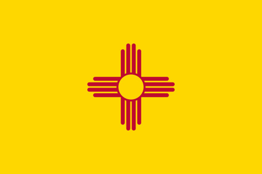

i dont really have a bad example here because this is subjective but on the left is the flag of new mexico. the red sun symbol is a puebloan symbol representing the native peoples who lived in whats now new mexico for thousands of years and the yellow background is for spain, who owned the land before the us took it. on the right is the flag of chicago, with two blue stripes represent lake michigan and the chicago river, and the red stars represent four major historical events
a lot of people will also say that you should only use two or three colors in a good flag but i think you can make more work, even though it might be harder

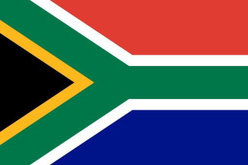
indonesia’s flag, on the left, is a flag with two colors that i would say isnt great (its almost identical to the flag of monaco, which existed already at the time indonesia chose theirs) and on the right is the flag of south africa, which is a flag with lots of colors that i would consider to be a good flag
all of that is to say, if you want to make a good flag, model it off an existing country flag. those are generally the best flags out there because they have the most pressure to be a good flag. most people who live in a country they’re proud to live in love their flags (theres a reason the us flag is so strongly associated with extreme patriotism!). The same cant be said of most states, as a lot of state flags have detailed designs and text, and especially cant be said of cities. i showed the chicago flag earlier because its one of the few city flags in the us that gets actual usage outside the government. chicagoans are proud of their flag as they should be and if youve been to chicago, youve seen the flag. they put that thing everywhere, from backpacks to water bottles. now to top it all off here are some of my personal favorite flags from around the world


left: the flag of barbados (i love the color scheme and the trident is a perfect stylized symbol) middle: the flag of yabucoa, puerto rico (a rare flag that uses purple, as well as having a pretty unique design) right: the flag of maryland, usa (a controversial pick, but its distinctive and marylanders wear it with pride (often literally))
20 notes
·
View notes
Text
boooooo game dev booo
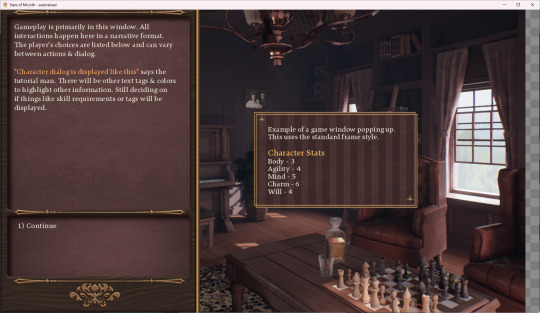
(background image is not part of the game it;s a placeholder, i did not create it. the ui is made by me tho) i have been putting off ui stuff so much jdkfhkdsh please help
it's so hard because you have to make small pieces and try and put it together in your brain. ive done mock ups but there's still like so many windows and things to keep in mind. i still have to design all sorts of menus but if i can get the basic elements then its just arranging shit.
this is the main thing thats been like. halting dev on the game because i have to get the ui set up to properly implement all sorts of functions. i do alot of placeholder stuff but i find that it takes a lot of fiddling /going back to edit text and arrangments that i think i should get it out of the way first. i can polish it up layer, i suppose.
i have been paying alot of attention to the ui in games that i play to get some ideas. animations are gonna be hard to figure out.
other things achieved but lack cool visuals to wow and stun the masses:
i created a grid-based location/travel system. this means nothing to the player besides that the world should feel cohesive and put together despite the game being in 2d & text. there will be a mini map. the first area is a town & surrounding forest-y area. im very proud of the coding i did for the location system so please clap
inventory system is somewhat working. there are items and you can pick them up and they all have stats and descriptions. yay! The clothing system works too. You can dress up and the clothing all have style points so you can dress to impress or distress. It will be fun when I get to draw the icons for the clothing because I shifted the game's aesthetics more towards a whimsy victorian-esque thing and i have been endlessly scrolling through various lolita stores.
i created a way to store the npc's data in a nice way. i like objects so much even if it's pointless at times. it will be useful for the player's journal system, it will keep info on the npcs. npcs will have various stats to keep track of like love/dominance and relationship flags. and hopefully birthdays although i am running into an issue of "is this actually a good idea or am i going a little too kojima on this"
ive gotten pretty far for just 1 person and especially someone who doesnt have formal coding knowledge and is too anxious to dare ask any ppl on the forums. if i run into a problem i will just bang my head against it until i figure it out.
anyway idk bye i wanted to ramble bc im lonely
4 notes
·
View notes
Text
PICREW LIST - What I've Used For Nina!
Time to make a list of picrews. Mainly for myself for future reference, but also to fellow LARPers who want to try out making their characters!
Fantasy icon maker

THIS ONE HAS SO MANY BIRD OPTIONS. I almost couldn't decide! I adore all the staff options, magic options, truly a very good fantasy picrew.
Fantasy girl
https://picrew.me/en/image_maker/197122

We've got a mischievous Nina this time! PURPLE CRYSTAL FOR STAFF YIPPEE! I also ADORE the clothing options! This one in particular caught my eye, cool for mage-like characters!
Yozora Dress Maker

So there's going to be a Winter Ball next year, and I have a fantastic purple ballgown that I could doll up for it... Let's just say i am Excited. I love all the options for magic in this one!! Bonus points for purple!!
Caramael's Character Creator

YESSS we got Nina's scar in this one! I love all the different earrings! (And going through all the pride flags gave me a giggle XD)
Teifling Maker

And here we have a tired Nina thats gone "no thoughts head empty" mode she's dissociating let her be for a bit. Lovely purple options!! And very nice clothes!! THIS PICREW IS VERY COOL!! VERY DIVERSE!! I LOVE IT!!
Nanamae ka (Namemaker)
https://picrew.me/en/image_maker/41329
I adore the artstyle so much!! And the clothes are so pretty!! Very texture!! Genuinely just obsessed with the artstyle, its so soft!!
#larp#picrew#dnd#dungeons and dragons#live action role play#ttrpg#warhammer#warhammer fantasy#rpg#larper#swordcraft
12 notes
·
View notes
Text
i think the esc is so... hm. because on the one hand it's a shitty colonialist and imperialist festival that is trying to rebrand colonizers into quirky modern nations and is so performative in all political messages and their collaboration with israel is literally unforgivable and its literally just nations giving each other points bc they want to politically appeal to them in the weirdest and most pathetic way ever etc.
but also. a lot of the culture of the organizers is in direct opposition to what the fans really watch for? like, macron or whomever isnt watching and personally taking notes on which of his neighboring countries voted for france, but the juries act like all politicians do this, and they use their time hosting as this massive branding and propaganda campaign, and they try to come across as kind of "modern and relatable", but don't want to be the "weird" entry, like. for westerners, this is kind of about "prestige", while at the same time they are refusing to send any compelling candidates?
and i think to the countries and organizers and the politics behind the esc this event is about showing a politically favorable image of their country that seems modern and prestigious, while the actual appeal of the show is to find artists that usually arent found on the international market and give a stage for more camp and artsy performances, and the people watching want an entertaining time, where they see songs that actually stand out and are fun to watch and listen to, whereas the juries just vote for an entirely different set of entries.
so like, a lot of people are watching it for the camp and queer and "unique" entries, while it's actually a show made for the boring ballads and shitty pop songs, because all the jury and the esc care about is, what is gonna sell and what isnt (this might take a new interesting turn, now that tiktok also has a big say in which songs become popular and which ones dont, but right now they know that generic pop has more sales than "too quirky" entries)
this is all ignoring that the thing was soooo obviously rigged this year so that they can do the "50th anniversary of ABBA" next year in Sweden, and that the jury almost always seems to tend to give points based on politics and not on music, and that i genuinely think that they are even manipulating the audience votes occasionally so that certain entries that win arent "ridiculed" because they got like, 21 points from the audience and 360 points from the jury.
and its like. probably 60% of the audience are queer people or people who are watching to see fun & campy and queer entertainment, and the showrunners know this, so all their bits are queer, they have queer hosts, they use their show break for drag performances and talk about "the first gay kiss of eurovision" and there's pride flags, and the iconic "quirky" entries make reappearances with new songs, while the boring ones almost never get a big re-invite. but they do all of this as a sort of fake promise, like, "yes our show is so gay and so camp and so fun and legendary for the fun entries hahahaha, anyways the jury vote goes to some guy pretending to be Imagine Dragons and none of the interesting entries because we cannot widely market homosexuality", and only when the audience vote is so truly overwhelmingly for one entry that they can overpower the juries, it promises marketability.
they will never abolish the juries because the juries exist so that marketable songs win that bring the ESC a lot of money, the type of hosting and their internal politics will never change because this is a contest that they can use to generate sympathies to a country. this whole thing is a fucking colonialist's PR campaign, like, "yeah, israel has a bad rep, but look at how cool all of these places in israel look and how fun and modern and #feminist and #gay our entries are! how could we possibly be an imperialist force who is actively commiting genocide?"
the esc is inherity tied to nationalism and imperialist propaganda, and while it pretends to care about international music in people's native tongue and artists that usually wouldnt be on a international stage and queer entries of all kinds, it really only cares about money and promoting one's own image as a country and that is never going to change.
and i don't think you can't at all watch the event, but it is literally insane how few people who watch it are aware of any of the politics happening within the event and who call it the "gay event of the year" or whatever with no idea that they are being sold and pandered to so that they spend more money on a product (votes and tickets), and give their undivided viewing time to a program that you can only call a continent-wide propaganda event. i hope i make sense
#i hope i make sense#esc#eurovision song contest 2023#esc 2023#eurovision#eurovision song contest#like. i am also occasionally watching the thing bc i do LIKE the queer and campy entries#and the people doing traditional music that has to do with their country#but. literally all this show is is marketing
9 notes
·
View notes
Text
its a long one lads

( @aomi-nabi ) THANK U AAAAAAAAA ur asks always make my day omg 😭😭❤❤❤

THE WALK WITH ME IS SENDING ME KFKJFDGFGK so far we’ve also canonized him death dropping so i can really see his ass doing both-

nothings going on dw ive just been busy dkfjdfk 😭😭
TYYYY RIGHT BACK AT U MWAHH

( @deathbypufferfish ) death by pufferfish . com
( @astralsi ) I CAME BACK JUST FOR U MAMA MWAAAHHH 🤧🤧❤❤❤

( @lava-nder ) ngl my sims rarely even interact with townies made by the game kfgjfk 😭😭 if i do notice my sim getting close to a townie (.ie nadine or josh) THEN i’ll give them a makeover, but other than that i just ignore them or put in my own townies kdfjk as for lots, i just build my own or place down any new ones once i realize ive been to a lot too many times and want to switch it up
GATIA BABY!!!!!!!!!!!!!
REAL i love oshin sm omg, been with her since her get famous lp 😌
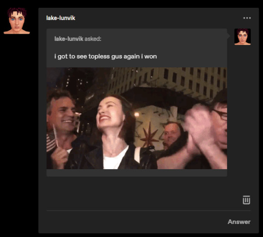
( @lake-lunvik ) YOU ARE SUCH A HORNDOG LIO SDJFKDFJKF

HELPPPFKFDK im not surprised, during homelandertrait halloween takeover i was ready to lose some followers 😭😭😭


( @mmusicalwhims ) thank u so much !! 🤧❤❤❤❤ i should bring back that username tbh it was kinda iconic KDFJKFD
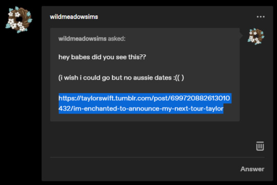
( @wildmeadowsims ) (link) AAAAAAA I SAW im not really a concert person but im excited to see everyones recording of it dkfjfkfkg and i heard she was adding more international dates eventuallly so fingers crossed !!!
ive never had that problem god bless KFDJK but i think u can turn off auto mean interactions with mcc so theres a temporary solution

the randomize button is my beloved
THIS ASK MADE ME GET OFF MY ASS AND FINALLY ORDER A MIC SO SOON IF I DONT PUSSY OUT DKJFKGF
( @velvet-disc ) TYYYY take them, they’re too much for me to handle anyways 🗿

( @25dejulho ) it depends on the save, but usually i start in another simmers save (my faves are ratboysims and simlicys), either build a house or find a shell off the gallery and decorate it myself, make a fam, then make some townies, give them all skills, careers, etc. just so theyre not like- newborns THEN start playing dkfjk its hella overkill and takes hours but thats how i do it 😭😭😭 tbh u dont even gotta do all that, u can just start in the aforementioned saves by other simmers and start ur own sims from scratch dkfjfgkj
( @catladyfinds ) hi!! i try to keep my cheating pretty minimal, but theres no like- hard fast rules i do. i never cheat money just bc i think its boring for my sims to be hella rich skfjkgfgk but at the same time, if they have to pee and the toilet is 3 stories up then ill just say fuck it and cheat it 😭😭 so my rule is pretty much, quick lil cheating of needs is fine, but nothing that would make the game too easy or unrealistic
currently its cas and gameplay! but im hoping to get bit by the building bug again bc i have some ideas dkffkfg
aaahhh, idk really i get hella attached to 90% of the sims i make instantly 😭

( @chlosimly ) TYYYYY 😭😭😭❤❤ its all the cc makers not me KFDJKF

(referring to the non-canon halabi death i overruled) SEE its so depressing and dark i dont even wanna say it 😭😭😭 ITS OKAY, THAT TIMELINE NEVER HAPPENED I INTERVENED
see i take offense to this bc the charm family is ugly as hell 🥴🥴
thank you!!! 😭😭❤❤❤
HELP i dont want to be too annoying so i try to keep the soju shut up posts to a minimum but im glad u like them 😭😭❤❤ im a chronic complainer so theres more where that came from dkfkff
i didnt wanna use her last name in the tag in case she got married and changed it 😭😭 same kinda with her first name, lord knows i cant resist family gameplay so i wanted something that could still work if i ever post from her future kids pov!

THE WAY THAT POST IS STILL FLAGGED TOO UGHHH
( @starterflowers ) thank u so much !! i also think hes pretty awesome kfdkfgk u have a great day/night as well ! 💕💕💕
*jumps then falls flat on my ass*
in theory 😌
REAL i need him as an actual tangible person i can slap around (affectionately)
i dont think its a specific part, more so just trying to make someone who doesnt look bland 😭😭 if a sim is too cookie cutter ik i wont feel any emotion for them kfkgfk

i actually liked how evermore/folklore had no hype! the surprise made the whole thing more special, like i lookback at those releases fondly dkjfkd now- yeah she def overhyped midnights 🗿🗿🥴🥴 this roll out has been so lackluster and so help me god if we get another anti-hero remix im gonna snap
#asks#anon#aomi-nabi#deathbypufferfish#astralsi#lava-nder#lake-lunvik#mmusicalwhims#wildmeadowsims#velvet-disc#25dejhulo#catladyfinds#chlosimly#starterflowers
23 notes
·
View notes
Text
I had some weird nightmare experience and then an equally weird waking up experience
The nightmare started with one of my family members finding a golden eagle. It had a collar and contact information so apparently it was being kept as a pet.
So the number was called. A seemingly nice family came over to pick it up and stayed to chat before revealing their true nature. These folks, parents and two children, were actually murderers. They let the eagle loose in order to choose their targets based on who contacts them.
The four of them all had an obsession with snapping people's necks to kill. Dunno why they never went after each other. I spent the dream trying to be the one they killed next because I'm emo. It was difficult because everyone was running and scattered.
Eventually it came to where the only remaining victims alive were me and mom and one of the murders was about to go for me and I was saying stuff like "please make it quick I've been wanting the sweet escape for a long time"
except it was interrupted by the sky turning gray. No sun, no clouds. Just covered in gray. It was dark for a few seconds but then the sky was illuminated by flashing icons of the flags of every country. And this wave of holographic-looking flags was disintegrated everything in its slow moving path.
I don't even know how to identify country flags and stuff. And yet every single flag of every single country was there one a path of destruction. The dream told me it was a nuclear explosion but I don't think they look anything like that do they? The part with the entire sky turning gray and dark I mean.
Anyhoo, this was an interruption and everyone was just staring while I was pleading with the murderer to just hurry up.
I woke up before the wave hit. and the room was colder than anything I have ever experienced. Like- I live in a hot climate and the summers get so hot people die. I rarely see snow. It only snows around every 10 years where I live, although a few years ago it snowed heavily. The snowfall was unlike anything the entire area had seen. I got frostbite for the first and only time then.
So as I was saying, it was colder than anything I've ever felt before when I woke up. It's summer time so this shouldn't be happening. I don't keep the air conditioner on when I sleep but this wouldn't have happened even if I did.
The cold was so severe I couldn't even move for several minutes. All my hair was up and I was stiff. I had some kind of mild panic attack when I realized I wasn't able to move. I stayed silent throughout all this, because I'm just weird like that.
I was praying in my head and then after what felt like 10 minutes, I was able to move and calm down, but it was still night and with that bizarre nightmare I was too scared to get out of bed so I decided to go back to sleep and so I did. I slept until noon and have been feeling weird since I woke up.
What was all that?
Later I talked to mom about this dream, but only because I asked out loud if anyone else got cold in the night. Nobody did. Everyone was confused and then I was forced to explain stuff(hence why I'm usually quiet about everything to my family) and mom wondered what the odds are it was a prophetic dream. With how the world is, who even knows at this point.
I've had prophetic dreams before, which is why whenever I have a pyrophobia triggering nightmare, I'm messed up for weeks.
5 notes
·
View notes
Note
My thoughts on the icon and name thing:
Firstly, I personally have just seen queer people changing the meaning of gay panic thing to something positive and I personally like the expression and do not have a problem with it. However it is a horrible real thing in its original meaning and I think people should be at least aware of it. And so like your blog name is fine. It's named after a character and something to do with the character.
Secondly, I check people's bios before following to decide if I want to and then honestly never again. So I don't even remember reading the ally thing. But what I see every time is the blogs icon. Personally if people have a flag on their icon no matter what other stuff there is (in this case steve) I interpret it to tell about the blogger and not whatever character is on the icon. (I repeat: I personally see it that way and if I interpret it wrong it's on me.) So to me the bi flag in the icon is "misleading" if you then say you're something else than what the flag says. (I repeat that I personally do this and actually just realised that maybe I'll want to stop doing that.) BUT it also connects to the character on the icon and to your blog name. It all makes sense when it's all put together.
Idk if this made any sense but I want to say that I don't think you've done anything wrong. I think your name and icon are fine. I actually like them.
I hope this doesn't blow up to a huge thing and you get to keep posting normally. You don't have to answer to/share this publicly, I just wanted to share my thoughts.
I really like your blog and hope you have a good day:]
-a queer person who is just trying to vibe
I totally agree that gay panic defence is an important part of history that needs to be condoned but yes I also agree that in its modern day meaning it's quite different and yeah no I get what you're saying about the pfp. I know some people use flags in the background as a general telling people what their sexuality is I think yes in passing if I'm randomly found somewhere on this hellsite people would probably assume I'm bi and that's very fair but I do feel that a lot of people do the same as you before they actually follow someone and that's check out their profile first and when put together I do agree it makes sense as a whole.
Thank you for ya vibes and adding to this discussion ❤️
16 notes
·
View notes
Text
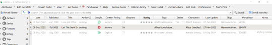
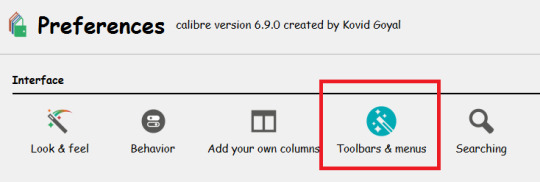
Calibre - Look & Feel
After setting up Calibre, setting up FanFicFare, it's now time to change the User Interface so to personalize Calibre at its best.
The standard Calibre UI can be changed by going to Preference -> Look & Feel menu:
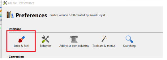
Main Interface
In the Main Interface menu you can play around the various options:
You can choose if you want to display the calibre style (and in this case if you wish to trigger the Night Mode, under "Color Palette") or your system default.
You can check and change the icon theme, by clicking on the "Change Icon Theme" button. Select the one you wish to try out and click on "OK"
Close the Look&Feel menu and the new icon set will be used instead of the standard one.
For example, this is the look of "Monstre" theme:
If you wish to have no icon at all on top, you can disable them. Or you can make them smaller (or larger). You can decide if you want to have the text displayed or not:

Finally, you can change the Interface font.
For example, if I don't want to have icon on the menu, and I want to use Comic Sans, this will be the final result:

Cover Grid
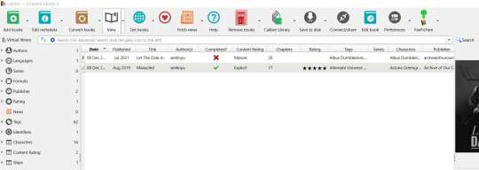
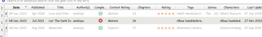
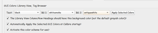
Calibre has two options to view your books list: the List View we talked about up to now and the Cover Grid, which shows the covers.
In the Cover Grid, you can tweak how you want your Cover Grid to look like. If you want to show additional information (the Title, or the Author, or whatever else), the background color/image, the size, etc.
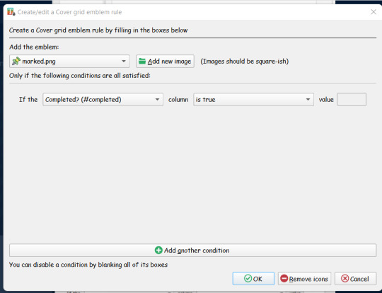
In the "Emblems" tab, you can choose to had an emblem to each cover following a rule. For example, let's say you want to show a "Completed" icon if the FF has been completed.
Go to Emblems, activate the "Show emblems next to the covers" option and then click on "Add rule"
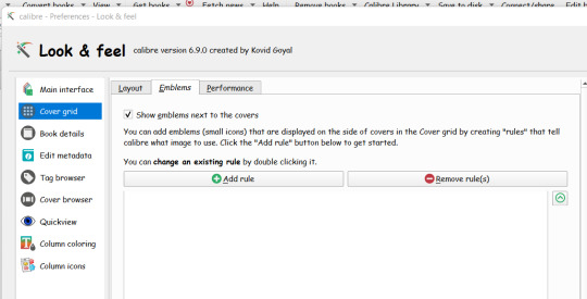
When you click on Add Rule, you need first to upload the emblem you wish to use. You can search and find for icons on the web.
Then you can add your rule. When you click on the drop-down menu next to "If the", all your columns will be listed. Remember the "look-up" name of the column you want to test and select that one.
In our example, we want to test if a FF has been completed, so we will need to find the "#completed" column.
Once we selected the column, in the field next to "column" we can add the condition. Calibre automatically detects the type of data we are dealing with, so in this case we already have as option "is true"/"is false"/etc.
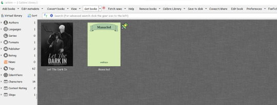
Confirm and go back to your books list. Click on layout on the right bottom bar and select "Cover Grid"

And here we are the final result:
Book details
In the Book Detail tab, you can flag which infos are shown in the Book Detail (quickview) that is shown on the right side (if you are using the "Wide" layout option defined in the Look&Feel tab) or at the bottom (if you are using the "Narrow" layout option). If you are comfortable with CSS you can change the CSS, you can also order how the metadata should be shown, and select which action should Calibre do as default when you click on the Author name:
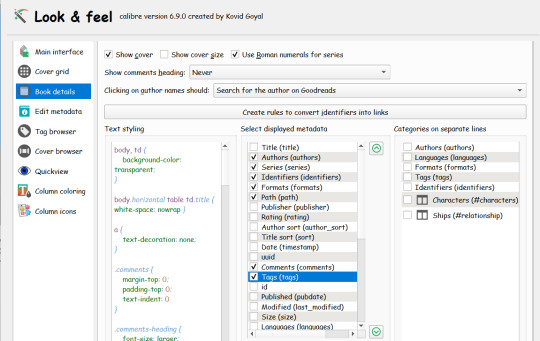
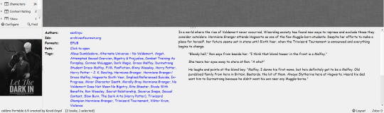
In the "Narrow" layout, the final result will be shown at the bottom:
You can change its size (just drag the "three dots" around), or you can disable the "Book details" view from Layout -> Hide Book Details
Edit Metadata
The Edit Metadata tab is useful if you want to change the order of your custom fields in the "Edit Metadata" function and how they are displayed (separated from the standard one or together)
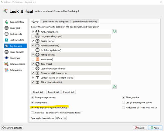
Tag Browser
The Tag Browser defines how the tag panel on the left side is customized:
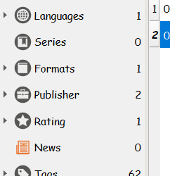
You can select which tags you want to be shown (you can hide/show tags also by right-clicking on the browser tag itself and hide/show the various tags). More importantly, you can decide to hide any tag that has no value
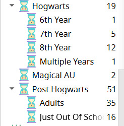
In the "Hierarchy & Searching" tab you can define which of your tags have a hierarchical structure.
By default all tags considered at same level, but Calibre allows hierarchical tags by interpreting the dot as your hierarchy separator.
For example, if you want to create an "Era Setting" and use this hierarchy:
Hogwarts -> 6th Year
Hogwarts -> 7th Year
Hogwarts -> 8th Year
Post Hogwarts
Others
You will need to create a custom column (#hp_era_setting) and flag it as Hierarchical in the tag browser.
If you fill data as "Hogwarts.6th Year", Calibre will show the hierarchy like this:
Cover Browser // Quickview
I'm skipping this two tabs because I have never changed anything there. They can be used to change the Cover Browser and Quickview tools you can find under "Layout" icon (the same one you use to switch to the Cover Grid and to Show/Hide the Books details)
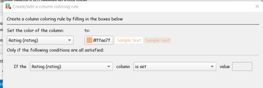
Column Coloring
Column Coloring tab is used to define how to change colors of a field based on any kind of rule.
For example, let's say you want to change the color of a row from black to gray if you have already rated a fanfiction.
You need to create a rule like this, in which you change the colour of all columns for all records in which the column "Rating" has been set
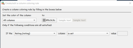
Here the result:
You can add multiple rules. So for example you want to change the color of your stars?
You need to add a rule in which you change the color of ONLY the Rating Column if a Rating has been set:
Column Icons
The last tab, "Column Icons" will allow you to add icons to column based on rules.
For example, let's say you want to show icons for the rating. You need to have rules like this one:
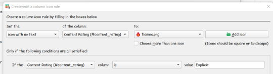
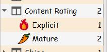
In which you are setting an icon (without text, if you don't want to see the actual column value) if the Content Rating value is "Explicit",
The result will be like this:
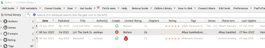
Changing the Tool Bar
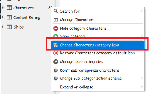
You can also change the Tool Bar to add/hide menu options you are not interested in.
Changing the icons on the Tag Browser
You can change the icons in the tag browser by right-clicking on the tag you wish to change and selecting the "change icon" option:
Further customization
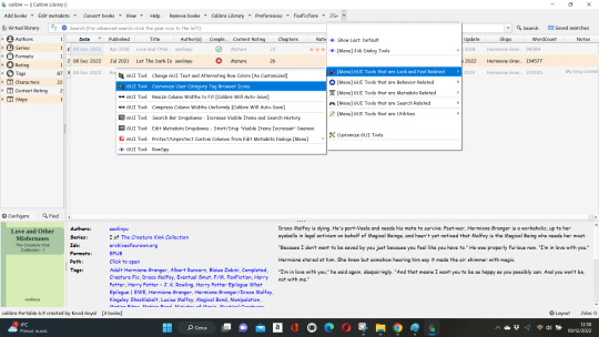
You can fine-tune the look & feel of your library through JobSpy Plugin.
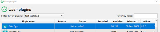
JobSpy is a super complex plugin (which I won't pretend I know much about to start with) but for our needs we just needs two things:
Open the "Customize GUI Tools"
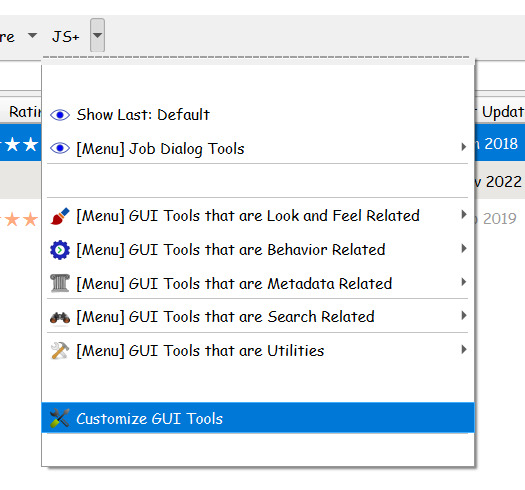
and scroll down till you find the GUI Colors: Library View, Tag Browser.
Here you can choose your color scheme and activate it:
2. By default when you change the icon on the Tag Browser, the new icon is used for all the items. But maybe you want to change the icons to match your "Column Icon" rule.
Select GUI Tools That are Look & Field Related -> Customize User Category Tag Browser
Select the tag you want to customize and the plugin will detect all the values currently used:

Browse your pc for the related icon and assign it to the value. You can review the assigned icon in the table.
Flag the option to apply them at Calibre start-up, and here you are the result:
Calibre Integration with GoodReads & your e-reader
In the next post I will go through some basic tools to integrate your calibre library to goodreads, to download goodreads cover and to set up your e-reader.
16 notes
·
View notes
Text

ooc: new ooc icons are still a wip but!! i thought i'd go ahead and show what i've got cooked up so far! i think i'm going to use these as the basis for all of my icons on this blog, cause i'm kinda attached to the design to be honest, but i'm considering making the main square a little bit smaller so i might have to widen the icon itself (theyre supposed to be 50x50 but tumblr is making them bigger even tho ive got icons with the same dimensions...........)
i've done a lot of rambling for this post, so i'm going to be putting all of the extra info i have typed out under the cut! (extra info includes some fun facts about these icons, new muses i'm bringing to the blog, the status of my icon making, etc.)
first off, yes i'm using song lyrics for these icons; i'm gonna try to make the icons have song lyrics from their theme songs that i picked out (which includes my icons, the lyrics are from nothing by catie turner bc its a song that i resonate with a lot)
and yes im also using pride flags for these icons!! the amount of pride flags may fluctuate based on my character headcanons, so the amount will vary between just 2 and all 4 of them; the flags in my icon in particular, in order (top to bottom), are transmasc, boyflux, uranic, and the 2019 polyamorous flag
anyways, i'm going to work on the rest of my ooc icons tomorrow! i will also get to work on editing all of my character icons...... it's going to be a hellish process (primarily because surge and twilight have well over 150 icons i'll have to re-edit) but that's the joy of running a multimuse is icon making lol, and i kind of miss doing it
my main 4 characters (kieran, kitsunami, wanderer, & kokichi) will have their icons done first since they are priority characters. i will slowly work on everyone else's icons as i go. all of my muses will still be available! they will just be iconless for the time being
i'll be using a mix of my old icons and new icons until all of the new icons are done (old icons will be used if that character's new icons aren't done yet) and all of my new muses will get the new icon style right away!
with that being said, i want to announce the new muses here since i haven't made a proper post about it (or i deleted it lol); the brand new muses i am bringing to this blog include rose quartz (and pink diamond), lapis lazuli, boyfriend, and kinitoPET!
additionally, i have taken a look at my considerations list and i have decided that i will officially be bringing puss in boots, discord, and bonnie to the blog! the newest muse up for me to consider is amethyst, so she has been added to the list in replacement of the others that i'm officially taking on or removing
speaking of removals, i've decided to remove mordecai and mystery from my considerations entirely, as i cannot effectively play them until i fully invest myself in learning their lore in its entirety (i was planning to play them primarily based on just the lackadaisy pilot and the msa episodes, but that's not the best course of action i can take right now)
so yeah, i think i'm finally done rambling now! with all that being said, i am 100% going to be active tomorrow! as always, every meme in my memes tag is open to be sent to the askbox, and i'll work on responding to roleplays or sending out unprompted/meme things inbetween my icon making (based on whoever is active), so i'll see you guys tomorrow! (after i finish my daily artfight attack ofc lol)
#:/: ooc#:/: psa#mun msg: ima not delete this one#mun msg: cuz this post is kinda important#mun msg: im heading to bed now!!!!!!
1 note
·
View note
Text
NM3217 Assignment 3 Critique
For the assignment brief, I thought of using a number infographic, with a big element in the center to anchor the entire design. As such, I started by placing the car - an E46 M3 car, before preceding to think abt the information I would like to include. For the information, I decided to go for the path of picking out the most important information or characteristics that made the car so iconic, such as the weight, engine capacity, etc. However, I did not want it to be a fully commercial-style infographic, thus I did not include the price, as this car has stopped production for quite a few years already. After placing the cars and information around them, I then added some elements to emphasize the point of different points of the car, such as the outline of the Nurburgring track where set its lap time, a piston to represent the engine, etc. Also, I chose to portray it on a black background as it helps formalize the design, bringing back a feeling of nostalgia while using a modern design language for car infographics, which is that of a dark background with brighter colored fonts. The use of white fonts gives an emphasis on the information being portrayed, as being more formal, while the contrasting blue of the car puts the center of focus on the car as the subject.
For self-reflection, my first version of the infographic for the critique feels a bit messy. At that point in time, I felt that the use of different colors for the information and the background seems a bit messy. Thinking back, I got quite caught up with the ideation and conceptualization of the inspiration, such as the German flag and the racing checkered flag. Thus, I failed to realize that the colors were clashing and a bit unsatisfactory as I turned down the transparency, making the background of the Germany Flag seem like a sick and pale yellow, red, and grey, which does not go well together with the blue of the car. As such, learning from this, I learned to be more cautious and always keep in mind when conceptualizing designs on how they will appear with the different colors, which might not be apparent when doing a black and white sketch for ideation.
One point brought up during the critique by my peers is the overly casual portrayal of information with the colors and font size and typography. As I used many colors, as well as many different fonts, with more than 2 fonts in the header alone, some of my peers revealed how it seems a bit messy and hard to focus on the information being portrayed. A comment on how the header can use a single font to anchor the entire design is also mentioned, as it can put the focus on the 1 header, which is the model of the car. My use of colored strokes was also mentioned, as it makes it hard to read the subheaders.
As such, I changed my design to be more formal and showroom inspired. By referring to existing car advertisements and infographics, I realized that a simple black or dark grey background will work well as it will appear more “black and white”, making the information seem more reliable and more true, which is important for people viewing a number infographic. I also added grid lines to anchor the different locations of the information, making it easier to identify which illustration belongs to which body paragraph. I also cut down on my usage of typefaces and used a san serif style to make it easier to read. The different colored strokes were also removed, as they seemed out of place and too casual on a black background for a car infographic.
Another point brought up was to make sure that all the illustrations have a purpose of portraying the words on the infographic. For instance, I inserted a graph without any labels such as the x-axis, y-axis, or any labeling. This was meant to show the high production numbers. However, this backfired as it does not really help the portrayed of information when people try to read it. As such, this reminded me of the purpose of the infographic, and how the design is meant to help people better visualize the information in words, rather than being there for aesthetic purposes.
Hence, I removed the graph as I realized that it does not bring much noticeable value to the infographic, but rather makes it messier and brings focus out of the other important information.
One other notable point is wordiness. One comment was that the infographic was too wordy, and many words in the paragraph can actually be shortened or removed. Initially, when doing up the infographic, I thought that more words will be more beneficial, as it is supposed to show information. However, I realized that this can blur out the vital information and make it more difficult to identify and read.
As such, I cut down on the words of the body and this helped shift the focus back to the important information.

With Adobe Illustrator software, I differentiated the layers that I wanted. For instance, for the headers, the car, and the body paragraph, I used a layer each so it is easier to shift them around and adjust. Also, for the various smaller illustrations such as the speedometer and the trophy, I tried to use a separate layer so it is easier to identify and lock it in place so they do not get accidentally shifted around or deleted and need time to redraw.
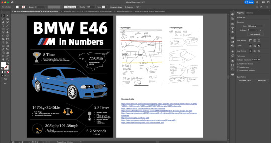
Finally, I added an artboard and added in the source and the prototypes.
0 notes
Note
Different anon here but can you go into more detail about how the original shorts are uncirculated and misinterpreted in certain fandom circles? I was under the impression that they were the most iconic and well-known versions of the characters and the other LT stuff wasn’t as popular.
I don’t want to go too in-depth about this because I don’t want to come off as hateful towards TLTS however I will say (with no disrespect towards people that like it and esp not the people that worked on it) that I feel the reason for its sudden resurgence has less to do about the show *in particular* but more how it presents the Looney Tunes cast in a consistent domestic setting with consistent characters—which is much more easily consumable for fandom than shorts with VERY little continuity and characterizations that could depend on director, year, or even just that short.
☝️this previous anon i just got completely hit the nail on the head and shares my sentiments exactly. The Looney Tunes Show hit a HUGE resurgence of popularity in the past few years (which is great, anything to get people interested in the characters) but i sometimes get the impression people wholly base their impressions on the characters off the show, and the show is VEEEERY far removed from the attitudes and personalities of the originals
i ALWAYS go on about him and have used this comparison countless times so i apologize for going on about it again, but a great example of this is Porky—i have a lot of issues as to how he’s portrayed in TLTS because he’s often portrayed as a helpless dweeb who everyone picks on and beats up and he’s just supposed to take it. this portrayal has sort of been adopted in a lot of modern LT media as a whole, but there’s a tendency to generalize characters, take one trait and run with it. Porky totally could be passive and a little dweebish in the originals (but often from a standpoint that paints it as endearing rather than mean spirited and sympathetic by proxy), but i have a hard time believing the same character who has spelled “START PRAYING DUCK” with a spray of bullets in the white flag Daffy was waving as a means of surrendering would totally be fine with having Daffy throw… was it butter? bread? i forget but there’s an ep of TLTS where Daffy lives with Porky and then just turns him into his personal assistant and throws stuff at him and Porky’s just fine with it. this is the same guy who nearly drove a domesticated dog to jump off a bridge and successfully shot a cat dead because it was keeping him awake

what little OF the originals is circulated again from a very fandom centric point of view… this isn’t an issue exclusive to the LT fandom, but viewing everything from a lens of “i MUST ship these two characters together everything has to be shippable” (i did this when i was first getting into things too—it’s a hard habit to break but i promise you do not have to ship anything and everything to get fulfillment) is so restrictive and makes people concoct their own personalities for the characters WHICH IS FINE, but trying to pass those interpretations off as cold hard fact is not so great. a lot of misrepresentation gets circulated that way and it all just kinda turns into one big loop
i realize how pompous i sound right now so i just want to say: don’t take any of this too seriously. my main point of this is to say curate your OWN experience and make opinions for yourself by watching the originals, and that INCLUDES me. if you watch the originals and don’t like them and want to keep doing things your way, DO IT! feel free to disregard all of this. i promise i’m speaking from a place of passion and love rather than scorn and gatekeeping. we all come from different places and have different points of view and different ways to experience things that we find the most fulfilling. if you enjoy shipping the characters and searching for a continuity and deeper meaning, that ROCKS and more power to you. i just wish more people would check out the originals or at least base those headcanons with an acknowledgement of the original mindset in mind, because i feel much of the popular consensus on the characters ranges from generalized/surface level to wholly misrepresented.
to say people have to enjoy and experience LT a particular way is totally wrong, and HAVING FUN should be a priority first and foremost. but i really do think you should familiarize yourself with the source material so you can have an understanding of what’s actually there versus so you can build off of that or at least acknowledge it. the LT characters are not one big happy family, they’re not ALWAYS actors unless explicitly stated otherwise, there are trends and continuous character traits or formulas for certain characters, yes, but the shorts themselves have no continuity. these characters change constantly in the originals. there are at times 3 separate conflicting interpretations of the same character at the same TIME from different characters. some people have a tendency to view that as a sign of weakness, and that’s WHY i encourage people to check out the originals because that variety and humanization and FEELING THE HANDS AND MINDS AND BACKGROUNDS THAT MADE THE CARTOONS is such a fulfilling and UNIQUE experience. revel in the variety and confusion and dissonance of the originals. there doesn’t always have to be an explanation or an end justifying the means. it’s 7 minutes of characters beating each other up, saying funny lines, and making outdated radio or celebrity references. enjoy it for what it is
#i’m gonna shut up on this now because i hate sounding like potential fun police or like I Know Everything truly i just wish more people#could have a greater appreciation for the originals because there’s a lot there to appreciate#long post#anonymous#asks
30 notes
·
View notes
Last Seen Blogs

shanes-mother-cluckin-asks
Ask Shane

shane-k
Untitled

adritav28-blog
VKook
obuqwe
Gay cat draws

shalinikarna
W.R.I.T.E.R