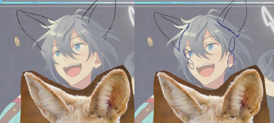
#so I'll see if I can find a tutorial for something similar and see if I've absorbed enough lessons to make it >:3
Text
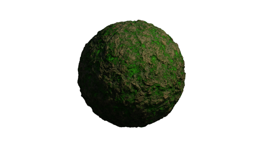
Month 4, day 3
Tonight we did a mossy ground texture :D
I'm going to cause ~problems~ with this >:3 Visorian problems~
#the great artscapade of 2024#art#my art#blender#blender render#procedural textures#blender 3D#cycles render#my roommate has issued me a challenge#or rather a suggestion#plastic!#which should be relatively easy enough to do but he specifically wanted with surface imperfections#like from the molding process on Gunpla parts#(he's the reason I'm doing that untitled Gunpla comic if anyone remembers the character expression sheets I did for that in '22)#so I'll see if I can find a tutorial for something similar and see if I've absorbed enough lessons to make it >:3
3 notes
·
View notes
Text
Just Dance Care AU!
Ok ok so I thought of a story for this Au but it’s nothing really impactful or full of drama and angst like my other au’s, I wanted to leave this au easy and fun to play around, because, let’s say it. Just Dance and drama in the same sentence makes me laugh.
story and PNG version under the cut!
(I gave up on Y/n design because I couldn't figure out a general look for them. This is you we are talking about! Draw your own JD fit, I'll draw mine soon XD)
Anyway here’s the story so far:
Year 2029, videogames industry made a huge step forward and classic consoles and devices were substituted by the new and upgraded VR headsets with full body tracking. It’s something like the NerveGear in Sword Art Online without the kill switch. Some games still require you to actually move your body (like fitness games or sports because yeah, they don’t have a purpose otherwise).
Y/n wanted to buy the newest VR headset but, while searching for the best offer, they found out FazCo entertainment was hosting a giveaway, the prize? One of their prototypes, a VR meant to be released the next year coinciding with the opening of their first mega pizza plex.
(so the plex doesn’t exist right now). You decide to sign up for the giveaway and after a while you receive an email telling you you won the VR headset and that, to claim it, you need to read and sign a series of NDA policies (understandable, it’s a prototype headset that’s not even in commerce). Some clauses are a little bit concerning but nothing you hadn’t read on other electronics booklets, so you decide to sign. After, like, a day, you have the VR in your hands.
The box let you know with super saturated and colorful writing, that the VR came with a game pre-installed inside. Uh, that’s why they were giving one away, they wanted a free game tester…but you know what, it’s worth it.
You always liked Just Dance games, they make you think about happy memories of your childhood. This pre-installed game called “Five Dances at Freddy’s” is a close copy of your childhood game with original FazCo songs, characters, environments and also some collaborations with other famous artists. It probably will be the cause of a big copyright infringement report.
There are various ways to play it: story mode, Casual dance, Five Dances, and Just Dance Care.
The first one is similar to the casual dance mode but with little cutscenes between a dance and another to tell a tale, Casual dance is how you can play the collab songs, Five Dances is the multiplayer mode and Just Dance Care is a more uhhhh “hard” way to play the game with all the other modes mixed in it. You stare at the description of the last mode smirking and decide to try it first just to see how far you can get before losing (yes you can lose in hard mode in this Just Dance, but you don’t die, you just have to restart from the beginning). Turns out the FazCo wasn’t kidding when they advertised the new headset as a breakthrough in the world of virtual reality headsets, the thing TRANSPORTED you inside the game itself.
You almost have a heart attack when you can’t find your VR on your head, but before you can try something you are blocked by two tall individuals who you think are the “tutorial” characters.
Yadda yadda, tutorial, you can pause the game and exit whenever you need just by opening an hidden menu, you find out your tutorial characters are called Sun and Moon and that you are way worse than you remembered at dancing (damn full body tracking, there is no way you are going to do a cartwheel in the middle of a dance, you still don’t know if your body is inside your home and if you’ll physically feel pain if you fall and you don’t want to find out).
You pass an embarrassingly long time trying to win your first dance battle just to discover it was still the tutorial.
You try to go on with the story but you fail at the first real battle with a bear character named Freddy.
And guess what? You have to start again from the tutorial! Y/n is gonna spend A LOT of time with Sun and Moon if this goes on.
509 notes
·
View notes
Text
how to make cool blobby turing patterns in photoshop
i'll preface with i learned the basic loop from skimming a tutorial on youtube, but as someone who prefers written tutorials i'm sure many would appreciate one! also, the second part of this is some of the visual effects i figured out on my own using blending modes and stuff.
i'm using photoshop CS4 on a mac so some buttons and stuff might be in different places on windows and newer photoshop versions but all the actions are the same. my canvas is 1000x1000 pixels.
UPDATES (i'm hoping these'll show up whenever you open the readmore?)
it's possible to do something similar in krita using this plugin, made by the love @arcaedex
it's also possible to do this in photopea, a free browser alternative to photoshop! the results are pretty much identical.
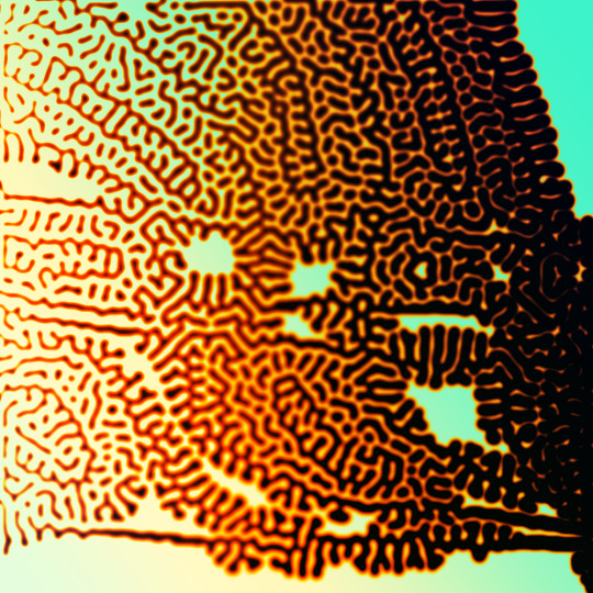
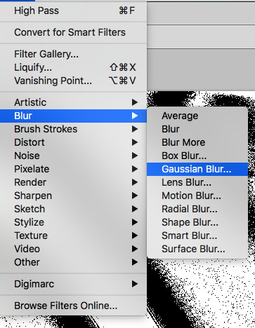
FIRST off you wanna get or make a black and white image of some kind. it has to be one layer. can be noise, a photo, a bunch of lines, whatever. here's mine, just some quick airbrush lines:

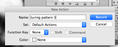
now find the actions tab. idk what it looks like in newer versions of photoshop but you probably won't need to dig!
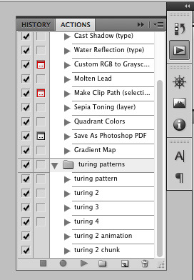
hit the little page thingy to make a new pattern. once you hit 'record', it'll record everything you do. the little square 'stop' icon will end it.
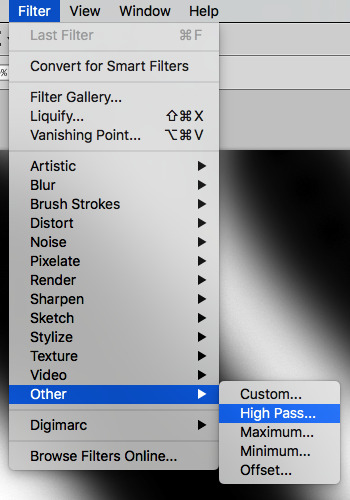
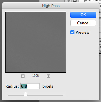
now you want to do a high pass filter. you can mess around with the radius to change the size of your squiggles, but the tutorial had it set to 6. experiment!
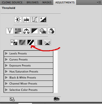
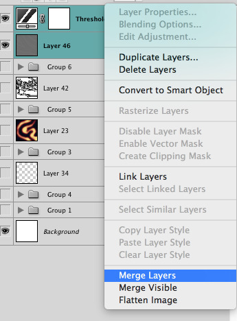
now add the 'threshold' adjustment layer. i use the adjustments tab but i think there's also a dropdown menu somewhere. keep it at the default, 128. merge it down. (control or command + E or you can right click it like some kind of weirdo)
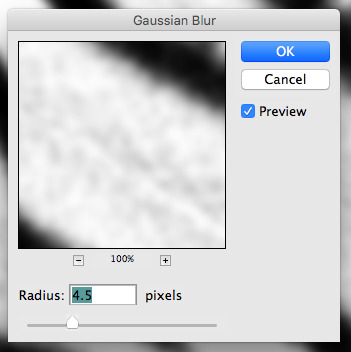
and finally, the gaussian blur! the radius of this affects the shape and size of your squiggles as well. i like to keep it around 4.5 but you can mess around with that too.
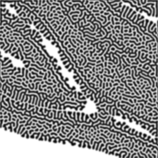
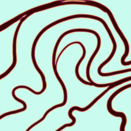
after that, hit 'stop' on the action you're recording, and then repeat it a bunch of times using the 'play' button, until you have something you like, like this:
WOW!! that was fun!! and only a little tedious thanks to the power of macros. anyway, here's some fun layer blending stuff i like to do. it's with a different pattern cause i made this bit first.
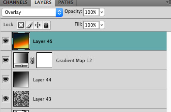
anyway, using a black and white gradient (or a grey base that you do black and white airbrush on), make a layer with the vivid light. this will make the blobs look thicker or thinner.

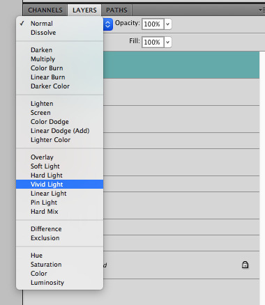

then, for cool colors, do a gradient map adjustment layer over that:

and finally, my best friend, the overlay layer. just using a gradient here bc i'm lazy, but feel free to experiment with brushes, colors, and blending modes!

NOW GO. MAKE COOL SHIT WITH THE POWER OF MATH. AND SEND IT TO ME
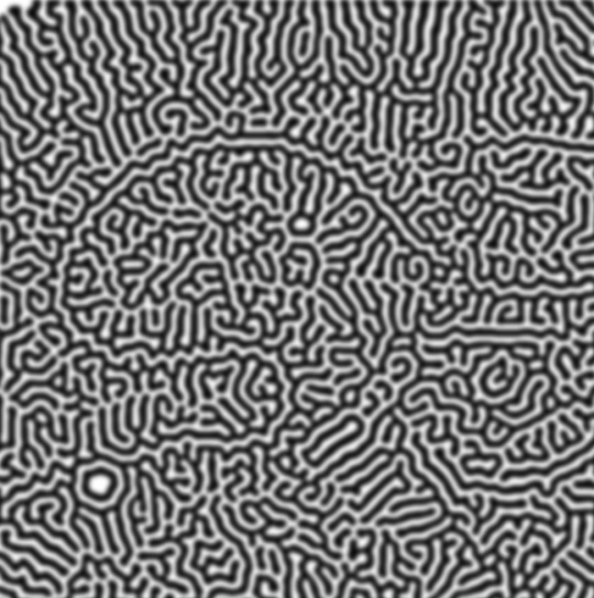
also these are not hard and fast rules PLEASE mess around with them to see what kind of weird shit you can make. here's a gif. as you can see i added some random airblush blobs in the middle of it, for fun.
924 notes
·
View notes
Text
28 asks! :DD Thank you as always!! 💖💖
@astaherussy
My FNAF AU has been sorted out. In the sense that the timeline has been re-written enough that I can go back to drawing it..
Now the next comic in the AU is a re-write/re-draw of my old FNAF comic, Moon Malfunction. A few months ago though there were several time sensitive projects that came up and I needed to shelf Moon Malfunction 2.0 until they were done. Well now they're all done.. but Moon Malfunction is gonna take me some time to get around to..
For the past few months I've been in a really bad spot mentally and physically. And taking on my FNAF Recap/Repair project is just not something I feel I have the mental energy to do at the moment.. All it feels like is a one big pile of work. And all I wanna do I just draw what ever comes easily to me and focus on recovering..
Soooo for the time being,, my main FNAF AU might not see any updates for a bit.. Though I haven't forgotten about it and I do want to get back to it at some point soon. But for now I want to cut any work out of my relaxing/drawing time and just draw what ever I want. Which atm is pirate cookies-- <XDD

They're also great for grabbing something across the room while I stay in bed 😎😎
Why haven't I drawn anything like that yet- what--
I might just have to at some point! :00

@ardent-38
AWWW THANK YOU SO MUCH!! THATS SO SWEET!! BUT ALSO LSKNAKJ XDDD
I never thought of it like that! Anyone who gets into the game through my characters is like a lactose intolerant person recommending an ice-cream joint- and they're very persuasive! XDD
But fr, thank you! And hey, even if my characters aren't in the game, they'll always be here on Tumblr waiting for you XDD

Actually, I wasn't! :00 I haven't seen that episode of the Cuphead show. But I'm assuming its about Cala Maria and Captain Brineybeard, yes? If so I can easily see the relation XD

(Post in question)
AAAA THANK YOU!! The comic was different than what I'm used to. But it was a nice change of pace. I'm glad you liked it! :}}}
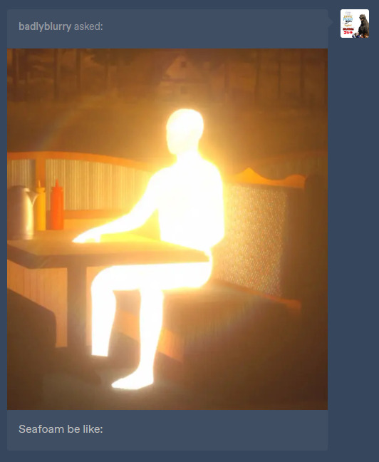
@badlyblurry (Post in question)
FRRRRRR THO He's been holding that glow back for a while. Trying not to send the wrong messages to Blue and potentially damage their friendship 💔💔

XDDD ITS OK!! THANK YOU SO MUCH!! :DDD 💖💖✨
@mod-bubamon
I have! In this post you can see 3 of them floating behind Melvin! (The anthro donkey)
And in this post, you can see Melvin holding one while it passes away... :((((( Sad day for sure.
Well? What did she taste like? XDD
Oh wait you're dead my bad-

Unfortunately I cant think of any songs that would match each crew members theme.. Rn all my brain can think about is this 👇
youtube
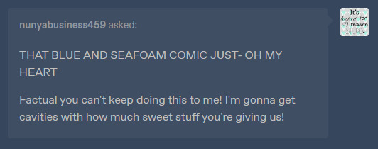
@nunyabusiness459 (Comic in question)

🥰🥰THANK YOU!! :DDD
What is primordial dough? :0

@2006-stupid-thatsme
Thank you! :DD Though unfortunately my fwernnd, I am known for being very bad at explaining how I do art things. :(
If I tried to explain my thought/design process it would just be a lot of word spaghetti that boils down to "uhhh... I just drew it.,. aandd if it dont look good.. draw it differently.. until it looks good-"
My advice would be to look on YouTube for character design tutorials or ask some other artists that have artwork similar to mine and see if they can help. :( Again, so sorry! I wish I could articulate my thoughts better 💔💔

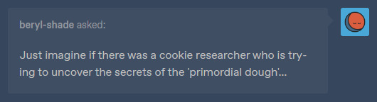
@beryl-shade
This actually makes me think- Google says that if you add too much sugar to a cookie they become brittle.
Huh,, makes me think. If one of the cookies was baked with too much sugar.. they'd break real easy.. hmm.. 👀👀

@whereismycupofcoffee


@artistiemi
Thank you so much!! :DD I wish the same for you!! ✨💖✨
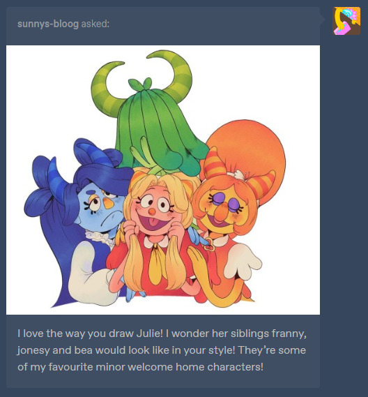
@sunnys-bloog
I've thought about drawing them! :0 And I thiiink I drew Franny one time..? The Blue one. Although I don't think I'll be able to find the sketch unfortunately-

NOT THE GUMDROP BUTTONS!!
tbh though I think they'd see him as just a normal guy! :0 Right..?

@beryl-shade
I'm not sure.. considering what I know about the games.. I thiiink they'd be horrified?? <XDD If they understand that they're made of dough, it'd be the equivalent of a human walking into a giant meat factory where they chop up meat and make weird false humans..
Okay yeah, they'd be horrified for sure XDDD
@wdillustration
:DD THANK YOU SO MUCH!! :}}}
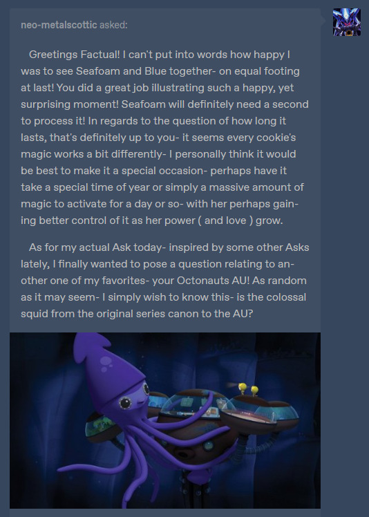
@neo-metalscottic (Cookie run post in question)
AAAAA thank you so much!! I'm glad you liked it!! :DD As for the power, I think you're right about it being a rare occasion. And the idea of her gaining better control over it over time? While her love grows as well?? Perfection. But man I'm also tempted to make it so she can change when ever she wants. :( I really like drawing her and Seafoam together like that.. 🥺
As for the Colossal squid episode,, I'd have to go back and re-watch it to decide if I'll keep it for my AU or not..
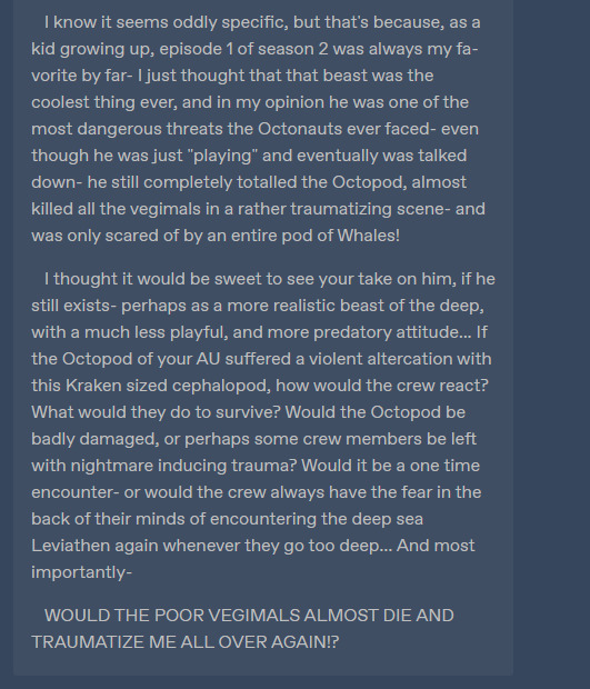
But thinking about all the stuff you described about a violent altercation and nightmares?? 👀👀 Its giving me ideas! XDD
Now if the crew did face a violent altercation like that, I imagine their #1 goal would to protect the Octopod. That's their home man! They would probably do what ever they could to get the octopod away from the situation. Like the Captain manually piloting it and some of the crew being sent out in gups to distract the squid. Stuff like that :0
@luna-purple454
AAA IT WAS ON THE 10TH BUT THANK YOU!! XDD :DD
@khoiazo
It was on the 10th actually- and hey thanks! Seam could probably use the calories <XD

@unpopularartist14 (referencing this ask post)
<XD oh boy, what a stark contrast between the sides--

@shaziztrazh
I didn't have them in mind while designing them,, though maybe I took some subconscious inspiration? I see the similarities! :0
#my response#fnaf security breach#octonauts#cookie run#cookie run kingdom#cookie run ocs#my ocs#welcome home#Youtube
83 notes
·
View notes
Text
Ways of being a father (Blue Lock)
Lyrics chosen and translated from Alligatoah's song Nicht adoptiert ("Not adopted")
Note: I didn't write something for every set of lyrics, but still wanted to keep some in to assign characters. Also thanks to @remy-roll for helping me a little 🫶 mwah mwah
gn!child!reader (reader is implied to be different ages in different parts)
If you're listening to this, you're alive, congratulations / I always knew you'd become more than a broken condom
Let's be honest, you weren't planned. Being a father initially wasn't part of his life plan, but then you happened. But he wouldn't replace you for anything in this world.
-Shidou, Barou, Karasu, Oliver, Noa, Ego, Raichi
Cause I don't believe in marriage you were born a bastard
-Oliver, Otoya, Karasu, Nagi
Sure, we love you, but there's a reason for that, kid / Nature arranges it like this so we won't kill you
Sometimes being a father can be frustrating and exhausting. But no matter how annoying you might get, his fatherly instinct always wins. In no way would he ever intentionally do harm to you.
-Barou, Ego, Kaiser, Raichi
It looks like you're family / Looks like it's just us now / We've got to get through it now, blood's thicker than beer / Sorry, you ain't adopted
-Lorenzo, Lavinho, Chris, Oliver, Karasu
I have no idea how to take care of children / But don't worry, I'll find a tutorial
He went into fatherhood completely without knowing what to expect. It all came a bit out of sudden for him, and he was too anxious to prepare himself properly. But when he held you in his arms for the first time, he knew he'd figure it out just fine.
-Nagi, Isagi, Bachira, Zantetsu, Kurona
The good thing is, I don't even have to share any knowledge with you / You can just read the wiki entry
-Nagi, Oliver, Zantetsu, Lavinho
I won't always be there for you, I have to party hard too / Did I say "party"? I mean "work"
Being a father doesn't mean that's the only part of his life now. He'll try to be there for you whenever possible, but there will be moments when he gets lost in other things.
-Otoya, Oliver, Karasu, Lavinho, Shidou
Joking aside, the ego-pig in me is happy that you are coming / Cause then I can play with Lego blocks
A part of him is still a child as well. And hey, being a father means he gets to play with toys again - that's something he can look forward to.
-Bachira, Shidou, Lavinho, Nagi, Isagi
Cause even though I'm putting effort and thinking about how / I can take the pressure off and still get you into bookstores / Something I do will lead to trauma, c'est la vie / I'll be the star of your psychotherapy, have fun
As careful as he is with you, he knows at some point he'll do something wrong. He's perfectly aware of how he won't always be the perfect father, but he's still trying his best.
-Barou, Ego, Noa, Isagi, Kunigami, Reo, Yukimiya
You're programmed for me, I'm programmed for you / Now we're sittin' here, I say now we're sittin' here / Sorry, you ain't adopted
He didn't choose to have you as his child, and you didn't choose him to have as your father. But still, you're perfectly made to be this role for each other.
-all of them.
You may not become president or student representative / Reality will throw your dreams in the chick shredder / I know what I'm talkin' about, life ain't no show
You won't achieve the greatest things in the world, and that's okay. You don't have to do that to make your father proud. He knows exactly what it's like to fail, and that's why he will always encourage you to reach your dreams, no matter how big or small they may be.
-Reo, Ego, Barou, Raichi, Kaiser, Tokimitsu, Yukimiya
You'll see my burdens, I've given them to you / If you think your genes are bad, they're Papa's genes / But you're my update, you can fix the bugs
You may not be a carbon copy of your father, but the similarities are undeniable - both the good and the bad.
-Ego, Barou, Shidou, Kaiser
In the beginning it's ambition like in a chess duel / You will emulate me until you outshine me / The balance of power is on my side - currently / But your chance is good, because Papa's withering parallel like a leaf
Being his child also means being his rival - in a fun way. If there's something to compete in, there will be playful competition. Board games, soccer in the backyard and running random races when you're just walking somewhere together - things like that.
-Shidou, Bachira, Karasu, Lavinho
This has to come out now 'cause later I won't be the same / When you're around I'm sure I'll write some corny shit / No more tasteless jokes, no more Hitler comparisons
He was more of an immature person before, but he knows after your birth he has to become more serious as a father - at least that's what society expects from him.
-Bachira, Oliver, Karasu, Shidou, Lavinho
I stand in front of the mirror and see a caricature / But I train every day for my father figure / I practice "La-Le-Lu" on the keyboard / And I subject myself to a motherfucking radio censorship / And I learn all the movie clichés, after birth / You'll get a wristwatch with your name engraved on it
At first, knowing he'll be a father soon felt so unreal to him. But the closer the day gets, the more the realization sets in. But that realization makes him nervous, so he's putting extra effort into learning how to be the best father he can be. And even though he doesn't want to be "like the other dads", he finds himself following every cliché possible.
-Zantetsu, Tokimitsu, Isagi, Snuffy, Yukimiya
Even though being strict clashes with my liberal nature / I'll pretend I'm interested in your Spanish exam
He doesn't care how much of a good or bad student you are, but he knows you'll have to pass school somehow. As much as he doesn't care about your grades, he pretends as if he does to keep you encouraged. But of course you'll get praise for your hard work when you get good grades.
-Isagi, Chigiri, Bachira, Ness, Yukimiya
I'll be mad at you for every adolescent booze story / But don't be afraid of me just because I fuck your mother
-Oliver, Karasu, Lavinho, Shidou, Raichi
I'm just an old cynic who writes frustration poems / But I swear I'll give it all to you till the end of my chapter
He'd do anything and everything for you. He will always make sure you feel safe and loved, no matter what age you're at. Even when you become an adult, he will always be your father and protect you as good as he can.
-all of them.
#💟 maochira writes#blue lock x reader#ryusei shidou x reader#shouei barou x reader#tabito karasu x reader#oliver aiku x reader#noel noa x reader#jinpachi ego x reader#jingo raichi x reader#eita otoya x reader#seishiro nagi x reader#don lorenzo x reader#lavinho x reader#chris prince x reader#yoichi isagi x reader#meguru bachira x reader#zantetsu tsurugi x reader#ranze kurona x reader#rensuke kunigami x reader#reo mikage x reader#kenyu yukimiya x reader#michael kaiser x reader#aoshi tokimitsu x reader#marc snuffy x reader#alexis ness x reader#blue lock#bllk#bllk x reader#blue lock x you#bllk x you
149 notes
·
View notes
Note
HOW DO YOU WRITE SO GOOD?? (tutorial/tips pls)
your writing is IMMACULATE AND SOOOOO, words can't even convey the feelings I get whenever I read your works
Lol, uh, brain makes things.
I got a similar message about characterization, so I'm going to try to include as many tips and personal tricks that I can in this post. I'll bolden the words that summarize each part, that way it's not too much of a mess and people can quickly find what they're looking for.

I'll mention CHARACTERIZATION first, just to check it off the list. So, the only characters I write for besides my own personal ocs, are the cast from twst. Compared to other series, the cast isn't that big, but it's still a pretty sizable cast. You got a mysterious and ominous fae prince with a penchant for speaking in a refined manner that at times sounds menacing, with a model/actor/singer beauty that also speaks more on the elegant side of things, but on the opposite spectrum you have a beastman who's arrogant and has bouts of laziness but is in no way incompetent, oh and don't forget the gloomy shut-in that weirdly enough has strange boosts of confidence and is snarky in his replies at times despite being very introverted and lacking in confidence. There's so many different characters, but I see them get mischaracterized very often. Here are some of the things I do to try and avoid making this mistake...
Look at references. This one may seem obvious, but I feel like people may not do this and just write what they want in the moment without much consideration. Often times if I find myself stuck and wondering what a character might do in response to something, I'll put a pause on my work and look up references to look at. By references, I mean things such as real dialogue from whatever media they may be in. In the case of twst, I'll go back to chapters the character appears in, or even listen to their voice lines. If I'm really stuck, I'll resort to looking at other posts like fanfics or fanart, and by then I usually get an idea. (I take a lot of liberties as a yandere writer)
Similar characters. There are times when I see one character, and think that they act very similarly to another character from somewhere else. In that case, thinking of the other character may help as well, but you have to be a little careful here since there will be obvious differences that could lead to mischaracterization.
Compare. In this one, I think it's important that I highlight that I do not mean to compare your entire work to someone else's. What I mean here is, if you have a writer who you like and you think they write the characters very well, then look at their work. What exactly about their work makes it seem like the character is well written? Maybe they use certain words, or describe certain things? Try and take a note of that. Unfortunately there is a lot of mischaracterization, so if you see some, it might actually be worth taking a note of so you know what you want to avoid when you're writing.
Take a step back. When I'm done writing, I read over the entire thing. I actually do multiple rereads, sometimes in the middle of writing, but I think the most important one is when everything is completed. When you think the draft is finished and you're almost ready to share, just read over it. Try to imagine that you're someone else, a reader who just found the post and began to read it. If you were another reader looking over this, would you be content with the way the characters are written or would you think that it needs improvement?
WORDS AND GRAMMAR. Ah, yes, I still make mistakes here often, I won't lie. I don't use too many sites to help with this. Just two that I can think of off the top of my head.
WordHippo. My savior. I use this site for everything, from writing silly little posts to writing important essays for college. It helps with everything from synonyms, antonyms, definitions, rhymes, etc. But I mainly use it for synonyms. For example, when I write for a character that speaks more meticulously or elegantly, you know, like the type of character that uses bigger/uncommon words, I'll use this site. Like, I know what I want the character to say or do, but I only know a simple word that might be boring or repetitive after a while, right? So using this site, I just find synonyms that fit way better and match the tone I'm trying to use.
Autocorrect. So, usually I'll mainly write on google docs, but this feature is on most sites by now. The system will automatically correct a mistake or highlight it if it thinks a mistake was made, which has caught some errors I've made on multiple occasions. But it's not entirely reliable, because sometimes something you wrote might actually be right but it changes it to something else. So just be aware if you do use autocorrect and read over for mistakes anyways.
And now, for MUSIC. I always listen to music when I write, it's like a necessity now. But it's a bit of a double-edged sword for two reasons. One: songs with lyrics tend to distract me. This may not be the case for everyone, but most of the time if I play a song with lyrics, chances are that I'll end up focusing on the lyrics instead of writing. Not all the time, but most of the time. Two: just trying to search for good music to listen to can lead you falling down a rabbit hole, because then you're just there scrolling and deciding what you want to listen to.
Here's a sorta long list of some songs I've been listening to in the past few weeks that keep me focused. Yes, it's a mess of different songs. You can totally tell what I've been watching/like just by the songs alone. The two at the top when I heard them at full blast in an IMAX theater for the first time literally had me like–– (WHEN I TELL YOU LUDWIG G. MAKES THE BEST MUSIC THAT INSPIRES ME)
Can You Hear The Music - Ludwig Göransson
Quantum Mechanics - Ludwig Göransson
Destroyer of Worlds - Ludwig Göransson
American Prometheus - Ludwig Göransson
Teacher's Pet - Ludwig Göransson, Joseph Shirley
Mando Is Back - Ludwig Göransson
A Walk in the Skies - Joe Hisaishi
Sophie in Exile - Joe Hisaishi
The Boy Who Swallowed a Star - Joe Hisaishi
Deep Sea Pastures - Joe Hisaishi
Mother Sea - Joe Hisaishi
Town by A Cove - Joe Hisaishi
Fujimoto - Joe Hisaishi
Ponyo Flies - Joe Hisaishi
Across the Spider-Verse (Intro) - Daniel Pemberton
Spider-Woman (Gwen Stacy) - Daniel Pemberton
Vulture Meets Culture - Daniel Pemberton
Guggenheim Assemble - Daniel Pemberton
95 notes
·
View notes
Note
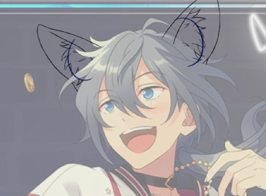
(If you're comfortable with this) could you make a tutorial on how you make your creations??? It'd okay if not, thank you for making them :D
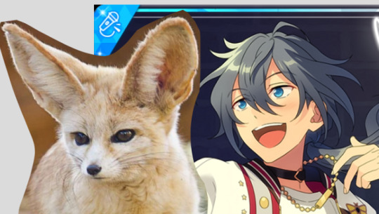
WAA i can try!! baby's first tutorial ft. this guy

🐾 first, a picture of your blorbo
i use waifu2x to up the quality, not always neccessary but it makes everything a bit easier and prettier. i use firealpaca to edit but you can use whatever you like, im not your mom
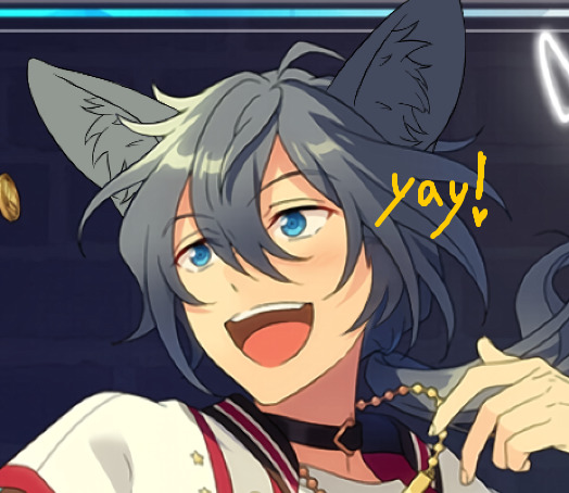
🐾 probably get a reference
yeah i dont always do this. but you should! i should! so google whatever creature you want to turn blorbo into and maybe scroll for a bit to get a feel for what they look like :3
try to find one at a similar angle to your blorbo picture and paste it/open as a layer. look this is close enough ↓
🐾 onto the actual editing! human ear surgery
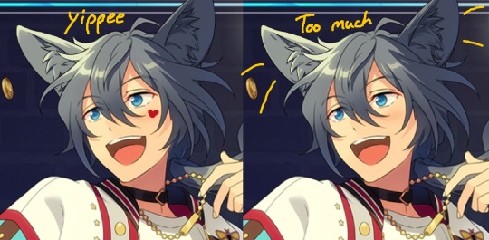
in case you prefer just one pair of ears. you have to understand the style so you can imitate it.... so look at their hair, maybe theres more colors or gradients than you can see at a glance or something ! i colorpick a bunch of them and put them over their ears, then blend them together with a low opacity watercolor brush
ALSO, notice the.. lighter glowy aura thing around his ear in the og? i try to imitate details like that too, used watercolor for this again
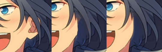
now maybe you wanna make it look like theres something covering that spot, since theres kinda nothing there now. soo if that looks weird to you, (open a new layer and) put some hair over it. i cant tell u how to imitate Any style so just. study it and keep trying
with enstars here the lines are pretty soft, so i go over it with watercolor brush after doing the general shape. with a higher opacity you could probably just use a softer brush from the start, i just like starting with the basic pen
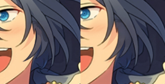
🐾 the lines!!!
nowww i lower the blorbos opacity to around 50%, bring the reference somewhere i can see and just kinda... start sketching. lot of redrawing and transform tooling here sometimes
TIPS 1. you can clean the lines up at the end so dont stress
2. think of your blorbos new ears as a real tangible part of their body and how they fit on their head since you dont wanna make it look too flat !
3. and for the placement i always end up at roughly one human ear length above their og ears if that makes sense. tried to visualize it
as for inner ear fluffs phew i dont know either. draw a circle and start from there? maybe there are actual animal ears in blorbo artstyle out there you could reference
🐾 coloring 🏳️🌈
finally some progress huh. i color the lines in a contrasting color first so i see the lines properly and dont miss anything, then fill it in with the actual color :3 OH and for gradients i just use the airbrush at the ear tips or sides
noww shading! new layer, basic pen brush and try to follow the shapes in the og art. it's best if you pick the colors from the actual picture!!! take notes mentally and just do your best i dont know how to explain this more
taking this as an example, the shading is mostly in pretty simple wider areas, so not a lot of seperate strands in there. and its again pretty soft around the edges of shades and highlights, so i'll go over it with my beloved watercolor. keep things like that in mind so the creaturing blends in well :3
if you like more detail better you can still go with that. or less detail on a complex artstyle. the world is your oyster
🐾 and the rest
what else could there be???? making the lineart more cohesive for example ★ oftentimes it's not one solid color, thicker or thinner than yours, things like that.
for things like piercings or fangs you can just draw them on top i believe in you <3 if its like an intricate earring use the lasso? magic wand? the one that lets you select an area to copy and move on top of your ear layers
+ remember details like shadows, if you put a tail on top of say blorbos leg there's gonna be a shadow under it! put a layer under the tail ones and freehand draw the shadow, OR copy the tail layer, put the copy under the og one and change color/opacity until it fits
30 notes
·
View notes
Note
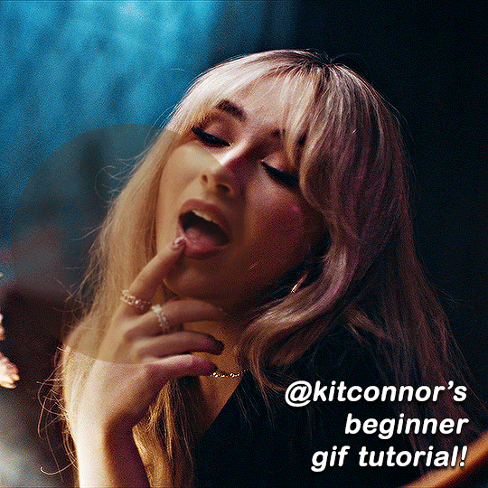
Hi! Happy 4k celebration 🥰 Can you share how you make your gifs or make a gif tutorial?
hi !! tysm <3 i'm more than happy to give you a little tutorial on how i make my gifs ! of course, my process is not the same to other gifmakers and may not always work for everyone but i hope it helps !
for this tutorial, i'm using the most recent edition of photoshop (2023) on my mac. full explanation under the cut.
full disclaimer: most of what i've learnt about photoshop and the giffing process is through pure trial and error. this won't work for everyone and others may think it's a little weird, but this is just how i make my gifs !!
1.find your scenes.
finding your scenes is sometimes very time consuming but you want to get it right the first time !! for this tutorial, i'm using a music video in mp4 format.
2. loading your scenes.
to load your scenes, you want to go: 'file' > 'import' > 'video frames to layers'. i know that this step varies on the user because some people like to go to timeline first, but i'd advise starting in frames first !
after that, a screen like i've depicted below will pop up. i've also annotated everything for you as well.
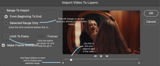
so, select your desired range, press 'ok' and then it will all load into ps !
3. setting up your gif.
i'm grouping this all into one step, but it's broken down into a few things.
the first part of this is: cropping. the recommended dimensions i follow are on this guideline here, but for the sake of this tutorial i'm just going to crop my gif 540x540 (as a w x h setting). the crop tool is on the left hand tool bar.
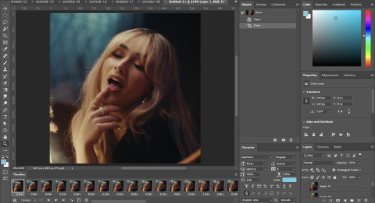
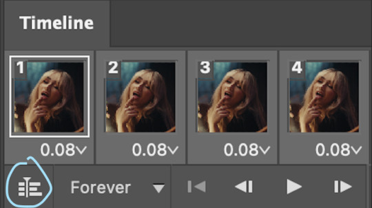
now, my gif looks like this. from here, i'm going to click on the timeline (the space along the bottom that has every frame). from there, click on the three lines to get this menu (i've circled where to go + what you'll click):

from there, go 'select all frames' and then click on any of the frames NUMBERS (where it says 0.04 with an arrow besides it, or whatever yours says) then change the frame rate. with most youtube videos i will use 0.08 as my desired frame rate, but when i'm gifing a show or something, it loads in as 0.02, so i change it to 0.05. 0.05-6 on any normal screen cap should be fine, but obviously you can change it depending on if it looks right or not.
from there, you've basically done the first half of the basics. now, you'll want to click on this button:
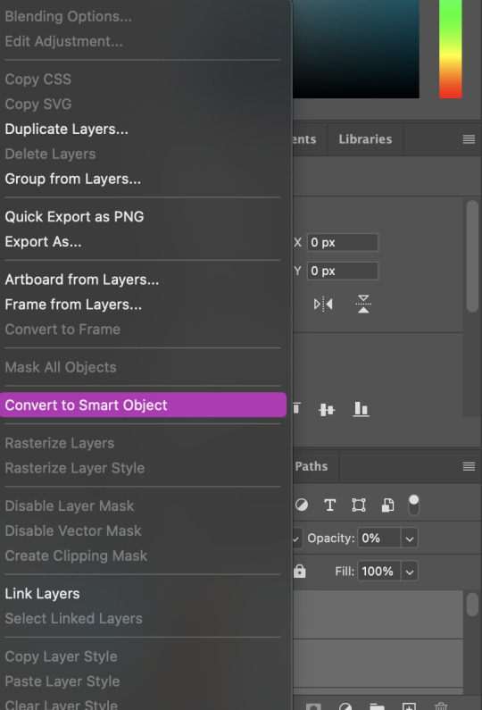
and now you'll be taken to the video timeline ! from here, select command + option + a (this is for mac, i think it would be control if you're on another device) then, right click on your layers and go 'convert to smart object'.
from here, i'll sharpen my gif before i colour. for this step i have two alternative sharpening settings first one by anyataylorjoy (rb to download !) and the other by maygrant (please ask !). the first one is tuser maygrant's and the second one is tuser anyataylorjoy's. i typically use morgan's for all my basic gifs but anyataylorjoy's for creative sets. every user has a different preference but just find what's good for you !

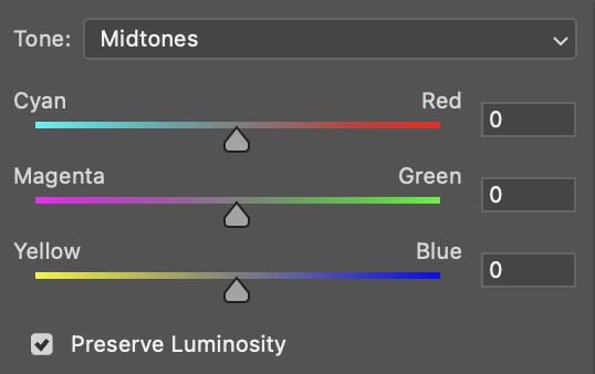
4. colouring your gif.
definitely the most tedious, this can be a little bit of a hassle depending on the scene. if the colouring isn't riddled with heavy yellows or cyans, colouring is usually a breeze but if it is, it can be hard.
CURVES

the circle with the arrow dropdown and that's half grey-white is the circle you want to click on to find curves. it'll open a menu and curves will be at the top.
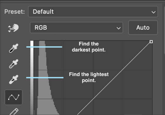
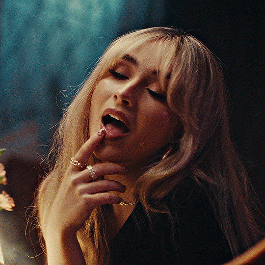
you'll see a little menu like above appear. now, select the dropper i've indicated as being the "light point" and then, using the zoom tool, we're going to zoom in and find the brightest point on the gif. this is typically where the light source is.
in this section here, i can see a couple of bright points. using the dropper, i'll click on the closest to white (note: i find that white rarely changes the colouring of the gif, so if there's like, a really really light yellow, for example, click on that) and then i'll do a similar process with the "dark point" dropper, finding the darkest spot, which is usually in shadows or in the corners. unlike with the light dropper, you want the closest to black, whether that's a dark dark brown or dark dark blue.
now, we can see how the colouring has changed:

optional: you can change the white line on the curves menu, which can make it lighter, or darker in different points of the gif.
LEVELS
levels is an optional step, but i recommend it on very light gifs, or if you want to add a little more depth. probably don't do it on an already very dark gif.
the levels menu looks like this:
the far left slider adds shadows and the far right slider makes it lighter. on this particular gif, i only need a little bit of depth to her face and i only need to contrast that a little bit. by just dragging the slider a little bit:
this is the result:
with levels, it can very quickly alter skin tone/make your gif look bad !! with levels, i don't think you need to go above 1-12 in adding depth.
OPTIONAL: BRIGHTNESS/CONTRAST
brightness/contrast is optional !! only add it if it's necessary :)
COLOUR BALANCE
a colour balance layer is great for fixing the tones for the gif !!
this one's pretty self explanatory. if you want it to be more yellow, slide it towards yellow. if you want it to be more red, slide it more towards red, etc etc. i've attached some gifs showing how i change tone:
but just play with it until it looks right. be very careful with skin tone !! colour balance can very easily whitewash/colour wash and that is not something encouraged, in the slightest.
SELECTIVE COLOUR
a selective colour layer is basically a "final touch" to colouring. where colour balance just kind of does an overall change of the gif, selective colour allows you to alter your specific tones, ie. reds, magentas, blues, etc. for me, i'll do the bulk of getting my desired colouring with colour balance, but if it overcorrects reds, for example, i'll add some cyan to red tones in selective colour, to diffuse that.
currently, in my gif, it's very red/yellow heavy. to balance that out, i want to add cyans. so, on the drop down list of the selective colour menu, i'll select 'red' and then i'll ADD cyans (so move the slider to the right, not the left to decrease) and then repeat that on other tones that i want to correct, with different colours.
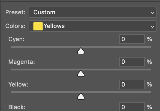
with each of the sliders, just add or decrease how much of that colour is in that tone. once again, be mindful of skin tone and whether it is appropriate or not.
with selective colour, if there are any standout colours (eg. in my gif, there's a big patch of cyan) that don't interrupt their face (eg. reds and yellows are always in faces) and change the way the subjects look, you can change those colours to make it more vibrant. so, in this gif, i'll enhance the cyans and blues and magentas to make the colours pop more.
5. saving your gif
once your happy with the colouring of your gif and done what you need to do with it, save it as a smart object with all your colouring layers, then go to 'file' > 'export' > 'save for web (legacy)...' . play back your gif, and it should be all good !! congrats on making your gifs !
i've included a playback of each layer, which is staggered to show each layer come into effect.
in order: nothing -> curves -> levels-> brightness/contrast -> colour balance -> selective colour.
hope this helped !!
#*tutorial#gif tutorial#ps help#ps tutorial#userriel#userautie#userraffa#usernorah#userrsun#usercats#thingschanged#**l.myeditss
88 notes
·
View notes
Note
Maybe you have some drawing tips for beginners?
Your style is incredibly beautiful and it just inspires this thing inside me to grab my iPad and start drawing but unfortunately I have no idea where to even begin
Or maybe you have some recs where to look to learn how to draw stuff?
But I understand completely that it’s your thing and artists should never feel pressured to share all their techniques and secrets, you worked hard on it!
I just really really love your art to the point where I just look at it for 30 minutes straight with this big feeling in my chest
<3
ah it was never about being secretive, i'm pretty open about my drawing process since gatekeeping knowledge is a big pet peeve of mine. It was more like,, laziness because writing a cohesive and helpful drawing tutorial is pretty difficult and i wouldn't even know where to start; i'm afraid i'll get maybe too technical and what have you.
As for tips for beginners, i've shared plenty on my couriouscat so you can scroll through the answers there, i also have some drawing timelapses on my twitter account as well (albeit you'll have to scroll a little)
I'm very flattered you feel that way about my art, it really means a lot to me and i'm glad to have inspired you to draw as well that's awesome and i wish you best of luck!
I actually don't know how different drawing on an iPad is compared to a graphic tablet+desktop, so I am actually pretty clueless in that regard. I think Procreate is the most used digital art app for iPad so you can start by getting it and familiarizing yourself with the UI. I think this step is often overlooked. The brushes and the chosen program can make or break the drawing experience. If you simply find yourself not enjoying Procreate, experiment with other apps or maybe try switching to a graphic tablet, maybe that feels better and is more suited to your tastes.
To be completely honest, one "bad" piece of advice that i should probably keep to myself is to draw something you actually enjoy: fanart, Pretty Girl Portrait(tm), your cat, landscapes etc even if it's above your skill level (becoming obsessed/ fixated on some character from a piece of media also works wonders i'm just gonna throw that out there). The main point is to actually care about your chosen subject in order to get inspired and to have that inner desire of "doing them justice" aka drawing them well. The traditional art learning route probably involves studying the fundamentals, shading spheres and cones and simple 3D forms blablbablah which. Yeah ! sure that's probably better advice but i'm telling you what will make you want to keep going and not get discouraged after a few failed attempts.
As for the drawing subject, I highly recommend having photo references to guide you.. you always need refs it's a recurring thing. My fastest artworks are the ones where I have the right references. the less references the more difficult it is to draw something
As a beginner it is also a good practice to draw OVER your photo reference to get the proportions right ( i'm not talking about literally tracing the contour of a face or limb ( just an example ), but moreso identifying the Main shape which makes up that body part and observe how long is it in respect to the other components, how does it connect to the other parts etc - big difference. Tracing won't help you in the long run).
Another thing you can do is to study your favourite artists and see how They tackle whatever it is that you like in their work. how do they simplify facial features? what about anatomy? color/ light etc and kinda reverse engineer your way through their process. ( but i highly recommend to just keep these practice sketches to yourself, and to not share them on social media- unless you get the artist's permission)
This is how i got into drawing and what i did back then, again, for more technical hands-on information i did answer similar CCs before so with a little bit of stalking you'll find them in no time
I wanna finish this with some resources that helped me:
>youtube guys - sinix, ahmed aldoori, marco bucci, and also just speedpaints in general i highly recommend watching those
>for simplified anatomy i found @/ taco1704 's ref sheets to be very helpful but ........... I'm pretty dry here i just look up refs on Pinterest tbvh
speaking of, here's my pinterest i have a bunch of art related boards board cool stuff overall maybe they can help guide you towards some direction or inspire you in some way idk
ok i kinda suck in the resource department listeN. im starving too just.................. watch youtube speedpaints ok
SORRY IT'S SO LONGGGBGGG i hope it was at least a bit helpful? this was all over the place... I'll try to come up with a tutorial as well but i really gotta be careful with how i go about it. I'll leave you with this for the time being. Again, thank you a lot for the kind words, I really am very grateful and touched esp by that last part about staring with the big feeling stuff eeeeeeeeeeeeee really wow T T that's so lovely and a big compliment thanks ty ly
#long post#this is so messy...... sorry anon#i don't have a very. linear thought process as the kids would call it#you should see my lit essays back in the day lmfao#anyways#if there are typos i'll fix them later#ASK IZTEA#they call me the tutor the way rial my way through the .....#ok nevermind
35 notes
·
View notes
Note
please post a tutorial or walkthrough or even just a longer process video talking about how you draw!! im obsessed with the textures and colors but i cant seem to wrap my head around it!! (i would pay money for a whole mini course tbh if you were interested in uploading one to gumroad or wherever 😵💫)
thank you, i'm flattered :') texture and colour are really important to me so i'm always fine-tuning them to find what works. to be honest i feel like i'm not qualified to teach others since i haven't really even settled on a process, i just kind of mess around until i like what i'm looking at. there are certain things i do much of the time but it's definitely not a linear process!
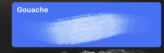
that being said lately i've been experimenting with traditional media and i've found i really enjoy how gouache behaves so i've been trying to replicate the process in digital. i'll try and explain how i've went about it recently using this super boring piece of a random person...
i'm using a basic pencil brush and a default procreate brush called gouache. i picked it for the name when i was looking for something similar to the paints i'd been using but honestly it looks more like a marker to me.

i find trying to do separate inks on top of a sketch distracting so i just erase what i won't need. i'll add a darken layer on top of the sketch and go over it with a single colour as a kind of underpainting. i did the flat colours on a separate darken layer here but generally i'll just work on one layer.
we'll add some colour variation and shading, it looks super subtle here but i'll punch it up later. i think the critical thing with this kind of brush is working with transparent layers so you don't lose the texture and you can play with mixing colours.
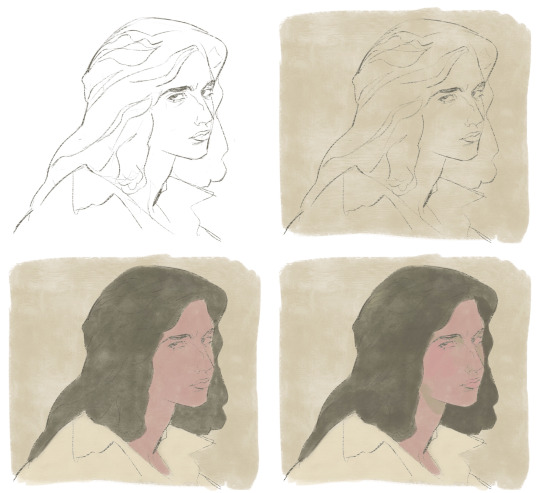
i'll often mess with the curve tool a lot but this piece is pretty simple and i ended up only using it once or twice. when i'm happy i'll duplicate the colour layer and see which blending mode i like, testing stuff out at different levels of opacity until i find something cool. i think i went with a transparent overlay layer here.
the lineart is getting buried so i duplicate that layer as well, drag it to the top of the pile and repeat the process of stacking blending modes. something i like to do is add one layer with the lineart blurred to give it a softer look.
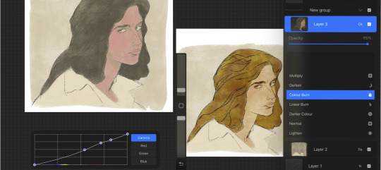
i'll fill a new layer with a dark colour, add about 80% noise scaled up a bit and set the layer to saturation. again you can experiment with the blending mode but i've been using this one recently.
this next part might be pointless but i save the image, open the new file and resize it without actually changing the resolution much, then sharpen it to bring back the detail. maybe it's in my head but i feel like this makes the image look a tiny bit more finished and adds some crunch.

finally i duplicate the whole thing, blur the layer on top and set it to luminosity on low opacity to create a soft glow effect.
final touch-ups and you're done!
sorry for the convoluted explanation! my process tends to messy, i get distracted and don't often work in distinct steps but i think i managed to describe some of the things i do the majority of the time. i hope it's even a little helpful :)
98 notes
·
View notes
Text
Graphics tutorial requested by anonymous
All made with adobe photoshop 2023 (you can find free downloads of cracked versions on here occasionally, photopea.com is also good I've heard) I'm assuming basic knowledge of photoshop/similar editing platforms and their tools, but you can always message me or comment if you are confused about anything!
Also, I used keyboard shortcuts sometimes to change the size of a brush or toggle the brush options, I'm not going to annotate this because it's a lot but here is a resource for basic photoshop keyboard shortcuts
Firstly, the sizing of your edit matters! Max sizing for best quality on Tumblr is 1280 x 1920. If you want to put to put two images next to each other sizing should be 640 x 960.
Next, always try to find the highest quality picture of whatever you're using. Good resources include taylorpictures.net, 4k Taylor Swift, and if I can't find them here I do a google image search of my photo to see if any other websites have a bigger/hq file.
This video is a couple clips I screen recorded for you to see my process and demonstrate a few different tools I use regularly. I added timestamps for you to follow along as you read the rest of this.
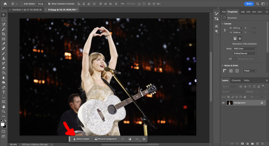
Here's a photo of my workspace I am working with and what I will do first is cut out Taylor from this photo and move her to my correctly sized canvas. There are multiple ways to cut out an image in photoshop, the easiest I've found is the select subject function and using the quick selection tool (see toolbar beneath the photo). Other tools include the magic wand tool, lasso tool, and quick selection tool which I will show later.
Now you will see that my selection isn't perfect, so I will use the quick selection tool to fix a few areas that I'd like to manually select/correct. This isn't totally necessary at this stage as you can always perfect your cutout in the next few steps, but it does help save some time.
This is where I'll use the quick selection tool to either subtract or add to my selection. There are keyboard shortcuts to toggle between + and - to make this quicker.
See my screen recording of the process from 0:00-1:07
Now that we have our image selected and cut out, I copy and paste it to my canvas I want to work with (size 1280 x 1920) and this is what I've got:
As you can see there's a few spots that need cleaning up in order to make our cutout perfect. You can do this with the eraser tool, magic wand, quick selection, or lasso tool.
See my screen recording of the process from: 1:08-3:50
Now that we're happy with our cutout, we can play around with it in any ways we want! Typically you're gonna do things like change the background color/texture, add elements with the square/circle tool to create what you're looking for, overlay elements and/or textures, and finally recolor it to your preferences.
This part is where you can try new techniques and play around to find what you like. I recorded some of my process of playing with different ideas and elements until I got to something I was happy with! The video explains the tools I was using as well
See my screen recording of the process from: 3:51 - the end
I hope this helps you with creating graphics in the future! The fun thing about photoshop is there are multiple ways to get what you want done. I showed you my way but there's plenty of other techniques and methods out there to try if you're unable to achieve what you want!
Best of luck and feel free to reach out to me if you are struggling/have questions! <3
#Tessa talks#requested#my tutorials#this took forever pls share!!!#photoshop tutorial#graphics tutorial#photoshop
32 notes
·
View notes
Note
Hello, this may seem a bit off, or rather something unexpected but I have been wondering how you design characters. I have always drawn not exactly realistic, but I have never drawn cartoon like. I love the cartoon and realistic style, but the ideas of having a cartoon like ideas like teh way you draw your astrotrain, or your evil villain mixmaster, I don’t know how to do this. I was wondering if you had any tips, I’ve been wanting to try a cartoonist style or a style similar to yours, I want to be less detail in my drawing but I don’t know how to start. If you do answer this, thank you even if you don’t have an answer or a way to explain.


Lots of text in those images, so I'll summarize that and give more thoughts!
But if your ability to design and stylize is what you're wanting to work on, I think this process will help you! Character design is a super broad topic, so it's hard to dive into how I consider every aspect of it in one post. Though I'd love to dig into different character design ideas in the future. Maybe streams or video essays? I dunno at this moment.
This process is more about learning what you want from your work and evolving it since it seems like where you're stuck is what you want from your art. So I recommend my "draw, reflect, exercise, redraw, repeat" way of practicing. My methods of practice aren't perfect or an exact science, but they have helped me a lot. And the idea of them is more about finding what you like and how to do it.
Step one is to draw. A design or illustration. Whatever you're wanting to make! Step two is to look at what you've made and ask yourself how you could make it closer to what you want it to be. "What do I want to change about this design?", "What art skills could I study up on that would help me make those changes?", and "What artists do I like that do those skills well that I can learn from by viewing their work and trying to apply the things I like about theirs in my own way?" are all really helpful to ask yourself! And the nice thing is, the answers to these will basically tell you what to study next. It'll give you skills to research techniques for and artists to look through for inspiration. And then you just redraw and apply what you've practiced. And you do that again. "Your art will look off to you until it doesn't look off anymore" is something I like to remember.
Art to me is finding your own solutions to problems with endless answers. I feel like I see a ton of art tutorials like "THIS is the RIGHT way to draw". And not that all those videos have unhelpful exercises or advice if they teach you the way you want to draw. But I think it's a more healthy relationship to have with your work to just figure out what you want from it and nurture it that way than to be determined to fit a specific mold that you might not necessarily enjoy. I have a basic understanding of perspective, but I still bend or break perspective "rules" for my transformers art. Having the basic understanding helps a lot in making it still look nice while I break the rules, so I studied up on perspective for a while with some basic exercises so I could apply it the way I wanted. And you can do that with pretty much any art skill.
That's my overview on ways of developing your work more where you want it to go, and I hope it helps. Always feel free to ask more art stuff if you like! I like to chat about my process, and if it helps others, than heck yeah I will talk about it XD Thank you for the kind words and stay cool out there!
120 notes
·
View notes
Note
Heyy, I’ve been reading your wonderful one piece works for a while — and I couldn’t stop wondering how are you actually doing those magnificent headers?
Like… hello? The great quality, with additional 3D-alike details I could catch by my eyes? I got only Ibis Paint X on mobile, since I’m only a young man that literally two months ago went on a life-time ‘adventure’ of living alone in a small apartment.
In short — I got no money to pay for additional graphics/drawing programs, not yet at least
Hello!
Thank you! I'm glad you enjoy my writing - I'm curious to know what's your favorite piece / part? Also I'm so happy you like my headers? Makes it feel worth it to spend time on them! :D
I have excellent news for you, I used a mix of Canva and Photopea. They're both FREE!
I'll be explaining the process for making these two kinda? The full tutorial is below the cut, to be courteous to the other folks, hope you don't mind?
Though I am hearing that Canva has given people some grief. But Photopea is just *chefs kiss*
If you've ever used photoshop, Photopea is essentially a free photoshop, and it even has the automation tools! An absolute lifesaver when you have multiple layers you want to export (but that's for larger projects not this)
I'm going to assume you have basic knowledge of layers in digital drawing programs for this. If anything isn't clear: ask me, I'll clarify!
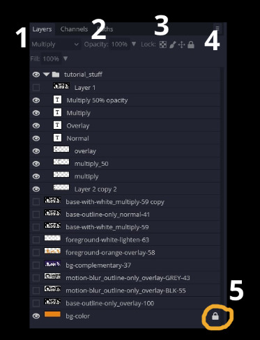
//-------------------------------------------------
My General Process is:
Search for official art / images
bring it into canva / photopea
crop / arrange images to match the dimensions
select a thematic color that is associated with the character
separate the foreground from the background
mess around and test things until they work
//--------------------------------------------------
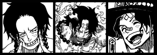
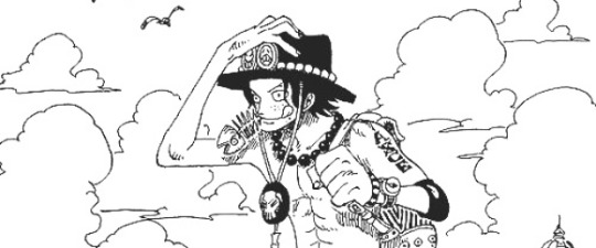
Given "Louder than Words" is the latest one I've made, I'll start with the process for it.
Dimensions: 3000 x 1055 px
dpi: 96
//-------------------------------------------
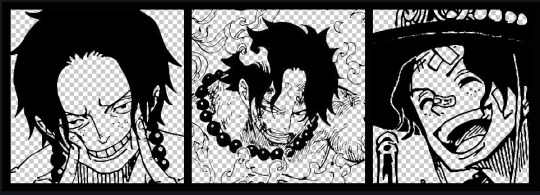
Let's Get Crackin'
Alright let's grab some official art so we're not using any fanart without the artist's permission
I try to pick images that feel relevant enough to what I'm trying to make.
For example: the image for the Matching banner shows the ASCE tattoo which is super important in that fic
2. Let's arrange them onto a banner where each individual image has the same/similar dimensions to the rest
That's probably part of why you like these. To a certain extent they have similar dimensions, so they have a uniformity that's pleasing to the eye! (It's not perfect because I threw perfectionism to the wind because this is tumblr not my portfolio)
Tip: if you have 3 images and only 2 that have similar dimensions, and the 3rd one can't be cropped logically: but the one that's a different aspect ratio in the middle!
3. lets arrange them in such a way that the borders all feel like they're the same/equal width/thickness
you might find that you have to shrink some images for this, that's fine.
ALTERNATIVELY: if you're going with one image crop it so it's just the relevant info and it matches the dimensions (3000 x 1055 px)
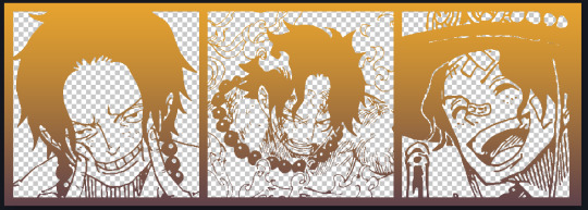
We have our base! Now let's add some color, and direct the viewer's eye together!
4. pick out a color that you think matches your character / vibe - that color is going to be your background
Given I'm making an Ace banner: orange is the color I'm going with
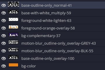
I went and named my layers for this lol. The numbers represent the opacity, and they aren't important. I just kept changing the opacity until I liked the way things looks. But here's the secret to the 3D feel:
Motionblur (+ moving it about)
Separating the foreground and background and dulling out the background.
I'm going to show you my process so you can see the effects, but first let's give you some quick skills:
//------------------------------------
SKILLS / THINGS I THINK ARE HELPFUL
//------- Select Similar
magic wand -> select something -> right-click -> select similar
This works best when you have high contrast images (like manga panels that are black and white). You can select the black or the white areas. Depending on what works better for you.
TIP!
Invert selections with ctrl + i
Say you know that you want to select everything but Ace's face in the second panel. Select his face with the magic wand then ctrl + i, and that's the only thing NOT selected

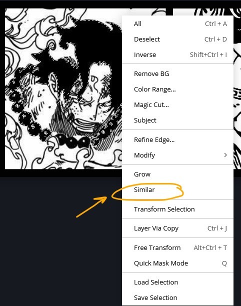

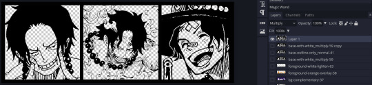
TIP!!!!!!!!!!!!!!!
Please, please, please, duplicate your original image and work on the duplicate layer. This helps you SO much. !!!!!!!!!!!!!!!!!
TIP!
Check your selection tolerance! This could be why too little, or too much is being selected.

//------- The Move Tool
Shortcut key: v
While the move tool is active, you can nudge the stuff on whatever layer with your arrow keys
Shift + arrow key = 10 px move (generally)
//------- Layer Locking
1- Layer Blending Mode (see Overlay vs Multiply vs Normal) for how this can affect results)
2- Opacity: how see through it is / isn't
3- Lock Transparency (it's the little checker board)
4- Lock Layer (looks like a lock)
5- Lock icon that appears when anything on the layer has been locked
More on 3 Lock Transparency: You can only paint on / modify what's on that layer. You CANNOT add anything to any area that is already transparent
Here's a demo of what you can do with this power:
Here's the original Image - notice how it's just the lineart with a transparent background.
It's powerful: abuse it
//------- Overlay vs Multiply vs Normal
I think seeing this is the best way to visualize how different modes can affect the color.
//--------------------------------
Back to the Tutorial
!!I IMPORTANT NOTE !!
Please play around with the opacity slider to figure out what opacity works best for you on the multiple different layers we're about to make / work with. It's up to your own style to figure this out.
Next: please feel free to not follow all of it. Add more layers, add less layers, take the base principles and go wild! :D
5. Separate the lineart from the background and save it as a new layer
6. Duplicate it and set it to overlay, or set it to overlay immediately
7. Duplicate that lineart layer twice and set the blending mode to overlay
8. lock transparency on the top one and change it to be a dark grey
9. Apply motion blur to both:
Main menu bar -> Filter -> Motion Blur
I made it so that the grey layer was blurrier than the black layer
10. More them around a little to give it a "3D effect" as you called it.
It creates shadows under the lines - I was aiming for an effect similar to chromatic aberration (chromatic aberration is a valid way to add punch to your stuff too!)
So this is what things look like now - painful, but let's keep going
11. Duplicate the ORIGINAL / BASE lineart layer, that you DID not apply motion blur to -> set the blend mode to multiply (reduce opacity for it to actually take effect)
okay that's less painful
here's what the layers look like right now:
let's bring more focus to Ace's face, and push the background farther away:
12. Use the magic wand tool to quickly select large areas of the faces / focal area / foreground and the lasso tool to refine things
TIP!
Hold shift + click -> add to selection
Hold Alt + click -> subtract from selection
13. On a new layer with blending mode -> lighten, fill that selection to be white
If you look at it, you'll notice that it is ALREADY starting to draw our attention to his face, but the background is kinda aggressive, so let's dim that down
TIP!
Right-click on the gradient tool to find the paint-bucket tool

TIP!
Sample All Layers:
Turning this option off makes it so that you only work with the content on THAT specific layer. Turning it on makes it so that it is working while taking all other layers into consideration.
14. ctrl + click on the "white foreground" layer to select the contents of that specific layer (pink thing is your mouse)
15. ctrl + i to invert selection and ON A NEW LAYER (layer mode -> multiply) fill that with a complementary color
16. I did one last thing where I took the original base (before we separated the lineart) and added it to the very top and played with the opacity to get something less in your face (layer blend mode was set to NORMAL)
And that's it!
More considerations that I take:
I want the banner to be "thin" or not square, so it doesn't take up too much screen real estate on people's devices
I don't want readers having to scroll too much to get to my writing (which is the whole point of the post, let's not waste their time making them look for things)
I want the banner content to be relevant enough?
ie: with Matching: I wanted the ASCE tattoo to be visible. With matching I wanted Ace to not look too happy in some of them.
I'm also trying to avoid spoilers, I hated getting things spoiled, so I'm trying to be careful that the images I pick don't spoil anything really.
Congrats on starting life on your own! I did that whole living by myself thing too! Tip: keep the pantry stocked with lentils, beans, pastas, baking essentials, rice. They really come in a clutch when you're hungry.
#photopea resources#photopea psd#tutorial#tutorials#tumblr banner#photoshop#photoshop tutorial#digital art#fuck adobe#adobe photoshop
9 notes
·
View notes
Text
I'm going to write about a complicated memory time I'm having as an endogenic non human alter, for science, and it's not nice, but I'm being vulnerable here so I can unpack this a little. Feel free to chime in if you have had a similar experience or know what causes this sort of thing.
So like, body has autism, I've accepted that that means I have autism, but like... My ASD symptoms as a child were very much me "being an alien" in my memory. And even to this day, logically, I know it's an autism thing but it still feels like an alien thing.
So when I was in 1st grade, I'm sure I was not the only one in the body at this point, but I remember doing this (very mean, I'll admit) thing in elementary school at least once day.
As other kids would pass by in a line or when we were waiting for something where we could see a lot of people or even when I would look at my year book, I would look at each person, one by one, and privately (thank goodness) think to myself about how ugly everyone is.
I hate your nose. I hate your eyes. I hate the way you smell. I hate the sound of your voice. Everyone around me I thought was ugly in so many different ways because I thought humans were ugly. I still kinda do, but to a much much much lesser extent. I was an outsider in a strange place with strange rules and I thought everyone looked unfamiliar and gross. I don't feel like this anymore but humans are still an acquired taste in my mind. I'm the only alter in the system like this.
I say this was probably an autistic thing because it had to do with facial features specifically and I've heard that we struggle to look at faces or recognize them, so I can only imagine this pushes the same brain buttons. I can't be asked/forced to draw human faces without melting down totally. I can draw the body perfectly well. So this isn't a skill issue either.
Now, this wasn't and isn't "everyone is ugly but me" this was very patently "the human form is awful. Who did this. Why me." It is the root of any un-aliving urge I've ever had. That I can't escape being human around so many humans with an existence completely dictated by humans.
I still to this day, will get so upset and angry when people talk about how figure drawing is mandatory for art students. Figure drawing triggers me.
You must draw the human form because so much art worships the human form. Which isn't.. bad. It's the mandatory part that is. I did it though, I chewed and swallowed that lesson reluctantly only to hack it back up and out later like a cat refusing to take a pill.
It did not help that my figure drawing prof was going through some mental health issues (her tutorial grad students were warning people that she wasn't acting herself)
This manifested as her saying a lot of fucked stuff she could have just kept to herself. Like telling me I needed Xanax because I couldn't bring myself to draw a face. Acting disturbed and confused by just the kind of artist I was. She treated me like a leper.
But the worst thing was by far this:
My human body is a little chunky, but my species is very slim biologically. That's just what we look like. We can be fat, but it's something we have to try really hard to do. I don't care that my human body is fat. I just eat what I can and try to stay alive. I'm not really thinking about weight discrepancy between my forms because I don't consider it an important detail past finding human clothes I enjoy wearing.
We have been drawing our species as a manner of spiritual reconciliation with the concept of self. We didn't fully actually decide the features of our species but instead based details on astral experiences and childhood dream disturbances.
This wasn't a secret to this prof and she basically said that we needed to overcome our body dysmorphia and stop slimming the life models down. Basically if you accidentally drew the model even a little skinnier by accident she would jump all over you.
"it's just habit because 90 percent of my art is tall gangly alien bodies"
"no, you just worship skinniness. You made your aliens skinny because you have an ED" no exaggerating, she said this.
Like excuse me? I didn't know how to report her but she needed to retire because she said this inappropriate shit constantly.
And her vibe influenced all my peers to think I was copping out by only drawing aliens (that I will remind you, are MY RACE, MY SPECIES, MY HOME PEOPLE. ) This isn't about weight. This isn't about "skill" I hate humans. I hate the human body. It is poorly designed and YOU worship it. It's not my fault I dislike it. I'm not a bad creature for disliking it.
Figure drawing doesn't help my art because I'm not fucking drawing humans like everyone else.
"but you can apply some of the anatomy to-"
SOME. I'm convinced that drawing specifically a living person having an improving effect on your drawing skills in general is myth brought on by the art worlds sick obsession with "old master" artists and copying their methods. It's drawing from life that improves you, not just specifically drawing naked people, unless you are an artist who wants to draw humans, which I am not.
All the "greats" drew naked people to practice their own subject, which was people, so now every art student has to, even if that's not their subject. "You MUST draw the naked person" is one part useful lesson, two parts art school hazing. If you wanna fight about this, just know I have already died many times on this hill only to rise again. You cannot change my mind in a way that matters.
I had to unlearn things from figure class. I had to re teach myself how to draw the extremely specific digitigrade legs my race has. I had to keep reminding myself to draw our spines longer.
Because there is real speculative anatomy in there. It's not just for looks. We have long torsos because we are marsupials and the baby needs enough pouch room. We are slim with long bouncy legs to outrun giant worms. These aren't just aesthetic choices. This isn't "skinny is prettier" I just have no biological need to store fat like I do as a human.
Figure drawing harmed me without helping me because of anthropocentric ideas about form. I learned more by studying furry artists and augmenting reference photos.
There were always ways figure drawing could have worked for me if the human form wasn't treated like the most important thing to draw. I maybe also would have been in a better headspace if this profs lectures weren't pointed spitefully at villainizing people who have no desire to draw the human body.
I don't have to deal with this any more but I feel like being malignantly nonhuman in human figure drawing class is an extremely niche and strange horror I needed to talk about.
9 notes
·
View notes
Text
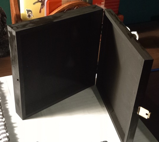
You ever get the feeling that sometimes the universe thinks the time is right for a specific project?
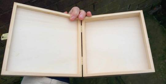
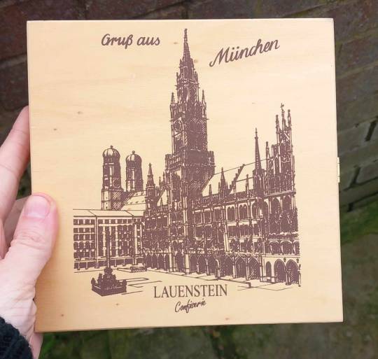
Earlier this week, heavily inspired both by @rattusrattus3 and their collage box youtube tutorial, and the gorgeous corvid boxes posted by @korva-the-raven, I decided to make something similar myself. THE DAY AFTER that decision was made I found this wooden chocolate box in a charity shop for £1.99. It could not be more perfect for purpose.

I had been thinking the collage part would be difficult as I "don't really keep interesting bits of paper." As it turns out, the hell I don't.
That same evening I found this stash in my old art folder. I thought all I had in there were a couple of greetings cards.
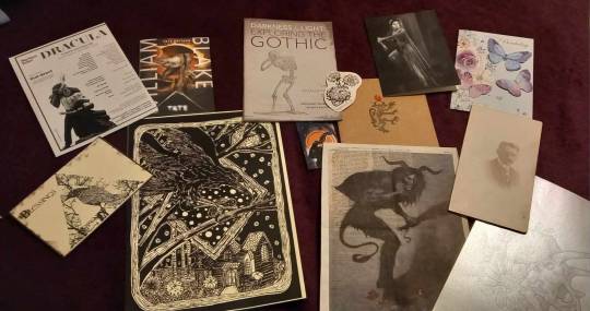
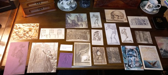
Of particular use were the William Blake and Exploring the Gothic art exhibition guides. These are both really high quality prints and contain some gorgeous artwork. Thankfully I have a paper guillotine so I could cut out the pictures really neatly.

This is what I ended up with. I could make several boxes just from these!
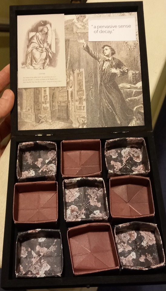
Korva's boxes have individual compartments made out of matchboxes which are also decorated. I don't have any matchboxes, but then I recalled that I know how to make an origami box - I had a friend in school who was Japanese and her mother taught me. So, what if I was able to find some nice paper and make small boxes to go inside? Again, the universe provided...

These are from a pad of scrapbooking paper, 24 double sided sheets, 30x30cm (12x12 inches) for £4. Very thick and high quality and excellent for making sturdy boxes that are fit for this purpose. I didn't love all of it but these designs are beautiful, and I will have more than enough for this project and tons left for the future 😁
I thought to save it looking too "busy" I would just use one plain colour and one floral. Since the internal boxes need to be quite small I thought a smaller print would work best, and paired that with a plain purple. I used the guillotine again to cut the paper into squares that were the right size (after a trial run with some cartridge paper to make sure they would fit) and...
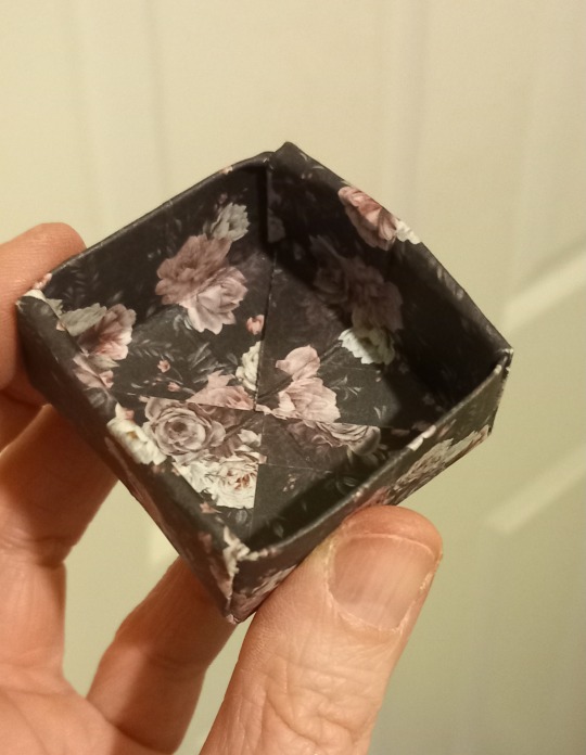
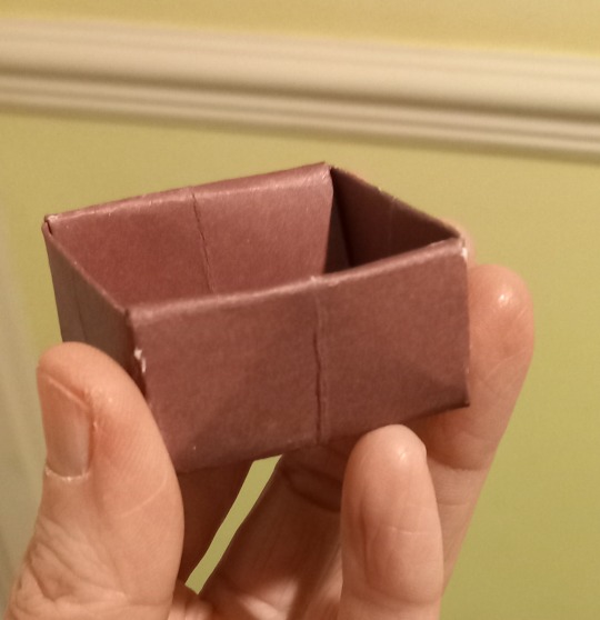
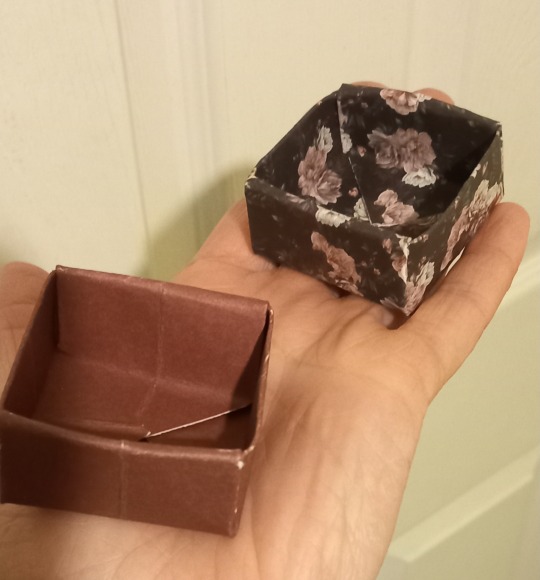
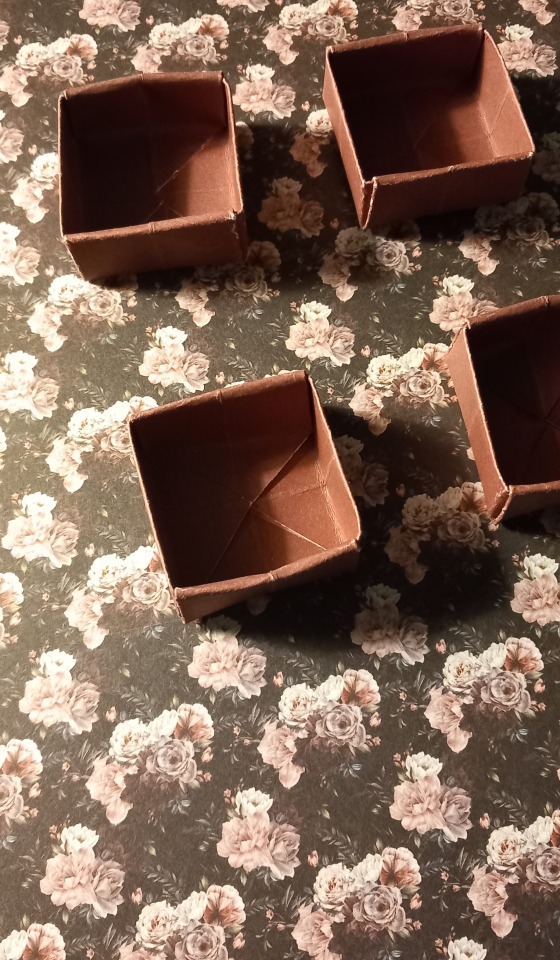
This box is super easy to do, probably why I still remember how to make it after being taught at the age of 5! Here's a tutorial.
Meanwhile the outer box got a couple of coats of black acrylic paint.
Then it was time to decide how to arrange my collage pieces. I quickly came up with this for the inside (Edgar Allan Poe themed, the large picture is an illustration to "The Raven" which is super appropriate for a corvid box, and the small one in the top right has lines from the poem "Lenore"). I'm still unsure about whether I will also do the base as its going to be covered most of the time anyway. I may just line it with more of the floral paper.
The outside was harder, but I've gone with some anatomical drawings, plus a couple of space-fillers which look pretty.

The edges are a little narrow so I'm not going to collage those for now, but I might see if any of the charms from my shiny things box would look good glued onto the sides instead.
Unfortunately I can't finish it just yet, as the only thing I haven't been able to get is modge podge - every shop I went into said "we used to have that but don't stock it anymore". So I ordered some online and I should have it within a few days.
Then all I'll need to do is decide how I want to fill it, I have lots of items to choose from 😁
Huge thanks to those who inspired this, it has been a project that I've absolutely loved, and I'm going to be on the lookout for more nice boxes so I can make another, I still have plenty of supplies!
#diy craft#collage#Collage box#goth diy#goth aesthetic#corvidcore#crowcore#crow aesthetic#gothic art#edgar allan poe#andreas vesalius#anatomical drawing#gothic#goth#crafting#crafts#craftblr#Goth crafting#paper art#paper craft#papercraft#paper collage#thrifting finds#thrift finds#thrifted#charity shop finds#charity shops#origami#arts and crafts#decoupage
7 notes
·
View notes
Note
Hi! I love this /post/708273065503653888/paying-attention-to-things-its-how-we-show gifset so much! I was wondering if you could tell me how you achieved that line/text effect or if you maybe have a tutorial or something 🥹 thank you so much 💖
Hi there! It's actually super simple, but I can absolutely show you how!
How to do a through-line effect on gifs
The gifset in question is this one here.
First, start off by making and coloring your gifs. Make sure they're all the same size (I usually go for 540x540). I would go for somewhere between three and four for a continuous effect, and it helps if they're related. I'm going to start off with this one:

Once you have all of them made, save them and reopen the gif you want to be the first in the set and convert it to smart filters. It should look like this:
Now add a new layer and using the marquee tool (m), set a fixed size of 2 pixels by 540 or more pixels for the height. I usually make the height a little taller for safety so I don't fall short on the top and bottom of the gif. For the instance of the first gif (as well as the last), you can either go down to half that height or just drag it to the middle of the canvas after the following step. This is because we're eventually going to put a circle marker at the center point.
At the bottom of the layers panel, click the fill/adjustment layer icon and go to solid color. Set the color to white and hit ok. Label your layer as line or something similar that way it's easier for you to find it while making the other gifs for the set.
Drag the line a little under halfway down the canvas, then set the opacity to somewhere around 85% and fill to 100%. You'll have to adjust the opacity as you go based solely on the brightness and coloring of the scenes you use. For this gif of Sarah, I have it at 75%.
Once you've got this settled, the next step is to add a drop shadow. For this, I kept the opacity at 80% and made sure to move the angle so you can actually see it.
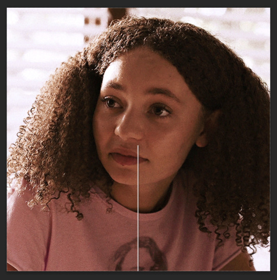
Next up is the marker! You're going to make another layer and go back to the marquee tool, this time going to the circle. At this point, I'd highly recommend grouping these layers together for ease of access.
Doing the same as before, go to fixed size and set your parameters as 10x10 pixels, and add a solid fill layer. Make the opacity is the same and change the angle of the drop shadow a little so there isn't a stark overlap, and drag it so it sits at the top of this line.
Keep in mind that since both the line and the circle have lowered opacity, you'll be able to see them overlapping, so make sure you zoom in and adjust their placement.
Now your gif should look something like this:

From here, do the same thing for the next gif(s), leaving the circle out until the last gif, where you'll bring it back in and add it to the bottom of the line, with the line coming in from the top like this:
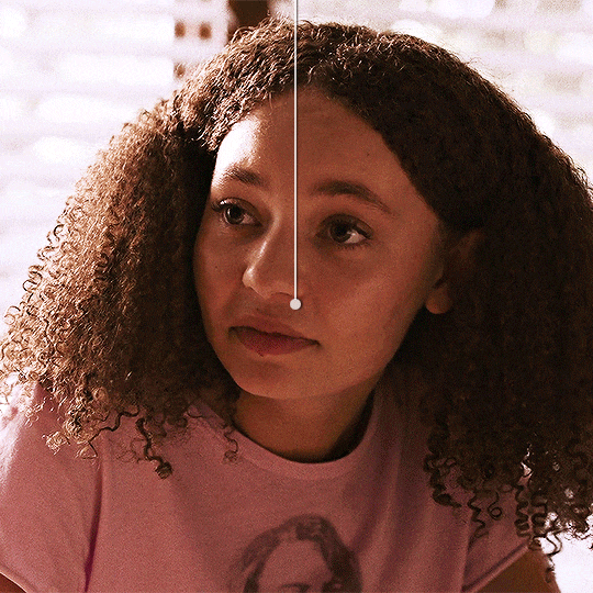
My best advice for this is to keep a canvas with the line and circle layers accessible and drag your remaining gifs onto that canvas so the line stays even through the whole set. That way all you have to do is move it up and down, not left or right. But keep checking as you work.
Once all your gifs are made and your throughline is added, your set should look something like this:
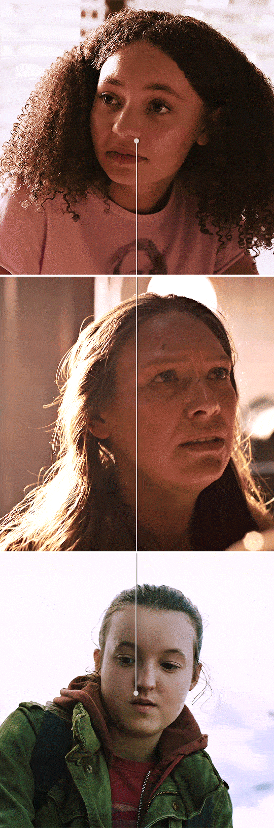
And that's it! I'll usually add words or some sort of text to break up the lines but it works either way.
If you have any questions, feel free to ask!
#anonymous#answered#gif tutorial#usergif#usersteen#userlang#useream#usermorgan#photoshop help#tutorial#photoshop tutorial#*#my edit#tlou hbo#tlouedit
67 notes
·
View notes
Last Seen Blogs
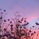
feathered-mushrooms
Wren - They/Them
paluco25
🐾

brook0116938-blog
3 review Hoaxes And How To Get Around
divergentchristian
Divergent Christian
honeykerb
honeykerb