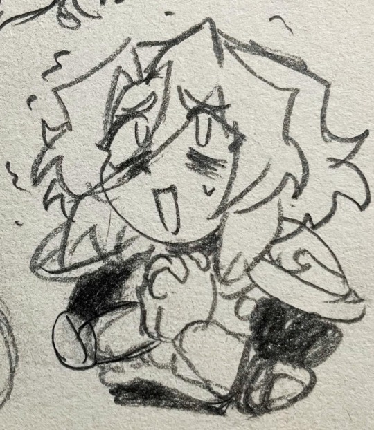
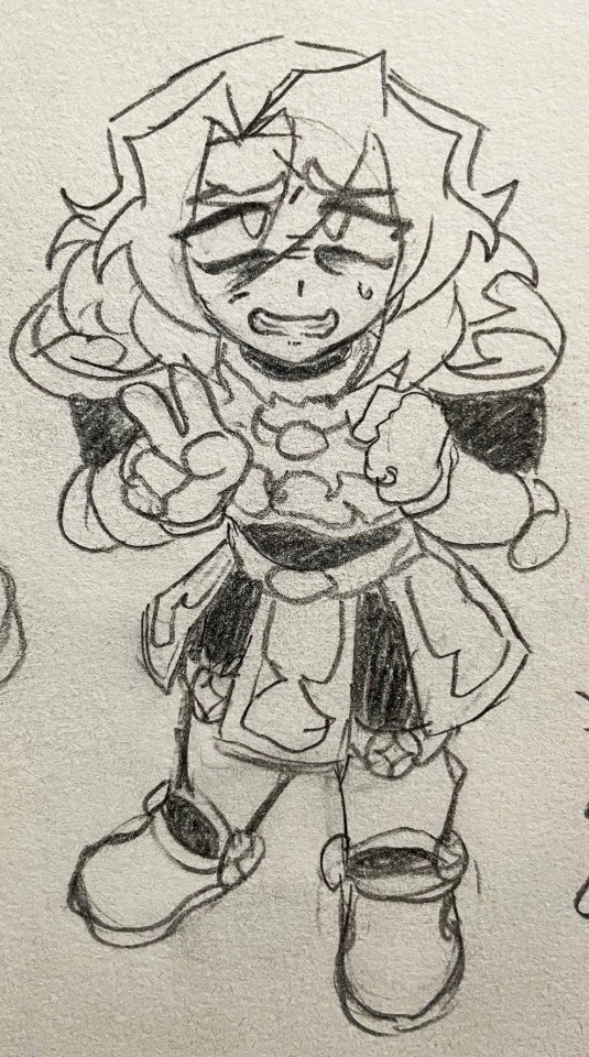
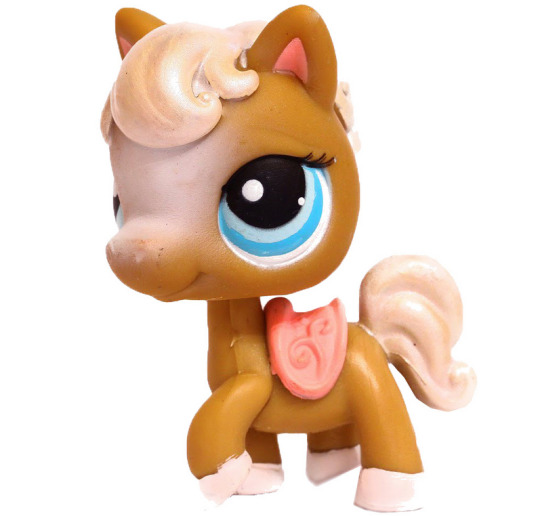
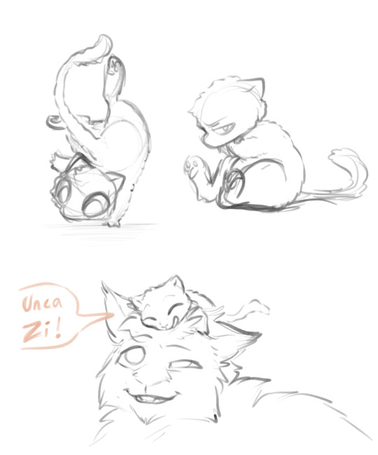
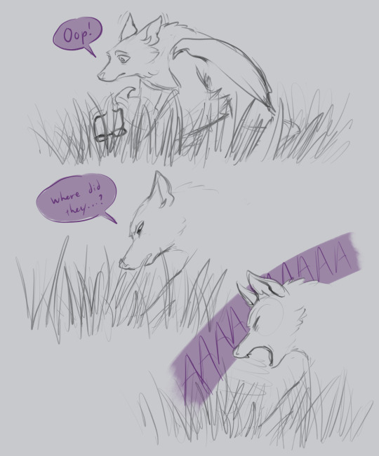
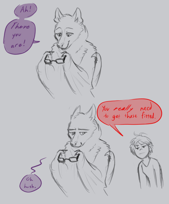
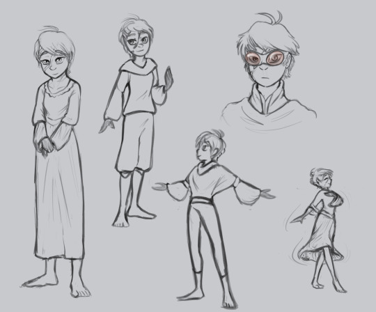
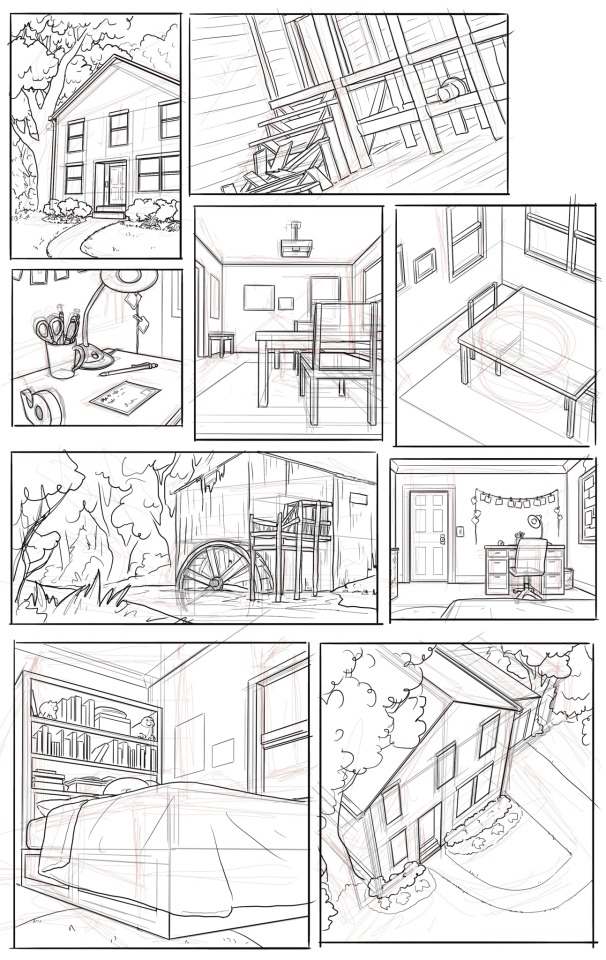
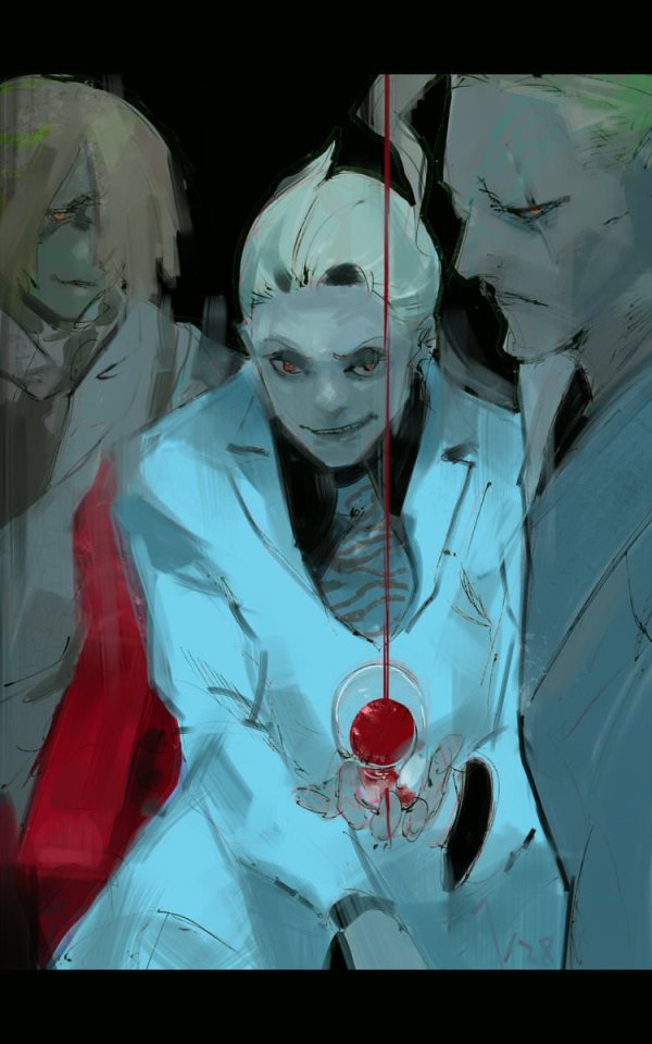
#some of these I feel like the proportions are off but I was drawing them really quick lol
Note
My hand never seems to actually translate the ideas that are spinning up in my brain. how do you get it all out? any advice? just draw more? do i need to use more references? your art is just so beatiful you are one of my top inspos.
ah first of all thank you very much! i'm honored! 😳
(long post incoming lol)
to answer the question though, i don't think i sufficiently translate what's in my mind and i frequently let myself down! but it's important not to let that Stop you. i think overall it's sort of multifaceted and different for everyone--theres no single answer i can give you that will guaranteed work for you--but for me personally i think it mainly comes down to Derangement, DISCRETION!!, Discipline, & Diet
before i say anything more though it's important also to remember that making visual art (in our case drawings/comics) is training like 2 or 3 separate skills (depending on how you divide them). the HAND represents your current drawing ability & technique; what your drawing hand is physically able to produce when you set pen to paper. the BRAIN is the creative engine that cooks up your ideas and thinks of ways to assemble them. and the EYE represents your ability to recognize what art looks like and how it "should" look. when your brain is thinking of ideas and your hand can't capture them, that is not because you're "bad" at it: it means your eye skill is currently outpacing your hand skill. your ability to discern art, to see things like proportions and anatomy and composition and whatever else is going on, is currently stronger than your ability to draw them yourself. this is not a flaw. this is not a flaw. this is not a flaw!!!! but it does mean your hands' ability to capture what your brain has imagined will let your eyes down until your hands catch up. once they do--by studying, practicing your technique, using references, and gaining confidence--your eye skill will then begin to outpace it again. this cycle, the dance between the two skills, is why you might sometimes feel yourself suddenly "getting good" at art, then just as suddenly plateauing or "getting worse"; you are training different parts of what makes art happen. there is nothing wrong with this. you are improving even when it doesnt feel like it--even when it feels like THE LITERAL OPPOSITE is happening. because you're improving different skills!
(and of course as your eye skill develops you will look back at previous stages of development and go "HOW COULD I NOT SEE HOW BAD THIS LOOKS!"--and yeah. that's the thing; you probably, rather literally, couldn't see it! you only think it looks bad now because you've improved your "eye" skill. you should try to be proud of that feeling, even though it also likely sucks and is embarrassing to you at the same time. there's posts, even recent ones, that i go "i cant believe i thought that looked OK enough to post PUBLICLY" and it is embarrassing for me! but all it means is that i'm better at what i do now...so it doesn't get me down too badly. you gotta shrug that stuff off.)
with that out of the way, my four evil councilmen are as follows:
DERANGEMENT: find something you are not normal about. this can be anything (whether it's a topic that interests you, The Character, a medium, a damn color palette...anything!), as long as it captures your mind and motivates you to create. your brain should be spinning up ideas like crazy and your only choice is to draw them. because once you have Derangement the only thing that feels worse than Making Something Subpar is sitting around Not Making Anything At All. you should be interested in what you draw. you should ideally love it, even if you don't love your own art yet. once you know what motivates you, let that simmer until you have no choice but to draw even if you're scared it'll turn out bad. and hey--there will probably (unless you become some kind of Art God) always be parts you think should've turned out better in some way, however:
DISCRETION!!: realistically nobody NEEDS to know what parts of a piece you're unhappy with. it's valuable to have friends/art partners/mentors/whatever that you can comfortably check in with and go "i dont like [part], what do you think" and get feedback, but that's for YOU. for the audience at large, maybe people will notice, maybe they won't, but as an artist you are constantly growing and you will very likely be constantly looking back at past pieces (even just days or hours old sometimes) and going "what the hell was i thinking? how did i not see [error/s], or why didn't i go for [different idea/finish/color palette/etc]?". getting hung up on this will probably either light a fire under you or demotivate you completely depending on your particular brain soup. for me it can go either way depending on where i'm at in my current hand/eye development phase. but i try not to fixate on it. it's enough to observe it and take notes for next time. every drawing is part of your growth and you have to make wonky art in order to occasionally make something that satisfies your eyes. in the meantime, don't beat yourself up or put yourself down. you are gaining experience and technical know-how, and spotting things you'd like to work on for next time; especially if you're sharing this work and other people are telling you they like what you made, there's no need to undercut this by dwelling on the rough parts so much that you can't enjoy it. the important thing is that you made it.
DISCIPLINE: you made it, it's done, now make something new. do it again from the top! you're right: Drawing A Lot is absolutely the key to Drawing Better. it is also usually an evil curse that reveals How Bad You Drew 3 Months Ago. but you have no choice, if you want to hone your skills and improve the Brain Image -> Art Image translation. you have to do it even when it sucks. do it bored, do it scared, but you have to do it or you'll never get anywhere. when improving yourself, you have to draw a lot to see change, and this is the part that sucks, right? feeling like you're not really getting anywhere or like you'll never capture what's in your mind. you can do studies where you collect references and focus in on ironing out something that's bothering you (such as, like, specific objects, perspectives, clothing details, anatomy pieces, light and shadow, etc etc); this can help crack the malaise for sure... learning how to use references is good, as well as whatever tools are available to you (in your medium/software). How To Do This is sort of a different post, but it does help (and sometimes annoyingly so; there's been rare but very annoying moments in my career where i will be simply looking at a picture and idly make an observation that cracks a style/anatomy problem i've had for Years and im always like COME ON!!! hahaha--but yes looking at references and studying them "like an artist" definitely helps, even when it's not as miraculous as that). overall work smarter and nail down the stuff you're unsure about, then incorporate what you've learned into your art style until it looks a way you like. you will likely have to just grind it out sometimes, and often this grind will not feel particularly fun. but you can Dog Medication Salami Pocket yourself into it if you're drawing something you're sufficiently Deranged about. <- this is what diesel is always doing with those women (LOL)
also, Output. you do have to Be Making Stuff in order to finish stuff. for example for comic projects like adastra or failteacher au, if i can draw ~1 page a day, the update will be complete in no time. but i have to draw that 1 page every day to make it happen, even if i feel off or lack confidence about what i'm making. of course i'm not saying you shouldn't take breaks; you NEED to take breaks, set your goals to your own level, and listen to yourself (and don't get some kind of wrist problem like me please). but the point im trying to make is that if you can make yourself sit down and do it even though you're scared it'll turn out bad, (or, hell, even if this part of your project is Simply Boring), then you can do it anytime. this is important too. but you will probably still sometimes feel stuck if you try to work and grind all the time.
DIET: regularly, but especially when you're stuck in a rut, step away from your craft and enrich your diet. you have to play just as much as you have to work. for example, i am always ALWAYS reading comics. at any given time i probably have 1-4 (sometimes more) tabs open of different comics i am simultaneously reading!!!! i read webcomics, webtoons, manga, DC--any demographic or genre, i take random recs from people and just go read them. whatever medium you're in, you have to take in what other people are doing with it, you have to let them teach and inspire you. you have to branch out and look at genres and styles you usually don't. unwind and look at comics, at illustrations, at design, at animation, at video games. enjoy them as an audience, but look at them like an artist too. when you like something, pause and examine (as both an artist and audience) why you like it. (vice versa: if you don't like something, you can try to figure out why that is!) let other people's ideas and habits flow over you. you have to relax and enrich your mind, to refresh your creativity and motivation. this is crucial. when you come back, you'll feel refreshed and ready to go, and your big brain cauldron of tools + ideas + techniques will be all shiny and bubbling. it's just as important to experience art as it is to make it. i really can't stress that enough!!!!
i talk about comics specifically here because right now obviously i am making a lot of comics (adastra, failteachers). i often feel like i get stuck in boring page layouts and can't think of how to panel something. and honestly sometimes a basic layout that just Gets Through The Scene is simply sufficient (after all, not everything has to be a Groundbreaking New Masterpiece; we would all get fatigued by that!)--or otherwise a "boring layout" is just what i have to put down in order to put down anything at all. but in both cases, reading comics and taking in what people are doing with their layouts makes me feel refreshed and i can return to my own work all rested and bright-eyed. everything we read and watch and take in is added to our "mental library" for the brain to reference when it's time to create something. it is just as enriching and important to experience someone else's art and perspective, and to enjoy a diverse range of impressions. you are always learning and observing, so try to pay attention--it's feeding your brain... :j
(and now, hopefully, your enriched Diet has added fertilizer for your Derangement, and the entire council can take their turn again from the top of the order. HDFHBJFS)
hmm...
well, overall, like i said at the top, there's no One Solution or really Single Piece Of Advice i can offer you. but i hope maybe you got something out of it anyway. everyone's a bit different and everyone's ideal workflow and journey is different too. but don't give up, keep at it, and...GOOD LUCK!!! 🫡🫡🫡
& always remember: in the end, making something YOU like, that looks good to YOU and fulfills YOUR goals, is more important than making something "perfect" (if such a thing even exists). as long as YOU'RE enjoying making your art (yes, even when making the art is hell and sucks!), that's all that matters. 🤝
29 notes
·
View notes
Text


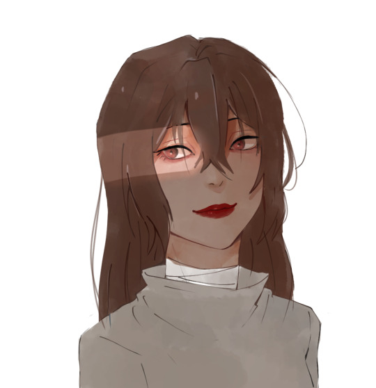
Wow no way me living up to my username and drawing in a chibi style whoah—
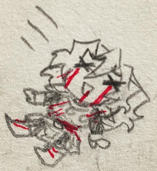
#castlevania#castlevania games#simon belmont#art post#my art#simon���s quest#yippie still going through art to repost here aaaa#Idk what to say uh#he cute 👍#some of these were doodled as responses to story questions and responses on Instagram lol#the two with the bleeding eyes was based on this post of ‘peace signs ‘n—nya…’ (dies cutely)’ or however it goes idk I didn’t screenshot it#the last two are older than the rest but I still like them :3#some of these I feel like the proportions are off but I was drawing them really quick lol#ugh hopefully I can start not just reposting things soon#the last oc drawing I posted was new but yeah I know that that’s not what anyone follows me for oof#I have a lot of Castlevania related drawings tho and will probably inevitably make more#if only the Simon cosplay worked out this Halloween :(#I didn’t finish it in time :(
36 notes
·
View notes
Note
i just need to take a second to gush about how much i love durge drow and astarion, they feel so fleshed out and perfectly written together in their fucked up wretched ways. They really inspire me to write more for my own tavs, hopefully one day ill be able to say im as happy with my own work as i get when seeing yours. I have to ask though, do you have any tips on drawing head shapes and faces? or maybe about wrinkles? i find i really struggle with that stuff when drawing and i adore how expressive and grungey all your art looks!
First of all thank you so much, I love hearing what people think of the two of them together 😭
Honestly you've hit on something that's quite near and dear to my heart, I love developing and figuring how to draw and stylize different faces to get the most unique, interesting looking results - everything about the details is highly rewarding to me. What does x type of nose look like from this angle? In this style? How can this eyeshape best translate to my art? How different does a face look when its making this expression? What does that MOUTH DO? etc etc.
In fact you kind of inspired me to put a little tutorial/guide together the last hour lmao and what a blessing it is that the two current subjects of this blog serve as great models here, being that their faces are basically polar opposites!
When it comes to heads, you've probably heard it a dozen times before that you want to think of them in terms of geometry and facets; my process to drawing them is pretty conventional so I won't spend too much time on it, but it goes something like this:
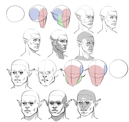
Obviously I don't do every single one of these steps most of the time, which is just something that comes from practice/developing muscle memory, but it is helpful to start off this way for two main reasons:
By making these guide lines and splitting a head into pieces like this, you'll have an easier time seeing and understanding it as a multidimensional object, and in turn, facilitate It for you when you venture out into doing wacky angles and lighting.
Making different headshapes starts HERE. notice how Astarion's "face" slate is narrower and longer, how my durge's jaw pieces sit lower on the head, how all of the same pieces came together in the same way but we ended up with one real pointy elf and a real brick of a drow - making characters look different successfully begins very early in the sketching process.
The next thing you want to do branches out into every day life: start noticing yours and other people's facial features. How does an upturned nose look from a high angle? How does the size of someone's cheekbones affect what they look like when they smile? How about when the light hits them a certain way? Does someone's lip shape changes when they pout? When they laugh? How does a person's hairline change the shape of their face? You do NOT need to creepily sketch every stranger you see on the bus, but get into the habit of actually noticing what people look like when you talk to them - when you look at pictures, when you watch movies - make a mental list of interesting ways mouths, noses, and eyes can come together in a variety of different proportions to make completely distinct looking mugs, and how they change depending on how you are looking at them.
Light and shadow play a HUGE role in how faces look, too, basically as crucial as actual bone structure does. As you see up there I tried to rough out how natural, head on, and underhead light would look on these two very different looking guys, and while we can see definite patterns, there are small differences that come to be because of the sizes and shapes of their features.
Here is a very, very basic look at how some of these features come to look the way they do, how they interact with one another, and how they compare between a blocky, rather conventionally "masculine" head and one that's much softer and slimmer.
Note please that it is not one or two characteristics that give a chaarcter their "look"; you can reduce a face to eyes, mouth, and nose through stylization and still have them be recognizable, but if you want to do more than that, you have to consider the whole package! Chin, cheeks, brows, direction of the jaw, slope and size of the forehead, depth of eyes, ridge of the nose, etc - I know this is probably far more than you bargained for, but if you start making note of a FEW of these things now and slowly add on, this will eventually become second nature to you.
Similarly, understanding how these characteristics come together will help you with rendering light and shadow in a realistic way, and predicting what their facial expressions may look like - if no two people are alike, neither are their smiles. :)
Lastly, remember that I'm no expert - I have developed my own methods and semiotics and yours may look slightly (or vastly) different, and that's fine! I hope only that by sharing this it has given you a base to work off of.
Anyways, I HOPE this has been helpful and not just the unsolicited ramblings of a face pervert.
666 notes
·
View notes
Text

Word count: Just under 1k
Warnings: NSFW, MDNI, buggy x GN!reader, no use of Y/N, mentions of masturbation, sex, and oral.
˗ˏˋ ★ ˎˊ˗ ✩ ˗ˏˋ ★ ˎˊ˗ ✩ ˗ˏˋ ★ ˎˊ˗ ✩ ˗ˏˋ ★ ˎˊ˗
Buggy who is surprisingly good at drawing.
Buggy who doodles all the time. Ugly little caricatures of people who piss him off. Goofy scribbles of bits that make him laugh. Potential skits.
Buggy who scrawls on the margins of paper, the corner of napkins, anywhere he can relieve the itch in his hands.
Buggy who designs costumes for his crew. Colored pencils and oil pastels bring the flashy couture to life.
Buggy who carries a small sketchbook in his coat. Deckle edged paper wrapped in leather, perfect for practicing pencil sketches and graphite drawings as he observes the crew.
Buggy who doesn’t share the drawings in his sketchbook, though. Some had to learn the hard way not to look over his shoulder.
Buggy who realizes too late that you are overtaking his personal pages. What started as small forms to study pose and movement grew larger, capturing more of your essence.
Buggy who becomes obsessed with capturing the small details. How your nose crinkles when you laugh. The sneer in your lips when you’re pissed. The way you rake your fingers through your hair when you try to calm yourself.
Buggy who gets curious late one night. Curious and desperate.
Buggy who draws you from memory and fueled by his filthy imagination. The soft sound of pencil scraping along the paper is comforting.
Buggy who fills a page with you in compromising positions. The lewd expressions you might wear. What he thinks you’d look like split on his cock. Or mouth open, begging to have your face fucked. His hands gripping your plush thighs.
Buggy who fucks himself to the hand-drawn porn and cums all over the page.
Buggy who feels guilty and burns the soggy drawings, as best he can. It takes a few frustrating tries and he panics, even though no one is around.
Buggy who tries to ignore those feelings. Trying to draw anything except you. But everything looks like shit now. Proportions are off. He presses too hard when sketching, unable to erase the stark lines. Even his doodles lack life.
Buggy who gives in and scribbles you in the corner of his sketchbook before moving on to something else. And it works. His movements flow better. A weight is lifted off his chest.
Buggy who eventually caves to the nighttime muse once more. Filling another perverted page with the obscene images flooding his mind. This time, he doesn’t ruin the drawings with jizz or fire.
Buggy who revisits that page frequently. Adds to that page. Convinces himself that it’s okay, it’s not hurting anyone. In fact, it helps him by taking away other urges.
Buggy who eventually manages to misplace his sketchbook. He fucking lost it.
Buggy who doesn’t want to bring attention to his lost treasure. If he says it’s missing, some freaks might find it and look through the pages. They’ll realize what a pathetic loser he is.
Buggy who frantically retraces his footsteps, barking orders to keep everyone away from him.
Buggy who finally finds it in the hallway just outside his room. The book must have fallen out of his pocket and laid mostly out of sight with the brown leather blending into the wooden floor.
Buggy who is relieved. It doesn’t look like the book had been touched or moved. Even the leather string is still wound around the sketchbook tightly.
Buggy who needs to get back to other duties after sloughing them off most of the day. He’s still on edge, reading into everyone’s interactions. No one acts differently, adding to the relief that no one knows about his perversions.
Buggy who doesn’t open the sketchbook until the end of a very long day. Who waits until he’s alone and in his room.
Buggy whose stomach lurches at the note peeking out of one of the pages. A page devoted to your smile. A note with your handwriting. “This is so impressive! I look so happy”
Buggy who slams the sketchbook shut and starts to pace around the room. Fuck. Did you find it first? Did you look through it? Why? What else did you see? What else did you see?
Buggy who freezes at the thought. Who stares at the awful book, as if it would pipe up and tell him in a fluttery voice.
Buggy who grabs the book and roughly throws it into a drawer, ready to lock up his feelings. Ready to deal with his unhealthy actions with more unhealthy actions.
Buggy who tries to go to bed but can’t sleep. He lays in bed surrounded by a carousel of thoughts. Of fear. And anxiety.
Buggy who sends over a hand to retrieve the damn book. He has to know. He’ll die if he doesn’t find out.
Buggy who can feel his hands shake with each heartbeat as he thumbs through the book, looking for more notes.
Buggy who feels both calmed and excited as he finds your commentary on a few more innocuous pages. Praises for his skill and appreciation for scenes he captured.
Buggy who finally flips to the page. That one.
Buggy who’s afraid to read the note you left there. But he does. “Want to collaborate one day?”
Buggy whose stomach and heart are in knots.
Buggy who keeps reading. “I’d like to see what you look like too.”
Buggy who shows up at your door, panting and red faced. Sketchbook in hand.
Buggy who trails his fingers along your face as he fucks into you, commiting each detail to memory. The shape of your mouth with each moan. Your lust-filled eyes. The little teeth marks left after you bite your lips.
Buggy who can’t help but stare at your sex-tired body. Chest heaving. Glistening.
Buggy who still wants to taste you. To taste himself on you. Who uses his mouth and tongue to memorize more of your body.
Buggy who is surprisingly good at drawing and collaborating.
˗ˏˋ ★ ˎˊ˗ ✩ ˗ˏˋ ★ ˎˊ˗ ✩ ˗ˏˋ ★ ˎˊ˗ ✩ ˗ˏˋ ★ ˎˊ˗
A/N: Just want to highlight this line bc I love it "This time, he doesn’t ruin the drawings with jizz or fire."
#buggy smut#buggy x reader#buggy the clown x reader#buggy x you#x reader#buggy op#opla buggy#one piece buggy#buggy the clown#buggy the clown smut#one piece smut#buggy x gender neutral reader#gender neutral reader
363 notes
·
View notes
Text
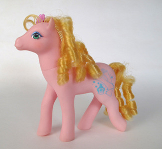
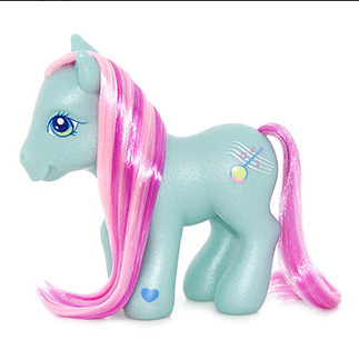
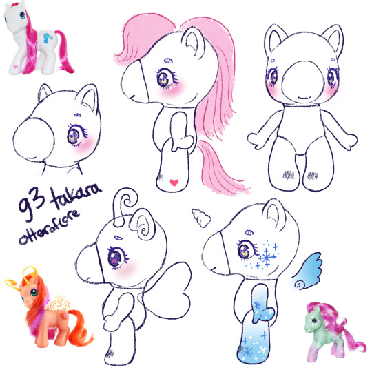
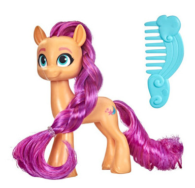
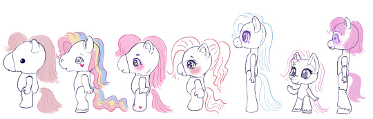
MLP-Takara generations: a design experiment
Takara MLPs are considered generation 1 My Little Pony; the original ponies look like little horses and the takaras are obviously very different.
But the standard MLP toyline underwent a lot of changes throughout the years... so, if the takaras had been successful, what would their changes look like?
Generation 1 year 2+ takaras.
Year one MLP was only a few ponies with a single color of body + matching hair... just like the takaras. It was year 2 that they introduced unicorns. pegasus, and seaponies.
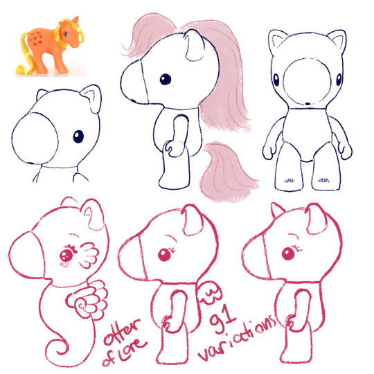
You all know I've already been concepting these so it's not surprising at all. As MLP g1 went on, they ended up doing more and more gimmicks throughout the 80s which would also be kind of fun to see the takaras do... (hint hint if you want me to draw those lmk which gimmicks are your favorites)
I also think they should bring in markings like the normal ponies but that could be part of the gimmicks. Maybe on their cheeks, or on their bellies like care bears?
In the later years og MLP also had a lot of variations on the normal pony body type, so maybe you could also see the takaras with that kind of variant, so that might be cute:
Moving on!
Generation 2
If you aren't big into early gen My Little Pony you might not know that generation 2 didn't do very well; it was a reboot of a beloved franchise, it was new, and different, and all that jazz:
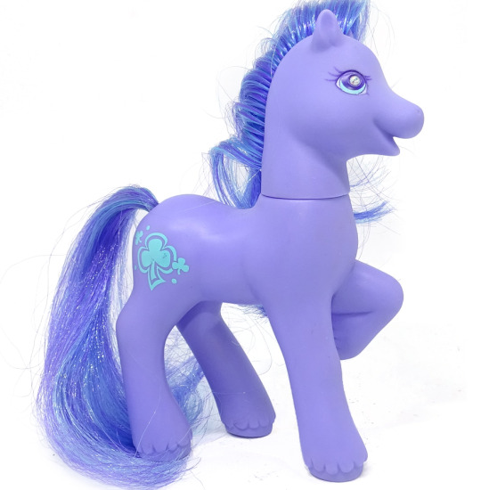
Main differences between them and g1: first, you can see they have a very late G1-type body, which is why I pointed out the thinner pony in g1. Their face is less detailed and rounder, but they have a little more expression, very smiley.
Their ears have a more horse-y curled in shape, they have fur around their hooves (in g1 only the boy ponies had hoof floof), and they have a gem in their eye.
Also they had a lot more moving-leg gimmicks where you could push one part of their body and another would move (eg push tail -> bobs head)
So you may ask, how am I could to g2-ify the takaras? After all, they are already much rounder than the g1 ponies. Well, I'm not going to make them just *look like* the g2 ponies, although I'll borrow more elements.
Instead: I am going to take and exaggerate all of the differences that I listed above and see what we come up with.
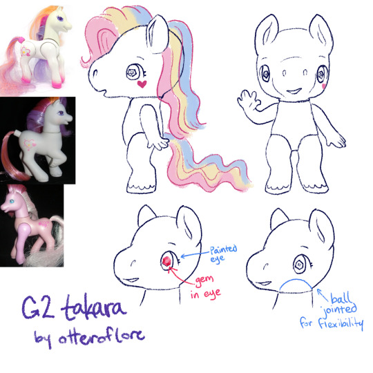
So! Here is my idea for g2 takara pony. I feel like its the exact balance of very cute and something that would upset collectors familiar with the original takaras, just as g2 upset the g1 fans.
First off, she's thinner, the iconic takara nose is removed in favor of a sculpt with a smiling mouth, the legs are more horse shaped with fluff and human fingers to match the additional foot detail. a lot of people find the g2s a little "uncanny" so I feel like this works.
The sparkley eye gem and ear shape are just straight off the original g2s, just to have extra gimmick to it (also the og takaras basically had the g1 ears)
g2 came out in the late 90s so I like to imagine the pony eyes would be extra shoujo too
Finally, a ball jointed head for more flexibility. (yes the arm would be posed like that in the doll, because its a more dynamic pose, and we can also assume that the larger size allows the doll to have a joint with more flexibility)
g2 had pretty similar gimmicks to g1 but also had some light up ponies, so maybe the takaras could have some with that gimmick too
fun fact, g2 MLP was sold for a longer time in Europe and performed better there.
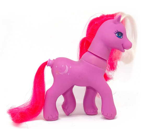
Generation 3
Generation 3 ponies are a pretty clear return to g1 MLP style, kinda scrapping most of the changes g2 made, other than proportionally thinning out the ponies a bit.
g3 ponies have very similar face sculpts with bigger eyes, nearly the same legs, and their heads just a bit bigger in proportion to their body
They do remind me a lot of the g1 Petite ponies, which were 1 inch sculptures that also had those proportionally bigger eyes and chunkier legs.
I have here included the g1 so you can see the slight changes better! I think the main difference would be the g3 takara would be a lot rounder, smoother, and cutesy-er. While the original has the hello-kitty simple cute look, the g3 version would definitely have like eyelashes and big eyes.
The only other thing to note about the body is some bigger ears, a generally rounder face, and round feet.
There weren't many gimmicks super /unique/ to g3 but one I wanted to highlight was the Breezies. G1 did have the flutter ponys, which were ponies with butterfly/dragonfly type wings, but the breezies are like their own little species AND they have antennae. While the flutter ponies were sort of graceful and thinner than the other ponies, the breezies are like little chibi-er ponies.
A little bit Littlest Pet Shop-core, since its the early 2000s too.
SPEAKING OF
Generation 4 Generation 3.5
Before there was gen4 there was a subset of Gen3 ponies with a different and unique style. They were basically an exaggerated version of the Breezies with even bigger feet and tinier snouts. They are also VERY littlest-pet-shop-core.
So, pretty straightforward changes
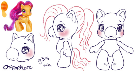
Just an even more chibi, kid-ish style pony. I think the g3.5 ponies were even meant to be kids. So this is just an even more child-friendly, littlest pet shop type horsey.
Generation 4
So, obviously generation 4 ushered in a whole new era of My Little Pony with its unique and bright artstyle, which did need to transfer over to the ponies
Personally, while I love g4 in a lot of ways im not a fan of the toys in the same way I am the other generations, their little noses have shrunk to specks, they're skinnier and more big-eyed than ever. Well, g3.5 was pretty big-eyed but at least those ones were like little kids.
This is such a drastic shift from g1/g3 and even g4, I would be unsure about the takaras.
So: eyes, bigger. Snout, so tiny and so smooth. Ears, bigger. Hooves are flatter and parts of the legs are just kinda featureless. a longer neck. They released a decent amount of ponies with plastic hair this gen, too.
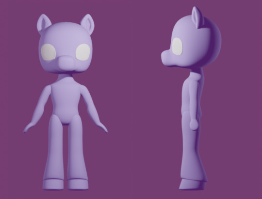
I was struggling to come up with a doll for this one, but I finally realized I was doing it backwards. The thing that makes g4 stand out, I think, is the fact it was fundamentally designed opposite from g1. Lauren Faust, an animator, designed the ponies and the toys had to be designed around her art.
So the primary difference was considering what a tv show- a tv show concieved in the 2000s and airing in 2010s- and I did look into some kids properties from that time period as I was designing
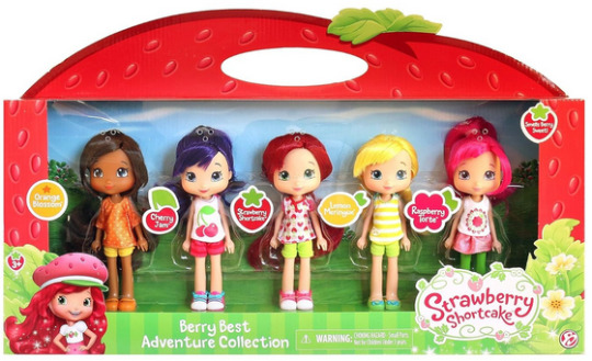
I think these Strawberry shortcake dolls are really close to the concept I'd want for a early 2010s mirror of MLP g4. So basically these toys but more anthro.
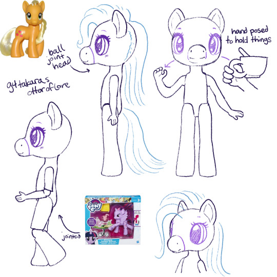
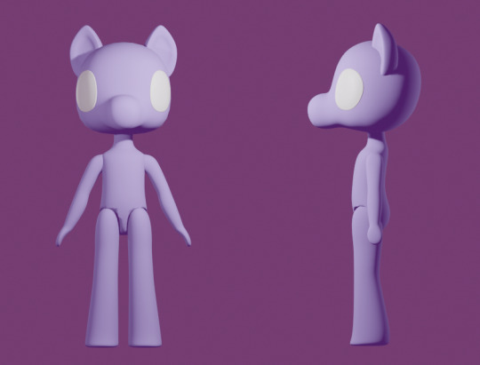
I ended up making a 3D mockup so I'd be able to plan the different angles and keep them consistent.
The eyes are kind of far apart but I think thats true of the g4 pony toys as well. Again, because of the way the g4 show was stylized as animation, there was sort of cheating with the anatomy, especially on the face.
Generation 4.5
Gen 4.5 was a spinoff of gen4, just like gen3 had 3.5 where the ponies are more chibi. More big eyes with even bigger ears and a face like... a cats? instead of a horse. Hoof fluff again.
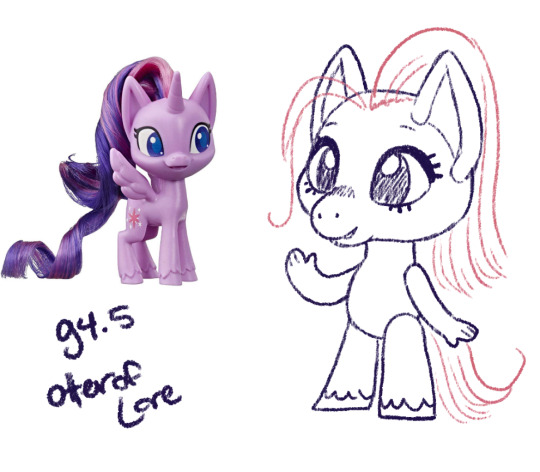
I think this nailed the style without being as much of an outright copy. The bendy arms with fingers seem so silly but also I think that matches the vibe/artstyle.
G4.5 don't look like horses to me really at all though, they're like cats with hooves. Out of all of them we've seen so far they're suffering the most from "predator eyes" where they've gone so far as to make their eyes just face forward.
Generation 5
Generation 5 premiered with a CGI movie, so the toys that would be released are fairly on model with their movie selves except for the fact their heads are smack dab in the middle of their neck which i find extremely unsettling and dislike
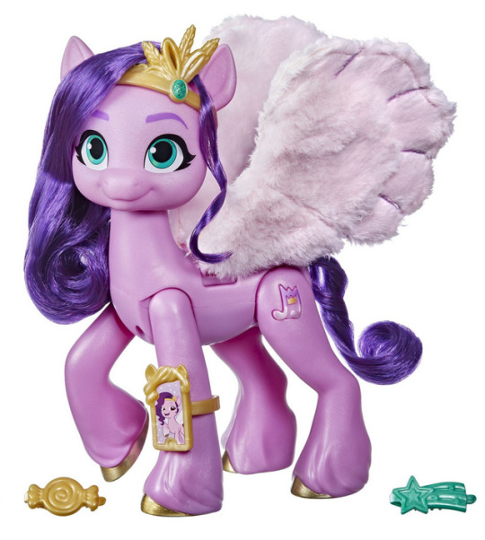
We've gone full "predator eyes" (no the predator eyes thing doesnt 100% biologically hold up but I find them freaky and I get to say it) AND full human eyebrows stenciled in like a makeup vlogger in the same color as the hair.
The ears are back to cup shaped (more horselike) but again the face is round with a little muzzle (more catlike). The hooves have really detailed feathering on the legs. Otherwise the body is mostly just structured like the g4 body (except a bit longer) just with more specific horse details.
These continued the trend of having a lot more articulated versions with moving legs as well. I think given that most dolls these days have articulated elbows and knees, it is reasonable to expect the takara g5 dolls would too.
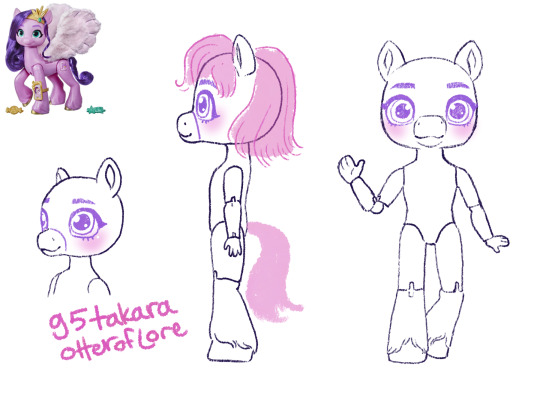
Again, I made a 3D model so I could keep it consistent from various angles.
ta-daaaa heres my takara pony generations 1-5 lineup! Tell me which youuuuur favorite are. if you want.
#im sorry for how long this post is#long post#my little pony#takara pony#mlp gen 1#mlp gen 2#and so on#generation 1#doll designs#sketches#i also wanted to do the clothes styles for each gen but this took so long already#and alternate gimmicks#would be fun to explore
212 notes
·
View notes
Note
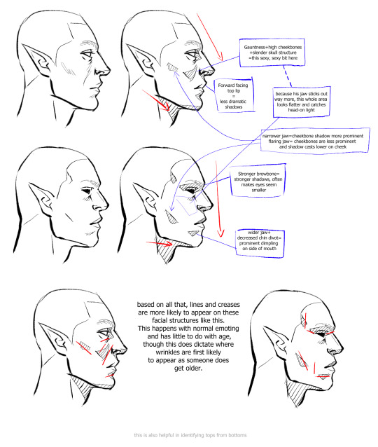
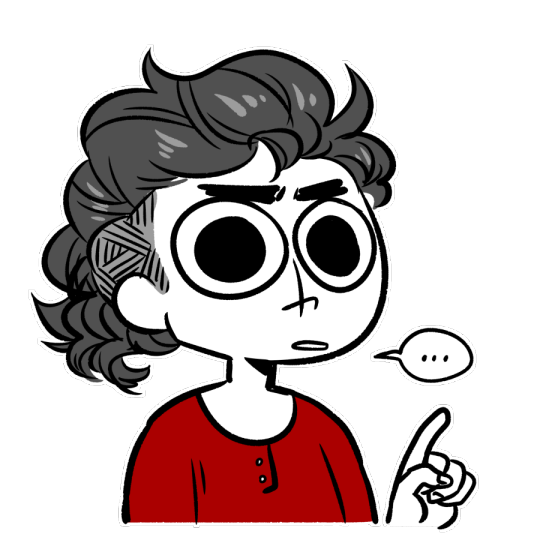
Any advice on drawing McCoy? I’m not used to drawing ancient wrinkley bastards (affectionate) and it’s surprisingly tough v-v
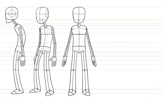
FOR SURE lmao i made. a diagram. just a warning that i am going to be irritating and long winded because u just hit a topic i really like sorry lmao
so first off i did some traces just to show whats there vs redraws to show my interpretation
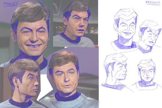
ive said this on other asks but again jsyk, tracing isnt bad!! its a tool. theres some stuff with intellectual property and whatnot but using tracing to study shapes and forms is a really valuable practice.
also just taking some time to learn facial structures and anatomy is super useful, reading what bones and muscles are where and how they interact with one another. taking this info and staring in the mirror and moving your face around and thinking about it. just really furthers understanding of how the face works. trying to sound normal about this but i love anatomy and motion and physics and whatever
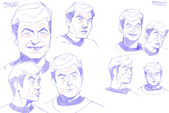
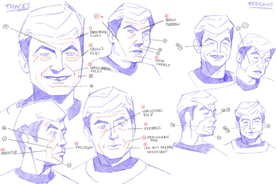
anyways im going to go through all the numbered points so there's no confusion.
1. forehead lines - self explanatory. more prominent when brows are raised
2. crows feet - at the outer corners of the eyes, more prominent when smiling or squinting
3. nasolabial folds - the folds that go from the corners of the nose to the corners of the mouth. more prominent when the mouth is wide, like smiling
4. brow furrow - self explanatory, most prominent when brows are furrowed. mccoy tends to have two right next to his eyebrows, kirk has one in the middle. everyones face works different lmao
5. chin crease - caused by how the chin and lower lip interact.
6. nasojugal groove - start from the inner corners of the eye and can extent over the cheeks. everyone has these and idk why people dont like them i think theyre really cool!!!! but Society. i guess. :/
7. eye bags - caused by the skin sagging beneath the eyes. mccoy isnt even that old in tos i think hes meant to be mid 40s by the end of the 5 year mission, hes just got really prominent eye bags lmao
8. idk what the name is for these, but when the mouth is wide and pushes the skin to the sides, these folds sometimes form outside of the nasolabial folds
9. philtrum - the groove above the upper lip. i dont usually draw this but mccoy's struck me as prominent enough that i usually draw it on him
10. masseter - the muscle that moves the jaw up and down. its a pretty rugged muscle and while i wouldnt say mccoy's is especially prominent, it kind of extends that nasojugal groove from certain angles/positions
11. orbicularis oris - mouth muscle, usually easier to see when lips are pursed or frowns are pulled. mccoy's is pretty prominent from 3/4ths or side, his mouth tends to protrude in profile
12. this isnt a muscle but more of a line defining the planes of the face, but since i drew it i felt i should explain lmao
a few points:
im an animator i tend to exaggerate and emphasize certain things so i usually make him more square.
i like to combine eyebags and crows feet for brevity/flow, same with nasojugal grooves, eyebags, and masseter lines. my approach is always subject to change based on pose, expression, reference image, etc.
i take out details that i deem redundant or cluttering and keep what details i need to make things feel Right
all this info is applicable to any character of any age, its just in how you apply it and facial proportions that willl change how old a character is perceived to be
there's a lot more with drawing a Character rather than an Actor, just because the features are there doesnt necessarily mean things will feel correct? its very much in the mannerisms and poses and expressions
i only went over my approach to his likeness but not really body type or posing or anything idk if u want that i could always try to answer that later haha
_______________
anyways all that info kind of exists nebulously in my brain while i draw its not like im sitting there thinking Must Draw. Nasolabial Fold...... i jsut do what feels right with the visual info i have. also i love specificity in faces.... i dont like to be a hater but when every character is drawn the same it pisses me off a little lmao. so
also dont take my word as The Only Way to do anything i just draw how i like to draw and no one should feel like these are things that Must be done to be a good artist or anything do whatever the hell u wanna do
#anyways my apologies that was. a lot#it will happen again if asked of me.#anon#ask#everyone has this stuff going on with their face and its really cool but capitalism and the beauty industry and whatnot#have been rotting peoples brains since the moment they came to be#the more u look at and appreciate how ur skin an muscles and bones interact with one another the more fine u are with your own face#trust me#because its really cool. like mechanically and stuff#idk if its like theraputic or something but maybe it is or maybe i think about it all way too much#how i draw#ive got some other similar things under that tag i think pertaining to merlin but still similar info
165 notes
·
View notes
Text
As tends to happen when I’m in an art funk, I’ve stockpiled a few sketch sheets.
First up, a little Momo love!
These ones are based on a plushie I got for Christmas. I want to reverse engineer its pattern someday, because I ADORE its proportions!

(The bottom right two are just freehands, not based on the plushie.)
And then just some “whatever my hands felt like doing” doodles.

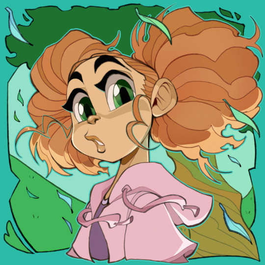
And… a character that I’ve been trying to iron out for a bit now… she’ll be relevant to the story at some point, but I’ve been enjoying drawing her and finally getting a solid idea of what I want her to be.
But since she’s relevant to the future, I’ll put her stuff under a read more, for those who would rather wait until she’s officially introduced.
This character is named Jamie, and is very near and dear to my heart. She’s not only an old OC of mine, but she—with help from a Gardevoir— is basically the one who got me out of a human drawing phobia many years ago. (So you can thank her for me being bold enough to share today, lol.)
She started out as a trainer-sona, but quickly became a character all her own, very different from me as a person.
Anyway, first for her, some gesture things and mood drawings.
Some hairdo practice
(I default to making parts either in the middle or on the left, hence the blurb in there, lol.)
And some fun I had with her Crobat, partially inspired by a comment from @penumbramewtwos
(I forgot her scars there, but it kinda works because I feel like this would happen before she got them. X3)
And finally, the part where I really felt like I was getting somewhere with her, aka some clothing testing.
I’ve been wanting to hold off revealing her until she comes into the story, but I really like how these all turned out, and I don’t know when I’ll be ready to move the story along. On top of that, her reveal really wouldn't have any special impact to most of you, since you don't know her. (Aside from a select few.)
So I thought I’d give in and share her with you all. Plus that frees me up to share more doodles of her if I so choose.
I hope you enjoy! ^v^
263 notes
·
View notes
Note
Hello!
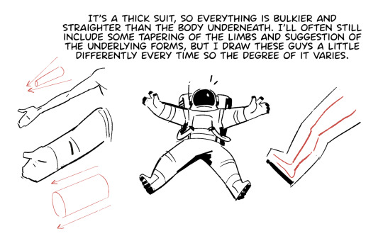
I was recently inspired to draw an astronaut (specifically in the Apollo 11 Spacewalk suit) but since can’t draw astronauts or human anatomy in general I had to give up. My point being, do you have any tips on how the draw astronauts? Btw I really love your art! You’re one of the first few people I followed on tumblr!
Aw thanks! First off:
Drawing is just making marks. If you can make the marks you want and you know where you want to make them, there's nothing that you can't draw.
Sorry that's not very astronaut-specific, but the way I think about it there's not much difference between drawing an astronaut and drawing, say, a steam train. It's all the same process of studying the real thing to understand first its basic forms and proportions and then its more complex details and then applying that knowledge. The more you understand something, the easier it becomes to play with it.
If you want to draw humans and humanoid things, start by studying the scaffolding, how the bones connect to each other, how they move, and what their relative sizes are. Don't worry about replicating the literal appearance of every bone, just think of it like a stick figure with a box for the ribcage and a box for the pelvis. Then you can layer muscle groups on top of that, skin overtop of muscles, and clothes and astronaut suits on top of it all. Will Weston's figure drawings are my favorite to study for this kind of thing.
There's basically nothing that's off limits when it comes to studying. You can draw from life, draw from a photo, trace the basic shapes on top of photos to get a feel for the proportions, draw from another artist's drawing, etc. It's generally best not to post stuff you trace or otherwise copy (and definitely don't claim it as your own) but it's all fair game for learning. The only thing that won't help you learn is drawing without any reference, since you won't have anything to evaluate your drawings by to see what you're doing right or wrong.
If it helps, here's some stuff I think about when I'm drawing my astronauts:
441 notes
·
View notes
Note
Kinda oddly embarrassed to send this but oh my god your art is so pleasing to look at for some reason
I think it's just the soft shapes you use and how amazingly 3D everything tends to look?? Like the angles and proportions are just so perfect that I find it easy to imagine most of what you draw as a 3D model or something
And like I don't think I could nail it like you (maybe with time!!) But I am definitely taking inspiration from it because it DOES get me thinking about how you use shapes and angles and wonder if I could practice that because oh my god I wish I could absorb your art
Do you have methods or techniques to make it look so 3D? if you know what I mean? I tend to use grids to try and map out the shapes in a vaguely 3D plane, so I was wondering if you had tips kinda like that to share with the class? or if you're just winging it and it's a lot of practice?
Thank you so much!!! It really means a lot to me when others take inspiration from my art, it reminds me of all the artists I used to look up to and emulate when I was first starting out on MSPaint with a broken trackpad for a pen, you don’t have to be embarrassed! You’ll definitely be able to harness 3D space and create fantastic work, you’re already well on your way! Having passion and a desire to learn will take you far :)
My biggest focus whenever I draw is to make the characters feel real, as though you could reach out and enter the space they’re in to sit next to them on the couch. I’m so glad that I’m able to pull it off! Thanks for the rose, I’ll be sure to cherish it :)
As for my methods and techniques…
Drawing on a 3D grid plane is definitely something I do! Its perfect for comic panels or storyboards, to set the scene and ground characters or props to their environment.
I did a lot of classical study, that is life drawing and still life drawing, but simply using reference for buildings and anatomy also helps a lot and is a lot easier to find. I’d also sketch my hands, plastic animals, and my surroundings, as well as people watch for inspiration for character mannerisms or fashion. It’s useful to know a little bit about the inner workings of anatomy, as there are places were bone makes a person inflexible, while places with more muscle or fat are affected by things like gravity or pressure that change their shape. Drawing a flour sac to act out different emotions is a great way to practice weight and character acting!
Having studied animation, I did a lot of turnarounds to get characters consistent and able to be rotated in 3D space. It can be pretty tedious for some people, but it really does help solidify the characters’ shapes and design, and serves as great reference to look back on if you need it! If you don’t want to do something so stiff as a turnaround, simply drawing expressions and poses from dynamic angles helps too. I’ve found that breaking a character down into basic shapes that are easy to draw in a 3D plane also can help my anatomy and foreshortening be more accurate.
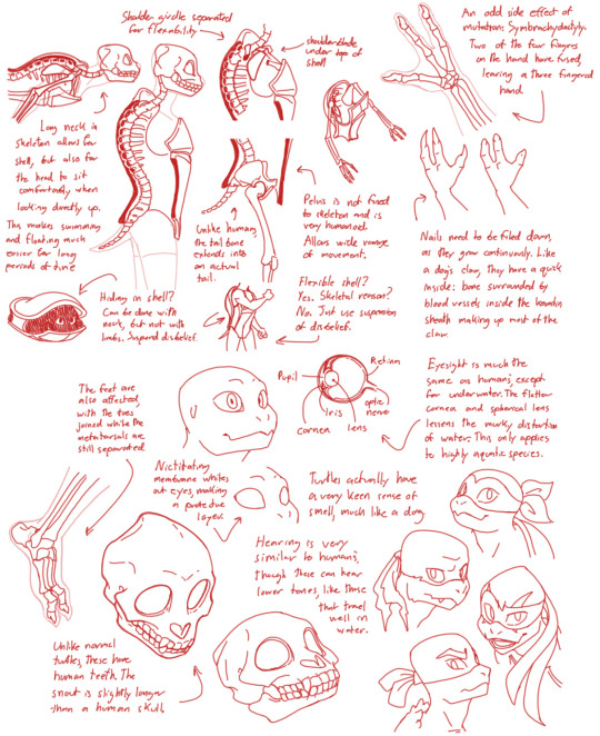
Most importantly, find something that brings you joy to draw! Every “traditional” method of study can be applied to things you like, so don’t feel the need to burn out thinking you can only draw the Mona Lisa or whatever. I’ve done anatomy studies on the Rise turtles to figure out their skeletal structure, and friends of mine have painted some mind blowing concept art inspired by Sonic and D&D!
I hope this helps some? Best of luck, and have fun! :D
Below are a couple of examples of some of my studies:
#ask#art tips#thank you!#it’s also definitely a lot of practice and winging it lol#i still don’t know how thighs and calves work sometimes
128 notes
·
View notes
Text
My Muse
~content warning: slightly nsfw~
Mizu x artist!reader
Authors note: I am not a writer so I apologize for any mistakes! Enjoy!
"Somethings' off...I can feel it..." you say as you squint at the canvas before you. Wether its the shape of the head or the length of the torso, you could TELL something was off. "Two years of art school and yet I still can't seem to get body proportions right. Ugh, maybe I should just find a different career path-"
You hear a knock on the studio door "Y/N? You in there? I made us some tea, can I come in?" you hear the voice of your partner, Mizu, behind the door. "Oh! Yes! Come in!" You exclaim. Upon your approval she comes in with two cups of tea and sets them both at the break table nearby. Deciding to take a break, you get up from the frustrating sketch before you to spend some much needed time with Mizu.
"Hows the art going? What are you working on?" She asks curiously. Mizu has always loved your art, and though she was a woman of few words, you could feel her admiration and respect coming off of her as she gazed fondly at the paintings made by your hand.
"I feel like if I try to fix it any longer I'm going to jump off a bridge" you sigh, half joking at this point. "Ouch, that bad?" She raises an eyebrow as her eyes scan the canvas. "It looks a little off but its not bad. Perhaps you should do some model studies. Who knows, maybe seeing the body up close will help you figure out what you're missing." The idea sounds good in theory, but theres a problem with it "Where would I find someone willing to strip down and let me stare at them for hours while I draw them? I don't really have the cash to pay someone for it." You ask her earnestly.
"Well..." she contemplated "I could be your model, if you want." Your eyes widen at the thought, it makes sense, and its not like you haven't seen her naked before, but you feel a blush crawling up your cheeks regardless. "A-are you sure you're comfortable with that?" "Absolutely sure, I'm comfortable with it if you are. We can start after we finish the tea" She says, her ice blue eyes seemingly brightening up with excitement.
A brief moment later, and Mizu stands before you, a robe being the only thing covering her up. "I'm ready. Where should I stand?" She asks you. "Oh, just go sit on the lounge right here, I want to try capturing you in a leasurely pose." You say. "Just lay back with your back proped up on the arm of the lounge, have one knee bent, and your arm resting on the bent knee. Look off to the side as well." she nods and gets into position as you ready your pencil. "Ready?" You ask, "Ready."
You begin sketching out her figure, glancing over at her every now and then for reference. Every curve, every scar, every fold of her body carefully replicated onto your canvas. From her slender yet defined arms to her lean torso and model-eque long legs. "She's so beautiful..." you think to yourself. You sketch more. Her breasts, her gorgeously long dark brown hair, her breathtaking blue eyes-
You notice her glancing at you, flinching away your daydream as you hastily hide your burning red face behind the canvas. You hear a soft chuckle emit from her as she looks away, a warm smile fixed to her face and a light blush forming. The silence in the air that followed was not a suffocating one, but one that carried a sense of quiet intimacy between two lovers. Warm, soft, and inviting. You feel yourself beginning to relax as you continue to sketch the beautiful woman in front of you.
You finish your sketch up and exhale deeply "Its done! It came out so well! Would you like to see?" You ask her excitedly as she rises from the lounge and reaches for her robe. "Hell yeah I would." She replied. As she scanned over the canvas, her eyes widened with awe. "Its...amazing love, is this how you see me?" She asked "Of course!" You tell her "You're the most beautiful and amazing partner in the whole world, you could say you're my muse..." she looks away bashfully, a shy but happy hum coming out as a response. You gently turn her head to face you a plant a loving, soft kiss on her lips, one which she reciprocates in kind. "Thank you Mizu, you've been a great help. I love you." She beams at those 2 magic words "I love you too, Y/N"
#mizu#blue eye samurai#blue eye samurai mizu#bes mizu#mizu blue eye samurai#mizu bes#blue eye samurai netflix#mizu x reader#mizu x you
141 notes
·
View notes
Text
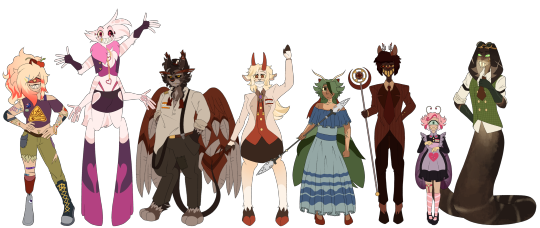
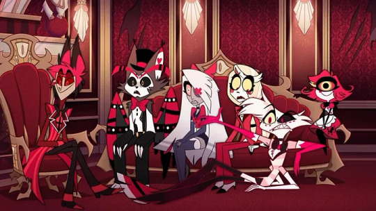
Hazbin Hotel residents and staff lineup! (+ Cherri Bomb)
They are all done!!
I am so happy with all of them and am incredibly excited to continue adding to this lineup! I’ve already got 2/4 extras finished so we’ll see how things go! I hope I’ll be able to finish them but after 19 hours of drawing for 5 days I think I may explode eventually.
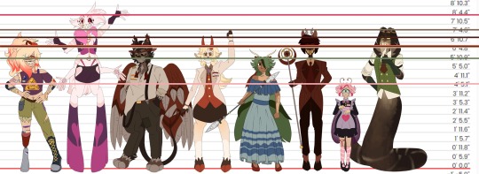
In order from shortest to tallest we have: Niffty (4’6”), Van/Vaggie (5’11”), Charlie (6’6”), Husker (6’7”), Cherri Bomb (6’8”), Alastor (7’0”), Sir Pentious (7’5”), Angel Dust (8’4”).
Very tall people!! Wow!
It’s really nice to see them all together like this and not all of them entirely red and pink. I like red but my god use it in moderation, christ.
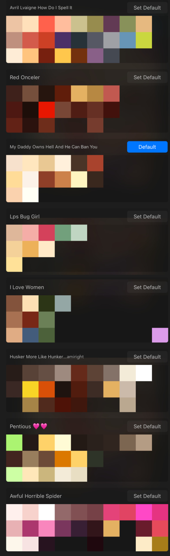
For anyone wondering or wanting to do something with these, here are my colour palettes for each of them.
Some of the colours in Angel’s are from other artworks so don’t mind that. Keep in mind my designs aren’t really TV friendly in my style, but I’m sure theres a way to simplify them to fit the criteria. Some of their proportions are also a bit questionable but honestly I like it. I know some people hate how Vivzie gives angel those weird feet but I’m unreasonably attached to them and I love his fucked up legs.
I really love when lineups feel alive, I think I pulled it off well enough! I want to kiss all of them on the head except Alastor because I hate him, but also half of these people are infinitely taller than me. I believe their personalities are much more clear through my poses than whatever the current ones have going on
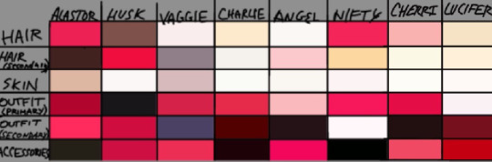
(I didn’t create or format this colour palette lineup but if you know who did please tell me!!)
All of the characters are so goddamn pink and red it hurts my eyes
Ive said it like a billion times but I should be able to tell whats happening in a scene from a quick glance or at least where people are placed. Maybe it’s just my shit eyes but like seriously man.
I’m probably gonna add more to this post soon but I have 3 more redesigns finished and I really really want to show them off because they alone took 8 hours to finish. Im very impatient and I need to show off my horrible creatures immediately.📺🧵💡
#hazbin hotel#hazbin critical#hazbin hotel criticism#hazbin hotel critical#cherri bomb#angel dust#husker#husk#charlie morningstar#vaggie#alastor#niffty#sir pentious#hazbin cherri bomb#hazbin angel dust#hazbin husker#hazbin husk#hazbin charlie#hazbin vaggie#hazbin alastor#hazbin sir pentious#hazbin rewrite#hazbin redesign#hazbin rework#hazbin hotel rework#hazbin hotel rewrite#hazbin hotel redesign#my art#anti vivziepop#anti hazbin
100 notes
·
View notes
Note
i understand that its cool to receive fanart, but ur really lenient about people who draw these characters thinner than they really are, and as a steven universe blog with art that is really respectful about bigger bodies its really disappointing to see u supporting these people skinnyfying fat characters
Here's the thing about your message:
It assumes everyone drawing bigger characters skinnier is doing so with fully acknowledged malicious intent
It assumes that openly shaming people for it will fix the problem and make them draw fat characters 'properly'
I'm going to be completely honest with you for a moment.
I'm a teacher. I teach kids from ages 8 to about 15 (currently I'm teaching younger grades, but I've worked a lot with the older demographic as well.) So take what I say with the comfort that I at least know a little bit of what I'm talking about.
Why does this matter? Because a lot of the fanart that is gifted to me by this community comes not from adults, but from children. Sometimes, they're teens who have been drawing for a few years! Sometimes they're younger kids who have only recently begun to develop their skills.

Here's the reality - drawing bodies is hard. ANY bodies - skinny ones, fat ones, unusually shaped ones. In order to get good at it, you have to draw them a lot! And in order to draw, you need to find ways to practice. Usually, this happens by the budding artist looking around at other artists and copying them. Or looking at tutorials.
Here's another reality - unfortunately, the majority of art online, the majority of tutorials online, don't touch on drawing larger characters. They simply pretend it's not a thing. Finding references to larger people can take work! Getting started drawing larger people if you only have skinny-people references... is hard!
You know what doesn't make it easier? Getting shamed and told off by another artist for drawing characters 'too skinny'.
I teach English to students who have never learned English before. From 8 year olds to 15 year olds, you know what the one thing that remains constant is? Learning happens best through kindness and positive reinforcement. Not through shame and grabbing the child's attention and smearing it in their mistake like you're punishing a puppy that peed on the floor.
In fact, yelling at people of ANY age about their mistake pretty rarely gets them to stop making that mistake. What ends up happening more often is that they end up hating that activity altogether.

There's a reason I consciously and indiscriminately reblog all sorts of art - all of it has something that the artist excels at. Do all of them have great body proportions that are correct for the character? No. Some art is clearly made by people who are not used to drawing anything except super skinny characters!
But all of them ARE kind enough to read my comic, which I try to fill with body types that are diverse, true to the show itself. And that, in and of itself, is exposing them to art styles that don't have to over-rely on anime or CLAMP-esque noodly kids that look like they just popped out of Wonka's Laffy machine.
So yes, maybe they draw Steven or Rose too skinny. But they're also looking at Rose and Steven and clearly find them adorable, and maybe someday, they'll try something different for a change. It's not my job to rub their nose in the fact that they haven't gotten the chance to experiment yet. It's also not my job to ignore them if they don't have the 'correct' proportions, because like it or not, that's also punishment.
I do make it my job to try to reblog the fanart I see and promote it, because getting positive reinforcement and being encouraged to continue to experiment with art is what will make kids and teens AND adults confident enough to go beyond the socially-accepted weight-limit for MCs.
I know it can feel demoralizing to see a lot of character with your body type erased and made skinny as if that's a 'prettier' version of them. But 90% of the people drawing Steven skinny aren't doing it because they hate you. It's because they haven't been told it's ok to draw characters chubby. Or fat. And the unlearning part of that sort of thing is a process that needs support, not shame.
I don't expect you to be kind if you're hurt by that. You can react any way you want, and anger is a healthy emotion in this case.
But if you want ME to react with malice on your behalf, then I'm afraid I won't. I have another job to do, and that job is teaching with kindness.
3K notes
·
View notes
Text
Sun Wukong, the Monkey King: my design notes
[!! click here for the full line-up !!] [click here for just the goodies on tumblr]
also titled, "I underestimated my file sizes" TAT
Separate images and info below the read more, beware this is LONG <3
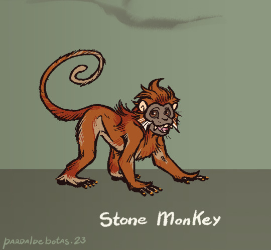
Stone Monkey: himbs baby, that is all <3 he's mostly based off the François Langur, but some of his anatomy and proportions lean more on the Gray Langur and Macaque side of things. His facial fur sort of forms a pentagon shape for the five elements, and I gave him ginger fur cus it's a common depiction for him but also baby langurs are very bright orange, and him not growing dark feels like an apt display of his more childish side, both good and bad. His nails are golden for a bit of a "hidden gem" from a stone egg. Also keeping the tail either in a spiral of C-curve when "engaged", and when droopy it has a feel of a heavy rope. Old World monkeys don't have prehensile tails, he can use it for balance and basic mobility but it's not a third hand for the sake of keeping his monkey-ness.
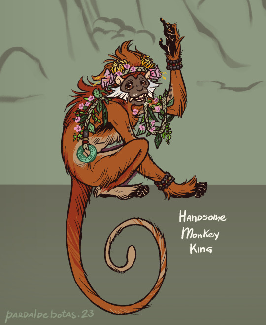
Handsome Monkey King: in one of the poems the monkeys are said to weave grass for mattresses, so I can see them coming up with a crown of woven grass and never-fading leaves and flowers for their king at the very least. His face skin is darker as an adult, but not much else changes overall. The fuzzy upper lips and sideburns are a feature of the species I'm basing him on and it felt like a good fit to add. I also love the forest langurs are so long-furred, makes for a good way to give him dimension but also, the linework style reminds me of old woodcut shorthands for fur. Added a jade coin for the symbolism, and it feels fitting that the king of such a miraculous mountain would have a treasure like that on him. Placcid chill eyes are imperative, dude's not had an existential crisis yet, he's straight up vibing.
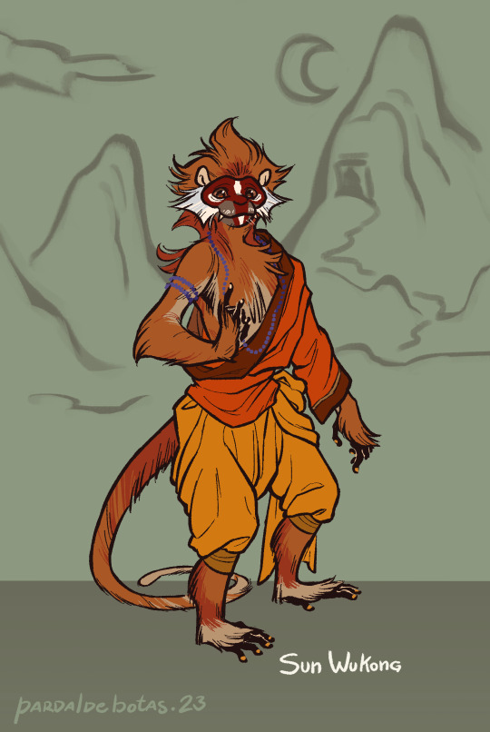
Sun Wukong: during his odd-ten years away from home, he learned human manners so he can stand but, I can see him still needing to lean on his tail to keep up his balance here and there. As he reaches the Western Continent (India) and learns the Way under Patriarch Subodhi, he adopts proper clothes for an apprentice and eventually becomes a Rishi. He dons his facial paint from then on, and after he masters the Way, there's a brightness in his pupils to show his cultivated immortality. The beads are purple solely to stand out over the deluge of oranges that is his design.
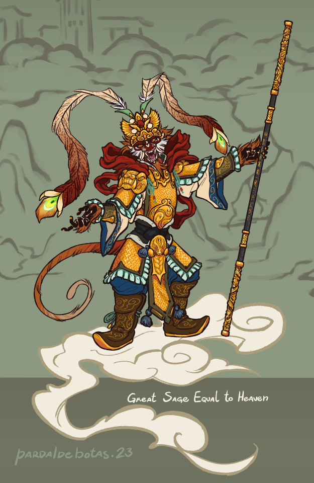
Great Sage Equal to Heaven: really went all out on this one orz this is Wukong at his most egotistical and ambitious, and I wanted his fit to truly embody that. Took bits from Peking Opera costumes and common depiction elements of him, with some bit of extra for appropriate levels of flair, like the phoenix feather design. I wanted to go for a mountain pattern mail but I couldn't figure out how to draw it, so I winged a pattern. I,,, doubt I'll ever draw this armor as detailed as here, but I wanted it to feel a bit overwhelming to look at, while also seeming like it doesn't quite fit him perfectly like it's swallowing him. Bit of a "baby wearing their parent's shoes" kind of vibe; he's stupidly powerful but he doesn't have what it takes to sit on the throne of Heaven. Also I leaned his expression to how he might appear during the Havoc in Heaven and then his bet with the Buddha. Full unbrindled rage murder monkey <3
-- Ruyi Jingu Bang: can't quite move on without my notes on the golden-hooped cudgel, now can I? The secondary hoops are there for further design appeal and for my own visualization of how the staff changes size (the hoops move over the staff's length as if to push it outward or inward). The metal is dark damascus alloy, though the pattern can be omitted for ease of drawing. One hoop end depicts a dragon, the other a phoenix, and in the middle of the staff is the canon inscription as described in the books, in seal script. Glow is optional and mostly for aesthetics.
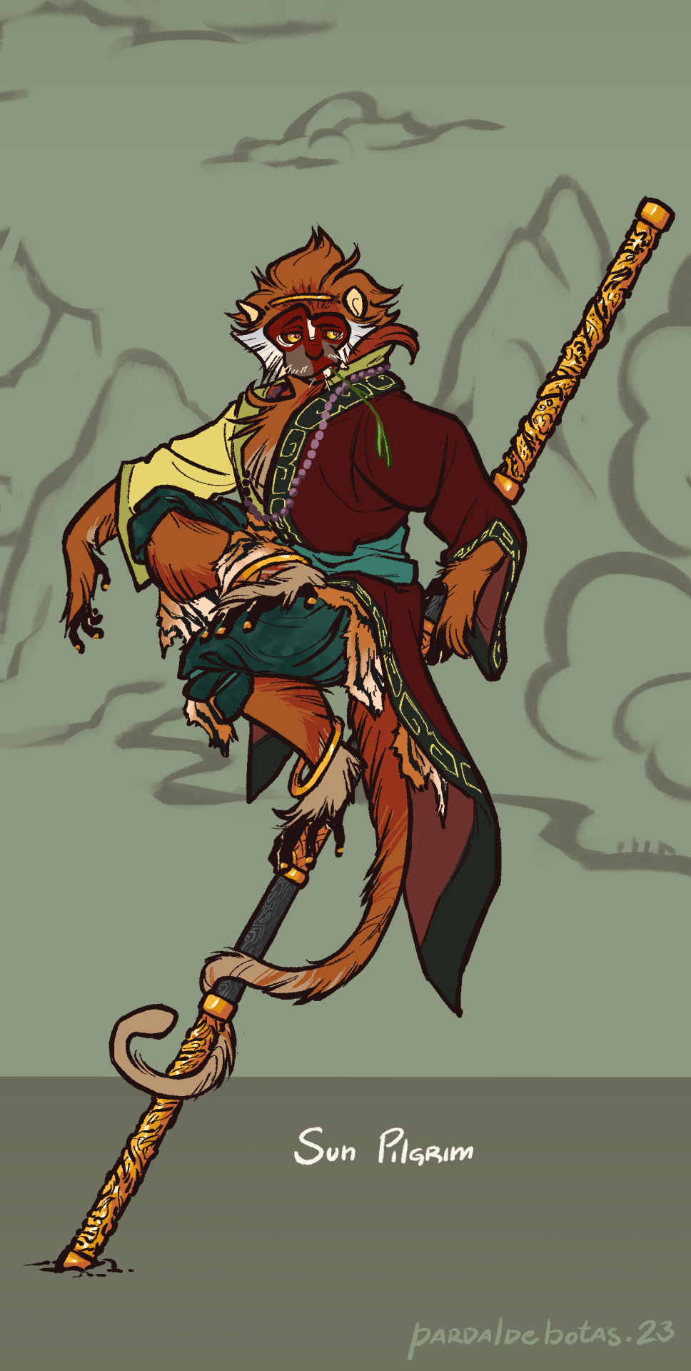
Sun Pilgrim: out of his stolen armor, Wukong seems to swim in his robes but in a less overwhelming way. Went for the simple fillet headband cus his face is busy enough as it is. I know he's skilled enough to skin a tiger into pretty decent squares, but after one too many battles, anything would get tattered. He wears red, teal, black and yellow, four of the five cardinal colors, while white (the West) is still missing. His red and black half-robe doesn't fully cover the yellow underneath, a call back to his golden armor; he tries to use his wisdom and teachings to fight back the impulses of his past, but they still shine through at times. I kept only the leg bangs for dynamic elements to better show movement, but also one could say he's got.... golden hoops (haha get it, like his cudgel?? :oD)
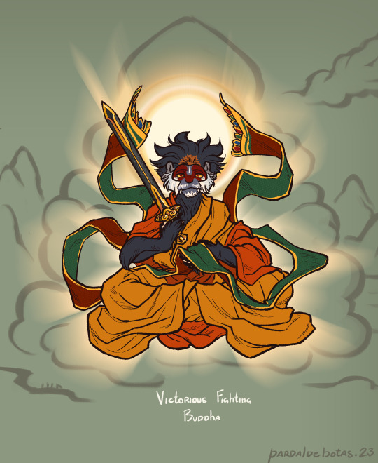
Victorious Fighting Buddha: leaned hard on the actual portrayals of the Buddha. Seeing that he's depicted with dark/blue skin, it felt appropriate to let the guy grow out of his baby ginger fur and into adult black, but a patch remains where the golden headband used to be. I didn't want to give him long hair so no bun, but instead, his fur has a sorta lotus-petals shape now rather than his single point. His face paint changes into a more domino-mask style, and his brow white line resembles a teardrop urna. I made the mail piece he holds longer to keep the flowy bits of his previous outfits, and I turned Ruyi Jingu Bang into the sword he wields.
Hello hi, this robbed me of three days of my life and I'd like to receive compensation x.x Anyway hope you enjoy this lad, I know I do! Also if you wanna send me asks about him pls feel welcome to, I'd love to chat about this bastard monkey (affectionate) (loving) (i`d die for him)
#jttw#journey to the west#xiyouji#jttw sun wukong#sun wukong#jttw fanart#monkey king#stone monkey#victorious fighting buddha#buddha victorious in strife#sun pilgrim#bell dragon art#expedition to the west au
282 notes
·
View notes
Note
Hi!! Love your artwork and your Charlastor AU with Dawn!!
I was wondering if you think Alastor would make any dawn-themed dad jokes and puns in your AU, and if he does, what would Dawn and Charlie think of them? I can’t really think of any off the top of my head right now, but I know ‘a brand new dawn’ is a phrase he could maybe use!
Again, love your art!!! If you don’t mind answering questions about it, do you have any advice for artists who want to improve their drawing or any practices that have helped you develop your skills? And are there any particular artists that really inspire you?
You’re one of my favorite artists and I don’t know how to explain it but your drawings have so much life in them!! 🌟
sdlksdflkj thank you so much omg!!!
I'm so glad you're enjoying them ;W;
And he would be insufferable with them lmfaoo, especially because I'm sure Charlie would hop in on a few of them and add to the pile as well xD
One more I can think of rn is "Oh, I was wondering where the sun went!" whenever Dawn enters a room, because the implied punchline is "but then it Dawned on me" or something? XD idk I'm not good with puns sadly
Now regarding the art advice!! This one got HELLA long so I'll hide it under a cut for everyone's comfort lmao
I know it sounds shallow and like worthless advice, but a huge huuuuge part of getting better at art is to just... make art! Practice makes perfect - it develops your motor skills, gives you somewhat of a muscle memory for certain basic shapes that are a necessity to have a good feel of for good foundation sketching.
Practice also develops your eye for compositing and for how color theory actually applies in practice, it basically helps you develop a more consistent grasp on art as a whole :D
There are some things I've learned over time that definitely helped speed things up though xD
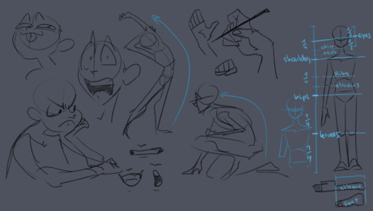
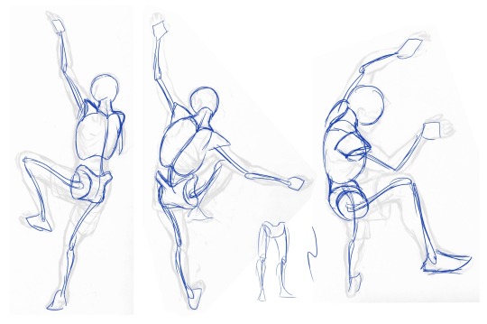
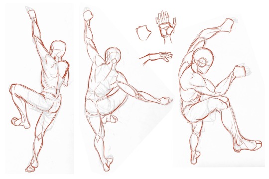
here's some rough sketches I did just to demonstrate what my rougher drawings can look like - also a little diagram (on the right side of the image) of things I keep in mind for the average proportions of a human body!
I tend to sketch very loosely and try to capture the overall vibe and silhouette/rough shapes first before I even think about adding details - there's a certain flow, squish and stretch to everything that's just much easier for me to get a good feel for when I use quick, loose brush strokes and as few lines as possible to convey a concept.
Repeatedly sketching humanoid characters of various shapes, builds and sizes for years genuinely helped enormously in getting not only faster but also more consistent with it!
I'm fairly well practiced with hands and expressions especially at this point since I like to focus on those in my art often, so those come fairly easily to me as well now!
Something I learned along the way about keeping a certain liveliness to my artworks is that sometimes you have to forego anatomical correctness a bit if you want to fully express specific emotions - if you try too hard to keep everything perfectly proportional and realistic, it can make the outcome look stiffer than you might've aimed for - this is something I actually struggle with in my cleaner artworks :'D The ones I do proper lineart for, since a lot of the flow of the original sketch gets lost in the process haha
As for artists/artstyles that inspire me...
There's @/southpauz for example!

Her artstyle is unbelievably expressive and her eye for compositing and her use of shapes is SUBLIME - it inspired me to let loose more with my expressions, exaggerate features a bit more and to push the way I try to vary facial features :D
Then, back when I had that massive Rise of the TMNT phase, the artstyle of it has actually greatly influenced how I draw today!
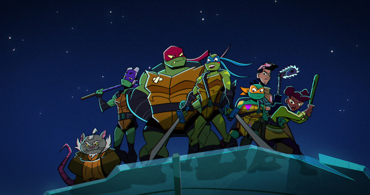
It manages to be detailed and highly recognizable despite its deceivingly simple style - it exaggerates shapes and uses it to communicate personalities, emotions and action super effectively and taught me a lot about utilizing those more efficiently myself :D
And last but not least Ishida Sui - the mangaka behind Tokyo Ghoul (which used to be a highschool obsession of mine)
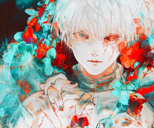
His striking use of colors, textures in abstract, yet symbolically heavy ways and his courage to be rough and expressive rather than looking polished, yet also having such a solid understanding of realism blew me the fuck away as a teen and still does now!!!
His art may have less of an influence on my style today than it used to back then, but I think in my more exagerrated, more horror-esque drawings you can kind of see it still :'D Either way I greatly admire him as both a writer and artist.
-----
I'm genuinely so so flattered that you enjoy what I do enough to give me such high praise, thank you so much for writing me such a wonderful ask <3 I'm glad I got to gush about some of my favorite artists/artstyles for a bit haha
If you have any more specific (digital) art related questions don't hesitate to reach out!! I love giving pointers about a subject I'm so passionate about, we don't gatekeep helpful information in this house!!! <3<3<3
45 notes
·
View notes
Note
They still feel off specially the eyes i could feel them about to manifest their own life and run off
Even my linework is ... Idk what's wrong and it's the problem maybe I'm staring too much but I don't think so
Sorry for bothering alot but i loved your last advice ty
i think the main problem with the first picture has to do with the proportions and anatomy of the lower body area aka the neck and shoulders. i'd make the shoulders wider and add some sort of form to the neck so that it looks believable instead of a flat rectangle shape ( maybe make it slimmer a bit too? although that might be just a stylistic choice so you do you). That's the first thing i'd fix because otherwise the head looks too big in comparison to the rest of the body, and it can throw you off
I actually think you did a great job with the eyes, they have a lot of life and that comes from the fact that they are the most rendered part of your piece, which is not a bad thing. The thing is, while it is true that the eyes are the main focal point of a face and portrait in general, that doesn't mean you can neglect the other parts, so i think it is also a consistency issue or not figuring out exactly what sort of style or rendering you want to go with that holds you back (which is totally fine and normal ofc). So let's pick a semi-realistic stylized rendering style for this since this is the vibe i'm getting from this piece.
If that's the style we're going for, then the face should have a bit more form. You have to remember that our facial features ( eyes, nose, lips) are connected with each other via the planes of the face, right? So, for a semirealistic style, revisit your reference and try to idenitify what those planes are and how they connect to those features, and most importantly, where the shadows hit, and just accentuate them more, because at the moment they look like 3rd forms plastered over a 2d surface which is not right, our skin has form as well. Color-wise, don't be afraid to go darker with the shadows, they really make your drawings pop. Without looking at a reference, i'd def add some shadow under the lips, a bit where the lips connect to the nose, under the neck, and in the lower body area.
I'm really trying to avoid the most basic answer which is " practice anatomy !!1! " because everyone can say that however, at the end of the day, this is the main thing the face lacks. And tbvh you don't have to actually know anatomy, you just gotta know some proportions things that make the face look believable enough. I feel like the features are mostly just drawn from the reference without an understanding of the structure behind it. Something tells me that in the reference picture, the person had their head tilted a bit upwards, but here it's kinda flat and the features are just painted without following the motion. Try to draw over your reference picture the vertical and horizontal lines and make up the head shape behind it to figure out the way it is tilting and facing, because the lips, eyes nose, etc will follow that same sort of flow, they're not stationary. I'd also make the eyes a bit smaller, or maybe make the skull bigger bc i think they are touching the outer edge too much now, and also narrow the distance between the nose and lips just a bit. Kinda hard to explain without actually doing it myself. But really, try to play with that, and try getting comfy with drawing 3d forms i know it's easier said than done but..... there really isn't any shortcut unfortunately
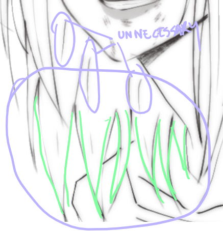
As for the lineart drawing, yes it's actually pretty solid, i like that duplicate blur thing you did, i'm familiar with that technique and it def has its perks so that's great. Im not an expert on lineart, however here i think there are too many " unnecessary" lines that could easily be omitted (purple). Less is more and all that~ The hair strands at the end feel too stiff and identical (green). If you notice, they all just end in this " V" shape and they rarely overlap thus making the image look flat. Try to break this pattern by introducing more spontaneity aka random hairflies, making the strands overlap, adding more shape variety etc
Make sure that the lines connect properly whenever they meet, and also although you already did it and i think that's great, you can make some lines even thicker, go even further and add even more lineweight. As a general thing, usually, the exterior or contour lines are thicker and whatever it is inside is thinner so experiment with that, you can start from the nose- thicker lines for the nostrils thinner for that nose tip i forgot what it's called and also add thin lines that just hint at the form. Lineart is hardd so i don't blame you, but if you're gonna keep the lineart in, try "shading" with black blocks so to speak, make sure the lineart layer can stand on its own, and pay more attention to the lower part area (neck and shoulders) even if it is less exciting to ink
#ok i lied it's long again#these are pretty fun to do can u blame me#ask iztea#you should also check in with other people don't take my word for everything#but since you asked my personal opinion here u go#sorry for any typos if there are any i'll fix them later#long post
70 notes
·
View notes
Note
omg can you review the mighty poogle 🥺

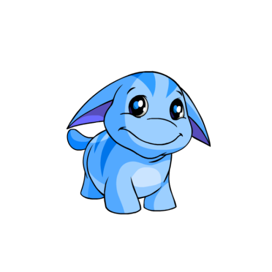
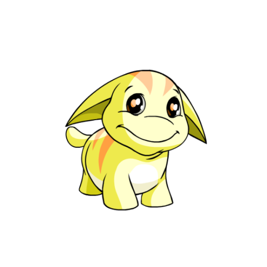

The Poogle is one of those really abstract Neopets wherein it's just a Creature(TM). What kind of creature? Who knows. I guess they're meant to be vaguely dog-like (seeing as Poogle racing is a thing, and it does sound vaguely like "poodle"), but they really don't lean towards any one specific animal, which is always something I enjoy.
What makes Poogles appealing is undeniably how chubby they are; it makes them look extra cuddly and is part of what gives them their distinctive noses (or lack thereof) and double chins. It also comes with a bit of lore about them living primarily in cold-weather regions, kind of like how seals have blubber to keep them warm.
Beyond that, I also like their stripes; they break up the design just enough without feeling too distracting, similar to their underbellies. The shape of the stripes is also mimicked by their distinctive ears.

I will fully admit though: Poogles got the raw end of the deal when it comes to customization. Not the absolute worst conversion job, mind you, as for the most part they look pretty dang similar—same pose, same proportions, same markings, etc.
However, what got completely messed up is their faces. Originally, Poogles had a soft, fleshy snoot that had two sets of lines to indicate that it was mostly fat and that it went back in space a bit. Removing this upper line makes their snouts look hard, and also has the side effect of making their snout and even their entire head look too wide.
Likewise, the chin got messed up. The Poogle originally had a pretty distinct double chin/fat neck that, once again, showed how chubby they were. More importantly, their chin lines weren't closed off, so their heads bled directly into their bodies. On converted Poogles, they now just look like they have one weird normal chin instead of a chin and neck. The end result is actually kind of uncanny if you stare at them for too long. It's a shame, because like I said, everything else about the conversion works, and there was no reason to change the elements they did. They're still cute, mind you, just slightly less so.
Favorite colours:

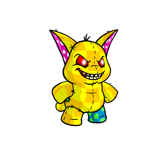
MSP: Species-specific colors always tend to be iconic and a delight, and MSP Poogles certainly are no exception. They're basically the same thing as a regular plushie Poogle, except Evil(TM), with red eyes and a nasty set of sharp teeth (side note: canonically, all Poogles actually have sharp teeth; you just rarely see them). The unconverted version also is bipedal, unlike the regular unconverted plushie, which was quadrupedal.
Both converted and unconverted MSPs have a super fun chaotic gremlin energy to them, and both designs are good depending on which stance you prefer (I kind of like the converted quadrupedal, though granted, the loss of some stitching and extra softness is a bit of a shame.)
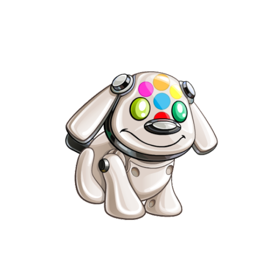
Toy: This color literally just released last month, but a toy Poogle based off of the good old iDog is just delightful. Even if you don't know anything about iDogs, the design is still good, with the eyes serving to complete a multi-colored hexagon that draws attention to the head, and the rest of the body considering of just a smooth off-white and black.
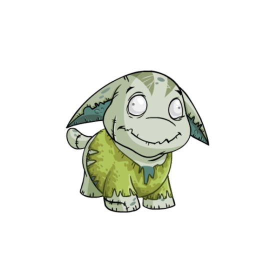
Zombie: The mindless eyes on this one are just absolutely delightful and give it a ton of personality. I also like the details, such as a few stitches here and there, a scraggly mouth, scratch lines against the usual stripes, and liver spots. As a bonus, it looks good both with PB clothing and without.
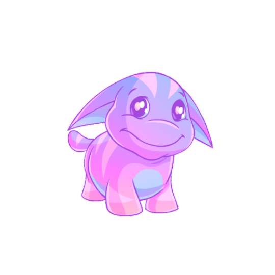
BONUS: I don't normally mention "recolor" Neopets as much on these reviews just because they tend to be mostly by-the-numbers, but the pastle Poogle is honestly gorgeous, with subtle gradients and a low-contrast blue and pink color scheme, helped by colored lineart. It's nothing fancy, but it's definitely one of the all-time best pastels out there.
82 notes
·
View notes
Last Seen Blogs

qugulives
Без названия

devlynsidious
Natalie DS

fuckyeahmaojun
fuck yeah maojun!

highbcltage-blog
MOVED TO @vcltaic