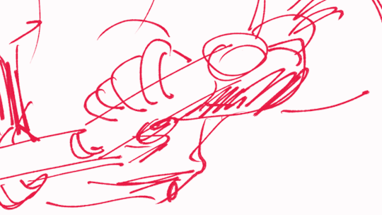
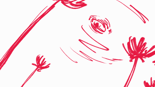
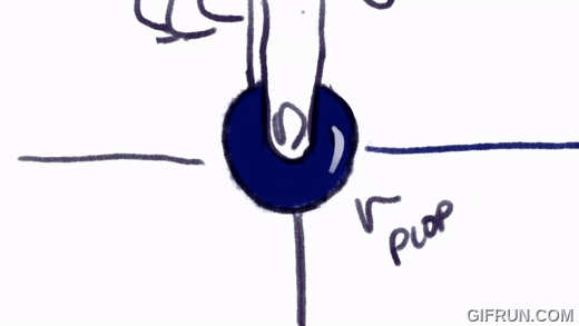
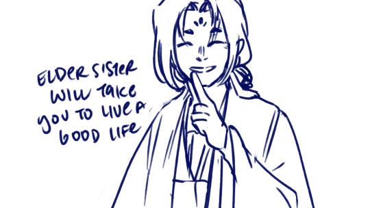
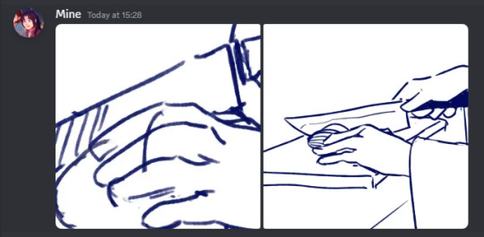
#still getting used to csp so this isn't the best best
Text
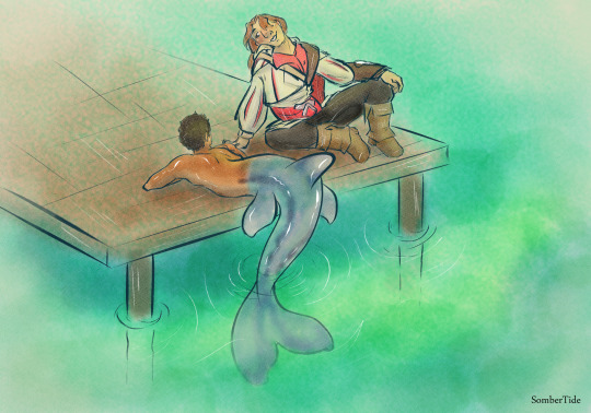
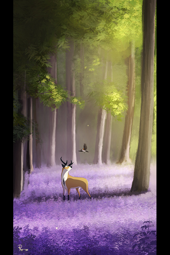
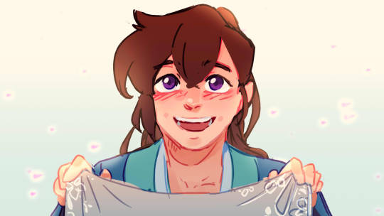
so a lovely artist I follow had a wonderful idea for a merman Desmond AU and I just had to draw a little bit of fluff hehehe
go check out @sulfies art, if you love Desmond :3
#art#digital art#sombertide art#watercolor#ezio auditore#assassin's creed 2#assassin's creed#ac#ac 2#desmond miles#ezides#merman#mermaid#gay#they are gay and in love#still getting used to csp so this isn't the best best#but i'm still proud
233 notes
·
View notes
Text
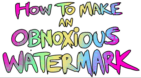
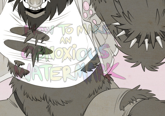
...that your audience won't hate.
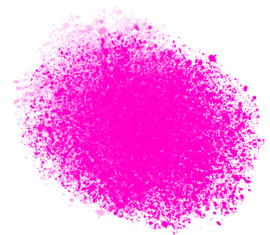
This is a method I started using when NFTs were on the rise - thieves would have to put actual work into getting rid of the mark - and one that I am now grateful for with the arrival of AI. Why? Because anyone who tries to train an AI on my work will end up with random, disruptive color blobs.
I can't say for sure it'll stop theft entirely, but it WILL make your images annoying for databases to incorporate, and add an extra layer of inconvenience for thieves. So as far as I'm concerned, that's a win/win.
I'll be showing the steps in CSP, but it should all be pretty easy to replicate in Photoshop.
Now: let's use the above image as our new signature file. I set mine to be 2500 x 1000 pixels when I'm just starting out.
Note that your text should not have a lot of anti-aliasing, so using a paint brush to start isn't going to work well with this method. Just use the standard G-Pen if you're doing this by hand, or, just use the text tool and whichever font you prefer.
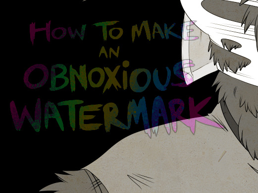
Once that's done, take your magic wand tool, and select all the black. Here are the magic wand settings I'm using to make the selections:

All selected?
Good.
Now, find a brush with a scattering/tone scraping effect. I use one like this.
You can theoretically use any colors you want for this next part, but I'd recommend pastels as they tend to blend better.
Either way, let's add some color to the text.
Once that's finished,
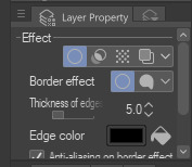
You're going to want to go to Layer Property, and Border Effect

You'll be given an option of choosing color and thickness. Choose black, and go for at least a 5 in thickness. Adjust per your own preferences.
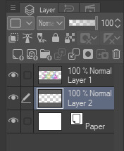
Now create a layer beneath your sig layer, and merge the sig down onto the blank layer.
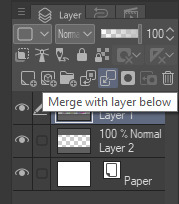
This effectively 'locks in' the border effect, which is exactly what we want.
Hooray, you've finished your watermark!
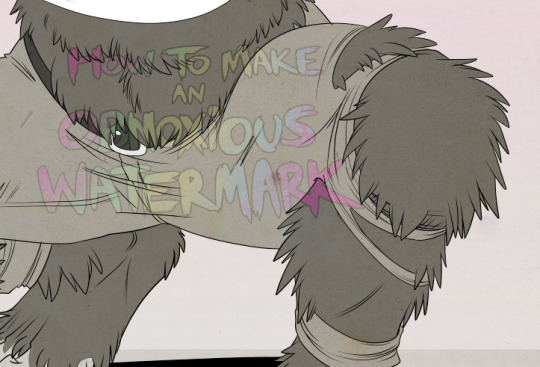
Now let's place that bad boy into your finished piece.
You'll get the best mileage out of a mark if you can place it over a spot that isn't black of white, since you'll get better blending options that way. My preference is for Overlay.
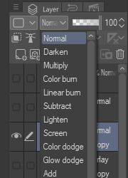

From here, I'll adjust the opacity to around 20-25, depending on the image.
If you don't have a spot to use overlay, however, there's a couple other options. For white, there's Linear Burn, which imho doesn't look as good, but it still works in a pinch.
And for lots of black, you have Linear Light
Either way, you're in business!
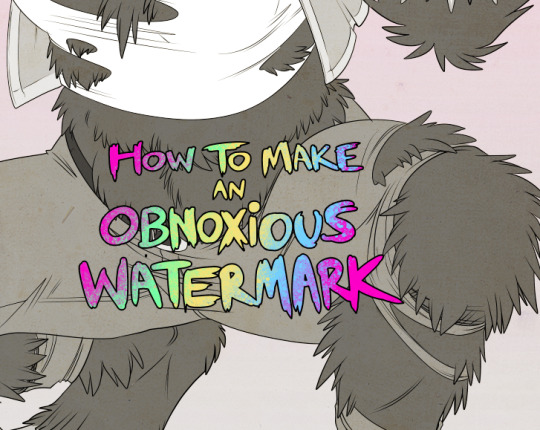
EDIT since this has escaped my usual circles, and folks aren't as familiar with my personal usage:
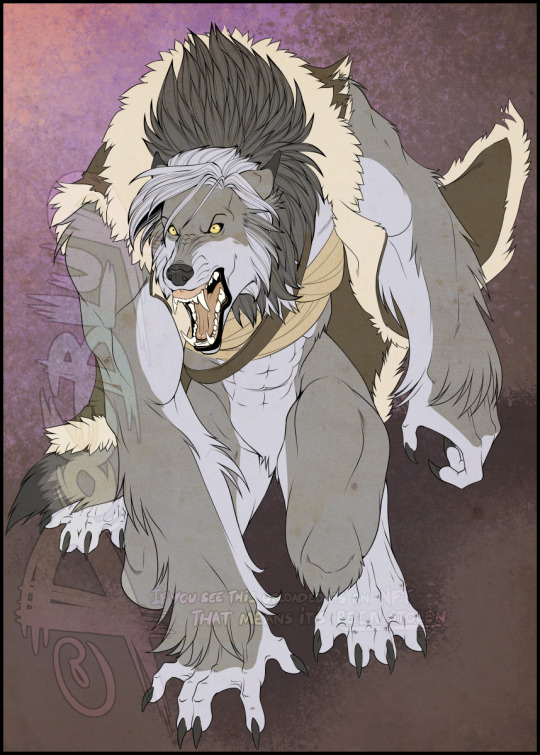
An example of one of my own finished pieces, with watermark, so you can see what I mean about 'relatively unobtrusive'-- I try to at least use them as framing devices, or let them work with the image somehow (or, at the very least, not actively against it).
I know it's a bummer for some people to "ruin" their work with watermarks, which is part of the reason I developed this mark in particular. Its disruption is about as minimal as I can make it while still letting it serve its intended purpose.
There's other methods, too, of course! But this is the one I use, and the one I can speak on. Hope it helps some of you!
52K notes
·
View notes
Note
I love Golden Shrike! I've had my own comic idea for about a decade now, but I'm wondering, for you, how long did it take you to be confident enough with your art to start your comics? had you attempted panels and backgrounds earlier and didn't put them out because you weren't happy with them yet? I'm almost done with my characters and writing but I'm worried I'm not good enough to actually start doing panels
(these are just my views and experiences! there's as many approaches as there's artists)
I was BAD when I started comics, but then I again I was a kid who didn't care if my bunny-cat-digimon comics weren't good enough, it was just fun to do. Which is what it should still be, fun and a fulfillment to you. I think the happiest an artisit can be is when they can draw like they have no audience.
My comics stopped in my teenhood when I actually wanted to make something good. I made so much groundwork but VERY rarely got to the actual page production because I thought everything should be perfect, but we all know there's no such thing. When I noticed all my attempts were doomed, I stopped making them for like ten years until I was zapped with Fuck It We Ball-mentality. And it's the best thing that has happened to me. Childhood whimsy. Make your own toys.
Did I make test pages for Golden Shrike before starting production? Well, the first page of the comic is a test page. And the second page. And the whole first chapter. I just never stopped. Not smart but it's what works for me. Starting these 'test pages' has kickstarted two bigger comics for me, Golden Shrike and Jet and Harley.
Sure I made couple of style tests for GS even though I had a clear visual vision from the start, but Jet and Harley I just started to draw without any real practice pieces, just based on couple of CSP brushes I wanted to use. This isn't very smart as you'll likely find out later that MAN, this style takes too much effort, but if you're unlike me and don't care so much for consistency, you can always simplify it on the fly. And even I've had to change it: I stopped shading after chapter 5, briefly used 3D assets in upcoming pages, now I'm gonna shrink the font a little. They're teeny tiny things for readers, but huge for me.
There's many comic authors who like to plan every little detail before getting to work, but it doesn't work for me so I can't say much about it. I have a skeleton to follow, but I fully flesh out each chapter one by one when I reach them with pages, because I like to revisit my old visions with fresh brains. When you actually get to work, you might realize some scenes aren't needed, or they'd be better changed. Don't be scared to crack some ribs off your story skeleton. Being too loyal to your old vision can often hinder you.
Starting production is the biggest monster in comic making, but after the first step you'll mow over it leaving it in your dust and create a baby you can be so proud of. I wish you, and everyone else on the cusp of their projects GOOD LUCK, HAVE FUN, LOVE YOUR WORK.
219 notes
·
View notes
Note
What advice would you give beginner artists?
it's fine to want to do more stylized art, but nothing will help you improve quickly like studying from life. even if you want to draw very stylized figures, life drawing is still going to help you understand how the human body works and then you can build your stylization off of that understanding. I also recommend studying specifically things you're looking to improve--if you feel like your poses aren't dynamic, ask your model to do some quick (1-2 min) dynamic poses and work on getting the gesture down. if you're looking for anatomy, ask for longer, more static poses and really study the contours of the body. this also applies for portraiture and character art--my expressions and facial structure improved like CRAZY when i started doing portrait studies from life! (note: i know live model sessions aren't accessible for everyone. i'm a huge advocate for nude models, if you can find a studio nearby that's affordable to you that offers sessions, that's the best you're gonna get. however, there are sites that will give you photos of nude models to draw from, too, or you can even just ask friends or family to pose for you when they aren't busy, that's what i did before i started getting model sessions from my school!)
materials are not everything but sometimes a good material can make a difference. it's important to know what's worth it and what isn't for your skill level. invest in some decent-quality supplies or a good art program, but understand that you're still going to need to work to understand your materials and use them to their fullest potential. (if you're a digital artist buy csp. trust me on this. get it on sale. it will change your life. also do not fucking use photoshop)
tracing is ok. listen to me. TRACING. IS. OK. tracing is how you learn. don't trace other people's art and pass it off as your own, obviously, but there is literally no problem with tracing real-life reference photos. I routinely trace references for backgrounds and the like. there is no reason for you to kill yourself trying to make complex perspective and shit up from your head when you can very easily just overlay a photo and get what you need.
in that same vein, USE REFERENCE PHOTOS. find pics online or take pics of yourself and USE THEM to see how your poses work. it makes it SO SO SO much easier. the understanding that you need to create a pose out of nowhere will come with time but you're not going to get that skill unless you have a foundation of understanding how the real human body works, and the easiest way to get that understanding is by copying photos of real people.
last but not least, there's generally a sort of 'rulebook' that new artists are expected to go by, especially online, when it comes to digital art. when i was first learning, it was all about lineart and cell shading, two things that I didn't really like. Nowadays it seems to be all about rendering. the single most important thing i can tell you is if it sucks you don't have to do it. if you hate lineart just color your sketches. if you hate shading don't shade, or find a different way to shade that you enjoy more. if rendering is annoying or difficult for you DON'T BOTHER!! art is supposed to be fun. if part of your process is annoying or upsetting to you, cut it the fuck out. don't torture yourself just to do art the "right" way. i guarantee your art will look better when you're having fun making it anyway!
#asks#ALSO don't go in expecting to monetize your social media presence/go viral as an artist. make art for YOU and make what you want to make.#if your art has passion behind it then attention will come naturally!
330 notes
·
View notes
Note
I have been following your soc comic adaptation and it just so good!!! I love how you draw them!
I have just one question: Why did you not include Inej's opening musings about Kaz on the first page? (Kaz Brekker didn't need a reason etc) I actually really like how there is not text on the first two pages, it's really atmospheric and moody so this really is not a criticism, I don't want to insult you. I guess I was just wondering what the thought process behind that was?
Oh, I've been wanting to talk about this for a while! Buckle up, this is gonna be one of my long comic rants. (Also, no offense taken at all! Anyone's welcome to question my artistic choices and I'm always happy to take critique, even though that isn't your intention.)
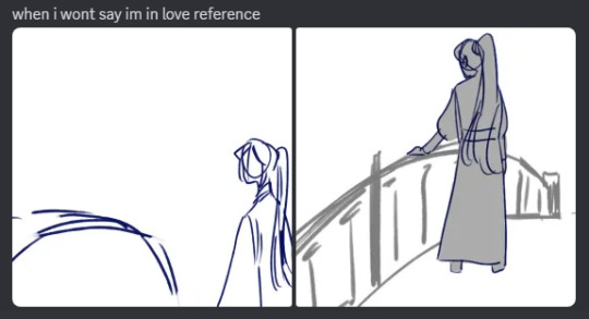
So, the thing is I actually planned on including that first paragraph into the comic! Here's when I first shared the thumbnails on here. Just for the sake of this post, I'll insert them here too.
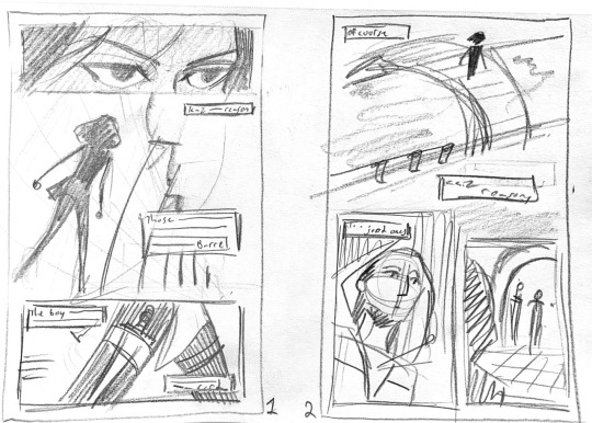
The boxes are meant to be where excerpts of that introduction would go. When I was creating the thumbnails, I was thinking about how iconic these lines were and how well they introduce the world and characters. I even finished the pages with the intention to include those lines. This is from my original csp file.
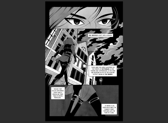
When I lettered it all out, I felt like something wasn't right...? Hard to explain. I wanted silence for the opening and the narration took that away. I then thought about the reader who'd go into this without reading the novel first, wondering if they'd be thinking, Who's this Kaz Brekker guy? Is it this character on the page? It's clearer in the book, but I didn't think it paired well with what I drew. I didn't want any confusion. It's also Inej's chapter, and while Kaz's parts take up most of it, I still wanted it to feel like her POV and her story. We can hold off officially meeting Kaz until page four.
But the main reason I took it out comes down to my philosophy when it comes to comic adaptations. I believe that an adaptation should use the original story in the best way for the secondary medium. A comic adaptation should play to the strength of comics, not the original source material.
Time and time again, I see a lot of comic adaptations of books try to use a book's strength instead of a comic's. When that happens, you get pages upon pages of narration boxes and exposition that could've easily been told in a single panel's image. If you want to read excerpts from the original novel, go do that! They're beautiful and well-crafted and you should be reading the original anyway! If you're making a comic adaptation, make a comic, not an illustrated version of the novel (that's a whole field of its own).
This whole thing really ties well into what I'm doing for Chapter 3. Kaz is such an internal character, his chapters have a lot more exposition that isn't setting description or character actions. I've had to do a lot more of my own writing for this chapter than the last just to turn that exposition into his own voice as an internal monologue. Sometimes, it's just a change from "he" to "I," but there are other times I've had to write new dialogue and find ways to naturally flow between thoughts. If I didn't do the work to adapt the expository text and instead just put in narration boxes of text from the book, there would be a greater disconnect between the reader and Kaz. Third-person limited works great in books and doesn't separate the readers from the story, but in comics, first-person internal dialogue keeps the readers inside the scene better.
If I were to redo Chapter 2, I think I would try to find a way to incorporate the information from the chapter intro better. I think by losing the intro I initially planned to include, I didn't establish certain ideas very well. Ketterdam and Kerch are established later on pages 4 and 5, but I don't think I ever go back and mention The Barrel. Also, the idea that Kaz is deliberate, even if his reputation says otherwise, is important too. I've made sure to fix this kind of issue in Chapter 3 and keep record of what kind of information I'm losing as I adapt it.
#comic rant over!#thanks for the ask I really love talking about this stuff#soc comic adaptation#asks#comics talk
111 notes
·
View notes
Text


my first fanart for a fic i've come to greatly enjoy (meaning yes, there are more fanart for other fics down the line)
no scene in particular, but it's the vibes i get from these two
In this world (it's just us)
it's a 2012x2018 crossover fic with some disturbing scenes so keep that in mind
i just love how the authors really dives into the whole "designed to be weapons of mass destruction" while still keeping their silly goober selves. When they're by themselves they're more like in the show, when they're with others they're slowing becoming villains lol
In one chapter they kill some Purple Dragons grunts and in another Donnie is chowing down on goldfish crackers cause it's the only safe food he can stomach at the time
26 chapters and they still haven't met their counterparts author please i beg of you when??? OTL
the most recent chapters have leo's mystic powers taking on more siren powers and hooo boy that did things to me 👀
slight warning: the fic isn't 2012!april friendly. it's not to the level of bashing, put she's def not painted in the best light.
bloody version under cut


found a lot of blood brushes in the CSP asset store and had fun lol
#tmnt#rottmnt#teenage mutant ninja turtles#rise of the teenage mutant ninja turtles#rise of the turtles#rise of the tmnt#my art#fanfic fanart#rise donnie#rise leo#rottmnt leo#rottmnt donnie#rottmnt fanart#RIP the mobster boss tag that was there early in the fic's history#that would have been interesting to see but the story demanded to go in a different direction
64 notes
·
View notes
Note
I just saw the ask by slushysblog. In response you sent a gif that blew me away:

You see, I'm just getting into digital art, and my PC can only handle about 5 or 6 layers before my graphics environment crashes. (Ofc this forces me to restart my PC and lose anything not saved.)
I've learned to work around this, my art isn't nearly so complex as yours, but I know if I want to continue I'll have to get a better computer at some point.
I was hoping you could tell me a bit about the technical side of your work. What are your PC specs? What software do you use? That sort of thing.
Thanks in advance! I love your art!
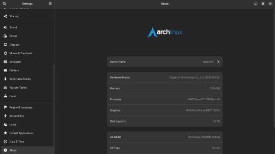
My set-up is complete overkill for art. It's a heavy gaming-ready desktop PC I got a few years back that I've upgraded the RAM and storage on over the years. I was doing fine with 16GB of RAM but I always have open a lot in CSP and other stuff so upgrading was definitely something I needed to do. 16GB should be fine for most people though.
You can also see that I run Arch Linux and uh yeahhhhhh it's a long story. The short of it is that my old laptop broke its Windows install during an update and I was completely unable to fix it so I just.... switched to Linux lol. I started out on Ubuntu and switched to Arch after a while. I don't rec using Arch unless you know what you're doing, Ubuntu is way easier.
What you might find more interesting is my away from home set up on my laptop since it's an older gaming laptop.
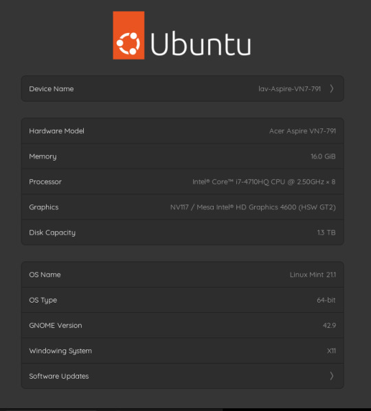
The graphics card is actually a NVIDIA Geforce 850 or something. It's so old that you can't play some games on it. However, I have no issues with it for art. I can open my comic project files in CSP fine on it. It's also running on Linux Mint, which isn't showing up on the little image for some reason. Both of my devices run Linux, but that's a me preference/need thing and I don't rec messing with your operating system if you don't know much about computers. It gives me a bit of an edge since the system doesn't use as much RAM as Windows but yeah don't touch unless you're committed to learn. Windows will serve you fine. Or MacOS even.
As for my program, I use Clip Studio Paint EX. I bought Pro a long time ago and upgraded to EX because of the extra tools for comics and animation (I've heard animators don't like CSP though, it's the BEST program for comics however). It's a really solid program but the recent changes to pricing and updates is really stupid. Fun fact: I use only default brushes and materials because getting it to run on Linux breaks the store. I also use an older version of it because of how I got it working on this system.
For my tablet I use an XP-Pen Artist 12 Pro. It's a pretty solid screen tablet on a budget (I bought it on a sale) and I have no issues with it. I actually partly got it because I thought it was cool that XP-Pen carries official drivers for Linux too, and this helped a bit since this was before Windows bricked on me and I switched to that. It was kinda weird how it played out lol. I would heavily not rec a Wacom tablet unless it's an older one for cheap. Wacom is stupidly expensive and you can get a better bang for your buck at other companies. My first tablet is a Wacom and it's still holding up pretty well but their quality on their new tablets isn't great. Check out XP-Pen, Gaomon, and Huion for better tablet options.
29 notes
·
View notes
Note
Ask art🎨! 1. 3. 5. 13. 15. 25. 34
What got you into art? When did you start?
I feel like I was one of those kids who was always drawing. One of the earliest hobbies I remember having was drawing, and since my mom was a teacher, it seemed like we were never at a loss for pencils, crayons and markers in the house. I think I also developed a desire to imitate things I saw on television pretty early on. I remember being TRANSFIXED by the Saban "Grimm's Fairy Tales" that would play on occasional Saturdays as part of Nickelodeon's "Special Delivery" programming. This was old timey anime, but even as a kid I could tell there was something different about it that I liked, and I tried to imitate the style as best I could in the margins of my notebooks.
Later, I got into comic books, and I remember wanting to draw my favorite characters from those (Batman was an early one, eventually giving way to Nightcrawler and the X-Men.) Again, I'd copy pictures out of comics I snuck in my bag to school. By the time high school came around, I was holding pieces of paper up to a paused video on television to get anime characters exactly right (please understand the internet was still in its infancy, and google wasn't even a thing yet). So I guess the thing that "got me into" art was seeing things I liked, and wanting to make them too.
3. What digital programs, if any, do you prefer?
I pretty much only use CSP for drawing, and then I'll hop onto Photo Pea if i need to do any grunt work (resizing/reformatting etc)
5. Who is your biggest inspiration?
Mostly, other people in my fandom circles. When I see people creating art of the things I love, it makes ME want to make art of the things I love. Sometimes this is people posting art that makes me think "I want to try that" and other times it's just conversations that spark something in my mind, but I know I'd be waaaaaaaaay less productive if I didn't have a community of awesome creatives to keep me fueled up!
13. Where do you draw inspiration from?
Hmm. Stories, I think? Sometimes I have an idea with a story connected to it, but I don't know if it could sustain an entire fic, and would rather see it as one powerful image. Other times, I'll hear a song and it will spark a visual in my mind I want to get out. And of course, I love a good redraw. I'm quick to draw associations between things I like, and a lot of time that has to get expressed as art.
15. Any tips and advice?
So, I actually originally went to school for painting hahahaha. I was convinced I wanted to be a fine artist. But I spent a lot of my time in art school convinced that I had to reach certain (totally undefined) thresholds before I would be capable (or allowed?) to do certain things. Use certain materials, attempt certain projects. And to be fair, I was limited by some things, like money, my ability to go places and *get* said materials, my available time etc. But that wasn't the roadblock in my head. Many years later, I was sitting in on a panel of female creators who had made a place for themselves in the digital space, and one of them asked the audience how many of them had an idea for a website, a podcast, a webseries etc- anything creative they wanted to do. A lot of people raised their hands. Then she asked how many of them had a cellphone. Everyone raised their hand again.
"Then you already have everything you need to get started. This isn't the best camera or microphone or computer in the world, but it's enough for you to get going. You don't need anyone's permission to get started."
I think that she did a really good job of articulating an issue I'd given myself- I was waiting for permission to do things, and I didn't need it! I try to keep that in mind now whenever I want to try my hand at something new.
25. Most frustrating thing about art?
Having an idea you're really excited about. Wanting to draw it. And being unable to make yourself get up and do it. I probably spend just as much time figuring out ways to have better habits and rituals around making art as I do actually making it.
34. Piece you didn’t think would get noticed as much as it does?
I cranked out that Scott Pilgrim deleted scene redraw (the comic with Murderdock at a Mary Janes concert) in the course of a single evening because the idea came to me all of a sudden and I knew that if I didn't do it RIGHT THEN i never would. Since that movie kinda only has a cult following, and the scene was only available on the DVD version, (and Murderdock was more niche than he is now) it was really something I did for myself. The fact that a bunch of people have found the idea s funny as I did still surprises me.
3 notes
·
View notes
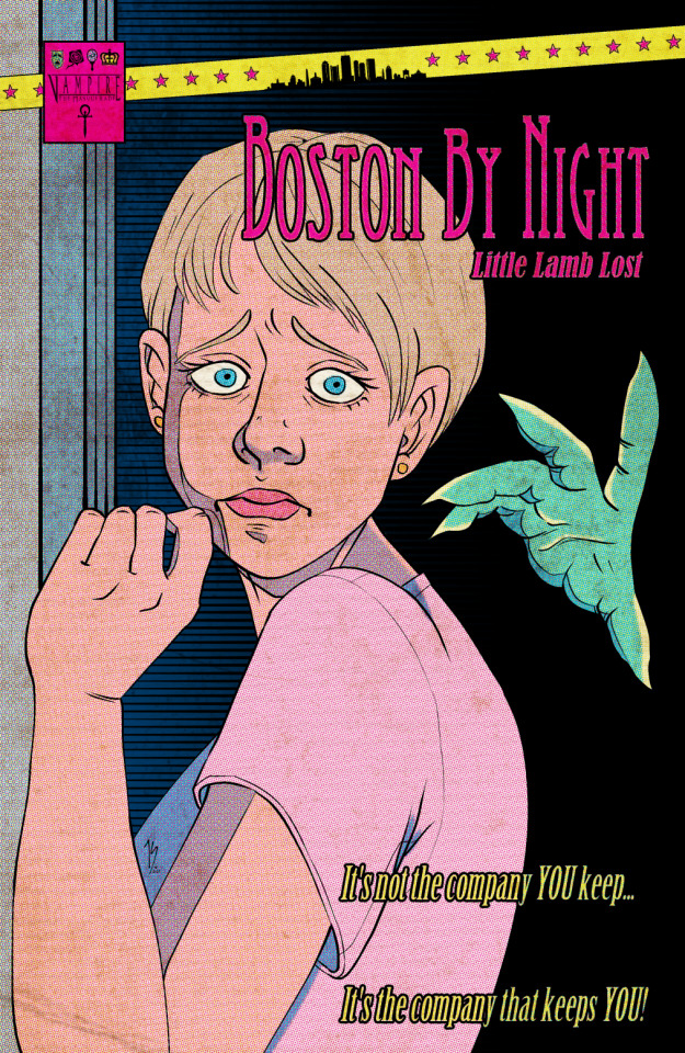
Note
Your VTM comic book covers are simply GORGEOUS, I'm totally in awe! How did you get the super cool halftone/coloured dots effect? It looks super cool and realistic, I love it! Have a lovely day! :)
Thank you so much!
So to get the halftones, I use an old-ass tutorial I got off deviantArt literally....more than a decade ago? (Rosalarian's Golden Age Tutorial). The account appears to be deactivated, but I'll go through the steps here:
For reference, I bounce between Clip Studio Paint and a very old-ass copy of Photoshop, but if you're using other programs that have fun pixelate filters and you can change the color mode, you should be ok.
NOW...
Ink your drawing in straight black on its own layer
Block your colors on another layer (I hunted up some old comic color palettes thanks to madformidcentury dot com/2013/10/mid-century-color-palette-in-comics dot html)
Turn off any and all blackwork (this is INCREDIBLY important), and take your colorwork into Photoshop. (if there are any gaps in your color work, fill a separate layer with white and then merge the layers so it's all solid)
Set the mode to CMYK
Go to Artistic Filters >> Pixelate >> Color Halftone (the only thing I mess around with is the size of the dots; the default for my era of Photoshop is 8 and that's a lil big for my taste--all the VTM covers are between 4-6. It's up to your own best judgement, but I go by how "readable" things look--does the face still look like a face at a reasonable distance or is it just a smudge? If it's not readable, undo and change your dot size)
Add 3 new layers to your document and LABEL THEM: Cyan, Magenta, and Yellow
Then go to your channels panel and click on the Cyan layer to make a selection of it
Back to your Layers panel, make sure you're on your Cyan layer, and SELECT INVERSE
Then FILL the selection with the CMYK cyan that you've picked out
Deselect your selection, move to the next layer (and make sure you've got CMYK magenta in your bucket) and repeat steps 6-8 selecting Magenta and Yellow respectively
NOW you've got the beginnings of retro-feeling halftone. At this point, I import the halftone manipulation back into CSP and turn my blackwork back on.
For the ✨ grunge ✨ effect, I grab an old paper texture (after reducing its saturation and upping the contrast until it's mostly black and white splotchy) and set it to OVERLAY at anywhere from 50-20% (this is a 'let your soul decide' moment) over the whole thing
Then I grab another old paper texture and put underneath the Overlay Texture Layer, on MULTIPLY, at anywhere from 65-25% (again, let your soul decide). Both layers will give you a nice level of funk to go with your halftone shenanigans
A lot of the colorwork is going back and forth and back and forth because what looked ok in flats didn't translate after toning, but it works out eventually!
Some important things to remember:
Cool tones tend to fade back and warm tones tend to move forward if you're gonna use this method on any kind of scene
Keep your shapes SIMPLE; don't get bogged down in tones of gradients and fades and all of that because most of it WILL NOT come across once you start toning! Think of it this way: mass-production doesn't have time for fine detail, that's why comics are a lot of heavy black inks and flat color contrast
Experiment with the colors! You're working in a limited palette (if you're using any of the old Marvel/DC print books especially), and it doesn't have to be photorealistic/absolute. For instance, my Nos isn't actually green, but the tone suited the funky retro vibe so I went with it!
Let yourself fall down the research rabbit hole of pulp covers because they're both hilarious and informative. Same dot energy is an interesting collection website to go through, you can also go through your search engine (remember to add -pinterest -youtube to your search term to filter out that crapola)
HAVE FUN!
💖
24 notes
·
View notes
Text
WIP under the cut bc it is. rough. and i rambled oops
anyways uhhh I finally sat down and looked at all the brush settings in CSP so i could figure out how to paint in that program and it is... a bit of an adjustment ough ^^;;

messed around for like an hour to figure out brush settings and which brush would work best for what I do, and then just jumped right into painting a rough sketch I'd done a couple nights ago! it is... very wonky LMAO but I also have so few refs for different angles of his specific style of nose and it is KILLING MEEEE I swear to god one of these days I'm going to just sculpt his face in clay just so I can have a proper nose reference to use 😭😭
honestly most of my time spent on this so far was just figuring out how to use shadow and highlight to get different nose shapes and I still didn't end up where I wanted to OUGH. i did learn a lot though i think
to be fair to myself, there are some weird shadows that arent normally there bc I have the sketch layer showing in this screenshot so that one line on the bulb of his nose isn't actually in the painting fjfkdl, it looks slightly better when the sketch layer is gone !
uhhh also I am working on tongues bc I don't know how to draw those or paint them, aaaand I am working a bit on studying how body fat lays on the chin and neck bc I can do more to portray it better !!! in general actually come to think of it i have been focusing on necks and the way they connect to the chin a lot lately, I've been trying to figure out how that stuff all works together fjdkdl
#also if u have ever wondered why the bg of my canvases are always that colour its bc its easier on my eyes fjfkdl#and also feels less intimidating to start drawing on for some reason LOL#i change it usually after my sketching before I add colour but this time it worked out bc i was going w yellow/orangey colours!#i try to set the bg colour to a general overarching colour that I'll be leaning my palette towards :] helps w the colour choices!#dandy.cmd#doodlebug.jpeg
2 notes
·
View notes
Note
Hello! I was reading through the asks you've answered and I saw that you use CSP Ex for animation line work but Opentoonz for color/fill-- is there a reason why you don't animate everything in Opentoonz? I ask because although I primarily draw/paint with CSP Pro, I've been practicing animation with Opentoonz because it's free and I'm hesitant to pay for the upgrade to CSP Ex
No worries at all!!
Well there really isn't any grand answer other than I've been using CSP EX since I was 19 (7 years as of 2023). When I bought the program in college, I just couldn't afford Harmony or TVPaint and absolutely hated the UI interface for Adobe Animate, Character Animator and Photoshop. OpenToonz wasn't even a thing yet (or at least open to the public yet) so when I stumbled across CSP I tried it out. And it stuck with me!
I just prefer CSP UI interface more because personally it feels the most natural to drawing/animating on paper while still having the option to do vector or raster layers. And once the animation feature came out, I just never went back haha. I do admit it's not perfect and can use some updating (audio scrubbing, symbols similar to Animate, optimize canvas playback, etc.) but after 7 years I just got comfortable with it I guess.
It's not that I wouldn't suggest using OpenToonz (especially if it fits within your budget). It's just that the program would constantly crash if I tried to do anything beyond color/fill work. ^^; I guess my CPU specs don't really match well with the program so I won't force something that doesn't work.
But yeah, if you're on the fence about CSP EX I would say it's worth it in the long run. Compared to Harmony (which I paid $1K and some change for the discounted industry professional license, you can imagine what the full price is) you're getting your moneys worth with a one time purchase instead of the monthly/annual subscription model every software has decided to follow (which isn't ideal for people who can't afford that reoccurring expense).
Overall, work what's best for you and your needs! I find it impressive to see other animators find workarounds that fit within their means. So if OpenToonz works for you, then I wouldn't pressure you to change your methods haha.
I hope that answered your question!
#industryq#animation industry#animation software#clip studio paint#opentoonz#anon#ask#send me anons#send me asks#ani#animation
17 notes
·
View notes
Text
Finally woke up and decided to work on animatic. Obligatory announcement post + essay commentary of this one below. Major book spoilers are abound.
Watch it here

Anyways
Proceed with your own discretion. But don't blame me if your reading experience is ruined because you decided oh this sounds interesting I'm going to read it even though you haven't finished the book.
Watching the video won't spoil you. No worries ^^ No guarantees either :P
Don't worry about it. Don't think about things too deeply.
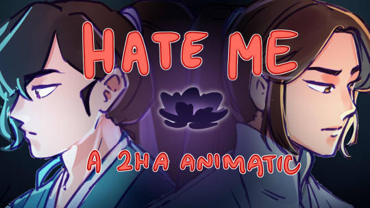
Some things about Hate Me
Okay, I've really really wanted to talk about this even when I was in the middle of working on it because hoooo. Not only is this (I think) one of the more densely packed animatics that came out of my mind lately, it's also one that has a really good chunk of WIP lore in it because this is a year old.
THIS HAS BEEN STUCK IN MY MIND FOR A YEAR
And it's not even the whole thing :3
Anyways why this song? What is "Hate Me" anyways?
First listen, thinking about the lyrics, it's a song about liberation. Basically liberating yourself from a toxic relationship, finally saying good riddance to the one that basically ruined your life. It's also kind of why the song sounds so peppy.
Like the best animatics I've had, I got this idea while stuck in one of my long hour commutes. And basically it stems off of this one youtube short about the song's creation and it's a vid of someone getting their tattoo removed.
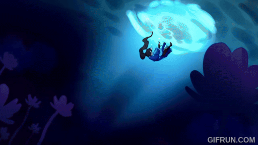
But my idea at the time was oh this would make a really fun animatic of MR turning evil under the influence of the Long Hatred Flower. And I think the flower's name and effect also has a hand in the creation of the idea.
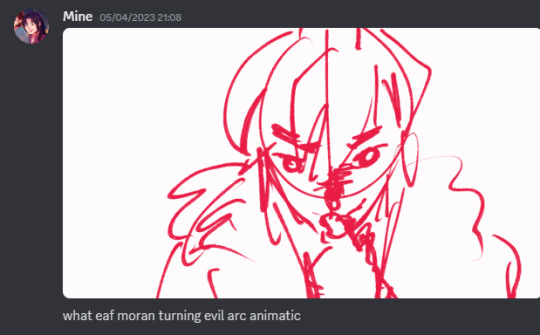
And initially, I just went off of vibes and just made concept gifs on CSP because that's the only thing I can do at the moment.

Most of which got in, but some didn't. And at the time I was just fresh off of being mentally rewired after seeing Lonely Man's Lazarus' The Mind Electric animation so my mind then was like oh transitions which is suuuuper evident in the final product.
Pretty rich coming from someone who rarely even makes animations but yeah.
Like how the flower distorts MR's perspective. The song's message also becomes distorted. Instead of liberation, MR slowly becomes trapped deeper and deeper into the headspace that the flower cultivates. And my intention was to convey that as a good thing and something to be hyped about.
TXJ's rise to power is supposed to be rejoiced about here. Honestly don't know why people are crying in the comments section lmao.
People in the know would be hit hard. People not in the know are supposed to just go "oh cool symbolism". And speaking of...
Let's talk about the symbolism!
The flower
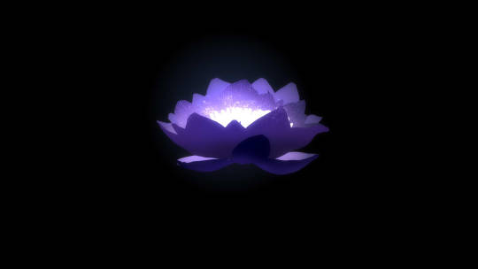
It's one of the mainstay and most obvious symbols littered up to the 2nd chorus. In hindsight maybe the animatic itself does have explicit major spoilers at the start ;P considering this is the first thing we see until it fades into MR's chest. It's also one of the things I heavily emphasized...
...anyways I'm just gonna pray people would be confused at most. 😄👍
We follow it from being a bud, to slowly and literally swallowing MR whole as a progress of MR's descent into evil and it literally culminates to MR burning Rufeng sect and CWN facing him off.
The flower itself is modeled after a lotus flower. Quite obvious as the name is a direct reference to the eight sufferings in Buddhism. (2ha actually has major Buddhism inspiration but that's for some out of pocket essay I made for my friends).
Narratively, it's described to be "那花朵含苞待放,还未打开,黑色的瓣叶,边沿闪动银光。" (A flower bud, still yet to bloom, its black petals and leaves fringed with a flickering silver light.) which isn't a lot, but other things also add to my headcanon that it's a black lotus, one of which is simply the term itself.
The first time I've encountered the term was in Scum Villain's Self-Saving, wherein it's used to describe Luo Binghe after the timeskip where Shen Yuan perceived him to have turned evil. While there's only a few discussions about what the term itself means, personally I agree with the interpretation of the white lotus being corrupted thus making it black.
Which is really really apt for MR's story. For 15 years of his life, he's stuck to the values of being kind and forgiving others, but it's only when he succumbs to the flower that he lets the intrusive thoughts win.
It also serves as a counterpart to CWN's association with the red lotus.
Chinese Chess Pieces
Zhenlong is one of the main ways that MR used in his rise to power. So naturally it would make sense to include it.
Contrary to what Westerners would think, the pieces themselves are Chinese chess pieces which are round pebbles that are colored black and white. It's main goal is capturing territory, and there can be a lot of board combinations which makes it a complex game to play.
In a way, MR slowly deciphering the technique is a sort of balancing mind game he and CWN played. (Although CWN has no idea about it). MR acknowledges that CWN is powerful enough to stop him in his journey to grow stronger, thus he has to make sure to go around CWN in order to win, slowly turning the tides to his favor.
It's kind of being pieced together as I typed this, but in a way the scene I attached above shows the start of the game. With MR has set the stage and is starting to gather his territories. It's not necessarily wrong for a scene, because black typically goes first in this game.
Puppet Mo Ran
It's such a small thing, but it's an intentional inclusion. For those who are up to date with my animatics, Puppet!MR is a direct reference to Please Don't Leave Me! Something I'm very happy to include because this means I'm so far into the 2ha animatic brainrot that I can start making references to my own work.
Specifically for the sequence before Puppet!MR appears, it's a reference to chapter 140. Where a flashback from CWN's previous life is introduced. Without going into details, it's one of the scenes wherein MR who's already deep into learning Zhenlong and into the clutches of the flowers temporarily gets out of the curse just because CWN got injured.
Something that shouldn't be shown for someone deep into the curse.
MR turning into a puppet, is partially me headcanoning that he might get an inclination that something's off with how he's acting towards CWN, and so tries to break away. What follows is his descent deeper into the flowers.
Burning Memories
Another sequence (not really a symbolism, but more of a reference) that I want to call to attention is the sequence before the first chorus which basically shows the flower's bloom and MR's good memories fading away.
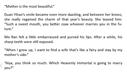
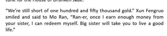
Yes. It's Duanxun.
IT'S NOT COZ I'M BIASED TO THEM THOUGH!!! It's literally because of this small passage in chapter 278 and it's basically the moment before MR falls unconscious after taking the flower.
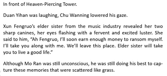
One of the flower's effects is the loss of good memories. And to a 15 year old MR, the people closely attached to the memories he holds dear are Duan Yihan, Xun Fengruo, and Chu Wanning.
While they don't appear in the same order, I specifically chose to use a burning paper effect to show memories fading away. Partially because MR is closely attached to fire. Not only will he burn Rufeng sect to the ground, but it's also because he burned down Xiangtan manor—a place that's closely related to the two people he could call family.
The scenes I referenced in the burning clips are also in the book, namely near the end of chapter 258 and somewhere in the middle of chapter 259.
The only scene that doesn't burn away is CWN's. Partially because there's not enough space in the song, and mainly because I wanted to transition to the triggering event for MR which is Shi Mei's death.
About the Work Process
I did mention it was a year old before. But it was mostly because I was going off on vibes when I started. Aside from what I've done with the concept animations (which isn't a lot), what I managed to create at the very beginning when I decided to finally sit down and work on this, is a prologue that finally sets the scene as well as the first verse.
(hint hint, check the last 2 seconds of the youtube video)
For a reason that can be summed up as "I don't want to spoil people too hard", I've decided to split it into two animatics. The second of which I'll post at a later date. Only you, dear reader, and my close fandom friends get to know this knowledge and this preview.
As for the rest of the animatic, I was stumped. I knew I had to include some scenes from the concept animations, and also some scenes, but to connect them...? I was lost.
Some parts solidified as time passed namely the memories burning away sequence and the last chorus. But how to execute the 1st chorus and the 2nd chorus? It took me a year to finally come around to forming it.
Mostly because of an 11 hour bus ride I took for vacation. (Man I really do take long commutes).
After that it was smooth sailing. I prioritized getting a rough draft down before cleaning it up and piecing things together and it went well.
youtube
It's really just getting over perfectionism and just getting things done. I'll prolly edit this when the prologue is out.
I think that's most of what I wanted to say. Thanks for getting this far and checking out my stuff, as well as the constant support!
See ya :3
Ok last: Bonus unintentional easter eggs
Because I draw too much 2ha, it's inevitable for some frames to be similar.
(Counting this one because of this unfinished frame i didn't commit to)
I draw too many CWN sideviews, but I distinctly remember referencing this while drawing the one on the left.
Summary
Overall, Hate Me is a very insightful animatic to work with. I ended up making frequent observations and ponderings while working on this too. A good example would be the Long Hatred Flower is a black lotus, and (the most out of pocket 2ha analysis) CWN and Buddha parallelism to name a few.
It could be better of course. Especially the razing of Rufeng sect sequence could've been executed better if I did it with after effects. And I've grown pretty particular with how I rewatch this.
Would this be the last? No, of course not.
It's an animatic that's part of my exploration into Mo Ran's character. Which is, in turn, part of an informal series diving into the theme. Heirloom is part of the series, there's another one that might be too 🗿 for yt and I've never bothered expanding on too.
I might end up posting some Duanxun animatics though (part of the Duanxun agenda more people need to acknowledge Xun Fengruo), or some non 2ha WIPs if I bother finishing them. Imagine 2ha AU animatic 😔 but that's for the very vague future.
Stay tuned for part 2 😘
#2ha#erha#danmei#dumb husky and his white cat shizun#animatic#evil mo ran arc animatic#yessir#Youtube
4 notes
·
View notes
Text
As averse as I am to apple I am afraid to admit I actually like using an ipad to draw.. compared to my display tablet which is just static on my desk it's actually way more convenient to draw and I can sit like an idiot and still be working on a piece. Actually I do enjoy being able to bring it over to school and my friends place while we do our little writers room . And I can draw while they talk. The issue with my current model is that I got the cheapest one I could use which has severely limited internal memory.. I can't even get more space on it but since the vilespace stuff requires relatively small images for assets like battlers and sprites it's not that much of an issue. For bigger digital paintings the layer limit isn't an issue either since I only really use two or three layers at most so that's _okay_ I guess . I just wish I could save and publish them directly from the ipad instead of having to send it to my Google drive I'm not that anal on the details either so I don't need bigger canvases beyond the A4 300DPI. Using it solely for art is fine but at the cost of like if I wanted to use it for music or other apps I'd have to adjust. I can't keep too many photos for the same reason . It would be great to be able to use more docs apps so I can also keep up with writing. That's another thing, the Bluetooth keyboard I use has its quirks and doesn't always work right, nor is it very good to type with. Cheap stuff. I don't care much for mobile games my phone has time wasters that I'm happy with so that's not something I'd need. Screen size I think is the average ipad screen size which is okay . Procreate itself has sliders I have difficulty using along with some gestures but it's the best art program I've used yet second to csp(I use on PC) which I know is subscription based on ipad. Also sometimes procreate crashes Maybe it's good I can't use social media as much on it. Photos storage is also an issue.
4 notes
·
View notes
Note
Little Bear here again to ask if you have any tips on how to start with the more complex side of animation!
I'm self taught so it's so hard to find proper resources because half the stuff I already know/do (Like when I start on the basics) but the minute I look for more complex stuff it's WAY too much to understand KLGJFDLK,,,, Do you have any middle ground between beginner and complex?
HI!!! Sorry I didn't reply earlier; it's been a crazy week as far as college assignments.
Unfortunately idk if I'm the best person to ask about starting to learn animation, because I've been lucky enough to have schools that offer animation courses since I was in middle school; I haven't necessarily done a lot of self-taught animation by this point.
Currently I use ToonBoom Harmony for class, which is an incredible animation program, but it also may not be the most affordable if you're not a student. (My university provides it to animation students for free.) The most basic option is currently sitting around $30 (USD) per month, which I will say isn't as bad as I thought, though. I use TB for rigged and hand drawn animation.
If you're able to use ToonBoom, I definitely recommend the free tutorials made by my professor, Matt Watts! He is a super cool guy and it's such an honor to call him my professor! He works at Disney and with Odd1sOut, and ToonBoom actually hired him to make tutorials, so you know he's a good resource!
I'm currently learning 2D rigged animation from him and my other professors, and he has a course on making a rig from start to finish here: https://www.youtube.com/watch?v=iVv7vmBaoUs&list=PLAixTSGooiioZ53TveysaKURS_bOOx-E-&pp=iAQB
I haven't gone through that tutorial myself, but a few of my classmates did, and having him as a professor, I've gone from knowing nothing about rigged animation to having a pretty decent understanding on how to build a rig from scratch and best industry practices!
As for hand drawn on a stricter budget... Flipaclip was my go-to before I got access to TB, though I'm pretty sure that's mobile only. It's free though, and there's tons of helpful tutorials for it on youtube! Clipstudio Paint also has animation tools, but unless you have CSP Ex, they're very limited; I personally haven't used it for animation.
Sorry I don't have more advice than that, but if you have any questions about certain aspects of animation or in using a certain program (assuming I'm familiar with it, of course) please feel free to ask me! I'd still consider myself a rookie, but I've been learning about animation for several years at this point, so I might be able to give some tips, at least ;w;
If anyone else wants to chip in with good resources for getting into animation, by all means share!
#animation#2d animation#animators on tumblr#animation resources#toonboom#flipaclip#matt watts#jemwolf talks
5 notes
·
View notes
Text
October 20th, 2023 - SDVX EG, Groove Coaster, Project DIVA, DaR, PIU PHOENIX, DDR A3
THE TRUE DAY OF RECKONING HAS ARRIVED, NOW IT'S REALLY TIME FOR MOTL5 GAMING!!! but first, isn't this card the absolute coolest??? i got it while checking into the event, slapped a crude drawing of my fursona onto it, and now i'm geared up n ready to destroy!!!

so i went to waffle house for the very first time with my family to eat breakfast (very good experience btw, i already miss the chocolate waffles), then we set off to spend the whole day at the mall and GUESS WHO I FOUND FIRST THING IN THE MORNING

IT'S BOMBER IN REAL!!! IN THE FLESH!!! WITH HIS ICONIC LACH TOWEL!!! AND HE KICKED MY ASS AT SDVX!!! (but he gave me haruka e-amuse pass to compensate :])


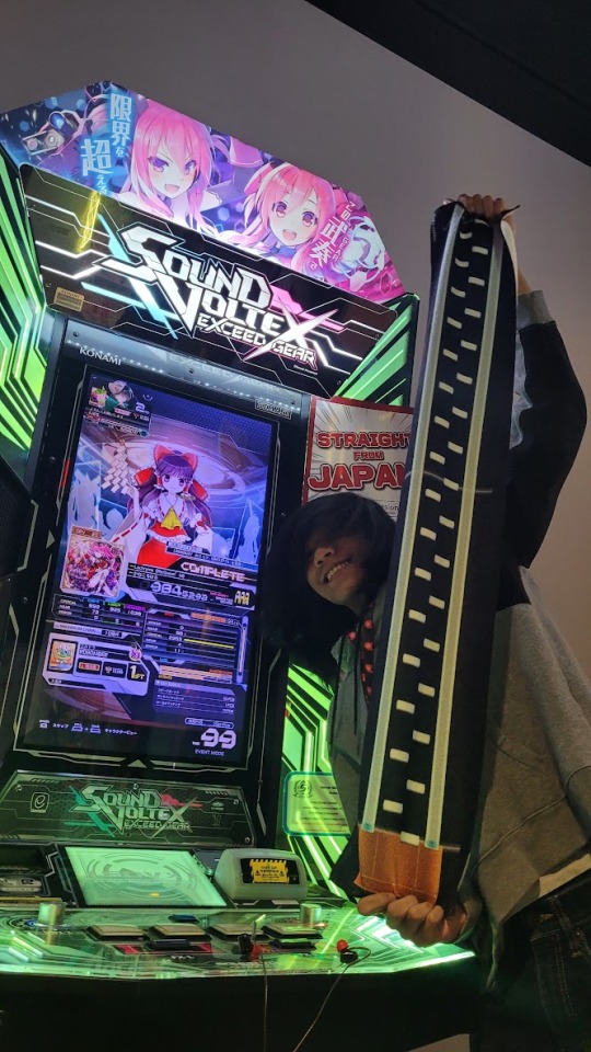
always wanted to meet him in person and the dream had become REAL, SUPER COOL EXPERIENCE!!!
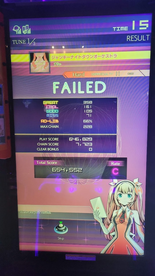
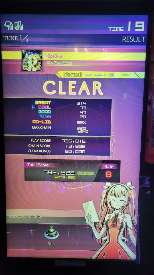
also random tangent but while we were playing sdvx, it turned out the PIU Phoenix kit was installed overnight and was being played while we were playing?? just last night it was XX... but i guess now i'd finally get a taste of the new system for the first time!
since all the dance game cabs (except DaR) were occupied for tourneys, i decided to warm up with the alternative... the busted old unused cabs! gc is so broken whyyy


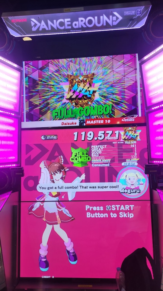
bonus: HAPPY FAMILY feat. moca and uli!!! (the tiny kohammy is mine)

but now, after all those exhilarating meetings and fun times, it's time for the real deal, my personal action moment of the event... it was TOURNEY TIME!! STARTING WITH PIU PHOENIX!!! warmups were simple, trying out the new songs and getting used to the pads,


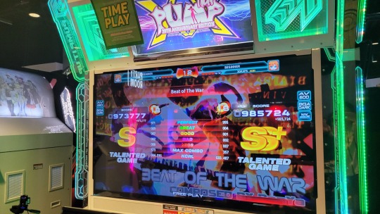
but then, it was the real deal vs MajinnTy in a waterfall-style bracket... and after almost getting wrecked with the top-right arrow dropping continuously... i managed to beat him 2-1 and took 2nd place in the pool!!! but since it's waterfall format (i didn't realize this until later), i got thrown into the redemption pool with everyone else and wouldn't get to play until later... but in retrospect that was STILL such an impressive victory.
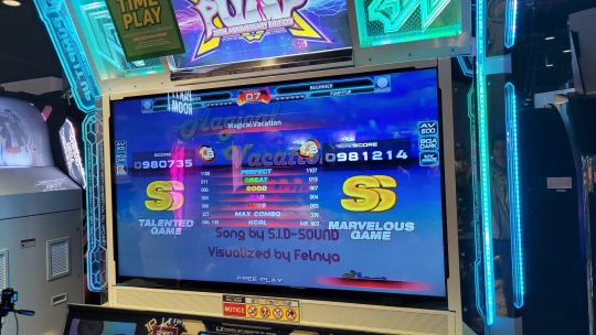
so once the redemption pool started, i got put up against EMCAT, who had been slowly upgrading from level 2 up to here. it was a weird match, but i hypothetically managed to 2-0 in my set, getting this sick 985k on beat of the war! but once again, it wasn't enough to beat the acc gods in the pool, PacRob and Ty, and i ended up 3rd out of 6 in the bracket, which left me a little dejected to see i wouldn't have my dark horse moment in my first tourney... but in retrospect i worked against the odds and managed to do really well!!! such a nice showing personally, and i'm excited to train some more and try again some other time! (also the 2nd image is from the commentary that my friend watched when i was up which is why i mentioned the dark horse moment, forever alone...)

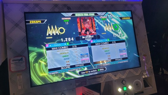
but NOW!!! IT WAS TIME FOR THE 2ND AND LAST TOURNEY OF MINE FOR THE NIGHT, THE ONE THAT WOULD SEAL MY POTENTIAL OVERALL LEGACY, THE DDR A3 TOURNAMENT!!! unlike the previous PIU tourney, this was a round robin format where all 4 players got to play against each other once in a best-of-three set. and after a set between two others in my pool, i was up for some back-to-back sets, starting with LUBANAHHHH
having warmed up already with pump, i decided to pick long train runnin' challenge for my warmup to confuse the commentators, but then the REAL action began. our first song was lubanah's pick, New York Evolved (Type A) DSP-13 (fucked up), which i dominated solely thanks to MA! and then when it was my pick, i PFC'ed Yoidore Shirazu ESP-13 on-stream once again, taking the set 2-0!!
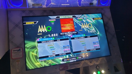
next up was against KINDLADY/Zaphine, where we both went in without warmup and played Xepher CSP-15 (Zaphine's pick) and Mess With My Emotions ESP-12 (my pick), and i took the set 2-0 again!! except with such a close call on Mess With My Emotions...
and finally in my pool, i played against MisterGuy in both Step Machine ESP-14 (my pick) and Healing Vision (Angelic Mix) ESP-13 (MisterGuy's pick), where i would just barely win Step Machine by 2 points (even got clipped on the Ohio DDR channel), and then PFC Healing Vision to claim my 2nd in-tourney PFC, taking the set once again 2-0 and advancing to level 9 with a perfect performance!!!


level 9 came and i was put up against SnowStorm/SIM, thejurok, and gabbyjay, which would be where my demise would come... only before a bunch of cab crashes! no scores for most of these unfortunately, but i was bested 0-2 by SnowStorm on Revolutionary Addict ESP-13 and PARANOiA Revolution DSP-14 (my MA wasn't quite up to par on either songs, probably exhaustion from only eating before my pump tourney...)
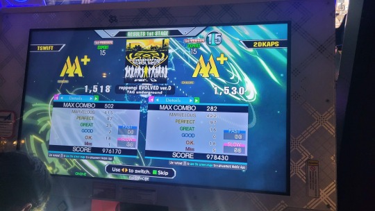
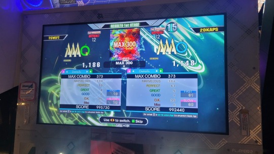
for my set against jurok though, i won my first pick; roppongi EVOLVED Ver.D ESP-15, even despite forgetting to disable my sudden+ before the speedup!!! i forgot what his pick was, but i lost it and lost the tiebreaker too, MAX 300 DSP-12, in order to lose the set 1-2...
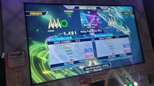
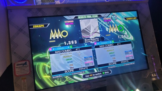
then lastly, the final and most ultimate set... the one against longtime Black Flag Academy admin and potential rival, GABBYJAY!!! this set was super funny because we both won each other's picks (he won Bang Pad(Werk Mix) ESP-13, i won osaka EVOLVED (TYPE1) DSP-13), and for the tiebreaker we got New Gravity CSP-14...

and after such an intense battle not shown on stream due to the sheer intensity and vulgarity (actually the stream was what was causing the cab to crash repeatedly), we finished the song and looked at each others' scores to see the results, and...
...by two points. i got a PFC up from a 988k, on-stream, not having seen the chart before, and yet i fell short by such a tight margin, losing the set once again 1-2...
but overall, super satisfying performance from both ends (and super funny reaction)!!! i loved this experience even if i didn't advance twice (which is fine, level 9 was more of a victory lap anyways LOL i was just a silly little teen playing against intimidating adults). but that did indeed conclude my tournament run at the mistaketh on the laketh, so until next time! thanks all who tuned in and cheered me on in chat, the support was so nice to read back at the hotel! but there's still 2 more days of the event to enjoy, so let's enjoy 'em!
#2dkaps 2023#2dkaps sdvx#2dkaps gc#2dkaps diva#2dkaps dar#2dkaps piu#2dkaps ddr#2dkaps sdvx eg#2dkaps piu phoenix#2dkaps ddr a3#2dkaps etc
1 note
·
View note
Text
TL;DR, the pigeon is very angry because art program not work and need it to work.
So, for the past few days I have been trying to work but have been rendered unable to because krita (the art program I use) is not properly receiving the inputs from my drawing tablet. It's not my tablet, I switched to my spare and still experienced the issue. It's not any software I downloaded, I uninstalled those and re-installed them when that didn't fix it. I turned my pc on and off, I let it sit shut down overnight, I reset it, STILL NOTHING!
Then I remembered.
windows 11 installed an update.
IT'S NOT EVEN KRITA THAT IS THE ISSUE! IT'S THE FUCKING WINDOWS 11 UPDATE!
"oh goody, new update, will this fix it?" NOPE. PROBLEM IS VERY MUCH PERSISTING.
Wanna know the real kicker? I have firealpaca installed on this pc, another art program, AND THE ISSUE ISN'T HAPPENING THERE.
At this point I am having to seriously consider getting clip studio paint. Okay, that's MORE time needing to learn ANOTHER art program, it's one I have to pay for, and if the issue somehow manages to resolve itself with krita, I will have wasted $50 on something that
I won't use except for when I have to. I also don't know if the issue I'm having won't also happen in csp.
ON THE OTHER HAND. I need to be able to work somehow. I have 20 different things I still need to do that I now can't do and won't be able to do until I have SOMETHING. ANYTHING. THAT WORKS.
Some may wonder, why not switch to using firealpaca? I can't. I used fa before I switched to using krita, it doesn't have everything I need. My next best option is clipstudio.
Also yes, I use windows 11, it came on the pre-built my parents got me.
I JUST WANT TO WORK. I DON'T WANT TO BE SITTING HERE DOING NOTHING! I GOT SHIT TO DO!
so now I'm here, no idea what to do. Waiting for an update on either krita or windows 11, or some magic fix, so I can use the art program I know how to use. or I have to spend money on a solution that might not even work.
#I just want to work#artists on tumblr#artist issues#digital art issues#fuck windows 11#i'm so angry
3 notes
·
View notes
Last Seen Blogs


survivorsolomonislands
Tumblr Survivor: Solomon Islands

blainey23rd-blog
Bitzbobz

rochdalecater
rochdalecater

drgastronot
drgastronot