#the original artist is linked on the description!!!!!!
Text
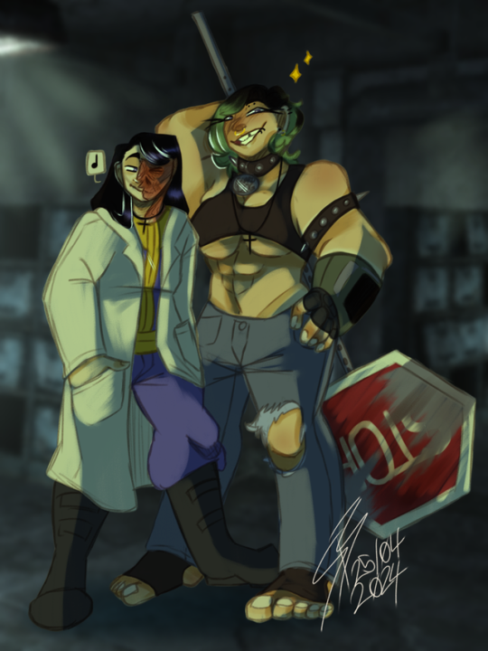
Small indie artists in need of support for moving out by September!
💜 These lovely folks [@QuinsCurse (they/them) & @sswitchblade03 (xe/xem and he/him)] are part of a small queer-owned Youtube community I'm in. 💖
💖 If you could lend a helping hand by reblogging & queueing this post up until the start of September, I'd greatly appreciate it & I'm sure these fine folks would too! 💜
⚠️ Do not tag as d*nations or anything like that! ⚠️

"Hi everyone! Requests are officially closed as I am opening emergency commissions! Please consider supporting me as we are getting kicked out and have managed to find a place that’s affordable but need to save up 5k by the end of the month! Anything helps! I also have a dontations page if you are willing to help do that! All the money received from commissions will be going to the deposit!
https://ko-fi.com/quinscurse/commissions
https://ko-fi.com/quinscurse/goal?g=32"
⚠️ Do not tag as d*nations or anything like that! ⚠️

"https://ko-fi.com/sswitchblade03/commissions
https://ko-fi.com/sswitchblade03/goal?g=0
EMERGENCY COMMISSIONS!! My roommate @QuinsCurseand I are needing about $5000CAD for a down payment on a new place as we need to be out of our current place by September! Every bit counts!
My goal is to be set to $3000CAD. I will draw anything (coloured and rendered) for $5 CAD each! If you are willing to give more it will be appreciated.
Examples of my work below!"
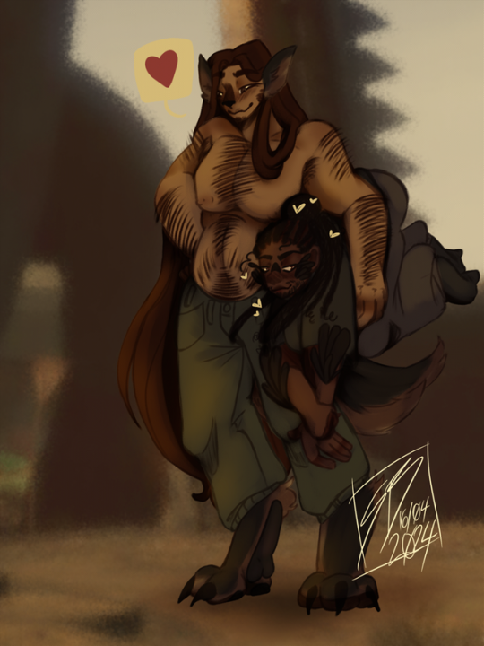
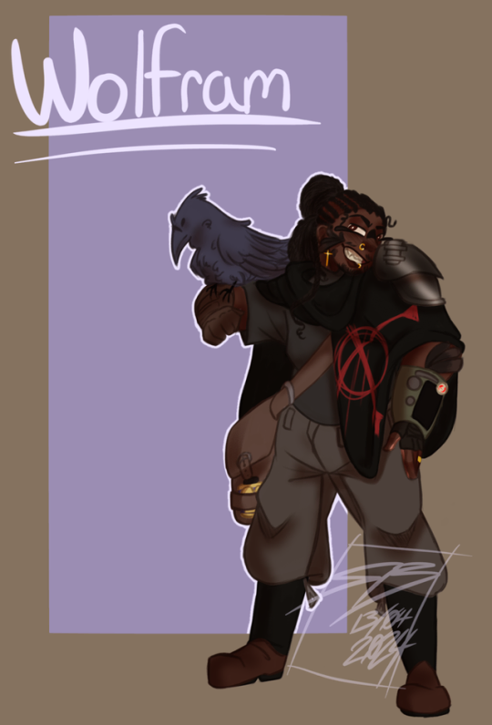
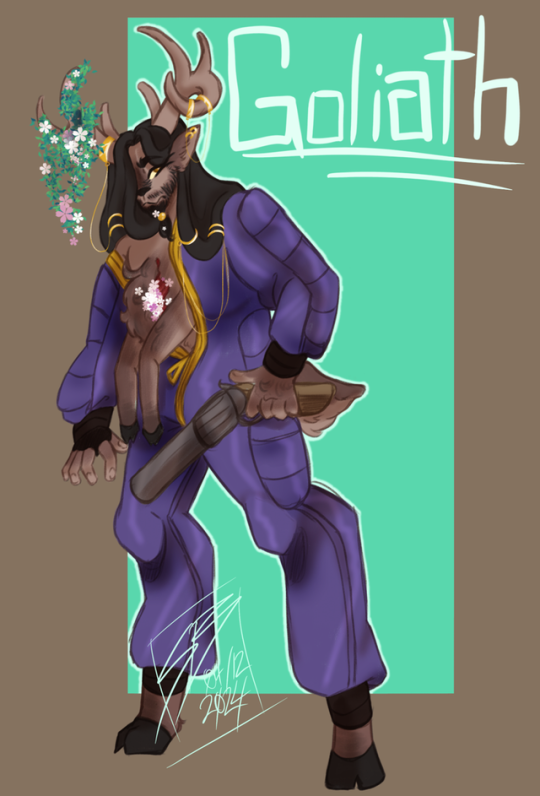

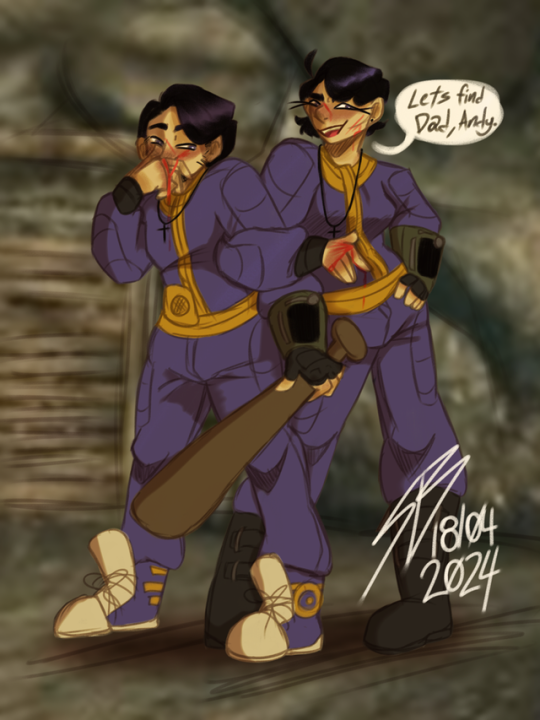
⚠️ Do not tag as d*nations or anything like that! ⚠️
#I tried to replicate the youtube posts to the best of my ability#text is in alt descriptions as well as the post itself because idk how to navigate tumblr in this way for these uses#couldn't get the images from yt itself without it messing up the formatting so hope this is good enough <3#I just went to one of the pages itself to find the closest possible images I could that looked like the ones on the original post#highlighted the links on the 2nd part though to make it easier to find the links in the post#the pronouns listed are accurate as of time of posting for those who see this post in the future; just so you're aware; go check if you wan#I have on idea what mutual aid tags are okay in our increasingly worsening internet of 2024 so I'm just gonna not tag it & queue a bunch#I just said I would post it; idk currency conversion or anything of that sort; this is my first time doing something like this so apologies#if it's not up to par with expectations#mine#op#indie artist#yknow what for the sake of not having people block my post tags; ill add a unique tag for this sort of thing#roses campaigns#FILTER THIS PREVIOUS TAG IF YOU FEEL IT NECESSARY; ill try to remember to use it when stuff like this comes up
283 notes
·
View notes
Text
It's time for my favorite season! 🍁🍂
I started following Kate Kortum pretty recently because she has such a lovely clear voice, and when she posted this rendition of 'Tis Autumn, I knew I had to write an accompaniment for it in honor of the best time of the year.
When I started working on the bassline, I wanted to see if I could sneak in any quotations of Autumn Leaves, and to my surprise and delight, the whole melody of Autumn Leaves actually fits perfectly with this melody, so that's literally the whole bassline.
Also, if you watch the original video, in the middle of the second verse there's this low humming background noise that is actually a nice counterpoint to the melody, and has sort of the quality of a chill autumnal wind. I wrote a rough transcription of that noise in the cello part, and then also gave that melody to the violins at the beginning of the verse.
Overall, I'm pleased with how this turned out! It's fun to get a little jazzy sometimes :)
video on tiktok
#tiktok#'tis autumn#autumn leaves#links to the original video and the original artist's tiktok don't seem to be working :/#if you want to hear that cool sound that was in the original video#you can click through to my video on tiktok where I @ mention the artist in the description#and find the video from there
5 notes
·
View notes
Text

theres this minimalist armour resource pack ive been using that i really like
#gamble the queue#art#my art#digital art#artists on tumblr#drawing#original art#minesona#minecraft sona#minecraft#Lucaria#the armour resource pack is really cool i got it from limited life from the traffic life series#i think it was martyn who linked it in the description of one of the videos? its pretty cool#i have like five now. resource packs are cool
8 notes
·
View notes
Text
now more than ever, please vet gofundmes before you donate.
copy and paste descriptions into google to see if there are scam accounts reusing the same story, check to see if there are any images/updates on the fund with faces. go to the original blog, check if the post asking for help is only an hour old, or even less than that. refrain from donating if all it links to is a PayPal account, without any further confirmation of identity.
it’s horrible to say but it’s never been a better time for scam artists to exploit your generosity, when things seem so dire, and I’ve donated to campaigns before only to realise later that the entire story was stolen from an actual family in need. due diligence might take a few more minutes out of your day but at least you won’t be sending money to an opportunistic scumbag.
51K notes
·
View notes
Text
holy shit someone decided to put this all in one place
#maidcore#yakui the maid#ozoi the maid#yabai the maid#scythe of luna#kaitai the maid#itai the maid#and some others idk if i should tag all#and there are links to support the original artists in descriptions too which is pretty neat#the channel is not mine just in case#i just found it and wanted to share#music tag
0 notes
Text
Fanfiction Authors: HEADS UP
(Non-authors, please RB to signal boost to your author friends!)
An astute reader informed me this morning that one of my fics (Children of the Future Age) had been pirated and was being sold as a novel on Amazon:
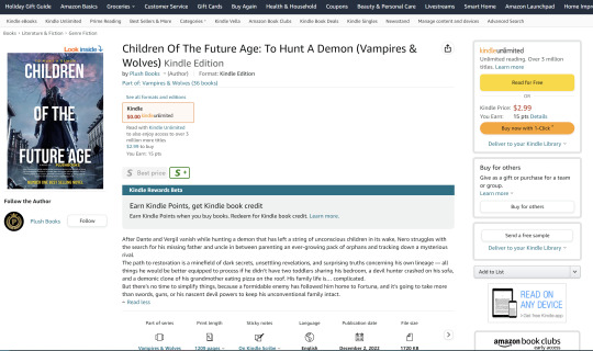
(And they weren't even creative with their cover design. If you're going to pirate something that I spent a full year of my life writing, at least give me a pretty screenshot to brag about later. Seriously.)
I promptly filed a DMCA complaint to have it removed, but I checked out the company that put it up -- Plush Books -- and it looks like A LOT of their books are pirated fic. They are by no means the only ones doing this, either -- the fact that """publishers""" can download stories from AO3 in ebook format and then reupload them to Amazon in just a few clicks makes fic piracy a common problem. There are a whole host of reasons why letting this continue is bad -- including actual legal risk to fanfiction archives -- but basically:
IF YOU ARE A FANFIC AUTHOR WITH LONG AND/OR POPULAR WORKS, PLEASE CHECK AMAZON TO SEE IF YOUR STORIES HAVE BEEN PIRATED.
You can search for your fics by title, or by text from the description (which is often just copied wholesale from AO3 as well). If you find that someone has stolen your work and is selling it as their own, you can lodge a DMCA complaint (Amazon.com/USA site; other countries have different systems). If you haven't done this before, it's easy! Here's a tutorial:
HOW TO FILE A COPYRIGHT COMPLAINT FOR STOLEN WORK ON AMAZON.COM:
First, go to this form. You'll need to be signed into your Amazon account.
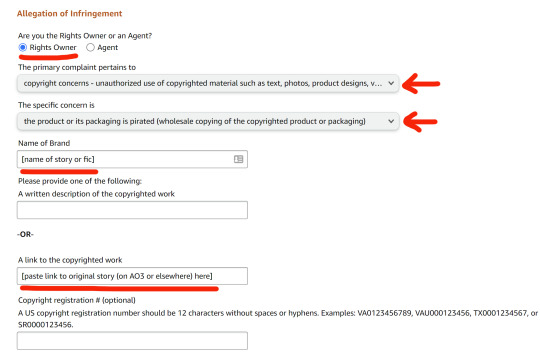
Select the radio buttons/dropdown options (shown below) to indicate that you are the legal Rights Owner, you have a copyright concern, and it is about a pirated product.
Enter the name of your story in the Name of Brand field.
In the Link to the Copyrighted Work box, enter a link to the story on AO3 or whatever site your work is posted on.
In the Additional Information box, explain that you are the author of the work and it is being sold without your permission. That's all you really need. If you want, you can include additional information that might be helpful in establishing the validity of your claim, but you don't have to go into great detail. You can simply write something like this:
I am the author of this work, which is being sold by [publisher] without my permission. I originally published this story in [date/year] on [name of site], and have provided a link to the original above. On request, I can provide documentation proving that I am the owner of the account that originally posted this story.
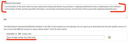
In the ASIN/ISBN-10 field, copy and paste the ID number from the pirated copy's URL. You'll find this ten-digit number in the Amazon URL after the word "product," as in the screenshot below. (If the URL extends beyond this number, you can ignore everything from the question mark on.) Once this number has been added, Amazon will pull the product information automatically and add it to the complaint form, so you can check the listing title and make sure it's correct.

Finally, add your contact information to the relevant fields, check the "I have read and accept the statements" box, and then click Submit. You should receive an email confirmation that Amazon has received the form.
Please share this information with your writer friends, keep an eye out for/report pirated works, and help us keep fanfiction free and legally protected!
NOTE: All of the above also applies to Amazon products featuring stolen artwork, etc., so fan artists should check too!
#fanfiction#ao3#piracy#dmca#pirated fanfic#please signal boost#i'm mad but also laughing that my dmc fanfic is now a 'number one best selling novel' lol#i'm also a traditionally-published author#so this is both hilarious and deeply insulting to me
87K notes
·
View notes
Text
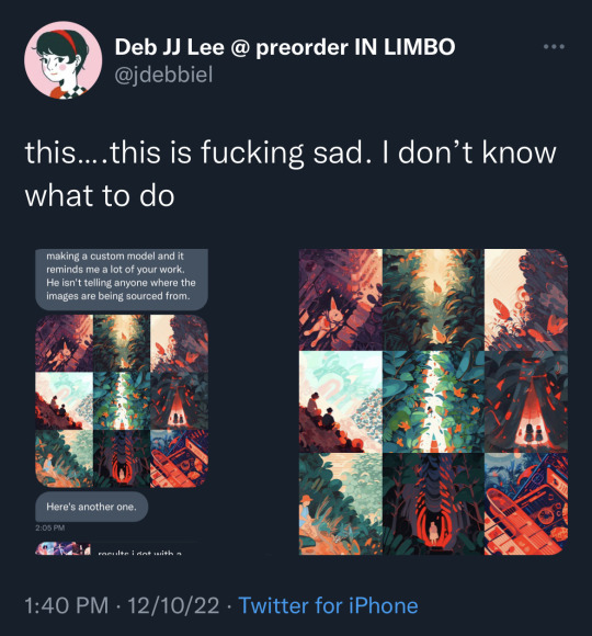
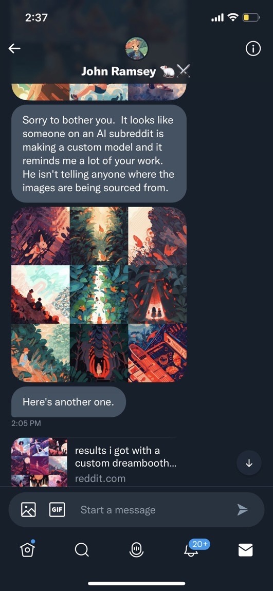


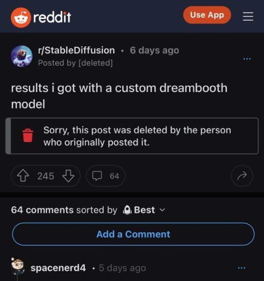
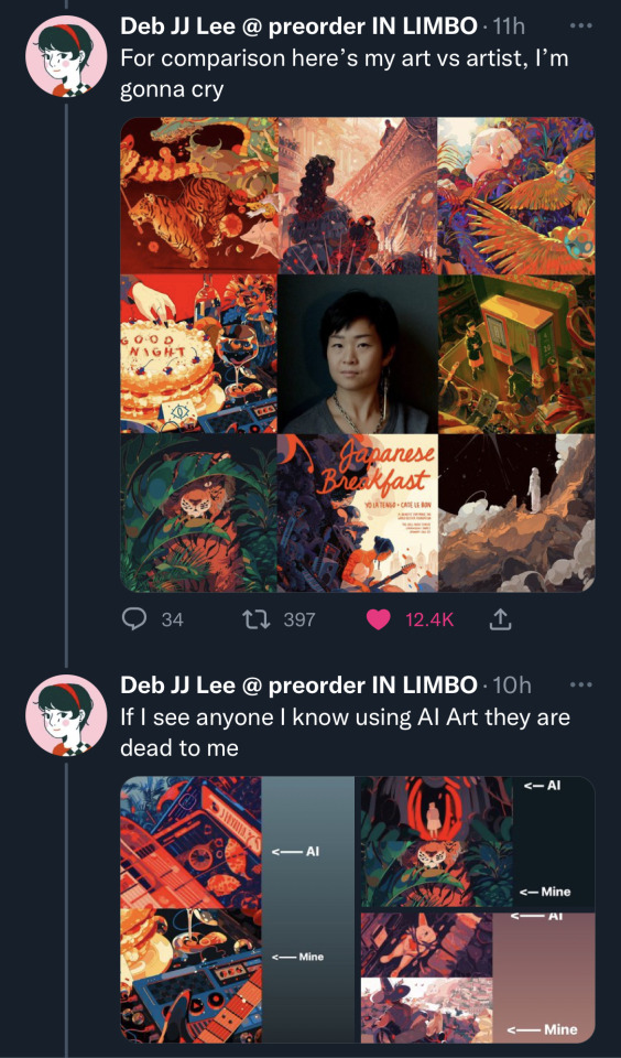
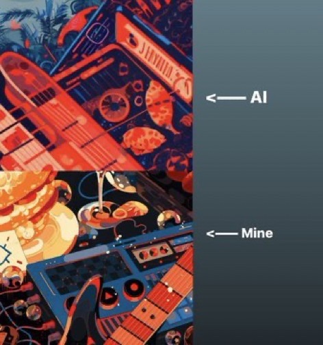
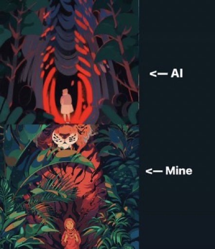

i don’t know what else to say except that AI art is no longer simply a source of creativity or a wonder of human creation. it has become actively hostile and destructive toward the very thing it pretends to uplift and celebrate. it is void of any human element, any soul or ounce of emotion or self-expression. continuing to use AI art knowing that it comes from theft and robbing artists of their livelihood is disgusting. they need your support now more than ever. stop giving these thieves your money and admiration.
[Image descriptions courtesy of @cryptid-deity: a series of screenshots from Deb JJ Lee’s twitter, @ jdebbiel.
Image 1 is a tweet that reads, “this... this is fucking sad. I don’t know what to do.” Included with the tweet are two images; one is a screenshot from a private text message conversation, the other is a collage of AI generated art that was sent to Lee in the text conversation.
Image 2 is a screenshot of only the text conversation, which shows multiple messages that were sent to Lee. There is a collage of AI art, then a text message that reads, “Sorry to bother you. It looks like someone on an AI subreddit is making a custom model and it reminds me a lot of your work. He isn’t telling anyone where the images are being sourced from.” Following is another collage of AI art, followed by the message, “Here’s another one.” The last message is a link to the subreddit.
Image 3 is another tweet that reads, “Oh so it *was* me,” with the word ‘was’ between asterisks for emphasis. The tweet includes two screenshots from the subreddit.
Image 4 is one of the subreddit screenshots. It is a post that reads, “Dreambooth model release! Say hello to kurzgesagtish!” Under these lines is a Reddit message that reads, “Sorry, this post was deleted by the person who originally posted it.”
Image 5 is the other subreddit screenshot. This post reads, “Results I got with a custom dreambooth model.” This post has the same deletion message as the former.
Image 6 is another tweet by Lee, which reads, “For comparison, here’s my art vs artist. I’m gonna cry.” Included is a collage of 8 works by Lee, which frame a photo of them. They follow up this tweet with another tweet, which reads, “If I see anyone I know using AI Art, they are dead to me.” The tweet includes multiple comparisons between Lee’s original art and an AI generated art piece based on it, judging by the subjects, colors, and lines.
Images 7, 8, and 9 are the examples from Lee’s tweet.
end description.]
52K notes
·
View notes
Text
The Artists for Palestine project does not have an end date
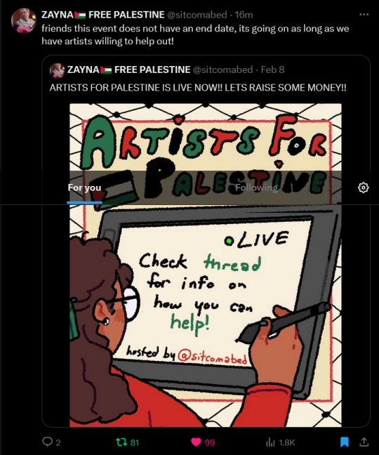
Its going based on artists willingness to participate alone!!
If you are an artist and want to help Palestine and this project you should message @/sitcomabed (https://x.com/sitcomabed?s=20) over on twitter and join the other artists in creating art and generation donations!!
You need to have a twitter account cause Zayna (the person that started this project) doesn't have a tumblr so you can only message her on twitter
here is the link to the original twitter thread where they explain how you can get your commission (https://x.com/sitcomabed/status/1755711698298716487?s=20)
also if you arent an artists you should still go and donate!!!
edit: i've been told that the link to the thread doesn't work for everyone so here are screenshots of the entire thread, the links shown in the screenshots are at the bottom
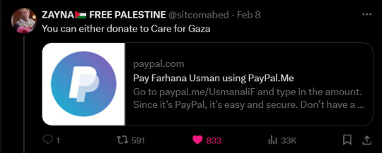
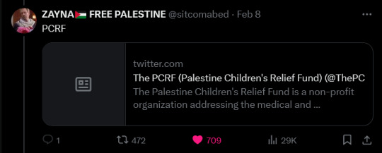
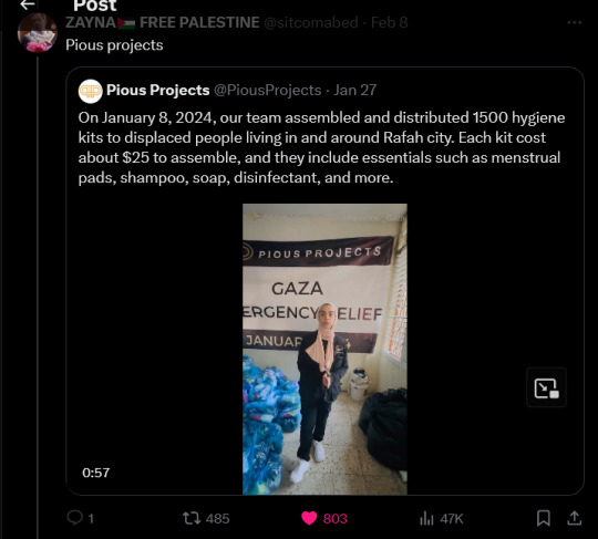
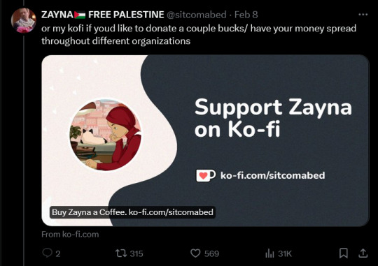

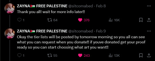
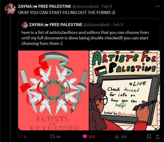

Care for Gaza: https://www.paypal.com/paypalme/UsmanaliF
Pious projects: https://x.com/PiousProjects/status/1751164159658541234?s=20
Donate to Zayna, the person that made the thread and that started this project: https://ko-fi.com/sitcomabed
Google form: https://docs.google.com/forms/d/1RStk1YXfg4KJ8X4sO6_DxDIpDlHZIsyZhPAyiCBK6VQ/viewform?edit_requested=true
Thread of the artists that are participating in this project: https://x.com/sitcomabed/status/1756036418869006388?s=20
Also if you want to donate to a different charity/project then the ones mentioned in the tweet, you can!! I asked Zayna and she said its fine as long as you put that down in your description.
If there are any other problems with the links please @ me in a reblog or leave a comment and i'll try to fiz things
#Artists for Palestine#palestine aid#free palestine#free gaza#gaza#gaza aid#palestine#palestine donation#palestine donations
6K notes
·
View notes
Text
Elegance
Here’s my original article for Elegance.
This is a topic I’ve wanted to write about for a long time. Ironically, the words needed to explain the concept kept the column from being elegant. So I did what all artists do. I found a way to say a lot in a little space.
Enjoy,
Mark Rosewater
[NOTE: EACH OF THE ABOVE FIFTY WORDS IS HYPERLINKED. BELOW IS THE FIFTY HYPER LINKS. THE HEADERS SHOULDN’T BE ON THE LINKED PAGE. I’M JUST INCLUDING THEM SO YOU KNOW WHAT EACH LINK IS.]
ELEGANCE
Merriam-Webster’s Collegiate Dictionary has five definitions for elegance:
• refined grace or dignified propriety
• tasteful richness of design or ornamentation
• dignified, gracefulness or restrained beauty of style
• scientific precision, neatness and simplicity
• something that is elegant
The common elements appear to be dignity, simplicity, and taste.
THIS
Elegance requires thinking, but it also requires feeling. Elegant prose is judged by how it makes the reader feel. It needs to generate a sense of calm that puts the reader at ease. Everything in your writing should feel as if it was carefully positioned to create the proper effect.
IS
Pound for pound, the writer’s greatest writing tool is the verb. Nouns add substance and adjectives add flourish, but it’s the verb that drives the sentence. Choose a strong, descriptive verb and the sentence has flair and purpose. Choose a weak one and the sentence lacks any sense of drama.
A
Here’s a little game to test an elegance relevant skill (based on an old game called Inklings). Randomly choose a noun. Try to convey that noun to the other players using the least number of letters possible. You’ll be surprised how much you can communicate in just a few letters.
TOPIC
One of the greatest stumbling blocks to elegance is the inability to choose a single focus. Elegance requires simplicity. Simplicity requires a single purpose of thought. This means that elegance starts before you write a single word. A good sculptor must know his image before he picks up his chisel.
I’VE
One of the common misconceptions of elegance is that it requires a writer to be fancy. Elegance though is more about familiarity than formality. You shouldn’t be afraid of friendlier language such as slang or contractions, assuming that such language adds an element of ease rather than one of laziness.
WANTED
An important element of elegance is a sense of passion. Brevity does not mean pulling away emotionally from words, but rather the opposite. When you find yourself limited to fewer words, you must pack each individual word with extra emotional punch. You are not reducing your message, simply your messenger.
TO
A good tool in understanding elegance is studying poetry. Poetry is the most concise of all written art forms. It strives to maximize impact while minimizing expression. Each word carries the burden of evoking some essence of the poet’s message. If it cannot carry its own weight, it is excised.
WRITE
To be an elegant writer, you have to become a student of prose. You have to study the mechanics of language to understand how it can be shaped. Once you have learned how to transfer the feeling in your head into meaningful words, you are on the path to elegance.
ABOUT
Be careful not to fall in love with ambiguity. While intoxicating in its beauty, it is the enemy of elegance. Remember, the goal is not to make the reader struggle for comprehension. Rather it is to lead them to the obvious conclusion. Elegance should be used to illuminate, not confuse.
FOR
Elegant prose requires connecting with your reader. To do this, you have to understand who that reader is. Nothing should come before this task. It needs to be done before writing can begin. I like to compare this to planning a trip. Maps are useless until you know your destination.
A
Another major key to elegance is the understanding of the importance of the tiniest detail. Just as a chain is only as strong as its weakest link, a piece of prose is only as tight as its messiest detail. A good writer doesn’t stop at the nouns, verbs and adjectives.
LONG
Don’t confuse elegance with brevity. Elegant things are short not because they have to be but because the difficulty to craft an elegant piece of prose combined with the limitations of time forces writers to be brief. Elegant novels, for example, do exist, but they are few and far between.
TIME
To quote Roman orator (and letter writer) Marcus T. Cicero, “If I had more time, I would have written a shorter letter.”
Simplicity takes more time not less. Anyone can get a point across with ten thousand words. But a true artist can do it in ten (or possibly fifty).
IRONICALLY
Irony is a potent tool for commentary. Its genius lies in the fact that it comments not on what is, but rather on what isn’t. Like all good humor, irony makes you laugh. But like the best type of humor, it also makes you think. It’s both funny and funny.
THE
Elegance in writing is about more than words. Equally important is how the words are woven together. Tempo, pacing, rhythm – these are the tools that set the mood for the piece. Try reading aloud your text. The natural beat of language is more suited for the ear than the eye.
WORDS
To realize the power of words, you must first understand how they work. Art is expressive; words are connotative. That is, words draw their power from their ability to extract different ideas from different people. A circle is a circle, but the concept of “scary” varies from person to person.
NEEDED
Elegance is not the result of any one attribute. It is the combination of numerous factors coming together in harmony. This is why it’s such a hard skill to master. Most people can pat their head or rub their tummy. But put them together and it’s not quite so easy.
TO
An elegant piece of prose needs to hit the reader at a gut level. Often they won’t know exactly why they like it, but they will recognize that something about the piece moves them. There are many types of writing where subtlety is lost. Elegant writing isn’t one of them.
EXPLAIN
There are many ways for you to explain an idea. The most elegant one though is not through definition but by example. By connecting your idea to one already known by the reader, you’re leaving the work of teaching to someone in the past. Education is hard. Comparison is easy.
THE
If writing is like building a house, the structure is like the foundation. Its design will dictate how the house is built. If it’s faulty, no amount of fancy brickwork will undo the damage. So take the time to ensure your structure is building the kind of prose you want.
CONCEPT
Never underestimate the power of a concept. An important part of elegance is condensing big ideas into little words. This is far from an easy task. It often takes a genius an entire lifetime to create a truly innovative concept. So take advantage of all their hard work and inspiration.
KEPT
A common barrier to elegance is the belief that only one way will work. Often a writer is unable to abandon a beloved piece of prose even when evidence demonstrates otherwise. If something doesn’t add to the larger sense of the piece, you have to learn to let it go.
THE
Readers notice things at a minute level far beyond their mind’s ability to interpret. This means that although they may not consciously notice many of your tiny details, they will do so unconsciously. Aesthetics teach us that it’s this unconscious structure that will determine whether or not it feels “right”.
COLUMN
All communicators, whether through speaking or print, need to find a voice. A voice provides familiarity and it teaches the listener or reader how to more quickly absorb the information. Elegance is all about the conservation of ideas. Having a pre-learned voice to guide you is a very valuable tool.
FROM
I’ve spent some time talking about understanding your reader. But there is one more person who is even more important to understand – yourself. Writing is about sharing your ideas with others. If you haven’t spent the time to figure out what you think, how can you possibly communicate it?
BEING
“A picture is worth a thousand words.”
Or so the saying goes. What the cliché forgets to mention is how many words a single word is worth. For example, take the word “being”. To capture the essence of what “being” represents is tens of thousands of words if not more.
ELEGANT
What is the value of being elegant? Why should you care? Elegance adds aesthetics. It evokes poetry. It grants beauty. Elegant prose draws the reader closer because it gives them something to not just learn but to admire. Good prose stimulates the head, but elegant prose resonates in the heart.
SO
Who, what, where, when, how - all important questions. But for a writer they pale next to why. If you don’t understand the reasoning beneath the surface, the other details are irrelevant. The act of elegance is cementing the why. It’s taking the purpose and engraining it into the piece.
I
Elegance is a very personal thing. If something doesn’t resonate with you, there’s no way for it to resonate with your reader. Writing is an art, not a science. There is no rulebook for how things must be done. If your instincts are telling you that something isn’t working, listen.
DID
An important tool in your toolbox is time. Elegance cannot be rushed. Mental ruts only get deeper the harder you focus on them. Make sure to work time into your schedule so you are able to walk away from your writing. An hour next week is worth a day today.
WHAT
Don’t let attention to detail pull you away from having a larger sense of what you’re writing. Take this column as an example. While I spent a lot of time fine tuning each entry I never lost sight of the effect they created when all the entries were put together.
ALL
Elegance requires taking a holistic view of writing. Every word, every sentence, every paragraph is a piece in a larger puzzle. It’s not enough to understand the impact of a single element. You must understand how any two elements interact if you want to understand the potency of your text.
ARTISTS
Elegance and art are very intertwined. Both seek to achieve a similar goal: to illuminate and inspire with a conservation of expression. If you’re trying to be elegant, I think it helps to think of yourself as an artist. The instinct for the latter mirrors the needs of the former.
DO
An important part of any writing is understanding the feeling you’re trying to evoke. And then realizing what mechanic tools you have available to evoke that feeling. Diction, verb tense, sentence length, alliteration, word flow, phonetic juxtaposition – each of these will control the mood and tone of your piece.
I
A writer’s life is the ultimate fodder. Don’t be ashamed to plumb your own experiences. You understand them deeper and more personally than anyone else. No painter would refuse to use his finest paints. And, as a bonus, by using your own experiences, you will become better educated about yourself.
FOUND
Don’t forget that the act of revealing is also an act of exploration. Don’t be afraid if you learn more than the reader you’re trying to educate. Writing is not an exact science. (Or even an exact art.) Often you will find that the road to salvation has a fork.
A
Your future is paved with your past. If you want to learn how to grow as a writer, you need to look back at what you’ve written. With time and a detached eye, your will find your mistakes become clearer. Remember that it’s failure, not success, that bests drives education.
WAY
The problem with looking for a single solution is that you’ll never find more than one. And the first one isn’t always the best. But if you’re open to the possibility that every problem has an infinite number of answers, you’ll have the freedom of choosing the solution you want.
TO
Sentences are filled with freeloaders. Because writers seem to love overwriting. (I include myself in this camp.) Make sure to create time for the editor side of you to prune unnecessary words. If a word can be excised without any harm to the sentence, it has no right being there.
SAY
I’m spending my time today talking about elegance in prose, but most of what I’m saying is applicable in speech. The key difference is that prose has less defining attributes like appearance or tone. The key to elegant speech is making people focus on the words rather than everything else.
A
It’s ironic that something designed to be so simple can be so complex. But that, my faithful readers, is the joy (and mystery) of elegance. Like an onion, elegance has numerous layers that reveal themselves as you slowly peel them away. Oh yeah, and it can sometimes make you cry.
LOT
An interesting exercise is to look at each word you’re using and think about how much content is loaded in that word. Then explore what other words exist that fulfill the same role but with added content. ��Once you’ve found the word you can’t best, move onto the next word.
IN
A good way to get better at understanding elegance is to look for it in every day life. I think you’ll be pleasantly surprised where and how often you find it. Study each example carefully and try to see if you can put your finger on what makes it work.
A
Writing is a shared endeavor. No one owns the words. If someone uses a technique that works, there’s no shame in borrowing it. Like science, writing creates technology that’s brought back to the group to spur further advancements. Elegance is hard enough to accomplish without refusing to use the toolbox.
LITTLE
How big should a piece of text be if you want it to be elegant? The answer is as big as it needs to be – and not a word more. Just think of it as playing the game Jenga. Keep pulling words out of your prose until it collapses.
SPACE
One of the most important lessons in art is learning the value of negative space, the idea that the eyes are equally drawn to what isn’t there. Prose has a very similar quality. When writing pay careful attention to what you aren’t saying. Often it will speak the loudest volume.
ENJOY
For some reason people tend to equate dignity with seriousness. And as such they come to the false conclusion that elegance has no room for humor. Ironic as humor is one of the most elegant of styles. A good joke is no longer than is necessary to do its job.
MARK
As is always true when I head off the beaten path, I am curious to hear your feedback. What did you think of this article? Was it entertaining? Was it educational? Did you actually read all fifty links? And if not, why not?
Tell me. Inquiring mind wants to know.
ROSEWATER
I couldn’t end this week’s column without my trademark closing. I mean, how inelegant would that be?
Join me next week when I go from being a letter man to a Letterman.
Until then, may you learn to appreciate now just the “what” but the “how” and “why”.
Mark Rosewater
417 notes
·
View notes
Text
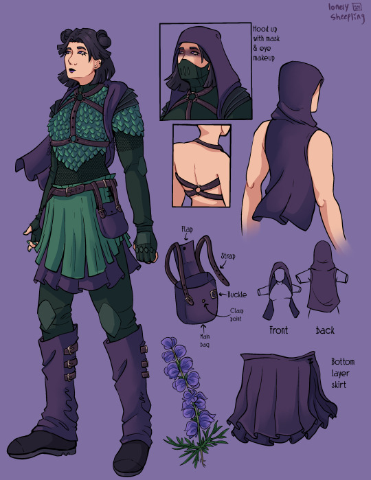
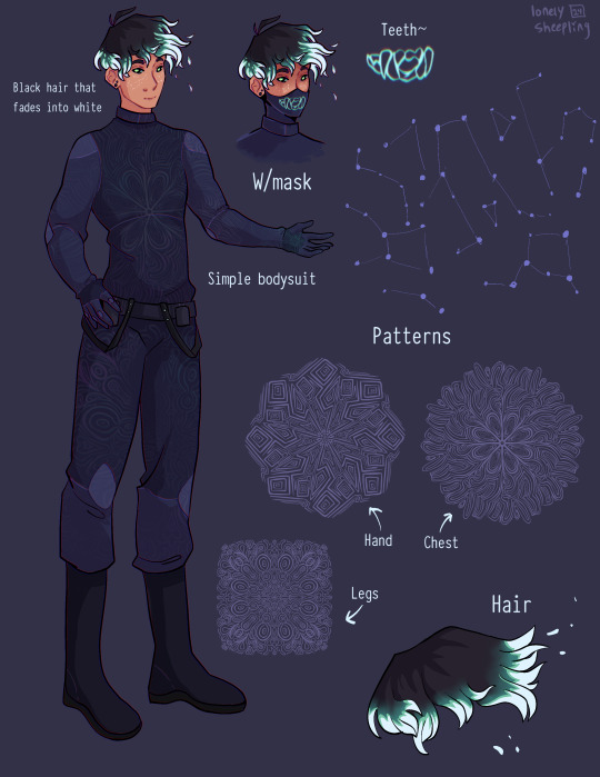
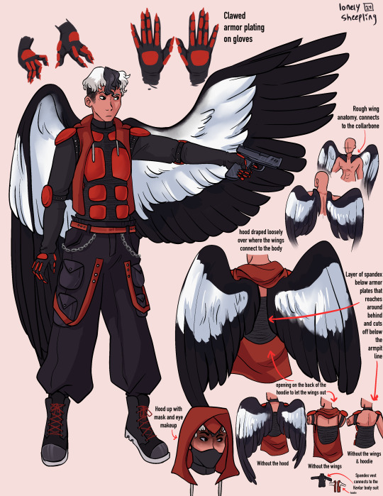
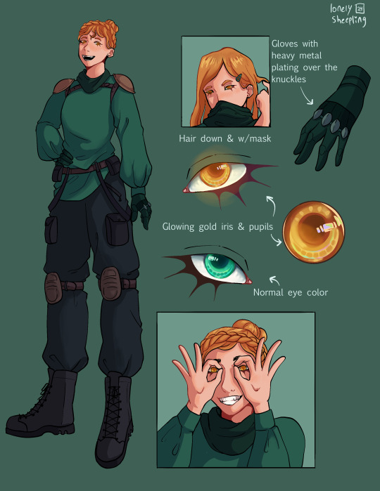
Recently read @queenofthequillandink ’s DPxDC crossover fic Unearthed, Reborn
I got inspired to draw character sheets for Danny, Sam, Jason, and Jazz’s vigilante personas. Here’s a link to the author’s drawings of their outfits (these were a vital reference for me when doing this so thank you so much for sharing them Quill)
More commentary (like 7+ paragraphs plus 2 images) about this project and the designs below the “keep reading” line.
None of these thoughts I have for each character are in order, but I have a lot of commentary for these since this project was a lot more conceptual than my normal work. I also just like talking about my art/design process.
If you ever find yourself wondering at some point why an element from the original design wasn’t included, the answer is that the removal was completely intentional and part of my grandmaster vision for this work and wasn’t because I just forgot about it entirely during the design process.
————————————————————————
Aconite (Sam)
This was the first one I sketched out, I wasn’t even sure at the time if I was going to fully commit to drawing all of them. I thought that Sam was gonna be the hardest since her description was way longer than the others, but then bird boy beat her out. I took a lot of creative liberties with her design, the bag was added bc I couldn’t figure out how to add pockets to the skirt. I was trying to avoid a joker color scheme so I had a lot of ref images that I got by searching like “purple green aesthetic” on Pinterest. The dark purple and dark forest/blueish green won out in the end. I desaturated a lot of my colors for her just to get as far away from the neon Gotham rogue aesthetic. I also added the bdsm harness over the armor to add more punk elements to her design, I know that in real life that would be very uncomfortable to wear over scalemail armor but sometimes we take creative liberties when they look sick as fuck. Also, I didn’t realize until I went to look for a reference for aconite flowers that aconite is wolfsbane! That was neat to learn! Also, the font I used for Aconite is called “zai Art School Calendar 1931”, I’ve used this a few times for other projects, it’s one of my favorite fonts. The ‘zai’ fonts the creator has are all very good.
Shade (Danny)
There wasn't much to add to this page. His outfit is pretty simple (besides the patterning). I wasn’t sure how to pull of an optical illusion pattern but I was reminded how I sometimes get an eyestrain induced headache when looking at someone wearing a patterned shirt with really thin stripes so I just leaned into the idea of a small/detailed hard lined pattern. I originally made 5 separate patterns for him and then turned them into stamp brushes in procreate. I only ended up using three of them, the one on the chest, the one on the legs, and the one on his hand. But, I imagine the patterns fade and shift when he moves, sort of like a lenticular print. I gave him constellation freckles and stylized the hair’s fade into white. The hair was inspired by how time-woods draws Martin Blackwood’s hair (linked: time-woods’s fanart of Martin Blackwood). Also put way too much effort into the teeth on the mask. I just like the chunky teeth design. Oh yeah and the font I used for him is called “Typewriter_Condensed_Demi”
Erinys (Jason)
Repeatedly ran into the issue of not having enough canvas space bc of my fervent need to thoroughly document and plan out how the wings worked. I also reversed the colors for the bodysuit & armor so the under layer was black while the armor plates were red. I only realized afterwards that I may have been inspired by the red centipedes in Rain World (linked: gif of the red centipede, don’t click the link if you’re unsettled/afraid of bugs/insects), artists subconsciously draw inspiration from other artists all the time though so I’m not like upset about it. I stand by it because it looks sick as hell. Also leaned into the magpie theming for the wings. I think the vigilante form was supposed to be reverse magpie coloring? I can’t remember, but I stuck with normal magpie coloring. The anatomy of how the wings connected to the collarbone was inspired by JayEaton’s Magpie Bridge Project. Reference image link. Link to the article the image is from. I didn’t draw the wing armor because I couldn’t figure out how to would work with the wing anatomy and I ran out of canvas space. Finally, the font used for him is “DIN Condensed” this is a default font, I would’ve used something more punk but I needed the text to be legible.
Insight (Jazz)
I did Jazz after I’d already finished the initial trio, so I had to switch to a new canvas for her bc I’d hit the layer limit multiple times on the previous one. I really do love doing that spiked under-eyelash thing with characters. Don’t know when that started. Anyway, I added the shoulder pads to her outfit to help break up the empty space. The golden eyes were a nice accent color since her design is very overwhelmingly green. Honestly the braid hairstyle and gold eyes really do obscure her identity, multiple times when drawing her I was worried that she didn’t really resemble Jazz enough. There wasn’t a drawing from the author for her so I only had the text description to go off of. I just realized that she sort of reminds me of a forest ranger and I don’t know what to do with that realization. I copy/pasted my drawing of her eyes when gold and recolored them to match her normal eye color. There were two layers for that, a hue shift and a hard light layer to emphasize the shadows.

Here’s what it looks like without the hue shift:
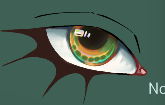
It looks really cool and I’m 100% that color combo in another drawing down the line. Oh yeah and the font used for this sheet was “Euphemia UCAS”. It comes with Apple’s operating system, I use it as a neutral default text most of the time bc it’s nicer than helvetica but not overly fancy like Times New Roman—and why am I talking about fonts.
———————————————————————
Anyway, this project was very fun to work on. The alt text for this was its own endeavor, hope the folks using screen-readers don’t mind 4-5 paragraphs of description text. Also, I cannot remember for the life of me if Dani got a costume description, but if she does I’ll make sure to update this image set with a sheet for her.
And to the author, QueenOfTheQuill, if you’re reading this message that I’ve left at the very bottom of this post below a read more line, thank you for the fic. It’s very good and I’m glad I caught it during my slow decent into DPxDC brainrot. I love the interactions between Jason and Tim, it’s nice seeing a revived Jason that’s not bogged down by pit rage. They definitely seem like they could’ve been good friends if not for the unfortunate circumstances that led them to meet in canon. Also, I’m sure Jazz will love interacting with Batman and Nightwing. So much psychological & childhood trauma to unpack with them.
Feel free to use/share these images if you so desire and thanks again for your work.
#art#art tag#digital art#my art#procreate#illustration#character design#fanart#dc#dc comics#jason todd#danny phantom#sam manson#jazz fenton#danny fenton#dpxdc#dp x dc crossover#alt text#id in alt text#alt text included#writing out the alt text for these was long and hard#but now that I’m finally back on my adhd medication I have the motivation to do it again#as always message me or comment if you have critiques regarding the alt text#character concepts#concept art#conceptual art#danny phantom fanart#danny phantom crossover#batman crossover#crossover fanart
296 notes
·
View notes
Text
While we're on break, this seems like a good time to tell you about my Magnus Archives Master Doc.
This document is a succinct summary of all the major people, places, items, and groups in the original Magnus Archives series, with internal reference links. This project began with my meticulous search for whatever tiny scraps of physical description I could find for the main characters, but grew as I realized on my second listen just how many connections I had missed. No fanon or personal interpretations are included, this is all purely from within the show. I find this easier than pouring through the ad addled wiki page, which also sometimes seems to contain subjective assumptions or connections.
I hope some of you may find this helpful, especially artists and fanfic writers. I promise I have found every scrap of physical detail for the characters. Enjoy.
350 notes
·
View notes
Text
✨Commission info✨
I'm ready, I'm rested, I'm refreshed! And I'm completely charged to take care of your new ideas and characters!! I truly believe that every character is awesome and original and deserves to be shown with their own story! And I'll try to help you with this in a way that is more convenient for you! You just pick one below ;)
✨ PRICES:
- SEMI-REALISTIC STYLE (for the cases, when you want it looks more real without much stylizing)

- USUAL STYLE (for the cases, when you don’t mind it looks more stylized and a lil sketchy)

- CONCEPT SHEET (for the cases, when you want to present your character, their outfit and props)

* you can find more examples on my page by the commission tag
** a helpful post describing a right order for your refs
✨ DEADLINES:
After you DM me with a brief description of your idea, I’ll tell you the approximate date when I’ll be able to proceed with your commission
!!!!Always warn me in advance if I need to draw art by a certain deadline!!!
✨ PAYMENT:
What: USD or RUB
When: full pre-payment (when you sent me the email and we approved the art idea)
Where: Boosty/Hypolink (russian platforms, support payment via PayPal)
✨ PROCESS:
You write to me in private messages on Tumblr, briefly tell me your idea of our future art, what style and what slot you want (full body / half body / bust). Then I give you my email address and you send me an email (with your Tumblr name as the topic please) with all necessary references (your character's face claim, their pose, clothes, background etc.). You describe the idea of the art in details, where it takes place, and other things that I need to know so that I can base the sketch on all that info, because after you approve the sketch, I don’t change art much in the further stages of the work, just some details. I send you the payment link on my Boosty page. Send you the sketch. After you confirm that you like the sketch, I finish the work and send it on your email😊
✨ OTHER:
- I don’t correct the art after you approved the finished version.
- I don’t copy other artist’s work.
- I publish every commission on my social media, if you don’t want it to be published, just let me know.
- If you’re not sure about the art idea, I can suggest you 4 sketches with different poses/concepts/angles for extra $20 and you pick the one you like the most.
- For significant corrections or a lot of small ones at any stage of work, an additional fee may be charged (this doesn’t apply to some small adjustments or details witch I missed). There are 3 free changes at the each stages of the work (sketch, finished version), further - $2-$5.
___________________________________
And of course I can't skip to say a huge thank you to those who commissioned and continue commissioning art from me! It means a lot! For real! This is not only material support, but also moral one, saying that I’m not wasting my time and energy in vain, that I’m moving in the right direction, that people like what I do! I can't tell how inspiring it is!! 300 commissions! I’ve never imagined that one day I would draw so many art for others! Just.. wow!! Thank you again so much for trusting me bringing to life your ideas! I truly appreciate it!😌
____________________________________
I think this is it, right? If you have any questions, feel free to DM me ;)
I’ll be VERY grateful for your reblogs!! ❤❤❤❤❤❤ (and thank you very much for this in advance, it helps me A LOOOOOOOOOT, you are the ones who keep me alive literally! I see each and every one of you doing that! You’re the best!!!)
Thanks for your attention! Have a good day =)
113 notes
·
View notes
Text
This is my online accessibility (especially image descriptions) masterpost, which I update periodically whenever I find a new resource or guide. I worry this has the side effect of looking overwhelming in scope, so if you're learning about IDs and/or Tumblr-specific accessibility for the first time, I recommend you start with the first five starred posts. All post titles are clickable links!
*Why and how to write image descriptions (with examples linked)
*Accessibility on Tumblr for new users (has templates, also talks about how to tag for flashing lights to accommodate photosensitive folks)
*I see an image and want to describe it: a step by step guide
*Fanart-specific and Tumblr-specific advice for image descriptions
*How to describe screenshots of tags
Why a short ID is always better than no ID
The key word for writing IDs: "Relevancy"
I want to make my posts more accessible, but can’t write IDs myself: a guide
Google Doc full of template descriptions for memes
Online image to text converter
Describing skin tone and describing hair (heads up that the posts themselves are undescribed and were written with fiction writers in mind; potentially still very useful)
How to remember to write descriptions (spoiler: by putting yourself in situations where you see descriptions more often)
Related, a Google doc of described blogs (almost all the blogs linked earlier in this post have tons of described posts and resources too)
(In my opinion, writing IDs is easiest to learn by doing — but especially if combined with watching other people do so. So follow some described blogs!)
Why not to put image descriptions in small fonts/italics (also, some non-definitive thoughts on IDs vs alt text, and why "both" actually makes sense as an answer in many cases)
More on IDs vs alt text from a visually impaired Tumblr user
Alt text vs IDs vs Captions with examples
Brief Intro to Transcripts/Video Descriptions
The People's Accessibility Discord sever (a very friendly community for crowdsourcing image descriptions)
How to make your blog's colors visually accessible - one of the easiest thing on this list!
Other easy things: show love to artists who describe their work, edit descriptions into your original post when someone provides one in the notes, and copy-paste inaccessible (eg, small text or italicized) descriptions as plain text when you reblog!
Lastly, and maybe most importantly, how to continue writing image descriptions while avoiding burnout.
Let me know if any of these links break! I personally don't describe nearly as much audio/video (got those audio processing issues), so this list is sparse on those resources, but if anyone has good guides/blog recommendations for that too, feel free to add on!
579 notes
·
View notes
Text
Descriptions & Propaganda
Dream A Little Dream Of Me
Composed by Fabian Andre and Wilbur Schwandt, with lyrics by Gus Kahn
Notable versions: Louis Armstrong and Ella Fitzgerald (x), Doris Day (x), The Mamas & The Papas (x)
Propaganda: None submitted.
St. James' Infirmary
Traditional
Notable versions: Louis Armstrong (x), Cab Calloway (x), Artie Shaw (x)
Propaganda:
i love how this song starts as a lament and then switches on a dime to such a cool, proud, almost bragging defiance of death. and of course that trumpet!! that trombone!!
imo this song exemplifies the rich tapestry of popular music and the links between the jazz standards, the blues, and the english, irish, and appalachian folk traditions. people sort of fight over whether this song is influenced by the unfortunate rake/rakes progress/young trooper cut down in his prime/etc., (musicologist a. l. lloyd’s theory) or not- there’s a whole book about it, “i went down to the st. james infirmary” by robert harwood.
but none of that really matters. if you love the blues and you love folk music this song is like a familiar hug, full of the themes and motifs you recognize but maybe can’t quite pin down. the mysterious origins are part of the fun. extra propaganda: if you know/love/have ever listened to “blind willie mctell” by bob dylan, this song is the father.
youtube
i like the way this one sounds but i also think it's historically/anthropologically pretty cool... it's part of the lineage of "the unfortunate rake" which also spawned popular folk songs like "streets of laredo" and possibly "house of the rising sun" (debated among experts but possible), but this one unlike those others was taken up by jazz artists starting in the 1920s and eventually came to be regarded as a jazz standard. fascinating stuff!
97 notes
·
View notes
Text
Gauging Interest in an Idea
I've noticed a couple notes on the original scorpion post along the lines of "wouldn't it be fun to engage in Bestiary Telephone and try to draw animals based on garbled descriptions?" And I was like, that wouldn't be hard to simulate, just find a friend to read you bestiary entries but not tell you what the animal is... and then I had a Thought.
I have access to an academic library and a reasonable fluency in Old and Middle English. I bet I could find a transcription of a bestiary in one of those languages, do a quick-and-dirty modern translation of each entry, and post them on here once a week with the actual names of the animals replaced by nonsense words or something.* Then people could try and draw them, with the same amount of information a medieval artist who had never seen this animal would have had access to.
*Yes, translations of bestiaries do already exist (I even have one on my shelf right now) but I don't know of any that are public domain and so I think it might be Not Cool for me to basically serialize the entire text on this blog.
I figure anyone who wants to play can post their drawings of the week's animal on their own blog using the randomly-generated nonsense-name as a tag, then at the end of the week I can round them up, link to the artists, and reveal what animal the text was actually describing. (No guarantee that the animal actually... exists, though. Lots of made-up critters found their way into these bestiaries over time.)
Before I get into finding & translating a source, though, I want to make sure there are at least a few people out there who would be interested in participating, because if nobody wants to draw stuff, then it's just a translation exercise for me, which, while fun, isn't an ideal use of my time. So:
I'm setting the poll for one week, and if there seems to be sufficient interest, I'll start getting the text together. (It'll probably take a couple weeks after that to get started, because I do have other projects and whatnot.)
751 notes
·
View notes
Text
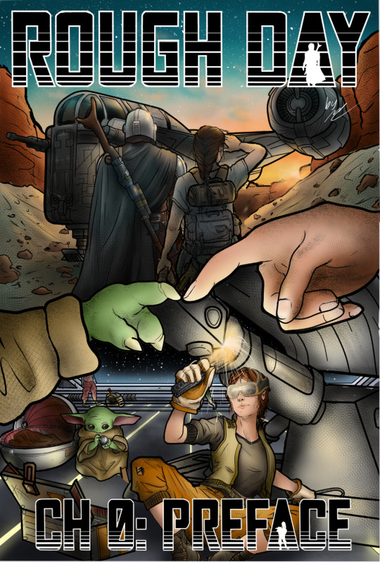
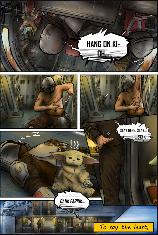
Rough Day Comic 0-1 "Other Talents"
💗PLEASE REBLOG TO SUPPORT!💗
SERIES MASTERLIST
Based on Rough Day by @no-droids
SERIES GEN WARNINGS: non-canon typical gore/blood, violence, light language, implied nudity, implied trauma (Blood, depression, anxiety, bullying, sexual), typos and general lore errors possible (plz lmk if you find any I enjoy accuracy)
See end for bonus content and credits.
LISTEN TO THE ACCOMPANYING MUSIC FOR A CINEMATIC EXPERIENCE! (LINKED AS YOU GO)
TRACK 1: REPROGRAM (only track til end credits)

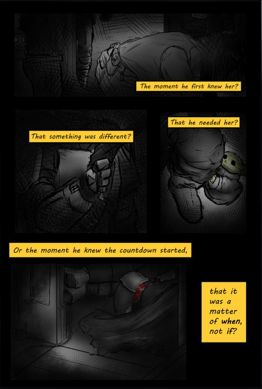
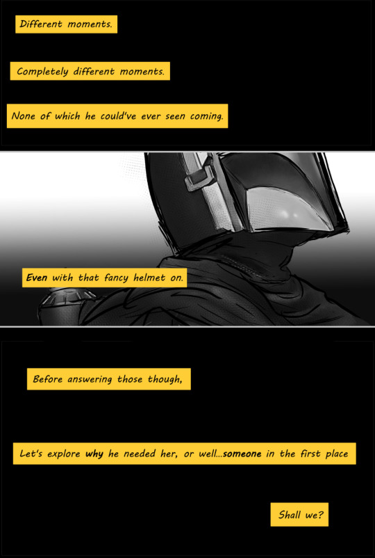
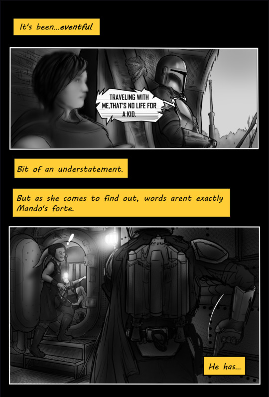
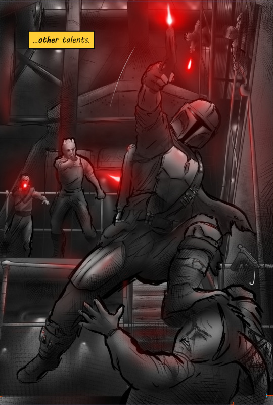
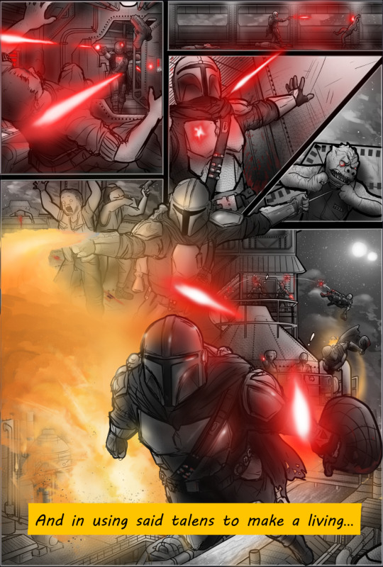
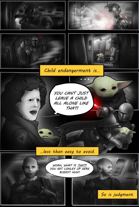
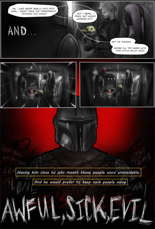
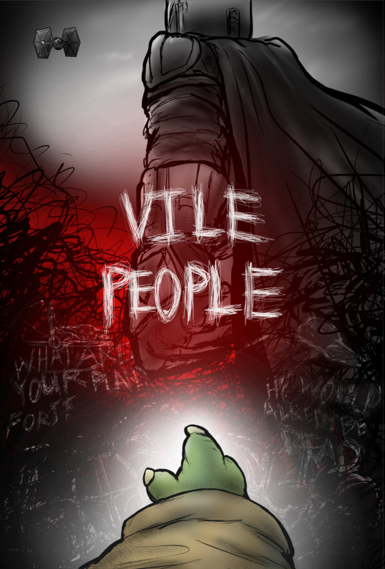
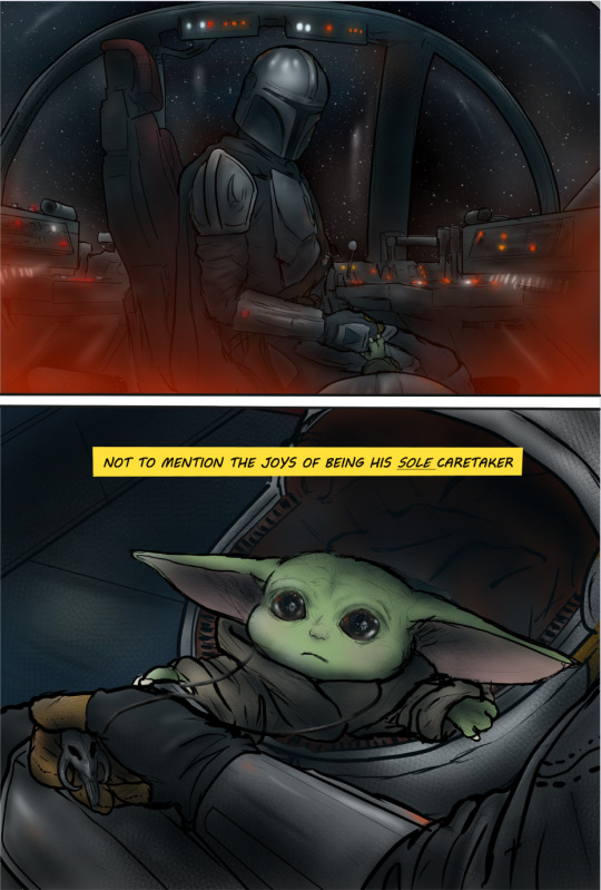
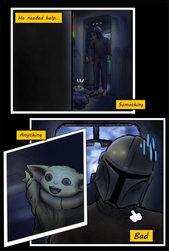

END CREDITS TRACK: A FRIEND -GUITAR COVER
Up Next: CH 0-2: "Rules and Habits"
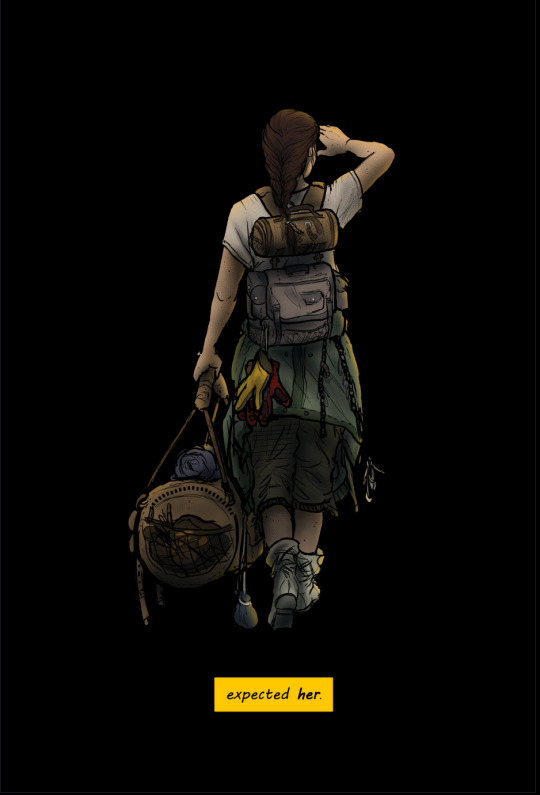
"And yet, only when she was absolutely certain he wouldn't see ...shed let that nagging curiosity get the better of her, make an exception...and-"

AUTHORS NOTE:
Well, this is the moment we've all been waiting for, sickos! I'm so proud of what Ive learned and been to accomplish these past few weeks (digital-art and writing in general), and have so much gratitude for all of the wonderful people who have followed along and encouraged me thus far. Most of all, thank you to the wonderful @no-droids for creating the fic in the first place. I cant wait to continue posting what's in store these next few (probably) years.
Thanks so much for reading! I hope you'll consider checking out my homepage for updates, sneek peeks, more depravity, the star wars mega-pinterest boards, and the unofficial soundtrack! 💗
Next chapter coming.....whenever its ready...in-person school is aboutta start and im going to pace myself and figure out how to balance going in person for the first time in a year...workin' and well...life, which includes this depravity and you all 💗!!!
Cheers, Sweet Girls. 💗
-M (@roughdaysandart)

CREATOR CREDITS
Credit to @saradika-graphics for the amazing dividers!
Credit to all of the talented artists making covers of the songs I link!
Credit to Brittany Broski for introducing me to RD/Ao3 this late in my life
Credit to...anyone else my mushy brain forgot (lmk ya'll)
credit to my drug-induced psychosis?
ERRORS/DISCREPENCIES/INNACURACIES (feel free to add)
Sweet Girl was drawn on the cover before her design was finalized, and so her clothing as well as her body are not exactly the same as how she appears in the series.
On page 5, Din is supposed to be laying in the cockpit's main compartment listening to the closed door, not in the mini hall where the ladder resides.
on page 9, there is a spelling error (talens--> talents)
On page 12, the rendering of the Crest's hull is a bit too wide (most dramatically apparent by the fresher door's length), the hull should be a tad more narrow. In addition, the flooring coloring is somewhat inaccurate, needing to appear more metallic instead of similar to the roofing textures and colorings
On page 12, the handle of the fresher door is supposed to be on the left side, not the right.
Speaking of the handle: I understand that manual doors are somewhat uncommon in the SWU, and it would be inconsistent for the Crest to have one when the cockpit and cot doors are auto, but I wanted to stay consistent with the descriptions in the original fic. In chapter 2, SG is described to slide open the door with her hand as she sees Mando standing outside. But I didint want to just purley stick to the fic's details and ignore in-universe discrepancies, so i thought of how this somewhat odd/niche detail could still make sense in this setting. I figured that with the inclusion of a control panel within the fresher (seen in later chapters) in addition to the one bewteen it and the cot, the option of an automatic function would presumably still be available aside from the manual one (which could be there for the purpose of giving the user a speed or distance preference or to avoid pinching etc.)
on the page beginning with "to say the least", the mini-halls' roof is suppposed to have a window. Therefore, the lighting of the space is somewhat innacurate.
#rough day comic#rough day fanfic#mando#the mandolorian#mando fanfiction#the mandolarian#mando x reader#mandotsecurities#din djarin#din dijarin x reader#din dijarin fanfiction#din darjin#din djaren#the mandalorian#ao3 fanfic#fanfic#rough day#pedro pascal characters#pedro pascal#pedrohub#pedrito#star wars fanfiction#star wars fanart#star wars#sw fanart#sw art#sw fic#sweet girl#disney#din and grogu
181 notes
·
View notes