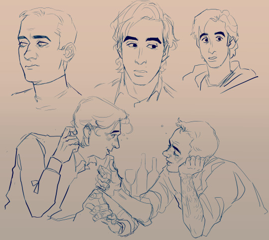
#they put it on my screen
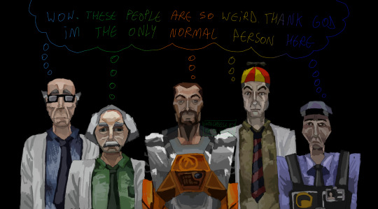
Text

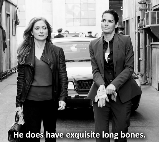
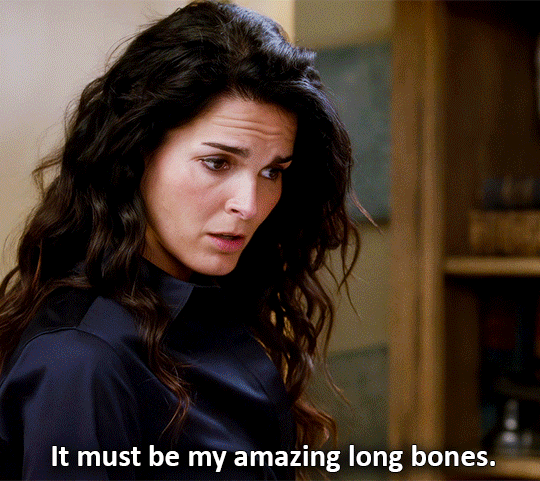
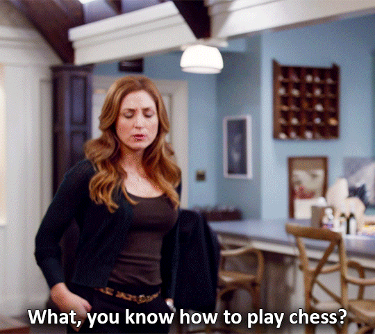
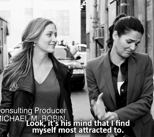


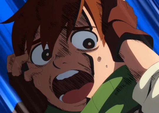
Maura & Jane | Rizzoli & Isles 2x09
#someone wrote this#they acted it#they edited#they put it on my screen#and they knew exactly what they were doing#rizzles#rizzlesedit#rizzoli and isles#rizzoli & isles#jane rizzoli#tvedit#cinemapix#crimeshowsource#wlwedit#wlwgif#wlwsource#dailyflicks#otpsource#userotp#aflawedfashiongif#affrizzles#r&i: season 2#r&i: 2x09
505 notes
·
View notes
Text
Funny things I found out playing with language setting in Netflix while looking episode 15:
Chilchuck's scream sounds HAUNTED in brazilian portuguese. Give it a try if you can.
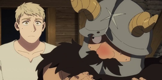
In spanish dub, Senshi says: "tocó mis senos de hombre", which means "he touched my man boobs" in Spanish. And I think that's the best dub line one so far.
#i love replaying certain scenes (usually screams) to see how they nailed it in other dubs#ive done it with Chilchuck & Mickbell screams because they're the funniest ones#give it a shot if you can#its really funny to hear certain character voices in other languages#for example. brazilian portuguesse gave both mickbell and chilchuck un-childlike voices (in japaneese both sound like little childs)#and they reused Chilchuck's japaneese screams for most of the other languages because he is so high-pitched and full of terror that it work#dungeon meshi#chilchuck#chilchuck tims#dunmeshi#delicious in dungeon#senshi#senshi of izganda#senshi dungeon meshi#idk how do you people screen record the episodes#if i knew how to i would put the shots here#my shit
22K notes
·
View notes
Text
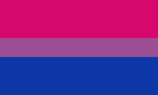
as a bi person, the bisexual flag brings me infinite joy and always puts a smile on my face, however as a person who has a Passion for Graphic Design, that undersaturated shade of purple infuriates me when it's used digitally
like, on an actual flag - which was its original purpose - it looks great!

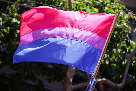
those look fine! lovely, even! with the semi-transparent fabric, the way it catches the sunlight, it looks beautiful!
but now look at how it looks digitally

the pink and blue are so vibrant compared to the sad, lonely lavender!
and let's look at this statement from Michael Page, the creator of the bi flag:

(sidenote: he created this flag in 1998, so if his takes on bisexuality is different from yours, it's okay to notice that! a lot has changed since the 90s when it comes to lived experiences and the way we describe them. but, it's also important to respect his thoughts about this and the way he presented them, even if today, we'd probably not say that bi people "blend unnoticeably into both the gay/lesbian and straight communities.")
so in pantone colors, the pink is 226 C, the blue is 286 C, and the purple of the flag is 258 C.
but...here's the deal
Michael talks here about how the key to understanding the symbolism is to know that the purple blends into both the pink and blue. and on a physical flag, I think you can see that!
but digitally, it absolutely does not blend. it clashes badly, and looks oddly separate from the other two colors.
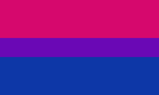
which got me wondering...what purple do you get if you actually blend 226 C and 286 C?
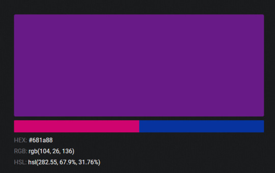
oh! oh, my god.

look at that! look at how nicely it fits between those colors!
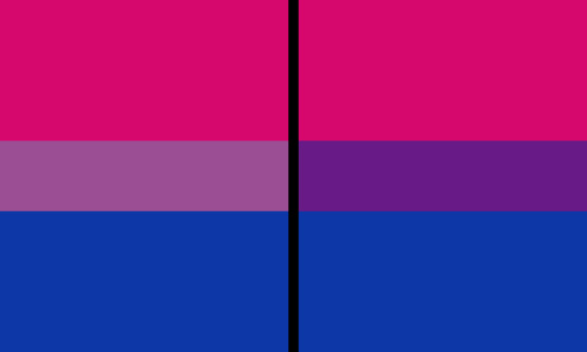
look at it next to the original color scheme! look at how much more vibrant the purple is!
and friends. this is just blending through rgb! you get even more purple variations when you use other color spaces!
let's compare all of them:


(top: original, lab. middle: lrgb, lch. bottom: rgb, hsl)
look at all of the different purple options you can get just by combining these two colors!
if you want almost too-vibrant saturation, you can go hsl, if you want something more relaxed that's closer to the original, you can go lab or lrgb. and if you want to split the difference, lch is bright and violet, while rgb is there with its saturated but darker purple.
anyway, I guess I don't really have a point here? this isn't so much an informational post as it is Me Getting Weird About Colors, but I think it is a useful lesson about how colors look very different on screens compared to how they look on objects in real life.
and sometimes, I think it's okay to compensate for that.
out of all of these, this is my favorite bi flag:

it's the one where the colors were blended in lab color space. for me, the lighter, softer purple is close enough to the original bi flag purple, while also feeling like a smoother blend of the blue and pink
but that's just me! and it might not even look the same to you, since every screen is different, because technology is a nightmare!
anyway, thank you for coming with me on this colorful journey! I will now retreat back to inkscape and make pained sounds about inkstitch gradients until something tangible pulls me back into reality
#bi#bisexual#bisexuality#bi flag#bisexual flag#sbs rambles#graphic design is my passion#id in alt text#but#the ids are probably deeply unhelpful for the different variations of flags#in the alt text of the six flags all grouped together#I just put what method the purples were blended with#and then tried to describe them more in the paragraph below#but this is an inherently visual post#so if you're reading it with a screen reader I am sorry :(
19K notes
·
View notes
Text
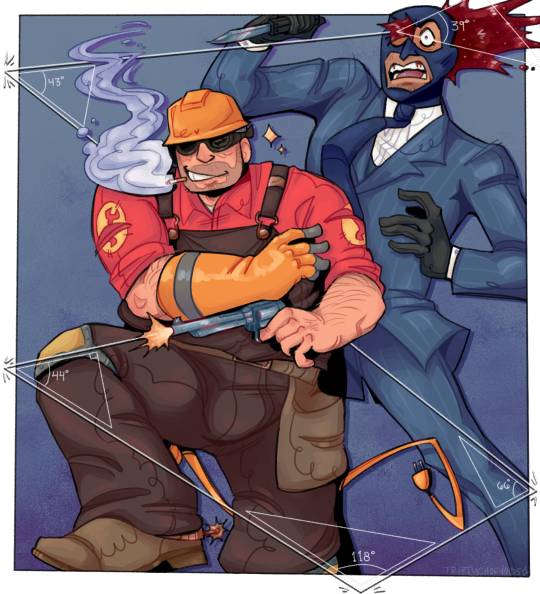
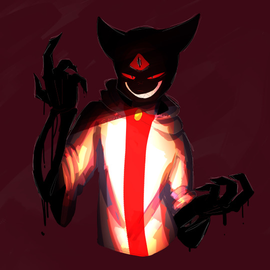
quick draw and trigonometry
#SMILES grins#this took me forever to draw.... i mean i started it yesterday but anyway#puts a protractor up to my screen where am i#wanted to do an engie-centric drawing for once#doodles#tf2#tf2 engineer#tf2 spy#anyone that knows what inspired this gets a kiss on the mouth btw. or something
3K notes
·
View notes
Text
personally love the interaction in the start of s4 where steve goes “ugh, you know i don’t do double vhs.” when robin suggests doctor zhivago. like ugh robin!!!! we’ve talked about this before!!! steve has a limited attention span and if robin puts on something too long, he will start shooting her with rubber bands
#or seeing how many paper clips he can stack into one tower#the answer is about 7#also love the idea that if u put on a movey he loves#like a sports film or something#he’ll be in the aisle — supposed to be shelving — but just staring at the viewing screen like :O#he’s a guy who stands with his mouth open if he’s distracted trust me#and that’s when ROBIN tries to hit him with a rubber band - aiming for his mouth#the great incident of ‘86 is when she manages to get it in and steve chokes on a rubber band for 15 seconds#anyways how often do u think they fight over movie picks ?#stobin#platonic stobin#steve & robin#stobin headcanons#they’re my fave besties :D#ok nanite
3K notes
·
View notes
Text


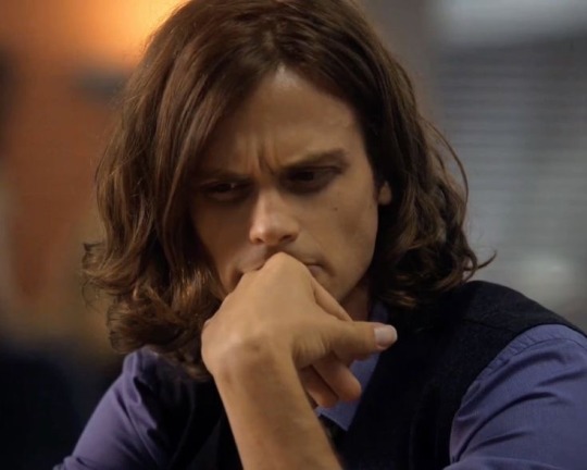
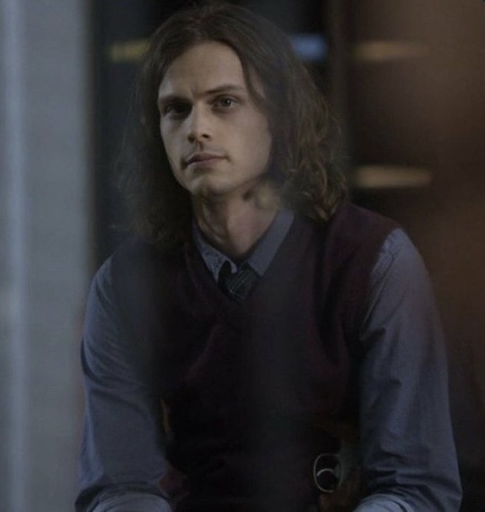
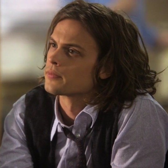
you may like long hair spencer but i love him in a deeper and more complex way (/j)
#i think i should be sedated when jesus hair spencer is on screen i genuinely don’t know how to act when i see him😔#criminal minds#spencer reid#spencer reid x reader#had to put my phone down multiple times when getting the photos cuz i was getting so giddy my heart felt like it was about to burst
2K notes
·
View notes
Text
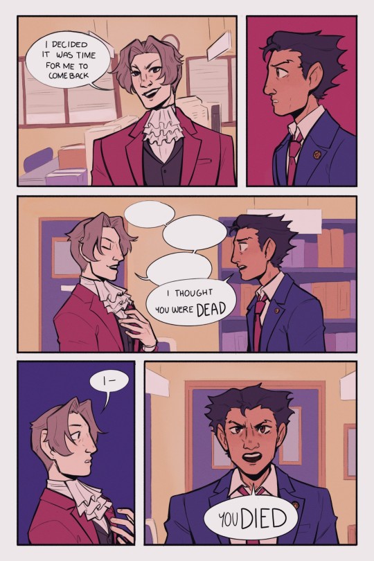
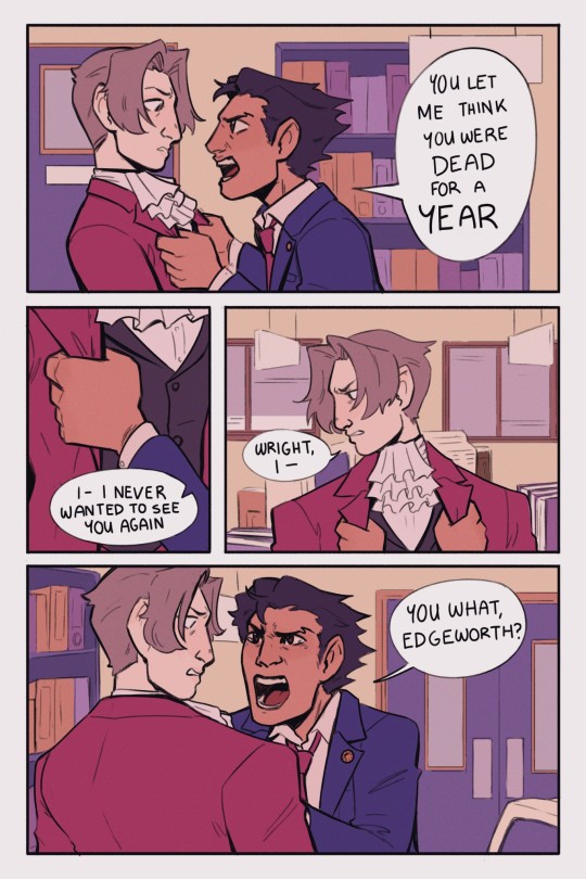
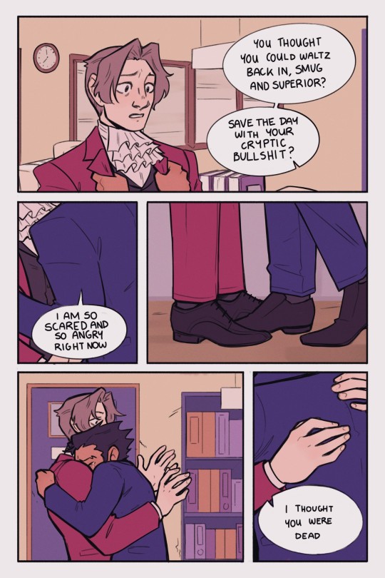
I've been meaning to do some kind of comic based on the events of Farewell, My Turnabout since I played it last summer, so here's something a little bit amped up from Phoenix's canon reaction to Edgeworth's return mixed with my own reaction to it (I was so relieved to see him)
[ID in alt text]
#phoenix wright#miles edgeworth#my art#ace attorney#narumitsu#wrightworth#i did actually screen record most of the process of working on this so i might try and see if i could put together a process video#it would be pretty long though comics take a while
9K notes
·
View notes
Text
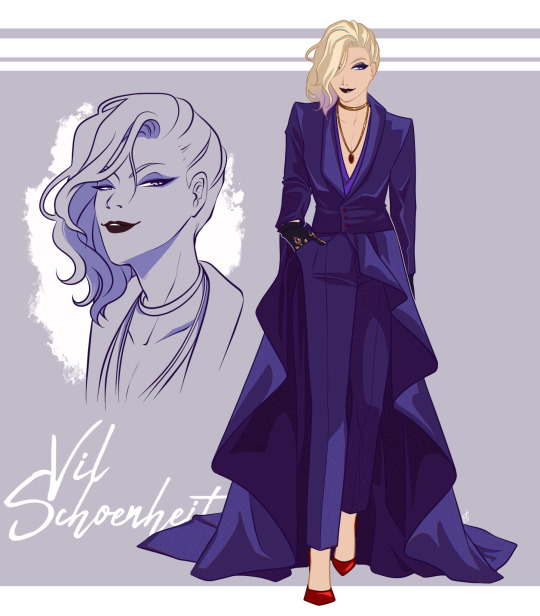
Listen up fives, a ten is speaking.
#twisted wonderland#vil schoenheit#guessing the full luxure couture ssr#I HAD to give a try#dear god I will never recover from this ssr#I refuse to put it as a phone screen otherwise I’m gonna stare at my phone ALL THE DAY#I’ve been waiting for a side hair Vil all my life
1K notes
·
View notes
Text
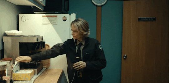
Crimes against short people
#artie gifs#true detective#night country#true detective night country#true detective spoilers#silly stuff#this is me whenever people put stuff on the top shelf#or any shelf higher than the first one tbh#if the internet is to be believed she's 5'3#I'm 5'4“ so this is pretty accurate to my experience lol#no one giffed this so i had to figure out how to use a new giffing program for this#because instagiffer just straight up didn't work it would only record half the screen no matter what
1K notes
·
View notes
Text
dont ask me what this pose is idk and also im still trying ta figure out howta draw him orz
#ppl draw him soooo cool its awesme#spacie scribbles#cotl#cult of the lamb#narinder#cotl narinder#this was a fun exercise ^_^#i kind of just turned my brain off and put strokes on screen#did some fun shading here!!#theres a bunch of errors but -#ill live lmao
1K notes
·
View notes
Text
so cool that fanfiction won anne rice’s war on fanfiction
#the new show is sooooooo good#everyone go watch it!!!#and as my buddy pointed out#so cool that tom cruise won anne rice’s war on tom cruise#she’s 0-2#for those not in the know:#she intentionally spread lies that cruise was trying to make the movie less gay in attempts to tank the film bc she was angry he was cast#and then fully admitted (!!) that SHE was the one who kept making edits to the script to try and make it more palatable to studios/audiences#(ie less gay and explicit) and that the director neil jordan actually put a lot of it back in there once he was in charge#and that tom had no say over the script at all#but by the time she apologized to him (like actually called him and apologized) the damage was done and people STILL think he did all that#and say what you will about him but thomas cruise put his whole pussy into lestat and stands by IWTV to this day#even after OPRAH called him to say she walked out of a screening of the movie because she thought it was putting the devil into the world#anyway.#sorry for being insane! it will happen again
17K notes
·
View notes
Note
Do yoy like their silly little dance
the inside of my brain at any given moment:

#twisted wonderland#twisted wonderland spoilers#stage in playful land#stage in playfulland#gif warning#gifs that bop along to your music warning#gidel is SO little#look at him compared to everyone else!#three apples tall!#i could put him in my pocket and still have space to pack him a lunch#this rhythmic is so silly. i love when we get a cutesy upbeat rhythmic right before everything goes straight to shit.#fellow and gidel: (dance around all cutely and throw confetti)#fellow and gidel: anyway now it's time to sell you#just the most adorable little kidnappers 🩷#so glad they made an official gidel chibi because otherwise i would have tried to and it would not have ended well#i'm trying to do a meleanor right now and she is giving me enough trouble. she doesn't even have any STRIPES.#do you think the riggers got handed the designs for this event with all the stripes and swirlies and patches and patterns#and just had to go stare at a wall for an hour or two#'okay look people are going to see this on a small screen with a rhythm game going on in the foreground'#'nobody is going to take a high-res screen recording and then go through it frame-by-frame to scrutinize our rigging breakdowns'#'what kind of HUGE NERD do you think plays this stupid game'#(shifty eyes)
1K notes
·
View notes
Text
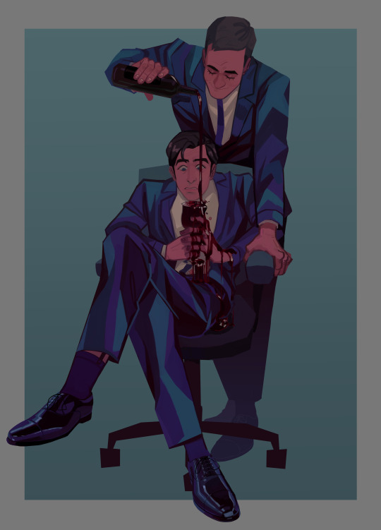
Uploading all my Tomgreg art at once from the past few week before season 4 hits, who knows in what kind of mental state i'm gonna be once it does :')
#tomgreg#succession#dont even talk to me i started watching this show when i had nothing to do at work and now i watch it with averiel my good friend averiel#and we are going to watch s4 together and i feel physically ill from bein so excited#so ya thats what ive been up to... anyway. i love these idiots they desever nothing but the worst (affectionate)#im also a tomshiv lover btw. im the one who yells 'THIS IS HOW TOMSHIV CAN STILL WIN' while they are actively losing on screen#thats the kind of person i am#dont look at me (lying on the floor)#okay i was not going to say stuff in the tags and let the art speak for itself but i NEED to point out details in the wine Painting..#i put a lot of work into that one. thinly veiled metaphors and symbolism yknow..#greg is gripping the stem of the wine glass with his full fist. tom and greg are dressed in the same outfit (sock garters included)#greg look appalled but he is not doing anything about the spill. tom is fondly pouring greg more and more wine. he is doing him a favor#i colored the red wine the same way i would color blood :) oh and tom is not really touching greg#only holding the chair in place. greg is making himself look smaller than he is like usual#oh and @ the person who said that it's the inverse of the tom and nate scene i love the way you think. i did not think of that before#but god. yeah. i actually thought about the scene change from when roman uhh.. christens his office in s1. the one with the coffee machine#i always go insane at that cut. this is not exactly the same since it's more.. about emotions but yknow.. it can be.. the same...
4K notes
·
View notes
Text

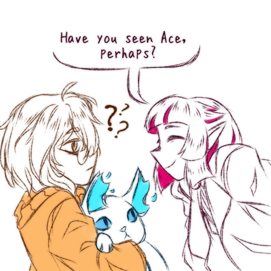

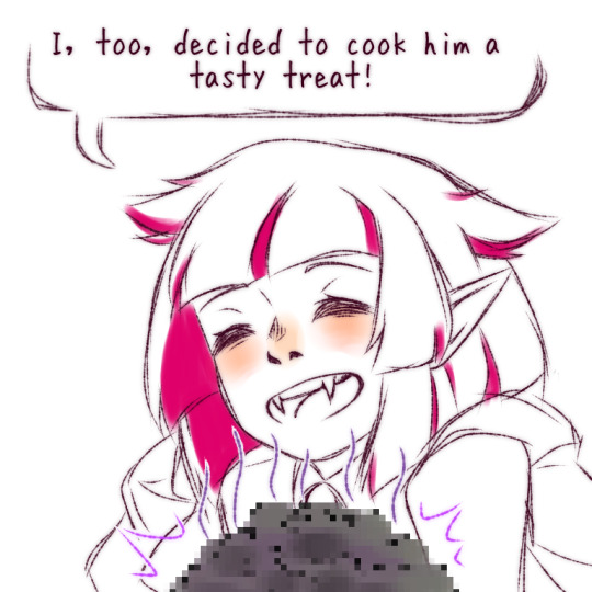


lilia vanrouge commits murder (ft. grim and my mc)
#this is actually based on when i put halloween lilia as my home screen chara and his first line ever was him hunting ace down#to give him a dessert ofc!!!#we love a thoughtful peepaw#my art#art#oc#twst#twisted wonderland#disney twst#twst lilia#lilia vanrouge#grim#twst grim#yuu#twst yuu#twst mc#twst oc#meme#comic
2K notes
·
View notes
Text
sorry our ai is breaking bad
#hlvrai#hl2vrai#bbvrai#my art#gordon freeman#benrey hlvrai#tommy hlvrai#bubby hlvrai#dr coomer#discovering this meme aparently was started with hlvrai is very funny#i didnt know i just put it here because i didnt want them to awkwardly stare at the screen#the more you know!
1K notes
·
View notes
Text
Writing Accessibility PSA
Please avoid using long strings of characters as line breaks in your writing - these are not screen reader/TTS friendly!
Every ‘°’ will be read as ‘degree’ - can you imagine how long it takes to read out a string of 25? Let alone more complicated combinations of characters (eg. imagine listening to TTS read out ~*~ |°| ~*~ multiple times per line break)?
A good rule of thumb is to stick with short, 2-3 character line breaks (eg. I don’t find — or *** too egregious to listen to). Your readers can tell there’s been a scene change whether you use two or twenty em-dashes, but if you use twenty, some of us might have to listen for 30 seconds to read the next scene. If you’re more concerned about aesthetics, you can insert an image of your aesthetically pleasing line break with alt text simply reading ‘line break’ for accessibility.
Don’t feel bad if this is something you’ve never thought about before - now you know better and can make your writing more accessible moving forward!
I would like to invite any other screenreader users to add their own thoughts or preferences to this post. We’re not a monolith and there’s a variety to how different softwares interact with repeating character strings and images with alt text, so there’s bound to be some conflicting opinions on what I’ve suggested above. Let’s try to make the stories we share accessible for everyone :]
#writing#accessibility#line breaks#linebreaks#screen readers#tts#text to speech#whump community#<- applicable to any digital writing but tagging for my own reference. as this is my whump blog.#maybe I’m old but back in my day there was a little kerfuffle about how many people kept using complicated character string linebreaks#on ao3 which has a native line break you can insert via html#I don’t know if you can still do that on tumblr desktop with all the changes recently so I’ve been sticking to my trusty —#this is all in good faith no harm no foul and I’m not a cop so do what you want with your linebreaks.#I’m just putting this out there because it wasn’t something I really thought about before using a screenreader myself
929 notes
·
View notes
Last Seen Blogs
azirafeast
Azirafeast

steintcbkehoe
Untitled
soxsick
love only

agatesshadowseer-blog
Sky Eyes

muzicoz-blog
Muzicoz