#tutorial lessons
Explore tagged Tumblr posts
Visit Tumblr Blog
Explore Tumblr blogs with no restrictions, modern design and the best experience.
Last Seen Tumblr Blogs


Fun Fact
In Q3 of 2020, 31% of US users access the Tumblr app daily.
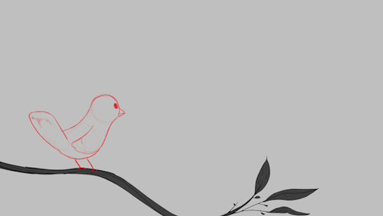
Text
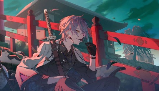
Lesson #15: Crafting
Crafting is pretty simple, all you need to do is get your journal ([J] key) and find the recipe for whatever you want to craft. Now, you will need to find or craft all the items required for the recipe. Once you have all the items, open the crafting menu and arrange the items in the order and number shown in the recipe.
You will have some basic recipes by default, and if you craft one of these recipes enough times you will receive an upgraded version. Additional recipes can be found in chests.
There are different crafting menus. You have the hand one by default but by using anvils, specialized tables, etc. You will get to use more recipes.
Example: You can't forge a sword without an anvil, and so on.
Most things you can craft can be bought and all items that can be bought can also be found or crafted. Crafting is always cheaper. You can also craft items to sell.
#tutorial tips#tutorial lessons#crafting#game mechanics#game tips#exclamania#Exclamation Point PFP RPG Blog Cinematic Universe#EPPRBCU#eppfprpg#punctuationverse#!CU
28 notes
·
View notes
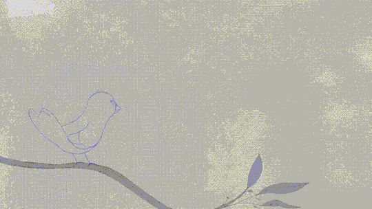
Text
a reminder to young/new artists;
YOU WILL GET THERE EVENTUALLY.
i promise you, you will get there eventually. you will have the art style you've always envied, the quality you thought you'd never reach, the skill you think you don't have. you will get there.
you just have to keep going.
#and i know that's not easy. i have been there. every artist has.#but no one gets where they are through lack of effort and practice#you dont have to follow fancy tutorials. you dont have to do fancy lessons. you dont have to do anything other than-#-doing what you love. doing what makes YOU happy. i promise you YOU WILL GET THERE.#take it from an artist that thought he never would. you will get where you want to be.#a talking bunny#feeling sentimental :') realized im the artist young me always dreamed of being and thats just. hoohkjghfgh#i never thought i'd get here. so. something for artists that may be like me#U WILL GET THERE!! IF I CAN SO CAN U!!!
208 notes
·
View notes
Text

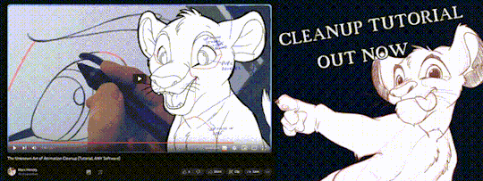
'ello folks, my Cleanup tutorial is finally done and out! hope you find it useful
#Animation#Tutorial#Advice#Lesson#The Lion King#simba#animation#Disney#character design#how to#2D#traditional animation#frame by frame#Adobe#Photoshop#Animate#Flash#After Effects#Premiere#Video#Film#Drawing#Tips#Gestures#cleanup#lines#krita#toon boom#procreate#tvpaint
1K notes
·
View notes
Text
The Load Order Myth
There's a persistent myth in this community that mod conflicts can be solved by making the mods load in the right order.
However: This is only true if the mod creator has made them compatible. It might be true if two mods just happen to do the same thing, but that's very rare.
How mod conflicts work:
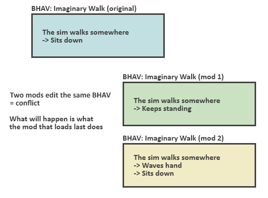
No matter in which order these mods load, the sim will always do either thing, not the combination of both.
So the mod that loads first will stop working.
Making these compatible is only possible by making a new mod:
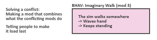
Depending on how complicated mods we're talking about, making compatible versions can be just as worksome than making a completely new mod.
So if the creator doesn't want to use both of the mods themselves, chances are they aren't interested in making yet another mod.
TL;DR: whenever creators say "these will work together if my mod loads after", they've intentionally made it that way (and will likely tell about it in the post).
199 notes
·
View notes
Note
hi! hope your having a good day/night/timezone/etc.! u got any writing tips (like how to not lose motivation/use up as much of it as u can while u have it, any ways to get the words flowing/“get in the writing mood” that have worked for u) for any of ur fellow fic writers? (idk if this’s been asked b4 (it seems like a common question lmao), but if it has, ‘pologies, lolol ^^)
i have a few that i've been thinking up to try and post!!
remember that you aren't on a deadline to write, and to take the time you need. no one wants to read something you rushed, let alone do YOU want to read it. and it REALLY matters if you love what you're writing. you'll kill your motivation trying to keep up with something like that!! if you only had time to write 300 or you had a great day and wrote like 3000, you're doing great either way!!!
there's a lot to keep up with when you're writing, and you have to remember and understand all of it. if you're trying to write while you're tired/upset/etc, you'll likely end up with something you're not that proud of. (granted, art is art, and sometimes these emotions can create something beautiful or meaningful). take metal breaks so you can come back to your work with a fresh mind, and don't overexert yourself. you'll remember and understand more if you treat your writing time like you would when you're studying. sometimes i make flashcards to remember characters, places, events, etc.
sometimes i can get too analytical with my writing, or it starts to become flat? if that makes sense? meaning, like... i'm putting words on paper rather than delving into the story. too many "they felt this way" and not enough "Character A turns to face the man that had changed their entire life with the single shot of a bullet, careless to what damage he could have caused. It's haunting to see that the man is simply that: a man. Not a monster as they had imagined, laying awake at night and wondering what their father had seen in his final moments. He's just a man." what helps with this is putting myself into the shoes of a narrator, remembering that i am telling the story as if i already know what's happening (even if I don't know where I'm going with a scene yet). i imagine that my reader is right there next to me and i'm telling them the story in real time like we're sitting around a campfire telling ghost stories, or that i'm the quirky narrator of a book they just picked up.
During times where i'm losing inspiration or feel like i'm in a loop, i like to go back to my favorite medias and spend some time with them. i recently rewatched Gravity Falls, the Sea Beast, and the Adam Project, and it was a fun mental break that got me into the writing mood. i try to find similar media to what i'm writing at that time. if i want a scene focused on funny banter or a comedic effect, i read or watch comedy. if i want to write a scary scene, i'll watch a horror movie. etc etc. "studying" your favorite media and putting yourself into your fav writer's writing shoes is a great way to improve your own writing. think about why that joke was funny, what the set up was that made it that way, and if it would have been a different joke if another character said it (Gravity Falls is one of the best media you can use for this, but really, reading mysteries in general can help)
physical exercise, if you can. getting your blood flowing and treating your body well!! when i was in band, we used to do "body warm ups" set to music, and i still do them to this day. it gets me awake and alert while also letting me listen to fun music before i write
#erinwantstowrite#ao3#ao3 fanfic#writing#writing advice#writing inspiration#writing tools#it's important to learn your trade!#just like you would look for tutorials on how to get better at art#or sports#if you're trying to get better at writing#you need to study what came before you#and go looking for lessons!#thank you for the ask!#and if you're trying to find motivation#remember that how you treat yourself has the most impact on that#you have to experience!!
74 notes
·
View notes
Note
Heyy !! Sorry if you already answered to that question ;-;
I'm trying to learn perspective but I'm a little lost...
Do you have any tips to draw perspective ?
And remember, don't overwork and remember to drink!
First of all, I shake your hand, you don't know how many artists say they hate perspective 😆, welcome to perspective lovers!
These are two examples, they are the two main perspectives and I recommend you start from these
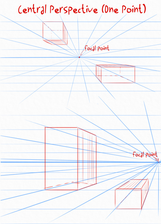
Central (or one-point) perspective is the simplest: choose a focal point, which can be in the center or more to the side, then draw lines that lead towards the focal point.
Above all, remember that perspective must be followed, every object you create must follow the focal point
This perspective allows you to already see the three-dimensionality in your work
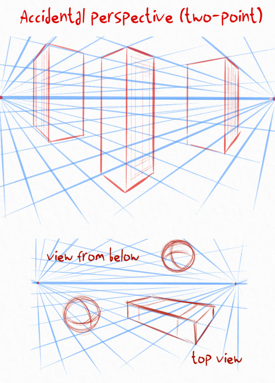
Then there is the Accidental (or two-point) perspective, this is more complex because we have two focal points, but it allows us to create more three-dimensional works
One little advice I always give is that everything you draw above the horizon is seen from below, and everything below is seen from above
This perspective is useful for everything 😄
There are many other perspectives and rules to place characters and objects, but explaining them like this would be too complicated
I hope I have given you some ideas to study it, but I invite you to do a study on the dedicated books, or from video tutorials, but look for professional artists in that case
Thanks for your ask! 💖
44 notes
·
View notes
Note
Rendering tutorial pretty please?
Of course! Now at some point I will make a proper tutorial, but for now here’s progress shots and a timelapse! I hope you’re able to find these helpful, random anon!
I really recommend checking out LavenderTowne’s videos specifically on shading, they’ll help heaps (or honestly any of her tutorials :))

#cult of the lamb#cotl#cotl fanart#cult of the lamb fanart#cotl oc#cult of the lamb oc#art tutorial#art rendering#ask box#tutorial#digital art tutorials#shading tutorial#shading#art lesson#art advice
59 notes
·
View notes
Text
youtube
Watercolor Tutorial with Yoichi Nishikawa
"Follow along and learn more about the whimsical beautiful world of background art with Yoichi Nishikawa. In this 30-minute tutorial Yoichi walks through the process, shares techniques, and introduces the tools used to create his signature airy cloud backgrounds. Academy Museum family day programs are made possible in part by a grant from the City of Los Angeles Department of Cultural Affairs. To protect the health of our community, the Academy Museum enforces health and safety protocols that are kept up to date on our website." - Academy Museum Youtube Description
#art#traditional art#animation pipeline#watercolor#watercolor tutorial#background painting#studio ghibli#yoichi nishikawa#traditional art tutorial#painting tutorial#backgrounds in animation#academy museum#watercolor tips#watercolor hacks#watercolor lesson#watercolor painting#Youtube
61 notes
·
View notes
Text


パースの描き方をよく聞かれますので、基本の知識をシェアさせていただきます。英語版です。
On me demande régulièrement comment dessiner en perspective, voici donc quelques trucs de base. En anglais(flemme de traduire en 3 langues)
i am regularly asked how to draw in perspective, so here some basic tips(in english this time yay!)
28 notes
·
View notes
Text
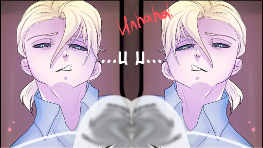
Lesson #9: I-I-I- AAAAAAAAAAA
I-I-I- AAAAAAAAAAAAAAAAAAAAA
[
Error: Exclamania-launcher.exe has crashed
If you are a beta tester, please contact the developers at @bug-finder-tyria and send the error logs.
If you are a player please make a support ticket on our web portal www.exclamania.net/support
Thank you for your patience as this game is still under development.
[OK]
]
#tutorial tips#error 501#tutorial speaks#tutorial lessons#tutorials lore#exclamania#Exclamation Point PFP RPG Blog Cinematic Universe#EPPRBCU#eppfprpg#punctuationverse#!CU
24 notes
·
View notes
Text
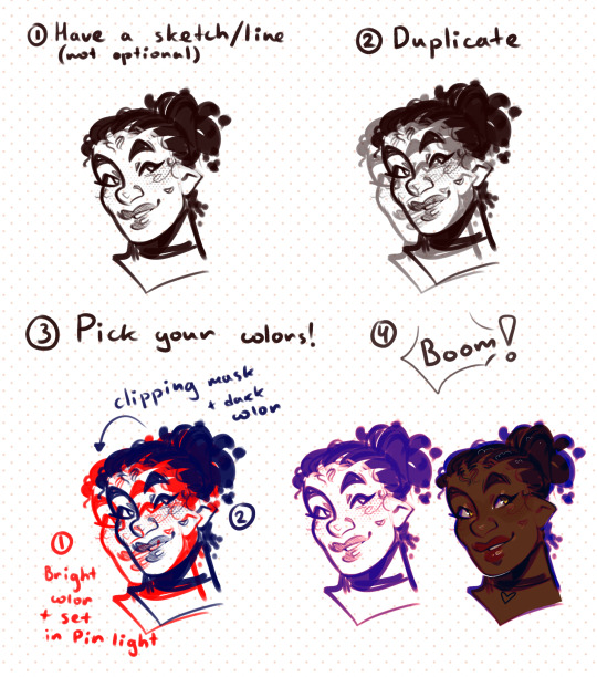
Was asked on twt how I make the lineart so soft and cool looking, here’s a little tutorial featuring my OC Imras
Bright bottom layer in pin light + dark top layer usually works the best, but you can experiment and do any other combination!
Works really good with sketches and textured brushes, makes stronger lines pop out more
#myart#OCs#Imras#digital art#tutorial#art tutorial#arttutorial#art lesson#art advice#drawing tutorial#drawing advice#lineart#line#sketch#skecth art
105 notes
·
View notes
Note
I really like your art style but had a question that might sound strange.
How do you get everything to look consistent?
thank you !! 🥺 this could mean a few things so I'm gonna try to answer all of them just in case! if you need me to explain anything in more depth just let me know (the art professor brain kicks in)
1. Style consistency across my work:
I personally don't feel like I'm very consistent. I know I have an overall 'style' that's mine and bleeds through even when attempting to draw in a different style, but I use such varied techniques and change up my process so much that I can't say the secret is in any of those things. It's more of the manifestation of the specific way I observe, translated to a visual work. Art to me is a lot of observation, then choices taken to arrange the observed using techniques, materials, and skills that are built over time and serve the purpose of achieving a goal.
I have a 'way' of drawing faces that people have pointed out is distinct. Same with hands, and clothing folds. It comes from muscle memory, and memes (not the funny type, the type that's a repetition of a pattern) or clichés that become the easiest way to do a specific part of a piece.
2. Consistency within a specific piece:
This one is a bit less tricky to explain. You're going to want to use the same tools throughout the piece for it to look consistent.
Example: If you use line weight somewhere, and completely uniform lines elsewhere, it's going to look out of place. This is a valid resource to produce a sense of estrangement in the viewer, but not something you want to happen unknowingly!
Practice writing down your choices for a piece and sticking to them, whether it's traditional or digital. Make a list of the tools (brushes, colors, method, materials) you will use. For mixed media art, there's a way to make even the most wild-looking, varied art, appear consistent! It's all in the treatment of the parts that CAN coincide. If you use the method of collage, maybe what matches is your palette? The composition rules? Proportions? go wild ^^
I hope that helps!!
18 notes
·
View notes
Text


front and back
(blue hydrangea from animal crossing)
#emieclat#embroidery#animal crossing#acnh#i don't actually know anything about animal crossing this is for my friend#also did you know if you're bad at something and you look up tutorials instead of stubbornly insisting you can figure it out on ur own#you'll actually get better at the thing#wild concept i know. maybe i will actually learn the lesson this time#(unpictured: very bad previous attempt at embroidery)#(this one i'm actually proud of)
188 notes
·
View notes
Text

I used to draw comics this way! It was the old year 2018 and I was 17 years old! HAHAHA!!! The man has a caterpillar torso!!! >0<
Back then, I was drawing comics without plotting and I was drawing starting from a line without a sketch! I was such an idiot!

It took me a long time to learn how to draw and feel comics. I've been experimenting a lot. Never be afraid to experiment and make mistakes.
I've made a lot of mistakes and now I know how to solve problems in comics. In 2022, I greatly overused the number of windows...
I used to write more text and obscure the main drawing and characters. I also drew very well-drawn illustrations for the comic, and it took me from 9 months to complete 1 chapter! In comics, it is important to have 50-50 text and pictures, not to create too much text and strong elaboration art in comics (if you do not have a company).
Now I've started drawing comics much faster and it takes me at least 2 months per chapter. Drawing has become more 2D and easier than it was before. Be able to keep it simple in the text and in the picture ^w^
You can draw comics in different styles, but follow the simple rules and your product will be great!
#art#drawing#paint tool sai#sai 2#comics#anime#drawing lessons#drawing tutorials#learn to draw#how to draw#how to draw comics#digital art#comic art#artwork#artists on tumblr#art study#illustrators on tumblr#digital drawing#digital illustration#comic book#comic books#original comic#short comic#web comic#lessons
16 notes
·
View notes
Text
lesson O1: cel shading and how to achieve it.
Project SEKAI uses a unique shading method, which is a cross between rendering techniques and what is commonly referred to as "Cel Shading." Cel Shading was a term coined by animators before computer animation, who worked in "cels" or hand-drawn scenes. Because of the limitations of the time, the animators had to find a cheap and simple way to shade, resulting in the shading we see usually in modern animation.
Project SEKAI uses this style in combination with rendering tactics to create their iconic art style.
In this lesson, I'll be going over how Project SEKAI achieves that look by breaking down their Live2d models and card cutouts.
Cel Shading is the basis upon which everything in Project SEKAI is shaded. Commonly, this is seen in: Live2d models and card trims. Here are some examples.


In both examples, you can notice the more "simplistic" style of shading. Now, the real question is: "How is this done?"
To explain this, I'll be using the card trim on the right as an example.
Firstly, artists need to put base colors under their lineart. Base colors are the bare-bones, not shaded colors. This is to provide a guideline as to what areas need what colors. Below, you can see the same Nene card trim, but reduced to its base colors.
It is a bit sloppy, considering I made it myself, but the point is; there is still **some** shading blocked out where it's needed. For comparison, see below.
So, now the question is: "how do I even do Cel Shading from here? I've gotten my base colors down, now what?"
And, luckily, I can share that too! First, let's start by doing the most important thing, deciding where our light source will be.
In this card, it looks to be at the top right, coming down to shine on her.

The yellow is where I estimate the light would hit her. Now, we need to decide where our darkest areas are.
In this card, the darkest colors would be away from the light, meaning they would be to the left.
The red is where I estimate the darkest areas would be. The areas behind her arm would also be darker than the rest of the card, since they aren't being hit directly by the light.
This understanding of lighting will help me to place my shadows and highlights later!
After this, I'd suggest putting in a new layer on top of your base colors, and clip it.

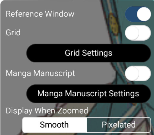
Now, I would be sure to grab a reference. For this drawing, I will be referencing the original trim, as well as the full card. I will be using a reference window, but use whatever works for you!
Now, we can get started! First, I'm going to block out where the **lightest** areas would be. I will be loosely following the card trim as a reference. Using the places we previously determined would be hit by the light, I blocked them out with loose colors.

We know that these areas would be directly exposed to the light if it continued at the angle we previously determined. Now, as for the headband, I decided to block out a very light yellow color. This is because of something called ambient lighting. Ambient lighting is just when highlights have a similar color to their light source. This is seen a lot in photography, and sometimes, even in cards!

As you can see here, the light itself has a yellow tint, so the wall behind it will also appear yellow as a result.
We can also see it in Rui's newest card!
The light behind him is a reddish-pink, so that light bounces onto him, and makes the highlights appear that color. You can also see it on the railing and the building behind him!
Back to Nene, I then blocked out some of the darkest parts of her, based on our previous assumptions about the source of the light.

I shaded the areas of her dress according to how the bow was shaded. Since they were in almost the same place, we can use it as a guideline. We know that the dress isn't exposed to the light, since it is in front of the bow. As for the arms, we know the arm closest to her face would be fairly far from the light source, so I blocked out a shadow there as well.

Here, I adjusted some of the shadows, and I added some shadows to the dress. I blocked them all out in shapes, which I will go back and refine later.
I also added some shadows to the white fur on her dress. I paid specific attention to the edges of it in an attempt to make it seem "fluffier."
Here, I blocked out more shadows of her dress based on how the light would hit her. Now, we'll move on to the hair!
While it is messy, I wanted to ensure that the areas I placed shadows in would line up with my assumption of the light source. So, I toggled back and forth between the reference for the light source and the card itself to see where it fell. Now, with that, we are done blocking our our shading! I would suggest duplicating this layer to touch up everything to ensure you're satisfied with it.
The eyes will be a lesson by themselves, seeing as I didn't want to rush out two lessons in one and overwhelm people with so much information. This was a longer post than I anticipated anyhow.
If you have any questions, please feel free to shoot me a dm or an ask in the ask box! I hoped this helped at least a few people, and I will try to do weekly/bi-weekly lessons if I can!
If you found this helpful, please consider reblogging this post for more reach! I want to help as many people as I can!
#art tutorial#art study#project sekai art#pjsekai#pjsekai art style tutorial#proseka art academy#art lessons#nene kusanagi#kusanagi nene#shading test#cel shaded#prsk
40 notes
·
View notes
Text
In With the New: Tarot Spreads for the New Year
by Keziah With the passing of each new year, many people turn to divination to see what the coming year has in store for them. The Gregorian New Year is upon us and now is the perfect time to look toward the year to come. These tarot spreads are intended to reflect on the year now behind us and the year to come ahead of us. In this piece, you’ll find six spreads in total, each easily customizable to meet your unique needs – two versions of an Out With the Old, In With the New spread, a 12-Month Tarot Spread, two versions of a 6-Month Tarot Spread, and the Wheel of the Year Spread, each offering a glimpse into the year to come in their own special way.
Out With the Old, In With the New
Version 1:
This spread offers the chance to reflect on last year, help us see what to let go of and to bring with us from the previous year, as well as look into the year to come.

1: Last year’s highlight or high point 2: Last year’s low point or most trying issue 3: What to bring with you in this new year 4: What to leave behind and let go of from last year 5, 6, 7: The essence of the year to come, your overall theme of this year 8, 9: Challenges you’ll face this year 10, 11: Advice you’ll need this year 12, 13: The overall outcome of the new year
Version 2:
This stripped-down version of the Out With the Old, In With the New Spread is perfect for readers of all levels, using less cards and a more direct line of questioning.

1: What to let go of from last year 2: What to bring with you from last year 3: The general essence or overall theme of this year 4: Your biggest challenge this coming year 5: Advice you’ll need 6: The general outcome
12-Month Spread
This easy 12-Month spread is beginner-friendly. Simply lay out a card for each of the 12 months, each card representing the theme or tidings that month will bring with it.

1: January 2: February 3: March 4: April 5: May 6: June 7: July 8: August 9: September 10: October 11: November 12: December
6-MONTH SPREAD
Version 1:
This first version of the 6-Month spread is exactly like the 12-month spread above but focuses on the next six incoming months instead of the whole year.

1: Month 1 2: Month 2 3: Month 3 4: Month 4 5: Month 5 6: Month 6
Version 2:
This version of the 6-Month spread offers a more detailed look at the next six months, revealing both the highs and lows of each month to come.

1: The high point of month 1 2: The low point of month 1 3: The high point of month 2 4: The low point of month 2 5: The high point of month 3 6: The low point of month 3 7: The high point of month 4 8: The low point of month 4 9: The high point of month 5 10: The low point of month 5 11: The high point of month 6 12: The low point of month 7
The Wheel of the Year Spread
This tarot spread offers a look at each month of the year and what it has to offer, as well as the central theme you’ll face this year, or the card that represents your year to come.

1: The overall theme and energy for you this year / The card that best represents this coming year for you 2: January 3: February 4: March 5: April 6: May 7: June 8: July 9: August 10: September 11: October 12: November 13: December
#tarot#cartomancy#divination#tarot spreads#tarot lessons#tarot tutorials#new year tarot spread#wheel of the year tarot spread#six month tarot spread#twelve month tarot spread#6 month tarot spread#12 month tarot spread#witchcraft#thewildwitchkeziah
12 notes
·
View notes