#what is css selector
Explore tagged Tumblr posts
Visit Tumblr Blog
Explore Tumblr blogs with no restrictions, modern design and the best experience.
Last Seen Tumblr Blogs


Fun Fact
Mobile US users spent an average of 115.8 minutes on Tumblr app monthly.
Text
Hey you
all of you complaining about tumblr live
Seethe and cope 😎
Okay but seriously
Get yourself the Stylus extension For Firefox users: https://addons.mozilla.org/en-GB/firefox/addon/styl-us/ and for everyone else: https://chrome.google.com/webstore/detail/stylus/clngdbkpkpeebahjckkjfobafhncgmne
Get the Old Tumblr Dashboard Style: https://userstyles.world/style/11286/old-tumblr-dashboard-2023
You should get this stuff even if you don't plan to remove tumblr live :3 Now here is where the magic comes from:
Stylus allows you to add custom css styles to websites, and you can edit themes made by other people to fit your needs!

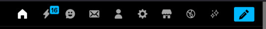
See that little fucker? How about we fuckin g kill it?
Press f12 to open the Developer Tools (or however it is called lmao)
Click on this little guy

Now you can select an element on the website, and it will show where it is in the html!
3. Point
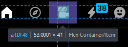
Click on it, and now we will see something like this in the inspector!
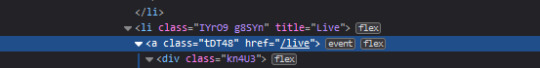
Collapse a bunch of this stuff, since here we only care about the list items, or <li>
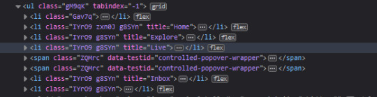
These are the different buttons in the banner
Now, how do we fucking kill that guy?
There are a number of ways to do this, so let's start with the simplest one
Delete
Just select the list item that has the title "Live" and press delete!

So it is gone now, right?
Well... not really. If you refresh the page, it is back. Which makes sense, since the only thing we did is remove that part of the "code" (if you can call html "code"), but when we refreshed it, the server gave us a version of the site that obviously had the button still there.
So what is a smarter way to get rid of it?
While you can't really delete a specific part of the site with just css, you can hide it! To do that, all you have to do is apply the style display: none;

Like that! While it doesn't fix the problem with the refresh, it brings us closer to the solution.
Remember when we got Stylus? yeah!
Go inside of it (😳), and inside the Old tumblr dashboard theme (😳😳), and now we just need to apply the css style of "remove that fucker" to the specific list item. How do we do that, since we can't add it directly into html? We use the attribute selector, and we look for title="Live"!
Where do I write this????
Well, css applies the styles from top to bottom of the style sheet (usually, this post is already too long), and you see how the list item has a few classes assigned to it? It so happens that they also modify the display property, so we have to override it by putting our selector after those in the css sheet... so basically you can just write the thingie at the end 😅
Here is how the attribute selector works!

the .IYr09 part is that specific class, so that if there is ever something on this page that has the title="Live" but isn't what we are looking for, it won't apply there (You don't need to do this, but whatever). The attribute selector is written in the square brackets, and you just... write the attribute that you are looking for there ;P
(I also did the same for the Explore button, but that can be an exercise for the interested ;P)
And now, BEHOLD
(How am I so popular that I got dms during the making of this >.<)
And it will stay like this, forever*
*except if something happens to the addon, theme, css of it or whatever, but you get the point!
#this post is too long#I could've just given the solution immediately#but this is funnier >:3#(am I on the autism spectrum? I kinda feel like it is the case tbh >.<)#Like this isn't how you write tutorials I think#whatever#css#tumblr live#fuck tumblr live#removing tumblr live#get stylus#get firefox too#idk at this point#196#pin
259 notes
·
View notes
Text
there are some work-arounds in CSS that seem so ridiculous it feels illegal.
so in CSS. selectors can be really picky with only wanting to cascade down from an element, or pick sibling elements (adjacent ones) but only after the selected one, or what-have-you - it constantly feels like you're wrestling with it if you want to do something slightly out of the way.
but you can also just apply pseudo selector to the entire HTML
so using the ":has" selector, if it finds a checkbox with this id in the entire HTML it will apply these settings


you can basically just make buttons that alter everything without any javascript like this??? this is ridiculous???
12 notes
·
View notes
Text
More QoL and UI Fixes and Updates
The Santae Team has been burning the candle at both ends (not literally!) to keep providing you all with QoL updates. The list of items to process grows steadily shorter as we are nearly halfway through this scheduled time of UI improvement. We are excited to share what new fixes have been implemented, and wonder if you may have already found some of them before this news post was released.
We again, thank all of you for your time and energy as you detailed the fixes you feel were most important for Santae going forward, we honestly could not ask more of our Beta Community.
The newest QoL and UI fixes and improvements are:
> The search feature header menu now has updated styling to match the header menus across site.
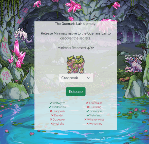
> A Dragon Minimal Checklist has been added to the Quenaris Lair. This check list will update live as you release the minimals into the lair.
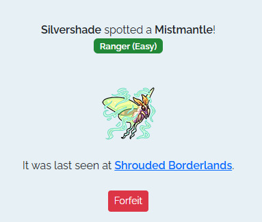
> Silvershade now links to the described land area the minimal you are seeking out is in. For example, if the minimal is in Shadow Veil Pass it will hyperlink that location. You will still need explore that region by checking the sub locations to find the minimal, but this should make your herding experience smoother.
> Users now have the ability to forfeit herding at Silvershade without needing to go find the minimal first.
> The Herding Difficulty is also displayed on the herding page for your active herding quarry:
> Similar to Fishing and Berry Picking, There is now a link on the Herding page to Minimal Menagerie to allow you to buy Tracker Treats with ease.
QoL Updates Continue
Our behind-the-scenes frenzy of Quality of Life and User Interface improvements continues with several more new updates today! This newest update has exciting news in store for our creative community of coders and designers,
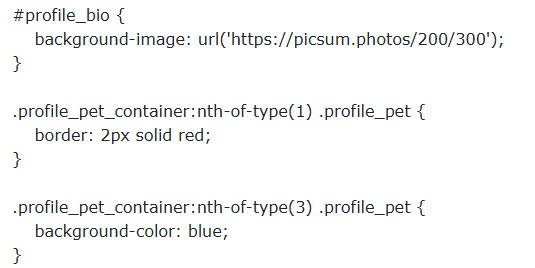
Each of the changes below have been enabled for Pet Profiles, User Profiles and User shops!
> Additional CSS properties have been whitelisted, including assorted background-* properties.
> Additional CSS selectors have been enabled too, allowing more complex designs.
> Images are now allowed in CSS!
And that's not all -- we have a few additional improvements to announce to various shops, as well as the Create-a-Pet page:
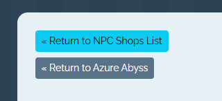
> NPC Shops now have a "Return to <location name>" button
> Multiple purchases can now be made from the Cash/Dust Shop (limit 100 per purchase)

> The Create-a-pet page now shows your total pets / pet slots whilst on cooldown.

> All of the gathering Locations are now updated to v4, which means you can use Scout Mixtures on them as the Abyssal Lake and Forgotten Cave. You can collect your currently gathering pets from the old versions of the gathering pages, which is viewable on the the Gathering List. We are aware that this has removed the Gathering Pool Lists, which are a favorite feature of our community, and will be working towards restoring them soon.
We hope you enjoy these latest updates! And the entire Santae Team would like to thank you all again for your patience and support as we continue to build Santae to be the best it can be. By sharing the fixes you wanted most, bringing bugs to our attention, and simply exploring Santae -- you're helping to make our Beta Test a big success! With Love & Gratitude, ~The Santae Team
7 notes
·
View notes
Text
Why won't my CSS style work?
Ever had that frustrating experience where your carefully crafted styles refuse to do their thing? Well, today, I am going to demystify CSS selector priority for you.
CSS selector priority
CSS selector priority determines which styles take precedence when multiple rules target the same element. It's crucial to grasp this concept to avoid unexpected styling conflicts in your web projects. There are several factors that influence selector priority, and understanding them will help you control the appearance of your web page elements effectively.
1. Specificity
Specificity is a measure of how specific a CSS selector is in targeting an element. It's often denoted as a four-part value, such as 0,0,0,0, where each part represents a different level of specificity for the selector. The more specific a selector is, the higher its priority. For example:
Inline styles have the highest specificity.
ID selectors (#element-id) are more specific than class selectors (.element-class).
Elements selectors (div, p, etc.) have the lowest specificity.
2. Importance
CSS properties marked with !important have the highest priority, even if other rules have greater specificity. However, it's generally recommended to use !important sparingly to avoid confusion and maintain a clean codebase.
3. Source Order
When all else is equal, the source order of CSS rules in your stylesheet determines which one takes precedence. The rule that appears last in the stylesheet will override previous rules targeting the same element.
Resolving CSS Priority Issues
Now let's explore how to resolve priority conflicts
1. Use Specific Selectors
To increase the specificity of your selectors, consider using more specific class or ID names. This will make your rules override less specific ones and help you maintain better control over your styles.
2. Avoid Using !important
While !important can be helpful in certain situations, it's generally best to avoid it whenever possible. Overusing !important can make your CSS harder to maintain and debug.
3. Review Source Order
If you're still facing priority issues, review the order in which your CSS rules are defined in your stylesheet. Ensure that the rule you want to take precedence appears after conflicting rules.
By following best practices and avoiding overuse of !important, you'll create more maintainable and predictable CSS code. So, the next time you wonder, "Why does my CSS priority not apply to my element?", remember what we talked about in this post.
Happy coding!
#html css#css#html5 css3#css3#code#codeblr#html#javascript#java development company#python#studyblr#progblr#programming#comp sci#web design#web developers#web development#website design#webdev#website#tech#learn to code
57 notes
·
View notes
Text
You know what, I'll bother making this post. It's long overdue.
PSA: Please don't install uBlock Origin rules for Tumblr that use :nth-of-type(), and please remove or fix any you have installed. They can and will hide the wrong things. I'll show you a few alternatives below.
First, an example of how we get here. I've used the uBlock Origin element picker to try to hide the "Get a Domain" sidebar item:
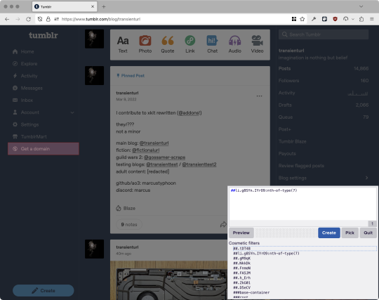
With some different adjustments of the sliders, it gave me these two snippets, one of which targeted a whole bunch of sidebar items, and the other of which selected the right one. Great, right? Read on.
www.tumblr.com##li.g8SYn.IYrO9:nth-of-type(7) www.tumblr.com##.gM9qK > li.g8SYn.IYrO9
As you can see, these both target a particular kind of sidebar item via "li.g8SYn.IYrO9"—fine—and as you can probably guess, the second one counts them all up and hides the seventh it finds.
This is bad, because what it actually hides depends on exactly how many sidebar items there are! Users can "snooze" Tumblr Live, which will make an item appear or disappear, and users with/without Ad-Free subscriptions will have or not have another. I have seen many, many people accidentally hide their activity, messages, inbox, etc using someone else's rule that's supposed to hide Live. Worse, some rules intended for e.g. recommended post carousels that use nth-of-type translate to something like "hide item number three on the dashboard no matter what it is," which will lead to a seemingly random post on your dashboard disappearing!
This isn't a problem specific to Tumblr, of course—I personally think uBlock Origin should never autogenerate these rules—but Tumblr has a ton of elements that aren't in fixed positions, so I feel comfortable wording that PSA the way I did. On a very static site, those rules might be fine. Here they almost always aren't.
So how do we fix this? First of all, as a developer of XKit Rewritten (check out @addons!), I must suggest you check if it has a feature to do what you want. Plenty of times it won't, though, and if not, we want to make a rule that hides an element based on what it is, not where it is. Here are three ways to make a robust rule:
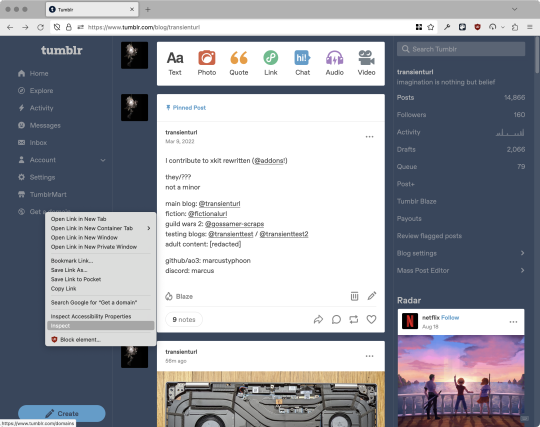
First, I'll right-click the element I want and use the inspect element tool in my browser's developer tools to look at the element I really want (Firefox and Chrome/Edge/Opera have different but overall similar interfaces for this):
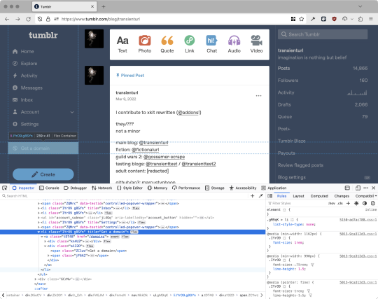
The HTML looks, for reference, like this (Tumblr sucks at code blocks but I'll try):
<li class="IYrO9 g8SYn" title="Get a domain"> <a class="tDT48" href="/domains"> <div class="kn4U3"> <svg> <use href="#managed-icon__earth"></use> </svg> </div> <div class="a132D"> <span class="ZC1wz">Get a domain</span> <!-- other unimportant stuff removed--> </div> </a> </li>
What's something unique about this element, preferably about the outermost element, and preferably contained within the <angle brackets> (HTML tags)? In this case, we have it easy: title="Get a domain" is definitely unambiguous and fulfills all of those three. If you're very familiar with web design using CSS, you'll know how to target that; if you've vaguely heard of CSS, you may be able to look at a reference sheet of CSS selectors, see [attribute=value], and figure it out, and if neither is true, I'll spoil it for you and say that we just put it in square brackets in this case.
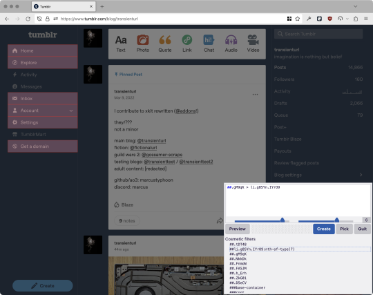
So—taking the rule uBlock Origin made, removing the :nth-of-type() and replacing it with our better selector—here's our first working, bug-free uBlock Origin rule:
##li.g8SYn.IYrO9[title="Get a domain"]
Okay, great. But what if we didn't have that attribute to target? What if our top-level element looks the same as the other ones? What if we want this rule to work if we change our Tumblr language to Spanish? Let's move on to :has().
:has() is a CSS selector (supported in uBlock Origin even in browsers where you can't use it for web development yet, i.e. Firefox), that lets you check the contents of an element for whatever is in the parentheses. Let's assume that Tumblr would never make two sidebar items with the same icon, and target that href="#managed-icon__earth" property:
##li.g8SYn.IYrO9:has([href="#managed-icon__earth"])
Yep, that works too!
Finally, what if we couldn't use either of those because we need to target the content of the page that's not contained within the <angle brackets>? We can take a look at the uBlock Origin documentation and find that it has something for that too: :has-text(). You can do very powerful things with this (e.g. you can sort of implement Blacklist entirely using uBlock Origin using something like article:has-text), but it doesn't perform well and can pretty easily be used incorrectly, so I'd suggest you avoid it when possible.
However, let's try using it here to target the "Get a domain" label text:
##li.g8SYn.IYrO9:has-text(Get a domain)
And that also works!
With these techniques, you should be able to target any specific thing you'd want to hide without using any fragile positional selectors. If you're going to share your uBlock Origin rules with others, please make use of this! If you're just using your rules for yourself, then hopefully I've given you enough information so that you can understand what a rule does and decide for yourself if it's worth bothering to fix (menu item order might not change that often, so maybe you're fine with certain rules being a bit prone to breakage; if your rule hides the first post in your timeline you really do need to fix that one!)
-
And, of course, a note for you web developers out there: :has() isn't natively supported in Firefox quite yet, so you can't really use it (I would not recommend using JQuery's simulated version—it's not quite the same). And :has-text() is just not a thing for CSS at all. Just use javascript at that point! Edit: No longer true in 2024; style away!
Final note: any rule with a random 5-character string like g8SYn will eventually break when Tumblr rebuilds its CSS map, though they haven't done that in ages. But when they do: no, it's not "Tumblr devs breaking our rules because they hate us." (Yes, I hear that sentiment a lot in contexts when it almost always makes zero sense.) If you're fairly experienced with CSS you can sometimes make Stylus/uBlock Origin rules that don't reference any, but it's usually convoluted and more trouble than it's worth.
81 notes
·
View notes
Text
my neocities site used to have a bunch of javascript.
for example, i had a page that existed to load up chapters of various stories so that you could read all of the chapters in one page, sort of like ao3's view full work feature. because it was scripted dynamically, i didn't have to maintain a separate copy of the text, and it was actually more flexible than what ao3 offers, because you could read specific arcs, heck, you could read a specific sequence of chapters (e.g., 2-13 specifically)
another thing i didn't want to maintain by hand was header at the top of the page with navigational links, so i had a script that updates them on page load.
problem is, it kind of just feels bad to load a page, then see a visible delay before the header pops in.
i spent almost a year living like that, but i eventually stopped maintaining my html by hand, and learned the joys of the static site generator.
i didn't need the chapter loader anymore, either - i could code my site generator to concatenate chapters into a full-text page, and since it's static, it'd load much faster than make the user's browser stitch together the html every time they want to open that page.
slowly but surely, everything i might've used js for was getting replaced by simpler, faster, and easier means.
i don't make much use of it, but my site actually has discord-style spoiler text. blocks of text you can click to reveal (and the css is uses currentColor, so it works even on different themes)


i don't even need javascript for this; the way i accomplish it is a bit clever:

it's a checkbox! even if you hide the actual box, you can still click the label to toggle its state
this was something i implemented early, based on this blog post where a similar trick was used for a no-js dark/light mode toggle.
but i took this to a new height this year: i added fancy footnotes

but under the hood, it's the same principle

check box to toggle the state, then some fancy css it position it to float above the text.
but of course, if i'm doing all of this without javascript, what do i need javascript for?
and there was only one feature that stuck around. it's something that i think no one really used, but i'm attached to it.
you see, i'm notorious for writing long chapters. i could split them up, but i have particular stopping points in mind. still, i am merciful, so in my stories with consistently long chapters, i'm gone out of my way to insert break points, "subchapters" seamless into the main text.

those little roman numerals would trigger a script that reformatted the page to hide all the other subchapters, and reconfiguring the next/prev buttons so that clicking them takes you to the next section rather than the next chapter
in theory, you could read Hostile Takeover as if it were a fic with 72 chapters instead of 16.
now, this is a very complex feature. you cant use checkbox tricks to emulate this, unless you want to go crazy writing a dozen css rules for every permutation of checkboxes, or force the user to figure out an arcane system where you need to uncheck one section before loading the next
but it turns out, while i wasn't paying attention, the css committee added a crazy new feature. there are :has selectors, enabling you to style elements based on the properties of elements that come below it in the document.
the whole game has changed now.
couple this with learning about :target selectors courtesy of wonder how a couple of really ambitious ao3 fics do their magic, i had everything i need
all it took to make subchapters happen now a few simple rules

really, you only need that first line. it says "if main has a target element, hide all subchapters that aren't the target"
the other lines are convenience; they had the next/prev chapter buttons if you're in the middle of the chapter. there's a couple other rules (beside the subchap nav i added a button that takes you to the top of the page, which resets the anchor target), but overall, it was quick and painless. really, the actual struggle was teaching my site generator spit out the right html. (i spent five minutes tearing out my hair and rebuilding to no effect because i forgot i had two layers of caching. whoops)
this new approach does sacrifice the ability to make the arrow buttons do double duty, but i don't think it's a big loss when the subchapter buttons are right there, and arguably retaining the single function of each button is a win for usability.
the biggest loss is that there's no real way to style the buttons differently if they've been clicked, so you don't actually know which subchapter you're actually browsing.
(maybe if anyone i actually uses this feature, they can complain to me and i'll whip up a quick bit of js to patch it :v)
but until then, i'll take some satisfaction in delete my site's scripts entirely. in a way, that's the biggest loss, but it's one of i'm proud of
2 notes
·
View notes
Text
Alright, Google is zero help with this (every variant of what I'm asking for just floods me with SEO-optimized results for exactly the opposite of what I'm looking for), so...
In my day job, I'm a web developer, mainly. I've got a good deal of experience working with HTML/CSS/JS for front-end UI development, so when I decided to build a content management system for my game project- which is going to be a bunch of pages and menus and buttons and selectors and stuff- it seemed like a natural choice to just build it as a web app, using those skills I already have. It wouldn't be hosted anywhere- the idea would be to just load index.html on localhost and work from a local browser window offline- but I figured I could prototype it pretty quickly with good old-fashioned divs and CSS.
Eeeeexcept I can't do that, actually. The purpose of the app is to manage a directory full of a bunch of structured custom content files- maps, units, sprites, yada yada yada, and lots of small individual changes will happen to a lot of different file resources. Browsers are bad for this, because they rightly have a lot of security protections against webpages accessing the user's filesystem. While I thought the File System API would just let me prompt the user for access to the content folder, and then just work with those files freely from there, that... is apparently a very experimental feature that Firefox doesn't support yet. Seems like a bad choice of thing to rest the entire functionality of the app on.
So what I'm looking for is... is there a framework somewhere for building desktop apps (so I can access local files easily) that uses HTML/CSS/JS for front-end UI development? Something like a browser that's not a browser and doesn't have those inherent security protections to get around?
41 notes
·
View notes
Text
Revisiting CSS Multi-Column Layout
New Post has been published on https://thedigitalinsider.com/revisiting-css-multi-column-layout/
Revisiting CSS Multi-Column Layout
Honestly, it’s difficult for me to come to terms with, but almost 20 years have passed since I wrote my first book, Transcending CSS. In it, I explained how and why to use what was the then-emerging Multi-Column Layout module.
Hint: I published an updated version, Transcending CSS Revisited, which is free to read online.
Perhaps because, before the web, I’d worked in print, I was over-excited at the prospect of dividing content into columns without needing extra markup purely there for presentation. I’ve used Multi-Column Layout regularly ever since. Yet, CSS Columns remains one of the most underused CSS layout tools. I wonder why that is?
Holes in the specification
For a long time, there were, and still are, plenty of holes in Multi-Column Layout. As Rachel Andrew — now a specification editor — noted in her article five years ago:
“The column boxes created when you use one of the column properties can’t be targeted. You can’t address them with JavaScript, nor can you style an individual box to give it a background colour or adjust the padding and margins. All of the column boxes will be the same size. The only thing you can do is add a rule between columns.”
She’s right. And that’s still true. You can’t style columns, for example, by alternating background colours using some sort of :nth-column() pseudo-class selector. You can add a column-rule between columns using border-style values like dashed, dotted, and solid, and who can forget those evergreen groove and ridge styles? But you can’t apply border-image values to a column-rule, which seems odd as they were introduced at roughly the same time. The Multi-Column Layout is imperfect, and there’s plenty I wish it could do in the future, but that doesn’t explain why most people ignore what it can do today.
Patchy browser implementation for a long time
Legacy browsers simply ignored the column properties they couldn’t process. But, when Multi-Column Layout was first launched, most designers and developers had yet to accept that websites needn’t look the same in every browser.
Early on, support for Multi-Column Layout was patchy. However, browsers caught up over time, and although there are still discrepancies — especially in controlling content breaks — Multi-Column Layout has now been implemented widely. Yet, for some reason, many designers and developers I speak to feel that CSS Columns remain broken. Yes, there’s plenty that browser makers should do to improve their implementations, but that shouldn’t prevent people from using the solid parts today.
Readability and usability with scrolling
Maybe the main reason designers and developers haven’t embraced Multi-Column Layout as they have CSS Grid and Flexbox isn’t in the specification or its implementation but in its usability. Rachel pointed this out in her article:
“One reason we don’t see multicol used much on the web is that it would be very easy to end up with a reading experience which made the reader scroll in the block dimension. That would mean scrolling up and down vertically for those of us using English or another vertical writing mode. This is not a good reading experience!”
That’s true. No one would enjoy repeatedly scrolling up and down to read a long passage of content set in columns. She went on:
“Neither of these things is ideal, and using multicol on the web is something we need to think about very carefully in terms of the amount of content we might be aiming to flow into our columns.”
But, let’s face it, thinking very carefully is what designers and developers should always be doing.
Sure, if you’re dumb enough to dump a large amount of content into columns without thinking about its design, you’ll end up serving readers a poor experience. But why would you do that when headlines, images, and quotes can span columns and reset the column flow, instantly improving readability? Add to that container queries and newer unit values for text sizing, and there really isn’t a reason to avoid using Multi-Column Layout any longer.
A brief refresher on properties and values
Let’s run through a refresher. There are two ways to flow content into multiple columns; first, by defining the number of columns you need using the column-count property:
Second, and often best, is specifying the column width, leaving a browser to decide how many columns will fit along the inline axis. For example, I’m using column-width to specify that my columns are over 18rem. A browser creates as many 18rem columns as possible to fit and then shares any remaining space between them.
Then, there is the gutter (or column-gap) between columns, which you can specify using any length unit. I prefer using rem units to maintain the gutters’ relationship to the text size, but if your gutters need to be 1em, you can leave this out, as that’s a browser’s default gap.
The final column property is that divider (or column-rule) to the gutters, which adds visual separation between columns. Again, you can set a thickness and use border-style values like dashed, dotted, and solid.
These examples will be seen whenever you encounter a Multi-Column Layout tutorial, including CSS-Tricks’ own Almanac. The Multi-Column Layout syntax is one of the simplest in the suite of CSS layout tools, which is another reason why there are few reasons not to use it.
Multi-Column Layout is even more relevant today
When I wrote Transcending CSS and first explained the emerging Multi-Column Layout, there were no rem or viewport units, no :has() or other advanced selectors, no container queries, and no routine use of media queries because responsive design hadn’t been invented.
We didn’t have calc() or clamp() for adjusting text sizes, and there was no CSS Grid or Flexible Box Layout for precise control over a layout. Now we do, and all these properties help to make Multi-Column Layout even more relevant today.
Now, you can use rem or viewport units combined with calc() and clamp() to adapt the text size inside CSS Columns. You can use :has() to specify when columns are created, depending on the type of content they contain. Or you might use container queries to implement several columns only when a container is large enough to display them. Of course, you can also combine a Multi-Column Layout with CSS Grid or Flexible Box Layout for even more imaginative layout designs.
Using Multi-Column Layout today
Patty Meltt is an up-and-coming country music sensation. She’s not real, but the challenges of designing and developing websites like hers are.
My challenge was to implement a flexible article layout without media queries which adapts not only to screen size but also whether or not a <figure> is present. To improve the readability of running text in what would potentially be too-long lines, it should be set in columns to narrow the measure. And, as a final touch, the text size should adapt to the width of the container, not the viewport.
Article with no <figure> element. What would potentially be too-long lines of text are set in columns to improve readability by narrowing the measure.
Article containing a <figure> element. No column text is needed for this narrower measure.
The HTML for this layout is rudimentary. One <section>, one <main>, and one <figure> (or not:)
<section> <main> <h1>About Patty</h1> <p>…</p> </main> <figure> <img> </figure> </section>
I started by adding Multi-Column Layout styles to the <main> element using the column-width property to set the width of each column to 40ch (characters). The max-width and automatic inline margins reduce the content width and center it in the viewport:
main margin-inline: auto; max-width: 100ch; column-width: 40ch; column-gap: 3rem; column-rule: .5px solid #98838F;
Next, I applied a flexible box layout to the <section> only if it :has() a direct descendant which is a <figure>:
section:has(> figure) display: flex; flex-wrap: wrap; gap: 0 3rem;
This next min-width: min(100%, 30rem) — applied to both the <main> and <figure> — is a combination of the min-width property and the min() CSS function. The min() function allows you to specify two or more values, and a browser will choose the smallest value from them. This is incredibly useful for responsive layouts where you want to control the size of an element based on different conditions:
section:has(> figure) main flex: 1; margin-inline: 0; min-width: min(100%, 30rem); section:has(> figure) figure flex: 4; min-width: min(100%, 30rem);
What’s efficient about this implementation is that Multi-Column Layout styles are applied throughout, with no need for media queries to switch them on or off.
Adjusting text size in relation to column width helps improve readability. This has only recently become easy to implement with the introduction of container queries, their associated values including cqi, cqw, cqmin, and cqmax. And the clamp() function. Fortunately, you don’t have to work out these text sizes manually as ClearLeft’s Utopia will do the job for you.
My headlines and paragraph sizes are clamped to their minimum and maximum rem sizes and between them text is fluid depending on their container’s inline size:
h1 font-size: clamp(5.6526rem, 5.4068rem + 1.2288cqi, 6.3592rem); h2 font-size: clamp(1.9994rem, 1.9125rem + 0.4347cqi, 2.2493rem); p font-size: clamp(1rem, 0.9565rem + 0.2174cqi, 1.125rem);
So, to specify the <main> as the container on which those text sizes are based, I applied a container query for its inline size:
main container-type: inline-size;
Open the final result in a desktop browser, when you’re in front of one. It’s a flexible article layout without media queries which adapts to screen size and the presence of a <figure>. Multi-Column Layout sets text in columns to narrow the measure and the text size adapts to the width of its container, not the viewport.
Modern CSS is solving many prior problems
Structure content with spanning elements which will restart the flow of columns and prevent people from scrolling long distances.
Prevent figures from dividing their images and captions between columns.
Almost every article I’ve ever read about Multi-Column Layout focuses on its flaws, especially usability. CSS-Tricks’ own Geoff Graham even mentioned the scrolling up and down issue when he asked, “When Do You Use CSS Columns?”
“But an entire long-form article split into columns? I love it in newspapers but am hesitant to scroll down a webpage to read one column, only to scroll back up to do it again.”
Fortunately, the column-span property — which enables headlines, images, and quotes to span columns, resets the column flow, and instantly improves readability — now has solid support in browsers:
h1, h2, blockquote column-span: all;
But the solution to the scrolling up and down issue isn’t purely technical. It also requires content design. This means that content creators and designers must think carefully about the frequency and type of spanning elements, dividing a Multi-Column Layout into shallower sections, reducing the need to scroll and improving someone’s reading experience.
Another prior problem was preventing headlines from becoming detached from their content and figures, dividing their images and captions between columns. Thankfully, the break-after property now also has widespread support, so orphaned images and captions are now a thing of the past:
figure break-after: column;
Open this final example in a desktop browser:
You should take a fresh look at Multi-Column Layout
Multi-Column Layout isn’t a shiny new tool. In fact, it remains one of the most underused layout tools in CSS. It’s had, and still has, plenty of problems, but they haven’t reduced its usefulness or its ability to add an extra level of refinement to a product or website’s design. Whether you haven’t used Multi-Column Layout in a while or maybe have never tried it, now’s the time to take a fresh look at Multi-Column Layout.
#:has#ADD#almanac#Article#Articles#back up#background#book#box#browser#challenge#clamp#colours#columns#container#content#course#creators#CSS#CSS Grid#css-tricks#Design#designers#desktop#developers#digitalocean#display#easy#English#Explained
2 notes
·
View notes
Text
A dark mode without JavaScript
I’ve by now been warned that the reason I had issue with a previous tumblr account may have been because I put some JavaScript onto my page. I knew Tumblr didn’t let us put JavaScript onto custom pages—I didn’t know why, but the alert came up if you tried—but there was no warning or anything when I added it to my main theme.
The JavaScript I added was just a function for a checkbox. It added a class to the body element, thus enabling some CSS for a ‘dark mode’ reader. But it doesn’t matter what the function did, you’re just not supposed to be using JavaScript at all. But Tumblr can’t just have a strict thing on their database that says “if page contains javascript, deny”, because there’s literally scripts in their own default theme. So I don’t know how this works. The detection must be less straightforward.
Weeks ago, not knowing why I couldn’t use messages and didn’t show up in search even for people following me, I made a new account, copied my custom theme onto it, started posting, and within a few hours I realized it was shadowbanned again, already. It’s possible I just instantly re-triggered whatever system they have in place by putting on the same script I was already using. It was only then I started trying to figure out what I did wrong, and after realizing it could’ve been the JavaScript the whole time, I made this account, did all the HTML and CSS changes I wanted, but haven’t added a line of JavaScript.
And so far, I’m good. This isn’t an airtight proof—it could still be a coincidence—but that does really make it seem like JavaScript was the issue. And if it was, then what the fuck? It’s effectively a secret rule, not indicated to me anywhere, and which punished me quietly without notifying me that was the issue? I know people make fun of this place for not being run well at times, but god damn.
It’s possible to implement a dark mode just using CSS. It just might not be as obvious how, and it’s a bit trickier because you need the element that triggers it to be in a specific spot in your DOM, i.e. next to an element that either is or contains everything you want to manipulate. Then you can use a sibling selector to apply rules only to things that appear next to the trigger (a checkbox is easiest).
Where that checkbox appears on-screen can then be manipulated by setting its position to absolute or fixed; it just needs to be a sibling of the container in the DOM structure.
So here’s what I did. Put a checkbox right before the “posts” container in your theme.

Then that checkbox can be made invisible. Just give it display:none. The element still ‘exists’ in a magical sense, but it doesn’t get rendered in the document. Then put a label somewhere on the page that links to this checkbox. I put mine in my nav. Unlike the checkbox, the label can be anywhere.

This isn’t a link, meaning it doesn’t highlight when you hover or click it, but you can just put it in an empty link element if you want it to look like one.

Then you just make whatever changes you want this checkbox to be activating by applying it to the posts container after the checkbox when it has the :checked pseudo-class.

#tumblr#javascript#technology#development#webdev#css#seriously why does tumblr punish you for using javascript#so sad#I mean I get it js is dangerous
2 notes
·
View notes
Note
hi! i saw your ask to robin about making a website that involves a search/tag feature that works kind of like ao3's?
i was wondering if you'd mind explaining a little about how you're doing that, cause i've recently started trying to make a website that i want to have a similar function (but for photos of Queen because. autism) and i don't really know what i'm doing
no pressure obviously, i'll probably be able to figure it out on my own, but if you'd like to help that would be cool :)
Oh my god. You're asking for the autism to be unleashed
So! Basically, most of the magic is Javascript, and I know nearly nothing of Javascript -- I write, ask AI to help correct stuff, and rewrite lmfao (I personally use SheCodes AI but I'm sure any coding-oriented bot does the same thing. It was just the top result when I searched lmfao -- it also has classes embedded in the site and can recommend you classes based on what you're asking for help on)
Also, this is... not very good. But you have my complete and express permission to build on it lmfao (for example, you can't select more than one tag at once, which is... something that I've got to figure out how to do)
But! Here's the initial CSS (image-div being the class of all searchable images): .image-div { display: none; width: 100px; height: 100px; margin: 5px; border: 1px solid #ccc; background-size: cover; }
That's the easy part. It's just styling what you want to be shown -- but, if you do want the images to be visible before they've been searched, you can delete the display: none line (I THINK. I haven't messed around with this enough to be certain)
Aaaand the HTML:
<div id="tags"> <button onclick="showImages('silly')">Silly</button> <button onclick="showImages('city')">City</button> </div> <div id="image-gallery"> <div class="image-div silly" style="background-image: url('___');"></div> <div class="image-div silly" style="background-image: url('___');"></div> <div class="image-div city" style="background-image: url('___');"></div> </div>
I made the divs themselves be the images because I was trying to save on time lol. If you wanted to have more than just images inside each div, then just code as usual inside each div (you'll have to change the CSS a bit, too -- if you still want the CSS to apply to the images inside each div, then make the selector '.image-div > img' instead of just '.image-div'... I THINK. Either that or '.image-div 'img''. Maybe. I'll have to refresh my memory, sigh)
Now, Javascript:
function showImages(selectedTag) { const allDivs = document.querySelectorAll('.image-div'); allDivs.forEach(div => { if (div.classList.contains(selectedTag)) { div.style.display = 'block'; } else { div.style.display = 'none'; } }); }
Hopefully reading through that is... somewhat self-explanatory. All it does is change the display style of the selected tags to block instead of none.
If you're an actual beginner and this all sounds like gobbledegook to you, I will gladly teach you from the beginning if you'd like lmfao
2 notes
·
View notes
Text
Basic Structure of CSS – Understanding the Foundations of Web Styling
Are you new to CSS and eager to learn how to style your web pages? Understanding the basic structure of CSS is the first step to mastering web design. CSS (Cascading Style Sheets) is a powerful tool that allows you to control the visual presentation of your HTML content. By grasping the fundamentals of CSS structure, you'll be well on your way to creating beautifully designed websites.
What is the Basic Structure of CSS?
The basic structure of CSS involves three key components: selectors, properties, and values. Together, these elements allow you to target specific HTML elements and apply styles to them.
Selectors: Selectors are used to target HTML elements that you want to style. For example, if you want to style all paragraphs on a page, you would use the p selector. CSS selectors can be simple, like element selectors, or more complex, like class and ID selectors.
Properties: Once you've selected an HTML element, you apply styles using properties. Properties define what aspect of the element you want to style, such as color, font-size, margin, padding, and more.
Values: Values are assigned to properties to define how the style should be applied. For example, if you're setting a color, the value might be red, #ff0000, or rgb(255, 0, 0). The combination of properties and values is what gives your web pages their unique look and feel.
2 notes
·
View notes
Text
CSS One-Liners to Improve (Almost) Every Project
CSS One-Liners to Improve (Almost) Every Project
#css#webdev#listicle
Most of these one-liners will be one declaration inside the CSS rule. In some cases, the selector will be more than just a simple element; in others, I will add extra declarations as recommendations for a better experience, thus making them more than a one-liner —my apologies in advance for those cases.
Some of these one-liners are more of a personal choice and won't apply to all websites (not everyone uses tables or forms). I will briefly describe each of them, what they do (with sample images), and why I like using them. Notice that the sample images may build on top of previous examples.
Here's a summary of what the one-liners do:
Limit the content width within the viewport
Increase the body text size
Increase the line between rows of text
Limit the width of images
Limit the width of text within the content
Wrap headings in a more balanced way
Form control colors to match page styles
Easy-to-follow table rows
Spacing in table cells and headings
Reduce animations and movement
Limit the content width in the viewport
body { max-width: clamp(320px, 90%, 1000px); /* additional recommendation */ margin: auto; }
Adding this one-liner will reduce the content size to occupy 90% of the viewport, limiting its width between 320 and 1000 pixels (feel free to update the minimum and maximum values).
This change will automatically make your content look much nicer. It will no longer be a vast text block but something that looks more structured and organized. And if you also add margin: auto; to the body, the content will be centered on the page. Two lines of code make the content look so much better.
Aligned and contained text looks better than a giant wall of text
Increase the text size
body { font-size: 1.25rem; }
Let's face reality: browsers' default 16px font size is small. Although that may be a personal opinion based on me getting old 😅
One quick solution is to increase the font size in the body. Thanks to the cascade and em units browsers use, all the text on a web page will automatically increase.
Larger text size makes things easier to read.
Increase the space among lines
body { line-height: 1.5; }
Another preference for improving readability and breaking the dreaded wall of text is increasing the space between lines in paragraphs and content. We can easily do it with the line-height property.
Spaces between lines break the wall of text and the rivers of white.
This choice (with the previous two) will considerably increase our page's vertical size, but I assure you the text will be more readable and friendlier for all users.
Limit the size of images
img { max-width: 100%; }
Images should be approximately the size of the space they will occupy, but sometimes, we end up with really long pictures that cause the content to shift and create horizontal scrolling.
One way to avoid this is by setting a maximum width of 100%. While this is not a fool-proof solution (margins and paddings may impact the width), it will work in most cases.
Prevent horizontal scrolling and make images flow better with the text
Limit the width of text within the content
p { max-width: 65ch; }
Another tactic to avoid the dreaded wall of text and rivers of space is to apply this style even in conjunction with the max width in the body. It may look unnecessary and sometimes weird, as paragraphs will be narrower than other elements. But I like the contrast and the shorter lines.
A value of 60ch or 65ch has worked for me in the past, but you can use a different value and adjust the max width to match your needs. Play and explore how it looks on your web page.
Break the bigger chunks of text into smaller blocks for readability
Wrap headings in a more balanced way
h1, h2, h3, h4, h5, h6 { text-wrap: balance; }
Headings are an essential part of the web structure, but due to their larger size and short(-er) content, they may look weird. Especially when they occupy more than one line. A solution that will help is balancing the headings with text-wrap.
Although balance seems to be the most popular value for text-wrap, it is not the only one. We could also use pretty, which moves an extra word to the last row if needed instead of balancing all the content. Unfortunately, pretty has yet to count on broad support.
Balanced wrapping can improve visibility and readability
Form control colors to match page styles
body { accent-color: #080; /* use your favorite color */ }
Another small change that does not have a significant impact but that makes things look better. Until recently, we could not style native form controls with CSS and were stuck with the browser display. But things have changed.
Developing a whole component can be a pain, but setting a color that is more similar to the rest of the site and the design system is possible and straightforward with this one-liner.
It's the small details (and colors) that bring the page together
Easy-to-follow table rows
:is(tbody, table) > tr:nth-child(odd) { background: #0001; /* or #fff1 for dark themes */ }
We must use tables to display data, not for layout. But tables are ugly by default, and we don't want data to look ugly. In particular, one thing that helps organize the data and make it more readable is having a zebra table with alternating dark/light rows.
The one-liner displayed above makes achieving that style easy. It can be simplified to be only tr without considering the tbody or table parent, but it would also apply to the table header, which we may not want. It's a matter of taste.
Easier to follow the data horizontally (by row)
Spacing in table cells and headings
td, th { padding: 0.5em; /* or 0.5em 1em... or any value different from 0 */ }
One last change to make tables more accessible and easier to read is to space the content slightly by adding padding to the table cells and headers. By default, most browsers don't have any padding, and the text of different cells touches, making it confusing to differentiate where one begins and the other ends.
We can change the padding value to adjust it to our favorite size. However, avoid overdoing it to avoid unnecessary scrolling or too much blank space.
Easier to follow data horizontally and vertically
Reduce animations and movement
@media (prefers-reduced-motion) { *, *::before, *::after { animation-duration: 0s !important; /* additional recommendation */ transition: none !important; scroll-behavior: auto !important; } }
Okay, okay. This code is way more than a one-liner. It has a one-liner version (removing animations by setting their duration to zero seconds), but other things on a web page make elements move.
By setting these declarations inside the prefers-reduced-motion media query, we will respect the person's choice to have less movement. This approach is somewhat radical because it removes all movement, which may not necessarily be the user's intent -it is "reduced motion" and not "no motion." We can still preserve movement on a case-by-case basis if appropriate.
No animations? No problem!
2 notes
·
View notes
Note
i am the person who originally let lolita know that you had been taking credit for her apocrypha skin. honestly the fact that you're doubling down and insisting that you coded your site's skin is wild. i literally recognized the apocrypha skin immediately when i saw your site. someone else let me know and was like, "huh wow, isn't this lolita's skin?"
this isn't "inspiration" this is stealing. you may want to look into the difference between inspiration and ripping. Hope this helps.
Thanks for outing yourself I guess.
In coding parlance, the difference between ripping and inspiration is that ripping is taking the raw code without editing it or editing it minimally. Reverse engineering something to perform the same task is generally not considered ripping.
I am also a designer (my degree is in digital media) and I am not denying that Lolita is essentially the visual designer of the skin. She is still credited on the site. However she did not code NOX's skin.
This is the forum row code from the Apocrypha skin:

I'm using the inspect element tool here because I want you to see all that css in the forum rows (and I took that out of there immediately, even when we did have the Apocrypha skin). I also want you to see how the code is laid out. Notice how Lolita uses flex and :after and :before selectors.
This is NOX's forum row code:

Does it look even remotely the same? I use grid to achieve my layout. Instead of using a bunch of css in the forum rows, I have a second class assigned to the forum (that's what "right-half" is and it's assigned using javascript). I only use flex for alignment because i hate it, and instead of using :after to create gradient underlines, I use an entire class, because then I only have to style it once and if I want to change it, I only have to change that class.*
I did not want to bring it up, because most of the coders in the Jcink community are self taught, but the reason I rewrote NOX's skin is because it was difficult to work with and if I wanted to modify one thing, I then had to go through the entire skin and modify several other things to fix it.
I understand that you want to help your friend, but you are not helping anyone by making assumptions and not even asking for an explanation. Instead of doing that you could have asked for my side of the story at any time.
*not directly relevant but the reason our skin is styled like this is because we also allow our members to choose their own gradients for their character accounts, which you can see in the main member profiles. When I was skinning the site, we were unsure whether we would be allowing the entire site to change colour depending on which character you were logged into.
#jcink rpc#zach does design#zach does explaining things very simply for people who cannot find the show source button#jcink skins
1 note
·
View note
Text
How To Make Multiple Choice Quiz In Html Code

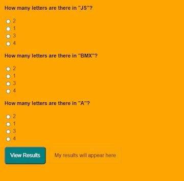
first, you play Multiple Choice Questions (MCQ) Quiz and then click on View results The results page will then be shown. This Multiple Choice Questions (MCQ) Quiz will be finished using JavaScript Code, a powerful language that allows for anything.
100+ JavaScript Projects For Beginners With Source Code
Live Preview Of Multiple Choice Questions Source Code and Preview:-
As you are looking in the project preview how the thing is organized.
Following is the feature of our project:-
We have arranged the Questions and options in the list format using the tag.
Then we set the option using span and defining the radio button and giving the appropriate value.
Multiple Choice Quiz Html Code:-
Now I’ll be telling you to define the structure using HTML. Not from scratch, just the code which is under the body tag.
We have the following part in the HTML section:
Portfolio Website Using HTML CSS And JavaScript ( Source Code)
First, we call the ul class which we have defined the class as a quiz.
Then using the tag we have set our question in the tag.
Then we used a label tag and called the radio button given the value and using span we have given the answer.
Similarly, we have done this for all the options and for all the questions.
Go through the code below and run it in our IDLE before CSS Styling.
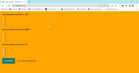
<ul class="quiz"> <li> <h4>How many letters are there in "JS"?</h4> <ul class="choices"> <li> <label ><input type="radio" name="question0" value="A" /><span >2</span ></label > </li> <li> <label ><input type="radio" name="question0" value="B" /><span >1</span ></label > </li> <li> <label ><input type="radio" name="question0" value="C" /><span >3</span ></label > </li> <li> <label ><input type="radio" name="question0" value="D" /><span >4</span ></label > </li> </ul> </li> <li> <h4>How many letters are there in "BMX"?</h4> <ul class="choices"> <li> <label ><input type="radio" name="question1" value="A" /><span >2</span ></label > </li> <li> <label ><input type="radio" name="question1" value="B" /><span >1</span ></label > </li> <li> <label ><input type="radio" name="question1" value="C" /><span >3</span ></label > </li> <li> <label ><input type="radio" name="question1" value="D" /><span >4</span ></label > </li> </ul> </li> <li> <h4>How many letters are there in "A"?</h4> <ul class="choices"> <li> <label ><input type="radio" name="question2" value="A" /><span >2</span ></label > </li> <li> <label ><input type="radio" name="question2" value="B" /><span >1</span ></label > </li> <li> <label ><input type="radio" name="question2" value="C" /><span >3</span ></label > </li> <li> <label ><input type="radio" name="question2" value="D" /><span >4</span ></label > </li> </ul> </li> </ul> <button class="view-results" onclick="returnScore()">View Results</button> <span id="myresults" class="my-results">My results will appear here</span>
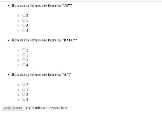
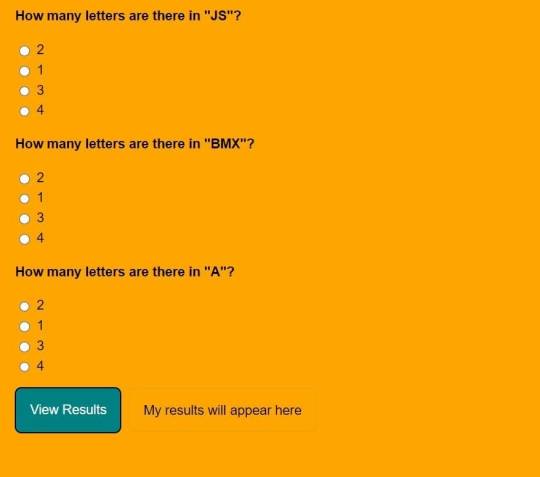
CSS Code For Styling Multiple Choice Quiz:-
By CSS design we will design our whole page here it is just a quiz so we’ll just add a background color, color to the button, and font family for the whole body.
And set the padding of the questions and options so that it doesn’t get messy and looks in a systematic order.
10+ Javascript Project Ideas For Beginners( Project Source Code)
The analysis will be aided by the CSS code below. After adding this file to your link rel-tag, wait for the results. We will add some of the basic styling to our quiz app using the default selector, and we will add styling to various quiz app elements using the class selector.
this is simple css code. we do not add any heavy css code because our main aim is to create Multiple Choice Questions (MCQ) functionality. if you need more Better Ui you can add more css code in this css section.
JavaScript Multiple Choice Quiz Code:-
In the JavaScript Code of Multiple Choice Quiz section, we will add logic for initializing our page. The logic must know what is correct and incorrect, So we’ll define there the correct option and then we’ll set that when the user clicks on the button the logic will generate and tell the user about his/her score.
Restaurant Website Using HTML and CSS
Through this blog, we have learned how to design Multiple Choice Quizzes using HTML, CSS & JavaScript.
Final Output Of Multiple Choice Quiz in HTML and JS Code:
Now I’m looking for some positive reviews from your side.
So, How was the blog Learners,
If you want a more interesting blog like this then please check our Blog sites. Stay tuned because every day you will learn something new here.
I hope that I’m able to make you understand this topic and that you have learned something new from this blog. If you faced any difficulty feel free to reach out to us with the help of the comment box and if you liked it, please show your love in the comment section. This fills bloggers’ hearts with enthusiasm for writing more new blogs.
Ecommerce Website Using Html Css And Javascript Source Code
Happy Coding
click and get full article and get complete source code
That’s it, folks. In this article, we shared 10+ Portfolio Website templates with cool and different designs.
Hope you liked this article. Share this with your fellow developers. Comment down below your thoughts and suggestions, we would love to hear from you.
See our other articles on codewithrandom and gain knowledge in Front-End Development.
Thank you and keep learning!!
follow us on Instagram: Ashutosh Mishra
2 notes
·
View notes
Text
The Path to Selenium Proficiency: How Long Does It Take to Master?
Learning Selenium, a widely-used automation testing tool for web applications, is a goal many aspiring software testers and developers share. However, the journey to Selenium mastery varies from person to person and depends on several factors. These factors include prior experience in programming and testing, the complexity of the web applications to be automated, and the depth of knowledge one wishes to acquire. In this comprehensive guide, we will explore the typical timeframes required to learn Selenium at various levels of proficiency. We will also discuss the importance of structured training and how institutions like ACTE Technologies play a vital role in expediting the learning process.

The Roadmap to Selenium Proficiency:
1. Basic Understanding (1-2 Weeks):
Prior Experience: If you have a foundational understanding of software testing concepts and some programming experience, you're off to a good start. With this background, you can expect to grasp the basics of Selenium in approximately 1-2 weeks.
What to Learn: During this phase, you'll learn how to set up Selenium, write simple scripts, and perform basic web automation tasks. You'll become acquainted with Selenium WebDriver, a core component for automation, and its functions. This is where your Selenium journey begins.
2. Intermediate Level (2-3 Months):
Prior Experience: If you are relatively new to programming or testing, or if you need to work on more complex web applications, you might need more time to reach an intermediate level.
What to Learn: The intermediate phase involves a deeper dive into Selenium. You'll master various locators like XPath, CSS selectors, and more, which help you identify and interact with web elements on a page. You'll also learn how to handle different types of web elements, such as buttons, text fields, and dropdowns. Additionally, this is the stage where you can explore test frameworks like TestNG or JUnit, which work well with Selenium and help you manage and organize your test cases more effectively.
3. Advanced Topics (3-6 Months):
Prior Experience: If your goal is to become proficient in Selenium and handle complex web scenarios, such as handling frames, alerts, dynamic content, and complex web elements, this phase may take 3-6 months of consistent learning and practice.
What to Learn: In the advanced phase, you'll delve into the intricacies of Selenium automation. You'll learn how to handle web elements within frames and deal with browser alerts and pop-ups. You'll gain expertise in automating complex web elements like tables and dynamic content. This is the stage where you can work on more challenging real-world projects and gain hands-on experience.
4. Best Practices and Advanced Techniques (6 Months+):
Prior Experience: To truly excel and apply best practices for test automation, code organization, maintainability, and reporting, your Selenium journey becomes a continuous learning process that extends beyond 6 months.
What to Learn: In this phase, you'll go beyond basic automation tasks and focus on optimizing your Selenium scripts. You'll learn how to create a robust automation framework that can be applied to various projects. This phase involves exploring advanced techniques, tools, and methodologies for test automation. Continuous learning and improvement are essential as the field of test automation is continually evolving.

In your pursuit of Selenium proficiency, the timeline for learning varies based on your prior experience and the level of mastery you aim to achieve. Whether you're aiming to grasp the basics or delve into advanced automation techniques, your journey to Selenium mastery can span from a few weeks to several months. Throughout this learning process, ACTE Technologies stands as a valuable partner, offering structured training programs that cater to learners at all levels. These programs provide hands-on experience and real-world examples, ensuring you gain practical skills in Selenium automation. ACTE Technologies is your catalyst for efficiently achieving your Selenium learning goals.
4 notes
·
View notes
Note
the unfucker is. currently a bit fucked itself lol
also this header thing is sticky and its annoying
what's causing this is that the selector that modifies the page header css (the thing taking up a whole screen in the first image) is somehow instead modifying the timeline header, which is why the page header isn't sticky and the timeline header is. i tested my code on three different blogs, but you must have some feature settings enabled that modify the timeline header that none of the blogs i tested had. can you send me a screenshot of this section of the page html?
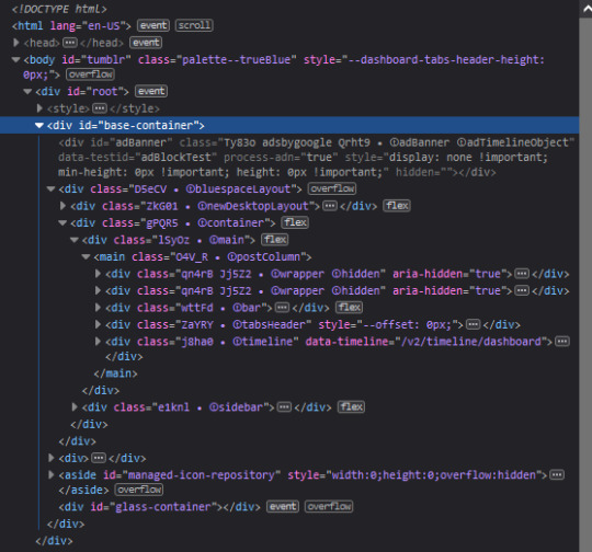
and also the json object printed at or near the top of the console that's labelled as dashboard-unfucker.user.js:37:21?

3 notes
·
View notes