#CSS Gradient Button Animation
Explore tagged Tumblr posts
Visit Tumblr Blog
Explore Tumblr blogs with no restrictions, modern design and the best experience.
Last Seen Tumblr Blogs


Fun Fact
China blocked Tumblr because of pornography and censorship problems in 2013.
Text
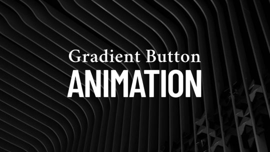
CSS Gradient Button Animation
#CSS Gradient Button Animation#css gradient#css animation examples#css animation tutorial#css animation snippets#html css#css#frontend#css buttons#neduzone
1 note
·
View note
Text
CSS Gradient Border Button
#css gradient button#html css buttons#gradient border button#css gradient#css effects#pure css effects#html css#frontenddevelopment#code#css#pure css animation#html5 css3#codenewbies#html and css
1 note
·
View note
Text
CSS Gradient Button Hover Animation
#Pure CSS Gradient Button Hover Animation#css button hover animation#css buttons#social media button hover#pure css animation#html css#divinectorweb#code snippets#learn to code#code
0 notes
Text
What Is Cross-Browser Testing? A Complete Guide for Seamless Web Experiences

In today’s fast-evolving digital landscape, users access websites from a wide array of devices, operating systems, and browsers. From Chrome and Firefox to Safari and Edge—each browser interprets your website code slightly differently. This is where Cross Browser Testing becomes essential.
This blog dives deep into what cross browser testing is, why it matters, what features it covers, and how to do it effectively—ensuring your website delivers a consistent, bug-free experience across all platforms.
What is Cross Browser Testing?
Cross Browser Testing is a type of non-functional testing that verifies whether a web application functions and appears correctly across different web browsers, browser versions, and devices.
It helps developers and QA engineers ensure that:
The UI renders consistently
Core functionalities work correctly
There are no browser-specific bugs or issues
Cross browser testing is not just about aesthetics—it’s about ensuring usability, performance, and accessibility for all users, regardless of how they access your website.
Why is Cross Browser Testing Important?
If you’re only testing your website on Chrome, you’re missing the bigger picture.
Here’s why cross browser testing is crucial:
1. Diverse User Base
Your users might be on Chrome, Safari, Firefox, Edge, or Opera, and using different devices like desktops, tablets, or smartphones. Testing across these ensures everyone has a uniform experience.
2. Browser Rendering Engines Differ
Browsers like Chrome (Blink), Safari (WebKit), and Firefox (Gecko) interpret HTML, CSS, and JavaScript differently. Even a small deviation in rendering can lead to layout breakages or functionality issues.
3. Prevent Loss of Traffic and Conversions
A buggy checkout page on Safari or broken navigation on Firefox can significantly hurt conversion rates and user trust.
4. SEO and Accessibility
Search engines value user experience. Broken layouts or slow load times on certain browsers can negatively affect SEO performance and bounce rates.
What Features are Analyzed in a Cross Browser Test?
Here are the key features and areas evaluated during cross browser testing:
✅ 1. Layout and Design Consistency
CSS rendering
Font sizes, spacing, padding
Media queries and responsiveness
Grid and flex layouts
✅ 2. JavaScript Functionality
Form validation
Dynamic content rendering (DOM updates)
Event handling
Navigation toggles
✅ 3. HTML5 and CSS3 Compatibility
Audio/video elements
Animations
Flexbox, grid, shadows, gradients
✅ 4. Third-Party Integrations
Plugins (chatbots, tracking tools)
Embedded maps or videos
Social sharing buttons
✅ 5. Performance and Speed
Load times across browsers
JavaScript execution speed
Rendering behavior
✅ 6. Security and Cookie Behavior
HTTPS redirection
Local storage and session cookies handling
How is Cross Browser Testing Done?
Cross browser testing can be performed manually or via automation tools. Here's a step-by-step guide:
Step 1: Define Your Browser Coverage
Choose browsers based on:
Your website’s Google Analytics browser report
Global browser usage statistics
Market demographics (e.g., Safari for iOS users)
Example Browser Matrix:

Read also: How Playwright Enhances Cross-Browser Testing Efficiency
Step 2: Set Up Your Test Environment
You can use:
Real Devices: For high accuracy
Emulators/Simulators: Quick tests for layout
Cloud Testing Platforms like:
BrowserStack
Sauce Labs
LambdaTest
CrossBrowserTesting.com
Step 3: Run Tests (Manual or Automated)
🔹 Manual Testing
Test scenarios using real devices and browsers, inspecting UI and performing tasks manually.
🔹 Automated Testing
Use frameworks like:
Selenium
Playwright
Cypress
TestCafe
Automation helps:
Reduce testing time
Run tests in parallel
Integrate with CI/CD pipelines
Step 4: Log and Fix Issues
Document browser-specific bugs, prioritize them, and retest after fixes.
Step 5: Continuous Cross Browser Testing
Use CI tools (Jenkins, GitHub Actions, GitLab CI) to schedule tests automatically on every build or code change.
Best Practices for Cross Browser Testing
✅ Always test on real user data (Google Analytics insights)
✅ Prioritize critical user flows first
✅ Automate repetitive tests, but don’t skip manual exploratory testing
✅ Regularly update browser versions in your testing matrix
✅ Perform regression testing after any major frontend update
Conclusion
Cross Browser Testing is not optional—it’s a necessity in today’s fragmented web ecosystem. Ensuring that your application works flawlessly across all major browsers not only boosts user experience and trust but also strengthens your brand’s credibility
As a leading Web application testing company, at Testrig Technologies, we specialize in comprehensive Cross Browser Testing Services that guarantee flawless digital experiences on any browser, device, or OS. Whether you're launching a new site or scaling an existing one, our QA experts are here to help.
0 notes
Text
Ao3 HTML/Coding References-Part I
I recently made a code-heavy choose your own adventure fic, and I wanted to compile all of the really helpful resources I've found along the way. Basics, Text altering and Fancy Formatting (adding dividers, columns, photos, videos, tabs etc.) is below!
(Note: I've had to split this in two, so see Part II for all the website mimic HTML)
Basics:
This Ao3 Posting Doc converts Google doc into HTML, adding bold, underline, italics, strikethrough, paragraph breaks, and centered text. Major game changer for heavy HTML works
The Fic Writer's Guide to Formatting by AnisaAnisa: This is a masterpost in itself, covering links, images, boxes, borders, fonts etc. So I'm putting it here since it's amazingly helpful
HTML References by W3 schools- I've linked the HTML colors here, but this is a platform designed to help people learn/reference HTML
Ao3's own guide to HTML on their site Lovely Q&A for Ao3 specific HTML questions
A Guide to Ao3 HTML by Anima Nightmate (faithhope) This walks through what HTML code means SO WELL!
Text resources: (altering the color, font, emoji, style etc.)
Font's chapter: The Fic Writer's Guide to Formatting: okay I know I already linked it above, but listen it's very good so I'm linking again
Fonts colors and work skins oh my by Charles_Rockafeller takes fonts to a different level.
Multicolored text skin by ElectricAlice GRADIENT TEXT
All the Emoji by CodenameCarrot while Ao3 has signifigantly improved on hosting emojis, this code helps with using some more unconventional emojis. Amazing resource.
Upsidedown text and Zalgo text generators - these specific text generators allow for you to see their direct HTML codes
Fun CSS Text Effects by DoctorDizzyspinner
Workskin for showing and hiding spoilers by ElectricAlice makes text appear when hovered/clicked. Amazing for Trigger Warnings
Make text appear when you click [Work skin] by Khashana clickable end notes buttons for your work, similar to the spoiler button text
Hide spoilers like Discord by Professor_Rye
Desktop/mobile friendly short tooltips workskin by Simbaline
How to make Linked Footnotes on Ao3 by La_Temperanza
User-selectable Names in a Fanfic work by fiend Ever want people to select between different names in a fanfic? I could also see this used as ability to switch gender in a fanfic.
AO3 Comic Text Effects using CSS by DemigodofAgni Ever want a giant comicbook POW in your fic?
How to override the Archive's Chapter Headers by C Ryan Smith
Collection: CSS Guides by Goddess_of_the_arena (many helpful text walkthrough resources)
Fancy Formatting {Note: this got long so I split it up into more manageable sections}
Coding Masterpieces (Multiple things within the same fic)
Personal Experiment with HTML and CSS by MohnblumenKind This has a variety of help, Chapter 6 & 7 were great for choose your own adventure, Chapter 4 talks about columns and skins, and Chapter 10 even has a newspaper made entirely from site code.
Repository by gaudersan google searches, ao3 stats, instagram and text messages galore
CSS in Testing/Bleed Gold by InfinitysWraith Masterclass in cool formatting, including overidding default headers, Doors opening animation, Grid interactive photos, Hovering to change a photo, Retroactive text etc.
CSS in Testing:Second in Series by InfinitysWraith: Interactive keypads, Mock news site and interactive locking mechanism.
Coding Encyclopedia by Anonymous: chess, opening html envelopes, functioning clocks, HTML Art– this book is genuinely the most advanced stuff I’ve seen with HTML code on Ao3– and I’ve looked at every guide on this list.
Decorations (Boxes, Dividers, letters/background)
How to mimic letters, fliers and stationary without using images by La_Temperanza Really helped with box formatting
Decorations for Fic (HTML/CSS): Fanart, Dividers, Embedded Songs and More by Jnsn this has SO MANY cool coding features, including a chessboard that moves when you hover over it
Build a divider tool demo by skinforthesoul
How to make custom Page Dividers by La_Temperanza
Found Document work skin by hangingfire
Embedding other formats: (Images, gifs, youtube videos, audio, alt text)
Embed that Audio by Azdaema
Newbies guide to Podficcing by Azdaema
Embedding youtube videos on ao3 to scale with the screen by pigalle add youtube videos mid fic
Conlangs and Accessibility by Addleton this fic instructs how to have accessible translations in fic
How to make Images Fit on Mobile Browsers by La_Temperanza great image adding code
How to Wrap text around images by La_Temperanza image text wrapping
How to put pictures and gifs on Ao3 from Google Drive by gally_hin
Choose Your Own Adventure Code
How to make a Choose Your Own Adventure Fic by La_Temperanza allows for clickable links and hidden text.
Interactive fiction Workskin Tutorial by RedstoneBug BEST CHOOSE YOUR OWN ADVENTURE RESOURCE
How to make your fic look like the game by MelsShenanigans, ThoughtsCascade (I was a Teenage Exocolonist is the game but it’s a Choose your own adventure re-skin)
Newspaper/Article/Blog mimic
How to make a News Website Article Skin on Ao3 by ElectricAlice
Newspaper/Magazine Article Template by deathbymistletoe
Newspaper Article by lordvoldemortsskin --basic but adaptive for mobile
Newspaper Article Adaptation by KorruptBrekker modification for different columns
TMZ WorkSkin by Anonymous
Basic blogpost skin by Anonymous
Blog Post Work Skin by Anonymous
Journaling App by egnimalea
Email Mimic
How to insert Gmail emails in your fic by DemigodofAgni
How to mimic Email Windows by La_Temperanza
Gmail Email Skin by Sunsetcurbed
The idiot’s incoherent guide for learning css & html for ao3 in dystopia by anonymous (Gmail skin)
Search Engine Mimic
Google Search Suggestions Work Skin and Tutorial by Bookkeep
Baidu Search History Work Skin by Bookkeep
Repository by gaudersan
Misc. General formats with HTML (mission reports, spreadsheets, other documents)
Screenplay skin by astronought
Screenplay workskin by legonerd
Mock Spotify Playlist WorkSkin by Anonymous
How to make a rounded playlist by La_Temperanza Ever want to show a character's music playlist within your fic
Workskin for in Universe Investigative/Mission Report with Redaction by wafflelate case files/CSI reports
Learn to Microsoft Excel by ssc_lmth insert a spreadsheet in your fic
Ao3 Work skin: a simple scoreboard by revanchist shows how to code a scoreboard
Colossal Cave Adventure by gifbot Working Keyboard anyone?
Tabbing experiment by gifbot (clickable tabs)
Bonus: Ever wanted to see how crazy HTML can be on AO3? Try playing But can it run Doom? or Tropémon by gifbot
Happy Creating!
Last updated: Dec 28 2024 (Have a resource that you want to share? My inbox is open!)
See Part II for Website Mimics here!!
#html coding#archive of our own#ao3 fanfic#fanfic#fanfiction#ao3 writer#ao3#ao3 author#fanfic writing#fanfic authors#fanfic ideas#ao3fic#fanfics#archive of my own#fanfic help#fanfic coding
967 notes
·
View notes
Text
Wrapping up Slots!Slots!Slots!
Whoops, forgot to update.
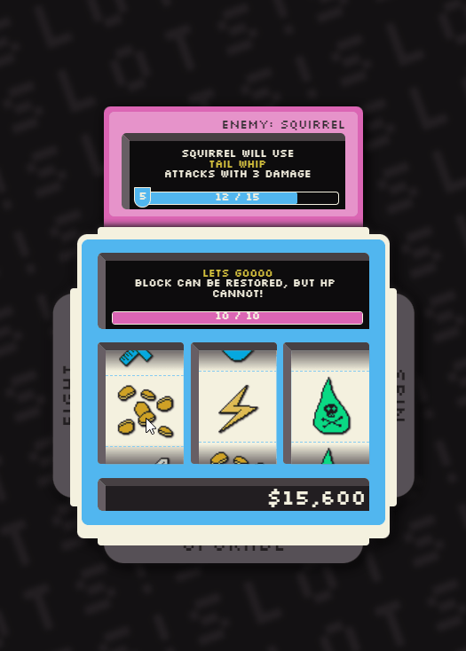
Last year, I got this project far enough along where I could put it down for a while. Getting to this point was pretty challenging, from a UX and game-design aspect . Combining a fighting mechanic with abilities, money, spins, and upgrades was pretty difficult to do. Ultimately what helped the most was animating the attack phase, so it's a lot more clear to the user what is actually happening. After emphasizing the buttons, and giving everything of a bit more juice, things seem a lot clearer and more cohesive
For now, the game works, I hope to revisit it soon, now that it's been over a year, all it needs is some levels and balancing and it should be good to go.
The work in-between
There was a lot of trial and error to get to get to the final design, here's some iteration since the previous post, where i first implemented the fighting concept.
For a while, leaning into some kinda simple, but skeuomorphic concept (with plates and rivets, maybe eventually screws could be rendered with css). I was trying to make the backgrounds change color when you won, or based on the level or powerup, but things were getting really confusing. The enemy needs to be really distinct here, and when it wasn't the only red thing, everything was getting really difficult to read. Even here, the HP of the player matches the color of the enemy, so it's still wonky. There is also a slow-rolling sheen on the metal, this was accomplished by animating some linear gradients in css.
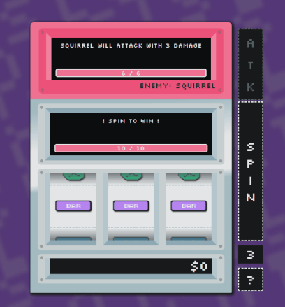
Here I was trying to make the experience work better for mobile, and attempting to make fewer interactions
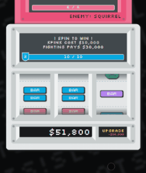
After giving up on the box concept, switched to something more like a slot machine that would sit on a bar-top. You can see how I was spiraling out of control with figuring out a good color palette.

1 note
·
View note
Text
100+ Navigation Bar HTML and CSS (Free Demo +Source Code)
Navigation Bar Using HTML and CSS
Hello Developers! Welcome to Codewithrandom with another informative blog. Today we’ll see how to make a Navigation Bar with Source Code. Here is the Latest Collection of free Navigation Bar codes in HTML and CSS. This is the Updated Collection of April 2023 with 36 New Navbar Source codes added.
What is a navigation bar?
A Navigation bar or a side menu is an integral part of any website, used for quick navigation links, a search bar, login/signup links, company logos, etc. Without a Navbar, any website looks incomplete.
Here we’ll show you how to create a Simple Navigation Bar In HTML and CSS with 100+ examples.
Related article — 100+ HTML, CSS, and JavaScript Projects With Source Code ( Beginners to Advanced)
Restaurant Website Using HTML And CSS With Source Code
Let’s see some cool Navigation bars in HTML and CSS.
1. Responsive Side Navigation Bar
Let’s start our list with a simple, light-themed left-sided navigation bar. Only navigation bar icons are visible on load but on clicking the hamburger icon side bar expands.
2. Bootstrap Navigation Bar
Simple and responsive navigation bar. This one is on top with several different categories and also a search bar. Additionally, it also has a login and signup button.
How To Build Interest Calculator Using JavaScript
3. Transparent Navigation
This is a very well made Navigation bar by Manas Yadav, when you click a navigation bar button it auto scrolls to its location on the page. Can be used for homepages.
4. Sticky Slider Navigation (Responsive)
Another navigation bar auto-scrolls but this one is even better with more satisfying animations and design.
5. Navigation bar design
A navigation bar with a gradient in its background with a cool gradient and blinking effect on hover.
That’s it, folks. In this article, we shared the Navigation Bar In HTML And CSS Source Code with cool and different designs. We covered everything from simple and minimal Navigation bars to bars with auto scrolls, cool transitions, and even 3D icons. Hope you liked this article. Share this with your fellow developers. Comment down below with your thoughts and suggestions
See our other articles on Codewithrandom and gain knowledge in Front-End Development.
Thank you
read full article and get complete source code
1 note
·
View note
Text

CSS Glowing Button
#html css buttons#css button hover effects#html css#neduzone#css gradient#css glowing buttons#css animation examples#glowing button html css#css#html#css3#frontend#frontenddevelopment
0 notes
Text
Shadow Play: Mastering Box Shadow in CSS

Introduction
Welcome to the world of shadows in web design! In this blog post, we'll delve into the fascinating realm of box shadows in CSS and how mastering them can elevate your design game. Box shadows add depth, dimension, and a touch of magic to your web elements, making them visually appealing and modern. Whether you're a beginner looking to grasp the basics or an experienced developer seeking advanced techniques, this guide will walk you through the ins and outs of box shadows. Get ready to unlock the full potential of this powerful CSS feature and add a captivating layer to your web projects.
Understanding Box Shadow
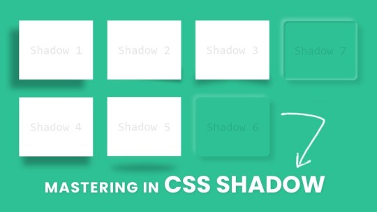
Box shadow is a versatile CSS property that allows you to add visual depth and dimension to elements on your webpage. It creates the illusion of elements lifting off or casting shadows, contributing to a more immersive and engaging user experience. Let's break down the key components of the box shadow property: - Color: The color of the shadow, specified in a variety of ways, such as named colors, hex codes, or RGB values. - Blur: The blur radius determines how blurry or sharp the shadow appears. A higher value results in a softer, more diffused shadow. - Spread: This property controls the size of the shadow. A positive value increases the size, while a negative value decreases it. - Inset: An optional keyword that creates an inner shadow, giving the appearance that the element is pressed into the page. Here's an example of a basic box shadow declaration: CSS.box { box-shadow: 10px 10px 20px #888888; }
Creating Basic Shadows
Now that we've laid the groundwork for understanding box shadows, let's dive into creating some basic shadows to enhance the visual appeal of your web elements. Creating a basic shadow involves specifying the color, blur, and spread properties to achieve the desired effect. Here's a step-by-step guide to creating a basic box shadow: - Choose the Element: Select the HTML element to which you want to apply the box shadow. This could be anything from buttons to cards or images. - Define the Shadow: Use the box-shadow property in your CSS to define the shadow. For example: - CSS.basic-shadow { box-shadow: 5px 5px 10px #333333; } CSS.radial-shadow { box-shadow: radial-gradient(circle, #4CAF50 0%, transparent 100%) 10px 10px 20px; }
Optimizing for Performance
See the Pen CSS Box Shadow Examples by vavik (@vavik96) on CodePen. While box shadows can enhance the visual appeal of your website, it's crucial to consider performance optimization to ensure a smooth and efficient user experience. Implementing box shadows irresponsibly can lead to increased page load times and negatively impact overall performance. Here's a guide on how to optimize box shadows for better performance: - Limit the Use of Shadows: Avoid applying box shadows to a large number of elements on a page. Excessive shadows can contribute to increased rendering times and slower performance. Reserve shadows for key elements that genuinely benefit from the visual enhancement. - Use Conservative Shadow Values: Opt for smaller blur radii and spread values, especially for shadows that don't require a pronounced effect. Smaller values contribute to faster rendering times while still providing a subtle visual lift. - Avoid Animating Shadows: Animating box shadows can be resource-intensive. If possible, limit or avoid shadow animations, particularly on elements that are frequently interacted with or visible on the screen. - Consider CSS Hardware Acceleration: Leverage hardware acceleration for smoother rendering. This can be achieved by applying shadows to elements that have their own GPU layers, such as elements with the CSS property transform: translateZ(0);. Additionally, here's a quick reference table summarizing key optimization tips: Optimization TipDescriptionLimit the Use of ShadowsAvoid excessive application of box shadows to maintain optimal performance.Use Conservative Shadow ValuesOpt for smaller blur radii and spread values for faster rendering.Avoid Animating ShadowsMinimize or avoid animations on box shadows for improved performance.CSS Hardware AccelerationApply shadows to elements with GPU layers for smoother rendering. By following these optimization techniques, you can strike a balance between visual enhancement and website performance. Remember, thoughtful and judicious use of box shadows contributes to a polished design without compromising speed and responsiveness.
Practical Applications
Now that you've honed your skills in mastering box shadows, it's time to explore practical applications where these subtle yet powerful design elements can make a significant impact on your website. Let's delve into real-world examples of how box shadows can enhance various elements and contribute to a visually appealing user interface. - Card Components: Implement box shadows on card components to create a sense of elevation and separation from the background. A subtle shadow can make cards appear as if they are floating, adding a modern touch to your layout. - Buttons: Apply box shadows to buttons to make them visually stand out and convey a sense of interactivity. Experiment with shadow intensity to find the right balance between a subtle lift and a more pronounced 3D effect. - Images and Thumbnails: Enhance the presentation of images and thumbnails by adding shadows. This technique provides a subtle border and makes the images pop on the page, especially when placed on a light background. - Navigation Menus: Use box shadows to distinguish navigation menus from the rest of the content. Shadows can help create a layered effect, making it clear that the navigation is a separate and interactive element. Here's a quick reference table summarizing practical applications of box shadows: ElementPractical ApplicationCard ComponentsCreate elevation and separation with subtle box shadows.ButtonsEnhance interactivity by applying shadows to buttons.Images and ThumbnailsAdd a subtle border and make images stand out with shadows.Navigation MenusDistinguish menus with layered effects using box shadows. As you integrate box shadows into these elements, remember to maintain a consistent design language throughout your website. Striking the right balance between visual enhancement and coherence contributes to a seamless and aesthetically pleasing user experience.
Common Mistakes to Avoid
While mastering box shadows can significantly enhance your web design, it's essential to be aware of common pitfalls that can lead to unintended and undesirable outcomes. Steering clear of these mistakes ensures that your use of box shadows contributes positively to the overall aesthetics and user experience of your website. Let's explore some common mistakes and how to avoid them: - Excessive Use: Avoid the temptation to apply box shadows excessively throughout your site. Overusing shadows can clutter the visual hierarchy and negatively impact performance. Instead, selectively apply shadows to key elements that benefit from the enhancement. - Contrast and Readability: Be mindful of the contrast between the shadow color and the background. If the contrast is too high, it can affect text readability or create a distracting visual effect. Opt for subtle shadows that complement the overall design without overpowering the content. - Uniform Shadow Values: Using the same shadow values for every element may result in a monotonous design. Vary the shadow properties based on the context and size of the element to achieve a more dynamic and visually interesting layout. - Ignoring Performance: Failing to optimize box shadows for performance can lead to slow page load times. Limit the number of elements with box shadows, use conservative shadow values, and avoid unnecessary shadow animations to ensure a smooth user experience. Here's a quick reference table summarizing common mistakes and their solutions: MistakeSolutionExcessive UseApply shadows selectively to key elements for a clutter-free design.Contrast and ReadabilityEnsure a balanced contrast between shadow color and background for optimal readability.Uniform Shadow ValuesVary shadow properties based on element size and context for a dynamic layout.Ignoring PerformanceOptimize shadows for performance by limiting elements, using conservative values, and avoiding unnecessary animations. By steering clear of these common mistakes, you can leverage box shadows effectively, enhancing the visual appeal of your website while maintaining a seamless and performant user experience.
FAQ
Explore answers to frequently asked questions about mastering box shadows in CSS. Whether you're troubleshooting common issues or seeking clarification on specific aspects, this FAQ section is designed to provide helpful insights and solutions. Q: Can I apply box shadows to any HTML element? A: Yes, box shadows can be applied to most HTML elements, including divs, buttons, images, and more. However, consider the purpose and visual impact before adding shadows to ensure a cohesive design. Q: How do I create a box shadow with a transparent color? A: To achieve a box shadow with a transparent color, use RGBA or HSLA values for the color property, adjusting the alpha channel to control transparency. For example: box-shadow: 5px 5px 10px rgba(0, 0, 0, 0.5); Q: What is the impact of box shadows on website performance? A: Excessive or unoptimized use of box shadows can impact performance by increasing page load times. It's recommended to limit the number of elements with shadows, use conservative shadow values, and avoid unnecessary animations for optimal performance. Q: Can I animate box shadows for dynamic effects? A: While it's possible to animate box shadows, it's important to consider the potential impact on performance. Avoid excessive shadow animations, especially on frequently interacted elements, to maintain a smooth user experience. Q: Are there alternative techniques for creating depth without box shadows? A: Yes, alternative techniques include using borders, gradients, and pseudo-elements to create depth and visual interest. Experiment with different approaches to find the method that best suits your design goals. Feel free to refer to this FAQ section as you navigate the nuances of working with box shadows, addressing common queries and optimizing your approach for a seamless and visually pleasing web design.
Conclusion
Congratulations on completing this journey into the art of mastering box shadows in CSS! Throughout this guide, you've learned the fundamentals of box shadows, explored advanced techniques, and discovered practical applications that can elevate your web design skills. As you continue to integrate box shadows into your projects, keep in mind the importance of balance. Strive for a harmonious design where shadows enhance the user experience without overwhelming the visual landscape. Experiment with different values, apply shadows selectively, and consider the unique context of each element to achieve optimal results. Remember to prioritize performance by avoiding common mistakes, such as excessive use of shadows and neglecting optimization. By following best practices, you can ensure that your web pages load quickly and provide a seamless experience for your visitors. Whether you're creating subtle shadows for a clean and modern look or experimenting with advanced techniques for a bold and dynamic design, box shadows offer a versatile tool to express your creativity in web development. Thank you for exploring the world of box shadows with us. May your future designs be visually captivating, user-friendly, and optimized for top-notch performance. Happy coding! Read the full article
0 notes
Text
Major skills required to become front-end developer

Top Skills Required For Front-End Developer
For the average person, there is little trickier than the machinations tucked behind a computer screen. Coding can seem like some form of near-inaccessible magic something that functions so reliably and smoothly that you cannot help but marvel at its capabilities even as you take it for granted. Equal parts impressed and intimidated, students of best Engineering College in Jaipur might have dismissed a career in development as a dream outside of your reach and skill set.
But this pessimistic perspective could not be further from the truth. Coding is learnable, accessible, and welcoming to all; with a little effort and know-how, a savvy developer can transform a static, boring webpage into a responsive and dynamic customer experience. If you want to learn how to make it in front end development, you are in the right place.
What Are Front End Developers?
Front end developers are responsible for everything that a site viewer can see and interact with on a given webpage. All those fancy custom fonts, gradients, animations, and drop-down menus represent the labor of talented front end, or client-side, programmers.
These professionals of best BTech College in Jaipur use a combination of the fundamental building blocks of the web namely, HTML, CSS, and JavaScript to make online sites usable by and attractive to the average person. These three main languages are supplemented by useful libraries and frameworks such as Bootstrap, AngularJS, jQuery, and hundreds more. If the web were a house, front end developers would be the interior decorators. They are responsible for making the internet a user-friendly, navigable, and utterly immersive experience.
Front End Web Development Skills That Employers Look For
There are several essential skills that employers look for when hiring web developers. If you want to learn how to become a front-end developer, students of top engineering colleges Jaipur should add proficiency with the following tools to your professional skill set.
1. HTML
HTML, or Hyper Text Markup Language, is used to define the structure and layout of content on a website. The language performs two crucial functions like one, it links separate web pages together (whether internal or external to the site) and, two, it allows content to be annotated with markup tags. All website pages are stored as individual HTML pages that contain groups of HTML elements offset by tags, descriptive names surrounded by “<” and “>”.
For instance, developers might define a paragraph by using the tag “
”, followed by the written content, and capped off with “
”. Later on, the appearance and behavior of the paragraph can be altered by referencing its type, identifier, class belonging, or name, which are all defined within the tag.
2. CSS
CSS (Cascading Style Sheets) is a sheet-based scripting language that modifies how HTML elements appear on a web page. Front end developers use CSS to change the appearance of HTML by directly referencing HTML elements, such as paragraphs, blocks, buttons, and more. This language is particularly powerful since a single CSS tag can be used to stylize an unlimited number of HTML tags of the same type, identifier, or unique name. Small blocks of well-placed code, for example, can change element spacing, color, backgrounds, ordering, fonts, and various other visual characteristics to make the site infinitely more attractive and compelling for its users.
3. JavaScript
JavaScript is what makes web pages dynamic and interactive to user commands. It is a sturdy but lightweight scripting language that allows developers of Private Engineering Colleges in Jaipur to update content, animate images, control multimedia, and handle user queries. Without JavaScript, websites would have only the most basic layer of functionality. Developers use the language to make HTML elements dynamically responsive without requiring a page redirect. Similarly, to CSS, JavaScript code files are linked inside of the HTML documents to which they apply to new behaviors.
4. Node.js
It is not often that HTML, CSS, and JavaScript work in isolation. Most modern developers rely on popular JavaScript libraries to automate code testing, development, and other aspects of site implementation.
Node.js (or just Node) is a platform built with JavaScript that makes it easy to build scalable network applications that can handle large user loads and traffic. With Node, developers of top BTech colleges Jaipur can run JavaScript code outside of the traditional browser environment and thus easily communicate with both client- and server-side scripts. These design decisions lend front end developers a greater ability to build real-time web applications, including flash games, dynamic pages, and APIs.
5. DOM Manipulation
All HTML pages are based on the DOM or “Document Object Model.” The DOM is an object-based representation of a web page, which allows for discrete objects (i.e., pre-bundled sets of programming functions and data) to be manipulated in scripting languages like JavaScript. After your browser opens an HTML page, it crafts an internal representation of the DOM that resembles a tree. All of the tree’s nodes directly correspond to the HTML tags defined in the page, which are hierarchically organized and accessed. JavaScript interacts with the DOM by selecting HTML elements by type, class, and identifier.
In short, DOM manipulation allows your website to respond to user behavior. Students of best engineering colleges Rajasthan need to know how to work with the DOM; without it, JavaScript will not be able to adjust the appearance of the page.
If the task at hand is complicated, many front-end developers employ the JavaScript library jQuery; it can do everything that vanilla JavaScript can do and more. With jQuery, developers can select DOM elements with CSS-style selectors. The library features a diverse array of selectors and manipulation methods, making it easier to specialize a web page’s functionality.
6. AJAX
Since its introduction in the 2000s (PDF, 257 KB), AJAX has been a staple tool in front end developers’ workstations. AJAX, or Asynchronous JavaScript and XML, is a common framework that uses built-in XML Http Request (XHR) objects to request data from a web server. The transported data is then displayed or used by the DOM and JavaScript.
If the acronym is a little confusing, AJAX allows web pages to be updated asynchronously by exchanging data with a web server. This means that the browser page does not have to be continuously reloaded to render new page content. By minimizing how often a page reload is required, the AJAX framework decreases network utilization and increases the user-friendliness of web pages.
7. SQL and NoSQL
To understand SQL and NoSQL, students of engineering colleges Rajasthan first need to grasp the interrelated concepts of data and databases.
Data refers to the quantifiable facts related to an object. For instance, data about you may include your age, name, weight, and height. Databases, in contrast, store data systematically and predictably, thereby allowing new data to be recorded and old data to be accessed, deleted, or modified.
Both SQL and NoSQL are tools that allow front end developers to interact with permanently stored data, say, user profiles and content that needs to persist across site visits. Both technologies are mission-critical for anyone seriously interested in web development, though they approach data storage differently. SQL, or Structured Query language, is a standardized language that allows developers to interact with relational databases. Relational databases like Oracle, Microsoft SQL, and MySQL organize data into tables that can be accessed by unique queries.
Conclusion
Front end development is one of the most satisfying, in-demand careers in the modern age. With consistent effort, anyone of any background can become a successful web developer.
Source : Click Here
#best btech college in jaipur#top engineering college in jaipur#best btech college in rajasthan#best private engineering college in jaipur#best engineering college in jaipur
0 notes
Text
Exploring 10 Sophisticated CSS Properties with Webtutor

In the ever-evolving landscape of web design, CSS (Cascading Style Sheets) stands as a cornerstone for creating stunning and visually captivating websites. As a web designer or developer, having a firm grasp of CSS properties is crucial to craft unique user experiences and bring your creative vision to life. In this blog post, we will delve into advanced CSS properties that can elevate your design game to new heights. Plus, we will introduce you to WebTutor, the ultimate online platform for mastering code and unleashing your web design potential.
Flexbox (display: flex)
Gone are the days of complex float-based layouts. With the 'display: flex' property, Flexbox simplifies the way you structure layouts, align content, and distribute space within a container. Designers can create responsive and dynamic designs, making it easier to build everything from navigation bars to complete page layouts.
Grid Layout (display: grid)
For those craving even more control over layouts, the 'display: grid' property offers a powerful solution. Grid Layout divides a web page into rows and columns, allowing designers to arrange content in a grid format. This approach grants unparalleled control over alignment, spacing, and responsiveness.
CSS Variables (custom properties)
CSS Variables, also known as custom properties, enable designers to define reusable values within stylesheets. This advancement allows for easier theming, dynamic theming, and quicker updates across an entire website. By centralizing key values, designers can swiftly adjust colors, fonts, and other design elements across the site.
Transitions and Animations (transition, animation)
Creating engaging user experiences often involves smooth transitions and animations. With the 'transition' and 'animation' properties, designers can add eye-catching effects to various elements, enhancing user engagement and guiding their attention to important content.
Box Shadow (box-shadow)
Box shadows add depth and dimension to design elements, making them stand out from the page. This property enables designers to create subtle or bold shadows that can make buttons, cards, and other elements pop, adding a touch of elegance to the overall design.
Background Blend Mode (background-blend-mode)
Background images can play a significant role in design aesthetics. The 'background-blend-mode' property lets designers blend background images with background colors in creative ways, resulting in captivating visual effects and unique design elements.
Transform (transform)
The 'transform' property opens up a world of possibilities for manipulating elements in 2D and 3D space. Designers can rotate, scale, skew, and translate elements to achieve striking visual effects that captivate users' attention and create a sense of interactivity.
Custom Fonts (font-face)
Typography is a cornerstone of web design, and the 'font-face' property allows designers to use custom fonts that might not be available on users' devices. This property ensures consistent typography across different platforms, enhancing the website's visual identity.
Gradients (linear-gradient, radial-gradient)
Gradients are versatile tools for adding depth and visual interest to backgrounds, buttons, and other design elements. With 'linear-gradient' and 'radial-gradient' properties, designers can experiment with color blends, creating stunning visual effects that catch the eye.
Scroll Snap (scroll-snap-type)
Enhancing user experience is paramount in modern web design. The 'scroll-snap-type' property assists in creating smoother scrolling experiences by snapping to predefined points on a page. This is particularly useful for websites with sections or galleries that need precise alignment during scrolling.
Introducing WebTutor: Your Pathway to Mastery
Now that you've discovered the power of these 10 advanced CSS properties, it's time to turn your knowledge into skills. Meet WebTutor, the ultimate online platform for learning code. With WebTutor, you'll embark on a transformative learning journey, guided by industry experts who are passionate about helping you master web design, development, and more.
Why Choose WebTutor?
Comprehensive Curriculum: WebTutor offers a curated curriculum that covers everything from the basics to advanced topics, ensuring you have a strong foundation for your journey into web design.
Interactive Learning
Dive into hands-on coding exercises and real-world projects that give you the practical experience needed to excel in the field.
Expert Instructors
Learn from experienced professionals who are dedicated to your success. WebTutor's instructors are there to answer your questions, provide guidance, and share industry insights.
Flexible Learning
Whether you're a full-time student or a working professional, WebTutor's flexible learning options allow you to study at your own pace, making it convenient to achieve your goals.
Community Support
Join a vibrant community of learners, collaborate on projects, share ideas, and celebrate your milestones together.
Conclusion
Mastering CSS properties opens the door to a world of creative possibilities in web design. As you explore these advanced properties, remember that practice makes perfect. And there is no better way to practice than through WebTutor, where you'll gain the skills and confidence to build beautiful, responsive, and user-friendly websites. Start your journey with WebTutor today and take your web design skills to new heights!
Learn more with WebTutor
Ultimate Guide to CSS Animations
Latest CSS Tricks and Features
Latest CSS Trends
Create Stunning Websites with CSS for Beginners
#Css Tutorials#Learn online CSS#learn the basics of CSS#Basics of CSS Syntax#learn CSS Selectors online#mastering the syntax of CSS#important aspect of CSS#learn CSS colors#online CSS colors#Learn Online CSS#Online CSS Tutorial#Introduction to CSS
0 notes
Photo
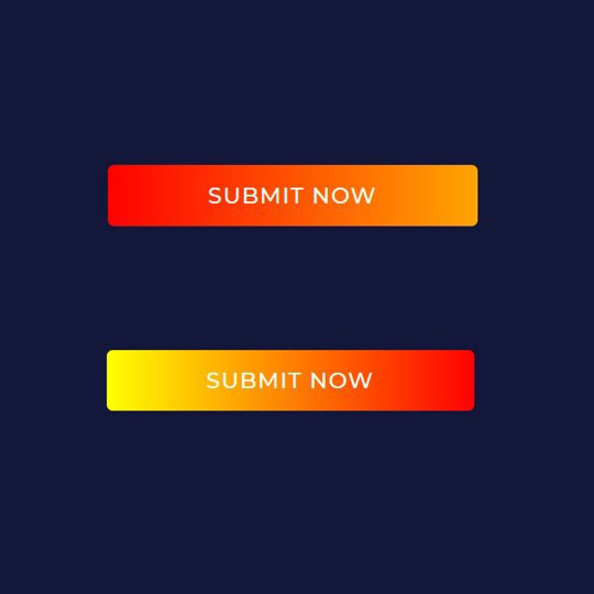
Gradient Button Hover Animation
#css gradient animation#css gradient#css buttons#css button hover#learn css animation#css animation examples#html css buttons#learn to code#code#learn css#codenewbies
0 notes
Photo

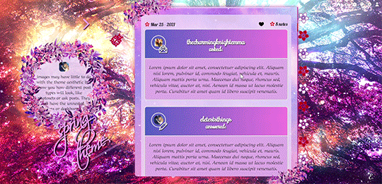
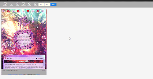
My first attempt at a premium theme: Spring theme! The price is 2 euro or any donation you'd like to make! Send me an ask/im for it, even just a ‘hey I’d like your spring theme’ and I’ll link you my ko-fi or paypal.
previews in the source. If you buy like or reblog, if you don’t buy and you’d like to help me get some visibility, you can reblog anyway (and just like the post if you like it, or donate regardless to give a hand) <3
What do you get with this 'spring' theme, which is probably the first of a season collection, besides of course the exact look you see in the preview 1? (you can check the previews to see most of what I'm talking about)
This theme is first of all responsive: you will be able to see everything, from posts to links to sidebar, in every device no matter how small, down to 320w x 340h tiny mobile screens. [On tablets/phones the navi links will simply move above the screen, then you'll have the title, description and finally the container.]
There is an optional dropdown menu for your updates and a searchbar, npf posts fix ( @ glenthemes ) so photos uploaded from your phone always show correctly, pxu photosets so photosets always resize correctly, minimal soundcloud player, video resizing script ( @shythemes and @bychloethemes ), an askbox with a colorful button ( @eggdesign), the 'can't right-button click nor see the source' script to keep people from stealing it, rounded borders, and instructions all over the html in case you want to bring changes there. Sources are always visible when present, tumblr controls are smaller and grow when you hover over them. Icons by cappuccicons (follow html instructions if you want to replace them) and bgs from pixabay.
It also has animated title and navi links, and your custom pages will appear right under them. Only note is that if you pick 540px posts people with small laptops (1024px) will only be able to see one column of them before they are cut off so max 9 links or they won't fit for them.
Options from the customization page:
-you can upload your own background (toggling off the selectbg option), and a semi-transparent 'overlay’ image on top of your posts, right now it's the same as the overlay you can add to your background.
-you can select: post-size, type of blockquotes, font of your posts, or if you toggled on selectbg’ you can also select one of the 7 spring themed bgs present, as well as adding an optional overlay and gradient on top of them (to remove them you select the blank space instead). Instructions in the html if you want to add the overlay and gradient to a background you uploaded instead (because they conflict with the existence of a background-color and it needs to be removed). -you can toggle on and off: like I said the selectbg option which allows you to upload your own background instead of picking among provided ones, the visibility of the container decorations in case you want them without flowers on the top left and bottom right corners, the like button, your avatar/portrait on the sidebar, the ladybug icon which you can click on to show updates and searchbar, the unnested captions in textposts, the unnested captions in all other posts (if you pick them, the portrait and url of the person who wrote the post will be on top, editable in the unnested captions sections of the html), the background for post-titles which will show you the blog background, the border around unnested captions, the 'spring version' of the description which will be replaced by a regular rectangular one without flower crown, the minimal spotify player (as opposed to one that shows you the big album art), and the fade-out (how things fade when you refresh the page).
-you can type in: the font size of your regular text, the space between images in photosets, your posts background and description background colors (right now it's rgba(234, 211, 248, 80%) for both, except the description has a 90% of visibility, I used rgba because I liked the semi-transparency but you can use whatever you want), the linear-gradient of your container bg colors and of your tumblr audioplayer, the symbol next to your lists, the text of your update (when you click on the ladybug), 7 navigation links and their titles when you hover over them.
What can't you do from the custom page? you need to go to the html editor to edit fonts and sizes of everything else (just search for font-family and font-size) as they go hand in hand, and you need to manually delete the navigation links you don't want or the spinning flower will stay.
A reminder to always toggle on and off everything and to not trust tumblr preview when seen from the editor because it will hide things and mess with images positions, always open the blog in another tab to see your changes.
And because I’m a nervous wreck at the thought of not giving it for free, a reminder that I’m happy to answer questions - though I can’t guide you every day/through super long complicated editing if you decide to change the entire theme because I’m not always here. If you decide to edit everything you should have some html/css knowledge.
#premium theme#contained theme#spring#nature theme#nature#flowers#cute theme#responsive theme#themes#evansyhelp#dailyresources#spllcraft#mythemes
18 notes
·
View notes
Text
10 Best Free WordPress Plugins for 2020
It is safe to say that you want to design your own website or upgrade the current one? Here we present to you a rundown of 15 most famous free WordPress plugins for you. The rundown contains various kinds of plugins designed for the various needs of users. Be it streamlining, relocation, store, displaying of images or availability, these plugins have loads of elite highlights to coordinate your prerequisites that will make your site more useful and appealing!
Yoast SEO

Yoast is a WordPress SEO plugin. It accompanies numerous advanced and prepared to utilize highlights and offers the most exceptional sitemap functionalities, absolute power over breadcrumbs and consequently sets authoritative URLs for keeping away from copy content. It gives SEO examination to SEO agreeable writings and comprehensibility investigation for better substance. Yoast is accessible in both free and premium versions.
Features
Page & post optimization��
Content Optimization
Social Card
Focus Key Phase
WooCommerce
WooCommerce is a modern WordPress eCommerce plugin that accompanies bunches of themes and blocks, customizable store extension and effective payment options. It likewise accompanies MailChimp, Google Analytics, and Facebook integration.
Features
SEO Optimization
Inventory Management
Order Management
Customer Account & Guest Checkouts
Elementor

Elementor is a WordPress pluguin for advanced page building that accompanies box shadows, background overlays, hover effects, headline effects, gradient background, shape divider, and animations.It permits versatile altering and fixes or redo update history.
Features
Drag & drop editor
300+ Designer Premade Templates
Responsive Editing
WooCommerce Builder
MailChimp

MailChimp is basic and ready to use WordPress plugin for connectivity. It permits users to remain associated with clients and assists with conveying the correct message to the perfect individuals at the perfect time. With this plugin, you can have unlimited authority over the form fields and send anything they wish to.
Features
WooCommerce
Buddy Press
Contact Form 7
Event Manager
Jetpack
Jetpack is a plugin for security and site management that accompanies helpful widgets, custom widgets galleries, site insights and analysis, improved distribution and mass website managements. It offers users simple and easy site management.
Features
Brute force attack protection
Malware Scanning
Easy CSS Editing
Social Sharing
W3 Total Cache
W3 Total Cache is a WordPress cache lugin that improves the SEO highlights of the sites by reducing loading time with CDN integration and improving website execution. It permits caching of posts, pages, feed, CSS and Javascript in memory, disk or CDN. It is likewise viable with shared hosting, virtual private servers, and dedicated clusters.
Features
Transparent Content delivery network
Secure Socket Layer
Mobile Support
Minification of Post, Pages and RSS Feed
Redirection

Redirection is a famous WordPress divert plugin that accompanies redirect manager, HTTP Headers and fine-grained authorization. It offers users an excessively quick redirection.
Features
Login Status Analysis
404 Error Tracking
Apache and Nginx Support
Import & Export System
MonsterInsights
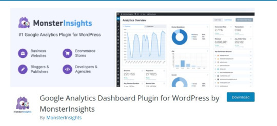
MonsterInsights is a simple method to install Google Analytics that permits e-commerce tracking, an affiliate link and ad tracking, document download tracking and custom link tracking. It offers page-level analytics and empowers Google to optimize for A/B testing and changes speed and sample rate. You can integrate with Google Analytics’ Chrome browser opt-out extension and implicit cookie opt-out system.
Features
Universal Tracking
Real-Time Stats
Google Analytics Dashboard
GDPR Compatible
OptinMonster

OptinMonster is a famous pop-up and email opt-in tool that offers advanced page-level tracking and behavior personalization. You can simply incorporate with all email marketing services with this plugin. It accompanies MonsterEffect Technology for alluring popup animations.
Features
Drag & Drop Page Builder
Optin Forms Templates
A/B Split Testing Tool
Conversion Analytics
Mashshare
Mashshare is a professional WordPress social media plugin that is a customizable ecosystem social media sharing and content optimization. It is extendable with many additional items like Google, Whatsapp, Pinterest, Linkedin, Reddit, Tumblr, and so on. It likewise accompanies high-resolution lossless vector font share button icons.
Features
Social Share Buttons
Many Short Codes
Multi-Language capable
Developer Friendly
ShortPixel

Shortpixel is a WordPress plugin for picture enhancement that accompanies a one-click backup, installed features and and offers outright picture security. It works with any well-known gallery and supports JPG, PNG, and GIF and is E-commerce prepared.
Features
Automatic & bulk optimization
One API key for many sites
PHP Compression Tools
No file size limit
Final Thoughts
I trust we could give you some alleviation in your journey to website creation. Did you get what you were searching for? Experience this rundown, get the one generally reasonable for you and add it to your dashboard. Adding additional highlights or functionalities to your website is not, at this point a fantasy. With the previously mentioned plugins, everything can be made simple.
1 note
·
View note
Text
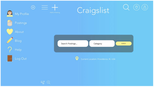
craigslist redesign
(html, css, js, balsamiq) | interface redesign
Navigating through Craigslist can be entertaining, sometimes rewarding, but more often than not, an overwhelming and confusing experience. This project involves an interactive redesigned Craigslist home page in HTML, CSS, and JS.
i. introduction
What is Craigslist? Craigslist is an advertisement/postings website that allows people to post job offerings and sell products as well as search for jobs or services/products. Categories range from “farm+garden services” to “jewelry” to “collectibles,” and even “free stuff.” However, processing large quantities of information can be overwhelming and may discourage users from returning to Craigslist; the original craigslist: rhode island interface can be found here.
The plethora of available content hinders and convolutes the navigation flow of the interface - for example, it is not obvious where the user can add a posting or even create an account. By adopting design principles such as layout hierarchy, iconography, and whitespace, a simpler web interface with the same functionalities can enhance user experience.
ii. usability research/redesign
Using the criteria from usability.gov, the interface critique below was developed. Potential redesign directions to enhance user experience were identified:
simplifying the splash page to allow for effortless navigation,
increasing the white space on the interface to improve user efficiency,
implement simple animations so users can easily detect functionalities.
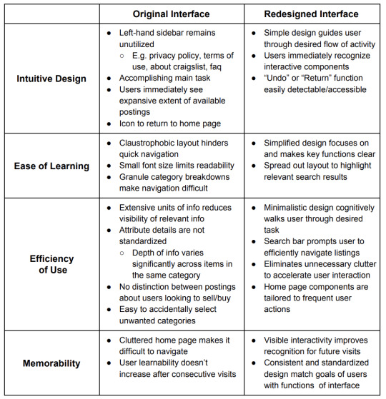
iii. visual/responsive redesign
The redesigned Craigslist improves readability and ease of use by improving alignment and reducing the number of elements on the interface.
We changed the color palette from a plain white and faint purple and employed a bright blue gradient with white text color and light yellow accents, carried consistently throughout side menu icons. This high contrast between the blue and white enables the website to be accessible to all users, including the visually impaired. We also include a translate button (to potentially translate text on page) at the bottom left of the Home page as well as a zoom button for accessibility.
Further, the renewed interface also emphasizes the primary feature of Craigslist – to search for postings. Users can easily achieve their goal with the core feature readily available and prominent in the very center of the Home screen and in the top right of each page (denoted by the universal search symbol of a magnifying glass).
We allowed for “breathing space” by consolidating the menu in a sidebar responds and appears as a user clicks on the hamburger menu in the top left corner of the webpage. Additionally, by using universal symbols such as the magnifying glass and map pin, users can quickly identify and achieve their desired tasks.
For the All Postings page, we used a grid to display several of the most recent postings as well as functionality for the user to filter the postings by category or distance radius. The user is also able to see what type of posting each posting is: either a job or service/product.
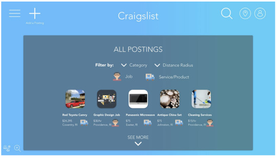
responsive redesign
The redesigned interface supports adaptive layouts and utilizes varied visual weight to convey hierarchy and maintain readability.
The home page and text size dynamically scales to different sizes and web page orientations. The text on the home page is overall a smaller font for smaller screen sizes, and vice versa. (Checked by writing @media screen size = 540px in home.css) .
When the hamburger side menu is opened, the spacing between elements in the header also decreases, and elements in the header shift right and closer to each other with smaller screen sizes (such as a tablet or small phone in portrait mode).
The spacing between the header elements (plus symbol (“Add a Posting”), Craigslist logo, animated search icon, location pin, profile icon) changes with screen size.
Main search form on the home page collapses using flex-direction: row and wrap for elements in the form. Search button wraps to the next line as user shrinks screen.
When the side menu is opened, the page listings in the side menu appear along with a close button to collapse the menu. To make the menu the frontmost item on the page and stand out on smaller screens, the main search bar on the home page is slightly overlapped by the menu. The page options in the side menu wrap to the next line for smaller screen sizes since there is less space for the side menu in smaller screens.
We used icons from https://www.flaticon.com/ for our prototype/responsive redesign.
iv. conclusion
The most challenging part about this project was reorganizing the interface in a simplified, intuitive manner while still enabling the user to easily access the plethora of available content.
Potential modifications on the interface include increasing the contrast between the sidebar/main page, and incorporating a brief description on the Craigslist service to improve interface learnability. Furthermore, a combination of A/B and eye-tracking testing could help determine common user behavior (eg. search habits, shopping frequency, etc.) to better cater redesign efforts.
1 note
·
View note
Photo
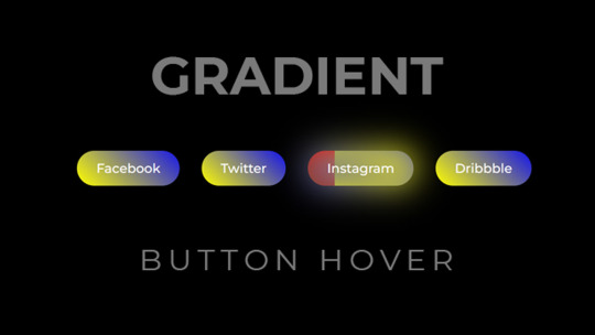
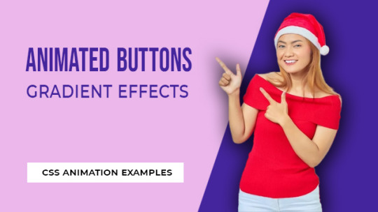
CSS Gradient Button Hover Animation
Visit codingflicks website for source code
#css buttons#creative css button hover#css gradients#html css buttons#css gradient animation#gradient css#learn to code#code#pure css animation#css animation examples#learn css animation#codingflicks
2 notes
·
View notes