#css gradients
Explore tagged Tumblr posts
Visit Tumblr Blog
Explore Tumblr blogs with no restrictions, modern design and the best experience.
Last Seen Tumblr Blogs


Fun Fact
The “We are the 99%” Tumblr blog became the slogan for the Occupy Wall Street movement.
Text

CSS Gradient Text Stroke
#html css#css text stroke#css text effects#css#html#frontend#css3#neduzone#css tutorial#frontenddevelopment#css tricks#html5#css effects#css gradient#css gradients#gradient text stroke
4 notes
·
View notes
Text
🎈 Bogwaters Demo update!! :D
Formatting update, 2 new NPCs, randomisation feature, and quality of life changes
(Previous post)
Bogwaters is a free, text-based, interactive fiction browser game about running an underground shipping Discord server in the 2021 MCYT fandom, hosted on itch.io.

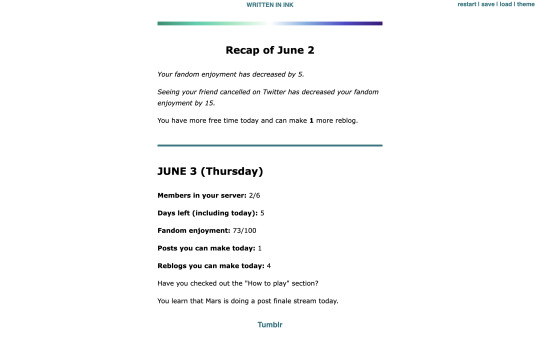
Formatting update:
Added more headers. Also added coloured dividers to section off text:
Home: teal
Tumblr: light blue
Discord: light purplish blue (Discord colour)
Ao3: dark red (Ao3 colour)
Messages: yellow
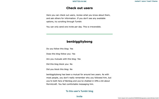
Check out users/invite: light green
Sleep/new day: gay man flag gradient
Trivia: colours for Tumblr, Messages, and Check out users are eyedropped from the old Tumblr UI
Feedback for these colours are welcome!
2 new NPCs:
Now you won't be locked out of winning the game if someone blocks you! The new NPCs are carbonara-art and hippie-benbog with their own storylines and unlock conditions.
New features:
Randomised mandatory daily fandom enjoyment decrease ranging from 3 to 7
Chances: -3 (10%), -4 (10%), -5 (60%), -6 (10%), -7 (10%)
When you sleep, there is a randomised potential +1 increase in reblog (20% chance) and post (10%) quota for the following day. Does not carry past that day.
In addition to blogs of the 2 new NPCs, blogs for doehills, ofthebigwaters, and riversymphony are added. These three are not interactable.
Quality of life changes:
Skippable prologue
Some scenes that don't have bearing on the gameplay are skippable (for this version, it's the conversation with kindredwaves on June 2)
An individual "check out a user" section now has a link to their respective Tumblr blog and vice versa
Misc:
Minor changes to dash content
Minor changes to text formatting
"Days played" shows up as a stat when you get an ending
"Days left (including today)" shows up in the home menu
Reduced animation
Reblogs and feedback are appreciated! Thanks for playing! <3
#interactive fiction#ink#inkle#bogwaters#trafficblr#treebark#life series#mcyt#mcytblr#hi yes. i added gacha#the gradient was gonna be rainbow but it looked soo goofy#this is like middle grade student's first html project#the thing is. ink itself is not very good with css since you can only put a class in one line. can't span multiple lines#so i haven't figured out how to make borders for sections but the dividers should help hopefully#my less ugly css baby...
67 notes
·
View notes
Text

How to add Gradient Background Overlay
#gradient background overlay#css gradient#html css#divinector#css#html#css3#code#webdesign#frontenddevelopment#css gradient effect#css tricks#css effects#learn to code
3 notes
·
View notes
Text

CSS Gradient Text Generator is a CSS code generation tool that helps developers and designers create visually appealing colorful gradient text effects. It allows you to apply gradient colors to text elements effortlessly.
#CSS Gradient Text Generator#CSS Code Generator#Gradient Text Generator#free online tools#online tools#web tools#online web tools#free web tools#online tool#a.tools
2 notes
·
View notes
Text

Gradient Text Border Animation
#gradient text border animation#neon border animation#html css#codenewbies#frontenddevelopment#html5 css3#css animation examples#pure css animation#css animation tutorial#css#html css animation#pure css effects
5 notes
·
View notes
Text
#workskin .rainbowStroke { -webkit-text-fill-color: black; background-image: -webkit-linear-gradient(-45deg,blue,magenta,red,orange,yellow,green,cyan); -webkit-background-clip: text; -webkit-text-stroke: 2px transparent; padding-left: 5px; margin-left: -5px; padding-right: 5px; margin-right: -5px;
}
edit: added four new lines to prevent bg clipping
spokeishere text (black text with rainbow stroke) if anyone wants it
idk if theres already a workskin that works just like/similar to this but i havent checked lol
breakdown of code for anyone too intimidated to play around with it (not an expert tho this is mainly just me listing down my conclusions after playing around with it, also written in a way thats assuming the reader knows fuckall about coding):
#workskin .rainbowStroke { -webkit-text-fill-color: black; background-image: -webkit-linear-gradient(-45deg,blue,magenta,red,orange,yellow,green,cyan); -webkit-background-clip: text; -webkit-text-stroke: 2px transparent; padding-left: 5px; margin-left: -5px; padding-right: 5px; margin-right: -5px;}
code name
> can be changed
> is what you use to define the code aka attach the properties to the actual text using text
text color
> webkit is what supports the existence of stroke hence why it's there and why you cant just use {color: black;}
> fill is what thickens the text, you can delete it but it makes the text harder to read
stroke colors aka the text outline
> deg is the way the colors are rotated, feel free to change the number and to make it positive or negative
what makes the stroke not just a square
> clipping for those of you unfamiliar with it just means it follows the shape of whats underneath it
stroke properties
> the px means pixels and indicates the size of the stroke
> transparent means it'll actually show whats underneath, it can be deleted but doing so will make the text moremuddy/desaturated
background overflow
> there to prevent the colors from being cut too short since nackground normally is almost the exact size of the text
> can be changed but will affect the colors, also having it too small will cause clipping
anything in black/white is code language properties, you cannot make anything without them
#writing#spokeishere#did this cause i wanted to try colorcoding in my fics but realized that spoke has a rainbow gradient thing going on#took me like 2 hours to get through all the technobabble and irrelevant info to find what i was actually looking for#https://stackoverflow.com/questions/61825324/css-gradient-text-with-opacity-and-gradient-text-stroke-outline#<---- shoutout to the guy from this question btw couldnt have done it without ya#https://stackoverflow.com/a/17756378#<------- also shout out this guy
6 notes
·
View notes
Text
2 notes
·
View notes
Text
Propiedades CSS Esenciales para el DIV: Guía Completa
En HTML es un elemento de bloque genérico que se utiliza para agrupar contenido y aplicar estilos con CSS. Por sí misma, la etiquetano tiene un efecto visual inherente en el contenido o el diseño. La “magia” ocurre cuando se combina con CSS para controlar su apariencia y comportamiento. A continuación, se presenta una tabla con las propiedades CSS más comunes y relevantes que se pueden aplicar a…
#columnas#CSS#degradado#Diseño web#div#estructura de página#Flexbox#footer#gap#header#HTML#linear-gradient#main#maquetación#nav
0 notes
Text
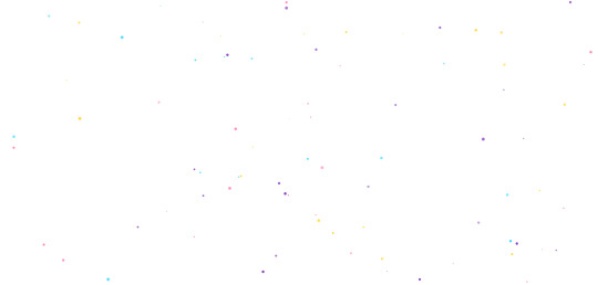
Premium Animated Background Bundle - Particle & Star Effects (Background + Transparent Versions)
LIVE DEMO - Premium Animated (Background)
LIVE DEMO - Premium Animated (Transparent)
BUY NOW
Elevate your website's visual appeal with our Premium Animated Background Bundle - a collection of professionally crafted particle and star effects designed to create immersive user experiences. This versatile package includes two distinct versions for maximum flexibility:
Gradient Background Version: Features a stunning cosmic-themed gradient background with:
150+ twinkling stars with randomized glow effects
100+ dynamic floating particles
Smooth parallax movement
Modern dark-blue/purple color scheme
Transparent Background Version: Perfect for seamless integration:
Fully transparent canvas
120+ semi-transparent glowing stars
80+ ethereal particles with opacity control
Works over ANY background color/image
Key Features:
✅ Double Value: Two complete versions in one package ✅ Zero Dependencies: Pure vanilla JavaScript + CSS ✅ Lightweight: Only 4KB minified (CSS+JS combined) ✅ Fully Responsive: Auto-adapts to all screen sizes ✅ Cross-Browser: Works on Chrome, Firefox, Safari, Edge ✅ Easy Customization: Change colors/size/speed in 2 lines of code
Perfect For:
Website hero sections
SaaS product backgrounds
Portfolio showcases
Landing page decorations
Presentation visuals
Digital product showcases
Technical Specifications:
Format: HTML5/CSS3/JavaScript
Total Files: 8 (4 HTML, 2 CSS, 2 JS)
Documentation: Detailed README included
License: Commercial Use (MIT)
Why Choose Our Bundle?
Performance Optimized: CPU-friendly animations with intelligent element recycling ensure buttery-smooth performance even on mobile devices.
Professional Aesthetics: Carefully calibrated timing functions and randomized parameters create organic, natural-looking motion that stands out from amateur effects.
Developer Friendly: Clean, commented code with modular architecture makes customization effortless. No jQuery or bloated libraries!
Instant Integration: Includes ready-to-use HTML files - just drag & drop into your project. Works with React/Vue/WordPress via simple wrapper.
Sample Customer Use Cases:
Web Designer: "Used the transparent version over client's photography portfolio - created magical hover effects!"
SaaS Developer: "Background version made our analytics dashboard feel premium and high-tech"
Marketer: "Increased conversion rate by 17% with animated hero section"
Agency Owner: "Our go-to solution for client projects needing wow-factor backgrounds"
Commercial License Includes:
Use in unlimited projects
Client work authorization
Resell in compiled products
Lifetime updates
#animated background#javascript background#css animation#parallax background#particles js#star background#vanilla js effect#cosmic animation#html5 animation#website hero effect#responsive animation#transparent canvas#gradient animation#animated stars#twinkling background#floating particles#pure css#no dependency#lightweight js#modern website effect#immersive ui#digital product design#animated hero section#landing page animation#portfolio background#saas ui background#interactive background#canvas animation#background bundle#particle effect
1 note
·
View note
Text
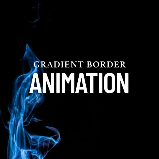
Gradient Border Animation
#gradient border animation#css animation tutorial#css animation examples#html css animation#html css#css#css3#html#frontend#neduzone#frontenddevelopment#learn to code#webdesign
3 notes
·
View notes
Text
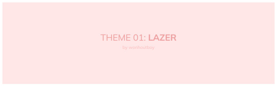
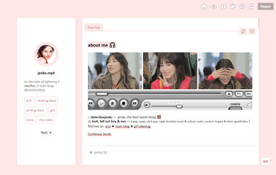
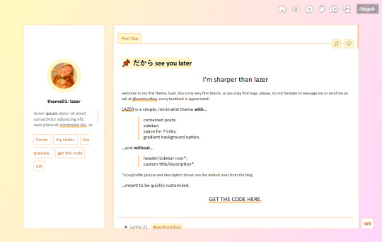
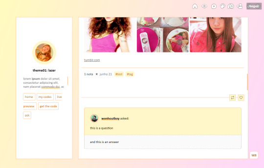
theme_01: lazer by wonhoutboy
static preview / [temporary] live preview / code
• simple, minimalist & responsive theme for easy customization; • sidebar and contained posts; • 7 links; • no extra icon/header or description (uses the blog's originals); • credits here; • please consider buying me a coffee <3.
!! this is my very first theme, so if you find any bugs/if anything doesn’t go well or if you just struggle with customizing it, please reach out to me via private message or ask and i’ll gladly help!
#code#theme#html#contained#container#sidebar#left sidebar#themes#tumblr themes#css#theme-hunter#themehunter#pink#gradient#customization
134 notes
·
View notes
Text
Gradient Background Animation
#css gradient#gradient animation css#html css animation#css animation examples#html css#divinectorweb#css#frontenddevelopment#webdesign#html#css3#animation in css#gradient background animation#gradient background
3 notes
·
View notes
Text

CSS Gradient Background Generator allows you to create beautiful and colorful gradient background using CSS. You can choose from a variety of gradient types, and customize the colors, angles, positions, and sizes of the gradient.
#CSS Gradient Background Generator#CSS Background Generator#CSS Code Generator#free online tools#web tools#online web tools#ai tools#a.tools
0 notes
Text

CSS Text Gradient Background Animation
#css text gradient animation#css text gradient#css text animation#css text effects#animated text effect#html5 css3#html css#codenewbies#frontenddevelopment#css#css animation examples#pure css animation#css animation tutorial#animated text#css gradient animation
2 notes
·
View notes
Text
Gradient is type of image Shading between two or multi color which is developed by computer programming.Gradient is implemented Background color. Gradient can be Implemented Background for Html control like div,button,range input etc.Gradient works faster than image with minimum code.Gradient impress user experience.Gradient development is easy and quick.Works almost all device , almost all browser.
1 note
·
View note