#HTML Text Formatting Support
Explore tagged Tumblr posts
Visit Tumblr Blog
Explore Tumblr blogs with no restrictions, modern design and the best experience.
Last Seen Tumblr Blogs


Fun Fact
1,644 Tumblr posts in 1 second.
Text
Complete List of File Types Indexable by Google
Discover all File Types Indexable by Google, including PDFs, DOCX, images, videos, and code files. Learn how to optimize non-HTML formats for search visibility and use the filetype: operator effectively. File Types Indexable by Google: A Comprehensive Guide for Webmasters and SEOs When it comes to search engine optimization (SEO), content is king—but so is the format that content comes in.…
#DOCX SEO#file types indexed by Google#filetype operator Google Search#Google indexable file types#Google indexing media files#Googlebot file support#image formats indexable#index CSV XML HTML Google#optimize PDFs for SEO#PDF indexing Google#search file types in Google#searchable documents Google#SEO document formats#text files indexed by Google#video formats indexable by Google
0 notes
Text
⋄⋆⋄⋆⋄⋆⋄⋆⋄⋆⋄⋆⋄⋆⋄⋆⋄⋆{ rules } • { muses } • { mun }⋆⋄⋆⋄⋆⋄⋆⋄⋆⋄⋆⋄⋆⋄⋆⋄⋆⋄ ⋄⋄⋄⋄⋄⋄⋄⋄⋄⋄⋄⋄⋄⋄⋄⋄⋄⋄⋄⋄🎕{ blogs } • { promo }🎕⋄⋄⋄⋄⋄⋄⋄⋄⋄⋄⋄⋄⋄⋄⋄⋄⋄⋄⋄⋄

⋄⋄⋄⋄⋄⋄⋄⋄⋄⋄⋄⋄⋄⋄⋄⋄🎕{ Kaito } • { VY2 } • { Flower }🎕⋄⋄⋄⋄⋄⋄⋄⋄⋄⋄⋄⋄⋄⋄⋄⋄ ⋆⋄⋆⋄⋆⋄⋆⋄⋆⋄⋆⋄⋆⋄⋆⋄⋆{ Ayasaki } • { Len } • { Kaguya }⋆⋄⋆⋄⋆⋄⋆⋄⋆⋄⋆⋄⋆⋄⋆⋄⋆ ⋄⋄⋄⋄⋄⋄⋄⋄⋄⋄⋄⋄⋄⋄⋄⋄⋄⋄⋄⋄⋄⋄🎕{ Utatane Piko }🎕⋄⋄⋄⋄⋄⋄⋄⋄⋄⋄⋄⋄⋄⋄⋄⋄⋄⋄⋄⋄⋄⋄

⋄⋆⋄⋆⋄⋆⋄⋆⋄⋆⋄⋆⋄⋆⋄⋆⋄⋆【 ©Art credits | ©Lyric source 】⋆⋄⋆⋄⋆⋄⋆⋄⋆⋄⋆⋄⋆⋄⋆⋄⋆⋄⋆⋄⋆⋄
#{|ooc post|}#since idk if i could edit the old pinned post and have it stay formatted as i liked it-- went ahead and redid it via the new post editor#tho-- i'm kinda mad that this editor doesn't seem to support centering text in html mode-- so i still lost half my old formatting anyway :/#i might still try to update my old pinned post later on tho-- since i'd far prefer having that one up lol
0 notes
Text
I have gotten a lot of messages saying that they really love the presentation of CURSE/KISS/CUTE. Often the commenter in question can’t say what exactly it is about the formatting that they appreciate, but that it just reads well and looks good. Well!!! Allow me to bare my wealth of secret knowledge for you once and for all:
I sorta just did some research into book typography...?
Here’s something you should know about web development, alright: typography on the web is really, really bad. The tools we have at our disposal—HTML and CSS—are incredibly powerful, but they are set up to fight you every step of the way towards Good Typography. When you know what you’re looking for, you can fix all the common issues quickly and easily. But it’s not easy to know what to look for, because
problematic typography is overwhelmingly the norm on the web, and
good typography is invisible.
Here’s a screenshot from CURSE/KISS/CUTE episode 0:

Now, I don’t want this post to come across as prescriptive. It is not my intention to tell you, “This is what good typography looks like, so follow my lead exactly.” I made a lot of choices with the typography of my web novel: many of those choices would not make sense in other contexts. What I want to convey to you is what those choices are, so that you will know they’re available to be made.
I mentioned that the web “fights you” when it comes to good typography. What do I mean by that? Well, check this out:

This is how that passage of text renders “by default.” In other words, this is how a web browser would render that text without any input from me about what styles to apply. It kind of sucks ass! But it also looks pretty familiar, right? This is not that far off from how a lot of websites—even websites full of prose (looking at you, AO3)—render text.
I think the most illustrative thing to do here would be to walk you through my thought process and show you, step by step, what decisions I made to turn this unstyled text into the styled version you see in the novel.
So, first things first:
1. We have got to shrink that text column.
Computer monitors... are wide. They are wider than they are tall. They are so wide, and they have so many pixels. This means you can fit a lot of characters on them. If you wanted, you could just have a wall of characters from the left side of the screen all the way to the right side. Talk about efficient!!
You should never, ever, ever do this.
This is one choice that I actually will make a prescriptive statement about, because it’s supported by quite a lot of research: fairly narrow text columns are more legible. Specifically, research seems to support the idea that a width in the range of 50 to 70 characters per line is the most comfortable for people to read*. Every font is different, so it takes a little doing to turn that “characters” figure into a pixel measurement; I went with 512 CSS pixels for the maximum width of my text column:

Isn’t that just so much nicer to read already?
*A commenter reminds me that I’d be remiss not to point out that the research on column width legibility isn’t completely conclusive. You do want to limit the width of your text columns, but going over the 70 character-per-line recommendation isn’t necessarily the end of the world, and you might have good reasons to do so. I did not: as mentioned, one of my goals was to mimic book-style typography, and books by nature have fairly restrained column widths, on account of they’re books.
2. Picking a font.
I’m not going to give you the blow-by-blow on how I decided what font to use. The short story is that I asked some designers, and one of the recommendations I got was the free font Crimson Pro, which I took a liking to immediately:

It’s just an all-around attractive serif font, but one thing I really like about it for use in a novel is its highly-visible quotation marks. They’re just kinda jumbo! They’re real big! Easy to see! In a novel, those things aren’t just ornamentation. It makes a great deal of practical sense for them to stand out just a bit. It also has a fairly large x-height, unlike a lot of the more traditional options, which is good for legibility on a computer screen.
3. Adjusting the line-height
Web browsers default to a line-height of about 1.2em, which, as you can probably tell, is quite cramped. If you go and Google “optimal line height for legibility”, you’ll get a number of results right off the bat suggesting 1.5em. Sounds good! Let’s do that:

Well... hmm. That’s definitely an improvement, but between you and me, it actually looks a bit too spacey to my eyes. I wonder why?
I’ll cut to the chase: the 1.5em recommendation makes some assumptions about the font you’re using. In Arial, the letter “A” is about 0.6em tall; in Crimson Pro, it’s about 0.5em. That means that there’s no one-size-fits-all solution to spacing your lines, because different fonts have different amounts of empty space baked in. How annoying!
Let me tell you something about the kind of nerd I am. When I had this realization, I grabbed some books off my shelf and pulled out a literal micrometer. I started measuring the line-heights against various font features to see if there were any patterns I could spot in professional typesetting. Here’s what I found:

Almost every book on my shelf spaces lines such that the distance between one baseline and the next is about three times the x-height. How cool is that? I clapped my hands like a seal when I put this together.
Adjusting the line-height to match what I observed in the wild gives us this:

It’s a subtle difference, but to my eyes it feels just right. It’s almost like magic!
4. Paragraph spacing...
Let’s address the elephant in the room. Probably the most controversial choice I made with CURSE/KISS/CUTE’s typography was to opt for book-style paragraph indentation rather than web-style paragraph spacing—like so:

I did this for a few reasons:
It’s what I’m used to. I’ve read a lot of books, and this is just the way that books are formatted. I think for something aspiring to the title of “novel”, there’s value in making it look the way a reader probably expects a novel to look.
A novel has a lot of paragraph breaks in it. A paragraph in, say, an encyclopedia entry might go on for half a page or more; whereas it is unusual for a paragraph in a modern work of narrative prose to run for more than a handful of sentences, especially in any scene with dialogue. Because paragraph breaks are so common, spacing between paragraphs in a novel results in a lot of wasted space. Also, subjectively speaking, the additional space seems to me to lend an undue amount of weight to paragraph breaks. I’m just starting a new thought; there’s no need for a 21-gun salute, you know?
Having said that, here are some good reasons you might decide not to do paragraph indentation anyway:
Doing it right requires a bit of extra legwork. Notice how the very first paragraph in the image above has no indentation. That’s because it’s the start of a new section, and the first paragraph in a section traditionally goes unindented. This is an easy detail to miss, and it can be difficult to wrangle CSS into doing it for you automatically.
Web users don’t expect it. For the first decade of the web’s existence, there was no good way to do paragraph indentation; by the time CSS rolled around and made it easy, paragraph spacing had already become the norm. And while CURSE/KISS/CUTE may be a novel, it is also, specifically, a web novel!
But it’s my house and I get to make the rules, so I went with indentation. Incidentally, there seems to be a dire lack of research into the question of whether indentation or spacing is more legible for readers—but the data that does exist appears inconclusive at best. So, the choice really does come down to vibes.
5. The tragedy of justification.
You’ll note that one way in which I did not make my web novel look like a paper novel is the text alignment. It’s un-justified: the right margin is ripsaw-ragged.
This is because it is not possible to justify text on the web.
Oh, you can try. Look right here: there’s a CSS property for it and everything. Just turn on “text-align: justify” and...

Nightmare! The interword spacing on that first line is almost as wide as the indentation!
Reader, I’m afraid that your web browser is simply too dumb. That’s not the browser’s fault: robust algorithms for justifying text without creating these distractingly huge gaps between words have existed for many decades, and modern computers are powerful enough to run them in real time with little performance impact. It’s just, uh—nobody has ever bothered to implement them into web browsers. It is the damnedest thing.
I tried, I really did. You can mitigate this problem a bit if you enable automatic hyphenation, but browsers are unfortunately also kind of dumb at hyphenating. Firefox, for example, will refuse to hyphenate any word containing a capital letter, so any sentence with a lot of proper nouns in it is a lost cause. I tried manually inserting soft hyphens with a text preprocessor I wrote myself, but still these overjustified lines plagued me: when the text column narrows, for example on a phone, even hyphens can’t save you. The line-breaking algorithm is simply too naïve to optimize for well-justified text, and that’s not something you can fix as a web developer.
As a result, my heavy-hearted recommendation is to never use text justification. It’s just too distracting.
6. And then some extra stuff just for me
I added drop-caps because it looks neat and I made the ellipses spacier because I think it looks good when it, uh, when they are spacier. I think that looks pretty good that’s just my opinion though.
That’s all! Hope you learned something bye!!!
524 notes
·
View notes
Text
Friendly reminder that Wix.com is an Israeli-based company (& some website builders to look into instead)
I know the BDS movement is not targeting Wix.com specifically (see here for the companies they're currently boycotting) but since Wix originated in Israel as early as 2006, it would be best to drop them as soon as you can.
And while you're at it, you should leave DeviantArt too, since that company is owned by Wix. I deleted my DA account about a year ago not just because of their generative AI debacle but also because of their affiliation with their parent company. And just last month, DA has since shown their SUPPORT for Israel in the middle of Israel actively genociding the Palestinian people 😬
Anyway, I used to use Wix and I stopped using it around the same time that I left DA, but I never closed my Wix account until now. What WAS nice about Wix was how easy it was to build a site with nothing but a drag-and-drop system without any need to code.
So if you're using Wix for your portfolio, your school projects, or for anything else, then where can you go?
Here are some recommendations that you can look into for website builders that you can start for FREE and are NOT tied to a big, corporate entity (below the cut) 👇👇
Carrd.co

This is what I used to build my link hub and my portfolio, so I have the most experience with this platform.
It's highly customizable with a drag-and-drop arrangement system, but it's not as open-ended as Wix. Still though, it's easy to grasp & set up without requiring any coding knowledge. The most "coding" you may ever have to deal with is markdown formatting (carrd provides an on-screen cheatsheet whenever you're editing text!) and section breaks (which is used to define headers, footers, individual pages, sections of a page, etc.) which are EXTREMELY useful.
There's limits to using this site builder for free (max of 2 websites & a max of 100 elements per site), but even then you can get a lot of mileage out of carrd.
mmm.page

This is a VERY funny & charming website builder. The drag-and-drop system is just as open-ended as Wix, but it encourages you to get messy. Hell, you can make it just as messy as the early internet days, except the way you can arrange elements & images allows for more room for creativity.
Straw.page
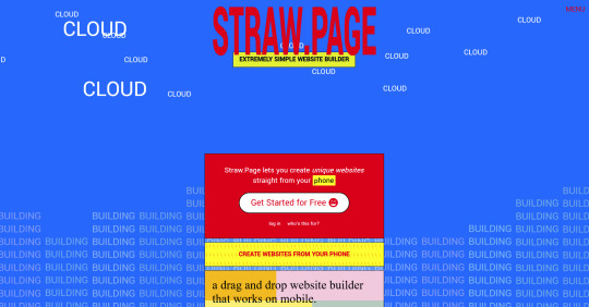
This is an extremely simple website builder that you can start from scratch, except it's made to be accessible from your phone. As such, the controls are limited and intentionally simple, but I can see this being a decent website builder to start with if all you have is your phone. The other options above are also accessible from your phone, but this one is by far one of the the simplest website builders available.
Hotglue.me
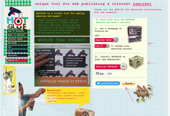
This is also a very simple & rudimentary website builder that allows you to make a webpage from scratch, except it's not as easy to use on a mobile phone.
At a glance, its features are not as robust or easy to pick up like the previous options, but you can still create objects with a simple double click and drag them around, add text, and insert images or embeds.
Mind you, this launched in the 2010s and has likely stayed that way ever since, which means that it may not have support for mobile phone displays, so whether or not you wanna try your hand at building something on there is completely up to you!
Sadgrl's Layout Editor

sadgrl.online is where I gathered most of these no-code site builders! I highly recommend looking through the webmaster links for more website-building info.
This simple site builder is for use on Neocities, which is a website hosting service that you can start using for free. This is the closest thing to building a site that resembles the early internet days, but the sites you can make are also responsive to mobile devices! This can be a good place to start if this kind of thing is your jam and you have little to no coding experience.
Although I will say, even if it sounds daunting at first, learning how to code in HTML and CSS is one of the most liberating experiences that anyone can have, even if you don't come from a website scripting background. It's like cooking a meal for yourself. So if you want to take that route, then I encourage to you at least try it!
Most of these website builders I reviewed were largely done at a glance, so I'm certainly missing out on how deep they can go.
Oh, and of course as always, Free Palestine 🇵🇸
#webdev#web dev#webdesign#website design#website development#website builder#web design#websites#sites#free palestine#long post#I changed the wording multiple times on the introduction but NOW I think im done editing it
499 notes
·
View notes
Text

★ STAY FROSTY.
personal. free / pay what you can. preview + download.
stay frosty is a single page template that utilizes scroll boxes. inspired by neocities + old web html sites. includes music player, custom fonts, text formatting, and a tv flicker effect over the whole page. html/css/carrd knowledge highly recommended : this is not a one-and-done template, but has plenty of room for customization. not very mobile friend ; it is tweaked to be usable, but this template is made for desktop screens. this template requires a pro-plus subscription. please see my terms of use in my pinned post before downloading!
download link includes my referral code! thank you for your support!
#carrd template#rp carrd template#personal carrd template#carrd pro template#free carrd pro template#TEMPLATES.#CATEGORY: PERSONAL.
74 notes
·
View notes
Text
Friday, August 25th, 2023
🌟 New
On /search pages on the web, we moved the search bar from the sidebar to the center/main section of the page.
For folks in the aforementioned reblog header redesign experiment, we added avatars back to posts from group blogs when the option to show author portraits is enabled.
When blocking a blog via a submission in your inbox on the web, you can now block from both your secondary (if it was the recipient) and your primary blog.
On the web, we have made some improvements to localized number formatting across all supported languages.
On the web, logged out users browsing a blog view will sometimes be prompted to log in after scrolling for some time.
We are testing out showing the “You’re all caught up!” carousel to folks with “Best stuff first” enabled.
🛠 Fixed
On the web, we’ve made some improvements to the post header in compact posts (like when they’re displayed in a grid on the Explore page, for example). Long blog names, badges, and the follow button no longer break onto a new line in the middle of a word, and each element remains properly aligned in the header.
We fixed an issue that caused a bullet point to appear next to the Blogs menu item when using Safari.
We’ve made some headway in fixing various issues relating to undo/redo in the post editor on web. You should notice improved stability when using undo and redo in the editor.
On the web, we fixed an issue where avatars from anonymous asks were empty.
On the web, we fixed an issue affecting the HTML and Markdown modes in the post editor where select all would sometimes select text outside of the editor.
We fixed an issue affecting some users where starting a search with a hashtag (#) would return search results instead of results for that tag.
🚧 Ongoing
We are hard at work updating our docs. If you see anything confusing or out-of-date, please send some feedback!
🌱 Upcoming
Nothing to share today.
Experiencing an issue? File a Support Request and we’ll get back to you as soon as we can!
Want to share your feedback about something? Check out our Work in Progress blog and start a discussion with the community.
501 notes
·
View notes
Text
HTML Fic Event Week
Prompt Sheet Generator | AO3 Collection | html tryhard on AO3

HTML is a markup language used to tell a web browser how to display content. You might be aware of simple uses of HTML, such as bold and italics but HTML can be used to do so much more! Do you like r/AITA stories? Have you ever been interested in including realistic text messages into your fics? Did you like choose-your-own-adventure books as a kid? HTML can be used for all of these things and more!
Join us for HTML Tryhards 2025, where we bully our friends (and you? 👀) into making fanfiction super extra shiny using the power of HTML.
AO3, a fanfiction hosting platform, supports the use of HTML, and that's where submissions for this event should be posted. We have a collection for you to post to, but please use the tag #HTML Tryhard on your work as well!
On Tumblr, @ this blog or use the tag #htmltryhard2025, and we'll reblog your posts.
Prompts
There are two (optional) prompts per day, one to influence the format and one to influence the story. You can generate your own custom prompt list here. Use as many or as few of the prompts as you like.
Rules
All fandoms welcome.
Submissions must include a significant portion of HTML. We'd prefer the entire work be HTML, but mixed prose and HTML is also acceptable.
Submissions MUST be HTML and not images or screenshots of text logs/tweets/etc.
There is no required minimum word count, but the suggested minimum word count is 500 words.
The prompts are OPTIONAL, use as many or as few as you'd like.
HTML/CSS guides are accepted (and encouraged!) as submissions.
Submissions should include the #HTML Tryhard tag on AO3.
Submissions should be added to the collection on AO3.
You can start posting submissions January 13th. The last date of the event is January 17th, though if you're running behind you can still post to the collection after that date.
Follow us!
If you don't know how to use HTML but it's something you're interested in, give us a follow! In the days leading up to the event, we'll be sharing works that have utilized HTML, as well as helpful tutorials. The difficulty of these tutorials will vary, and we'll post things we hope will be helpful for tryhard veterans and beginners alike.
You can also send us your HTML questions and we'll do our best to help you out!
#html#AO3#fandom event#fic event#fanfiction event#writing event#html tryhard#htmltryhard2025#fanfiction#fanfic prompt
47 notes
·
View notes
Text
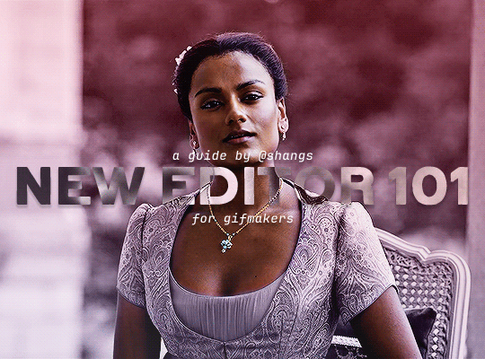
NEW EDITOR 101: A GUIDE FOR GIFMAKERS by v @shangs
Hi friends! I know I said I would do this way back in April/May when this change was announced but I've been massively busy lately so thank you all for being patient with me :)
Based on the results of this poll, I will be trying my level best to help make a guide for gifmakers to best deal with any problems that have been present with the new editor. However, it's worth noting that I have personally not experienced any of these problems myself and I have no record of any problems from other people that I could send to staff and get guidance on, so for some of these issues I will unfortunately be a broken record.
That being said, I have been using the new editor for a few months now and it hasn't been too bad. So don't be discouraged by the new editor if you still love to make gifs and share them. You may need to adapt a bit, but it's doable!
This is meant to be comprehensive and will be explanation and image heavy. Full guide under the cut.
CONTENTS:
What is the new editor?
Steps to take before posting
Making a post
Troubleshooting
01. WHAT IS THE NEW EDITOR?
Some of you may be asking yourselves what the point of the new editor even is and why it's being implemented in the first place when we already had a (mostly) functional editor. My very limited understanding of it as a CS student is app compatibility and flexibility. I'm not totally clear on the details nor am I 100% certain this is the case, but NPF posts (basically, posts made with the "new editor") first started with the mobile app. I'm unsure if the different post types were simply too unwieldy to transfer to the app - having to make a whole bunch of post types when with the new editor you can now have posts with any elements you want without the rigidity of a set post type - or if it was simply not able to be implemented, but the apps have always used NPF. The majority of Tumblr users are coming from the mobile apps. Then it became a case of having the legacy editor for the web users (which were fewer in number) and the new NPF editor for everyone else. That takes resources to keep around and it's pretty inefficient. Naturally the older editor that was used by less people was going to get the axe, especially since you couldn't tell on mobile that there was even a difference between NPF or legacy posts.
So now here we are and the posts are NPF. This means they're in "Neue Post Format." Basically, every post you make is by default a text post, containing "blocks" of other media - as gifmakers we will primarily be dealing with photos.
I understand that it's frustrating to many to see "our gifs are now rendered as text posts" and ask WHY it's happening when photos should logically be rendered as photo posts - but the fact is, there's now no real delineation between a "text post" and a "photo post." The reason NPF posts are now "text posts" is because that's how they are rendered for desktop themes, not because everyone is going to see your post as text and your gifs are going to be compressed into the quality of a potato (though I know some have seen this issue - more on that later.)
02. STEPS TO TAKE BEFORE POSTING
The long and short of it is that you may have to update your theme. More detail here for those who are interested, but check that your theme supports "new editor posts" or "NPF posts" AND that this is true for original posts (you can read more about why in this ask and, although this may be a bit time-consuming, test it out on your blog). I can say with certainty that my second theme Cygnus supports original NPF posts. This is NOT true of my first theme, though.
You can try to add the NPF Fix by @glenthemes to your own theme (beware if you don't know HTML/CSS) or try this tip by @burningblake for original posts.
Feel free to add theme makers with fully NPF-compatible themes in the notes! I have been happily using my own theme so I can't say to what degree others' themes are NPF-friendly.
03. MAKING A POST
If you're sticking around to post on the new editor and you have trouble ordering your gifs around, here's a little guide on how to post.
If I click on "Photo" from web and open up the editor, here's how it looks:
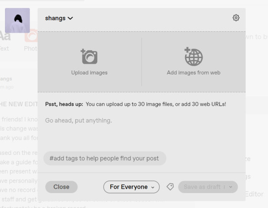
I went ahead and added three full-width gifs and the editor put them in like so:
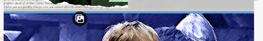
You'll most likely also have to order your gifs around in the way you want them. You can go ahead and hover over your gifs to see the button to orient them (the four dots in the top left corner) and the button for an image description (the three dots in the bottom right corner). I've attached images of all three below:


If you hold the orientation button, move your gif around until you see the blue line that shows where your gif will end up in the spot that you want it. For example, I wanted to move the second gif below the first one, so I oriented it so that the blue line would show the marker between the two gifs:
Now my gifs are oriented nicely! Of course, this is a simpler layout, but the principles still hold.
If you save your gifs as a draft and reopen them or you just notice a large gap like this in between your gifs when you're in the editor, don't worry.

This will not show up in dash view or on a desktop theme that supports original NPF posts. For example, this is how the gifs' gap (without modification) looked in my desktop theme:

With your gifs ordered, the final step is to add alt text. You can read more about alt text and why you should use it here. (Feel free to ignore the sections about the captions on the legacy editor since it is no longer relevant. It's also unnecessary to clearly mark descriptions if they're not in the caption of your post because they will clearly show up under "ALT" on Tumblr.)
If you click the three dots in the bottom right corner as seen above, and click "update image description:"

You can add the description you like and click "update." Your photos' alt text will show up under the "ALT" bubble on Tumblr. This is generally a good practice to get into to make your content more accessible, so I hope you guys will consider using alt text regularly :)
Also, I've noticed that in the editor, if you go back and edit something it will take some time to show up. You may have to refresh the page or load it again after some time, but your edits should be there. I would not go back and edit posts again if you see your posts haven't shown up. I also advise against editing your posts on mobile because it's easier to make a mistake.
And there you go, you've successfully made a post with the new editor!
04. TROUBLESHOOTING
I'm sure you've all been waiting for this. Unfortunately I am probably going to be extremely unhelpful if the editor hasn't been refined in the last few months for those experiencing issues. I'm going to go in the categories that I listed out in my original poll, but keep in mind that I haven't personally seen any of these issues on my end so I haven't been able to contact staff with any evidence that this happened other than my poll.
Dashboard view quality issues: I haven't noticed this issue. I'm not sure if this has been fixed since the original poll was posted. If you're experiencing this issue, this is not something I know how to fix so I would contact staff with screenshots of the issue.
Desktop theme side padding: As noted before, this is a theme issue. If you change themes to something that is NPF-compatible with original posts, there shouldn't be any more issues here.
Small gifs on mobile: In my experience this was happening regardless of what editor was used; it's a bug that seems to have been fixed since this poll was created. If you're still experiencing it, at the risk of sounding like a broken record, I would advise contacting staff.
New editor doesn't accept gifs of size 9.8MB < x < 10MB: I haven't experienced this issue so I would say the only workaround would be to either trim the size of your gif so that it is under 9.8MB or whatever threshold seems to be the cutoff or contact staff (I am so sorry for constantly having to suggest this 😭 unfortunately there's no trick I can offer because the new editor has been taking all my gifs just fine)
Logistical issues ordering gifsets: I hope this guide has been able to answer the majority of questions and shed some light on some of the more buggy behaviors of the new editor, but if you have any more specific questions you can feel free to shoot me an ask!
HTML issues / colored text: Unfortunately it seems colored text may be deprecated entirely? This could be for accessibility purposes because I believe screen readers would read out every single letter of gradient text in captions which I imagine can get quite frustrating for users of this technology. I recommend just using the normal rich text editor. If you want small text, you can highlight and click the <s> button!
Other: If it seems like something I may be able to answer, please feel free to ask me. Otherwise... hound staff 😭
Here's where you can hound staff, btw. If you're having major issues I would advise you guys to submit support tickets. That way if there are any widespread bugs, staff will hopefully be able to fix them.
I hope this guide was helpful to you guys in dealing with the new editor, and happy giffing <3
#gif tutorial#new editor tutorial#completeresources#userphotoshop#resourcemarket#userrobin#userbells#arthurpendragonns#ughmerlin#userbecca#usersameera#usermarsy#alielook#tuserlucie#tutorial
561 notes
·
View notes
Text
differences ive noticed between tumblr and cohost so far:
tumblr has numbers, like most social media sites, for almost every aspect of it. notifications, likes, reblogs, comments, followers, following, etc. cohost only had numbers for notifications (opt-in) and number of comments. the rest had nothing indicating a number, not even for the original poster.
tumblr has notifications for many actions, including "<person> liked a post you shared" and others. it seems you can turn them off but the fact tumblr has them in the first place is concerning. cohost, by design, had very limited notification scope. when someone rechosted your chost with added text, you only got one notification: that someone rechosted it. you won't know the likes and rechosts of it. you also didn't get mention notifications.
tumblr also offers push notifications on their mobile app, while cohost never offered notifications (and was purely a web app that could masquerade as a mobile app).
tumblr's ask system (which cohost's was based off of) is a LOT more robust. private ask answers, the option to allow media in your received asks, etc. the only leg-up cohost seemed to have was the option to allow for asks from logged-out accounts. cohost also allowed for media in asks until the feature was abused and it was globally turned off.
cohost's post format had an unstyled title that could be up to 240* characters long, and a post body that could be styled however you want. tumblr does not seem to have this title system, other than the "biggest" text style option.
cohost never had an algorithm for showing you chosts. it was reverse chronological only. the only system they had for a global feed is the #The Cohost Global Feed tag, and it was still only reverse chronological. tumblr has a For You page, with recommended posts that your mutuals liked or have many notes, but it seems to have a Following feed that's reverse chronological as well?
cohost had mostly unrestricted html and css (as long as it was inline)* as well as some basic markdown support. tumblr seems to just have a few fonts, some colors, and pretty much the same range of basic text styling.
cohost was very sex positive and allowed pretty much all porn with exceptions for csam and other illegal material. (18+ content needed to be tagged as such). tumblr, as of 2017ish (iirc?) does not allow for pornorgraphic content of any kind.
cohost's four staff members were queer as fuck and the atmosphere of cohost was EXTREMELY queer. tumblr has seemingly had multiple instances of bans of trans users for seemingly no reason other than "they were trans".
cohost had a cool mascot while tumblr seemingly doesn't have any. eggbug win
as someone who used cohost a ton before it shut down, moved to bluesky, and is now dipping their toes into tumblr, i think cohost did it better than tumblr on a lot of fronts, even if its features weren't as fleshed out. i'll do a full retrospective piece about cohost another time though
anyways shoutout to tumblr sending one of my bullet points to the void when i was changing the formatting. very cool
and if you used cohost as well, let me know what i missed!! i'll edit this post if so :3
14 notes
·
View notes
Note
do you have any recommendations for document formatting software? i'm really admiring your page layouts on space gerbils but i know i couldn't even really think of pulling something like that off for my own works in word/libreoffice without lots of hassle
Afraid I can't help you there. I don't use desktop publishing software of any kind – I write my games in Notepad++ as HTML documents, and that's the only version of the text that's ever touched by human hands. The PDF and EPUB versions are generated automatically using document conversion tools that support CSS Paged Media extensions; I personally use a commercial product called Prince for the PDF side because I have excruciatingly specific requirements in terms of supported typesetting features, but there are any number of free and open source alternatives if you're just getting started.
116 notes
·
View notes
Note
how did you make those colors. i only get these 6
The conventional Tumblr post editor arbitrarily locks you to those 6 colors, but the colored text inline formatting option is able to handle any hexadecimal color you throw at it via unconventional means, such as when you make a post with the Tumblr API.
Also, I think you can copy and paste colored text.
I do wonder if Tumblr's legacy HTML formatting supports inline CSS. If so, this paragraph should be sky blue.
9 notes
·
View notes
Text
PODFICCER (and fic author) RESOURCE: things i learned about HTML today
-> from this reference work on ao3: A Complete Guide to 'Limited HTML' on AO3 by CodenameCarrot (please go leave a comment if you find anything here useful !!!)
EDIT: OMG Y'ALL I HAVE BEEN HAVING SO MUCH NERDY GEEKY FUN TWEAKING MY PODFIC HOW-TO GUIDE WITH THIS STUFF
headings, blockquote, div

----

-----
html currently allowed by ao3 html sanitizer

a. abbr. acronym. address. b. big. blockquote. br. caption. center. cite. code. col. colgroup. details. dd. del. dfn. div. dl. dt. em. figcaption. figure. h1. h2. h3. h4. h5. h6. hr. i. img. ins. kbd. li. ol. p. pre. q. rp. rt. ruby. s. samp. small. span. strike. strong. sub. summary. sup. table. tbody. td. tfoot. th. thead. tr. tt. u. ul. var.
-----
in-line (text) formatting tags supported by ao3


-----
OMG LOOK AT THIS !!! IDK WHEN I WOULD EVER USE THIS BUT LOOK HOW COOL !!!

-----
paragraphs & p formats: archiveofourown.org/works/5191202/chapters/161901154#AddParagraphs

-----
omg I'VE ALWAYS WONDERED HOW TO GET THAT LINE BREAK THINGY IN THE MIDDLE OF THE PAGE !!!

-----
end post
#podfic resource#podficcer resource#fic author resource#ao3 writer resource#ao3 fanfic#ao3#html resource#html reference#html#reference#resource#html tutorial#basic html guide#CodenameCarrot
6 notes
·
View notes
Text
i have opinions about how we fanfiction for the internet, and i don't mean literary or aesthetic ones: i mean your experience of writing it!
this is just my markdown manifesto again:
there is no reason to tangle with google or microsoft for writing copy that will ultimately be rendered as HTML on ao3 and tumblr!! rich text editors are slow as hell on desktop and mobile, both in performance and how much time you waste formatting, which takes your hands from the keyboard whether physical or touchscreen. most users end up redoing that formatting entirely in their destination site's embedded rich text editor and inevitably miss things anyway!! google docs and microsoft word and their ilk were made for printed documents no matter how much they try to mutate to stay relevant—i'm side-eying google's "paste markdown" here, nevermind gemini and copilot!
commonmark markdown is quick and easy to learn. enable markdown on tumblr and all you have to do to is copy and paste (only on desktop, unfortunately). if you don't bother with headers or dividers, the most you have to do afterwards is add a "read more" cut. ao3 is less perfect; you might have to ctrl+R formatting marks for the plain text editor and annoyingly add forward slashes to end tags, but there's still explicit fidelity to the formatting you defined while writing that the clipboard cannot lose. yes, i know "paste with formatting" exists, but it's not a problem for me because I live like this. in markdown, your writing isn't tied to any website or service; it's really yours.


that said, you still need a markdown editor, and there are several:
obsidian.md (windows/android/mac/iOS/linux): i used this for more than three years for grad school and writing. i still use its android app since i sync my notes with a git repo instead of the cloud. without paying for obsidian sync, you can keep your vault in your desktop icloud or google drive folder so you can access it from your phone. it's a great way to learn a version of markdown and get comfortable with just how lightweight and portable your drafts can be. this is a good fit if you've ever used and liked notion and want to focus on words
@ellipsus-writes (web app in open beta; no mobile app yet but the mobile site is functional): they don't market themselves as a markdown editor and clearly aim to replicate a gdocs/word-like, mouse-dependent formatting experience, but they support markdown! if you feel trapped by google because of file sync and being able to share docs privately, this is one of your best bets. i haven't tried this, but i think exporting your work from ellipsus as a .md file and then pasting it into tumblr is Great option
i haven't tried these extensively/recently but know they're out there:
simplenote (android/iOS/windows/macOS/linux): i used this forever ago and it looks like it's grown a lot!
bear (macOS/iOS only)
and another thing is: i think it's nice to use different programs for different parts of life. i use google docs for work and yes, using their awful markdown support, but it still makes a difference to write my fanfiction somewhere else (in the terminal, because i'm the most annoying person alive)!! compartmentalize beyond different accounts, don't let the bastards get you down
also i'm not gooning for a brand here i personally use neovim
6 notes
·
View notes
Text
Librera Reader is a highly customizable and feature-rich application for reading e-books in PDF, EPUB, MOBI, DjVu, FB2, TXT, RTF, AZW, AZW3, HTML, CBZ, CBR, DOC, DOCX, formats.
With its intuitive, yet powerful, interface, Librera makes ebook reading a veritable pleasure. It even features a unique auto-scrolling, hands-free Musician's mode, with controllable speed.
F-Droid version is based on the latest MuPDF and support Android 4.1+.
The only difference between Librera FD (F-Droid) and Librera PRO is the absence of Google Play services and Google Drive book synchronization in Librera FD.
Just a few Librera main features:
Easy document discovery by configurable criteria:
Auto-Scan (user-specified folders)
Browse folders (using an in-app file explorer)
Recent (featuring a reading-progress indicator)
Support for bookmarks, annotations, and EPUB3 tables of contents
Configurable Day and Night modes
Configurable link color (hence, footnotes and endnotes color)
Support for many popular offline dictionaries
Vertical-scroll lock
Auto- and manual centering of documents
Custom ad-hoc CSS coding
Single-page view of two-page documents
Musician's mode with configurable scroll speed
Customizable TTS reading and built-in media player
Page-wise TTS recording to MP3 or WAV
Multi-word text search
Support for archived (.zip) documents
Support for RTL languages (Thai, Hebrew, Arabic, etc.)
Import and export of settings, auto-backup of current session
Leading initials in FB2 documents
RSVP reading (à la Spritz)
Movable bookmarks, w/ a floating indicator
And a whole bunch of other features for you to check out.
You can read books in your web browser with the Librera Book Reader https://librera.mobi/online-book-reader/
The best way to fully appreciate Librera Reader, however, is to use our restriction-free Librera PRO version from Google Play.
If you enjoy Librera, please consider making a donation: https://www.patreon.com/librera
8 notes
·
View notes
Text
I just played all of blooming panic and I’m giving Cat a bunch of traits inspired by traits my actual cats have. Some of these my cats don’t do anymore and some are my interpretations of how Xyx/Bloomic server would react to Cat doing these things. Also poly!toastxyx because this is my blog and I get to choose the propaganda.
Also I edited this in the HTML text editor so if the formatting is fucked, blame that.
Watches doorways. If there is an elevated surface near a door Cat will sit there and watch
Cat will also yell at whoever walks in until they give it pets. The likelihood increases if you dare talk to the person in the room before acknowledging it. Will also interrupt your conversation if you don’t move over fast enough and pet it.
Fiends for crinkly things and will stare at you until you let it sniff whatever it is you have (wrapped food most often)
Will bat at/grab the Crinkly for The Crinkle
On that note, uses its paws like hands way more than is probably normal for a cat. Will grab toys from its toy bin with its paws, as well as grabbing the clothes of anyone walking by if it wants them to pet it. Surprisingly good at it too.
Two modes when in “pet mode” :
- I do not care HOW you pet me, I just want YOU to pet me
- I do not care WHO is petting me, just pet me like THIS
Tries to walk off with the string of hoodies/sweats/etc… while you are still wearing them. Will be slightly confused when the string goes taut and it drops it.
Doesn’t care how it is being held as long as it’s supported and upright. Will scream until it is held and will let out a squeak while being picked up.
Drops its toys in any unsupervised coffee cup. Xyx has to keep his coffee in his hand or in his line of sight. Toast usually has coffee at his desk anyways so it's not much of a change. Cat does not like when its toys are soggy. Nobody knows why it does this.
Cat once walked around the house struggling to carry a slipper. Xyx filmed it and sent it in the server to several cheering him on. Cat has gone on to do this with water bottles, with people making bets as to how far Cat will carry it this time.
Goes insane when brushes are involved. Toast bought a pair of brush gloves and ever since they first used them, whenever Cat sees someone taking out the box it follows them around until it’s getting brushed, where it will then flop on the ground and purr loud enough to be heard across the room.
Loves to lay in the bathtub. There have been several moments where someone walked into the bathroom and turned the light on, only to find Cat squinting at the light.
Only sleeps on the bed when it is made.
Sometimes does biscuits with one paw.
One time he escaped the house for hours, only to be found nearby hiding behind the trash. Earlier that week you bought everyone heating pads for their back pain, and when Toast went to lay down on his, Cat had stolen it.
They leave it and decided to play FFXIV, only to be interrupted by Cat meowing at them to turn it back on when it automatically turned off.
When Xyx sent a photo of Cat on the heating pad and detailed its newfound tyranny, the first reply was
Nightowl: It remembered why it stopped being a stray
I think that's it. I'll probably post more headcannons when the brainworms prove too powerful.
19 notes
·
View notes
Note
From a development/maintenance perspective, what is the problem with supporting superscript/subscript in the new post editor? The old editor let me add it in HTML mode, but the new editor strips it out. Clearly someone thought it was worth removing, but I'm curious as to why that was. Do you know the reason?
not that it was worth removing, but that it wasn't worth continuing to support when we transitioned to the new post content format (NPF). you can read about some of this decision making process here.
long story short: post content used to be stored as HTML, so we could theoretically support whatever HTML did, but HTML is really, really poorly performant for parsing, storage, and rendering. so we created NPF as a JSON-based post content format, and included as many things as had widespread usage. superscript and subscript were used maybe dozens of times per day at best, out of tens of millions of usages of text formatting types in total, so they didn't make the cut.
small text was right at the barrier of what we deemed worth it, so we ended up adding it later for fun. same with colors, actually!
whenever we want to add support for something in NPF, we need to update the backend to be able to parse and understand it, then we need to update four different client libraries to be able to edit it and render it. so adding support for new stuff isn't super easy, we have to choose carefully how we spend that time.
32 notes
·
View notes