#How-To
Explore tagged Tumblr posts
Visit Tumblr Blog
Explore Tumblr blogs with no restrictions, modern design and the best experience.
Last Seen Tumblr Blogs


Fun Fact
Tumblr was created by web developers David Karp and Marco Arment.
Note
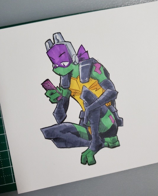
How do you make your little paper turtles? I like the idea and I think my brother's fiance would love them i may also want to make them for myself cuz they're amazing
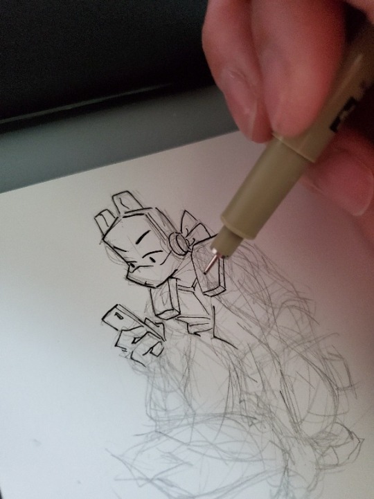
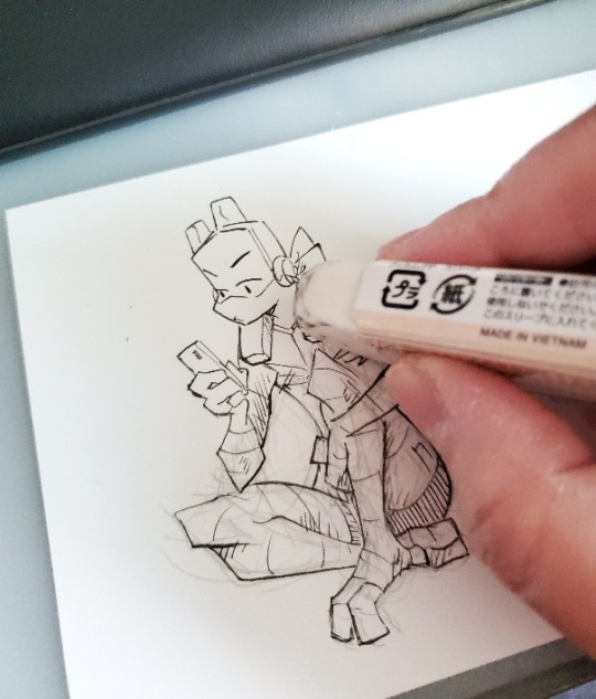
They're not too difficult! I use a cardstock-type of paper and draw a thing first, and then outline it. My usual go-to has been an 02 Micron, and I use an 01 for line shading here and there. I go over some of the lines again for some weight variation, and then we get rid of my mess of sketch lines!
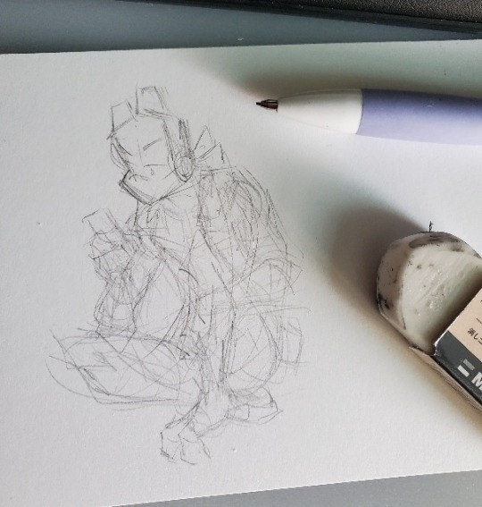
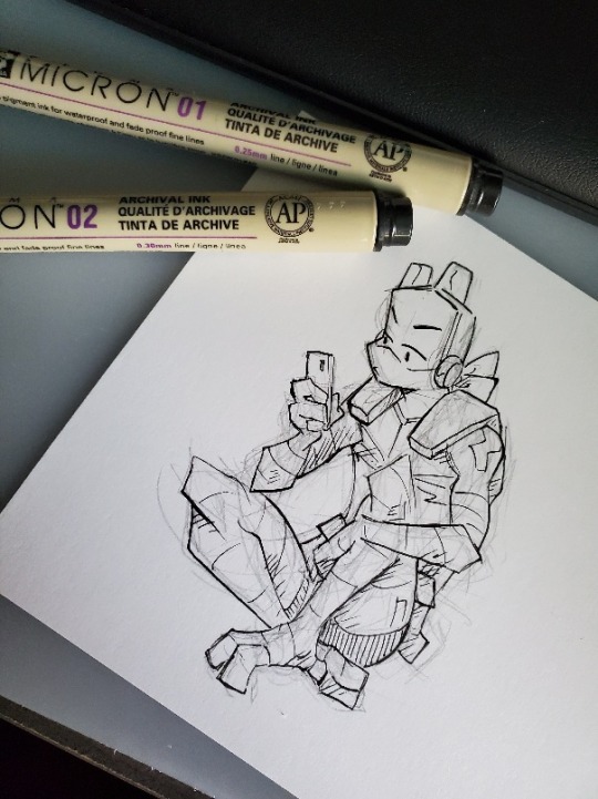
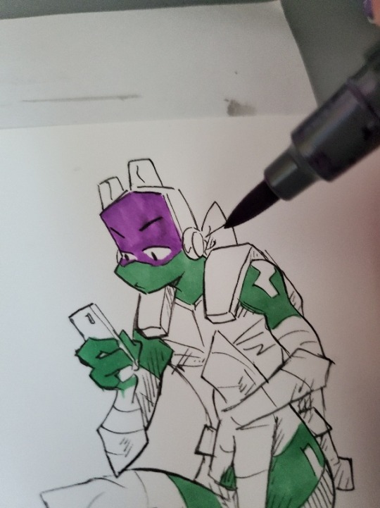
Then it's time to color~ I use alcohol markers since they blend pretty nicely so you don't get those streaky marks that show where you've colored.
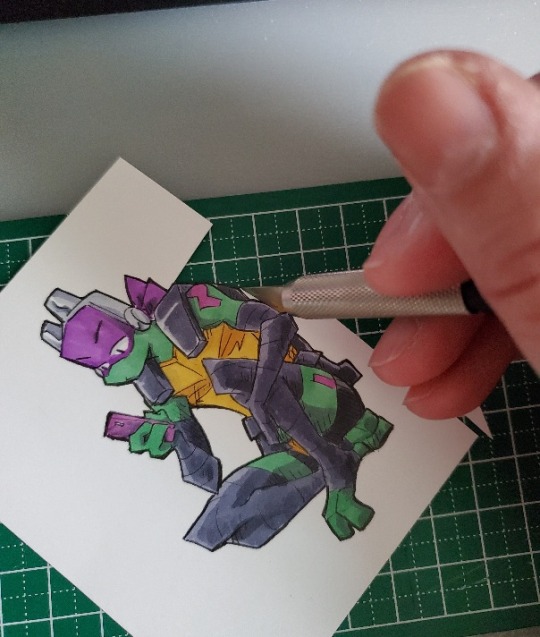
I could've probably done it earlier but I went over the outside lines with a thicker Micron (05) just to give me something of a space for when I trim. Don't know if you can see the difference...
ANYWAY then we cut! Usually I use scissors but a craft knife does make it a lot easier for cleaner cuts, especially around the corners and the blank space in between colored sections when you have them. Whichever method you opt for, I've found it easier to cut in sections, trimming away bit by bit rather than trying to cut all the way around.
Laaaastly is maybe the most important part to really sell the illusion of integrating them into the background of wherever you decide to hang or stick them. It's kind of like when you do digital and 'stroke' the external lines of an image with a transparent background (do people still do that anymore...) so there aren't any white artifacts that show up when they come up over dark backgrounds. Same idea here.
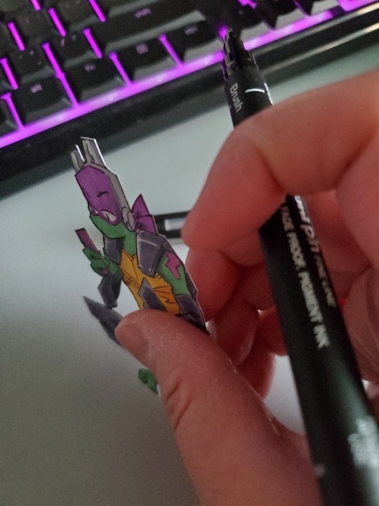
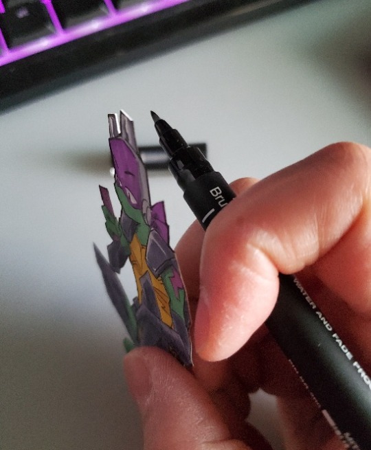
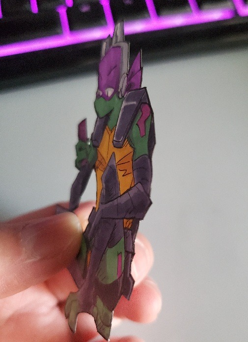
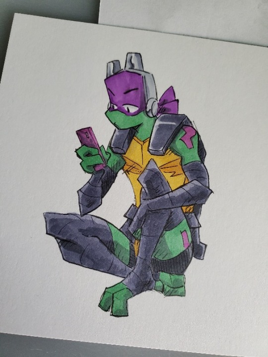
I go over the edges with black. This helps blend your cutout in with wherever it is. You can also touch-up your outer lines if there's any bit of white from when you cut things out. But that's all there is to it!
And now....we stick this boy somewhere.
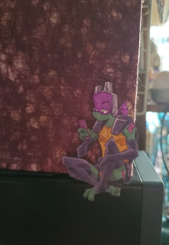
You could do this digitally too if drawing and coloring it directly on paper isn't your thing. The main step to follow would be the last one with the black edging.
Hope this helps! :D
191 notes
·
View notes
Text

[さと@luql_x]
101 notes
·
View notes
Text
Tutorial: How-To Create Striking Gradient Shapes & Waves for Adobe Illustrator for iPad

In this tutorial, we will explore step-by-step instructions and tips to create striking gradient waves and shapes that can enhance any project, from digital illustration to web design and marketing materials.

Starting off you'll want to open Adobe Illustrator on your iPad, and select 'custom size'.

Create a canvas that measures at 3000 x 3000 points.

Set the colour mode as 'RGB'.

Select the 'Pencil' tool, and then select 'Paint Brush'.

Select 'Calligraphic' brushes, and scroll down until you find the 15 pt. 'Round' brush and select it.

Select the 'Fill' option and set the colour value to none.

Select the 'Stroke' option and set the colour value to a colour of your choosing.

Select the 'Smoothness' option and set it to the maximum value (10).

Draw a wavy line.

Select the 'Stroke' tool and choose a new colour.

Draw another wavy line over the top of the previous.

Select the 'Stroke' tool and choose another new colour.

Draw another wavy line over the top of the previous two.

Select the 'Selection' tool.

Select all of the shapes.

Select the 'Repeat' tool.
Within the 'Repeat' tool, select the 'Blend' option.
Tip: If you have a keyboard connected to your iPad, you can use the keyboard shortcut 'Command+Alt+B' when objects are selected to blend them.

Now our gradient wave shape has been created!

Once the shapes have been blended, you can manipulate the spacing of each shape with the three dots in the middle, each one represents each of the lines.

Move each point around until you feel comfortable with their spacing.

We may want to make some alterations to our shape such as changing the rotation, shape, size, order of lines. Here’s how we can do that.
Select the 'Selection' tool.

Drag and select the shape.

Select the 'Object' tool.
Select the 'Release' option.

Now the objects are unblended they can be altered or manipulated to our liking.

To put our gradient wave back in place, first select the 'Repeat' tool.

Then select the 'Blend' option.
Congratulations on completing the tutorial on creating striking gradient waves and shapes in Adobe Illustrator for iPad! You've taken significant steps in enhancing your design skills, learning how to apply gradients effectively, and bringing your digital artwork to life with vibrant colours and dynamic forms.
Keep Practicing - As with any creative skill, practice is key to mastery. Continue experimenting with different gradient combinations, wave patterns, and shapes. Find new ways to enhance your designs.
The more you practice, the more confident and proficient you will become.
If you're interested in supporting me, or checking out some free eBooks, Wallpapers, and more. Please consider checking out my Ko-Fi page: https://ko-fi.com/spikeeager
#freebies#guides#guide#how to#howto#how-to#how-to's#how-tos#art guide#art#design#illustration#art help#art tip#art advice#art tutorial#drawing tips#graphic design#creative#unique#marketing#tips#artwork#art process#digital painting#drawing#illustrators on tumblr#illustrator#illustrative art
141 notes
·
View notes
Text


You’ll need to decide what kind of time and resources it might take to motivate people to act for a particular goal. There’s some basic criteria that you can use to evaluate how much work it might take to have an impact.
HISTORY/CONTEXT:
Have there been previous fights there?
Are people involved in current or previous struggles elsewhere? Experience and confidence are infectious. (Example: Many of the people who started the Ferguson uprising were fast food workers organizing at work.)
Are people paying attention to other external struggles? (Eg Tim Hortons workers fighting to keep benefits)
You’ll get a lot of this information by talking to people.
#labor organizing#labor#organizing#IWW#how-to#guides#manuals#Industrial Workers of the World#module#workers#anarchism#anarchy#anarchist society#practical anarchy#practical anarchism#resistance#autonomy#revolution#communism#anti capitalist#anti capitalism#late stage capitalism#daily posts#libraries#leftism#social issues#anarchy works#anarchist library#survival#freedom
74 notes
·
View notes
Text
So Google has decided in their infinite wisdom to force everyone over 18 into their Gemini app garbage. Here's how to turn it off and delete any activity.
15 notes
·
View notes
Text

At the controls.
#vintage illustration#infographics#detailed drawings#aviation#aircraft#vintage aircraft#vintage airplane#military aviation#military aircraft#information#how-to#how to#how to fly#pilots#piloting
15 notes
·
View notes
Text
Cosplaying Salomé (1922): A How-to
Seeing as my cosplay of Nazimova as Salomé is one of the more ambitious projects I’ve done for the blog, it seems fitting to give you all a little BTS and how-to. Because I didn’t fully document my process, this isn’t necessarily as full a tutorial as my Century of Glamour Ghouls series, but you could definitely recreate this yourself (and learn from my mistakes) as this would make a great Halloween costume!

a full-length shot of my cosplay of Nazimova as Salomé
Part one of “CtC: Nazimova as Salomé” goes into more detail on Nazimova & Rambova’s creative choices for the character and her design, but to be brief about it:
Nazimova’s Salomé is heavily informed by young women and girls of the early 1920s, so there is a dynamic conflict created between the baby-fication of young women and pop-culture sexualization of the same group. So, this first look from the film communicates unsophisticated youth with an impetuous edge. The pearled wig is not only a dazzling visual, but also emphasizes Nazimova’s brazen pantomime—amplifying every flitting gesture. It also gives the character a more childlike silhouette, which Nazimova pairs with an immature, sometimes bratty body language.

my gif of Nazimova in Salomé
The rest of the costume is quite simple: a shimmery/sparkly sleeveless, belted tunic and flat shoes. (Contrasted with Rose Dione’s costuming as Heriodas, flowing and heavily adorned.)
Get the Look!
(below the jump!)
What’s below covers the materials and methods I used, but improvements could definitely be made. I would love to see others take this on!
The Wig

My recreation of the wig in natural light


my gif of a closeup of Nazimova in the wig & gif of my cosplay wig in motion
Materials:
Black wig cap
Black yarn
Springs (I used the plastic ones sold as cat toys)
Black thread
Curved sewing needle
Rug Hook (This is a tool I already had on hand. If you have a small enough crochet hook, that might also work!)
Baubles (maybe: pearlescent paint for the baubles)
Craft glue (I don’t own a hot glue gun, but that would have been better!)
Optional: black bangs/fringe track
The Process
Note: my finished product is scaled up a bit from the wig used in the film largely because I was also working with a mix of items gifted to me from my wishlist and things I already had around the house. The springs were 1 inch in diameter as were the baubles. If you are buying everything new, you might want to try and track down .5-.75 inch materials!
Thankfully, about 10 years ago, the original wig was recovered in a trunk in Georgia, so I had a modern photo to reference for how the wig was constructed. [You can see it here!]

Some of the materials I used to create the wig
I started by wrapping the black yarn around the springs, which I had stretched out slightly. Once a spring was fully covered, I cut the yarn with roughly 3 inches extra length to fasten the spring to the wig cap.
After I had a significant amount of covered springs—I did it in waves of ~20—I used the rug hook to pull the extra yarn through the mesh of the wig cap. Then, I knotted the yarn tightly and pulled the extra yarn back to the topside of the cap using the rug hook, crossed it over the opposite side of the spring and back through the cap to knot it again on the underside of the cap. This way the spring is fastened at two opposite points of its circumference.
Once a wave of springs were loosely attached to the cap, I went in with a curved needle and black thread to sew the springs more tightly in place. This also gave the whole headpiece more stability. (This is important because the baubles will weigh the springs down a little!) I repeated this process in waves until I ran out of materials (and thankfully the cap was covered).

detail shot of the springs, the arrow is indicating the support stitching I added to the backside of each spring
At this point, my springs were a little droopy, so I reinforced them with a little bit of thread from the base to the end. This also allowed me to fine tune where each spring would sit in relation to its surrounding springs to get an even spread.
All the loose yarn inside the wig cap I roughly french braided together so it would sit flat and also add a little extra stability. It’s not a pretty sight, but it’s surprisingly comfortable!
The glass baubles I had on hand were not pearlescent, but multi-colored, so I had to paint them before gluing them to the springs. If you’re buying new, you can try and pick out the finish, size, and material you want.
That’s basically that. I adjusted two of the springs so that their baubles wouldn’t clatter into one another too much, but the wig is finished!


unfiltered cameraphone photo of the cosplay & final edit of the cosplay
I’m fairly certain that in the film Nazimova is wearing fake bangs under the pearl wig, but I just cut my own bangs bluntly and ran some gel mixed with black eyeshadow through them with a spoolie. (I don’t have any special feelings for my hair, so I tend to just cut/trim it whenever I cosplay. I understand this is unusual! You all don’t need to remind me! Thanks!)

my gif of a closeup of Nazimova as Salomé
——— ——— ———
The Tunic


my gif of Nazimova as Salomé & my cosplay recreating the moment above
For the tunic, I chose red sequined velvet. I don’t know what the screen-used fabric was though it certainly wasn’t this! I chose this fabric as it was affordable and I thought it might give off a similar effect in the finished photos. In a happy accident, I think the sequins give off a scaled-up look that matches the wig.
I don’t think the screen costume was black, but something that photographs dark on 1920s black-and-white film stock. That’s why I chose red, though I think a deep purple would also have worked.
Since I’ve followed The Closet Historian’s 1920s One-Hour Dress Tutorial twice before, that method was my baseline for making the Salomé tunic.
Using my hip measurement as the primary guide and adding .5 inch of allowance, I folded the fabric in half and cut it into a long rectangle—the fold being where I would cut the neckline. After I cut the neckline in, I put it on and pinned and tucked the shoulders, bust, and bottom hem to where it would sit right. My body is not rectangular, so the bust/shoulders had to be brought in a bit. Very professional, I know.
Then I sewed the edges of the whole rectangle and the neckline. I only attached the front to the back on one side, from bottom hem to hip, as that appears to be how the tunic was sewn in the film. (When I wear this out as a costume, I will likely sew up both sides!)

my cosplay with the belt featured over my left hip
I used scrap fabric to sew together the belt and some velcro (repurposed from an old ribbon) and fastened it to a plastic ring (repurposed from the last new scarf I bought). I then hung some beaded necklaces that I already owned to finish it (tho it wouldn’t be a great expense to buy some cheap strings of faux pearls if you want it to look closer to what’s on screen).
The slippers weren’t a match for the film, but I already owned them and thought they fit the vibe. What Nazimova seems to be wearing in the film are some simple light/white satin-ish flats.
——— ——— ———
The Makeup


unfiltered cosplay cameraphone photo & finished cosplay photo
Since this is such a high-contrast look, I personally opted not to use contouring for this cosplay. Also, I didn’t use any kind of blush because if you are photographing in black-and-white or for B&W editing, blush and warm colors register darker than they look in color.
For the base, I mixed a lighter pigment into my foundation to achieve a mask-like quality and set it with the lightest powder I own. (I think if you are “Portland Tan” like me, you could legit use white face paint for this and it would look pretty cool!)

my gif of a closeup of Nazimova as Salomé
For the brows, Nazimova’s are rounded but elongated, so I drew mine in a slightly rounder shape than they naturally grow.
For the eyeshadow, I used the old garage-door strategy with a purple-y taupe shadow from my lashline to the browbone with a small gap between the end of that shade and the brow. As it’s done in the movie, the shadow covers the inner corner all the way out to the end of the liner wing and all the way up to the browbone.
For the eyeliner, Nazimova’s eyes are fully rimmed in black, but with a flatter shape along the bottom. I drew a line straight back from the lowest point of my lower lid, drew a line down from my upper lid to that first line, then filled in the triangle made at the outer corner. I used black eyeshadow with a wet brush to both fill in my eyebrows and draw on the eyeliner. I also tightlined my eyes, though if your eyes aren’t quite as round you might want to skip the tightline! I finished it off with a plain black mascara, false lashes are not really a necessity for this look.
For the lips, I covered the outside edges of my lips with my base makeup to get Nazimova’s pout. Then I used a dark pink lipstick and a lip brush to paint on the pouty shape (that Nazimova was born with) making sure to overemphasize the top lip. (I didn’t overline my top lip, because that looks a bit extreme on my face, but it might suit you really well!) I then went in with a slightly darker shade of lipstick at the center of my lips to further emphasize the pout.
Here are some photos from my Irena Dubrovna/Cat People cosplay tutorial that illustrate the difference tightlining makes and what lip re-shaping looks like before blending and adding lipstick:


Irena process photo showing the effect of tightlining & unblended lip re-shaping
If you’re only accustomed to 2020s makeup, keep in mind that this is a 1920s makeup look. If it looks too blended, too sharp, too smooth, it’s just not going to look authentic. (Which is perfectly fine if you’re not going for authenticity but rather a 2020s reimagining!)
——— ——— ———
Bonus: The “Backdrop”
This isn’t necessarily useful for putting together a Halloween costume, but I thought it might be a fun curiosity to share how I made my “backdrops.” Basically, I wanted a black background as the film’s terrace set has a void-like quality, so I roughly brushed black paint over black 12x9in construction paper.


natural light photos of my drawings of the gate, the moon, and the black backdrop
Using the same size construction paper, I drew the decorative metal fencing from the film with colored pencils on yellow paper and used a black felt tip marker to fill in the gaps. Likewise, I drew out the clouds and moon on construction paper in yellow, blue, and purple—as I knew how those colors would register in B&W—and cut them out. I then attached them to clear plastic to photograph them with directional lighting similar to what I used for the cosplays.
I cleaned up the drawings digitally and then composited the elements with my cosplay photos.


cosplay photos composited with the moon, the gate, and the black "backdrop"
Conclusion
Thank you all for reading, following along, and supporting my work! If you decide to use this guide or any of my previous how-tos this Halloween, please share. I’ve loved seeing your Asta Nielsen Hamlets over the past few years!
Stay Tuned for Postscript to Cosplay the Classics: Salomé and Orientalism! For now, check out Part One: The Importance of Being Peter and Part Two: Artists United?
——— ——— ———
☕Appreciate my work? Buy me a coffee! ☕
——— ——— ———
Other Costume/Cosplay How-Tos:
Theda Bara | Pola Negri in The Wildcat (1921) | Asta Nielsen in Hamlet (1921) | Musidora in Les Vampires (1915) | Conrad Veidt in The Cabinet of Dr. Caligari (1920) | Gloria Holden in Dracula’s Daughter (1936) | Simone Simon in Cat People (1942) | Vampira in Plan 9 from Outer Space (1959) | Yvonne Monlaur in Brides of Dracula (1960) | Daria Nicolodi in Deep Red (1975) | Amanda Bearse in Fright Night (1985) | Fairuza Balk in The Craft (1996) | Barbara Stanwyck in The Lady Eve (1941) | Barbra Streisand in The Way We Were (1973)
#1920s#1922#1923#nazimova#alla nazimova#film costume#costume design#halloween costumes#costume#halloween#how-to#makeup tutorial#tutorial#cosplay#film#cinema#silent movies#silent film#silent cinema#classic film#queer#queer artist#queer film#classic movies#classic cinema#old hollywood#classic hollywood#film stars#natacha rambova
23 notes
·
View notes
Text
A Quick Read.
And more juggling.
65 notes
·
View notes
Note
how/when did you claim the dead boy detectives badge bc I Want it but literally cannot figure out how to get it 😭😭😭 idk maybe I'm just missing something obvious
hihi!
so it won’t show up if you go to the badge shop through your own profile, but here’s the way i got it (accidentally):
i clicked on another user’s badges when their post showed up on my explore feed, and then i hit the present/gift box icon, which led me to the shop. then you can claim it and go back and edit your blog to get the badge :)
hope this helped?


15 notes
·
View notes
Photo
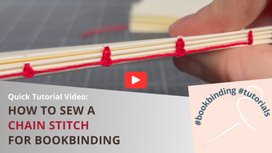
papercraftpanda (via How to Sew the Chain Stitch Bookbinding Pattern)
#bookbinding#binding books#chain stitch#journals#art journaling#make your own journal#mixed media#how-to#diy#papercraftpanda
19 notes
·
View notes
Text
Shown here are two popular Dim Sum (点心) items - Fried Prawn Dumplings (明虾角) and Spring Rolls (春卷) with a cup of Teh Siew Dai or in simple English, milk tea less sweet. I have also included a video (not mine) on the making of the fried prawn dumpling.


youtube
#Dim Sum#点心#Cantonese#Fried Prawn Dumpling#明虾角#Spring Roll#春卷#Deep-Fried#Teh Siew Dai#Milk Tea#Less Sweet#Video#Youtube#Recipe#How-To#Breakfast#Snack#Food#Buffetlicious
45 notes
·
View notes
Text
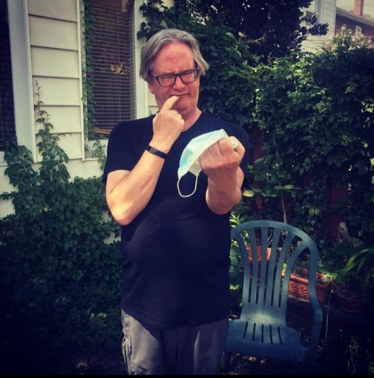
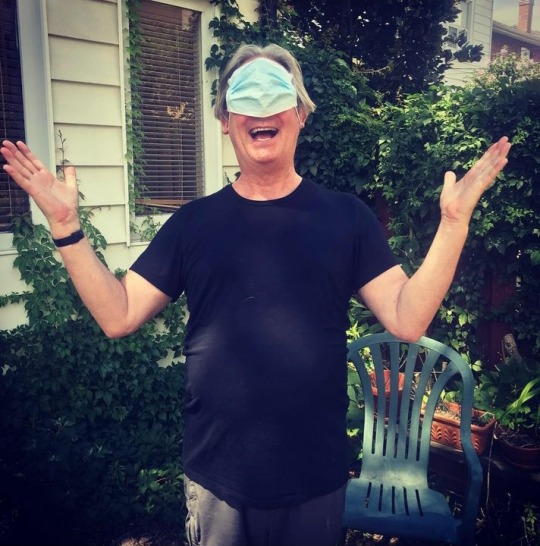
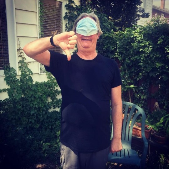


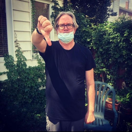
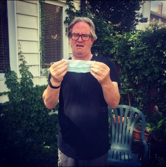
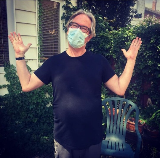
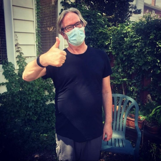
Mark's handy-dandy guide to wearing a mask.
16 notes
·
View notes
Text

i made a 60-second guide to doing a girl voice for my younger transfemms:
i hope it helps u. special thanks to @transvoicelessons on youtube.
#trans voice#voice training#instant guide#quick guide#60-second guide#guide#FAQ#trans women#transgender#transfem#transfemme#female voice#girl voice#voice acting#dnd#ttrpg#dungeons and dragons#dungeons & dragons#feminine voice#easy#how-to#trans pride#youtube#ytube#short#tiktok#instagram#meta resonance#transvoicelessons
9 notes
·
View notes
Text
Chunky Fan Sweater Tutorial
My relationship with chunky yarn is complicated. It’s fun to work with and very soft, but isn’t my favorite for wearables, which is about all I crochet. I also can never manage to get enough of it to make anything decent. So when I managed to get 5 skeins of Fluffy Day by Hobbii for free at a yarn swap, I was determined to settle the score between chunky yarn and myself.…
#acrylic#bulky yarn#crochet#crochet pattern#crochet tutorial#design#fiber art#free crochet pattern#free crochet tutorial#free pattern#free tutorial#handmade#hobbii yarn#how-to#slow fashion#sweater#Tutorial#yarn#crochetblr
2 notes
·
View notes
Text


Going Public (or not!)
One of the key parts of strategy and tactics involves whether or not to go public as a union/organization/committee/group of concerned folks. This decision can lead to a lot of goodwill, as we saw with neighbors and friends surrounding our Burgerville and Stardust campaigns, but it can also lead to a lot of angry energy and union busting techniques.
One of the reasons to go public is to show your unity and strength together — that none of their cheap intimidation is working. This is a step in which inoculation and reorganization becomes extremely important.
#labor organizing#labor#organizing#IWW#how-to#guides#manuals#Industrial Workers of the World#module#workers#anarchism#anarchy#anarchist society#practical anarchy#practical anarchism#resistance#autonomy#revolution#communism#anti capitalist#anti capitalism#late stage capitalism#daily posts#libraries#leftism#social issues#anarchy works#anarchist library#survival#freedom
45 notes
·
View notes