#I hope something awesome
Text
Oh my God guys I'm watching Midnight Mass (....first of all.... 🤌) episode 4 and Bev just went from my least favorite character to my most favorite holy shit. I mean she's *awful* she's a bitch she's a bigot she's a pious arrogant bastard but she is so. ride. or. die. it's incredible. Bev I hate you so much but I am in awe. In awe! No hesitation whatsoever. ALSO black-haired priest covered in blood shivering sadly in the corner is 100000% my aesthetic. That's gender. Or something.
#midnight mass#this show had a long slow build but. it sure is built now huh#father paul is driving me insane I don't even know what I mean by that just *points* look at him#oh I JUST got why he calls himself paul don't mind me it's not like he literally spelled it out last episode#I am so ready for wherever this show is going#there's a moment in this episode#a long scene actually!#where a christian and an atheist both discuss what they think happens when they die#and both opinions are treated with equal amounts of gravity and poignancy both by the characters and the show itself#and it's beautiful#and the muslim sheriff. he's going to have his moment soon I can feel it and I am so excited. what are they going to do with that#I hope something awesome#🙏 good soup gimme more
6 notes
·
View notes
Text
being aromantic is like. hey btw you're going to live a life that is the culmination of most of society's worst nightmares. sorry lol ✌️ but then you turn around and take a really good hard look at it and it turns out that living in that nightmare is fucking awesome and you get to wake up every day and take that fear that other people have and laugh and hold it close until it's a great joy for you instead. and being happy is a radical act that you define instead of someone else. and you're sexy as fuck that's just a fact of life i don't make the rules on that one
#aromantic people are just sexy i'm not making the decisions here it's just facts#course ur hot as fuck. it came free with the aromanticism#being sexy is just default settings for aromantic people 👍#hope this all helps. anyway i'm on my 'i hope i die alone <3 i can't wait to die alone <3' kick rn#i think the existential fear that people have of Not Partnering specifically is so. well.#obviously that shit is strong and it is SO awesome to be free of it.#realizing you're aro and you don't Want a partner can be such a hit to the solar plexus#cause society says that's the only thing that'll make you happy. so either you go without that thing or you force yourself#into doing something you don't want which would make you unhappy anyway.#so you think it's a lose lose situation and you have to come to terms with what amatonormativity presents as the worst possible situation#but then! whoa! turns out personhood is inherently valuable in and of itself and romantic partnering is just a construct!#and that nightmare is now your life to do with as you please... define as you will... structure as you want...#best case scenario. is what i'm saying.#every day i wake up ready to spit all that amatonormative rhetoric back in life's teeth by being alone and being happy#and it's so fucking satisfying. every day.#fucking JUBILANT being by myself. and i love being a living breathing 'fuck you' to the romantic system#you need a partner to be happy? oh that's sooo fucking crazy guess i'll go be miserable then. in my perfect fucking dream life lmao#yeah obviously it's the worst possible outcome on earth to die without a partner. so terrible. can't wait for it :)#aromantic#aromanticism#aro positivity#aroace#arospec#sorry to bitches who are sad about not having a partner. i could not give a fuck though get better soon#you couldn't EVER pay me enough to go back to a mindset in which my inherent value wasn't enough by myself.#FUCK that shit. absolutely miserable and a bad life outlook in general. like genuinely do the work w/ amatonormativity and get better#life is something that can be so fulfilling whether someone wants to kiss you or whatever or not#i'm on antidepressants and i have people i care deeply about. what the fuck would i need a partner for lmao
8K notes
·
View notes
Text

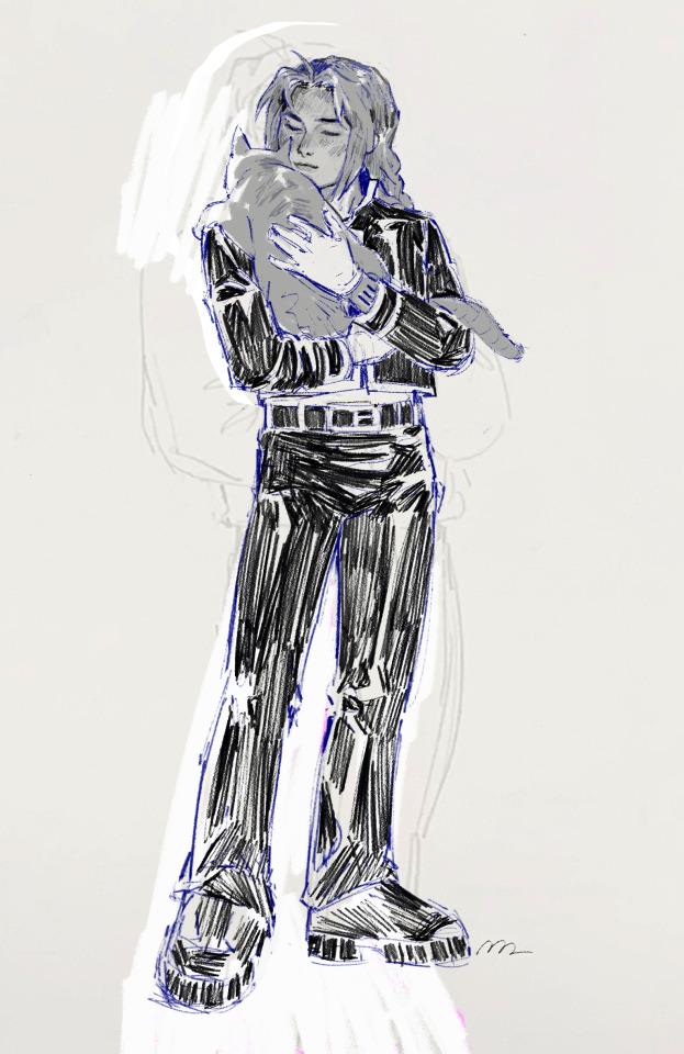
consumed with the urge to draw with ed holding cat. that's all
edit: metal arm wrong side bc canvas flip
#the legs look so fucked to me so cropped version first#edward elric#cat#I cannot explain#is it not self explanatory#probably bad to post this at 1 am my time but my impatience has always been strong and today is no different#fma#fma03#fullmetal alchemist#fmab#I really struggled with this and I still don't completely love it but I wanted to post something#it's been about a year since I first got BACK into fma#still into it lolol#fan art#anyway life updates... nothing really#I have been listening to hozier's new album for weeks and I saw him in concert which was awesome!#today I saw the PJO trailer and it brought me happiness#sketch#proportions are so fucked like I love edward's build but it really is hard for me to nail down#hope someone enjoys!
3K notes
·
View notes
Text
why Aurora's art is genius
It's break for me, and I've been meaning to sit down and read the Aurora webcomic (https://comicaurora.com/, @comicaurora on Tumblr) for quite a bit. So I did that over the last few days.
And… y'know. I can't actually say "I should've read this earlier," because otherwise I would've been up at 2:30-3am when I had responsibilities in the morning and I couldn't have properly enjoyed it, but. Holy shit guys THIS COMIC.
I intended to just do a generalized "hello this is all the things I love about this story," and I wrote a paragraph or two about art style. …and then another. And another. And I realized I needed to actually reference things so I would stop being too vague. I was reading the comic on my tablet or phone, because I wanted to stay curled up in my chair, but I type at a big monitor and so I saw more details… aaaaaand it turned into its own giant-ass post.
SO. Enjoy a few thousand words of me nerding out about this insanely cool art style and how fucking gorgeous this comic is? (There are screenshots, I promise it isn't just a wall of text.) In my defense, I just spent two semesters in graphic design classes focusing on the Adobe Suite, so… I get to be a nerd about pretty things…???
All positive feedback btw! No downers here. <3
---
I cannot emphasize enough how much I love the beautiful, simple stylistic method of drawing characters and figures. It is absolutely stunning and effortless and utterly graceful—it is so hard to capture the sheer beauty and fluidity of the human form in such a fashion. Even a simple outline of a character feels dynamic! It's gorgeous!
Though I do have a love-hate relationship with this, because my artistic side looks at that lovely simplicity, goes "I CAN DO THAT!" and then I sit down and go to the paper and realize that no, in fact, I cannot do that yet, because that simplicity is born of a hell of a lot of practice and understanding of bodies and actually is really hard to do. It's a very developed style that only looks simple because the artist knows what they're doing. The human body is hard to pull off, and this comic does so beautifully and makes it look effortless.
Also: line weight line weight line weight. It's especially important in simplified shapes and figures like this, and hoo boy is it used excellently. It's especially apparent the newer the pages get—I love watching that improvement over time—but with simpler figures and lines, you get nice light lines to emphasize both smaller details, like in the draping of clothing and the curls of hair—which, hello, yes—and thicker lines to emphasize bigger and more important details and silhouettes. It's the sort of thing that's essential to most illustrations, but I wanted to make a note of it because it's so vital to this art style.
THE USE OF LAYER BLENDING MODES OH MY GODS. (...uhhh, apologies to the people who don't know what that means, it's a digital art program thing? This article explains it for beginners.)
Bear with me, I just finished my second Photoshop course, I spent months and months working on projects with this shit so I see the genius use of Screen and/or its siblings (of which there are many—if I say "Screen" here, assume I mean the entire umbrella of Screen blending modes and possibly Overlay) and go nuts, but seriously it's so clever and also fucking gorgeous:
Firstly: the use of screened-on sound effect words over an action? A "CRACK" written over a branch and then put on Screen in glowy green so that it's subtle enough that it doesn't disrupt the visual flow, but still sticks out enough to make itself heard? Little "scritches" that are transparent where they're laid on without outlines to emphasize the sound without disrupting the underlying image? FUCK YES. I haven't seen this done literally anywhere else—granted, I haven't read a massive amount of comics, but I've read enough—and it is so clever and I adore it. Examples:


Secondly: The beautiful lighting effects. The curling leaves, all the magic, the various glowing eyes, the fog, the way it's all so vividly colored but doesn't burn your eyeballs out—a balance that's way harder to achieve than you'd think—and the soft glows around them, eeeee it's so pretty so pretty SO PRETTY. Not sure if some of these are Outer/Inner Glow/Shadow layer effects or if it's entirely hand-drawn, but major kudos either way; I can see the beautiful use of blending modes and I SALUTE YOUR GENIUS.
I keep looking at some of this stuff and go "is that a layer effect or is it done by hand?" Because you can make some similar things with the Satin layer effect in Photoshop (I don't know if other programs have this? I'm gonna have to find out since I won't have access to PS for much longer ;-;) that resembles some of the swirly inner bits on some of the lit effects, but I'm not sure if it is that or not. Or you could mask over textures? There's... many ways to do it.
If done by hand: oh my gods the patience, how. If done with layer effects: really clever work that knows how to stop said effects from looking wonky, because ugh those things get temperamental. If done with a layer of texture that's been masked over: very, very good masking work. No matter the method, pretty shimmers and swirly bits inside the bigger pretty swirls!
Next: The way color contrast is used! I will never be over the glowy green-on-black Primordial Life vibes when Alinua gets dropped into that… unconscious space?? with Life, for example, and the sharp contrast of vines and crack and branches and leaves against pitch black is just visually stunning. The way the roots sink into the ground and the three-dimensional sensation of it is particularly badass here:

Friggin. How does this imply depth like that. HOW. IT'S SO FREAKING COOL.
A huge point here is also color language and use! Everybody has their own particular shade, generally matching their eyes, magic, and personality, and I adore how this is used to make it clear who's talking or who's doing an action. That was especially apparent to me with Dainix and Falst in the caves—their colors are both fairly warm, but quite distinct, and I love how this clarifies who's doing what in panels with a lot of action from both of them. There is a particular bit that stuck out to me, so I dug up the panels (see this page and the following one https://comicaurora.com/aurora/1-20-30/):

(Gods it looks even prettier now that I put it against a plain background. Also, appreciation to Falst for managing a bridal-carry midair, damn.)
The way that their colors MERGE here! And the immense attention to detail in doing so—Dainix is higher up than Falst is in the first panel, so Dainix's orange fades into Falst's orange at the base. The next panel has gold up top and orange on bottom; we can't really tell in that panel where each of them are, but that's carried over to the next panel—
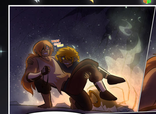
—where we now see that Falst's position is raised above Dainix's due to the way he's carrying him. (Points for continuity!) And, of course, we see the little "huffs" flowing from orange to yellow over their heads (where Dainix's head is higher than Falst's) to merge the sound of their breathing, which is absurdly clever because it emphasizes to the viewer how we hear two sets of huffing overlaying each other, not one. Absolutely brilliant.
(A few other notes of appreciation to that panel: beautiful glows around them, the sparks, the jagged silhouette of the spider legs, the lovely colors that have no right to make the area around a spider corpse that pretty, the excellent texturing on the cave walls plus perspective, the way Falst's movements imply Dainix's hefty weight, the natural posing of the characters, their on-point expressions that convey exactly how fuckin terrifying everything is right now, the slight glows to their eyes, and also they're just handsome boys <3)
Next up: Rain!!!! So well done! It's subtle enough that it never ever disrupts the impact of the focal point, but evident enough you can tell! And more importantly: THE MIST OFF THE CHARACTERS. Rain does this irl, it has that little vapor that comes off you and makes that little misty effect that plays with lighting, it's so cool-looking and here it's used to such pretty effect!
One of the panel captions says something about it blurring out all the injuries on the characters but like THAT AIN'T TOO BIG OF A PROBLEM when it gets across the environmental vibes, and also that'd be how it would look in real life too so like… outside viewer's angle is the same as the characters', mostly? my point is: that's the environment!!! that's the vibes, that's the feel! It gets it across and it does so in the most pretty way possible!
And another thing re: rain, the use of it to establish perspective, particularly in panels like this—

—where we can tell we're looking down at Tynan due to the perspective on the rain and where it's pointing. Excellent. (Also, kudos for looking down and emphasizing how Tynan's losing his advantage—lovely use of visual storytelling.)
Additionally, the misting here:
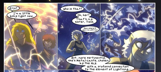
We see it most heavily in the leftmost panel, where it's quite foggy as you would expect in a rainstorm, especially in an environment with a lot of heat, but it's also lightly powdered on in the following two panels and tends to follow light sources, which makes complete sense given how light bounces off particles in the air.
A major point of strength in these too is a thorough understanding of lighting, like rim lighting, the various hues and shades, and an intricate understanding of how light bounces off surfaces even when they're in shadow (we'll see a faint glow in spots where characters are half in shadow, but that's how it would work in real life, because of how light bounces around).
Bringing some of these points together: the fluidity of the lines in magic, and the way simple glowing lines are used to emphasize motion and the magic itself, is deeply clever. I'm basically pulling at random from panels and there's definitely even better examples, but here's one (see this page https://comicaurora.com/aurora/1-16-33/):

First panel, listed in numbers because these build on each other:
The tension of the lines in Tess's magic here. This works on a couple levels: first, the way she's holding her fists, as if she's pulling a rope taut.
The way there's one primary line, emphasizing the rope feeling, accompanied by smaller ones.
The additional lines starbursting around her hands, to indicate the energy crackling in her hands and how she's doing a good bit more than just holding it. (That combined with the fists suggests some tension to the magic, too.) Also the variations in brightness, a feature you'll find in actual lightning. :D Additional kudos for how the lightning sparks and breaks off the metal of the sword.
A handful of miscellaneous notes on the second panel:
The reflection of the flames in Erin's typically dark blue eyes (which bears a remarkable resemblance to Dainix, incidentally—almost a thematic sort of parallel given Erin's using the same magic Dainix specializes in?)
The flowing of fabric in the wind and associated variation in the lineart
The way Erin's tattoos interact with the fire he's pulling to his hand
The way the rain overlays some of the fainter areas of fire (attention! to! detail! hell yeah!)
I could go on. I won't because this is a lot of writing already.
Third panel gets paragraphs, not bullets:
Erin's giant-ass "FWOOM" of fire there, and the way the outline of the word is puffy-edged and gradated to feel almost three-dimensional, plus once again using Screen or a variation on it so that the stars show up in the background. All this against that stunning plume of fire, which ripples and sparks so gorgeously, and the ending "om" of the onomatopoeia is emphasized incredibly brightly against that, adding to the punch of it and making the plume feel even brighter.
Also, once again, rain helping establish perspective, especially in how it's very angular in the left side of the panel and then slowly becomes more like a point to the right to indicate it's falling directly down on the viewer. Add in the bright, beautiful glow effects, fainter but no less important black lines beneath them to emphasize the sky and smoke and the like, and the stunningly beautiful lighting and gradated glows surrounding Erin plus the lightning jagging up at him from below, and you get one hell of an impactful panel right there. (And there is definitely more in there I could break down, this is just a lot already.)
And in general: The colors in this? Incredible. The blues and purples and oranges and golds compliment so well, and it's all so rich.
Like, seriously, just throughout the whole comic, the use of gradients, blending modes, color balance and hues, all the things, all the things, it makes for the most beautiful effects and glows and such a rich environment. There's a very distinct style to this comic in its simplified backgrounds (which I recognize are done partly because it's way easier and also backgrounds are so time-consuming dear gods but lemme say this) and vivid, smoothly drawn characters; the simplicity lets them come to the front and gives room for those beautiful, richly saturated focal points, letting the stylized designs of the magic and characters shine. The use of distinct silhouettes is insanely good. Honestly, complex backgrounds might run the risk of making everything too visually busy in this case. It's just, augh, so GORGEOUS.
Another bit, take a look at this page (https://comicaurora.com/aurora/1-15-28/):
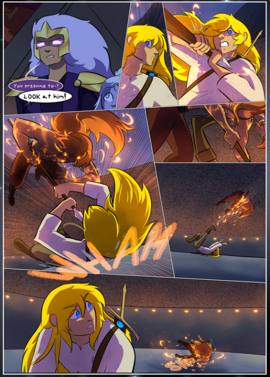
It's not quite as evident here as it is in the next page, but this one does some other fun things so I'm grabbing it. Points:
Once again, using different colors to represent different character actions. The "WHAM" of Kendal hitting the ground is caused by Dainix's force, so it's orange (and kudos for doubling the word over to add a shake effect). But we see blue layered underneath, which could be an environmental choice, but might also be because it's Kendal, whose color is blue.
And speaking off, take a look at the right-most panel on top, where Kendal grabs the spear: his motion is, again, illustrated in bright blue, versus the atmospheric screened-on orange lines that point toward him around the whole panel (I'm sure these have a name, I think they might be more of a manga thing though and the only experience I have in manga is reading a bit of Fullmetal Alchemist). Those lines emphasize the weight of the spear being shoved at him, and their color tells us Dainix is responsible for it.
One of my all-time favorite effects in this comic is the way cracks manifest across Dainix's body to represent when he starts to lose control; it is utterly gorgeous and wonderfully thematic. These are more evident in the page before and after this one, but you get a decent idea here. I love the way they glow softly, the way the fire juuuust flickers through at the start and then becomes more evident over time, and the cracks feel so realistic, like his skin is made of pottery. Additional points for how fire begins to creep into his hair.
A small detail that's generally consistent across the comic, but which I want to make note of here because you can see it pretty well: Kendal's eyes glow about the same as the jewel in his sword, mirroring his connection to said sword and calling back to how the jewel became Vash's eye temporarily and thus was once Kendal's eye. You can always see this connection (though there might be some spots where this also changes in a symbolic manner; I went through it quickly on the first time around, so I'll pay more attention when I inevitably reread this), where Kendal's always got that little shine of blue in his eyes the same as the jewel. It's a beautiful visual parallel that encourages the reader to subconsciously link them together, especially since the lines used to illustrate character movements typically mirror their eye color. It's an extension of Kendal.
Did I mention how ABSOLUTELY BEAUTIFUL the colors in this are?
Also, the mythological/legend-type scenes are illustrated in familiar style often used for that type of story, a simple and heavily symbolic two-dimensional cave-painting-like look. They are absolutely beautiful on many levels, employing simple, lovely gradients, slightly rougher and thicker lineart that is nonetheless smoothly beautiful, and working with clear silhouettes (a major strength of this art style, but also a strength in the comic overall). But in particular, I wanted to call attention to a particular thing (see this page https://comicaurora.com/aurora/1-12-4/):
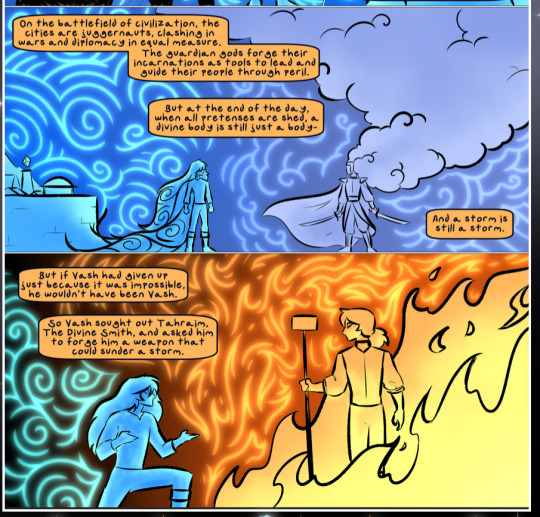
The flowing symbolic lineart surrounding each character. This is actually quite consistent across characters—see also Life's typical lines and how they curl:
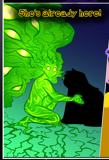
What's particularly interesting here is how these symbols are often similar, but not the same. Vash's lines are always smooth, clean curls, often playing off each other and echoing one another like ripples in a pond. You'd think they'd look too similar to Life's—but they don't. Life's curl like vines, and they remain connected; where one curve might echo another but exist entirely detached from each other in Vash's, Life's lines still remain wound together, because vines are continuous and don't float around. :P
Tahraim's are less continuous, often breaking up with significantly smaller bits and pieces floating around like—of course—sparks, and come to sharper points. These are also constants: we see the vines repeated over and over in Alinua's dreams of Life, and the echoing ripples of Vash are consistent wherever we encounter him. Kendal's dream of the ghost citizens of the city of Vash in the last few chapters is filled with these rippling, echoing patterns, to beautiful effect (https://comicaurora.com/aurora/1-20-14/):
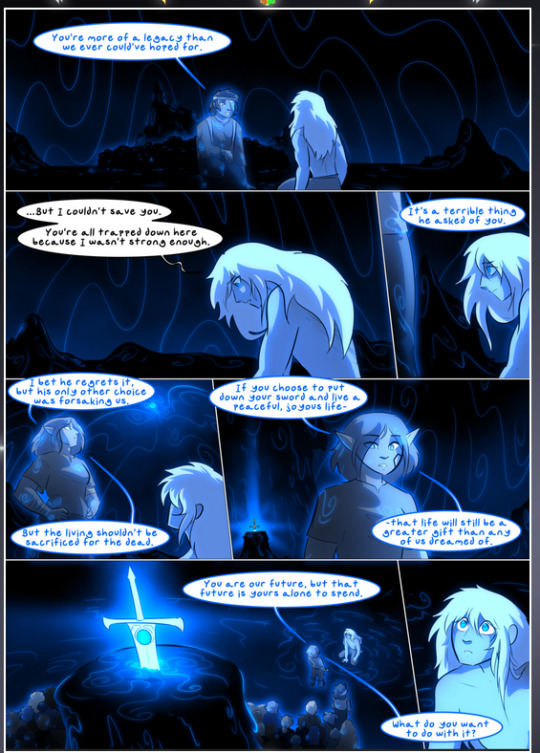
They ripple and spiral, often in long, sinuous curves, with smooth elegance. It reminds me a great deal of images of space and sine waves and the like. This establishes a definite feel to these different characters and their magic. And the thing is, that's not something that had to be done—the colors are good at emphasizing who's who. But it was done, and it adds a whole other dimension to the story. Whenever you're in a deity's domain, you know whose it is no matter the color.
Regarding that shape language, I wanted to make another note, too—Vash is sometimes described as chaotic and doing what he likes, which is interesting to me, because smooth, elegant curves and the color blue aren't generally associated with chaos. So while Vash might behave like that on the surface, I'm guessing he's got a lot more going on underneath; he's probably much more intentional in his actions than you'd think at a glance, and he is certainly quite caring with his city. The other thing is that this suits Kendal perfectly. He's a paragon character; he is kind, virtuous, and self-sacrificing, and often we see him aiming to calm others and keep them safe. Blue is such a good color for him. There is… probably more to this, but I'm not deep enough in yet to say.
And here's the thing: I'm only scratching the surface. There is so much more here I'm not covering (color palettes! outfits! character design! environment! the deities! so much more!) and a lot more I can't cover, because I don't have the experience; this is me as a hobbyist artist who happened to take a couple design classes because I wanted to. The art style to this comic is so clever and creative and beautiful, though, I just had to go off about it. <3
...brownie points for getting all the way down here? Have a cookie.
#aurora comic#aurora webcomic#comicaurora#art analysis#...I hope those are the right tags???#new fandom new tagging practices to learn ig#much thanks for something to read while I try to rest my wrists. carpal tunnel BAD. (ignore that I wrote this I've got braces ok it's fine)#anyway! I HAVE. MANY MORE THOUGHTS. ON THE STORY ITSELF. THIS LOVELY STORY#also a collection of reactions to a chunk of the comic before I hit the point where I was too busy reading to write anything down#idk how to format those tho#...yeet them into one post...???#eh I usually don't go off this much these days but this seems like a smaller tight-knit fandom so... might as well help build it?#and I have a little more time thanks to break so#oh yes also shoutout to my insanely awesome professor for teaching me all the technical stuff from this he is LOVELY#made an incredibly complex program into something comprehensible <3#synapse talks
761 notes
·
View notes
Text
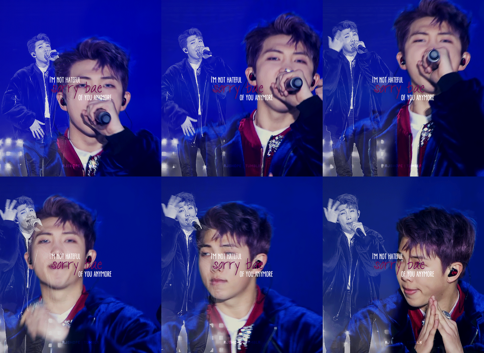
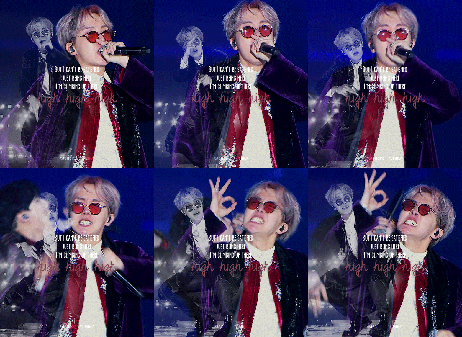
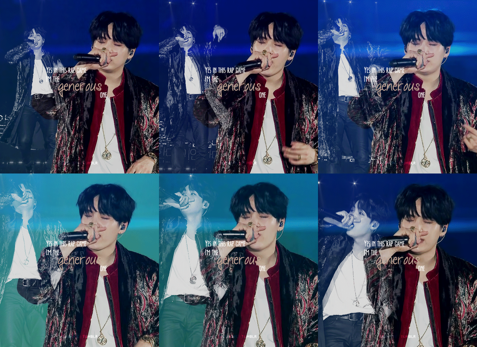
I love I love I love myself
I love I love I love myself
I know I know I know myself
Ya playa haters you should love yourself
Brr
Happy birthday @raplinenthusiasts 💖
#btsgif#btsedit#userbangtan#dailybts#cyphernet#namjoonedit#hoseokedit#yoongiedit#bts#kim namjoon#jung hoseok#min yoongi#*#yes i remembered once that your birthday is in october so i made these and quietly waited for the right day😈#i hope you'll like it bc it's my first time doing something like this👉👈#anyway i wish you the happiest birthday!#i love talking to you#you're an awesome companion on my bts journey i love sharing my thoughts and opinions with you#you're so supportive and understanding i feel very lucky <3#hope it was (and still is) a very very YOUR day#sending the biggest hugs your way💖🌷💖
376 notes
·
View notes
Text


Double date

another version without the lighting i guess
#HAPPY VALENTINES DAY EVERYONE <333#Do you have a valentine? I DO I DO I DO#If not then WHO CARES you don’t need anyone to be happy just vibe and be cool 😈#I WANTED TO DRAW SOMETHING DEDICATED TO THE NEW EPISODE BCUZ HOLY SHIT 😭 but maybe I’ll do it next time 🔥#I HOPE U GUYS LIKE THIS ONE cuz I haven’t been able to draw a lot in the past few days :(((((#HAVE AN AWESOME DAY LOVES MWAH MWAH MWAH#South park#Sp#Creek#Bendy#Craig tucker#tweek tweak#wendy Testaburger#bebe stevens#tweek x craig#Fanart#my art#digital art
2K notes
·
View notes
Text
*me immediately after going through a terrifying and traumatic experience* haha yeah I guess it was rough but I'm fine now like I'm totally chill. It was kinda funny actually if you think about it
#GUESS WHO GOT A PIERCING INFECTION SO BAD OVERNIGHT SHE HAD TO RUSH TO THE HOSPITAL#AND GET SURGERY TO REMOVE IT BC THE METAL WAS BURROWING ITSELF INSIDE HER LIP#yep that was meee :3#man. it sounds so silly now. like that probably shouldn't have made me panic nearly as much as it did#but you have to understand at the time it was terrifying#I noticed my lip was a bit swollen earlier in the night but I was like ok it's probably nothing serious#I put some ice on it hoping it would be back to normal after I got some sleep#then I woke up at like 5:30 AM with my lip super swollen and my lip piercing literally burying itself inside my flesh#I tried pushing it back out a bit and blood and pus started coming out so yk I started panicking#so I went upstairs and I asked my mom to drive me to the hospital#luckily we have free healthcare in brazil and the hospital was basically empty(this was on sunday)#but when I got there they told me the doctor wouldn't arrive until 8AM and it was like 6:45 at that point#so I REALLY started panicking 🫠 bc I could feel like the piercing kept burying itself more deeply like#I felt like the skin inside my lip was going to close around it and I was terrified bc I had no idea what to do#and I was scared it might make things worse#but all I could do was sit there and wait and so I started having a panic attack#luckily my mom was there with me the whole time so at least I didn't feel alone#and then I just. waited for it to end. and then tried to keep myself distracted until the doctor got there#I got treated by military doctors! sjdjcjck the army has been giving additional support for hospitals in my city#bc of the floods some health units are currently closed and demand got higher so they needed extra support there#so an army doctor performed my surgery(inside an army tent no less ajfjjfkf maybe not ideal but. functional)#he was so nice?? like probably the calmest most careful doctor I've ever been treated by#I still had a bit of a nervous breakdown again after the surgery but that was bc I'd never been through something like that before#I got anesthesia obvs but I still felt the tug when he cut into my skin to remove the piercing and did my stitches#so my mind started cooking up all these horrible scenarios of how everything could go wrong and I was gonna die#cried on the doctor's table. 👍🏻 awesome#but he and his assistant were super nice about it she even offered me a hug#but anyway in the end I finally calmed down and got some medication#now I'm all stitched up with my little bloated lip eating soup out of a straw 👍🏻 but I'm ALIVE and I'm just glad it's all over fjjvjkf#sleep.txt
74 notes
·
View notes
Text
HAPPY VERY LATE PRIDE MONTH!! 🥳🏳️🌈

Drawing this was my odyssey. Anyways, I think they're best friends.
(alt version and closeups below 🤭)
Without filters

Closeups


#artists on tumblr#fight club#fight club 1999#soapshipping#tyler durden#the narrator fight club#pride month#cnebhfeuwfnbw pushed my limits with this cause I really wanted to draw something substantial#it's this month's serious drawing heuehdueheh#next step is to stop being a pussy and learn backgrounds#and proper lighting#and *dies*#I would've finished it like two days ago but I kept playing roblox with my sis#we beat everyone's ass in dress to impress it's amazing#hope I don't develop a fucking roblox games addiction cause that would kill me both mentally and spiritually#huhu anyways#very proud of this drawing#I played around with many brushes and that's how I got to the graffiti bg#the spraypaint brush is my new fav brush#expect spraypaint drawings huhu#collapsing now#bye pookies stay awesome#muah#martyryo
117 notes
·
View notes
Text


Mash Burnedead + Cream Puff
Anime, Manga, Voice Actor (Kobayashi Chiaki), Stage Play (Akazawa Ryotaro)
Dedicated to @apparently-artless, happy belated birthday!
#mashle#mashle magic and muscles#mash burnedead#kobayashi chiaki#akazawa ryotaro#my gifs#userartless#mashleverse#HAPPY BIRTHDAY ART!! I knew your birthday was at the end of august but I've been so busy... I only had the time to make something today...#and i'm sorry it's very simple and don't have as much gifs+experiments as the previous gifs...#but i still wanted to make something for you even if it's not much#i hope you like it!!#and i hope you have an awesome day and week ahead!
64 notes
·
View notes
Text
Can you imagine being the fan that gave that bracelet to Punk?
You just made a little gift for you favourite wrestler, with all the same colourful beads you use to make bracelets for yourself and friends. And people may think it's silly, but it's fun to you. And then you find out you're going to a wrestling meet-and-greet. You make it just on the off-chance that you get to see your favourite and give it to him. And you do! And he starts wearing it religiously, even on TV and in public, and it then becomes a major prop in one of the best storylines in the WWE currently, where it's stolen by McIntyre who states that he knows that, to Punk, it's "absolutely priceless". McIntyre then proceeds to start wearing the bracelet, showing it off online, and kisses it on camera, while people are left theorising how Punk will steal it back to bring honour to his family.
I think i would actually implode.


#thing is it's probably a young fan who made it#either a kid or a teen or something#imagine them going into school and being like#“yeah you know that bracelet that was on TV? I made it!”#how fucking awesome would that be for that fan#I bet this whole thing has made their day#no#their life#just hope the bracelet doesn't just wind up getting destroyed in the next few weeks#that'd be kinda sad#cm punk#drew mcintyre#punkintyre
62 notes
·
View notes
Photo

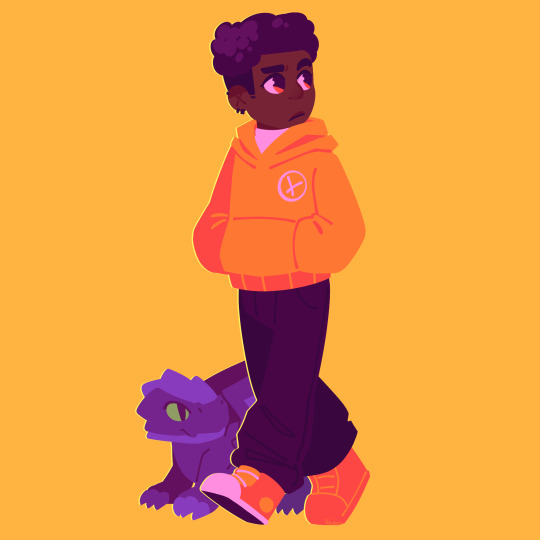
when the. dragons rise
#i love the. pink hair catgirl#shes me fr#i hope shes awesome in the show#arin too i hope theyre both awesome#ninjago fanart#lego ninjago#ninjago#ninjago dragons rising#dragons rising#my art#im not all satisfied with this art specally sora's buuut i wanna post something ig?#isomething dragons rising related bc#im excited
732 notes
·
View notes
Note
I love how you draw silver so so much do you have any tips
THANK YOUUUUU thats so nice of you 🥺
drawing silver was a lot of trial and error for me ill be honest, im still kind of figuring out how to do it. HOWEVER i do have tips : ) it will be under the cut because im allergic to being concise.
1.most important. dont skimp on the fluff. i know his 06 model looks a bit like he glued on yarn to his neck but its important that he is fluffy. to me
2. and more seriously, the toughest part to figure out is is stupid fan weed forehead quills. theyre stupid, they block half his head, theyre a defining characteristic and they make drawing his eyes a nightmare. for most other characters you can draw the eyes easy, but the way silvers quills work make fitting them and the eyes together really weird.
anyways my though process drawing them is. try not to think about them as separate things. its easy to think of it like being the eyes and then somewhere above there are the quills, but its eaier to get them to fit together if you imagine the eyes are following the shape of his quills

like this ^
they intersect. so the shape of the eye is influenced by the way his quills lay, but you can also use his eyes as guidelines for the quills too. they start where his eyeline ends, and they follow the shape of his brow on the top as well. you can start from the brow or the corner of his eyes, either way works, just pick the one that makes dinding the position and size easiest
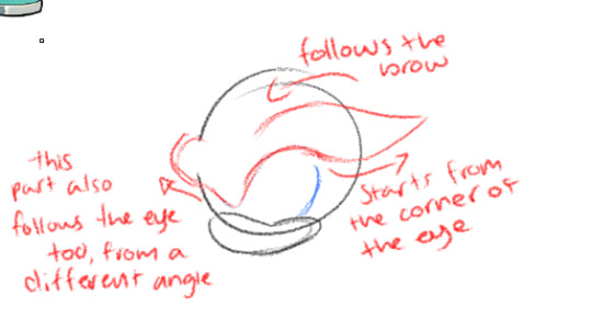
from there you care use his eyebrow quills to reference the rest of them. i usually jump to the middle on next and use its position to judge where the last ones lay, cause those ones are kinda awkward
then of course you can add his little ears in. you dont HAVE to if the angle is awkward. his ears are itty bitty and easily hidden

all his quills slope back a bit, so they have a cute bend to them.
3. uhhh those 2 big fucking quills on the back of his head. they are weird to position because they are SO. LONG. luckily theres only 2 of them. theyre spaced out pretty evenly from each other, and there is a gap in between them. we've all seen his bald spot
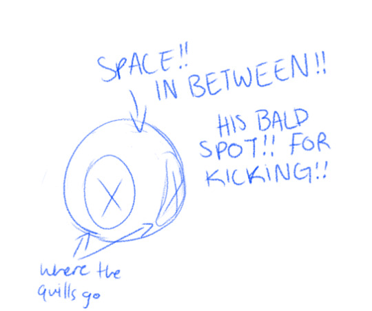
anyways the quills have a gradual curve downward and outward. you can see it pretty well in that first picture, with all the silvers lined up. you can see it pretty well on the silver figure. from the front you can see them falling to either side of him
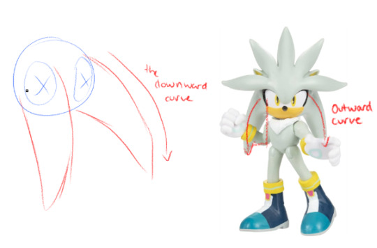
his quills kinda look like a starburst from the front : )
anyways i think thats the best advice i can give. dont ask me about drawing his cuffs or boots. they scare me

i am also figuring it out still but hopefully this helps a little : ) this also by no means a rule book, ive seen people draw him a million different ways and they all look awesome so experiment with this. have fun drawing him!!!
#YAYYY btw i am incredibly flattered you'd ask me for advice. your art is already so awesome i hope this will be helpful to you#ALSO if i missed something you wanted to know more about lmk and ill add it on#silver the hedgehog#sth#ask#eggthew#sonic artventure
106 notes
·
View notes
Text
thinking about. transfems. and trans girls. and how cool they are.. literally if you're a tgirl or girl-adjacent transgender person i want you to know that. you are so wonderful and beautiful and kind and talented.. we need you on this site now more than ever, and im so sorry about literally everything that's happened here. none of you deserve to be treated like this; you deserve so much better, and i'm sincerely hoping that other people (especially people with power to instate significant change that affects a lot of people) will understand this and work towards making this a safer platform for all of you. please don't let anything that's happening right now on this literal hellsite make you think that you're any less than amazing; i love all of you so so so much <333 please stay safe out there!!!
#not fandom#let's get serious#transgender#trans#trans positivity#trans rights are human rights#transfem#trans girl#trans women#trans pride#literally whenever i find something new that i love so so much and i look at who made it#its always a trans girl. always#how are you all so awesome at literally everything#also this includes nonbinary transfems!!! that should go without saying#everyone whos transgender and feminine in any way at all. i love you so so so much <333 forever and always#fuck photomatt this will always be the trans people website#on that note seeing so many people posting transition pics in light of this incident is. really inspiring to me#it gives me hope that someday i'll look the way i want to as well#just... i love trans girls. it cant be put into words how much hope you all give me just from existing and surviving#please keep doing it. please keep existing and surviving#its so so so important that you live#please remember that#sorry if this post is kind of incoherent my brain is. mush. because im thinking about how cool trans girls are#scary crane rambles
113 notes
·
View notes
Text


Clever girl. I'm so proud of you.
#just a quick little something for these awesome ladies#i ultimately chose the blank versions but#happy mother's day#marveledit#maggie lang#janet van dyne#hope van dyne#cassie lang#ant man (film)#ant man and the wasp#quantumania#graphics#graphical hodgepodge#quotes
71 notes
·
View notes
Text
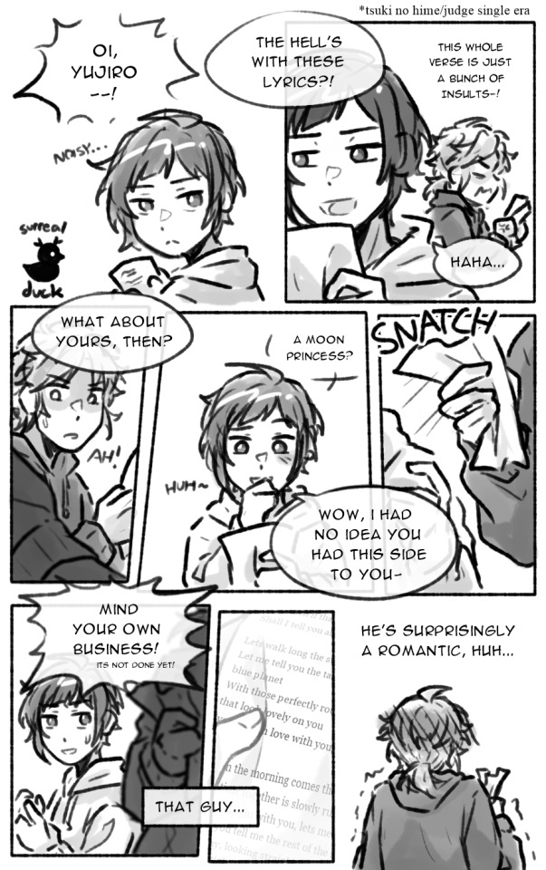
happy birthday to the most idiots of all time
#i DIDNT forget how to draw them 🎉🎉🎉#doodles#duck scribbles#minicomic tag#honeyworks#lipxlip#someya yuujirou#shibasaki aizou#aiyuu#confession executive committee#id do something more but im getting my ass beat lately#wanted to participate in aiyuu week too but </333 hope this suffices anyways#i like to think w judge and tsuki no hime being noted to somewhat related to them specifically they had a hand in writing in themselves#this idea has been haunting me for a good year or so now and im releasing it into the wild. be free#and happy bday to minami as well youre awesome king... i wish i wasnt so low energy these days#this is supposed to lead up to something but ive been falling asleep so. ponder the implications
130 notes
·
View notes
Text
i think i wouldn’t hate disco elysium’s collage mode nearly as much if it weren’t for 1) the way that it was marketed in such a tasteless, soulless manner, let alone the fact that it was a last ditch distraction from a dead on its feet studio piloted by dumbass thieving execs and released on the day of the court declaration, and 2) those dumbass fucking stickers
like if it had been included with the base game from the start and had been titled something a bit more tasteful and in-line with how i would have liked the feature to be marketed as— something like “exploration mode”, something that perhaps could only be unlocked after completing the game for the first time, AND didn’t have those stupid as hell visually and tonally incongruent with the artstyle stickers, i would have applauded it as a nice little bonus for being able to study and appreciate the 3d models and environments for reference.
#it is just so bleak man.#i have no words left to say for the latest development at zaum studios so instead i will just remember how fucked up this was lol#those stickers are the same energy as that dumbass fucking christmas card they put on steam.#cutesy fanart is awesome and all but don’t muddy the tone of the actual source with it. why is that necessary.#for gods sake what happened to boundaries#again i probably would take a different tone to even the stickers if#it had been done under the original creators (which i don’t think it would have‚ which is my point‚ but say hypothetically it happened)#but with the circumstances the way they are it is impossible to not view it all as tainted with a veneer of absolute tastelessness#and a disrespect to the source material and a sorry attempt to appeal to the shallowest parts of ‘fandom’#like you can add cartoony emoji faces and a sticker with harry and kim as cats. or their hands with the caption ‘best friends!!!’ (wtf lol)#and a frame with a bunch of pride flags being waved around (hard to articulate why i feel doubly annoyed of this one.#your corporate pride parade aesthetic is showing again. also it feels… lazy)#but you can never‚ ever erase the fact that you are parading around a stolen IP that you are entirely out of touch with#and one that you clearly have *no idea what to do with*#(something that we’ve all known for months with these hints but today has finally been basically confirmed as the sequel seems to be#officially cancelled with the last of the original writers’ crew being laid off)#how could you have known what to do with Elysium? how could you ever have?#hope you have fun with your stickers. rot#disco elysium#me talking
98 notes
·
View notes