#UX/UI Design tips
Explore tagged Tumblr posts
Visit Tumblr Blog
Explore Tumblr blogs with no restrictions, modern design and the best experience.
Last Seen Tumblr Blogs


Fun Fact
In 2020, 44% of users from Denmark used Tumblr daily.
Text
CRO UX: How To Improve CRO With Better UX
In the current digital environment, the interplay between Conversion Rate Optimization (CRO) and User Experience (UX) is crucial for companies aiming to enhance their online presence. This detailed guide explores the essential connection between CRO and UX, revealing key tactics and established methods to boost user interaction and, as a result, increase conversion rates. -Key…

View On WordPress
#conversion rate optimization (CRO)#CRO#CRO Strategies#Digital Marketing#Digital Marketing Strategies#Digital Marketing Tips#User Experience#UX#UX Design#UX design principles#UX/UI Design tips
0 notes
Text
Getting My Ass Beat in WarCraft 2 Made Me Faster in Photoshop

Back in the 2000s, I spent hours getting my ass kicked in WarCraft 2 by a friend. Their secret weapon? Keyboard shortcuts. While I fumbled with clicks, they issued commands instantly – buffing units, moving them, setting patrols – no delay. I never beat them, but it made me think about Photoshop.
Learning shortcuts in Photoshop has the same effect. Speed boosts creativity. You’re not hunting for tools or lost in menus – you move faster, explore more, and keep the momentum going.
I still suck at WarCraft but I can drive Photoshop like it was stolen (and it was).
#blog#warcraft#ui#ux#gaming#videogames#photoshop#design#graphicdesign#videogame#games#text#text post#graphic design#digital art#design tips#warcraft 2#creativity#adobe photoshop
2 notes
·
View notes
Text

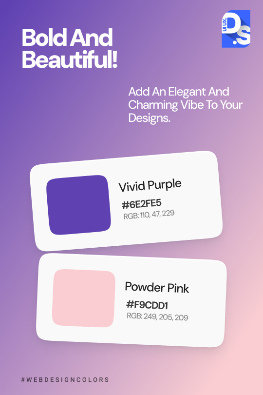
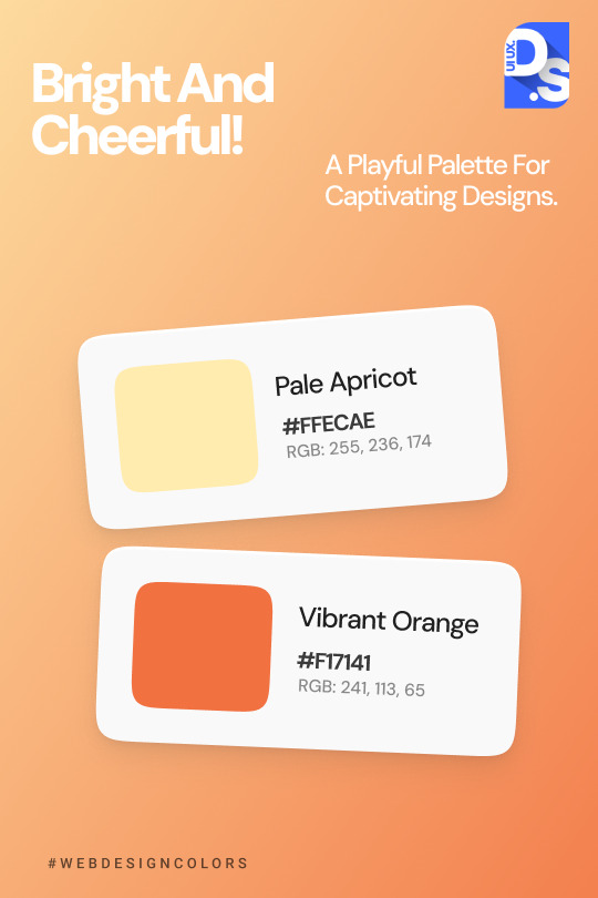

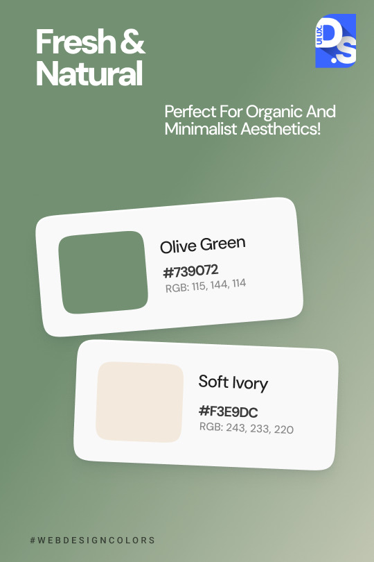

Colors bring life to your designs! 🎨✨ Discover inspiring combinations that will make your designs shine and stand out from the crowd. Whether you're creating a website, mobile app, or graphic, the right hues can tell a story and evoke the perfect emotions. Check out these eye-catching palettes and start transforming your designs today!
#ui ux design#web design#ui ux trends#uidesign#ui ux agency#ui#ux#color palette#graphic design#design tips
2 notes
·
View notes
Text
Why is UX Design deemed necessary?
In our modern-day, technologically advanced society, competition grows fiercer as user demands evolve endlessly – amidst this environment, UX design takes on unprecedented significance.
increase user satisfaction
drive business success
save company's time and money
achieve their goals more effectively
coherent brand experience
strengthens brand identification
interesting experiences
Get in detail info about UI/UX design in Guide to UX design.
4 notes
·
View notes
Text
This is instantly recognizable as a work nightmare to anyone who's ever worked in software, particularly web interface design, particularly anything governmental. Giveaways include:
Lots of "academic and online discourse", with the subtext that folks are offering strong opinions uncontaminated by actual experience with vaccine clinical trials AI development space-time anomalies triggered by overuse of temporal highways
Bureaucratic football between governments and transnational organizations
Mobile app UI that uses font size, background coloring, and button size to scream at the user "NO REALLY IT WAS A TRICK OF THE LIGHT"
i had a dream that time travel was invented and too many people choose to travel back in time to save the titanic from sinking (the question of whether unsinking of the titanic deserved so much attention in the face of human history was the subject of both heavy academic and online discourse), which caused a rift in the space-time-continuum that led to the titanic showing up indiscriminately all over the world’s oceans and sea in various states of sinking.
this caused a lot of issues both in terms of fixing said space-time-continuum and in terms of nautical navigation, and after a long and heavy battle in the international maritime organization it was decided that the bureaucratic burden of dealing with this was to be upon Ireland, much to their dismay. the Irish Government then released an app for all sailors and seafarers so they could report titanic sightings during their journeys, even though they heavily dissuaded you from reporting them given the paperwork it caused.
anyway i woke up with a clear image of the app in my head and needed to recreate it for all of you:

#work nightmare#RMStitanic#wibbly wobbly timey wimey#government-developed apps always require at least two seals#that UI REALLY wants you to hit the green button#but not as much as Amazon wants you to BUY NOW over (add to wish list in smallest font possible also grey text)#ui design#ux design#i tip my hat to you OP
114K notes
·
View notes
Text
Why Good Design is Good Business: The ROI of Investing in Quality Digital Design
At WJM Digital Design
In today’s fast-moving digital world, design is often the first and most lasting impression your brand makes. Whether it’s a website, a social media ad, or an app interface—how your business looks and feels directly influences how customers engage with you.
But great design isn't just about making things look good. It’s a powerful business tool that can increase trust, boost conversions, and drive long-term growth. Let’s break down why good design is good business—and why investing in quality digital design is one of the smartest decisions a company can make.
1. First Impressions Are Formed in Seconds
Research shows that users form a first impression of a website within 50 milliseconds. That’s faster than the blink of an eye. In that fraction of a second, people decide whether your brand feels trustworthy, credible, and worth their time.

Good design uses color, layout, imagery, and typography strategically to create a professional and inviting digital space. Bad design, on the other hand, creates friction and sends people running to competitors.
Bottom line: You never get a second chance to make a first impression—especially online.
2. Design Directly Impacts Conversion Rates
You could have the best product or service in your industry, but if your digital design doesn’t guide users clearly, you’ll lose potential customers. Quality design improves conversion by:
Making navigation intuitive
Placing call-to-action (CTA) buttons where they make the most sense
Designing for mobile responsiveness
Using visual hierarchy to guide users toward decisions
For example, a well-placed CTA button with the right color contrast can improve click-through rates by 20% or more. Similarly, optimizing page layout can reduce bounce rates and keep users engaged longer.
Design isn’t just decoration—it’s strategy.
3. Brand Consistency Builds Trust
Your brand’s visual identity needs to be consistent across all digital platforms—from your website to your social media to your email campaigns. Inconsistent colors, fonts, and styles confuse users and reduce your credibility.
Strong branding creates familiarity. Familiarity breeds trust. And trust leads to conversions.
A professional digital design agency ensures every visual element aligns with your brand’s personality and message, making your business more memorable and trustworthy.
4. Real-World Examples: The ROI of Better Design
Here are a few anonymized client examples that demonstrate the power of great design:
Client A: After a homepage redesign with better UX and CTAs, their lead conversion rate increased by 48% in just two months.
Client B: A full brand refresh and website overhaul led to a 65% increase in time on site and a 30% decrease in bounce rate.
Client C: A mobile-first redesign helped them improve mobile sales by 40%, tapping into an audience segment they were previously losing.
These numbers show that professional design pays for itself—often faster than you'd expect.
5. The Pitfalls of DIY Design
With so many drag-and-drop tools available today, it’s tempting for business owners to create their own designs. But there’s a difference between putting content on a page and crafting a strategic user experience.
Common DIY mistakes include:
Poor use of white space
Inconsistent branding
Lack of mobile optimization
Unclear navigation
CTA buttons that get ignored
A digital design agency brings experience, strategy, and polish—turning your vision into a tool that drives real results.

6. How to Know It’s Time for a Redesign
Not sure if your current design is holding you back? Here’s a quick checklist:
Your site looks outdated or cluttered
Your bounce rate is high
Your branding is inconsistent
Your design isn’t mobile-friendly
You’re not getting the conversions you want
Users complain about usability or navigation
If you checked off even two of these, it’s time to consider a design upgrade.
Final Thoughts: Design That Drives Growth
In a world where digital is often the first (and sometimes only) touchpoint with your audience, design is no longer optional—it’s essential. It shapes perceptions, builds trust, and directly impacts your bottom line.
At WJM Digital Design, we don’t just create beautiful designs—we craft strategic digital experiences that turn visitors into loyal customers. Whether you’re a startup or an established brand, investing in quality design is an investment in growth.
🚀 Ready to Elevate Your Design?
Get in touch for a free design audit or a no-obligation consultation. Let’s explore how better design can bring better results to your business.
#Digital Design#UX/UI Design#Website Redesign#Brand Identity#Conversion Optimization#Graphic Design Tips#Business Growth#Creative Agency#Design Strategy#Visual Branding#User Experience#Digital Marketing#ROI of Design#Web Design Best Practices#Design for Business Success
0 notes
Text
How to Break Into UX/UI Design Without a Design Degree in 2025
Free tools, courses, and portfolio hacks to get your first paying gig. 🧠 Summary: UX/UI design continues to be one of the most in-demand remote-friendly careers—and you don’t need a fancy degree to get started. In 2025, with AI-assisted design tools and free platforms, breaking into the field is easier (and cheaper) than ever. 🔧 Start with the Skills That Matter You’ll want to learn: UX…
0 notes
Text
This is a cool technique. Until now I used this site to help me generate a color pallets quickly
But every so often I'd get a pallet of colors that I love individually but not together as a pallet. Can't wait to try this tint strategy on my next project
DEAR ARTISTS, PLEASE READ THIS POST I STUMBLED ACROSS
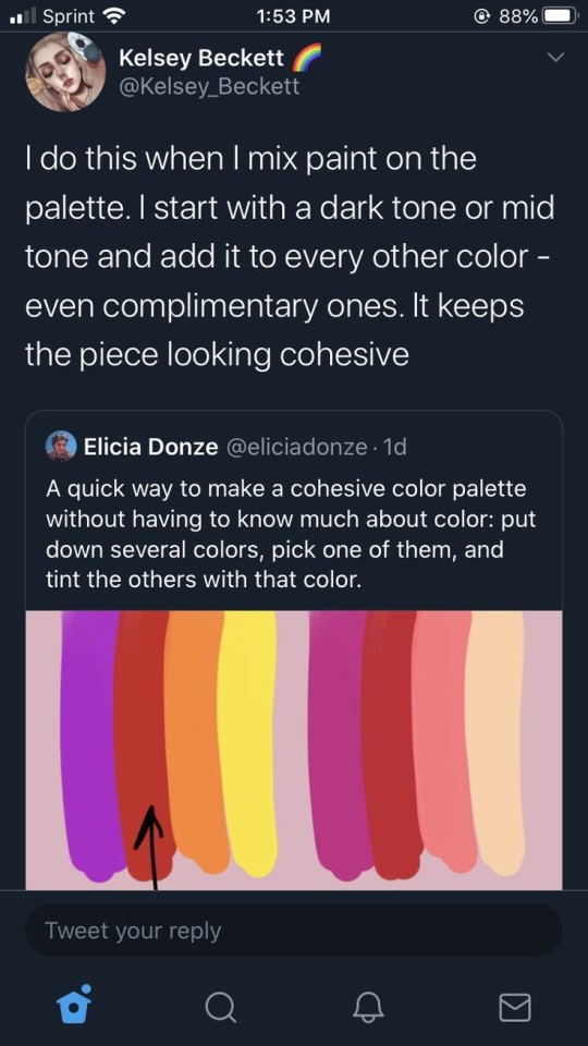
IF YOU ARE NOT DOING THIS ALREADY, YOU SHOULD TRY IT
I even tested it out myself, it works great
69K notes
·
View notes
Text

Common Website Problems Business Owners Face
A poor-performing website can quietly cost you leads, customers, and credibility. Below are major issues I see too often:
1. Slow Loading Times
Visitors won’t wait, they’ll leave. If your site takes too long to load, it’s already losing you money.
2. Broken Links
Clicking a link and landing on an error page frustrates visitors and damages trust.
3. Security Vulnerabilities
An unsecured website is an open door to hackers, lost data, and broken reputation.
4. Poor Design & User Experience
If your site is hard to use or looks outdated, people won’t stay, much less buy.
5. Mobile Incompatibility
Most users browse on mobile. If your site doesn’t work smoothly on phones, you’re shutting out potential clients.
6. Hidden Technical Issues
Broken code, outdated plugins, or bad hosting can silently sabotage your success.
Got any of these issues?
Reach out to me directly. I’m Emma Shegzy, and I’ll help you fix these problems with the best and perfect solution tailored to your brand.
0 notes
Text

A website redesign is an exciting opportunity to breathe new life into your brand, but it can also be a risky venture if not executed properly. Whether you’re a growing eCommerce brand or an established business, a poorly handled redesign can lead to traffic drops, user confusion, and even revenue loss.
At Tech Wishes, a leading website design company, we’ve helped 100+ brands avoid costly missteps and turn their redesigns into powerful conversion magnets. For more information view: https://www.techwishes.com/redesigning-your-website-avoid-these-costly-mistakes
0 notes
Text
Top 10 UX/UI Best Practices for Your Website that transforms User Experience

You build a website, but does it offer the best user experience for optimum conversions? Without the right UX/UI best practices in place, even the most visually appealing sites can suffer from low impressions, poor CTRs, and weak engagement. A lot of it comes down to the front-end designers and developers who fail to factor in key UI/UX metrics, and your business ends up with a mildly aesthetic but otherwise cluttered site.
Inconsistent design, confusing navigation, or unresponsive layouts can quietly undermine user trust, lower engagement, and hurt conversions. Great UI/UX design, on the other hand, is not just about aesthetics — it is about performance, accessibility, responsiveness, and alignment with user behavior.
In this article, we break down 10 essential UX/UI best practices that can transform your website into a high-performing, user-first platform. These are the same principles Altumind follows to help clients build digital experiences that engage, convert, and retain.
Top 10 UX/UI Best Practices
1. Performance: Slow page loads diminish user experience (UX) and increase bounce rates. You must optimize your Core Web Vitals — CLS, FID, and LCP — optimize your database, compress multimedia assets, and use a Content Delivery Network (CDN). Minify CSS, JavaScript, and HTML, reduce server response time, eliminate render-blocking resources, and regularly audit site performance using tools like Lighthouse or GTmetrix.
2. Responsiveness: Frustration from poor mobile experiences leads to drop-offs. Ensure a mobile-first, intuitive design using responsive frameworks like Bootstrap or Tailwind. Optimize for multiple screen sizes, adjust typography for readability, use scalable images and icons, and prioritize essential content for smaller screens.
3. Images: Images breathe life into a webpage, but when used randomly, can bloat the same and diminish user experience. Use icons and visuals meaningfully, use proper formats (JPEG, PNG, WebP, or AVIF), compress images using TinyPNG or ImageOptim, cache images, and reduce dimensions. Avoid using large resolution images unnecessarily, enable HTTP/2 for faster loading, preload key images, use sprites to reduce HTTP requests, try adaptive device-specific delivery, and finally audit image assets and remove unused files.
4. Accessibility for all users: Make your website inclusive. Add descriptive alt-text, transcripts, semantic HTML, and accessible forms. Follow the latest WCAG guidelines. Consider screen reader compatibility, readable color contrast, and structured headings. As Design should not just work for most it should work for everyone.
5. Call-to-Actions (CTA): CTAs get users to buy or drop a lead for your business. So, you want them to be clear and concise. Keep them short & relevant, use action-oriented text such as “Get Started,” “Claim Your Offer,” etc., and maintain consistency across the page, avoid clutter, and have more whitespace instead. Optimize CTAs for mobile devices, position them strategically, and place primary CTAs above the fold. Always A/B test them to arrive at the best converting one.
6. Forms: Keep forms short and user-friendly. Minimize the number of fields, auto-format entries, and use clear validation cues. Consider multi-step flows for complex data and tailor forms for mobile entry. A well-designed form is the difference between a lost lead and a conversion.
7. Whitespace: Whitespace reduces cognitive overload, leading to higher engagement. Whitespace enhances readability and improves user focus. Maintain consistent spacing, avoid clutter, and balance visuals with text and leave sufficient margins between sections and to the left and right of the page content.
8. Videos: Videos are a great way to captivate resources, but they tend to get a bit heavy on the page resources. So, avoid auto-playing videos, only preload the metadata, use compressed formats, implement lazy loading, and optimize thumbnails. Keep load time in check and prioritize usability across devices.
9. Pop-ups: Pop-ups are a great asset for catching user attention and highlighting offers but can disturb user experience. So, limit the number of intrusive pop-ups per session, minimize heavy animations, compress text and image assets in it, make them responsive, use lightweight pop-up scripts, reduce HTTP requests, and use succinct messaging in pop-ups. Further, defer loading non-essential elements, avoid auto-play videos, prefetch resources for critical ones, and update outdated frameworks or libraries used in them.
10. Textual Content: Content is good for SEO and for readers but stick to some hygiene standards. Keep content concise, structured, and SEO-optimized. Use readable fonts, break text into digestible sections, and maintain brand tone. Clear content enhances both usability and discoverability. Further, localize content for multilingual websites, add metadata, use descriptive anchor text, left-align body content, and center-align headings, and fact-check the content.
Final Thoughts: UX/UI Best Practices
Your website is your digital identity, and the UX/UI is the personality and voice that shape how your site is perceived, not just by bots/crawlers for SEO but mainly by users. A bad sitewide UX/UI can leave a terrible first impression, ultimately affecting your branding, revenue, and profits.
54% of users want the content to appeal to their design sensibilities and 45% expect it to work across multiple devices for it to be successful — Adobe
Want to turn casual visitors into buyers? At Altumind, we specialize in building user-first digital journeys backed by data and design expertise. From wireframes to fully responsive designs, we help businesses deliver web experiences that don’t just look good they work, convert, and scale! We bring years of expertise in delivering exceptional data-driven UI/UX experiences that resonate across all touchpoints.
0 notes
Text
The Best Iconic Sections for Fashion, Beauty & Lifestyle Brands
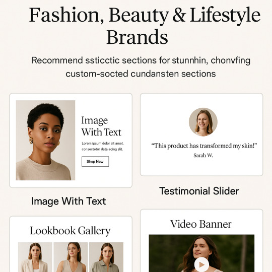
In the competitive world of fashion, beauty, and lifestyle eCommerce, visual storytelling and seamless user experience are everything. A Shopify store that looks professional, loads fast, and communicates your brand vibe will always stand out—and that’s exactly where Iconic Sections shines.
Whether you're selling apparel, skincare, or lifestyle products, Iconic Sections offers powerful, customizable theme sections that bring style and strategy together. No need to switch themes or hire a developer—just install, customize, and publish. Let’s dive into the best Iconic Sections for your niche and how they can help you increase conversions and connect with your audience.
1. Image With Text – Perfect for Storytelling
Fashion and lifestyle brands thrive on aesthetics and emotion. The Image With Text section allows you to pair beautiful visuals with engaging copy, letting you tell your brand story or highlight your latest collection.
Use it for:
New arrivals
Sustainability message
Behind-the-scenes storytelling
Seasonal promos
With its clean layout and mobile optimization, this section blends style with clarity, making it a go-to choice for fashion-forward brands.
2. Testimonial Slider – Build Trust with Style
Beauty and lifestyle shoppers rely on social proof. The Testimonial Slider is designed to look sleek and professional while showcasing customer feedback or influencer quotes.
Use it to:
Highlight glowing reviews
Showcase influencer endorsements
Share real-life results for skincare or wellness products
Testimonials create instant credibility, especially when paired with photos. This section allows for smooth sliding animations and modern typography—no clutter, just trust.
3. Lookbook Gallery – Turn Browsing into Buying
Nothing beats a curated lookbook when it comes to visual storytelling. The Lookbook Gallery lets you display product photos in a layout that feels like a fashion magazine.
Use it to:
Showcase outfits, accessories, or beauty routines
Create seasonal or campaign-specific lookbooks
Inspire lifestyle-driven purchases
With hover effects and clickable images, you can link each photo directly to the product page, making shopping intuitive and beautiful.
4. Video Banner – Bring Your Brand to Life
Today’s shoppers love motion. The Video Banner section allows you to embed a promotional video or aesthetic brand reel at the top of your homepage or any landing page.
Perfect for:
Fashion runways
Makeup tutorials
Lifestyle brand storytelling
When executed well, videos increase engagement, reduce bounce rates, and communicate your vibe faster than text ever could.
5. Product Grid with Filters – Showcase & Simplify
Fashion and beauty stores often carry dozens of SKUs. The Product Grid with Filters lets you show off your products in an organized way while helping users find exactly what they want.
Ideal for:
Clothing collections
Color or size variations
Skincare categories (e.g., serums, moisturizers, etc.)
It’s fast, responsive, and makes browsing a breeze—perfect for keeping users engaged and increasing add-to-cart actions.
6. Instagram Feed – Social Meets Storefront
Your Instagram is part of your brand. With the Instagram Feed section, you can sync your social media posts directly to your homepage, keeping things fresh and dynamic.
Use this to:
Share latest posts, reels, and influencer collaborations
Drive cross-platform engagement
Keep your store design lively and on-trend
This section is especially helpful for beauty and fashion brands targeting Gen Z and Millennials, who are constantly influenced by what’s trending.
7. Newsletter Popup – Build Your Email List Beautifully
Growing your email list is crucial for long-term success. The Newsletter Popup section is designed with clean, eye-catching design to encourage visitors to subscribe.
Great for:
Welcome discounts
Exclusive collection previews
Beauty tutorials or style guides delivered via email
A subtle, elegant popup feels like an invitation—not an interruption—and helps turn visitors into loyal subscribers.
Why Fashion & Beauty Brands Love Iconic Sections
✅ No developer needed: Easily drag, drop, and customize.
✅ Pixel-perfect design: Every section is built with modern UI/UX best practices.
✅ Fully responsive: Look great on every screen size, from iPhone to desktop.
✅ Weekly section drops: New layouts are released regularly to keep your store fresh.
Final Thoughts
If you're a Shopify brand in the fashion, beauty, or lifestyle niche, Iconic Sections is the ultimate toolkit to build a visually stunning, conversion-focused store. With premium sections like Lookbooks, Testimonials, and Image with Text, you can elevate your brand image and customer journey—without switching themes or sacrificing speed.
Ready to give your Shopify store the glow-up it deserves? 👉 Explore Iconic Sections now and design like a pro.
#shopify#web development#ui ux design#shopifystore#shopifythemes#shopify theme#web design#shopify ecommerce development#shopify tips
1 note
·
View note
Text


Want to add a cool light beam to your designs in Figma? It's easier than you think!
Just design a few shapes, blur them, and blend them together for a glowing effect.
Follow these steps to make your designs really shine!
4 notes
·
View notes
Text
The Psychology of Colors in UI/UX Design

When it comes to UI/UX design, color isn’t just a design choice; it’s a powerful tool that impacts how users feel and interact with a product. Understanding the psychology of colors can help you create a more effective, engaging, and user-friendly interface. Whether you’re designing a website, mobile app, or digital product, the colors you choose can influence the user experience (UX) in ways you might not even realize.
For more articles please visit: https://pixelizes.com
In this blog, we’ll explore how colors can affect user perception, behavior, and emotions in UI/UX design.
Why Colors Matter in UI/UX Design
Colors have a significant psychological impact. They can trigger emotions, influence behavior, and even drive decision-making. In the context of UI/UX design, your choice of colors can:
Enhance usability and navigation
Improve readability
Set the tone of the design
Influence conversions (clicks, sign-ups, purchases)
Red: Energy and Urgency
Red is a color associated with passion, action, and urgency. It’s bold and attention-grabbing, which is why it’s commonly used for calls-to-action (CTAs), like “Buy Now” buttons or error messages. It can stimulate the senses and increase heart rates, making it perfect for encouraging immediate action.
When to Use Red:
To create urgency or excitement (e.g., discounts, limited-time offers)
To highlight critical actions (e.g., delete buttons, error notifications)
Caution: Too much red can be overwhelming, so balance it with neutral tones for harmony.
Green: Calm and Trust
Green is the color of nature, growth, and balance. It’s often used to communicate trust, sustainability, and health. In UX design, green is commonly used to signify success or positive outcomes (e.g., “Success” messages or confirmation buttons). It is also associated with ease of use, so it’s a good choice for buttons or elements requiring user interaction.
When to Use Green:
For positive actions (e.g., “Submit,” “Confirm”)
To convey eco-friendliness or sustainability
For calming or soothing experiences (e.g., wellness or meditation apps)
Blue: Trust and Professionalism
Blue is known for its association with trust, calmness, and professionalism. It’s one of the most commonly used colors in UI/UX design for industries that require a high degree of trust, such as banking, healthcare, and technology. Blue evokes a sense of security, making users feel confident and safe while navigating your interface.
When to Use Blue:
In forms, navigation bars, or CTA buttons that require trust
For backgrounds or sections where you want users to feel calm and assured
In corporate websites or services where professionalism is key
Yellow: Optimism and Attention
Yellow is the color of optimism, creativity, and happiness. It grabs attention and stimulates mental clarity, but too much yellow can feel overpowering. Use yellow sparingly to draw attention to important elements or to add a pop of energy to your design.
When to Use Yellow:
To highlight important actions or notifications
In small doses to evoke positivity and enthusiasm
For calls-to-action that want to stand out (like “Subscribe” or “Learn More”)
Caution: Ensure it doesn’t dominate the design; too much yellow can cause eye strain.
Purple: Luxury and Creativity
Purple is associated with luxury, creativity, and innovation. It’s a great color for conveying sophistication, elegance, and originality. Purple is often used in industries like beauty, fashion, and high-end products. In UI/UX design, purple can be used to create a sense of exclusivity or to enhance the creativity of the interface.
When to Use Purple:
For premium products or services
In creative fields like design, fashion, or beauty
To add a touch of luxury or elegance
Black & White: Minimalism and Contrast
While not technically colors, black and white are incredibly important in UI/UX design. They represent simplicity, clarity, and contrast. A monochrome color scheme can help create a clean, minimalist look, and the stark contrast between black and white enhances readability and focus.
When to Use Black & White:
For minimalist designs that prioritize clarity
To create visual contrast and make other colors pop
In sophisticated and high-end brands looking for simplicity and elegance
Pink: Playfulness and Femininity
Pink is often associated with playfulness, warmth, and femininity. It’s commonly used in designs targeting young audiences or those in the fashion and beauty industries. Pink evokes positive emotions and can create a welcoming, friendly experience for users.
When to Use Pink:
For apps or websites targeting a younger, trendy audience
In creative or fun products
For enhancing the aesthetic of fashion, beauty, or lifestyle sites
Tips for Using Colors in UI/UX Design
Contrast is Key: Always ensure there’s enough contrast between text and background for readability.
Consistency: Stick to a cohesive color palette to keep the user interface consistent.
Accessibility: Use color contrast checkers to ensure that your design is accessible to those with color blindness.
Cultural Relevance: Different cultures may associate different meanings with colors, so always consider your target audience’s cultural background.
Final Thoughts
Understanding the psychology of colors can help you make more informed, strategic decisions in your UI/UX design. By carefully selecting colors that align with your brand’s values and the emotional experience you want to evoke, you can enhance usability, guide user actions, and create a more engaging and effective interface.
Remember: Colors are not just visual elements—they’re an integral part of the user experience!
#UI/UX design#Color psychology#UX design tips#Color in design#User interface design#Color theory#Emotional design#Web design#Mobile app design#Color contrast#User experience#Branding and color#Design for accessibility#Color palettes#Conversion optimization#Visual design#Design aesthetics#User behavior in design#UI design trends.
1 note
·
View note
Text
Beginner to Pro: Top UI/UX Design Tricks You Need to Know

Introduction
UI/UX design plays a crucial role in crafting user-friendly digital experiences. Whether you're starting your journey in UI/UX or aiming to enhance your skills, mastering the right tricks can set you apart. In this blog, we'll explore essential UI/UX design tips that can help you transition from a beginner to a pro.
1. Understand Your Users
Before you start designing, it's essential to know your users. Research their preferences, behavior, and pain points. Conduct user testing and surveys to gather insights. A strong understanding of user needs leads to a more intuitive design.
2. Keep It Simple and Intuitive
A cluttered interface confuses users. Stick to minimal design principles by using whitespace effectively and ensuring that navigation is easy. A well-structured UI makes interactions smooth, improving user satisfaction.
3. Master Typography and Color Theory
Typography and color are powerful tools in UI/UX design. Use fonts that are readable and align with the brand personality. Colors should be strategically chosen to evoke emotions and improve usability. Contrast is key for accessibility.
4. Mobile-First Approach
With a significant number of users accessing websites and applications through mobile devices, designing with a mobile-first approach is essential. Ensure that the interface is responsive and adapts seamlessly across different screen sizes.
5. Focus on Microinteractions
Microinteractions, such as button animations, hover effects, and subtle transitions, enhance user experience by making interactions feel engaging and natural. They provide feedback and guide users through the interface effortlessly.
6. Prioritize Loading Speed
Slow-loading websites and applications drive users away. Optimize images, use compressed files, and implement caching techniques to improve performance. A fast-loading UI keeps users engaged and enhances usability.
7. Utilize UI/UX Design Tools
Leverage powerful design tools like Figma, Adobe XD, and Sketch to create wireframes and prototypes. These tools allow designers to visualize ideas and collaborate efficiently.
8. Stay Updated with UI/UX Trends
UI/UX is an ever-evolving field, and keeping up with trends is vital. Follow industry experts, take up courses, and experiment with new design patterns to stay ahead of the competition.
9. Get Certified and Build a Portfolio
Enrolling in a UI UX design certification in Yamuna Vihar or UX UI design training in Yamuna Vihar helps solidify your expertise. A strong portfolio showcasing your work can significantly boost your career prospects.
10. Learn Web Development Basics
A solid understanding of Web Designing Training in Yamuna Vihar or Web Development Training Institute in Yamuna Vihar can complement your UI/UX skills. Knowing HTML, CSS, and JavaScript helps designers create functional prototypes and work efficiently with developers.
Conclusion
UI/UX design is an exciting and dynamic field that requires continuous learning and creativity. By implementing these strategies, you can refine your skills and deliver exceptional user experiences. If you're looking to enhance your expertise, consider enrolling in a UI and UX design course in Yamuna Vihar or Full Stack Web Development Training in Uttam Nagar to gain hands-on knowledge and industry exposure.
Start your journey today and transform into a professional UI/UX designer. Visit Us.
Suggested Links
Oracle Database Administration
MY SQL Training
PHP Development
#ui ux design#html training#css tips#java programming language#full stack development#web design#web development
0 notes