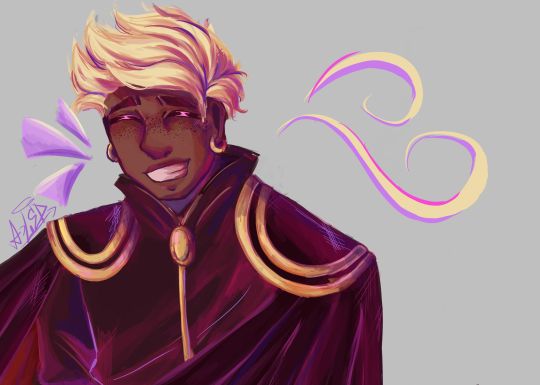
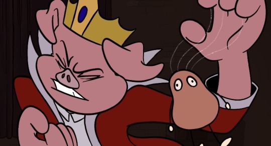
#added the lineart because i like it that much
Text


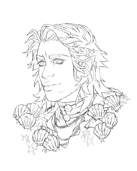
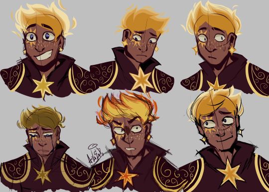
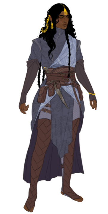
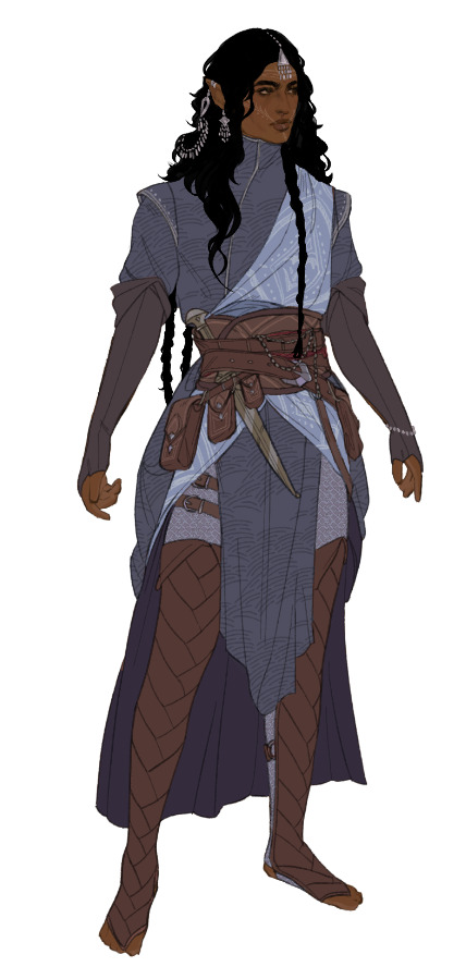
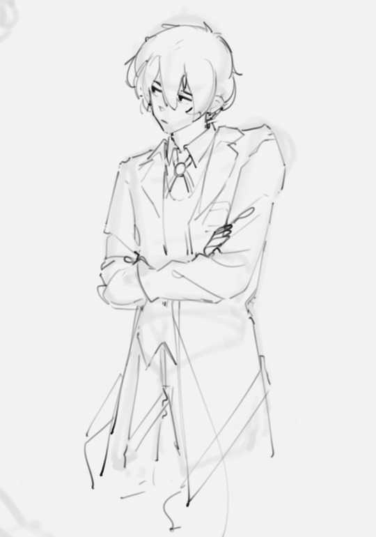
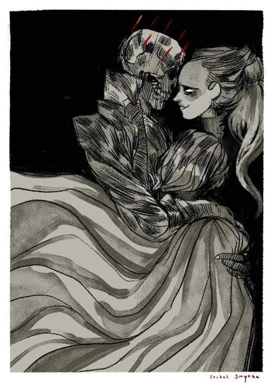
Dax and Caelan belong to @br0j0bs !
#commissions#a5 headshot rough#paexie commissions#added the lineart because i like it that much#headshots
525 notes
·
View notes
Photo
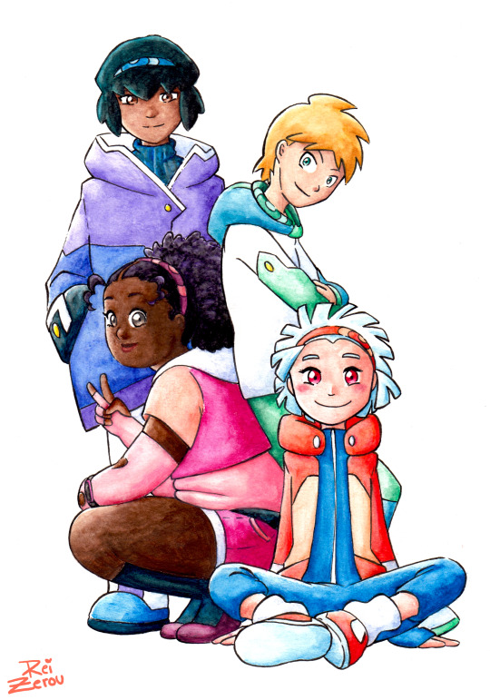
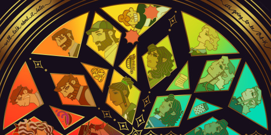
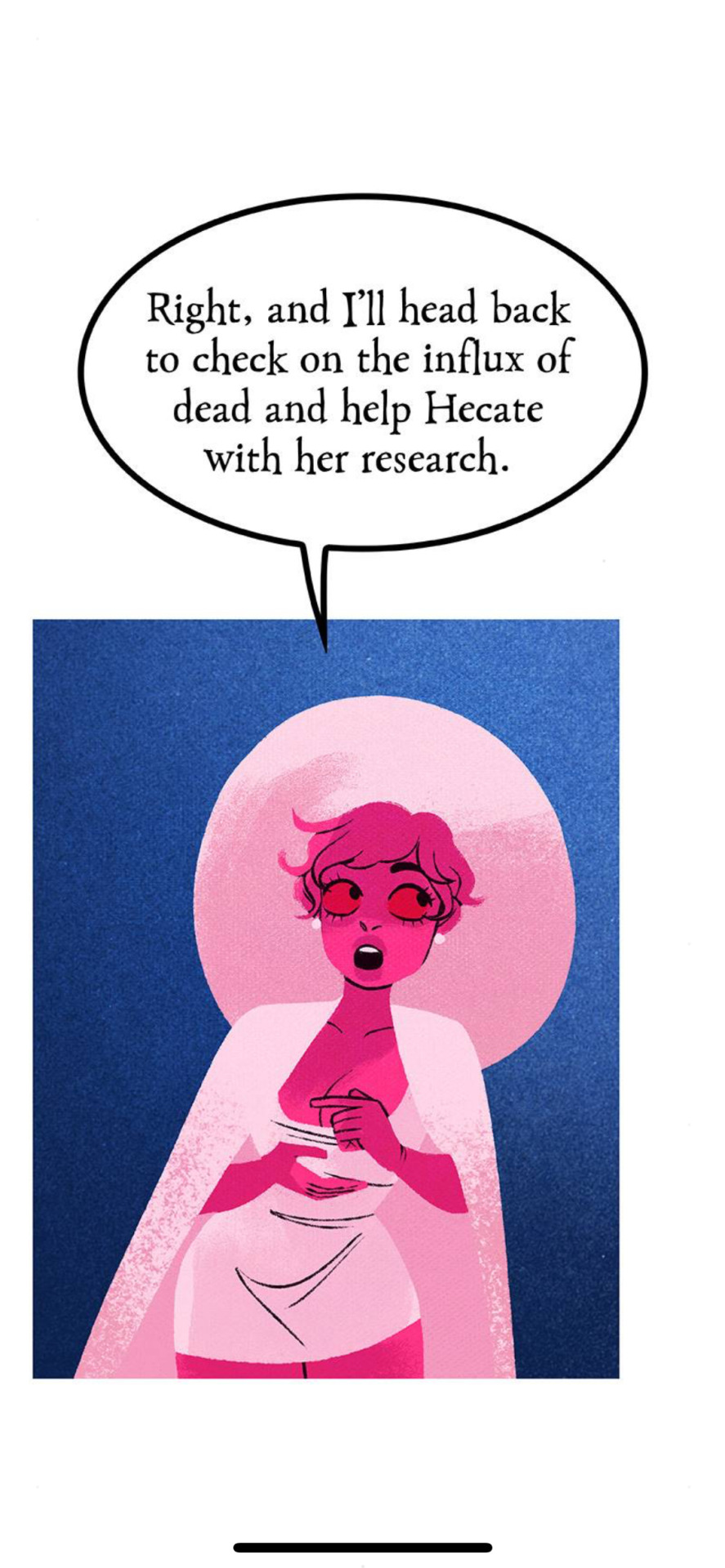
It’s now February 2nd 2023, which means that I officially revealed my fan project Pokémon Kaleidoscope exactly two years ago. Here’s a group pic to celebrate the occasion, as well as finally some info on what will happen next in the project and how things are progressing.
The most important thing first:
POKÉMON KALEIDOSCOPE THE WEBCOMIC IS STARTING NEXT YEAR, 2024!
Or at least I hope so! Things are subject to change of course since I still have a lot of prep work to be done, but that’s the goal right now.
If you’re only now hearing about this project, check out the tag #Pokemon Kaleidoscope on my blog.
Rest of the info is under read more so that this won’t get too long fjjfjdf.
Continues here...
I did try to keep it compact. Kinda failed. But I decided to try to do it anyway. It might take a while but I can do it. *Deep breath*
Rough outline was finished last summer. Detailed outline is 54 % done. I’ve completed writing the beginning into about 11 % of the planned length of the story, as well as the last 18 %. (Or completed as much as needed for now, I mostly come up with exact dialogue in the storyboarding stage) Then there are some complete parts in the middle. But overall, I’ve planned what goal every scene has but there are still a lot of scenes that I’m not sure how I should go about.
I also decided to split the comic into two equally sized parts and I’m focusing on writing and making part 1 first. So there’s going to likely be a break between the parts. Kinda like a break between tv seasons.
I’ve also storyboarded about 7 % into the planned length of part 1, and I have some sketched or ready pages that are not all part of the storyboards bringing the total amount of planned or ready content to 13 % into part 1. I’m planning on at least making as many storyboards first as possible even if I finish writing before next year, because those take very little time but once I have them it should be much easier to update the comic regularly.
That’s all for now! I hope you will follow Jaylee, Aven, Kitt and Zue’s journey through the Lona region once it actually starts! ^__^
#pokemon kaleidoscope#pokemon#trainer Jaylee#trainer Aven#trainer Kitt#trainer Zue#pokemn oc#pokemon trainer oc#trainer oc#reizerou oc#my art#traditional#coloring this took like at least 5 hours#maybe 6#but hey linearting only took one hour instead of three!#because I used a new brush pen#so I only need to do every line ONCE#instead of individually adding lineweights like how I've done until now with microns#saves so much time with big pieces like this
20 notes
·
View notes
Text
I don’t normally post my art because I don’t make much often but uh working on a biblically accurate angel again
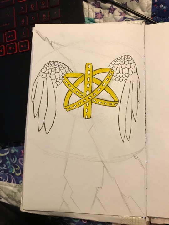
#I’ve only just started adding the color and I’m working slow because im still kinda figuring gouache out#also gotta fix the library up after color but so far im liking it#this is also very much not on the correct type of paper but i am justifying making this sketchbook by actually using this sketchbook#*lineart
1 note
·
View note
Text
sitting there like has my art gotten better over time or do I just add way too much unnecessary detail now
#but lineart becomes honestly really meditative for me at times especially if im adding texture to something#i will say at least i dont pick such ugly colors anymore. i used to always have reslly bright colors and then i thought it was too much#and overcorrected imo so everything was desaturated and boring#oh i also used to color in the lines for like every single color on the character? idk how to describe it but it was tedious#i like it on other people's art but i dont have the patience and i dont like how it looks when my lines are “cleaner”#sometimes i do miss how i used to not care if what i drew was “cringy”#but i think im coming back out of that considering all i draw is like. gay shit and elves and various iterations of myself and also my ocs#i should redraw some really really old art after what im working on maybe#i almost started working on a redraw of when i drew yavanna in likr 2017-18 but i dont like the design i gave her at all#minus the weird branch ears those were cool#mostly im just frustrated it still takes me hours to draw lol. i dont know why i get insecure about it or about art in general#i guess bc no one in my family really does so they have this idea im good at it#and i wanna grab them and shake them sometimes and explain all the reasons im actually not and all the mistakes i regularly make#i dont know if that makes any sense and i dont know why i struggle to just take the compliment#i guess because i know im not good enough at it for it to be a job? except thats not it either because ive almost always wanted to write#its very dumb and weird. especially considering i dont really draw for other people. i mean i like when people like my art but unless its#for somebody specific im not necessarily going to take it very hard at all if its not to their taste. i just do it because i enjoy it#and because there are things i only know how to express through writing or drawing. and when one doesnt work sometimes its the other#maybe i just get frustrated i cant be good at everything#its not realistic but i always end up wanting to do so many things and getting frustrated when i dont pick them up right away#because OF COURSE i dont#ok where was i going with this#its nearly 2am and my head is pounding again i dont even know what day this makes it. at least a week?#i dont know
1 note
·
View note
Text

this is so stupid but i actually quite like jayce's skin on this one--- it looks like its supposed to be
#coloring in general is a bit harder when your line isnt black; at least thats my experience.#you have to play more with colors to make them fit; and also some colors are not... registered as the actual color they are.#like for black i actually use deep purple; but it cant be too deep bc otherwise it ruins the whole aesthetic#with the line being lighter than the filler. i dont use actual black anymore i think; its always some shade or purple.#depending on the other colors i use a very very light shade of pink/red for white. i can also use actual white#but then again; it depends of the other colors lol. and in this case isnt even that light of a color. skin is other issue#i have a palette full of skin colors but i dont really use it for just the color-- i moreso use it as a reference.#then you have me being all stupid with the color wheel for a bit trying to find a color and the saturation that fits the piece.#and dark skins are kind of their own thing; bc otherwise it doesnt give the image of actually being brown#and actually gives the image of idk you fucking slapped a random color on them. and VEEERY rarely actual brown in the color wheel works#rn jayce's color is in a mix between pink and red. but it doesnt looks like that!! it mixes and looks brown in the piece.#i used a different color on the one with chase but that was because the lineart colors were different kjsnfkjndjfds#so yeah for someone who doesnt have that much of an eye for this; this is kind of a training in a way. its ok though#i refuse to go back to pure black lines the thought of doing them sickens me (no that doesnt means i dont like when others do them)#(and no im not saying using black lines its easier or not as worthy or something its not what im trying to say)#sorry for going in a ramble about how i color?? idk sorry i just thought about adding it#lilith whispers
1 note
·
View note
Text
Today is Dungeons & Daddies’s 5th Anniversary!

I haven’t been listening for nearly that long but the podcast and all its characters means a lot to me. Happy Anniversary!!!
Throwing the cropped sections under the cut because there’s a lot of stuff going on and I know Tumblr likes to throw half the pixel quality out the window. And also so I can ramble a bit about this piece!!!
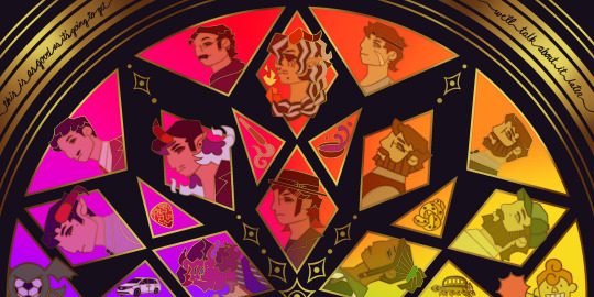
This piece has been months in the making, possibly an entire year. And by that I mean I’ve had a sketch of the comp scribbled on my whiteboard for ages because I wanted to save this specifically for 5th anni art. Now onto design stuff!
(First off a random thought: I really love how the garlic knot came out, I kind of want it as an enamel pin.)
I knew I wanted to make this a stained glass piece since the beginning, but I was also going to add flowers at one point but quickly dropped the idea. It felt like too much and I also didn’t want to fuss over flower language assignments for everyone. I was also going to add Doodler tentacles, but also dropped that idea pretty early. Kind of on accident, right at the end, I figured out how to make it even more stained glass-like but taking a duplicated lineart underneath the regular layer and turning the brightness all the way down, then setting it to overlay and adding a guassian blur. It’s very subtle but it adds that tiny bit of depth that makes it look more real. As for shading on the lineart/gold, I tried adding more highlight on the characters who died but once I evened everything out it wasn’t as noticeable anymore so I’m throwing that thought here so the attempt at least known lol.
The order of characters only changed a little bit from my original comp, I flipped the Wilsons and the Oaks so the rainbow could work. As for the anchors, specifically in season 2, I lined them up to the teens since the season 1 anchors lined up with each dad:
Tony —> Scary: his death was the beginning of Scary’s betrayal arc and also Willy killed him.
Guitar Pick —> Taylor: it’s not really aligned with Taylor at all, but the anchor was with Glenn so I put it next to his blunt.
Scroll —> Normal: was only because it was the last left to give him, but there’s the whole scene of him and Hermie in the Green Room so it still works!
Garlic Knot —> Link: one of two that he broke, but the more significant of the two with him telling Grant he never wants to see him again.
Small notes on the season 1 anchors: I put the layer of mold in the overnight oats but you can’t really tell with the overlay. And to make the supper bowl more interesting I added the fantasy sodas mix they dumped into it. The lure of actually drawn before so I just traced my own art lol.
As for the other smaller triangles, it took me a bit to figure out what I wanted to put there. I didn’t even think of adding the vehicles until two days ago but I’m so glad I did. I don’t really have my own take on the mascot version of the Doodler (yet?) so I borrowed the design from one of the stickers in their merch shop. Teeny was terrifying as just a front facing head so I made him cute again.
In the outer circles, I put what I felt was the most significant quotes for each family. I really wanted to use “It’s okay to be angry, it’s not okay to be cruel” but it was just a little too long.
That’s all I can think of! If you read all the way through, thank you for indulging me in my excitement to gush over this piece.
#dndads#dungeons and daddies#dndads fanart#dndads s1#dndads s2#dndads glenn close#darryl wilson#henry oak#ron stampler#jodie foster dndads#nick close#nicholas foster#nicky swift#grant wilson#sparrow oak#lark oak#terry jr#taylor swift dndads#lincoln li wilson#normal oak#scary marlowe#hermie unworthy#bill close#paeden bennetts#barry oak#willy stampler#meryl streep dndads#robert wilson#hildy russet#stud stampler
2K notes
·
View notes
Text
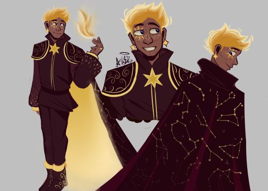
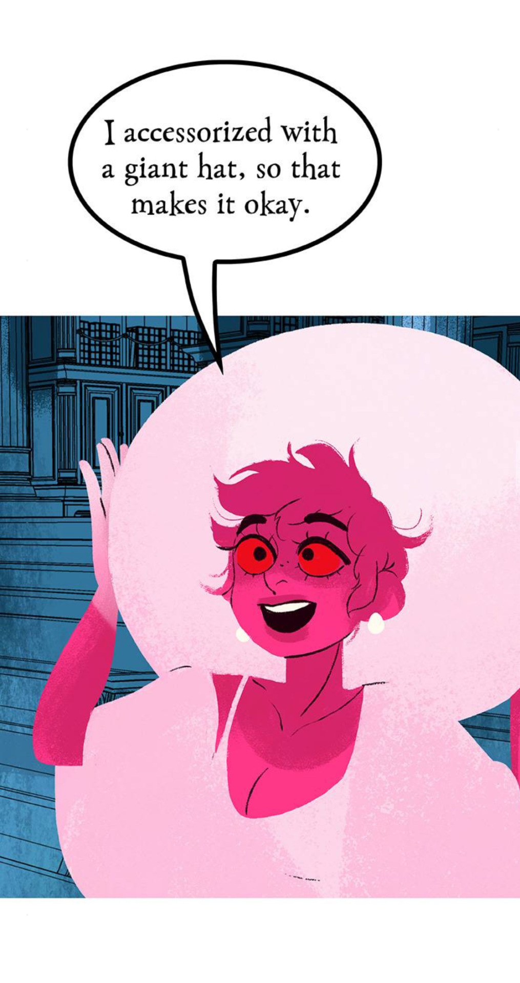
THE MOMENT WE WERE ALL WAITING FOR, FINALLY FINISHED THE DESIGN OF ASTER YESSSSSS ✨✨✨✨✨✨❤❤
This design belongs to the Wish rewrite called "The kingdom of wishes" (Written by @annymation and soon illustrated by @emillyverse and me)
Sorry for the delay, but this guy had so many things to draw and I also had a thousand ideas that it took me a while to capture them all (4 drawings wow, even I'm surprised lol)
Now after this introduction I will tell you the procedure of its design :]
2D MODEL:
-Maybe some don't notice it, but for the 2D drawing of Aster I didn't add many shadows, because in the classic Disney movies the animation doesn't have many shadows if we look closely, this is for several reasons (at that time they had to inking FRAME BY FRAME, can you imagine how much longer it would have taken to add detailed shadows? I really have respect for the animators)

(Here are some examples of what I'm trying to explain)
-As I said before, I didn't detach myself much from the concept art of the movie, I just added some other details that occurred to me, Anny and Emy.
-We decided that his cape would have the constellations of the signs of the zodiac (It was Emy's idea), which in the final result are on the cape, the constellations are noticeable more or less depending on Aster's mood.
-In the Wish rewrite it is mentioned that Aster's hair is like a candle (Reference to Hades) so I decided not to add the lineart in that part
His hair changes depending on his emotions, but not only that, but also his lineart, the calmer he is, the cleaner his animation will be, however with strong emotions (anger, sadness, nervousness) his details will be more neglected, especially when He is REALLY angry, by the way I made his hair look like a flame to give more drama to his design and also make a reference to Ember from Elemental
And as a final detail, the star-shaped gem that she has as a brooch changes color, just like her earrings.
3D MODEL:
-When Aster disguises himself as a human, his details on his clothes would disappear and the shape of his accessories would change to ones without a star shape, also the tone of yellow would look duller, you know so as not to draw attention (although he is dressed like a prince with a giant cape, the boy doesn't know how to hide the truth very well lmao)
-In general, it's just that the design becomes simpler, the only thing that changes is her hair that is no longer a flame, her freckles that are no longer little stars, her clothes no longer have so many details and her mark on her eye disappears( ̄▽ ̄) .
By the way, I wanted to thank @the-autistic-idiot for giving us the great idea of Aster having a star-shaped mark on his eye :D.
-Also, I think that those who have seen my other Wish redesigns are wondering why it seems like I had spit a rainbow at Aster's 3D drawings, what happened is that when I was painting my neurons said ✨Change your coloring✨ and well, The drawing in the end came out like this, although I honestly like it better, it better represents how I draw in a traditional way
Yes, basically the coloring of my drawings is as if a unicorn had spit on them lol
FINAL COMMENTS:
-It was very fun to draw Aster! The boy really has a lot of changes, but thanks to him I already discovered my digital drawing style so I am satisfied.
-Again sorry for the delay, I know that for many Aster must be their favorite character so I hope your wait was worth it :]
See you next time!✨✨
#disney wish#wish 2023#disney#wish movie#sketch#wish#art#artists on tumblr#artwork#drawing#star wish#starboy#human star#wish star#starsha#star redesing#the kingdom of wishes#the kingdom of wishes fandom#the kingdom of wishes au#starboy wish#starboy x asha#asha and starboy#wish concept art#asha x star#wish asha#wish disney#disney fanart#disney movies#disney animation#walt disney animation studios
379 notes
·
View notes
Text
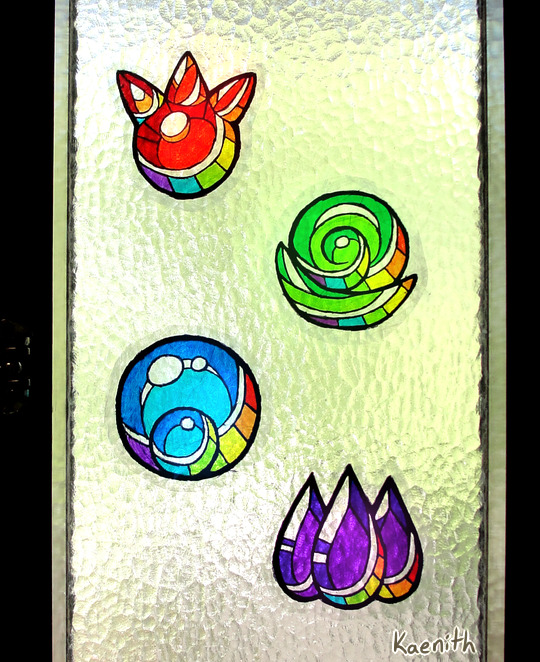
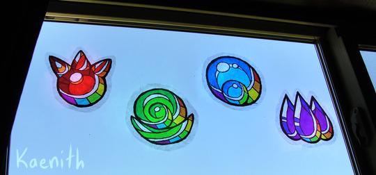
I've been making window clingies of the elemental gems from Minish Cap and Four Swords (plus rainbows because pride month) and I thought I'd put together a tutorial :)
Materials needed:
Permanent markers
Clear cellophane wrap
Scisors
Paper to sketch or print your design on
Not strictly necessary but useful:
Tape (for holding your pattern in place)
Something with a straight edge, like a ruler or bone folder (for smoothing out the plastic)
Step one:
Decide on a design. I drew mine digitally and printed it out. The printer had an issue, but eh, I can still see the lines, it's good enough ¯\_(ツ)_/¯

Step two:
Fold a sheet of cellophane wrap in half to make a double-layered sheet that is a little bigger than your intended design. Try your best not to get it too crumply and wrinkled, but in my experience a little bit of crinkling is unavoidable. Best not to get too perfectionist about it, and just embrace it as part of the stained-glass look!
Unfortunately, cellophane being clear, this step is hard to photograph ^^;;
Step three:
Lay the double-sided cellophane sheet over the top of your design. The best way I found to keep everything in place was to tape the pattern to a smooth surface and stick the plastic down around it.
Starting with the lightest colors first to avoid color bleed, start coloring your design, leaving the lineart for last.
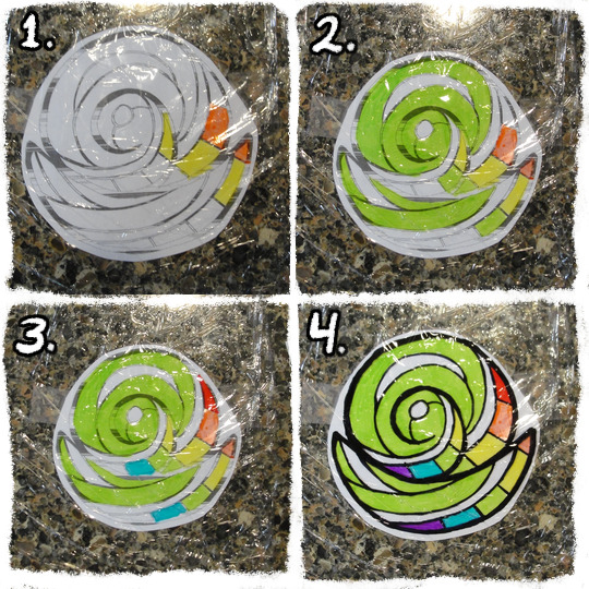
Step four:
At this point, the colors might look nice and vibrant against the white paper, but when you pick the plastic up and hold it up to the light, it will likely look washed-out and/or streaky.
To build up the colors more, fold another layer of cellophane and place it on top of the inked side of your current sheet. Then go over the colors and lines again, once again in order from lightest to darkest.
Keep adding layers until you're satisfied with the darkness of the colors. You can even get some interesting effects and shading by combining layers of different colors!

Step five:
When you're done, add one final layer of cellophane to the top to protect the inks. If you have a ruler or bone folder, I recommend using it now to smooth out the plastic and press the layers together as much as possible.
Then just trim around the edges and slap it on your window! :D
#legend of zelda#four swords#minish cap#tutorial#tutorials#craft project#craft projects#to pluralize or not? it seems I have done both in the past#pretty colors#my art#fanart
646 notes
·
View notes
Note
Hey! I love your art a lot, and you've helped me learn a lot about other things aswell. I just wanted to thank you for all that! ❤️
(This part is optional: I was wondering if you have any process videos of the full body character designs, you do? Like with the different outfits? I love the texture of that particular style of yours so much and would love to learn to integrate some aspects into my own art, If you would allow for that?)
Hi and thank you! It's much appreciated and I'm glad you stuck around :)
That's totally fine! Unfortunately, I don't think I have any process videos of the character designs (they take me a while and I go back and forth a lot with outfits so I never have space for them on my computer) but I can give a run-through of what I do!
- this is only applicable for CSP -
Step One:
First Image: So I start with the base, I go about these like those paper dolls. I sketch these out, line them, and color them in as I would any other lineart - however I merge the layers after I'm done. They are always bald because if I'm going for an outfit lineup I can change up the hairstyle depending on the clothes. Second Image: After I merge all the layers and lower the opacity, I can sketch the outfits on a different layer - If there are smaller details I want to include I usually sketch them in a different color so I can see it clearly.


Step Two:
First Image: after sketching out what I want, I turn down the opacity for the sketch layer and line over that. I use a really high stabilization because I have shakey hands and it always looks clean with a high stabilization. For things like jewelry, I don't always do line art (mostly depends on how small it is) but I save it for later. Second Image: I don't always do hair as a solid color but In this case, I painted the hair on a layer above both the lineart, base, and coloring layer. Coloring the lineart is pretty standard, nothing fancy (I use the fill tool to speed up time often). Just make sure the colors are differentiated enough so you can use the color gamut tool in the next step.
Step Three:
Images One & Two: With the lineart fully colored, you can select individual colors and add or draw patterns. Most of the patterns I use are from the Csp gallery (bunabi has good ones up I use often). If you have the selection on a different layer, you can change up the layer filter or even do another select color gamut on the pattern and shade/color it yourself (this is how I do metallic fabrics). Once you're done adding patterns, merge everything except the base layer and lineart.

Step Four:
Images One & Two: For things like jewelry that would be too small to line, I freehand a silhouette of the jewelry with a bright neon color, then select the color gamut on the neon color, and then select the color outline so it has the appearance of me doing itty bitty lineart for it. I go back in on the color layer, shade it, and color it as metal, and then bam. You are all done!
Smaller things: After everything is done sometimes I'll go back in with a dark pen and go over some of the lineart where fabric creases just to give it more depth or I'll put a color filter over the final drawing just to make it all a bit more cohesive.
This is the brush I use for softer lineart:
And this is the brush I use for more thin, detailed, lineart:
Hope this helped a little, happy drawing!
169 notes
·
View notes
Note
Hi, I'm sure you get this often but I really love your recent genshin artwork, do you think you could explain your painting process? I love the colouring effect in that piece especially. Thank you.
Thank you so much! I got a few messages like this from my previous piece (thank you guys for the staff pick & blaze btw, I really didn't expect all the support😭) so I thought I'd share a bit of my process below as thanks.
I always do my lineart first because it feels less daunting to me when applying colours. I will do some rough colours first so I can easily adjust it to my liking.

Next, I make sure to separate each character into different layers when I clean it up. I like to work one character or object at a time, it's less overwhelming for me that way, and I can use clipping masks for ease of rendering.

I'll usually apply some adjustment layers on top of the base layer for shadows and highlights. When I say base layer, I just mean a layer of the colour without any effects.
I like using 'hard light' for shadows, and 'screen' for highlights, but you can really use whatever clicks with you.
Rinse & repeat this process for every character in the illustration. Note that I make Furina the focus so everything behind her will be less rendered than the elements in front of them (Neuvillette is a lot less rendered compared to Furina, and the painting in the back barely has much shading).
Once I render out each asset in the illustration and add shadows & highlights to my liking, I then to merge foreground/ midground/ background elements so I can make the overall illustration clearer to read. I don't want it to feel messy or overcrowded, and I think it's easy to get tunnel-visioned in small details and lose the clarity of the entire illustration.
Make sure to zoom out constantly and make your illustration B&W to check the values to see if the drawing is clear.

I created a simple S curve with the values for readability, and have the foreground elements have darker values & contrasts.
As for the BG, I wanted to add more textures into the drawing, particularly the painting in the back. Here's an image of it when I only added in the base colours.
I use the smudge tool to create more texture once I fill in the base colours. Since I don't really 'paint' anything with the textures in, I just put in the base colours and take a textured brush to smudge it. However, over-smudging can lose the painterly texture I want, so I usually smudge vertically or horizontally in a single stroke to create a sense of movement.
Another thing to note is that I only textured the BG, I thought it would help it blend into the background a bit better. I usually wouldn't do this for the foreground because I want those elements to be clearer.
At the very end, I tend to spend a fair bit of time just fiddling with more adjustment layers, various filters (such as blur, or noise), or liquify small details to really finalize the piece. Just vibes...basically this is me

Anyway, I hope that was helpful & it made sense!! Feel free to message me if you have any other questions & I'll try my best to answer! I might've glazed over a lot since I didn't wanna make this too long.
203 notes
·
View notes
Note
I LOVE YOUR ART!! <3
I'm sorry if this bothers you but is there any tut for lineart?
Have a nice day!
hello!! no there isnt, but i can talk about it quickly!
Let's talk about how I did the lines for this dazai drawing below:
I acutally don't do lineart, I just clean the sketch 😭 All my lines/sketches are done using the regular hard airbrush and just erase using that same brush to create different line widths.
First, let's talk about pen pressure and line width. To create depth, I like to make certain parts of the lineart "heavier" in pen pressure:
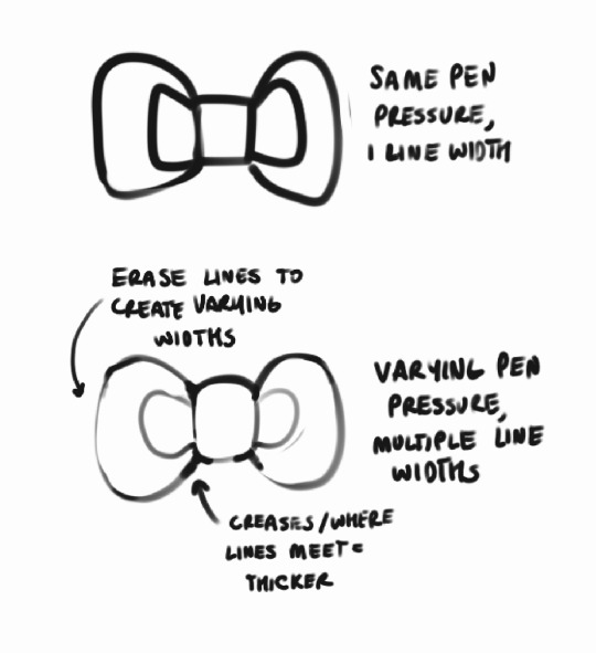
You can see in the lineart above that stuff like where the hair meets other roots, creases in the jacket, etc. all are heavily lined, while other stuff is left more detailed. I think it helps draw the eye in to parts you want to focus on?? just something I've picked up from habit and i liked it so i kept doing it hahsdh
I usually just start with a really rough anatomy sketch, and make a new layer to start the actual drawing:
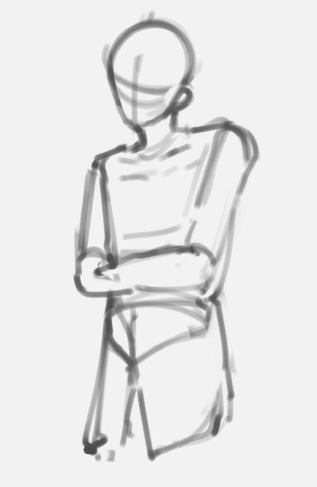
Looks nothing like the finished drawing (or my usual style), right?? And like, yeah that's normal, at least for me. I approach lineart as a way to refine something I've drawn into my own style, it doesn't just like. pop straight out as soon as I start doing lines 😭 (also probably why my art looks so inconsistent lmao)
Then from there I refine the sketch! Because of this, I'm working all on one layer, by erasing and redrawing portions of the sketch using that like pen pressure variation technique:
Usually I just make a mental note of how something looks, erase it, and redraw it. At this point I'll also start adding more detail or fixing posture/anatomy etc. as I go to make something closer to what I want.
Eventually this refines into what you see as the final lines!! Because this process is probably not the best. it takes me a long time to sketch, but I actually really like cleaning the lines! I find it refreshing to put so much detail in them :D
This is probably an incredibly wrong process in professional work, but I'm self taught and this is just what I enjoy doing :D I wouldn't recommend really doing this if you're trying to sketch quickly, but it's just what works best for me!
Happy sketching!
218 notes
·
View notes
Text
I am deeply touched that so many people enjoyed my little animation of Technoblade. I genuinely didn’t think that my post would get spread much, if at all, so thank you from the bottom of my heart for reblogging it and giving me such kind words.
While Procreate does include a playback feature, unfortunately the playback for how I animated this is 45 minutes long and well beyond the capacities of tumblr’s compression and limits. And since I don’t yet have a YouTube channel to host such a lengthy video, the best I can to is provide this quick and dirty breakdown of my process.
I animate the roughs in procreate and you can see that I am VERY loose with my initial pass. I often forget if I’m drawing him with 4 or 5 fingers, I changed his outfit halfway through the animation from a draping cape to a coat, and proportions fly all around. The most important aspect of this initial pass is just to get the timing and movement right.
I then do a second cleanup pass. It is not shown here, but this is what the lineart will eventually be based on. This pass is to refine the art and solidify it. Fix anatomy issues, those finger and clothing issues, and just generally work on sticking closer to the model I had chosen for my reference.
Then I do the lineart pass. I did this in Procreate Dreams by importing the animation as a video, lowering the opacity to 50%, and using it as a guide for the lineart. Here I refine the animation further and clean up any lingering problems.
Finally once the inking is done I color the animation. In Dreams I realized that groups are a godsend for this process. Every color was its own separate layer. But once I finished a layer I could group it together and Dreams treats it like it’s own singular track on the timeline. Then once I finished another color I would group those together with the group I already finished. And then again and again and so on until eventually I only had one layer for all the lineart and color. But if I ever needed to fix anything I could expand those groups and go directly to the frame in question. It’s a really handy feature!
Because he looks out the window at one point I wanted to have the light cast shadows on him. So I colored all the frames before and after the window in a darkened pallet, and the frames where he is at the window in the actual colors. Then I animated a shadow layer that I placed over those frames where he’s at the window at 30%.
For the background I drew an extra wide scene in Procreate and imported it into Dreams. I included an outside, and inside, and three curtains. Two closed, one open. With all of this in Dreams I then added the camera move, and a warp effect on the open curtain to make it seem like it was pulled open quickly. It was surprisingly easy to do!
As a final touch I added a reddish tint to the end when he goes full crazy.
If anyone has any questions about the animation process, or about Dreams or anything, please feel free to ask and I’ll do my best to answer as I can.
Again, thank you for enjoying this animation. I’m deeply touched by the response.
As an added bonus, here’s my 3 favorite smear frames!

#procreate dreams#procreate#animation#2d animation#procreate animation#hand drawn animation#dreams#technoblade never dies#technoblade#Minecraft#mcyt
189 notes
·
View notes
Text
Hey so I have a question-
Is Rachel even contributing to LO's art anymore? Like, at all?
CAUTION: MILD FASTPASS SPOILERS AHEAD !!!
I've talked at length about the 'tells' of each assistant and artist, and while it doesn't guarantee that I can tell exactly who drew each panel, there's one thing there's been a lot less of in the most recent episodes that have caught my attention - things that I know Rachel would typically contribute.
And most of it comes down to her lineart.
The shading was always her, no doubt about that, you could tell with how consistently awful it is, how she would take actual decent flats from her assistants and proceed to butcher them with muddied shading.
AmyKim89's flats vs. after Rachel's gotten her hands on them:

(seriously Rachel why tf did you darken Persephone's legs here, it looked so much better before ??)
But there was also her lineart which, at first, I didn't realize who was drawing it. It didn't show up super often in LO but it was always very noticeable when it did so I knew it had to be someone on the team doing it:

The thickness of the lines and the extra little strokes added in along the knuckles and bends, that wasn't something that was really common in LO at this point... at least it hasn't been since S1:

And when comparing it to the lineart she used to do in The Doctor Pepper/Foxglove Show:

(look at the mouth in The Doctor Foxglove Show vs. Hera in the pilot version of LO, they're literally the same)
So yeah, it was certainly the revelation to discover that that one instance of "weirdly detailed lineart" wasn't one of her assistants having a little extra fun, it was Rachel herself. It was already so uncommon for her to contribute all the way back in S2 that her contributions seemed to be more of the exception rather than the norm.
And since seeing the art that's been in the newest FP episodes following the return of the series... is Rachel even drawing at all anymore? Because lately the lineart has felt very thin, in a way that I can't tell if it's her assistants just doing all the lineart now or if she's trying to emulate S1 LO more by using less lineart. But S1 didn't have thin lineart, it had very thick lineart, BUT only being used where necessary to emphasis shadows and depth.
Now the lineart feels very... dinky? Especially when you look at the eyelashes.

That said, there are moments from S1 that had similarly 'dinky' lineart, so take this with grains of salt. It still didn't feel as dinky though as it does today where the lines are practically non-existent in how thin they are.

There are also times when you can tell they're really trying to emulate that S1 look, the pieces are there but they aren't being put together very well:

So yeah at this point I wouldn't even be shocked if all Rachel's doing at this point is scripting and roughs. And considering there are definitely times where she'll just draw without knowing what to write, the 'scripting' is also practically non-existent. It's just her leaving her roughs off to the last second for her assistants to whip out with very little time to pay attention to what's being submitted.
Once again it's Rachel fundamentally missing the point of the criticism that's being made of her work. She's trying to forcefully emulate something that she didn't even have a process behind. I can attest as someone who's been trying to do studies of her past work to recreate it as faithfully as possible through Rekindled, it's very difficult to achieve the 'old LO' look because 'old LO' was literally just Rachel slapping down brush strokes until they looked good, there was no specific process or guidelines that she followed, she just made things look textured and colorful. Everything else was basically up to her figuring out what actually looked good, with panels often having their own vibes separate from others in isolation of one another.
Now she's trying to replicate that look while missing the point entirely that it's not something she can really replicate anymore. Though we do get the odd panel that's way closer to the point, those panels have one thing that she's clearly not putting into the comic as a whole anymore - love and effort.

(fr this panel is so gorgeous but I feel like at this point it was more sheer luck because of how rare it is to see panels like these nowadays, this feels like an accident LOL)
Case in point, this honorable mention towards Persephone's outfit which is literally just a color-swapped version of the sketch that Rachel posted to Blue Sky that got meme'd to death in the ULO sub:
Did you catch that though? The weird dark patch over her boob and the gap in the lineart of her cleavage?
That's because they copy pasted the first panel and then erased out the hands, but missed the part of the hand shading that was overlapping the breast and the gap in the lineart.
I shit you not, Rachel coming up with memes on Blue Sky that she's scraped out of shows she watched 20 years ago is basically the full extent of her writing at this point.

Haha take a thing and make it bigger! So funnyyyy!

(seriously Rachel's 'humor' feels like it's stuck in 2010)
Yep, you're really earning that #1 NYT Bestseller label that you haven't even gotten since Volume 3, Rachel. Put your hand down, there are no high fives for you here.

#anyways this is all speculation ofc#so take it with mountains of salt#obviously we don't have an actual official list of who drew what panels#but it's clear from the flats we've seen on her assistants' web pages and their personal flairs that they're carrying the bulk of the work#i literally have no clue why they put up with this shit but i guess we'll never know lmao#maybe they really do just love LO that much#no hate if they do#but damn#are they really happy with the work that's being put out ??#at least the work they're showing off is before rachel's gotten her hands on it i suppose LOL#rachel's literally forgotten how to draw#lore olympus critical#lo critical#anti lore olympus
155 notes
·
View notes
Text
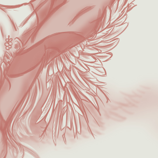
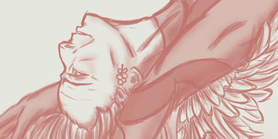
DAY 14 - «On Thin Ice» Good Omens AU - Triptych Tribute for @blairamok
Part 2/3: "Fallen Serpent" Crowley


Please, listen to this
Race
Life's a race
And I am gonna win
Yes, I am gonna win
And I'll light the fuse
And I'll never lose
And I choose to survive
Whatever it takes
You won't pull ahead
I'll keep up the pace
And I'll reveal my strength
To the whole human race

Yes, I am prepared
To stay alive
I won't forgive, the vengeance is mine
And I won't give in
Because I choose to thrive
Yeah, I'm gonna win!
Race
It's a race
And I'm gonna win!

Tomorrow, they will be together for the Grand Finale... See you there! ;-)
[Previous] [Next Day] [First Day]
Don't forget to 💕/ reblog ;-)
↓Come on, check the behind-the-scenes!↓
Personal challenge: a simple sketch each day
Goal: forcing me to keep things simple - inking, shading, just a few sashes of colour
Improvement pursued: to get the movement, the emotion, finding how to add depth, learning how to leave things barely finished
Max time allowed: 2 hours, as usual for my Daily Challenges.
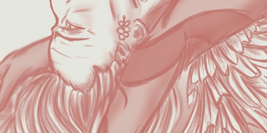
Tribute Time, so I threw the timer away, lol :-p. As for my Fallen Angel Aziraphale (link), I spent more or less 3 hours on the lineart, plus 1h30 on the colouring/shading.
Crowley, as my « Fallen Serpent ».
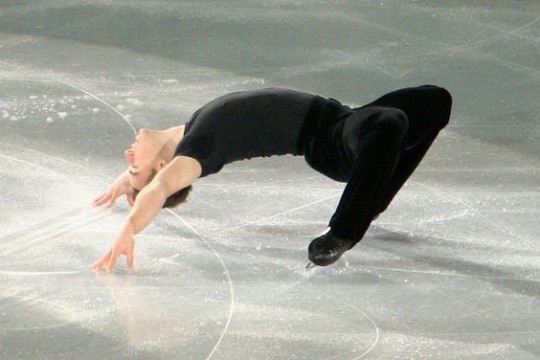
“On Thin Ice”'s author Blairamok describes the Cantilevers figure as « one of the biggest fuck yous to physics », and so one of Crowley’s signature moves. As I was searching drawing references about this amazing figure, I found a lot of ways to perform it, all beautiful and impressive. I finally chose this particular one (I am sorry I don’t know the original performer’s name on the picture I used, but to me he seemed so powerful, yet relaxed and happy on the picture, so I couldn’t resist). Though I had to slightly re-adapt the figure to Crowley who is taller, thinner and maybe even more flexible (ssssnaky, duh).
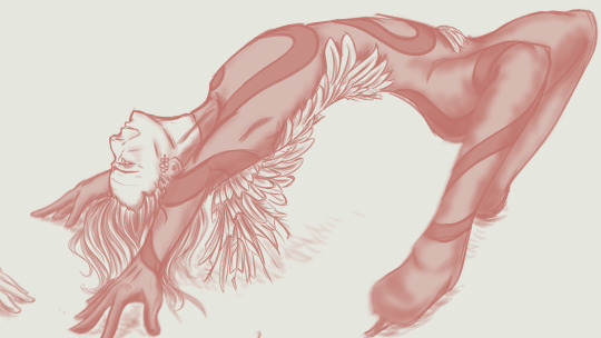
I had so much fun re-thinking his clothes for my sketch. I used the scrumptious💕 black and red « Serpent » clothing that Blairamok created, and I added my own « signature move » : wings – or, well, feathers. As Crowley is THE Fallen Angel here, the feathers are slightly burnt, some of them almost torn apart. They cover his shoulder blades, then spread out as a unique short and damaged wing at the back of his right shoulder, go down on his right flank, then cross his back as they slightly go embracing his left hip. The Red Serpent Pattern is quite the same as Blair’s clothing, but it still continues on his leg and circles his right ankle like a leg shackle.

I am particularly proud of Crowley’s eye and expression. Remember? I dearly wanted Crowley sharing a glance with Aziraphale while he was doing his Cantilevers, and Aziraphale was supposed to glance back to him. I had to give up on this idea later – because the figure I chose for Aziraphale definitely couldn’t allow such a shared glance. (but wait for the third part of this triptyque, it will be posted tomorrow!)
So, my Crowley still has this ethereal, strangely happy, almost enthralled expression. It kind of represents my own interpretation of the Cantilevers figure : it’s a proof of complete trust, in yourself, in your skills, in your art and your environment. And I like to imagine that if Crowley is able to have such confidence in himself, then maybe he can and will trust his partner Aziraphale with quite the same strength.

Thanks for reading! See you tomorrow for the third part - our Ineffable Partners will be toghether, finally! (aaaand they will be not talking but whatever the acting will speak for them)
[Previous] [Next Day] [First Day]
Don't forget to 💕/ reblog ;-)
#on thin ice#blairamok#I am so happy about it!#good omens#good omens fanart#Aziraphale#Crowley#aziracrow#art#my art#ineffable husbands#David tennant#Michael Sheen#ElenPersonnalChallenge#ElenthyaAndGoodOmens#Ineffable Feathers#good omens au#Ineffable lovers#Ineffable Ice Skaters#MUSE#Survival by MUSE#MUSE FAN FOREVER#ElenthyaGallery
131 notes
·
View notes
Note
ohh my goodness can you pls pls pls do a brush tour?? i love ur art so so much its so cruncy >:]
Yes I can, I appreciate your interest!! I use paint tool sai 2 which is kind of archaic, but I've been drawing on a wacom pen and touch small + using paint tool sai since 2012 and I'm too stubborn to move onto something better. I actually only use three brushes so I've made a little drawing where I only use one brush per character to show the differences:
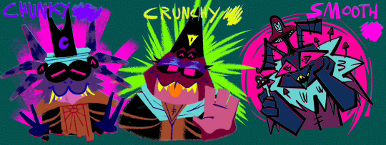
Gonna put the screenshots of the brush settings below the cut cause it got longer than I expected:
I drew my three big faves cause frankly I am sick of looking at kallamar and narinder's smug faces lmaoooo ANYWAY. GOING FROM LEFT TO RIGHT, WE HAVE THE CHUNKY BRUSH. I use that brush for messily coloring things in, doing big blocky background shapes, or just adding texture to a drawing. It's my favorite brush to paint with but I have not....finished a painting for this blog yet...

Then for the crunchy brush, it's a tool I use half for lineart and half for coloring. I use it for stuff like changes in fur color/markings, drawing all the lines in the backgrounds I do, and finer details the chunky brush can't handle. It's also the lineart tool I use for my drawings where the lines are all on the inside of the chararacters but not the outside!
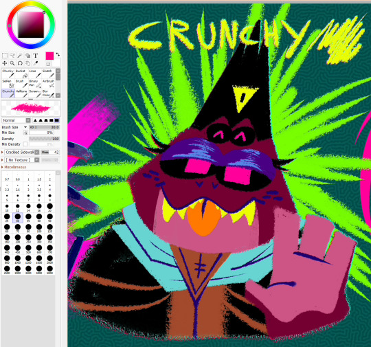
As for the smooth brush, this one only ever gets used for lines but it was created when I was so bored of my lineart tool I stopped drawing for a while. I wanted a calligraphy pen and had to work around SAI's limitations, so while it doesn't have that thin-thick angular effect that calligraphy pens have....I manually apply the pressure and it looks passable enough. I hope.
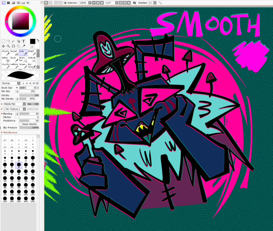
The brush settings are visible in the pics but uNFORTUNATELY I DO *NOT* remember where I got my stupid brush pack from. I literally downloaded the files before I was even a teenager but I *do* remember they're from deviantart. If anyone is for some reason kicking and screaming to acquire this ancient, crusty brush pack I'm sure I could throw it in a google drive
I have other useless information about my process if any of this is remotely helpful: for the anaglyph effect on my lines, I literally take a full 120 seconds to copy+paste two copies of my lineart, color it red and cyan, and then slightly move them up+down beneath the black lineart to get that 3dish effect. My flat backgrounds are just another sai preset texture, usually the checkerboard one cause it's swag. The rest of my brushes are just for utility or to fill in the gaps, that scroll bar leads to a bunch of empty space. They're not worth showing off just because they don't ever get used, or it's just like. The bucket tool. The select tool. A binary pen I never use. And lastly, for my usual lines, I actually go back and mess them up myself to get them to look more chaotic...my lines are usually smooth + even but it's so boring to look at and time consuming that I'm trying to unlearn that.
here's a wip of what my lines USUALLY look like with the smooth brush. You can see for the background I mostly used the chunky brush for shapes and then the crunchy brush for the finer lines! But yeah it takes forever to do smooth lines because I have nerve damage in my arm (it's why my stabilizer is maxed out...) and I refuse to use the line tool. In a professional setting I definitely make sure my lines are polished but this is just my goofy fanart blog and I want everything to look like it's been laced with crack.
I HOPE ANY OF THIS HELPS?? OR JUST SATES YOUR CURIOSITY, I try to not gatekeep the way I do my art so I have literally no secrets tbh
81 notes
·
View notes
Text
THE MAP IS OUT!! Here's my individual part for it, along with my credit image! I'm so happy to have been able to work with such cool collaborators on this project, this was so fun! :D <33
WIP and fun facts below the cut!
First pass of my part!

General Notes:
- All of us had a cut-off frame so Sammy (our MAP host!) had space to transition shots! the stick in my cut-off is my oc Lixy <3
- As always, I don't have an actual animation program. Each frame of this was individually drawn in Clip Studio, saved as PNGs, and meticulously arranged in a video editing software. it took a while and a headache. the software crashed 4 times hdkjh </3
- The process was sketching, lining, then compiling it all together! Line art took the most time (because i don't like lineart hkjdh)
- Fun fact, all of the sketches (seen in the wip above) were all drawn on my first plane ride ever :> <3
- The background is Alan's animation program that I took from a screenshot from AVA 6 :> I didn't want to do anything too complex for it ;w; <3
- All of the slide transitions were done manually! It may look like tweening, but I don't have a program that can do tweening lmao :'> <3 Each of the slidings was individually 3-6 frames of moving them across the frame, a single frame of stretch for movement, then a settling frame before the next stick slid in.
- Green is doing air guitar as they slide in :3 <3
- My Blue design has a hat that can magically change into a Witch hat (when potion making), Chef hat (when cooking) or Sunhat (when gardening <33
- Purple looks nervous after he crashes into everyone, like they're expecting to be in trouble, but smiles and laughs when everyone else does. You can see Blue with their hands up, reassuring Purple.
- Originally Yellow didn't move as much in the final laugh scene, but I saw the first frame of the person after me (@/sleptonce!) which had Yellow in a little crouch :> i adjusted Yellow to match the next frame a little better!
- Also Yellow's hair is flipped from the way I usually draw it because I felt it worked better this way hgkjh <3
- (I totally didn't forget my Second's design has green eyes and had to edit those frames very quickly hfkjh <33)
- The only colors that aren't the stick's original colors are when Blue's hat falls on Purple, and Red's yellow bandana <3 (These are also the only movement animation in the blinking sequence!)
- Adding Alan's cursor was a literal last minute decision, he was never in any of the sketches, I literally added him in 15 minutes before submitting my part hgkjh <33 I think after my shot, Alan helps gently pick them up <3
- My suit in the credits is mostly red and orange, because my favorite sticks are Red and Second! <3 The rainbow cape reflects how I enjoy the color gang the most though hkjdh <33
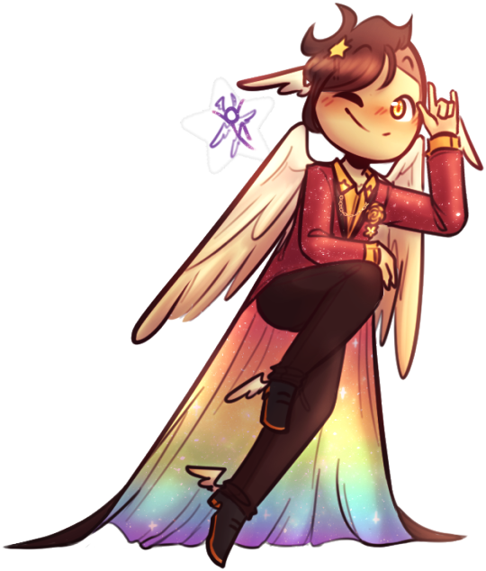
Thanks for reading!! :D <33
#Alan Becker#Animation Vs Minecraft#Animator Vs Animation#AvM#AvA#my avm art#avm red#avm second coming#avm orange#avm yellow#avm green#avm blue#avm purple#starlight originals#lixy
180 notes
·
View notes
Last Seen Blogs
eriyuan
♡
ramctheatheist
Moving Designs

uncannyspark
OR

artech0101-blog
artech0101
lucosborne-blog
#toofabu