#adobe photoshop tutorials
Explore tagged Tumblr posts
Visit Tumblr Blog
Explore Tumblr blogs with no restrictions, modern design and the best experience.
Last Seen Tumblr Blogs


Fun Fact
Tumblr.com is the 103rd most visited website in the world.
Text
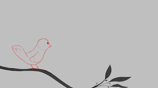
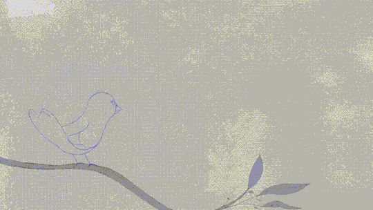

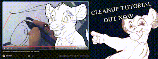
'ello folks, my Cleanup tutorial is finally done and out! hope you find it useful
#Animation#Tutorial#Advice#Lesson#The Lion King#simba#animation#Disney#character design#how to#2D#traditional animation#frame by frame#Adobe#Photoshop#Animate#Flash#After Effects#Premiere#Video#Film#Drawing#Tips#Gestures#cleanup#lines#krita#toon boom#procreate#tvpaint
1K notes
·
View notes
Note
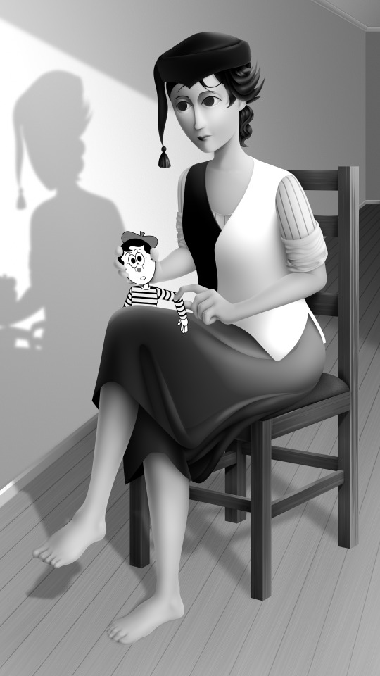
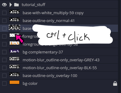
What art program do you use? sorry if you already answered something like this but im so mesmerized by the techniques you use in your art.
Thank you. No need to apologise; I don't mind answering this question because it's an excuse to walk through my latest image!
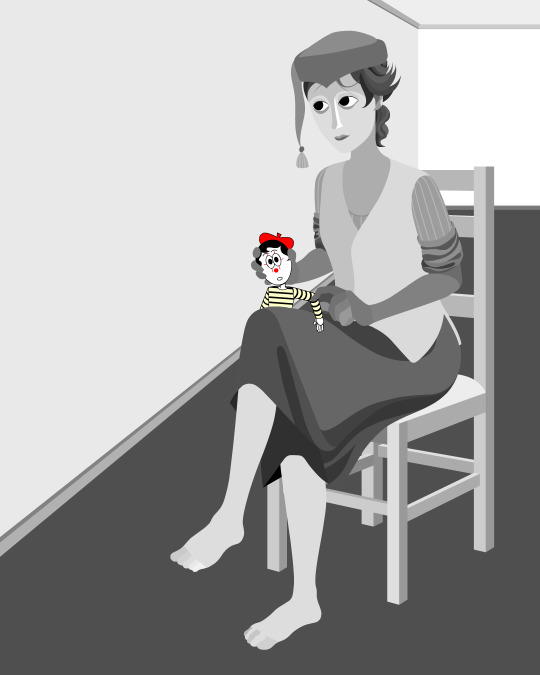
The concept for this piece is based on being perceived online through interpretations of posts and artwork, yet how artificial this can be. The relationship the viewer forms is more with the narrative of the work, and any insight into the artist through this feels highly awkward to me, which is precisely what I want to explore with this piece.
In this example, I wanted an attractive sitter to look like someone out of a new romantics music video or like an Enya video, because this genre and era of media is very aesthetically pleasing and nostalgic for me. I hold it as an unobtainable ideal— a hauntology. So, as wonderful as it is, it equally feels shameful and perverse because it's an aesthetic object of desire that I am contriving.
The sitter is holding one of my cartoon characters, Lauren Ipson, the protagonist of my Ersatz world project. A trope in writing is when a character acts as a self-insert of the author, and I'm conscious to try and avoid that with Lauren. I try to write Lauren as dry and sardonic yet also fun, dramatic, and friendly. I don't think of these as personal qualities of my own, but I imagine personal qualities bleeding into fictional characters is inevitable.
Yet Lauren Ipson feels much more alive a character to me compared to any attempt at self-portraiture or self-expression that I've done, which is very little because I'm not interested in constructing a perceivable identity. (I'm aware this text itself can be interpreted as self-expression; however, to me this is just another construct.)
So Is the sitter meant to be me, controlling Lauren? I'm definitely baiting the viewer to think this, and you can interpret it that way if you want, but really I don't think of the sitter as me at all. My intention is to show how it's all a facarde. The sitter is basically just as much a doll, a puppet, a mannequin as Lauren Ipson is, if anything more so.
There's a deliberate irony between Lauren's cartoon rendering and the sitter, who I wanted to render with more detail and evoke a modernist style. I'm inspired by Hans Bellmer and Dorothea Tanning with their work with dolls. However, despite that implied visual hierarchy, the more detailed sitter shares a similar, stilted vector construct to Lauren. They're both born from vector drawing after all. And it's further undermined with the way Lauren the doll looks directly at the viewer, as if she's alive, while the sitter looks to the side with a blank, almost dead-in-the-eyes expression.
Anyway, with that in mind, almost all of my work starts as a thumbnail sketch. Although I often draft digitally and am fine with doing that, I feel more confident doing it freehand on paper. Digital rendering feels more like a refinement process to me. Funnily enough, although I often prefer to sketch with physical materials, I'm anxious of refining or rendering with them.
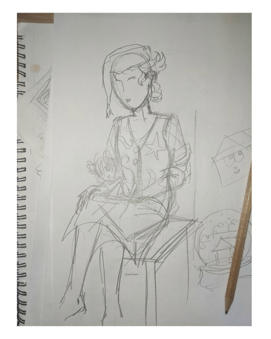
I like my designs to be very direct and conceivable, so a solid silhouette, pose, negative space etc. I often create a quick digital sketch with this in mind, either by tracing or referencing the thumbnail, although sometimes I skip this step and go straight to the rendered drawing. The aim is to establish a visual guide, dividing the drawing into various shapes for digital airbrush rendering later on.

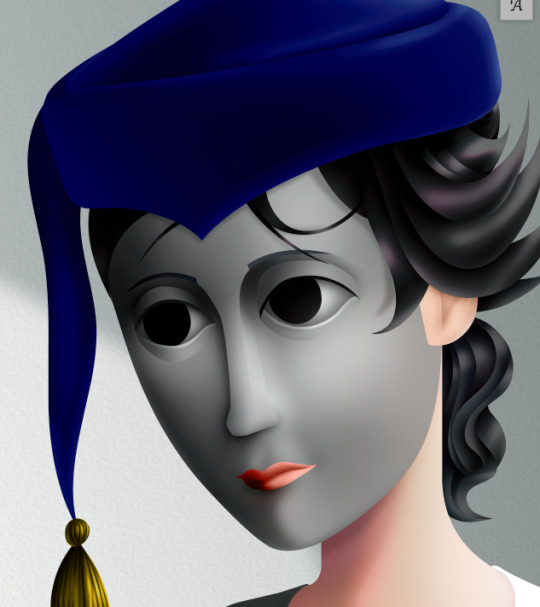
With this composition, I made a second draft with more attention to details such as the face, hands and feet. Sometimes I'll use photo references if I'm struggling with posing or anatomy. These drafts are often blue because it's easier to render the black linework over a transparent blue sketch.

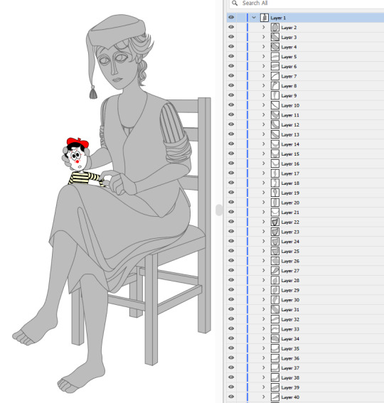
The chair took some time but was relatively simple to render. It uses the line tool set to magnetic anchor point, following two-point perspective vanishing points. I like two-point perspective because it feels sort of digitally native to me to have these impossibly perfect vertical lines. I also know the horizon line should be at eye level or something, but I just like the idea of the top of the chair to be perfectly horizontal.

Here I'm drawing the final rendered form. I use the stroke tool with it set as smooth as possible. Often I'll redraw lines over and over if it means getting certain curves to look right. Once the lines are drawn, I'll fill them in and remove the stroke, leaving just the solid vector shape. The shade of grey I use is done to simply denote the shape. It does not represent any kind of shading or anything; in fact, when I bring it into Photoshop, all these shapes are set to the same shade, but if I had that here in Animate as I'm drawing, it would be impossible to see what I'm doing. The red background is just for clarity.
Once it's all drawn, I'll make sure every shape is clean, overlapping nicely, and divided into its own layer. A composition can often be comprised of hundreds of separate shapes.
Each shape will be its own layer in Photoshop, which will operate as a clipping mask. The clipping masks act like masking tape or shielded off areas for soft brush opacity rendering, similar to the soft atomised rendering from an airbrush, just done digitally.
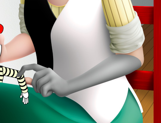
I follow very rudimentary painting techniques of simple shading, lighting, and bounce-back highlights. I follow a simplified Grisaille technique, focusing on strong values in greyscale before adding a wash of colour with a color gradient map set to layer style color. Sometimes my values can be a little off, but as long as the values are all consistently acting together, I can correct them with transparent washes or color curves. If the greyscale looks harmonious with all the forms clear, colour will likely work.
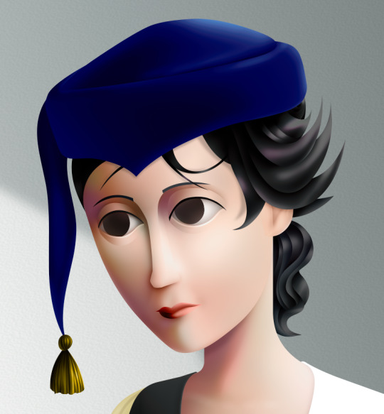
Proper digital painters will say this is an amateur process, with results that look mechanical and stiff, as colours in the real world all bounce together off different surfaces, resulting in colour harmonies. However, I don't mind the inharmonious nature of the colours, as I find the values give the composition enough harmony. I'm working digitally, so why go to all the effort to make it not look digital? It's interesting to me to have the red chair look blindingly red, the green skirt look blindingly green.
Colours can look boring without some form of harmony though, so I will add in blue-greens with the darker areas, more turquoise greens towards the highlights.
Skin tones are far more complex, however, as it's something that's more informed by realism. This is why kigurumi dolls with their plastic flesh look so artificial to the eye, because we're familiar with how light passes through flesh and skin and all the subtleties of colour that it picks up. This piece is the first time I've explored flesh tones, as typically I avoid all this by rendering skin as grey porcelain.
I needed to really up the contrast, with shaded areas becoming purples and highlights verging on washed out. Areas with more blood, like feet and cheeks, appear more orange and red. Areas closer to bone and cartilage, like the bridge of the nose, can look almost blue and green. Exploring these colour values and tints in the aim of natural tones was fun to do, and ironic given how blank the face is.

Although in the moment I feel very much like I'm rendering a realistic reality, when I step back, I'm reminded how stylised and unrealistic the painting actually is. It looks kind of insane, like everything is so uniform and overtly saturated. It doesn't feel present in a real space, despite the shadow and form implies one. But I'm not consciously thinking of these things, of style, as I'm working. To me, it's a process of world-building and problem-solving.
129 notes
·
View notes
Text

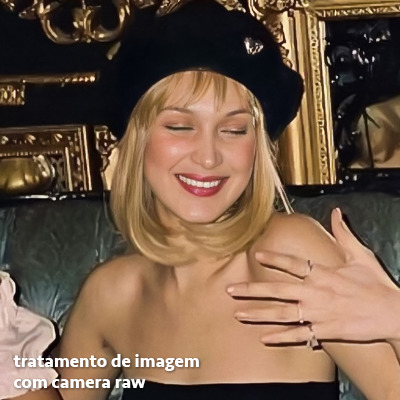
Raw photo.

2. Darken background w/ masking (focusing on blacks and darks, leave highlights alone because it will get rid of the delightful little bokeh on the water surface. Also popped the saturation & warmed up white balance)

3. Run De-noise (not necessary per-se, but pulls some details back into some of the feathers and I'm a recovering pixel peeper.)

4. Final touches: open in photoshop and dodge/burn the particles in the water, and around the backlit feathers to pull a little more contrast/saturation. Also took a little saturation out of the lightest feathers of the ducklings bc they pulled too orange for me, and knocked the white balance a little more green - the whole image was feeling a little too pink for me.


Full-size before and afters.
This is pretty much the exact process I follow with backlit images. I try to keep most of my edits "true to life" - but there is a lot of subjectivity in that statement lol.
Image Deets:
Nikon z7ii x. 180-600.
600mm
F 6.3
1/800 (handheld/propped up on a tree root)
ISO 2000

The usual set up. I often lose the tripod bc it doesn't get low enough for me most of the time. So I end up balancing my camera on my feet, or a root, or something.
#behind the image#behind the scenes#lightroom tutorial#how to lightroom#making of an image#photography tutorials#how its made#photography nerd shit#wildlife photography#postprocessing#photo editing#my photos#image editing#adobe photoshop#lightroom#nature#birding#nikon#bird watching#birds#ornithology#oc#bird#bird photography#animal#animals#wild#wildlife#wild animals#wild birds
26 notes
·
View notes
Text
GUIA COMPLETO DE COMO EDITAR FOTOS EM ALTA QUALIDADE (HQ)!
oiê, bem vindos(as)! à pedidos, estou trazendo um tutorial bem abrangente sobre como editar fotos no geral para icons, headers, etc., em alta qualidade. neste guia/tutorial trarei dicas, truques e informações gerais sobre o que é preciso para editar em hq. lembrando que o conteúdo deste guia é sobre como eu edito, a maneira que funciona comigo e meu progresso e aprendizado ao longo de quase 12 anos editando icons, ou seja, o que contém neste guia pode — e deve — ser adaptado à sua maneira e ao software de sua preferência. aproveitem e se divirtam!
nota: este tutorial está bem longo, então, se possível, veja este guia pelo pc/notebook!
O QUE VOCÊ VAI ENCONTRAR NESTE GUIA
softwares necessários com links para download;
onde e como baixar as fotos para as edits;
métodos de edição e passo a passo;
como melhorar a qualidade de uma foto;
como salvar a foto corretamente para postar;
dicas de actions e outros resources.
clique em “continuar lendo” para ver o tutorial.
1. SOFTWARE
photoshop
eu recomendo fortemente o uso do photoshop cc na versão mais recente, ou outra versão com camera raw ou filtros neurais suportada pelo seu pc ou notebook.
você também pode usar o photopea como alternativa (eu particularmente prefiro o photoshop pois acho que as edits ficam com mais qualidade). se você preferir o photopea, algumas dicas desse guia poderão não funcionar devido à falta de algumas funcionalidades que o photopea não oferece (ex: camera raw, galeria de filtros, filtros neurais e outros).
eu uso a última versão do photoshop (atualmente, a versão 25.5.1) e uso a versão paga (obrigada adobe pelo desconto de estudante!!!!!), mas vou deixar alguns links para você baixar o photoshop gratuitamente caso você não seja estudante e/ou não tenha condições para assinar um plano.
atualmente eu uso um mac mini 2014 para editar, mas sempre usei windows, então, as dicas e os links valem para os dois sistemas operacionais.
links
macos: 1, 2 & 3.
windows: 1, 2, 3 & 4.
2. BAIXANDO AS FOTOS
galerias de fotos
muitos artistas têm fansites com galerias de fotos e você pode achar facilmente digitando no google: “nome da pessoa + gallery”.
o artista que eu quero não tem galeria própria e agora? tranquilo, ainda temos galerias de fotos de famosos variados como hqdiesel, hqsource, hq-pictures e até mesmo o theplace.
em último caso você pode usar o gettyimages e usar um removedor de marca d’água ou um site como o gettyimages downloader.
instagram
para artistas estrangeiros que tenham apenas instagram e/ou não tenham fotos em galerias de imagens, eu recomendo o instagram pessoal da pessoa.
você poderá fazer o download das fotos com extensões de navegadores como o image downloader for instagram (para firefox e google chrome), ou sites como o saveig, o snapinsta ou o igdownloader.
eu recomendo baixar pela extensão do navegador, pois ela baixa a foto direto do site do instagram no computador, diferente dos sites que você precisará ir foto por foto, copiar o link e colar no site para fazer o download.
mas, caso a extensão esteja indisponível, com algum erro ou pare de funcionar, o site é uma excelente alternativa (só precisa ter mais paciência).
nos sites para baixar fotos do instagram, geralmente eles dão a opção para você escolher o tamanho da foto. você deve sempre selecionar a resolução maior da foto (acima de 1000px é o melhor).
pinterest
em casos extremos de artistas low profile, sem instagram, sem aparições públicas, sem galerias de fotos, nadica de nada, eu recorro ao pinterest.
porém, é preciso ter muito cuidado ao fazer download de fotos do pinterest, porque são muitas fotos repetidas e muitas com baixíssima resolução e qualidade.
se você for baixar fotos do pinterest, escolha a foto com maior resolução (imagens maiores que 500px já são ok para editar icons), e depois de baixar a foto, eu recomendo fazer um tratamento na foto para melhorar a qualidade dela, como vou ensinar.
3. EDITANDO
3.1 importando a foto no photoshop
apertando ctrl+o ou cmd+o uma guia vai abrir no programa, onde você vai até a pasta onde a foto foi salva. selecione a foto e clique duas vezes nela para abrir.
3.2 cortando a foto nas dimensões desejadas
muitos tutoriais de edições de icons sugerem que você copie a imagem e cole ela em um documento novo já do tamanho da sua edit, mas eu não recomendo essa opção, pois ao redimensionar a foto com a ferramenta de transformar (ctrl+t), ela dá poucas opções para manter a qualidade da foto e se você não souber o que cada opção faz, poderá perder a qualidade da imagem. então, eu sempre faço o recorte na própria foto para não alterar muito a qualidade dela.
aperte a letra c no teclado para abrir o atalho da ferramenta de corte. (se o seu photoshop for alguma versão do cc, eu recomendo que você marque a opção para usar o modo clássico de corte, assim fica mais fácil e você tem um controle maior sobre a ferramenta!). para fazer essa alteração é simples, vá no ícone de engrenagem, clique e marque a opção “usar modo clássico”.
para fazer icons, você deverá cortá-lo usado dimensões quadradas, ou seja, 1x1, e para headers 15x5. você pode mudar as dimensões na caixinha da ferramenta de corte.
3.3 redimensionando a foto
nessa parte você precisará prestar atenção, pois ao redimensionar a foto, você poderá perder ou ganhar um pouco mais de qualidade na foto, e para isso você usará uma opção chamada reamostrar (ou resample se seu photoshop estiver em inglês). deixe a opção marcada para usar as definições.
3.4 explicando as definições do reamostrar e qual definição usar de acordo com o resultado que você quer
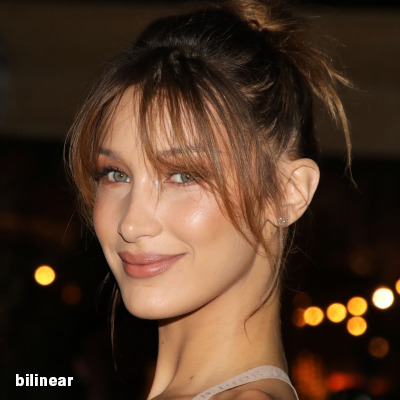


bilinear: a melhor opção para redimensionar gifs, mas para fotos não é tão bom pois dependendo da foto algumas partes ficam nítidas, outras mais suaves e se você for aplicar action de nitidez, pode ficar com um aspecto de “craquelado” com as bordas granuladas, o que eu pessoalmente acho que fica um pouco estranho.
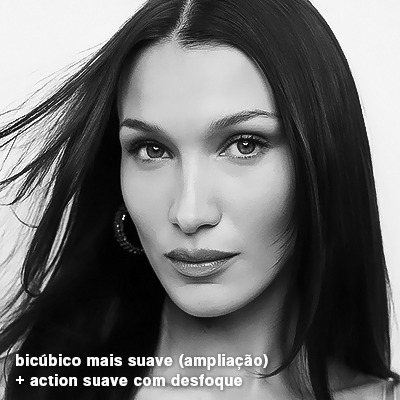
bicúbico mais suave (ampliação): como o nome já diz, ele deixa a foto mais suave, ou seja, os pixels “craquelados” e granulados da foto ficarão mais suaves. é uma ótima opção tanto se você for aplicar actions de nitidez ou actions mais desfocadas e mais suaves.
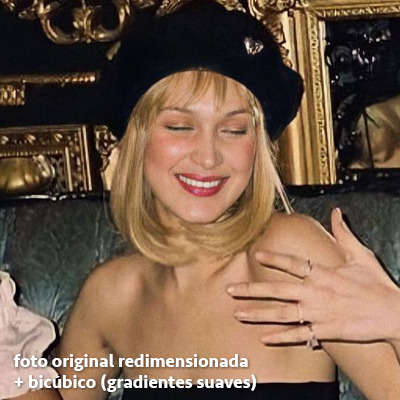
bicúbico (gradientes suaves): pode parecer a mesma coisa do bicúbico mais suave, mas esta opção além de suavizar a imagem, cria um “desfoque iluminado” nas transições das cores da foto. é a melhor opção para fotos sem muita qualidade e principalmente se você for usar actions suaves e desfocadas, sem muita nitidez.
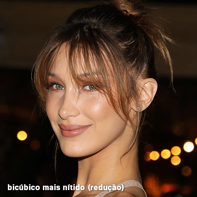
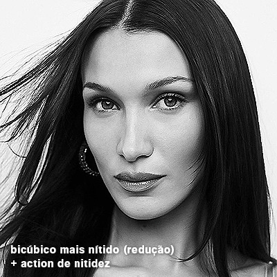
bicúbico mais nítido (redução): acentua os pixels e as arestas nítidas da foto, ou seja, essa definição redimensiona a imagem mas preserva a nitidez da foto. se você usa actions de nitidez que não tem desfoque nas configurações, essa é a melhor opção de reamostra. (mas cuidado, se sua imagem ficar muito nítida com essa definição, você precisará usar outra opção. caso contrário, quando você aplicar a action, a edit poderá ficar muito exagerada e/ou com aspecto áspero.)
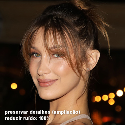
preservar detalhes (ampliação) com redução de ruído: esse em especial é ótimo para quando você precisar redimensionar uma foto para deixá-la maior sem distorcer tanto a imagem. você pode ajustar a redução de ruído para deixar a foto mais suave, sem perder muita qualidade. (obs.: essa opção não deve ser usada para redimensionar imagens muito pequenas, por exemplo de 200x200 para 400x400, ou a imagem vai ficar muito distorcida. ela deve ser usada quando a diferença de pixels não é muito grande, por exemplo, você cortou a foto e ela ficou no tamanho 370x370, aí sim você pode redimensionar para maior sem perder muito da qualidade. então você pode ir ajustando a qualidade com a porcentagem da redução de ruído).
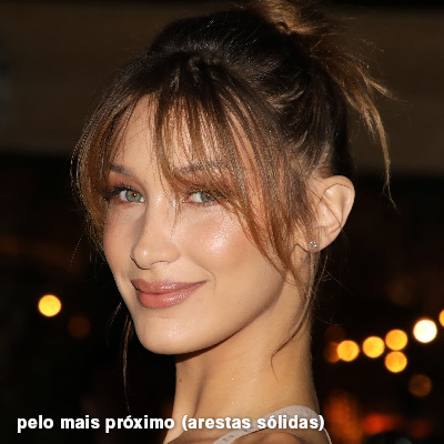
pelo mais próximo (arestas sólidas): essa é uma opção traiçoeira, pois não fica bem em quase nenhuma imagem (a menos que seja um pixel art). essa definição redimensiona a imagem e mantém os pixels nítidos, ou seja, a foto fica menor mas tudo nela que tem aspereza vai prevalecer. é muito usada para redimensionar pixel art, pois preserva as bordas ásperas. pode ocorrer de ficar boa em uma foto aleatória mas não será possível aplicar action, ou a imagem ficará exagerada.
3.5 aplicando a nitidez depois de redimensionar
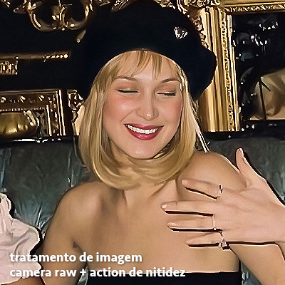
depois de escolher a foto, baixar, redimensionar de acordo com o estilo da action da sua escolha, está na hora de aplicar.
eu fiz duas versões para mostrar como fica com cada tipo de action:
assim, os dois icons tem uma alta qualidade usando actions diferentes, graças a remostragem ideal para cada tipo de action :)
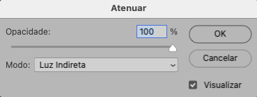
4. TRATAMENTO DE IMAGEM PARA MELHORAR A QUALIDADE
nesta parte, é muito importante que você tenha baixado uma versão do photoshop com neural filters e/ou com o camera raw, mas caso você não tenha, tudo bem também, vou ensinar como fazer uma melhoria na foto de três jeitos: com camera raw, com neural filters e com desfoques. a melhor forma vai depender de quão ruim está a qualidade da sua foto. em geral, apenas fazendo ajustes no camera raw você já tem um ótimo resultado na maioria das fotos.
camera raw
se seu photoshop tem o filtro do camera raw, ele vai estar em filtro > filtro do camera raw...
tudo que iremos fazer será na aba de “detalhe”, ali você deve dar mais atenção ao ajuste de redução de ruído, pois é ele que vai remover o ruído da imagem e melhorar a qualidade dela.
vá mexendo nas configurações de redução de ruído até que a foto fique mais suave. ajuste também o detalhe e o contraste da redução de ruído.
essa parte será mais no olhômetro mesmo, pois as configurações vão variar de foto para foto, mas eu recomendo muito você mexer também na nitidez para não deixar a foto tão desfocada, mas nada muito intenso para não interferir na action que você irá usar.
eu mexo também na redução de ruído de cores, porque dependendo da foto, algumas cores estarão saturadas ou com muito ruído. só cuidado para não colocar um número muito alto, pois esse ajuste pode tirar a saturação da sua foto e deixá-la apagada.
enfim, aqui está uma comparação da foto original com o tratamento feito com o filtro do camera raw e depois já com a action de nitidez aplicada:
e essas foram as configurações que usei nessa foto em específico:
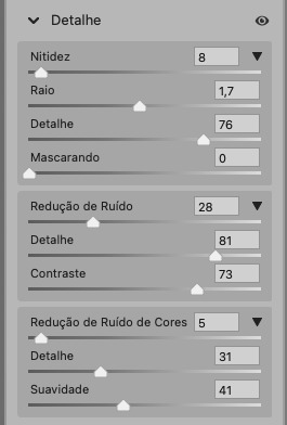
como eu disse antes, as configurações irão variar de foto para foto, a depender da qualidade de cada uma e de quão ruim a foto está, mas com essa configuração básica, você já vai conseguir melhorar algumas fotos.
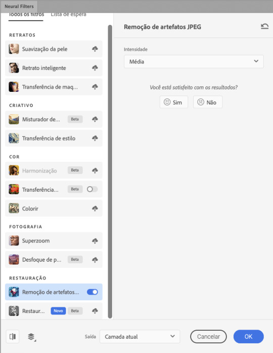
neural filters
se a versão do seu photoshop vem com neural filters (ou filtros neurais), ele estará em filtro > neural filters...
irá abrir uma janela com vários filtros mas o que a gente irá usar vai estar em “restauração”, com o nome “remover artefatos jpeg”. se precisar, faça o download do filtro.
eu recomendo usar a intensidade sempre média, a menos que a foto esteja muito ruim, aí você usa a intensidade alta. mas em geral, a intensidade média ou baixa já dá conta do recado.
a saída deve sempre estar na camada atual, ou seja, na camada da foto selecionada.
assim:
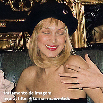
e aqui está uma comparação da foto original com o tratamento feito com o neural filter e depois já com a action suave com desfoque aplicada:

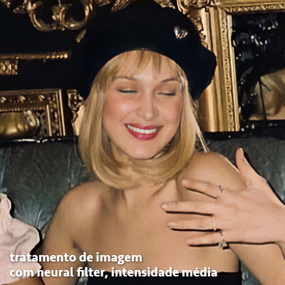

a opção do neural filter é uma ótima alternativa ao camera raw, o único contra é que ele deixa a foto com uma textura áspera, e quando você usa uma action de nitidez eles ficam muito visíveis e acaba não ficando muito legal.
porém, um bom jeito de contornar isso é adicionando ruído na foto. eu uso o efeito de granulação do camera raw para adicionar ruído no icon (você também pode adicionar o ruído em filtro > ruído > adicionar ruído..., mas eu prefiro o camera raw pois ele dá mais opções para ajustar o granulado do jeito que eu preferir).
no primeiro icon abaixo, dá para perceber a textura áspera que o neural filter deixa depois de melhorar a foto e adicionar nitidez; já no segundo icon eu mostro como eu adicionei o ruído e contornei esse defeito.

as configurações de ruído que usei no camera raw foi 12 de granulado, 35 de tamanho e 20 de aspereza.
lembrando que, se você for usar uma action de desfoque e/ou remoção de ruído, não será necessário adicionar a granulação, pois a própria action já vai suavizar a textura do neural filter (a menos que você queira adicionar o ruído, claro).
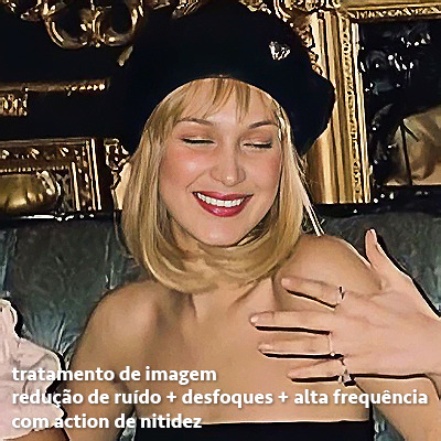
redução de ruído + desfoque
caso a sua versão do photoshop não tenha nenhuma das opções de camera raw ou neural filter, caso você use um photoshop mais antigo, photoshop portable ou prefira usar o photopea, essas alternativas podem ser úteis.
mais uma vez, irei me basear no olhômetro, de acordo com a foto e irei ajustando as configurações de acordo com o que eu quero e acho necessário.
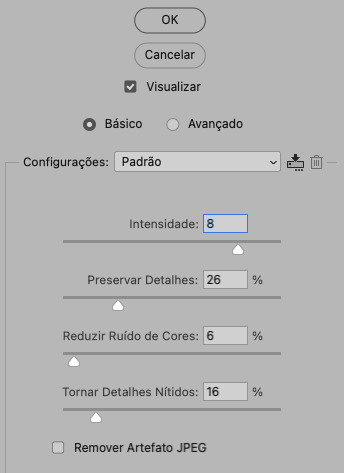
vamos começar com a redução de ruído! ele está em filtro > ruído > reduzir ruído...
na janela de redução de ruídos você verá alguns ajustes que são: intensidade, preservar detalhes, reduzir ruído de cores e tornar detalhes nítidos e vou explicar cada um para que você possa saber ajustar eles de acordo com sua foto:
intensidade: o número de 1 a 10 irá definir a intensidade da luminescência, a intensidade do filtro e o quanto da imagem você quer preservar ou extinguir, sendo 1 o mínimo da intensidade do filtro e 10 o máximo;
preservar detalhes: o número digitado irá definir a porcentagem de detalhes a serem preservados. quanto maior o número, maiores serão os detalhes mantidos na foto, como ruídos, manchas e outras aberrações da foto;
reduzir ruído de cores: o número digitado irá definir a intensidade e reduzir o ruído cromático, ou seja, vai reduzir as aberrações cromáticas, como por exemplo, fotos que distorcem as cores. preste atenção na porcentagem inserida, pois quanto maior o número, menos saturação sua foto terá e poderá ficar com aspecto de foto envelhecida;
tornar detalhes nítidos: o número digitado vai definir a porcentagem de nitidez para restaurar pequenos detalhes da foto. quanto maior a porcentagem, maior vai ser a intensidade dos detalhes da foto. preste atenção na porcentagem inserida, pois se a intensidade da nitidez for muito alto, vai afetar a sua action, seja ela de nitidez ou de desfoque.
sendo assim, para a foto usada eu fiz estes ajustes:
obs.: se você for um usuário mais avançado do photoshop, poderá explorar a opção avançado, que possui as configurações básicas para melhorar a foto e também as configurações para remover ruído das cores primárias (vermelho, amarelo e azul) individualmente. mas, mesmo se você não for um usuário expert, eu recomendo você dar uma olhada nessa opção e explorá-la, mexendo nas configurações e ir ajustando e aprendendo, pois o resultado poderá ficar ainda melhor nos ajustes avançados.
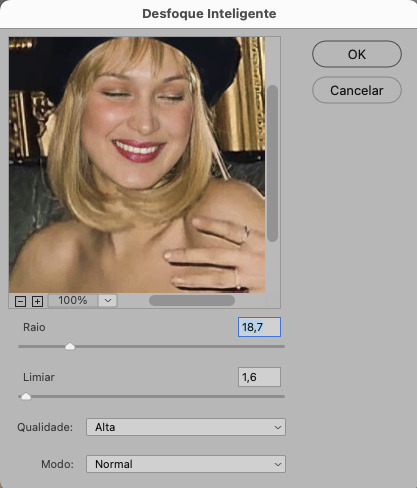
aplicado a redução de ruído, vamos partir para o desfoque! eu estarei usando o desfoque inteligente antes do desfoque de caixa. você vai achá-lo em filtro > desfoque > desfoque inteligente...
na janela que abrirá, você verá os ajustes: raio, limiar, qualidade e modo. vou explicar eles:
raio: vai determinar o tamanho da área que será considerada para o desfoque. quanto maior o número, mais detalhe serão preservados;
limiar: vai determinar a diferença dos pixels entre si antes de serem alterados pelo desfoque.quanto maior o número, maior será a área em que o desfoque será aplicado;
qualidade: vai determinar a qualidade e intensidade do desfoque. ao escolher a opção mais alta, mais partes da foto o desfoque atingirá;
modo: vai determinar o traçado das linhas de bordas que o filtro identificar. o modo normal aqui é o ideal, pois os outros modos “somente arestas” e “sobrepor arestas” irão identificar somente as bordas da imagem.
sendo assim, esses foram os ajustes:
após o desfoque inteligente, partiremos para o desfoque de caixa! ele está em filtro > desfoque > desfoque de caixa...
(você também poderá usar o desfoque gaussiano a depender da foto, mas para esta em questão, o desfoque de caixa funcionou perfeitamente)
a intensidade do desfoque de caixa, assim como do desfoque gaussiano, é medida em pixels e o mínimo é 1 pixel, e para icons é uma intensidade forte, então eu coloco o número mínimo (1, no caso) e depois de clicar em OK e aplicar o desfoque, vou em editar > atenuar desfoque de caixa... e ajusto a porcentagem de acordo com a foto. nessa foto deixei a porcentagem em 33% e ficou ótimo.
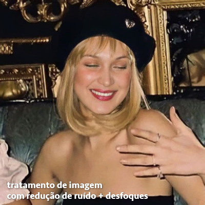
no entanto, infelizmente, por não ser o melhor método para melhorar a qualidade de uma imagem, ela ficará um pouco desfocada demais. mas podemos contornar isso usando o filtro alta frequência para devolver um pouco da nitidez e detalhes na foto. você encontrará esse filtro em filtro > outros > alta frequência...
o filtro de alta frequência, assim como os desfoques, é medido através de pixels e quanto maior o número, mais detalhes passarão despercebidos, ou seja, menos detalhes e menos nitidez sua foto terá. eu recomendo em torno de 2px se você quiser mais detalhes e em torno de 5px se você quer mais suavidade.
a primeira vista esse filtro parecerá estranho e distorcido, mas dará tudo certo, você só precisará mudar o modo de mesclagem. para isso vá em editar > atenuar alta frequência e mudar o modo de mesclagem para “sobrepor” ou “luz indireta” se você quiser que fique mais suave. se preferir, poderá também ajustar a opacidade para os detalhes ficarem mais ou menos intensos.
assim:
assim fica o resultado sem o filtro de alta frequência e com o filtro:

sendo assim, fica a seu critério usar o filtro ou não.
aqui está a comparação das fotos com o tratamento de redução de ruído + desfoque com e sem o uso das duas actions:
5. SALVANDO A EDIÇÃO
e chegou a melhor parte: salvar a edição para postar!
seja a edição um icon, uma header, ou qualquer outro gráfico estático (edições não animadas), a melhor opção é sempre, sempre, SEMPRE, salvar no formato PNG!
o formato jpg ou jpeg não preserva a qualidade original como o formato png preserva. então, sempre escolha esse formato ao salvar suas edições estáticas!
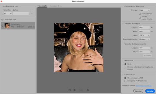
a melhor forma de salvar uma edição em alta qualidade é exportando ela. sendo assim, vá em arquivo > exportar > exportar como...
em “configuração de arquivo”, selecione o formato PNG e desmarque a opção “transparência” se sua foto não é uma imagem com fundo transparente; em “tamanho da imagem” deixe como a altura, a largura e a escola como estão, apenas mude a opção em “criar nova amostra” para BICÚBICO AUTOMÁTICO; e em “espaço da cor” marque a opção CONVERTER PARA SRGB, porque assim, independente da calibração do seu monitor, a foto ficará com as cores originais e não sofrerá alteração.
assim:
no entanto, se você tiver um pc ou notebook lento, ou apenas não tiver paciência para salvar sua edit em exportar, você pode salvar no modo normal, indo em arquivo > salvar como... OU arquivo > salvar uma cópia..., no entanto, se você for usar essa opção, não esqueça de marcar a caixinha para “incorporar o perfil de cores srbg”, essa opção geralmente fica na parte de baixo da janela que abre quando você vai salvar a edição.
6. ACTIONS & RESOURCES
para facilitar pra vocês, todos as configurações de filtros usados neste guia, estarão disponíveis para download em uma pasta de action. para fazer o download é só clicar aqui: ★. já a dupla de actions usadas (a de nitidez & a de desfoque suave) estarão disponíveis para download na lista de dicas abaixo.
dicas de actions de nitidez – premium & gratuitas (free)
lovie potion by @loviestudio [premium]
action #26 by @harupsds [premium]
action #25 by @harupsds [free]
01 action by @harupsds [free]
cherrie by @loviestudio [free]
action #11 by @miniepsds [premium]
face action by @miniepsds [premium]
crispy by @nebulies [free]
scarlett by @l-agallerrie [free]
eight action by @peachcoloring [premium]
bubblegum by @hisources [free]
kendall by @hisources [premium]
hekate by @hisources [premium]
sharpen by @l-agallerrie [free]
#01 action by @buntterflies [free]
dicas de actions “suaves” – premium & gratuitas (free)
teddy bear by @loviestudio [free]
action ten by @peachcoloring [premium]
caelestis by @miniepsds [premium]
fleuriste by @hisources [free]
angel by @loviestudio [free]
action #13 by @harupsds [premium]
action #12 by @harupsds [premium]
wild action by @hisources [free]
outras actions – premium & gratuitas (free)
denoise action effect — remove o ruído das fotos sem perder muita qualidade by @loviestudio [premium]
photopea quality action — action para melhorar a qualidade da foto no photopea by @loviestudio [free]
exclusive hq actions — um conjunto com as actions que foram usadas neste tutorial by @girasois, @loviestudio [free]
denoise and sharpen actions — conjunto de actions para melhorar a qualidade da foto automativamente by heavnsent
7. BÔNUS: DICAS EXTRAS
a adobe cc learn tem muitos tutoriais que você pode dar uma olhada e aprender muito mais sobre o photoshop e outros programas da adobe!
o youtube é outra fonte incrível para você aprender edição no photoshop, lá você encontra tutorial para quase tudo de edição de fotos e muito mais! se você entende inglês, eu recomendo muito os canais piximperfect e brendan williams tutorials.
para fonte de inspirações, o tumblr é o lugar certo! se jogue nas tags para se inspirar e nos blogs de photoshop para ver muito mais tutoriais e muito mais resources.
o blog @looksgreat infelizmente não é mais atualizado, mas você ainda pode encontrar muitos tutoriais sobre quase tudo de edição, e o melhor, todos os tutoriais são em português!!
ainda recomendo outros tumblr brasileiros de resources e tutoriais: @miniepsds, @harupsds, @peachcoloring, @gmfioart, @colour-source, @l-agallerrie, @wasirauhlpsds, @hisources, @opulenceps, @sunshinepsds, e @loviestudio; e no deviantart: jungrainsoul, rockjealous, heavnsent, aureangels e rohdossantos.
8. CRÉDITOS E INFORMAÇÕES
crédito colorings
off hearts + whimsy by @miniepsds ♡
informações
antes de tudo eu gostaria de pedir desculpas pelo tamanho deste guia, mas eu quis abranger o máximo de dicas possíveis para vocês e deixar o tutorial super completinho.
em segundo lugar eu gostaria de agradecer todo o carinho de vocês, isso me motiva muito a continuar. obrigada, de coração!
enfim, é isso! minha ask estará sempre aberta para dúvidas, sugestões, pedidos e mensagens fofas (sempre com educação e respeito, claro)!
#tutorial#photoshop tutorial#tutoriais#tutorials#resources#hq tutorial#tips#useful#ptbr#adobe photoshop#photopea tutorial#tutorial tips#dicas#dicas de edição#dicas de actions#guia completo#guia#guia de edição#guia de edits#edits tutorial#edit tag#masterpost#long post#editing tips#icon tutorial#header tutorial#hq edits
168 notes
·
View notes
Text
youtube
So I kinda promised many months ago that I would write a detailed tutorial on how to make gifs with Photoshop. Unfortunately, I never got around to it and I kind of forgot as well because the idea overwhelmed me a little, so, sorry.
Then, today, a friend of mine on Discord asked me how I make my gifs, so I finally decided to make a quick video tutorial for it. English is not my first language, but I hope you can understand what I'm saying here. ^^
Since I aimed to make this tutorial as short as possible (still around 9 min though) and for a friend who already has experience with Photoshop and making gifs with it, I will unfortunately not explain every little function or tool that I'm using in this video. 😌
However, if you have any questions, do not hesitate to pm or send me an ask! I'll respond as soon as I can and as well as I can. ♥
#gifs#gif tutorial#tutorials#gif tutorials#photoshop#adobe photoshop#photoshop tutorial#photoshop resources#gif#itsphotoshop#gifmakerresource#gif makers#ps help#allresources#chaoticresources#completeresources#i've been pushing this back for so long so i hope this answers some#sorry for not making it more detailed but i'll try to do better next time#i'm trying to get back into making gifs again after so long so this was kind of fun to make as well haha#my tutorials#Youtube
15 notes
·
View notes
Text
question from my YT I wanted to give a more in depth answer to with visuals!
Why I like CSP animation better than photoshop: mostly just more organized/easier workflow! because:
Video groups can be clipping masks
Groups can be frames + CSP remembers previous frame's settings
also tl;dr go watch finchwing's photoshop and then clip studio paint animation tutorials if you want to compare the two programs for animation!!
youtube
Photoshop can have INDIVIDUAL layers or regular non-video groups clipped onto video groups. But CSP can have video groups clipped onto other video groups, so for me the workflow in CSP is much simpler/cleaner. (+The visual clutter of photoshop animation can kinda get overwhelming for me lol but that’s personal pref).
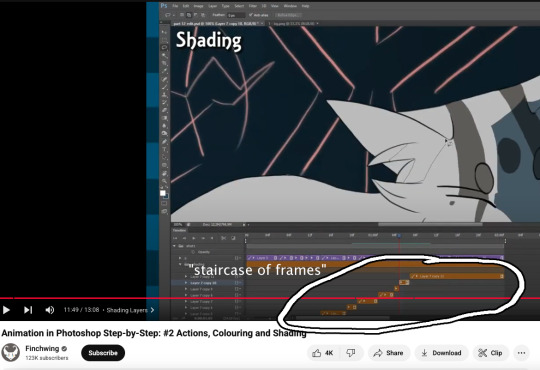
Finchwing has an Amazing video tutorial on photoshop animation including a video on colouring+shading animation in photoshop; it’s where I first learned how to animate on photoshop and I highly recommend taking a look. But even just to compare what their photoshop timeline has to look like for shading compared to CSP, CSP looks much more organized while photoshop is a “giant staircase of frames” (as Finch describes) just because photoshop has to use individual layers to maintain their clipping mask functionality (turning it into a video group makes it unable to be clipping masks, which Finchwing mentions at 10:50).
Actually speaking of Finchwing, they made another animation tutorial with CSP if you want a more in depth comparison I’d really recommend just watching both their photoshop + CSP tutorial to compare the two programs!!
2. Groups can be frames in CSP. Again this makes for easier cleaner organization, and CSP does this cool thing where if I insert a new frame, it will REMEMBER the settings of the previous frame. So my previous frame was 1 group, with two layers in it (one for line one for colour). When I insert a frame it automatically creates 1 group with two empty layers in it. Very convenient. Photoshop can’t have groups within Video Groups, If you try it just puts the layers you’re trying to group together side-by-side like two separate frames. (which tbh i was fine with having separate video groups for line and colour in photoshop lol i can see benefits to just keeping them separate even in CSP as well)
IN CONCLUSION:
It really is more of an organization/quality of life thing. photoshop served me well for many years! Animation is so totally doable in photoshop (just look at finchwings photoshop animation work as evidence that you can POP off in there), but now that I won’t have access to adobe as I’m graduating and preferred a 1-time purchase over a subscription, I went and got CSP.
I admit after photoshop the learning curve was a little tough (CSP's distinction between 'frames' vs 'cels' confused me for a bit + I really missed how visual the ‘cutting’ of frames looks in photoshop lol?), but it only took me about 3-4 small test/practice projects, some googling, and a few custom keyboard shortcuts to get me preferring CSP over photoshop animation now C:
(also bonus gripe with photoshop: idk if there is a way to do this and i just never figured it out, but. i couldn't find a way to use arrowkeys/other keyboard shortcuts to scrub to frame to frame?? I had to use my mouse to drag the header along lol. CSP i set a keyboard shortcut for going to previous/next frame and bam that was that)
#tutorial#clip studio paint#animation#photoshop#adobe photoshop#art programs#ppmpost#if you or anyone else has any qs about comparing csp n photoshop feel free to ask while i still have photoshop until end of May lol#that way i can show more direct visual comparisons while i still have both programs
15 notes
·
View notes
Note
Hi, I’m new to gif making and I was wondering if you would please post a colouring tutorial for any gifset you’re working on right now?
sure!
this is the set i used these for
I was thinking about giving you a psd to look at as well but tbh its better if you learn to do the process yourself instead of relying on psd's made by other people. I'm a little old school in that regard, repetition is the key to remembrance and practice makes perfect and all that.
So I'm working on an OPLA Zoro/Luffy set right now which I guess kind of works out for you since I have to do more work recoloring live action scenes.
So I've made my gifs, I've cropped them to 540x540.
Each gif will get two Smart Sharpen (Filters>Sharpen>Smart Sharpen) smart filters. It's important that you do them in this order or it will look different. The first and second filter, respectively -
Amount: 500% Radius: 0.3px Amount: 10% Radius: 10px
You can adjust these as you'd like, but I personally don't do that. I know some giffers add Gaussian Blurs or Surface Blurs, but I like my gifs to be as crisp and clean as possible, I don't want any blur on them.
From that you can start to color. Since I'm doing overlays for this set, I'm going to get that set up first and then I'll start on the coloring. I'm not going to explain how to do overlays in this tutorial just because it's a long explanation. I do have a tutorial for Photopea that I will link at the bottom. The process is mostly the same with some minor variances.
So the first gif I'm recoloring is pretty dark. Both gifs on it are dark, so I'm going to relight them separately with a Curves layer. When using Curves, I use the eyedroppers to show PS which two points of white and black I want the gif balanced between. So with the white eyedropper selected, I click on a white point of the gif and with the black eyedropper I click on a dark point of the gif. This is going to relight your gif and is one of the most important steps in coloring gifs.

I don't always get it right the first try and I usually click around a bit and try different points of white/black before I find something I like the best.
Next I'm going to add a Hue/Saturation layer with the Saturation at 10 and a Vibrance layer with the Vibrance at 30. I use these as base points and I'll recolor the rest of my gif after doing these.

I don't love how red Mackenyu is now so I'm going to add a Hue/Sat layer and switch to the Red panel and set the Saturation to -10 and the Lightness to -5.
My personal rule of thumb when adjusting the skin tone of my actors and characters of the Global Majority is to do it in increments with the H/S no more than -30 and I usually set the Lightness to half of whatever the H/S is. But of course this is just what I do and if something else works better for you, please do that.
From here I'm going to do the rest of the heavy adjusting:
Color Balance > Tone: Shadows Cyan / Red: +10
Selective Color > Red Cyan: +50
Selective Color > Black Black: +5
Brightness/Contrast Brightness: +10
Selective Color > Magenta Magenta: -50
Vibrance Vibrance: +30
And for now, I'm done with this gif and I'm going to move on to the others in the set.
One of the other gifs is really bright, its made up of a day time scene. My coloring on this will be really different than the night scenes.
The same base layers: Curves, Hue/Sat, Vibrance I'm also going to put the same Hue/Sat red adjustment layer here because I don't want Kiki and Mack to be too red.
Color Balance > Shadows Cyan - Red: +10 Yellow - Blue: +10
Selective Color > Cyan Cyan: +50 Yellow: -50
Selective Color > Black Black: +10
Brightness/Contrast Brightness: -10
Selective Color > Yellow Yellow: -20
Vibrance +30

Honestly anon, once I got more comfortable with PS my coloring process is more varied. I go by vibes more often than not. And actually, I did all this work and then changed my mind once I got all the gifs done and ended up making most of them black and white.
But I hope this helped you! If you have any more questions you're welcome to ask.
My DMs are also open, I can help a little more specifically that way, and you can ask for my Discord and we can chat there if it's easier.
Good luck anon!
Overlay Tutorial with Photopea
#asks#anonymous#giffing#gif tutorial#coloring tutorial#gif coloring#photoshop tutorial#adobe photoshop#userphotoshop
28 notes
·
View notes
Note
Heyy, I’ve been reading your wonderful one piece works for a while — and I couldn’t stop wondering how are you actually doing those magnificent headers?
Like… hello? The great quality, with additional 3D-alike details I could catch by my eyes? I got only Ibis Paint X on mobile, since I’m only a young man that literally two months ago went on a life-time ‘adventure’ of living alone in a small apartment.
In short — I got no money to pay for additional graphics/drawing programs, not yet at least
Hello!
Thank you! I'm glad you enjoy my writing - I'm curious to know what's your favorite piece / part? Also I'm so happy you like my headers? Makes it feel worth it to spend time on them! :D
I have excellent news for you, I used a mix of Canva and Photopea. They're both FREE!
I'll be explaining the process for making these two kinda? The full tutorial is below the cut, to be courteous to the other folks, hope you don't mind?
Though I am hearing that Canva has given people some grief. But Photopea is just *chefs kiss*
If you've ever used photoshop, Photopea is essentially a free photoshop, and it even has the automation tools! An absolute lifesaver when you have multiple layers you want to export (but that's for larger projects not this)
I'm going to assume you have basic knowledge of layers in digital drawing programs for this. If anything isn't clear: ask me, I'll clarify!
//-------------------------------------------------
My General Process is:
Search for official art / images
bring it into canva / photopea
crop / arrange images to match the dimensions
select a thematic color that is associated with the character
separate the foreground from the background
mess around and test things until they work
//--------------------------------------------------
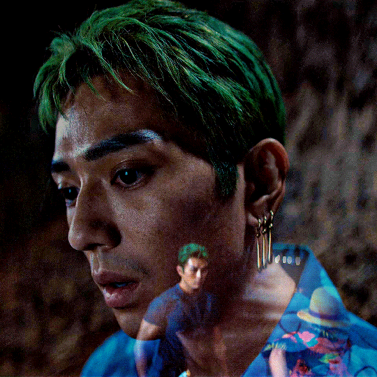
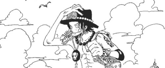
Given "Louder than Words" is the latest one I've made, I'll start with the process for it.
Dimensions: 3000 x 1055 px dpi: 96
//-------------------------------------------
Let's Get Crackin'
Alright let's grab some official art so we're not using any fanart without the artist's permission
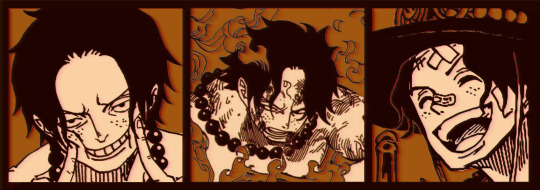
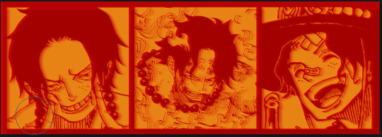
I try to pick images that feel relevant enough to what I'm trying to make. For example: the image for the Matching banner shows the ASCE tattoo which is super important in that fic
2. Let's arrange them onto a banner where each individual image has the same/similar dimensions to the rest
That's probably part of why you like these. To a certain extent they have similar dimensions, so they have a uniformity that's pleasing to the eye! (It's not perfect because I threw perfectionism to the wind because this is tumblr not my portfolio) Tip: if you have 3 images and only 2 that have similar dimensions, and the 3rd one can't be cropped logically: but the one that's a different aspect ratio in the middle!
3. lets arrange them in such a way that the borders all feel like they're the same/equal width/thickness
you might find that you have to shrink some images for this, that's fine.
ALTERNATIVELY: if you're going with one image crop it so it's just the relevant info and it matches the dimensions (3000 x 1055 px)
We have our base! Now let's add some color, and direct the viewer's eye together!
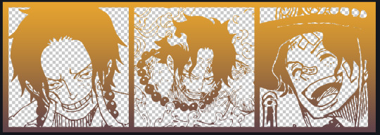
4. pick out a color that you think matches your character / vibe - that color is going to be your background Given I'm making an Ace banner: orange is the color I'm going with
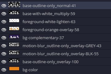
I went and named my layers for this lol. The numbers represent the opacity, and they aren't important. I just kept changing the opacity until I liked the way things looks. But here's the secret to the 3D feel:
Motionblur (+ moving it about)
Separating the foreground and background and dulling out the background.
I'm going to show you my process so you can see the effects, but first let's give you some quick skills:
//------------------------------------
SKILLS / THINGS I THINK ARE HELPFUL
//------- Select Similar
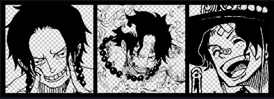
magic wand -> select something -> right-click -> select similar This works best when you have high contrast images (like manga panels that are black and white). You can select the black or the white areas. Depending on what works better for you. TIP! Invert selections with ctrl + i Say you know that you want to select everything but Ace's face in the second panel. Select his face with the magic wand then ctrl + i, and that's the only thing NOT selected

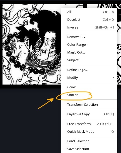

TIP!!!!!!!!!!!!!!! Please, please, please, duplicate your original image and work on the duplicate layer. This helps you SO much. !!!!!!!!!!!!!!!!! TIP! Check your selection tolerance! This could be why too little, or too much is being selected.

//------- The Move Tool
Shortcut key: v While the move tool is active, you can nudge the stuff on whatever layer with your arrow keys Shift + arrow key = 10 px move (generally)
//------- Layer Locking
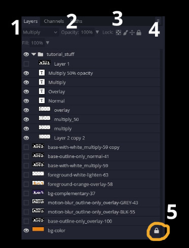
1- Layer Blending Mode (see Overlay vs Multiply vs Normal) for how this can affect results) 2- Opacity: how see through it is / isn't 3- Lock Transparency (it's the little checker board) 4- Lock Layer (looks like a lock) 5- Lock icon that appears when anything on the layer has been locked More on 3 Lock Transparency: You can only paint on / modify what's on that layer. You CANNOT add anything to any area that is already transparent Here's a demo of what you can do with this power:
Here's the original Image - notice how it's just the lineart with a transparent background.
It's powerful: abuse it
//------- Overlay vs Multiply vs Normal
I think seeing this is the best way to visualize how different modes can affect the color.
//--------------------------------
Back to the Tutorial
!!I IMPORTANT NOTE !!
Please play around with the opacity slider to figure out what opacity works best for you on the multiple different layers we're about to make / work with. It's up to your own style to figure this out. Next: please feel free to not follow all of it. Add more layers, add less layers, take the base principles and go wild! :D
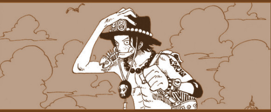
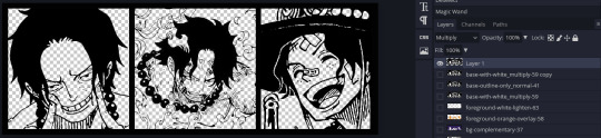
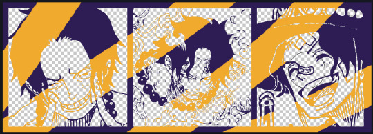
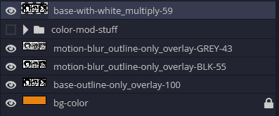
5. Separate the lineart from the background and save it as a new layer 6. Duplicate it and set it to overlay, or set it to overlay immediately
7. Duplicate that lineart layer twice and set the blending mode to overlay 8. lock transparency on the top one and change it to be a dark grey 9. Apply motion blur to both:
Main menu bar -> Filter -> Motion Blur I made it so that the grey layer was blurrier than the black layer
10. More them around a little to give it a "3D effect" as you called it.
It creates shadows under the lines - I was aiming for an effect similar to chromatic aberration (chromatic aberration is a valid way to add punch to your stuff too!)
So this is what things look like now - painful, but let's keep going
11. Duplicate the ORIGINAL / BASE lineart layer, that you DID not apply motion blur to -> set the blend mode to multiply (reduce opacity for it to actually take effect)
okay that's less painful here's what the layers look like right now:
let's bring more focus to Ace's face, and push the background farther away:
12. Use the magic wand tool to quickly select large areas of the faces / focal area / foreground and the lasso tool to refine things
TIP! Hold shift + click -> add to selection Hold Alt + click -> subtract from selection
13. On a new layer with blending mode -> lighten, fill that selection to be white
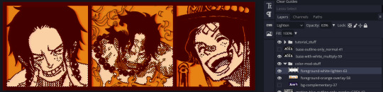
If you look at it, you'll notice that it is ALREADY starting to draw our attention to his face, but the background is kinda aggressive, so let's dim that down
TIP! Right-click on the gradient tool to find the paint-bucket tool

TIP! Sample All Layers: Turning this option off makes it so that you only work with the content on THAT specific layer. Turning it on makes it so that it is working while taking all other layers into consideration.
14. ctrl + click on the "white foreground" layer to select the contents of that specific layer (pink thing is your mouse)
15. ctrl + i to invert selection and ON A NEW LAYER (layer mode -> multiply) fill that with a complementary color
16. I did one last thing where I took the original base (before we separated the lineart) and added it to the very top and played with the opacity to get something less in your face (layer blend mode was set to NORMAL)
And that's it!
More considerations that I take:
I want the banner to be "thin" or not square, so it doesn't take up too much screen real estate on people's devices
I don't want readers having to scroll too much to get to my writing (which is the whole point of the post, let's not waste their time making them look for things)
I want the banner content to be relevant enough?
ie: with Matching: I wanted the ASCE tattoo to be visible. With matching I wanted Ace to not look too happy in some of them.
I'm also trying to avoid spoilers, I hated getting things spoiled, so I'm trying to be careful that the images I pick don't spoil anything really.
Congrats on starting life on your own! I did that whole living by myself thing too! Tip: keep the pantry stocked with lentils, beans, pastas, baking essentials, rice. They really come in a clutch when you're hungry.
#photopea resources#photopea psd#tutorial#tutorials#tumblr banner#photoshop#photoshop tutorial#digital art#fuck adobe#adobe photoshop
39 notes
·
View notes
Text
Jindiao process
#adobe photoshop#dreamworks fanart#kung fu panda#dreamworks animation#painting#illustration#illustrator#kfp jindiao#jindiao#kfp fanart#kungfupanda#Tutorial
20 notes
·
View notes
Note
Hi! Your edit for Day 8: Sono Bisque Doll wa Koi wo Suruis is really cute!! Would you please make a tutorial for it?
Hi, anon! Thank you!! So glad you like it. (o˘◡˘o)
And sorry for the late reply. Please check the layout tutorial under the cut for this POST.
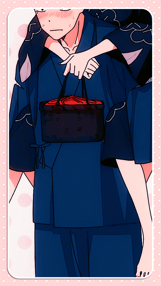

So you can follow the steps easily, I uploaded the PSD file HERE.
These will be the layers of the file upon opening:
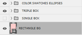
The SINGLE BOX folder is for the GIF with one image. I turned the visibility off since I wanted to focus on the triple image tutorial. Either way, you will do the same actions for the single box and triple box. If you will use the single box, just turn the visibility on and turn off the TRIPLE BOX and COLOR SWATCHES ELLIPSES folders.
In my original post, I used a pattern and clipped it on the RECTANGLE BG (which is a rectangle shape) but I did not include it on the PSD file because the pattern is not mine. You can use whatever pattern you would like or simply change the rectangle shape's color. To do so, double-click the RECTANGLE BG icon then change the color.
Expand the folder to use the TRIPLE BOX layout:
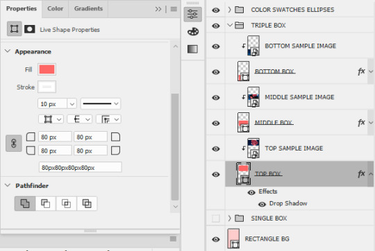
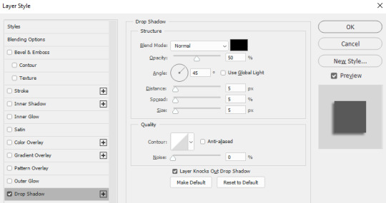
For the boxes (TOP, MIDDLE, and BOTTOM), I used the rectangle tool with the following properties on the left side. Then I added Drop Shadow effect for a 3D-ish visual effect using the settings below:
Feel free to change this setting according to your preference.
The SAMPLE IMAGES will be replaced by your GIFs [if you will use GIFs instead of images]. To add GIF, you need to make sure that your GIF file is using VIDEO timeline instead of FRAME timeline and that it is converted to a SMART OBJECT. [It must be a smart object so you can clip it on the boxes.]
Once you added your GIF/image to the PSD file, make sure that it is one layer above the BOX where you want to place it. Once placed, right-click on the GIF/image, then select Create Clipping Mask.

If you want to move the image inside the box, make sure that you have selected the image file. If you want to move both the box and the image inside it, select both layers.
Do the same actions on the MIDDLE and BOTTOM BOXES. The same actions also apply to SINGLE BOX.
Next would be the COLOR SWATCHES ELLIPSES:

I already converted the ellipses to smart objects on the PSD file. To change the colors of the ellipses and other settings, you need to open the smart object by double-clicking the icon. Once opened, another file should open with a .PSB filename.
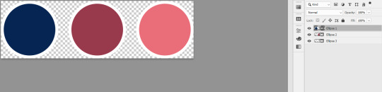
To change the colors of the ellipses, just double-click on the individual ellipses layers icons. You can also change the settings by going to properties:
Once done with the changes, just save it (CTRL+S), then close the PSB tab. The changes should successfully reflect on the PSD file.
NOTE: The TOP ELLIPSES and BOTTOM ELLIPSES are the same smart object. The other one is simply the flipped version of the other. So any changes made to a single smart object will also reflect on the other smart object. If you want to have different colors for the TOP and BOTTOM ELLIPSES, you need to copy the smart object instead. To do this, right-click the smart object, then select New Smart Object via Copy.
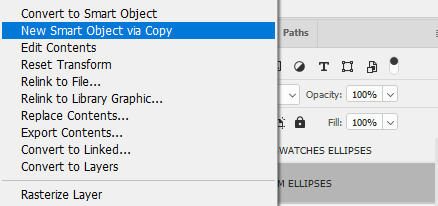
This means that you are trying to create a totally new smart object that will retain its own settings and not be affected by your other existing copied smart objects.
That's it for this tutorial! I hope I explained it clearly but if there are issues with the file I shared or questions on how to use it, feel free to send me an ask or a message.
#art answers#reply#anon#gif tutorial#clipping mask#psd template#adobe photoshop#resources#artsresources
30 notes
·
View notes
Text
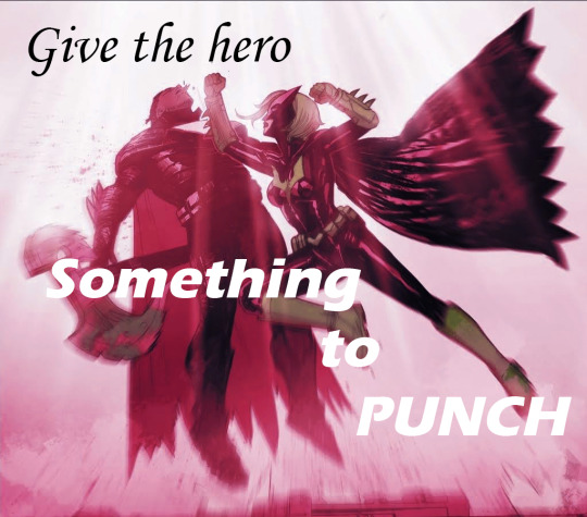
But look at us Luke, we're the ones left alone, holding some rich monster's pain. All of existence, built on his violence. All of space-time, humming to life with a single inviolate rule. Give the hero something to punch.
#kate kane#duke thomas#luke fox#outsiders#dc comic edit#comic edit#dc comics#my first time using photoshop lmao#got it for free with my school adobe acc and obviously im gonna abuse it for comic editing purposes. although i skipped all the tutorials#and just fucked around so idk this isnt like impressive. couldnt find buttons for a lot of what i wanted to do but i think i was just looki#in the wrong spots. anyways yeah.#batman#panel from outsiders no 3 ofc#dont know what else i say here. this is v much the product of me procrastinating writing an essay draft#if the format is weird im sorry im on tumblr desktop which idk how to use. bc photoshop is on my computer and also i turned my phone off so#would stay off my phone and focus. which obviously worked rlly well lmao#swishy's comic edits#panelposting#not rlly but ill tag that too for personal reference. yeah#bats#anyways this issue is so funny to me. like yes lets talk about how batman is everywhere and is taking over everything and also cant die. in#a batman comic that is taking over things (notably the team name etc) from other characters#IRONY!!!!#anyways dark multiverse(? idfk) duke thomas i love you. you can kill as many versions of bruce wayne as you like <3
17 notes
·
View notes
Text
PRO Tip For Fixing Color Bleeds in Photoshop 2024
SCRIPT and STEPS:
Masking out single color reflective subjects from backgrounds leaves behind a color bleed and using the brush or clone tools just don’t cut it Here is the fix Head over to select menu and hit subject Go to layers and create a layer mask Right click on the mask and click apply Create a new layer Hold alt and clip it to the subject layer Change the blending mode to color Pick the brush and sample the blue color Now paint away the color bleed And that’s it
#photoshop tutorial#photoshop#illustrator#adobe photoshop#adobe design#adobe illustrator#seotimerank
8 notes
·
View notes
Text
Learn to download and use my PSD templates. Available now: https://www.youtube.com/watch?v=w_fBVX-I73Q&t=65s
#graphic design#photoshop#adobe photoshop#templates#psd#psd template#photoshop template#photoshop tutorial#psd tutorial#photoshop download#psd download
31 notes
·
View notes
Text
youtube
The Best Adobe Alternatives 2025
In this video, we’ll look at how to replace Adobe software. This includes Photoshop, Illustrator, Premier Pro, After Effects, and Lightroom. I’ll show you free Adobe replacements and some that have no subscription cost. Best of all, many of these programs are supported on multiple platforms: Windows, Mac, Linux, iPad, and mobile.
#graphic design#The Best Adobe Alternatives 2025#Adobe#adobe illustrator#photoshop tutorial#beyond the adobe#graphic designer#premier pro#Adobe Alternatives#graphic designers#Canva#tools for designers#education#designer#design#Youtube
4 notes
·
View notes
Text
instagram
This piece might be winning the award of least amount of layered textures used of all of my works. Reminds me : “The artwork is done not when there’s nothing left to add but when there’s nothing left to take away”
#timelapse#timelapse art#art timelapse#art tutorial#how to art#blender#blender community#adobe photoshop#adobe#women illustrators#women in art#female illustrators#artists on tumblr#women artists#behind the scenes#bts art#instagram
5 notes
·
View notes
Text
How to make a modern cult leader in Paint.net (FREE)
ALSO, go download and install a shitload of plugins from the forums
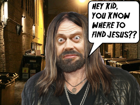
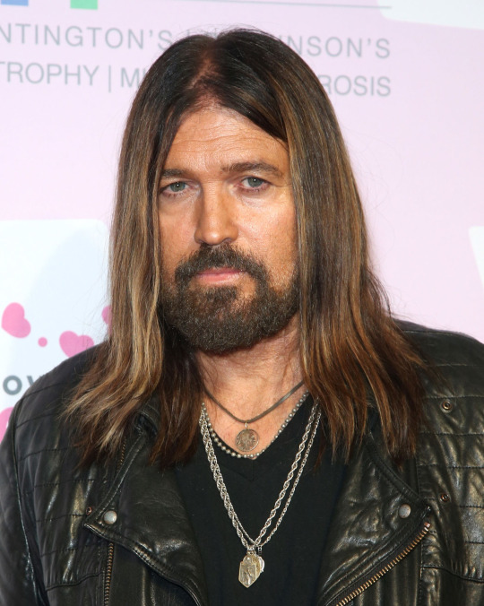
step one: Gitcha some Billy ray Cyrus
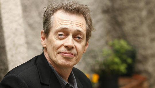
Step 2: snatch up some Steve Buscemi
step three, remove face
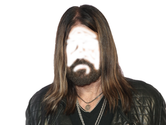
, adjust size until....
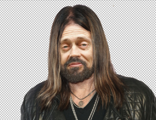
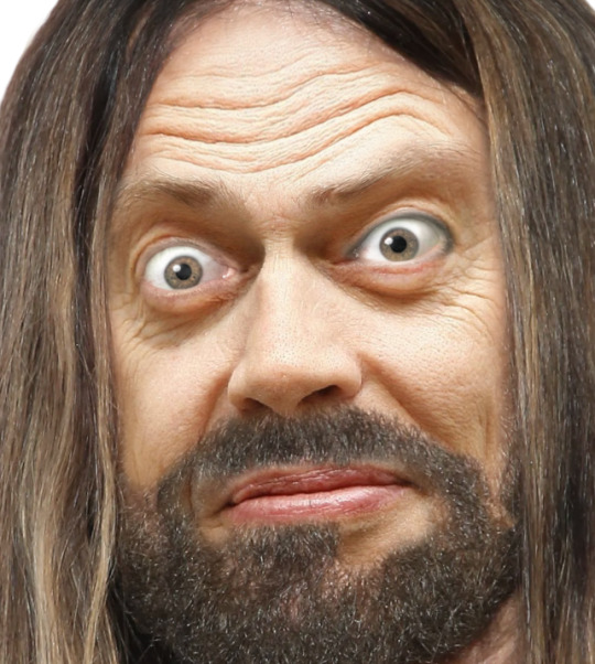
OH GOD, THAT looks weird,
use the Liquify plugin to squish the weird angle/telephoto/klingon head effect until it looks like...
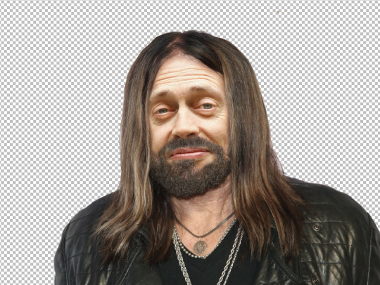
... that man sings for a minimum of 3 creed coverbands.... not culty enough.... use the liquify tool again on the lower layer of steve's face until he looks disgruntled:
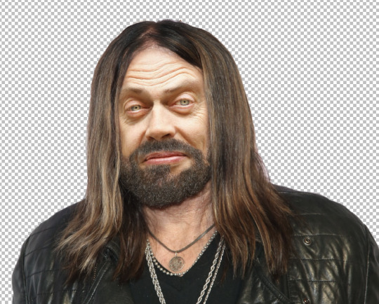
I also put lighter layer of steves face under, and used the eraser tool on the eyes to try to make them look eviler, but still not evil enough, so off to the internet for some "crazy eyes"
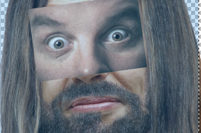
SHOCKING NEWS!
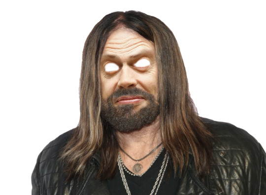
PUT THAT bitch under your steve eyes, then gently erase the top layer until it looks okay.
HEY KID YOU WANNA BUY SOME JESUS?!?!?!
I TALKED TO GOD THE OTHER DAY, HE SAID GIVE ME MONEY AND LET ME FUCK YOUR WIFE.
there's alot of color adjustment steps I left out using the "basic adjustments" plugin under Effects> photo. also just plain squishing and stretching layers while they're partially transparent to align them.
lol.
15 notes
·
View notes