#also it was really fun to design modern outfits for them ^^
Explore tagged Tumblr posts
Visit Tumblr Blog
Explore Tumblr blogs with no restrictions, modern design and the best experience.
Last Seen Tumblr Blogs


Fun Fact
The most popular pages on Tumblr are about Minecraft, GIFs, and David J. Peterson.
Text

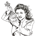
cavalry initiates trio going on a shopping trip to buy ingredients for yuder's birthday cake? pie? cupcake? they haven't decided yet ^^;;
🖤 turning fanweek 🖤
day 7 yuder's birthday | free day
#turning novel#터닝#yuder aile#kanna wand#gakane bolunwald#turning fanweek#fanart#myart#doodle#rahhhh this was probably the most ambitious piece i made for this fanweek#i wanted to challenge myself w/ the perspective and the bg and it turned out pretty well!#also it was really fun to design modern outfits for them ^^#cavalry initiates ot3 my beloveds#happy yuder day!!#ofc i had to draw him surrounded by the people who care about him ;u;
104 notes
·
View notes
Text
TAILS GIJINKA BREAKDOWN!
FINALLY!! i put together some tails gijinka/humanized stuff LOL!! see below for some goodies and an in depth (kind of indulgent) breakdown!!


[for the third image: sonic gijinka design belongs to @noka-exe !! i havent really come up with my own but i like theirs :-) ]

thisss gijinka is packed with headcanons LOL.. beware!! for starters...hes just a little guy!! i took visual inspo from markl (howls moving castle) and simon (gurrenn lagann)!! mostly simon bc i find a lot of similarities between him and tails.. short and unassuming shy boys who are also compassionate and brave!! (isn't it also awesome how simon and tails both have an older brother figure who encourages them to be brave.. 💥💥🤯 and they both have some sort of space opera and id go on but thats spoilers!!) i also went with a prosthetic leg to kind of represent his tail!! i think it could parallel to how tails' tails can act like a mobility aid, and he'd get the opportunity to tinker and repair them too!! it could also possibly correlate to how tails makes something he was picked on and bullied for, his tails, and uses it to his advantage! and again tying in his interest for mechanics and being able to customize and repair it is a concept that i find neat!! (maybe some inspo from fullmetal alchemist.. bahahaha..)

speaking of customization. i also love the idea of him covering them with stickers!! i've already added tails' own emblem on there but this has prompted me to look into adding some more!


(sorry that im singling you out again @tornado1992 LMAO i just loved your input!!) but i also love the hc that tails gets hand me downs from sonic!! for instance his gloves.. ik theyre not directly from sonic but it is such a sweet detail that tails has a rubber band around those oversized gloves to mimic sonic! and tails definitely has the means to make his own fitted gloves yet he still has those bands on in his modern models!! auhgh!! so yes.. lets say the hoodie is so oversized and oozing with swag cause it originally belonged to sonic! :-) maybe tails likes it so much that he designs the cyclone after it!! just some ideas... more depth into his clothes: i drew a lot of inspo from already existing tails-related designs!! the main outfit i draw him in is a large short-sleeve hoodie with some elements pulled from the cyclone and tails' racesuit design from sonic speed simulator! he also has his goggles and shoes from sonic riders, with some slight details added on!! see below for a better look at the outfit LOL


(the pins on his crossbody bag are a fly-type emblem, a mint, and a red star ring! theres also a sonic keychain that i keep forgetting to add/switch out with the fly type emblem LOL)
here's some more doodles from last year with this design!


yes i did make a classic design for him!! his younger hair is more of that nice vintage orange-yellow but as he gets older itll turn amber then maybe gold? i was also thinking he dons some red clothing to reflect his admiration for sonic but later starts implementing his own style with some grays and blues!!
i'll also point out that i lean into more of a space-pilot design instead of the usual aviator pilot!! tbf i was raised on sonic x season 3 which is just a huge space opera.. ���😅 but i still do love the aviator pilot concept!!


this should be about everything i have to dump about my design!! im not usually this talkative in posts so im a little embarassed to be sharing this at all 💀 but if u read through all of this thank you so much LMFAO im so crazy about him!! if you have any questions or ideas youd like to share id love to hear them!! maybe draw them out too... i may even do a cosmo design update/breakdown!! for fun.. heres the first tails gijinka post i ever posted!!
also shoutout to @corvussio for the incredible detailed comment on my other tails design post!! i know its been ages but i still think about how you took the time to look into each and every detail!! thank you greatly pal!!
#miles tails prower#tails the fox#sth#sonic the hedgehog#sonic#sonic fanart#fanart#my art#sonic and tails#unbreakable bond#tails gijinka#sonic gijinka#sonic humanization#gijinka#humanization#human version#human design#redesign#qwiopty#sonic headcanons#headcanon
346 notes
·
View notes
Text
My Adventures with Superman EP 4: Design Works
My goodness it feels so strange to see these designs two years later but I actually had a hand in Clark, Lois and Jimmy’s gala suits in episode 4 of My Adventures with Superman!

This happened WAY back in Sept 2021 but during my first week on the show I jokingly sent a piece of art to one of the design leads and well, one thing led to another:

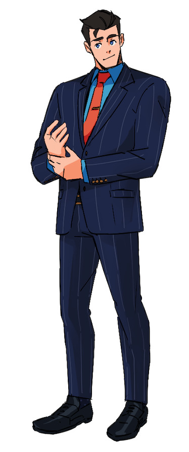
This is kind of running gag with my work, but I somehow always predict things when I draw fanart haha. I truly didn’t know there was gonna be a gala episode and now I was tasked to do a pass for the main trio’s gala outfits.
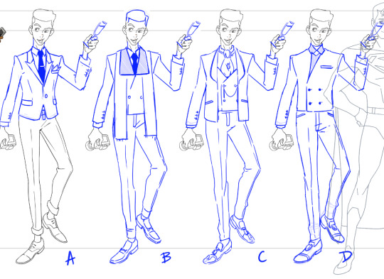
CLARK KENT
Naturally since it started with Clark, he was the first one I did a pass on. I actually really like men’s suits design so this was the most fun to design out of the three. Overall, I drafted up four different suits that gave 4 different feels for our soft boi. Option A was a full 3 piece with slick backed hair (which honestly now feels very Bruce Wayne than Clark haha). Option B had a high school prom feel, Option C was more business casual (hence why his dress shirt was unbuttoned at top) and finally Option D was sleek turtleneck & suit combo. Honestly, I was rooting Option D ‘cause I’m a sucker for a turtleneck but if I remember correct they went with Option B ‘cause it felt the most Clark. But just know I tried haha.
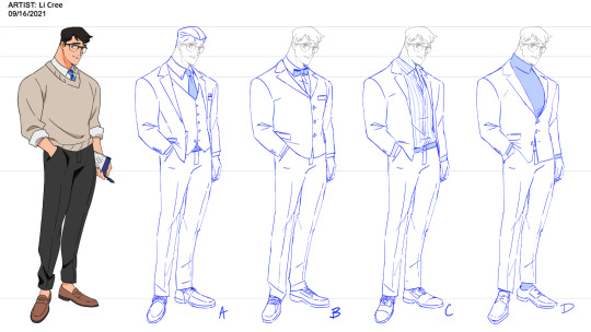
LOIS LANE
Lois’s outfit was quite challenging since I had no clue until I was given the assignment that she’s Korean (yes, Lois is canonically Korean in the show). I remember the design leads Jane Bak and Dou Hong showing me a rough concept of a modern hanbok. I spent so many days researching hanboks and the construction behind them...it truly was a learning experience for me haha. It was quite challenging trying to create and outfit that spoke to Lois’ heritage while still keeping her energy. This was my very first pass but I think ultimately the team did a great job to hone in the final look and balance both elements for her outfit (the backless top is just chef’s kiss). Also yes, I did try giving Lois slick back hair haha.
JIMMY OLSEN
There isn’t much to say about Jimmy’s outfit (sadly I left the production to work on Spiderman Freshman Year before seeing what they decided on). But from what I remember, I specifically was looking at men’s outfits from the Met Gala from that year and before (I think Chadwick Boseman was the biggest influence for me at the time). Though I think his final suit design aren’t like too far off from my initial thoughts, it’s still super cool to see how it evolved into the final look! But yeah! Just a little behind the scenes on the work I got to do on the show. Again, super brief since Spidey was calling my name but I truly had so much fun getting to design for this show. MAWS was my first ever time doing design work (since I primarily work as a 2D animator and board artist). I was so nervous but the team was welcoming and taught me so much! I really have to thank Dou Hong and Jake Wyatt for taking a chance on me and allowing me to draw hot anime characters for a DC show haha.
#long post#my adventures with superman#maws#maws spoilers#superman#lois lane#clark kent#jimmy olsen#digital art#character design
2K notes
·
View notes
Text
The Sewer Squad's designs are fine, actually
If you ask me, the Sewer Squad from KHUX are a really great visual example of Kingdom Hearts' approach to writing and design.
That approach being: it's fine to make design and writing decisions that come across as silly, campy, unbelievable, or "cringey" if those choices are meaningful in context and contribute something significant to the story.

On the whole, the Sewer Squad are a mess of character designs. Minus the Leader who just kinda looks like a normal character tbh, the remaining 3/4ths of the group don't look particularly cohesive or even...aesthetically pleasing? At least for me. If you were to judge these designs purely on a visual and technical level, using commonly accepted character design guidelines, I personally don't think they would score very high.
Function has been thrown out the window with their accessories, with a lot of said accessories looking either bulky, heavy, face/movement obstructing, or just plain uncomfortable, despite them presumably fighting Heartless on the daily.
Color palettes are all over the place, especially with the Gummi Girl who's sporting three different hues of pink all conflicting in one design. Themeing is likewise all over the place—using the Gummi Girl once again as an example, she's pairing futuristic Gummi ship wings with a ninja outfit and a modern-looking frog hat. Which like, normally you can marry vastly different themes/time periods together into one character design just fine if you do it well, but here these elements are just kinda pasted all over the design separately with no blending/discussion between them. (Yes I know this makes perfect sense given the lore; I'm getting there.)
And then characters like Fancy Bowtie Boy are wearing gimmick-y clothing pieces based off of canon characters, such as Ansem SoD and...Halloween Town Goofy, for some reason. Which makes the design look derivative and nonsensical. (There's a way to justify this in canon thanks to the Book of Prophecies and the medals, but it's still kinda weird and offputting to see one of the Big Bad's gloves on a silly side character.)
It also doesn't help that their outfits/hair/facial features weren't designed specifically with them in mind, and instead are comprised of various disparate, pre-existing Player assets slapped together haphazardly. And not being able to give these characters more thoughtful, bespoke design elements means losing the opportuntiy to communicate who these characters are more precisely.
They do have recognizable silhouettes though (along with some much needed diversity), so I'll give them credit for that.
But, everything I just said and criticized above? THAT'S ENTIRELY THE POINT, BABY!!!
They're not supposed to represent a typical character with a typical character design that follows typical character design rules because they're not typical "characters"—rather, they're supposed to represent the average, real-life players playing KHUX. The people who buy random outfits with whatever Jewels they have and then mix and match the pieces together regardless of whether or not they actually look "good" together or logically connect. The people who are just having fun with customization.
And this distinction is meaningful because the whole idea behind these characters is that they belong to the same party that the Player belongs to. They're not like Player's other friends such as Ephemer and Skuld who are main characters in the plot and thus require more visually pleasing and thought-out character designs; they're not "generic" NPCs that Player runs into only once or twice like the "my friends aren't my power" guy who can just wear one of the basic default outfits and it'll serve its purpose just fine; they are, specifically, Player's fellow party members. And if the Player themself is wearing a silly costume too, well, they'll just fit right in with the Sewer Squad, won't they?
Thus, they're meant to mirror the visuals and dynamics of real KHUX parties comprised of real people, hopefully making it easier for the person playing the game to relate to them (if said person belongs to a party themself) and intuitively understand the role these characters play in Player's life. And despite how unrealistic their outfits are (considering most of them are running around fighting in outrageous, cumbersome costumes), I would argue that their closer resemblance to the actual playerbase gives them the potential to feel more real, paradoxically.
This also just demonstrates KHUX's commitment to its story and gameplay integration. It doesn't matter how "silly" a gameplay feature might look or feel in practice, it is going to be properly represented in the story regardless. Lux, Guilt, Power Bangles, Spirits, Shift Pride, player costumes, it doesn't matter, if it's a part of the gameplay, it's going in the story somewhere. The game takes a risk and trades a little bit of immersion/suspension of disbelief for pure gameplay and story synergy. Perhaps it doesn't work for everybody, but in general it works for me, and I respect it.
121 notes
·
View notes
Text

And now for Zanmu, who I am having issues with stylizing her face in my current style because I am a perfectionist and have very high expectations for when I draw my favourite characters lmao.
Artist's notes;
Continuing from my New Year Keiki piece, I once again took a crack at simplifying shapes with this piece by focusing a lot on silhouettes. I really, really, really love how the shapes of this piece turned out. I didn't do any proper rendering with this and there are a few details I omitted from Zanmu's design for the sake of clarity (and also, my sanity), but overall I love how this turned out. I had so much fun with using her shirt's sleeves to create a blocky silhouette, and I am so happy with how I did her hair. This is around the time where I realized that I don't need to render every single strand of hair, and I am so happy I realized that because it has helped me in my art process so much. I also really like the colour palette for this, it was kinda inspired by the Zorn colour palette for this, and I wanted to use solid black for some of the shading since I liked the contrast it provided. I also experimented with giving her tanner skin and once again it helped in unifying the colour palette a lot. While I do wish I could make Zanmu look a little older with her face, I do like how simplified I made it. I also gave her a white undershirt, mainly from a "how does this outfit make sense" perspective because I can be a bit of a stickler for that sometimes lol.
Now to just talk about Zanmu a little more because she has officially supplanted Keiki as my favourite Touhou character and I love thinking about her. So first of all, every time I come back to Touhou 19's story and dialogue and I read any scenario with Zanmu in it, I just appreciate her more and more.
Like, take this piece of dialogue from if Zanmu wins in Saki's scenario.

This has the same vibes as a villain in a shounen anime saying to the protagonist, "get up" and then taunting them while they're injured from their fight on the ground. Zanmu is what would happen if you shoved a shounen villain into Touhou project, she goes into monologue's about how she's basically won before literally every fight against her in everyone else's scenario.
Also, I can't get over this moment from Mamizou's scenario.

This makes me want a short Touhou story where Mamizou convinces Zanmu to come with her to the outside world to show her modern things and Zanmu just...has no fucking clue what's going on. Keep in mind, Zanmu has been staying in Hell for thousands of years at this point, and aside from Hecatia raiding three Hot Topics at once every now and then, Zanmu has no idea what the modern world even looks like.
What I'm trying to say is, I wanna see Mamizou give Zanmu a bag of doritos, they should go on a road trip around modern Japan together.
Also, I'm calling it now, if we ever get a new fighting game with both Zanmu and Yukari in it, people are gonna make memes and shitposts about Yukari showing Zanmu a train for the first time....by throwing one at her....
105 notes
·
View notes
Text
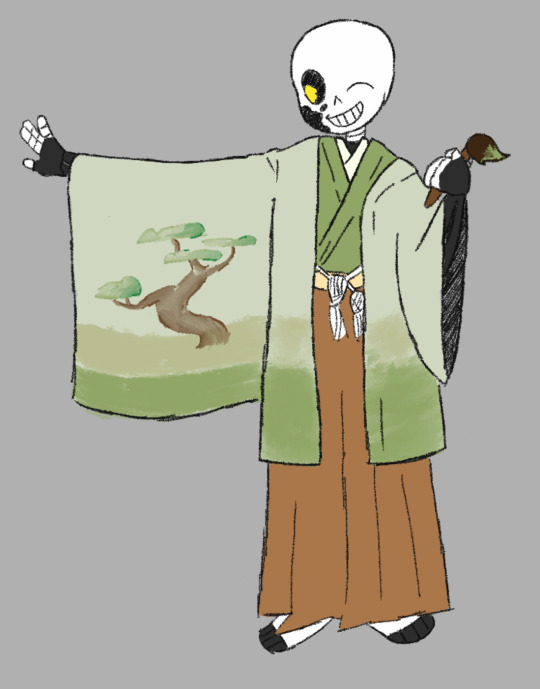
Don’t know if this is still going on, but here’s a (kinda) quick drawing of Ink in that one haori in that post by @letsatomicbanana !
Additional notes under the cut (be warned though it’s a lot lol):
So when I saw the post I ended up reverse image searching the photo in order to see in what context this haori and hakama would’ve been worn in (though it didn't really matter in the end, as I just ended up drawing Ink painting on their sleeve). Just to like get an idea of what kinda thing I wanted to draw Ink doing in it and stuff, as well as just to get a better idea of how it’s supposed to look when worn. Now, for this specific one I’m not entirely sure, as since it seems to have been reposted on like a bajillion different websites, with many of the ones listed in the search not being in English. So needless to say, no clue where this thing came from!
However! My search wasn’t for naught! From the list of suggested links from the Google search, one was for a haori and hakama set from a rental clothing company called “Keio” (I think… keep in mind I’ve still been using google translate since the website was in Japanese lol). The specific outfit in question was this:
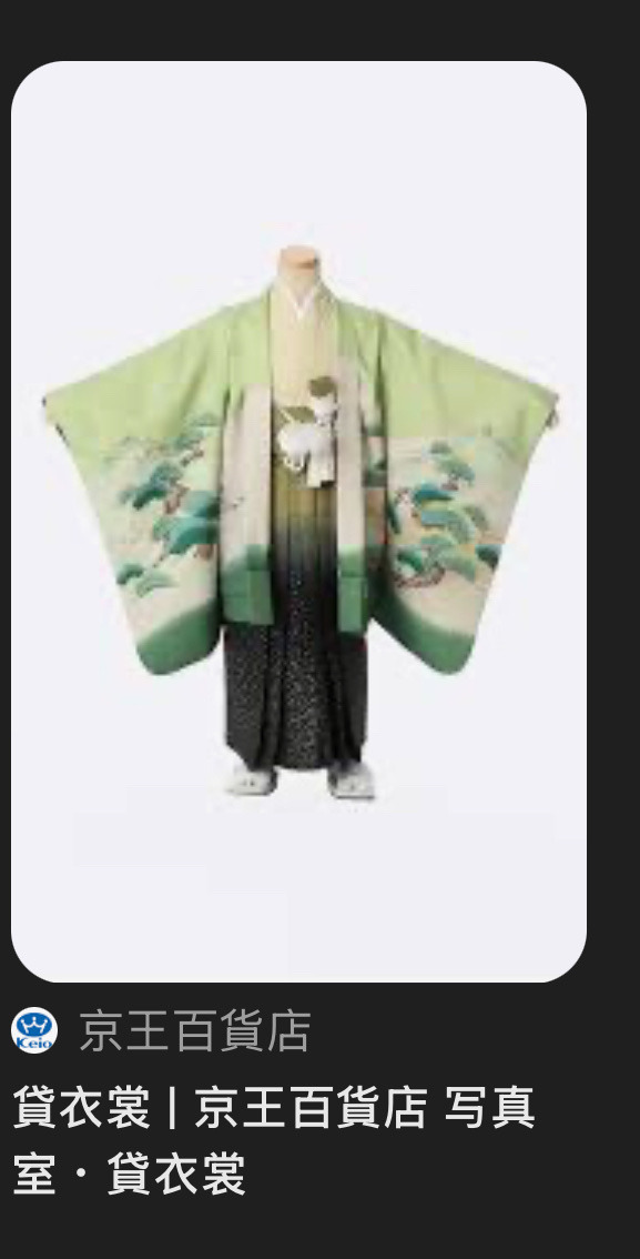
Now, this looks very similar to the one Banana posted, so I’m going with the assumption that the two outfits were probably made for similar purposes. Especially since not many adult haoris are made this these kinds of intricate designs (at least none that I could find). Anyways, this ensemble was listed under clothing one could rent for their child to wear for the Shichi-go-san (literally “seven-five-three” in English) Festival.
((Now quick disclaimer for the following: I am not Japanese nor any sort of expert on Japanese culture and history! As such, take the following with a grain of salt and I very much encourage you to look more into this festival on your own, as learning about this holiday was quite fun and informative and I would be 110% be happy being corrected for any misinfo, whether that be in the tags, reblogs, or any other method most preferred! Also, I've listed the websites I used here at the end of this post for y'all to check out after reading, apologies though for no footnotes.))
Continuing: During Shichi-go-san, parents bring their children of ages three, five, and seven to visit a Shinto shrine to celebrate the children’s growth and to wish or pray for good fortune. Why these ages? Glad you asked! It’s because three, five, and seven are considered auspicious ages in East Asian numerology, with this also making the date this festival is held— the 15th of November— especially lucky! It’s also interesting to note how the festival was originally exclusively done by the aristocracy and samurai families, though the tradition spread to the common people by the Edo period (1603-1868), though how the festival is currently held evolved from the Meiji era (1868-1912).
Now for the actual visit itself, traditionally five year old boys wear hakama and haori like the one pictured above (as traditionally this was the age that first allowed them to wear hakama in public), with seven year old girls going wearing a kimino with an obi (similar reasoning to the aforementioned boys; seven was the age where girls would traditionally begin wearing obi). For the three year olds? Girls may wear a hifu (a type of padded vest) and both genders seem to be able to wear hakama kimonos (take the three year olds dress stuff with a grain of salt though, not 100% sure on it lol). Also interesting to note is how in the past the age of three was the last year that parents kept their kid’s head shaved before allowing it to begin growing out more, though this practice of hair shaving seems to have fallen out of fashion around the 1800s.
In more modern times, many of these aspects are still upheld (except obviously the aforementioned hair shaving) during the Shichi-go-san festival, of now of course though with the modern addition of parents taking this opportunity to get lots of photos of their kids in formal attire lol. Additionally, parents also often get their kids some chitose-ame (longevity candy)—a type of sweet hard candy—after the shrine visit!
Slightly unrelated, here’s a quick sketch I drew of Ink eating this candy cause I thought it’d be funny:
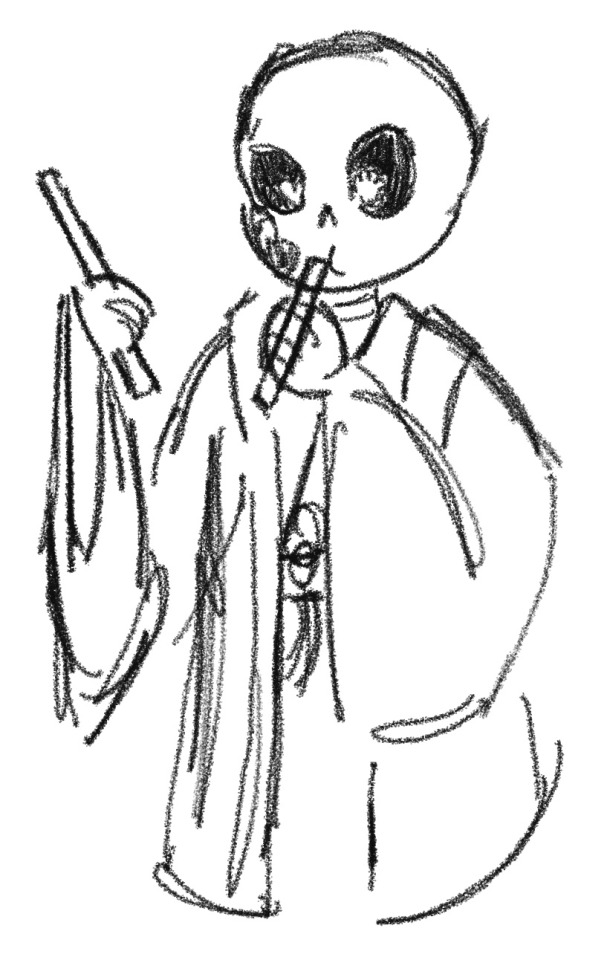
He is NOT getting his rental deposit back (…is that a thing? Idk I’ve never rented clothes before lol)
ANYWAYS, I just wanted to put this stuff down cause I found learning about this festival really interesting and thought it to be relevant with the whole Japanese-attire thing lol. And again, don’t be afraid to correct me on anything and/or add your own additions to the info written above!
List of sources:
Tsukihana
Kids Web Japan: Shichi-go-san
Japan America Society of Greater Philadelphia
Wikipedia page for Shichi-Go-San
Have a great rest of your day/night if you got this far!
78 notes
·
View notes
Note
HEY! its me again.. finally.. and yes ortho is very eyes! And I am So SO sorry that it took so long like i know i did say that i would and wanted to do more fanart but wow i got like really busy and sick and all that fun stuff uhm anyway i made some drawings (sadly not that many) and only some ignihyde ones,
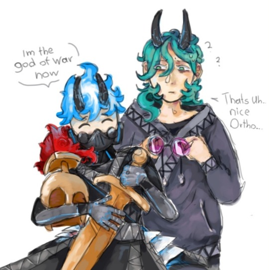
I made ortho well look more like ortho i mean i made him his signature mechanical suit?? gear its called right? Well and i gave the imp or the mc more of a hoodie! They look So dapper! And its also a movie reverence i dont have a picture or the exact scene at hand, but i really did like Herkules its definitely one of my top 10 disney movies by far
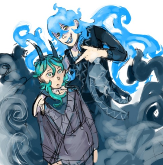
First of im sorry for the decline in quality but it should be fine? I guess ( by the way it Was kinda hard making idia, like just in general so thats kinda the reason why it looks so bad i just gave up slightly) i didnt know there existed an artists curse,
i really hope the mc gets the title 'employee of the decade'
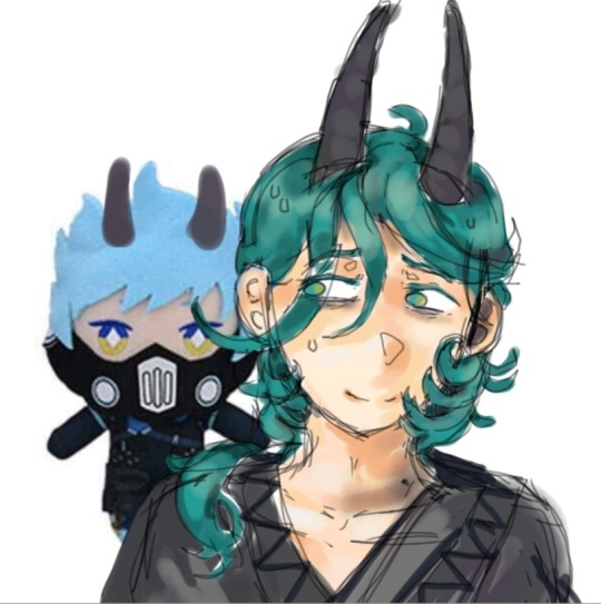
And this one i dont really like it, its one of the first ones i drew its alright i guess, i really wanted to draw more idia but man he is so annoying to draw for me at least(( skill issue? Yeah probably
Anyways! Im sorry that it took so long!! I Love ya work
and have a good day/ night!!
THREE? HOLD ON, THEY ARE COOKING. This was a delight. It's very rare to get three different pieces in one go, and you say they decline in quality or that you don't like them, but I love them! For this effort, I think I have to really extend my reply, so I'll try my utmost best without sounding repetitive.
Don't worry about the time, anon, I literally do not mind. I understand if someone says they want to make something, but it either comes late or never comes at all. I'm completely find with that. I know people get busy and find other things to do, so no worries. But I hope you're doing better now!
Okay, okay, so for the first image... I'm assuming you saw that I based Ortho's design off his Cerberus Gear? If not, well, guess we had the same mindset. And the MC's hoodie fits so well with the aesthetic, it doesn't clash with the outfit of the others and it also fits that strange modern/ancient Greek style. It's a great take, I adore it!
For the second image... MC's thousand yard stare. You depicted it so well. I love the details in Idia's outfit which you can just barely make out, but I think my favorite part is the signature swirls that resemble the ones Hades has. You nailed that part!
The third one... tell me why it took me so long to notice the horns drawn on Ortho here 😭. The image just makes me think that's the exact moment MC realized that they ain't safe with Ortho either.
Thank you so much for these! I seriously love all the pieces you send my way (as I love all the pieces I receive). This is going straight to the folder. ✨
81 notes
·
View notes
Text
AstrologyObs: Appearance
Disclaimer:my opinion
Cancers are the cutie of the zodiac!! Round facial features. Cozy, comfy, warm and inviting. They may look great in Asian make up styles or old classic make up styles. Bohemian. 70s look or even 50s.
Gemini have a cheekiness to them that’s apparent in their features. They look like troublemakers in a wholesome way. They usually have quite sharp smiles. They have a very on the go energy , and I think they can get away with being sporty or even messy. But they also look so good with a basic 90s style which reflects their logical mind.they may also have a “rebel” “punk” or even Avril Lavigne vibe.
Pisces just feel like a wave of tranquility and I just want to chill with them. They have such dreamy eyes that make you want to get lost in them. They look so good with shimmers, in make up and clothes. Also metallic colours. Glowy make up. MERMAID. They suit modern style of clothing a lot.
Sagittarius, the free spirits, can actually look great with more revealing looks. They can get away with over the top things, and they will make it look cool, like their way of dressing is part of their philosophy. I feel like Sagittarius also has a lowkey sense of humour to their style, “ I did it for the fun of it, why not” also look so good in red:::
Scorpio.. you guys just remind me of Johnny Depp in pirates of the Caribbean, looks wise that is. Very alluring, darkness around the eyes. You change and transform people so no one will ever experience another you again. Your dress sense may have elements of danger. Leather jackets. A sense of shock, uniqueness . Darkness. Alternative or femme fatale.
Aries yall look good in office things, or just sophisticated and sharp styles tbh. There’s an angularity to you but it looks very cool and dramatic, it makes you interesting and cool. Lush, and sharp.it gives lip gloss and matte outfit vibes.
Capricorn, your organisation influences your dress sense so much and i actually think that Capricorn represents a mainstream dress sense or something conventional and basic you see everyday. So you look good in that. Simple. Classy. Timeless. Capricorns with Aquarius placements may disagree
Taurus, yall look really good with heavy makeup up looks, or full face glam. you guys look good with mullets. And electric colours. Graphic liners. Cool eyeshadow looks. IG baddie make up looks. May also suit dip dye hair styles or highlights.
Virgo, I feel like many of you may have had a hipster phase, plaid shirt and boots situation. Or some kind of lowkey emo phase . Even a tomboy phase. But anyways, you look great with slicked back hairstyles, neat loose natural hair. You Look Royal, in a laid back way. No matter your aesthetic. Virgo, you look best when you take care of yourself, when you look very clean, and tidy. Clean girl aesthetic
Leo, Animal prints look so great. You’re royal in a flashy way. You may feel like you look great in designer clothing or higher end brands. The quality and brand may be of importance to you and you won’t just buy things from anywhere. You’re going to attract looks, because the planets revolve around the sun. You look good being flashy and fully expressing your authentic self and uniqueness, don’t hold back your greatness.
Libra, yall could wear a potato sack and still look great asf. Your facial features are usually very proportionate and balanced. I think your natural glow is what suits you best, and an elegant outfit. You look great showing everyone the embodiment of Venus on Earth, and I think you have “aesthetic” in your genes.
Aquarius, you look good in unisex or androgynous, long or short hair, any colour, you will make it work. Doesn’t matter if things clash, you can make it work. The innovated. Unique style. Dreamy aura, they have an intelligent vibe. You’re giving the audience a taste of the stars. Of intelligence beyond this earth. Cyber /rave styles can look great on them too. Or very artsy looks. Many of them also get into cosplay. They look ethereal so they can embody what isn’t real (anime, cartoons, movie characters etc) People may even say they look like an anime character.
#law of attraction#law of manifestation#manifesting#self healing#healing#metaphysical#feminine energy#astrology observations#manifestation tips#capricorn zodiac#virgo zodiac#scorpio zodiac#aries zodiac#libra zodiac#pisces zodiac#aquarius zodiac#leo zodiac#cancer zodiac#sagittarius#aries#taurus#gemini#capricorn#Spotify
542 notes
·
View notes
Text
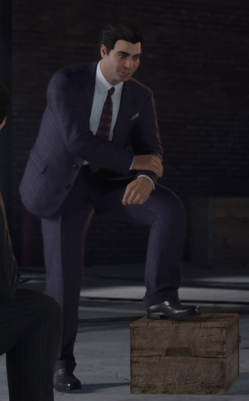
Clothes Make The Man: Paulie Lombardo

Much to my chagrin, I’ve discovered that Mafia DE is maybe one of the best video game remakes of all time. It’s obvious from the designs to the writing to the worldbuilding that someone cared a lot about making something with intent and purpose and quality in mind.
Maybe you disagree, and that’s fine, but I haven’t seen anyone really make the case for DE in a design sense. I’ve seen arguments for gameplay, the graphics, the acting, but not so much the characters. Fortunately, I do this kind of thing for fun. If it falls to me to be the guy that talks about the fashion choices in a game from 5 years ago, so be it. Derek Guy I am not, but I can certainly try. Hello, I’m Ray, and I’m going here to talk at length about something no one cares about!
Fun bonus challenge: Try to guess what my major was by the end of this post.

The first thing I noticed in the jump from Mafia (2002) to Mafia DE was the choice to really shake up the character designs. This makes sense, as Mafia wants to be a cinematic series and the foundation of good cinema is strong characters. Hiring actors is part of that, but so too is the deliberate design of the characters - how they look and what they wear in specific.
Paulie and Sam and Tommy are beloved characters in Mafia Classic, but the fact that the games are so old presents a challenge to the modern designer. Audiences in 2020 need more than a cool badass player character gun guy to carry their interest, and Paulie and Sam as your sidekicks need to charm and engage the player for the game to deliver on its narrative beats.
So how do you take an old, low-fidelity character design and make him memorable? Let’s take a look.
I want to start with Paulie because I think his rework tells us the most about the goals of the designers, and we can use that in the future when we (I, me) talk about the other characters and their design choices.

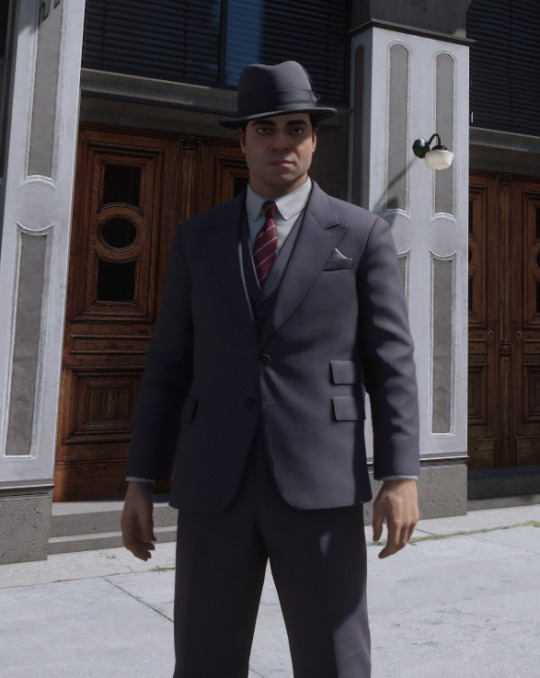
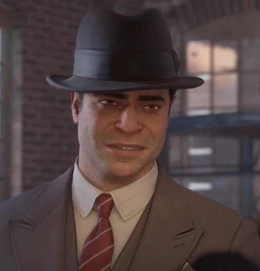
In Mafia Classic, Paulie is easily described: Grey suit, red tie, no frills. The only reason his suit isn’t black is because that distinction is reserved for Tommy, who’s tie is also red.
This isn’t an indictment or commentary on the original game at all. If you thought keeping the dark-haired, dark-eyed, be-suited cast of guys in a mafia movie was difficult, imagine trying to do it in a video game and all while staying within a certain polygon count. The fact that you can tell - at a glance - the difference between Paulie, Tommy, Sam, Salieri, and Frank and do so while keeping most of them in a similar uniform is a testament to Illusion Softworks’s attention to detail and commitment to making something of a particular caliber. For 2002, Paulie’s is a perfectly functional design, no notes.
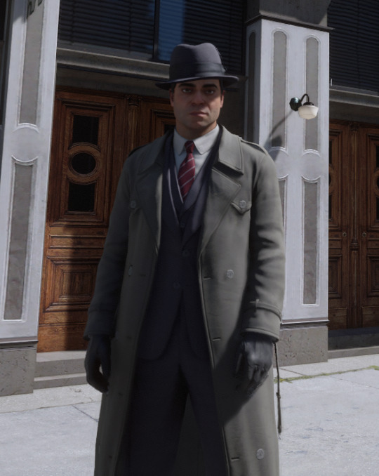
Mafia DE, having the flexibility afforded them by time and a budget, makes the (frankly, inspired) choice to change the characters’ wardrobes over the course of the story. Paulie actually gets the fewest amount of wardrobe changes of the main three with only two suits (three, I guess, if you count the one he wears to the funeral), a coat, a hat, and the single appearance of the shirt/suspenders combo we see him in at the end of the story and nowhere else.

For those curious, the funeral fit is just a recolored version of the grey suit, double left-side pockets and all.
This lack of outfits compared to Sam (four suits) and Tommy (I haven’t finished counting, but it’s more than four) is interesting in light of the fact that DE also expanded his character to make Paulie something of a clotheshorse. He’s only got a few suits, but he’s very proud of the ones he does have. As indicated by his dialogue, he hates getting his clothes wet, schemes about stealing classy suits as a way of making money, and at the very least has a passing interest in maintaining his hair. Our boy’s got a bit of a vain streak.

Note Tommy's quick pursed lips expression here. Here's a guy who's used to dealing with this shit.
The brilliant part (and this will become a running theme) is that the character design is doing as much work here as the dialogue.
Taking cues from the Classic design, the outfit we first see DE Paulie in is a grey suit and a red tie. However! The increase in graphical fidelity gives the designers here an opportunity to expand on the details.

As a quirk of what I believe to be the lighting engine, Classic Paulie’s suit often appeared not just grey, but cool grey, almost violet. The DE designers really leaned into that, giving the first suit we see him in a more purple tone, brought out even more by the (now darker) red tie. The second suit he starts wearing after A Trip to the Country leans into this even more heavily, purple windowpane check with a rich purple tie and matching pocket square.

Thank you Nikita Nanako on Artstation for uploading this to his portfolio. Makes my life easier.
Even without knowing the historical significance of purple in fashion, this marks Paulie immediately to the player’s eyes, and certainly in the eyes of the other characters. Purple is a flashy color, historically expensive to manufacture, associated with royalty. By the time Paulie’s wearing it in 1930-whatever, it was an artificial dye and much less expensive to make, but that doesn’t stop it from being a statement. Purple is a color you wear when you want someone to notice what you’re wearing. And as we’ve established already, Paulie very much wants people to notice. There’s also like, literary implications to the color choices here, but I think that’s another post.
The lapels on the DE suits, too, say a lot about the kind of guy Paulie is. Both suits have peaked lapels as opposed to the notched lapels of the Classic design, and indeed, everyone else in DE. Peaked lapels - like the color purple - are a deliberate choice, one that draws attention to itself. They’re sharp-looking, or as Paulie says, “real classy”.

More importantly for our purposes as students of design though, they’re not always appropriate for every situation. A peaked lapel is usually reserved for a highly formal look. To our modern eyes, we see a peaked lapel and think ‘high-powered courtroom drama’, or ‘classy social event’. It’s not exactly out of style, but it’s a bold choice to wear to, say, an illicit moonshine deal at an old abandoned farm. Paulie does not care about the context. Unless the situation demands discretion, this is a guy who is pulling up in his Sunday best no matter what.
And the hat. Oh, we can’t move on without talking about the hat.
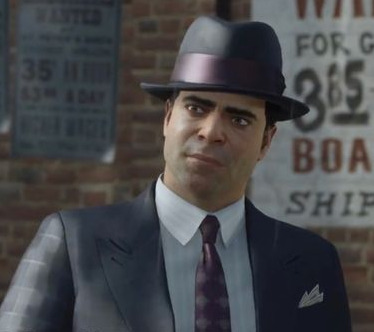
Note the windowpane check suit has a hat with a shinier band too!
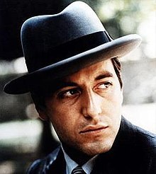
Paulie is the only character in the game to sport the homburg, again setting him apart from the more classic fedoras the Sam and Tommy usually wear. The homburg is a favorite of online menswear aficionados, but despite years of tireless blogging, this particular hat has yet to come back into fashion the way the fedora has. As a result, to the modern eye, the homburg looks very old-fashioned. It has a tall, broad profile that… Hey, see if you notice a running theme here: draws attention to itself.
Importantly, the homburg (in the American cultural consciousness anyway) is very much a bad guy hat. There’s a few contributing factors to this, but it comes primarily from our genre fiction and the images of the mobsters of the ‘30s and ‘40s. In gangster flicks, the good guy detective wears a fedora. The big, bad, cigar-chomping gangster wears a homburg. If you’re British, you might be able to get away with wearing one as a stuffy upper-crust sort, but if you’re American you are immediately ranked amongst the likes of Michael Corleone and Lucky Luciano.
The urge to add a picture of Diamonds Droog here was a little too strong.
There’s more I could touch on. His ostentatious little peacock pocket square alone has bewitched me.
But really, I want to get to the crux of the thing, which is that like… Despite everything about him saying he pays attention to these things, none of these aesthetic choices he’s making are actually working for him.
The peaked lapels, the big, fat hat, the garish colors. They might command a hefty price tag, but they don’t actually *look good*. This is a guy who has learned what good taste looks like in theory, but has not made himself master of it. The clothes are wearing the man.
Would you trust this man with your money? Your car? Dating advice?
It makes sense when you think about what his background would have been. What does a poor son of immigrants know about expensive suits? Only what he can pick up by observation! He wasn’t raised in a high-society environment, he wouldn’t know the difference between a suit you wear to a warehouse shootout and a suit you wear to a wedding just as he wouldn’t know the difference between a fish fork and a salad fork. To a guy like Paulie, the details don’t matter. He just knows the suits are expensive, and that a younger Paulie would never have been able to afford them.
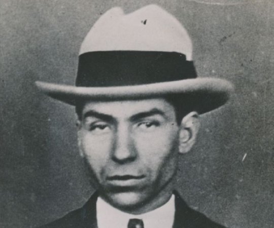
Many real-life gangsters had this problem as well. Al Capone went from being a poor bootlegger to an extremely rich and powerful gangster, and all the money in the world couldn’t buy him good taste either.


He's swimming in those lapels! And hey, that tie looks familiar...
There were other gangsters who had this problem too, but some were smart enough to look to their peers for cues about what to wear and how to wear it. (We’ll talk more about that when I get around to Sam.)
The fact that Paulie doesn’t do this, however, tells us everything we need to know about the guy just by looking at him. He’s stubborn, stuck in his ways, unable to tell the difference between expensive and tasteful, and wouldn’t know subtlety if it clocked him in the jaw. All from the design decisions the art team made, and without adding a word of dialogue. This is brilliant stuff. I’m in love with him, obviously.
That's all for now! Thanks for reading.
#paulie lombardo#mafia the city of lost heaven#mde#mafia definitive edition#mafia 1#mafia game#salieri sends his regards#<- my text post tag if you. don't want to see this i guess?#clothes make the man
101 notes
·
View notes
Note
If I didn’t miss requests, how about Legend in embroidered doc martens?

This was a really fun one, and I think we all need some more pretty Legend in our lives 💜
My first thought when I saw this prompt was that I really wanted to draw Legend in a modern outfit cause a little fun fact, I actually have a bit of a hobby in outfit design for/inspired by characters, so I enjoyed getting to indulge in that here! I took a little bit of creative liberty with the shoes since this exact design doesn't actually exist but I hope I at least captured the feel of them!
It's not by any means the most clever or exceptionally designed outfit out there since it's just a casual hobby of mine, but I still really like how it turned out! (Though I do still think there are some clever little details in it so feel free to let me know if you spot any of them :D) I was actually thinking of designing the rest of the Chain modern outfits, you know, just in case anyone else would be interested in that too 👀
(And I'd like to add that I've been getting a little more accustomed to drawing with my digital tablet and this piece was partially an effort to practice some more. My hand hurts a little bit now but not as much as it had been before so we're finally starting to make some progress! Also yes, I will rest my hand for a day or two, I promise)
#the legend of zelda#legend of zelda#linked universe#lu legend#tloz#loz#loz fanart#lu fanart#art suggestions#stan art
51 notes
·
View notes
Note
Howdy just wanted to let you know how much I love your fantasy AI and how cute the designs are!

Assuming you meant Fantasy AU haha- Thank you! Ive admittedly been playing with their design a little in the background (And it hink I posted some sketches before? though im unsure if I tagged them) since some of them looked. a little too human ((sorry archie i LOVE selkies but untransformed it truly is just a fur coat. which. isnt great for a more tropical setting)) but the core of it has never changed lol I love modern fantasy
The designs are half inspired by Pokémon now, though not tooooo intensly.
Max is still mosty faun, but leant a little more into full furry for him I guess. Cope old man.
Archie has been changed from selkie which HORTS but alas i lacked the skills to draw him cool. He's just a general mercreature now. He has legs but he's half fish in design he can breathe underwater. You get it
Others I've had thoughts on:

May gets to be torchic in harpy form. She's a rare case, as she can naturally do some magic! She can Breathe Fire. Very fun for her parents. She can't fly, but she can kind of flutter- which is great for parkouring around! Active kid. Due to lacking arms/hands she uses her legs/talons for most things instead
I want Courtney to be Meowstic inspired, probably with some/devil/demon inspo for the monster part? But I admittedly haven't thought of a design Im happy with yet. She also has some natural magic! Again, not supposed to be very common. She can levitate stuff and throw around psychic shockwaves if she's mad. She tried studying to be a witch for a little while, but she didn't really like it.
Lisia is Mostly Just Regular Lisia except the cloud fluff on her outfit is part of her lol. She's a combination of Swablu inspired and a full on wind spirit. She looks normal most of the time but if a strong wind catches on her physical form literally temporarily blows away into clouds. She can control the condensation in the air around her- which is almost entirely useless, except she can use it to create rainbows behind her. Great idol trick
Zinnia gets some fun dragon traits, and also lives up to her Lorekeeper title. While there's plenty of common spells written down and going around, Zinnia has access to and protects a lot of more powerfull forgotten stuff. Most imporantly Delta Magic, which... Functions via Totally Not Mega Stones, and allows the user unlimited access to type magic for as long as it's active. It's pretty draining, but it's the only time that actual world changing magic can be made to happen, rather then more mundane or minor stuff
#ribbon answers#fantasy au#the great big fantasy au revamp i guess#i like worldbuilding so this all happened a while back thinkng about the worldbuilding lol#still not at a place im happy with it so i might change it Even More#but i just like the idea of modern fantasy. mermaid but she runs a hairsalon in town and does your hair while chillin in an open aquarium#behidn the stool is like. the most fun concept imaginable to me#this world is literally just meant ot be that LOL#but yea. started incoorporating a bit of pokemon in the designs for funsies. and also to make veryone more noticeably not human#some are still more human then others#and theyre all kind of meant to be based on a pokemon but also a creature or monster#so its not one or the other. its mostly supposed to be both
66 notes
·
View notes
Text

Next up in the Sabzerus designs: Tighnari and Cyno!
I know this is unrendered, but I already committed to not rendering these two until I finish Haitham and Kaveh's designs which, in hindsight, is difficult atm because I have more ideas about Collei's design over them. With the recent release of Sethos, it seems that it would have to wait until I finish his and Collei's designs when I get to them. I'm writing a fic now lol so it the wait is probably quite long.
Tighnari's is relatively easy and I'm so pleased with the results! He finally looks put together and not... odd, palette-wise (to put it mildly). His clothing is based on the traditional dress of the Kabyle people, an Amazigh ethnic group from northern Algeria, with some modernized touches (I used references from modern-day photos of Kabyle dress!). The highlight is the burnous (hooded cloak), originally a symbol of resistance in the Algerian War of Independence and now a garment worn in special occasions such as religious festivals. I think it would be appropriate of Tighnari to wear one for his Sabzerus dress.
Cyno is so far the most difficult one to design. I have 0 references outside of speculative fashion plates and museum pictures of jewelry. I struggled so much with the outfit components, but I persevered and this is the result. His clothing is based on what Ancient Egyptian high priests of the New Kingdom wear. The long shendyt (kilt) and shawl are made from linen, which in higher social classes are woven so finely they appear as though transparent. Not just luxurious, but also airy for comfort against the desert heat.
Previously on: Nahida + Wanderer | Nilou
As usual, close-ups and some more thoughts under the cut:


Tighnari's canon design is incredibly confusing to me, because unlike some other Sumeru characters I have absolutely no idea which part of Algerian (or Arab, but that's a very wide ballpark) dress it's supposed to be based on. Where is that white fabric wrap even from? However, when I looked at his hoodie, I realized that it's probably supposed to be a "modernized equivalent" of a burnous. Probably.
The belt accessory is actually an article I always see on women's robe kabyle, but never men's. I think they look neat and Tighnari wears belt accessories, so I incorporated them. (If any of you seeing this are Kabyle or Amazigh, do tell me more of the nuances. Are they exclusively feminine accessories? I also read that Kabyle women tie their sashes differently depending on marital status, but does this only apply to sashes or does it also apply to these cord belts?)
It's not very obvious, but the burnous has a split back, so Tighnari's tail can poke out comfortably. It's also pretty fun to try and incorporate elements of his official design, such as the paw-print gloves, the boots, and the turtleneck. To me, Tighnari without a turtleneck is unimaginable for some reason.
I've been tentatively calling Cyno's design "the one time Cyno puts some effort into doing his hair". The little braids aside, his hair is actually in a half-up bun. I really should draw these refs from more angles... and this is unimportant in the grand scope of things, but I gave him some beef. My guy deserves more beef (and I apologize for covering his chest regardless).
The wesekh (wide collar) is made from gold and various precious gems/minerals. This one has gold, carnelian, and turquoise. The narrow golden beads on the outermost layer represents beetles, which in turn symbolize resurrection (i.e. Hermanubis' indwelling within Cyno).
I've always been baffled at the fact that Cyno wears mostly black, but would prefer for my design to contain elements from his actual design, so I kept the sash and helmet black. However, I do know that too much dyed linen (and animal fibers) are inappropriate to wear in temples. Unless you are a funeral priest, where you wear a leopard skin as a part of the rites. Then again, Cyno's biggest inspiration is Anubis, so perhaps he could get some leeway here...
To continue with the flower theming, I chose the Sumeru Rose for Cyno and Tighnari wears the yellow flower on his canon clothes once again. It's never mentioned in game, but I'd like to think the Sumeru Rose is among the national flowers of Sumeru along with the Padisarah, so it's appropriate for the General Mahamatra to wear it.
Lastly, I gave them matching double piercings. Tighnari wears them on his right ear (as per his canon design), and Cyno on his left. Another matching set :)
#ksadraws#genshin impact#genshin fanart#tighnari#genshin tighnari#cyno#genshin cyno#am i allowed to tag this cynari? i feel like i should tag this cynari bc i sure implied it
106 notes
·
View notes
Note
if the made another 4 plush, like one with a gimmick like Lanky Puzzles and his velcro hands, what would you want them to do with that?
As much as I love him its not fair that Puzzles gets 2 plushies with all this detail and one has a cool lenticular face and the other has ability to hug and hang off of things meanwhile the actual main character of the show (besides Mario who yknow. Is Mario) only gets one plushie with not nearly the same level of detail in esp his face and also his shoes look really weird. Fails to capture the sheer beauty of smg4
if they put you in charge of new Four marketable plushie hypothetically. What do?

*grabs you* if I were in charge of making a 4 plushie?
OH BOY, do I have some ideas! Give me a second *pushes stuff off from desk* okok, we first have to set some product guidelines (bc there are):
We can't have anything small enough to be considered dangerous if consumed, especially for kids and pets. And ofc it has to be considered a plush. (and while I'm at it, a bit of a disclaimer: this is not me hating on the modern 4 plushie we have. This is for the funsies) Good? Okay then, onto the fun part and ofc, I brought some references for us to work with:


Now, as you said, we gotta capture the embodiment of 4, our local ambassador of joy :) Shape-wise, he needs to be round and still resemble his model. I do want to give him his nose just so I can boop it like in the real model, hehe *boop*. And it may be hard to do manufacturing-wise, because it may be a small plush, but I wanna see the details on his overalls (especially the straps) and gloves. Just have more depth in his clothes/shoes, but still squishable. Y'know, like you wanna give it a big hug! And perhaps shake him with so much cuteness aggression you hope he explodes 💙
His face should be a lot.... how should I put this.... more? I suppose??Take the Karen and Leggy plush for example, they're a lot more expressive and full of color, literally. You can tell their whole personality. Meanwhile, we got a 4 plush and he kinda stares into your soul, which works for the memes hehe, but it could be more. I would give 4 a tad bit of a bigger smile and some blue in his eyes. Speaking of his eyes, they should be a lot more expressive for our silly lil guy.
Other than adding them in his eyes, colors should be fine. Maybe a touch of color for his skin tone :) For some reason, I wanna like. Dress the plushies up as if they're from build-a-bear or something. We did get 4 in his winter wear and other costumes so I thought it might be fun to put him in his little outfits for every occasion. Think of the wardrobe releases.....
I think that's pretty much it for the most part, if we're dealing with current canon 4 bc if yall wanna go with my design of him based on my headcanons, I would absolutely go crazy with it. Glitch pattern in his overalls, two-toned blue sweater, heterochromia eyes, numeral 4 in his gloves, and so on. But regardless, I do wanna have it be a plushie that you can carry around in your bag while you go to a con or smth.
I based much of these ideas from being an ace attorney fan (hello fellow fans! and nicc too) bc they're these really cute fanmade plushies from alumints, and I could imagine the crew plushies to be like that too (I mean, just look at them)


Ofc this isn't counting the costs of manufacturing and production, we're just here for the funsies, but there's definitely potential! Like how a fun idea it was to emphasize Puzzles' long limbs into a plushie design ^^
thanks for the ask, anon!
#smg4#ink answers#I'm just a graphic designer hehe#I just wanna carry him in my stroll and say that's my boy 🥹💙#also me: I wanna throw his across the room /aff#(btw anon sorry it took so long!!)
26 notes
·
View notes
Text

so the years spin by and now the boy is twenty / though his dreams have lost some grandeur coming true there'll be new dreams, maybe better dreams and plenty / before the last revolving year is through
i have been churning this one out for WEEKS and i am so so happy to say it's done!!!!!
i'm so happy to have been able to sit and meditate on how arywin would change!! and how to represent the ways they've been influenced by the people around them, and how their culture has both hindered and enlivened them, and. i love them!!!!!!!!
id in alt text, and individual pieces/my thoughts behind each one under the cut


get ready for a million thoughts
age 20: their ears have already been pierced with the irremovable crests of their family. their outfit is meant more for play than any other outfit they have, but it's still covered by a largely ornamental robe. they're already being made to keep quiet and still.
age 55: i thought the lute being too big for them was cute :) their uniform is based off the uniform for christ's hospital, which hasn't changed in abouttt 500 years? the skirt hasn't fully closed off yet, they still have some room to move their legs. their school is in the middle of the woods, intentionally very hidden, and a way the students (yknow, the future of the nation, their most precious resource) keep themselves safe by staying out of sight. the gold is their family's signature colour!
age 75: their hairstyle is just straight up stolen from their brother! they wanna be just like him! and if you zoom waaay in, you'll see they've already got the facial scar from his "fencing lesson" to them, right over their eyebrow! :) there's a tepidity in their instrumentation; they didn't choose to play the lute and, as adept as they are at magic, there's a block in trying to channel it here.
age 104: this is the design i revisit the most lol, but i did throw in that ornamentation on the skirt just for kicks. their magic is wrapping around themself, kind of protective. one of their siblings did convince them to cut their hair (it's not traditional but it's fashionable and rebellious!), but arywin's kind of a baby about rules and they only committed halfway.
age 106: this is where it gets fun!!! they've fully cut their hair - symbolically cutting off their past and their history - but haven't committed to ridding themself of their family's crests. their skirt is looser, and you can actually see some of their leg where they've hitched it up! the laurels have become much more wild and natural, and they're sort of mimicking the appearance of antlers, as a reference to their grandparent (who was an eladrin, and had all the weird, animalistic, floral stuff going on!). i like to think the laurels are magically alive :) their cape mimics a viceroy butterfly, which has been their symbol for a minute now. hanging off the bow is their grandparent's crest, which is more or less the shape of the modern one but notably not made of gold. aaand the magic they're casting is channeled through their new lyre, but it isn't coming from the lyre; they're fully a bard/sorcerer now, and their magic is internal, and it's stronger for it.
???: they've cut out the crests of their family, and they've left their ears scarred and notched for it, but! it isn't a rejection of their heritage! they've picked up the affectations of the eladrin: the forms on their clothing are softer, more flowing, more wild. their instrument has shifted again to a crwth, which brings them closer to their eladrin heritage than the lute or the lyre (yeah the eladrin here are based on wales!!!). the dragonfly cape also comes from their grandparent, and they've grown their hair out again to symbolise building their own history. i'm really fond of them, once they've shed the prison of elvish nobility, really learning about and loving their eladrin-fey-elvish-refugee heritage. i think they become a poet that publishes in sylvan :)
#dnd#dnd oc#original character#dnd 5e#art#illustration#srb#high elf#artists on tumblr#dungeons and dragons#bard#sorcerer#wild magic sorcerer
23 notes
·
View notes
Text
[Click for better quality]
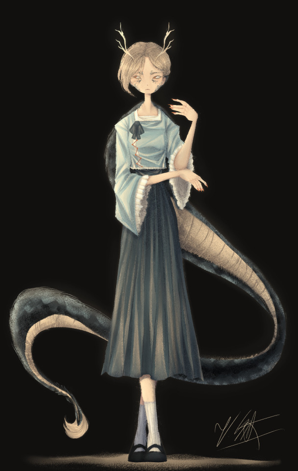
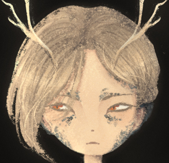
Ok so as a sort of followup to that Yachie drawing, I did one of Yachie as well. I already had a pretty solid idea in mind (though tbh drawing her wasn't as fun as drawing Saki) but I'm overall pretty happy with this drawing.
Artist's Notes;
So I knew that I would never forgive myself if I completely missed the oppurtunity to give Yachie face scales, which is something that I haven't really seen many people do yet. I do feel like I could've pushed it a lot more, but I'm liking the direction my take on her is going.
I also wanted to take this opportunity to talk about some of my headcannons for how Hell's fashion works since I've had this on my mind for a while. So ever since I refined my own design for Zanmu, I really liked the idea of having there be some connection between her and Satori in their clothes because they're both the defacto "leaders" of their respective Hells, and then I had the idea of having Hell's fashion trends mimic real life history where it mimics whatever the upperclassman are wearing in someway? I've always been really fascinated with the idea of how Modern Hell works as a society and also how Old Hell was impacted by it's abandonment, and while I am aware that the animal realm isn't exactly Hell and is moreso it's own thing right next to it, I imagine that there would be some overlap in the fashion and culture due to their close proximity to each other. Of course, I still kept a lot of elements in from Yachie's original design, the only thing I really added to the outfit was the jazzed up sleeves and the bottom of her shirt as well as those cool triangle things ZUN added to her shirt in 19. I also have her some nice and sharp nails since I thought they fit her. I also tried adding some scales onto the tips of her ears though tbh IDK how well they read. Her colour palette also ended up becoming a lot more teal than I had anticipated, but I honestly like it as I love it whenever people make Yachie's colour palette and design a lot more teal. I also wanted to try and differentiate her face from Saki's, though I do plan on experimenting more on how to avoid same face syndrome, as it's a problem that haunts me in my dreams. There's not really much I can say here aside from "hee hee clothing rendering go brrrrrr" and how the Clip Studio Paint charcoal brush is really all you need for any given piece and it is literally the only brush I use aside from the occasional airbrush for lighting (sometimes) and the blend tools. I've been doing a lot more simple character art recently and I've just been waiting for a cool enough idea for a full blown piece.
Though now that I've talked about some of my headcannons about how Modern Hell works, I really just want a Touhou manga spinoff about Modern Hell. Like, please ZUN I'm begging you, just do it, it would be so fucking cool because Touhou 17 is literally the only time in modern Touhou when we've been to Hell proper, does modern Hell have any settlements of Oni and other Youkai? Does it have cities? Towns? Villages? What's the technological level of Hell? How do they keep sinners from pulling a Touhou 17 and summoning a fucking god to save them? Where do all the characters associated with Hell as of right now fit into everything? You can't just drop a character like Zanmu who is stated to essentially be the king of fucking Hell and then not elaborate further on how she fits into the general framework of Hell! Is she officially the king or is this more of a "true mastermind using the official king/ruler as a puppet" type deal? How does the Animal Realm fit into all of this? Did Hecatia purposefully create Hell so it would be right next to the Animal realm? Did it just appear there on it's own once Buddhism started popping off on Earth or was it established once Zanmu established Modern Hell? How long was Keiki a problem for, and how did that affect the rest of Hell? Seriously there are so many unanswered questions here and I don't know if I just need to read an interview Zun had where he was asked these same questions and if so please tell me because these questions have all been stirring in my brain for quite some time and I really wished we'd just get a new fucking manga instead of going over the same settings in Gensokyo over and over and over and over again dear god. Like, I get that there's still a lot to explore with what we already do have, but it would just be really nice to see the Animal Realm get a little more explanation as to how it fits into the overall grand scheme of Gensokyo's worldbuilding because that would just make such an already interesting idea for a setting in Gensokyo so much better.
I'm hoping to get the drawing for Keiki done before Touhou 17's 5 year anniversary, though I am willing to postpone that and take my time on it and I also have something coming up where I won't have access to my main drawing tablet for a while so it might be a while until I post again, maybe, who knows, consistent posting schedule? Who are they, I've never heard of them. I do fully intend on talking about my thoughts on Touhou 17 though, even if it's a day or two late, it's Touhou 17's birthday month so it still counts! Also because out of all the Touhou game anniversaries, this is the one I care about the most because Touhou 17 was the first Touhou game I played and 1CC'd(???) on normal, and even though it has plenty of flaws (i.e. the many missed opportunities for it's gameplay, how unbalanced the mechanics are and also screen visibility), I'm always going to have a bit of a soft spot for it and I think that the game's strengths make up for some of it's weaknesses in my opinion.
160 notes
·
View notes
Note
Love the clothes you describe in your writing! Where do you get outfit inspo for your writing/how did you figure out your characters' personal styles?
Oh I love this Q thank you so much!! This turned into a very long ramble, so I put it below the cut! 🫶
Pretty much all of my inspo comes from Pinterest and Tumblr. (But I also love clothes irl so I have somewhat of a grasp on the aesthetics/influences of the characters.) I save soooo many aesthetic images and will often browse through them when I'm working on fics. Sometimes it happens the opposite way, like for ES 7 — I found the chapter card image and instantly knew that was Lily's outfit for Slughorn's party. Honestly most of my style inspo for the characters is based in modern clothing, and then I like to add a layer of whimsy to it. Capes, funky sleeves, fastenings, etc. So for Lily's dress in 7, I had the picture of the neckline and necklace for inspo, and then I was thinking, how can I make this a little more ~Wizarding World~? Same with Euphemia — her outfits are based in modern corporate workwear but elevated (think The Row + Upper East Side + British royal family) and then given some whimsy with cloaks, capes, etc.
Personally, I visualize wizarding world clothing based off how the movies did it, where some adults (Dumbledore, McGonagall, the Minister, etc.) wear more "wizard" clothing with robe ensembles and such, but most of the overall wardrobe mixes modern Muggle fashion with wizarding world fashion. And I will fully admit this is mostly laziness on my part!! I personally don't want to create strict wardrobe/fashion rules as part of world-building, so I just don't lol. I want them to wear typical uniform clothes of trousers/skirts with collared shirts to class and then wear jeans / sweaters / t-shirts to Hogsmeade. And I think the books are murky enough on clothing to support the idea that there was a decent (if not a lot) of Muggle influence in terms of fashion.
I picture it as being tiered societally. So you have people at the "top" who are dressing to the nines, in very "wizard" clothing, every day: Dumbledore, the Malfoys, the Minister, maybe more Ministry employees, etc. This would be the equivalent of like the British royal family or Wall Street or D.C. or haute couture, where the environment dictates a certain elevated + exclusive dress code. But for most wizarding folk, especially those living alongside Muggles or in closer proximity to them (the Weasleys near Ottery St. Catchpole, the wizards around Godric's Hollow, etc.), that type of dressing is more of a "special occasion" thing, and their normal day-to-day blends in more Muggle influences (jeans, t-shirts, cardigans, rain boots).
As for the characters' personal styles, they came naturally to me once I understood their personalities and influences:
Lily — Grew up squarely middle class, had a lot of hand-me-downs from Petunia and her mum, shopping the High Street was a big deal and really fun. Has a very girl-next-door quality in that her default is very casual and she looks like a babe doing it — cutoff jeans, tanks/tees/crops, hats, etc. — but she can also clean up. On the occasions she dresses up, she's stunning, but it doesn't feel natural for her to be dressing up or as into fashion as some of her friends. She's very Urban Outfitters meets Gap for me.
Mary — very similar to Lily in terms of style. She's super athletic and focused on her sport, very girl-next-door and tomboy-ish. Herbology is her best subject, she's interested in healing. She's very low-key, low-maintenance, and has a bit of a boho vibe as well? She's very Free People to me.
Marlene and Dahlia — they're the feminine, girly-girl gals of the bunch. My Marlene was originally inspired by Blair Waldorf, so that's how I picture her style (and how I came up with the background of her mum owning a witches fashion/bridal boutique). She's very preppy/coastal/J.Crew (they're based in Cornwall) and more into designers and such. Dahlia is half-French and has a very Chloé meets Sézane je ne sais quas about her. She also comes from money, so she's had more exposure to couture and that's fed her natural interest in fashion.
James — His style's very laid back and is mainly about comfort — he takes after Fleamont that way. Jeans, t-shirts, rugby-style shirts, a lot of athleisure. His two main activities are Quidditch and being with his mates, and his wardrobe reflects that — BUT he's also a child of Euphemia, so his "laid back casual" is still, like, Barbour and Ralph Lauren.
Sirius — He grew up in a household in which his parents were longing for the return to Victorian times and probably dressing the boys accordingly (lmao) so breaking out of that bubble made him the most into fashion out of the boys. But not in a "high fashion" way, more in just "clothes are art and a reflection of who I am" way. He has so much to learn and catch up on, but he takes it in stride and just has fun with it. He's the more adventurous one with graphics, jackets, vests, colors. I see some punk influences with him. Very Urban Outfitters meets Balenciaga.
(And I also hc that because James and Sirius are similar in size/build, they shared clothes and influenced each other. Like Sirius introduced James to some more "edgy" looks, like black skinny jeans with an oversized tee, maybe the occasional leather jacket, while James showed Sirius how to do elevated basics and be posh without being stuffy about it.)
Remus — He's a rag & bone guy on a H&M budget. It's that simple.
Peter — I truly don't think he has a personal style because he doesn't have much of a "personal" anything. He's such a follower that he doesn't know himself. Peter comes from a working class background, so he doesn't have much experience with clothes at all, and I think he just follows what the others do. (Until he eventually social climbs enough that he entrenches himself in the world of only wearing "wizarding" clothes.)
14 notes
·
View notes