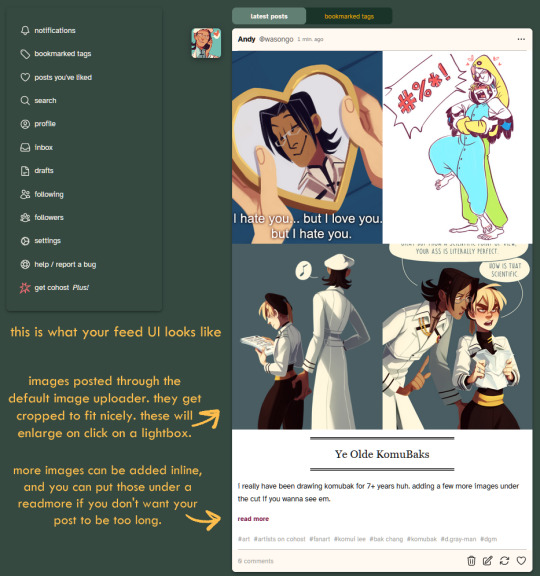
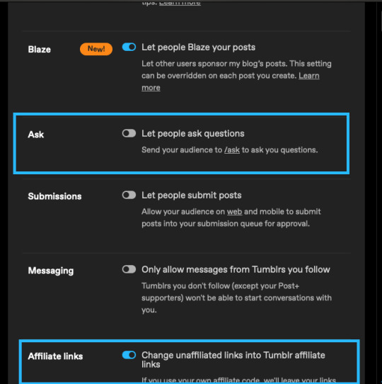
#for people on mobile who don't have the sidebar
Text
As someone who doesn’t use Twitter and hasn’t used it since 2016, at this point I feel like every even slightly Twitter-esque (let alone overt Twitter-esque) design choice Tumblr makes gets yelled about because People Really Just Fucking Hate Twitter whether they realise it or not.
Which, like. Fair ‘nuff. I also hate Twitter, which is why I don’t use it. But nobody ever really gives these design decisions any time to percolate on this site in favour of kneejerk “they changed it and we hate it” reaction. Public likes are not new. Multiple tabs on a dashboard (some of them not things you opted into seeing) are not new. Having to block ads with external tools is not new (and it’s a big deal that photomatt said the words “ad blocker”, like, you couldn’t get that shit on any other profit-driven site, everyone is too scared for their precious monetisation)
The new sidebar, also, I think is pretty ugly right now but it’s probably going to go through a few iterations. I, personally, really wish they’d put the search bar literally anywhere else (maybe group search and discovery together IDK I’m not an UX designer) and I think accessing sideblogs has been too complicated for a while now, but none of those are the same as “this looks like The Other Blue Site”.
Like I’m not a graphic designer. I am certainly not a fucking UX designer, and I think those people are either all nuts or all geniuses. I’m pretty sure the new layout is being extensively heatmapped rn, and what changes it’ll undergo are gonna be done based on that, based on comments that are along the lines of ‘this change would make me more productive’ and less on “WEEEEEH CHANGE IT BACK CHANGE IT BACK CHANGE IT BACK”.
Your animosity towards change is not meaningful user experience information. You misclicking on shit more *is*. If this layout is really *that* bad and terrible, Automattic’s research tools will demonstrate it as such. The developers now are actually much better versed in Web 2.0 design, for better and for worse.
#van stuff#Also like yes I also hate the touchscreenification of desktop sites#as someone who does not have and does not want a touch screen computer#but that's not a design trend I get to dictate as I am in fact a minority user for this site#and the complaints I am tired of seeing are also coming from other legacy minority users of desktop#There are many good UX reasons to opt for a vertical layout instead of a horizontal one#and I think the majority reason is so that people who are on mobile and desktop simultaneously don't have to have two different brainmaps#for their muscle memory on this site#but like... the vertical sidebar is not the same as 'randomly swapping 'Close' and 'Post'' lol#the top of the screen horizontal bar still does things and there's way less empty space there now#and I get wanting negative space and less screen clutter#like... that's the ONE criticism of this update I can agree with#but that's STILL NOT THE SAME as 'arbitrarily fucking over the muscle memory of EVERY site user'#how many people on this site *ever* move out of their dashboard? I know I do!#but I think it's the minority of people considering the user-curated model of propagation this site is still#*actively* promoting#This site looking superficially more like twitter doesn't change that!#like the sky is not falling call me when they eliminate the ability to browse the tags in favour of a flat search#AGAIN#remember when we had that? Remember how *BAD* it was?#remember how much easier finding stuff became when we got 'browse tags' back as the default search?
11 notes
·
View notes
Note
STOP reblogging all the old art. it just clogs up my dashboard and gets my hopes up thinking there's actually a new post. if i wanted to see all the old art, i'd click on the blog and scroll!
Yikes, man. I'm choosing to answer this rude ask so I can share some information for anyone who'd prefer to not see my old art reblogs on their dash.
All my reblogs of old art are tagged IPPreblog and old art specifically for the purpose that people can blacklist them if they don't want the reblogs to appear on their dashboard. I tag my ask responses as IPPasks for this purpose as well. I tag everything meticulously, so nothing should slip through. This is even covered in my FAQ.
Here is how to use tumblr filters to hide certain tags from your dashboard, both mobile and desktop.
I also have New Art Only view as a link in my pinned post and as a button on my desktop sidebar, for those who just want to see new art.
Also, while I think this ask was very rude, no hate to anyone who doesn't want reblogs on their dash; I totally get it! That's why I use the tag system.
Edit: I greatly appreciate all the support in the replies ❤. Anon has apologized and I am fine!
#IPPasks#anonymous#amazingly this is the first complaint I've gotten about this in nearly 10 years#anon did you know that when I went on vacation in the past and didn't have reblogs queued up people asked me to queue them#because they missed seeing them on their dash?
128 notes
·
View notes
Text
I think I got a lot of new followers recently because twitter keeps going to shit. However, as you probably know I can't and don't post nsfw art here.
You can find my NSFW socials on my pinned post. I think a lot of people are hesitant to join platforms which aren't fully available to the public yet but if you'd like to keep up with my nsfw art I'd like to:
Urge you to visit my website and subscribe to my RSS feed for gallery updates!
Suggest you follow me on either Pillowfort or Cohost (18+).
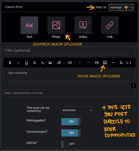
In the last year I have started using PF and Cohost more than Mastodon, as they've implemented new features and their posting system is more in line with what I enjoy: robust tagging and filtering, ability to post MANY images, and readmores for long posts.
If you've been hesitant to join either of those platforms since you don't know what to expect here's a small-ish review of both purely from my experience as someone who: a) enjoys profile customization b) likes to have an organized art gallery that is filterable by tags.
This review is aimed at artists looking for NSFW spaces to post! UI screenshots might have suggestive terms and images. Proceed with caution.
Edit: Good grief tunglr, if you open this on the web dash the images aren't shown in the neat galleries I put them in to make the post shorter. Head on over to the permalink if you'd like a better looking post!
Let me just say that if you're looking for a review on more technical aspects of these platforms, like security and moderation policies. I'm not your guy. You'll have to look elsewhere for that. I'm focusing on QoL UI and community aspects.
Though both these platforms allow nsfw, please make sure to read their ToS/Community Guidelines for rules on what is and isn't allowed. Though as far as I'm aware they have pretty similar rules.
Pillowfort
Overview::
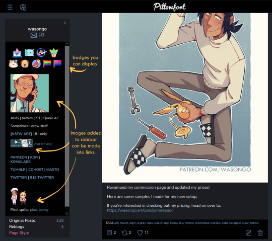
Pillowfort has more years under its belt being available to users than Cohost does, as such I THINK the artist/fandom userbase atm is larger, which means you might see more activity there. UI as of right now is very comfortable and the site runs pretty smoothly. Loading times are very decent. Posting is easy, though the image uploader is a little wonky (they are working on fixing this). You are able to create and manage communities based on interests or themes, which people can follow or join and all post in the same space. You can personalize your profile by adding images, links, and formatted text to your sidebar, as well as customize your own profile colors. Tag searches in my experience yield results of both art and aesthetic irl porn and gifs. If that's something you miss from ye olden tumblr days it might be worth a look.
Pros:
Posts have privacy options (everyone, logged in, followers, mutuals, only me)
Has a DM system
Posts have Commentable, Rebloggable, NSFW toggle
Can post MANY images on a single post
Readmore feature for long posts
Robust tagging system
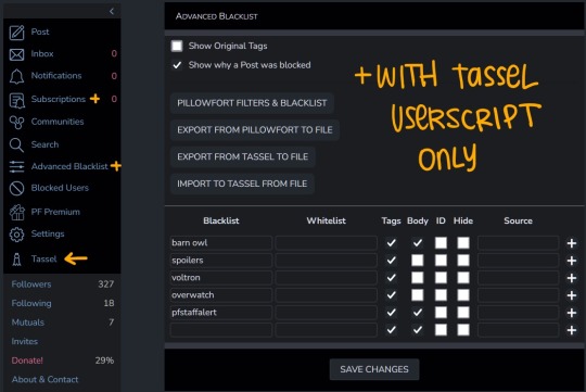
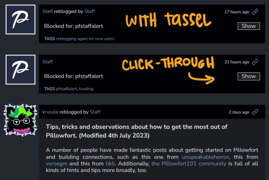
Robust filtering system: hide or click-through warning (by installing Tassel userscript only)
Customizable profile colors, Light/Dark mode for whole website
Communities you can follow/join for shared interests
You can filter posts on profile by tag
You can filter posts on profile by "original poster" or "reblog"
Cons:
wonky image uploader, cannot upload multiple images at once
Cannot search for multiple tags at once
Search for terms with periods in them is currently broken (ex. "D.Gray-man" will not yield any search results)
Communities have few moderation features atm
Without Tassel installed the filtering system is pretty garbage atm (you can either show or hide nsfw or filtered tags completely, with no click-through warnings)
No multiple account/side blog feature yet
Some inline image formatting options are broken atm
Default endless scrolling
No progressive web app for mobile atm
For a more in depth explanation of PF's UI and features you can check out this official post.
Here are some images of the UI.
---
Cohost
Overview::
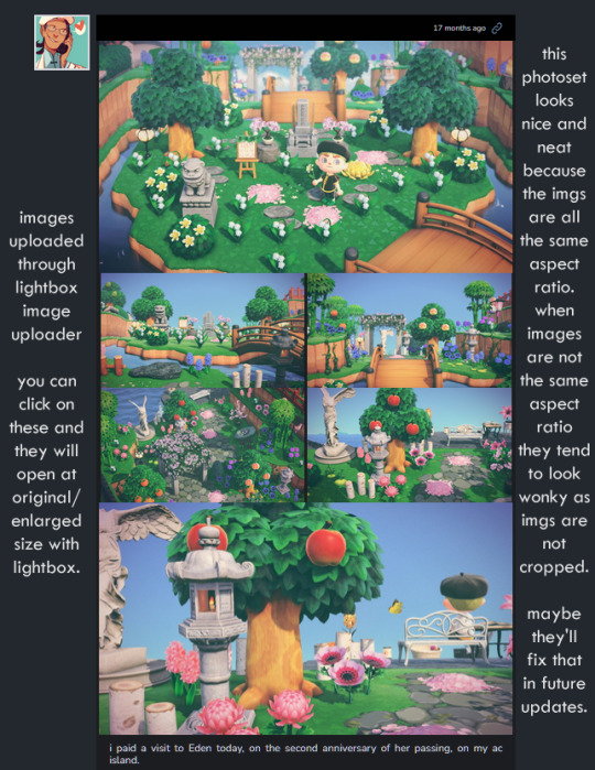
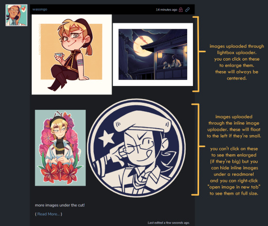
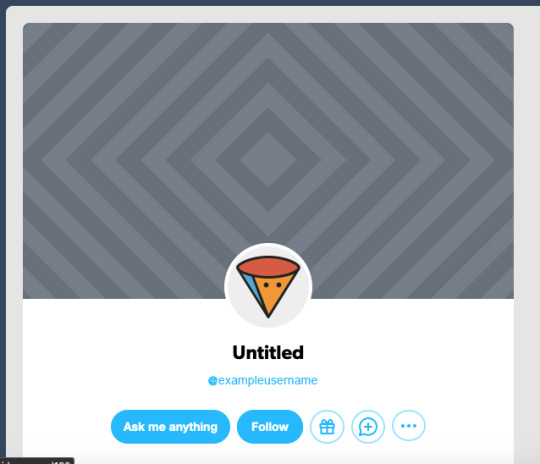
Cohost feels like it has a small artist/fandom userbase at the moment. However, to make up for that it has a pretty slick UI, it works great as a progressive web app on mobile, and it recently implemented an ASK system similar to tumblr's! Everything loads pretty quickly, and you can switch between your "latest posts" feed and your "bookmarked tags" feed. You can access your likes as a bookmark system, but as a whole "notes" and engagement numbers except for comments are not visible anywhere (this is wonderful for my personal mental health). It has a simple post editor and though the image uploader only allows 4 images that will load with lightbox, there's a workaround to upload MANY inline images if you want. The catch is you'll need to use a bit of markdown or html to do that. (more on that below) Though you can't personalize your profile colors, you can add personality to your page by making very cool pinned posts and adding images to your sidebar.
Pros:
Animated avatars! (listen i like having my animated komui icon)
You can make multiple "pages" (blogs) which function independently for comments/asks. switching between pages is effortless
Ask system, with anon toggle (you cannot reply privately atm tho)
2 Factor Authentication
Progressive web app for mobile works like a charm
You can preview your post before you post it
Posts have a NSFW toggle and you can save drafts
Can post MANY images in a single post (bit of a workaround as you'll need to upload your images to a draft first and then add them to a new post with some markdown or html code)
Readmore feature for long posts
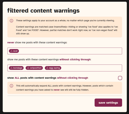
Robust tagging AND filtering system (show, click-through, hide completely), plus CW system to give your posts additional click through warnings you deem necessary
You can do incredibly cool things with HTML and inline CSS on your posts
You can filter posts on profile by tag, and you can have pinned tags
Toggles for hiding reblogs, replies, and asks on profiles
Paginated browsing instead of endless scrolling (things load faster)
No engagement numbers visible ANYWHERE
Cons:
Image uploader does not let you upload multiple images at once. Limit to 4 images (can upload more as inline images with code)
Advanced post formatting (ex. bold, italics, bullet list, inline images etc.) has to be done through markdown or html + css which is not the friendliest for those who don't know any code (there's a button for a markdown cheatsheet when you post tho!)
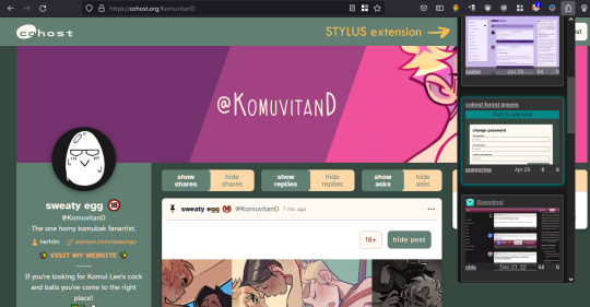
No dark mode, or customizing profile colors atm (however there are workarounds to changing site colors with Stylus extension)
Cannot search for multiple tags at once
Cool things you can do with CSS on your posts might look very bad on mobile
Since you can do some crazy things with CSS on posts, you might come across eye straining visuals and movement on some posts. There are settings to tone this down, and people are pretty good about tagging things, so with some good filtering you should be able to avoid this however.
A little quieter on the artist/fandom front (but we can change that)
Here are some images of the UI.


If you made it to the end of this review thanks for giving it a look! If there's something vital you might want to know that I missed in regards to UI and posting features let me know and I will try to answer. But again, this is not a technical/security issues/bugs review so don't ask me about that.
Lastly, I've been seeing a handful of NSFW artists I follow on twitter hopping on bluesky. I REALLY suggest you do a little research on the owners and platform to see if you think joining is worthwhile, since I have a feeling many artists might not want their alternative to be a site owned by crypto advocates (and also a billionaire). Some basic research will get you there. Just take heed and use your best judgement. On that note Cohost is strictly against crypto (I'm guessing PF might be too but I don't have a link that I can point you to confirming this atm).
I believe community driven and supported platforms are the way to go. If you end up thinking either of these two places are worth your time, do consider getting your friends and favorite artists on board or supporting them! You'll get added perks on both platforms if you become a supporter. PF recently added the ability to have MULTIPLE AVATARS (PFPs I think they're called nowadays) which I think is super cool (i really miss that from LJ days).
Again, thanks for reading and I hope to see some of you there!
242 notes
·
View notes
Note
i'm on pc for a change and i just looked at your askblog AND OMG THAT IS SO PRETTY?????
it looks so good and the little interactive details? so cool so cool i don't know how hard it was to make it look like this but it definately paid off
pc users are eating so much better than mobile
I'm glad you like it!! It was a lot of fun to put together. I know most people use tumblr on mobile these days and won't ever get to see desktop themes, but I've always really liked custom tumblr themes and I try to use them on all of my blogs.

This theme was pretty easy to set up, I used the theme "Glitch" by glenthemes. They have a ton of other pretty themes in their portfolio as well.
(Full disclosure, I was inspired to use this theme after I saw it used on the blog ask-jewels-against-the-sea, I thought their setup was really pretty. Hopefully they don't think I'm copying them, I just thought their theme was very nice.)
Also, it's worth mentioning for people who are newer to tumblr/only ever use it on mobile, but setting up custom desktop themes is extremely easy. While on desktop, go to your blog's settings page, scroll down to "Custom Theme", toggle the "Enable Custom Theme" button ON, and then click "Edit theme".

It will open your blog's theme customization page, which looks like this:

Settings are on the left, and a live preview of your theme is on the right. (Any changes you make to your theme aren't reflected on your actual blog until you hit the blue "Save" button.)
Tumblr has a few first-party themes in the "Browse themes" tab you can use, but most of them are pretty limited, and a bunch cost real money (ew). There are literally HUNDREDS of custom themes that people have made that are completely FREE. They're not that hard to find if you know where to look; you can literally just type "Custom Tumblr Theme" into the Tumblr search bar or Google. A lot of people have portfolios with live previews of all of the themes they've created, with links to the HTML code. Also if there's a specific theme from someone's blog that you want to use, almost all themes have a "Theme" button you can click that leads to the artist's portfolio:

Installing the theme is literally as easy as copying and pasting. Portfolios and live theme previews usually have a "code" button you can click that will take you to the raw HTML of the theme.


Select the entire code by hitting CTRL+A, and copy it.
Then go back to your theme customization page and click on the grey "Edit HTML" button under "Custom Theme".

It will open up the HTML editor tab, which looks like this.

All you need to do is hit CTRL+A again to select the code that's currently there, delete it, and paste the code from your clipboard into the editor. Then hit the green "Update Preview" button to update the live theme preview on the right so you can see how it looks.
Most themes require zero knowledge of HTML to use. If you click on the back arrow, it will take you out of the HTML editor, and back to the theme customization tab. Scroll down to the "Theme Options" header.

Here you can change the colors, fonts, toggle settings on and off, upload background or sidebar images, etc etc. The settings of some themes allow you to get very granular with the customization, with custom fonts/image sizes/colors for different elements of the theme, so you can make your theme unique.
Once you're satisfied, hit the blue "Save" button and the theme will be reflected on your blog.

I highly recommend looking around for a custom theme you like and adding it to your blog, it's a lot of fun!!! I've been on tumblr for over a decade and custom themes used to be completely ubiquitous; everyone wanted to have a unique theme that reflected their personality and interests. Themes are a very fun form of self-expression. Even if most people these days won't see your desktop theme, it's a nice little treat for yourself when browsing your own blog, so make it something that you enjoy.
#asks#beeb-oob#I apologize if you already know all of this lol. I just want to inform other people as well#customize your theme!! it's fun!!!!
19 notes
·
View notes
Text
These were some ideas that I had for dashboard and blog features that I wanted to share after the boop-a-palooza we had yesterday (April 1st). Please share with others for a bigger sample size, thank you!
-- Aquarium on your blog and/or dash 🐠
Users pick out some fish from a variety of options along with tank gravel color, decorations, etc. People who visit your blog can feed your fish. Additional items can be found just by scrolling and being clicked on in the sidebars of the dash or by visiting other blogs Fish tank bubble ambiance noises. (They don't even have to be animated fish. jpg fish would work just fine. Bring back that old school look and feel)
-- Pets on your blog and/or dash. 🐈🐕🦺
Similar to the Aquarium, users could either find animals on their dash and/or 'adopt' them which puts them in a little animal house on your blog that you can decorate with items also found while scrolling. Allow users to pick up and place one of the animals onto the dash, which allows it to wander around and/or possibly follow the mouse. You can pet the animal by clicking on it. You can play with the animal ie pick up ball with mouse or touchscreen (mobile) and drag it and leg to to 'throw' it. Allow users to put up animals for 'adoption' so that other users can adopt/trade/swap them with one another. There's dozens of types of cats and dogs out there, so think of it like collecting pokemon. :) Plus you could get wacky with it and do like.. fantasy stuff. Wizard Cat, Pirate Doxie, a dragon... etc.
-- Window to the outside on the dashboard 🌧
Let users put a window (literal window) on the web dashboard in the lower left/right corner that can be changed to play different types of weather. For example, if you choose to go with 'rain/thunderstorm', it would show rain pelting against the glass with clouds and thunder while also playing sounds like something from rainymood. If someone chose nighttime, there would be a moon filled sky (possibly reflects location?) with stars and the sound of insects and/or peepers (frogs). Daytime would have birds chirping, you get the idea.
23 notes
·
View notes
Note
Hii it's me again!
I wanted to say thank you for answering my questions! It's was so nice to finally talk to you. I'm glad you brought up sanzu because I think with your dark writing style you could capture characters like sanzu and hanma in a really deep headspace. A lot of people write sanzu as cold and chaotic but forget that he was characistically loyal to a fault (and low-key a God complex when it came to mikey).
I feel his bontent executive lifestyle would not be one of stability or kindness and that any women that somehow peaked (and kept) his interest would be stuck between his curiosity and (not so subtle) obsessive tendencies masked as loyalty. What do you think🤔
Either way I'm so excited to see how your future works will be with him! He's such an enigma that dark creators like yourself truly get to play around with the many faces they have. I hope you don't work yourself too hard with all our requests❤️ make sure to eat something delicious as a treat.
-🐇 anon
OKAY I'm on a computer just for this ask bc I have a lot to say I think and I need full mobility lmao. One I'd like to thank YOU for your kind words and thoughtfulness I appreciate it so much! It's really great to have these deeper questions for these characters because they really are so complex, and I know I get caught up in just the heehee haha's of it all and writing them the way I'd like to see it or someone requests it but thinking about what they do or say in the real world would be terrifying.
SO SANZU! While I do think he is cold and chaotic, I completely agree with you. Don't get me wrong I LOVE the way people write him and I think it's phenomenal I can read Sanzu fics all that (@ everyone reading this if you have faves drop the link) but sometimes I do think sight is lost on who he is/how he's depicted. Sanzu is cold in the sense that no one else is worth his time, because Mikey exists. He doesn't have time for niceties because he has a job to do, and everyone else just gets in the way. Sanzu's chaotic in the way a gang member has to be to survive. But I think we also gloss over the fact that he's taking drugs. Now while it's not explicitly discussed what it is, I imagine it's an upper, so most pills are out the window (except party drugs but they won't do much in comparison to how he acts).
But I like to think the drugs he takes is a combo of something like coke and heavy medication (that he very blatanlty abuses) to cope with the trauma that he practically relives. He has a lot of PTSD that's really shifted its way to stockholm syndrome with what Mikey did to him. The way he's still so loyal to him is really a trauma response beacuse it's easier to deal with. I think ALL OF THIS creates such an intense character that without thinking much about it can get boiled down to just a crazy silly guy with a gun.
Sanzu in a relationship is a terrifying concept, because he really would be obsessive. I don't even think he'd be the type of obsessive that would kill a man because he's jealous, I think his mind would tell him it's out of pure protection for whoever's he's dating. I think the longer he's with them the more difficult it is for him to stop himself from being outwardly obsessed, but I think the exposure to his lifestyle over however long would kind of make his s/o be like 'okay well this is him and i love him so it's okay' type deal (we know that's not healthy)
I think if I let this fester in my brain I can create a lil sumn for Sanzu because he's a scary individual that has CPTSD and doesn't recognize that, along with an insane amount of power and a drug dependancy.
ALSO this is a sidebar but I read a short drabble once about Sanzu seeing someone and Mikey found out and basically executed them in front of Sanzu, and he immediately after shot himself in the head. It was intense but a really good ficlet and that seems VERY accurate for Sanzu in a relationship, that eventually they will overtake the number one spot from Mikey and he'll be so attached to them that he'd just take his own life because he can't live without them. I need to find it bc it was good.
ANYWAYS THIS IS A LOT TO TAKE IN IM' SORRY I WROTE SO MUCH I LOVE YOU NONNIE. I hope I get to write for him and characters like Hanma soon in the future, it's very fun!!!
#milk rambles#milk asks#sanzu#sanzu haruchiyo#sanzu haruchiyo x reader#sanzu x reader#tokyo revengers hcs#tokyo revengers#tr#tr sanzu#tokrev#tokyo rev
43 notes
·
View notes
Note
Greetings, lovely Jude
* Blink big round eyes twice *
Better: Lord (f) Jude
* Blink big round eyes twice like puss in boots *
Could you, please, if it isn't terrible to do, put the option to not see the "dialogue option intention sign" ( I don't know how they are called BUT) ?
I get the appeal to know the intention of the option, but I think this takes some part of the immersion ( i read it as a novel and i be like: what a heart is doing here?), like we don't know how what we say will be understood and some times we make mistakes in how we say things. So, maybe this would be cool to some people [ like me 🐯🍷].
(If it's not so much trouble and all, I can live with it
Furthermore, I think if you could make the menu of OYHS "hideble" the game will become more mobile friendly (like in WWC, we click in the arrow and the menu slide out)
Sorry if you had already got those and all
Love you work! Fighting!
I’m sorry but I’m not taking off those things, I can’t. Without the heart the antagonistic romance option could be confused with just antagonism and that would make the readers confused and vice versa for those who want to be mean but not romantic. I get immersion better than anyone but I’m not going to make the game confusing especially for those who are dyslexic, or autistic and might have trouble reading those options without those signs and even neurotypicals sometimes get confused. I get as a reader it’s hard to remember that others are playing the game too but that must be remembered, others have different reading habits and their own struggles with it and my goal is to be as accessible as I can
Your point about mistakes is actually one thought I had which is why I took off the back button so a mistake can stay a mistake ☺️ I do approach my games as more novels than games so I do get why you asked but yeah I need to try and make diverse readers as comfortable as I can
The sidebar is now hideable but I do warn those in mobile that it does push the page to the side so you have to scroll to the middle but overall more customization of games means it’s less mobile friendly each time as twine games are technically made to play on bigger screens the mobile friendly button on itchio isn’t a panacea unfortunately 😭
7 notes
·
View notes
Text
Recently on Reddit I learned that there is a dating/friendship site just for a-spec people! It's called AceSpace. I wanted to share it here to help spread the word to anyone who might be interested.
It does not follow the swiping model popularized by Tinder. Instead you search all users (with filters)! There no limit to how many people you can like, match with, or message. There is also a built-in social media feed that anyone can post to. Because of the small community, it's a very relaxed place.
All the main features are free, and they're going to stay that way. Anything you have to pay for is either purely cosmetic or not necessary to enjoy the site.
You are not required to have a profile picture, although that is strongly recommended, but it doesn't have to be a photo of you. One of your pet, or a Picrew, or something like that is fine! You are also not required to use your first and last name.
Right now it's browser only, but a mobile app version is in development.
It's pretty small at the moment because it's fairly new, so don't expect to find 50+ people in your area. I think right now word-of-mouth is the main (or only) way people are finding it.
It's also friendly to all of these people!:
Aromantics and anyone on that spectrum
People looking for Queerplationic relationships
People looking for Polyamorus relationships
Sex-repulsed people
Romance-repulsed people
Link to AceSpace
Under the cut is more info for how it all works!
Okay, let's go through this one tab at a time!
Home:
This is the social media feed I mentioned earlier. So far my experience is "it's like if Facebook wasn't full of old conservative people, unfunny memes, and clickbait." Which is to say it's mostly life updates, asexual memes, and "Hi! I'm new here." Everyone on AceSpace is allowed to post here.
When you post, you have to option to specify that the post is relating to one of your interests. It's the button inside the text box that says "AceSpace". Only people who have the same interests on their profile as you will see these posts. For example, if I change it to "crochet" only other crocheters will see it on their feed.
You can filter your feed by your interests and your location, but some locations and interests don't have any posts right now.
Discover:
This is where you find and match with people! Since the userbase is pretty small, searching all users is not as overwhelming as it sounds. Especially once you have a few filters set the list of people will become much more manageable.
On the left, there's a sidebar with the current filter settings. By default, the filters are set to what you specified you're looking for on your profile. But you are free to adjust them as you wish.
If you set your profile to relationship only, only people looking for relationships will see you in search results. Same with friends only. So if you're only there to make friends, you won't have any people who don't stop to read trying to flirt with you.
Right now most of the userbase is in the US and UK, but there's a handful of people in other countries.
Messages:
Pretty self explanatory. Just your standard DMs. No limit on these, nor do they expire or close after a certain time.
My Profile:
The profiles have a ton of room to give a detailed description of yourself, your interests, and what you're looking for in a partner/friend. You also have more than one text box to fill out, and you can title those boxes whatever you want! Although there are preset titles to get you started on what to write.
On the right is a sidebar that gives the basics for what you are looking for in a partner/friend. Specifically age, gender, and their repulsion-favourableness towards sex and romance. Unlike for your own attitude, you can set this as a range. (e.g. Indifferent to favourable towards romance.) If you want to get any more specific in what you're looking for, you will have to write it out yourself in one of the bio sections.
The rest of sidebar gives basic details about you, so you don't have to write them out in your bio. Not just gender and age, but your physical build, your education level, your feelings about marriage, your interests/hobbies, kids or no kids, your preferences with long distance relationships, your political leanings, how much you do or don't drink, and more.
VERY IMPORTANT: DO NOT LEAVE OPTIONS BLANK
Let's say you're indifferent about marriage. You'd be happy with whatever your partner wanted to do. So you just leave your feelings about marriage blank/as prefer not to say. Well, unfortunately this means anyone searching for "does not want marriage," "open to marriage," or "does want marriage" won't see you! Sadly, there is no way to say you feel indifferent with these options. The closest thing is "open to it."
So if you want people to find you, fill out all the options if possible.
(I'm only bringing this up because I've seen so many profiles where people only filled out half of the options. Or just the required ones. So I don't see them in search results unless I clear almost all filters, and the same goes for everyone else on AceSpace.)
Okay, but what is it like to use AceSpace?
I've been on there for about two or three weeks, and I'd say it's pretty slow paced and easy-going. You don't need to constantly check it or always have the tab open unless you're currently messaging someone.
The busiest the feed gets is one post every 15-20 minutes, but usually it's about one post an hour. I'm able to fully catch up on all the overnight posts in like 5 minutes. So yeah, you could easily just check in once or twice a day and be fine.
So far I've only had one person Like my profile and send me a message, but they never got back to me. (They might have deleted their profile, actually.) But! I'm not losing hope. This is pretty standard to see on any dating site. Lost of people come and go and come back again.
#acespace#acespace.love#asexual#aromantic#aspec#dating#relationships#friendship#queerplatonic#polyamorus
13 notes
·
View notes
Note
Ok i have a kinda dumb question that i am having trouble finding answers for, but what is the deal with Fandom (the site/company with all the wikis) sorry to ask but the name is so painfully generic i am having trouble finding info rip
@hope-punk put it pretty well in the replies of my post, so I hope they won't mind me quoting them here
if you've tried to look up a media specific wiki, you'll probably have found a Fandom wiki. That's Fandom with a capital, because they're a specific company. They operate a large wiki system that invites people to make wikis for whatever they want, and boast being the platform for many major wikis like the Minecraft wiki and Zelda wiki. However, going on a Fandom wiki will quickly make apparent the bad side of using Fandom wikis,
Fandom forces large, intrusive ads, auto play videos, the whole works onto the page, to the point where it becomes extremely unpleasant to use. In addition to this, they limit what you can do with your wiki compared to independent wikis or even other wiki networks, forcing large yellow sidebars and limited layouts. There's also pushes to make it a kind of social network with comments and such (which is… not what a wiki needs, at least in the format forced).
In addition to this, Fandom the company is quite frankly rabid in their push to consume or subsume fandom, hobby and media platforms. They recently acquired amongst other companies, Gamespot and GameFAQs, as well as other wiki platforms in the past. It takes a concerted effort to try and remain out of the grasp of Fandom the company, such as the wild steps the Blaseball fandom took to escape that someone added, or the Nintendo Independent Wiki Network
some other notable Fandom Crimes:
They purged LGBT-related wikis in an attempt to merge almost all of them into One Single LGBT Wiki, which is a nightmare idea considering the LGBTQ+ community is not a single unified monolith. Microlabels that were previously documented on the now-purged wikis were not considered notable enough to be documented on the merged wiki, and were instead directed to the Ezgender Wiki, placing an undue burden on wiki staff who weren't consulted about any of this in advance
On popular wikis, they'll sometimes put auto-playing videos on wiki pages outside of the wiki editors' control. These videos can contain spoilers or irrelevant/inaccurate information
Acquired Gamepedia, a competing wiki farm, and forcibly converted all of those wikis to Fandom's format. This is why Zelda Wiki, a founding member of the Nintendo Independent Wiki Alliance, is now on Fandom
Acquired and shut down Strawpoll.me
As I alluded to in the original post, you don't really "own" your wiki, and if your wiki makes Fandom a lot of ad revenue, they have a vested interest in keeping it up and running. If you make it obvious that you're trying to migrate or shut down such a wiki, they can simply get rid of you, replace you with new mods/admins, and revert anything they deem "vandalism" (basically, all signs that you were trying to migrate)
edit: can't believe I forgot to mention this but they've worked with the U.S. military
also reading Fandom wikis on mobile looks like this:


(id in alt text)
180 notes
·
View notes
Text
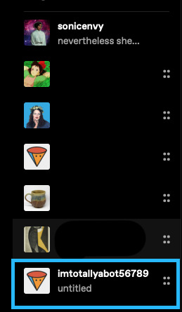
So I was poking around through my followers list and I noticed that there are a few of you who have no title, no profile picture, no custom site and no bio who do have enough likes to make me think you might be a real person and not a bot. If you are indeed a real person, please read this post.
If I click on you and your blog looks like this:
you look like a bot, yes even if you have a substantial amount of likes.
It is very easy to make yourself look human, and because I'm feeling helpful and chatty today, I'm going to show you how to do that, with screenshots. I even went on this site in safari where I don't have dashboardunfucker set up to take these screenshots, so you know I'm feeling good today.
Step 1:
In your sidebar go to "account" highlighted in blue below:

Step 2:
Select your blog in the drop down. (There are a bunch of blogs on mine because I have multiple junk side blogs.) For the purpose of this exercise I made a brand new blank one called imtotallyabot56789.
Step 3:
Go to "blog settings" in the right hand sidebar. This will take you to a new page.
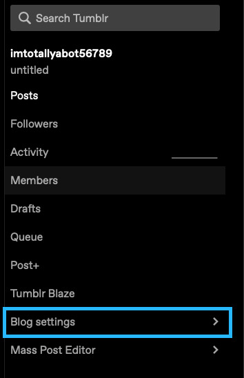
Step 4:
On that new page, select "edit appearance".
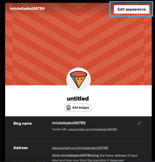
Step 5:
Get to editing! I've highlighted for you the 4 most important things you need to change to not be a bot.
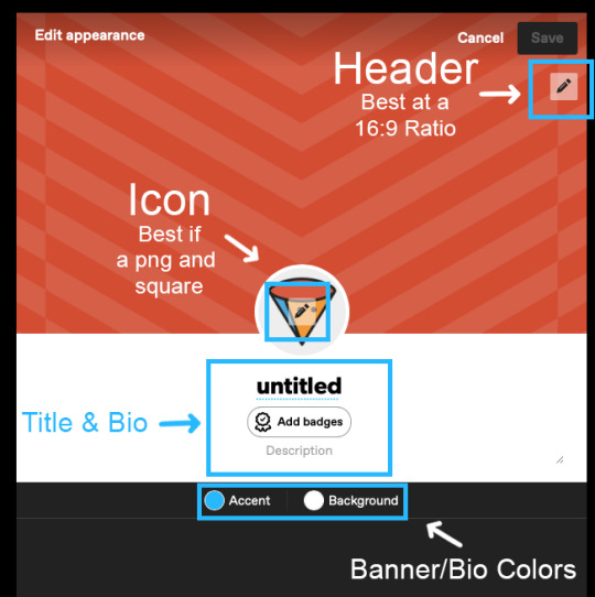
Those things are:
your icon
your header
your title & bio
you banner/bio colors
Some notes:
Your banner can be a .gif, a .png or a .jpg. It is best at a 16:9 ratio. I can't remember how big mine was, but a little bit bigger is better so that it displays decently on desktop and on mobile.
Your icon/profile picture should be a square. I think it displays at 128x128, but I don't know for sure. Use a bigger image than that though. Mine is apparently 886x886 at 72 ppi. Don't pick a photo of yourself unless there's something interesting about it (ie: you're in cosplay or something) because a regularass photo of a person looks like a bot as well. If you don't know what to pick, you can head over to picrew and use an icon generator there to create an icon. There are a lot of fun options. If you want to design your own and don't have photoshop or something like that, check out photopea which is an in browser photoshop clone. Have fun with this -- pick a character you like or a pretty image. Like whatever you want just don't stick with the default one. Use either a jpg or a png.
Your title doesn't have to be that deep. Or descriptive. A lot of people use lines from books, music, poetry, tv or movies for theirs. Mine is related to Elizabeth Warren ("Nevertheless She Persisted"). I've previously used "Death Cannot Stop True Love" and "This could be a little more sonic"
Your bio also doesn't have to be long or, like describe anything super detailed about you. The beauty of tumblr dot hell is that it is one of the more anonymous social media sites out on the internet. You could literally just put something like "Fandom Lurker". Just have something.
The banner/bio colors just change the color of the border around your header image/icon "background" and the accent color.
Step 6:
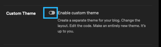
Some additional basic (optional) things to do:
Enable "Custom Theme". This gives you an actual website rather than the dumb little tumblr dot com/blog/yourblognamehere thing that you get by default. The advantages to having an actual yourblognamehere dot tumblr dot com website are numerous. I made a whole post about that with instructions on how to do that. (note that the screenshots in that post were made before the tumblr layout change that was tumblr staff copying twitter's homework). A big benefit to having your own site is that it is easier to find tagged posts on a site because the default search that tumblr has on the /blog/yourblognamehere thing is hot flaming garbage and pulls posts that don't have that tag whilst also missing ones that do. with a yourblognamehere dot tumblr dot com site you can simply go to yourblognamehere(dot)tumblr(dot)com/tagged/mycooltag and see all the tagged posts. Dooo this. you know you want to doooo this.
2. Open your ask box and turn off tumblr affiliate links. Asks can be fun. They can also be terrible. You can always turn them off later if you decide that people are being mean to you. Personally I have not had that problem in the 12 years I've been here. Maybe it's just the relative obscurity of this blog? who knows. glad for that though.
3. Add some featured tags.

This is a newer setting but I think it's fun. If you make posts (or reblog lots of posts) you can add a few tags that you use very often to this as little shortcuts for people visiting your blog.
Whew! That's all for today folks! Thanks for coming to my tumblr how to for newbies talk. I'll probably post another tumblr for newbies chat at some point.
with love and light,
💚 your local internet crazy lady slash tumblr oldtimer
Be kind to yourself and someone else today!
#tumblr#tumblr how to#how to tumblr#tumblr for new users#tumblr tips#tumblr tutorials#tumblr for newbies series#long post for ts
16 notes
·
View notes
Note
Hello! Excited to jump into the world of Tumblr and the Band of Brothers fandom! As someone who's new to this scene and a bit more seasoned (I'm over 50!), I'm eager to connect with awesome folks like you.
I'm on a quest to make new friends and engage with the community in all the right ways, but I could use some guidance. Could you help me understand the difference between the ask box and inbox on Tumblr? I want to make sure I'm using them effectively to reach out and connect with fellow fans.
Your insight would be greatly appreciated as I embark on this adventure! Thanks a bunch for your help!
Hello, Kind Anonymous Friend, and welcome! We are SO GLAD you are here!
The Askbox and the Inbox are basically words for the same thing from different angles. The Askbox is the public face of the box, and can be open or closed for people to send asks, like you did, and the inbox is the collecting point the receiver looks at to read and reply to those messages. Here's mine, right now, with this message in it!

Because I have multiple blogs, they have multiple inboxes, appearing to the right of the screen. Each inbox will show a count for the messages in it. (I always forget where this is on Mobile; it's hidden inside something.)
Asks have a character limit, which means if you'd like people to be able to send longer messages, you may also open up your blog to submissions, which basically allow any user to send you an entire post that you can then publish to your blog. These submissions also show up in your Inbox, if you have that submit feature turned on. (I do, if you'd like to experiment with that.)
Asks and submissions are a more public way to message people - they can be published, like I'm doing now, and they're often only one way.
If you'd like to have more of a conversation here on Tumblr, or you'd like your conversation to be more private, you can use the Messages feature, which starts a chat channel between two users. This is also sometimes called a dm, for direct message. These can be accessed from the Messages panel on the left-hand sidebar, or your Activity tab on Mobile.
There are a couple of settings you can turn on and off about who can send you messages. (Safety note: It is entirely possible for a bot to send Messages and we've had a fair bit of that recently. You'll know them when you see them. No one uses that many emojis.)
Just like other aspects of the site, if you don't like someone who is sending you asks or messages, both of those features have a feature you can use to block specific users.
Hope this helps! My dms are open if you have more questions!
12 notes
·
View notes
Note
hey! I have been meaning to get xkit for a while now and you seem to be well versed, any advice, pointers, or places where to look? the new layout is hell for my brain to navigate
hey! and yeah, i've been using xkit since at least 2014
it's been through a lot of updates and changing hands as people have stopped working on it and new people have started, but they've kept it called xkit for conveniences sake
the most recent version, the one that's still updating, is xkit rewritten, this is a fairly bare bones version in that it's solely about fixing things staff have done to the website + adding accessibility options - this extension will show up in your browser extension toolbar and can be modified from there. this doesn't have a fix yet to fix the twitter layout (i'll get to that), but its most recent update was fixing the fact that you can't click on urls to go to specific posts anymore - if you look under tweaks, and "restore links to posts in the post header" (or worded along those lines, on mobile atm), that'll fix that. and feel free to have a playaround with the other stuff it can do!
new xkit is the version that existed before that - this shows up as an additional icon in the tumblr header (or now the sidebar for the twitter layout). a lot of people will say don't get this, i honestly don't see a problem with it, but this was the xkit that existed for a long time and used to have extensions that modified the website just for fun, rather than solely to fix it. this version is no longer updating and it lost about half its extensions in the process, but the ones that remain still work fine, and if you care for something more whimsical, there's a couple fun extensions left, plus i just find the customisability of extensions easier with this
(new xkit and xkit rewritten can be used at the same time, and i have been using both since i got xkit rewritten - but if you only want one, xkit rewritten is definitely the way to go)
now, if you want to actually fix the twitter layout, xkit isn't what you need, there's two options for that
i use stylus, and this extension, which has so far been working fine for me (minus one slight issue in menu sizing that i fixed with a single line of code, i'll throw details to that in under the cut if it happens to you)
i'm also aware of dashboard-unfucker, which uses a different browser extension, i haven't used this personally, but i know some people have had better luck with it than stylus, so feel free to have a playaround and use what works for you!
(and the author does have a note added in that this version of dashboard unfucker only works with xkit rewritten, it has problems with new xkit, so if you wanna go this path keep that in mind)
but yeah, you should be able to find some combination of extensions that works for you, feel free to get back in touch if you're struggling to install anything, and good luck in your journey of modifying tumblr!
okay so the issue i was having is i think this extension was designed on a very specific screen size, and i'm assuming one smaller than my desktop screen? so it ended up making the menus up the top super wide when opened
i'm not a css expert (honestly if anyone who is knows how to make the other new icons that i don't care about disappear, and realign what's left back over to the right, would love to know how to do that), but i researched enough to add this line in
if you open stylus once this is installed, click manage, and then select tumblr.com, you should be taken to the source code and be able to edit it
around line 281 (after you install it, the preview version has more stuff added in) there's a section titled "Moves the menu so it appears over the top and not in the header", and several lines of code underneath that
somewhere in that list (doesn't matter where as long as it's in the brackets, i've put it under max height for organisation) add "max-width: calc(20vw);" in on a new line (minus the quotation marks, but make sure you keep the semicolon)
basically that just checks the width of your screen and tells the menu it can't be wider than 20% of the screen, which works for me, feel free to change that number according to what works for you, i find stylus very easy to modify, you just hit the save button (i don't think you even have to reload the page, but try doing that if it doesn't work) and it'll make the changes
4 notes
·
View notes
Text
ramble incoming about indie websites, neocities, and modern web design... putting below a read more because i wrote way more than i thought i would, oops.
whenever i see posts going around about how imaginative and creative old web design used to be, and how minimalist and same-y everything is now, while i do agree and wish that modern web design was more interesting and more dense with information... it's not as simple as "let's go back to how it used to be."
most old websites did not conform to modern accessibility standards, making the internet harder to use for many people, and on top of that we live in a smartphone era now where websites have to be designed in such a way that they work on both phones and computers... phones have a much smaller space to work with - kind of hard to decorate your website in pretty graphics and lay out the information in unique ways when you're designing for tiny screens in portrait resolutions!
i work pretty hard to make sure CPG displays on both mobile devices and computer monitors in at least decent fashion, and the website is absolutely less interesting looking on mobile. the sidebars are traded in for a toggle-able menu at the top of the screen (i'm considering changing it to a button that sticks to the bottom of the screen so you can open the menu without scrolling up, but i digress) and images that would float on the right or left side of articles in an aesthetically pleasing way have to be put into their own blocks between passages of text so that the text doesn't become impossible to read, squished on the sides. i'm not perfect at accessibility, nor am i perfect at optimizing the site for mobile, but i think i do an okay job with my relatively simple layout. i do this because i want my website to be viewable to people on any device, even people who aren't enthusiastic about the indie web, or desktop browsing. this would not be nearly as easy with some of the complex table layouts of the past.
it is interesting to me that a lot of people choose to simply not make their website usable on mobile and will put a notification that the site is either best viewed on desktop or doesn't work on mobile at all on the front page... there is nothing wrong with this, mind you, i'm not making a judgement of the person or their coding abilities, some people are just chilling and doing their hobbyist thing without fretting about that, or making their content for a specific audience that would mostly view from their computers, which is fine! how other people make and run their websites is none of my business. but i do think a lot could be gained from exploring mobile design and making the indie web space more accessible to mobile users, which take up a large percentage of the population. we'd probably have more eyes on us if our spaces were more accessible for people on phones. also, personally, i actually find making my site compatible for mobile with pure vanilla html/css/js a fun challenge.
at the very least, even if a website isn't built to be mobile-friendly, making sure everything is at least visible and clickable is a good thing. my website dynamically changes the size of elements based on the device viewing it, but there is also the option of making your entire website layout a set pixel width, so that it is the same on every device, people just might have to scroll horizontally or zoom in to see/click things... which is annoying but at the very least workable. i have seen some high quality neocities sites that do exactly this and i think it's a good alternative from dynamically sizing pages.
all this being said, i'm coming from the perspective of someone who actually wants their website to be seen and be used by as many people as possible because i'm providing niche game guides/tools/resources, so again, people who are just doing their hobbyist thing probably don't care as much about how many people see their site, especially outside of indie web spaces and especially neocities. it's a bit of an insular community where everyone on there is exploring their fellow users' desktop websites. also, just because a website is not workable on mobile doesn't mean people won't see it! plenty of people still use their computers to browse the web of course, it just cuts out some parts of the population. it's complicated and i'm not an expert on the subject but i don't know, i just felt like talking about it ww
TLDR; i think the ideal would be for a less corporate, more creative internet that still is accessible for disabled people and still allows the use of smartphone browsing. maybe one day when i'm more educated on code, i can make some cooler things in this regard...
#ayano.txt#ayano was here#i feel weird talking this much but i don't really have anywhere else to put these thoughts
10 notes
·
View notes
Text
updates [03/13/2023];
hello everyone!
apologies from the get go, for my silence. i know that this blog is pretty much run on a queue of various quotes / prompts / writing things / etc., and not even many people following... but to those that are here, following because you enjoy my work, i wanted to provide an update on what's going on with everything:
[to save on space, everything is below the cut. TL;DR also below the cut.]

chasing down the gods ⇨
the update is much, much later than i had previously promised. this is due to some things that happened offline, and threw my mind [and - generally - everything] into a bit of chaos. it's been hard to find inspiration, so i was giving myself some breathing space. my hope and goal is to get the chapter done this week, since the following one is already completed. i had considered posting that, but i don't want to time-skip quite yet. i don't think it's fair to all of you who have stuck with me for... 8 years, if my math is semi correct.
in the interim, i actually made this fun page for it [link also in the sidebar/drop down titled "check the page"]! my hope is to make one for every work i've posted / am working on [aka, WIPs and completed]. feel free to check it out! i hope you all like it [it's dark mode, and should be mobile friendly-ish].
now, speaking of WIPs...
untitled gd fic ⇨
if you check this blog's homepage much [i will not blame you if you don't], you will have noticed a new work was put under the right sidebar [dropdown menu on mobile]. this was titled "untitled gd fic," and i am happy to announce that i am ready to reveal some first insights! as with cdtg, a WIP page has been made. as much as I would love to share it, due to a title being... not there, the url is a bit choppy. so, to make it up a bit, here's a photo so you all can have a sneak preview:

a couple notes:
this will be multichapter
this will be close to complete / mostly completed prior to uploading beginning
current ETA for uploads starting is may 2023 [forgoing more unforeseen life issues]
none of the bigger "archive warnings" for AO3 will apply [i.e. no non-con / major character death / etc.]*
* only exception might be gore, but the plan is to not have extreme graphic details. think more criminal minds prior to it going to paramount+ and thus being able to show more.
when we are in april, my hope is to have the page itself available for everyone to check out. i am hoping to use these across the board
anything else ⇨
as said, these pages will be made for every fic. so, that includes mending bones and packed lunches and misplaced mistletoes. i will be putting links to these... somewhere. i have not gotten that far in my thought process. but, this allots a bit of time to actually work on things for this blog / towards my muse and writing inspiration, rather than just sitting and waiting.
one more thing [almost posted without mentioning this]: i will be linking to my main blog for a fic rec list. there, you'll find fics i've read and recommend for various fandoms. they were basically all wlw, but i don't know what else anyone would expect from me here. i will link both the mobile friendly edition, and the desktop version. i tend to prefer the desktop, but i know that tumblr mobile has become a lot more popular than when i first started here.
i will note: i need to update it [has not been updated since... early february, i believe], but if you want something to read, check it out!
my blog will also have a book rec page up eventually. that one takes a lot longer since that library is also expansive. if you want to go ahead and see recs now in the interim, here's the link to my blog's page with the direct links to said pages.
that's it though! i know i wrote a lot here, so:
TL;DR:
cdtg update will come as soon as life stops being messy + a fun WIP page
a new fic for a new fandom coming soon to a theater near you
pages for all previously completed works [aka all two of them] will be added to the blog very soon.
feel free to reach out, if you want to chat or anything. tumblr notifications are wonky as heck - but i will reply as swiftly as i can. hopefully i can do these kinds of updates biweekly / monthly. those of you here for the fic and the quotes, let me know if that sounds good to you.
much love - C
2 notes
·
View notes
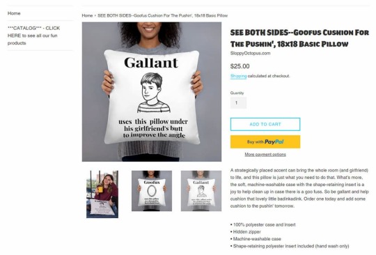
Text
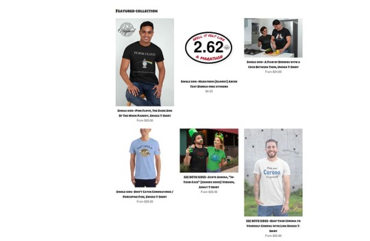
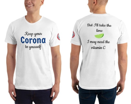
Sloppy Octopus Site Review
Sloppy Octopus Site Review
Sloppy Octopus is an online t-shirt store started by Anthony Perry in New Orleans, Louisiana, USA. Sloppy Octopus sells original and unique designs that cannot be found anywhere else. Sloppy Octopus opened its virtual doors in 2019. They specialize in designs oozing sexual innuendo but branch out into topical subjects like the current COVID-19 crisis, all the while keeping it light and humorous. Be sure to check out the Sloppy Octopus t-shirt review as well as the Sloppy Octopus site review below.
Logo
The Sloppy Octopus logo is one of my favorite things about this site. I would remove the ".com" but otherwise, I wouldn't change a thing about it. I like the colors, the name, and the cute little sloppy octopus mascot. I don't know where this character came from or what his connection is to t-shirts but it is fun, funny, and ridiculous. Maybe that's the point.
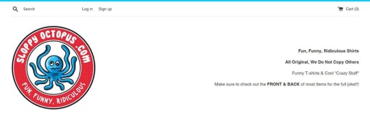
Site Design
The homepage is a bit of a mess. The logo is a little too large and while the text to the right might have some SEO benefits and tells us what the site is about, it looks cheap and dated.
Because I think the logo is cute and has impact, I would center it on the homepage and move the text to another part of the page but reduce the size by about 30%. On mobile, it is centered but far too big. You need to scroll down to see what Sloppy Octopus has to offer. Actually, this is a header area for the whole site, which means you have to scroll down to see the focus of every single page on the site. That's not ideal.
I would save the logo for the homepage only and then use the same font and colors in a simple bar across the top of the site for every other page. I think that would be enough to retain branding. Or perhaps just use a reduced size logo featuring only the mascot.
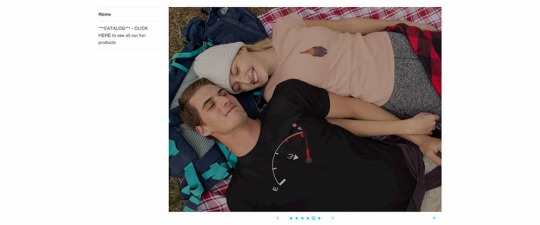
The homepage has an image slideshow which is a feature that many people think is a waste of time and space. I'm of mixed opinions about them. Probably because despite reading convincing arguments saying that they are unnecessary distractions, I am probably one of the few people who like to look at them. Still, this slideshow is wasted. It may show you the products that are on offer but it's not clear what the purpose of it is. Only one of the slides has a link. It is a button that says "Shop Now" which if you click, takes you to the shop page of the site. I think it would have been much better if the button said something like "Buy This T-Shirt" with a link to the actual product page of the t-shirt(s) in the image. All slides should link to a relevant page.
I'm going to harp on about issues I have with the homepage for another bit in this Sloppy Octopus site review so please bear with me. Check out the text in the image above, which is literally a sidebar when it should be the call to action. There is some text asking you to check out the catalog when there should be a prominent button with the words "Shop Now" or something to that effect. If it's a button people know what to do immediately and you don't need to tell them to click on it. A big button or large underlined text with the words "See all our fun products" would work too.
I'm still talking about the homepage but this problem persists in the shop pages. The lack of symmetry makes the store look like it was just thrown together and may make people question the legitimacy of the site. There is no real reason that the images can't have a consistent size. Having a consistent image style can take quite a bit more effort but I think it's less important.
I think having the featured products on the homepage is a great idea but I would move them to the top of the page and add the aforementioned call to action directly below. Basically, you will be telling the people visiting your site that if you like these products you'll probably want to see more.
Below the featured image there is some text about their "front and back joke" t-shirts. T
hat's great but there should be some images to go with that text instead of a seemingly random picture of the sea. It's a nice picture but I can't figure out why it's on the home page.
https://youtu.be/Vh0gYmC4TdE
And below that, there is a video of a "Beautiful young girl in a tight outfit holding a SloppyOctopus.com tote bag". I don't see the point of this video and what the relevance of the girl's outfit is except to get someone to view the video. I think the video could be put to better use. For example, Sloppy Octopus could offer the tote bag for free on orders over a certain amount and you could promote the video as a way to get a free tote bag, like the girl has in the video.
One last point about the homepage and it affects every other page too and that is the footer links. There is a header for two sets of links but there is only one list. I would either split the list or use the second column for something else like social media.
The product page, apart from the header and footer issues mentioned above, is well laid out and easy to understand. It might have all the information you would need to help you make the purchase on the page. It also has nice big clear images. That sidebar needs to be removed or improved, though.
Product Images
The images are a mix of mockups and actual product shots. They are all quite well done and if you can put aside the lack of standardization (which I find difficult to do), you can't complain. I would probably use the mockups as the standard thumbnails and use the photo shots for featured images, banners, header images, and social media.
Also, for the "front and back" t-shirts I would try to show both sides in the first image. You don't need to make your customers work.
The T-Shirts
Sloppy Octopus sells more than just t-shirts but as the Shirt List is a t-shirt website, I will focus on their t-shirt selection. I don't want to hurt anyone's feelings in this Sloppy Octopus site review but I think it's important to give an honest opinion. So I'll be frank here and admit that I didn't find any t-shirt that I would be interested in buying. I know I'm not the target market but despite the reasonably large selection of t-shirts in the store, I only found one funny enough to make me smile (the Corona t-shirt).
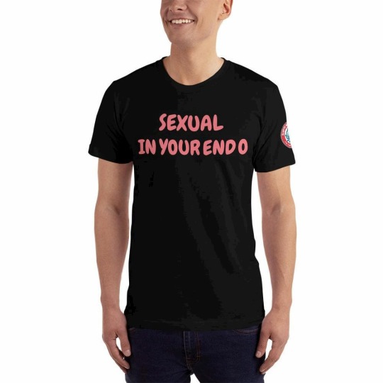
Most of the t-shirts are "front and back joke" t-shirts. The idea is that you should be shocked (or at least drawn in) by the front of the t-shirt and feel compelled to look at the back of the t-shirt. I did look at the "punchline" on the back but my reaction was either confusion or just to say "Oh" to myself. The following t-shirt is a single side t-shirt but I think it summed up the humor well for this site.
Most of the "jokes" are quite puerile. I feel they are joke ideas that a 13-year old budding comedian might think of during a brainstorming session and then discard because they are simply not that funny. I would like to reiterate that I am not the target market but I am not really sure who would be interested in most of these shirts.
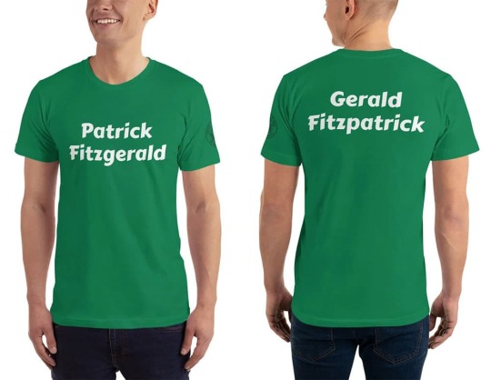
Here's an example of one of the cleaner shirts on the site, that I might wear if it were given to me, even if I wouldn't purchase it myself. I like t-shirts with simple designs. I like green t-shirts. I'm Irish. You might think it was made for me. But even though I get the joke (it's an old one), and I understand why it's funny, I don't think it's funny enough to put on a t-shirt. Perhaps if my name were Patrick Fitzgerald or Gerald Fitzpatrick... The Paddy O'Furniture t-shirts are a class above.
I was going to post some more t-shirts here but as the artwork/design doesn't really contribute anything, I'll just post a sample of the "jokes", instead.
Front: Hello. My name is Tat.
Back: I believe in tit for tat.
Front: Uranus
Back: Next door to heaven
Front: I likey gurls.
Back: Sorrry for the misspelling, it should be "Licky".
Front: 1 (In very large font)
Back: Have you ever seen 1 so
big?
I don't know know what else to say about them really. Let's move on.
Oh, I don't know if all the t-shirts are American apparel but the one I received to review was indeed American Apparel so the t-shirt fabric quality is pretty good.
Shopping Cart
Sloppy Apparel uses Shopify as their storefront and on top of a clean shopping interface and shopping cart interface, there is a variety of payment options.
Navigation
The navigation on Sloppy Octopus is slapdash. The sidebar contains the most important navigation to the store but it is just plain text. There are links at the top for "Log in", "Sign up" and "Shopping Cart". I think only the shopping cart link needs to be there. I would categorize the products in the store and then have links in the top navigation. Even if it's just categories like "T-Shirts" and "Accessories", it would be helpful.
The bottom navigation contains what it should but the design needs a bit of work. As there is a search bar on the top of every page, I'm not sure that we need a link to a search page.
SEO
They have put a bit of effort into the on-page SEO. There are a lot of keywords and keyphrases on the homepage. They probably need to be refined and strengthened a bit but overall it is a good effort. Even the product pages have lengthy descriptions. Some of the product titles could be shorter. For example this title: "SEE BOTH SIDES--Acute Angina, "In-Your-Face" (sounds good) Version, Adult T-Shirt" might work better as "Acute Angina T-Shirt" or "Funny Acute Angina T-Shirt".
A blog would help drive traffic to this store. Anthony Perry has a particular sense of humor and perhaps with a blog, he could find like-minded followers who could be converted into customers. If his blog visitors commented, it might also be a source of ideas and/or a critique of existing ideas. The t-shirt market is highly competitive so SEO is a constant struggle. Sloppy Octopus needs to do something to give it an edge over the likes of Redbubble and Cafepress.
Selection and Pricing
There is a decent selection of t-shirts (about 50) all with a similar sense of humor, so if you find one t-shirt you like you will probably find more. Most t-shirts are priced at $25 including shipping so that's pretty standard.
Social Media
There is a rarely updated Facebook page. I had to Google to find it.
Conclusion
The site itself needs a lot of work regarding layout and design. I'm undecided as to whether it would be worth it because I am still trying to figure out who would buy these t-shirts. I have a Sloppy Octopus t-shirt so I know the fabric quality and the print quality is good but I have to wonder if there is an audience willing to buy this kind of joke t-shirt. Thanks for reading the Sloppy Octopus site review.
https://www.theshirtlist.com/sloppy-octopus-site-review/?_unique_id=64634fc52a896

0 notes
Note
i just want to ask cause some of the art you reblogged recently was tagged with it, but do you ship cora and law romantically?
as a deeply traumatized person who wishes that i'd been loved instead of hurt? yeah. but not within the confines of canon, and certainly not when law is a child
there's nothing sexual about it (i personally don't see it ever being sexual), but i'm not going to sit here and let myself be separated from people who do want it to be that way. they are not lesser for it. sex is another form of intimacy, and when you are traumatized, wires tend to be crossed in hard to swallow ways. i am firm advocate against censorship of any kind, also, and believe that untraumatized people can also consume content which is not strictly palatable.
you're allowed to be uncomfortable with the ship, and you're allowed to block me, but as an actual survivor of grooming and csa, i'm allowed to cope in ways that are comfortable and not triggering for me. that's suggested by therapists. i am also, as someone with OCD, allowed to not pick myself apart over what is or is not morally pure.
it's taken me a very, very long time to feel comfortable with my trauma. the filtering on this site is quite robust now, and i suggest using it liberally if you're uncomfortable. the blocking system, also, is quite robust. you can easily find my other blogs if you look in my sidebars on desktop, but if you function purely from mobile, here they are as well: @boyish and @mniaceae . block me everywhere you must to feel comfortable.
i'm trying very hard to handle this as a simple question, but i also hope you understand my caution and stiffness. people have been doxxed for less than simply being a survivor and hurting no one.
#i don't recall what my talk tag is#but i am experiencing some chronic pain and don't care to go looking. i hope this got my point across without sounding unkind#i don't mean to sound robotic. i wish for your wellbeing and continued safety#and i hope you were asking this genuinely and for your own safety and not simply for the excuse to jump all over someone#i tried my best to format my response as though the former was the case and not the latter
1 note
·
View note
Last Seen Blogs
awthredestim
James Corck's A.T.D.I.

wtruchan
W. Truchan
alvintoah
Alvin Toah

black-seelenzauber
Black-Seelenzauber

rileydoesvoices
Riley Jean Clemens🎙️✨