#format: sewing patterns
Explore tagged Tumblr posts
Visit Tumblr Blog
Explore Tumblr blogs with no restrictions, modern design and the best experience.
Last Seen Tumblr Blogs


Fun Fact
After the announcement of the deal with Yahoo!, there were 170K signatures of unhappy Tumblr users petitioning to prevent the sale in 2013.
Text
Pride Patch Patterns: March 2025
#aroace#aroflex#aroflexible#aromantic#creator: k. a. cook#format: accessories and jewellery#format: art and crafts#format: cross stitch#format: embroidery#format: fabric art#format: needlework#format: original art#format: sewing patterns#romo aro#transgender#unit aroace#work: pride patches#work: text patches
7 notes
·
View notes
Text


BONNET
#Instagram butchered this image but thank god Tumblr doesnt mess with the format#anyway yeeh technically ya'll have already seen this Bonnet when i posted pics of me wearing it but fuck it#i really like my instalation for this :3#this is in no way meant to be a historically accurate bonnet btw do not come for me#I made the pattern entirely for Lolita fashion purposes#noah sews#jfashion#Bonnet
5 notes
·
View notes
Text
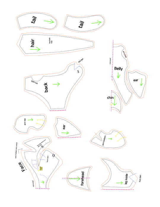
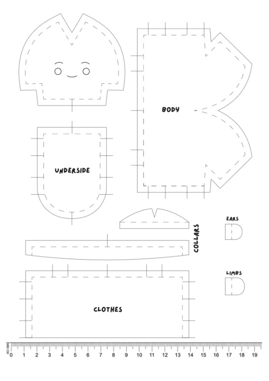
✩ Make your own Kyrii Plushie ✩
Thank you @free-sewing-patterns and @jestersneopia for asking so kindly for me to release my pattern dupe! :3 These guys are very intricate little plushies so I did my best to make something comprehensive. I also made detailed instructions which I will include after the readmore, so long post ahead!
McD's Plush Kyrii
What you will need:
•The two included images printed on 8.5"x11" (A4/Letter) paper.
•Enough of your desired Fabrics (reference the pattern size on your paper, you don't really need much at all)
✩ I recommend a short pile faux fur or other nonstretch fabric for the two body colors, and a long pile (1-4cm) faux fur for the mane and tail.
✩ You can also make the mane and tail using yarn or doll hair wefts by attaching them (sewn or glued) to a backing fabric like cotton or felt.
•Scissors or precision knife to cut fabric.
•Sewing implements (needle, pins, thimble, thread scissors, etc.)
•Thread matching one or both of your body color fabrics.
•black thread or embroidery floss for the mouth embroidery.
✩embroidery floss or thread in your desired eye colors (recommended a white for sclera, an iris color, and a black for outlines)✩OR✩buttons or safety eyes in your desired size and color.
•Stuffing (two or three handfuls of polyfill will do the job)
✩ribbon or cord to use as arm tension band and/or a loop to clip hardware like keychains and backpack hangers.
((✩ optional ))
General note: default suggested stitch length is 3mm apart unless stated otherwise.
Step 1
Print out the pattern, making sure to format your printer to use the full page with no margins. Check print preview to be sure nothing is cut off. (I made the piece inventory sheet to sort of offset any default margin weirdness but I'm new to this so let me know if it messes up.)
Step 2
Conceptualize your design and gather your materials. Are you cloning one of the plushies already out there, or making your own design? It is always good to keep reference on hand during any art project!
What special design elements are you translating to plush form? Keep in mind this pattern is small and intricate and it might be easier to omit or simplify certain design elements if you are working from something more detailed.
The cutting guide assumes 1 base color, 1 accent color, and 1 fur color with no significant shape, size, or design difference to the original McD's plushie. (Only a few fixes for symmetry and fur direction.)
Step 3
Prepare your base material for cutting. If you are doing embroidery or applique designs this may be easier while the fabric is flat and whole. Same with fur wefting, do anything like that while you have one big piece of fabric to work with. Trace the pattern pieces using chalk, heat erase pen, or some other washable marking tool using the cut guide provided. (I recommend cutting out any shape you need to add details to from the pieces inventory page, then trace those pieces on your fabric in roughly the same positions as the cut guide page.) Then do any embroidery or details you need to do while the pattern is flat.
Embroidery tips:
• Use a stiff backing piece like interfacing or felt behind your fabric to make the embroidery more durable and stiff.
•Use a back stitch or chain for lines, line in color for crisp color-changes.
•Parallel vertical lines close together catch the light and read as blocks of color best.
•Don't use stitches that are too long or loose, build stitches up diagonally like a brick pattern instead, the key is to attempt to stay parallel.
•If you are using sewing thread instead of embroidery thread, use two or three strands at once to save time.
•When you are done, cut away your backing fabric/interfacing a little outside where your embroidery stops so as not to interfere with future seams.
Step 4
Cut out your materials. If you didn't need to trace from the pieces inventory for pre-cut details, then you can just pin the cut guide paper to your fabric and cut it directly. Otherwise simply follow your trace and cut out your pieces. Be sure to keep track of which pieces go on the left and right of your plushie.
Step 5
Begin assembly by sewing all your darts first, those will be on each side of your face, inner leg, arm bottom, belly, and back pieces. Follow the blue lines that appear anywhere that says "dart" and any sew lines that create a V-like dip in the perimeter of the piece (like the arm bottom and belly pieces). Fold the seam allowance inside your seam so that the right sides of the fabric end up with a clean, unnoticeable seam. I recommend a tight, short straight-stitch about 2mm apart on darts.
Step 6
Make the loose body parts.
Sew together ears, arms, and tail by placing right sides together and sewing around based on the solid black lines in the pattern.
•Each ear will have a base color piece and an accent color piece. Make sure their shape lines up so that right sides of the fabric are together. The ear pieces are fairly flat and their sew lines should line up perfectly. Use any stitch you are comfortable with, straight stitch about 3mm apart works just fine.
•Sew one top arm piece and one bottom arm piece together for each arm. The discrepancy in their shapes creates a slight twist that gives the arm part a tube-like shape. I recommend pinning the pieces at the ends and wrist first to get the tension/gathering correct on the arm part. Any stitch works but a straight stitch will probably be easier to keep track of tension with or to rip if you make a mistake and need to retry. Keep it tight, about 2mm apart.
•For the tail, sandwich your pieces right sides together so that all the fur is tucked inside and you can sew the edges with a secure stitch like a whip or back stitch.(about 3-4mm apart) You might need to pick or brush out the fibers if they get caught in the seam.
Once you finish each piece, flip it inside out, wrong sides should remain inside while the right sides of the fabric show and all seam allowance remains inside. If any edges are having trouble flipping inside out, use a thin tool like a crochet hook or chopstick to prod them from the inside.
Stuff the 2 arms until they hold a 3D shape, firm fill recommended. Leave the other pieces in this step unstuffed.
You should have two ears, two arms, and one fluffy tail.
Step 7
Shape the face.
With the dart now sewn into the cheek, the two seams with the || registration marks should be much closer in length. Line the seam up according to the marks and fudge the rest of the length using tension. I recommend using a ladder stitch on the right sides while keeping in mind the general size of the seam allowance.
Repeat on the other side.
When you are done, your face piece should have curvy cheeks.
Step 8
Build up the head.
Connect the forehead piece to the face piece, the curve's center goes right above the nose.
Sew in the chin piece along lower jaw.
There is a bit of leeway into how long the ears will be and which angle they stick out. For best results, give it a test right side out and pin where you like the ears to stay.
The ears go into the notches on the top of the face piece, about half of the ear should fit into that notch. Sew it into that notch, any remaining ear folds around that top seam towards the forehead and is stitched down to give the ear a slight curve that helps it remain upright.
When you're finished you should have the (bald) head.
Step 9
Construct the body.
Sew the two inner leg pieces onto the sides of the belly piece.
Sew the back pieces onto the belly and inner leg piece, leaving the arm notches alone to make the arm holes. Sew all the way around the inner leg and to the center line on the belly where the dart seam sits. There may be some overlap/extra on the back piece.
Sandwich the tail between the two back pieces and sew them together. You can adjust the angle of the tail before you sew it in, the original plushie has its tail sticking up behind the back. (Tip: if you fully close the tail seam you can use a loose couple of stitches to attach it to the body to make a hanging tail that wags when you pick up and shake the plushie.)
Your current parts should be a head, a body, two arms, and the hair piece.
Step 10
Attaching the hair piece to the head.
(OPTIONAL): First, if you want to add a keychain loop like the original plushies, snip two tiny holes into the backing of your hair piece about 6mm apart and feed a small length of cord or ribbon inside to create a loop on the outside.
Leave plenty of slack on the ends of the loop for a more sturdy hold.
Secure the loop and holes with a lot of sewing and/or glue to keep the fur fabric from fraying. Stitch down the ends of the cord/ribbon to the backing of your hair piece.
Start sewing the hair piece to the head beginning with the hairline along the forehead to get it nice and clean. Next sew across the ears and down the face piece on both sides.
Your head should now have hair, with the rest of the mane hanging down behind.
Step 11
Sew head to body.
Make sure the chin piece lines up to the belly piece, the bottom of the head should line up with the rest of the back piece on either side.
Next, sew down one side of the hair piece to the back piece, connecting the bottom edge to the seam near the tail and stopping.
Leave the other side seam of the hair piece open for arm adjustment and stuffing.
Step 12
Attach the arms.
Tension Band Explanation:
The original plushies have an arm tension band inside to keep the plushie's shape and seams intact when pulling on the arms. Generally I think this can be skipped without much issue, but could be a good idea if you plan to use this as a bag hanger or keychain plush, as the arms are the extremities most susceptible to getting caught on things, and when they are secured more comprehensibly they are less likely to rip the plush apart when yanked. Not a big deal if you just plan to keep them around the house.
(OPTIONAL): If you want to install your own arm tension band, start with the plushie right-sides-out. Sew the band to one arm and pull it taught through the chest to the other arm, securing the tension band before sewing the arms into the body piece.
To sew the arms, be sure to pose them and pin them in place right-side out first. (originals usually have one arm down and the other up on their chins/waving, though they vary a lot and there are plenty of ways to position them for different expressions.)
Then, either turn insideout again or ladder stitch the arms into place.
Almost there! You should have all your pattern pieces together at this point.
Step 13
Stuffing the plushie.
Make sure your plushie is right side out, with no incorrect seams or holes other than one of the seams between the hair piece and back piece. If you need to, gently prod a crochet hook or chopstick along the backs of seams to turn them out.
OPTIONAL: To make a weighted plush, add a small mesh bag of plastic pellets or weight of your choice to the bottom of the plushie before stuffing.
Add in your polyfill, pillow fluff, yarn fibers, scraps, or whatever you decide to stuff the plushie with, paying attention to the density of the stuffing.
I recommend keeping the head and feet more densely stuffed to keep their shape while leaving the body a bit more loose for a squishable belly.
Step 14
Close up the last seam.
Using a ladder stitch, close up your last seam, pulling tight and tying off your thread at the end for a clean, invisible seam.
Now that all the seams are in, you can now brush or pick any long fibers from the hair and tail out of the seams.
The plushie is whole! You can keep it like it is, or do some thread sculpting for a more finished look!
Step 15
Thread Sculpting.
(OPTIONAL):
Using thread in the color of your body fabrics, you can pull tension at various points to create a more sculpted shape. The original had two through the face (vertically through the chin up behind the forehead, and horizontally between the corners of the eyes), and two over top of each hand and foot to look like the separation of the toes. See the original pattern pieces for precise placement.
And that's it! You should have a finished plush kyrii!
If you have any questions or concerns please contact doggyspeak. Feel free to use this pattern, share it, or edit it with or without credit.
PLEASE DO NOT SELL THIS PATTERN OR INSTRUCTIONS! IT IS BOTH NOT ORIGINALLY DESIGNED BY ME AND ALSO SOMETHING I'VE WORKED VERY HARD ON!
If you would like to see more pattern reconstructions from me, show me your finished plushies and provide feedback and suggestions to me. I would love to see what you have made and hear what you'd like to see next! ^o^
#neopets#Next time I make a new kyrii plush I will snap pictures of each step to add to the instructions!#doggyspeakart#plushie#plushie pattern#sewing patterns#bootleg#thanks for your patience I got over an illness 2 weeks ago and have spent most of my free days since then doing dentist or house stuff!!
239 notes
·
View notes
Text
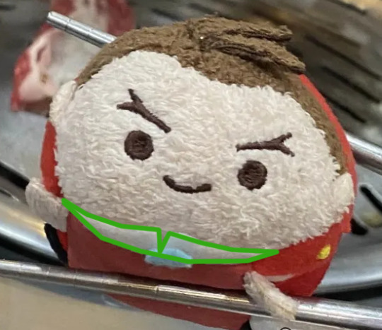
TSUM PATTERN!!!
retested it after digitizing to make sure all the seams are in order, and everything's looking fine imo :3 here's a tsum made with this pattern with susato tsum for comparison:


here's the pattern, formatted for A4 size paper :>> guides are for lining the pieces up + ears/limbs placement
if you wanted to be really accurate with printing out the pattern: in my experience, setting the custom scale to 100% in the page setup will get the ruler on the page to be 1:1 with a real life ruler
additionally: if you want the tsum to be as close as possible to official ones, they use non-stretchy fabrics for the underside part of the tsum. i only have minky but ironing on some lightweight fusible before sewing the pieces together made it non-stretchy ^^
it looks to me like they used a very thin faux suede with fusible interfacing for some structure (i could be wrong though as 1) i am not an expert in identifying fabrics and 2) i only took apart klavier tsum and no one else. but everyone else that i own seems to use the same fabric for the underside).
they also have a little bag of filler beads inside that weigh around 14.5g (bag they were in included), and the stuffing was ~8g if you wanna be REALLY accurate. anyway. enjoy!
EDIT: forgot to add that the collar pieces are more of a size/sewing guide so they'd fit onto the tsum in case your character has any clothing with lapels/collars and are meant to be changed according to your design! the smaller piece is the little piece between the face and the underside while the bigger piece is for the "lapels" (so in retrospect i should've named it that but whatever.) here's how they'd look like on the tsums for reference in case i'm not explaining well LOL

#.docx#sewing pattern#had to look up if light microsuede/faux suede was a thing#and it is! lmao#i found a listing on etsy for it#might order some from there n see how it goes. will update on my findings#also yes i weighed everything. just in case.#note for my edit: to anyone who's used to sewing that might be like. obvious#but i'm just adding an explanation in case any complete beginners would wanna try this out LOL
218 notes
·
View notes
Text


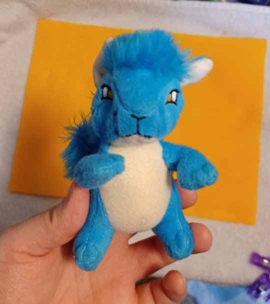
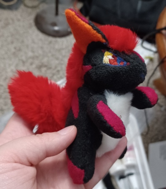
my boy finally done!!
some more pretty shots under the cut :)


my boy empty and headless
#i made this pattern from scratch so im gonna try to put it on here soon so yall can try it!!#just have to figure out how to format it first lol#dragon#sewing#plush#my art
246 notes
·
View notes
Text
Great news! After a ton of work, I've got my business's 2024 Kickstarter up and running! It's live now until Sunday, November 17.
I have a lot of projects underway that this project will help me see to fruition, including:
Embroidery/historical costume kits with good materials and accessible instructions
A digital sewing pattern for what can be a partlet, if you're feeling nerdy, or a way to bring damn cool sleeves to whatever outfit you want if we're being modern about it
A system of patterns and stencils that bring intricate freehand Elizabethan embroidery down from (imo) terrifying complexity to an accessible art project
And/yet/also, I know myself. I am a bit of an ADHD chaos goblin with chronic pain. So I've learned from Kickstarters past, and made sure to center the campaign around rewards that I can be certain of delivering. That is, this campaign absolutely will include vouchers for free or discounted copies of those projects if they're funded and they happen! But I know they will take time and definitely not arrive by Christmas 2024.
Therefore: I've been designing a bunch of new items that I can be sure of! I wanted to be able to show off my embroidery patterns in new and interesting ways, and find different methods of fulfillment that are ready to roll out the moment the campaign ends and I get your shipping information.
If you've ever wanted to get all the unique patterns I design for my Etsy shop in a charted PDF format? Backing my Kickstarter is the way you get that.
Some of my most popular designs will be available as decorative stickers, paper bullet journal-style productivity stickers, and a mug!


There are a lot of others, and I'll probably detail more about them over the next week and a half, but it's past 4am so I'll keep this relatively short. The outlines are up on the Kickstarter. Here's the one I'm the most excited about:
Motherfucking CUSTOM-WOVEN throw blankets!

I made the design myself, as the intersection of my obsessions with medieval celestial ceilings, sacred geometry, marine navigation, Tolkienian Elvish heraldry, and quilting. It's called "Mariner's Star", and I'm incredibly excited about it. If you don't know about jacquard looms and how they were 19th century punch card proto-computers, I think you're missing out.
Kickstarter link here!
It ends Sunday, Nov 17!
#haberdashery#2024 kickstarter#costuming#embroidery#historical costuming#cottagecore#blackwork embroidery#embroidery for beginners#visible mending#diy
270 notes
·
View notes
Text
To Boldly Sew: The Creation of Star Trek's Iconic Wardrobe
Gene Roddenberry’s arguments with NASA, costumes crafted from shower curtains, male characters in miniskirts, and why the gold command uniforms were actually green—this is the story of Star Trek’s groundbreaking wardrobe and the visionary work of the man behind it, Bill Theiss.
If you’d like to read the formatted article with easily accessible references, you can also find it on AO3.
During the production of the original Star Trek, the creative team faced numerous challenges, the most persistent being, unsurprisingly, the show’s limited budget. These restrictions had a significant impact on many aspects of the series, including one of its most crucial visual elements: the wardrobe.
Each week, the costume department was tasked with creating original outfits for the show’s characters. Alien civilizations had to look distinct and believable without distracting from the storyline—all while staying within a tight budget. To achieve this, the team employed clever tricks, such as repurposing and dyeing old uniforms, turning garments inside out, and even fashioning costumes from unconventional materials like vinyl shower curtains.
"Sometimes a show will call for 30 or 40 costumes," explained Star Trek’s costume designer William "Bill" Theiss. "And since we film back to back, that means I have to design, get approval from the producers and director, and construct the costumes in six to eight days." [Source]
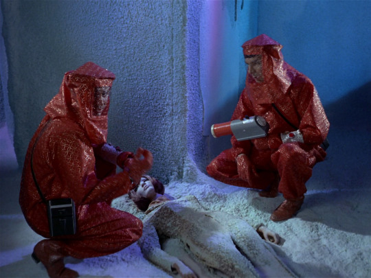
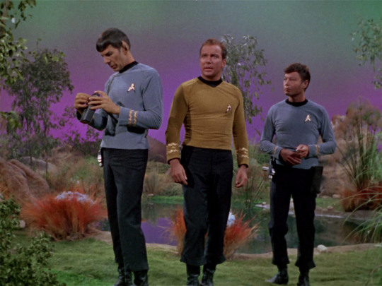
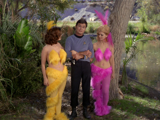
Commander Spock and Lieutenant Tormohlen don "protective suits" fashioned from shower curtains as they investigate the mysterious death of a mannequin crew member. (Season 1, Episode 4, "The Naked Time.")
Theiss was a key figure in shaping the visual identity of Star Trek’s universe. Over the course of the show’s three seasons, he designed costumes for a wide range of characters, from blue-skinned Andorians to the infamous Orion slave girls, and even the Nazi-inspired inhabitants of the planet Ekos. (Interestingly, the episode Patterns of Force, featuring Ekos, was banned from German television until 1995 due to its controversial themes.) [Source]
Theiss first met Star Trek creator Gene Roddenberry while Roddenberry was developing the show’s pilot. At the time, Theiss had gained attention for his innovative work on the science fiction play The Veldt, based on Ray Bradbury’s short story of the same name. This caught the eye of Star Trek writer Dorothy Catherine Fontana, who introduced Theiss to Roddenberry. By then, Roddenberry had already interviewed over a dozen costume designers but had yet to find someone who could bring his vision to life. Theiss’s creative approach, which often involved crafting unique costumes from unconventional materials, immediately resonated with Roddenberry. Their collaboration would continue for decades, even though, amusingly, Theiss never learned how to sew. [Source]
After the original Star Trek series was canceled, Theiss and Roddenberry remained close collaborators, working together on various projects until Roddenberry’s passing in 1991.


Left: William Theiss adjusts Susan Oliver's costume on the set of the 1965 pilot episode, "The Cage."
Right: William Theiss and Leonard Nimoy on the set of Season 2, Episode 26, "Assignment: Earth" (1968).
When designing Star Trek’s now-iconic multi-colored uniforms, Roddenberry drew inspiration from the color-coded uniforms used on American naval vessels, where quick role recognition was essential in low-visibility environments. As a former military pilot during World War II and later a police officer, Roddenberry had firsthand experience with structured, hierarchical organizations. These influences shaped not only Star Trek’s command structure but also its visual design. [Source]
Each division was assigned a distinct color: engineers, communications officers, and security personnel wore red; medical staff and scientists were dressed in blue; and command officers wore—believe it or not—green. (But more on that later.) All uniforms were paired with dark ash-colored trousers and high boots.
Star Trek is not typically associated with realism, which makes it surprising to learn that NASA was involved in the show’s production, offering advice to ensure it was "scientifically believable." Among their suggestions was the idea that 23rd-century astronauts might wear form-fitting jumpsuits. However, Gene Roddenberry dismissed the concept, humorously referring to the design as “long underwear.”
NBC, on the other hand, had entirely different priorities. The network insisted that female Starfleet officers wear more revealing attire, a demand that clashed with Roddenberry’s vision of a future where women were treated as equals to men. In the first pilot episode, The Cage (1965), Roddenberry boldly dressed female characters in pants—an unconventional choice for 1960s television. However, after much debate with the network, a compromise was reached: miniskirts. Highly fashionable at the time, they were paired with shorts and dark tights, blending contemporary trends with Star Trek’s futuristic aesthetic. [Source]
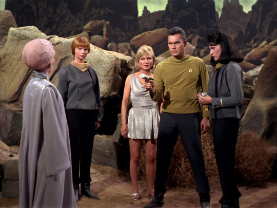
Captain Pike and a group of serious women in pants protect the heroine from an ass-headed very wise alien. The first pilot of Star Trek, "The Cage" (1965).
Years later, when NBC faced accusations of sexism and objectifying women, Nichelle Nichols, who played Uhura, defended the wardrobe choice in a BBC interview. She explained that the miniskirts weren’t unusual or inappropriate for the era:
“I was wearing them on the street. What's wrong with wearing them in the air? I wore 'em on airplanes. It was the era of the miniskirt. Everybody wore miniskirts.” [Source]
Grace Lee Whitney, who portrayed Janice Rand, echoed Nichols’s sentiment, adding that she “didn't think the women should be in pants” and that she wanted to “look like Flash Gordon” on screen. [Source]
Meanwhile, costume designer Bill Theiss had his own, more subtle approach to creating “revealing” costumes.
“He felt that revealing non-sexual flesh (the outside of the leg, off one shoulder, the back) promised that the viewer would see more — but they never did,” explained screenwriter D.C. Fontana, citing the gown worn by Lt. Palamas in Who Mourns for Adonais? as a prime example. [Source]
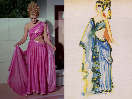
Lieutenant Palamas's "ancient Greek" dress from the episode "Who Mourns for Adonais?" alongside William Theiss's original sketch for the design.
When designing the original Star Trek uniforms, Theiss was tasked with creating something that reflected military influences while also looking futuristic and remaining inexpensive to produce. His approach was practical:
“As for where I get my ideas from… well, I don’t get them from my dreams or anything. Mainly, I get them from fabric that I see that’s available; I look for interesting patterns in the material itself,” Theiss once explained. [Source]
For the first two seasons, the Star Trek uniforms were made from velour, a newly invented fabric that was cheap, easy to maintain, and had an appealing sheen under studio lights. However, velour had its drawbacks: it tore easily (as evidenced by Captain Kirk’s frequent shirt-ripping battle scenes...) and shrank significantly after dry cleaning. Since the costumes had to be cleaned after every episode, viewers may notice that the uniforms became progressively tighter throughout the first two seasons. By the third season, velour was replaced with double-knit nylon, a more durable fabric used in professional baseball uniforms.
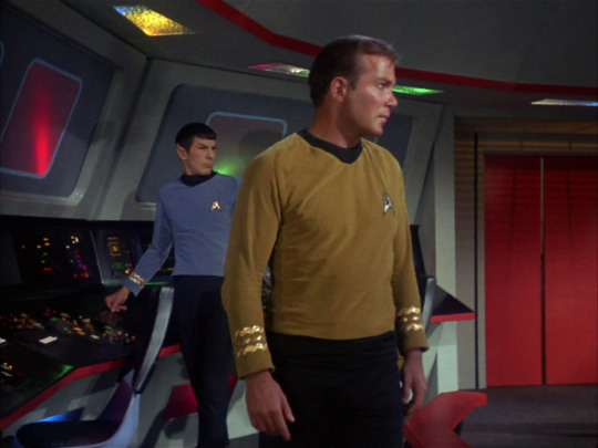
Left: Kirk's velour shirt from Season 1, Episode 10, "The Corbomite Maneuver." Right: The same shirt in Season 2, Episode 22, "By Any Other Name." Shatner is diligently sucking in his stomach.
This brings us to another interesting aspect of the original velour uniforms—their appearance on screen.
“It was one of those film stock things,” Theiss explained. “It photographed one way—burnt orange or gold. But in reality, it was another; the command shirts were definitely green.” [Source]
So, what color was Captain Kirk's uniform really? In truth, Kirk's uniform—like the rest of the command crew's—was olive green. However, under the bright studio lighting and the quirks of 1960s film stock, it appeared gold on screen. The greener hue becomes more noticeable in scenes filmed on location with natural light. The difference is also evident in photos of the original uniforms on display, such as those taken at an exhibit in Detroit, USA. In one image, taken under dimmer lighting without flash, the fabric looks closer to its true green color; in another, taken with flash, it appears more golden.


Left: Kirk's velour shirt photographed without flash—olive green. Right: Kirk's velour shirt photographed with flash—yellow gold.
This might come as a surprise to Star Trek fans, but it makes sense when you consider that Kirk's alternate uniforms—the wrap-around tunic and dress uniform—were distinctly green. This wasn’t an intentional design difference; those variations were simply made from a different fabric that didn’t react to light the way velour did.

“The problem is that a lot of my work is seen on screen for only two to three seconds, and even then, it might be in bad light or at a bad angle,” Theiss noted. “But then, you can't really justify taking two hours to light and block a scene just to showcase a costume.” The play's the thing, according to Theiss. "That's what it's really all about. It's not about the costumes." [Source]
The color discrepancy of the uniforms became an interesting challenge when animators began working on Star Trek: The Animated Series in 1973. They had to decide whether to depict the uniforms in their originally intended green or the gold shade that had become iconic to audiences.
At the time of Star Trek's release, many viewers were watching on black-and-white televisions, making it impossible for them to discern the true colors of the uniforms. At the Kirk/Spock convention, @kiscon, I spoke to a longtime Trek fan who told me she had no idea what color the uniforms were when she first watched the show as a teen. For those fortunate enough to see the series in color, however, the command uniforms became strongly associated with yellow. As a result, changing the uniforms to their intended green in Star Trek: The Animated Series would likely have confused audiences who had grown accustomed to the gold appearance on screen.
Ultimately, the gold uniform was canonized in The Animated Series and used in all fan materials until the release of the Star Trek feature films. Meanwhile, the trousers—whose color had also been slightly distorted on film—remained their original dark ash shade.
Because of these discrepancies, fans often debate which version of the uniform to follow when cosplaying or creating visual content. Many cosplayers choose to replicate the original olive-colored velour, trusting that proper lighting will naturally recreate the golden appearance seen on screen. Others opt for the now-iconic gold shade, reflecting the way the uniform has been depicted in official materials for decades.

Star Trek: The Animated Series (1973).
Ironically, NASA was right in its assumption that jumpsuits would become the norm for astronauts, and Roddenberry was forced to use them in the first feature-length Star Trek film, 1979's Star Trek: The Motion Picture. The multi-colored shirts were rejected by the studio as too garish, and the miniskirts worn by Uhura and most of the female crew members were already considered a relic of the sexist 1960s by 1979.
William Theiss, who designed the costumes for the original series, was too busy with other projects to work on the film, so Gene Roddenberry brought in a new costume designer, Robert Fletcher, who created the Starfleet uniforms now remembered as the worst in the franchise's history. In an effort to avoid comparisons to military uniforms, the studio opted for muted tones ranging from pale blue to dirty beige and nude shades. The result? The Enterprise crew looked more like spa staff than starship officers, and some background extras in nude-tone bodysuits appeared practically naked on screen. Not only did these uniforms make it impossible to distinguish the characters' ranks and departments, but they were also surprisingly impractical. The suits were sewn onto the actors' shoes, meaning they needed an assistant every time they went to the bathroom.
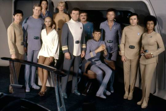
Star Trek: The Motion Picture (1979).
Luckily for us all, in the next film, Star Trek II: The Wrath of Khan (1982), it wasn’t just Khan who was filled with rage—the cast themselves rebelled and outright refused to wear the dreadful jumpsuits again.
Despite the failure of his design, Robert Fletcher remained as costume designer for the next three films, promising changes. In Star Trek II: The Wrath of Khan, the uniforms returned to a more military style, with the lead actors wearing maroon jackets with overlapping lapels that they could dramatically unbutton if their character was meant to look tired or stressed. If you look closely, you’ll notice that these maroon uniforms were actually redyed and slightly modified versions of the jumpsuits from The Motion Picture. The reason for the maroon color? It was the best shade that worked with the existing fabric from the first film. [Source]
William Theiss, reflecting on Fletcher’s designs, commented:
“Bob Fletcher is a very fine designer, and I mean that very sincerely. We don’t design the same way, and there’s no reason we should—or could. It’s apples and oranges. But my personal feeling is, if you go to a structured, woven fabric and do the kind of tailoring and structuring he’s done, it puts those costumes back, historically, 500 years, with shoulder seams and shoulder pads of that type.” [Source]
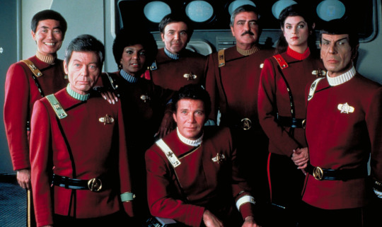
Star Trek II: The Wrath of Khan (1982). Everyone turned red with anger.
In Star Trek: The Next Generation, Roddenberry reunited with Bill Theiss, and together they decided to bring back the iconic miniskirts as part of the uniform, but with a twist—they wanted to make them inclusive. In The Next Generation, male crew members were occasionally seen wearing the same miniskirts or “scants” (a hybrid of skirts and pants), reflecting Roddenberry and Theiss’s vision of a future where gender norms no longer dictated clothing choices.
However, the social climate of the 1980s and 1990s wasn’t as receptive to this progressive idea.
“Having both actresses and actors in skirts was meant to diffuse any sexist accusations that might have been associated with designs from the old show,” Theiss explained. “It’s also fashionably probable that, 400 years from now, men would wear skants. Even so, there was usually a problem on the set,” he admits, “because some wisecracks were always made.” Theiss emphasized that he wanted his actors to feel at ease in the designs. “I won’t force an actor or actress to wear something they’re not at least 80 percent comfortable with.” [Source]

While Theiss’s designs were undeniably groundbreaking, he was known to be a challenging person to work with. Constantly preoccupied with time and budget constraints, Theiss had little patience for anyone—whether they were directors, producers, or even Gene Roddenberry himself. He was even less tolerant of people who approached him simply to praise or critique his work, or even just to say hello. His philosophy was simple: “Better to be rude than to delay filming.”
Actors, extras, and costume assistants often recalled how Theiss would dart around the set, frantically hemming, tucking, and adjusting costumes between takes. Many of the alien outfits seen on the show weren’t actually "costumes" in the traditional sense. Instead, they were often assembled from patches, ribbons, scarves, curtains, and wire, with actors being "stitched into" them directly on set. [Source]
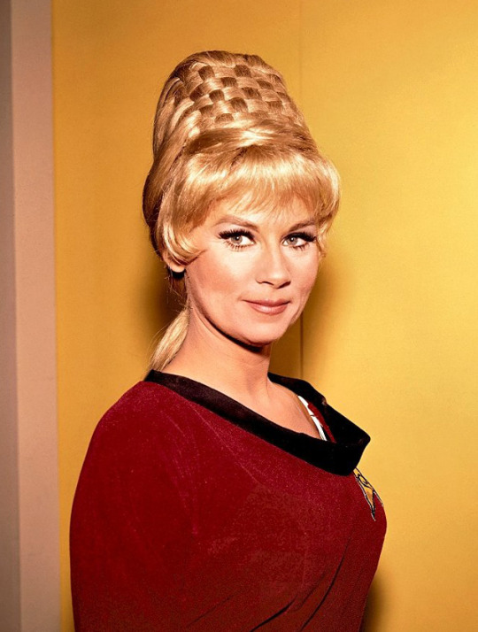
For example, Janice Rand's iconic beehive hairstyle was crafted from several wigs braided together over a cone. Grace Lee Whitney, who played Rand, recalls running back and forth between the dressing room and Roddenberry’s office with Theiss, constantly piling on more hair. Each time, Roddenberry would stare at her intensely, then declare, “Higher!” Whitney and Theiss would rush back to add more wigs until the hairstyle reached its iconic height. [Source]
One Smithsonian Institute employee, who worked with Theiss in 1992 while preparing for a Star Trek costume exhibit, recalls combing through the Paramount warehouse filled with racks and boxes of costumes. She was amazed to discover that most of the "costumes" were actually scraps of fabric neatly hung on a single hanger. Yet, when these scraps were sewn, tied, and pinned together, they became the iconic designs we now associate with Star Trek.
Andrea Weaver, one of Theiss’s fellow costume designers on the original series, remembers:
“Bill Theiss was a creative designer. His designs for Star Trek were original, rather than distilled from other sources or redefinitions of previous works. This is what I appreciated about Bill Theiss. I thought he was a truly unique and rare costume creator.” [Source]
William Ware Theiss’s contributions to Star Trek are legendary. His uniforms for both Star Trek: The Original Series and Star Trek: The Next Generation remain iconic, instantly recognizable even by those who aren’t fans of the franchise. His innovative, DIY approach to creating futuristic costumes brought a distinctive charm to the original series and left an enduring legacy.
Here are some of his most memorable designs:


Left: Season 2, Episode 11: "Friday's Child" Right: Season 3, Episode 13: "Elaan of Troyius"

Left: Season 1, Episode 15: "Shore Leave" Right: Season 3, Episode 20: "The Way to Eden"
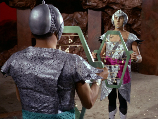

Left: Season 2, Episode 1: "Amok Time" Right: Season 1, Episode 23: "A Taste of Armageddon"


Left: Season 2, Episode 9: "Metamorphosis" Right: Season 1, Episode 6: "Mudd's Women"


Left: Season 3, Episode 5: "Is There in Truth No Beauty?" Right: Season 1, Episode 15: "Shore Leave"


Left: Season 1, Episode 23: "A Taste of Armageddon"Right: Season 2, Episode 16: "The Gamesters of Triskelion"


Left: Season 3, Episode 11: "Wink of an Eye" Right: Season 3, Episode 8: "For the World Is Hollow and I Have Touched the Sky"
#star trek#star trek tos#spock#kirk#s'chn t'gai spock#star trek the original series#star trek tng#star trek the next generation#star trek the motion picture#star trek the animated series#star trek the wrath of khan#articles#eldar of zemlya#captain kirk#james t kirk#behind the scenes#wardrobe#costume#costume design#costume department#filmmaking#gene roddenberry#bill theiss#william shatner#leonard nimoy
146 notes
·
View notes
Text
How obsessed and hyper-fixated are you with your fanfic characters?
Me:
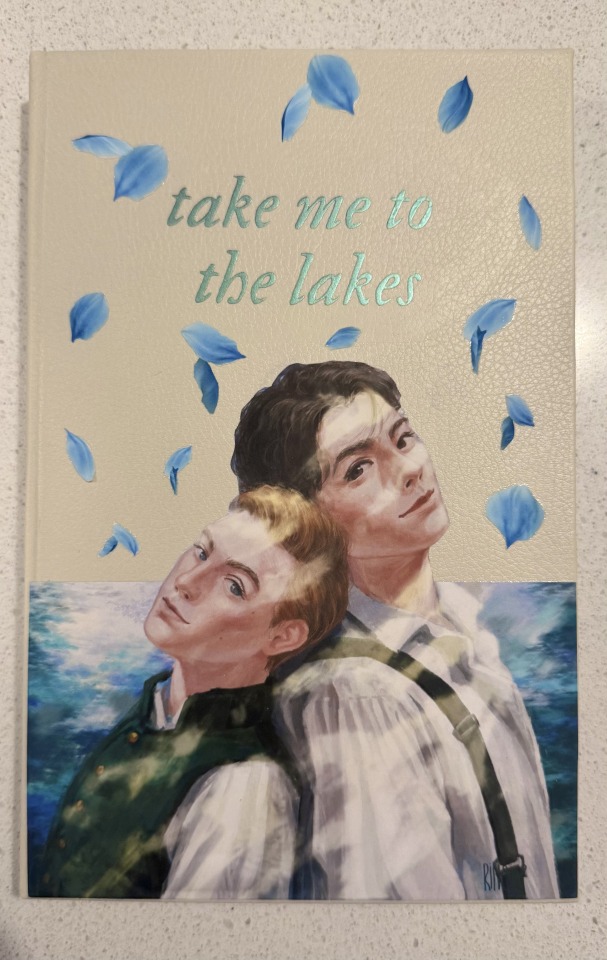
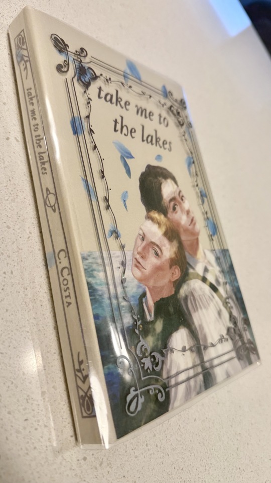
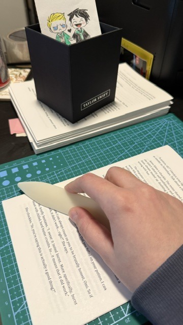
BOOKBINDING!
Ominis and Phineas now sit on my shelf along with my other books ♡
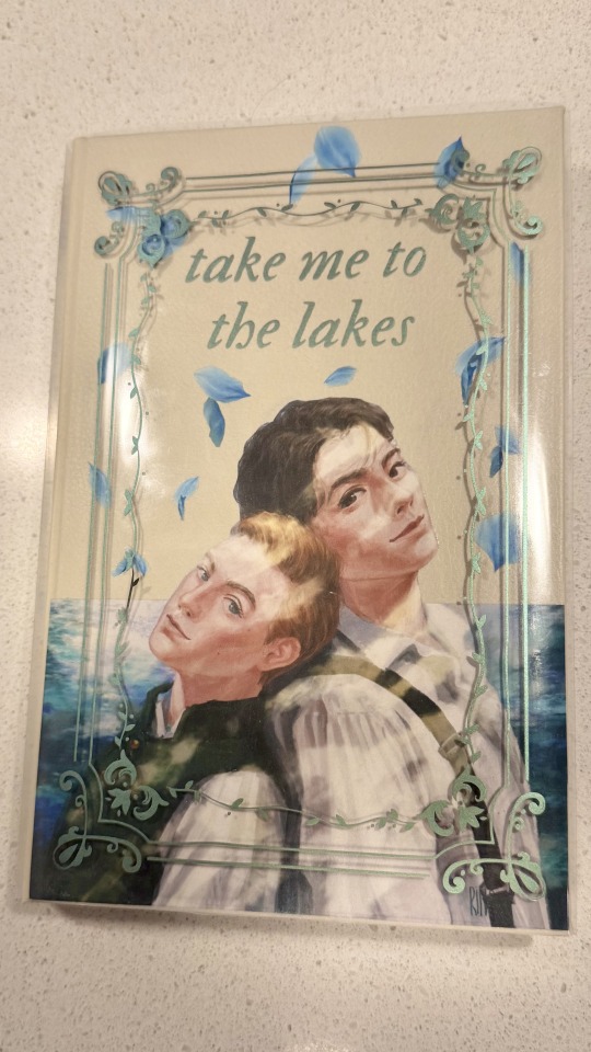
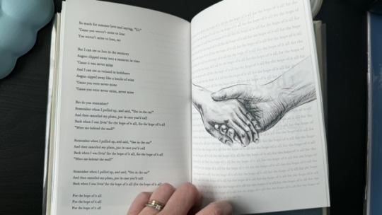
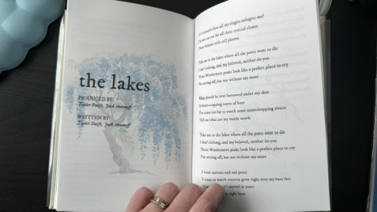
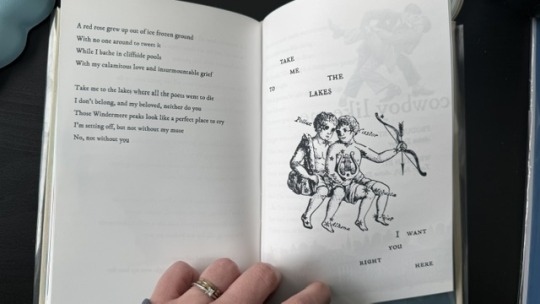
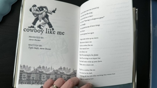
This was my first time binding fanfic, and no better choice than my own, "Take Me To The Lakes" (AO3 / Wattpad)
update (March 30): New cover art by the amazing @rinthecap 🩵
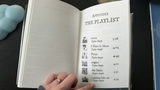
More photos and the step-by-step after the cut! (+ the appendix with Taylor Swift songs in a stylised lyric book)
I'm all about my crafty hobbies. I've been eyeing bookbinding for a while, and the algorithm finally convinced me to dive into it so I'd have a reason to procrastinate on writing
Having written a shorter fic ("Lakes" is roughly 35k words) gave me the perfect opportunity to start with something simpler.
The main tutorial used is the one by NeatFreakGeek on Tiktok.
Step 1: The typeset
I used the base template file by NeatFreakGeek, which already had the settings for printing in formatted book signatures.
With the basic body of the document formatted and ready, I started the personalization: choosing the fonts, spacing, sizing etc.
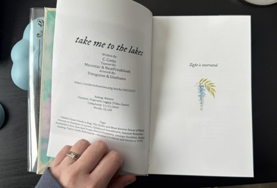
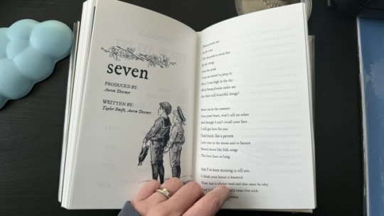
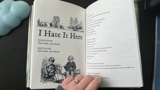
For the quote at the beginning, I chose one of the lines I wrote for Ominis + the wisteria.
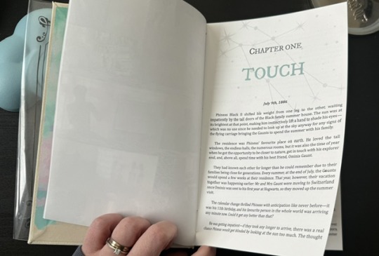
For chapter headers, I chose the Gemini constellation. (In the story, Ominis and Phineas got their middle names from the stars in the same constellation, Castor and Pollux.)
I also made the chapter titles with the HTV to give it an extra glow.
Sight is overrated. Phineas makes all my senses the very essence of life itself.
Since the story was rather "short", in order to have a thicker spine, I added an appendix with the stylised "lyric book". This was probably my favourite part of typesetting!
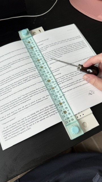
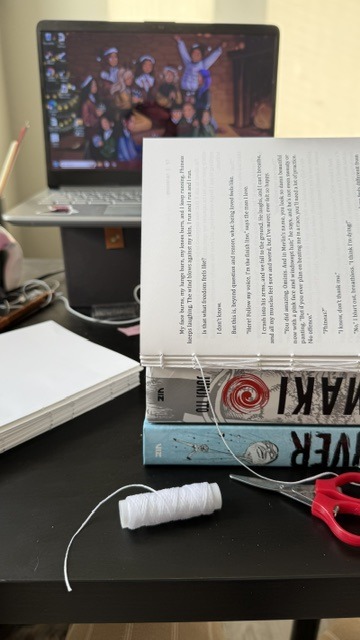
Step 2: The textblock
With a little lot of trial and error and more mathematics than expected, I printed each signature at a time, then folded each at a time, making sure it didn't get mixed up across the signatures. My printer does front/back automatically, but to print the commissioned arts as borderless, I gave myself a headache, printing it separately and manually. This step could have been done considerably faster with a laser printer and b&w content only :)
Next, it was sewing and glueing. I won't go into detail here because the video tutorials are way better at explaining. All in all, with the right tools, this was done rather easily and with barely any mistakes, so I didn't have to print anything again, thankfully.
Step 3: The endpapers
I got a scrapbook 12x12in block in this abstract colours. I had many different ideas on how to match the theme, but I ended up choosing these colourful patterns that align with how Ominis perceives the world. Then, I added the quotes from the story.
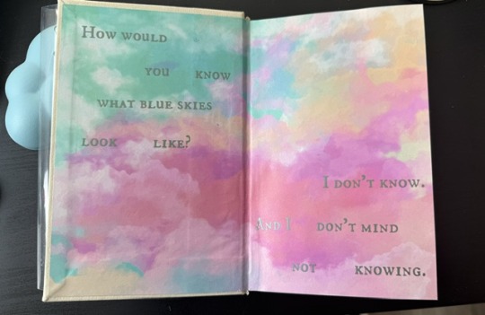
The endpaper of the front got this sky-like print to go with the dialogue Ominis and Phineas have when they are children.
P: How would you know what blue skies look like? O: I don't know. And I don't mind not knowing.
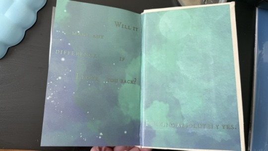
The endpaper of the back is in green x blue shades, colours that are also a big part of the story. For the quote, I chose one of their last lines when their relationship is established.
P: Ominis, you always care too much about the others... but who takes care of you? O: No one ever did. P: Let me care for you. Please. Let me love you, Ominis Gaunt. O: Will it make any difference if I say no? P: Absolutely not. O: Will it make any difference if I love you back? P: Fucking absolutely yes.
Step 4: The cover! (Yes, the most interesting part!)
This was the most challenging step in both the conception of the design (too many ideas to choose from) and the execution (I've never hated box cutters so much.)
With the basic cardboard casing cut and glued, I chose a faux leather material as a book cloth. This might be the choice I regret the most, because the glue it comes with is not that strong, so it would often unstick easily, and also, it's a bit too thick, leaving the corners a bit weird. But the final result was a bit worth it.
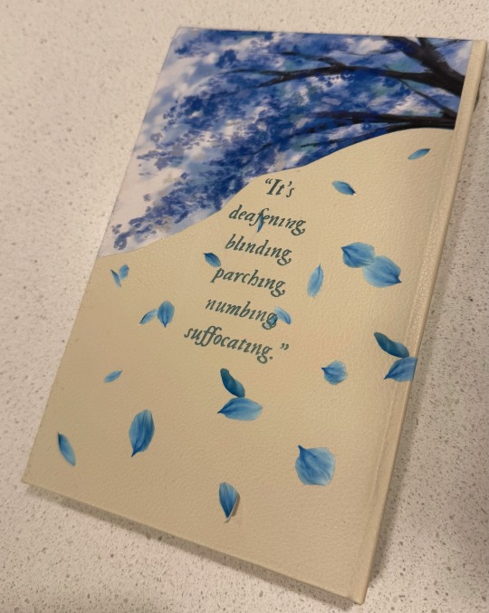
For the cover design, I printed the art with fabric HTV and ironed it on. On top of it, I threw in some wisteria petals (a reference to the song "the lakes", by Taylor Swift), and another quote of the story at the back.
I didn't have a cricut machine back then for the vynil pieces, so I ordered it online. This part was harder than I thought, once again because of the faux leather choice: as I ironed the HTV, some parts of the material melted lol.
Lastly, I decided last minute to create a clear dust jacket because the combination of the faux leather + printed HTV seemed tro fragile to be handled. I liked the final result, but ironing the HTV on the acetate was a pain lol.
In summary, this was so much fun and not as hard as I expected, craft-wise. The designing of it all took the most time just because I wanted every little detail to have a meaning :)
I made two copies to gift one to a friend, so it gave me the opportunity to make the first one and mess it up, then, for the second one, I had already learned from my mistakes.
There are many things I'd do differently for my next binds, but that's the most fun part: experimenting with materials, themes, and processes.
#I have a lot of free time#In crafts we trust#now I'm even more motivated to finish my other fics just so I can print them#my family asked for a copy now I don't know how to explain that I won't let them read my fic in a million years#hogwarts legacy#ominis gaunt#ominis gaunt fanfic#ominis x mmc#book binding#bookbinding#fanfic binding#gay fanfiction#gay#lgbtqia
74 notes
·
View notes
Text
The Why of Sewing 2: Fabric Anatomy (knits)
This post is in a series I am starting that is going to talk about concepts in sewing and fiber arts and try and explain some of the whys behind the hows.
The first thing anyone should learn about sewing is the basic building block of what fabric IS. There are two basic categories for fabric: Woven and Knit. Today I am writing about knit fabric.
Knit fabric is made up of rows of interconnected thread loops. Some knitting machines work back and forth to make a flat fabric, but it is more common for knit fabric to be made in a big tube which is then cut open and the edges sealed. This is the selvedge edge for your knit fabric, but beware! Sometimes when the edge is cut they do not follow the grain correctly.
There is a lot of variety in how the loops can look, but the most basic pattern in knitting is stockinette stitch where the right side of the fabric looks like little v shapes stacked on each other, and the reverse looks like little bumps. This is true in both hand knitting, and the manufacture of knitted cloth. Most fabric used in tshirts and sweatshirts are stockinette. Tshirt fabric is known as jersey.
Below you can see the Right and Wrong Side of a hand knit sweater


Here is a 8x photo of a cotton lycra blend tshirt jersey - it has the same vertical rows of Vs as the handknit sweater.

All knits are at least a little bit stretchy. The loops of fabric just have a lot more movement than the 90 degree angles of woven fabric. Some knit fabric is VERY stretchy, and some is just a little. Fiber content makes a big difference, but I think tackling that is a whole other post.
Knit fabric can be tricky to cut and sew because of that stretch.
The grain of knit fabric is also important to be able to determine. In addition to grain is the DOGS (Direction of Greatest Stretch) this is usually on the cross grain, or perpendicular from the columns of V shaped stitches you see close up. Generally knit fabric is used with the DOGS going around the body. It is especially important for things like neckbands to be cut on the DOGS, as they function like bias on a woven fabric.
below from Left to right I am stretching cotton lycra jersey on grain, on the cross grain (I don't have big enough hands to stretch it to its full ability), and on the bias.


When you cut knit fabric a rotary cutter, mat and pattern weights will help keep the fabric stable and cuts precise, unlike shears and pins. Pins can also cause runs in knit fabrics (like pantyhose). The cut edges of most knits do not fray, which is a big advantage to this type of fabric. This is not true of big chunky sweater knits and handknits. However knits do roll on the edges and the more you handle them, the more they will roll. It will usually roll on both selvedge and the cut edge, but in opposite directions. Generally the best way to handle this is to not be rough with your fabric and when cutting weight down your edges or even tape them down to the cutting mat with masking tape.

Knits also need special sewing machine needles. There are two main types of needles used on knits a ball point needle and a stretch needle. In general a stretch needle is used on fabrics like spandex which are VERY stretchy and difficult to pierce. Most knits do okay with either type, but if you are ever trying to sew a knit and getting lots of skipped stitches or loops on the back try a different needle. Sometimes a microtex needle is used on very fine knits as well.
What is happening to the fabric to make those skipped stitches and thread nests so ubiquitous to beginners trying to work with knit fabrics? The fabric is not being correctly pierced by the needle. Instead of the needle passing through the fabric stretches and travels down into the machine, even a tiny bit of this can disrupt stitch formation.
This image of thread nesting is on a woven fabric, but it will look the same on a knit as well. Citation Link

if you are pretty sure you have the correct needle but you are still getting lots of thread nests, especially at the beginning of the seam, put a bit of tissue paper under the fabric.
Sewing with knits also means considering the stitch you use. A straight stitch seam will break when the fabric stretches because the thread does not stretch. On a regular machine you need to use a narrow zigzag, lightning stitch or a three step zigzag for constructing the seams. For hemming you can use the stitches above, or use a twin needle or the triple stitch on your machine. These stitches vary in how stretchy they are so I recommend trying some out. I almost always choose a narrow zigzag for construction and a three step zigzag for my topstitching.
The other barrier many sewists find when sewing with knit fabric is that on an everyday machine the fabric tends to stretch under the foot. There are a few ways to avoid that. 1. Careful handling - this is never going to be the only solution but rough handling you knits will distort them no matter what else you do. 2. Reduce your foot pressure. Not all sewing machines have this ability, check your manual. 3. Use a walking foot - this foot essentially is like having feed dogs on top and on the bottom of the fabric so it moves smoothly through the machine. It is a very useful thing to have. Beware of off brand walking feet, they might be fine, but a bad walking foot can damage your machine. 4. Use a water soluble double sided tape to stabilize the seam before sewing. This is my least favorite solution, but a tool in the arsenal none the less.
There is a lot to talk about when we talk about knits, but I also don't want this to be a million miles long. Your key takeways from today are the following: How to find the grain and DOGS on knit fabrics, choosing the right needle and stitch for your fabric, and how to handle the fabric under the machine to prevent stretching.
#quilting#sewing#sewing tutorial#fabric#textile art#sewing tips#sewing techniques#the why of sewing#fabric grain#sewing knits#knit fabric
85 notes
·
View notes
Text
Excerpts:
"The convenience of instant answers that LLMs provide can encourage passive consumption of information, which may lead to superficial engagement, weakened critical thinking skills, less deep understanding of the materials, and less long-term memory formation [8]. The reduced level of cognitive engagement could also contribute to a decrease in decision-making skills and in turn, foster habits of procrastination and "laziness" in both students and educators [13].
Additionally, due to the instant availability of the response to almost any question, LLMs can possibly make a learning process feel effortless, and prevent users from attempting any independent problem solving. By simplifying the process of obtaining answers, LLMs could decrease student motivation to perform independent research and generate solutions [15]. Lack of mental stimulation could lead to a decrease in cognitive development and negatively impact memory [15]. The use of LLMs can lead to fewer opportunities for direct human-to-human interaction or social learning, which plays a pivotal role in learning and memory formation [16].
Collaborative learning as well as discussions with other peers, colleagues, teachers are critical for the comprehension and retention of learning materials. With the use of LLMs for learning also come privacy and security issues, as well as plagiarism concerns (7]. Yang et al. [17] conducted a study with high school students in a programming course. The experimental group used ChatGPT to assist with learning programming, while the control group was only exposed to traditional teaching methods. The results showed that the experimental group had lower flow experience, self-efficacy, and learning performance compared to the control group.
Academic self-efficacy, a student's belief in their "ability to effectively plan, organize, and execute academic tasks"
', also contributes to how LLMs are used for learning [18]. Students with
low self-efficacy are more inclined to rely on Al, especially when influenced by academic stress
[18]. This leads students to prioritize immediate Al solutions over the development of cognitive and creative skills. Similarly, students with lower confidence in their writing skills, lower
"self-efficacy for writing" (SEWS), tended to use ChatGPT more extensively, while higher-efficacy students were more selective in Al reliance [19]. We refer the reader to the meta-analysis [20] on the effect of ChatGPT on students' learning performance, learning perception, and higher-order thinking."
"Recent empirical studies reveal concerning patterns in how LLM-powered conversational search systems exacerbate selective exposure compared to conventional search methods. Participants engaged in more biased information querying with LLM-powered conversational search, and an opinionated LLM reinforcing their views exacerbated this bias [63]. This occurs because LLMS are in essence "next token predictors" that optimize for most probable outputs, and thus can potentially be more inclined to provide consonant information than traditional information system algorithms [63]. The conversational nature of LLM interactions compounds this effect, as users can engage in multi-turn conversations that progressively narrow their information exposure. In LLM systems, the synthesis of information from multiple sources may appear to provide diverse perspectives but can actually reinforce existing biases through algorithmic selection and presentation mechanisms.
The implications for educational environments are particularly significant, as echo chambers can fundamentally compromise the development of critical thinking skills that form the foundation of quality academic discourse. When students rely on search systems or language models that systematically filter information to align with their existing viewpoints, they might miss opportunities to engage with challenging perspectives that would strengthen their analytical capabilities and broaden their intellectual horizons. Furthermore, the sophisticated nature of these algorithmic biases means that a lot of users often remain unaware of the information gaps in their research, leading to overconfident conclusions based on incomplete evidence. This creates a cascade effect where poorly informed arguments become normalized in academic and other settings, ultimately degrading the standards of scholarly debate and undermining the educational mission of fostering independent, evidence-based reasoning."
"In summary, the Brain-only group's connectivity suggests a state of increased internal coordination, engaging memory and creative thinking (manifested as theta and delta coherence across cortical regions). The Engine group, while still cognitively active, showed a tendency toward more focal connectivity associated with handling external information (e.g. beta band links to visual-parietal areas) and comparatively less activation of the brain's long-range memory circuits. These findings are in line with literature: tasks requiring internal memory amplify low-frequency brain synchrony in frontoparietal networks [77], whereas outsourcing information (via internet search) can reduce the load on these networks and alter attentional dynamics. Notably, prior studies have found that practicing internet search can reduce activation in memory-related brain areas [831, which dovetails with our observation of weaker connectivity in those regions for Search Engine group. Conversely, the richer connectivity of Brain-only group may reflect a cognitive state akin to that of high performers in creative or memory tasks, for instance, high creativity has been associated with increased fronto-occipital theta connectivity and intra-hemispheric synchronization in frontal-temporal circuits [81], patterns we see echoed in the Brain-only condition."
"This correlation between neural connectivity and behavioral quoting failure in LLM group's participants offers evidence that:
1. Early Al reliance may result in shallow encoding.
LLM group's poor recall and incorrect quoting is a possible indicator that their earlier essays were not internally integrated, likely due to outsourced cognitive processing to the LLM.
2. Withholding LLM tools during early stages might support memory formation.
Brain-only group's stronger behavioral recall, supported by more robust EEG connectivity, suggests that initial unaided effort promoted durable memory traces, enabling more effective reactivation even when LLM tools were introduced later.
Metacognitive engagement is higher in the Brain-to-LLM group.
Brain-only group might have mentally compared their past unaided efforts with tool-generated suggestions (as supported by their comments during the interviews), engaging in self-reflection and elaborative rehearsal, a process linked to executive control and semantic integration, as seen in their EEG profile.
The significant gap in quoting accuracy between reassigned LLM and Brain-only groups was not merely a behavioral artifact; it is mirrored in the structure and strength of their neural connectivity. The LLM-to-Brain group's early dependence on LLM tools appeared to have impaired long-term semantic retention and contextual memory, limiting their ability to reconstruct content without assistance. In contrast, Brain-to-LLM participants could leverage tools more strategically, resulting in stronger performance and more cohesive neural signatures."
#anti ai#chat gpt#enshittification#brain rot#ai garbage#it's too bad that the people who need to read this the most already don't read for themselves anymore
38 notes
·
View notes
Text
Pride Patch Patterns: May 2025
As I post weekly pride patch patterns on Patreon, here’s a monthly round-up for non-subscribers! Folks who need help with materials, stitching, finishing or attaching patches should check out my tutorial master page. Previous patterns are available at my pattern gallery. Continue reading Pride Patch Patterns: May 2025
#agender#aroflex#aromid#creator: k. a. cook#format: accessories and jewellery#format: art and crafts#format: cross stitch#format: embroidery#format: fabric art#format: needlework#format: original art#format: sewing patterns#idemromantic#oriented aroace#queer#quoiromantic#work: pride patches#work: text patches
4 notes
·
View notes
Text

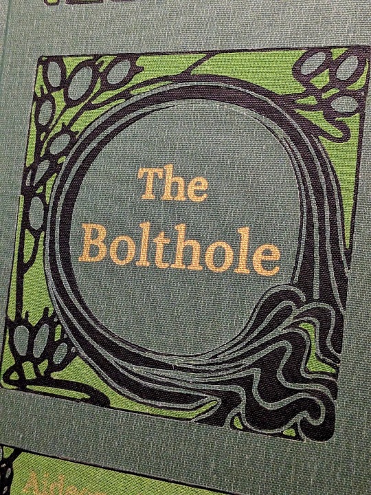

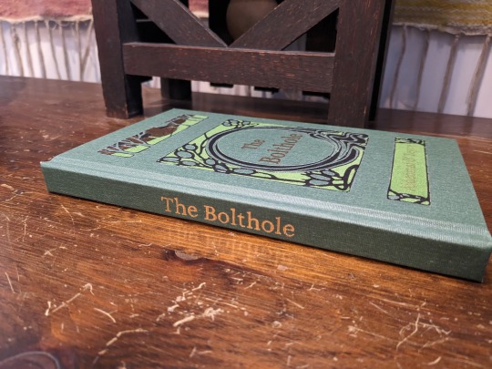
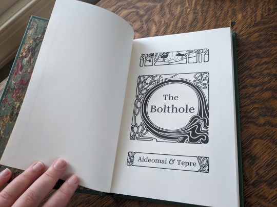
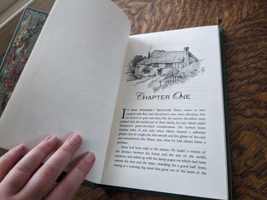
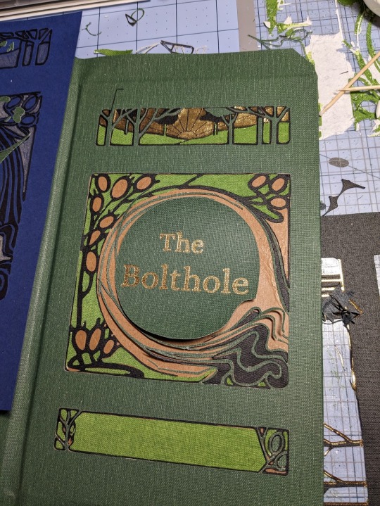
The Bolthole by aideomai, Tepre, and GallaPlacidia
I'm absolutely thrilled to finally share my first fic bind here on Tumblr! I completed this bind back in November, and it introduced me to so many wonderful people.
You can find pictures and detailed explanations of my process under the cut.
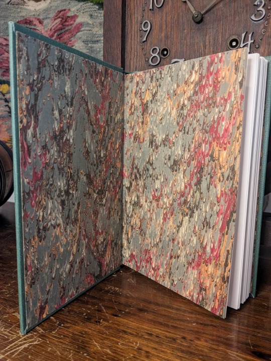
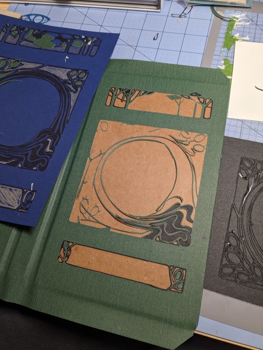
This is "The Bolthole" by Aideomai, Tepre, and (formerly) GallaPlacidia on Ao3. The cover design is adapted from "The Little Brother" (1902) by Josiah Flynt. The typeset is my own.

I fell in love with this cover the moment I saw it, and wanted to try to recreate it with book cloth. As a hobbyist book binder, I like to try to revitalize older designs from the public domain. There are so few copies of this book left in the world, so I thought it would be fun to give it new life as the cover of a contemporary story.
The cover is made out of three different colors of book cloth from the Allure and Verona lines. The book cloth and endpapers were bought from Hollander's.
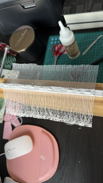
I used my Cameo 4 and a strong tack mat to cut the design out of each color of book cloth. I then assembled the pattern like a puzzle. It was MUCH harder than it sounds! Some of the pieces were incredibly thin and fragile, and they were difficult to keep track of.


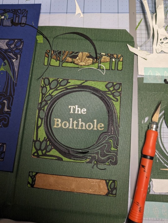
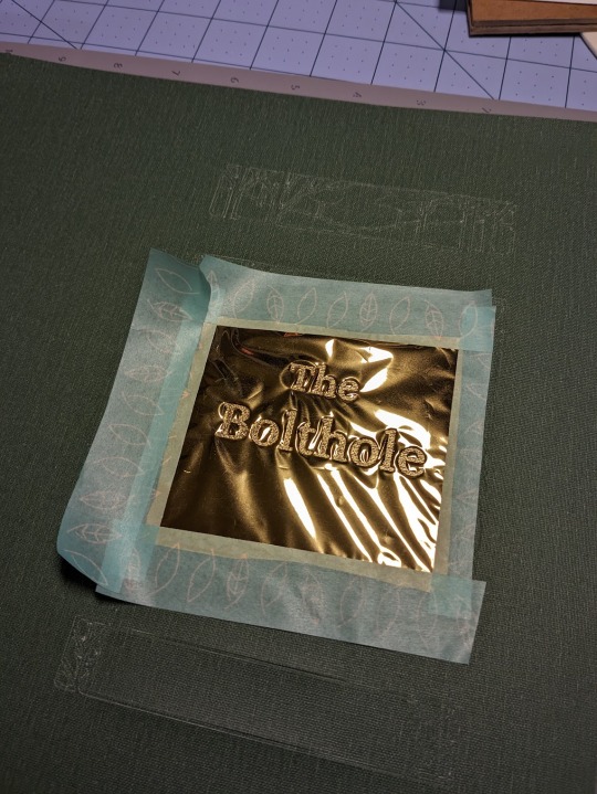
For the foiling, I used my Cameo 4 and the We R Memory Keepers fine tip foil quill for everything but the spine, which I did by hand. I foiled immediately after I cut, without removing my mat from the machine. This helped me line everything up. It did not, however, prevent me from sweating bullets as my machine worked.


This method was, frankly, torture, but I'm really glad that I tried it. Now that I've had a nice long break, I'd like to try it again soon. I love running my hands over this book, and the texture of the book cloth feels wonderful under my fingertips. I do, however, have a few words of caution. Do not try this out unless you have book cloth to burn! Here are some pictures of just a few of my failures.


The Cameo 4 is not your friend. Your cut-outs can and will get fucked up for no reason. If the mat isn't sticky enough, or the blade isn't sharp enough, or the fabric doesn't adhere properly, your design could get completely shredded. I strongly recommend that you avoid Verona book cloth, or anything with a paper backing and loose fibers. It was absolute hell to work with. When it wasn't shredded by the machine, it was fraying like crazy. Acrylic coated cloth is the way to go if you want clean lines. And, you know, your sanity intact.
This was my most challenging bind to date, but I learned a lot! Aside from experimenting with book cloth, automated foiling, and my Cameo 4, it was also my first time formatting, printing, and sewing a text block. I'm incredibly grateful for all of the online tutorials and wonderful people who helped me make this bind a reality!
#book binding#ficbinding#fanbinding#fanfic binding#drarry#the bolthole#harry x draco#my binds#haxkattpress
333 notes
·
View notes
Text


Made this little guy!!
I used this pattern to make the full body!
I customized the tail fins, making them bigger to fit the body proportions, and sewed them on in a different way than the video.
And I used a different formate to make the eyes.
Didn’t time myself making it. So, not sure how long it took me. But I’m pretty please with how it turned out!
#crochet#amigurumi#crochetblr#crochet plushie#plush#animal plush#crochet animals#goldfish#goldfish plush#soft toy#plush toy#plushblr#handmade plush#fiber art#crochetflav#my plush
172 notes
·
View notes
Text
To Live In Color Bookbinding Tutorial(s)
Here's how I turned To Live In Color into a book.
This fantastic book binding tutorial by @armoredsuperheavy was incredibly helpful and insightful. It taught me how to format the fic in a Word document. I cannot overstate how detailed and wonderful this tutorial is.


After winning a battle of wills against Word headers, I sent the PDF to a printer in order for it to be printed in color. Shockingly, color was important for the artwork in a story whose title and main theme is about color. I used Armored Super Heavy's method for sewing signatures together using linen ribbon for stability. I took no chances on my masterpiece.


I used this bookbinding tutorial from youtuber Bitter Melon Bindery as a guide for the construction of the book. Two cutting boards still covered in cellophane and two clamps as my bookbinding press were my pressing tools. Is it fancy? No. Is it cheap and does the job? Yes. After the spine was glued, I cut the edges for a smooth, polished look using a box cutter and metal ruler. This was the most nerve wracking step, and the one I struggled with the most, honestly. Mistakes were made. Fine grit sandpaper was key for fixing them and achieving a smooth, professional look. Then I added mull (or the closest fabric I could find acting as mull) to strengthen the spine. I made two copies of the book, one for myself and one for @sparrowmoth, who was the biggest cheerleader for this fic. Seriously, their comments (and friendship which started because of this fic) were so wonderful that I'm gifting them a physical copy.


I measured and cut the book board. The cover is meant to look like Wylan's waistcoat in the fic, Cinderella blue with eye catching silver and blue embroidery. Sparrowmoth helped me design an embroidery pattern to fit the dimensions of the cover. The final design is an adjusted version of this embroidery pattern from Bella Savory on Etsy. I did buy the pattern, for the record. I would have liked the pattern to swoop diagonally across the cover (as pictured above on paper), but the narrow length made this difficult.
I cannot tell you how many times I drew this pattern. First, it was copied onto paper and also copied onto the reverse side of the paper. Then, it copied (backwards) onto the interfacing which was then ironed onto the wrong side of the blue satin used for the cover. All of this was a spacial awareness nightmare for me to make sure it was on the correct side of the cover and facing the correct direction. Woof. Finally, I held the satin up to the light and retraced the pattern AGAIN with pen onto the front of the satin.


I have no real experience embroidering, other than using a simple back stitch once for cosplay. But I looked up stitch tutorials online and made two practice samplers (once exactly as instructed by the original pattern I bought, and once with the modified pattern, satin fabric, and satin silver floss) before attempting the final version. It's not perfect, but I am very proud of how it turned out.


I then turned the satin fabric into bookcloth by using a double sided adhesive (shown with the square paper) and blue tissue paper. The color was not necessary because it's not seen when finished, I was just being extra. The adhesive had the added benefit of securing the back of the embroidery. Then I glued the cover boards. The glue warped the boards, but they were easily fixed by placing the text block between and pressing it down overnight with a heavy textbook.


Unfortunately, the corners were a mess. The satin frayed easily despite being glued and I was forced to use metal corner covers to prevent the fabric from damage. The corner covers actually worked in my favor. Now I like the look of them. They definitely make the book seem more polished and fairy tale fancy.


Finally, I glued the textblock to the cover, completing the book. It's not perfect by any means, but it is my masterpiece. Every part of the book (except for Sparrow's artwork) was created by me. I wrote the story, formatted the text, created all of the other artwork including the title image with the butterflies, and embroidered the cover. It was a labor of love from beginning to end. I am so proud of my fanwork-turned-book.

45 notes
·
View notes
Text
mini 70s fashion resource masterlist
I'm working on bigger projects (that might never see the light of day because I can't figure out formatting, links and other stuff) but I wanted to provide some sources for those interested in fashion, specifically for writing 70s fashion in fics and books.
I love 70s fashion and it hurts my heart to see so many characters in bell bottoms, bright colors, converse and leather when those weren’t even the biggest parts! I like to use pictures from real people and their lives, as well as magazines. I like to stay away from the costume style that’s often portrayed in movies.
these are sorted from my favorite to least favorite
Reddit- Yeah yeah I know it’s reddit, but there are so many good resources!
r/TheWayWeWere is MY FAVE!!!! It’s literally random people’s pictures from any era! Their focus is on people in everyday life, so it’s perfect. Go to this subreddit, type your desired era or use the flair and you have hundreds of real life pictures from real life people in your desired era.
r/70s is a lot, it’s everything 70s so you get some good stuff and some bad stuff, but it’s authentic for sure
r/vintagefashion and r/vintage a lot of this is really good, but some can get gimmicky, overall they are good resources
r/TheGoodOldDays hit or miss but it’s okay
r/fashion and r/mensfashion hard to sort through, a lot of the advice tends to be a little gimmicky
Sewing Patterns- A lot of people sewed their own clothes in the 70s
Readily available, easy to find, with the variety you can find super popular stuff and less popular stuff
Simplicity Sewing Pattern, Vintage Sewing Pattern Company, Vintage Sewing Patterns Wiki, there’s SO MANY websites out there
Magazine articles from the 70s- this is the advice a lot of people followed so it’s good for me!
A big big reason for this being second is that it’s a bit inaccessible, I haven’t had much luck but I am not the most technologically advanced individual
The best way to view these is at a library that has them archived on microfilm, if you have a good, large library near you then you might be in luck
There are some archived and digitized online, but they are mostly behind a paywall or incomplete pieces.
Large magazines have vaults, like TIME and Vogue, but some they can be a representation of the upper class and the very rich which isn’t the target of most authors
Movies/shows from the 70s- ehhh pretty hit or miss. movies from the 70s tend to be a pretty idealistic representation of what people were wearing. it HEAVILY depends of what kind of show
Movies set in the 70s- this is a super broad one so some are great! some are bad! i would suggest looking at other sources, at least for a while, once you notice the trends then you can notice what’s realistic and what isn’t.
#marauders#marauders era#marauders fandom#1970s#1970s fashion#70s outfit#70s clothing#1970s outfit#vintage clothing#70s fashion#james potter#sirius black#remus lupin#peter pettigrew#lily evans#resources#fashion resources
88 notes
·
View notes
Text
(Slideshow with voiceover, transcript below - it's in my weaving video tag but there are no loom noises.)
An attempted animated explanation for the doubleweave warp I'm putting on the loom today! Or tomorrow or something. This is for the X shaped scarf project that I solicited feedback on. The actual colours will be one "scarf" solid navy/black (it's technically navy but it looks black in most lights) and one "scarf" yellow&green houndstooth. But those weren't the colours of card in my stationery box, so you get bright blue and yellow instead.

Feedback very very much welcome on how much sense this does/ doesn't make, especially after I have warped the loom and filmed the actual weaving process too. I don't know if that will be clearer or less clear, my instinct is that neither format will make complete sense without the other.
Transcript with some slides under the cut (click for it):
My next weaving project is an X shaped scarf that will look like two scarves intersecting lengthways. There's no cutting or sewing, it is woven like this. It cannot be taken apart, the two pieces of cloth pass through each other down the middle.


These are the warp threads longways on the loom. To weave, you need to raise every other thread so that the horizontal weft can go over-under-over-under through the space between them, called the shed.

We start with a blue shed. Every other blue thread is raised all the way along, ready to be woven by a blue weft, but in the left half all the yellow threads stay down - they won't be woven because there is no over-under pattern happening. They form a solid layer below the blue. In the right half, the yellow threads are all up forming a solid layer above the blue instead, but they still don't get woven.

Now for a yellow shed. The yellow threads now make the one-up-one-down pattern all the way across, being woven by a yellow weft. The blue threads are all above the weft on the left side, below the weft on the right side, again making solid layers without being caught by the weft.

Back to a blue shed. The opposite set of blue threads are now raised - in the first shed we raised all the odd ones, this time it's all the even ones. but as always with the blue weft, the left set of yellow threads are solidly underneath, the right set are solidly on top.

Last is the second yellow shed, raising all the even yellow threads between the solid layers of blue.
"Odd blue shed, odd yellow shed, even blue shed, even yellow shed" completes the pattern and we go round again. (The video repeats the slides with no further audio.)
17 notes
·
View notes