Photo
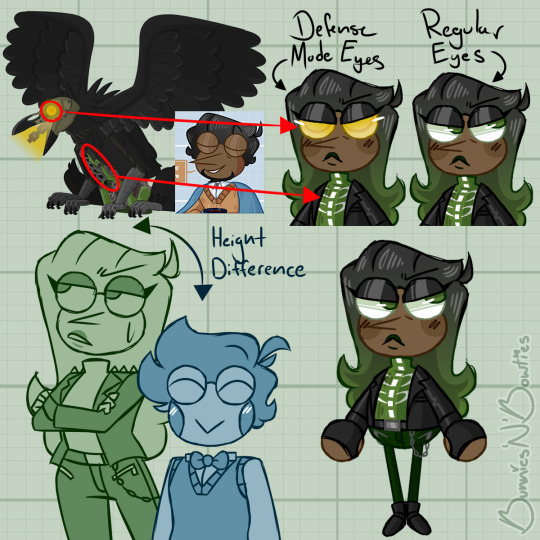
⋆ You guys need to stop giving me IDEAS djhsbdjhs-/j I instantly had to start doodling a concept for....uh, her/them. (I can’t come up with a name for her.) I’m sure this won’t be her final look, but I tried my best with what I had. I’ll explain her design in the tags, but I think it’s pretty self-explanatory. ⋆ ⋆ Anyone have any name ideas? ⋆
#poptropica#ai merlin#my doodles#i was thinking maybe piper?#i was also trying to look into bird related names like raven#i saw avis and melody#and then it would be melody and merlin!#m and m#ANYWAY#design#so her hair resembles her creator because of course#it's just longer and dyed green to match the clothes#i obviously had to give her the cute raven nose#because i'm sure that in the future when he is redeemed#he would come in terms with loving himself and his appearance#her color scheme was originally going to be red and black#to match raven#but i went with green instead to match the actual machine#much like the blue on merlin's mechanism#and tried to give her a hardcore aesthetic?#if that's the right word#the rib cage design on her shirt matches the rib cage on the actual machine#and yeah#she would also have raven wings and claws#and....yeah#she is very tol#i think she might be a bit taller than my bard#and he's taaaaalll#but yee!!#it's 2am i need to go to bed
34 notes
·
View notes
Text
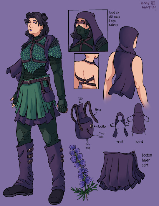
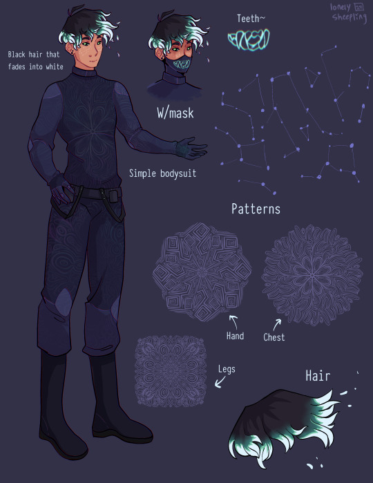
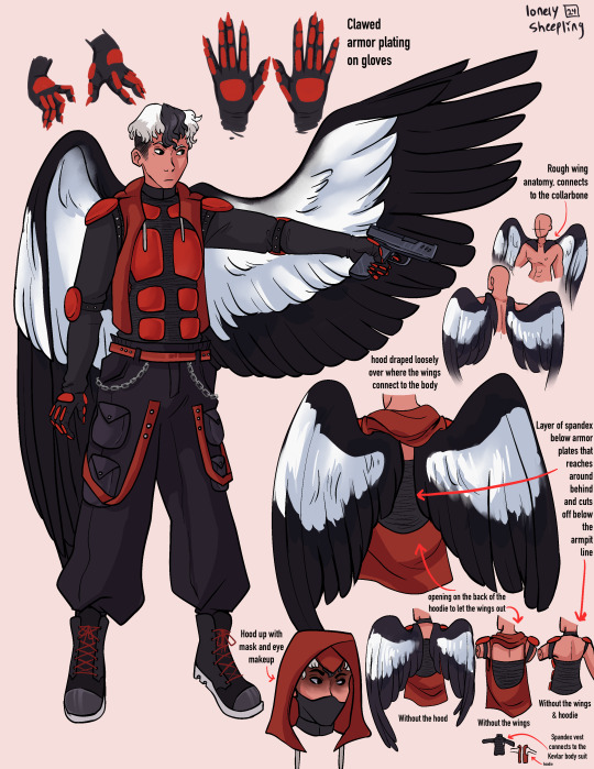
Recently read @queenofthequillandink ’s DPxDC crossover fic Unearthed, Reborn
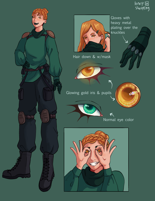
I got inspired to draw character sheets for Danny, Sam, Jason, and Jazz’s vigilante personas. Here’s a link to the author’s drawings of their outfits (these were a vital reference for me when doing this so thank you so much for sharing them Quill) More commentary (like 7+ paragraphs plus 2 images) about this project and the designs below the “keep reading” line.
None of these thoughts I have for each character are in order, but I have a lot of commentary for these since this project was a lot more conceptual than my normal work. I also just like talking about my art/design process. If you ever find yourself wondering at some point why an element from the original design wasn’t included, the answer is that the removal was completely intentional and part of my grandmaster vision for this work and wasn’t because I just forgot about it entirely during the design process.
————————————————————————
Aconite (Sam)
This was the first one I sketched out, I wasn’t even sure at the time if I was going to fully commit to drawing all of them. I thought that Sam was gonna be the hardest since her description was way longer than the others, but then bird boy beat her out. I took a lot of creative liberties with her design, the bag was added bc I couldn’t figure out how to add pockets to the skirt. I was trying to avoid a joker color scheme so I had a lot of ref images that I got by searching like “purple green aesthetic” on Pinterest. The dark purple and dark forest/blueish green won out in the end. I desaturated a lot of my colors for her just to get as far away from the neon Gotham rogue aesthetic. I also added the bdsm harness over the armor to add more punk elements to her design, I know that in real life that would be very uncomfortable to wear over scalemail armor but sometimes we take creative liberties when they look sick as fuck. Also, I didn’t realize until I went to look for a reference for aconite flowers that aconite is wolfsbane! That was neat to learn! Also, the font I used for Aconite is called “zai Art School Calendar 1931”, I’ve used this a few times for other projects, it’s one of my favorite fonts. The ‘zai’ fonts the creator has are all very good.
Shade (Danny)
There wasn't much to add to this page. His outfit is pretty simple (besides the patterning). I wasn’t sure how to pull of an optical illusion pattern but I was reminded how I sometimes get an eyestrain induced headache when looking at someone wearing a patterned shirt with really thin stripes so I just leaned into the idea of a small/detailed hard lined pattern. I originally made 5 separate patterns for him and then turned them into stamp brushes in procreate. I only ended up using three of them, the one on the chest, the one on the legs, and the one on his hand. But, I imagine the patterns fade and shift when he moves, sort of like a lenticular print. I gave him constellation freckles and stylized the hair’s fade into white. The hair was inspired by how time-woods draws Martin Blackwood’s hair (linked: time-woods’s fanart of Martin Blackwood). Also put way too much effort into the teeth on the mask. I just like the chunky teeth design. Oh yeah and the font I used for him is called “Typewriter_Condensed_Demi”
Erinys (Jason)
Repeatedly ran into the issue of not having enough canvas space bc of my fervent need to thoroughly document and plan out how the wings worked. I also reversed the colors for the bodysuit & armor so the under layer was black while the armor plates were red. I only realized afterwards that I may have been inspired by the red centipedes in Rain World (linked: gif of the red centipede, don’t click the link if you’re unsettled/afraid of bugs/insects), artists subconsciously draw inspiration from other artists all the time though so I’m not like upset about it. I stand by it because it looks sick as hell. Also leaned into the magpie theming for the wings. I think the vigilante form was supposed to be reverse magpie coloring? I can’t remember, but I stuck with normal magpie coloring. The anatomy of how the wings connected to the collarbone was inspired by JayEaton’s Magpie Bridge Project. Reference image link. Link to the article the image is from. I didn’t draw the wing armor because I couldn’t figure out how to would work with the wing anatomy and I ran out of canvas space. Finally, the font used for him is “DIN Condensed” this is a default font, I would’ve used something more punk but I needed the text to be legible.
Insight (Jazz)
I did Jazz after I’d already finished the initial trio, so I had to switch to a new canvas for her bc I’d hit the layer limit multiple times on the previous one. I really do love doing that spiked under-eyelash thing with characters. Don’t know when that started. Anyway, I added the shoulder pads to her outfit to help break up the empty space. The golden eyes were a nice accent color since her design is very overwhelmingly green. Honestly the braid hairstyle and gold eyes really do obscure her identity, multiple times when drawing her I was worried that she didn’t really resemble Jazz enough. There wasn’t a drawing from the author for her so I only had the text description to go off of. I just realized that she sort of reminds me of a forest ranger and I don’t know what to do with that realization. I copy/pasted my drawing of her eyes when gold and recolored them to match her normal eye color. There were two layers for that, a hue shift and a hard light layer to emphasize the shadows.

Here’s what it looks like without the hue shift:
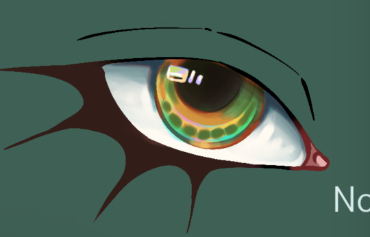
It looks really cool and I’m 100% that color combo in another drawing down the line. Oh yeah and the font used for this sheet was “Euphemia UCAS”. It comes with Apple’s operating system, I use it as a neutral default text most of the time bc it’s nicer than helvetica but not overly fancy like Times New Roman—and why am I talking about fonts. ——————————————————————— Anyway, this project was very fun to work on. The alt text for this was its own endeavor, hope the folks using screen-readers don’t mind 4-5 paragraphs of description text. Also, I cannot remember for the life of me if Dani got a costume description, but if she does I’ll make sure to update this image set with a sheet for her. And to the author, QueenOfTheQuill, if you’re reading this message that I’ve left at the very bottom of this post below a read more line, thank you for the fic. It’s very good and I’m glad I caught it during my slow decent into DPxDC brainrot. I love the interactions between Jason and Tim, it’s nice seeing a revived Jason that’s not bogged down by pit rage. They definitely seem like they could’ve been good friends if not for the unfortunate circumstances that led them to meet in canon. Also, I’m sure Jazz will love interacting with Batman and Nightwing. So much psychological & childhood trauma to unpack with them. Feel free to use/share these images if you so desire and thanks again for your work.
#art#art tag#digital art#my art#procreate#illustration#character design#fanart#dc#dc comics#jason todd#danny phantom#sam manson#jazz fenton#danny fenton#dpxdc#dp x dc crossover#alt text#id in alt text#alt text included#writing out the alt text for these was long and hard#but now that I’m finally back on my adhd medication I have the motivation to do it again#as always message me or comment if you have critiques regarding the alt text#character concepts#concept art#conceptual art#danny phantom fanart#danny phantom crossover#batman crossover#crossover fanart
352 notes
·
View notes
Text
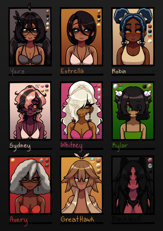
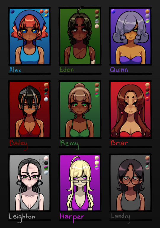
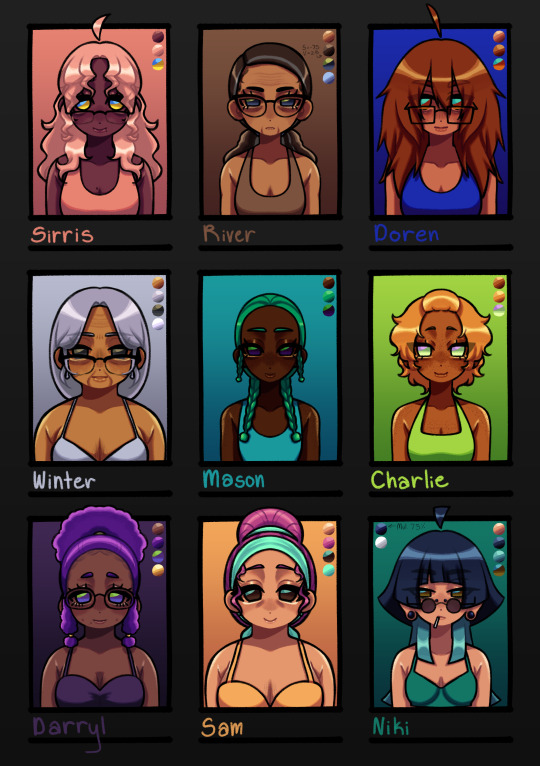
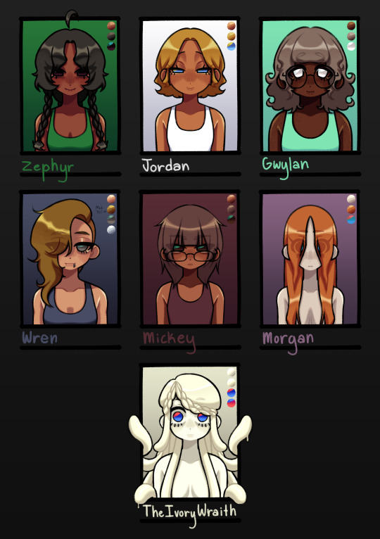
I FINISHED THEM. I DID IT. WOOHOO (crying)
design notes:
Yaira: nothing changed
Estrella: dead mom ponytail gone </3 i only did it in the og drawing of her bc its funny
Robin: ROBINNNN. IM SO SORRY I FORGOT THE PUFF BUNS UUEHEHHHHH- anyway, when i was planning out the designs for the other named npcs, i was like "why the hell are there so many gingers" so i made her have blue hair :3 to match with her confidence stat :3 also gave her yellow/orange eyes instead of green bc there were also a lot of green eyed npcs
Sydney: SKUNK HAIR. I DUNNO HOW I FORGOT ABOUT THAT YUMMY DYE STYLE. SYDNEY IM SORRY. i completely forgot i wanted to still have her natural hair (also just made pink bc teehee i like whimsy) to show
Whitney: not much changed besides the hair style. completely forgot i wanted her to be super gyaru OTL. gave her cheek piercings bc they're cute :3
Kylar: i lowkey started to not like how i did her hair originally and then came across all the sketches i made for the LIs and was like FLUFFY KY :3 ofc had to keep the emo bangs :3
Avery: nothing changed LMAOAOA
Great Hawk: FEATHER HAIR. I FORGOT I MADE A SKETCH FOR FEATHER-LIKE HAIR FOR HER. IM MAD AT MYSELF.
Black Wolf: not much changed, just made her hair longer bc why not
Alex: not much changed, just made he hair more of a red red, darkened her skin, altered her bangs, and changed the color of her bandana. still wanted to keep her looking like a cutie patootie
Eden: I ACCIDENTALLY GAVE HER A GIANT FOREHEAD THE FIRST TIME AND I DIDN'T MEAN TO SOBBING. not much changed though, just made her hair darker and have a green tint to it. look im trying to make my designs have lots of whimsy
Quinn: you can tell with Quinn LMAO. i just felt like she needed to have a distinct look since she's a special npc n all :3 classic purple and green color scheme for a shady character
Bailey: i'm gonna be honest, i was originally gonna go with a mean asian mom look for Bailey but then i was like "....what if muscle mommy"
Remy: i wanted her to look like a little shit. that's all
Briar: tried to go for a bit of a Jessica Rabbit and Rarity type aura. i really like her design and she could put me in the underground brothel any day :3 /j
Leighton: just an old hag, nothing special
Harper: wanted to make her look a little inhuman??? i think i got it with how dead her skin looks idk. also wanted her to look like a little shit
Landry: here's where the asian mom look went. i like her and Mickey's dynamic and they both just look like regular people (better for crime)
Sirris: Sydney if she was older. idk what else i should've done lol
River: old lady :3 hot old lady :3c (pt 1)
Doren: i wanted her hair to look fluffy as hell
Winter: old lady :3 hot old lady :3c (pt 2)
Mason: SEAWEED HAIR. that's all
Charlie: wanted to embody :3c
Darryl: she's very cutie patootie to me so i made her a cute patootie
Sam: wanted her to look like candy kinda. idk :3
Niki: i only made her hair a little longer and no weird two layer thing for the short portion
Zephyr: wanted her to look smug and also kinda cute???? idk, i didn't really have a vision for her
Jordan: also didn't really have a vision for her, but it did want her to gave similar eyes to Quinn
Gwylan: her i did have a vision for :3c she's a cutie patootie, that's all :3
Wren: thought a side shave would make her look cooler
Mickey: hairstyle changed a little. other than that, not much changed
Morgan: still a wet rat
Ivory Wraith: nothing changed (they have special eyes tho)
#dolgl#dol#degrees of lewdity#silly billy kitty draws#yaira the beloved#estrella the dead mom#robin the orphan#sydney the fallen#whitney the bully#kylar the loner#avery the businessperson#great hawk the terror#black wolf the alpha#alex the farmhand#eden the huntress#the ivory wraith#jordan the priestess#bailey the caretaker#harper the doctor#briar the brothel owner#remy the farmer#leighton the headteacher#landry the criminal#quinn the mayor#wren the smuggler#mickey the hacker#morgan the sewer dweller#niki the photographer#sirris the science teacher#river the maths teacher
190 notes
·
View notes
Text
I recently finished reading all the Lockwood & Co books, and my god they were good, but it got me thinking. If the show continued, like it deserved too, would Holly and Kipps have gotten a signature color the same way the trio did? If so what would they be? Well I was looking at twitter and I saw that most people agree that Holly's color would be yellow, and Kipps' would be white, and I'll be honest I disagree so badly I'm about to write an essay. It's funny because I distinctly remember finishing the books and thinking, "ah watch everyone put their colors as yellow and white cause it's easy". LOUD INCORRECT BUZZER. Y'all just don't get color theory OR the characters the way I do so listen up.
Holly is many things. She's positive, and compassionate, and kind, but she is so much more than that. She's not just a "yellow", yes maybe she is the sunshine of the group, but honestly? Not really, and that's ok. She's fierce and sometimes she has a short temper, she pretends to let everything slide off her shoulder, when really she's just keeping it inside. That's why her and Lucy are constantly budding heads in the beginning of their friendship, they are so similar. I think her color should be red. She's constantly described as wearing it, and I think it really fits her. Red represents passion, energy, confidence, and excitement to name a few. Holly is always described as having a presence, and her energy and enthusiasm comes off her in waves. Red is usually described as the color of love, and I still think that fits. She has such love for the entire crew, and it's so clear she would go to the ends of the earth for them. I also think this would blend in with the others very well. Despite it not actually being blue's real opposite, blue and red are often seen as polar opposites, which really fits for Lucy and Holly's dynamic. It also works because red and orange are both warm colors and George and Holly have always gotten along. They are similar in their methodical and sometimes odd ways of life. I also think it's fun cause Skully's color is green, and green are red are direct color wheel opposites. I'm pretty sure he hates her the most, but Kipps is also competing hard for that title. And lastly black is kinda the color in between, now more on that in a second.
I see what twitter was going for, Lucy and George are blue and orange, direct color wheel opposites, because they are quite literally direct opposites. So it makes sense for Kipps to be white since he's the direct opposite of Lockwood? LOUD INCORRECT BUZZER AGAIN. Tell me y'all didn't understand their dynamic without telling me. Lockwood and Kipps didn't get along cause they were so different, they butted heads so hard because of how similar they are. It's exactly what happened with Lucy and Holly. Plus white represents a lot of things that are definitely not Kipps. My proposed color for him is purple, I know that's a little odd, but walk with me. Although it's never explicitly stated, one can assume that Kipps was an absolute prodigy when he had his talents. I only bring this up, because purple often represents royalty and luxury, and he practically became a fallen king when he lost the only thing he was ever good at it. But purple is much more than that, it also represents bravery, uniqueness. ambition, and justice. I think Kipps' original color is grey, and not just because of the uniform. Grey represents seriousness, sadness, and boredom. That's how Kipps was before, but when he remeets the crew during book 3 and 4, we begin to see the shift. The group helps him gain his ambition back, and with all of their love and support we even begin to see how brave he really is. He has a unique way of going through life, and even when all the odds are stacked against them, he still seeks justice. Purple fits with the general color scheme as well. It's very close to black, which represents how similar him and Lockwood are, and it's also a cooler color like blue. Kipps and Lucy certainly got along the easiest out of the crew.
Overall it just makes sense. George and Holly are the warmer colors, Lucy and Kipps the cooler, and Lockwood as the mediator between them. I feel like red might be a little hard to incorporate without being overpowering, and I know that purple isn't a super masculine color, but hell if those costume designer made full orange outfits look good they can literally do anything. Anyways I know this isn't that important, but ugh I love color theory so much, and I love how much thought the costume designers put in the first time. I feel like having Holly and Kipps color being yellow and white is just a cheap easy shot, and doesn't take into account the characters and their growth enough. I rest my case.
#lockwood and co#lockwood netflix#anthony lockwood#lucy carlyle#george karim#holly munro#quill kipps#SAVE ME COLOR THEORY SAVE ME#God I want another season of this show more than anything#THIS COSTUME DEPARTMENT DESERVED TO BE ABLE TO EAT LIKE THIS AGAIN SMH#it keeps me up that we'll never see holly and kipps' development
237 notes
·
View notes
Text
i've got the blu ray for volume 1 playing and i'm watching the behind the scenes video and Monty explicitly spells out how important collaboration with other creatives was in building RWBY, saying how he wanted to work with Kerry and Miles on it in creating the world and how he mostly gave them broad strokes. and it's mentioned how they all put the show bible together - i'm gonna put the whole transcript for the video under the cut (which i'm having to do myself because no one has uploaded this video anywhere as far as i can tell and there's no fucking subtitles)
Monty Oum [Creator and Director]: It’s the stories I’ve always wanted to tell versus the idea I came up with about, a little over a year ago. And we were talking about doing another show, and I just kind of half-asleep came up with the idea of a color rule for a bunch of characters. The red, white, black and yellow color scheme was something that was very prominent even in my previous work, so I started matching names up, matching ideas up. Also thinking about like, some of the ideas I’d stored up over the years. At some point or another the word ‘RWBY’ came to me.
Monty: Starting the show out originally, I designed the original character, Ruby, as well as going into the other characters. So once I had the first trailer done, and thinking about the rest of the characters for the show, I started bringing in other artists who I had watched for years. People I’d always said “someday I’ll work with them, someday I’ll have them design for me.” And when I was certain about having certain characters, I first contacted an artist I admired and found over DeviantArt. Her name was Ein Lee, she’s actually from Taiwan, and I found her art probably well over five years ago, and just loved her art style, and therefore wanted to incorporate it into my characters. So, I would do rough designs for team RWBY as well as designs for team JNPR, and she would flesh that out to be even further. To the point where eventually I didn’t need to design characters anymore, she started designing a bunch of the rest of the characters down the line.
Monty: The second person I brought on to RWBY was Kerry, because we had just been having conversations about the kind of show we could make. I’d been working with Miles on Season 10. He was writing scenes while I was making scenes, and so the three of us would have a lot of meetings and collaborate on the show to the point where I just started coming up with the broad strokes eventually and they had pretty much written the bulk of the show. Collaboration’s a big deal here, and I tried to include as many people as I can.
Kerry Shawcross [Co-writer]: Right after RvB ended, we wanted to just go straight into RWBY, but that was like right when we were going into commercial season. So we would work our normal hours here. Like 10 to 7-ish, then we would go back to one of our apartments and just start writing.
Miles Luna [Co-writer]: Monty really was enthusiastic about having these characters that may appear really one-dimensional for like the first few scenes that you see them, but the longer you get to know them, you realise “Oh, Yang isn’t just a dumb blonde party girl. She’s a very caring and nurturing girl, that has had to essentially be there for Ruby when she was young.”
Kathleen Zuelch [Producer]: When Monty and Miles and Kerry came to me, and really took me through the story. I started becoming a huge believer, because I’m a big fan of old school, traditional fairy tales, I love the Brothers Grimm, I love all the Snow White, and I love Little Red Riding Hood. I grew up with all of those stories, and the way that they were very clever in creating this whole world that’s kind of making homage to all of these amazing stories really inspired me to get more on board with what they wanted to do with this whole anime show.
Taylor McNee (née Pelto) [Art Director]: The world of RWBY, it looks very familiar. We wanted a blend of very classic looking architecture and clothing and cars, but we’re also mixing in this really kind of futuristic feel, like these little touches of some really futuristic stuff like holograms and things that you wouldn’t find in a classic [inaudible]. And that’s how we’re making this world unique. Our assets have to go through this pipeline of concept, modelling, texturing, and then finally being able to be put into the 3D program. So we start out with the concept and we usually bring that image into Maya, which is the main 3D software that we use. We have to make a 3D model that looks exactly like the concept that we were given, and it’s quite a process. Basically, we’re pushing polys and extruding stuff until we make the perfect shape, then afterwards we have to UV unwrap it, and then lay everything out on a texture sheet and then paint it, and that will put the image on the model. After that we’re basically done with the model and texture, and then we have to give it to the animators. So then we will set it up in Poser so the animators can grab it and use it for their characters.
Gray Haddock [Lead Editor]: There’s a lot of people working on this show, and there’s a lot of different elements in the pipeline. Editorial kinda serves as a hub between all the different departments, so we help all the communication and coordination between all the different pieces of the show, depending on what part of development that they’re in. Editorial’s getting involved way early in the process, we work alongside the director and the writers and the storyboard artists, and we use the scripts to help develop the storyboards and the camera angles for all those boards. So editorial is responsible for building up the moments of any given scene in terms of the timing and what you wanna look at, at any given moment. So we take the script and we help develop the camera angles and how long you wanna linger in a particular camera angle, look at one character or another or the scene as a whole, and the rhythm of the scene in terms of how long is it gonna take to spend on a particular line or when you want the music to come in, things like that. So we build up a set of animatics with the storyboards, and the first pass of all the audio. This is what then is handed off to the animators, so they can know exactly what is in what shot and how long do they have to animate it in a given shot. And once they’re done animating and their shot’s been approved, then their shot goes to the render farm, we get the rendered shot back and we drop it into the timeline for our episode and finesse the cut a little bit if we have to. But for the most part, we’ve done our job right and everything should pretty much be locked in for the most part by the time we’re getting animation.
Kerry: What’s kinda interesting as we’re creating the characters is, we kinda knew what kind of character they’d be. We knew Ruby would act a certain way, we knew Weiss would act a certain way, but we didn’t really know much about them. So we would get to the point where we’d be figuring out plotlines or figuring out dialogue and we’d be like “What would Weiss say here? What would Nora say here?” And then it turned into “Oh well now we know.”
Miles: Obviously we put a lot of thought into Ruby, Weiss, Blake and Yang before we started writing the dialogue. I remember sitting upstairs and we made a show bible, and we’re starting- we talked about likes, dislikes, personality traits. One of the first things I remember making was “Weiss drinks coffee. Blake drinks tea.”
Kerry: It’s important. It sounds not important at all, but it’s very important. It says so much about them
Miles: But it’s so important. So much about them, also it says nothing about them. It was just like- that’s just what it is.
Monty: I want the show to have resonance with people who are growing up. Cos everyone’s story is the story of kind of becoming who they are. Especially these days when the path of becoming who you are tends to be marginalised with reality. Having done what I’ve done, where I’ve essentially dropped out of high school, started learning this stuff on my own, and therefore land in a position where I get to take the things I was dreaming about when I was growing up and make it real. I tend to get a lot of response from people who are also not sure what they’re meant to become, a lot of them also have the same bright imaginations and with the way the world is, the hardships of what it means to grow up tends to marginalise who you are, and I would hate that to happen to anyone because the future is in creativity and that’s not something you can just manufacture. I actually would like this show to grow up with the people, so unlike most shows where they tend to be ageless or age very slowly, I’d like our fifteen-year-old fans watching fifteen-year-old Ruby, when they’re twenty-five, to be watching twenty-five-year-old Ruby, and to actually have some resonance with the character. Probably one of my favourite types of feedback is to say “I know this person” or “this person is just like me,” and that’s probably one of the best things about coming up with these characters.
189 notes
·
View notes
Text
Meet Velvette📱🧶
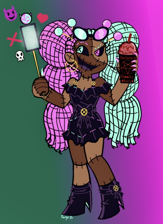

Meet my take on Velvette! I had LOT OF FUN with this one! She’s reviewing Pentabucks newest drink!(being its top influencer can get you it for free!)
My Velvette’s more involved with social media/advertising/trends rather than owning all of Hell’s fashion indurstry. She’s basically a social marketer/influencer who uses her influence to support and advertise a lot of the overlords and high influence peoples businesses, products and services. She’s def still into fashion, I imagine she has something like a Bergdorf Goodmans, luxury end store and probably collabed with other fashion brands). I also see her own some fo the trendiest resteraunts, clubs, beauty salons, etc. def sewn herself into big brands!
I’ve heard she was suppose to be a doll because her pilot look mouth alluded a bit to stitching and wore frilly clothes.


so I ended up making her a rag doll! Doll’s are very popular to sell, especially to sell additional objects such as fashion, accessories, etc. Basically she sells herself out to the public eye 👁️. There’s also a bit of sewing terms that fits with social media such as “Pinned”, “Threads”, etc.🪡📍
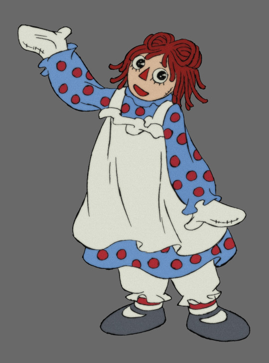
And rag dolls are known for their adaptability(perfect for trend setting Vel)! I styled her outfit as a kinda tweaked modern outfit of Raggedy Anne/Andy’s outfit. The jumper and black booties. Restyled into a more flashy romp jumper and heeled boots 👢 Even made it to her name, VELVET!
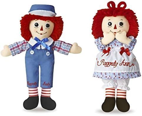
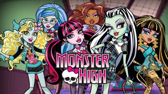
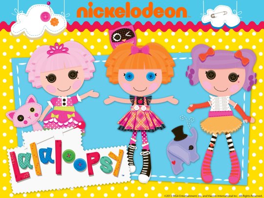
Ngl many friends of mine have said she gives off Monster High vibes(I feel like 2000’s cartoons def inspired me). As well as Lalaloopsy!!!!!!! I was also a bit inspired by OG Millie’s outfit(love the double straps).
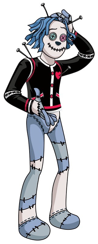
Put her in two shades of brown for a patchwork vibe! Another thing I’m going for with the rag doll theme is to allude to insecurity. I imagine she came from less glamorous origins. Didn’t have porcelain dolls like Charlie or plastic Barbies like all the other popular and rich girls, but simple rag dolls and stuffies. No matter how hard she tries to be like perfect porcelain or pretty plastic…she’s cursed to be seen as just some raggedy rag doll💔. I also imagine her death had something related to becoming…torn up(I imagine it wasn’t a pretty end)…
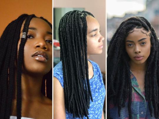
For this look, went with bubble braids made from balls of yarn 🧶 She has all kinds of hairstyles, from yarn, cotton, stitch on wigs and even real hair(from scalps of those who got on her nasty side, @a-sterling-rose suggested this). There’s even a type of hairstyle called “yarn braids”.
Wears fake nails 💅. Gel, acrylic, she’s made of cloth so she can adapt to any kind.
Gave her actual ears 👂 (added them on herself).
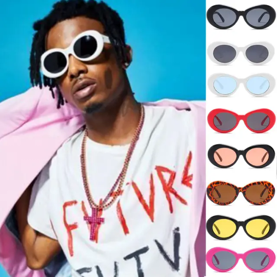
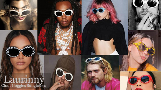
Clout Glasses 😎.
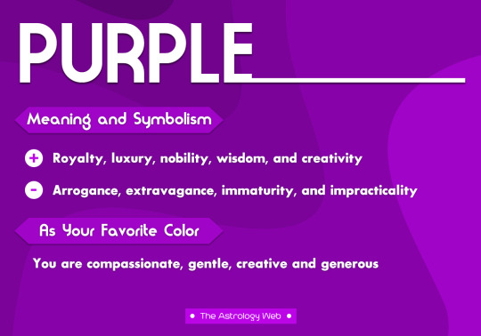
For her color scheme, @the-burd-lord suggested I'd go with RGB theme, colors on display screen(Vox is the leader and a screen) Ngl I was conflicted what colors to go with for the vees(Primary, Red blue purple etc). But then I realized when u mix those colors u get those other colors and then I decided to give the Vees two main color themes for each. One for show, the other their true colors! Velvette likes to use green, magenta and purple, for a visually pleasing vibe, light green and magenta for sweetness with purple/gold for luxury, but truth she’s a vain, envious clout seeker who has and will do less than ethic things for the likes. The two colors r also a mix of Val and Vox’s colors(uses them, advertises them to advertise herself!)
Played around with a assymetry color vibe for the envy vibe, thats she’s two faced 🎭. Having a deceptive social media personality like Miss Heed(less lovey dovey).
@lovesart23 video on Velvette really helped me consider what to do with her, like her beign Envy theme(she’s a clout chaser afterall). I LOVE her use of purples and greens for her! I also really dig the eye theme which mine in a sense does too. In this case, button eyes.


Added more weight on her a bit, to give off a more rag doll type body(especially with the limbs 🦾🦵)
Gave her black purple eyes with pink and mint button irises. Got Pin eyelashes 🪡📍
Her her a needle/selfie stick. Good for selfies, fashion emergency and stabbing people!
What do u think? I’d love to know💖
I’ve also done the Hazbin Gang, Mimzy, and even her associate, Vox 📺.
#hazbin hotel#hazbin hotel velvette#velvette#habzin hotel redesigns#hazbin hotel redesign#Hazbin redesigns#Hazbin hotel fanart#velvette redesign#the vees#Hellaverse#hazbin hotel rewrite#Hell hotel#velvette hazbin hotel#velvette fanart#hazbin hotel rewritten#The vees#My art
76 notes
·
View notes
Text
Ooooookay! Hazbin Hotle redesigns....but not really? Honestly, it's just me drawing them in my style, but they could be considered redesigns, I guess, specifically Charlie
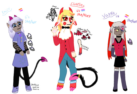
Uhhhh I guess we start form left to right sooo, Emily!
Right, so, Emily is obviously a fallen angle. Thiguht this isn't her fallen look, since we already kneo what she looks liek with wings and a halo I didn't think about making a 2nd version of her without the demon disguise- but maybe I should
Either way, I kinda kept her original dress, with the symbols and what not, I feel liek blue and purple really suit her so, indigo
I tried to add red to her, but it just didn't look good. It gave me an eye strain.though her till and horns have a sort of dark magenta color going on
I wanted to add more 'freckles' cause, thier cute, and I have a bunch of freckles ove rmy arms and legs and face and stuff so, added them to em, I put a few on her ears and tail and horns to
Gave her gold buttons and fishnets on her arms, i forget what their called cause they are cute, and I like Athnek(?) Posts about Emily and uh, goth Emily, I think, is pretty cool and so boom, fishnet glive things- I gitta look up what there called
Lso ehr shoes look liek dolphins, which I didn't mean to do but it happened and I've accepted it
Next is Charlie!!
Um. Obviously, Charlie is the most changed from her canon design, I relaly like her hooves and others redesigns of her looking more liek a goat
Originally, I was just gonna add gaot ears and stuff, but the more I thought about it, the more I liked the idea of her having fur soooo tadaaaaa~
I gave her a little red stripe between her eyes and fade on her legs and ears to match Razzle and dazzle, and since lucifer was a high angle a seraphm/archangels hoenstly I dotn see a difference. I gave her some white freckles as well to sorta, show that connection
Also, toe beans! If she has claws, she can have beans, I think that Emily would have a normal human hand while vaggie would have little soft spikes on her like moths do, tho that's not shown
I also drew charlies wings cause it's cnaon she has them, and I wanted to play around with the demon/angle wing/s she could have, my irl friend K helped me decide which one to choose
I also drew her leg so you can see the fade in full. Side note that her belly has the same cherry red fur
I also added some chest fluff because why not?
As for her horns, I kept them the same color but added rings like Lilith has to show a connection between them. She also has her mom's eyes and heart tail point. I wanted her to have some demon stuff out just cause, she is a demon, she should......also realizing just how long I made her tail-
Uhhh, oh, right, side note, which I'll have to make a separate post about, Lucifer/eve/lilith are all dating each other, and Chalrie is all 3s kid. Eve is where she got the goat aspect from, inckuding horn shape, her scaly tail, snake fangs, red cheeks and color scheme over all are from dad, and Lilith is where she got her eyes and horn rings and heart point from, and beans to I guess
Maybe I should make a gene sheet one day; I gave her Jean shorts, like how I usually wear just cause I didn't want to add too much red or black
Okay, vaggie time!
Vaggie is the least changed. The most I really change about her is how her wings look. Her hand snow has soft spikes like moths do, and her hair
I do think when she fell, she got more demon aspects, but since her wings were torn off, she doesn't have to many physically other than fangs and the spikes
I also made her hair shorter because please, nobody has their hair that long!! or if they do, then I've never seen them!
I know it's a show, but it was driving me crazy! I'm not that skilled at draw front view bodies yet, so if vaggie looks off I'm sorry:(
Play that should be it!-
Oh wait, hold on, right. The reason they have gold rings/objects on them is because in term software demon courting their all technically married, okay bye-
#hazbin hotel#hazbin hotel au#hazbins fallen au#hazbin hotel vaggie#hazbin hotel emily#hazbin hotel charlie#chaggie#chaggiem#chaggily#charlies angels#pleas ask me abotu that last part#im MORE than happy to explain#i finshed this a while ago actually but kept changing it and adding things to make it better#Al in my style/redesign should be next. only cause K asked me to dra whim and wince i did i might as well digitize it first#hazbin hotel redesign#kinda#really its jsut in ym style + headcanons/au#supernatural art
60 notes
·
View notes
Text
Kung Fu Panda 4 Thoughts/Liveblog Thing
Just caught this at the theater for a grand total of five whole dollars, so I thought I'd do some quick opinions while it's fresh.
Non-spoiler opinion: It was Okay(TM), but the movies were considerably stronger as a trilogy. It's worth seeing one (1) time if you're a KFP fan (and really, who isn't), but I wouldn't bother paying full price for it or anything
SPOILERS FOR ALL 4 MOVIES UNDER THE CUT:
A list of things that slap:
The animation is stunning and fast-paced. Really loved the use of Chinese-style paint brush strokes to accentuate the action
Also I'll talk about the 5 later but I also really liked the animation change when describing where they are—all KFP movies have at least one animation shift and I'm glad this one kept up with it
Some of the fight scenes were super good, I liked the one that uses the tilting bar on a cliff in particular
(side note: the Missing Link did something similar, just on a ship. Go watch the Missing Link)
The Chameleon served straight cunt the entire time she was on screen and I kind of loved (almost) everything about her. Character design was incredible, voice was perfect, palace design was amazing, abilities were sick
Also the way she rides up chilling in a golden tree branch of all things? Fellas, we have no choice but to stan
Also I just appreciate the choice to both do a female villain for a change and to get a reptile in here after having only mammals and one (1) bird as villains previously
Speaking of character design there were a few really good ones in there, like a pangolin that moves Sonic the Hedgehog-style, a cool looking female boar, and a bunch of Komodo dragon henchmen. Good stuff
The jokes were a very mixed bag for me, some hit and some didn't. I will say that Zhen just going "that's great for you" in response to Shifu stating he's a red panda got me for some reason
If anyone hurts Po's gay dads I'm killing everyone in this room and then myself
Jack Black's cover of Baby One (1) More Time is unironically better than the original
A list of things that Do Not Slap:
Pacing/Plot:
This movie lacked a color scheme? KFP 1 was blue (also some gold), KFP 2 was red, KFP 3 was green. These colors weren't subtle either, there are entire scenes in each movie drenched in these colors and it was really obviously missing here
The whole first half the movie feels really breathless and too fast-paced. Apparently it was a studio mandate to have it not go over an hour and a half which is A) stupid and B) hurts the pacing
As much as I love Po's two gay dads we REALLY should not have been wasting time on their journey when the runtime is so tight
Also them tagging along felt off? Mr. Ping was worried sick about Po in KFP 2 but he doesn't tag alone because obviously he needs to let his son have his space. It's more in-character with Li Shan but it doesn't come across like he's talking Mr. Ping into it or something
In general there are so many plot points in this movie that feel under-developed. You could've made an entire movie out of the previous villains returning, Zhen and the Chameleon's relationship (see below), etc.
Po's Character:
People not knowing Po is the dragon warrior is weird, I'm pretty sure he would've been more well known than that
The entire thing with Po needing to give up his role as the Dragon Warrior doesn't really make sense? The Dragon Warrior is literally a made-up title. There's no need to have a Dragon Warrior because there is no such thing technically, it's why Oogway denied Tai Lung the title and then waited years and years to give it to Po. Like it's not a role that needs to be passed down, that's missing the entire point of the Everything
Also Po's only been like Dragon Warrior for a few years? I don't think we're ever given a time scale but it wasn't that long
The jokes about Shifu and Po having trouble with inner peace/mediating feels off given that was the entire plot of the second movie
It felt like Po regressed a bit character wise. He acts like he has no idea how to be a teacher in this movie but he already was a teacher by the end of the third, that was the entire point??
Also he seemed like he was more gullible in this movie but I could be wrong
Why is Po so impressed with Juniper city. He literally spent most of KFP 2 in Gongmen hello?? I think(?) Juniper is bigger but he shouldn't be acting like he has no idea what a city is
Zhen/Chameleon:
Zhen's character design doesn't match anything else, which is weird because most of the new characters in this film keep the distinct style in some form or another
Her wanted poster shows her with the bold markings KFP is known for and it looks SO much better
The plot twist with Zhen working for the villain was so obvious I did not realize it was supposed to be a twist at first
Also, the entire thing with Zhen was entirely unneeded? The Chameleon could've just just stood up and announced her plan to take over and Po would've shown up on her doorstep with the staff
I guess the idea is that Po needed to hand over the staff willingly for it to work? But if that's the case the Chameleon could've just impersonated Tigress or something and gotten it that way in like 1/3 of the time
Originally she was supposed to have kidnapped Shifu which would've been a much better plot point as it would've given Po extra motivation
The other problem with treating Zhen as a plot twist is that it hampers the relationship she has with the Chameleon effectively being her mom, which is FASCINATING. They had some really interesting chemistry together (the whole "stand up straight" thing as one example) and I could've seen it as a Mother Gospel from Tangled kind of deal, but we barely get any interaction between the two and it's like AAAAAAA
Fanfic writers fix this shit. I believe in you
I'll have to chew on it more but my pacing thought would actually be to start with Po finding out about the Chameleon's "take over everything" plan very early due to Shifu's kidnapping. He breaks into the lair like at the 1/3 mark or earlier and he meets Zhen inside which then leads into why she's doing what she's doing and the mother angle, etc etc blah blah
The Chameleon needed to just straight-up murder someone, comically shoving them down the stairs isn't good enough. I know stairs are Po's greatest enemy but I don't think that applies to everyone
Shen was allowed to stab someone on-screen so I think the Chameleon should be a allowed to strangle someone or something. as a treat
If violence was the concern just keep it off-screen like Master Rhino's death in KFP 2
The shapeshifter turning into a giant monster trope is overrated and I'm glad it was just used briefly here and not even for her defeat
Also the Chameleon's thing with her being rejected from Kung Fu because she's too small makes no sense b/c Mantis, which I'm pretty sure everyone's pointed out already. She does say "lowly" I think but was she ever poor? Could make a very interested parallel to Zhen if that was the case but it was never brought up again
I've heard some argue body image parallels w/ Po in KFP 1 but if that was the intent it's not explored, like, at all, which is a shame because it could've been an interesting angle
Also If they wanted a better excuse related to body image just say she was too frail instead of too small. I haven't owned chameleons but I've heard from people who have that they are very frail and very hard to keep alive, which would be a much better reason to turn her away
Cameos:
Yes I'm devoting an entire section to five second cameos don't judge me
I have mixed feelings on the Five not being present (save for the end cameos). On the one hand they are sorely missed but on the other hand they would've just made the plot bloat even worse
Lack of speaking was also bothersome. Part of me is glad they weren't recast with cheaper VAs because it's disrespectful to interchange them, but on the other hand that might've been better than just not having them speak and not paying anyone anyway
Tai Lung had all the best lines and was also the best used out of all the cameos, even if it would've been nice to have him on screen for longer. Also if they stuck with Shifu being kidnapped those two could've had some much-needed dialogue
Side note, while I don't think it contradicts anything from KFP 3 the spirit world having only kung fu masters in it feels off? It makes it seem so small and limited
Kai being there is weird. He's like. dead dead. Deader than dead. I guess you could argue that you can't kill something that's already dead but there's nothing even acknowledging this
Trying to take Shen's kung fu is really weird because the entire point of the fight with Master Rhino in KFP 2 is that he is not? a master?? like he's GOOD but he's not amazing, like if a master is like a 10/10 he's like an 8/10.
"The Chameleon has the powers of all my old nemesises!" WHAT'S SHEN'S POWER EXACTLY. HIS ONLY POWERS ARE GUN AND MOMMY/DADDY ISSUES
She does summon him way later than Tai Lung and Kai so maybe she was just camp spawning every single person she could think of regardless of skill level? she also uses his wings at one point so maybe she just wanted those, I don't think(?) there were other birds summoned
Though speaking of which she claimed she was using his wings but very clearly wasn't? not only were they black but they were raggedy and lacked the five longer feathers on the tips
Also Shen's model was super off, it looked way too fluffy and like an entire row of eyespots were missing from the edge of the train (which might have been a clipping error? unsure) it's been said the new models were made out of glue and popsical sticks and I believe it
Tai Lung has a habit of just like Grabbing anyone that's smaller than him and it amuses me
It's honestly really weird that everyone would just agree to go back into the spirit world willingly?
Like I think it works for Tai Lung because he's a noble person who just goes into a disassociative state and commits atrocities. Like I think he'd be willing to accept his death
Also it checks out for Shen because he killed himself and given his "dead belong in the past" mentality I can't imagine him wanting to stick around, he'd probably think it was unnatural
But Kai?? Kai was FURIOUS at being dragged back into the spirit world at the end of 3, like hell he'd just go quietly
Also I can see Tai Lung maybe respecting Po enough to bow to him but everyone else is pushing it unless they have therapists in the spirit world. Po offered Shen some nice advice at the end of KFP 2 and his response was to kill himself on the spot, I don't think him or Kai would be bowing
All of them were definitely in the middle of a mahjong match and were experiencing the equivalent of being woken up in the middle of a nap so they were just going along with things
Chameleon: I'm going to steal your kung fu
Everyone:

Misc:
I did like some of the more subtle callbacks. Stuff like Po seeing his reflection in the blade the way Shifu did or the "I can't even beat you to the stairs" scene were nice and not overly overt or in-your-face
If Po actively refers to himself as the "Kung Fu Panda" one more time I'm going to end it all
anyway that was not supposed to be a 12 page essay but it's too late now, goodbye
#kung fu panda#kfp#kung fu panda 4#kfp 4#liveblog#outdesign posts things#don't get me started on kfp or I won't shut up about it
88 notes
·
View notes
Text

So I made a second licofait kid, Licorice Syrup
I’m gonna be honest, I kind of forgot that she’s not just me making a second licofait kid and is instead Red Licorice’s replacement, but whatever. She does still replace Red Licorice I guess
So basically, Licorice Syrup here is a magician who uses sing based magic. I’m not entirely sure what her actual magic is, whether it’s necromancy or something different. I just knew how she’d use her magic and thought I’d figure it out along the way
Personality wise she reminds me of Trixie from MLP. She’s kind of a showboat and she acts incredibly confident. However her insecure side shows with enough pressure on her, and she’s not that much different from her dad in that sense
In my head, if she had a human name it’d be like, Sirena. Which I did pull from Venture Bros and I know isn’t a real name, but her powers remind me of sirens so I thought it fit. I suppose Serena works just as well, with it being like “serenade”
Also with the thing about sirens, I imagine her to be dating a mermaid, since I feel like that fits. Not sure how it happened but she is. Her girlfriend’s probably not another fankid, but rather someone else entirely
…*sigh* I’m sorry, this isn’t that good. Admittedly, she’s kind of been a thing I do in spare time over different intervals, and most of that time was yesterday when I was waiting for the volunteer event to start and waiting in line to pick up our stuff, so I wasn’t 100% focused on her. And so she’s a bit lacking in areas. This will also be relevant in the design section
Anyways, so her name comes from black licorice syrup. Which admittedly I wasn’t entirely sure was a thing but apparently it is. I came up with the name because licorice, and because Parfait has syrup in her pop star look (even if it’s not in her natural look), and ice cream (and I think parfaits) can have syrup in them
Originally her name was Black Syrup, which on one hand I still kind of like, but on the other, I realized after finishing her that I had recently come up with a new character called Dark Syrup, and the names are really similar so I changed her to Licorice Syrup since that’s still what she is
But yeah anyways, this is a picture of licorice syrup I found online

So I originally drew her in a rough sketch, just doing her hair, but as I recall the hair color itself didn’t look right, so I scrapped her at the time to come back to another day, which I eventually did. All I could really remember about what I wanted is that she’d have a similar color scheme to Licorice
Admittedly her final design may be a bit too plain. I tried to mitigate that with the light blue at the bottoms and with the skull pin, but she still might look too plain. But ah well
Speaking of the pin, I put that there to spruce up her head a bit, but then I forgot that she wears a hood, so I don’t really know how it works
I’m also not sure how I ended up with blue as her accent/secondary color, but I did. I guess it works with sirens and mermaids? It’s also why I made her eyes blue. I color picked them from Parfait’s pop star look, even though I know those are colored contacts, because they were nice and bright
I do wonder if I should have made her eyes a different color though, so that they can be an extra pop of color
Her hair was originally going to be all black, but I wanted to spruce it up a bit by having the ends white. The idea is that her hair is yogurt covered in licorice syrup. One of the main things I tried to do with Licorice Syrup even just starting out was that I wanted her hair and hair color to make sense, instead of just going from black to white for no particular reason like with Red Licorice, and I like to think I accomplished that
Overall while I recognize she may not be the best, I do still think overall I like what I did, and I hope you guys like her too
#I haven’t done much art since like last week#I need to do more of that#anyways now I’m thinking of giving her a sea based costume#and her with her gf#whom I don’t even have a name for she just kind of exists#cookie run#cookie run kingdom#licorice cookie#parfait cookie#licofait#fankid#fanchild#licorice syrup cookie#my ocs#my art
57 notes
·
View notes
Text
when i’m trying to use a more plausible color scheme for everyone in my MCD rewrite (since it’s going to be set in a more underdeveloped time period, a lot of colors are going to be expensive/hard to find) and can’t decide what colors to give certain people 😭
im obviously gonna keep some of the original colors in the beginning (like Lord Burt wearing red because of its significance as a powerful color), but keep everyone’s else’s mostly plain. for example Nana won’t be an explosion of pink (although it will remain her favorite color), Aphmau won’t be wearing purple as often (the most common variation of the color was tyrian purple which took a very extensive amount of labor to make even one gram of the pigment. that, as well as the color being reserved for royalty), and Laurance won’t have as many green articles of clothing in the section of my rewrite portraying season two (the emerald green pigment was made from arsenic, which made it not only extremely toxic to produce but to wear as well as the skin would absorb the poison)
(i’m still debating about Dante and Garroth with their blue tones because it was a more common color amongst the poor people and was made with cheap, low quality dye, but Louis IX and Henry VIII started wearing it with other nobles and it became a color of high standing so…)
now this is also where I also come to a standstill because of these colors and what they used to represent. each Divine Warrior will have a color associated with them, which is where part of their symbolism will come from. however, I’m stuck on what color to give Irene
there’s a very brief clip somewhere I can’t remember when it appeared, but Irene was wearing a black two piece that seemed to be torn. I imagine this being something like her “first” outfit in the world so i’m not too worried about that one, but I’m more concerned about the one she wears when she’s portrayed
we see Irene wearing two cloaks from what I remember (my memory is garbage and I have yet to reach that far in anything). one of her cloaks was royal blue and the other is a lilac purple. the lilac purple would be a more difficult hue to achieve in the time period i’m reaching for, so either way i’m going to make the purple into a deeper shade.
i’m having such a war in my head about which color to choose for her, though. because both colors could signify who she is and i’m honestly debating just having different people give her different colors but I don’t know
on one hand, tyrian purple was a color reserved for royalty. using it could be used to show the high regard in which people in Ru’aun placed her. it could be used to signify their desire to have Irene rule as queen over the region before she diminished the monarchy and developed the Lord system instead. however, this color was made from a tiring process that required extensive amount of labor for barely anything to show the effort, and I feel as though the way to obtain the color doesn’t represent Irene the Matron
on the other hand, I feel as though a deeper blue pigment would be a better match. blue was original worn by peasants but the steady popularity it gained with nobility made it a more expensive and luxurious color for people that could afford it, as I previously said. this color I feel would fit better with her character to show that Irene came from humble beginnings and was put on a pedestal after her efforts for peace and becoming Lord of Scaleswind (which would be equal to blue becoming a color of nobility). the only problem with the blue is that the dye used by the peasants was low quality made from the woad plant that (from what i’ve seen) was dyed much lighter compared to the royal blue i’m talking about. i don’t know, maybe she got an upgrade at some point…
(can you tell i love the history behind colors)
(also if anyone has any other impactful information concerning colors please let me know i also actually love learning about it)
(and greatest apologies guys this is basically a yap post it has very little significance to anything)
#did i use this as an excuse to yap about how colors were originally made?#perhaps#but i’m sure y’all learned something#aphmau#aphmau mcd#minecraft diaries#aphblr#mcd#aphverse#mcd rewrite#laurance zvahl#garroth ro’meave#irene the matron#kawaii chan#dante aphmau
28 notes
·
View notes
Text
Rewriting Danganronpa Characters: Gundham Tanaka
Hey folks! Welcome to another Character Rewrite Post and this time, we'll be going with my least favorite Danganronpa 2 Character. That being.....

Gundham Tanaka.
Yeah, sorry about it. I mean, I do see his strong points but...I just wish that he could have been better. Like....a lot. So, I will try my best to rewrite his character for the better, while respecting the original intent behind the character itself. As always, this is just my opinion and you can feel free to agree and disagree.
Well, with that out of the way, let us begin.
Personality:
His general demeanor will be the same, but I will tone down his hamminess. This Gundham will be a lot more quiet and appear more menacing, occasionally making grunts. They sound animalistic at times, which should showcase how he seems more at ease with his animals than with other people.
However, he is never really mean to anyone. Just very distant and when he does talk to other people, he speaks in his overlord-persona, with a polite tone. He does occasionally drop some menacing words into his speech, but it is less out of being mean and more for other reasons. Reasons I will discuss later on.
As in game, his "Muhahahahaha I am so evil lol" persona is a facade. In reality, Gundham is quite shy, socially awkward and pretty anxious in general. He does speak more normally in his true persona, with some tidbits of his overlord speech remaining. Why that's the case, will be addressed soon.
Appearance:
I really liked the hair design for Gundham in DR 3 and therefore, I shall give him that hairstyle. His overall oufit has a bit of darker texture than in canon and he is also wearing a bag that has a creepy design of sorts, with magic symbols on it. But ultimately this bag contains nothing, but food items for his hamsters and also some medicine for said animals, in case they get sick.
He also wears a mask, covering his mouth. This is supposed to make him look more menacing and off-putting, with the mask having a dark red color scheme. His eye on the left does no longer have red contacts, but instead a black one. This gives him a black eye with a white dot in the middle and depending on his mood, it would flash in various colors.
His built will be somewhat muscular and toned, because I do think he did have to exercise in order to tame certain animals that were difficult, like certain kinds of dog-breeds, eagles and whatnot. His hand without the bandage part, has a few bite marks. From his devas that is.
Past:
Well then, here I did a little revamp about his past. I understood the original message behind it, in the canon version, but feel it could be more fleshed out of sorts. So...here's my idea.
Like in canon, Gundham was born in a wedlock relationship. He came to be in a one-night stand by accident and he was born about several months later. And Gundham's childhood was...difficult.
His mother was very loving and patient towards him, often checking on him and seeing how he was doing. She devoted most of her time to work several jobs, to keep the house and themselves afloat. Gundam's dad was the opposite. While he was not physically abusive towards him, he was very neglectful. He himself was quite well-off and yet would only visit his son at least 2 times a year, because he was too busy with being in different countries and living the high-life. And if he did show up, it was solely for a fun time with Gundham's mom and not the boy himself.
His mom never broke up with him officially, because of his charms and the fact that he'd occasionally send her money. Gundham did see what a monster his dad was, when he once heard him brag about doing something.....monstrous to another woman. But at the time, Gundham was too scared to tell his mom, out of fear what his dad would do them and because he didn't want to break his mom's heart. Because he loved her that much.
Like in canon, his mom's cooking was quite...bad. But not in the sense that the meal didn't taste bad, but because the food she bought had a tendency to....not be good. This caused Gundham a lot of health problems and he never told her, because he didn't want to upset her. Unfortunately, he often missed schools, due to his health problems. And at the same time, he also learned from a convo of his parents, how he came to be.
This caused his self-image to drop and he began to view himself as a monster, something inhuman. Someone who will only hurt those, he comes the closest too and he thinks he is a burden. Due to this, he tried his best to distance himself from others, bit by bit.
He took on his "Evil overlord" persona, to drive others away. And to lift up his self-confidence and to not feel miserable all the time. For this, he studied tons of mythical books, to make his act sound more believable.
Now, why did he become an animal breeder? Well, it began when he was at the hospital. When he lied there in the bed, he noticed a hamster being all lost and confused. Gundham took care of him. He learned from the staff that the hamster belonged to an elderly patient, who suffered from dementia and passed away. Gundham took him in and named him Cham-P. He then discovered his love for animals and began to take care more of them.
As the years went by, Gundham started a blog to document his experiences with animals and at the same time, use the ads on the side to give his mom a bit of extra money. He acted more natural around his mom and said mom is still alive, before he went to Hope's Peak.
Relationship with Sonia

Now....the original game didn't really show the relationship between those two, in detail. So...let me give it a shot.
Sonia did buy into his act, but not because she liked bad boys or anything. She found his interest and knowledge of mythical and dark topics fascinating and found someone, she could connected too. She did try to open himself up to her a few times and Gundham, after hesitating, did open up to her.
Gundham at first tried to push Sonia away, but the fact that she didn't seem scared of him, made him feel more at ease. He struggled to open up to her though, out of fear that she would abandon him and then later realised, that the two were similar. Sonia wanted to be seen as normal, while Gundham wanted to be seen as dangerous. This allowed the two to confide in others and to overall, feel better about themselves.
Their relationship can be seen, as either platonic or romantic. Your choice, really.
Other Notes:
-He loves fantasy novels
-He is vegan.
-Something he can't stand in movies, is if animals get visibly injured.
-Adding to that, when an animal does get hurt by someone, Gundham would threaten to hurt said someone. Very much.
-Thanks to his dad, he has a very low opinion on those, who hit on women just because they are pretty.
-He despises zoophilia with a passion.
-His room has tons of animal plushies.
-While he can tame most of his animals, he has a hard time doing that with cats of all things, noting that they have a mind of their own.
-His favorite subject in school was biology and his least favorite, was Drama Class. The reason being is that he has stage fright.
And that's it! I hope you enjoyed this little rewrite of mine. Please LIKE and REBLOG for more posts. It helps out a lot and I wish you a good day.
Byeonara! :D

#danganronpa 2#danganronpa 2 goodbye despair#super danganronpa goodbye despair#gundham tanaka#gundam tanaka#tanaka gundham#character rewrite#danganronpa redesign#danganronpa au
17 notes
·
View notes
Text
Hot take: Toxinelle's design for the most part isnt as great as everyone makes it out to be, much less it being groundbreaking or the best emo design, since it's barely anything new at all:
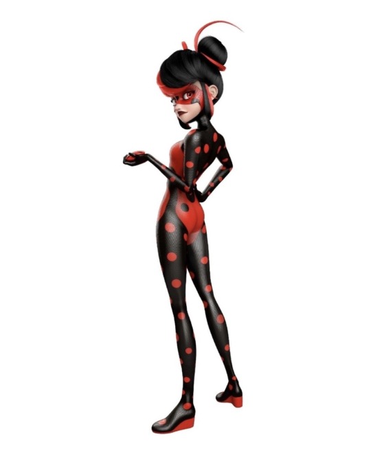

it's just her head that's amazingly designed and the fact that Ladybug's regular suit honestly couldn't set the bar any lower.
Griffe Noire on the other hand is actually punk through and through. Not giving a single shit what you think of his look and being the punkest bitch by even going with a feminine-coded name in the french original bc he doesn't care about your single-minded bs when you for some reason automatically think he MUST be female just because he has two "e"s in his name:

One of these two got one hell of a save design where barely a single risk was taken so she remains universally pretty for every viewer
And the other one actually was allowed to embody a whole new fashion style and life style, that fits perfectly as an extension of his OG character, merely things went south.
In my opinion there is no competition who got the better character design.
It's the one that actually does something for the character besides looking pretty, cool and being inoffensively save.
I'll give you a hint: it ain't Toxinelle.
edit:
Just to clarify this, I'm not saying I fell out of love for Toxinelle's design to be a b*tch. I'm saying it from the stands of me wanting the show to put the same amount on effort into Marinette's designs as Adrien's.
Griffe Noire is allowed to be straight up punk and yet the most I can give Toxinelle is that her design is Gothic-INSPIRED:

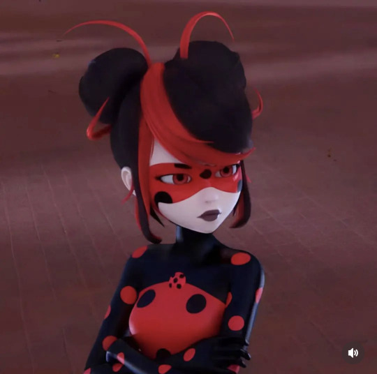
Again, her head is the most well designed part and especially the mask going underneath her chin, the amazing hair style and the conveniently fitting red-black color scheme works perfectly for Gothic.
As are her already incorporated gloves, the fact that she's wearing a mask in the first place and her dark makeup. Especially her vampire red eyes (like Monarque Bug, I love that detail) and I'll also give credit to how the upper red part of her body suit looks like a sleeveless dress and the little Ladybug symbol looking like a necklace.
All that combiened with her overall Gothic-elegance shows how AMAZING Toxinelle could have looked if they had for once taken an actual risk with her and prioritized what the fashion style is actually supposed to be over her looking universally pretty for every viewer.
I'm being nitpicky here because of how frustrating I find it that Griffe Noire has such a phenomenal character design, straight up one of the best in the show, and yet Marinette is still stuck with the same one-layer body suits a la "just this time the stripes go to the left"
Character design is not decided by if EVERYONE thinks they look great. The priority is what the character design does for the character. It's visual story telling.
I personally dress much more like Juleka or Emo Marinette in real life and yet in my opinion it's still crystal clear that Rose as Pigella has one of the best hero character designs because of how unapologetically ROSE it is:
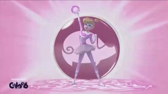
I personally don't have to want to wear it or even like it at all to think it's one of the best ones because of the simple fact that this design embodies Rose's PERSONALITY (as does her whole transformation) and tells me more about her.


Especially in direct comparison with Griffe Noire, or even civilian emo Adrien probably wearing his dead mother's jacket while Adrien HAS TO keep dressing more low-key, Toxinelle barely tells me a thing about this Marinette's personality besides "slay Queen"
Because there IS no personality. The most you can get out of this is her being even more uptight and closed off because of how her collar directly blends into her mask, keeping her in a visual choke hold.
But that's mostly it. For Griffe Noire they explicitly went with punk fashion, meaning everything punk stands for can now be put into new context with Adrien.
But Toxinelle barely embodies a fashion style, she's just Gothic-INSPIRED (at most). And that's such a shame because Gothic, especially if you wanna use it in a darker way, was a PERFECT fashion style to utilize here.
The most common Gothic styles are inspired by Victorian funeral wear and give off an aura of authority, seriousness and melancholic detachment, being kept in the past (this is in no way meant as generalization, fashion is complex)
In what reality COULDN'T we have gone with that for Toxinelle? She would have been the perfect complimentary style for Griffe Noire by her side.
And we don't even need to go with a dress. Gothic women wear pants too:
Can you imagine how amazing she could have looked as an actual goth? How much visual story telling through FASHION they could have put into her design when the evil Ladybug is a vampire goth whose fashion is inspired by funeral wear??
Yes, I AM pissed.
Thanks for coming to my TED talk.
#ml spoilers#miraculous ladybug#miraculous#Toxinelle & Griffe Noire#Shadybug & Claw Noir#ml paris special
139 notes
·
View notes
Text
Gangle the Dryad

The last of the masked clan of Dryads, “Gangle” is an influential resident of Casino. She is one of the dancers that entrance the residents of the faction with grace and elegance unmatched. It might have to do with her melancholy nature, despite the ever-present smiling mask. Often in despair, and doesn’t speak much. However, she does act friendly enough to both the natives of her new home and the other refugees. But don’t let her demeanor fool you. There’s something… off about her, especially regarding her own personal grove. No one who’s gone there has come back. And some rumors say she’s involved with some criminals’ punishment. Though it’s possible it’s just superstition. Even then, it’s not like the leaders she’s close with will say anything about it one way or another….
Five down, one to go! Ribbon girl has a body, a wooden one. She’s a walking tree. Yeah, I eventually decided on making Gangle a dryad, based/inspired by kousa dogwood trees. Mostly because I wanted her to have white flowers to go with her original color scheme. And I certainly tried my best to keep the red, black, and white she initially had.
So slight explanation. Two countries are mentioned in this world. One is “TAD”, which has the previous four made natives to, and another is called Ryardnja, though that name has fallen into obscurity. Probably be called “RY” or something like that. Gangle and Kinger are both from the latter, with Zooble being an honorary resident back when the country still existed. Hence why Gangle (and later Kinger) has a purple background color and Zooble has both green and purple.
And that’s why Gangle is 60s-inspired. I decided her main outfit would be in the mod fashion, as it’s supposed to be ‘modern’ and kind of futuristic. Compared to the now 80s environment she’s part of, and her attempting to be more involved with the present, I think it fits. And the second outfit… is honestly for fun; thought she’d look cute.
Her song is “Paint it Black” by The Rolling Stones
YouTube link here
#Spotify#the amazing digital circus#tadc#tadc gangle#the amazing digital circus gangle#gangle#gangle fanart#digital circus#tadc au#tadc post apocalypse#post apocalypse#post apocalypse au#artists#artists on tumblr#christian artist#art#character design#character redesign#music#60s music#60s fashion#60s aesthetic#humanradiojmp#worldbuilding#fantasy worldbuilding
20 notes
·
View notes
Text

drew the ow strike team as paladins of voltron, because i am normal about them :]
(2 other versions and a fucking essay below the cut!)

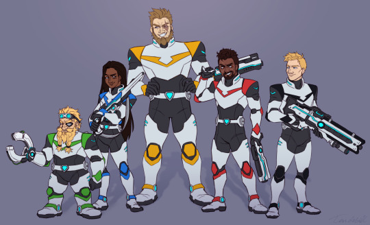
ok so im gonna give my reasoning for each of them
Reinhardt - the easierst to pick, the Yellow Lion is the most tank-like (besides the Black Lion, but thats cuz Black is the head + torso), also i think the legs of voltron are supposed to be the "pillars" that allow the team to work well, without them the whole thing crumbles (literally). from what i recall from the actual show, the Yellow Paladin is protective and loyal. Rein was the easiest to match up tbh (plus even the color fits lol)
Torbjörn - not my favourite choice, but tbh i dont think any other lion fits him? besides maybe Yellow, but Rein was too perfect so i couldnt give Torb that one. anyway, the Green Lion is the left hand. i consider the legs to be the "pillars" holding up the team, whereas the arms are the actual damage-dealers/the ones that act on what the leader commands. and as Torb is a dps, that fits just fine. hes not quite a leader, so being the left hand instead of the right is good. plus the Green Lion is inquisitive and curious, and since Torb is a genius, that fits just fine too. i thought he would look weird with green, since i associate him with red-orange-yellow the most, but he looks kinda nice
Ana - i was originally gonna make her blue from the get-go, but i thought it'd be silly to make the remaining three switch lions a bunch, so i can get an excuse to draw Gabe and Jack in multiple suits lmao. but Ana starts out as red, the right hand of Voltron, described as the most temperamental and aggressive. it requires a paladin that can keep up with it and works on instinct most of the time. i feel like Ana would have to BECOME the motherly figure for her team, instead of being one from the start. with that i think she would have been a more "lone wolf" type at first, only later on becoming more mindful of her teammates and how much they need her, which would lead to her becoming the paladin of the Blue Lion - a pillar that keeps the team going along with Rein, a vital part, but no longer in a leadership position. i've seen the Blue Lion described as a "free spirit" too, which i think is also perfect for her :3
Jack - for him i had three options, all of which fit him well: blue, red and black. and instead of picking one, i decided he was going to have three different lions :))) for shits and giggles. so he starts out as blue, a free spirit, very versitile (from what i gathered, the Blue Lion doesn't have a specific "thing" it specilizes in, but instead does a little bit of everything, kinda like Jack). i imagine Jack was the middle-man, an integral part of team-building. he would have been the one to push everyone to work together and follow Gabe's lead, but he was content being on the sidelines most of the time. eventually he takes up more responsibility, sees that he's vital for the team and that he can do more working side by side with Gabe, and so he becomes the paladin of the Red Lion, Gabe's right hand man. then he of course slowly grows to be the actual leader, as Gabe's approach changes and he slowly abandons his original role, passing the command over to Jack. and so Jack's last lion is the Black Lion. also i feel like all three lions fit Jack's color scheme pretty well, so that's another win for me hah
Gabe - since he was the original Strike Commander, i thought it only natural that he would be the first to pilot the Black Lion. the pilot needs to be decisive, stay cool in the face of danger and be someone whose men will follow him into battle with no hesitation - all traits that i see Gabriel would have had to have during the first Omnic Crisis. like i mentioned before, Jack eventually becomes his second in command, and then slowly their roles start to shift. Gabe is no longer content in making decisions for the whole team, he probably also becomes more violent and reckless, relying on Jack to keep him in check. he loses his connection with the Black Lion and becomes the paladin of the Red Lion, Jack's right hand man. the traits of Red fit him well too - aggressive, relies on instinct, temperamental, plus i imagine Gabe is the type to want to get things done as quickly as possible, no matter the risk, to save more people faster. plus, again, the colors match up yaaaay!
fun fact: i never finished watching voltron ^^
also i am truthing anahardt and reaper76 as we speak
#fighting all of my base instincts so i dont make this into an actual au and dont pour in hours of work to make it make sense#lowkey losing but holding on#voltron#voltron legendary defender#overwatch#overwatch2#ow#ow2#reaper overwatch#reaper76#anahardt#ana amari#jack morrison#torbjorn lindholm#reinhardt wilhelm#gabriel reyes#soldier 76#tendebill art#voltron au#overwatch strike team#voltron strike team AU#overwatch fanart
166 notes
·
View notes
Text
Clothing in Castlevania: Yellow vs Purple

Every Castlevania character has their clothing color scheme. With Trevor, it was reds and browns and then later black, red, and gold. Sypha's was white and blue. Alucard's was black and gold. In the Official Artbook, it says this was done to preserve some elements of their original video game designs. We can see they kept this change with Richter (blue) and Maria (pink.)
But Annette's original design wore a mostly green dress with some yellow accents, not a yellow one. It's a harmless change, of course, and it might just be a bid to completely remake her character, but I do wonder if there's more significance at play here because green was not forgotten by Nocturne. Annette says her favorite color is green, which I think is a very tiny, subtle callback to her old design while independently preserving her new look.
At first, I thought it might be in reference to her ancestor god Ogun, but from what I can find, his sacred colors are green and black, red, or sometimes blue, according to different regions. (As far as I understand.) So the significance for Annette's clothing change isn't here.

The answer, I think, partially lies with Olrox.
Yellow in general is often regarded as a positive color, representing success, a bright future, happiness, and optimism. It's also used to represent the sun just about universally around the world. Definitely a good choice for a protagonist and it also holds significance for the season finale as the ending is the sun literally going dark.
As for Olrox, his clothing color scheme is purple, same as the video games. This also fits his background in Nocturne as purple was regarded as a divine color by the Aztecs, reserved for priests and the nobility. A good choice for a powerful vampire.
So while the positivity and representation of the sun may hold true for Annette's yellow, I also want to point out that yellow is the polar opposite of purple on the color wheel. Maybe the color scheme choices for Annette and Olrox were intended to play off each other with Richter as the fulcrum between the two: Olrox's purple as Richter's dark past and Annette's yellow as the possibility of a brighter future.
#castlevania#castlevania nocturne#annette#olrox#yellow vs purple#castlevania netflix#trevor belmont#sypha belnades#alucard tepes#color significance
142 notes
·
View notes
Text
Disclaimer‼️ I am not a professional designer in anyway. These are just my opinions and if you like the original designs that is a-okay and more power to you!


So I found out about the Hundred Line Defense Academy from a repost tweet and checked it out only to find that most of the designs are alright… well except for two. Two of the designs we’ve seen so far were either so bad or so awkward that I felt the urge to redesign them complete with design comments.
Closeups + extra comments + earlier outfits I was struggling with under the cut ✨


Darumi’s original design is the one I actually outright hate. There’s just too much going on (the blue hair that awkwardly goes from black to blue at the top, the bows, the weird face tattoos, the striped sweater with bright red patches randomly thrown on, and the random pins??)
Plus the colors are just an eye sore (bright light blue, bright pink for the eyes, dark blue for the sweater, and strong red for chocked and patches????)
She also gives me vibes of being made in a test tube to be the fan favorite
Not only that but we have only seen two lines of dialogue from her we’ve seen (as of making this post) are just like- groan worthy
I went with the black with bright colors to try and make the whole “bright” colors thing work without making it as much of an eyesore
Anyways I feel like I strayed too far from the original in my redesign. I could’ve stuck to the blue color scheme a bit more instead of making her mostly black and pink. Oh well, it is what it is. I at least improved the colors a bit and still made the design fit her personality which is what matters


Kako’s original design is better to me than Darumi’s. It’s more awkward that outright bad
Again, the colors are a bit weird, but unlike Darumi’s original colors, the original colors could work. Light lilac, crimson red, navy, and white could work. The problem is the placing. By making Kako’s hair light lilac and uniform crimson red, that makes her mostly liliac and red which classes a lot. Your eyes are immediately drawn to the red uniform because it stands out so much instead of her face
However, unlike Darumi, another complaint I have is that Kako just looks like two Danganronpa characters smashed together (which is a fair complaint in my opinion because Kodaka made Kako AND Danganronpa and it’s in the same art style). She has a light lilac hair and purple eyes, which makes her look like Kyoko Kirigiri and a VERY similar outfit to Maki Harukawa (there’s a few differences like how Maki has a white bow with tiny red dots, a striped collar, and infinity pin and how Kako’s uniform is a dress and Maki’s is a shirt and skirt). Like at the very least they could have changed the uniform colors and eye colors
It took me until finishing Kako’s ref up to realize this, but the mini buns and extra strands of hair could work because they are kinda similar to Sailor Moon, and I dig her design. Though Kako’s hair is still off to me despite that for a reason I can’t pin down
Anyways I ended up making my redesign closer to her original design because her original design wasn’t as bad as Darumi’s and because I felt like I needed to balance things out since I made Darumi too far from the original I think
Alright that’s all I got commentary wise. Here’s some work in progress stuff for outfits that I ended up not going with
Hope this was a fun read through, for those interested


#artists on tumblr#art#fan art#character design#character design rant#character design critique#critique#art critique#art criticism#criticism#redraw#screenshot redraw#danganronpa#danganronpa fanart#danganronpa 4#hundred line last defense academy#hundred line#last defense academy#darumi amemiya#kako tsukumo#hundred line last defense academy fanart#hundred line fanart#last defense academy fanart#realclemart
18 notes
·
View notes