#how to read like a professor
Text

“Every novel is brand-new. It’s never been written before in the history of the world. At the same time, it’s merely the latest in a long line of narratives — not just novels, but narratives generally — since humans began telling stories to themselves and each other.”
― Thomas C. Foster, How to Read Novels Like a Professor: A Jaunty Exploration of the World’s Favorite Literary Form
#bookworm#bookish#booklover#book review#book recommendations#book blog#books#how to read like a professor
0 notes
Text
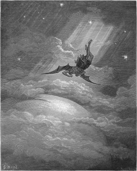
if magneto knew what the internet was then he would post to r/aita as often as possible and all his posts would be the top posts of the year. thats the kind of drama hes going through. he also gets permabanned from r/mutants for advocating violence
#.din#.txt#marvel#x men#GD I FORGOT HOW OFTEN XAVIER USED HIS GO GO GADGET PTSD ON MAGNETO IN THIS SERIES. JESUS CHRIST.#im scared of getting gwenpool'd into the marvel universe cause thatd be the first thing id think of if i met professor x#and like what if he hadnt used his go go gadget ptsd telepathy yet in that universe?#would i be responsible for teaching him how to give magneto war flashbacks?#would he be offended that i thought about it? might be worse if he wasnt honestly.#that would be my first five questions but my hand would be covering my mouth so hed be reading my mind.#< as in the go go gadget war flashbacks would be my first five questions i mean
1K notes
·
View notes
Text
why Aurora's art is genius
It's break for me, and I've been meaning to sit down and read the Aurora webcomic (https://comicaurora.com/, @comicaurora on Tumblr) for quite a bit. So I did that over the last few days.
And… y'know. I can't actually say "I should've read this earlier," because otherwise I would've been up at 2:30-3am when I had responsibilities in the morning and I couldn't have properly enjoyed it, but. Holy shit guys THIS COMIC.
I intended to just do a generalized "hello this is all the things I love about this story," and I wrote a paragraph or two about art style. …and then another. And another. And I realized I needed to actually reference things so I would stop being too vague. I was reading the comic on my tablet or phone, because I wanted to stay curled up in my chair, but I type at a big monitor and so I saw more details… aaaaaand it turned into its own giant-ass post.
SO. Enjoy a few thousand words of me nerding out about this insanely cool art style and how fucking gorgeous this comic is? (There are screenshots, I promise it isn't just a wall of text.) In my defense, I just spent two semesters in graphic design classes focusing on the Adobe Suite, so… I get to be a nerd about pretty things…???
All positive feedback btw! No downers here. <3
---
I cannot emphasize enough how much I love the beautiful, simple stylistic method of drawing characters and figures. It is absolutely stunning and effortless and utterly graceful—it is so hard to capture the sheer beauty and fluidity of the human form in such a fashion. Even a simple outline of a character feels dynamic! It's gorgeous!
Though I do have a love-hate relationship with this, because my artistic side looks at that lovely simplicity, goes "I CAN DO THAT!" and then I sit down and go to the paper and realize that no, in fact, I cannot do that yet, because that simplicity is born of a hell of a lot of practice and understanding of bodies and actually is really hard to do. It's a very developed style that only looks simple because the artist knows what they're doing. The human body is hard to pull off, and this comic does so beautifully and makes it look effortless.
Also: line weight line weight line weight. It's especially important in simplified shapes and figures like this, and hoo boy is it used excellently. It's especially apparent the newer the pages get—I love watching that improvement over time—but with simpler figures and lines, you get nice light lines to emphasize both smaller details, like in the draping of clothing and the curls of hair—which, hello, yes—and thicker lines to emphasize bigger and more important details and silhouettes. It's the sort of thing that's essential to most illustrations, but I wanted to make a note of it because it's so vital to this art style.
THE USE OF LAYER BLENDING MODES OH MY GODS. (...uhhh, apologies to the people who don't know what that means, it's a digital art program thing? This article explains it for beginners.)
Bear with me, I just finished my second Photoshop course, I spent months and months working on projects with this shit so I see the genius use of Screen and/or its siblings (of which there are many—if I say "Screen" here, assume I mean the entire umbrella of Screen blending modes and possibly Overlay) and go nuts, but seriously it's so clever and also fucking gorgeous:
Firstly: the use of screened-on sound effect words over an action? A "CRACK" written over a branch and then put on Screen in glowy green so that it's subtle enough that it doesn't disrupt the visual flow, but still sticks out enough to make itself heard? Little "scritches" that are transparent where they're laid on without outlines to emphasize the sound without disrupting the underlying image? FUCK YES. I haven't seen this done literally anywhere else—granted, I haven't read a massive amount of comics, but I've read enough—and it is so clever and I adore it. Examples:


Secondly: The beautiful lighting effects. The curling leaves, all the magic, the various glowing eyes, the fog, the way it's all so vividly colored but doesn't burn your eyeballs out—a balance that's way harder to achieve than you'd think—and the soft glows around them, eeeee it's so pretty so pretty SO PRETTY. Not sure if some of these are Outer/Inner Glow/Shadow layer effects or if it's entirely hand-drawn, but major kudos either way; I can see the beautiful use of blending modes and I SALUTE YOUR GENIUS.
I keep looking at some of this stuff and go "is that a layer effect or is it done by hand?" Because you can make some similar things with the Satin layer effect in Photoshop (I don't know if other programs have this? I'm gonna have to find out since I won't have access to PS for much longer ;-;) that resembles some of the swirly inner bits on some of the lit effects, but I'm not sure if it is that or not. Or you could mask over textures? There's... many ways to do it.
If done by hand: oh my gods the patience, how. If done with layer effects: really clever work that knows how to stop said effects from looking wonky, because ugh those things get temperamental. If done with a layer of texture that's been masked over: very, very good masking work. No matter the method, pretty shimmers and swirly bits inside the bigger pretty swirls!
Next: The way color contrast is used! I will never be over the glowy green-on-black Primordial Life vibes when Alinua gets dropped into that… unconscious space?? with Life, for example, and the sharp contrast of vines and crack and branches and leaves against pitch black is just visually stunning. The way the roots sink into the ground and the three-dimensional sensation of it is particularly badass here:

Friggin. How does this imply depth like that. HOW. IT'S SO FREAKING COOL.
A huge point here is also color language and use! Everybody has their own particular shade, generally matching their eyes, magic, and personality, and I adore how this is used to make it clear who's talking or who's doing an action. That was especially apparent to me with Dainix and Falst in the caves—their colors are both fairly warm, but quite distinct, and I love how this clarifies who's doing what in panels with a lot of action from both of them. There is a particular bit that stuck out to me, so I dug up the panels (see this page and the following one https://comicaurora.com/aurora/1-20-30/):

(Gods it looks even prettier now that I put it against a plain background. Also, appreciation to Falst for managing a bridal-carry midair, damn.)
The way that their colors MERGE here! And the immense attention to detail in doing so—Dainix is higher up than Falst is in the first panel, so Dainix's orange fades into Falst's orange at the base. The next panel has gold up top and orange on bottom; we can't really tell in that panel where each of them are, but that's carried over to the next panel—

—where we now see that Falst's position is raised above Dainix's due to the way he's carrying him. (Points for continuity!) And, of course, we see the little "huffs" flowing from orange to yellow over their heads (where Dainix's head is higher than Falst's) to merge the sound of their breathing, which is absurdly clever because it emphasizes to the viewer how we hear two sets of huffing overlaying each other, not one. Absolutely brilliant.
(A few other notes of appreciation to that panel: beautiful glows around them, the sparks, the jagged silhouette of the spider legs, the lovely colors that have no right to make the area around a spider corpse that pretty, the excellent texturing on the cave walls plus perspective, the way Falst's movements imply Dainix's hefty weight, the natural posing of the characters, their on-point expressions that convey exactly how fuckin terrifying everything is right now, the slight glows to their eyes, and also they're just handsome boys <3)
Next up: Rain!!!! So well done! It's subtle enough that it never ever disrupts the impact of the focal point, but evident enough you can tell! And more importantly: THE MIST OFF THE CHARACTERS. Rain does this irl, it has that little vapor that comes off you and makes that little misty effect that plays with lighting, it's so cool-looking and here it's used to such pretty effect!
One of the panel captions says something about it blurring out all the injuries on the characters but like THAT AIN'T TOO BIG OF A PROBLEM when it gets across the environmental vibes, and also that'd be how it would look in real life too so like… outside viewer's angle is the same as the characters', mostly? my point is: that's the environment!!! that's the vibes, that's the feel! It gets it across and it does so in the most pretty way possible!
And another thing re: rain, the use of it to establish perspective, particularly in panels like this—

—where we can tell we're looking down at Tynan due to the perspective on the rain and where it's pointing. Excellent. (Also, kudos for looking down and emphasizing how Tynan's losing his advantage—lovely use of visual storytelling.)
Additionally, the misting here:

We see it most heavily in the leftmost panel, where it's quite foggy as you would expect in a rainstorm, especially in an environment with a lot of heat, but it's also lightly powdered on in the following two panels and tends to follow light sources, which makes complete sense given how light bounces off particles in the air.
A major point of strength in these too is a thorough understanding of lighting, like rim lighting, the various hues and shades, and an intricate understanding of how light bounces off surfaces even when they're in shadow (we'll see a faint glow in spots where characters are half in shadow, but that's how it would work in real life, because of how light bounces around).
Bringing some of these points together: the fluidity of the lines in magic, and the way simple glowing lines are used to emphasize motion and the magic itself, is deeply clever. I'm basically pulling at random from panels and there's definitely even better examples, but here's one (see this page https://comicaurora.com/aurora/1-16-33/):

First panel, listed in numbers because these build on each other:
The tension of the lines in Tess's magic here. This works on a couple levels: first, the way she's holding her fists, as if she's pulling a rope taut.
The way there's one primary line, emphasizing the rope feeling, accompanied by smaller ones.
The additional lines starbursting around her hands, to indicate the energy crackling in her hands and how she's doing a good bit more than just holding it. (That combined with the fists suggests some tension to the magic, too.) Also the variations in brightness, a feature you'll find in actual lightning. :D Additional kudos for how the lightning sparks and breaks off the metal of the sword.
A handful of miscellaneous notes on the second panel:
The reflection of the flames in Erin's typically dark blue eyes (which bears a remarkable resemblance to Dainix, incidentally—almost a thematic sort of parallel given Erin's using the same magic Dainix specializes in?)
The flowing of fabric in the wind and associated variation in the lineart
The way Erin's tattoos interact with the fire he's pulling to his hand
The way the rain overlays some of the fainter areas of fire (attention! to! detail! hell yeah!)
I could go on. I won't because this is a lot of writing already.
Third panel gets paragraphs, not bullets:
Erin's giant-ass "FWOOM" of fire there, and the way the outline of the word is puffy-edged and gradated to feel almost three-dimensional, plus once again using Screen or a variation on it so that the stars show up in the background. All this against that stunning plume of fire, which ripples and sparks so gorgeously, and the ending "om" of the onomatopoeia is emphasized incredibly brightly against that, adding to the punch of it and making the plume feel even brighter.
Also, once again, rain helping establish perspective, especially in how it's very angular in the left side of the panel and then slowly becomes more like a point to the right to indicate it's falling directly down on the viewer. Add in the bright, beautiful glow effects, fainter but no less important black lines beneath them to emphasize the sky and smoke and the like, and the stunningly beautiful lighting and gradated glows surrounding Erin plus the lightning jagging up at him from below, and you get one hell of an impactful panel right there. (And there is definitely more in there I could break down, this is just a lot already.)
And in general: The colors in this? Incredible. The blues and purples and oranges and golds compliment so well, and it's all so rich.
Like, seriously, just throughout the whole comic, the use of gradients, blending modes, color balance and hues, all the things, all the things, it makes for the most beautiful effects and glows and such a rich environment. There's a very distinct style to this comic in its simplified backgrounds (which I recognize are done partly because it's way easier and also backgrounds are so time-consuming dear gods but lemme say this) and vivid, smoothly drawn characters; the simplicity lets them come to the front and gives room for those beautiful, richly saturated focal points, letting the stylized designs of the magic and characters shine. The use of distinct silhouettes is insanely good. Honestly, complex backgrounds might run the risk of making everything too visually busy in this case. It's just, augh, so GORGEOUS.
Another bit, take a look at this page (https://comicaurora.com/aurora/1-15-28/):

It's not quite as evident here as it is in the next page, but this one does some other fun things so I'm grabbing it. Points:
Once again, using different colors to represent different character actions. The "WHAM" of Kendal hitting the ground is caused by Dainix's force, so it's orange (and kudos for doubling the word over to add a shake effect). But we see blue layered underneath, which could be an environmental choice, but might also be because it's Kendal, whose color is blue.
And speaking off, take a look at the right-most panel on top, where Kendal grabs the spear: his motion is, again, illustrated in bright blue, versus the atmospheric screened-on orange lines that point toward him around the whole panel (I'm sure these have a name, I think they might be more of a manga thing though and the only experience I have in manga is reading a bit of Fullmetal Alchemist). Those lines emphasize the weight of the spear being shoved at him, and their color tells us Dainix is responsible for it.
One of my all-time favorite effects in this comic is the way cracks manifest across Dainix's body to represent when he starts to lose control; it is utterly gorgeous and wonderfully thematic. These are more evident in the page before and after this one, but you get a decent idea here. I love the way they glow softly, the way the fire juuuust flickers through at the start and then becomes more evident over time, and the cracks feel so realistic, like his skin is made of pottery. Additional points for how fire begins to creep into his hair.
A small detail that's generally consistent across the comic, but which I want to make note of here because you can see it pretty well: Kendal's eyes glow about the same as the jewel in his sword, mirroring his connection to said sword and calling back to how the jewel became Vash's eye temporarily and thus was once Kendal's eye. You can always see this connection (though there might be some spots where this also changes in a symbolic manner; I went through it quickly on the first time around, so I'll pay more attention when I inevitably reread this), where Kendal's always got that little shine of blue in his eyes the same as the jewel. It's a beautiful visual parallel that encourages the reader to subconsciously link them together, especially since the lines used to illustrate character movements typically mirror their eye color. It's an extension of Kendal.
Did I mention how ABSOLUTELY BEAUTIFUL the colors in this are?
Also, the mythological/legend-type scenes are illustrated in familiar style often used for that type of story, a simple and heavily symbolic two-dimensional cave-painting-like look. They are absolutely beautiful on many levels, employing simple, lovely gradients, slightly rougher and thicker lineart that is nonetheless smoothly beautiful, and working with clear silhouettes (a major strength of this art style, but also a strength in the comic overall). But in particular, I wanted to call attention to a particular thing (see this page https://comicaurora.com/aurora/1-12-4/):

The flowing symbolic lineart surrounding each character. This is actually quite consistent across characters—see also Life's typical lines and how they curl:

What's particularly interesting here is how these symbols are often similar, but not the same. Vash's lines are always smooth, clean curls, often playing off each other and echoing one another like ripples in a pond. You'd think they'd look too similar to Life's—but they don't. Life's curl like vines, and they remain connected; where one curve might echo another but exist entirely detached from each other in Vash's, Life's lines still remain wound together, because vines are continuous and don't float around. :P
Tahraim's are less continuous, often breaking up with significantly smaller bits and pieces floating around like—of course—sparks, and come to sharper points. These are also constants: we see the vines repeated over and over in Alinua's dreams of Life, and the echoing ripples of Vash are consistent wherever we encounter him. Kendal's dream of the ghost citizens of the city of Vash in the last few chapters is filled with these rippling, echoing patterns, to beautiful effect (https://comicaurora.com/aurora/1-20-14/):

They ripple and spiral, often in long, sinuous curves, with smooth elegance. It reminds me a great deal of images of space and sine waves and the like. This establishes a definite feel to these different characters and their magic. And the thing is, that's not something that had to be done—the colors are good at emphasizing who's who. But it was done, and it adds a whole other dimension to the story. Whenever you're in a deity's domain, you know whose it is no matter the color.
Regarding that shape language, I wanted to make another note, too—Vash is sometimes described as chaotic and doing what he likes, which is interesting to me, because smooth, elegant curves and the color blue aren't generally associated with chaos. So while Vash might behave like that on the surface, I'm guessing he's got a lot more going on underneath; he's probably much more intentional in his actions than you'd think at a glance, and he is certainly quite caring with his city. The other thing is that this suits Kendal perfectly. He's a paragon character; he is kind, virtuous, and self-sacrificing, and often we see him aiming to calm others and keep them safe. Blue is such a good color for him. There is… probably more to this, but I'm not deep enough in yet to say.
And here's the thing: I'm only scratching the surface. There is so much more here I'm not covering (color palettes! outfits! character design! environment! the deities! so much more!) and a lot more I can't cover, because I don't have the experience; this is me as a hobbyist artist who happened to take a couple design classes because I wanted to. The art style to this comic is so clever and creative and beautiful, though, I just had to go off about it. <3
...brownie points for getting all the way down here? Have a cookie.
#aurora comic#aurora webcomic#comicaurora#art analysis#...I hope those are the right tags???#new fandom new tagging practices to learn ig#much thanks for something to read while I try to rest my wrists. carpal tunnel BAD. (ignore that I wrote this I've got braces ok it's fine)#anyway! I HAVE. MANY MORE THOUGHTS. ON THE STORY ITSELF. THIS LOVELY STORY#also a collection of reactions to a chunk of the comic before I hit the point where I was too busy reading to write anything down#idk how to format those tho#...yeet them into one post...???#eh I usually don't go off this much these days but this seems like a smaller tight-knit fandom so... might as well help build it?#and I have a little more time thanks to break so#oh yes also shoutout to my insanely awesome professor for teaching me all the technical stuff from this he is LOVELY#made an incredibly complex program into something comprehensible <3#synapse talks
746 notes
·
View notes
Text
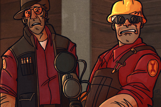
practical problems screenshot redraw!! :DDD
#i dont like how engie looks in my style :( some day i'll figure out how to draw him... some day.#also any trash professor abacus (instrumental) by torpedo boyz(song that plays in the sfm) is liek one of my fave songs of all time btw#everytime i read the tf2 comics i play that song on repeat and only that song for all 6 comics in a row.#it is my tf2 theme song and i love it and it is currently playing at the time of posting this lol.#art#digital art#tf2#tf2 fanart#team fortress two#tf2 sniper#tf2 engineer#sfm art#discounts art
289 notes
·
View notes
Text
my new headcanon for why chase is Like That about house is that back when chase was first hired, before cameron and foreman joined the team, house decided to pavlov his fellows. and for every correct diagnosis a fellow received a tasty little treat. and chase was INTENSELY susceptible to this and house stopped doing it eventually because it became very boring. but chase still subconsciously hopes that one day house will give him a tasty little treat if he just comes up with a diagnosis brilliant enough to earn house’s approval
#chase dogboy agenda#i dont know how operant conditioning works my psych professor was really hot and i was very distracted in her class#she made us read out our personality test results in front of the class and said that i should seek psychiatric help bc i had#‘a warped perception of myself’ and ngl ive jerked off while thinking about that moment like a LOT#house md#chouse#robert chase#house md headcanon#house md hc
149 notes
·
View notes
Text
The Vampire and the Stag: A Look Into the Symbolic significance of Dutch Van Dir Linde and High Honor Arthur Morgan
Warning: This post has spoilers for Red dead 2
Symbolism is one of the most important visual and literary elements used to push the narrative of Red Dead Redemption 2. The game is chock full of biblical references, animal symbolism, and references to other famous works. Hell, I might've even found a Blood Meridian reference via that Judge Meredith Holden letter, but that might be a reach. In any case, this game uses symbolism to push the story further and I want to do a short little retrospective on my two favorite characters of this game and what they represent in the literary sense.
Let's start with Dutch.
Dutch Van Dir Linde is many things. He's a violent idealist, a romantic, a gang leader, a notorious outlaw, and a legendary gunslinger in his own right.
He's also an allegory for the vampire, and by vampire, I mean the European literary symbolism of the creature.
Let's start off with looks. Right from the get go, Dutch is differentiatued from the rest of the gang members by his luxurious and eccentric appearance, something that the vampire usually has. He had gold chains, personalized gold rings, one with a D and another with a lion. His jacket seems to be velvet, he smokes cigars rather than cigarettes, and his hair is done up in ringlets as we know his actual hair texture is straight rather than curly (Guarma, epilogue, RDR1).
His color scheme is also very stereotypical of the more modern vampire. While other characters usually have a more diverse color scheme, Dutch is suited in reds and blacks the entire main game.
The nature of the undead is also with Dutch via his horse, the Count. First of all, there is just the name the Count that gives off vampire energy (Count Dracula) but there is also the fact that Dutch's horse shouldn't exist. Foals born with albinism, which is the coat the Count is said to have, die because of lethal white syndrome. The Count should have died long ago but it's still alive somehow- he cheated death like a vampire. That's also not mentioning death in the sense that death comes riding on a pale horse.
Vampires in classic literature are never just about vampires as these charming blood sucking creatures almost always exist to convey a deeper meaning of consumption. In the 1800s, this idea of consumption, with the most famous visualization of it being the older vampire man sucking the blood of young, usually virginal women, is often an allegory for selfish sex and defilement. Vampires in old media could very well be a criticism of wealthy men taking advantage of younger women, taking their virginity, and then tossing them aside and being virtually fine while the women lose everything from respect to family to even lives, which can also be the case with Dutch and Molly, but overtime, the vampire became less an allegory to write sex without outwardly writing sex in the 1800s, and became more a symbol of personal consumption at the expense of others.
The wonderful Professor Thomas C. Foster puts it best: "That's what this figure (the vampire) really comes down to, whether in Elizabethan, Victorian, or more modern incarnations: exploitation in its many forms. Using other people to get what we want. Denying someone else's right to live in the face of our overwhelming demands. Placing our desires, particularly our uglier ones, above the needs of another. That's pretty much what the vampire does, after all." - "How to Read Literature Like a Professor"
Dutch is basically that. He consumes people for the sake of his own goals, his own dreams, and his own delusions of grandeur. He will believe in people as long as those people believe in him, but their belief in him is more important to him than his belief in them.
Dutch seems like a Messiah to the disenfranchised, a Jesus figure of sorts. He seems charming, empathetic, cultured, and different from other men, like the vampire. People are enthralled by him, become obsessed or loyal to him, like the vampire's victims. However, these people, like Arthur, John, Molly, Bill, Javier, etc., are used and Dutch, the vampire, doesn't return the favor as he only consumes for his own favor.
And in the end? People suffer or they die and Dutch moves on to his next victims, even if he did love these people.
Dutch is the embodiment of the vampire in every possible way except in the most literal way, which is the blood sucking.
Now let's move on to Arthur Morgan.
Arthur and the stag are one in the same when it comes to Red Dead's symbolism. If one were to mention a stag in the Red Dead universe, more likely than not, people would think of high honor Arthur Morgan. The Stag is Arthur's symbolism, but let us dig a little deeper into what the stag could symbolize beyond just high honor.
When it comes to animal symbolism, stags are almost as iconic as male lions with what they are meant to represent. All throughout various cultures, the stag usually represents a noble creature. It can represent honor (duh), strength, virility, grace, and regeneration, amongst other things, but I want to focus on interpretations of the stag from a few cultures and how they ultimately relate back to Arthur Morgan.
Considering that Arthur has Welsh heritage, or so we assume, let us start with the interpretation of the stag in Welsh culture and mythology. The stag has a huge presence in Welsh culture and mythology, with even some gods and higher beings taking the image of a stag. However, I would like to focus on the stag as a messenger, a messenger between worlds, which is what Arthur becomes in a sense to John Marston.
John's world for such a huge part of his life as the gang. The gang raised him, fed him, taught him to read, taught him morals, taught him many skills, and gave him a purpose. The gang is his world and for such a huge chunk of his life, it was the only world he knew. Sure, Abigail gets pregnant because of him, but she was a part of that world too.
Arthur was able to see other worlds. Mary wasn't a girl who was downtrodden like Abigail and thus would take on well to the life they lived. She was a normal girl and he was not a normal man. Eliza wasn't part of his gang life either, and neither was Issac. They lived in a different world, in a world of civilization, in a world where they didn't or shouldn't have had to keep one eye open to stay alive. Arthur would jump over to their worlds, even if just for a short amount of time, and then back to the gang- he has seen and experienced both of those worlds.
Arthur then gives John the message that he should leave and be a man and provide for his wife and protect his child by leaving the gang life that destroyed the both of them. Arthur becomes a messenger from one world to another- from gang life to normalcy. And with that message, John experiences a change- a change of character and motives.
The Stag is a messenger and Arthur is a messenger. A messenger to not only John, but to everyone else he tried to get out of there for he experienced two worlds and one is better than the other.
Another interpretation of the stag is the selflessness of sacrifice, which can be shown through the Greek culture of story and mythology and explained perfectly in the story "Iphigenia at Aulis" by Euripides. Iphigenia goes to her father and tells him that she will offer herself as a sacrifice to the goddess Artemis. Sacrifices must be made to keep the gods happy and the people alive and happy. Iphigenia offering such a thing shows her selflessness, her want of wanting others to be safe and sound, even at the expense of herself.
Sound familiar?
Reminds me of a certain dark romantic cowboy.
By the end of the story, Iphigenia's selflessness was rewarded by the goddess, and as Iphigenia's father was about to slit her throat, the girl got replaced by a stag while Iphigenia was escorted to live amongst the gods for her selflessness.
The deer becomes the sacrifice and in a way, Iphigenia and the deer become one and the same. The deer is sacrificed for the sake of others- the stag becomes a symbol of noble selflessness, much like Arthur. Arthur sacrifices himself in order to save John, Abigail, and Jack- a noble cause, a noble sacrifice.
The stag being a noble sacrifice is also associated with certain Native American cultures (I cannot for the life of me think of which tribes they were exactly, but once I find them, I will edit this post). The stag must be killed for people to eat, thus the deer is a noble creature. The consumption of the stag is an allegory of people living better lives or having better days because of the sacrifice of a person. Because of that, the stag is a heavily respected creature.
And given that Dutch's vampire is all about consumption, Arthur's symbolism of being a stag is perfect for their dynamic since the deer is all about sacrifice and nobility and the vampire is all about selfishness and despair.
In any case, the deer represents many things across many cultures, from being a messenger to being a sacrifice, but one thing for certain is that the stag is synonymous with honor and nobility- the person that Arthur tried to be in the end.
Yapyapyapyapyapgodifuckinglovesymbolism-
#rdr2#red dead redemption 2#arthur morgan#dutch van der linde#symbolism#literature#vampires#stags#yall did i cook?#i had so much fun with this#also#that how to read like a professor book is godlike
44 notes
·
View notes
Text

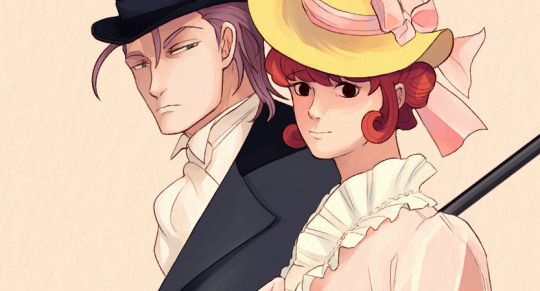
A Victorian couple. (Leyendecker redraw)
#the great ace attorney#tgaa#tgaa spoilers#dgs spoilers#klint van zieks#klimt van zieks#lady baskerville#<- isn't it madam van zieks tbh (though i like that she has at least a last name)#i'm glad i didnt rush this one.. i think i started it one or two months ago?#i like painting because since it's more time consuming i get to really think about the characters and what kind of thoughts they were havin#at that moment... in this one i'd say the professor killings have already started. kvz looks quite grim here compared to how silly i usuall#depict him lol#anyways! move outta the way gayboy im about to get it#i wanna do this with mr asougi (gen-chan..💖) as well at some point#OKAY done rambling <3 idk if anyone reads this far but if u do hiii. the joys of following daipeanutsaiban on tumblr: chatter for days#scheduled#help i forgot the ship tags im not retyping all that.#klintville#baskerzieks#fun fact: the ship name for klint and the name i gave lady (primrose) would be *drumroll* ...PRINT....lmao....
97 notes
·
View notes
Text

Can I get an amen?
#postal dude#p1#postal dude sr#religous imagery#postal redux#my favorite Christ figure#like Jesus he has long hair#vaguely middle aged idk if 27 counts but idc#good with kids (he didn't kill them)#according to “how to read literature like a professor” these are some attributes of a Christ figure.#take this with a grain of salt#just an observation and joke
46 notes
·
View notes
Text
Mingjue's gaze softens.
"Didi. You are confused. You are misinterpreting brotherly love for romantic interest."
Huaisang clenches his firsts and stares down at the floorboards. His expression morphs into one of pain. He draws in a deep breath.
"Da-ge, please sleep with me." Mingjue's body jerks back at his little brother's words. "If I sleep with you, then I'll know for sure what I'm feeling."
#bro doing anything but organizing her code#my brother says i write like i wasnt allowed to go to school#recently my brother had to do a project for school where he had to pick up a new hobby#he didnt do the assignment and at the last day he was like brother im so fucked help me#so i let him use one of my fanfics for the before and told him to use his own fanfic as an after and present that#his professor told him his improvement was incredible#thats all i have to say#theres something so cringe about when i write#ill write it and be like yeah. and then i read over it and die#unironically i actually run away from my fics. i have never once read them again after finishing#like when i draw. i look at it. im like yeah that part is good that part is bad. pretty mid but its ok.#writing? i turn red and hide from the monster i have created#i think my writing could be lethal. like if i read all my fics one after the other id die from cringe poisoning#i regularly look at my old drawings and cry how much ive regressed. but i can look at them.#one time my friend wanted to torture me so he called me to read my fics out loud. i endorse this as an execution method#shit gets me sweating. i have to get normal about this#some words#wip#the second wip actually#the first one is the saber spirit takes over nmj and he fucks nhs on the training grounds infront of everyone.#second one is nmj is like brother you have to stop being a freak this is getting out of hand and nhs is like nuh-uh. but also how'd you kno#on a side note remember my former student that confessed? yeah well#he proposed marriage
13 notes
·
View notes
Text
Hey, Tolkien fandom!
Do you guys ever just sit there, as peaceful as a hobbit in the Shire, lost in your own thoughts in a beautiful place, thinking about how blessed we all are to have read J.R.R Tolkien's writing, to have received the blessing of Christopher Tolkien's continuation of his father's work, and to have seen Peter Jackson's glorious adaptation of it all? Your chest expands whenever you think about the Battles of Beleriand (for good or ill), Beren and Lúthien's journey and how their love changed the course of Middle-earth, Theoden's speech when they were about to save Minas Tirith. Right?
But then...
You remember that Rings of Power exists. That it's a thing that's been made.
That's just sad. And an outright desecration.
#ropgarbage#srsly#I was reading the silmarillion for the 9374839th time#as I tend to do#and I took a break to check what tumblr was up to#and for some reason#even though I blocked all the rings of power tags#there was a rop content in my mentions which really couldn't have come at a worst time#and it hits you REALLY hard#like... how much of an insult rings of power is to our beloved professor's work#there are no words#you can make fun of me it's fine#fine I am a tolkien nerd... and proud of it#but I am genuinely angry#that this trash called rings of power#even exists#I will crap on this disgusting thing until the day I die
17 notes
·
View notes
Text
I wrote about going to the most recent live show for an assignment and one of my peer reviews was just this when I described Night Vale

#AAAAAAAAAAAA#WORST WORD CHOICE POSSIBLE#not to mention it was kind of a dick review since I literally just described how NV is an unexplainable paranormal town#my professor liked it but the my peer reviews nicked at things as if they didn’t read my paper#but cie la vie#welcome to night vale#wtnv#cecil palmer#carlos the scientist#welcome to night vale live show
32 notes
·
View notes
Text
You don’t like him because he’s evil? Grow up. The way in which the narrative displays his separation from the higher plane as an ultimate act of rejection from a being capable of divine and unconditional love that somehow cannot accept him, in which the rejection itself was caused by his own jealousy of humanity and subsequent desire to destroy that which the other loved as a means to free both himself and those like him from servitude to these “lesser beings”, all of which can be traced back to his initial twisted desire to be loved in a way he could understand (something that at is fundamentally misaligned from his counterpart) that ultimately ends in his own destruction and the sacrifice of the counterpart for the sake of humanity IS PART OF HIM. And I for one, love him for it 💖
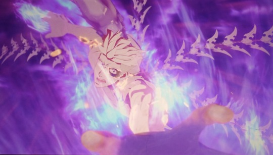
#trigun#trigun stampede#trigun spoilers#trigun knives#knives millions#vash the stampede#trigun vash#i do think it’s really funny how I read paradise lost in college and not only was I like ‘Satans right’#but i scared my professor because not only is he right but he’s also hot and was making great arguments#like fuck the trinity wtf was happening in that piece like I think Milton wanted Satan to be the most hot and right person#im sorry you can’t dissuade me from this#anyways knives Trigun was ok but then the fall happened and oh? ok bet I get it now :)
98 notes
·
View notes
Text
an overview of the things we watched during my turbofolk seminar for @roadwhores @lofimp3 and my other balkan (and non-balkan) followers who might be interested
(my professor is bulgarian for context and unfortunately she hasn’t made the presentation with all the additional information public yet so these r just my personal notes & things ive remembered.Thumbs up)
we started with the only balkan song that is on the voyager golden record which i thought was sooooo beautiful as someone from a country who didn’t have anything interesting to contribute to the golden record besides the greeting to the universe i feel very humbled and reverent to have listened to it
goran bregović - bella ciao & kalashnikov at sziget festival 2012 (our professor mentioned that he’s kind of a piece of shit who steals songs from marginalized communities and profits off of it and has been actively sued for it in the past so i made sure to shake my head while i was listening to show that i didn’t agree with his actions)
recordings of traditional folk songs being performed at serbian weddings I forgot to write the performer’s name down but he played the clarinet beautifully and someone stuck a bill to his forehead while he was playing to show their appreciation which I think we need to bring back)
we talked abt ceca quite extensively and also looked at one paparazzi photo of her with some politician guy who besides being her biggest fan in the world is also apparently a huge fan of vinnetou & robert de niro which i thought was kind of a slay personally
we watched one lepa brena video from the 80s and one from the 90s to see the transformation of her style and the sound of her music throughout the years
+ also clips of her wedding to boba which we compared to ceca’s wedding to the serbian mobster who then ended up being assasinated (we didn’t touch on ceca’s personal criminal history too much but after a brief glimpse at her wikipedia page I think we should have im slightly obsessed with her i think)
the most aggressively 90s and vaguely bisexual music video by saška vaseva abt clubbing and drinking….loved it
neshto netipichno (probably not spelled right but i copied it from the yt title) by ivana
azis!!!!!!!!! he’s such an icon to me our professor showed us a selection of his mvs ranging from the time when he wasn’t out as a gay man yet to i think his most recent song so we kind of witnessed his whole transformation from his like full blown drag stuff (i.e "hop" - SLAY!!!!!!!!!!!!!!!) to his most recent very aggressively masculine & americanized style but i am literally actually legitimately obsessed with his look from his old videos i need to look exactly like him immediately like . Are you kidding me

we ended with dubioza kolektiv - USA & no escape from balkan and i kind of want to tattoo the lyrics of the second song on my body if im being honest i respect what these guys have going on
overall it was definitely the best seminar from this course and im so glad i dragged my lifeless body out of bed in the morning to attend it bc i cannot even imagine missing out on it you guys have a very wonderful culture and i loved that 80s & 90s balkan music videos literally look identical to czech mvs from that time I felt a deep sense of kinship while watching them. Long live yugoslavia ❤️
#our professor obvs had much more insightful commentary on a lot of things including the relationship between turbofolk & balkan politics#+ the most frequent key themes of the songs and how it was usually typical for the female pop stars to have a very sexualized look etc#and how the music mostly became associated with like the criminal underground etc#but i was so caught up in the euphoria of turbofolk and also so focused on remembering everything so that I could make this report#that i forgor </3 and I cannot refresh my memory on account of the presentation still not being updated#but I hope this is still fun & interesting to read……Smiles#mp
13 notes
·
View notes
Text

good day to all 5 people who ship Clemmy have this shitty ass no effort me meme
#mar draws things#(??? I GUESS?????)#professor layton#clive dove#emmy altava#clemmy#of course the first PL post I post on the internet is a shitty ass rarepair ship meme#and not like#an ACTUAL drawing i've done because no I needed to make this funny haha#I could probably see this working the otherway round but this was too funny not to have it done like this#something about characters who aren't usually easily flustured getting flustured gets to me idk#hot take clive probably gets very easily flustered but tries to look but unfortunately he is a NERD (affectionate)#idk how I started shipping this but I am here now#it's always the rarepairs that gets me#*shakes fists dramatically* always the rarepairs#ANYWAYS HI HELLO IF YOU READ ALL THESE TAGS YOU'RE GREAT HAVE A NICE DAY#clive has wormed his way up to being my second fav PL character (nobody will ever top Luke being number 1 sorry clive)
29 notes
·
View notes
Note
Have any fic recommendations for Prof. Membrane and kids content?
Hi there!! yea yea let me checkk
Ao3:
All the Membrane's Guide to Becoming a Better Parent: LOSE YOUR FUCKING ARMS
A Pretty Shitty Bloaty's Coupon
Never Love an Anchor
Parenting, Science Style
Classified
Professor Membrane and the Mall Santa
Stitching The Wounds Up.
Science Dad
Fanfiction.net
I'm Still Here
(I haven't checked this website enough.)
And if someone has more fic recs with this theme pls gimme gimme gimmee
#ask#professor membrane#dib membrane#gaz membrane#fic recs#invader zim#I don't know how long I spent looking for each one lmao#there was even one that I remembered reading but apparently it was deleted -sad noises-#Anyway I hope you like these#fanfictions my beloved
100 notes
·
View notes
Text
the constant theme of water throughout this season! Not only with Stede literally jumping in multiple times to pull Ed out, but also the storm!?! The way it serves as a purge/cleansing for him?!? The way that all of his masks are literally washed away and you realize his insanity? The way the crew tells Stede that he was washed off the boat in the storm, still believing to some extent that all of Ed’s actions weren’t done with his full mind? That he was swept away by his madness? And when he finally decides to live, the fact that he is pulling himself out of the depths? He is choosing to stop sinking? Just water as renewal y’all
#our flag means death#ofmd#stede bonnet#ofmd season 2 spoilers#ofmd spoilers#how to read literature like a professor#ed teach
18 notes
·
View notes
Last Seen Blogs

matsusforyou
Matsus and More!

yogat-it
yogat.it
alunasky-blog
Alunasky

dramacide
At sea

flyba3
Eat My Lemons