#i think it really helped with composition and made the process more fun ^^
Explore tagged Tumblr posts
Text
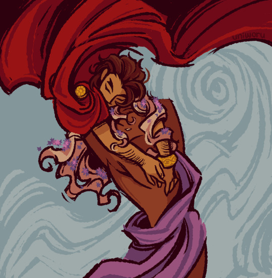
the sun's embrace
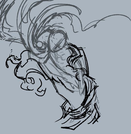
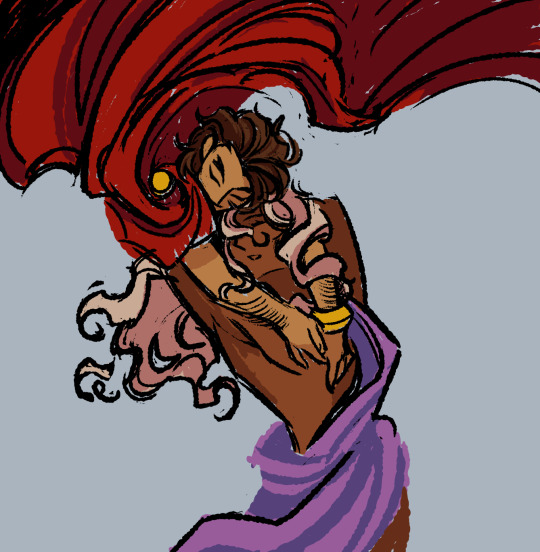

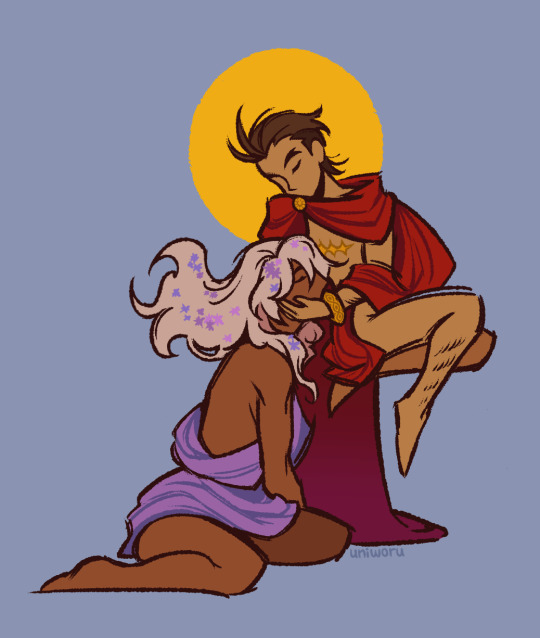
some progress pics and a comparison with the greek mythology klapollo i drew in december 2023
#ace attorney#gyakuten saiban#klapollo#apollo justice#klavier gavin#kyodoroki#i pretty much drew the entirety of this in one night..#idk what came over me but hey i like how it turned out#also i tried a new method where i didnt zoom in as much so i wouldnt get too caught up in tiny details#i think it really helped with composition and made the process more fun ^^#art#my art
1K notes
·
View notes
Text
speaking of drawing people's faces and lifting any art of [will roland role based] characters overhead when you can tell the artist was actually trying to meaningfully use that inspiration beyond "brown hair. glasses" like wow once in a lifetime unsame as it ever was
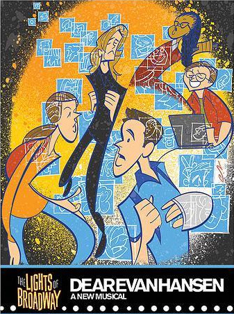
not coming up a lot that Professional Illustrators are drawing will roland as [role] or like, in general, but that in fact there Are the examples of professional illustrator justin "squigs" robertson drawing him several times and it's like, doing stylized portraits of people working in theatre that are indeed focusing on distinguishable individuals versus, say, the style being more abstracted
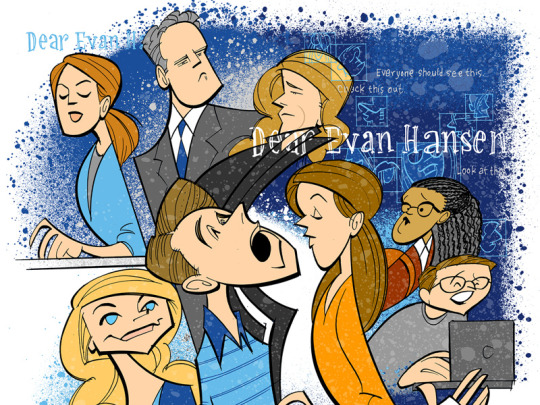
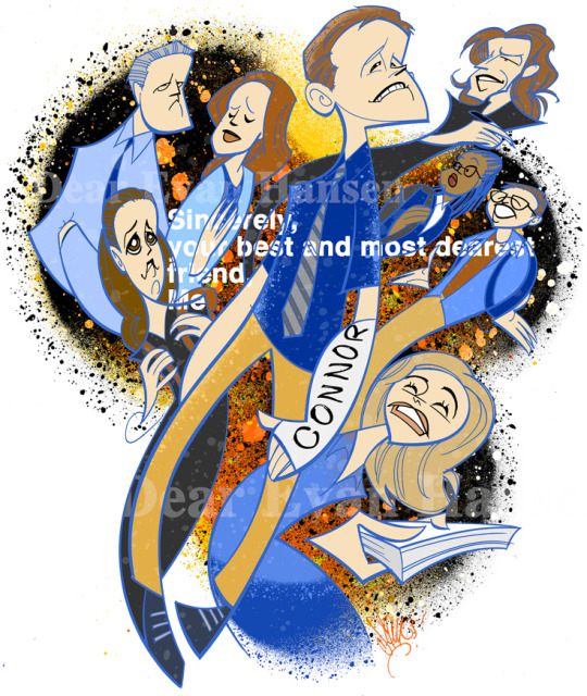
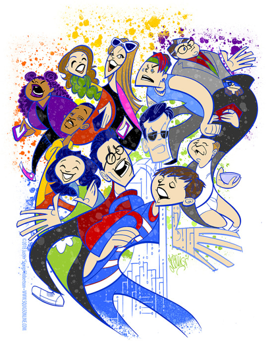
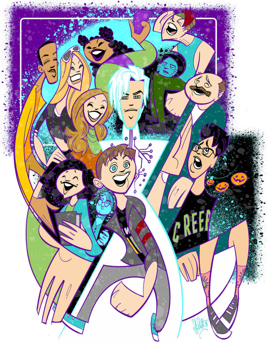
all drawn differently but various gists are there, and none of the people in these group collages look interchangeable or like oh and this person gets thee "generic/default" look
there's also the fact i'm like 99% sure there's a squigs-drawn larger portrait of will roland just as himself that i love to think of / sure further encapsulates that "thank god this artist drawing Features" but i can't find it or remember exactly what context it was in. augh
but also there's this other deh illustration ft. wrol jared i found lol. bonus
#sooo replenishing#and like the issue pointed out that the excuse of [skill issue] is offered like It's Really Not A Skill Issue#someone can be very inexperienced at say; drawing; and still Evidently be actually trying to capture something Actually There in whatever#their model is. me as a like 5 yr old on the level of [yes all faces Are abstracted as =) ] still for example clearly depicting my mom's#usual hairstyle in my crayon portraits there#these examples here the polar opposites of The Nose Issue lol like stylized simplified And Yet still all clearly downturned#even the stylization leaning more convex nose bridge than that concave upturned nose slapped on anyone's face#deh#will roland#bmc#and forever the idea that Stylized Simplified drawing techniques are easy / bad but like it sure af is neither#you can note 'ah i see that this experienced artist's drawings are not photorealistic; formed of what i can tell are simple lil lines even'#but then be thrown off b/c of course it Looks easy but their lines are afforded a Casualness in their execution from their experience#knowing how to form and place them to give it that [Looks Good] without it being a painstaking &/or [9000 tries & errors] process for them#and like sure then anyone can Recreate it but you can throw yourself off thinking you Ought to be able to straightup Create It similarly...#like copying these obviously simplified stylized Faces made up of varying Shapes as seen here? prob a fun & neat & helpful exercise#especially if one's just working on breaking out of the ''i draw a Default Face for Everyone'' kind of situation#the exaggerated swoops and hard angles Geometry of compositions and forms overall is also a v fun element used here
23 notes
·
View notes
Note
I've been trying to focus on thinking about things I enjoy about the idea of the TWST anime. And regarding overblots, I think an anime version would really help illustrate (even more) how terrifying the process is. I really like how the manga shows Riddle's OB, and I love anime as a medium, so I'm pretty hyped to see how it will be conveyed in it.
I really hope they accentuate the horror of it- I'm aware that they might not go all in w the horror like I would personally like, but the thought still excites me. What kind of music will they play? Will the animation change like it does in some animes when the characters are distressed (wobbly lines, glitchy effects)...? What sort of directions will the voice actors get? I mean, they already voiced the game, but anime gives them more room to do voice stuff. I'm really hyped for this aspect tbh...
And I'm also excited for the possibility of dubs, since I'm quite a fan of the whole dubbing world. (I know some ppl have their fears about this last possibility, but in my case even if it turns out to not be so good, I think we could still have a good time w something like that. Plus I've seen some popular eng dub actors hyped about the anime and wanting to be casted for certain characters)
I also wanted to apologize for my previous ask ᕙ(⇀‸↼‶)ᕗ I already did so in the comments, but I felt bad about doomposting on your inbox. My mind's first reaction is usually to see the negative first and become anxious, and it's something I'm working on, but it sometimes goes out of hand. But now that a bit has passed, and specially thanks to your advice, I can sit down and try to focus on the things that excite me rather than the ones that scare me. Sure, building too much expectation could backfire at the end— but as you said, we have little to no information at this point. So I think focusing on the things I'd like to see is a better usage of my time. If they turn out to disappoint me... That's something I'll worry about next year, I'll suppose. I'm still a bit anxious and scared, but there's also lots of things I'm hyped for. I'll try to take your advice and focus on those. 🫂 Sorry if my previous negativity made you uncomfortable.
[Referencing this news! Asker’s prior post here.]
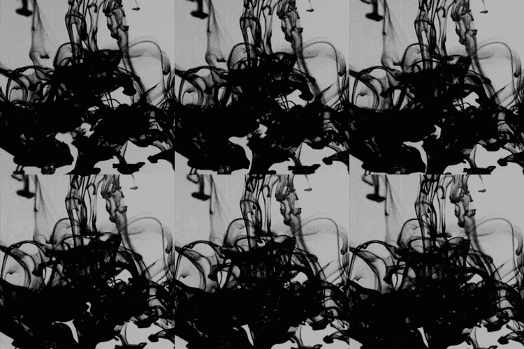
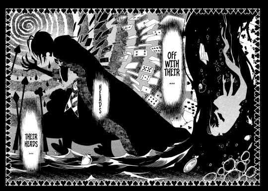
I’ve seen a lot of fans speculating that the OB transformation sequences will resemble magical girl ones! While that’s a fun idea, I do feel like it makes more sense for the anime to portray OB as something scary and all-consuming, similar to how it is depicted at the end of animated dorm commercials and in the manga. For the characters experiencing them, it’s not meant to be glamorous… All that agony, the dripping ink leaking out of their orifices and dripping like blood. Overblot looks incredibly horrific, and I think that should come through in the animation—whether they change the usual style for these segments or keep it the same.



I think the anime would reuse (or maybe do remastered versions of?) the Twst soundtrack for a lot of the show. The compositions are already there, so might as well. Maybe experiencing the anime will help to make the music more memorable, since it seems the game soundtrack alone isn’t doing it for some fans.
No clue about the JP voice cast; I did see some people worrying that they could replace the game’s voice cast for the anime, but as I’ve mentioned already, that’s an unfounded claim. If the usual VAs are there, surely they won’t just reuse the already recorded lines from the game?? 😂 I’d think they’d at least have to rerecord those based on how the script and its scenes are laid out, plus additional dialogue to fill in the gaps (such as new scenes).
No confirmation of an English (or other language) dubs yet either! (Again, this is another topic related to the anime that sparks worry, but I must stress that it’s pointless to get into a tizzy about something that isn’t concrete yet.) But yes, I’ve already seen English VAs expressing interest in certain characters; Daman Mills wants to audition for Malleus, Alejandro Saab has made it known he has Twst on his radar and wants to voice Leona, etc. (The latter has done Twst dorm leader impressions for fun before; I think Mr. Saab could make for a decent Leona or even Malleus!)

Don't worry about the previous ask ^^ I think it's better that we discuss these things with one another rather than post or tweet into the void and allow those negative feelings to fester. If you want to view it in a different way, think of it like the OB boys actually getting therapy/finding someone to confide in instead of being allowed to stew in their own emotions and risking OB a second time. Sometimes all it takes is that gentle nudge or a reminder to step back and take a deep breath. When we let our emotions get the best of us, we end up thinking and acting in irrational ways, and then that can lead to people--whether yourself or others--getting hurt.
#twst#twisted wonderland#disney twisted wonderland#disney twst#twst manga#twisted wonderland anime#twst anime#twisted wonderland manga#notes from the writing raven#advice#Leona Kingscholar#Malleus Draconia#Riddle Rosehearts#Jamil Viper#Kalim Al-Asim#Scarabia#Azul Ashengrotto#Vil Schoenheit#Idia Shroud
104 notes
·
View notes
Note
I was wanting to try doing an art piece in the style of the signature spell poster art pieces you create. But I’m not really the best at coming up with a composition for such a thing.
Do you have a process for how you come up with the compositions for them?
oh, awesome! it is an INCREDIBLY enjoyable style to work in; I hope you have fun with it! :D
I'm not great at putting my thought/art process into words, so my apologies if this doesn't make a lot of sense, but I'll try! my first step is always to do a LOT of thumbnails to figure out both the idea and how I want to show it; not trying to do a real sketch or anything, just little doodles to figure out what exactly I'm trying to portray. (I also call these "garbage passes" because they're not meant to be any good, they're just there to throw things out. aha. ha. ...anyway.) I think it's important during that first stage to really focus on the idea and the layout and not to get too bogged down in the actual drawing yet!
I tend to save my final thumbnails, so I'll use 'em as examples (I posted the ones up through episode 5 here if you're interested!) (and, uhhh, spoilers through episode 5 also in this post, hopefully that won't be an issue!)
the main thing I try to think about in composition is balance -- not necessarily in terms of symmetry, but in where each element is placed and how much space it's taking up. remember, empty space is still space! it's also really important to think about the parts that don't have anything in them, as much as the parts that do!
personally, I like to divide things up roughly by both halves and by thirds -- there's a lot more in-depth info out there on why the "rule of thirds" in particular works well visually, but in short, our brains tend to focus on things that are placed closer to imaginary division lines, instead of in the exact center of an image. so even when I'm doing something that is very centered and symmetrical, I try to keep that in mind and generally aim around those for landmarks like faces/eyes (or...where they would be, anyway) and other focal points.
it's not a formula of "the character's face should be in this division of this grid" or anything, more like "our minds like to focus on these areas, let's think about how to use that", if that makes sense! and of course rules are made to be broken, art is lawless anarchy, and so on. but it can be a good starting place for deciding where you want to put things!
(blue - thirds, red - half)
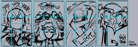
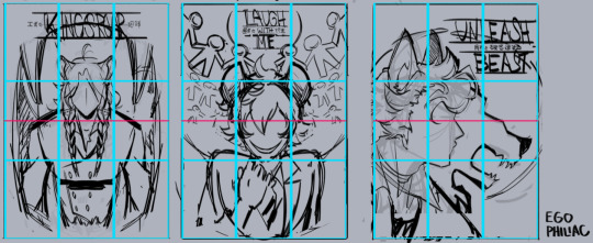
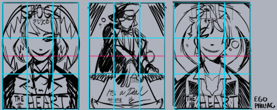
and against the finished versions, because they do usually end up changing a lot (including the empty space of the border):
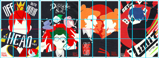
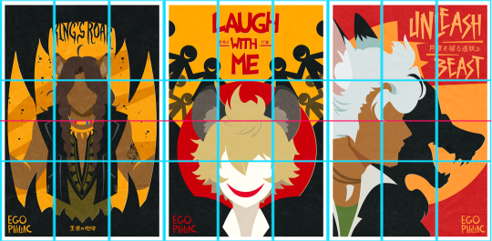
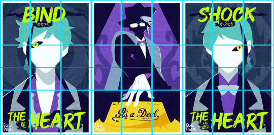
(...these actually lined up a lot better than I thought they would. :') it makes me look like I do things way more intentionally than I do.)
other stuff I just try to keep in mind is that our eyes like following arcs and paths, which can be a good way to guide the eye:
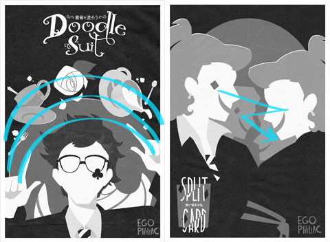
and frame and control the focus:

honestly, composition is one of those things I feel like I struggle with a lot, so I'm not sure how much of this is helpful or actually makes sense outside of my head. but hopefully it helps a little! it's all just stuff to think about while drawing and not anything hard-and-fast, so don't, like, stress out about making sure things are lining up exactly on the thirds or anything. again, it's more "our brains think these are the dopest parts of the rectangle" than anything else! take advantage of the cool parts of the rectangle!
NOW GO HAVE FUN DRAWING seriously though, it is always super cool that other people like this idea and style enough to want to do it themselves and for other/their own characters! thank you! ❤️❤️❤️
#art#sketch#twisted wonderland#...technically i guess? it's not about twst but there is twst art present anyway#i did have a few more examples but then i wasn't sure if you were cool with episode 7 spoilers. whoops. 🫠#many other people have explained the rule of thirds and directional flow way better than me and i apologize#it is so hard to put things into words i am so sorry#me: the...you know...the lines...they sort of converge? like a triangle?#the internet: mm-hmm. yes. go on.#me: (sweating) the...the triangle points here...because it...it has a point.#the internet: it's doing better than you are then#genuinely shocked at how well some of these line up though#uh. i mean. actually it was all totally intentional and i put actual thought into it! NOT an accident at all!#my eyes darting back and forth shiftily are just ✨following the paths✨
441 notes
·
View notes
Note
What was your process for making the Noelle amv, if you don't mind sharing?
hii! im not sure how eloquently or clearly ill be able to explain it but i definitely have some pictures you can look at!
(the video)
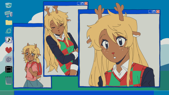
i actually got the idea while i was away on a trip with very limited wifi -- it wasn't Trust Me that i got an AMV idea for first, but instead it was one of 4syu's other songs, There's Nobody. for such a happy sounding song it really made me so sad, to the point where if i tried to sing it to myself id get choked up by the chorus LMAO. it was baddd
but basically i was rapidly trying to find both songs on spotify so i could listen to them offline, and it only took me a few loops of Trust Me and thinking about the original MV to make me go "ohhhh. how can i make this about noelle." And so i did .
i was thinking about doing a storyboard, but in the past, i've found that doing storyboards for animations/AMVs lowkey... kills my motivation altogether... SAD... but i saw the whole video so clearly in my head, and i didnt want to make the same mistake i made before... so i went right to doing quick sketches (while still on my trip...) just so i could get the ideas out of my head
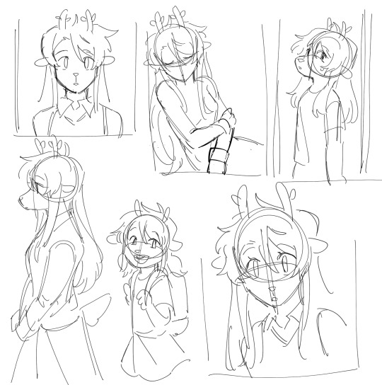
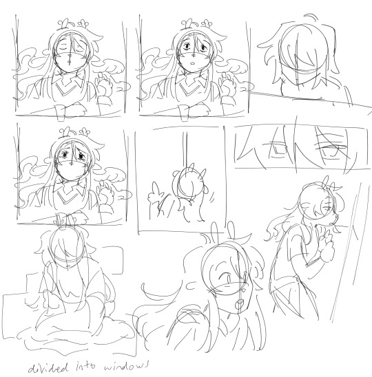
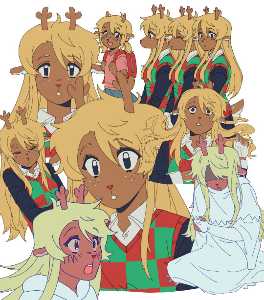
i was torn on what to do with my style at the time, whether i wanted to make it more similar to the original video, or to her canon appearance, or to MY style and how i draw her. i think it kind of ended up as an amalgamation of all three...? at the very least, her light world color palette definitely was more bland and desaturated, like i purposefully wasn't trying to do anything special with her colors.
after that point, and getting maybe a few of the actual drawings done, my motivation crashed again, and i left it all to marinate for nearly a week. it was baking, guys, it wasn't abandoned, listen to me, why are you throwing tomatoes at me,
i had up to about the "I dreamed about that again" animation done and stopped, and it wasn't until i decided to sit down and start editing it anyway that i really got in my groove again. i got all my little assets into a workable state so i could really try to sit down and make the video come to life and all
the really fun part was honestly working on the desktop backgrounds. i really wanted to limit colorpicking from the original video as much as possible, but i decided that making look as similar as possible to the original could help with the contrast i wanted to add later.
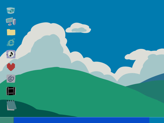

i drew these two backgrounds first. i was hoping i could somehow fit the bunker into the second one, but decided to do something different anyway. the second one's ui didn't actually change until later in the editing process.

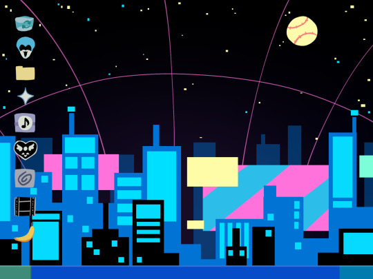
drawing THESE were fun especially, and im happy with how they came out. i think the dark world icons are really cute still. one thing i really did know i wanted to do from the beginning was to turn the soul/undertale icon into the deltarune one.
i was worried if the shift from the Windows Field Background to the dark world would be too sudden, like you would just blink and suddenly it was all different, but i think it ended up all right...?
the not so fun part was drawing all the different boxes, lmao. it go really tedious by the end, so i tried to reuse as many of the same ones as i could.
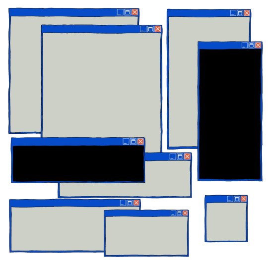
a lot of copy-pasting and tracing rectangles for sure.
i also had to make sure the animations didnt Suck. i brute forced those things and used every last braincell i had in order to make those pictures move bros


fun fact. ive never animated hair like this before. or in any complex manner really. i had to use sooo much brain here... heres how it started vs. how it ended up
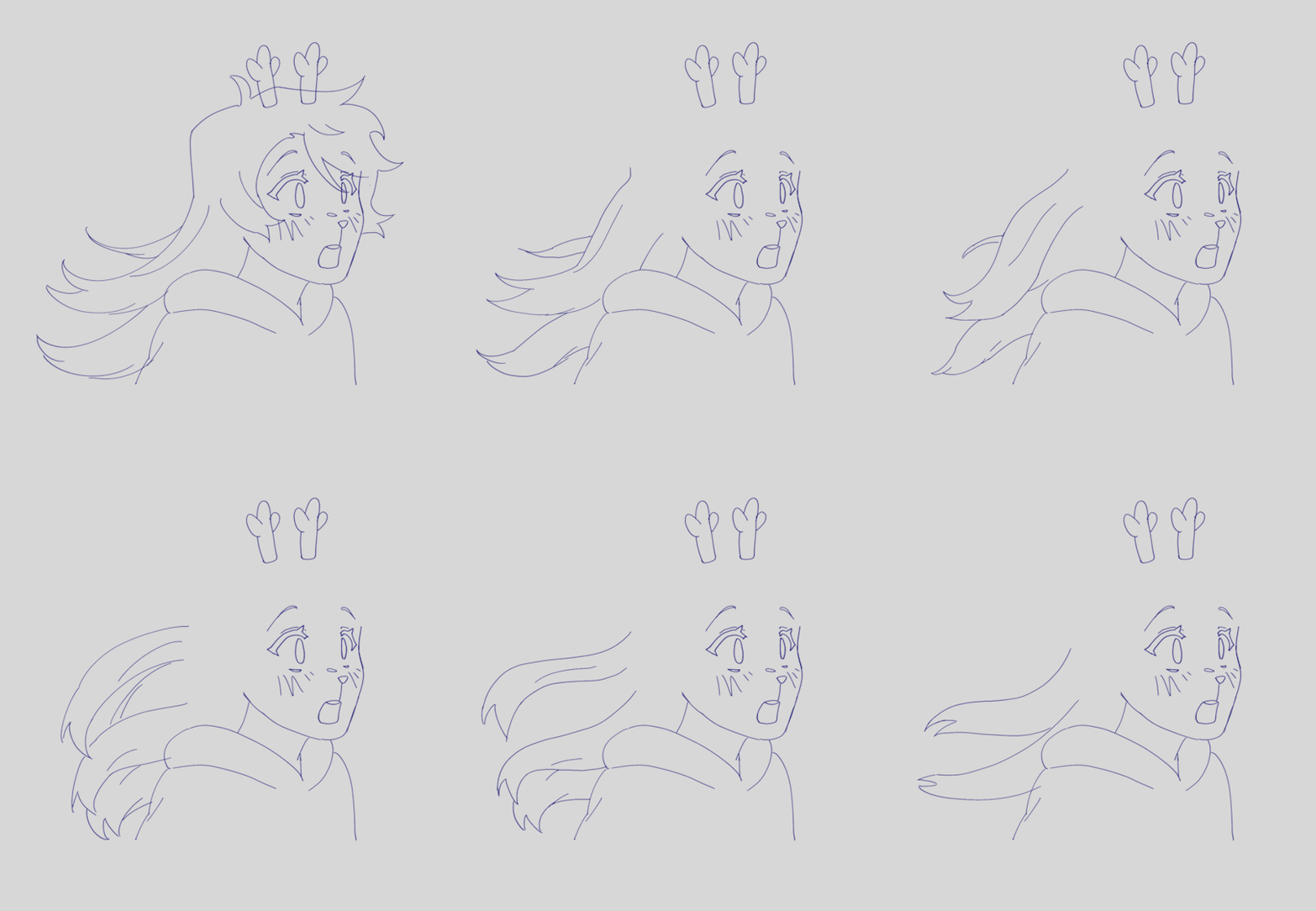
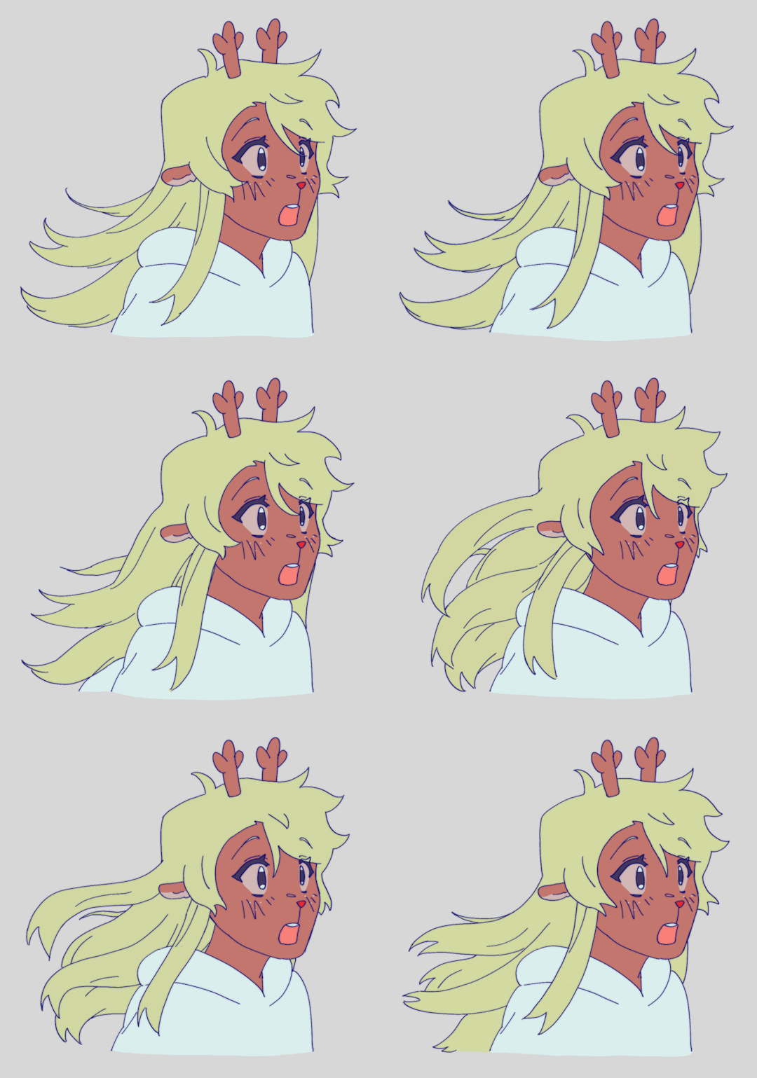
had my animator gf hype me up thru the whole thing... i was having a great time based on the filenames alone
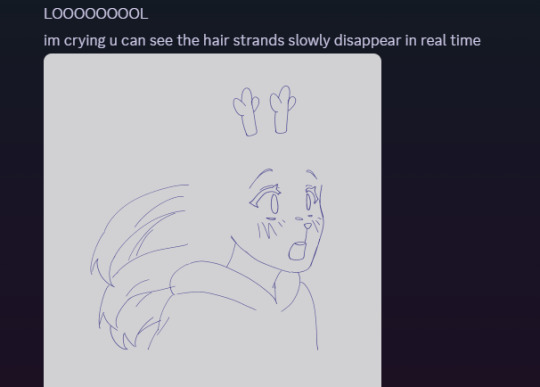

aaaand then ummmm i edited it. i learned after effects like 1 month ago. never touched it before. i learned it for internship purposes and then used my newfound powers for evil it seems
i split the whole thing up into multiple compositions of course, but i probably could have split things up more... im sorry for having 84 layers on comp 3 its not my fault
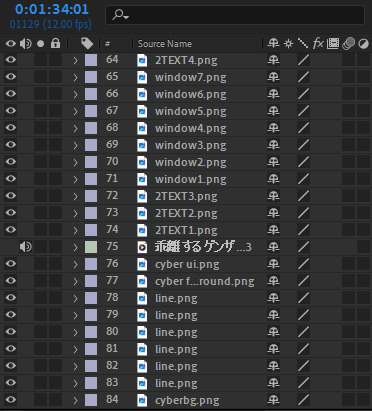
editing a video in 12 fps was a fun change though -- very easy for my brain to go frame-by-frame, and yet still some of the timing ended up being off... tis the goomy way
like i said before, i started editing when i barely had half the drawings done, but seeing it all start to be in motion really pushed me to finish it up. and i mean Really. like i finished the whole thing maybe 48 hours after i first started editing.
and...i think that's it? i do a lot of discord art streaming to friends lately but i kinda kept this one more under wraps compared to usual, i think i just wanted to surprise everyone... look guys i remembered how to make a video! and it's three minutes! waow
sorry if this is way more than you asked for LMAO
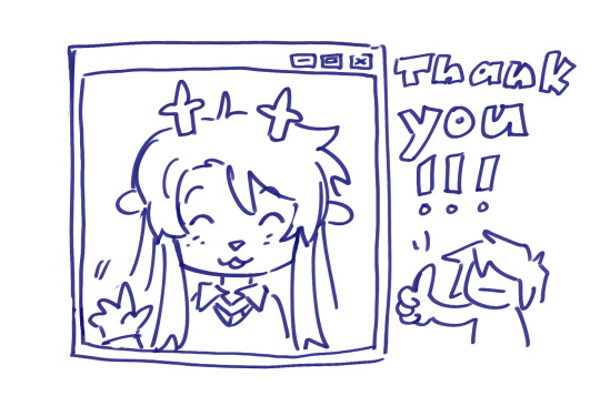
also, the AMV hit 5k views on youtube today! ive never had a video do well like that so quickly! thank you!!
145 notes
·
View notes
Text
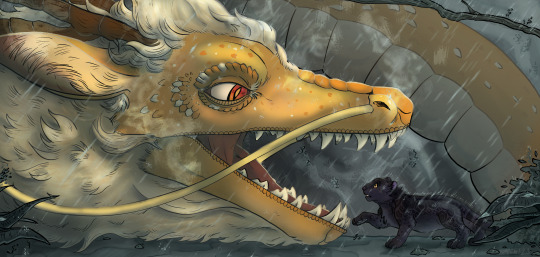
Howdy ho! I'm very excited to finally be able to share this illustration I worked on as part of this year's @bumblebybigbang for @tahnex's lovely and super fun fic (with no pain attached whatsoever), "Of Dragons and Panthers," which you can read here! As soon as I read the original notes on it this scene captured me so much I had to do something dramatic for it. It's been such a pleasure watching the whole collab come together, tysm for having me!
First time joining an event like this, and I'd love to again if the opportunity comes around hehe. Still a few postings to go on this one, the pieces before us this year have knocked it out of the park and I'm super excited to see the rest once they come around!
Made a few process cuts just for fun, which I left under the cut!
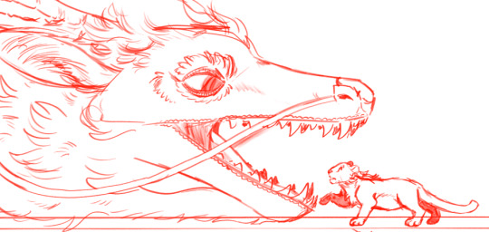
I did do a few sketches roughly before I started out, especially based on other parts of the chapter, but this particular composition was so fixed in my mind that I ended up just sticking with it. In retrospect, I would've loved to go back and do some more thorough exploration for it. Here are a few of the sketches I managed to fish back up:


I also was thinking of trying a few other doodles/another big piece, but ended up not really having the time between other obligations :')
And the sketch I finally settled on:
Inking was SUCH a fun process on this piece in particular. I'm a huge fan of how dragon!Yang's mane turned out, especially, and all the detailing on the head and around Blake's fur and such. Feel like I'm really satisfied w the particular way the line weight variations came out, and it's where the piece shines the most imo.

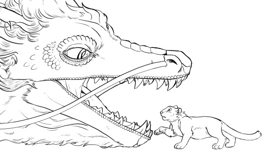
Panther!Blake, too. Oh gosh. I feel like it took me a lot of reworking to get her structure to a point where she felt very leopard-like, rather than any other type of big cat- especially around the head.
Colours were such a challenging part. There was a big feeling I had for that glow coming off dragon!Yang in the middle of the heavy rain- I love seeing that sort of effect in real life so that's something I'm really hoping to work to capture better as I practice. Trying to get dragon!Yang's slight iridescence in there and to balance out the lighting on panther!Blake's fur each took a long time, too- I'm only a pinch sad that a good chunk of it is covered by other lighting effects XD
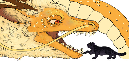
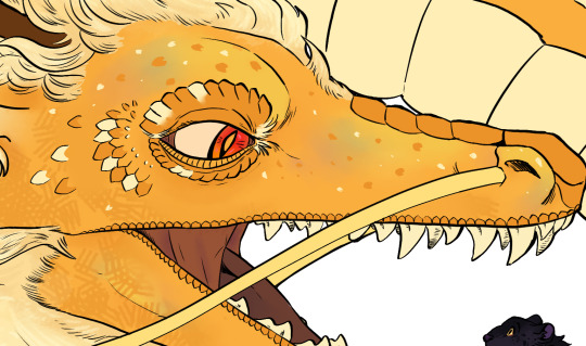
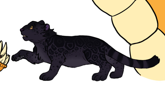
Blake's rosettes were SO fun. Augguhugg.
In terms of backgrounds. HOO boy I was going through a strange patch in life while working on the background and final polish for this piece, which is why (at least I feel like) it looks kinda rushed. I have been practicing natural landscapes and doing some observational studies but still struggling to get those rock shapes quite right, which I think is a big make or break point of something like this. I did really enjoy toying around with inking on the foliage and foreground layers of the ground, though! And in the end, lighting and effects ended up masking a lot of the big weak spots :D

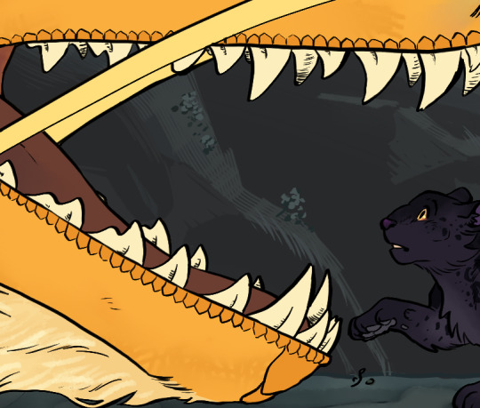
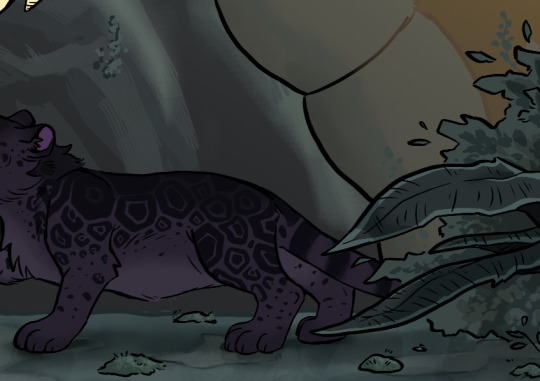
I think natural effects like smoke/steam, and rain, are big things that I got to practice more of in this piece, but also really would like to get better at in future. Esp since I feel like it's been a great opportunity to mess around with different colours and brushes that I use way less, which I'm always grateful for w painting. I think just layering the rain on its own ended up being about 10 odd layers?


I think the only other thing I would have loved to improve is to just help the piece feel more Bumbleby™ in the final look. I think I like the cool colours of the lighting for this particular outcome, but I also would have probably tried to have made things much clearer (ahem at the very least switch to yellow/purple) in the long run in terms of representation and resemblance. Ik that at least for me it is fairly easy to associate the two characters with dragons and panthers since I'm more familiar w the fandom lingo around these two, but esp for outsiders I feel like it's probably not great at conveying who they are, and why they are potentially in this situation.
I'd also love to try and find a shading style that still has a painterly quality but compliments the inking a bit better, rather than overpowering it.
I think that, on the whole, I am pretty satisfied with the piece and had a great time working with Tahnex on the whole collab! And I've also has a fun time reading his work and notes in return, and thank you so much for being so so patient with me even as my updates were slow n rocky at points :'D
That's about all I got, have a great day y'all! Still a few big bang postings to go, so very excited for those once they come around!
#riinkun art stuff#my art#digital art#bumbleby big bang#bbb2023#rwby#YIPPEEEE#very very happy to finally be able to show this off aaaaahugghh!!!!#it's been v cool working on this collab- tysm for having me again! :'D
237 notes
·
View notes
Text
28th June ‘24 - [arch] One Page Limitation??? - My process for Traffic Zine #5

Hello All!
A couple months ago, I got accepted to @trafficzine, a digital anthology of pieces by a large group of artists and writers based on the most recent season of the Life Series. I made this piece back in April, but thankfully I kept some notes of my process.
Heads up - this contains spoilers for Secret Life :D
We were able to choose our own prompt from a list! For this project, I wanted to push my comic making - especially how to communicate a lot of information in a small space. I went through and watched a few clips from the series to see which prompt would fit a comic and settled on Scott’s death.
As usual, I began by getting some reference images and going ham on some big paper. This gets me excited about the project and helps generate ideas. I go for whatever interests me in terms of medium and subject matter, but I try to use a process that doesn’t let me control too much (in this case brush and ink)
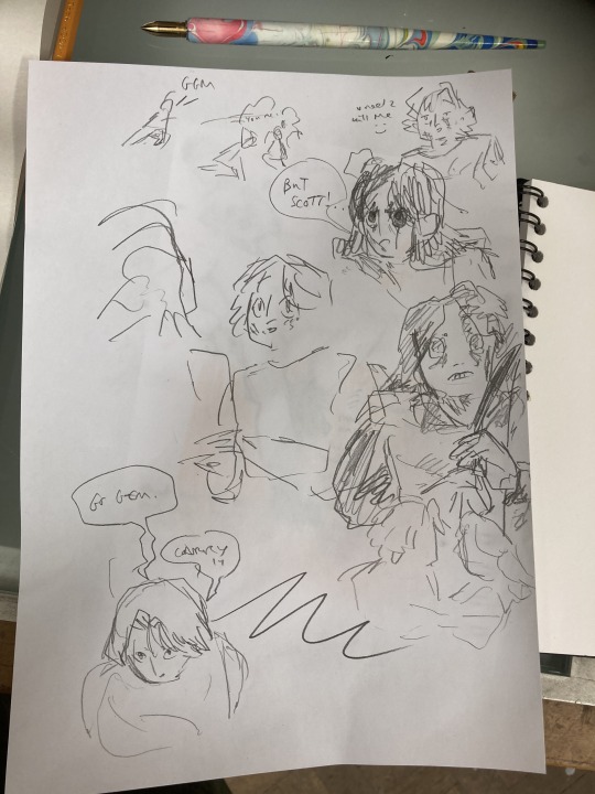
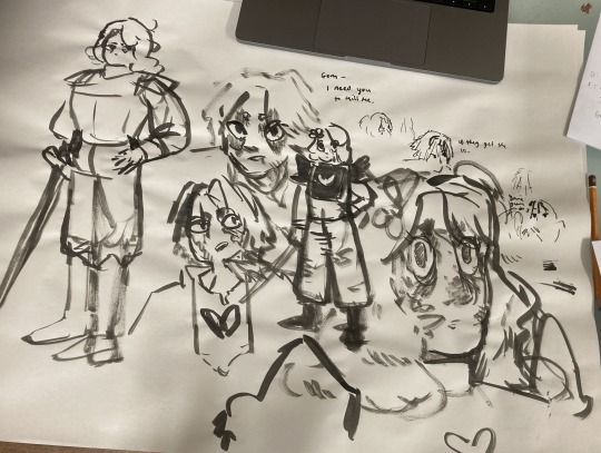
initial sketches for fun and vibes :D
During this, I also took the time to transcribe the scene - I wanted to use the dialogue directly, and see how much I could fit into the single page that I was allowed for the zine.
In these early planning stages I make sure to do warm-up sketches to remind myself of the energy I want to communicate. This also keeps things fun and fresh so I'm not ONLY thinking about page composition and making things 'good'. (the expectation for it to be 'good' kills a project prove me wrong)
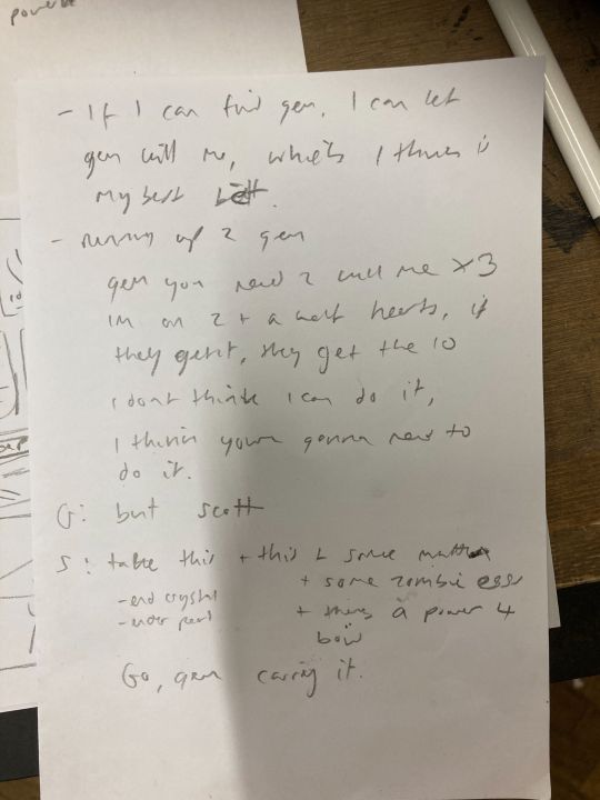
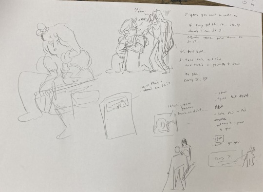
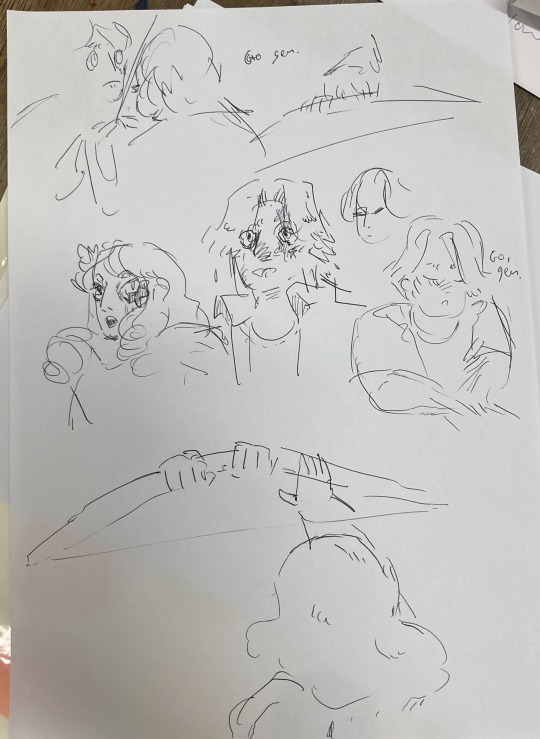
Dialogue from the clip + warm up sketches
Next up, I started to plan what panels I have on the page. At this stage, some panels might just be a box with some words, and some may have a sketch if I have a clear composition in mind. This stage is mostly for pacing and plot, so instead of focusing on what the panel and page will look like, I will think about:
what will happen in the panel
it's purpose and
what it will communicate
Sometimes I'll illustrate a string of panels that tell the story and fit them on a page after - but this depends on the project and my confidence with the size of it.
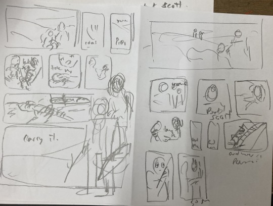
After messing around with these and coming up with a pretty clear direction, I draw a bunch of boxes to see how the panels could sit nicely together. At this stage I might realise I have too many panels, and need to cut a few or come up with a creative solution. Nothing is set in stone at this point.
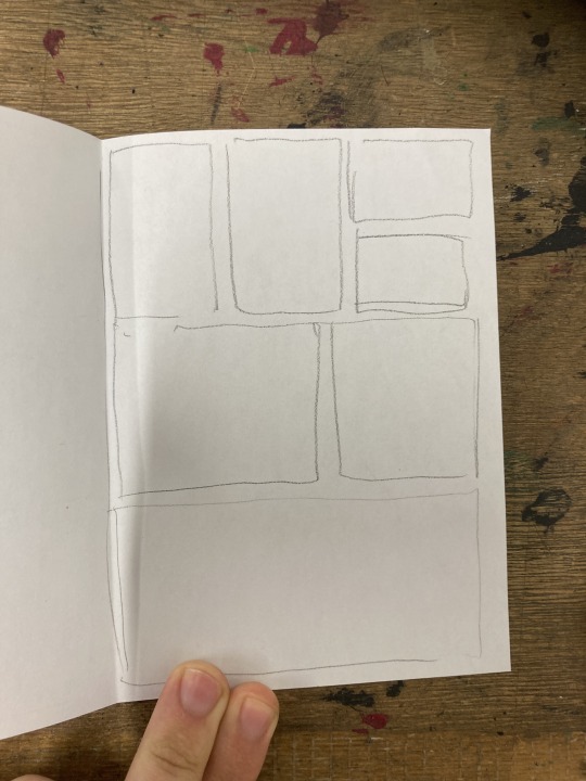
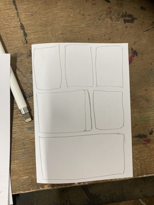
sketching panel layouts
Now begins the fun! I decide on the layout I prefer and I can start putting planned compositions into the boxes. I often do this digitally, or a digital editing process will be involved.

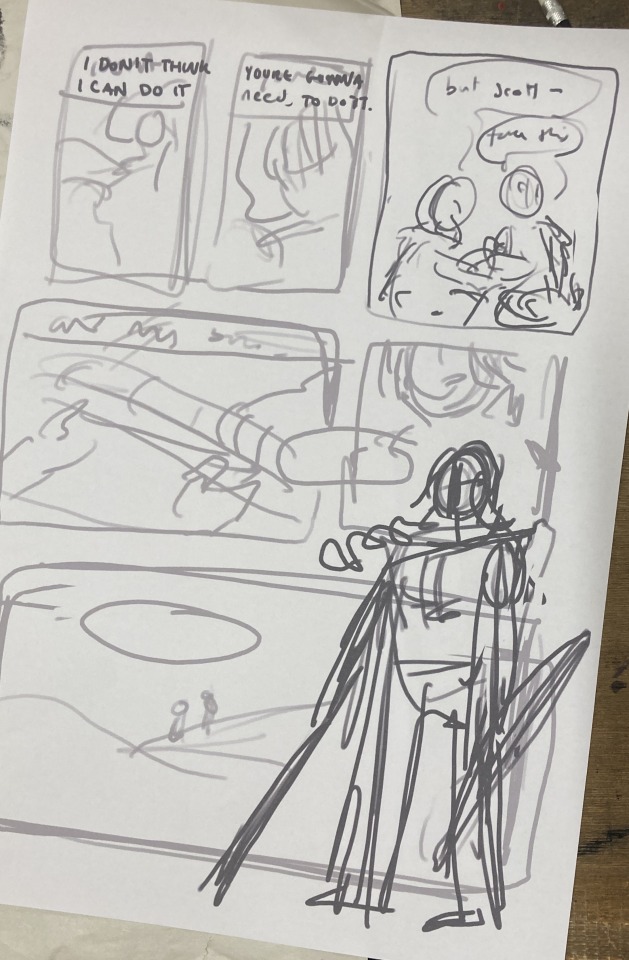
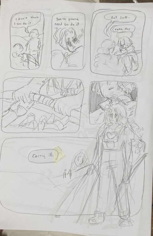
Once planned, I print these out to do a more refined sketch over. I find that my traditional drawings have a lot more life and character to them than digital ones, so I try to keep the majority of the process traditional, with passes of scanning and digital editing.


I tried a version with her looking out at the distance - ready to face the oncoming battle. But it still felt off. So I turned to my slides to ask myself some questions!!

I tried to think of more things that were working - but I really felt like it was lacking a lot. I was going for this slower emotional feeling because that came more naturally to me, but it just wasn't working for this image. The original clip is quite rushed and chaotic - which would be harder to communicate in a comic format but the challenge interested me. Either way, I knew I wasn't happy with this direction so... i decided to start from scratch! Back to the drawing board!!!
In the previous version, I had cut out a lot of the dialogue, but I decided to go back to the original clip and use AS MUCH as possible. Since passing the bow was my favourite part of that first composition, I really wanted to lean into it as the emotional height and final goodbye before Scott's death. It's a moment to slow down and absorb the vibes :D

I made a list of panels along with their descriptions to refer to when trying to figure out the order of panels. there were SO MANY and it was VERY CONFUSING when they were too small to read.
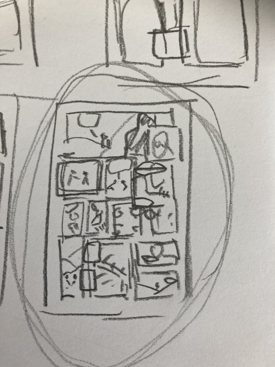
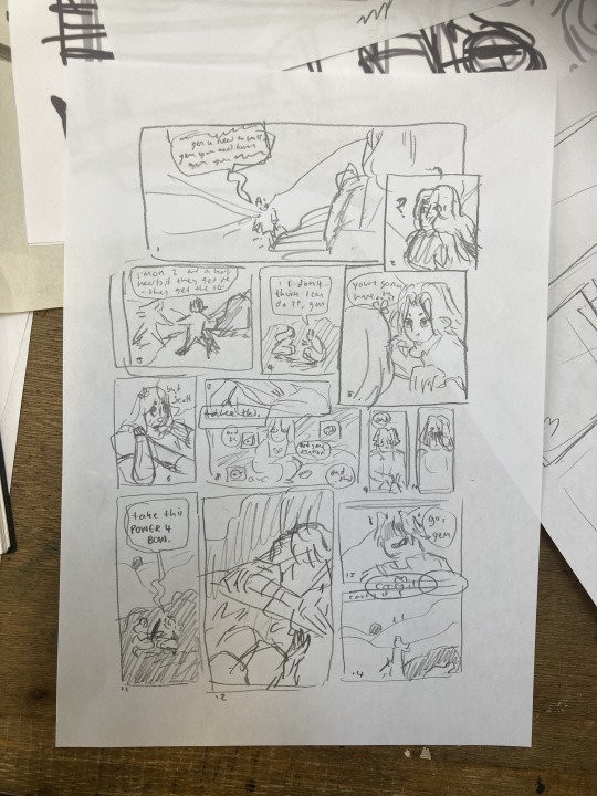
These thumbnails were super small and would not have made sense without my list, I swear.
I printed this tiny thumbnail out at A4, so I could sketch over it and get a clearer sense of flow. Then began a loooong process of printing out tiny photocopies and rearranging the panels to be legible. It was a difficult balance of communicating busyness while making sure the hierarchy/reading order made sense.


After some tweaking, i printed out an A3 copy to draw my panel borders and text.
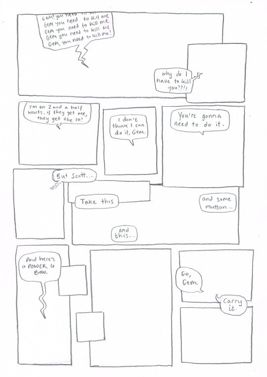
Doing this on a separate piece of paper means I don't have to worry so much about messing up the text or borders when drawing the characters. This allows me to be more free and expressive with my illustration.
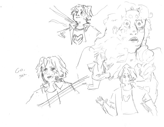
Woah! Quick trip back in time!! During the thumbnailing process I drew these warm up sketches! I looooved the way the linework came out. I drew this on an A3 piece of paper - and the shocked Gem would, in theory, be one of the smallest panels. So I decided to do a crazy thing.
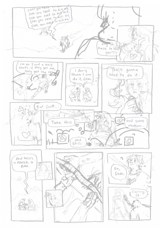
I touched up the sketch digitally, compiling some of my favourite warm up sketches, some traditional sketches made for the panels, and filling the rest in digitally. Then I printed this image out in QUATERS at A3!! This meant the final sketch layer, printed out was A1!! (aka very large, considering the final file would be at A4, about 8x smaller)
I did this so I could get fairly small detailed lines with my pencil while being quite expressive and firm with my mark-making. Slowly, I dlined all of the panels traditionally and scanned them in. Then I assembled the finished linework on Photoshop, along with the text and panel borders and got to colouring :D

final linework :D
For colouring, I played a little bit with halftone but I found the texture made it feel a bit too busy - the panels are already doing enough. Because of this, I also decided to use a limited colour palette. Here are some images of the colouring process, which I won't go into today.


I'm really happy with how this came out - I think it captures the chaos of the moment, while taking time to linger on the emotion of it. Keeping that bow moment really made it, I think.
I think the last panel is still quite weak. Earlier in the process there was a low-angle shot of Gem about to kill Scott which may have been more powerful, but I think I was struggling with my actual drawing skill when it comes to perspective. A lot of learning how to draw, and in particular with comics, is about knowing where your skills are at, how to utilise them best and how to test and push them.
I'm glad that I started again, instead of finishing that composition I wasn't happy with. It was a tough project but I learnt sooooo much from it, and it's been essential skill-building for.... the current comic I'm working on (stay tuned!!! :0) Thanks for reading this incredibly long post! Go check out @trafficzine and look at all the other cool art Cool vibes and silly men,
Archie :D
#archillustrates#arch is learning#project development#art#art process#art resource#process#artists on tumblr#illustration#comic#picture book#art blog#illustration blog#queer artists on tumblr#illustrator#female illustrator#queer illustrator#comic artist#comic art#female artists on instagram#artists on instagram#procreate#digital artwork#artist blog#artist on tumblr#web comics#tumblr art#tumblr art blog#art on tumblr#life series
144 notes
·
View notes
Note
How do you think of your wonderful beasts?
Usually I start with really vague ideas for shapes or colour schemes and just make the creatures up as I go along. Most of the time I'm aiming to make something that has personality but isn't too easy to compare to any existing animal. If it's too boring then I'll weird it up a bit by rearranging parts or throwing on extra shapes. If it's too abstract then I'll swap in some more realistic animal features.
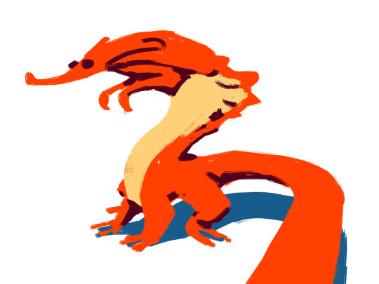
I saved some in-progress pics of yesterday's creature to step through the process:
I started by giving myself the very open-ended task of drawing a creature with a mouth in an unusual place. When sketching digitally I often like to forgo lineart and just play with blocks of colour.
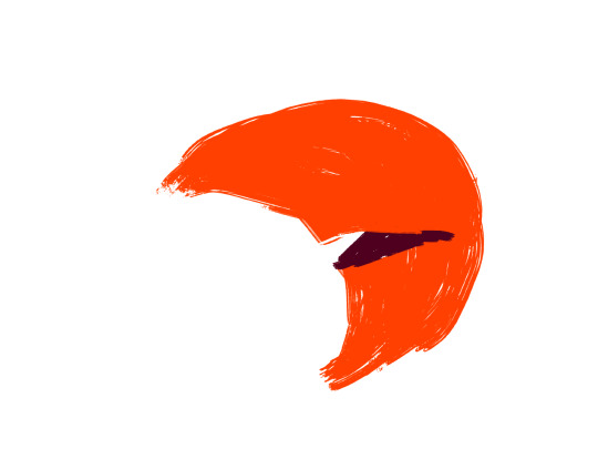
Why is it crescent shaped? Why is it orange? I dunno. But I think that I can turn this into a body with the mouth at the centre of the mass. There are certainly weirder and more interesting places to put a mouth then in the belly, but I don't really know how this sketch is going to go from here. Maybe I'll put more mouths on the feet or something. Finding out is part of the fun.
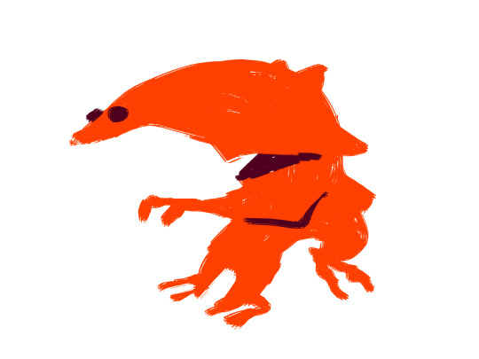
Let's start simple. I figure that it should have arms to pick up food, as well as eyes and a nose to clearly define a 'head' somewhere away from the mouth. Okay now it looks like a creature, but not one that I particularly like. Also there's nothing between the nose and the mouth so it looks less like it has a mouth in its stomach and more like it just has a really big, weirdly-shaped head. I can fix that if I move the arms above the mouth. And I'll give it a tail and another bend in the torso to balance it out and make it less front-heavy.
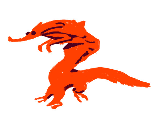
Now we're getting somewhere. I'm starting to like this for reasons entirely unrelated to the mouth, so I'll just remove it completely. It's getting in the way of the rest of the anatomy. There's no client or art director dictating what I need to make here. The initial premise is just a jumping-off point and I can ditch it entirely if the design works better without it. I like this bug-eyed, cobra-hooded aardvark-centaur-dragon-thing. That seems like enough of a creature without throwing on extra features.
I try to keep my palette organized and only add more colours when they feel necessary. The countershading here helps to define the creature's shape a bit better and break up all of that orange, as well as just making it a little more realistic. I made the tail bigger just because I like what that does for the 2d composition of the picture.
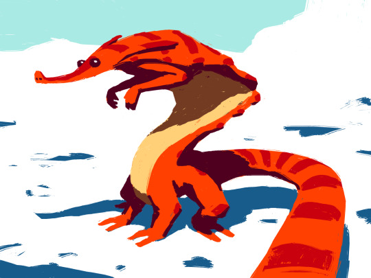
Cleaning up the shadows also helps to make the volume read a bit better. The stripes help too, but I mostly added them to break up the orange some more and make the creature more interesting. I also started laying in some blobs of colour for a background. Now that all of the basics are in place it's just a matter of adjusting colours and polishing out details until I'm either happy with it or just sick of looking at it!

Done!
110 notes
·
View notes
Text
Here ye here ye, another breaking down processes post from yours truly!
For this animation, my plan was to make something I'm proud of AND also something to force me to take my time since with all previous animation works they were all rushed. I normally tend to speed through work as someone whose illustrations are painterly and I like to keep them rough. Also lets be totally honest my other plan for this animation was to animate Mizrox being so sickeningly sweet.
Fun fact, this animation was going to be longer. I had tried to plan out Olrox climbing on top of Mizrak during the kiss to lay on his chest. There was an attempt trying to rough that out and several ref videos It was scrapped because for the life of me I could not figure it out. Also hypothetically if I was going to keep it, I would cut to another angle (perhaps Mizrak's face close up) and then cut to another angle that would make it easier to see that climbing over the top. OR, consider Olrox already sleeping on his chest (im just rambling now but this is basically 'if you were able to do this again' section).
I wish I actually went through a more proper tie-down process because the jump from going from my rough straight to clean was rough (badum tsk) for the first few seconds. Defintely learnt my lesson ALSO Olrox is surprisingly really fun to draw from behind.
I challenged myself to see if I could get the idea of "bigger movements, less in-betweens, smaller/slower movements, more in-betweens." Though the effect of Olrox rubbing his face against his arm may be a little too jarring and I steered quite a bit away from my rough and self-reference video in hopes of making the face rubbing more apparent because I thought the character acting was too subtle and wanted a contrast to the other half of the scene. I reconfigured my CSP animation workspace for this too so it definitely made the process less tedious when cleaning up the animation.
(Which by the way I do record a lot of self-references depending on the section! For things I can't do/uncomfortable doing, I'll end up looking up videos. It's the easiest for me to catch subtle things in body language and also get a feels for the motion.)
Also I'm really satisfied with Olrox's anticipation before his smooch and the shoulder roll at the end even though technically the arc doesn't complete itself. MIZRAK THOUGH, when cleaning up I realised my rough wouldn't make sense because he's already looking at him so there's no need for a turn, and then the lack of a shoulder movement felt jarring, so all of that was done without any thought, wish I did think about it more though.

Now compositing was a monster in its own right and basically me jumping back and forth between turning on and off different layers, but here are all the new things I did; I duplicated and blurred the lines of the lineart, beveled the shadows so it was lighter on the inside, and added a rim of blur so the focus drew towards the couple. Also will absolutely admit that my fanboy ass went "... be crazy and try to mimic the show." The final did not go that route because I thought it was more important to emphasize the mood/atmosphere (Also Olrox is intentionally stylized differently because i wanted him to be softer here and I had to give him eye highlights for plot HELP). THOUGH to say I did not try to mimic the style, the #2 lighting test was my 'attempt' LOL 😭 I can never consume media normally.
Here are the lighting tests I went through. I definitely knew I wanted to go with a morning vibe, though I tested out a night ver for fun and did some edge lighting which led to mixing both version #2 and #3 to make #4.
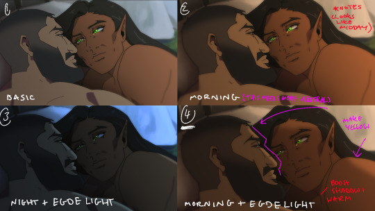
Fun fact, I almost went with #2 due to fear of getting too heavy-handed with compositing and therefore losing the animation (even though I really liked #4 at the time). Thanks to a friend, they also shared the sentiment of liking #4, though pointed out it felt like midday and encouraged me to make the colours warmer and deepen the shadows. It is a really tough balance but I think for a softer scene like this, the more additional layers of comp worked out in the end.
The edge light was a last minute thing because someone told me to add sound and to have light stream in. Also at this point I deadass forgot that you know, Olrox, is a vampire, but hey rule of cute overrules. We can pretend its light not from the sun LOL

Also yay I got to show off my own style a tad, I love paintingggg. It's not as completely fully rendered coz I knew that it would get covered up but I still made sure it was quite clean regardless. I didn't realise how much of it would be covered up even though I did make sure they would fit/make sense for bg LOL
Now we are done!
If you've gotten this far thank you! There's gonna be less frequency of these animations due to the semester starting back up soon and I don't get many opportunities to actually 2D animate (despite it being an animation degree RAH). Also I remembering cringing and laughing a lot when I immediately started putting colour down going "oh i can see the end of the horizon, i have too much power as an artist, people will see this i cant let them see me be crazy"

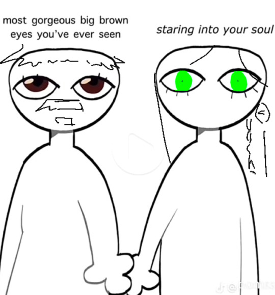
[Here's some memes I drew over while my friend was reviewing my work]
#mystery talks#castlevania nocturne#artists on tumblr#castlevania#castlevania fanart#fan animation#olrox/mizrak#i still keep going “oh no people who worked on the show will see this theyre gonna see im insane /lh”#its ok coz being crazy pushes you to achieve things
93 notes
·
View notes
Text
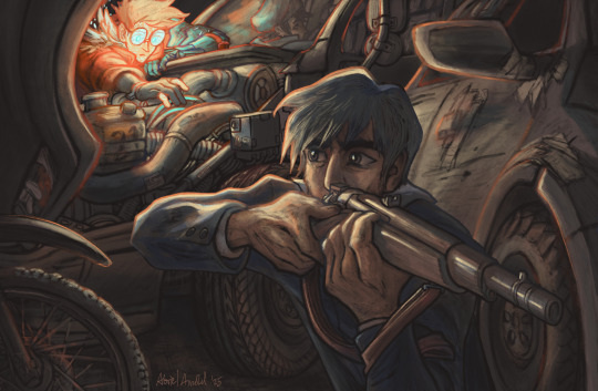
The song didn’t quite fit, but she had a feeling it wasn’t meant to. He was singing for someone else. Trying to call them back to him.
The Unknowable Tomorrow
by @screechthemighty
What a good good fic. I'm so excited for the next part in the series. (the suspense! aaaa!) The way Wolfwood is characterised and written is everything to me. The premise is fascinating and executed extremely well. I think about this fic a lot.
(process stuff below the cut because figuring out the composition for this was a fun challenge!)
i usually start with a pretty loose sketch layer, but when i tried to draw out the scene i quickly realised that i would need to figure out a much more solid base before i could even think about lineart. (looking back, this is still really close to the final composition, which is cool, because the scene in the fic is really strong and when i read it i could see it very clearly in my mind)
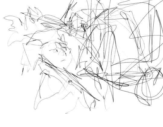
so first, (after a few days of agonising and scheming and rotating because i knew this was going to be A Challenge and a Proper Endeavor) i drew a quick birds eye view of the scene to kinda figure out what the field of view could be. then, i drew the vehicles at different angles so that i could have something to mix and match until i found a combo where everything fit together.
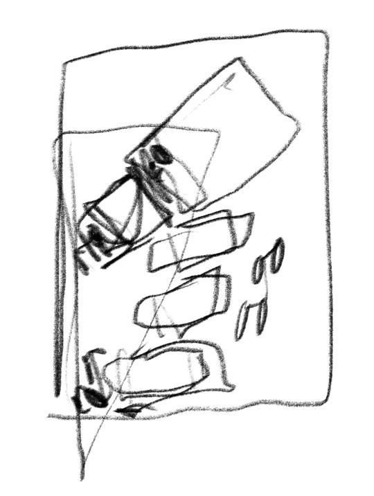

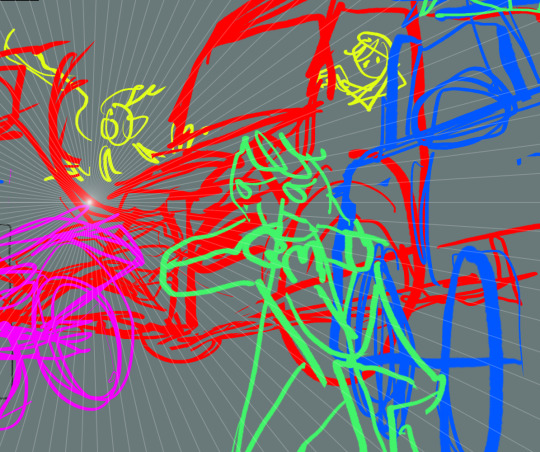
(this first concepting stage took as much time as the final lineart stage, with a lot of stopping and thinking and mental gymnastics, but i think that time spent getting everything in place really paid off!)
then i made a refined sketch (still loose, but confident and with the major shapes in play.) and a quick value layer to make sure the light sources would lead the eye where i wanted.
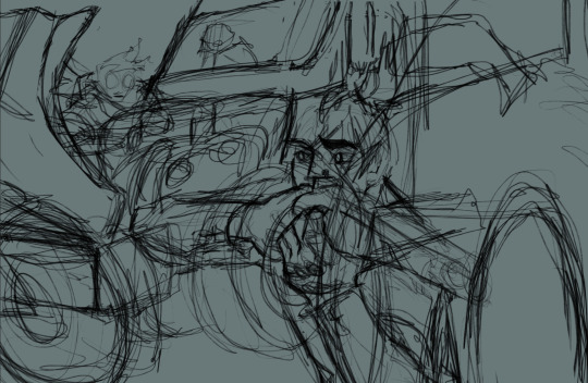
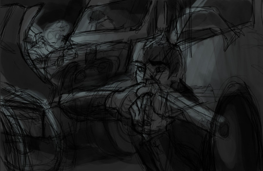
then i drew the lineart and a refined value layer to use as a base for my colour layer. (i really like how bold and punchy this layer turned out, and i think it really helped me remember to preserve a lot of intentional contrast)
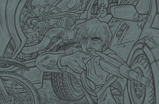
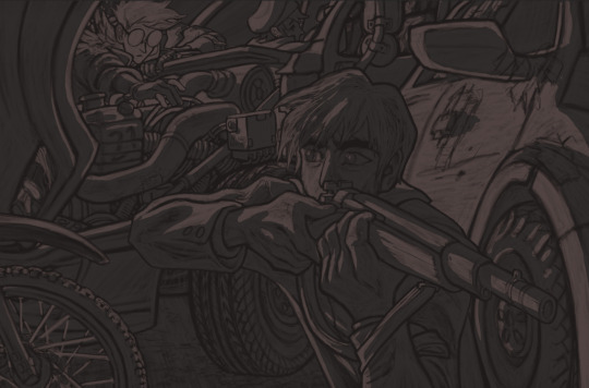
at this stage, the rendering is pretty much there and it's almost done and i have a lot of time to plan out the colours as i go.
#abrielart#ficrecs#trigun#vash the stampede#nicholas d. wolfwood#meryl stryfe#the unknowable tomorrow#thinking about drawing vehicle guts broke me out of my 'looks at everything that happened in november' depressive funk#this scene came right at the tail end of a wonderfully heavy wolfwood chapter. (meryl and vash care about him so much).#man this fic is so good. rereading it right now and everyone is SO well written and the povs are so immersive and in-character.#love love love
50 notes
·
View notes
Text

is it still me that makes you sweat? (my fav outfits from the fever era)
(silly rambling + commentary + process under the cut! reblogs appreciated!!!)

happy 19th birthday, afycso!!!!!! can’t believe that it’s been 19 years since the best album of all time was released, time really does fly lmfaooo
as a bit of celebration, decided to draw some of my fav fits from the fever era!! from left to right is Katie Kay, Ryan Ross, and Roger Fojas!
here are the reference pics i used:


i had wanted to add in Dusty because her outfit is also AMAZING, but i did lose some motivation after sketching out the first three :( also, composition-wise, i probably would have had to readjust the sizing of everything if i added a fourth figure, so i decided to just leave it at three
Ryan Ross is a tad bit out of place since he’s part of the band and the other two are performers, but lowk? just wanted to try drawing the rose vest! I don’t think i quite did it justice, but it sure was fun!!! and that is all that matters tbh
about my process: I really love screen tones guys. like i REALLY love screen tones. this is just layers upon layers upon layers of screen tones, i truly think i am allergic to using anything other than screen tones
i can’t help it!!!! I LOATHE using color in my art actually and also im a sucker for texture!!!!! it was so fun messing around with textures and different screen tones, UGH!!!!! luv them fr <3
some extra process pics (sorry for shitty quality):


just some extra thoughts about the fever era: afycso is truly my favorite album in the world, HANDS DOWN. there really isn’t another album that I listen to completely on a regular basis (the only album that comes REMOTELY close is from under the cork tree)
to me the aesthetic of afycso is UNMATCHED, out of every band i’ve done fanart for I just keep constantly coming back to this album!!! it will never fail to inspire me genuinely, even 19 years later it still holds up remarkably well
(there is something to be said about the misogynistic undertones of a lot of early to late 2000s emo/pop-punk music which afycso was NOT exempt from, but I talk more about that in my commentary under the “dance dance” post I made about a year ago! to summarize, I cannot in good conscience make art about this album without acknowledging how it talks about women, ESPECIALLY as an afab person, but I also have to acknowledge that these songs played and continue to play a large role in my artistic journey. I am not saying that every band in the early to late 2000s was necessarily misogynistic just because of the lyrics, but rather that the standard, acceptable ways that we talk about and refer to women in media have changed in the last 20 years. we can enjoy the music, but we shouldn’t try to replicate it exactly. if you have any more thoughts about this subject, feel free to send me an ask! I love to chat!)
anyway that’s it, byeeeeeeeeee! <3
#digital art#my art#fanart#art#ryan ross#artists on tumblr#a fever you can't sweat out#pre split patd#panic at the disco fanart#patd fanart#patd#panic at the disco#Katie Kay#Roger fojas#live in denver#emo#fever era#happy 19th birthday fever!#bandom#bandom art#xoxo my art#afycso fanart#afycso
41 notes
·
View notes
Text
@unknownsodabrand Well Lucky you, I also love the artistic process and I keep all my sketches!! (seriously this is the most self indulgent question I could ever answer, thank you sm I'm gonna ramble a while sorry)
First I was only planning on doing the one Geno Illustration, I mostly wanted to experiment with the long 1000x2000 format bc I thought It could make for an appealing composition and it ended up being pretty challenging to get right.
So. I started with some rough planning of where I wanted everything:
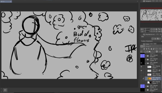
Since this was gonna be a full Illustration I planned the colors earlier than I usually would (I have a love/hate relationship with coloring):
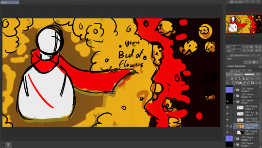

Didn't really like how it came out the first time so I just put a color mask over it, I wanted something a little warmer+brighter cause the flowers looked kinda green to me (Geno's was the one that gave me the most trouble and I liked it the least at first, by the time I finished It was my favourite XD)
Then I decided to make the three parts:
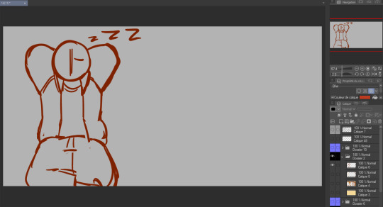
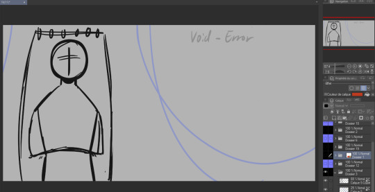
again used the same planning, rough sketch then color.
Then onto actually starting the Illustrations. I worked on these one by one but I'll show the process for all three by the steps rather than saying the same thing thrice.
as much as I wanted to keep the best for last I couldn't help myself and did the characters first.
Lineart:
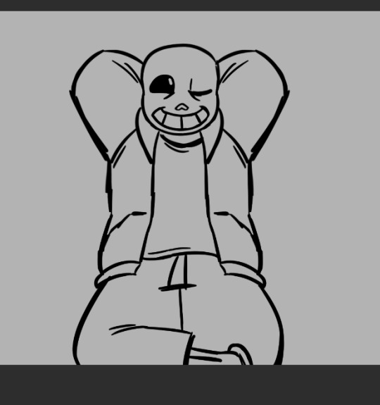
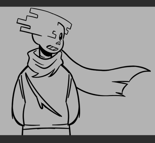
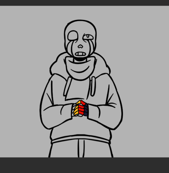
(Error was supposed to be holding a golden flower so I made his hand's lineart and color layers it's own folder so I wuldn't mess it up trying to draw the flower. I looked a bit stupid so I scrapped the idea)
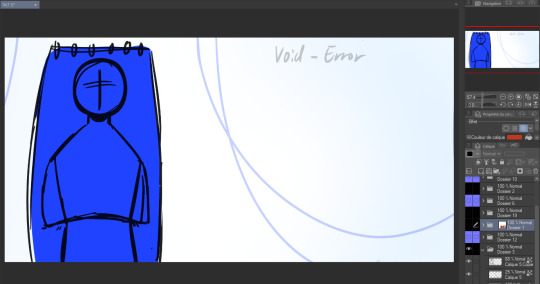
Flat color:


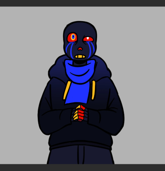
(I think I did Error's coloring after his background?)
In terms of backgrounds:
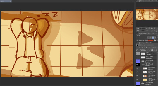
for Sans I started with the grid pattern, so I used a ruler tool and went in with color directly (the gradients are changes I did at the very end but I'm not editting out) Then I added the columns and the flowers were a last minute addition because the piece just felt a bit... naked. (also! I say columnS cause I planned on putting two, couldn't make it work the angle and space so I scrapped the bottom one)
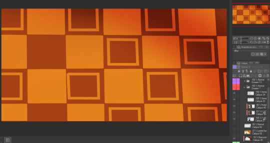
The light is a yellowish white with gaussian blur of orange, it's an 'add' layer? ("ajouter(éclat)" because my app is in french) It's about 50% opacity.
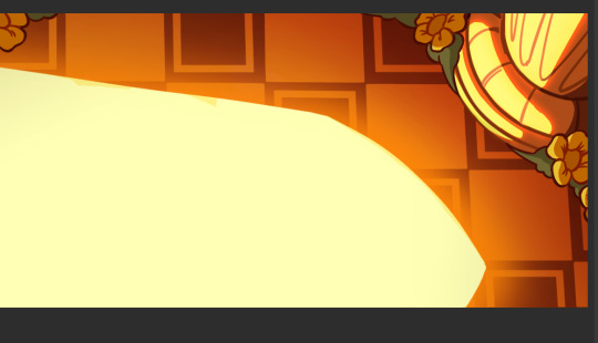
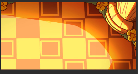
I also shaded Sans at the same time as this with a multiply layer with a dark and light color (reddish brown and like light yellow) I'm not showing it bc I do have a 30 image limit I think
Then for Error's background it's just a case of making the lineart for the hammock, haing a layer underneath for the color, a white bg with blue gradient and the strings
For geno I have underneath the black to grey of the save screen, then I have the moss and the flowers
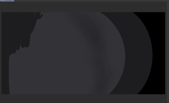
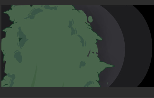

(The flowers were very fun to make I think I only copy pasted one?)
The lighting is a multiply layer over the whole image made the exact same way as Sans' coloring, I thought it was maybe a bit too dark so I dupplicated geno's lineart and colors folder to overlay over the lighting so he would pop more (seeing this now I think either would have been good. The first one might be better actually)
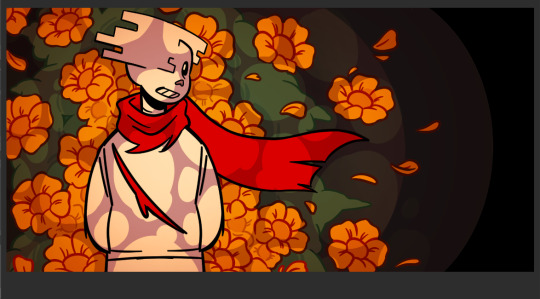

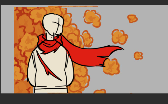
and that's it I think! If you read all of this, well first of all thank you but don't you have anything better to do?
also revised Geno's sketch once but it didn't fit in any where:
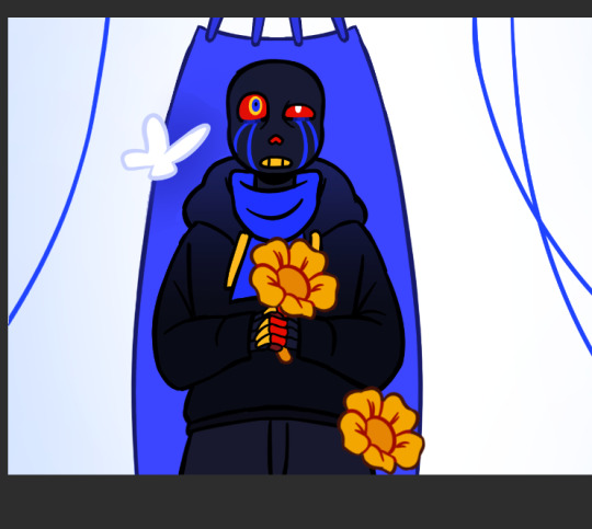
Error with my attemps of making the flowers work
#my art#undertale au#undertale#sans au#pigeon's art stuff#art process#digital art#digital illustration#I hope this is clear#If someone wants me to explain anything in more detail (which I doubt) send an ask#pigeon's utmv art
53 notes
·
View notes
Note
two questions.
one, HOW DOES ONE COMIC/STORY BOARD??
IM OBSESSED WITH HOW YOU DO IT ITS SO BEAUTIFUL
two, HOW DO YOU SO IT SO FAST( that’s question is more just me being super impressed oh my goodness)
you’re very good😳
Aw, sweet, a board question *puts on serious glasses*
Ok, bring it on anon.
So, the first thing to ask yourself when starting a comic, as I see it, is what type of board are you dealing with. Webtoon? A4 pages? 4 panels? There are many ways to go about it, and each involves different processes. For example, pages will allow for more superfluous scenes, whereas the webtoon format has to be super succinct because of the reading direction. I personally think that's the main reason I do pages, among other advantages: •narrative density •variety •Tumblr-friendly format
There are quite a few disadvantages too but you have to go through the process of trials and errors to really find out what suits you best!
Then there's the ambition of the sequence you're boarding for. And it goes from 1. how used I am to boarding this kind of sequence/drawing these characters/setting and backgrounds, to 2. is it an emotional sequence? Dialogue-heavy? Or more contemplative?
It changes the way you work and how you should approach your board! For example, in TMS, the very wordy chapters (4 and 5 for ex) generally called for simple and narrow framing. Of course, you don't want to bore the reader so you can spice things up to match the characters mood and reactions once in a while, but you have to bear in mind that the sequence aims to provide dialogue and information = the text bubbles are key and WILL take a lot of place. So let them.
( then again, it's all about pacing and balance. A page full of dialogue and one with too much happening are equally hard to read and boring to do)
Only dialogue, simple squares, no compostion, the focus is on Mel's reaction
On the other hand, parts 7 and 8 are all about action and atmosphere! This makes for wider and more varied shots!
They're fighting, things are going fast so why not use a single line to show many actions! They're still basically squares and rectangles but the pacing is totally different!
Or why not give the action a full page to really show its sheer impact
You can also split things, with a zoom or small time gap, depending on if it's a gag or if you want to put the focus on a reaction. Here, the asymmetry helps reinforce the unstable, jerky aspect of the scene. The situation is getting out of hand, and visually, the pages are affected too.
Now, these are case-by-case examples. And I never work on my pages separately.
For context, this-

-is the "first" board I did for part 8.
The drawings are very small and frankly difficult to make out, but the intention is what matters at this point lol I have the script (very important) next to my canvas, and I scribble the pages one after the ither. This allows me to see if the actions flow well, if the compositions are varied and also whether certain passages are too long or too short in regard to their importance. Which scenes can be merged? Removed? Toned down or if they deserve more bite?
This is a really fun and creative part but, I'll say it again, made a lot easier with a solid scipt. And I'm talking about a text document with clearly defined dialogues (or at least outlines) and actions.
I can't really explain how to write a script, it really depends on your work flow and how confortable you are with writing, but it's too important to just rush through it. No matter how much it changes before, during or after your finish boarding (cuz you gotta break your own rules sometimes and you'll often realize some things don't work as well once you put them on paper/sometimes art block can be resolved by writing the scene and just taking the time to imagine) but it's still your one guideline.
Aaaand, that's about it.
Other than that, I can only highly recommend reading lots of comics, Webtoon, books, watching movies, paintings, illustrations, animatics or listening to music, to inspire you and expand your own "personal library of references". Professional or not, anything your find inspiring and well executed. Boarding is at its core, telling stories. No art skill involved, just pure subjectivity. At the end of the day, it's all about squares, rectangles and bubbles so you gotta work on your creativity. The rest is gut feeling!
Constantly ask yourself how to tell this story, and how you want to tell it. How this sequence should be perceived? What do you need to show to make pages and pages of words appealing and interesting.
Be patient, be bold. Start with easy stuff to get some confidence if you need to. Accept that "boring" pages are smt necessary and that it's up to you to build up tension for a scene to really pop. Try new ideas and be ready to scrap many of them, the result will be worth all the work!
Now, concerning the "fast" part, I'm flattered but I personally think I'm super slow xD You prbly get that impression bc I finish the whole chapter before posting it, but behind the scene, I'm just working at a very regular pace.
Thank youuu anon ♡( ◡‿◡ )
#ask#ask me#forgot the tag I use for those errr#tuto#boarding is so much fun *sigh* unlike this *looking at the pile of pages waiting for lineart*#I personnaly prefer boarding for animatic but comics are fun cuz I know I'll get to actually see the final result haha#I know some artists love to do intricate shots with lots of details and pers (big flex here) but I'm more about the vibe really xD
59 notes
·
View notes
Note
How did you improve so much in a year at building and taking screenshots?! Forever in awe
hahah thank you so much! I'm so happy with my improvement - the answer is ~magic~
nah, really, it's just that when I started Lucky Girl back at the end of 2022, I knew absolutely none of the screenshot tricks - I only ever got ts4 as a way to tell the story, and hadn't played it at all in the years prior. I ended up trying to take screenshots in a game where I didn't even know how to work the teleport function - and you can tell, I fear.
I was also using another platform to share my story at the time, and a lot of the content there kinda looked the same - vanilla, screenshots taken with plumbobs on and the walls down etc. I wasn't using Tumblr so I didn't have any inspiration. Coming here really pushed me to be better and taught me a lot of tricks and new things to add to my game to make it look better - the short of it, is that I just really didn't know better, and I just wanted to write the story. The screenshots felt secondary. I look back and cringe tbh, but I distinctly remember not really bothering that much with them, and thinking that 'just okay' was good enough.
Since then I've learned so much!
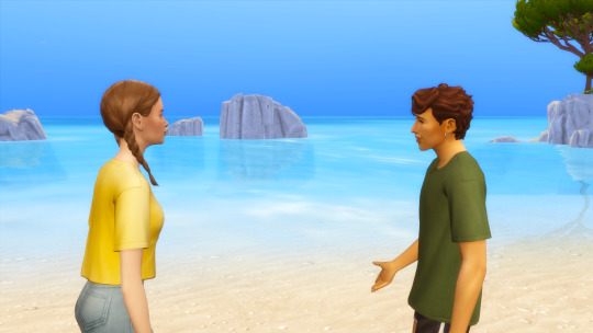
The first was how to teleport, and use MCCC to get sims to do couple poses off the lot
I got TOOL and figured all of that stuff out - including to create the illusion of varying heights etc.
I added in more details to the sims, changed any hair and skin issues, and added in skin details galore
I use WW for posing whenever I need something a bit more complex
I got over my fear of having too much CC in my game and just got so much build/buy cc - this made it possible to create the kinds of houses and rooms I imagined in my head - also, experience building helped a lot. In the beginning I was so intimidated, and frankly, unable to make things looked good that I relied on builds from the gallery 90% of the time.
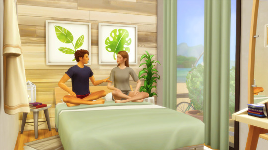
Weirdly, even though I studied film in college, I never applied my knowledge of composition to the screenshots - I just started doing that, and generally trying to think more cinematically.
I got more use to using photoshop to fix screenshots, mix them together and crop them to be more compositionally pleasing. I also did that tutorial about changing the BG of a scene - I do that as a last resort, but it really works.
RESHADE - this was the biggest one. That DOF really changed my screenshot game - there's a point in lucky girl where I started using it, and you can see the instant difference.
Lighting mods - I use sunblind, and I also use the ghibli replacement clouds. I have a few others also to fix the shadows and lighting in general
Being more intentional with poses. I got a bunch of new ones with more subtle expressions that I felt suited the tone of my story better. I think the exaggerated ones are super cute, but they always seemed too much for my story. I also got animations for even more natural movement in scenes. Sometimes I'll make my own, too, if I can't find exactly what I am looking for
The eye trick was a huge gamechanger - I use it almost every single shot, and truly couldn't live without it.
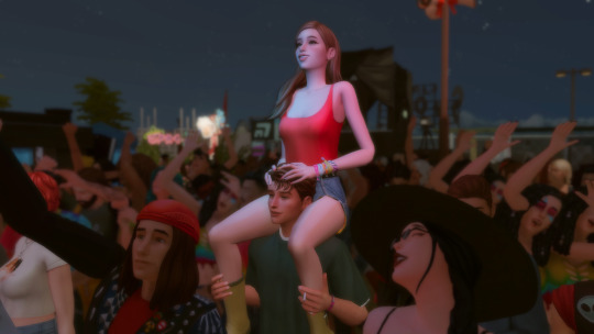
Relight is a recent addition to my game - I only figured out how to use it around the end of part 2 of Lucky Boy. I don't use it a lot, but it was great more some of the dramatically lit festival scenes, and whenever I want some lamplight on a character (Or to just balance out a dark part of the shot)
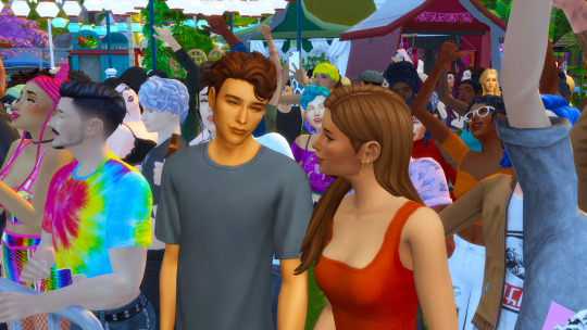
camera mods have helped me gain more control of my scenes, along with the CTRL 5/6/7/8/9 camera saving trick. I use this a lot too, especially when I need to characters to look at each other with the eye trick and they won't do it at the same time (recent example below)
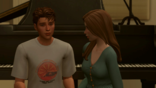
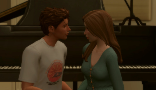
All of that is basically how I did it! It was a whole process but I'm so pleased because I look at the old screenshots and just think, damn, I've come so far!
More examples of the same scenes redone, because it's fun


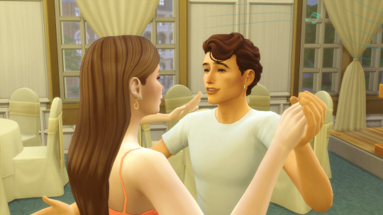

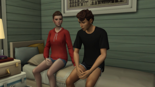
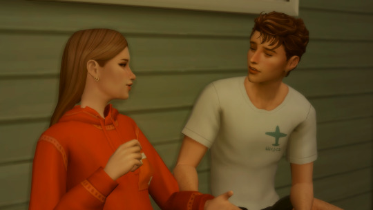





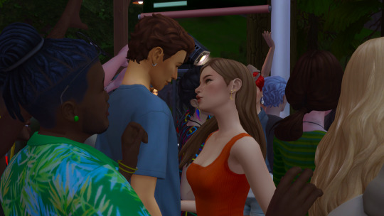
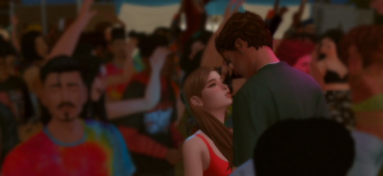
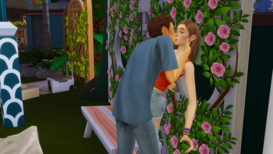
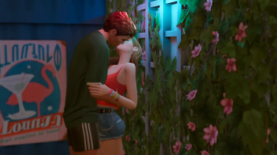
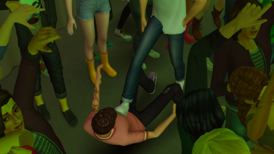
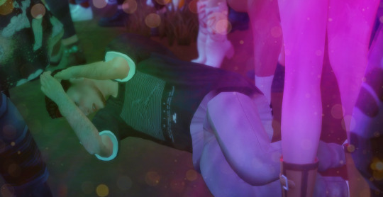
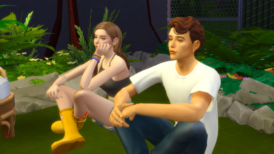
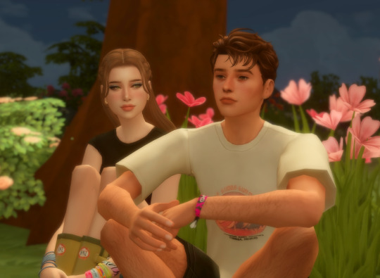
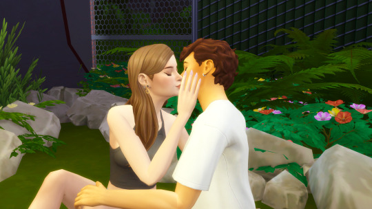
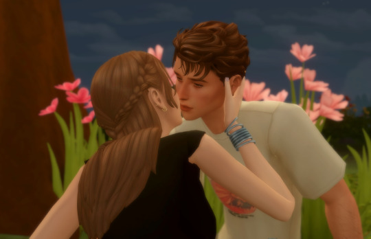
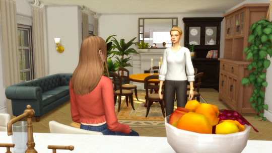
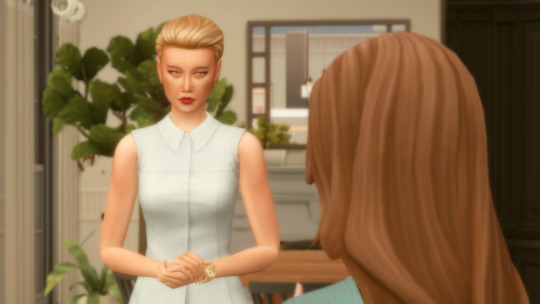
25 notes
·
View notes
Note
do you have any tips for learning how to draw? your art looks so free and expressive even in rough sketch form, and the colors are absolutely gorgeous, but i don't even know how to color normally and don't have the means to do it digitally, so i'll leave that for later haha. anyway just wondering if you did anything in particular to practice or to learn your skills. your art is just so good. sorry if you've been asked before. thank you for sharing your art with the dn fandom!!
thank you for your message!!! ♥︎ you're very kind. I hope what I write here is helpful, but this is sort of a complicated one for me to answer!
in all honesty, I struggle deeply with seeing my art as good enough. my relationship with my creative process is something I’d consider unhealthy more often than not– though I’d like to think it’s getting better as of late. :')
I wasn’t formally taught how to draw, but I was obsessed with hand-drawn media from a young age, whether it was comics, 2D animation, illustrations, etc., and growing up, I would try to emulate the artists I loved as practice. I was just using a cheap yellow pencil and notebook paper, but it was all I needed at the time. and I think that's a really good place to start! don't worry about buying a bunch of art supplies all at once; you'll naturally accumulate tools as you go.
I’d say look at art, a lot of different types of art, and study it to discover what you like, and equally importantly, what you don’t. drill into why. if an artist you love shows their works in progress or sketches, really take a look at those. it’s so much easier to understand a rough image and how it was drawn/what marks the artist used rather than dissecting a polished piece.
if you have friends who like to draw, spend time drawing with them! make up stories and characters together. I drew all the time growing up. all the time. I was a super quiet, well behaved kid in school because I was terrified of getting in trouble, and yet I was constantly reprimanded for drawing during class. it was the one thing I was willing to get yelled at for. my point isn’t to get in trouble (lol), but more so– draw whenever you can, wherever you can. even when it’s mindless. keep paper nearby. doodle. draw what you see around you.
these days, it’s my perfectionism that really kills my love for drawing. it stops me from drawing at all sometimes, because I’m worried (before I even start!) whatever I make won’t be “good enough”, whatever that means. it got much easier when I stopped trying to keep a neat sketchbook and allowed myself to let go. draw quick, draw messy, draw “bad”. you have to make art you aren't satisfied with to get better. and it sucks! you might try something new and feel like, damn this looks so incredibly amateur, but it's an unavoidable part of the process. if you can look at what you made, accept it for what it is, and then keep going, you’ve already jumped the biggest hurdle.
when I’m stuck in a mental feedback loop of oh my god, I don’t know how to draw, why is my art so bad, I compare something I made this year to the year before. even if the differences aren’t immediately apparent, chances are you learned something between then and now– whether it be a better understanding of your personal taste/drawing style or composition or, like, how to draw ears. it gives you concrete proof that you’ve improved.
⬇ this is a Light I drew in 2022 compared to one from early 2024. even now, I look at the more recent image on the right and think, yeah I would probably draw that differently. but I'm also proud of the me back then who did her best.
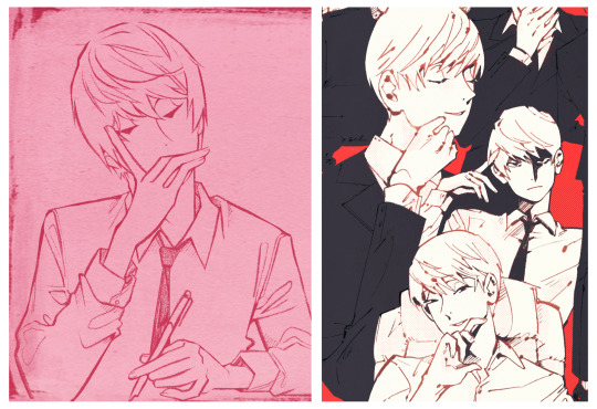
really, truly, I’m still learning how to draw all the time. part of the reason I made this account and started posting Death Note fanart was because it was a low pressure way to be creative and let go and have fun. and maybe that’s my biggest piece of advice, simple as it is. enjoy it! draw self-indulgently. strive to improve, but also be lenient with yourself. if you find the love in drawing, it'll pull you through the times when it’s frustrating.
♥︎
#I'm so sorry this is probably a longer response than called for lmao#but I hope it's at least a little helpful!!#drawing is hard#but also so fulfilling#and I hope you have fun with it anon!!!
18 notes
·
View notes
Note
Hey! I love your style so much! The lineart, the angles, the expressions, keiths flat mullet and lances personality conveyed through your drawing. If you'd like to share, how did you learn to draw? What's the process behind your art?
Anyway, thanks for existing and blessing us with your vision! :)
Hiiiii thank you so much, you’re so sweet !!🫶🏽 sorry for taking so long to answer, I really wanted to do this ask justice !
Your question about how I learned to draw really made me have to think back, because I’ve been drawing for almost 10 years now!
Back then, tumblr was a different place, and I had just been exposed to digital art as a medium and I was enthralled. So I started by looking at people’s art that I looked up to and any potential tutorials they had made (which were popular for artists to do back then) such as Viria (x, x, x, x) Burdge (not made by her, but a collection she has reblogged which are still helpful x), Ikimaru (x, x, x) (and a bunch more on instagram when that was such a hub for both traditional and digital art); people who’s art I loved a lot.
And over time I looked at other tutorials and art advice videos (link is to my YouTube playlist of tutorials I found helpful over the years) and once I gained a bit more confidence and skill I targeted specific areas of my art that I wanted to improve on, such as color, or composition or figure drawing etc.
Most importantly I practiced a lot! I drew almost every single day! Whatever I wanted really (most of which was fanart lol which is all I draw now). It’s one way of making studying art (which is what you do every time you draw, essentially) a bit more fun!
Examples from 2020


And more recently


My process now looks very different from what it used to be, some of it due to the extreme change social media has undergone over the years, but most of it is actually due to some personal art slumps I’ve had. Right now for example, I’ve drawn more over the last two weeks than I have over the last two years.
So now, while I’m trying to get back into it, I’m kinda going back to basics, warming up with figure drawings using line-of-action.com for about 30 min, and then scouring Pinterest for inspiration for more dynamic poses and interesting compositions or angles. All the rest are mainly just doodles, cause I’m trying to take it easy while I get back into it and trying new brushes and seeing what works for me after all these years. Right now I’m really happy with CSP and this brush I’m using. But it may change two months from now. It really depends. It really fluctuates constantly.
As for my process right now, what better way to show you than by putting a Timelapse of my recent drawing :’))
I hope any of this was helpful. good luck !!
9 notes
·
View notes