#might as well tag that too
Text
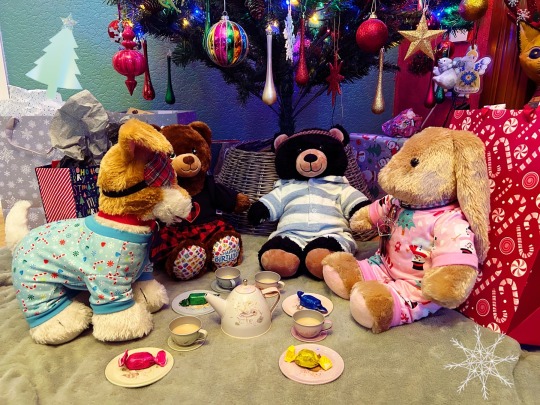
Christmas Eve tea party with the girls (and Lan, who is considered an honorary girl for the day)
Elsbeth thinks she's in charge, Elle is actually in charge, Jessie is serving the tea and poor Lan is just doing what he's told
You're all invited too 🫖
#tw food#tagging just in case#plushie: Elle#plushie: Jessie#plushie: Lan#plushie: Elsbeth#plushies#stuffies#toycore#plushcore#plushblr#plushwave#build a bear#I don't know if any of these tags are even still active but it's a habit by now#agere#sfw agere#might as well tag that too
157 notes
·
View notes
Text
Got to talking about mommy kink stuff very briefly with one of my friends and I am APPALLED that there is all of three tagged mommy kink fics on ao3 for transformers.
#valveplug#transformers#it seems like such an obvious kink for some of these characters guys#come on#am i gonna have to write the mommy kink fic#mommy kink#might as well tag that too
14 notes
·
View notes
Text
Peli Motto in Star Wars: The Book of Boba Fett (via Titan Magazines)
#star wars#peli motto#the book of boba fett#the mandalorian#might as well tag that too#hi i made a sideblog even though i don't really use my main#anyway i'm glad i found this book online because oh my god
3 notes
·
View notes
Text
“Women and non-binary people” stop. Do you mean people with marginalized genders? Do you mean gender-oppressed people? Then say that. Stop refusing to recognize the very much gendered oppression of other trans people. There’s not some chasm of difference between how our oppressors treat a very masc non-binary person and a more binary trans man. I’m also non-binary and very much oppressed for my gender but because I’m transmasculine I could never feel comfortable in a space that marketed itself like that. Tell me what the real harm is of letting gender-oppressed mascs into spaces discussing gender oppression is. Because the consequence of not doing so is denying them space for their experiences just because of their gender identity. Do better.
#‘’but 🥺 we don’t want men in our spaces 🥺’’ why. these men are oppressed for their gender identity & expression.#‘’well some people have trauma around men’’ some people have trauma around women too. should we keep them out of queer spaces#‘’their appearance might make someone uncomfortable’’ are you also keeping out cis women butches and trans women who aren’t hyper femme#because if so your space has serious problems and you are the one making gender-oppressed people uncomfortable#so many trans women are wary of these spaces because they police perceived masculinity. so how abt stop doing that#transandrophobia#intracommunity issues tag#mine
5K notes
·
View notes
Text

Kabru has a secret admirer in the castle!
#running from my responsibilities (drawing armour) by imagining post canon Kabru fashion#minor spoilers in the tags!#royal advisor Kabru’s office is probably overflowing with gifts from foreign dignitaries eyeing him up for marriage#and sacks of perfumed letters from Melini citizens#Marcille would be so sick of it#Laios also has his fair share of proposals#Yaad is like … boys spare us all and pick a suitable candidate already#well Yaad there’s a saying that goes two birds one stone#anyway lol#someone might have suggested to Laios ‘hey Kabru works so hard. you should show your appreciation.’#Laios (blushing sweating): uuuh how do i do that#Marcille probably: i hear it’s customary to give your royal advisor flowers the same colour as their beautiful blue eyes#Laios: well if you say so#but he starts having second thoughts bcs what if the gift is too romantic#so then Laios is like oh i know i just won’t sign it (:#fool proof plan Laios good job#totally not taking into account that Kabru can recognize his penmanship at a first glance#so at their next meeting Kabru is like ‘i wonder who my secret admirer in the castle is 😉’#and Laios sweats so hard he falls out of his throne#doesn’t Kabru of Melini have a nice ring to it#better yet …. Kabru Touden#much to consider#dungeon meshi#dungeon meshi spoilers#kabru#kabru of utaya#labru#if you squint#wasabi doodles
2K notes
·
View notes
Text

was staying up till 1am drawing worth it for this shitpost
#hermitcraft#hermitcraft meme#hermitcraft memes#grian#do i tag the dudes in the messages?#might as well#cubfan135#zedaph#mumbo jumbo#docm77#impulsesv#gtwscar#grumbot#lol#shitpost#this is too many tags#i feel#kys joke#tw kys joke#?#masondrawing
5K notes
·
View notes
Text

ohoho!~ art thee working hard, or hardly working, sir edgeworth? 🌻🎭💗💕
originally drawn for narumitsu week 2022 day 3: free day!
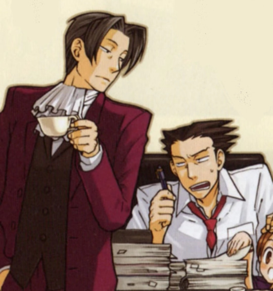
i suppose i should post some of my old swap au art since i'm too busy rn to answer asks adfghd <3 (i'm so sorry, i appreciate everyone's interest and curiosity with the au! but between college and brain stuff, i'm afraid i don't have any spoons rn </3)
anyways, like i mentioned, i drew this for nrmt week 2022 and i polled my bird app followers for which piece of official art i should redraw for the swap au, and this one won so here it is!
y'all finally get to see the full image of this blog's icon if y'all weren't aware lol
#ace attorney#phoenix wright#miles edgeworth#den's aa roleswap au#narumitsu#wrightworth#narumitsu week 2022#<- well. i drew it for that so might as well tag it too#aa swap au art#ace attorney roleswap#roleswap au#aa roleswap au
3K notes
·
View notes
Text

— chuck palahniuk, haunted
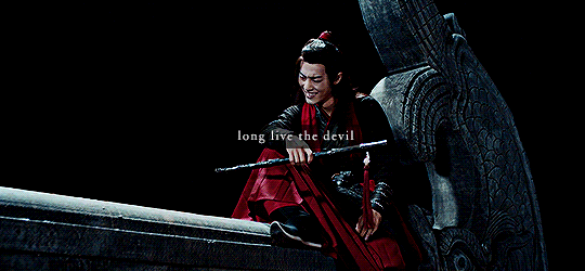
#cqledit#The Untamed#Wei Wuxian#Wen Ruohan#mdzs#myedit#you know while I'm in the giffing mood then let's go#I should tag jgy here but idk if I wanna clutter the tag without him actually here#but yeah this is very much relevant to him as well#just yeah calling out the cultivation world for just jumping from target to target like it's nothing#obv some deserved and some not but that there will always be The Public Enemy Number One#and you never know if you might not be the next one#and wwx knows this all too well hah
862 notes
·
View notes
Text

i feel like people are sleeping on the occam's razor situation of how buckwild it is to outright accuse a guy of being a clone of your friend even if you DO have a lot of circumstantial evidence. there's other options is what im saying. they could just be like. a guy. that's a sensible deduction. you should explore that deduction. ignore my shirt that reads I <3 RED HERRINGS.
i still think odile has the correct theory on lock but she's smart enough to know it needs like... a real smoking gun to be able to bring it up without sounding insane.
anyway. (mirabelle voice) i know its rude to speculate but has anyone else noticed the grieving? they seem to be grieving. does anyone have any thoughts on the grieving? i have some thoughts on the grieving.
#[isabeau voice] am i insane or does sometimes loop talk like they might have killed their whole family. is that just me? just checking.#nille design highly inspired by @kiwibrain's since its the one that imprinted in my mind. liberties taken since i didnt look @ reference#anyway i have a lot more thoughts on this? i guess ill hide them in the tags...? scroll down i suppose.#isat#in stars and time#isat spoilers#in stars and time spoilers#isat act 6 spoilers#isat loop#isat siffrin#isat bonnie#isat nille#isat fanart#in stars and time fanart#doodlebyte#----------------------------------------------------------------------#anyway the extra thoughts. are literally just my general thoughts on postcanon. (and thus are the context for all of my postcanon doodles!)#which is i think nille joins the party before loop reappears for a start (either from a period of nonexistence or just wandering around)#and that like. i think the party should be able to integrate loop as a completely new person. because they are! the secrecy isn't great but#They and Siffrin shuffle into different ecological niches in the party (eg. i think sif is more squeamish after it all but loop isnt)#and while it's not *exactly* what Loop wanted they get that beggars can't be choosers. and its pretty good#(i am glossing over how i think loop's reappearence drags both them and siffrin into a massive behavioural backslide and is likely a bit#distressing to watch go down. cycle of argument -> lovebombing -> normalcy -> repeat. etc etc. but since they are no longer literally#stewing in the worst pressure cooker of all time they do resolve it via productive conversation on their own time. its fine)#the party well-meaningly tries to deduce things from loop's vagueries and are able to pin down the DEAD FAMILY vibe pretty quickly.#but eventually the question of their prior identity falls by the wayside because well! they're just their friend loop! (also change belief)#as for how The Truth Come Out... this is what i mean by The Isabeau Torment Nexus(tm). which is that i think... isiloop should almost occur#BEFORE isabeau knows who loop is. he's just genuinely charmed by them eventually and tries to close the open end of the polycule#which FREAKS LOOP THE FUCK OUT because thats just too genuinely sick and wrong. and obviously w emotions high its not a great confrontation#ANYWAY told u i had more thoughts. if i were normal itd be a text post but.
1K notes
·
View notes
Photo

day 31: the full line-up!
i honestly didnt think id finish the whole month so im kinda proud that i actually did it lol. but it was such a fun challenge!! and definitely pretty good practice too
#i think the quality might be slightly bad here cause the file was too big for tumblr - but well the drawings are all on my account lol#hermitaday#hermitcraft#oh dear now i gotta tag everyone huh#ethoslab#iskall85#falsesymmetry#geminitay#docm77#xbcrafted#mumbo jumbo#stressmonster101#goodtimeswithscar#zombiecleo#tango tek#zedaph#impulsesv#vintagebeef#grian#keralis#hypnotizd#xisuma#rendog#ijevin#cubfan135#welsknight#joe hills#pearlescentmoon#bdoubleo100#tinfoilchef
3K notes
·
View notes
Text
why Aurora's art is genius
It's break for me, and I've been meaning to sit down and read the Aurora webcomic (https://comicaurora.com/, @comicaurora on Tumblr) for quite a bit. So I did that over the last few days.
And… y'know. I can't actually say "I should've read this earlier," because otherwise I would've been up at 2:30-3am when I had responsibilities in the morning and I couldn't have properly enjoyed it, but. Holy shit guys THIS COMIC.
I intended to just do a generalized "hello this is all the things I love about this story," and I wrote a paragraph or two about art style. …and then another. And another. And I realized I needed to actually reference things so I would stop being too vague. I was reading the comic on my tablet or phone, because I wanted to stay curled up in my chair, but I type at a big monitor and so I saw more details… aaaaaand it turned into its own giant-ass post.
SO. Enjoy a few thousand words of me nerding out about this insanely cool art style and how fucking gorgeous this comic is? (There are screenshots, I promise it isn't just a wall of text.) In my defense, I just spent two semesters in graphic design classes focusing on the Adobe Suite, so… I get to be a nerd about pretty things…???
All positive feedback btw! No downers here. <3
---
I cannot emphasize enough how much I love the beautiful, simple stylistic method of drawing characters and figures. It is absolutely stunning and effortless and utterly graceful—it is so hard to capture the sheer beauty and fluidity of the human form in such a fashion. Even a simple outline of a character feels dynamic! It's gorgeous!
Though I do have a love-hate relationship with this, because my artistic side looks at that lovely simplicity, goes "I CAN DO THAT!" and then I sit down and go to the paper and realize that no, in fact, I cannot do that yet, because that simplicity is born of a hell of a lot of practice and understanding of bodies and actually is really hard to do. It's a very developed style that only looks simple because the artist knows what they're doing. The human body is hard to pull off, and this comic does so beautifully and makes it look effortless.
Also: line weight line weight line weight. It's especially important in simplified shapes and figures like this, and hoo boy is it used excellently. It's especially apparent the newer the pages get—I love watching that improvement over time—but with simpler figures and lines, you get nice light lines to emphasize both smaller details, like in the draping of clothing and the curls of hair—which, hello, yes—and thicker lines to emphasize bigger and more important details and silhouettes. It's the sort of thing that's essential to most illustrations, but I wanted to make a note of it because it's so vital to this art style.
THE USE OF LAYER BLENDING MODES OH MY GODS. (...uhhh, apologies to the people who don't know what that means, it's a digital art program thing? This article explains it for beginners.)
Bear with me, I just finished my second Photoshop course, I spent months and months working on projects with this shit so I see the genius use of Screen and/or its siblings (of which there are many—if I say "Screen" here, assume I mean the entire umbrella of Screen blending modes and possibly Overlay) and go nuts, but seriously it's so clever and also fucking gorgeous:
Firstly: the use of screened-on sound effect words over an action? A "CRACK" written over a branch and then put on Screen in glowy green so that it's subtle enough that it doesn't disrupt the visual flow, but still sticks out enough to make itself heard? Little "scritches" that are transparent where they're laid on without outlines to emphasize the sound without disrupting the underlying image? FUCK YES. I haven't seen this done literally anywhere else—granted, I haven't read a massive amount of comics, but I've read enough—and it is so clever and I adore it. Examples:


Secondly: The beautiful lighting effects. The curling leaves, all the magic, the various glowing eyes, the fog, the way it's all so vividly colored but doesn't burn your eyeballs out—a balance that's way harder to achieve than you'd think—and the soft glows around them, eeeee it's so pretty so pretty SO PRETTY. Not sure if some of these are Outer/Inner Glow/Shadow layer effects or if it's entirely hand-drawn, but major kudos either way; I can see the beautiful use of blending modes and I SALUTE YOUR GENIUS.
I keep looking at some of this stuff and go "is that a layer effect or is it done by hand?" Because you can make some similar things with the Satin layer effect in Photoshop (I don't know if other programs have this? I'm gonna have to find out since I won't have access to PS for much longer ;-;) that resembles some of the swirly inner bits on some of the lit effects, but I'm not sure if it is that or not. Or you could mask over textures? There's... many ways to do it.
If done by hand: oh my gods the patience, how. If done with layer effects: really clever work that knows how to stop said effects from looking wonky, because ugh those things get temperamental. If done with a layer of texture that's been masked over: very, very good masking work. No matter the method, pretty shimmers and swirly bits inside the bigger pretty swirls!
Next: The way color contrast is used! I will never be over the glowy green-on-black Primordial Life vibes when Alinua gets dropped into that… unconscious space?? with Life, for example, and the sharp contrast of vines and crack and branches and leaves against pitch black is just visually stunning. The way the roots sink into the ground and the three-dimensional sensation of it is particularly badass here:

Friggin. How does this imply depth like that. HOW. IT'S SO FREAKING COOL.
A huge point here is also color language and use! Everybody has their own particular shade, generally matching their eyes, magic, and personality, and I adore how this is used to make it clear who's talking or who's doing an action. That was especially apparent to me with Dainix and Falst in the caves—their colors are both fairly warm, but quite distinct, and I love how this clarifies who's doing what in panels with a lot of action from both of them. There is a particular bit that stuck out to me, so I dug up the panels (see this page and the following one https://comicaurora.com/aurora/1-20-30/):

(Gods it looks even prettier now that I put it against a plain background. Also, appreciation to Falst for managing a bridal-carry midair, damn.)
The way that their colors MERGE here! And the immense attention to detail in doing so—Dainix is higher up than Falst is in the first panel, so Dainix's orange fades into Falst's orange at the base. The next panel has gold up top and orange on bottom; we can't really tell in that panel where each of them are, but that's carried over to the next panel—

—where we now see that Falst's position is raised above Dainix's due to the way he's carrying him. (Points for continuity!) And, of course, we see the little "huffs" flowing from orange to yellow over their heads (where Dainix's head is higher than Falst's) to merge the sound of their breathing, which is absurdly clever because it emphasizes to the viewer how we hear two sets of huffing overlaying each other, not one. Absolutely brilliant.
(A few other notes of appreciation to that panel: beautiful glows around them, the sparks, the jagged silhouette of the spider legs, the lovely colors that have no right to make the area around a spider corpse that pretty, the excellent texturing on the cave walls plus perspective, the way Falst's movements imply Dainix's hefty weight, the natural posing of the characters, their on-point expressions that convey exactly how fuckin terrifying everything is right now, the slight glows to their eyes, and also they're just handsome boys <3)
Next up: Rain!!!! So well done! It's subtle enough that it never ever disrupts the impact of the focal point, but evident enough you can tell! And more importantly: THE MIST OFF THE CHARACTERS. Rain does this irl, it has that little vapor that comes off you and makes that little misty effect that plays with lighting, it's so cool-looking and here it's used to such pretty effect!
One of the panel captions says something about it blurring out all the injuries on the characters but like THAT AIN'T TOO BIG OF A PROBLEM when it gets across the environmental vibes, and also that'd be how it would look in real life too so like… outside viewer's angle is the same as the characters', mostly? my point is: that's the environment!!! that's the vibes, that's the feel! It gets it across and it does so in the most pretty way possible!
And another thing re: rain, the use of it to establish perspective, particularly in panels like this—

—where we can tell we're looking down at Tynan due to the perspective on the rain and where it's pointing. Excellent. (Also, kudos for looking down and emphasizing how Tynan's losing his advantage—lovely use of visual storytelling.)
Additionally, the misting here:

We see it most heavily in the leftmost panel, where it's quite foggy as you would expect in a rainstorm, especially in an environment with a lot of heat, but it's also lightly powdered on in the following two panels and tends to follow light sources, which makes complete sense given how light bounces off particles in the air.
A major point of strength in these too is a thorough understanding of lighting, like rim lighting, the various hues and shades, and an intricate understanding of how light bounces off surfaces even when they're in shadow (we'll see a faint glow in spots where characters are half in shadow, but that's how it would work in real life, because of how light bounces around).
Bringing some of these points together: the fluidity of the lines in magic, and the way simple glowing lines are used to emphasize motion and the magic itself, is deeply clever. I'm basically pulling at random from panels and there's definitely even better examples, but here's one (see this page https://comicaurora.com/aurora/1-16-33/):

First panel, listed in numbers because these build on each other:
The tension of the lines in Tess's magic here. This works on a couple levels: first, the way she's holding her fists, as if she's pulling a rope taut.
The way there's one primary line, emphasizing the rope feeling, accompanied by smaller ones.
The additional lines starbursting around her hands, to indicate the energy crackling in her hands and how she's doing a good bit more than just holding it. (That combined with the fists suggests some tension to the magic, too.) Also the variations in brightness, a feature you'll find in actual lightning. :D Additional kudos for how the lightning sparks and breaks off the metal of the sword.
A handful of miscellaneous notes on the second panel:
The reflection of the flames in Erin's typically dark blue eyes (which bears a remarkable resemblance to Dainix, incidentally—almost a thematic sort of parallel given Erin's using the same magic Dainix specializes in?)
The flowing of fabric in the wind and associated variation in the lineart
The way Erin's tattoos interact with the fire he's pulling to his hand
The way the rain overlays some of the fainter areas of fire (attention! to! detail! hell yeah!)
I could go on. I won't because this is a lot of writing already.
Third panel gets paragraphs, not bullets:
Erin's giant-ass "FWOOM" of fire there, and the way the outline of the word is puffy-edged and gradated to feel almost three-dimensional, plus once again using Screen or a variation on it so that the stars show up in the background. All this against that stunning plume of fire, which ripples and sparks so gorgeously, and the ending "om" of the onomatopoeia is emphasized incredibly brightly against that, adding to the punch of it and making the plume feel even brighter.
Also, once again, rain helping establish perspective, especially in how it's very angular in the left side of the panel and then slowly becomes more like a point to the right to indicate it's falling directly down on the viewer. Add in the bright, beautiful glow effects, fainter but no less important black lines beneath them to emphasize the sky and smoke and the like, and the stunningly beautiful lighting and gradated glows surrounding Erin plus the lightning jagging up at him from below, and you get one hell of an impactful panel right there. (And there is definitely more in there I could break down, this is just a lot already.)
And in general: The colors in this? Incredible. The blues and purples and oranges and golds compliment so well, and it's all so rich.
Like, seriously, just throughout the whole comic, the use of gradients, blending modes, color balance and hues, all the things, all the things, it makes for the most beautiful effects and glows and such a rich environment. There's a very distinct style to this comic in its simplified backgrounds (which I recognize are done partly because it's way easier and also backgrounds are so time-consuming dear gods but lemme say this) and vivid, smoothly drawn characters; the simplicity lets them come to the front and gives room for those beautiful, richly saturated focal points, letting the stylized designs of the magic and characters shine. The use of distinct silhouettes is insanely good. Honestly, complex backgrounds might run the risk of making everything too visually busy in this case. It's just, augh, so GORGEOUS.
Another bit, take a look at this page (https://comicaurora.com/aurora/1-15-28/):

It's not quite as evident here as it is in the next page, but this one does some other fun things so I'm grabbing it. Points:
Once again, using different colors to represent different character actions. The "WHAM" of Kendal hitting the ground is caused by Dainix's force, so it's orange (and kudos for doubling the word over to add a shake effect). But we see blue layered underneath, which could be an environmental choice, but might also be because it's Kendal, whose color is blue.
And speaking off, take a look at the right-most panel on top, where Kendal grabs the spear: his motion is, again, illustrated in bright blue, versus the atmospheric screened-on orange lines that point toward him around the whole panel (I'm sure these have a name, I think they might be more of a manga thing though and the only experience I have in manga is reading a bit of Fullmetal Alchemist). Those lines emphasize the weight of the spear being shoved at him, and their color tells us Dainix is responsible for it.
One of my all-time favorite effects in this comic is the way cracks manifest across Dainix's body to represent when he starts to lose control; it is utterly gorgeous and wonderfully thematic. These are more evident in the page before and after this one, but you get a decent idea here. I love the way they glow softly, the way the fire juuuust flickers through at the start and then becomes more evident over time, and the cracks feel so realistic, like his skin is made of pottery. Additional points for how fire begins to creep into his hair.
A small detail that's generally consistent across the comic, but which I want to make note of here because you can see it pretty well: Kendal's eyes glow about the same as the jewel in his sword, mirroring his connection to said sword and calling back to how the jewel became Vash's eye temporarily and thus was once Kendal's eye. You can always see this connection (though there might be some spots where this also changes in a symbolic manner; I went through it quickly on the first time around, so I'll pay more attention when I inevitably reread this), where Kendal's always got that little shine of blue in his eyes the same as the jewel. It's a beautiful visual parallel that encourages the reader to subconsciously link them together, especially since the lines used to illustrate character movements typically mirror their eye color. It's an extension of Kendal.
Did I mention how ABSOLUTELY BEAUTIFUL the colors in this are?
Also, the mythological/legend-type scenes are illustrated in familiar style often used for that type of story, a simple and heavily symbolic two-dimensional cave-painting-like look. They are absolutely beautiful on many levels, employing simple, lovely gradients, slightly rougher and thicker lineart that is nonetheless smoothly beautiful, and working with clear silhouettes (a major strength of this art style, but also a strength in the comic overall). But in particular, I wanted to call attention to a particular thing (see this page https://comicaurora.com/aurora/1-12-4/):

The flowing symbolic lineart surrounding each character. This is actually quite consistent across characters—see also Life's typical lines and how they curl:

What's particularly interesting here is how these symbols are often similar, but not the same. Vash's lines are always smooth, clean curls, often playing off each other and echoing one another like ripples in a pond. You'd think they'd look too similar to Life's—but they don't. Life's curl like vines, and they remain connected; where one curve might echo another but exist entirely detached from each other in Vash's, Life's lines still remain wound together, because vines are continuous and don't float around. :P
Tahraim's are less continuous, often breaking up with significantly smaller bits and pieces floating around like—of course—sparks, and come to sharper points. These are also constants: we see the vines repeated over and over in Alinua's dreams of Life, and the echoing ripples of Vash are consistent wherever we encounter him. Kendal's dream of the ghost citizens of the city of Vash in the last few chapters is filled with these rippling, echoing patterns, to beautiful effect (https://comicaurora.com/aurora/1-20-14/):

They ripple and spiral, often in long, sinuous curves, with smooth elegance. It reminds me a great deal of images of space and sine waves and the like. This establishes a definite feel to these different characters and their magic. And the thing is, that's not something that had to be done—the colors are good at emphasizing who's who. But it was done, and it adds a whole other dimension to the story. Whenever you're in a deity's domain, you know whose it is no matter the color.
Regarding that shape language, I wanted to make another note, too—Vash is sometimes described as chaotic and doing what he likes, which is interesting to me, because smooth, elegant curves and the color blue aren't generally associated with chaos. So while Vash might behave like that on the surface, I'm guessing he's got a lot more going on underneath; he's probably much more intentional in his actions than you'd think at a glance, and he is certainly quite caring with his city. The other thing is that this suits Kendal perfectly. He's a paragon character; he is kind, virtuous, and self-sacrificing, and often we see him aiming to calm others and keep them safe. Blue is such a good color for him. There is… probably more to this, but I'm not deep enough in yet to say.
And here's the thing: I'm only scratching the surface. There is so much more here I'm not covering (color palettes! outfits! character design! environment! the deities! so much more!) and a lot more I can't cover, because I don't have the experience; this is me as a hobbyist artist who happened to take a couple design classes because I wanted to. The art style to this comic is so clever and creative and beautiful, though, I just had to go off about it. <3
...brownie points for getting all the way down here? Have a cookie.
#aurora comic#aurora webcomic#comicaurora#art analysis#...I hope those are the right tags???#new fandom new tagging practices to learn ig#much thanks for something to read while I try to rest my wrists. carpal tunnel BAD. (ignore that I wrote this I've got braces ok it's fine)#anyway! I HAVE. MANY MORE THOUGHTS. ON THE STORY ITSELF. THIS LOVELY STORY#also a collection of reactions to a chunk of the comic before I hit the point where I was too busy reading to write anything down#idk how to format those tho#...yeet them into one post...???#eh I usually don't go off this much these days but this seems like a smaller tight-knit fandom so... might as well help build it?#and I have a little more time thanks to break so#oh yes also shoutout to my insanely awesome professor for teaching me all the technical stuff from this he is LOVELY#made an incredibly complex program into something comprehensible <3#synapse talks
743 notes
·
View notes
Text
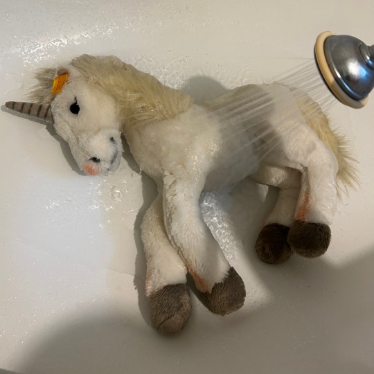
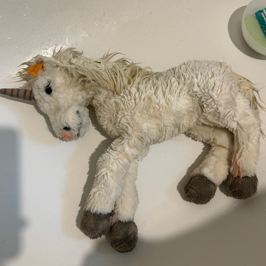
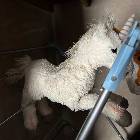
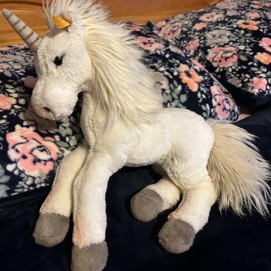
Gem got a bath 🛁
I've had Gem for 11 years, she wasn't dirty but a bit discoloured with age. I didn't want to risk ruining her airbrushed details so I washed her by hand using soap and water, and let her air dry while combing her fur repeatedly.
I think she came up beautifully! ❤️
#plushie: gem#I have no idea how to tag this#cleancore#is it? i suppose it is kind of#plushcore#plushblr#might as well tag that too
55 notes
·
View notes
Text

in which marius' mechanism is like an angry parasite and burrows its roots further into his body when removal is threatened.
[imade id: a digital painting of marius von raum from the mechanisms. his metal hand is clutching a bar and the arm has been ripped away from his body just below the elbow with an eruption of blood, tissue, and silver cables. the stump of his remaining arm is drenched in blood and the same silver cables snake in and out of his skin from his elbow to his neck; his whole right side is also bloodied. most of his face isn't visible, as he strains and leans away from the carnage. His eyes are shadowed. the background is nearly black with a jagged and gritty stroke of red lancing through, and the whole thing has a gritty paper effect applied over top. end id.]
#image described#marius#the mechanisms#alientoastt#body horror#blood#parasite#ask to tag#i gotta draw more mechs body horror. theyre freaky.#i dont know if this is too grotesque. it feels like it might be. but i am proud of this piece#it also might be too cartoonish for the concept its trying to get across?#oh well.
535 notes
·
View notes
Text


i kinda like her
#i love lesbians#poison ivy#pamela isley#might as well tag her gf too#let her in on the action#harley quinn#harlivy#batman#gotham#dc#dc comics#detective comics#fanart#sabeldraws
2K notes
·
View notes
Text
The fact that maia arson crimew, the trans catgirl therian who leaked the 2019 TSA no fly list and posted it online, has a link on its pastel pink uwu aesthetic website to her own Wikipedia entry that contains hyperlinks to the articles for 'United States grand jury' and 'criminal charges' is purely iconic.
No notes maia. You're doing great
#none of these words were in the bible#also i feel like this might get me put on a list somewhere?#oh well#CIA if you're reading this i promise i'm harmless i have too much brainrot to do any crimes#anyways#i need real tags#maia arson crimew#maia crimew#maia#crimew#tsa no fly list
2K notes
·
View notes
Text

what a weird garbage noise
#deltarune#utdr#kris dreemurr#ralsei#wd gaster#<- like. he isn't THERE but he is there you know? i had to download his fontype so might as well tag him too#my art
5K notes
·
View notes
Last Seen Blogs

liliskm-blog
Renaissance
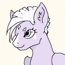
northernstarpony-blog
Northern Star ☁️✨
dejaru
Déjà Ru
daimonclub
Daimon Club Organization

hillparks96
The Journaling of Larsen 733