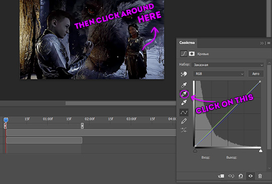
#one of these days I should make a tutorial for basic set-up
Explore tagged Tumblr posts
Visit Tumblr Blog
Explore Tumblr blogs with no restrictions, modern design and the best experience.
Last Seen Tumblr Blogs


Fun Fact
Tumblr was created by web developers David Karp and Marco Arment.
Text
The reason I get excited at being able to implement even small functions in RenPy is because whenever I try to follow a cookbook or tutorial: = The information is outdated, and I don't realize this until I get errors trying to execute the code. Much of the documentation that exists is obsolete by now, and RenPy is always updating the syntax it will accept. So you can have code that works for version 7.1.1 if you "word" the code right, but not work for version 8.1.1 because the newer version changed how you express the function. = The tutorial-maker made a mistake or neglected to establish an important variable early on, and you only realize it 5 forum thread posts later when they're like "teehee disregard what I just said, this is the correct code" = The code is poorly-written. Nobody in this Chili's fucking indents their shit. Also y'all need to comment out code with TWO pound signs, not one.
= I keep getting syntax errors because it's like 3 AM and I don't realize I forgot a single quotation mark. = It turns out the function I need to manipulate is a piece of code in screens.rpy or gui.rpy, or both, or neither, or it needs to be defined in the script as well. Nobody tells you where to put init:, for example, everyone assumes you already know you put it in the script. And like I said, because RenPy changes what syntax it will accept with each version of the program, you need to place code in specific places in order for it to work. But some other stuff like changing the text, font, and size of the notify box but not the notification box without also changing all of your game's GUI can be tricky.
= After much banging of head against wall, you realize the way you're implementing something is contradictory and causes a crash because you're trying to make RenPy read something in the wrong order (putting cart before horse) or you're trying to make it read something you haven't defined, or which doesn't exist. The computer can only read variables you have defined. = Didn't indent. = Indented too much. = RenPy decides nah, it doesn't wanna run the code.
That being said, I am now unreasonably excited about finally being able to use object classes in Python. The problem I kept running into in OaS was that, for whatever reason, I couldn't get persistent variables to stick, meaning the flags for triggers that were not as complex as I may have liked. But object classes seem to work around that constraint just fine, and the best part is I don't have to define a million individual variables with easily-breakable if/else statements.
So now instead of the narrative being based on one binary choice while feigning the illusion of divergence in the others, I can craft a more complex narrative that actually takes your choices into account and assigns variables to them that will influence the ending you get or which routes you see.
Implementation is going to be a shit ton of work as usual, but I'm actually really excited to see how this will pan out.
#one of these days I should make a tutorial for basic set-up#it may save another poor soul much grief#renpy
4 notes
·
View notes
Text
Play ideas for chronically ill, disabled, or otherwise bed bound/low energy littles
Hi all! I am chronically ill. I am not comfortable sharing my specific diagnosis, but I am more than okay with talking about disability in general. Everything below is based on my own personal experiences and activities I like to do while stuck in bed. Everyone's body and experiences are different. I may list some things that just aren't an option for you, and that's okay. You are more than welcome to add on to this post with activities you do too!

🐛 Open the curtains and cloud watch! I like to look for clouds that remind me of animals or characters and day dream a story about them. If the weather is nice, consider opening your window a little bit and letting some fresh air into your room.
🐦 Bird watch! I have a bird feeder outside my window that I painted myself from a kid's kit. There are also bird feeders that have suction cups that can be stuck right on your window. You can also make your own seed ornaments. You could pick yourself up a kids book or two on learning to identify birds.
🌷 Get a window planter. You may need someone's help to set one up, but once they are in place they are fairly easy to care for. I like pansies and marigolds because they remind me of childhood, and they are low maintenance and do well in containers.
📖 Audiobooks are great for middles who want to read chapter books. If you have a library card you can borrow tons of audiobook, ebooks, and comics through hoopla and Libby for free. There are some audiobooks for younger kiddo books, but honestly I think YouTube is better for that.
🖼️ Scrapbooks and journals! Being penpals with another little is also an option, but I do recommend using basic internet safety and common sense. (I don't think you should do this if you are under 18). You could always scan/take pictures of your letter and send it digitally to your penpal instead.
🛏️ If you spend a lot of time in bed, and have the money to do so, I really recommend getting items to make your time in bed more comfortable. Extra pillows, or even a reading pillow can be helpful. Lap desks or bed tables can give you space to color or set up play scenes with small toys.
🌟 You can also decorate the area around your bed to make it more child like! Fairy lights, glow in the dark stars, bed canopies, posters, and the like.
🪑 I have a floor chair I use for times I am playing outside of my bed. Being close to the floor helps me feel small, but not having back support hurts after a short while. I have an adjustable one that I can lay flat on the floor as a sleeping mat. Very helpful for the times when I need a quick nap after playtime.
🎨 Check the seasonal and kids sections at dollar stores and Five Below. I usually find fun craft kits that can keep me occupied for a bit for really cheap.
🧶 Do your own crafts! I like the knit and crochet. Some people can do them in bed, but I find it difficult to find a comfortable way to do that. However making friendship bracelets in bed works out pretty well. They make great gifts, even for non little friends. Or you could make matching ones for you and your CG or favorite plushie!
🪀 Make your own sensory bin! You can find tons of tutorials and ideas online. Bonus is you can get most of the items you would use at the dollar store. There are tons of other DIY sensory toys you can make as well if you look around. Glitter/shaker bottles are pretty popular too.
🐇 Cuddle with your stuffed animals. Tell them stories. Play pretend. Read to them. They will appreciate all of it.
🎮 If you have an old 3DS stuffed away in a drawer somewhere, pull it back out. 3DS are fairly easy to install homebrew and there are toooons of kiddo friendly games you could get (check 3ds.hacks.guide for this, do not follow tutorials on YouTube or random websites as they very well could be outdated)
💊 Decorate your medicine organizers with stickers. If you use mobility aids you can decorate them as well! Fake flowers are great for decorating mobility aids and there are tons of ideas you can find online.
🍼 I have stomach problems that makes it hard for me to eat enough. I often drink Ensure to make sure I am getting enough calories/nutrients. I get the strawberry flavor and sometimes put it in my sippy cup and pretend it is strawberry milk 😋
😴 If you need rest, rest! You deserve to get as much sleep as your body needs. Babies and toddlers take naps all the time! Trying to just exist with chronic health issues is difficult enough. You don't need to push yourself.
#age regression#age regressor#agere#sfw agere#age dreamer#agere blog#agere community#age dreaming#chronic illness#chronically ill#disability#disabled#sfw interaction only#sfw regression#sfw little community#sfw littlespace#agere little#safe agere
2K notes
·
View notes
Note
Hello! Many people have said this but ill say it too, I LOVE YOUR COMIC SO MUCH ( ´ ▽ ` ).。o♡
I really wanted to ask you about how you do the backgrounds? (Something i struggle with) whats the process? Like from start to finish, also, to do the rise backgrounds do you use reference from the show and generally real photo of ny? Or do you come up with them? And last question- The shadow and light on the background- Like HOW
i know it’s a lot of questions but i’m just so curious qwq and wanna learn to be better, thank you again in case you read this and respond, in case you don’t, i hope you have a nice day and a wonderful life uwu keep up the great work! (≧◡≦) ♡
Backgrounds are a really broad subject and I'm always a little overwhelmed when asked this question. Just like drawing the human body, backgrounds take time, repetition, and practice!
My answer got a bit long, so it's going under a read more :) but if you digest info better in video format I found this on youtube
youtube
It pretty much goes over everything I wanted to say, but in a much better way. I wish I had found it before writing all this out lol
ok, first of all, I'm not a teacher nor was I built to be one of those cool helpful art tutorial people who do a full coloured tutorial filled with illustrations. This is just going to be a messy "how I do backgrounds / environment layouts from start to finish." kinda thing.
... lets start with a sight tangent.
Sketch from Life!!!
If you want to get better at backgrounds I recommend doing some sketching out in the real world!
When I was first getting into doing backgrounds I went to cafes and parks to just sketch the buildings and objects. Sketch rocks, flowers, clumps of grass, garbage cans, bottles, tables, street signs, etc. If you are drawing a tree observe how the trunks twist, how the bark flows, or how the leaves are bunched.
If you can't leave the house the same still applies! Sketch the interiors of your house, the walls, or common objects like chairs and bookshelves. How are objects stacked? items on the floor?
If you aren't comfortable with drawing outside or in public you can take some photos to draw from! They are good for practice and you can use them again as references later. Alternatively you can find pictures online of buildings and objects to sketch as practice.
All spaces have objects in them, it becomes easier to draw those kinds of spaces when you already have spent time observing and sketching them.
ALSO! They don't have to be good sketches! It's just to build out your mental catalogue and strengthen your perception of perspective.
now the actual thing...
BACKGROUNDS
(the pictures used for this are my own. I dug them out of my 2022 folder)
Backgrounds have slightly different rules based on what you are making them for. Videogame Environment Concept Art vs Animation Layouts vs Comic Backgrounds vs Illustration backgrounds.
They all follow the same basics, which I will go over here, but the intention and function of those designs are going to be different. It's all about how you set up the scene and what it's purpose is!
Brainstorming and Thumbnailing
I like to think about a location as though it is a character. An abandoned old house with creaky sagging floorboards is very different from a futuristic space ship with sharp metal floor panels. A gas station has a very different feeling from a library.
I usually start by asking what is this location's story? Why was it built and for what purpose? What kinds of things does this room need to fulfill that purpose? You don’t need solid answers, but its good to be thinking about it while you are working.
Next, sketch some ideas for how this place is going to look. For me, this usually involves drawing the idea from multiple angles and then making lists & small sketches of the objects I think should be filling the space.
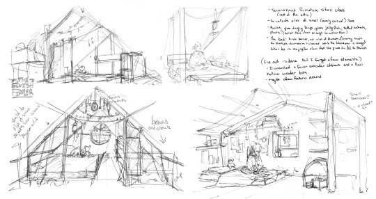
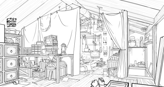
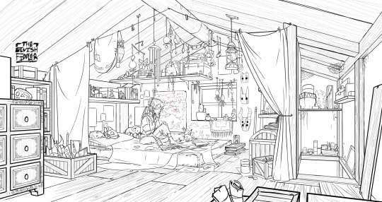
Example: The main character of my original work is a Wanderer. They collect a lot of things on their travels, but those items have to be small enough to be easily carried in a backpack. I wanted his room to be in the corner of an attic, walled off by curtains, and filled with trinkets. You can see some of my brainstorming above.
References
I only look for references after I've done some sketching and planning; this is to solidify my idea first so that I don't accidentally copy anyone else's work. I will make a moodboard with pictures of lighting, colours, items, rooms with specific ceiling beams, old chairs, etc. basically whatever I feel fits the vibe.
Honestly, I don't use references as much as I should. For ROTTMNT fanart I look at backgrounds and screenshots from the series to study the style. I also reference actual photos of NYC to get a feel for how Rise condenses the visual information.
In general, it's good to have references of real life objects/locations, because there are so many details like cracks in pavement, stickers on polls, crowning on buildings, fancy fencing, weird chair legs, etc. that you might not think of. It's the imperfect details that can make a location feel more alive.
Perspective
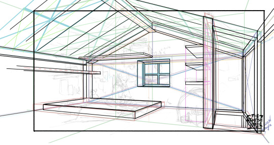
Once you have your chosen sketch we move to.... the infamous perspective boxes. Doing backgrounds is just learning to be comfortable drawing So Many boxes and carving items out of them.
Many better artists than myself have made videos on perspective, vanishing points, and all the technical bits. Videos like THIS ONE and THIS ONE are helpful (this post is great too!!). There are probably a lot of classes to be found on Skillshare or Schoolism. I learned a lot of this in my college art course, so I can't give you a specific video which helped me.
You can get by and be a good artist without learning this stuff. There are quite a few successful artists who have admitted they never bothered to learn perspective (one of these people even made a whole graphic novel series).
I personally avoided properly learning this stuff until I was in my 20s because I thought it would be boring and difficult to do. tbh I really wish I had learned it earlier because it's so much fun to make those silly little boxes imo. It looks scary and complicated but, just like drawing humans, it just takes time, repetition, and practice to develop the knowledge and skills.
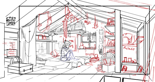
Cleanup
You have your boxes and lines! Cool! Now to make a scene out of it. Fill in the details, get everything placed were you want it! Generally, the lines of each item will point back towards the horizon line, but they can have different perspective points.
Generally you would want to clean it up and get your room completely sketched before doing the lineart. I tend to combine the steps (not recommended)
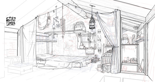
Lineart
I've mentioned how I do this before. Closer objects have thicker lines and more detailed inside. Further objects have thinner lines and less detail. I didn't quite achieve that balance with the image below, but it's close enough.
Colours and Shading will have to be a separate post. In the meantime, I highly recommend the book "Color and Light" by James Gurney. I used to borrow it from my local library and a good chunk of my knowledge was learned from it :)
#Artist's Comic Rambles#asks#art related asks#thank you for the ask!! I'm glad to hear you enjoy the comc :D#i hope this was somewhat helpful...#i get overwhelmed by broad questions very easily haha#if you would me to elaborate on something specific I mentioned feel free to ask#i wrote this all out weeks ago and then forgot about it... I just added a link or two but yeah here it is
308 notes
·
View notes
Note
hey!! would you mind doing a tutorial on how you blend your gifs? they're so perfect! if not, then that's fine but thanks anyway :)
hi there! first of all, thank you for the kind words, i appreciate it so much! and i'm always more than happy to make tutorials! below the cut i'll do my best to explain my process when it comes to creating blended gifs like these:
original gifset
original gifset
original gifset
original gifset
disclaimer that i in no way consider myself an expert when it comes to blending. i actually struggle with it quite a bit sometimes and there are tons of gifmakers far more talented than myself. here's a link to all the blending tutorials i've come across for my other blog @gifmakerresource just in case!
when it comes to blending two or more scenes/shots together, i cannot overstate how important the scenes you choose are. i'll go more in depth on this in a moment, but there have been so many times when i'm making gifs like the ones above where i spend ages testing out different scenes together to see if they'll actually work and give me the desired effect.
so, what should you be looking for when selecting your scenes? in my opinion, what's most important (and can therefore cause you the most trouble) is lighting and contrast. dark on dark is what blends best. now, you can obviously tweak these things using adjustment layers, but i think it's best to set yourself up for success right from the very start.
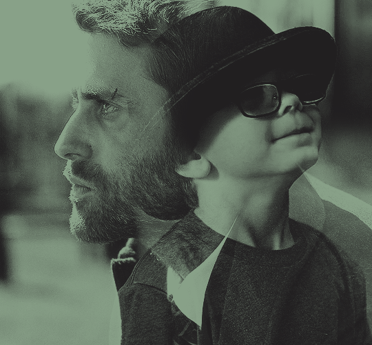
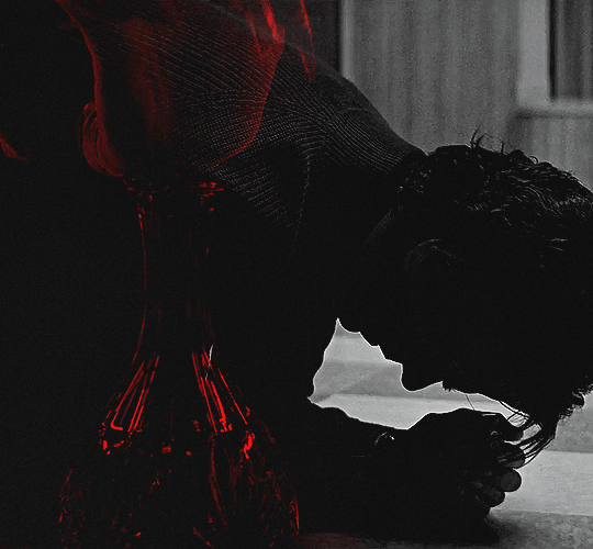
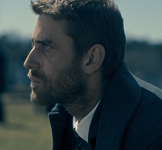
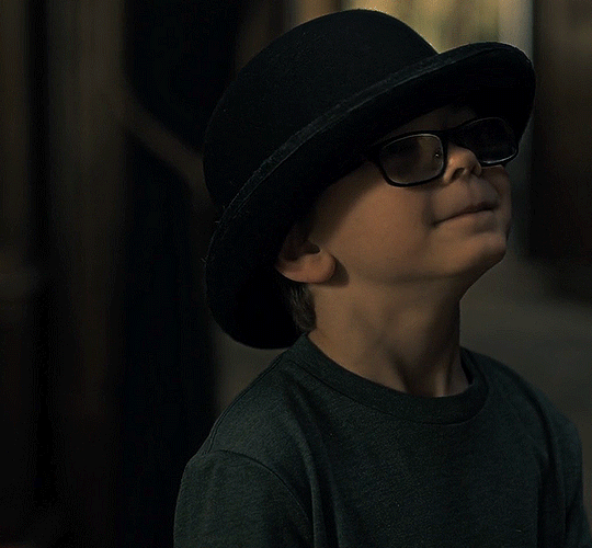
if we look at my first and last examples above the cut (luke in hill house and pruitt in midnight mass), these are the two that show this the best. the scene of adult luke is high in contrast to begin with; we've got areas of bright highlights and dark shadows and the latter are the areas where the blending shows through the most clearly. luke's hair and shirt are darker as is young luke's shirt and hat. the same can be seen in the midnight mass example. both scenes are on the darker side to begin with, but the shot of pruitt praying is silhouetted and makes for very stark contrast, allowing the shot of the angel's blood to be seen most easily in the darkest parts.
now, a lot of this does and can come down to trial and error and i want to make a point of saying that before i get into the actual process. there have been numerous times when i'm working on gifs like these where i have to try out multiple different shots and scenes until i find something that works. sometimes, i just save what i've done so far as a psd and go work on something else for a while, and then i can come back and look at everything with fresh eyes at a later time -- never underestimate the power of doing this, btw. some of my most popular and most favorite sets have happened as a direct result of taking a break!
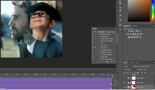
now it's finally time for what you came here for! how do you do this? i'll walk you through this step by step and for now, i'm just going to be walking through 2 gifs blended into one. i've done 3 and even 4 blended into one, but they are outliers adn should not be counted. blenders georg, who created photoshop and blends over 10,000 gifs a day -- [gunshots]
step 1: make your base gifs. i'm assuming basic gifmaking knowledge, but if you need some help there, here's a tag on my resource blog with all beginner gifmaking tutorials (and i'm willing to make one of my own, personal process if anyone shows interest).
i'm mostly talking converting them to timeline and into a smart object. each person's process varies a little, but i personally use an action i made that converts from frames to timeline and applies the sharpening settings i use all in one. it's entirely up to you if you want to color your gifs before or after you have them on one canvas. in this case, i colored mine after, so this is what i have right now. two separate sharpened but un-colored gifs.
as an added note, when i'm blending gifs, i almost always keep them at their original dimensions until i bring them to the new canvas. i find it easier to position them where i want them and then crop to my desired dimensions. that way i don't have to worry that i accidentally cut something off. but for the purposes of this tutorial, i'm using my psd from this gif, which has been cropped to 540px x 500px.
step 2: bring both gifs onto a new canvas. as i just stated, the dimensions of this particular gif are 540px x 500px. if you're unfamiliar with tumblr's dimensions, i whipped this up. what matters is the width, whereas the height can be whatever you want. i saw something recently (though i can't find it now, of course) that said the middle gif in the row of 3 was no longer 178px and is now also 177px, but take that with a grain of salt! the gutters (the automatic spaces between gifs that tumblr puts in) are 4px.
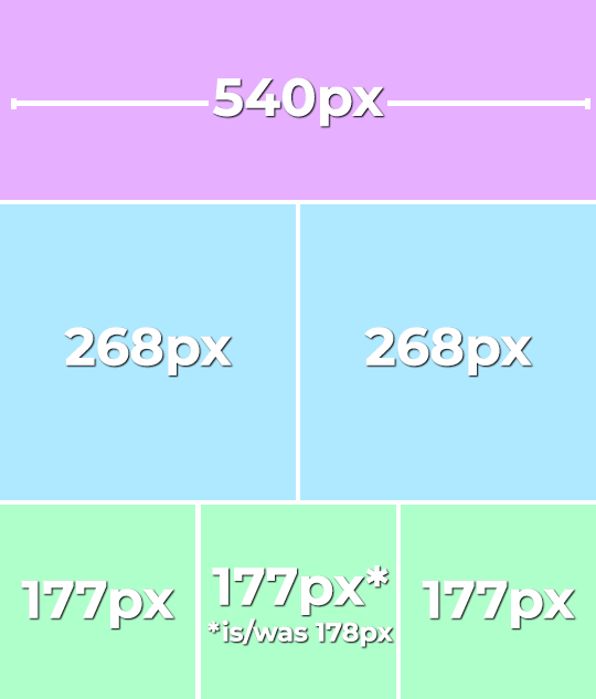
so, since this is a single gif in a row, the width must be 540. bear in mind that the larger your dimensions, the larger the gif file will be and tumblr's upload limit is 10mb per gif. with blended gifs typically being on the larger end, i try to keep mine somewhere between 35-50 frames. this particular one is 35, which along with 40 frames is what i most commonly use.
create a new canvas with your desired dimensions and either copy your gifs to it or drag them onto it. you should have something like this now:
for now, ignore the other layers. as i said, using my psd of the completed gif.
step 3: add a black fill layer. this step is personal preference and therefore completely optional, but when blending, i always add an all black layer at the very bottom of all my layers. i find it helps when using layer masks (more on that soon) to make the blends appear more seamless. play around and see if you like it or not!
to create this layer, i use the keyboard shortcut (i'm on pc) ctrl+shift+N and then press G to call up the paint fill tool. once you have the color selected, just click anywhere on the canvas and it fills it. then drag this layer to the very bottom, beneath all other layers.
alternatively, you can go to layer -> new fill layer -> solid color -> choose your color but i heart keyboard shortcuts.
step 4: set the blending mode of each gif layer to SCREEN. right now, we can only see the layer that's on top. when you switch the blending modes from normal to screen, the blending begins! this is also where you can move your gifs around until you find the best placement for each one.
brb, crying about baby luke for the 800th time.
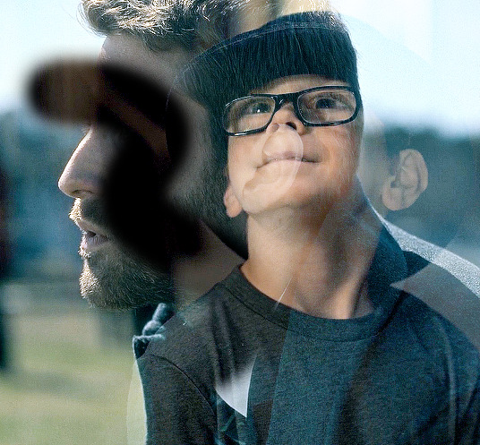
step 5: color! if i haven't already colored my gifs, i would likely do it now. that way, when i go to apply the layer masks, i'll know i'm working with a mostly-finished product coloring-wise. this is what i have now:
you can see just how important the contrast of lights and darks becomes. look at the difference between how visible the right side of young luke's face/hat is before coloring compared to after. when we lighten the highlights and darken the shadows, the blending becomes much more apparent.
step 6: layer masks! before i even tell you how to use them, we need to know how to apply them. you'll do this a layer/gif at a time. with one gif selected, press this button:

and you'll now have this:
that selected white box is our layer mask. now do the same to the other gif layer. you should see this:
now that we've applied our layer masks, what are they for and how do we utilize them? layer masks allow you to, at their most basic, adjust specific parts of a single layer without permanently deleting them. the beauty of layer masks is that you can get rid of a certain area on a gif and if you realize later you want to bring some of it back, you can! all by using the colors black and white and, in this case, a soft round brush.
the most important part of working with layer masks is that you make sure the mask itself is what's selected. in the last image, the layer masks are NOT selected. in the one before, the layer mask IS selected. you can always tell because of the little borders around the corners of the mask. if you find something isn't working quite right, chances are that's your issue (speaking from personal experience).
as i said, we're only working with black and white here. using your brush tool (press B on your keyboard), select a soft, round brush. i personally set the hardness to 0 for the most gentle fade possible. i don't want hard edges in my blends. the size of the brush depends on how large of an area you're working with. sometimes i'll go all the way up to 150px+ and other times, i'll be well below 50px. the smaller the better for more detailed work. black (#000000) erases and white (#ffffff) brings your image back.
for a visual example, with a black brush, i'm going to mask an area of adult luke:
pretty obvious, right? because both layers are set to screen, masking an area of adult luke's gif reveals young luke's gif. because that area of the gif is no longer blending with anything, we see it purely with its coloring. now i'm going to take a smaller brush and switch the color to white (to do this quickly, pressing X on your keyboard will switch between the two colors [foreground and background] on your color picker).
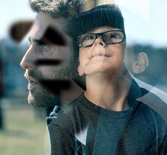
you can see the lines/cuts where i ran the brush through the mask and it brought back the parts of adult luke we'd erased. if we did this same thing on young luke's gif, black would erase young luke and reveal adult luke and white would bring back young luke. i know this might sound a little confusing, and even though i knew a fair bit about layer masks before i started giffing again last year, there was still a learning curve for me.
now that we have our layer masks, we need to identify which parts of which gif we want to mask/erase. for this one in particular, i didn't like that adult luke's ear was smack dab in the middle of young luke's face. to remedy this, i selected the layer mask on adult luke's layer and, using a fairly sizeable black brush, i colored over young luke's face and up into the top-right corner. i wanted to see more of his hat and because that area was so light, i covered that whole part. this is what my gif and layer mask looked like after:
the black on the little layer mask corresponds to where i colored on the gif. now that corner only shows young luke's gif and his face is much clearer without an ear in the middle of it.
step 7: that's it! maybe.
in theory, this could be a completed gif. from here on out, nothing changes as far as blending or layer masks. you could save and export this and upload it and be done. but in this case, i just didn't like the coloring. because mike flanagan wants to see me suffer, his shit is almost impossible to color and i just didn't like the difference in coloring between present day adult luke and 90s young luke. this is also part of a larger gifset with a color scheme.
regardless of that though, i have to confess that i do this almost every. single. time. i make gifs like these. i slap a big fat gradient map on those puppies and somehow they look 10x better to me. i scrolled back through a shit load of my gifs and i only found 2 examples of blended gifs that weren't under a gradient map. oops. maybe this is the easy way out or maybe i just love colors, but idk i think it helps them look more cohesive! if you're interested, read on. if not, that's pretty much it!
if you still have questions or encounter any problems after following this tutorial, PLEASE let me know! i'm more than happy to clarify things or help out if i can! otherwise, check out some of the other blending tutorials i linked at the beginning! if you'd like me to make tutorials for anything else, feel free to send an ask, anon or not! i'm quite literally always happy to help as i don't believe in gatekeeping resources or knowledge!
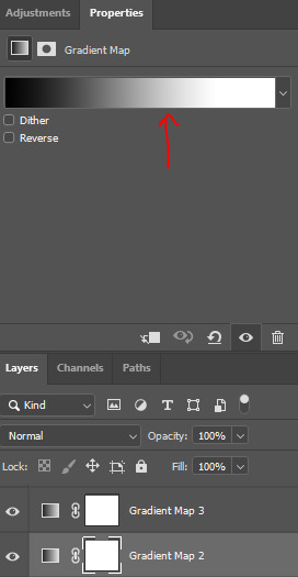
step 8: i ended up applying two gradient maps on this gif. it's important that these go on top of all your other layers (namely, the gif layers). if you're unfamiliar, you click this to apply a gradient map:
then you'll see this:
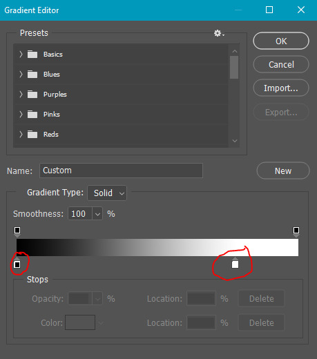
photoshop automatically applies a gradient map using your current foreground and background colors. to edit the colors, click on the map itself (my arrow). unless you're going for an inverted x-ray sort of look, your darker color needs to be on the left and the lighter one needs to be on the right. click on the bottom color points to change their colors:
normally, the right one will be all the way to the end, but moving it in will let more white show through and brighten the image, which i wanted in this case.
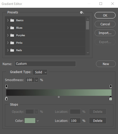
my second gradient is the green one, which looks like this and goes from #211f20 to #88a188.
i encourage you to play around with gradient maps. as you adjust the colors, you'll see the changes live as long as you pull the window to the side a little bit. i think they're super fun and can completely change the vibe and aesthetic of a gifset.
from here, i added my typography (lyrics, naturally) and then exported and saved the gif! and here we have this gif that literally made me cry while i made it because HE WAS SUCH A BABY
again, i hope this helps and if you have any further or other questions, don't hesitate to ask!
#answered#Anonymous#my tutorials#gif tutorial#gifmakerresource#completeresources#dailyresources#chaoticresources#thanks for being patient anon!#i know it's only been a few days but typing all this took me like 3 hours lmao
115 notes
·
View notes
Text
Astro observations part 6
🪻Individuals with Sun in Taurus degrees (2,14,26) are always thinking about money - how they can earn more money, what to spend it on. If it's in Scorpio or conjuncts Pluto, they'll often lie about how much money they actually have just to profit off of you. You'll often hear them say "I don't have any money" but secretly have stash of money hidden in their house
🪻Not only do Aquarius Suns have a lot of friends, they also befriend the shy/awkward/forgotten kid (me). I haven't noticed this with other Sun signs
🪻People with Venus in Leo/Leo degrees (5,17,29) often get complimented on their thick hair
🪻Asteroid Fraga (1105) conjuncting any of your planets/angles/nodes indicates your love for strawberries lol
🪻 Check your Moon in Webb (3041) Persona chart. It gives you more insight on the type of content you like to consume on the internet. You can also take into consideration the degree of your Moon
Aries 🌙 - *watches sports matches live*; *laughs at stupid, childish memes *
Taurus 🌙 - the one who always searches for tutorials; "how to bake lava cake", "how to remove a stripped screw"; hmm, maybe i should move *searches houses for sale*;
Gemini 🌙 - *watches memes*, doesn't care what kind of meme it is as long as it's a meme; *scrolls endlessly on r/todayilearned*
Cancer 🌙 - *watches baby videos*; the type that reads family drama posted on reddit, but also regularly checks what their own relatives post on social media
Leo 🌙 - the newest tea on their fav celebrities; they're the first to know what Zendaya ate this morning, where Tom Hanks went on vacation yesterday and if Kylie Jenner is pregnant again; awww a kitty *ends up in an endless loophole of cat videos*
Virgo 🌙 - "declutter with me" videos, "clean with me" videos; *checks their fav blog every day*; *watches workout videos while working out*; *checks e-mails 20 times a day*; ugh, i need to take a break *watches pet videos*
Libra 🌙 - "get ready with me for..." videos, "OOTD" videos, make-up tutorials; their pinterest is full of outfit inspo and aesthetic house decor; "red/green flags in a guy/girl" videos, "first date do's and don'ts" videos
Scorpio 🌙 - *watches every true crime documentary out there*; "Michael Jackson spirit box session"; time to do the deed *watches p8rn*
Sagittarius 🌙 - *saves bible verses all the time*; searches "how to manifest everything you want", obsessed with Neville Goddard content (i'm so sorry, i'm guilty of this); *decides to go on a spontaneous trip, so they end up watching travel videos*
Capricorn 🌙 - the type that doesn't use the internet for entertainment much; actually, you'd be surprised by how little they use their phone compared to the average person; probably has a daily time limit set on their phones, *reads memoirs and biographies*,
Aquarius 🌙 - twitch is their life basically; if they're not watching someone play a video game, then they're playing a video game; *follows LGBTQ+ content during pride month*
Pisces 🌙 - they're listening to music 24/7, has a playlist for every mood they're going through, *watches tangled for the 7th time in a row*; actually, they're always watching a tv series if not for a disney movie
🪻I noticed that most film directors (Hitchcock, Kubrick, Tarantino) have got Neptune in Gemini or Neptune in Gemini degrees (3,15,27). Besides Hitchcock, they also don’t have any aspect between Neptune and Mercury

#astro#astro community#astro placements#astrology#astro observations#asteroids#astro posts#astro notes#astro blog#astroblr#astrologyblr#sun in astrology#taurus#gemini#leo#scorpio#aquarius#venus in leo#neptune#sun in gemini#neptune in gemini
1K notes
·
View notes
Text
The making of Friendship Test:
I have always wanted to make a RPG Maker game. Throughout the years I have played several games with small pixel sprites as characters, as worlds, and I have always been fascinated that you can create a beautiful, funny and interesting story through them. I can not code and I do not have any 3d art skills, the chances of me ever making a videogame were very limited, but I have always wanted to make one. RPG Maker always seemed like the most available objective I could achieve, but I was never motivated enough to try anything cause I never had any good concept in mind for a videogame.
The year of 2024 started with a big robot obsession for me. Robot Dreams had recently came out and I did not stop thinking about it ever since, and soon after I started playing Toontown Corporate Clash, needless to say I adored those corporative robots too. I have always loved robot characters and thought it would be fun to create a story with them, I had several OC projects in mind but none of them included robot characters, so I thought I should change that.
I daydreamed about the concept of a story with robots, suddenly came with an idea: “what if an army of robots turned ‘good’ and only one of them was still ‘bad’?”
A very simple concept, one that would change and develop a lot, but an idea that I really liked. Of course, I like writing character dynamics, so it could not be a solo story, I gave the corrupted robot a companion in their journey. It was the story of a robot that was built to be kind turning ‘mean’ and a robot that was built to be a weapon turning ‘good’, traveling through a laboratory of abandoned robots that had all turned ‘good’, but how maybe that’s not as nice as it sounds.
I had that idea in mind, but I wasn’t planning on doing much with it. Perhaps a quick drawing, post it on tumblr and move on to other projects for now. But an image showed up in my brain that I could not shake off: I imagined this game as a rpg maker game. I imagined the sprite of the protagonist walking around this abandoned lab. And the strangest thing? It looked good. It looked promising. At least, it did in my brain.
The story was nothing but a mere simple concept, but it was good enough to give me enough motivation to look up tutorials on how to use GameMaker. Yeah, you read that right, GameMaker, not RPG Maker. I wanted to try out a more complicated engine, spent three days learning how to build one single room. I followed the steps, but somehow, I ran into a bunch of issues and it was not working properly. It did not feel great to waste three days for nothing, I was ready to give up and just go back to drawing simple drawings, go back to something I already knew how to do just fine.
But the image of the little robot still roamed around in my brain. So I decided to look up tutorials for RPG Maker.
Needless to say, I should have done that from the beginning.
I didn’t become an expert immediately, I still am not an expert whatsoever, but even if it took time and effort, RPG Maker was easy to use. No wonder so many use it to make videogames.

Again, the concept of this game was still very limited, I had a lot of ideas in my mind on how the story could go, drew a lot of concept art, wrote a few lines of dialogues, but nothing was set and stone yet. I decided to make one short area at the very least, and while I was creating it, I could think on the story some more.
I did just that, the first area is basically exactly what I had in mind since the beginning: a dark, empty abandoned lab. FriendProgram’s character design was very stuck on my brain too, they did not require a lot of concept art, their final design was very clear to me.
I made a couple of rooms, learned the basics on how to move from one room to another, how to change the character’s speed, how to make them interact with things, how sprites worked, all that stuff. But I needed to make FriendProgram interact with SOMEONE at some point. I needed a couple of funny NPCs for them to interact with. That’s how I came up with FUN and GAMES.
Now, I already had a few ideas for characters we would meet later on the story, but these two were not planned ahead, I just needed a funny duo to introduce us to the test ‘battle’ mechanic and to showcase the overall humor and dialogue style this game has.
However, I ended up liking them so much that they became part of the main cast of characters, even if their role is smaller than others.

When it comes to the tests, I was a bit concerned with that aspect. I knew that was the main gameplay of this game, the friendship tests you are put through, but I was not certain how I was going to pull that off. Would it be boring? Would it be repetitive? Would I not be able to program it? As flawed as they are, I am pretty satisfied with the results.
You have only seen a pretty simple friendship test, they get a bit more creative later on.
When it comes to the ‘battles’, I wanted them to be short and simple, nothing that takes too much time and nothing too complicated either. It’s the reason why there are so many, cause they are all meant to be pretty short, and the game allows you to save whenever you want. I hoped that getting a game over would not be too punishing to the player, since I’m aware some battles can be a little difficult to figure out what you are exactly supposed to say. Game overs are a bit essential to the point the game is trying to make.
Still, I am aware the battles can hurt the pacing a little in the first act, which is why they are better distributed in later acts, instead of getting 5 consecutive battles at once.
The mechanics of the battles change a little in each act, with act 2’s probably being the most complicated. But battles are not the main point of the game, which is why you might see less of them as the story progresses. Still, I’m okay to have a flawed ‘battle’ system, at least I have one at all, which I was worried I might not have been able to have.
The other gameplay ‘mechanic’ are of course, the friend_test_mode. They are however meant to be more story-focused than anything else, the first one is very simple, the other one can be a bit more annoying to get to the correct answers, but both of them do not punish you with game overs and are not meant to be anything too complicated. It’s presentation, part of the story, less a gameplay mechanic.
But enough about gameplay! This is a videogame that is more about characters and stories.
Before arriving to the new location this act takes place in, you find yourself with two experiments and learn all about the battle system. One of the two experiments is Exe, a strange mysterious rabbit. Exe was originally not part of the story, I adore characters like Exe, the funny annoying comedic relief characters, I tend to include them a lot in my stories. But so far, I hadn’t included any characters like that, I thought that maybe they would annoy people and it wasn’t necessary to the story. This changed however, I realized that if I’m making a game that I would like to play myself I had to include a character I would love, even if there were people who wouldn’t like them. So I included Exe, who serves as a tutorial and overall guide to the player. She started out as a small funny character, but as I wrote the story she became so essential that now I can not imagine the game without her. Sometimes the annoying comic relief character can save your story.

But now we arrive to the Reprogram Town! Very early on I knew that the first real area of the game should be a place full of nature, a huge contrast to the rest of the lab. It’s not just the nature, but the people are also very different from what you will see in this lab. The reprograms have sealed themselves away from everyone else, which means they can live in peace, away from the rules of BestFriendProgram, the program in charge of the lab.
The concept I had for this first area was to evoke something familiar: a cute little town with fun and kind NPCs, a bunch of simple quests, a bunch of simple battles and a story that ends with a nice lesson and with the characters being happy and loving each other very much, all thanks to you, the protagonist. I think it’s something we have seen in plenty of games, you play this area and you have an idea on what to expect, it is something pretty simple and easy to swallow. You are a nice protagonist that helps others and becomes friends with everyone, this is a game where you will meet a lot of programs and become friends with all of them and make everything better through kindness! This is what you are meant to believe.

The protagonists of Reprogram Town are Hammer, Keys and Wrench. The story is all about them, you are helping them but you are not part of their story. You are just a kind silent protagonist that doesn’t steal the spotlight from the story we are witnessing.
I knew from the beginning I wanted a simple but emotional conflict between these new characters, something that you could solve in one episode, but still has meaning to it. Just because you are a little deceived into thinking this game is going to be one way and then it turns out to be a little different than expected, doesn’t mean that the emotional conflicts have no meaning. What these three go through is real and they still have a lot to go through, specially Keys, who will get more things to do later on.
Something I really like about Keys is that he is a character that has kind of already went through his big character arc, there isn’t really much you can help him with when he has already grown as a person on his own and with the people he is close with. It doesn’t mean his journey is over, but it makes his interactions a lot of fun.
His asexual side plot is the first aspec-related story we see in the game and it is very essential to the character, at first I mostly implied it but I wanted to make it very obvious, this is not the ‘implied aspec’ game, this is the ‘stated aspec stories’ game after all. Keys is asexual and is a huge part of his story, as we will see later on.

Kindness is a big theme in this game too, and I really like the story of Hammer choosing to be a kind person despite everything. I like Wrench a lot too, even if he doesn’t show up as much I wanted his personality to be so vibrant that you will forget he has very little screentime. I really like when stories focus on siblings so of course I wanted two of the main cast of characters to be siblings and this is the act where they get to shine.
This first act establishes a lot of world-building as well. There is still a lot of things to find out about, but little by little you learn how this world is supposed to work. The mandatory tests, the water damage, the reliance on metal, the unconscious days, the data corruption, the old organisms… So much information in what appears to be a very silly and cute chapter of a bigger story.

Speaking of a bigger story, seems like that’s where FriendProgram and Waterbottle will truly get to shine. Waterbottle shows up very little in this act, and FriendProgram barely acts like a character, but this changes completely after the ending the demo. The rest of the game is very different from these first few hours and it’s all because of this program duo, especially FriendProgram, but it is also not different enough that it’d feel like a completely different game. The demo gives you a very clear idea of how the tone, pacing and dialogue of this game is usually like, even if there will be improvements later on.
Waterbottle is, in my opinion, probably the best character in the game. They are very fun to write and I enjoy every moment they are on screen, I think this character genuinely makes my game way better, which is why the demo is one of the weakest parts of the story, simply because Waterbottle is barely in it. Not for any other reason, it’s just cause Waterbottle doesn’t have enough screentime.

Now when it comes to FriendProgram, I did not want Friendship Test to be a cynical story where I “criticize” games that “force” you to be kind just to get what you want, I thought that would be very dumb and against everything that I am. FT offers a funny scenario of a character that has no other option than to be a really good friend to be able to advance the story, but it doesn’t mean they are not a complex person with no kindness in their heart. It doesn’t mean that helping other programs is meaningless, it doesn’t mean that FriendProgram hates everyone and would kill everyone if they could. There is a lot of layers to this story and this character.
You might be wondering however: ‘Where are the aspec themes? You said this game was about lovelessness!’ To that I say, patience! Don’t worry, the rest of the game does NOT shut up for a second about the main message of the story, but it was very important to establish the world building and characters first before fully focusing in the main themes. Besides that, the demo is also meant to trick you into thinking this is another story about the power of love, there is a reason why it is not really discussed at the beginning. There is more to the story and to FriendProgram than you might think.
I am very proud of my game, despite the flaws, I’m happy that I finally had the motivation to make the rpg maker game I have always wanted to make. Perhaps this game will help me make a better game one day, who knows, for now I am very happy with the result so far.
The first update was more about the making of the demo, but the next ones will all be about previews and presentations for the rest of the game! Next month I will talk about the next area of the game: The Emulation Area!
Thank you for reading and supporting, see you!
-------
Get your updates 1 week earlier and extra posts in Patreon!
25 notes
·
View notes
Text
Mr. Qi Friendship and Romance Mod: 4/19 Progress Update
It's a working title, I'm trying to come up with something less wordy that still will pop up in Nexus searches.
I wanted to be able to track my progress, mainly for myself, but if you're curious, this is the state of the mod right now:
Writing:
Heart Events - the 2 heart event is fully written (with blocking directions), and the 6, 8, and 10 heart events are outlined. The 4 heart cutscene currently has me a bit stumped; I have ideas, but nothing concrete yet. I definitely now understand why Sam's 4 heart cutscene is him dropping an egg. 14 hearts is on the back-burner as a little treat to myself once I get further into things.
Generic Daily Dialogues - about 1/3 done, probably the highest priority for writing. I'm leaving his vanilla casino dialogue as the two heart dialogue, and the vanilla Walnut Room dialogue as his four heart dialogue, with a few small changes. And, since it's me, I have more marriage dialogue written than anything else...
Day-Specific Dialogues - very few written, lower priority. Hoping to have a lot of these made eventually, and I have plenty of ideas, but they aren't necessary for the core of the mod so they're on the back-burner for now.
Gift Dialogues - all 5 generic gift response dialogues are written, with an additional 22 dialogue lines for specific items/groups of items. I'm also up to around item 530 in figuring out what item corresponds to which dialogue/whether or not he likes it. Certain item groups, like cooked food, still need more lines, however. This is definitely something that should be low priority, but also something I'm really enjoying working on. Some personal favorites so far are-
[if given a fish (hated)]: "Eugh, it's all slimy..."
[if given a legendary fish (disliked)]: "If you must give me one of the rarest fish in the valley, can you at least wrap it so I don't have to touch it with my bare hands?"
And I think that's pretty funny.
Art
Portraits - 3 new portraits finished: "deep frown" "glint" and "glasses-less". I'll probably be messing with "glasses-less" for a looong while; it's first shown at a dramatic moment so it needs to look good. Blushing portraits are next on the docket.
Here's "glint" btw, with a background thrown on so I can have a custom icon. You know I gotta make him do the anime glasses thing a few times.
Sprites - no progress yet. Walk cycle is up next after I finish the blushing portraits. Did you know he doesn't have a walk cycle at all? [1.6 spoilers] in the cheated Summit cutscene where he attacks(?) you, he literally just slides at you very fast. Anyways, I may also change his map sprite a bit as well, since it was drawn to match his old portrait and doesn't actually have the same color scheme as his sprites. Note to self: is it possible to make the sparkles on his outfit prismatic?
Maps - no progress yet. The 6 heart and 10 heart cutscenes both require custom maps, with the 6 heart one being a fully custom asset. 10 heart recycles some existing assets but will still need some custom stuff done as well.
Misc Sprites - in my head, there's a dream version of the 8 heart cutscene that has so, so many unique sprites. Like an incredible amount of stuff. I think it'll kick ass, but also that sequence could be done with a few lines of text. So, for now, it's low priority. But maybe in a few months I'll put out a request for help.
Implementation
Not totally sure how to split this into sections yet, as I'm very much still in the preliminary stages so far. To say that I'm feeling overwhelmed is an understatement; documentation on the wiki swings wildly between "an asset is a file in a video game" and "this is an advanced tutorial. Read these 4 other pages first before continuing."
I've started using Ms. Coriel's NPC Creator which has been good for setting up the basic file structure, but ultimately doesn't cover some of the more complex stuff I want to do. EDIT: Turns out it's completely outdated for 1.6! Had to throw out a bit of work, but I still learned from it so it's fiiine.
I think setting up his "schedule" will be a challenge, in that I don't actually want him to have a real schedule like most NPCs. Not to pull back the curtain too much here, but I want him to "exist" in both the Casino and the Walnut Room simultaneously, which is to say, he does not exist in two places at once in the narrative, just in the code. This will change after marriage, however.
My next goal is to set up placeholder cutscenes for each of the heart events, and then to implement the generic daily dialogues once those are finished.
Final Notes
God, this will be a work in progress for a while, but I'm enjoying it! Definitely enjoying the writing more than anything else, but hey, that's how it be. I've got around 70 lines of dialogue written, a bit of art done, and I've started learning how to actually get stuff in game. I've always been more of a designer than a coder, but it's getting there!
ADDITIONALLY I've decided that if I abandon this project for more than 8 months, anyone is welcome to request my work so far and use it for their own mod. If this blog hasn't posted in a long while, feel free to send me an ask or message! I may say no, however.
Ultimately, I want this mod to exist in some fashion. While there is an existing one, I have a pretty different take on the character and I want to share it with you all! Every line of dialogue, every heart event, every little detail needs to share something interesting about a character and their world. Yet, Mr. Qi is a mysterious guy, and I think some things should be left up to player interpretation. And I think it's crucial to be able to match his tone and voice to the vanilla game, while also expanding on his characterization. It's a fun challenge to write, and I hope the finished product, uh, well I hope it gets finished mostly, but I think it'll be pretty good.
Thanks for reading all this. This is largely just a stream of consciousness for myself, but I hope it's...interesting, or something?
104 notes
·
View notes
Text


4 years ago today my dear friend @kpopingenue and I were talking and she sent me the MV for Wonderland because she liked it and thought I would too.
And, thus, my Ateez journey began.
I jokingly call it a slow burn relationship. I loved their music from the first time I listened to Wonderland but it took a few months before I checked out their albums and listened to their b-sides.
Even after that I still didn't know all their names (which is nothing against them, I'm the same with a lot of kpop groups I've been listening to for ages. I've been listening to Stray Kids for almost as long as I've been listening to Ateez and I still only know half the members).
Eventually, and I remember this clearly, in December 2021 I had a very vivid dream about buying Zero Fever Part 2 and I took that as a sign and ordered it as soon as I woke up.
It was funny because I knew some of the members at this point but not all of them and I had to text a photo of my photocards to a friend because I knew one of them was San, but I had no idea who the other one was (it was Yeosang).
After that, it became a pay day treat. Every month when I got paid, I'd treat myself to an Ateez album until I had them all. I now have at least one version of every album including all the Japanese ones.
And I finally sat down and watched a guide because if I was going to start collecting albums I should probably learn who everyone was.
Even after that I still struggled telling Yunho and Jongho apart for the longest time, and I have no idea why because now that I know them well I can see that they don't look anything like each other.
So, this carried on for a couple more years. I was happily collecting my albums and watching new MVs when they came out, but I still, for whatever reason, hadn't crossed the bridge into the fandom side of things. I was just quietly enjoying them by myself.
Then Will came out, and I don't know why, but that album rewired something in my brain. Suddenly I was fully obsessed. I watched Hongjoong's behind the scenes of Matz vlog, and suddenly I wanted to make gifs, but proper gifs not just a using a screen recorder which was all I'd ever done before.
I had an ancient version of Photoshop (which I have now upgraded) so I found a gif making tutorial for beginners. The gifs I made were very basic, but I had made them, and I was proud of myself for learning a thing.
Then I decided that to practice and learn new colouring styles, it would be fun to make gifs of all the Ateez MVs. So I did! It took a good few weeks of making a new set every evening, but I did it, and I can definitely see how I've improved as I've gone along.
And there we have it. 4 years from watching an MV to collecting albums to learning how to make gifs. And along the way I've reconnected with some old friends who love Ateez, and made some amazing new friends too. I went to my first ever cupsleeve in May, and I've been to a couple more since then, with another one on the calendar for later this month (happy birthday Mingi). And next time they come to the UK I am definitely going to try and get tickets, which will also make them my first kpop concert.
It's taken me a long time to get here, but the important thing is I made it.
Happy Ateez-versary to me!
#my gifs#ateez#ateez gifs#hongjoong#kim hongjoong#hongjoong gifs#seonghwa#park seonghwa#seonghwa gifs#yunho#jeong yunho#yunho gifs#yeosang#kang yeosang#yeosang gifs#mingi#song mingi#mingi gifs#san#choi san#san gifs#wooyoung#jung wooyoung#wooyoung gifs#jongho#choi jongho#jongho gifs
46 notes
·
View notes
Note
how did you make the gif into that shape?
https://www.tumblr.com/bylrndgm/715951263258411008/i-wanna-be-more-than-a-friend-more-than-a?source=share
Hey anon, thank you very much for the ask. 💞 It's a very simple and quick technique, all you need for this tutorial is a basic photoshop knowledge.
1: Make your gif as you always do
Make the gif, sharpen it, color it. (I'll be using a random scene as well as some basic coloring for this tutorial)

Once you have your finished product group all the layers (select all the layers and use the shortcut CTRL/CMD + G).
2: Find the shape
In that gifset I had used a ripped paper shape - but follow the same exact steps for every shape tou want! Tip: png shapes are easier to use, so try to find one that has a transparent background :)
Once you find your shape, place it over your gif and play with it until you like the result.
3: Sharpen the shape
I never skip this step because it allows you to hape "crisp" shapes.
Click on the png layer -> right click -> Convert to Smart Object
Go to Filter -> Sharpen -> Sharpen (repeat if necessary!)
4: Masking
Now, while holding your CTRL/CMD button, click on the shape layer's thumbnail
And the border of your shape should be all dashed, like this:

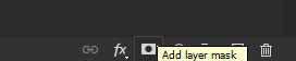
Now click on the group we made on step #1 (the yellow one) and on your Layers tab, click on Add Layer Mask:
Next to the group a new thingy should pop up (it's B&W). Select it by clicking on it and press CTRL/CMD+I to invert the mask (the black should become white and viceversa).

Now you can either delete the shape layer or make it invisible by clicking on the little eye on the left

5: Saving
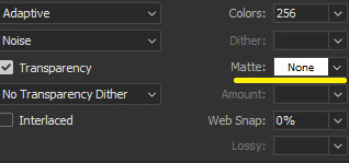
Choose your usual settings, but remeber to change the Matte option to None.
And... you're done!
You can do this with any shape or even text!

Hope it was useful <3 Have a nice day!
47 notes
·
View notes
Note
Hello! I love your blog and would like to ask for your advice. I want to look like an elegant, expensive woman. However, I am having a hard time applying makeup and setting up a skin care routine. Do you have an tips or resources on how to wear makeup elegantly and care for one's skin (for those new to makeup and skin care)?
What are the basic products needed for a dewy, classy make up look? Do you have any tutorials?
What are the basic products needed for healthy, minimal skin care routine?
Thank you for reading this ask! Have a great day!
Hi love! Sharing some of my tips below:
Skin:
Always use a disposable cloth when washing your face: Regular towels store bacteria and can cause breakouts too easily. These facial wipes from Amazon are my holy grail.
Wear sunscreen daily: Yes, even when you spend all day indoors. UV rays can interact with your skin through windows, too.
Niacinamide, Vitamin C Hyaluronic Acid, & Tea Tree Oil are among the few skincare ingredients almost everyone should consider incorporating into their skincare routine.
Learn the correct order to apply the products in your skincare routine: Cleanser, Toner, Serum, Eye Cream, Spot Treatment, Moisturizer, Sunscreen (or Retinol/Skin Oil at night).
Remember: From a dermatologist's perspective, your face starts (or ends) at your nipples. So, ensure you're cleansing, exfoliating, and applying sunscreen daily to your neck, chest, and décolletage to keep your skin smooth, youthful, and well-hydrated.
Vaseline is a great (affordable) alternative to traditional eye creams.
Sugar scrub your facial hair for a more gentle alternative to waxing (Combine sugar, lemon, and water). Laser hair removal, especially under your arms and your arms/legs is life-changing.
Follow up a warm shower with a dry brush and coconut oil for smoother, firmer skin.
Always apply a hydrating lip balm, mask, or Vaseline, hand cream, and moisturizer to your feet before going to sleep.
Layer complementary scents. Ensure the scents of body wash, lotion, and perfume work well together and don't clash.
Makeup:
Learn your skin undertones and educate yourself on color theory (I can create a short ebook/PDF if you want some more educational content on these types of topics – I write about them for a living!).
Test any foundation, concealer, or face powder on your wrists, too.
Don't forget to color-match your bronze and blush: They can appear orange or muddy if you don't find a product with the correct shade or undertones for your skin type.
Invest in products that go on your face, brow products, and eyeliners. Great mascaras and lip products are easy to find at a drugstore or relatively cheap (I suggest Covergirl and NYX, respectively).
Apply concealer in a triangle; don't dot it around your eyes for better coverage.
If you have oily skin (or it's humid outside), apply powder before your liquid/cream products. Set them again with a light powder to lock the color in.
Apply mascara from tip to base for the best lashes of your life: One coat on the tip, another from middle to tip, and the last coat from base to tip.
In a pinch, use a fragrance-free moisturizer and a Q-tip to remove excess makeup (no more raccoon eyes).
Use a light nude or white eyeshadow underneath your brow to make them appear more defined.
Apply face powder under your eyes to help the eyeliner on your waterline last longer.
Create a simple daily makeup routine formula: 1 skin coverage (foundation/concealer), 1 skin color (a favorite blush or bronzer), brows, mascara, an eye-definer (eyeliner or shadow), and a signature "your lips but better" lip shade (1-2 shades deeper or lighter than your natural lip color): This formula provides you the basics, so you never have an excuse not to put yourself together for the day (5-10 minute routine here).
Discover your day-to-night hero product: Always keep a slightly deeper lipstick, a smoky eyeshadow, or liquid liner in your bag to transition your day look into the evening with one portable product.
Hope this helps xx
#femme fatale#femmefatale#dark feminine energy#dark femininity#divine feminine#the feminine urge#it girl#makeup#fashion and beauty#skincare#haircare#beauty tips#dream girl#queen energy#female excellence#higher self#self improvement#ideal self#hypergamous#hypergamy#level up#glow up#femmefatalevibe#high value woman#high maintenance#beauty hacks#beauty advice#skincare routine#makeup tips#glam aesthetic
207 notes
·
View notes
Text
So! Let's recount 2024 and talk about the new year. Happy 2025 everyone!
2024 was a very eventful year. Not the year I started working on this, but the year I basically started to become what I am now, working towards how I want this to be.


2024 saw the release of my Protodermis Reclamation Yard packs, which has been instrumental in making use of otherwise wasted material (as well as getting the Legendary Mask of Cheese into a few folk's hands)

We matched Yellow, bringing the colour count up to Six, a very important number! (Though I'm debating tweaking the White formula again this year...) I sold out of yellow Rurus and Kakamas so many times over and I've still got folks asking when they'll be in stock again 😅


Yellow also led to the launch of commissions! Which still haunts me to this day. I'm thrilled with the ones I have completed, but there's still so much to work on that's taking so much longer than I could've expected, so I will not be reopening commissions this year. (I'll explain more later)


The last release of the year - and my celebration for 810nicle day - the Metru Nui Matoran Mystery packs! Managed to just match silver in time for this, taking us to 7 colours (though I never put out silver beyond this yet)


And we capped off the year with two more colours - Orange and Teal! Don't feel time to take a new picture of the latter but this morning's test I think is it, having opened it a few minutes ago! Thus the total colours matched is 9 - Red, Orange, Yellow, Teal, Blue, Pink, Black, White, and Silver! Masks will be available in all of these once the shop reopens.
This was also the year I started Mask Monday! Great fun that ways, even if I missed a lot more than I would've hoped. I'll be trying to keep to that this year as well!
Which takes us to this year. 2025 is going to be a year of change, and my Forge is no exception! I've had some rearranging in my personal life that should allot me more time to work the Forge, so I'm hoping to boost both production and development through the year.
There's been a complication with the shop though, which I'll be getting help to resolve so I can open things back up as soon as possible. I'd rather not discuss it too deeply because it's incredibly stupid, but it's really my fault for putting things off for so long that they became problems. Again, as soon as these are resolved the shop will reopen, even if it still takes some time for me to add any new masks and colours to proper listings.
Regarding commissions, the current ones in development are going to of course continue to be worked on, even if some of them currently feel impossible (looking at you, Purple and Sand Blue.) Aside from those two, I am developing Lime, Medium Blue, Pearl Gold, and a consistent formula for a custom Neon Pink (that commission was already sent but I want to revisit the colour and add it to the list, start doing some other non-lego colours eventually too).
However, as aforementioned, commissions will not be reopening this year, and likely not next year either. The commission formula was chaotic, frustrating, and hard to properly estimate. As such I've been turning around another idea in my head, and I'd like some feedback on them if you're willing!
Since development can take so long, some sort of steadier support would be more ideal. I've been thinking of making a Patreon! There, supporters would be able to vote on which new development ideas I pursue, as well as gaining access to behind-the-scenes/tutorial videos! I'd of course set access behind as low a barrier for entry as possible, but I've gotta have some incentive there as well, right?
That wouldn't launch until after the shop is reopened, and there wouldn't be polls on developments until current commissions are finished. No way am I widening that list before it's cleared out. The videos though I am very excited for and have already begun writing scripts for!
That's pretty much all I've got planned for the year. I don't wanna overhype myself with empty promises like "oh, this year I'll finally get the Mctoran build!" So the focus is just gonna be on clearing the backlog and getting things back up and running.

Thank you all for sticking around with me for the past year - being part of such a fun, supportive and creative community has been a highlight of my life, and I hope to be able to bring you all great things! Happy New Year, let's make 2025 a great one together!
18 notes
·
View notes
Note
Love the latest edit for Angrboða (Especially for Angrboða Appreciation week)! <3
I'm curious (and have been in a little while), but have you ever thought about making tutorials of how you style your edits or is there any tutorials out there that you reccomend for people who's starting out? This ask is late, but I hope you're taking care of yourself in any way (with life being merciful of course). 💕💕💕 ^^
Hey there. Firstly, I'm glad you enjoyed my little contributions to Angrboda Appreciation Week and we have Serena/@stupidrant to thank for making it possible by organizing and hosting it for us all. Angrboda deserves all that and more.
Regarding the gif styling process, there are several types of design for gifsets and techniques that I normally use. Seeing as you mentioned one of my latest ones, I assume it is specifically the "colorful/vivid" gifs that you would like me to delve into the process of creating. I will be using this gifset as an example of the most common design I go for, which is three color edits (as I am not skilled enough to pull off anything more complicated and versatile). Like this gif:
As you can see, there are three dominant colors - a classic combination of Cyan, Magenta and Yellow, with additional dashes of orange and blue. Now, I have to admit that in order to produce a gifset a day for the Angrboda Week I shamelessly cheated with this one and picked the most "easy" scenes to manipulate the color. As you can see, the top two scenes in the composition do not have much movement in them and have one dominant color which you can enhance or change to another color.
With the winter Atreus and Angrboda scene I simply enhanced the blues, changed them to deep cyans, added some cyan into whites for background and then changed the reds of Atreus's clothes to be magenta while erasing the color change from the rest of the scene (especially their faces) with layer mask. I will be covering this part in this tutorial because the biggest challenge of making colorful gifs is to avoid color manipulation affecting characters/actors faces. It is especially important to make sure that by increasing brightness and saturation you don't whitewash POC characters/actors (will be touching up on that too).
Then there is the main scene in the composition where the original footage has a convenient background in the form of a carpet the two are lying on; which has several colors in it already. Thus, one can tweak those to match the exact color combination they need (will be addressing this as well), in this case cyan+magenta+yellow.
It makes it even easier that there is almost no movement in the scene and it takes just two brush strokes to erase whatever color changes one has applied from their faces.
And I also realize everything I just said above would not make one lick of sense to those just starting out which is why consider it a preface to an actual tutorial.
It is also an explanation to why I have decided, for this occasion, to choose a more challenging scene (not included in this gifset) where there is A) much less color to manipulate and work with and B) a little bit more movement.
So let us go from this:
to this:
Now, do keep in mind that as a separate gif, in it's own right, this looks too obnoxiously vivid and not the result one should strive for if they are making a regular gifset. We are focusing specifically on "stylized" multi-color gifsets now.
In order to get to the point where you have the gif in it's original color (top one), you have to have a basic knowledge on gif making: uploading screencaps/frames to photoshop using a player (I use KMPlayer) or a built in Photoshop feature. Then you have to crop and resize the gif to meet Tumblr standards and, most importantly, sharpen it. When the entire composition is ready, you will have to set the frame rate (the speed of the finished gif, where all the colors are enhanced and all the scenes are merged together).
To accomplish the above, as well as to learn basic coloring, I recommend these thorough, step by step tutorials that guide beginners through the entire process and offer different approaches to the basics of gif making: X X
Once you do have the top gif, sharpened and playing in your Photoshop timeline, let's get to our vivid coloring. First thing first, you have to apply basic coloring before you have anything to go off of in terms of color manipulation.
In many cases people use ready made base PSDs or adjust lighting, contrast and saturation themselves using Curves, Levels and Vibrance Layers. In both methods, with scenes like this where there is not much color dimension and one dominating color (in this case blue in the mid-tones), you might end up with a result that enhances only that one color. While this is important for further manipulation, it also has a side effect of making the coloring look flat and the skin tones do not come out right. Like this:
It is not necessarily a terrible start for a base - the contrast and saturation already look better than in the original - but as you can see, the blues and magentas are in all the wrong places: on characters' skin and in the areas where they make reds and yellows look snuffed out and watered down.
So let's add dimension to the scene before we apply our base (for base PSDs I recommend following the tips and coloring process of this blogger on YouTube, for they excel at fixing dimly lit, undersaturated scenes; most of my base PSDs were created using their methods). To do that, create a Curves layer below any "base PSD" or before you tweak the lighting, contrast and saturation.
Once you have the Curves layer, click on the mid-tones eyedropper, find the spot in your gif that is neither too dark or too bright that has too much dominant color (in this case blue) and click on that spot to offset this color a little. Like this:
This is the result you get:
Already better! This is the trick that works wonders on more tinted scenes (like the ones in Ironwood a lot of which have a yellow tint and this method balances out the yellow by adding blues to mid-tones and making the shot cooler, as opposed to warmer like here). No more blue tint all over the characters and more dimension added to the surroundings due to yellows and reds being automatically enhanced.
However, the color still looks flat, Atreus's face has gained a sickly greenish tone and further adjustments might end up whitewashing Angrboda's skin. So I went on and added several new layers to fix/prevent this:
A Color Balance Layer: Mid-tones: Reds: +4 (adds the saturation and vibrancy to the overall gif)
A Selective Color Layer: Reds, the blacks slider + 100 (ensures that Angrboda's skin is not washed out when you add more brightness and curves layers later; duplicate this layer if need be, depending on your coloring and character's original skin tone). In my case, I use the "Absolute" setting instead of "Relative" because the goal in this one is to bring back/preserve the original skin tone despite upping the brightness vs oversaturating the skin.
All of the above layers should be placed below the base PSD (that's an important part). With them and the base PSD the gif will look like this:
Finally, a solid base to work with.
This is the point where I forgive Kratos or I kill him where the "colorful" part comes in. You have two options for the next step: try one of the many ready-made PSDs on here or create your own. For this gif I used a ready made PSD (which I claim no credit for) + my own adjustments. The end goal is to enhance the Blues and the Yellows.
To do that, create a new Selective Color Layer, go to Yellows and increase the Yellow in it (pull the yellow slider to the right). Depending on what hue you are going for, play with the Cyans slider in Yellows and move it a little to the left to remove the greenish hue and add dashes of orange into yellows. Then create a new Selective Color layer (you can use the same one but I prefer to create a new layer for each color enhancement), go to Blues and pull the Cyans slider all the way to the right and the Yellow slider all the way to the left.
For Blues I normally use the "Absolute" setting rather than "Relative" in the Selective Color layers. This makes blue more saturated without affecting other colors. You end up with a pretty blue background and a generally much more pleasant looking gif.
After the ready made PSD (I recommend this Resource blog to look for those - it has a vast collection of PSDs, including bases and vibrant ones, for Live Action and Animated media alike) and my own layers enhancing the colors mentioned above, I get this:
If you are making a regular gifset, this is where you would want to stop. But since my previously stated goal was to make an unashamedly vibrant edit, I will continue.
This stage is where color change/manipulation starts. Remember one simply rule: for a manipulation to work, you HAVE to first enhance the color you are manipulating. In this case, I wanted yellows to become purple in some places, particularly behind Atreus (the house wood) and I wanted the reds of his clothes to gain a purplish/magenta hue. For background, I wanted Blues to be more cyan.
The Blues to Cyans part is the easiest: just create a Selective Color layer, go to the Blues tab and pull the cyans slider to the right again and the magentas to the left as much as you need. Play around with the yellow setting to see which works best. Then go to Cyans tab and enhance the cyans (pull the appropriate slider to the right) and see if you want to tweak any other slider to get the hue you need.
My settings are as follows:
Selective Color - Blues: cyans + 100, magentas - 18
Selective Color 2 - Blues: cyans + 100, magentas - 50, yellows - 70
This is guaranteed to make blues more vibrant and then turn blues to cyans. Everything else is up to preference.
The Yellows and Reds to Purple or Magenta is more challenging.
For that, I created a New Folder, added a Selective Color layer, pulled the "yellow" slider in Yellows all the way to the right (this is to make yellow as vibrant as possible; duplicate the layer if you want even more vibrancy), then created another Selective Color Layer, went to Reds and pulled the Cyans slider all the way to the left (this enhances the Reds and makes them more vibrant).
Once I had Yellows and Reds as saturated as possible I changed both to be purple. This can be done by using Selective Color or, if you are a beginner, the easiest way would be Hue/Saturation layer. Pick the color you want to change from the drop down list in the layer's menu and move the slider to get the desired result. Play with the saturation and lightness if need be.
As you have probably guessed, doing this would mess up characters' skin badly (even before making the colors purple and definitely after that). That's where Layer Masks come in.
There is a reason why I mentioned creating a New Folder earlier. But fret not if you didn't do that - you can make a Group out of specific layers at any point. For that, select the Layers that you need in your layer panel and Click Ctrl + G. This is how you have a group of layers where you enhanced the colors and then changed them.
I named and color coded my "purple group" to make it easier to get oriented, as this gif already has an inexcusable number of layers.
Now that you have the layers grouped, add an Inverted Layer Mask to hide them. Click on the Layer Mask in your bottom panel, then click properties, then click Invert. The mask will become black. This will hide all the A) Yellow and Red enhancements and B) the changes you've made to those colors to make them Purple. Character skins and other areas of the gif will go back to normal.
Once it's done, pick a Brush tool, make sure to choose the White color and paint over the Inverted Mask on your "Purple Group" in the area that you want to be purple to "reveal" that area.

In my case it was the wood behind Atreus, some bits of his clothing and a little "glow" behind him to fit him into the background.
As you can see, we got purple added to the backgrounds without affecting any other areas of the scene.
You have probably noticed that the finished gif above has a lot more yellow in it than there is now (especially the accessories on Angrboda's outfit, her earnings and Atreus's armor). Then there is snow behind Angrboda that has more cyan in the finished version too. After all the enhancements we still do not have that in the screenshot above.
So how do we get there?
The answer to all of that is: at this stage I created a new Selective Color Layer, put it below the PSD coloring which is demonstrated in the gif above (the one I recommended to stop at if you're not up for playing with colors), went to Whites and pulled the yellow slider to the right. This added yellows to Atreus and Angrboda's clothes and some "glowing" touches to Fen's fur. I added a Layer Mask like before, except this time I did not invert it but took a Black brush and erased the areas where I did not want whites to be Yellow. Such as the snow.
Then I added another Selective Color layer, went to Whites again and pulled the Cyans slider to the right to add some cyan into the snow. Experiment with the Brush settings to find the right opacity, flow and hardness.
Before adding color to Whites:
After:
I didn't really like the lemon shade of the yellows that I got as the result of adding them to Whites. Hence why I created another Selective Color layer, went to Yellows tab (not Whites anymore - those have already been transformed into yellows and cyans and you no longer need that tab) and pulled the cyans slider to the left and the magenta slider to the right to add some red/orange into Yellow.
I also enhanced the Purples by adding saturation to them (Selective Color, Magentas tab, play with the settings to see which would work best).
Then I created a new empty layer and added some light brush strokes (30 percents flow - I use the flow setting instead of opacity for the Brush but again, this depends on the scene and on the result you strive for) and a "light/glow" textures, setting one of them to "screen" mode and other to "lighten".
And here we have a gif demonstrated above, that can be used as one of the images for a bigger "colorful" composition:
In many cases I use the Blending technique to combine scenes (like in the bigger gif above) but it doesn't always work. In some cases a layout with multiple gifs looks much better (like the other big gif in the set linked above).
If you're looking for tutorials on how to blend scenes, I once again recommend checking this blog and their navigation page. It features a worth of educational content, including some of the best and most comprehensible Blending tutorials.
Hope you have a good time and hit me up if there is anything else you want to ask :)
9 notes
·
View notes
Note
Hi!
I was just wondering if you have a tutorial on how you created this effect in your gifset, it's something I'd like to try but have no idea where to start. Your set is so pretty! Any helps appreciated x
https://www.tumblr.com/tawaifeddiediaz/712911415428743168/ill-take-you-with-me-then-well-both-die-you?source=share
Hey Nonnie, thank you! This is super late, but I don't actually have the psd for this set anymore (I delete them as soon as I post them), so we're just gonna wing it with a gif I made the other day. I think this ask is about the text, but if it's anything else, just drop me another line and I'll get to it when I can!
I'm pretty sure I got this tutorial from the wonderful @eddiediaaz but I then turned it into Lazy Girl Hours :)) anywho, here we go!
We’ll be making this gif:

This tutorial assumes basic knowledge of gif-making, Photoshop, and coloring. I’ve only described the typography tutorial in this, but you can reach out if you have any questions.
Tutorial under the cut:
Couple things to note beforehand:
There is a lot of trial and error involved when doing any sort of effect, and this is no exception! You might have to play around with the colors and the settings before you find something that looks good and readable and that fits your set!
This text effect works better on big gifs (540px width).
For this, I find that a simple font works better than a fully-cursive one, but play around with what you like. The boxes may need some adjusting if you use a font with too many tall or tail letters (i.e. text where all the letters aren't on one uniform line - that's why capital letters work so well.)
Movement works really well with effects like these, but again, it depends on your gif + readability. If you have a blended gif, it may take a little more trial and error.
I work in frame animation for all my text effects, but this works just as well in timeline as well.
We’re going to start with this gif:
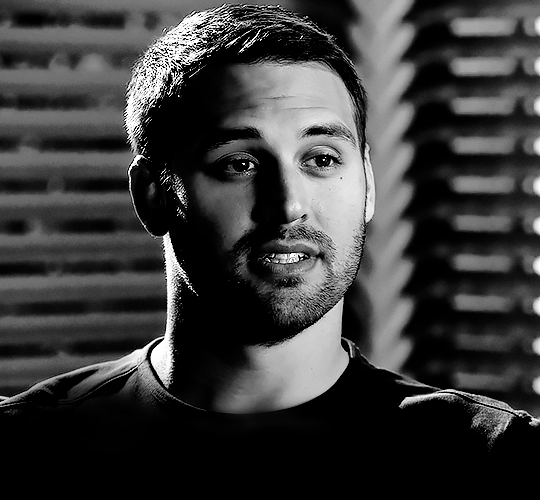
First, I like to put my text on the gif. You can obviously move this around later so don't worry too much about how it looks right now.
The dialogue is "Just don't feel it." "Feel" is one of those Big Words for this quote, so I'm going to emphasize it with cursive text.
I am using Moon for the sans serif text, and Santa Fe Spring for the cursive text. Keep both of these in white for now:
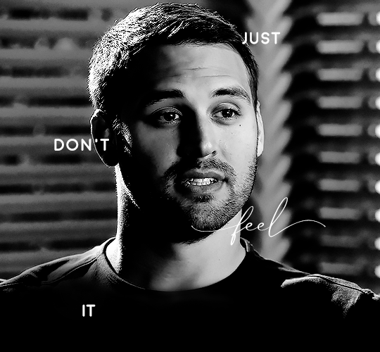
Next, we're going to use the rectangular marquee tool to draw our rectangles around the capital letters (we're not touching the cursive text right now). I just eyeball this, and then try to center it as much as possible.
(The rectangular marquee tool has a keyboard shortcut of M, and it's the second tool in that little toolbar on the left of most people's Photoshop.)
This is what that'll look like:
Next, we're going to go down to the icons at the bottom right of the layers panel and select the half-black half-white circle > Color Fill.... You should get a color dialogue box. Choose your color - I'm using #8d0000. Then, we're going to move that layer below the corresponding text layer, and set its blending mode to Difference. This is what that looks like (click the image for better quality):
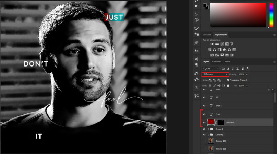
I'm going to repeat that with the other two boxes as well, using the same color. The boxes will look different with the Difference blending mode because of the shadows underneath.
For example, the box with "it" looks like a solid red square because it's against a completely black background, while the other two have some blue shading to them since there are some highlights behind them.
This is what my gif looks like now:
Next, I like to go The Lazy Girl™ route and put all three color-fill layers into one group underneath all the text layers. This just lets me edit the drop shadow of all three of them at the same time.
Right-click the group and open up the Blending Options. In Drop Shadow, these are the settings I'm using. The drop shadow color is #0c6477:
(Note: uncheck "Use Global Light" especially if you're working in frame animation to make sure all the drop shadow has the same angle on all frames.)
This is what my gif looks like now:
Now that we've finished that, time to move on to the cursive text.
I usually match the cursive text to the palette of the rest of the text, and since the drop shadow is our "accent" color, so to speak, I'm going to use a lighter version of that color. I am also going to add a drop shadow for readability.
The color I used for the text is #acfffe and I actually ended up adding two drop shadows, just because I needed something subtle that doesn't overwhelm the text, especially since it's a delicate font. Here are the settings for both layers:
And here's what my gif looks like now:
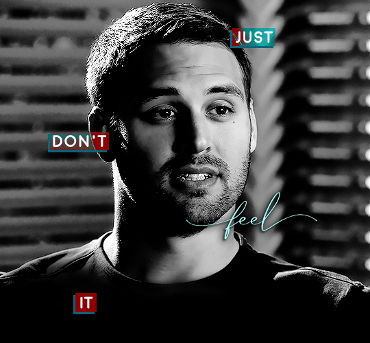
Now, before we move on to the lines, just check the adjustment of all these text layers, see if there's anything you want to change. It's easier to change now than after the lines are added, since you'll most likely have to redraw them if you move the boxes after the fact.
To draw the lines, we're going to use the Line Tool. I just freehand all of this, and I try to go from center to center of the boxes when I can. It all depends on your angles.
My lines are 2px thick, but you can change these depending on your preference. Here's what mine look like right now:

We're going to do the same lazy hack that we did for the color fill, and put all three line layers into a group. Move this group below the text layer and the color fill layers. The reason for this is so that the lines look like they're coming seamlessly from the box, rather than from on top of them or something.
Then, set the group to opacity 50%. I like more subtle, simple looks in my gifs, so I don't like super high opacities.
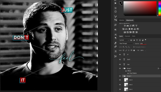
And that's it! This is our final gif:
Some final notes:
Absolutely play around with the blending modes of the color fill layers for this effect. These two gifs are the exact same color we've been using, just two different blending modes. You can see how drastically different they look. The first one is Linear Dodge (Add) and the second one is Vivid Light:
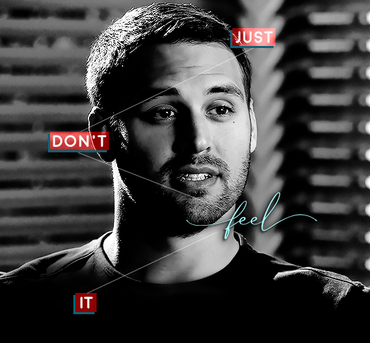
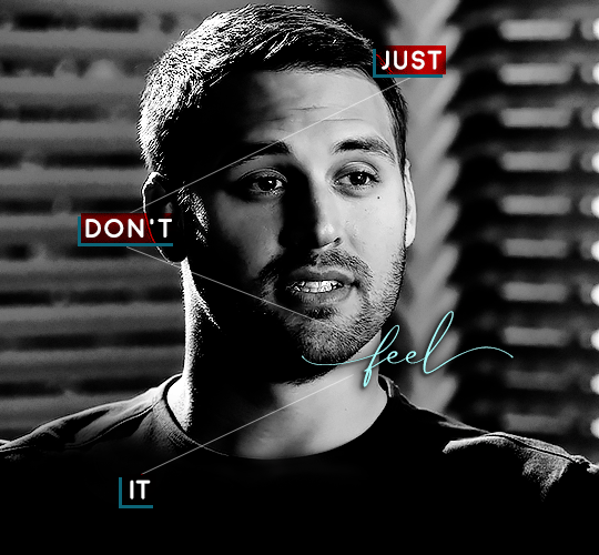
It can change how your gif looks in a BIG way, so play around with it, see what you like, especially if you don't really like the "two toned" thing going on.
Sometimes, I also like playing with the width and height of the text in the font settings, making it shorter and wider, or making it taller and more compact. You can play with the letter spacing as well. The world is your oyster, etc etc.
One other thing I've started doing is erasing the lines with a big brush, just to fade them from his face a little, like this:

To do that, use a layer mask on the line layer folder, and a brush that's 0% hardness, and at least 200px big. For this gif, I also changed the opacity of the lines back to 100% so the fading effect is a little more pronounced:
(this gif isn't the best example for this, but oh well. Anywho, hope this helps, Nonnie! Let me know if you have any questions.
Enjoy!
#zee's tutorials#tutorials#gif tutorial#photoshop tutorial#resources#dailyresources#completeresources#itsphotoshop#allresources#dailypsd#userisha#userdahlias#alielook#userabs#tuserheidi#userelio#userjaelyn#userisaiah#usermorgan#usergert#zee answers#im so pissed at myself for losing the tutorial the first time like you do not know how mad i am right now#i didn't even do anything tumblr just hates us all
204 notes
·
View notes
Text
Ena Ǝ tutorial thing
okay so no one's actually asked me to make this but I know it is a character you can have on your keyboard, so if anyone wants to know how to find it I have this!
Note that I don't know how to do it on PC or laptop because I rarely use those for casual stuff- this is mobile/tablet or essentially anything where the keyboard comes up on the screen.
However! If you do have that kind of device, it's pretty easy. Most devices these days allow you to have different languages on your keyboard (e.g. switching between an English keyboard and a Chinese keyboard), and using different languages gives you different options for umlauts and whatnot. The turned/reversed E is the uppercase form of ǝ, and it's used in languages that use the Pan-Nigerian alphabet. Thus, to get the character (and a shit TON of other umlauts too), you should use a keyboard for that. In my phone, which uses Google Keyboard (I know, I know, shitty company, but it's the default setting), this materialises as "English (Nigeria)", which feels bit weird because i'm pretty sure the intention for the keyboard isn't english (Pan-Nigerian alphabet was apparently created to allow all Nigerian languages to be typed with one keyboard according to Wikipedia), but it's a super useful keyboard to have! It's pretty much god mode keyboard, you've got every umlaut I've ever seen and even more I haven't on it (Nigeria is fucking amazing for that one). It's basically become my default keyboard because it's so versatile (and doesn't move letters around like my German keyboard does 😂 I don't accidentally click the wrong thing).
So yeah. The character is called a reversed or turned E, and it's used in the Pan-Nigerian alphabet, which manifests on Google Keyboard as "English (Nigeria)". If it's on any other keyboards I haven't found it, but it's a great keyboard, so it doesn't really matter.
To actually get the keyboard, it's a matter of finding out how to add languages on your keyboard. Mine has a globe icon on the side that when held allows me to switch and add languages (tapping it just cycles through the ones I have already). Otherwise, going to your keyboard settings through Settings on your phone will be the way to add another keyboard. There's definitely more accurate tutorials out there on how to add languages on your device, but in terms of which language to add, this post can be your baseline if anyone knows how to do a similar thing on PC or a device that uses a physical keyboard, please do tell in the notes and I'll add it!
Edit: this lovely user gave a way to do it on PC!

4 notes
·
View notes
Text
˖⁺‧₊˚✦ ways to make your laptop aesthetic feat. some extensions, websites & apps for students
i created this cause i found some time to finally upgrade and properly personalise my laptop, it took me almost an entire day watching youtube videos, researching for these and setting them up. so... i'm basically posting this for myself lol, but i also feel like sharing cause these are actually really good hehe
i'm using a windows laptop but i think most of these should work on mac too. most of these are free but there are maybe like less than five that require to be paid.
those that are marked with an asterisk (*) are the ones that i'm currently using while others are recommended or alternatives!
here is what my home screen looks like now:
i. screen saver
fliqlo (ios & win) * flipit (win, an inspired & alt ver of ^) flix clock (mac & web, paid ver comes with colours other than black) aura gradient clock (mac & web) retro anime desk clock (mac) flocus (web) * studywithme (web) note: remember to right-click the file and select "install", then ensure that the wait time (e.g: 5 mins) is less than your "turn off your screen" and "put my device to sleep after" (e.g: both 15 mins) in power settings
ii. tab themes
kluk: a clock tab theme * angry study helper: a tab theme that gets angy at u whenever u open a new tab gratitutab: a minimalistic tab theme that works as a to-do list prioritab: a tab theme that shows priorities that u had set for the day, week, and month
iii. extensions
tldr this: summarizes long docs, websites, articles, etc. with just a click * paperpanda: download research papers by clicking on it, it searches on domains like google scholar, semanticscholar, aodoi, and more * coffeelings: mainly a mood tracker that also saves mini journal entries colorzilla: an eyedropper colour picker * whatfont: click on it and hover on any text to show what font it is * mybib: an apa, mla, harvard, and more styles citation generator * read aloud: a tts reader that supports more than 40+ languages * notion web clipper: creates a website into a bookmark into notion * noisli: lets u listen to relaxing playlist while u study/work
iv. websites
lofi.cafe i miss the office i miss my cafe i miss my bar i miss my library a soft murmur patatap tomato timers animedoro lifeat coolors blush designs untools fontjoy zenpen decision maker museum of endangered sounds future me
v. apps
virtual cottage chill corner notion *
vi. rainmeter skins
mond * lano visualizer amatical * small clean weather animated * ageo sonder * cloudy harmattan note: if you're new to rainmeter, it can be a bit overwhelming, u may check out this short and simple tutorial on it, make sure to read the instructions if you're using complicated skins like weather (may require u to edit in txt), i also highly rec watching techrifle's videos
vii. misc.
wallpaper engine * (highly rec getting from chillhop) my live wallpaper (free alt of ^) translucenttb * roundedtb note: u can disable your shortcut icons to be invisible by right-clicking on your home screen, go to "view", and untick "show desktop icons", this is optional and i would always enable it whenever i'm working and gaming for easier access, i also set the icons to small
68 notes
·
View notes
Text
tuesday again 1/30/2024
a good 60% of my brain is screaming in unemployment terror at all times so these will be somewhat abbreviated until that situation resolves itself
listening
sleeping on the ceiling by friday pilots club. this is a song by a five-piece alt-rock band from chicago that could EASILY open for mid-aughts fall out boy. i would like to think it is from the point of view of a freshly-turned vampire. listen this slot isn't about the best song i heard this week it's about the one that got stuck in my head the most
Hey, I swear I'm okay Honey, I been sleepin' on the ceiling all day Yes way, like hey I swear I feel great Looky, looky, love the feeling of being okay Yes way
spotify.
youtube
reading
Lara Croft: Tomb Raider and the Amulet of Power by Mike Resnick. it was in a dollar book bin and i got it as a joke gift for a friend. mike resnick is a remarkably prolific writer who's done a lot of tie-ins. i don't have anything particularly notable to say about his star wars books but they are a sort of minimum viable product? they feel star warsy and don't annoy me on every page.

this book was published in 2003 and treats the people of the Nile delta and their beliefs with all the delicacy you might expect from a 2003 video game tie in novel. i do think the twist is being telegraphed way too hard. perhaps i should say instead of sending a telegram mr resnick has simply set the telegraph office ablaze as a signal fire. the titular triangle-pointed woman herself ms croft is VERY insistent she's just as good as the boys. this is pretty on par for my experience of 2003 empowering womens' feminism AND my experience in a male-dominated field so i can't really ding it too hard? aside from the racism, in the notably racism-free fields of archaeology and video games and archaeology video games, this book is aging a little strangely overall. i do not know if i will finish it before i mail it out to my friend, but despite its sins it is a very fast read.
watching
watched the four dungeon meshi episodes. it's cute! ProzD was an unexpected delight! it made me want to make something fancy for dinner but alas i still have to go food shopping!
some posts on my dash were talking about how the episode with the mollusks inside the living armor really got them hooked and i have to agree. i also saw the full potential of the show's speculative biology unspooling before me. i don't know if i currently have the brainwidth for the manga but it is going on my reading list for after i finish berserk. which is kind of like saying i'm going to watch chopped after i finish up hannibal
playing
forgot i had an original gen switch, given to me through a complex series in a complex series of friend barters back in uhhhh late '21? early '22? i got through 3/4 of the divine beasts the first time around and then could not crack the camel. it was well past time to create a new switch profile so i could start a new game without losing the old one.
omg twinnsssssssss

i did forget how goddamn big the map is. i have just now unlocked the camera and the memory quests, i have not really. done much more than basic tutorial and beginning of game stuff.

making
anxiously junebugging between a whole bunch of shit. finally figured out the correct charger/extension cord setup for my bedroom. replaced all the fluorescent lightbulbs and took them to be recycled. fixed the hall door enough so it latches closed and an irritated cat can't claw it open. tidied up the balcony and patio and repotted the surviving houseplants.
in textile news, started this cross stitch. this is a Bless This Wretched Hive of Scum and Villainy Star Wars themed sampler, i have made two as gifts and had to throw out a mostly-completed one i made for me bc of the moths. but i now know exactly where this will go in this apartment and i already have the frame and i bought all the floss pre-being fired, so might as well? the real bitch of the situation here is backstitching the buildings. it's so start and stop. it's so much tan. i talked about this on the weekly siblingchat facetime and now my brother has requested one lmao. that's his christmas gift settled. i suppose.

i had somehow forgotten how loadbearing textile crimes are for me. i haven't done much of anything since the moth debacle, and that was almost two years ago. last night i found some suspicious holes in a camisole and i'm really really hoping it's just cat claws and not moths or carpet beetles or any other fun things that eat clothes.
25 notes
·
View notes