#sometimes it's just stylized shading
Text
ok idk how to word this properly, but sometimes it's not "bad" comic art, sometimes it's just an artstyle you're allowed to dislike
#sometimes it's just stylized shading#sometimes it's just stylized anatomy#and yes sometimes a lot of the times it is influenced by misogyny and racism and other isms#but i think there's nuance to it and i keep seeing people “fixing” bad comic art but they just make it#idk more homogeneous??#idk i think maybe we should sometimes let art be ugly#also i can't help but notice that nobody is trying to “fix” belen ortega's plastic cutout same face dolls#just do a redraw bro#show us how you would do it fully#bahiara rambles
1 note
·
View note
Text
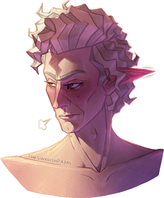
The man truly can’t take a genuine compliment 🙄
#my art stuff#digital art#baldur's gate 3#bg3#astarion#astarion ancunin#this is part of a series I like to call “I’m never settling on a singular detailed artstyle”#I have no consistency in drawing realistic people/characters other than my shapy cartoon style#but I truly don’t get enough opportunity to properly shade anything with art in that style-!!! it always looks weird to me-!!!!!#I think some rude lil worm in my brain is wriggling around telling me it’s a futile attempt at still doing realism#cus I’m one of those “gifted” artists that grew up promising his parents he’ll end up among the big names or whatever#constantly training to become better at art but with realism oil paintings as the goal#you know how it is 😔#I wanna shade my lil funky designs but they never feel good enough to really put energy into or whatever so I compromise with stuff -#- like this where I try to draw characters more accurately while still stylizing them and shading them however I feel like it#which is great and all but I should really learn to give my more relaxed and less perfectionist art a chance#I deserve to enjoy the process and the result without working myself dead#it’s so much easier and rewarding to copy cartoon styles - stylizing realism makes me too anxious of doing it “wrong”#at least cartoon styles give me a goal to reach or a reference to strive towards#man I really should just cut myself some slack altogether#either way - this man is a flustered mess and he’s embarrassed about being called adorable in public or something#being teased in an affectionate way about his sweeter side and stuff#don’t ask why he’s shirtless - anatomy is just a lot more fun for me to draw sometimes#tasteful nudity and all that is extremely gorgeous to me#i need to practice anatomy more cus I just kinda did some shit and went with it this time with a BIT of consideration for muscle structure
51 notes
·
View notes
Text
I think it's fair to say that sometimes people dislike or hate their own art bc "it's theirs" and they have self image issues etc and all. But. I also think there's another angle that can be looked at here. Like, sometimes you dislike your art bc you're trying to make it into something you think it's supposed to be, not what you really want it to be.
Some of us(me included) can get so caught up in the search for approval from a community that we put aside the stuff we actually like in favor of what we think we have to do in order to be accepted, or to impress. Art is an extension of ourselves, it's an expression of our identities, of the things we love, the things we grew up with, the things that used to impress us and make us happy and that might still make us happy today. The more we distance ourselves from that, the more we might start to feel like something is wrong. Like something is missing. Like it's never good enough, and you might find yourself adding more and more things that are "supposed" to make your art look better but that never really fix the issue.
I think sometimes we have to ask ourselves: am I doing what I like, and am I doing it the way I like it? Look at your favorite artists, look at the stuff you love to see. Look at the stuff you used to love. Is that what you're doing? And if not, then why not?
#I just think the answer to why a lot of us dislike our own art is more complicated than just 'bc it's yours' sometimes#sometimes we've really strayed off from what we liked#and not to be pretentious and reference classic artists and all that but that's literally what picasso meant w his art#that sometimes you get so caught up in what you 'should' do that you forget that art is all about you#it's all about you babey. it's all about those specific little things that you like#it's about the way YOU like to draw and line and shade and color and stylize and the stuff YOU like to draw#and the closer you get to doing exactly what you like the happier you'll be#I'm at the end of an art course rn and I'm having Thoughts#sleep.txt#but also getting back into manga and anime is doing things to me#I've felt really off about my art for a while and looking back at the simplicity and designs I used to love#is really like. 'filling the gaps' yk?#I've been starting to like my own art way more lately
46 notes
·
View notes
Text
Art guild: draw yourself a la komi can't communicate
Me: -draws self AS Komi can't communicate
#nailed it loo#*lol#listen it was like 'characters in komi can't communicate' are stylized after tropes draw yourself like that#its just like no shade to Komi but her quirk is my quirk like i dix it first lmao#( it...im the shy person who can't talk sometimes what do you want from me)
6 notes
·
View notes
Text
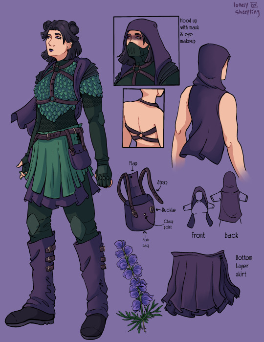
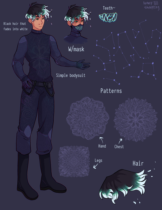
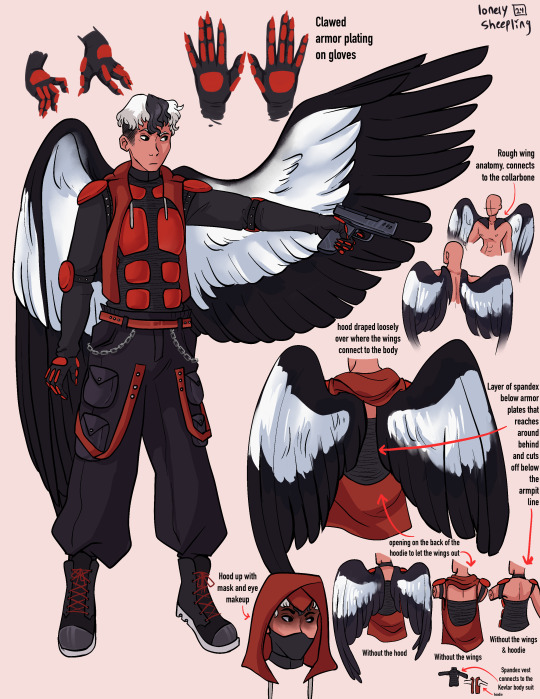
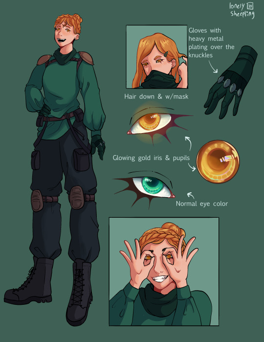
Recently read @queenofthequillandink ’s DPxDC crossover fic Unearthed, Reborn
I got inspired to draw character sheets for Danny, Sam, Jason, and Jazz’s vigilante personas. Here’s a link to the author’s drawings of their outfits (these were a vital reference for me when doing this so thank you so much for sharing them Quill)
More commentary (like 7+ paragraphs plus 2 images) about this project and the designs below the “keep reading” line.
None of these thoughts I have for each character are in order, but I have a lot of commentary for these since this project was a lot more conceptual than my normal work. I also just like talking about my art/design process.
If you ever find yourself wondering at some point why an element from the original design wasn’t included, the answer is that the removal was completely intentional and part of my grandmaster vision for this work and wasn’t because I just forgot about it entirely during the design process.
————————————————————————
Aconite (Sam)
This was the first one I sketched out, I wasn’t even sure at the time if I was going to fully commit to drawing all of them. I thought that Sam was gonna be the hardest since her description was way longer than the others, but then bird boy beat her out. I took a lot of creative liberties with her design, the bag was added bc I couldn’t figure out how to add pockets to the skirt. I was trying to avoid a joker color scheme so I had a lot of ref images that I got by searching like “purple green aesthetic” on Pinterest. The dark purple and dark forest/blueish green won out in the end. I desaturated a lot of my colors for her just to get as far away from the neon Gotham rogue aesthetic. I also added the bdsm harness over the armor to add more punk elements to her design, I know that in real life that would be very uncomfortable to wear over scalemail armor but sometimes we take creative liberties when they look sick as fuck. Also, I didn’t realize until I went to look for a reference for aconite flowers that aconite is wolfsbane! That was neat to learn! Also, the font I used for Aconite is called “zai Art School Calendar 1931”, I’ve used this a few times for other projects, it’s one of my favorite fonts. The ‘zai’ fonts the creator has are all very good.
Shade (Danny)
There wasn't much to add to this page. His outfit is pretty simple (besides the patterning). I wasn’t sure how to pull of an optical illusion pattern but I was reminded how I sometimes get an eyestrain induced headache when looking at someone wearing a patterned shirt with really thin stripes so I just leaned into the idea of a small/detailed hard lined pattern. I originally made 5 separate patterns for him and then turned them into stamp brushes in procreate. I only ended up using three of them, the one on the chest, the one on the legs, and the one on his hand. But, I imagine the patterns fade and shift when he moves, sort of like a lenticular print. I gave him constellation freckles and stylized the hair’s fade into white. The hair was inspired by how time-woods draws Martin Blackwood’s hair (linked: time-woods’s fanart of Martin Blackwood). Also put way too much effort into the teeth on the mask. I just like the chunky teeth design. Oh yeah and the font I used for him is called “Typewriter_Condensed_Demi”
Erinys (Jason)
Repeatedly ran into the issue of not having enough canvas space bc of my fervent need to thoroughly document and plan out how the wings worked. I also reversed the colors for the bodysuit & armor so the under layer was black while the armor plates were red. I only realized afterwards that I may have been inspired by the red centipedes in Rain World (linked: gif of the red centipede, don’t click the link if you’re unsettled/afraid of bugs/insects), artists subconsciously draw inspiration from other artists all the time though so I’m not like upset about it. I stand by it because it looks sick as hell. Also leaned into the magpie theming for the wings. I think the vigilante form was supposed to be reverse magpie coloring? I can’t remember, but I stuck with normal magpie coloring. The anatomy of how the wings connected to the collarbone was inspired by JayEaton’s Magpie Bridge Project. Reference image link. Link to the article the image is from. I didn’t draw the wing armor because I couldn’t figure out how to would work with the wing anatomy and I ran out of canvas space. Finally, the font used for him is “DIN Condensed” this is a default font, I would’ve used something more punk but I needed the text to be legible.
Insight (Jazz)
I did Jazz after I’d already finished the initial trio, so I had to switch to a new canvas for her bc I’d hit the layer limit multiple times on the previous one. I really do love doing that spiked under-eyelash thing with characters. Don’t know when that started. Anyway, I added the shoulder pads to her outfit to help break up the empty space. The golden eyes were a nice accent color since her design is very overwhelmingly green. Honestly the braid hairstyle and gold eyes really do obscure her identity, multiple times when drawing her I was worried that she didn’t really resemble Jazz enough. There wasn’t a drawing from the author for her so I only had the text description to go off of. I just realized that she sort of reminds me of a forest ranger and I don’t know what to do with that realization. I copy/pasted my drawing of her eyes when gold and recolored them to match her normal eye color. There were two layers for that, a hue shift and a hard light layer to emphasize the shadows.

Here’s what it looks like without the hue shift:
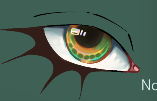
It looks really cool and I’m 100% that color combo in another drawing down the line. Oh yeah and the font used for this sheet was “Euphemia UCAS”. It comes with Apple’s operating system, I use it as a neutral default text most of the time bc it’s nicer than helvetica but not overly fancy like Times New Roman—and why am I talking about fonts.
———————————————————————
Anyway, this project was very fun to work on. The alt text for this was its own endeavor, hope the folks using screen-readers don’t mind 4-5 paragraphs of description text. Also, I cannot remember for the life of me if Dani got a costume description, but if she does I’ll make sure to update this image set with a sheet for her.
And to the author, QueenOfTheQuill, if you’re reading this message that I’ve left at the very bottom of this post below a read more line, thank you for the fic. It’s very good and I’m glad I caught it during my slow decent into DPxDC brainrot. I love the interactions between Jason and Tim, it’s nice seeing a revived Jason that’s not bogged down by pit rage. They definitely seem like they could’ve been good friends if not for the unfortunate circumstances that led them to meet in canon. Also, I’m sure Jazz will love interacting with Batman and Nightwing. So much psychological & childhood trauma to unpack with them.
Feel free to use/share these images if you so desire and thanks again for your work.
#art#art tag#digital art#my art#procreate#illustration#character design#fanart#dc#dc comics#jason todd#danny phantom#sam manson#jazz fenton#danny fenton#dpxdc#dp x dc crossover#alt text#id in alt text#alt text included#writing out the alt text for these was long and hard#but now that I’m finally back on my adhd medication I have the motivation to do it again#as always message me or comment if you have critiques regarding the alt text#character concepts#concept art#conceptual art#danny phantom fanart#danny phantom crossover#batman crossover#crossover fanart
298 notes
·
View notes
Text
MODERN DAY LOVER BOY

SUMMARY: April Fools Day Special with the JJK Men in Alternate universes!
A/N: Happy April Fools everyone
WARNINGS: None
Tattoo artist! Geto Suguru who casually tells you he'll give you a free temporary tattoo for "today's promotion for pretty girls", but when you get home and peel off the bandage he's written his number there
Tattoo artist! Geto Suguru who, once you've made it official, makes you both matching couple tattoos - not necessarily a heart and your initials, but rather the logo of the cafe you guys had your first date at stylized to become the both of you
Tattoo artist! Geto Suguru whose customers ask him who the woman in his latest art selections are and it's you (he's not afraid to flex about it)
Tattoo artist! Geto Suguru who rarely had off days because that parlour was his life, but you breathed a new meaning to it and now he closes the store with the money he carefully stored over the months for a quick vacation with you
Tattoo artist! Geto Suguru who just has to look at all the photos or selfies or whatever it was that had caught your eye you constantly bombard his phone with to get inspiration for his next art. He's been called a king at what he does but you were a goddess of art itself.
***
Guitarist! Gojo Satoru who spots you in the crowd as he drums, a surprised look in your eyes and upon your once irritated face at how your best friend had dragged you here as he stuns you with his skills
Guitarist! Gojo Satoru who secretly hopes you would show up after the show for an autograph, who's over the moon when he discovers the person you're with has backstage passes, if only to meet his bandmate Geto
Guitarist! Gojo Satoru who adds in smaller writing his number to the poster you ask him to sign, and in fact gives you an autographed Polaroid of himself for free and with a sly smile while the rest of his fan girls groaned in jealousy
Guitarist! Gojo Satoru whose first date with you is to a karaoke and teaches you drums, showering you with whatever you want with his money - that premium gelato? Sure! VIP room? Why not! Nothing but the best for the true idol in his eyes.
Guitarist! Gojo Satoru who from then on always dedicates his songs to a "my pretty muse" that no one knows, except he always engages in eye contact with you
***
Piercer! Yuta Okkutsu who smoothly, kindly comforts you when you start having doubts about your piercings, assuring you it would only hurt for a moment and he'd never dare to cause suffering to such an angel
Piercer! Yuta Okkutsu who claims it's a free gift but hands you a box of heart shaped earrings with his number scribbled inside and a nervous ask out to coffee sometime
Piercer! Yuta Okkutsu who's now the reason you somehow ended up with two more piercings at the top of your ears, him hopefully suggesting you could match with him
Piercer! Yuta Okkutsu who can't stop blabbering about his beautiful girl to his other customers, leaving them forgetting about the uncomfortable stings and wondering who such a beauty would be
Piercer! Yuta Okkutsu who gifts you the engagement present in the form of custom designed earrings with both your initials in it, be decked wth your favourite colored gem
***
Graffiti artist! Inumaki Toge who, in his pining stage for you, started spaying a hell lot of red and hearts and Cupid's arrows into his artwork
Graffiti artist! Inumaki Toge who had no idea you were a fan of his work...and was extremely flustered to find out you discovered his not so secret crush on you when you saw the love song quotes spray painted under a painting of someone who looked suspiciously too similar to you
Graffiti artist! Inumaki Toge who helps you sneak out of your bedroom at night after throwing pebbles at your window and both of you run off on skateboards to colour the streets the same bright shades of your teenage love
Graffiti artist! Inumaki Toge who wasn't good at apologising after fights or misunderstandings, so he borrowed others' words to quote and paint somewhere he knew you'd see, with a bouquet of wildflowers left there if you did happen to actually see it in the flesh
Graffiti artist! Inumaki Toge whose biggest artwork was not the bridge he had covered with slogans last month but in fact, the gigantic canvas of you and him racing into the night with streaks of spray paint exploding behind you
***
Ghost Hunter! Yuuji Itadori, the self acclaimed "Myth Buster", who went around to various most haunted places in his hometown to explore and prove that in fact, ghosts DO NOT EXIST, which he kept trying to convince you, his skeptical one-man camera crew, of, although your ongoing bet was that if he could you'd give him a kiss
Ghost Hunter! Yuuji Itadori who was often requested to do rituals or demon summons to provide evidence for his theories that "ghosts" were just people's imaginations being sparked up by even the most mundane of things by fear, but one of the reasons he really refused was because he didn't want anyone else butting on you and his time - besides, ain't no way was he using you as a sacrifice
Ghost Hunter! Yuuji Itadori who finally works up the courage to confess that he wanted to take this friendship to higher levels ironically on Halloween...even more ironically after he grabbed your hand and dragged you out of the haunted house screaming.
Ghost Hunter! Yuuji Itadori who declared himself your lucky charm against the supernatural and promises that he'll protect you from whatever came from beyond the grave (he didn't believe it ghosts but sure did in protecting you) and used the excuse to stay over at your house at night
Ghost Hunter! Yuuji Itadori who tells you in the spookiest way possible to meet him at the latest haunted expedition, but when you get there it's all set up with fairy lights, a movie and a picnic to celebrate your one year anniversary as a couple
#Sunny's Works#jjk#jujutsu kaisen x reader#jujutsu kaisen#x reader#jjk x reader#jjk x gender neutral reader#gojo x reader#gojo satoru x reader#geto x reader#geto suguru x reader#yuuji x reader#yuuji itadori x reader#yuta x reader#yuta Okkutsu x reader#toge inumaki x reader#inumaki x reader#april fool's day#april fool's special
263 notes
·
View notes
Note
Well I really love your art, may I ask how do u color? I struggle with coloring turtles and I wasn't to know how do u do that?
Hi anon! That's a very broad question, so you've given me a great excuse to ramble anything I want about my coloring, eehehehee~!
This will be in two parts and I'll start with talking about my simpler coloring style.
As in, when I color characters on a white background, with a limited or light palette.
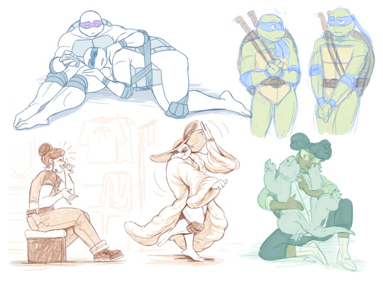
The driving force behind this style is me being lazy. My time, energy, and attention span are pretty limited, so if I want to finish anything, I gotta do it fast. And with fanart, I'm usually just doing it for fun and relaxation, so there's no need to push myself to polish it too much.
Despite that, I rarely post just black and white sketches or line arts. I always try to add at least a little bit of toning or shading, because that makes the image easier to read. The characters and their shapes pop out and catch the eye of the viewer better.
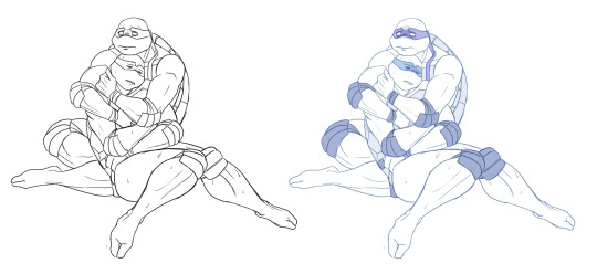
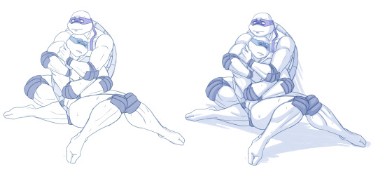
However, in this particular example, just the couple toning colors don't quite do the job. The way Don and Leo are entangled makes the center area of this illustration very busy and hard to read.
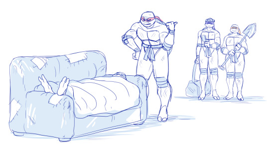
As a comparison; this pic has only one tone + mask colors, and it works. This is because all the characters are standing separately and their poses are very stationary and simple.
So for the Don + Leo pic, adding some shadows helps in bringing out shapes and depths. Also in general, if you don't feel like drawing BGs, it's good to at least add a shadow below the characters. It grounds them and makes them feel like they exist within a space.
Sometimes if the posing looks too complex and busy, it might just be best to color in the characters fully.
However, even if I do full flat colors, I tend to use a lighter palette. Putting characters in their neutral/default color on a white BG can look a bit jarring as if they're floating in a void. It feels less immersive and like the picture is unfinished.
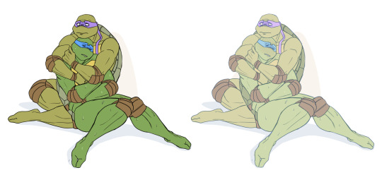
Using lighter colors makes the image more cohesive, and fits the characters into the white environment a bit more naturally.
If I'm too lazy to draw a BG, I prefer using stylized and limited colors. It feels deliberate and that the whiteness is just part of the palette, whereas the character-accurate colors on white don't match as well, even if they're more pastel.

That being said, there's nothing wrong with just slapping the flat-colored characters on a white background. As you know, I do it too. I'm just exposing my 'fancy coloring style' for what it is; me being lazy, hah!
Limited and monochromatic palettes are a nice shortcut even when you do actual backgrounds. It's faster and you don't have to worry about clashing colors. And you can still convey atmosphere and mood.
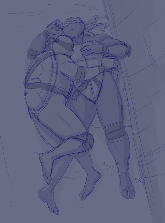
Also, on the topic of conserving your time and efforts; I think it's very common among younger/less experienced artists to think that the amount of time you spend on your art piece = how good and well received that piece will be.
Which has some merit to it of course, but it can lead to putting too much effort into areas where it's not necessary. E.g. filling the piece with tons of details and clutter that don't serve an actual purpose, but rather make the image hard to read. Or doing really complicated shading for a meme/comic, where simplicity would deliver the joke better.
So whenever I'm drawing something I intend to publish, whether it's a quick doodle or a more polished piece, I try to follow these two principles:
Make it easily readable and do the bare minimum that needs to be done to convey what I want to convey.
Putting time into practice is important, but if you draw for work, it's also crucial that you know how to prioritize and use your time efficiently!
Anyway, thanks for reading! In the next part I'll go into how I do my fully colored pieces, so stay tuned for that!
173 notes
·
View notes
Note
What advice would you give beginner artists?
it's fine to want to do more stylized art, but nothing will help you improve quickly like studying from life. even if you want to draw very stylized figures, life drawing is still going to help you understand how the human body works and then you can build your stylization off of that understanding. I also recommend studying specifically things you're looking to improve--if you feel like your poses aren't dynamic, ask your model to do some quick (1-2 min) dynamic poses and work on getting the gesture down. if you're looking for anatomy, ask for longer, more static poses and really study the contours of the body. this also applies for portraiture and character art--my expressions and facial structure improved like CRAZY when i started doing portrait studies from life! (note: i know live model sessions aren't accessible for everyone. i'm a huge advocate for nude models, if you can find a studio nearby that's affordable to you that offers sessions, that's the best you're gonna get. however, there are sites that will give you photos of nude models to draw from, too, or you can even just ask friends or family to pose for you when they aren't busy, that's what i did before i started getting model sessions from my school!)
materials are not everything but sometimes a good material can make a difference. it's important to know what's worth it and what isn't for your skill level. invest in some decent-quality supplies or a good art program, but understand that you're still going to need to work to understand your materials and use them to their fullest potential. (if you're a digital artist buy csp. trust me on this. get it on sale. it will change your life. also do not fucking use photoshop)
tracing is ok. listen to me. TRACING. IS. OK. tracing is how you learn. don't trace other people's art and pass it off as your own, obviously, but there is literally no problem with tracing real-life reference photos. I routinely trace references for backgrounds and the like. there is no reason for you to kill yourself trying to make complex perspective and shit up from your head when you can very easily just overlay a photo and get what you need.
in that same vein, USE REFERENCE PHOTOS. find pics online or take pics of yourself and USE THEM to see how your poses work. it makes it SO SO SO much easier. the understanding that you need to create a pose out of nowhere will come with time but you're not going to get that skill unless you have a foundation of understanding how the real human body works, and the easiest way to get that understanding is by copying photos of real people.
last but not least, there's generally a sort of 'rulebook' that new artists are expected to go by, especially online, when it comes to digital art. when i was first learning, it was all about lineart and cell shading, two things that I didn't really like. Nowadays it seems to be all about rendering. the single most important thing i can tell you is if it sucks you don't have to do it. if you hate lineart just color your sketches. if you hate shading don't shade, or find a different way to shade that you enjoy more. if rendering is annoying or difficult for you DON'T BOTHER!! art is supposed to be fun. if part of your process is annoying or upsetting to you, cut it the fuck out. don't torture yourself just to do art the "right" way. i guarantee your art will look better when you're having fun making it anyway!
#asks#ALSO don't go in expecting to monetize your social media presence/go viral as an artist. make art for YOU and make what you want to make.#if your art has passion behind it then attention will come naturally!
330 notes
·
View notes
Text

art summary through the years! i saw this going around and i wanted to play too, i always love doing these summaries.. template 🌹
my art became "i discovered the joy of drawing drapery and fabric in 2021 and never looked back" HAHA
looking at the early stuff, sometimes i really miss stylizing and drawing cartoons!! 2015 was the first year i started drawing cartoony stuff, pre-2015 was purely anime style. an updated art summary from 2010+ for me would be fun.
going back to the 1st sentence, stylizing just doesn't give me what i want from art anymore, it doesn't satisfy my art hunger haha (dungeon meshi joke.. iykyk). although it's still fun to experiment once in a while (e.g. merch). even if my current personal art is not very animation industry friendly or "hireable", i think i have a stronger notion of my "artistic" voice now more than before. (again, at least for personal art)
2020-2022 were rough years during the pandemic... i wanted to stop drawing so many times. i always say this, but during that time i went back and touched base with things i used to love as a teen, such as old anime (fma, pandora hearts, etc) that inspired me to pick up a pencil in the first place, and it helped to revitalize my love for art. and then i discovered drawing and studying fabric and i could never go back! i think my art is now more inspired by fine art history than cartoons hence the more realistic drapery...
one reason why i always change up my art style or technique every 2 ish years is that i kinda get bored of the same brushes easily... ive worried that using the same brushes gets boring and stale to people, but i think my art values are more or less consistent with how it was 3 years ago. i cycle through a set of like, 3 different brush sets (watercolour, pastel/lineless, and regular shading) depending on the mood of the drawing. different drawings call for different techniques you know?? and i think it's okay to use different tools for each drawing, art isn't meant to all be the same.
#art summary#bit early for art summary but a half year/through the ages one is fun once in a while#my art
97 notes
·
View notes
Text
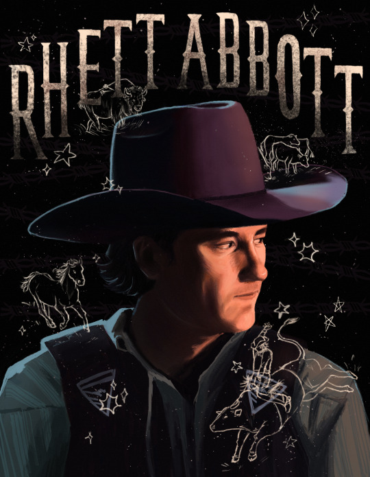

amelia county's very own: rhett abbott !!!!!
details + me yapping under the cut :>


After 87 years I finally finished!!! Definitely the most realistic and detailed portrait I have ever done. Loosely inspired by flesh.png on instagram. I love their portrait work and the doodles they include in the background!! I wish I could have been more adventurous with the colors like their work is but alas I lack the color theory knowledge.
It would be fun to try another portrait with less shadows. The dramatic lighting is fun but would be nice to focus on hue and less on value and then try to combine the two in a later piece ? dawg idk what I'm doing
Also I just realized I flipped the bison so it fit better, but now the arrows are on the wrong side I think. whooppss
Also the colors look so different on my computer 💀 I don't know how to fix it. If you can't see it, I just want you to know that there's also barbed wire in the background too.
Also cowboy hats are so hard to draw they are the bane of my existence.
N E ways, hopefully I will be more active here. I just got swamped with finals, summer class, and working and I'm also about to visit family for almost the entirety of September and then school is gonna start up again but I will try my best!! I just get overwhelmed and self conscious sometimes even though its literally not that serious 💀
I'm already working on another Rhett portrait and Rhett in the heat stroke trend (from twitter? I think) and I got some Bob doodles that are basically finished !! I also sketched out some Harrison and Miles doodles but idk how I feel about them.
I would also love to draw some stuff based on fics but no promises as I am the world's slowest drawer 😭 and I still need to improve my anatomy, coloring, perspective, stylization, shading, line art, composition, and design skills 😃👍 all my ideas are too ambitious for where I'm at rn rip
Nevertheless I stay motivated and will do my part reading fics and drawing pictures 🫡
oki das it thx for reading :>
#i need to move on from this fr#every time I look at it I see something I wanna change 💀#rhett abbott#aka pookie bear <3333
45 notes
·
View notes
Note
i absolutely adore the way you stylize wolves<333 theyre so simple yet expressive and the coats capture the detail so well- theyre also just so shape and your lineart is so loose and chunky /pos
would you ever do a tutorial or show some wips of your process? especially on how you stylize coats, i love the way you draw them-
if not, thats totally cool ofc!
thank you!!! :-) heres a little breakdown of my process + sort of a tutorial- i dont usually do art tutorials so im sorry if this doesnt make sense!!
a big inspiration for the way i pick colours for coats is actually this post by @/vhsdruid, so go check that out too ^_^

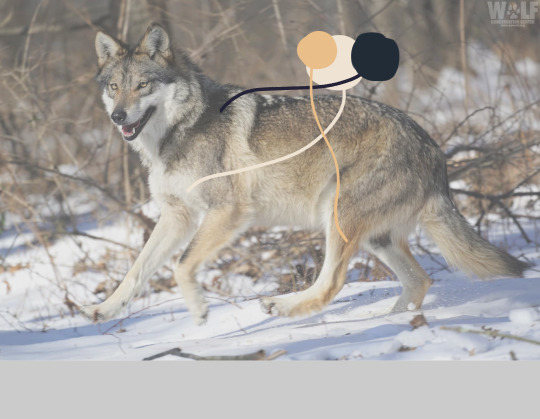
more specifically for wolves, there are a lot of pretty consistent features that most wolves share, like having a black tip on their tails and having countershading, so just knowing about those can make it a lot easier to simplify a coat. wolves also break down pretty easily into 3-4 colours with transitional shades between.
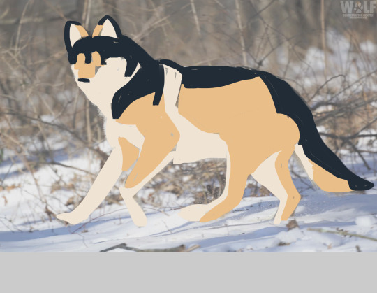
then all you have to do is break down the wolf into big colour blocks ^_^ ! it really doesnt have to be perfect, i mostly just make it up. i also add more colours in between because to me it always comes out looking like a husky when you have such clean distinctions of the pattern, but thats the gist.
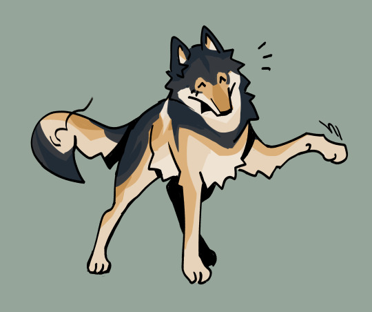
that wolf i was using as an example was also the reference for wolf 048's coat! so you can tell how my coat stylization goes from blocks -> in between shades -> final :)
whenever i start a new wolf, i find a reference image i like for posing AND a reference image for a fun coat (like, for wolf 048, these were the reference images).
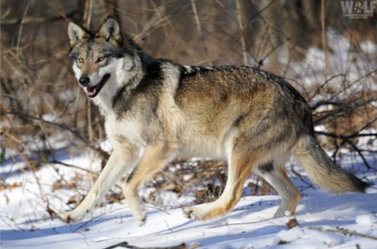
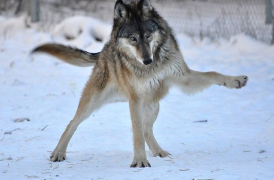
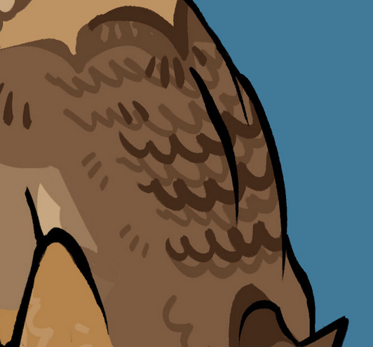
wolves also have this thing with their fur that makes it look like it has a Ton of variation in a small area which i sometimes stylize with wiggly lines, like this! vv


also, here's a speedpaint of wolf 048, and the sketch + raw lineart!!


im not really sure how helpful all that is, but im always open to answering any questions ppl have abt my art/tips for drawing wolves!! keep in mind im no expert haha (but, maybe by wolf 365, i will be?)
#art tutorial#long post#flash warning#<- to be safe w the speedpaint. its minor but#call and response
680 notes
·
View notes
Note
I adore your batman stuff very much. I recently read the Wayne Family Adventures, and now I really want to read some more. Do you have recommendations on comic lines to follow?
Hi! I'm glad you're having fun with getting into comics and enjoying the posts around here, it's always nice to have new blood (or returning blood, in my case)! <3
I would give a gentle caution in that Wayne Family Adventures is sort of in a class of its own in a lot of ways, the characterization is much softer and fluffier, while the mainline comics are darker and messier, the characters are definitely not always as nice as they are as in WFA. That's no shade on either of them, just that I want to give a quick warning that if you're stepping from one to the other, the culture shock can sometimes be more than you're expecting.
(And also keep in mind that comics are a shifting landscape, there's no one "true" version of many of the landmark moments of characters' lives, you'll see events often retold, you'll see comics that later get retconned, you'll see comics that are in different continuities/set before or after a universe-wide reboot, etc. Don't worry about it, just recognize that you're reading a story to enjoy that story, not as Hard Continuity!)
That said, some of the lighter comics that I think would be fun if you're looking to come over from WFA are:
Li'l Gotham is a cute parody series that's super adorable, has some lovely art, and is nice little self-contained stories that are humorous. It's not in mainline continuity and it's even softer than WFA, but it's deeply charming and it's a fun, quick read.
Super Sons (2017) by Peter Tomasi is in mainline continuity and it's focused on Damian Wayne and Jonathan Kent becoming friends, bickering all the while, and getting into hijinks. It tends to lean more humorous and cute, so it's a nice stepping stone up to regular comics.
Robin and Batman (2022) by Jeff Lemire and Dustin Nguyen is a good litmus test for whether you might like regular comics--it's a short 3-issue mini-series focused on Dick's early days as Robin and the complicated, thorny relationship he has with Bruce about it. It's one of my favorite, it balances what a terrible gremlin he was with what a little angel he was and the emotional beats are painful in the best way.
Robin: Year One (2000) and Batgirl: Year One (2003) by Scott Beatty/Chuck Dixon and Marcos Martín/Javier Pulido are good places to start for both characters, and hold up okay considering their age. The art is a bit stylized in a way I really like, it lends it a charming old-fashioned vibe while still being pretty to look at, and there's some solid character moments in both.
Nightwing (2016) by various (starts with Tim Seeley, but it's been several authors by now) is one of my go-to recs, I think it's a great jumping on point, has a lot of really nice art, and often tells fun stories, as Dick has some of the best connections to various other characters in the universe.
Nightwing (2016) by Tom Taylor starts with issue #78 and is a great jumping-on point and Taylor's writing is just very light-hearted, action-packed, quippy, and fun. Starting here saves you from having to slog through some of the worse arcs of Dick's series, you get Bruno Redondo's fantastic art, and you can feel the affection for the character, the author and artist love this character and want to make him very cool, as well as they love his relationships with other characters, so you get good Bruce guest appearances, Babs appearances, Damian appearances, Wally appearances, Jon appearances, etc.
Robins: Being Robin by Tim Seeley and Baldemar Rivas was a fun self-contained mini-series that had all the Robins working together and I don't think it should be taken super seriously as a case story, but it had some quality banter, some hilarious moments, and a great look at these chaotic gremlins all shoved into a mini-van together to go solve a case.
Batgirls (2022) by Conrad Michael W./Becky Cloonan and Jorge Corona is focused on Babs, Cass, and Steph as a trio and being adorable together, with some humorous moments, cool art, and fun Batfam moments. It's nice that they get the spotlight and the chance to shine (it's their book, so they get the majority of the cool moments) and it's not super-long and you can jump right in.
Batman: The Knight by Chip Zdarsky and Carmine Di Giandomenico is a "Bruce travels the world to learn the skills he needs to become Batman" and I'm really in love with the way Zdarsky writes a Bruce who is deeply complicated, messy, coming from a place of loving deeply, but also this man has twenty seven different flavors of fucked up trauma going on in that hell brain of his. Zdarsky's current run on the main Batman title has been my jam, but that's a bit of a darker leap than this one, and I think this one is a great way to get to know Bruce Wayne as a character.
Batman: Urban Legends volume 5 has a story called "The Murder Club" that is basically "Thomas and Martha Wayne are time traveled into the future and see what's become of their son, they're not thrilled about it, but come around when they see the people that love him so deeply--primarily Dick, Damian, and Alfred." and was an absolute BANGER for me for feelings, gorgeous art, and some great character moments.
Batman/Superman: World's Finest (2022) by Mark Waid and Dan Mora is an absolute knock-out, it's Bruce and Clark in their early days of their friendship, where Waid is one of the best writers in the industry for how fun his stories are but also how well he knows the characters, Mora's art is often THE portrayal I think of when I think of the characters, and there's a ton of bonus guest appearances from various characters across DC's universe. Also, I am biased, Dick tags along a lot, as he's still Robin at this point in time, and it's a great dynamic between the three of them.
Batman: One Bad Day: Mr. Freeze by Gerry Duggan and Matteo Scalera was easily the standout of the "One Bad Day" stories for me, it's set in the early days of Bruce & Dick as Batman & Robin and it has ADORABLE sunshine gremlin baby Dick Grayson, a genuinely touching story about Mr. Freeze and his wife, and some beautiful art.
Year One: Batman/Scarecrow (2005) by Bruce Jones and Sean Murphy is a fun look at the early days of Scarecrow, but also has absolutely banger baby Dick Grayson content, there's a scene where Bruce literally just grabs him by the scruff of the neck to haul him out of the way of a crowd about to stampede and it's the funniest thing because that 12 year old could destroy your face with his fists but also Bruce can literally pick him up one-handed. There's some great banter in there and it's just a super fun dynamic.
As you make your way through this list, keep the author/artist and year listings in mind, as often times there are multiple series under the same title and some are more relevant to what you're looking for right now than others. Like, there have been three different volumes of "World's Finest", but I want to direct you specifically to the 2022 version because I think that'll work better for you. Similarly, Nightwing 1996 is one of my faves, but I think the 2016 version will work better at drawing you in right now.
This is definitely biased in favor of my faves, but I honestly think they work for good jumping on points for someone new to comics and who's coming from WFA and might not want to get into the messier stuff of the mainline comics right away. Hopefully, you'll enjoy these and anyone else who wants to transition from WFA to reading mainline continuity comics, feel free to join us! Yeah, comics fandom can be a bit of a pill sometimes, but genuinely there's a lot of really fun moments to love and the characters are so much more fun when you're reading their stories with all the history and depth behind them!
87 notes
·
View notes
Note
I think SVSSS as a 2D cartoon would be the best moving medium for it imo.
I mean, personally, yeah, that's how I'd enjoy seeing it as well! My ideal slightly pretentiously artsy SVSSS screen adaptation would probably look only a little more detailed than linograph prints (2D or shaded 3D?) (someone hit me up in like two weeks to draw an example of what I mean, if I don't remember on my own, I don't have access to art stuff right now), very stylized and vibrantly colorful, because that's one of the art styles that I particularly enjoy.
I'm not a personally a fan of the 3D SVSSS show because I find the characters a little too doll-like and same-facey for my tastes? It's fine! It works! It's serviceable! It's just all, backgrounds included, a little... safe? I tend to like over-the-top bright colors and intricate details and impractically weird shapes and yet also coherent world production design in my fantasy, which is a lot to demand of any production, perhaps especially with animation productions, which are always squeezed for time and money.
(EDIT: I know the SVSSS show was under heavy constraints and the results are impressive considering their resources; it doesn't change the fact that I just don't like the art style and nevertheless find the results underwhelming. I don't like a lot of "realistic" modeling / rendering styles, not just "anime" ones, even if they are extremely technically impressive. Believe me when I say that I know the vast majority of the entertainment industry is overworked and underpaid and creatively restrained.)
Slightly tangential general note: I don't think 2D is inherently superior to 3D (EDIT: NOT trying to imply asker is saying this, just having some general thoughts), especially because, with the realities of production, each have their advantages. 2D has a lot of stylistic advantages still, but 3D shaders are catching up and doing some incredible things these days! More advanced puppet controls and particle effects and such are doing some beautiful things for 2D shows as well these days. A lot of stuff has been subtly mixed media as soon as 3D became possible. It is potentially possible (note: not saying any studio would actually greenlight this) to do an equally slightly weird and artistically stunning 3D SVSSS show, given the freedom to work. (Good boarding and writing is also sooooo important in both mediums, obviously, it's not just about the art design. You can get away with incredibly limited animation with good boarding, writing, and art design.)
Another slightly tangential ramble: both 2D and 3D have the potential for stiff animation and poor character acting, which also comes down to production limits and animator skills? (I often think of character animators as a type of actor!) There are a lot of 2D shows that I don't really like because I find the animation incredibly stiff, both puppet and handdrawn (there's great 2D puppet stuff out there these days), which pretty much always comes down to production limits (deadlines and budget and software, saving up their animation for the coolest scenes). One of my favorite things about Studio Ghibli films (which as features get a lot more space to focus on art compared to the demands and restraint of television) has always been the squash and stretch in otherwise relatively realistic action, making things like hugs look SO nice for example. But 3D stuff is getting better at that these days! The ways characters slumped into each other in "Nimona" for example was great. And it's just fascinating to look at the elasticity / stylized sculpt of expressions in "Puss in Boots: The Last Wish" compared to the technical limits of the models / rigs in "Shrek" or "Shrek 2".
Adding these side notes because I want to be clear about my respect for both 2D and 3D artistically! A lot of video games are doing cool stuff in 3D that looks very close to 2D with stylized shaders, which you can sometimes spot by the large or small rotations in character action / acting, which is difficult (and therefore often expensive) to do in 2D with all of those extra drawings / angle poses. Also, I think the current push towards funky shaders in 3D is so cool and it's hard not to gush about them!!!
73 notes
·
View notes
Note
please do tell about why woman of tomorrow sucks i love reading your takes they’re always so well written
Sure! And thank you for throwing me this bone because WOOF
(btw it's totally fine for people to like Woman of Tomorrow, and I can even see why! This is just my experience with it that I wish was talked about more)
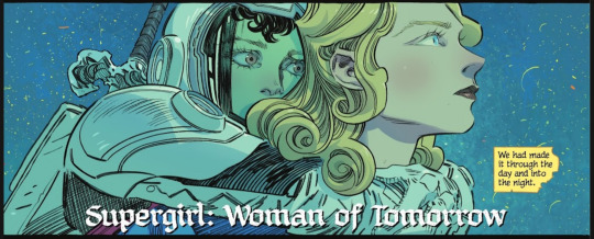
Quick context: Woman of Tomorrow is about a space farmgirl named Ruthye who seeks revenge on Krem, a guy who killed her dad. Supergirl guides her on this journey so they can learn lessons about grief and revenge.
The biggest flaw of the comic is the narrative prose. Ruthye's dialogue is a rambly, over-indulgent, stylized mix of an attempt at medieval Shakespearian speak, but then in the last few issues the writer remembers she's a farmgirl so he decides she should suddenly say "ain't" more often and speak in double negatives to sound a bit more Southern. I can enjoy wordy comics! But Ruthye's dialogue and narration is blatantly excessive purple prose. So many scenes would hit harder with a less-is-more approach while still being stylized and characteristic. Sometimes the narrations pairs nicely with the art to create layered irony, but most of the time it feels like it's disregarding the comics medium altogether.
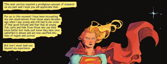
The other thing about Ruthye's narration is that it holds the story back. I get that the narration is Ruthye writing from the future, but the way it's done gives us a very passive relationship with the events of the story. We don't get to be with the characters in the action heavy moments because we're reading caption boxes of Future Ruthye rambling about poetry recounting The Battle of Capes. I'm not experiencing grief or dread with the characters, I'm being told about it. All of Ruthye's narrative rants boil down to "Supergirl is really badass, sad and kind. I promise this is deep." and "here's how my farm girl experience is relevant to this". Ruthye also speaks in glowing admiration, idealization and worship of Supergirl; it makes it really hard to get to know Kara in a humanizing way. I'm sure the purple prose hits differently for others, but I personally think the story would have more room to breathe without it.
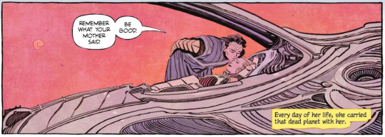
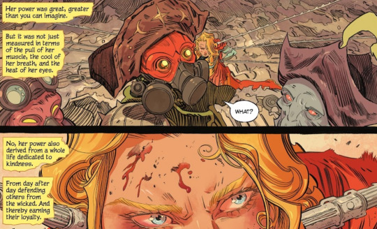
You know how people like saying "Superman is boring because everything is too easy for him, he's too powerful" yeah that's Woman of Tomorrow. The conflict Kara faces are not challenges to her character, they're inconveniences. The resolutions to each story don't feel clever or earned. Kara just knows where to find the murdered purple aliens, Kara just happens to have a silver age-reference magical horse that can outrun the suffering-ball Krem throws at her, Kara just toughs out 10 hours in the green sun. Why be a smart storyteller when you can just give your heroine the upper hand every single time? There could've been a great bonding moment where Ruthye uses her famer-smarts to build shade for Kara, she could've crafted a salve to protect Kara's skin. But I guess having her guard Kara from dinosaurs is ok. Kara helps of course, even though she's dying because she's so cool, badass, sad, kind, etc.
Kara's internal conflict is that she was hoping that taking Ruthye on this journey would teach the farmgirl a lesson about revenge, but has Kara herself learned to move on? She's still thinking about Krypton after all. The problem with how this is presented is that it's not a flaw that we get to see evolve with the story. We see Kara act mopey, get an origin story flashback and then Kara tells us this- in hopes it'll recontextualize everything you've read before. By the time we make it to the end, the characters act like they've learned so much and I'm just standing here wishing I got to see all this growth they're talking about.
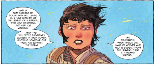
At the heart of it, I feel like Woman of Tomorrow represents the side of Super-fandom that wants to see the Kryptonians deified by the narrative. They hate seeing Kara do silly girly rom-com teenager things, she needs to be SERIOUS and EDGY and SAD and ALONE but like a god would be and not how a young woman would be that way. How else will boys take her seriously? Don't forget to remind the reader that she's STRONGER than her boy scout wholesome cousin! There's potential in a short revenge story about young girls finding hope in seeing a role-model woman survive loss, but not like this.
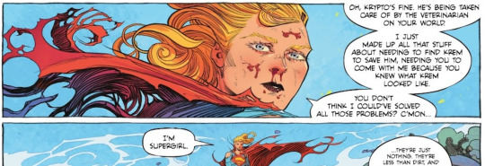
"You don't think I could've solved all those problems? C'mon I'm Supergirl." I sure love seeing female characters be badass girl-god legends who don't get to be humanized by being unflatteringly flawed people. Anyway the better Supergirl grief+revenge story is "Supergirl: Being Super". I don't think it's perfect because it misses the crucial difference between Kal and Kara among other things- but as a story about a teenage heroine learning how grief shapes her and those around her, it's way better.
Woman of Tomorrow's art is stellar though lmao would get a copy just as an artbook to reference.
#askjesncin#woman of tomorrow#jesncin dc meta#media criticism#there's a whole Ruthye rant where she talks about how superfam stories aren't pointless because they'll meet opponents stronger than them#and then the story proceeds to show supergirl defeating genocide pirates no biggie with help from horse#all she had to do was fight harder
53 notes
·
View notes
Note
Hiya! Hope this message finds u well :3 I absolutely love your art; found you from insta! Quick question also; I’m not sure if you’ve answered this before, but which brushes do you use for ur digital art? I love the textures they’re so crunchy (endearing)!! Have a lovely day!! :D
hello!! here's a little brush tour ft. this half rendered martin.
also, a great app for ipad artists who really want to dig into texture is art set 4. i swear by it and i've been using it for about two years. none of my more recent art uses it, but that's just because i'm experimenting with my process rn
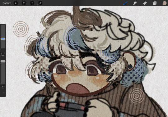
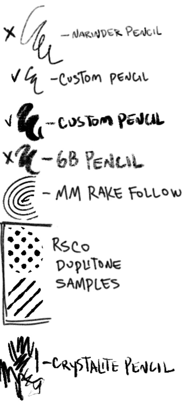
so here's a list of my most used brushes lately, and there will be links to all of them at the bottom of this post.
the two labeled "custom pencil" are both my own personal modified pencils (both sourced from the 6b pencil) but the narinder pencil and the vanilla 6b pencil are both very similar to them. i use these two for sketching and flat color specifically, and if you do specifically want these two brushes then i'd be happy to upload them somewhere for you to download, but they're not really necessary for texture
i also use G&B halftone brushes sometimes! but i greatly prefer the RSCO sample pack, and i cannot find the link to the G&B brushes no matter how hard i google, and pretty much any halftone brush set will do the same job
and here's what they look like in practice!
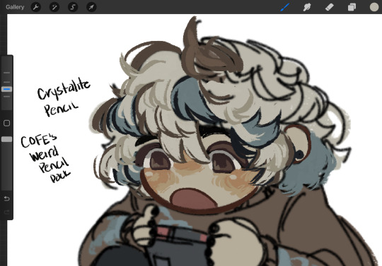
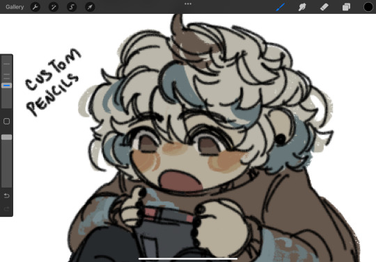
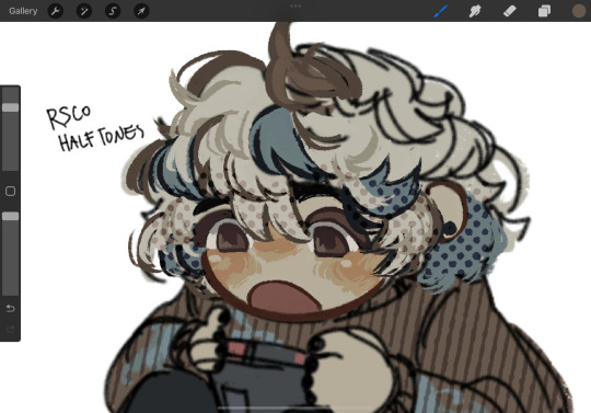
(i like to set these halftones to color burn. color burn is my most used blending mode, even for shading)
and then i hit "copy all," paste, and duplicate it. so you should have two layers of just your entire canvas. then import a paper texture
i'm partial to the set i'll link down below, my favorite is #5. you should absolutely check out the rest of the free texture packs on their website if you're wanting to diversify your texture process btw, all of their stuff is fantastic.
to use that texture, your layers should look like this!
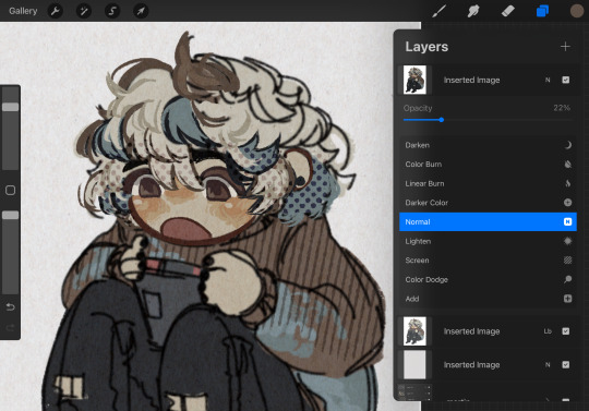
on the layer set to the linear burn, i also like to go into the adjustments menu and bump up the brightness until all of the colors are at similar values to what they were before. and the normal layer on top is just to control the intensity/opacity of the paper texture!
after all of that, sometimes i'll go in with brushes like MM rake follow, or more from COFE's weird pencils, on top of all of those layers for finishing touches.
definitely play around with it, try new free brushes all of the time (i heavily recommended subscribing to Manero. they have a lot of free stuff and it's all fantastic) and see what works for you <3
here are the links to the brushes in this post, as well as some extras! some of them are paid and some of them are completely free. + it wasn't mentioned here, but i use the tatyworks linen fabric brush for blending! for any of the paid brushes, i'll try to link some free alternatives
paid brushes:
alternatives to paid brushes:
free brushes:
extra goodies:
#procreate art#procreate brushes#art tutorial#artists on tumblr#digital art#digital artist#art recommendations#art resources
63 notes
·
View notes
Text

It's important to me that you all know that in my computer this is labeled as "divorce.png"
Tested out some different stylization with this one! I especially wanted to do a little studying on how Sage Cotugno does their lighting in TGS, so it's basically that but a little different. Some rambling about art and divorcees under the cut.
These two are so fucking funny to me, because their type of divorce vibe is SOOOOO specific. They feel like two divorced dads working out a custody calendar with their almost adult children. While they're arguing (meaning Fergus is arguing and Carrion is calmly messing with him for entertainment) Zach and Liam go "eh, I've been living with him longer anyways" and stay at their respective houses and Adrian and Daniel play rock paper scissors in the background to see who gets first dibs.
By god this took so motherfucking long. I'm still not entirely happy with it. That inconsistent light source is really frustrating, I had a clear idea of it in my head that I just couldn't get on the page properly, but I've also spent so long on this and sometimes you just gotta call it done. I don't really cel shade, so this was good practice at least. I definitely want to get way better at it. Especially because I love comics, and there's no way in hell I will survive if I try to do painterly shading in a comic. I also wanted to try to practice drawing clean images of characters actually interacting with each other physically, something I tend to fudge through the messiness of a sketch.
And for fun, some details:
I put both of their sigils in their respective upper corners. I did my best based on the narration, but this kind of design is not my forte, so hopefully I got it in the ballpark at least. I think they look pretty neat anyways
The background has those curtain outline things- that is intended to be a reference to the Chariot card! Chess has said that Fergus is essentially the Chariot in terms of plot relevance, so I wanted to include a little bit of that imagery. I was gonna try to put in some references to Temperance to represent Carrion (my best guess for what fits him, I don't know tarot beyond basic Google searches) but it was already pretty busy so I scrapped that.
#coffeepaintart#dandies in danger fanart#dandiesindanger#dandies in danger#carrion dandies in danger#dind#ttrpg podcast#ttrpg show#rpg podcast#rpg show#dnd podcast#dnd show#fergus derbyshire#fergus dandies in danger
17 notes
·
View notes