#table rows in html
Explore tagged Tumblr posts
Visit Tumblr Blog
Explore Tumblr blogs with no restrictions, modern design and the best experience.
Last Seen Tumblr Blogs


Fun Fact
When “GIF” was named word of the year in 2012, Oxford Dictionaries U.S.A. credited Tumblr for pushing the word.
Text
Responsive Sortable Table for HTML Websites
People watch website both from Laptop and Mobile. So, when a web developer creates Table, he or she should make it as responsive. Sometimes it is important to set different color for odd and even row that reader can read the table easily. This Code can make your Table Header sortable too.
#HTML#HTML website#CSS#CSS3#Different Color for Odd and Even Row#Even Row#Filter Table#Filterable Table#Hover on Table Row#Odd Row#Responsive#Responsive CSS Table#Responsive Table#Sortable Table#Table
2 notes
·
View notes
Text
Needle Lace Resources
This is a very long post, so I'm including a cut.
Tutorial-like Things, Others' Work
An overview of the stages of needle lace (specifically learning from Alençon, I believe. They link to a documentary type of video on Alençon lace): https://www.taixtile.com/needle-lace-first-steps/. This blog has links to other resources (one link is broken, if I recall correctly).
A very approachable first project, I think. From a lace maker who has done very cool illustrations with lace, Maggie Hensel-Brown: https://youtu.be/OLuRpJ96p4Q?si=gqBWqYxa755gFozr
This channel has videos of the stages of needle lace making. They specifically demonstrate Irish lace, I believe. But the stages are very similar to or the same as the stages in Alençon lace. https://youtu.be/dZVagIFCnLc?si=d8lRnPsmz5iTM0Z_
Pierre Fouché has a video about making dense filling stitches and even doing short rows to makes curves (something I tried but did not yet succeed at): https://youtu.be/DK5cMQND3b8?si=qySmT9yaoTcpsUV9 He also does really cool bobbin lace illustrations by constructing patterns in cell-like units.
An embroiderer tries needle lace in two videos. In one of them she tries different styles from different places: https://youtu.be/eTO7dA4oyl4?si=VInx35kql115bIIo https://www.youtube.com/watch?v=A9Wa6-Qf5xw
Example of a different style of needle lace. Unsure what it is exactly. Some sort of cut work or reticella, idk: https://youtube.com/shorts/7DFogWC3tDI?si=uju74sPFbRj3_wrn
Sampler directions: https://youtu.be/oDKBfjDYBnU?si=shQYvaT4kAZD7BgV
Again, a more geometric style of needle lace. I don’t know the particulars of this style (styles?), since I’ve mostly been looking into styles similar to Alençon because I’m aiming for more illustration-like lace. This channel has multiple videos demoing and explaining that process: https://youtu.be/gJd6mkrsUCQ?si=AfVIiwljHvfismrX https://www.youtube.com/watch?v=R6dk721UwW4
Not so much instructions but video of a very skilled lacemaker working on a project: https://youtu.be/01H2GdEXLrs?si=2suFHSG4Kwa6Yl2m
Another lacemaker's work on their blog. I don’t know if they do as much lace making as they do other needle arts https://www.robesdecoeur.com/blog/needlelace-my-work-so-far
A lacemaker's work... the site is older and kind of tricky to navigate. Like. there's no home button, as far as I can tell. Album of their work: https://www.lacemakerslace.oddquine.co.uk/album/index.html Home page, I think: https://www.lacemakerslace.oddquine.co.uk/
Useful/Interesting Things to Know
Alençon lace -- specific French style from the Alençon region, which has a history of point lace and a current institution dedicated to preserving the skills and producing lace. This is the style that I was looking at examples of to try and learn from.
Search terms like different styles of lace that I’m not qualified to talk about but you can look into and do research on: Battenburg, point de gaze (very very fine work, like gauze)… More to be added as I learn about them.
The terms "needle lace" and "point lace" are both used to refer to lace made with a needle. I'm unclear on if there are subtle distinctions between them or if it's simply a matter of location. But having versions of a search query for both terms should help find more results than just using one.
Encyclopedia of Needlework by Therese De Dillmont is an excellent resource to learn how to do different stitches. It seems these stitches mostly come from Irish lace, according to the book. HTML copy of book available on Project Gutenberg here: https://www.gutenberg.org/files/20776/20776-h/20776-h.htm I recommend using ctrl+f to search for "lace stitch" on the page. The end of each chapter in the HTML version seems to have a link to the Table of Contents that is at the end of the entire document. It has chapters for plenty of other needle arts, so it's a good resource all around.
If you want to find examples of needle lace, look on Wikimedia Commons! Using a variety of search terms will help you find more material for inspiration/observation than otherwise
If you want to design your own needle lace depicting objects, it might be worth looking at stained glass to see how larger shapes are broken up into smaller shapes that still feel complete.
You can use multiple colors! Let yourself use multiple colors, like stained glass!
Thoughts from the Learning Process So Far (some terminology used here, look them up so you know what the actual definitions are, but I’ll define what I mean by them)
Tacking vs Couching... I'm unsure about the actual definitions so I may be using them wrong here. In the videos I’ve seen tacking seems to be making a stitch that runs along the way the cordonnet will run. Couching seems to be just when the thread that secures the cordonnet comes up through the backing and goes down through the backing at the same point. With these definitions… Tacking went faster for me than doing couching, but it feels a lot less secure and precise for the form of lace I’m making. Unless I made the tacking stitches perpendicular to the cordonnet's path, the outline cord moved too much due to tension. If it's perpendicular and not a very short stitch, it might get in the way of your filling stitches or binding off stitches. Which might be fine, since you pull them out anyways. But it would also mean more holes in the backing, and at some point the holes are too close together and might tear the backing and pattern. I don't like that. Couching—much, MUCH more tedious for me because I’m not practiced at making the needle come up in exactly the right spot. but it feels more secure to me. The outline seems to be less affected by tension as you work. And I took some shortcuts for couching that helped. I don’t couch the doubled cord, instead I whip stitch back over the already-secured cord. I might make a post to demonstrate what I mean. It kind of messes with the shape/placement of my cordonnet, but for the sake of my impatience I’m willing to sacrifice the precise shape.
Backing material... To use fabric in backing like the instructions usually say, or not? Idk. For me, it’s hard to find the right hole for the couching stitches when I can't see my pattern from the back. It took a lot of trial and error until I got a feel for how to predict where my needle would come up. I don't like the way the poke-and-check method of stitching the cordonnet down tends to rip the pattern up (at least, with my easy-to-access materials. Probably better with better materials and more practice. Using my thumb to find approximately the right spot helped, but not enough). So I just used a sandwich of tape/paper/tape as my backing. If you're willing to fuss around with fabric in your backing, it might make it easier to remove the couching threads after you're done, and when I tried. The directions I've seen usually say to use a backing of doubled-up fabric, clay paper (I'm unsure what this is. might be a thicker paper than cardstock, or it might be paper made to contain clay particles. Probably more like the first option), and contact paper. My last attempt at making a backing used notebook paper (or other type of paper) with packaging tape on both sides to provide a smooth surface and structure. I think it worked fairly well, and I didn't have to figure out where to buy contact paper (or figure out exactly what contact paper was).
#lace making#fiber arts#needle lace#instructions#tutorials#information#resources#my post#i will make this cleaner/easier to read later
129 notes
·
View notes
Text
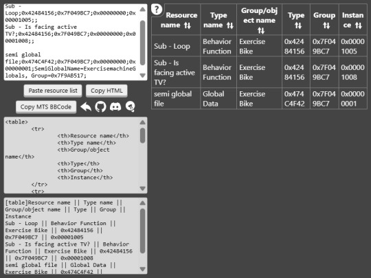
Resource List to Table Tool
I've just released a web tool for The Sims 2 modders that converts SimPe resource lists to HTML and Mod The Sims BBCode tables. The tool includes group and type names, and allows to sort the rows of the generated code.
It's intended to make preparing technical descriptions for mods easier. See an example of how it can be used.
The Sims 2 resource list to table (cosmatevs.github.io)
39 notes
·
View notes
Text
Day 6 [Forms In HTML]
Introduction To HTML
Day 2 [Multimedia Elements In HTML]
Day 3 [Table in HTML]
Day 4 [Link Tag In HTML]
Day 5 [Lists In HTML]
Forms are basically used for collecting user information. And they are really important to learn. Here's a simple form in HTML:
Code:


Line By Line Explanation:
<form>: Used for creating forms. All the form elements go in this tag. Action: When submitted, data is sent to this file or URL [index.html] Method="post": Sends data
<label> : This describes the input tag for="___": Connects the label to the input with id="name" id : gives a unique identification to the tag <input>: It's used to make the form elements
<input> Type Elements :
type="text" : A simple text box is created.
type="email" : A box to input email.
type="checkbox" : A small square that users can tick. Can select multiple options using this.
type="radio" : A small circle, you can only select one option.
type="submit" : A button that submits the data to the server.
<textarea>: Accepts multiple lines of text. rows="4": It creates 4 lines cols="30": It creates 30 characters
<select> : Creates a drop-down list <option>: Creates an item in the dropdown. value="colorname": This is the data sent to the server if chosen.
Output For The Code:

_______________________
Hope This Helps !!
#code#codeblr#css#html#javascript#python#studyblr#progblr#programming#comp sci#web design#web developers#web development#website design#webdev#website#tech#html css#learn to code#school#study motivation#study aesthetic#study blog#student#high school#studying#study tips#studyspo#website development#coding
41 notes
·
View notes
Text


April 8, 2025 • Tuesday
📚 30 days of productivity — COLLAB CHALLENGE WITH @studaxy @winryrockbellwannabe @nanthegirl and @larstudy — Day 16/30 📚
💛 Axy's study time: 5h 44min 💚 AJ's study time: 1h 💜 Nan's study time: 1h 30min 🩷 Lar's study time: 6h 30min👑 💙 Iris's study time: 4h
A sad sad truth has befallen us. I have more workload from uni, so I can't goof around with burger institute anymore T_T. Now I need to make a legit college website to submit to my prof lol. So here we have, Alfea University XD (yes I stole it from winx club).
The problems I ran into while making this:
I struggled to align the logo and the heading once again, but that got solved by putting them in a table and having the logo and the heading in the same row.
The navigation bar took a while to align, but I sorted that out.
THE PAGE WAS FRICKIN LARGER THAN THE SCREEN. Took a lot of stack overflow browsing to find out that if I add the attribute 'box-sizing: border-box' to the style of the body/html tag, that gets fixed :) It's basically aligning the content to stay within the size of the device that the site is being viewed in. Pretty cool stuff :)
🎧 Given-Taken - Enhypen

#dailyfoxposts#studyblr#studyspo#codeblr#study#compblr#coding#web dev#study motivation#collab challenge pt.4#30dop
14 notes
·
View notes
Text
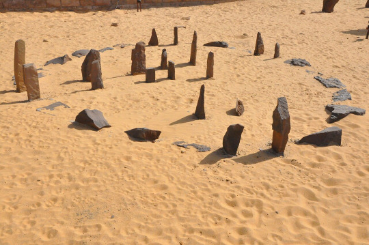
Megalithic Sites
A megalith is a huge stone that has been put to some type of purpose, typically between the Mesolithic through the chalcolithic period, fading out through the Bronze age. They can be single or multiple stones, though they are generally not tombs.
Single stones can come in three general types: Menhir, also know as 'standing stones', monolith (a single stone on its own), and capstones, which cover burial chambers without other supports. Multiple stones can come in five general types: Alignments which can be rows or spirals, megalithic or Cyclopean walls, which are rough-hewn bolder walls, stone circles or cromlechs like Stonehenge, dolmen which can be called a portal tomb and are table like entrances into tombs, and cist which is a stone coffin.

By German Archaeological Institute, photo E. Kücük. - Dietrich L, Meister J, Dietrich O, Notroff J, Kiep J, Heeb J, et al. (2019) Cereal processing at Early Neolithic Göbekli Tepe, southeastern Turkey. PLoS ONE 14(5): e0215214. https://doi.org/10.1371/journal.pone.0215214Image: https://journals.plos.org/plosone/article/figure?id=10.1371/journal.pone.0215214.g001"Copyright: © 2019 Dietrich et al. This is an open access article distributed under the terms of the Creative Commons Attribution License, which permits unrestricted use, distribution, and reproduction in any medium, provided the original author and source are credited." (links to CC BY 4.0 the day the picture is uploaded), CC BY 4.0, https://commons.wikimedia.org/w/index.php?curid=90543136
Humans began building large stone structures even before we began living in cities. Some of the earliest are around the area of Gobleki Tepe in modern day Turkey, which were built around 9000 BCE by a culture that we don't know what they call themselves and first rediscovered in 1963. It wasn't until about 1994 that the excavations began. These sites consist of many large stones that are decorated with male figures and animals. Because these sites predate writing, we don't know what the purpose was, but we can tell by what refuse is around that these sites were not for full-time shelter. Because of this, we believe that they held ceremonial significance. However, with less than 5% of the site excavated, we still have a lot to learn about this site, though we have learned so much already.

By Mahmut Bozarslan (VOA) - https://d33vxfhewnqf4z.cloudfront.net/a/tarihin-yeni-sifir-noktasi-karahantepe/7351113.html, Public Domain, https://commons.wikimedia.org/w/index.php?curid=145335567
Nearby, there is a site called Karahan Tepe that was discovered more recently that might be older, possibly dating as far back as 11000 BCE. It also includes area where the stone for the megaliths was quarried. It was first rediscovered in 1997. It hasn't been as excavated or studied as much as Gobekli Tepe, however it appears to have been intermittent in habitation, possibly following herds of grazing animals and availability of wild growing grasses such as barley and wheat.

By Hanay, CC BY-SA 3.0, https://commons.wikimedia.org/w/index.php?curid=15044109
Atlit Yam is a site one kilometer off-shore from modern day Atlit. At the time it was built, approximately 6900 BCE, during the last Ice Age, the location was on the shore. There is a large stone semicircle that would have been around a freshwater spring. This site also has what appear to be houses as well. Around 6300 BCE, Mount Etna appears to have a collapse of its eastern flank that likely led to 40m tsunami in the Mediterranean. There were piles of fish and other evidence of rapid evacuation of the site. Within the site, there is also a woman and child that appear to have had tuberculosis, the earliest known cases, as well as men who have inner ear damage that indicate that they probably dived to fish and that the water was likely cold. There is evidence that this was one of the earliest sedentary cultures with grain storage and what appear to be wells, before it was abandoned to the tsunami and sea-level rise of the end of the last Ice Age.
By Raymbetz - Own work, CC BY-SA 3.0, https://commons.wikimedia.org/w/index.php?curid=7525976
Another pre-agriculture seasonal megalithic habitation is Nabta Playa in modern day Egypt. While the location is now within the Sahara Desert, at the time, it was a rich savanna with a lake nearby. Archaeological findings suggest that people began camping there seasonally around 10000-9000 BCE. The megalithic structure was probably built around 7500 BCE, The megalithic site seems to be a "calendar circle", though there is some debate about that. Given that the exact alignment of the stars and seasons has shifted over the past 12000 years, it's difficult to know for sure which constellation the stones align to and which season, but they do seem to align with the bright stars in the constellation Orion. There are suggestions that the site was used as a ceremonial gathering site prior to the building of the stone circle based on the remains of cattle found in the location. It's believed, based on modern nomadic cultures, that cattle would have only been killed on important occasions.
Resources:
Milo Rossi (miniminuteman on YouTube and tiktok): Series on Archaeology of Southern Turkey Series regarding Netflix's Ancient Apocalypse
#megalith#megalithic sites#gobleki tepe#karahan tepe#nabata playa#atlits yam#prehistory civilizations#neolithic civilizations
3 notes
·
View notes
Text
Let's understand HTML

Cover these topics to complete your HTML journey.
HTML (HyperText Markup Language) is the standard language used to create web pages. Here's a comprehensive list of key topics in HTML:
1. Basics of HTML
Introduction to HTML
HTML Document Structure
HTML Tags and Elements
HTML Attributes
HTML Comments
HTML Doctype
2. HTML Text Formatting
Headings (<h1> to <h6>)
Paragraphs (<p>)
Line Breaks (<br>)
Horizontal Lines (<hr>)
Bold Text (<b>, <strong>)
Italic Text (<i>, <em>)
Underlined Text (<u>)
Superscript (<sup>) and Subscript (<sub>)
3. HTML Links
Hyperlinks (<a>)
Target Attribute
Creating Email Links
4. HTML Lists
Ordered Lists (<ol>)
Unordered Lists (<ul>)
Description Lists (<dl>)
Nesting Lists
5. HTML Tables
Table (<table>)
Table Rows (<tr>)
Table Data (<td>)
Table Headings (<th>)
Table Caption (<caption>)
Merging Cells (rowspan, colspan)
Table Borders and Styling
6. HTML Forms
Form (<form>)
Input Types (<input>)
Text Fields (<input type="text">)
Password Fields (<input type="password">)
Radio Buttons (<input type="radio">)
Checkboxes (<input type="checkbox">)
Drop-down Lists (<select>)
Textarea (<textarea>)
Buttons (<button>, <input type="submit">)
Labels (<label>)
Form Action and Method Attributes
7. HTML Media
Images (<img>)
Image Maps
Audio (<audio>)
Video (<video>)
Embedding Media (<embed>)
Object Element (<object>)
Iframes (<iframe>)
8. HTML Semantic Elements
Header (<header>)
Footer (<footer>)
Article (<article>)
Section (<section>)
Aside (<aside>)
Nav (<nav>)
Main (<main>)
Figure (<figure>), Figcaption (<figcaption>)
9. HTML5 New Elements
Canvas (<canvas>)
SVG (<svg>)
Data Attributes
Output Element (<output>)
Progress (<progress>)
Meter (<meter>)
Details (<details>)
Summary (<summary>)
10. HTML Graphics
Scalable Vector Graphics (SVG)
Canvas
Inline SVG
Path Element
11. HTML APIs
Geolocation API
Drag and Drop API
Web Storage API (localStorage and sessionStorage)
Web Workers
History API
12. HTML Entities
Character Entities
Symbol Entities
13. HTML Meta Information
Meta Tags (<meta>)
Setting Character Set (<meta charset="UTF-8">)
Responsive Web Design Meta Tag
SEO-related Meta Tags
14. HTML Best Practices
Accessibility (ARIA roles and attributes)
Semantic HTML
SEO (Search Engine Optimization) Basics
Mobile-Friendly HTML
15. HTML Integration with CSS and JavaScript
Linking CSS (<link>, <style>)
Adding JavaScript (<script>)
Inline CSS and JavaScript
External CSS and JavaScript Files
16. Advanced HTML Concepts
HTML Templates (<template>)
Custom Data Attributes (data-*)
HTML Imports (Deprecated in favor of JavaScript modules)
Web Components
These topics cover the breadth of HTML and will give you a strong foundation for web development.
Full course link for free: https://shorturl.at/igVyr
2 notes
·
View notes
Text
HTML 💻 30 Cheatsheet
New Post has been published on https://tuts.kandz.me/html-%f0%9f%92%bb-30-cheatsheet/
HTML 💻 30 Cheatsheet

youtube
Basic Structure ```html <!DOCTYPE html> <html lang="en"> <head> <meta charset="UTF-8"> <meta name="viewport" content="width=device-width, initial-scale=1.0"> <title>Page Title</title> <style> /* CSS styles */ </style> </head> <body> <!-- Content goes here --> </body> </html> ``` Headings ```html <h1>This is Heading 1</h1> <h2>This is Heading 2</h2> <h3>This is Heading 3</h3> <h4>This is Heading 4</h4> <h5>This is Heading 5</h5> <h6>This is Heading 6</h6> ``` Paragraphs and Text Formatting ```html <p>This is a <strong>bold</strong> paragraph.</p> <p>This is an <em>italic</em> paragraph.</p> <p>This is a <u>underlined</u> paragraph.</p> <p>This is a <mark>highlighted</mark> paragraph.</p> <p>This is a <ins>inserted</ins> paragraph.</p> <p>This is a <del>deleted</del> paragraph.</p> ``` Links ```html <a href="https://www.example.com" target="_blank">Visit Example.com</a> <a href="mailto:[email protected]">Contact Us</a> ``` Images ```html <img src="image.jpg" alt="Description of image"> <img src="image.jpg" alt="Image not found" width="300" height="200"> ``` Lists #### Unordered List (Bullet Points) ```html <ul> <li>Item 1</li> <li>Item 2</li> <li>Item 3</li> </ul> ``` #### Ordered List (Numbered) ```html <ol> <li>First item</li> <li>Second item</li> <li>Third item</li> </ol> ``` #### Description List ```html <dl> <dt>Term 1</dt> <dd>Description of term 1.</dd> <dt>Term 2</dt> <dd>Description of term 2.</dd> </dl> ``` Division and Span ```html <div>This is a division.</div> <p>This is a span within a paragraph <span style="color: red;">highlighted text</span>.</p> ``` Tables ```html <table border="1"> <tr> <th>Header 1</th> <th>Header 2</th> </tr> <tr> <td>Data 1</td> <td>Data 2</td> </tr> </table> ``` Forms ```html <form action="/submit" method="post"> <label for="name">Name:</label> <input type="text" id="name" name="name"><br><br> <label for="email">Email:</label> <input type="email" id="email" name="email"><br><br> <label for="password">Password:</label> <input type="password" id="password" name="password"><br><br> <textarea rows="4" cols="50" name="comment"></textarea><br><br> <label for="gender">Gender:</label> <input type="radio" id="male" name="gender" value="male"> <label for="male">Male</label> <input type="radio" id="female" name="gender" value="female"> <label for="female">Female</label><br><br> <label for="cars">Choose a car:</label> <select id="cars" name="cars"> <option value="volvo">Volvo</option> <option value="saab">Saab</option> <option value="mercedes">Mercedes</option> <option value="audi">Audi</option> </select><br><br> <input type="submit" value="Submit"> </form> ``` not enough space for the whole cheatsheet
0 notes
Text
8 CSS & JavaScript Snippets for Creating Sticky Elements — Speckyboy
New Post has been published on https://thedigitalinsider.com/8-css-javascript-snippets-for-creating-sticky-elements-speckyboy/
8 CSS & JavaScript Snippets for Creating Sticky Elements — Speckyboy
Modern websites often feature extensive scrolling. Long pages are common on desktop devices, but are even more frequent on mobile screens. The practice creates usability challenges for tasks like navigation and referencing important information.
That’s where “sticky” design elements come in handy. They allow users to scroll without losing access to your site’s menu. You can also use them to keep ads in view, attach social media sharing buttons to the viewport, or create fun special effects.
Implementing a sticky element can be simple, as CSS has a dedicated position property for this function. JavaScript can be used for building more robust features. As usual, there are several methods to achieve your goals.
We searched the CodePen archives to find interesting examples of sticky elements in use. Below, you’ll find various options that enhance the user experience. So, get stuck in your easy chair and be inspired by these code snippets!
Pure CSS Header Animation to Sticky Navigation
Created by Amit
Sticky headers are among the most popular use cases. On Chromium browsers, this snippet uses CSS to transform a tall and narrow header into a full-screen bar upon scrolling. Unsupported browsers receive a narrower, taller, sticky header. Keyframe animation is used to create smooth transitions. The feature is useful, lightweight, and attractive.
See the Pen Pure CSS header animation to sticky nav by Amit
Sticky Responsive Sidebar Navigation
Created by Areal Alien
Sidebar navigation can also take advantage of staying put during scrolling. Hovering over the sidebar expands the navigation to include text labels – it works on mobile too. However, you might also reserve this concept for large screens and use the traditional “hamburger” menu for mobile.
See the Pen Sticky responsive sidenav by Areal Alien
CSS Sticky Table Header & Column
Created by Mike Golus
Long HTML tables can be a pain to read. You have to memorize the column headers to understand the context. Sticky headers make even the busiest tables easier to read. Using position:sticky (and a few other tricks) on the first row and column enables scrolling without losing sight of key information. The examples in this Pen demonstrate how it’s done.
See the Pen CSS Sticky Table Header and Column by Mike Golus
Long Scroll Sticky Sections
Created by Burmese Potato
Here’s a unique way to denote the various sections of a long page. Scroll down the page, and the episode number (displayed in the left column) sticks until you reach the end of the section. The snippet combines sticky positioning with the calc() property on the container’s height to keep the number in view. This little bit of CSS adds a nice touch to the user experience.
See the Pen Pretty Sticky by Burmese Potato
Just Another Sticky Section Layout
Created by Misala
Sticky design elements can also be used to show off product features. Scroll down this page and watch as featured text and videos change. The layout occupies the entire screen viewport and is responsive for mobile devices. It’s a high-end feature sure to capture a user’s attention.
See the Pen just another sticky section layout by misala
Multi-Navigation Sticky Bars & Layout
Created by Den
This snippet asks the question: What if you have more than one navigation bar? The first bar is sticky by default. Scroll past a few sections, and a second sub-navigation bar lines up underneath. That second bar also features a neat frosted glass look as content scrolls underneath.
See the Pen Sticky layout + filters #2024 by Den
Sticky Video with CSS @container scroll-state()
Created by Jhey
We’re seeing more websites implement sticky videos, where the presentation sticks to the bottom corner upon scrolling. It allows users to view the rest of your content without losing sight of the video. Here, CSS container queries are used to reposition the video player. Use the included config panel to see how different settings impact the animation effects.
See the Pen CSS @container scroll-state() faux PiP video by Jhey
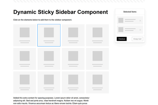
Dynamic Sticky Sidebar Component
Created by Ryan Mulligan
Features like shopping carts are a perfect fit for sticky sidebars. The UI makes it easier for shoppers to keep track of their cart and, most importantly, finish their purchase. This sidebar widget keeps track of cart contents and sticks to the screen while you scroll in the page content area.
See the Pen Dynamic Sticky Sidebar Component by Ryan Mulligan
Stick With What Works in Your Designs
We may think of sticky elements as being used for site headers and navigation. However, the examples above show that they can do much more. There are so many creative possibilities for informing and entertaining users.
What’s more, CSS can do a lot of the heavy lifting for you. Several snippets in this collection don’t require a single line of JavaScript. Still, it’s nice to know you can add some DOM manipulation when needed.
We hope this collection sparked your imagination! Check out our CodePen collection for even more sticky snippets.
Related Topics
Written by Eric Karkovack
Eric Karkovack is a web designer and WordPress expert with over two decades of experience. You can visit his business site here. He recently started a writing service for WordPress products: WP Product Writeup. He also has an opinion on just about every subject. You can follow his rants on Bluesky @karks.com.
Read more articles by Eric Karkovack
#2024#ADD#alien#amp#animation#Articles#attention#Building#Business#buttons#Capture#change#chromium#code#container#content#CSS#CSS Layout Snippets#CSS Snippets#Design#desktop#devices#easy#effects#Featured#Features#Filters#Full#glass#hamburger
0 notes
Text
Listenansichten in FileMaker optimieren/ PHP und FileMaker
Listenansichten in FileMaker optimieren Nach einigen Jahren und vielen 1000 Datensätzen die neu ins FileMaker-System gekommen sind, war es soweit. Eine spürbare Verschlechterung der Performance beim Aufbau einer extrem komplexen Listenansicht. Diese Ansicht enthält sehr viele Sortierungen, diverse bedingte Formatierungen zum Ein und Ausblenden von Symbolen, Farbgebung etc. Wenn jetzt noch jemand per VPN auf die Datenbank zugreifen wollte, so konnte es einige Zeit dauern bis die Arbeitsfähigkeit hergestellt war. Dabei wurde die Struktur schon ohne Formeln entwickelt. Die schnellste und effektivste Lösung. Alles wird über ein WebViewer abgewickelt. Betritt der User das Listen-Layout wird ein Serverscript gestartet, sammelt alle FileMaker Daten und überträgt diese dann an ein PHP-Script. Bruchteile später, steht die Liste schon zum arbeiten bereit. Da die Liste nur mit Java-Script arbeitet, sind alle Aktionen sehr schnell. Die Daten werden mithilfe eines FileMaker-Skripts vorbereitet und mit Insert from URL an eine PHP-Datei auf dem Server geschickt. Der Request erfolgt als klassischer application/x-www-form-urlencoded-POST-Aufruf. Der Server nimmt die Daten entgegen, bereinigt sie, zerlegt ggf. Pipe-getrennte Listen, und speichert sie in einem assoziativen Array zur weiteren Verarbeitung.
<?php // Daten säubern function cleanData($value) { return trim($value); } // Pipe-Werte aufspalten (z. B. '4711|4712|4713') function processPipeSeparatedValues($value) { return array_map('trim', explode('|', $value)); } // POST-Verarbeitung starten if ($_SERVER['REQUEST_METHOD'] === 'POST') { $postData = array_map('cleanData', $_POST); // Weiterverarbeitung folgt... } ?>
Auf der FileMaker-Seite wird der Post so aufbereitet Das PHP-Skript erzeugt eine strukturierte HTML-Tabelle, die über CSS und JavaScript erweitert wird. Sticky-Header, Hover-Effekte, Icons, Kartenintegration, alles dabei. Dank JavaScript lassen sich die Einträge mit einem Klick sortieren. Nach PLZ, Straße oder Kategorie. Auch Gruppierungen sind möglich, z. B. nach Stadtvierteln oder Bezirken, die dynamisch über Google Maps Geocoding ermittelt werden.
function sortByPLZ() { const table = document.querySelector("table"); const tbody = table.querySelector("tbody"); const rows = Array.from(tbody.querySelectorAll("tr")); // Entferne alte Gruppenköpfe document.querySelectorAll(".plz-header").forEach(row => row.remove()); // Sortiere Zeilen nach PLZ (Spalte 12, also index 12) rows.sort((a, b) => { const plzA = a.cells[12].textContent.trim(); const plzB = b.cells[12].textContent.trim(); return plzA.localeCompare(plzB, "de", { numeric: true }); }); // Neue Gruppierung einfügen let currentPLZ = ""; rows.forEach(row => { const plz = row.cells[12].textContent.trim(); if (plz !== currentPLZ) { currentPLZ = plz; const headerRow = document.createElement("tr"); headerRow.className = "plz-header"; const headerCell = document.createElement("td"); headerCell.colSpan = row.cells.length; headerCell.textContent = "PLZ: " + plz; headerRow.appendChild(headerCell); tbody.appendChild(headerRow); } tbody.appendChild(row); }); }
In dieser Ansicht wird unter anderem die Entfernung zu den nächsten Standorten ermittelt. Nach erfolgter Sortierung ist es sehr schnell möglich Aufträge zu verketten bei minimierter Fahrzeit. In dieser Ansicht aber nur berechnet über die Haversinsche Formel. Aber es ist ein extrem schneller Anhaltspunkt um Aufträge in Gruppen zusammenzufassen. Besonders charmant: Das ganze geht auch über die Google Maps API. Die Ansicht dann über Google Maps. Über das InfoWindows-Fenster lassen sich unendlich viele Informationen einblenden. In meinem Fall kann aus dieser Perspektive schon die Tourenzusammenstellung erfolgen. Es wird die Arbeitszeit ermittelt und kenntlich gemacht. Eine implementierte Fahrzeiten-Anzeige hat sich für Berliner-Verhältnisse als Unsinnig herausgestellt. Zu viele Verkehrsänderungen, zu viel Stau, in diesem Fall bedarf es der Erfahrung von Mitarbeitern und Disponenten. Wichtig, ist natürlich auch die Sequentielle-Suche. Diese kann natürlich wie schon einmal berichtet, auch in normalen FileMaker-Listen, Anwendung finden. Eine klassische FileMaker angelehnte Suche fehlt natürlich auch nicht. Hier lassen sich verschieden Kriterien verbinden und ermöglichen eine flexible Suche, ähnlich der klassischen FileMaker-Suche. Das ich im Regelfall innerhalb von FileMaker immer Arbeitslayouts nutze, die im Hintergrund bei -30000 Pixel arbeiten, kann ich aus dem WebViewer heraus, alle FileMaker Script nutzen, die im Vorfeld genutzt wurden. Sie bekommen die Parameter in einer etwas anderen Form, meist als Liste. Somit ist der Aufwand auf der FileMaker-Seite überschaubar. Fehlerbehandlung und Fallbacks Natürlich kann nicht immer alles glattlaufen, etwa wenn der Server nicht erreichbar ist oder die Daten aus FileMaker unvollständig übertragen werden. Für diesen Fall habe ich einen einfachen Mechanismus eingebaut. Wenn keine oder fehlerhafte Daten ankommen, zeigt das Skript entweder eine Hinweisbox oder einen minimalen Fallback-Inhalt an. Dabei ist es wichtig, am Anfang der Datei gleich zu prüfen, ob zentrale POST-Werte gesetzt wurden. Gerade bei VPN-Nutzern oder instabilen Mobilverbindungen ist das hilfreich, der Nutzer bekommt sofort Rückmeldung, statt auf eine leere Seite zu starren.
if (!isset($_POST['touren']) || empty($_POST['touren'])) { die("<div class='error'>Keine Daten empfangen. Bitte erneut versuchen.</div>"); }
Unterschied zwischen FileMaker-Client und Server Eine kleine, aber entscheidende Stolperfalle hat mich bei diesem Projekt einige Nerven gekostet. Während der gesamte Aufbau der Liste über den FileMaker Pro Client reibungslos funktionierte, lief das gleiche Script nicht mehr, wenn es über ein Server-Script (FileMaker Server) angestoßen wurde. Die WebViewer-Seite blieb leer. Kein Fehler, kein Hinweis, einfach nichts. Nach längerer Analyse stellte sich heraus, die Anzahl und Verschachtelungen der DOM-Elemente war der Grund. Im Client lief das Rendering noch sauber durch, aber der FileMaker Server scheint bei der Generierung und Übergabe des WebViewers, speziell in Kombination mit „Insert from URL“ -> WebViewer -> HTML-Rendering, empfindlicher zu reagieren. Besonders bei vielen verschachtelten div-Containern, Tabellen-Inlays und Icon-Ebenen war Schluss. Die Lösung war eher pragmatisch als elegant, ich habe den DOM deutlich verschlankt, viele dekorative Elemente entfernt oder durch schlankere Varianten ersetzt. Statt
mit drei Ebenen für Rahmen, Schatten und Hover, verwende ich jetzt.
<tr class="hover"> <td>4711</td> <td>Berlin</td> <td>…</td> </tr>
Und auch bei Zusatzinfos im InfoWindow der Google Maps Ansicht wurde auf alles Überflüssige verzichtet. Das Resultat, die Darstellung läuft jetzt reibungslos auch bei serverseitiger Übergabe, ohne dass der WebViewer hängen bleibt oder gar leer bleibt. Was bleibt nach dieser Umstellung? Ganz klar, die WebViewer-Lösung ist ein echter Gamechanger für große, komplexe Listenansichten in FileMaker. Die Performance ist kaum vergleichbar mit der klassischen Layoutdarstellung, besonders dann, wenn Sortierungen, Gruppierungen und visuelle Hilfsmittel wie Karten gebraucht werden. Eine HTML-Tabelle mit JavaScript schlägt hier jedes FileMaker-Layout um Längen.
0 notes
Note
I'm not sure about how Notion works, beyond what I have just read in this post. But I feel that the principles of this method could be adapted to other writing software. In my case, it could be adapted to Obsidian.
How I imagine that happening is that one creates a table within a note in Obsidian with the same columns as what is described, then simply create new notes that are linked to the names in the table. Obsidian also has the ability to allow for the rearranging of rows and columns as well as html support to customize the table as a whole.
Hello!! I hope you're having a good day ^^ I came across your post about writing non-linearly on Notion and I'm excited to try it out because the advice resonated with me! Though, I'm really new to using the app and, if possible, need help with how to do this part: 'where every scene is a separate table entry and the scene is written in the page inside that entry.' ;v;
Hello! Thank you so much for messaging!!! Since that post about writing non-linearly (linked for context) blew up roughly ten thousand times as much as anything I've ever posted, I've been kind of meaning to make a followup post explaining more about how I use Notion for writing non-linearly, but, you know, ADHD, so I haven't done it yet. XD In the meantime, I'll post a couple screenshots of my current long fic with some explanations! I'd make this post shorter, but I'm unable to not be Chatty. XD (just ask my poor readers how long my author notes are...) (There is a phone app as well which syncs with the desktop/browser versions, but I work predominantly in the desktop app so that's what I'm gonna be showing)
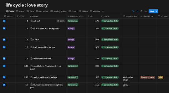
(the table keeps going off the right side of the image but it's a bunch of unimportant stuff tbh) So this is more complicated than what you'll probably start with because I'm Normal and add a bunch of details that you might not need depending on what you're doing. For example, my fic switches POVs so I have a column for tracking that, and my fic follows a canon timeline so I have a column for dates so I can keep track of them, and I also made columns for things like if a scene had spoilers or certain content readers may want to avoid, which they can access in my spoiler and content guide for the fic. (As I said, I'm Normal.) I also do some complicated stuff using Status and estimated wordcount stuff to get an idea of how long I predict the content to be, but again, not necessary. Anyway, you don't need any of that. For the purposes of this explanation, we're just gonna look at the columns I have called Name, Order, and Status. (And one called Part, but we'll get into that later) Columns in Notion have different types, such as Text, Numbers, Select, Date, etc, so make sure to use the type that works best for the purpose of each column! For example, here I'm using Select for Character POVs, Number for Order and WC (wordcount), and Text for the In-Game Date. Okay let's get into it! Name is a column that comes in a Notion table by default, and you can't get rid of it (which drives me up the wall for some purposes but works totally fine for what we're doing here). As you can see on the scene I've labeled 'roll call', if you hover over a Name entry, a little button called 'Open' appears, which you click on to open the document that's inside the table. That's all default, you don't have to set anything up for it. Here's a screenshot of what it looks like when I click the one titled 'I will be anything for you' (I've scrolled down in the screenshot so you can see the text, but all the data fields also appear at the top of the page)
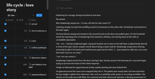
(This view is called 'side peek' meaning the document opens on one side and you can still see the table under it on the left, which is what mine defaults to. But you can set it to 'center peek' or 'full page' as well.) All my scenes have their own entry like this! Note that I've said scenes, not chapters. I decide the chapters later by combining the scenes in whatever combination feels right, which means I can often decide in advance where my chapter endings will be. This helps me consciously give most of my endings more impact than I was usually able to do when I tried to write linearly. So hopefully that gives you an idea of what I mean by writing inside the table and treating the table as a living outline. The 'Status' column is also pretty straightforward, and might require a little setup for whatever your needs are. This is another default column type Notion has which is similar to a Select but has a few more specialized features. This is how mine is set up:
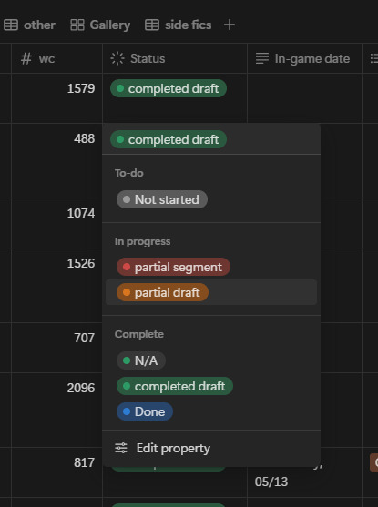
(I don't actually use 'Done', idk why I left it there. Probably I should replace it with 'Posted' and use that instead of the checkmark on the far left? whatever, don't let anyone tell you I'm organized. XDD)
Pretty straightforward, it just lets me see easily what's complete and what still needs work. (You'll notice there's no status for editing, because like I mentioned in my other post, I don't ever sit down to consciously edit, I just let it happen as I reread) Obviously tailor this to your own needs! The Order column is sneakily important, because this is what makes it easy for me to keep the scenes organized. I set the Sort on the table to use the Order to keep the scene ordered chronologically. When I make the initial list of scenes I know the fic will have, I give all of them a whole number to put them in order of events. Then as I write and come up with new scene ideas, the new scenes get a number with a decimal point to put them in the spot they fit in the timeline. (you can't see it here, but some of them have a decimal three or four digits deep, lol). Technically you can drag them to the correct spot manually, but if you ever create another View in your table (you can see I have eight Views in this one, they're right under the title) it won't keep your sorting in the new View and you'll hate yourself when it jumbles all your scenes. XD (And if you get more comfortable with Notion, you probably will at some point desire to make more Views) The Part column isn't necessary, but I found that as the fic grew longer, I was naturally separating the scenes into different points along the timeline by changes in status quo, etc. (ex. "this is before they go overseas" "this is after they speak for the first time", stuff like that) in my mind. To make it easier to decide where to place new scenes in the timeline, I formalized this into Parts, which initially I named with short summaries of the current status quo, and later changed to actual titles because I decided it would be cool to actually use them in the fic itself. Since it's not in the screenshots above, here's what the dropdown for it looks like:
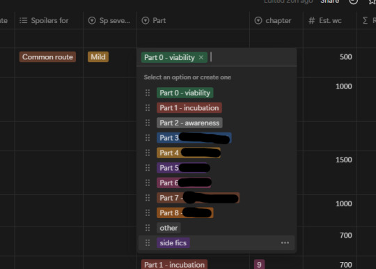
(I've blocked some of the titles out for spoiler reasons)
Basically I only mention the Parts thing because I found it was a useful organizational tool for me and I was naturally doing it in my head anyway. Anyway, I could keep talking about this for a really long time because I love Notion (don't get me started on how I use toggle blocks for hiding content I've edited out without deleting it) but that should be enough to get started and I should really, you know, not make this another insanely long post. XDD And if anybody is curious about how the final results look, the fic can be found here.
#writing#writing advice#fiction writing#fic writing#fanfic writing#fanfiction writing#writing resource#writing resources#writeblr#writers on tumblr#fanfic#fanfiction#fiction#fic
576 notes
·
View notes
Text
Day 3 [Table In HTML]
Day 1 [Introduction To HTML]
Day 2 [Multimedia Elements In HTML]

Line by line explanation:
Defines a table,
border : This attribute adds a simple border to the table.
style : Used to add some styling to the webpage. Can be used with any tag.
Border spacing: Adds space between table cells.
Text-align : Aligns the text in the table.
Contains the header section of the table.
Represents a table row
Represents a table column
Holds the body of the table → main data (menu items).
Used for individual data cells in the table.
<table> <thead> <tr> <th> Column Head 1 </th> <th> Column Head 2 </th> </tr> </thead> <tbody> <tr> <td> Row 1 Data = Column 1 </td> <td> Row 1 Data = Column 2 </td> </tr> </tbody> </table>
Final Output

------------------------------
Hope it helps :)
#code#codeblr#css#html#javascript#python#studyblr#progblr#programming#comp sci#web design#web developers#web development#website design#webdev#website#tech#html css#learn to code#school#study motivation#study aesthetic#study blog#student#high school#studying#study tips#studyspo#website development#coding
9 notes
·
View notes
Text
<style> .bit-html-export { width: 100%; background: #fff; font-family: Arial; color: black; font-size: 12px; } .bit-table { width: 100%; } .bit-table td { padding: 7px 10px; vertical-align: middle; } .bit-table a { color: #00b4b3; text-decoration: none; } /* alternate row background color */ .bit-table tr:nth-of-type(2n) { background: #eee; } /* separate line between rows */ /* .bit-table tr td { border-bottom: 1px solid #ccc } */ .bit-table .bit-cta { text-align: center; width: 25%; } </style> <div class="bit-html-export"> <table class="bit-table"> <tr> <td> <strong style="line-height: 1.2em;">WED, JUN 25</strong> <div> <a href=" https://www.bandsintown.com/e/106861154?affil_code=js_emailwidget_0011894978&app_id=js_emailwidget_0011894978&came_from=248&utm_campaign=rsvp&utm_medium=email&utm_source=artist_email& " target="_blank" style="color:inherit;"> Boise, ID </a> </div> </td> <td class="bit-cta"> <a href=" https://www.bandsintown.com/e/106861154?affil_code=js_emailwidget_0011894978&app_id=js_emailwidget_0011894978&came_from=248&utm_campaign=rsvp&utm_medium=email&utm_source=artist_email&trigger=rsvp_going " target="_blank">RSVP</a> </td> </tr> <tr> <td> <strong style="line-height: 1.2em;">TUE, JUL 8</strong> <div> <a href=" https://www.bandsintown.com/e/106861156?affil_code=js_emailwidget_0011894978&app_id=js_emailwidget_0011894978&came_from=248&utm_campaign=rsvp&utm_medium=email&utm_source=artist_email& " target="_blank" style="color:inherit;"> Chicago, IL </a> </div> </td> <td class="bit-cta"> <a href=" https://www.bandsintown.com/e/106861156?affil_code=js_emailwidget_0011894978&app_id=js_emailwidget_0011894978&came_from=248&utm_campaign=rsvp&utm_medium=email&utm_source=artist_email&trigger=rsvp_going " target="_blank">RSVP</a> </td> </tr> <tr> <td> <strong style="line-height: 1.2em;">WED, JUL 9</strong> <div> <a href=" https://www.bandsintown.com/e/106861162?affil_code=js_emailwidget_0011894978&app_id=js_emailwidget_0011894978&came_from=248&utm_campaign=rsvp&utm_medium=email&utm_source=artist_email& " target="_blank" style="color:inherit;"> Chicago, IL </a> </div> </td> <td class="bit-cta"> <a href=" https://www.bandsintown.com/e/106861162?affil_code=js_emailwidget_0011894978&app_id=js_emailwidget_0011894978&came_from=248&utm_campaign=rsvp&utm_medium=email&utm_source=artist_email&trigger=rsvp_going " target="_blank">RSVP</a> </td> </tr> <tr> <td> <strong style="line-height: 1.2em;">THU, JUL 10</strong> <div> <a href=" https://www.bandsintown.com/e/106861170?affil_code=js_emailwidget_0011894978&app_id=js_emailwidget_0011894978&came_from=248&utm_campaign=rsvp&utm_medium=email&utm_source=artist_email& " target="_blank" style="color:inherit;"> Davenport, IA </a> </div> </td> <td class="bit-cta"> <a href=" https://www.bandsintown.com/e/106861170?affil_code=js_emailwidget_0011894978&app_id=js_emailwidget_0011894978&came_from=248&utm_campaign=rsvp&utm_medium=email&utm_source=artist_email&trigger=rsvp_going " target="_blank">RSVP</a> </td> </tr> </table> <div style="text-align: right; margin: 6px 8px; font-size: 10px; padding-bottom: 6px;">
</div> <div class="bit-html-export">
0 notes
Text
<!DOCTYPE html>
<html lang="en">
<head>
<meta charset="UTF-8">
<title>Water Company Integration Table</title>
<style>
body { font-family: Arial, sans-serif; padding: 20px; background: #f4f4f4; }
textarea { width: 100%; height: 400px; margin-top: 20px; font-family: monospace; }
table { width: 100%; border-collapse: collapse; background: #fff; }
th, td { border: 1px solid #ccc; padding: 8px; text-align: left; }
th { background-color: #0077cc; color: #fff; }
</style>
</head>
<body>
<h1>Water Companies Integration Table</h1>
<table>
<tr>
<th>Company Name</th>
<th>Country</th>
<th>Type</th>
<th>Service Scope</th>
<th>Digital Contact</th>
<th>AI Control Potential</th>
<th>Remote Access</th>
<th>Integration Notes</th>
</tr>
<tr>
<td>Veolia Environnement</td>
<td>France</td>
<td>Private</td>
<td>Global</td>
<td><a href="https://www.veolia.com" target="_blank">veolia.com</a></td>
<td>High</td>
<td>Yes</td>
<td>Use Veolia AI OpenData API</td>
</tr>
<tr>
<td>Suez</td>
<td>France</td>
<td>Private</td>
<td>Global</td>
<td><a href="https://www.suez.com" target="_blank">suez.com</a></td>
<td>High</td>
<td>Yes</td>
<td>Integrate with Suez Smart Solutions</td>
</tr>
<tr>
<td>American Water Works</td>
<td>USA</td>
<td>Public</td>
<td>National</td>
<td><a href="https://www.amwater.com" target="_blank">amwater.com</a></td>
<td>Moderate</td>
<td>Partial</td>
<td>Monitor SCADA endpoints</td>
</tr>
<tr>
<td>Thames Water</td>
<td>UK</td>
<td>Private</td>
<td>Regional</td>
<td><a href="https://www.thameswater.co.uk" target="_blank">thameswater.co.uk</a></td>
<td>Moderate</td>
<td>Partial</td>
<td>Request Thames smart metering API</td>
</tr>
<!-- Add more rows as needed -->
</table>
<h2>Edit HTML Below</h2>
<textarea>
<!-- Paste this table HTML here for editing or transcription -->
</textarea>
</body>
</html>
1 note
·
View note
Text
HTML માં ટેબલ કેવી રીતે બનાવવું?

https://youtu.be/Yrut0-802ZM 🖥️ HTML માં ટેબલ કેવી રીતે બનાવવું? જો ���મે વેબપેજ પર ડેટા સ્વરૂપે ટેબલ બતાવવા માંગતા હો, તો HTML ટેબલ ખૂબ જ અસરકારક અને સરળ રીત છે. 📊 આજે આપણે જાણીશું HTML માં ટેબલ કેવી રીતે બનાવવું અને તેને કસ્ટમાઇઝ કેવી રીતે કરવું. 🚀 🟢 HTML ટેબલની બેઝિક સ્ટ્રક્ચર HTML Table Example
Simple HTML Table
Student Name Subject Marks Rahul Maths 85 Aisha Science 90 Krishna English 88 ✅ આ શું કરશે? - : ટેબલ બનાવે છે. - : ટેબલ રો (Row) બનાવે છે. - : ટેબલ હેડિંગ માટે. - : ટેબલ ડેટા સેલ માટે. 🎨 ટેબલને સ્ટાઇલિશ બનાવવી (CSS સાથે) ✅ આ શું કરશે? - ટેબલને સુંદર લુક આપશે. - Hover Effect અને Even Row Coloring ઉમેરશે. 🔥 ટેબલમાં colspan અને rowspan ઉમેરવું colspan: Combined Cell rowspan: Merged Row ✅ આ શું કરશે? - colspan: બે કે વધુ કોલમ્સને મર્જ કરવું. - rowspan: બે કે વધુ રોઝને મર્જ કરવું. ❗️ ટ્રબલશૂટિંગ ટિપ્સ: - Border Missing? border="1" નો ઉપયોગ કરો. - Spacing Issues? cellpadding અને cellspacing સેટ કરો. - Responsive Table? width: 100% CSS ઉમેરો. 🎥 ટેક્નોલોજી શીખવી હવે થઈ ગઇ વધુ સરળ! જો તમને આ માહિતી ઉપયોગી લાગી હોય, તો અમારા YouTube ચેનલને સબ્સ્ક્રાઇબ કરો અને વધુ HTML ટિપ્સ અને ટ્રિક્સ શીખતા રહો! 🔔😊 👉🏼 સબ્સ્ક્રાઇબ કરો અને વેબ ડેવલપમેન્ટમાં માસ્ટર બનો! આભાર! 🙌🏼 Read the full article
0 notes
Text
Top 3 Computer Courses After 12th

Here are top 3 computer courses worth taking after the 12th grade! Still confused about what to do after 12? Are you into the digital world and want to build a career in IT? TCCI-Tririd Computer Coaching Institute offers the best computer courses that have demand industries that are future proof. Let’s look at the Top 3 Computer Courses After 12 that can help kickstart your career!
1. Python Programming
Python is among the most popular and most accessible programming languages available in the world today: aspiring software devs, data analysts, or tomorrow's machine learning engineers - Python is just your thing! We cover everything, from the fundamentals of Python to advanced features, and teach real-life project implementation at TCCI.
Highlight:
Easy to learn syntax
Though it's a general-purpose programming language, it's most popularly used for web development, artificial intelligence, and automation.
High growth even if you change domains!
2. Web Designing (HTML, CSS, JavaScript)
Love to get your hands dirty with creative stuff? Web designing is ideal for you! It combines design and coding to construct visually attractive yet highly functional websites. TCCI's courses provide training in HTML5, CSS3, JavaScript, and Bootstrap to prepare you to be a freelance designer or begin your IT career.
Highlights:
A strong foundation for front-end development.
Freelancing and job opportunities.
Building responsive websites that suit mobile devices.
3. Advanced Excel & Data Analytics
Excel is more than just rows and columns; it constitutes great data-analyzing software. The advanced Excel training at TCCI covers complex data handling techniques, various dashboard setups, and visualization techniques using charts and formulas. Recommended for students planning to enter management, finance or analytics.
Highlights:
Essential for any office function and analysts.
Learn Pivot Tables, VLOOKUP, and Macros.
Value addition to any resume.
Conclusion:
Choosing the right course after the 12th will be responsible for your life ahead. Whether you belong to science, commerce, or arts, computer courses open a world of exciting careers. The TCCI-Tririd Computer Coaching Institute provides expert instruction, flexible timings, and hands-on practice. Don't delay - start shaping your tech future with TCCI today!
Location: Bopal & Iskon-Ambli Ahmedabad, Gujarat
Call now on +91 9825618292
Get information from: https://tccicomputercoaching.wordpress.com/
#computer courses in bopal Ahmedabad#Computer courses near Thaltej Ahmedabad#Computer Training near Shela & Shilaj Ahmedabad#TCCI - Tririd Computer Coaching Institute#Top 3 Computer Courses
0 notes