#visual communications in context 2
Explore tagged Tumblr posts
Visit Tumblr Blog
Explore Tumblr blogs with no restrictions, modern design and the best experience.
Last Seen Tumblr Blogs


Fun Fact
Tumblr was named as a finalist in Lead411’s New York City Hot 125 in Aug 2010.
Text

// Changing Theme and Coding \\
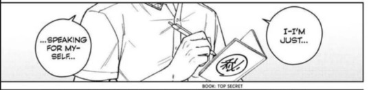
I decided to change the theme for my website for one that fit my design better. However, there was some differences like having an upload date and author name on each page, however, I was able to remove those once I researched how use CSS to remove those objects.
0 notes
Text
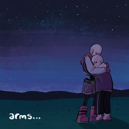
THIS IS HOME
@forgettable-au Fan-Animatic ⭐️
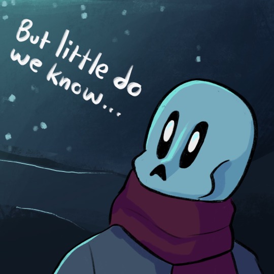
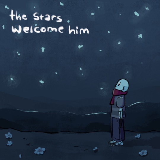
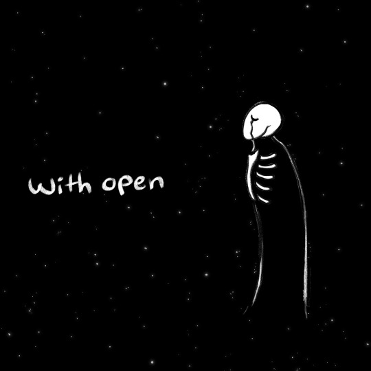
The stars welcome him with open arms…
Work and Progress + Analysis below!
You can find the work in progress things here! because I wanna show the sketch animatic and you can only upload one video…
The entire idea was inspired off of THIS lovely little qna written a bit ago! havnt forgotten about it since! Despite what the AU might have you believe And recently I decided I could just draw out the fun part instead of go through the pain of storyboarding and cleaning up a nearly 4 minute long song 👍👍👍
Thats the idea though, theres no real plot, so no real context I can give other than the things the comic itself already provides. “This Is Home” just works incredibly well for this poor childs trauma, and it was a great opportunity to practice my composition and storytelling!!
Onto the deep analysis of every frame individually!!! (this is normal. this happens every time.)
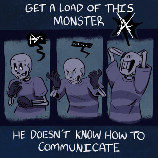
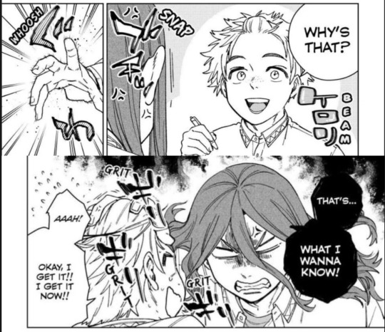
The idea that Wingdings just eventually- gave up. Trying to connect with anyone. HURTS ME DEEPLY. I’m not sure if thats specifically because he just couldn’t get the font thing down, but I imagine that was a big contributing factor. But thats what specifically stops him here. He eventually slams his keys down on the board and says “IM DONE” and throws himself into a thing he can purely enjoy on his own- science. Even at a young age, I feel he only had 2 lives. One with Sans, and one with science. Then when those worlds combined when he became the royal scientist uhhh- I imagine it got worse.
Speaking of his young age, In these shots he’s also notably a tad older than the later depictions of his younger self with the scarf. Less full of joy and whimsy
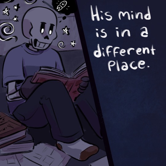
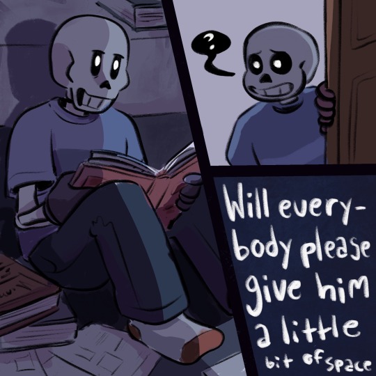
“His mind is in a different place” is taken a tad more negatively than in the context of the song I feel, as he’s more or less isolated himself from everyone (but Sans) now in this “giving up” phase of his childhood. I wonder how Sans noticed/took that and if he tried to convince him otherwise, but in this case he just thinks he needs some time to himself.
Also let it be known that the words being crammed in at the “Give him a little bit of space” bit is on PURPOSE and a SILLY LITTLE JOKE/VISUAL GAG GIVEN THE LINE. I AM SO FUNNY.
The colors are also notably dark blues, that get greyer when Wingdings has given up. The light that Sans lets in ((looks into the camera, tearing up)) is still pretty cold despite it being brighter.
The berating is also in uppercase to show most of this is from Wingdings’ pov- I know he speaks in proper casing at this time, but I NEED SOME SORT OF INDICATOR, WORK WITH ME HERE. His main issue was his own self consciousness and desire to communicate properly, since it was said before on the blog that no one really picked on him for his inability to talk to them.
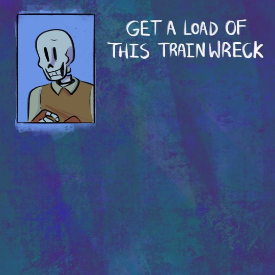

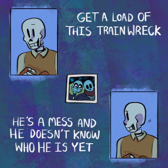
Then we have Papyrus!! The colors are similarly blue, but a lot brighter and a touch purpler and greener. Its from the same world, but not the same person. Also he’s wearing a yellow vest which is the complimentary color to blue ☝️
Papyrus is more heavily associated with warm colors in contrast to Wingdings, but this takes place very early on when he was very confused where his place was (or at least I assume thats what happened). He’s associating with warm colors (yellow) but is somewhat weary about it and still subconsciously clutching onto the comfort in familiarity.
The scene ofc depicts Papyrus being incredibly uncomfortable about any photos of himself as a child. It still definitely…looooks… like him. it just feels really wrong.
Similar thing to last time with the fonts as well, uppercase, Papyrus’ pov, he just wants to know who/WHAT he is.
I enjoy the colors in the photo and how they reallly stand out from the rest of the shot, just another emphasis that the photo feels otherworldly to Papyrus.
This is the part where I start weeping pitifully. The tiny Wingdings to Gaster comparison- it’s just so upsetting, I want to know what this poor child would think if he saw what he ends up as 😭
Wingdings enjoyed dreaming about the real stars he MIGHT get to see one day with Sans. The scene is dark, as it still hasnt happened yet, but still bright and hopeful as he stares up at the light! Its always a possibility. But then we have Gaster, who finally did it. He reached the stars, he gets to look up and say “wow…. I really did it”. Staring up at the void before him. Without Sans…I feel he wouldn’t ponder on it much, and consciously he doesn’t see anything bad about his circumstances, but the crack going down his eye that elludes to a tear says otherwise in the suppressed emotions.
The world Wingdings lived in when he was small, seemed so endless…Despite the underground being small compared to the real world, his imagination was endless. He could dream, he could imagine, and create things, get and give new ideas! But now as an adult that just so happens to be a lovecraftian entity, everything is much more simple and straightforward. At least from his perspective…Gaster may be able to DO way more than he ever could as a small child, but his mind is pretty one track at this point.

I wonder how Gaster feels…Now that they’ve gotten to the surface. without him
Im not sure how Papyrus in the game or even in the comic feels about stars, but Sans for one doesnt have to daydream anymore. They’ve also “done it” just like Gaster, but the hug insinuates less of that and more a “we WON”. They share in this moment together more emotionally than anything.
Again, compared to Gaster and them, they enjoy the moment in their own ways- Gaster just the action of seeing the stars, and Papyrus in what the moment itself means. I feel those are the 2 wants Wingdings had and thats a lot of what Papyrus and Gaster are. 2 halfs of Wingdings’…whole…thing
Also the stars welcoming him with open arms is both in reference to Sans but also Papyrus welcoming/accepting/loving himself…
IN CONCLUSION:
…yknow ive never asked before, but if anyone has any questions or needs clarification im happy to-
#forgettable au#papyrus#wingdings#gaster#sans#MY BOYS#brothers (sobs in a violent fit of rage)#this one was really fun to experiment with#and not be such a perfectionist#love when I can feel myself growing as an artist ✨#BUT THIS ACTION VS FEELINGS THING IS SO RRRAAAAAHHHHHHH#Me love when characters think their great achievements make up for their horrible actions#I wanna see an AU where Wingdings never did give up#how similar to Papyrus would he be#i say ‘I want an AU’ like this isnt already one#UGHHHH I WONDER SO MUCH ABOUT THIS AU#WHEN ITS FINISHED#*ITS SO OVER FOR ALL OF YOU*#IM GONNA COOK UP THE MOST DIABOLICAL CANON AMV THATS EVER AMV’D#I try not to overexplain as much in my yaps cause I wanna leave some up to interpretation#*but also I love talking about my silly arts cause i put way too much thought into it for my own good*#also theyre getting way harder to explain now that ive started prioritizing feelings instead of direct symbolism#BUT ITS GOOD PRACTICE FOR WRITING ANYWAY!!#(hyperfixation yap)#ANYWHO#Take my pain and go in peace…es…#:3
739 notes
·
View notes
Note
I've always been impressed by your ability to analyse media. Your understanding of characters, dynamics, themes have always blew me away, and it's even more impressive how you always find ways to communicate it so elegantly in your artworks. And being able to pick up on these complexities seems to have made engaging with media extra fulfilling for you.
I love seeing this kind of literary depth in fandoms, but I have the media literacy of a brick and have always had to rely on other people's analyses or takes to even begin understanding on that level. I was wondering if you know how you do it, or how anyone can learn to do it really.
btw thank you for always making such lovely art, hope you have a nice and fun year.
close reading is a skill, and like any skill it's something you can develop with effort!! the more you engage and think about a piece of work (and libraries of works) the more you'll get out of it
analysis at its core is inquiry and evaluation... when you're engaging the text ("text" here meaning the work itself whether it's literal text, artwork, movies, games, etc.) try breaking down ur thoughts:
what does the text want to say? -> what does the work want to accomplish? does it instill a narrative, a message, a feeling? teach a lesson? does it ask you a question? does it set up and fulfill or subvert expectations?
how does the text say it? -> what literary/visual techniques did the creator use to convey #1? what were you told versus what were you shown? what was implied vs explicated? does the work favor certain types of techniques or recurring motifs? are they aligned with specific characters or moments or themes?
how did you receive it? -> did the text succeed in conveying #1 via #2 to you? did it hit the mark, and to what degree? if it didn't: why not? if there's disparity between what the text seems to want to say and what you got from it--why and how?
there's so much more to analysis (e.g., for example, applying this framework to a text in context to history, or current events, or the genre; accounting for bias, on the part of the author or the reader; etc. etc.), but as a basic framework this might help to think about the text in large scale (the work as a whole) and then narrow it down (breakdown an arc in the story--a specific character's story--an individual moment in the story--etc).
i also think it's important to sit with a text and formulate ur own initial thoughts on it first before looking for other people's opinions! then you can read others' analysis too to see where it aligns or diverts from yours, what you agree or disagree with, what takeaways might change or enhance your own reading of the text. and then you can get RIGHTEOUSLY indignant when they dont understand ur blorbo the way you do
sorry for textwall HAHA but the more you practice close reading, the easier it gets to identify tropes and literary & artistic devices, and as your mental catalog expands, i think it'll become more fun to identify, compare and contrast what works/stories really resonate for you...! it's wonderful as a creator too, because you can reverse engineer that framework when you're telling your own stories ✨
183 notes
·
View notes
Text
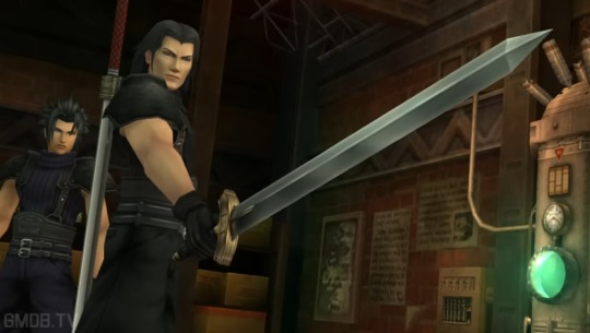
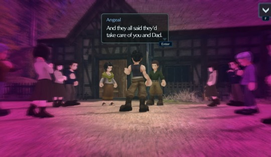
Nobody is talking about how Angeal and Sephiroth are exact opposites in EC and it's making me unwell so I'm gonna dump it.
Have some pictures of their 2D renders for fun

Prepare yourself, this rant is a little long (but don't worry there's visual aids)
There's more obvious tells out there, like their body language and overall postures, Angeal is generally more open and Sephiroth is generally more guarded.
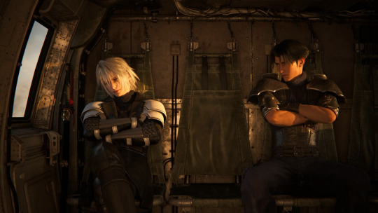
However, notably, this carries into how they hold their weapons throughout all of their appearances, even in Crisis Core
Fair warning, my source is multiple Google articles so prepare for some inaccuracy and uncertainty. Feel free to correct me.
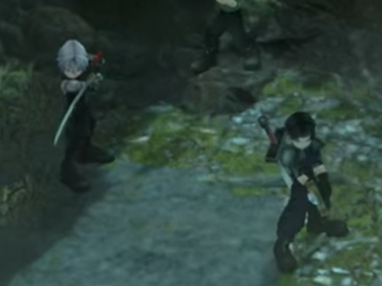
Sephiroth carries his sword in an ox guard, which has the purpose of intimidating your opponent while also having the sword protect your vital organs.
Angeal's sword is held in a plow guard, which operates a bit like a fool's guard (I actually thought it was one at first), making yourself look more open to attacks to Provoke an enemy into coming in. Unlike the fools guard, the plow guard gives you a quicker maneuverability to strike first once the opponent comes in.
This is really important for their fighting styles, as Sephiroth is quick and deadly, meanwhile Angeal (i think the game refers to his character type as a Provoke Tank) always stands somewhat in front of Seohiroth and tries to draw in hits, acting as a shield. They have the sword and shield dynamic
BUT ITS ALSO RELEVANT TO THEIR PERSONALITIES you see Sephiroth acts cold and bitter, trying to keep people at arm's length, especially raw after EC Part 1 where he and his past friends had a Not Great Time (I won't give the recap sorry it'll take too long and I'm laser focused rn). Anyways, Sephiroth, much like his stance, tries to intimidate people into staying back. He will not let himself look vulnerable to attacks.
Meanwhile, Angeal is more open and friendly, taking Sephiroth's briskness and impoliteness in stride. He's open and welcoming even when Sephiroth's defense is his offense.
They're also both well trained with swords, so they can probably infer a lot about each other's personalities through how they hold their blade. Angeal seeing Sephiroth as someone who is guarded and closed off, avoiding getting hurt by being the first to lash out. Sephiroth views Angeal as being too open and vulnerable, and may even have a presumption that, like his fool's guard, Angeal is baiting Sephiroth into getting close enough that he can attack him the second he's open. It's good shit.
Next up: the weird purple-vignetted dreams they get in EC
So there's some spooky shenanigans going on in this story. I have my own predictions as to what's going on, but for future's sake, at the time of writing this is am only 2 chapters in. I'll try to be more direct to context and then provide my future game predictions at the end. Cool? Cool.

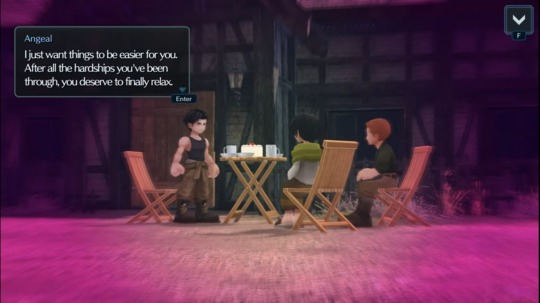
So we know based on canon that Sephiroth's dream isn't a memory, or an event or anything like that. So by process of elimination, Angeal's is the same way. Plus
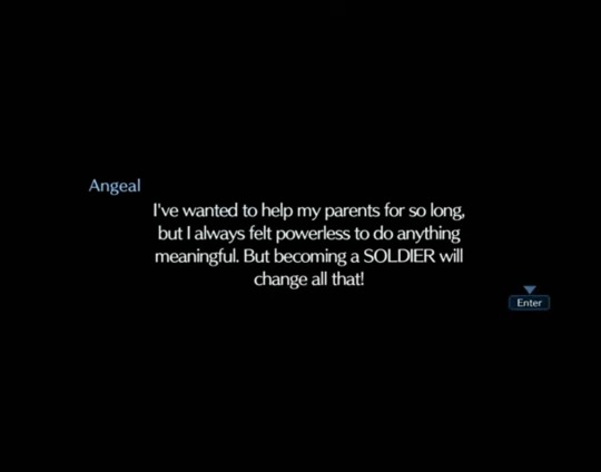
Little confirmation here that Angeal always felt unable to care for his parents, which hurts me so bad btw. Anyways, analysis time.
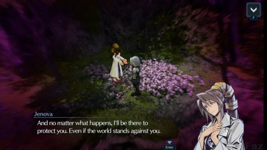
Sephiroth fantasizes about being cared for and reassured. He wants to know what it's like for someone to love him unconditionally, he cannot even imagine the possibility. This dream shows him exactly that, his mother making him food and telling him she's always been there for him and they've always has this. In the dream, he believes it although is confused by conflicting memories. She's momentarily able to convince him that he is cared for and loved by her. In reality, he's never met his mother (her name isn't Jenova either, but that's a story for another day).
Angeal fantasizes about being to care for others. He wants to help his village, create a strong community, care for his parents and make it so they do not have to work so hard. He wants everyone to feel safe, secure, and rested and he is willing to carry all of the work on his shoulders to the best of his ability. His dream shows him doing exactly that, which based on the falsehood of Sephiroth's dream, means it's a false memory and he never was able to care for his parents for whatever reason. Really hopeful the game will tell us soon. Maybe he did try but it wasn't enough. Maybe he was weak because they didn't have enough food. Who knows.
Also, for context, Tetsuya Nomura (FF7 director) did confirm that Angeal's father has a chronic illness and died shortly after Angeal joined SOLDIER, after having worked himself to death. So Angeal dreaming of these memories of helping his dad to support his grateful but guilty mother is likely very much influenced by a sense of grief or guilt.
Then in the next chapter, these dreams happen again.
The Banorans obviously either did not make this promise or did not act on it, seeing the state Angeal's family is in in Crisis Core, his dad having worked himself to death when he was a young recruit and his mother being in a very grief-stricken and detached state.
So this plays into how they view the world. Sephiroth longs for someone to protect him from the world he's observed to be cruel and cold. He mentions this in dialogue talking about how they world views anything different as a monster. Even SOLDIERs to which Angeal promises himself that he'll help Sephiroth see that people are not all like that.
Sephiroth is jaded and distant to protect himself, as he thinks the world will turn on him in a moment's notice. Angeal, however, holds an optimistic worldview. He believes people want to help each other and everyone wants to help each other to the best of their ability.
So they're very much opposites, but they're also exactly what each other needs. Angeal needs to feel needed and helpful, protecting people who trust and depend on him. He is friends with every SOLDIER, able to recognize them at a first glance (ironically he does not do this for Alissa but I may wait to share my theories about her). Sephiroth is guarded but secretly longs to be cared for. See where I'm going with this?
So based on how these dreams are going, they're definitely being influenced by some kind of force or another. Personally I think it's Jenova itself, as Jenova has the power to do this and to transform things into projections of loved ones in order to garner their trust (much like Kadaj does in The Kids are Alright). My prediction for where the climax of this story is gonna go is that Angeal is going to have to protect Sephiroth from these visions, and Sephiroth learns that unconditional love can come from friendship and camaraderie, not just maternity. It's gonna be great. I have entire scenes mapped out in my head about this.
They're a sword and shield, Sephiroth being quick to strike and Angeal always being there to defend. It's one of my favorite dynamics ever. Their appearances also contrast, most notably in their hair color.
They both have a resigned acceptance about the implausibility of their fantasies. Sephiroth does not have a mother to care for him, and Angeal cannot save everyone. The foil of their dynamic is so magnetic it hurts. I will scream if I see Angeal make pumpkin soup for Sephiroth in the future.
My rants getting distracted so I'll cut it off here. Merry Crisis
#ff7#final fantasy 7#ff7 crisis core#ff7 ever crisis#ever crisis sephiroth#ever crisis angeal#miniroth#angeal hewley#sephiroth#is this enough tags yet?#me when i spot a narrative foil#theres so much more i can say about the sound design and shit#but im going solely off of screenshots i saved in my phone last night when i bore witness to the story
228 notes
·
View notes
Text
So... what exactly are executive functioning supports...?
Planners, checklists, and reminders are definitely executive function supports, but they aren't the only things that are available. ...so, I've made a list of some examples. A thread (🧵)
Executive functioning includes so much, so executive function supports can be SO MANY things. Executive functions include decision making, working memory, task initiation, planning, prioritizing, many forms of self-regulation, and more.
So let's talk in broad categories
Category 1: Decisionmaking
Avoiding a decision altogether,
Choosing randomly,
Reducing the number of options to decide between,
Always doing the same decision (such as having a uniform for yourself),
Outsourcing decisions,
Having outside structure/expectations
Category 2: Working memory
Keeping things visible,
Reminders,
Collaborators who gently remind you of things,
Writing it down (i.e., notebooks, post-its, to-do lists, etc.),
External structure such as lunch hours,
Understanding why and how working memory fails
Category 3: Information processing
Avoiding weak processing areas (eg. reading for dyslexics like me)
Have information in multiple forms,
Make information processing context relevant,
Reduce incoming information or competing demands
Category 4: Task Management
Body doubling,
Transition time,
To-do lists,
Breaking tasks down (including people to help with that),
External structure for identify the next step,
clear, explicit instructions,
Schedules, planners, itineraries.
Category 5: Organization
Mind maps,
Labels,
Notetaking templates,
Physical organizers,
Organizing methods (Kondo, Only 4 Things, etc.),
House cleaners, professional organizer, etc.
Clear bins,
An ability to toggle visibility
Category 6: Cognitive Flexibility
Transition time,
Pre-change warnings,
External support for identifying and reminding the new direction,
Context-based exemplars of similar change,
Visual schedules,
Reminders of when structure will start again
I've listed a lot of things here, but there are just so, so, so many more options.
Executive function supports can be ways that we think or approach situations (internal) or structures imposed on us by others (external). They can be physical tools that we can touch and interact with (tangible) or completely abstract ideas or approaches (intangible)
The big takeaways are that executive function supports can be any tool, structure, or communication that supports any of our executive functions.
Executive functioning struggles are core to the ADHD and autistic experiences (and secondary to other ND conditions). This means executive functioning takes a lot of energy for ADHD and/or autistic people, and the more support we have the more energy we can use for other things
So, yeah, planners, checklists, and reminders are definitely executive function supports, but so is a highschool bell schedule, hobby-related groups, professional services, and colleagues (consensually) harassing you to remember to send that email.
There are a lot of options!
#adhd#executive function#executive functioning#coping#coping strategies#autism#task initiation#decision paralysis#actually autistic#neurodivergent#mental health#executive dysfunction
2K notes
·
View notes
Text
I think, not everyone, but a lot of the people who are so hung up on the kiss aren’t thinking about it within the context of the narrative.
I probably won’t articulate this well, but the whole plot of season 2 felt like a direct, meta-y response to us, the fans, and our desire see Aziraphale and Crowley’s relationship progress to something more.
Neil had established in the first season, they are already in love, so what is it really then that we want see? What is it that’s missing? That leaves us feeling unsatisfied?
What does love mean to you? What would it mean to Aziraphale and Crowley? What does a loving relationship look like, and how does one get there?
The methods Crowley and Aziraphale use to get Maggie and Nina together are common romance tropes in fiction. Crowley says “one fabulous kiss and we’re good!”
But rainstorms and dancing didn’t make Maggie and Nina fall in love. They were going to get there on their own, eventually, after a lot of open communication and working on their own personal growth.
And “one fabulous kiss” won’t give us a happy ending. It won’t give us what we’re missing from Aziraphale’s and Crowley’s relationship. We as fans like to think that’s all we want, but is it really? Because the love is there! What we’re truly missing has more to do with internal growth and healing, communication, and working towards a true understanding of each other.
And I think that’s what we’ll get in season 3! I don’t know if we’ll get another kiss although I would love to see one but we will get a satisfactory resolution between two beings who are deeply in love.
As a side note, I don’t want to down play how fucking important it was to have them kiss on screen. As someone who has grown up watching queer coded relationships on screen and is exhausted from having everyone involved queerbait, or even outright ridicule their fans for seeing it that way, it is so refreshing to have a very visual, undeniable, romantic gesture. Because I know it really does take a kiss for some people *cough* my parents *cough* to see a relationship as anything but platonic. I’m so glad we got that undeniable validation before what I can only expect is going to be an epic third chapter!
#good omens#go 2#good omens 2#good omens season 2#ineffable husbands#aziraphale x crowley#crowley x arizaphale#neil gaiman#crowley#aziraphale#good omens fanfiction#good omens analysis#good omens kiss
2K notes
·
View notes
Text
house md rewatch: 1x20, "love hurts"

chase being a Confirmed Freak* is, somehow, not the most interesting moment of this episode
*good for him! not his fault that the rest of PPTH is boring lol.
i love how you can see the way house's expression changes just before he self-sabotages like wild - the moment of decision to (attempt) to read cameron for filth would be hilarious if it wasn't so tragic. so overall, i really enjoy this episode. jennifer morrison is so powerful in scenes where cameron's world view/morals are challenged, and this is one of the strongest of those moments. and all of this combined with a dominatrix subplot, the ethics of which bleed into the rest of the characters? slay.
despite everyone dogging on chase for being into kink, i'd argue that this episode is lowkey pretty sex-positive (in a 2000s tv sort of way. i'll always apologize for that context lol). i like how 1x20 offers the patient, harvey, and his dominatrix, annette, and the clinic patients, an elderly couple struggling to negotiate the frequency of sex in their AFFAIR, as 2 sides in a sexuality spectrum. crazy different situations and perspectives, but both advocate for clear communication and consent and an understanding of one another's boundaries. and once it's revealed that harvey and annette's asphyxiation ritual is to blame for some of his health problems, they give it up.
so it's fascinating when annette is introduces the central theme of the episode: control. she says that harvey enjoys being safely asphyxiated because he can "feel in control by being controlled." in a character arc fraught with competing attempts to control the terms and outcome of their burgeoning relationship, neither house or cameron feel this way. house seems to realize this when he leaves the conversation with cuddy, the hospital lawyer, and annette once it's determined that she's not hurting harvey:

annette describes a perfectly equal relationship in terms of power dynamics, despite what it seems like to outside eyes - harvey has as much agency as she does. since neither house nor cameron feel comfortable rescinding any control, 1x20 implies pretty early that the date that's haunting the background of this episode will not work out.
paradoxically, however, foreman's quick preview into one of the show's writ large strongest themes undercuts this episode-specific argument. when chase is describing the more private, scandalous parts of his sexual history, foreman says that, "why would you want to be with in a relationship with someone that's so obviously only gonna lead to pain?"

that's it, foreman. that's the show. vulnerability and control and meeting halfway and every other piece of a successful relationship will never exist without pain, no matter how badly characters like house try to resist this.
cameron's expression during this conversation is hilarious because, whether she's just realizing it or has known subconsciously for a while, she's about to do exactly what foreman decries:

in my notes, next to the "to feel in control by being controlled," i wrote why #hameron doesn't work. i think she may have an inkling of that here, or at least feel a little targeted by some cosmic irony.
i'm actually gonna outsource some observations about cameron and her relationship dynamics to my resident fellow-expert @all-pacas in this link here. it's a really good breakdown of how the original house/cameron arc leads into her later development with chase, growth within romantic relationships, and how she leaves house in the dust in terms of Growth. regarding the date itself in 1x20, however, i'll add this:
the massive flower vase isn't emphasized in the early shots of them at the restaurant, but when things go south because house gets tired of being read for filth by cameron and lashes out, it divides the frame in half almost perfectly.


even cameron's corsage implies distance; by conflating her visually with the flowers, it acts as another component of house's failure to bond. he meant well by the gesture (it's so cute and would have worked on me lol), he ruins it by self-sabotaging. his body language is closed off, too, with his menu off the table and his feet crossed. cameron, meanwhile, extends both her arms and foot toward him. i truly cannot imagine how the rest of this night panned out lol.
additionally, in his attempts to scare her off, he completely misses the mark. he says that she thinks he's a charity case, and that "but what i am is what you need: damaged." nope. she does, in fact, like you. we've been through some of her messed up reverence issues, how she thinks she should thank house like he's some deity, and how love is a moral obligation to cameron, but that doesn't discount the fact that she does want to be there. he's such a jerk smh.
also, this is a misdiagnosis, and applies in later seasons to another character who is attracted to the shine of someone's needi---
finally, i am qualifying this as Wilson's Compulsive Heterosexuality Ground Zero. my entire viewing experience is informed by my reading that wilson likes men in a schroedinger's closet sort of situation. if he doesn't know the closet exists, can he really be trapped inside it? and if that seems wildly out of left field to you, i am dedicated to convincing more people of the merit of this perspective throughout my rewatch, so please stick around! i even try to differentiate this from strictly hilson posting, the caveat being that house is the only man (for a while) with whom he has any close relationship.
superficially, and much like how chase and foreman treat house and cameron's date, it's a huge, silly spectacle to wilson. when he squeezes it out of house at the beginning of the episode, he's comically elated. we can safely lump him in as another Guy Friend who's teasing his emotionally stunted buddy about taking out a much younger woman.
he undoes this, however, after making a surprise appearance (seriously where have you been lol) to cameron much later in the episode. he appeals to her about the upcoming date, friendly at first.

with 1x19 in mind and wilson's warnings to house that if he doesn't drop the pushing-people-away problem, that he'll wind up alone, it follows that he'd warn cameron about how house is most likely going to hurt her feelings, right...?

no, that would be too simple. abruptly, wilson seems really unhappy with this arrangement, and not because it's breaking a dozen HR policies (chase and foreman are right to be worried lol). he tells cameron that she needs to conduct herself well around house because, if he gets hurt again, he might close himself off for good. noble though wilson's intentions might be toward house, this is an unkind thing for wilson to do, imo. he's investing himself in the situation despite house actively keeping him out of it; he's giving his 2 cents when no one asked; he's attempting to control the situation.
and much like how formulaic annette and harvey's arrangement was, that's how wilson views the date's proceedings. the scene immediately following this one is wilson coaching house on how to act, with a nod to sleeping with cameron at the end - the infamous "panty-peeler" comment...

this is an event to be orchestrated, to be observed from a distance, toward which to give unsolicited advice and feedback. wilson runs through the laundry list of topics to bring up - cameron's shoes, her earrings, her DHA (dreams, hopes, and aspirations) - with the express goal of sex at the end. despite asserting to cameron that this date means a lot to house by way of threatening her, wilson won't conceptualize of anything beyond the superficial. he's the persona guy, after all.
wilson's involvement means more to him than the date does; his ability to influence, live vicariously, control his friend and be protective, is written all over his face here:

along with some real kindness because he does want house to find happiness. we haven't seen what happens when they fall out of sync yet though. they can't handle it lol.
this is all pretty subtle - i know i'm reaching a bit - but just think about where house/wilson/cuddy goes in the future seasons. they're both obsessed with orchestrating sexually-charged scenarios to embarrass the other toward the woman who holds power over them both, the difference being that house has genuine feelings for cuddy, while wilson...? it's all about Living Vicariously, without even knowing that he's doing it.
furthermore, it's certainly a 2000s gay joke atp that wilson is so obsessed with shoes. this is at least the 3rd time he's made a comment about them - the time house noticed that he looked pretty at work; the interviewee from 1x19 that was wearing prada shoes, according to wilson; and now this, when he's so certain that women will respond well to compliments about their footwear. clever way of using said gay joke to make the point that he is forcibly superficial in his romantic dealings.
and what did i say in the last recap about inverted visual dynamics/posturing between house and wilson? wilson is seated, looking up at house, talking about/analyzing him, dominating the conversation:


this is NOT, and never will be, a process by which i erase wilson's adultery. whether or not he finds fulfilment in his relationships over the years doesn't mean he hasn't hurt a lot, a lot of women. just because you're suppressed doesn't mean you get to make it everyone else's problem. and the episode's merit isn't all that impeded by qualifying all of my rambles as just wilson being a dirty rotten player who can't keep it in his pants.
i know i deemphasized parts of the episode that stand out, but as the characters get Bigger and Bigger, i've found that i need to focus on what grabs me the most if i ever want to get thru these lol. and is it just me or does wilson consistently have crazy, unwarranted beef with cameron, whether or not house is involved?
#i may save the strictly hilson elements of this episode for a separate post#i don't want to shove characters aside for that sole reason#and i hope this showcases that i like wilson Away from house just as much as i like him inextricably bound lol#leave it up to me to write a post 2/3rds about him when he's in about 15% of the episode MAX#house md#malpractice md#greg house#james wilson#allison cameron#robert chase#eric foreman#house md rewatch#rewatch 1#season 1#comphet wilson
65 notes
·
View notes
Text

A silly funsie thing of my very rough, loose interpretation of alterhuman identities (just a couple of them) in a limited 2D visual representation.
Really, alterhumanity is probably 5D+ motion madness. At the very least, I'd imagine that constel is going around like its namesake.
(Posted as requested by @paracosmic-gt :D) (that grammar was weird, ugh. I donno how to fix it)
Terms below cut.
Likeness - What's on the tin, whatever you "share a likeness with". archive.md/2023.10.30-142647/https://extranth.tumblr.com/post/680195890861998080/okay-so-this-is-my-coining-but-again-its-not
Simile - "A simile (in the context of alterhuman identity) is a character, animal, concept, or object, which reflects or otherwise represents who you are, without actually being a part of your identity. A simile may be described as a metaphor for who you are."
Vaguetype[1][2] - An alterhuman identity that may fall into multiple categories, or if one has uncertainty or simply prefers not to define what all goes into a single identity.
Archetropy - An identity in which one performs the role, the title, the trope, or the narrative space one occupies and embodies.
Cameo (Shift) - A shift not of one's 'type. otherkin.wiki/wiki/Shifting
'Flicker - A brief, temporary identity.
Hearthome - "A place, whether real or imagined, to which a being has a deep and meaningful emotional connection, considering it their 'home.' This connection is strong, even if the being has not been raised or spent a significant amount of time in that particular location."
web.archive.org/web/20240907223441/https://blog.alt-h.net/post/154524344385/heart-is-where-the-home-is
Mirrortype - "A reflection of the ideal self".
Paratype - "an identity facet that only exists in relation to a preestablished identity".
Kardiatype - A past life [in] which [your] experiences had such an impact on you that it [wholly or partly] formed your core identity and personality, even to this day, [but] … you [DON’T] identify as the being from your past life anymore.
Constelic - Individuals "that adopt an identity(s) throughout their lives. Constelic individuals can have any number of constelic identities, and the amount might fluctuate throughout their lifetime. They aren't typically there at birth, instead being found and adopted later in life, and they oftentimes aren't permanent, though they can last a very long time." web.archive.org/web/20230519124625/https://constelic.carrd.co/
Heartedness - Identifying with something instead of as. To fully understand what that abstractness entails, I highly recommend reading Part I of Poppy's Simile essay.
Synpath - Something you identify with on several levels, which could be a concept that resonates really strongly with you, an animal or mythological creature you feel you act like, or a person or character you share a lot of common behaviors with, among other things. This often is used in synonymous to heartedness, but many do use it differently than hearttype.
'Linked - A intentionally made connection towards an identity, and can be later dropped as needed or desired. Usually, people only link identify-as identities, but there are folks like me who go beyond and link all sorts of alterhuman identities on the spectrum. web.archive.org/web/20180325235532/http://victiim-of-changes.tumblr.com/post/170162038800/otherlinkers-are-not-kin-but-voluntary I'm also avoiding the usage of "voluntary" because that's a whole mess within the community. A linked identity is the connection that you intentionally bridged, that's it.
Kinity - In which one identifies as a nonhuman species or character. otherkin.wiki/wiki/Otherkin
Therianthropy - In which one identifies as an animal. Essentially the same as being otherkind or fictionkind, just of different focus. Just in case, therian does mean any species that has animality within.
Any links that aren't embedded are due to external links not being able to be reblogged into the community. Please put the links directly into your URL bar or add https:// at the front.
#alterhuman#visualization of alterhuman identities#I have no idea where stuff more plural or plural adjacent would go on there#Someone else make a better image description I suck at this#Dream Dragon Draws#does this even count?#Dream Dragon Posting#maybe?#do I list out all the terms used above?#likeness#simile#vaguetype#othervague#archetropy#archetrope#cameo shift#flicker#hearthome#mirrortype#paratype#kardiatype#constelic#otherhearted#synpath#otherlink#c'link#otherkin#fictionkin#therian
71 notes
·
View notes
Text
replaying super paper mario, sporadic thoughts post-chapter 2:
very easy so far--& although ttyd was also easy, spm's gameplay is sadly substantially less rich thab ttyd's was
having said that the game design in spm is! unrelentingly charming!! the use of platforming as a framework for a varied stream of stage styles (straightforward levels, dungeons, towns, the entire 2-3 Situation) is creative in a way that imo predicts the sort of things the mario maker community later ended up making. chapter 2's set pieces in particular are extremely quirky (the rooms with traps, the rubee thing, the mazelike basement, the merlee game show lmao)
few platformers have boss fights that feel like genuine Combat, so that's pretty cool
i will confess that as a First Dungeon, yold ruins doesnt have half the sauce of hooktail castle--it's much more linear in layout, with far less of that zelda-y "explore & comprehend the space" principle that made ttyd's dungeons hit
in a similar vein, it's kind of crazy how tippi has like a fraction of the personality that goombella had. it's a bit sad for the character doing the vast majority of the talking to just.... not really have any opinions on anything
the momentum of the chapters likewise means very few npcs ever get to stick out. like, even the "first town crotchety old mayor" character was a total one-and-done, one dialogue and you never have a reason to speak to him again (mostly just speaks to the game structure, which is as mentioned a bold enough exercise that i feel i cant really fault it for that)
bringing up a menu to use items In A Platforming Context is not at all natural to me, so im finding myself just not really using them
this game is a masterclass in visual design imo. the npcs & enemies & pixls being made of primitives that reconfigure themselves into different shapes really elevates the interplay of 2d & 3d, the backgrounds/environments are extremely aesthetically satisfying (the Mathmosphere in lineland, the optical illusion in the sky in gloam valley, all of castle bleck), & i love how the constant "digital/tech" motif (eg the "dragging selection boxes to flip/teleport", the trees & shrubs looking like something youd make in ms paint, etc) is an ingenious progression of paper mario's core aesthetic design
dimentio is so fun
i ADOOOORE nastasia
the inter-chapter dialogue flashbacks are surprisingly earnest? for such a tongue-in-cheek game where almost every line of dialogue contains a joke of some kind, those exchanges feel humourless & sincere. that probably contributes to the Space the game occupies in all of our memories lol
likewise it was really interesting how peach's "escape" sequence after chapter 1 was (while, again, still extremely sardonic) aesthetically & narratively framed with such a sense of Hopelessness. that's not to say like "woahh this mario game is 10x darker than you thought!!!!", more that it's just not a space the series commonly ventures into
the Ancients stuff is being leaned into extremely hard lol. ttyd mostly teases at that kind of "mysterious rpg lore" thing peripherally (the riddle tower inscriptions, grifty, etc) so it's interesting how spm puts it front & centre in contrast, without ever sacrificing the sense of mystique
this game really highlights how interesting the wiimote is as a controller--pressing the A button while holding it sideways (ie removing your left thumb from the direction input to press a button) is something that i cant think of any other controller doing, & it projects onto that button a really interesting sense of, like, Valence
it's the kind of game that seems to beg for one of thsoe posts like "things that ACTUALLY HAPPEN in _____"
120 notes
·
View notes
Text


//15 Minute City Final Presentation \\
0 notes
Text
we need to talk about spoilers and tumblr etiquette
hi all. i've noticed a rising problem in the ssmy/hrkg fandom with people getting spoiled against their will on a website that used to be pretty good about spoilers, particularly in the hrkg side on account of the more frequent chapter updates, plus the influx of people coming from twitter, etc. i'm gonna go out on a limb and assume a lot of you are new to tumblr. i don't fault you for not being familiar with how things work here but we need to talk about how to post in a way that is mindful to others as to not disrupt people's experience, especially with the new chapter schedule and so we don't have to be here every month.
there are really only 2 basic things to keep in mind:
tag your spoilers. tumblr has a pretty functional tagging system, with the option to filter/hide certain tags and key words. if your post contains spoilers it is the most basic of rules to tag them so tumblr filters can do their job. to tag effectively, it's recommended to use #(series name) spoilers. you can use as many tags or variations as you want for more effect.
hide all spoilers under a Read More. tumblr has a function when creating posts where you can add a "cut" and put stuff under it. this will hide the content in the dashboard and people have to click manually to see it. this is also ideal for images, as merely putting a text warning at the top of the post unfortunately does nothing, since our eyes tend to go over the text and land directly on the larger visual. this way, people won't see the spoilers unless they actively choose to.
honestly, that's it. these two things are all you need to do to post spoilers safely so everyone can have a good time.
on to the faq:
Q: why should i tag and hide spoilers?
A: because not everyone likes to get spoiled! some of us want things to be a surprise, and we don't want the experience ruined for us by people posting spoilers out of context. even for the people who don't mind spoilers, they deserve the option to choose whether or not they want to see them. it's just common courtesy and allows people to curate their own experience.
Q: shouldn't people know not to go into the series tag if they're avoiding spoilers? why should i use additional tags?
A: if you tag your posts with the series name or use certain keywords, it doesn't just show up when people explore the tag, but tumblr may put that post in their dashboard or for you tab as a recommended post, so they may end up seeing it against their will even if they stay away from the main tag. also, it's just pretty basic etiquette and provides context.
Q: why is it necessary to hide spoilers under a read more if i already tagged the post?
A: it's possible that posts may bypass tumblr's filtters for whatever reason. maybe it is not the exact same tag as the filtered one (ex. "#hirakagi spoilers" vs "#kagihira spoilers") or someone who reblogged failed to tag it properly, or they didn't have spoilers filtered. hiding under a read more is just an extra safety measure that goes a long way to ensure people don't get jumpscared by unwanted spoilers or images.
hope this helps! honestly other than this the ssmy/kghr community here on tumblr has been amazing and it's been wonderful to see this side of the fandom grow. i just want all of us to blog safely and have a good time. anyone is free to add to this post if there's anything i missed.
#hirano and kagiura#hirano to kagiura#sasaki and miyano#sasaki to miyano#psa#i guess?#fandom etiquette#im just. it had to be said#im tired#let's just try to be better#kagihira#hirakagi
54 notes
·
View notes
Text
[WBK Character Analysis] Suo Hayato and the Crises of Contact, Part 1.5: Emotional Intelligence and Emotional Interaction
What started as a section in Part 2 of the Crisis of Contact analyses had expanded so much that I felt the need to move the discussion of Suo's emotional intelligence, as well as his approach to emotionality, to this separate essay. I had much troubles deciding whether I should move parts of the analyses here to discuss Suo's relationships to others, as I valiantly outlined in the previous part, but I decided against fragmenting the flow of thoughts further.
The discussion of Suo's capability to deflect within social context with social competence in Part 1 of Crisis of Contact (linked above) may be helpful as a review. There may be significant overlap between this part and Part 2— alack! It is what it is.
Once more, because I got too deep into everything ever, have a TOC:
When Sakura was sick: Demonstration of Emotional Intelligence
The Staircase to Adulthood: How Empathy was Taught (by Suo)
Suo's and Nirei's Opposing Approach: Speech, Emotionality, and Intervention
(Appendix) Suo and Nirei as Emotional Foil, Suo and Sakura as Battle Foil
So, how did this start?
It begins with my passing observation that Suo is very, very smart, intellectually and emotionally. Intellectually, we have seen his capability as a strategist; Nii-sensei confirmed that he is one of the smartest people in class 1-1, along with Kiryu. It may be very obvious that he is emotionally intelligent, too, but I want to reaaaaaaaally dive into it. Partly, because the visual story-telling of Wind Breaker is just too good.
When Sakura was sick: Demonstration of Emotional Intelligence
From the objective information (text) given, Suo was able to not only understand what Sakura is experiencing (subtext), but eloquently put it into words.

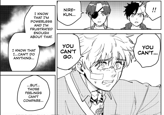
Note the focus on Suo's eyes here — Eyes are the windows to the soul — and especially, especially pertinent to Suo. The story heavily relies on Suo's eye to communicate his feelings (see the images in Part 1, Emotional disquiets) because he never speaks on his own feelings, be it anger, shame, anxiety, conviction, or otherwise! He only did it once, internally (once!). While both Nirei and Suo's faces are depicted with surprise, the visual narration quickly focuses on Suo's scathingly internal introspections.
Do I think these insights come from personal experience? Absolutely, hell yes, fuck yes. Emotional intelligence is a skill honed from personal experiences: both from what you have been through, and learning how to identify it in others. It's an incredibly mature skill to master. So, so many adults never get to this stage; look at how popular the book Adult Children of Emotionally Immature Parents is.

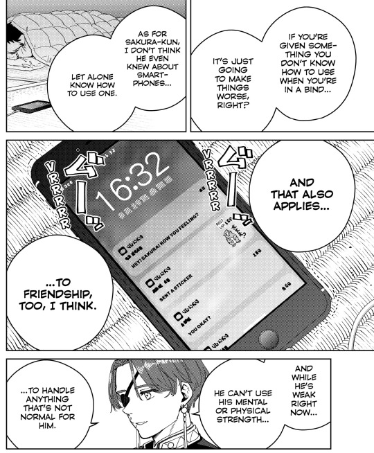
I do also want to point out that it's not that Nirei isn't emotionally intelligent. I will compare how Suo and Nirei "performs" on this front later. But, in this chapter (ch 57), note where Suo's and Nirei's concerns lie: Suo is primarily concerned with Sakura's mental state; Nirei focuses on the progression of Sakura's emotional growth.
The former is preoccupied with what (he thinks) Sakura can handle, emphasizing Sakura's emotional fragility. That is a very deep concern on and empathy for someone else's emotional status: imagining yourself in their shoes; calibrate what may ticks them off, make them happy, make them worse; make an educated decision from there. That deep, deep, and thoughtful empathy coming from emotional intelligence. Though, we can see that this preoccupation with someone else's pain (and protect them from it) hindered him from actions.
Nirei, on the other hand, focuses on practicality and growth. If Sakura never learns how to depend on other, he will never get there the next time he needs it. What better time to grow than now? This also plays into Nirei's overall narrative theme of growth (thus this conversation may have put Suo's narrative theme into that of intellectual empathy without actions; a caged bird in a sense— but this is getting too close to discussing Backstory Speculations). While Suo has the skill to understand, and articulate, how Sakura feels, Nirei understands the necessity of "growing pain". That, to me, especially after hearing Suo's explanation, is also emotional intelligence. As a segue, may be there is a narrative foil between Nirei's actions and Suo's intellects at play...
Very aptly, the arc culminates in Kotoha — who technically knows Sakura for longer — who has the social grace, intelligence, and brazenness to do what Suo and Nirei hesitated to do as Sakura's classmates.
Empathy on the Staircase to Adulthood: How Empathy is Taught (by Suo)
Staircase to Adulthood is probably one of the most iconic ways a character is introduced, like, ever. Amidst his biographical mysteries, we are hit upfront with Suo's core ideology. That's a hell of a first (major) impression— this, is, like, the third base in getting to know a fictional character. Adding to that, it is also a total shock from how Suo was introduced.

And the main thesis of this fight is: You are an immature scumbag without empathy— without ever imagining stepping into someone's shoes and immersing in the reality of the experience, thus being able to know and engage with other people's feelings. This, notably, is depicted as something learned: a skill.
Empathy, as also emphasized earlier, is the basis of emotional intelligence and (emotional) maturity: this is Kanuma's first lesson towards maturity. Later on, in both Sakura's and Sugishita's emotional development, Suo demonstrates great command of this skill. Empathy is part of his identity of being mature. What else can I say? Suo is a real, mature adult (lmao, nope, no 15yo ever is, trust me).
Suo's way of "teaching" this to Kanuma is, arguably, empathetic but not kind. To me, his method of public humiliation was quite harsh. There is something to be said about the necessity of humiliation towards growth of social awareness (children and teenagers, especially, learn a lot about social conventions and norms from small instances of "humiliation" and "shame"), however. I would think that this shaming is somewhat necessary if not for the fact that Suo planned to toy with Kanuma the entire fight and then finishing him off. That certainly will drive the lesson home. But I'm not sure if I would consider that necessary. Certainly, some people think otherwise— I don't think there is a right or wrong answer in this case.
Regardless, it does not mean Suo is unempathetic. Arguably, being able to put himself in Kanuma's shoes and engage with his feeling is the exact recipe Suo provided here. What seems to happen is that, despite understanding the humiliation Kanuma will experience — in contrast to Kanuma's callousness, which Suo attributed to an inability to empathize with other — Suo humiliates him anyway. "Engaging with other people's feelings", here, is equated to "understand and predict what they are feeling" (like in Sakura's case) without necessarily preventing it from happening. Growing pain, we suppose.

Note, also, in the image above this, the focus on lived experience— here goes more material for Backstory Speculations! All the empathy Suo had for Sakura's solitude— what can it say? (As a last note, while I think that you don't necessarily need to have the exact lived experience someone is going through in order to empathize with them, I do think that thinking about how you can empathize with someone else, based on shared experience, is a necessary step in learning empathy. Once you learned that skill, then it'd be a lot easier to imagine yourself in their experiences and empathize from there.)
Suo, overall, is an empathetic (emotionally mature) person, through and through, via his experience and skill of imagination. Whether he hates you enough to wants you to suffer anyway.... well. He is 15, after all.
Suo's and Nirei's Opposing Approach: Speech, Emotionality, Intervention
Now, I want to analyze what makes Suo's emotional intelligence so apparent, per se. I think this is most apparent when comparing how Suo and Nirei utilizes their ability to understand other people. In short, what makes Suo seems so much "wiser" than Nirei in this aspect is his ability to eloquently and detachedly (thus giving off the impression of maturely) communicated his observations; this lead us to Suo's intellectualization of feelings versus Nirei's engagement, and thus Suo's non-interventionist versus Nirei's interventionist approach.
Nirei's emotional intelligence; his spontaneous speech versus Suo's pre-meditated approach
Nirei is, by all mean, also an incredibly emotionally intelligent individual. Time and time again, he was able to understand the anxieties others are going through and relate it to his own experience. For example, after the Shishitoren fight, as Sakura was having a crisis over his inability to "accept" other, Nirei was the one disrupting his spiral...


and, in his clumsy way ("What am I trying to say here?") managed to deliver the message anyway: that Sakura has accepted him, was seeing who Nirei for who he is, thus Sakura is a person that is accepting and deserved to be accepted in return. Similarly, in the Roppo Ichiza arc, Nirei was able to empathize with Shizuka's anxiety of being a burden on the people protecting her, and also Roppo Ichiza's affections for Shizuka

Nirei's "clumsiness" is a direct manifestation of Nirei's spontaneous genuineness. He speaks directly from the heart, as the words are forming, because he believes that it is practical to contradicts what he think others got wrong, to get them to the right track for themselves.
Meanwhile, Suo, either with Sakura or with Kanuma or Oobiki, often pre-meditated his speech: they are eloquent and organized. Suo mulls over and thinks about his words before he says it. Perhaps the most informative example is with Sakura's confession of his worries post-KEEL. In ch. 60, while one by one refuted Sakura's worries (primarily Anzai), Suo let them have the stage and come swooping it at the end with what seems like a closing, conclusive statement.
... before Anzai comes in to propels the plot to a humorous register. In what immediately follows, the group again engaged Sakura emotionally by showcasing their "lameness" before Suo arrives with the final, encouraging "closing statement" — the register shifts once more to the humorous, closing out the scene.
There is also a nuance that, well, sometimes people are just naturally eloquent. This may surprise you, but the way I write here is not that far off from how I speak in real life, like, casually and on the spot (I do edit my posts, of course, but the vocabulary/register is quite similar). Suo does not pre-meditate his speech in the Oobiki's fight, where he responds to the former's taunts and callousness as it comes. But, predominantly, in empathizing with his peers: Sakura, Kanuma (Suo definitely had the time to think about staircase to adulthood deeply before his performance), Sugishita (Suo caught Sugi's worries, but does not speak up— more on this later), Suo does not speak as the feeling comes the way Nirei does it. Does this make Suo less genuine? No, I don't think so. But it does means that his response/portrayal of himself is quite controlled and measured— this, we already know.
Suo's intellectualization versus Nirei's engagement
Which bring us to the difference between how Suo and Nirei processes feelings, then coming into conclusion regarding Suo's ability to engage with others. The evidences focus on their response to others' feelings, but this may very much also apply to their own emotions. This is most cleanly demonstrated by their reassurance of grandma Yui's feelings to grandpa Ito, and re-emphasize with Sakura post-KEEL.
In the first case, note how the group resolve the issue at hand. While the group is at lost for words, Suo speaks first, and he asks for factual information: Why took the photo? Who planted the tree? What happened? Then, he explained grandma Yui's feelings with accepted knowledge (thus, in a sense, facts): using flower's language

And that was his role in the narrative: translating grandma Yui's feelings into a language other understands; a task with little personal interjection. Meanwhile, Tsubaki, Sakura, and Nirei all depends on their personal experience with grandma Yui or their feelings to support Suo's arguments. Particularly, Nirei directly "puts himself in grandma Yui's shoes" and speaks from that very personal perspective:

There is personal feelings versus facts; putting yourself in the conversation versus speaking from the outside looking in. Nirei's direct, first-person engagement to others' feelings is repeatedly demonstrated, between post-Shishitoren, this arc, and then Roppo Ichiza. But Suo's noticing of the dogwood tree also emphasizes his observational skill (building off his hobby of people-watching).
Coming back to post-KEEL Sakura, while Nirei does not have a lot of lines here (he is occupied with other worries— as Suo noticed), Suo's "closing statements" are primarily conventional wisdoms that most (except Sakura) are familiar with; this is once again a translation task between what Anzai and the group tries to tell Sakura, versus distilling it into actionable terms and generalization that Sakura can understand deeper and utilize. It is, once again, an informative approach, not so much an emotional one.
There is always this problem of detachment from and unfeelingness of feelings when we evoke "intellectualization of feelings". Part of why, I think, Suo sounds so eloquent speaking on all of these is that he never let his own feelings leaked. He stays grounded in the others' problems, feelings, their known scenarios without relating it back to his own: closed room, no leakage, no input to the conversation. Suo deflected from his own feelings, or maybe he never let us get close enough to them in the first place. That's why we learns almost entirely nothing about Suo's internal thoughts or turmoil compare to we do Nirei, who is his narrative and screen-time symmetry.
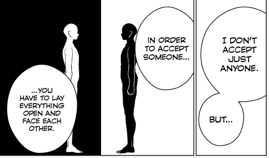
This detachment is the same reason why we perpetually feel that Suo is not connected to his friend group and Furin— spurring this entire discussion of him refusing to "engage in a conversation" through the fist, or his diet, etc etc. But now that we get to this point, I think what is happening is that, it's not that Suo is refusing to integrate into Furin, but he does not know how to. You must be able to be vulnerable to others in other to get close to them. Umemiya himself said this in the story, and re-emphasized it by sharing his traumatic past to Sakura to allow him to understand why Furin is so important to him.
If Suo does not know how to do this, then we must ask why. If you are familiar with attachment theory, this may reminds you of the question of why certain individuals in society cannot successfully form meaningful relationship to other; the theory came back to the person's relationship to their mother's at birth. However, attachment styles can changes — for better or worse — as a person goes through life and either heal or get traumatized. I'm getting dangerously close to the Backstory Speculations territory here, but this may says something about how Suo grew up, if we claim that he does not know how to be emotionally vulnerable to other people. But also, I can see one (1) reason why Suo would come to detach himself from/distrust others:
His eye trauma.
I wrote it explicitly there (don't worry, it's nowhere near as long as this one), but to summarize, of course you would get skittish and distrust others after someone, uh, presumably violently take out your eye. That sort of trauma would significantly damage your ability to be vulnerable. Eventually, you forgot how to do it.
Nirei's Interventionism vs. Suo's Non-interventionism
What does it means to be detached from others, versus not?
Semantically, we travel directly upstream of our logic to "not engage" versus "engage”: Nirei directly "jump the gun" to action, while Suo observe and wait— seemingly patiently wait for the relevant party to be ready to come up to him, like he did with Sakura when he was sick; Suo isn't going to force their way. In Roppo Ichiza, while Suo was not in a (physical, locational) position to intercept Shizuka, he was still astounded that Nirei decided to speak to her at all— similar to how he was taken aback at Nirei's arguments for trying to help Sakura when he was sick. Nirei, in the same circumstances, seems to be more anxious that the other party will not come to them at all, so he sprung ahead to grab them where they are at, and drag them along— for their own good (I would not be surprised if the difference in their approach will come to head at some point).
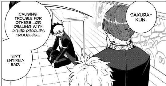
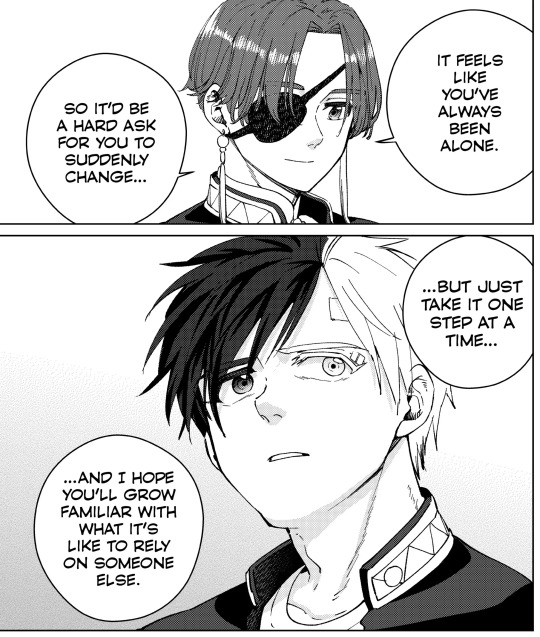
What is tangentially related, and interesting, is in Sugishita's mini-arc. While Suo, the more intuitive and observant of the two, seems to understood Sugishita's state of troubles (if not the exact source of trouble itself) from the very beginning. It makes sense, since Suo was the one to put (or maybe "pit") Sakura and Sugishita together, despite their rocky friendship, by the necessity of battle. Suo does not intervene in improving their relationship before this. He basically says, "This is what Furin needs you two to do, put your big boy pants on and do it." This and Suo's non-interventionist approach points to his theme of maturity, where he treats his peers as (and expect them to be) adult, capable of handling their own troubles and come to him for help when they are ready.
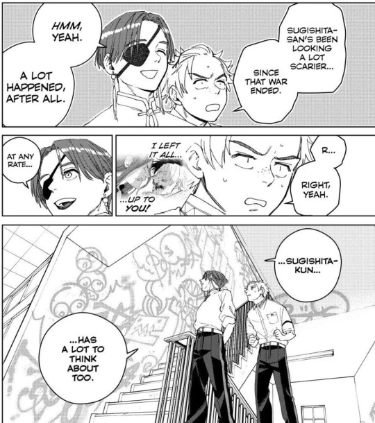
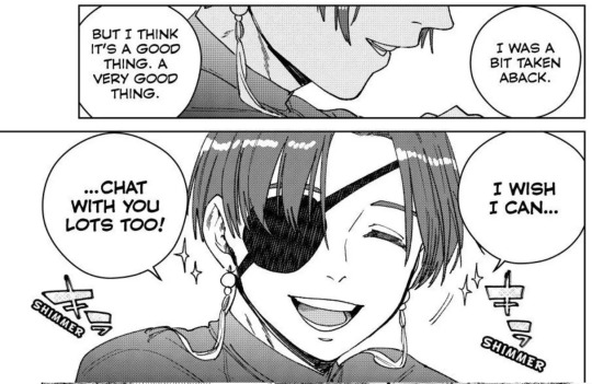
By that same logic, Suo knows, but does not interfere with, Sugishita's troubles. He is waiting for Sugishita to figure out what to do. Should Sugishita come to him for help, Suo would be happy to provide— as he make sure that Sugi knows, later, in a very jokey register
Nirei, on his side of things fulfilled his literal and symbolic function as the interventionist and walked Sugishita through his issues — crucially, walking through it together — in their conversation, which deserves a closer look:
Nirei, unlike Suo, was thrown into the depth, equally as disoriented as Sugishita. It may start as "the blind leading the blind", but it's more like: let's walk down your trouble and figure it out together— like teenagers learning to navigate life together:

Nirei started the conversation completely not knowing what's going on
Catching up to where Sugishita is at

"Let's figure it out together"

Helping Sugishita out by relating his own experience as an example— and also functionally invite Sugishita to be vulnerable, too
And, as Nirei walks through it with Sugishita, by examining his own feelings, he was able to work out what exactly troubles his friends. Nirei's emotional intelligence — the ability to walk in someone's shoes — enables that.

Notice that Nirei understands the situation with both facts and emotions— he is as factually knowledgeable as Suo is. Just that, in communicating, Nirei focuses more on the emotions and lived experiences.
The vice-captains duo is, textually-evident, the heart and the brain. They have both to help them understand the situation, but favor one over the other in resolving the task at hand.
This is why Nirei is more suited to help Sugishita than Suo. When I imagine switching Suo and Nirei in this situation, the scenario comes off very differently: Suo would know exactly what Sugishita is worried about — he will likely remains ahead, waiting for Sugi to catch up/ask questions first (which Sugi have difficulties with in the first place) — which may results in a long stalemate until Sugi figured out what to ask (Suo seems like the type to have infinite patient); Suo will likely also do not relates his own experience with Sakura to Sugi. At any rate, it's a very different experience of admiration from Nirei's anyway; something deeply emotional with a sense of personal shame/inadequacy that is not quite along the line of what Sugi is experiencing. I think Suo versus Sugi conversation, pre-Nirei, would be like two mutually unmovable object staying still on the timescale of the Earth forming and shifting mountains (millions of years).
So, yeah, that's our emotionality duo— suitable for different task, different situation, and that relate a looooooot from their characterization.
Coming back to Suo (because this is, after all, a Suo-post), I offer another facet of why Suo interfere less in others' problems: this is a culture/propriety thing. As I mentioned before, he treats his peers like adults who can come to him when they have problems; he will not poke his nose into their business, even if he sees and knows it. It's a pretty Asian (and Confucian thing, in my experience) to respect other (household)'s privacy with their internal business. You don't tend to pry, allowing other to keep their pride in the public sphere. Nirei, on the other hand, as someone whose life was changed for the better by someone's intervention, sees the value in it. Maybe this come back to Suo's seeing himself as more distant from someone else — their interaction remains in the formal "public sphere" rather than the more personal "private sphere"? Maybe this come back to his theme of maturity and adulthood? Very plausible! But I would not let these very symbolic, second-order extrapolation takes away the focus from the textual evidences, which are, in summary:
Suo thinks before he speaks
Suo relies on facts and general knowledge in helping other with their emotion— he relies on rationality to dispel anxieties (oh, hey, more Backstory Speculations material; remember KEEL? Sakura pulled Suo out with a rational necessity)
Suo waits for other to approach him, rather than pulling them in.
And, looping back one more to speculations, I think it's important to keep in mind that this is likely not only how Suo handles everyone else's emotions, but how he handles his own also.
Appendix: Suo and Nirei as "Emotional" Foil, Suo and Sakura as "Battle" Foil
In Part 1, I heavily rely on Sakura as narrative foil to analyze Suo's habitual deflection, extrapolating the mental and emotional from the physical (the fights). Here we examined in depth Suo and Nirei as complementary foils, emotionally. There seems to be a great triangular balance of the brawn, the heart, and the brain in this trio. In this formulation, we emphasized Suo as the primary vertex of this triangle, Sakura and Nirei's approaches (all-physical versus all-emotional, comparatively) coming to conjunction where Suo is.
This is not to say Suo really is the primary vertex. I like to think of them as an equilateral triangle— equal side lengths, equally important vertices. Did you know that the strongest shape is a triangle? That's why foundation of bridges are made from triangles. Equilateral ones, usually.
Suo is where Sakura's brawn and Nirei's heart comes together. Sakura is where Suo's intellectualization and Nirei's passion comes together (amongst other things, I'm sure, but my brain juice is running out). Nirei is where Sakura's protective tendencies and Suo's laissez-faire, everyone-is-mature-enough policy comes to contact. It's a solid equilateral triangle that will carry them all through the narrative. Seems like, like Sakura's psychological state in the Extinction War arc, we are looking to see it being put to the test — therefore displaying its fortitude — as the narrative unfold.
#wind breaker#wbk#wind breaker analysis#wind breaker meta#wbk analysis#wbk meta#suo hayato#nirei akihiko#sakura haruka#sugishita kyotaro#anne carson#well well well. after sakura-suo foil we have nirei-suo foil too#rccl#if u cant tell. im running out of real work to do in school#this is not actually true i just have a Problem#im crazy if you havent been able to tell.
51 notes
·
View notes
Text
Damn i really want to know tf happened in the writing room of arcane s2. Some of the downgrades were inevitable due to the show's corporate limitations (not being able to progress the class war story in a meaningful way, having to tie things back to league of legends in terms of making playable characters more appealing to well, play... rip Mel and Viktor in particular), sure. But i still feel like it's even worse than that? There are so many bad decisions that i couldn't even start listing them all... the characters, plot, pacing, themes, it's just such a mess? Even the dialogue writing, it feels much more mm Marvel at its worst i suppose. What i am most bothered by is probably just the straight up harmful messaging so um... Cycles of violence and abuse can be broken by individual decisions to become a better person! Got nothing to do with systemic oppression, living conditions, mental health issues, you can just conveniently ignore aaall the social context, live laugh love and then things get better automatically yep, oppressors famously stop oppressing you when you show them that you're harmless and won't put up a fight anymore. Literally three out of three suicidal characters dying to redeem themselves? Not even in a tragic/cathartic way but in a bittersweet 'they finally atoned for their mistakes' way? Groundbreaking lmao. Romantic relationship between Vi and Caitlyn including no communication about their biggest fight, just conveniently skipping to sex and getting back together - would have loved that if it was framed as the unhealthy fucked up thing that it is, skipping over Vi's hurt and her background to once again become a cop, her girlfriend's direct underling at that (!) due to her not having any other support systems... But nope that was our cute lesbian romance wrapped up, a good thing all around, not concerning at all. Jayce telling Viktor that what he 'always admired about him' was his disability and his deadly disease (??? from a character who spent the whole s1 and first act of s2 desperately trying to help Viktor find a cure? sure) and that those imperfections don't need fixing, just wtf truly. Magic bullshit was also weird, some implications of 'natural magic is ok, but achieving that power through other means corrupts you into a crazy robot bitch or just wilts your trees i guess', but tbh it was written in such a weird and inconsistent way that we can skip this one... Yeah actually a lot of things were just such a mess that I feel silly pointing to specific moments or lines I didn't like, I mean duh, it barely makes sense as a story at all... I am happy we have s1 which comparatively was a masterpiece, and i also really enjoyed s2 act1, i truly believed it would lead somewhere good at the time, my mind still kind of cuts off the story at that point when i think about it, that WAS the open ending of the show to me (is it possible that there were rewrites? targeting act 2 and 3? idk, wishful thinking perhaps). Despite my extremely negative feelings about this season's conclusion i remain glad that so many people appreciate the show regardless, it is clear that there was STILL a lot of love in the process of its creation (although i'd argue that even some of the visual aspects of the show suffered in quality, once again i have to wonder about behind the scenes mood of it all) and i get very upset when i see creatives online despairing over reception of their projects even when i'm absolutely in the disgruntled crowd hahaha... ...however yeah, this wasn't great In a world that increasingly grows more and more right-wing politically... we really needed something different i think.
#tbh i also feel a little annoyed that all the league jayvik fans were right all along#i always rolled my eyes like oh shush changing the characters doesnt mean ruining them#and here we are#boo boo the fool jpeg#arcane spoilers#arcane s2 spoilers#arcane critical#negative#ranting#text#long post
126 notes
·
View notes
Text
So I thought it would be fun to talk about all the musical segments in season 2 of Arcane. Here's where you can find other posts.
"Sucker". What is there to say about this besides: this is what efficiency looks like


Like none of these characters are *particularly* important, you just need to know who they are to understand the context. So you can just do a few frames to communicate the gist of things. But just because it's efficient doesn't mean it has to be boring, it's still all really interesting visually.
Then you get shots of Jinx, that tell the audience both what's going on around her (chaos, Chross' thugs going after kids) and what she feels about it (nothing), again very efficiently.


It's the abstract quality of the sequence that allows it to be so efficient. You don't need a whole scene, it's almost just pure information.
There's also the fact that there's a texture over all of this, like it's old damaged film. That's another element that creates a sense of separation between Jinx and her surroundings. Like this is all just a movie playing out that she doesn't particularly care about.
Then there's this little bit that I think it cool.


Jinx walks through these warring gangs, and she doesn't do anything, she doesn't interact with them, but there's still a sense that she's leaving chaos in her wake. Because in a sense she did. It is all the result of her killing Silco.
And then there's the introduction of Isha.
There's this video that breaks down the scene really well, and says a lot of stuff that I'm not going to repeat.
One thing it points out is how Isha's introduction parallels Powder's introduction in s1e1.
They're both making big jumps, they both don't make it.


But while Vi catches Powder and pulls her up, Jinx catches (kind of) Isha at the bottom.


And that reflects what their relationships are like too. Vi is trying to bring Powder up and encourage her ("You're ready", "You can do this") while Jinx's little speech to Isha basically communicates, "this is a good place to be" ("best feeling in the world, kid").
There's also a sense of Jinx being clobbered by the consequences of her actions. She's walking through the chaos that she created, feeling nothing, in her own head, disconnected. But she can't stay that way, the chaos she created won't let her.
The other parallel, that the video does not mention, is this one.


And I love both of these parallels so much. Because Isha's introduction very clearly references both these scenes. But that also highlights how different they are.
Jinx doesn't try to parent Isha in the way that Vi parented her. She doesn't do any "I believe in you" stuff. She doesn't try to shield Isha from her world, she invites her into it.
Jinx does identify with Isha in a way, as indicated by her little speech. She knows what Isha is feeling and tells her it's a good thing. Where Silco sheltered Jinx, Jinx invites Isha to chase after danger.
And Isha is not shattered and helpless. She doesn't hesitate before making the jump. She doesn't cry or panic. But she is fascinated by Jinx.


Isha imprints on Jinx so hard. And I love that for her.
49 notes
·
View notes
Text
Solo Leveling (anime)

For a long time, artists have experimented with phenomenology, or how art is changed by the way a person experiences the art. In visual arts, phenomenological experiences are usually achieved with optical effects, where art looks different when viewed from different angles, with ultimate results that are, in my opinion, gimmicky. But as a concept, I always felt phenomenology could find new artistic life in the medium of video games. Even in the most basic, non-narrative video games -- say, for example, the original Super Mario Bros. -- the way the player plays the game crafts a narrative experience. Mario can move carefully or aggressively, slowly or quickly, exploring for secrets or barreling to the end; he can die many times or none. However the game is played, it manufactures a "personality" for the character Mario unique to each player. In that interplay between the contributions of a game's creator and player, video games become a wholly unique art form.
Yet, as video games developed, and other art forms have retroactively become influenced by video games, I wonder if the real outcome of phenomenology in games has been an increasing tilt toward myopic individual artistic experience, or solipsism.
In my review of Sword Art Online, I mentioned that Solo Leveling's properly translated title is "Only I Level Up," which perfectly encapsulates the solipsistic focus of this genre of Gamer fiction. It is not simply about being powerful, it is about being the only one who is powerful. In Solo Leveling, this point is made at the end of the second episode, when protagonist Jinwoo receives a game prompt to become a "Player." As he is the only Player, every other character is necessarily a non-Player, or in Gamer lingo, an NPC.
I find something admirable about the nakedness with which Only I Level Up cuts to the quick. The most frustrating aspect of Sword Art Online as a viewing experience is how it attempts to hide its solipsistic power fantasy. The singleminded focus the show has on Kirito's power as the only power that matters undercuts everything else SAO claims to be, whether that's a tense death game, a heartfelt romance, or a story about the legitimacy of online community. Only I Level Up dispenses with pretense; its true face is right there in the title.
To frame it another way, I once watched Mission Impossible: Ghost Protocol, the first film in Late Tom Cruise's career as a psychopathic do-my-own-stuntsman, where the core appeal of a Tom Cruise film is to see what death-defying feat the actor pulls off. And, yes, the stunts Tom Cruise performs are spectacular to watch. The problem is that these stunts comprise, collectively, 10-20 minutes of a film that is well over 2 hours. The rest of the film is mired in tedious plot, weak stabs at character drama, banal comic relief -- all the things a Hollywood movie is "supposed to have," even if they are not the core appeal of the film at all. Because of this, I was much more impressed by The Raid, an Indonesian action movie that excises nearly all plot and character to provide 90 minutes of nonstop action, or Mad Max: Fury Road, a film that is accurately described as a two-hour car chase.
Only I Level Up reaches a similar level of efficiency as it pushes Jinwoo from encounter to encounter. The loop is simple: Jinwoo is too weak, gets pushed around, levels up, wins, and the moment he wins the story already has a new stronger adversary waiting to appear. All other characters are either helpful assistants/helpless innocents Jinwoo has to protect, enemies to overcome, or, in the case of the show's brief cutaways to other powerful figures in-universe, power goals that Jinwoo is striving toward (and will ultimately exceed). The last category, though seemingly the most extraneous, is pivotal for providing context to just how strong Jinwoo is, what exactly it means when his numbers go up, and also for fueling the core grievance of weakness that makes this show so tastelessly indulgent: "Look at these rich, strong, beautiful people at the top. Why shouldn't I have what they have?" Though this is a Japanese anime, it's an adaptation of a Korean manwha, and the class envy so prominent in other Korean popular works like Parasite and Squid Game manifests here too. The S-rank Hunters that Jinwoo is leveling toward are suited executives in penthouses, people who own companies and walk around in sharp suits, while Jinwoo starts the story nearly getting killed just to make ends meet. The show's power fantasy is thus not simply about getting stronger, but about class inversion; Jinwoo's first ally is a rich corporate heir who becomes Jinwoo's drudge laborer (carrying equipment, mining loot with a pickax) and gleefully calls Jinwoo "boss." There's a scene I can only describe as "job interview revenge porn" where a suited executive, noticing Jinwoo's hidden talent, attempts to headhunt him with a lucrative contract; Jinwoo effortlessly turns the tables, reveals he's worth more than the interviewer's entire company, and cons the interviewer into paying him obscene amounts of money for nothing. Despite being humiliated, the interviewer leaves happy because Jinwoo gave him his contact info -- a direct line to Jinwoo is just that valuable.
The flipside of the class envy power fantasy is the humiliation Jinwoo suffers before his ascent to the top. In true solipsistic fashion, just as his strength is ultimately superlative, so is his initial weakness; he is nicknamed, no joke, "Mankind's Weakest Hunter." The early episodes are rife with masochistic internal monologues emphasizing again and again this weakness, even at inappropriate times. When Jinwoo sees a living statue cut a guy in half, his immediate thought is "That guy was a D rank, and he was killed in one hit... what will it do to me, who is a lowly and pathetic E rank?" My guy, it'll do exactly the same thing. Since the statues can annihilate anyone regardless of rank, they're actually an equalizer as far as Jinwoo is concerned, but Jinwoo still has to belabor his weakness. It's all in the service of breeding resentment toward the unfairness of Jinwoo's situation, which makes his later ascendance more cathartic. Sword Art Online also pulled this bullshit, though in a different way, since SAO had a fanfic-like squeamishness toward ever showing Kirito in any sort of weakened state. Instead, after Kirito defeats a boss, everyone baselessly calls him a cheater (sorry, beater). The baselessness is the point. It's not fair they called him a beater! It's not fair! It's not fair! It's not fair!
Obviously, this mindset is puerile, both in SAO and OILU, and in all the endless imitators of their ilk. The more interesting question is: How did we get here? How has this become the face of Gamer fiction?
In my Sword Art Online review, I framed the ascendance of SAO in 2012 as a byproduct of a longstanding culture-wide sneering at video games, emphasized by Roger Ebert's declaration that video games could never be art, but also demonstrated by the dismissive and insincere way video games were adapted into film during the preceding two decades. Either you got silly children's movies (Spy Kids 3D, The Wizard) or hysterectomy-like disembowelments where a D-list director's vanity project wore the original material's skin Buffalo Bill-style (Resident Evil 2002, Super Mario Bros. 1993). One has to go all the way back to 1982's Tron to find a film that treated the concept of video games with any sort of respect, and that was a film from the teenager-driven arcade era, before Nintendo indelibly associated the medium with kids toys.
In this milieu, the Gamers were being humiliated. Their hobby, their passion, the guiding focus of their nascent online communities and identities, was kid stuff, nerd stuff, not worth shit in the culture at large. It's no surprise that Gamers would glom onto media that tapped into their feelings of resentment. Kirito is a real-world misfit who is all-powerful in the game world. The virtual world is presented as a location of power inversion, where the weak becomes strong, similar to the class inversion that guides Solo Leveling -- and this correlates to the idea that the Gamer in real life is a humiliated underclass.
Yet, there is a crucial difference between Sword Art Online and Solo Leveling: Solo Leveling doesn't take place in a virtual world.
One of the few elements of SAO I actually like is how it depicts Kirito in the real world. I mentioned before that the show is allergic to showing Kirito in any state of weakness, but this is only true in the game world. Kirito is never weak; Kazuto Kirigaya often is. The Aincrad arc ends with an emaciated, atrophied Kazuto weakly limping across a hospital; the next arc begins with Kazuto getting his ass beat in kendo by his little sister. The show's only exciting action scene comes at the end of the otherwise lifeless Alfheim arc and doesn't involve flashy magic or swordplay, but rather a tense and realistic Waffle House-style knifefight in a parking lot between Kazuto and Average Adult Male. Kirito is fully dependent on the virtual world for his power, which explains SAO's insistence on the virtual world being as legitimate as the real one: that way, Kirito can matter.
In its typical pretense-dispensing fashion, Only I Level Up instead drapes game logic on reality. Jinwoo's Gamer power is real-world power; leveling up gains him increased strength, money, and status in a recognizably modern Seoul, South Korea. This difference comes at the cost of the fantastical environments and paradise-like alternate reality so prominent in SAO. It's not that OILU is less of a Gamer work for it; its video game system is more fleshed-out and true to real video games than SAO's is, and it is at times comedically insightful about the modern video game landscape. (I laughed out loud when Jinwoo, rejecting a message prompting him to change class to Necromancer because it would screw up his build, immediately reconsiders when a FOMO-inducing follow-up message cryptically says "Are you sure? Necromancer is a hidden class.") But the video game system exists only as a system. There is no sense of place or worldbuilding, virtual or otherwise; dungeons are either draped on the real world or take place in generic caves and castles. The virtual world was paramount to SAO's themes and aesthetic. In 12 years, where has it gone?
The answer is more fundamental to the way people experience video games today, or even more broadly, how they experience the internet as a whole.
Communities on the early internet were typically niche and nerdy and existed in chatrooms and forums. The thing about chatrooms and forums is that, though digital, they embody a sense of place. (It's called a chatROOM for a reason.) A forum's structure is static, divided into boards and threads, and remains that way for each user who accesses it. For instance, everyone who goes on /vg/ at the same time will see the same messages. /vg/ exists independently of any one user, and will continue to exist even if individual users log off. Due to this consistency, the forum takes on a sense of place, like a building people can go into and leave at will. MMORPGs, the focus of Sword Art Online, add a visual component to this same idea. Everyone is in the same World of Warcraft. Though they may do different things in it, go to different cities or dungeons, play in different ways, the World itself retains its shape and character.
By contrast, the way most people interact with the internet today is via social media, which eschews spatial consistency in favor of individualized "feeds" of algorithm-driven (or user-curated) content. When you go on Twitter, the content you are presented with is a wholly unique combination, yours alone. Your Twitter is different from your friends' Twitter, even if -- sharing similar interests -- your algorithms have presented you with some overlapping content.
Due to this individualized transience (this phenomenology, let's say), Twitter, Instagram, and TikTok are not "places" the way forums or MMORPGs are. You couldn't describe them as a building, or depict them as a mansion the way Julian Dibbell does an old Multi-User Dungeon in A Rape in Cyberspace. And the removal of this sense of place erodes the feeling of community present in old forums and MMORPGs, where there is a static world outside the individual and thus an external existence toward which a person can feel a sense of duty or responsibility. Similarly, social media promotes a greater sense of inequality and anti-democracy. If you post on a forum, your post will exist at the top of the board, at least until other people post and push it down. Every poster has the same opportunity to be seen and interacted with. In social media, your capacity to be heard when you make your shouts in the dark is entirely tied to the algorithm's decision on whether to present your shout to enough individualized feeds.
Solo Leveling is Gamer fiction for the social media age. Whereas SAO, and its significantly more community-minded predecessor .hack//Sign, are deeply concerned with online environments as a distinct place, Solo Leveling sees its game environments as nebulous, pseudo-spatial pockets that exist briefly and are then destroyed. Jinwoo displays nonexistent interest or curiosity in these environments as anything beyond leveling challenges, compared to Kirito, to whom the world of Aincrad holds deep significance. Likewise, Jinwoo is distinguished by his ordinary clothing; all of his gear is, for seemingly no reason, invisible. (Everyone else in setting wears ridiculous fantasy armor, often to the point of being a joke.) In Solo Leveling, video games are only important as a determiner of skill, a way to establish superiority over others; anything suggestive of an alternative world or culture or even aesthetic is outright rejected. Hence why so many of its enemies and environments, scant as they are, are modeled on Dark Souls, a game that has become synonymous with hardcore challenge (while still being a single-player game that the developer has designed for you to win). MMORPGs, and online communities in general, are passe. The online experience now is individualized, perfectly phenomenological, each in their own bubble, the solipsistic hero of their own story. Everyone else is an NPC.
Likewise, Solo Leveling is not an escapist fantasy, the way SAO or any isekai is. Perhaps there's something quintessentially Japanese about the isekai: an appeal specifically to the otaku NEET who has retreated from society at large. It invites its audience to forsake the real world in favor of a fantastical one, compared to the Korean class consciousness that stages its definitive power fantasy in reality. And as the internet and the real world have continued to blend together in real life, to increasingly bizarre political and economic results, I wonder if Solo Leveling's real world adaptation of the isekai formula might wind up being significantly more prominent in the pop cultural landscape moving forward. Solo Leveling is already the hottest show airing today; I expect to see high-profile imitators soon.
33 notes
·
View notes
Text
Alchemy & Dreams in Beetlejuice Part 2
As mentioned in the last post, red represents Lydia: the material realm & sulphur. The item which falls next to Astrid's cracked photograph is a molecular structure with a red atom and a green atom. It's already common knowledge that Betelgeuse is green-coded, but I have further proof to support the atom theory.
Alchemists viewed the human body (microcosm) as a reflection of the universe (macrocosm). This suggested that atoms could give insights about human nature. Within this context, consider Rosenkreutz illustration of the Chymical Wedding, where the married couple are holding onto the structure. They're supposed to represent two atoms of the same trigonal planar molecule, because they are of the same element, thus sharing a chemical bond.
Alchemy consists of a mix of chemistry, philosophy, semiotics, and metaphysics, with much of the symbolism used to convey alchemical themes in Beetlejuice.
Before I come back to this, let's talk about...
Otho
Throughout the first movie, Otho is typically associated with black and red. He's often wearing black with either a red tie, red buttons, or red shoes (which mysteriously disappear in a couple scenes only to be replaced by different colour shoes).
Red shoes have long been used in media to represent a metaphorical journey (The Red Shoes (1948), Kiki's Delivery Service (1989), and Hans Christian Andersen's The Red Shoes are a few examples). Need I remind you of one of Tim Burton's favourite movies, The Wizard of Oz?
Otho is the only character other than Lydia who piques interest in the dead. Despite his willingness to exploit them, he is ready to believe in their existence and study the handbook. These visual cues are conveying the character's motives.
Part of the alchemical process are the stages "Rubedo" and "Nigredo". Rubedo is Latin for "redness", the stage of understanding where two opposites have joined and created harmony. Nigredo is Latin for "blackness", the stage of putrefaction or decomposition, thus symbolising the dead. In layman's terms, red and black represent the character's willingness to connect with the dead. The only other character really associated with black and red is Lydia, and that speaks for itself.
Otho is a character who inspired the creation of Rory in the second movie. Within Lydia's psyche, Rory has been manifested from guilt. In the first film, Lydia is almost complicit in helping Otho to exorcise the Maitlands after he makes it clear that he wants to capitalise on the dead. In the second film, Lydia is under Rory's management to capitalise on the dead, and she is trying to make peace with that guilt by trying to help people through exorcisms.
Guilt in dreams is often seen as a manifestation of the unconscious mind's attempt to communicate unresolved internal conflicts. This is where the shadow becomes a central concept in Jungian psychology, referring to the parts of the Self that the conscious mind rejects or ignores. Lydia rejects the traits that Otho and Rory embody, and that is why her reconciliation with Astrid is a manifestation of her own forgiveness.
More on The Chemical Wedding
We talked about the purpose of the Chemical Wedding before, but why is it so relevant to the plot of Beetlejuice? Other than the fact Betelgeuse has fallen in love with Lydia, there is an allegorical reason for why the wedding must take place between these two, and no one else but these two.
A Chemical Wedding is the marriage between the sun and the moon. In alchemical texts they are often depicted as the white queen and the red king, though this has nothing to do with literal gender roles, for we see Lydia herself portrayed as the red king in her parallel with Astrid. It is related to the Anima (the female self) and the Animus (the male self). This is also the marriage between mercury and sulfur, spirit and matter, the dead and the living.
One of the most famous works on the subject of a Chemical Wedding is a Rosicrucian allegory published in 1616 by Christian Rosenkreutz. It describes a mystical journey where the main character must attend a wedding at a mysterious castle. The journey is a symbol of the alchemical process, while the wedding itself represents the final transformative stage.
The story is filled with strange and dreamlike imagery, with many claiming it as a source of German dark romanticism.
Rosenkreuz's allegory actually represents inner transformation of the individual, with marriage being used as a metaphor, insofar as the masculine and feminine halves must be merged together in matrimony to achieve completion within oneself.
"Death and the Maiden" trope is a motif that depicts a woman being taken by Death, as he desires to marry her. It is dire for death to marry his living bride, for he wishes to venture the living world and the underworld with her.
Betelgeuse is the perfect complementary opposite to Lydia, each crafted to embody the other's symbolic missing half. Betelgeuse is the animus; he's loud, provocative, and dead; Lydia is the anima; she's quiet, thoughtful, and alive. The contrast is straightforward and uncomplicated. You could easily spend hours analysing their differences, and you'd still be right—because they are deliberately written as foils to one another.
Looking back at how Otho/Rory represents the shadow of Lydia, we should take into account who guided her through this dream sequence. Our psyche creates these thought-images in our unconscious minds as a means to roleplay scenarios where we have internal conflict. It gives us a chance to psychoanalyse ourselves and try to understand the core of our trauma.
Betelgeuse, within Lydia's dream, is acting as a guide (remember his guide outfit in the first film?). He's constantly appearing to her, influencing her and urging her to face her fears. While he's causing chaos in the way he knows best, he's also showing Lydia the bare truth, and this is especially apparent when it comes to Rory: he tells Lydia she's an enabling codependent and forces Rory to tell the truth about his intentions. Betelgeuse is what Jung would refer to as the Trickster archetype. The Trickster is often seen as a figure that disrupts the status quo and challenges the Ego through chaotic and karmic actions, serving as a profound guide in the process of one's personal development. Think of "Jester's privilege", or The Fool in tarot.
In mythological symbolism, there comes the legend of a scorpion that stung Orion to death (the giant red star "Betelgeuse" sits on Orion's belt). The scorpion was delivered as to snub Orion's pride and teach him a lesson by way of death, because the scorpion is a symbol of death and rebirth. This is the Trickster archetype again, teaching a lesson in a very karmic way. Betelgeuse does the same throughout both movies. Otho, the Deetz, and the Deans are all punished by him in the first film for acting as antagonists against the ghosts of Winter River. Despite this, he also acts as an antagonist himself by punishing the Maitlands, two loving parental figures for Lydia, for getting in the way of his plan to marry her.
"They therefore represent a supreme pair of opposites, not hopelessly divided by logical contradiction but, because of the mutual attraction between them, giving promise of union and actually making it possible. The coniunctio oppositorum engaged the speculations of the alchemists in the form of the ‘Chymical Wedding," — Carl Jung, Psychology & Alchemy
In alchemical tradition, Saturn is associated with the metal lead, which symbolises the starting point of the alchemical work—the Nigredo phase. Alchemy is mostly known as the quest to turn lead into gold, but the allegorical meaning is to refine the Self. Saturn is equated with Cronos in mythology, the father of time, who was portrayed as an old man with a scythe/sickle, similar to the grim reaper, who is associated with the end of one's time. Betelgeuse has time-warping powers and wears time-keeping devices on his wrist, all a microcosm for how we measure eternity.
The whole Alchemical Opus works through THREE stages:
Nigredo (Black Stage): Betelgeuse represents lead and Saturn. Putrefaction.
Albedo (White Stage): Before Lydia summons Betelgeuse and agrees to the marriage, he is wearing a black and white suit. White is added to the mix. Purification.
Rubedo (Red Stage): Lydia is manifested a red wedding dress to finish the ceremony. They completed the alchemical process. Lead is turned into Gold.
In the movie's original wedding scene, found here, at 9:11 on the clock the afterlife creature who marries Lydia and Betelgeuse dissipates into fire, and then the scene ends. 911 in numerology is the number of completion, and is used in occultism to symbolise new beginnings and rebirth.
For this reason, it has been theorised that the wedding vows went through, and the Chemical Wedding was completed.
#beetlejuice#beetlejuice 2#beetlejuice beetlejuice#theories#alchemy#carl jung#numerology#dream analysis#lydia deetz
56 notes
·
View notes